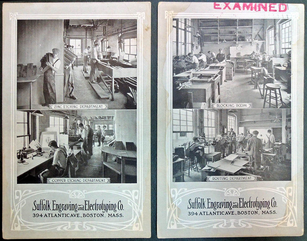
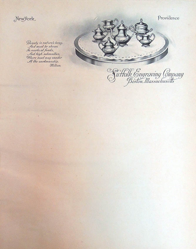
 The Graphic Arts Collection acquired an early 20th century sample book from the firm of John Andrew & Son, Department of the Suffolk Engraving & Electrotyping Co., 394 Atlantic Avenue, Boston, Mass.
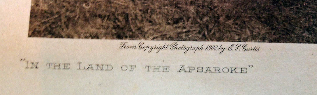
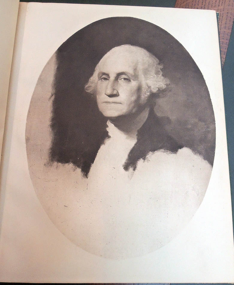
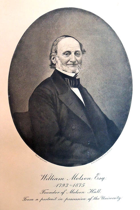
After an introduction (see below), the reader is shown 36 plates with examples of their photogravure work including 2 letterheads, 2 engravings, 1 etching, 1 painting, 3 Edward Curtis Indians (1 from Flute of the Gods), 1 portrait of Edward Curtis (unmarked), 26 photographs of scenery, goods, and portraits of George Washington (1732-1799); William Henry Moody (1853-1917); John William Dawson (1820-1899); William McKinley (1843-1901); King Camp Gillette (1855-1932); William Molson (1793-1875); and others.
[1] John Andrew & Son. In presenting this selection of reproductions by photogravure of a varied line of subjects … / John Andrew & Son. Boston : John Andrew & Son, [1915?] [Text] In presenting this selection of reproductions by photogravure of a varied line of subjects, we desire to call attention to the superiority of this process to any in existence at the present day for the reproducing of pictorial or commercial subjects. Its place, as regards the reproduction of paintings and book illustrations, needs no comment, and its use, in presenting high-class goods to select lists of patrons, presents possibilities which can be readily appreciated from the samples shown in this booklet. Its distinctive quality suggests the same quality of goods advertised.
The wide range of selection of paper and the method of printing insure a result, in the final product, absolutely equal to the first finished proofs, with no falling off of in quality as in half-tone or other mechanically printed reproductions. It is a process of plate-making and printing that at once lifts a piece of advertising matter out of the ordinary. We respectfully solicit your correspondence, or an invitation to confer with you, regarding the production by photogravure of any work you may have in mind. Following a brief description of plate-making and method of printing by this process. 30 cm. Page no. [1]
 [2] John Andrew & Son. Photogravure. Photogravure has been justly called the aristocracy of photographic reproductive processes. Boston : John Andrew & Son, [1915?] [Text] Photogravure. Photogravure has been justly called the aristocracy of photographic reproductive processes. It is an intaglio process having every advantage of photographic accuracy, and the depth and richness of a steel engraving or an etching. It is printed in exactly the same manner as the latter, from a copper plate, the surface of which is protected with a delicate coating of steel. It must be borne in mind that it is exactly the opposite from relief or letterpress printing, inasmuch as the paper is squeezed into depressions in the plate, which are filled with ink, instead of taking the ink off of a surface which is covered with ink. The process of plate-making is as follows: On a highly polished copper plate is deposited a very fine dust of bitumen, which is a resinous powder. This is subjected to a proper degree of heat which melts the fine particles of the powder to a certain extent, and gives a plate covered with very fine resinous grain. This copper plate is then coated with sensitized gelatine in practically the same manner as a photographic dry plate is made.
A regular toned negative, of the same nature as would be required to make a good print on photographic paper, is made, and from this a positive of the size called for in the final photogravure print. This positive is of the same nature which we see in a window transparency or latern slide. The sensitized grained copper plate is then placed in contact with the positive in a printing frame and placed in the proper light, exactly as if we were making a photographic print on paper.
The action of the light on the sensitized grain on the copper hardens it in different degrees, according to the different tones in the positive. The highlights or transparent parts of the positive allow the strongest action of light, which hardens the particles of grain protecting these parts of the plate to the greatest extent, so that when we come to etch the plate the acid has very little chance, or none at all, to disturb the surface of the copper. The shadows being acted upon less, or not at all, leaves the copper in different degrees of protection, and gives the acid a chance to bite into copper to a greater or less extent, as called for in different values of shadows or blacks in the subject. We must bear in mind all the time that this operation is exactly opposite from that which we wish to obtain in a half-tone or relief plate, as we wish the lights to be solid metal and the darks to be depressions in the metal, hence the use of a positive instead of a negative. When we get a proper print on the copper and have washed away the superfluous gelatine, we have a plate which is protected in varying degrees in accordance with the tones of the subject. 30 cm. Page no. [2]


[3] John Andrew & Son. Next step is to protect all the surface of the copper outside the boundaries of the picture, as this must be perfectly polished copper. Boston : John Andrew & Son, [1915?] [Text] The next step is to protect all the surface of the copper outside the boundaries of the picture, as this must be perfectly polished copper. This is painted over with an asphaltum varnish, as well as the back of the plate, and we are ready to etch. The etching is done with perchloride of iron solution as an acid, and the result is then dependent on the skill and judgment of etcher.
The plate is then thoroughly cleaned, and we have in the darks of the picture a roughness of copper, but extremely fine in texture, and this roughness or grain smoothing itself out through the different tones until, when we get to where we wish white paper, we have no grain at all, but smooth, polished copper. Any defects are corrected, or minor changes are now brought about, in the same manner that a steel engraver or etcher would manipulate a steel or copper plate, and we are ready for a proof. The plate is put on the bed of the press, which is flat, and kept slightly heated, and the ink applied by a hand roller in quantity sufficient to fill all the interstices of the grain in the plate, and the excess wiped away with cloth, and afterward with the bare hand.
The paper, which can be of almost any nature, except coated or highly sized, is dampened and laid on the plate. The bed is then run under a roller covered with a woolen blanket, with considerable pressure, which squeezes the paper into the filled-in grain, and the result is a print which in depth of shadow and beautiful gradation, and softness of tone, cannot be equaled by any other photographic reproductive process. As soon as this proof is considered approved, and we are ready to print an edition, the plate is electro-plated with a very thin coating of steel which in no way affects the quality of the tones, but protects the delicate grain which would soon wear away, as the copper itself is too soft to stand the continued wiping and general wear of printing. Photogravure has been used to the greatest extent for high-class book illustration and the reproduction of paintings for framed pictures.
It has come into use recently, however, along commercial lines where the edition has not been too large, and many exquisite booklets, covers, menus, announcements, etc., have been produced. These have the quality and value of steel engravings, but are much more artistic and yet not so prohibitive in regard to expense as the latter. The impression of quality is heightened when the photogravure is printed on one of the many imported hand-made papers from Japan, Italy, France, Spain and England. 30 cm. Page no. [3]

See also: https://graphicarts.princeton.edu/2018/06/05/who-printed-the-north-america-indian/


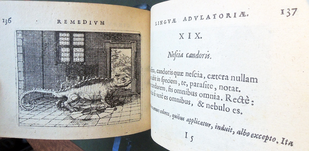
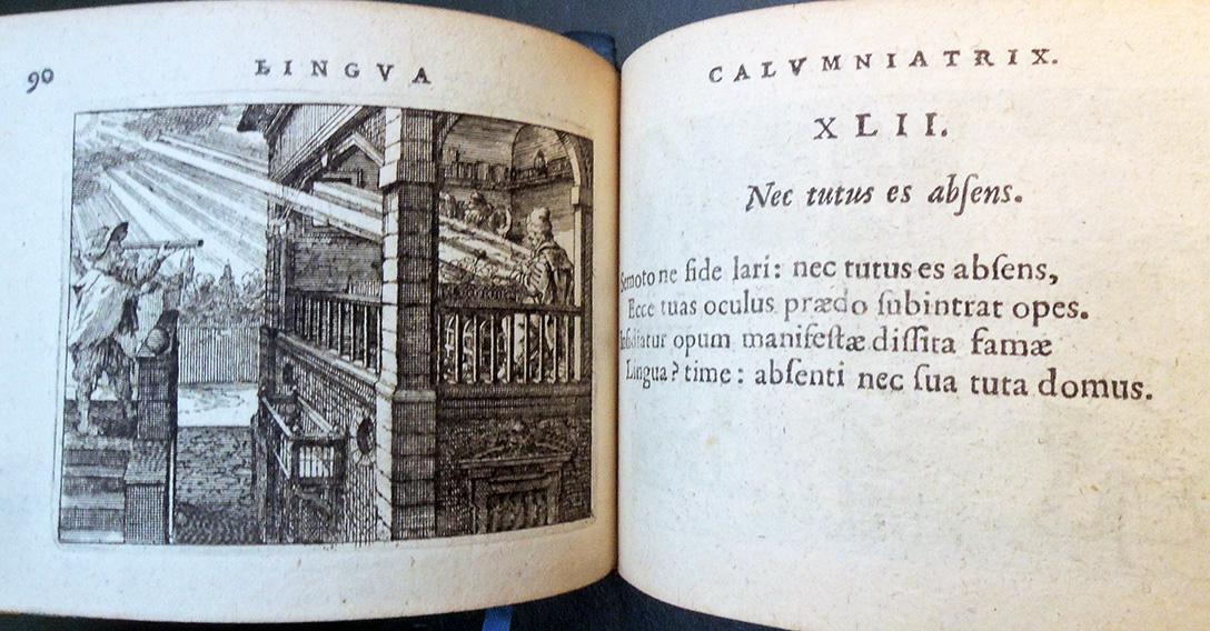
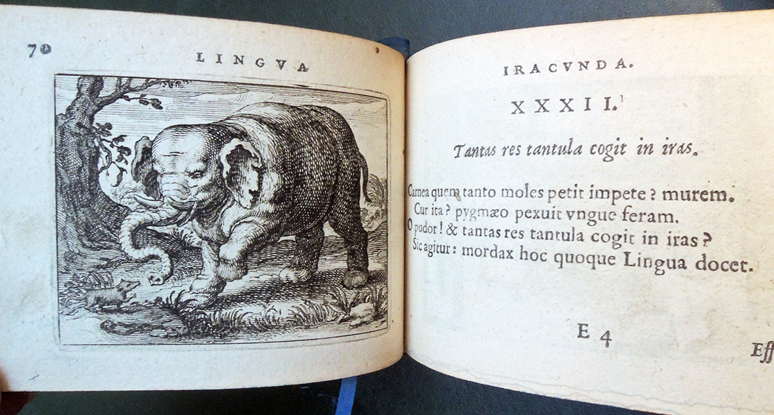
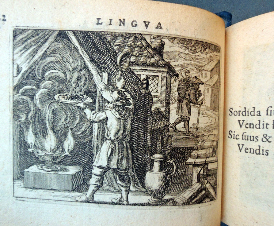
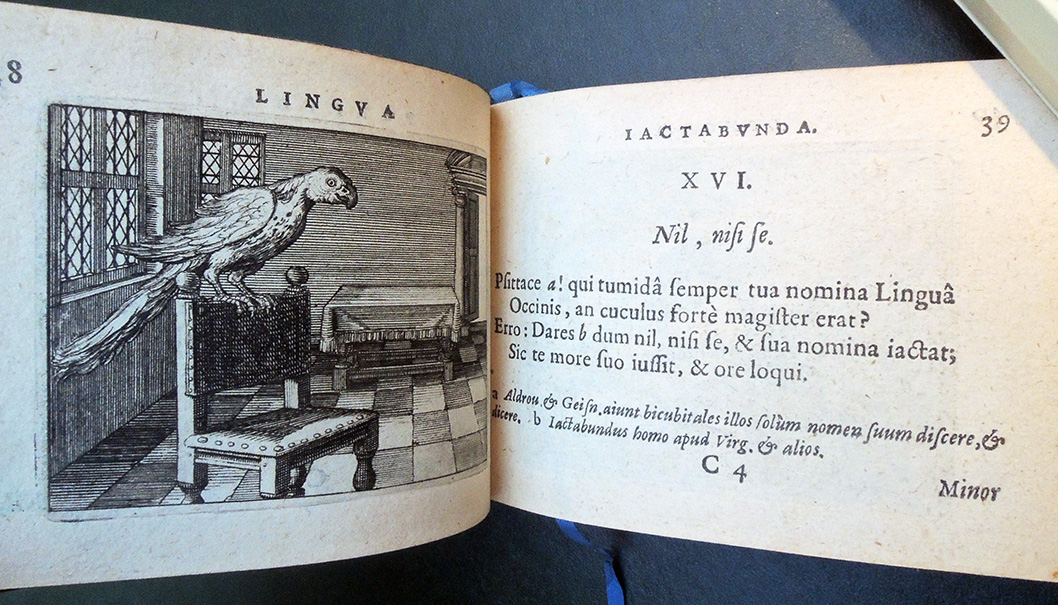
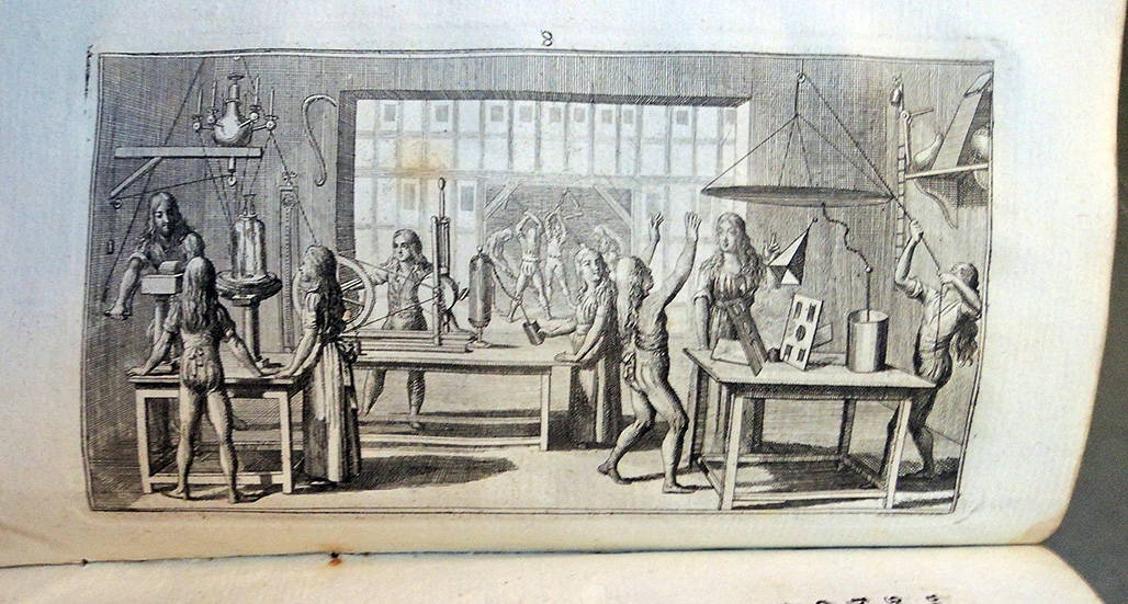
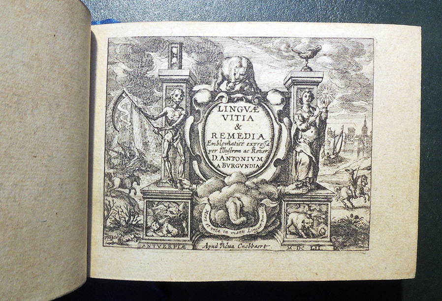 Antoine de Bourgogne (ca. 1594-1657). Linguae vitia & remedia Emblematicè expressa (Antwerp: Widow Cnobbaert, 1652). Graphic Arts Collection GAX 2019- in process.
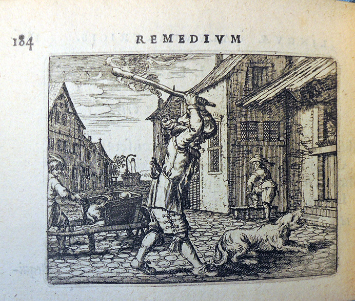
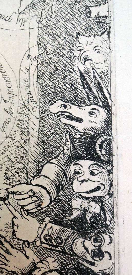
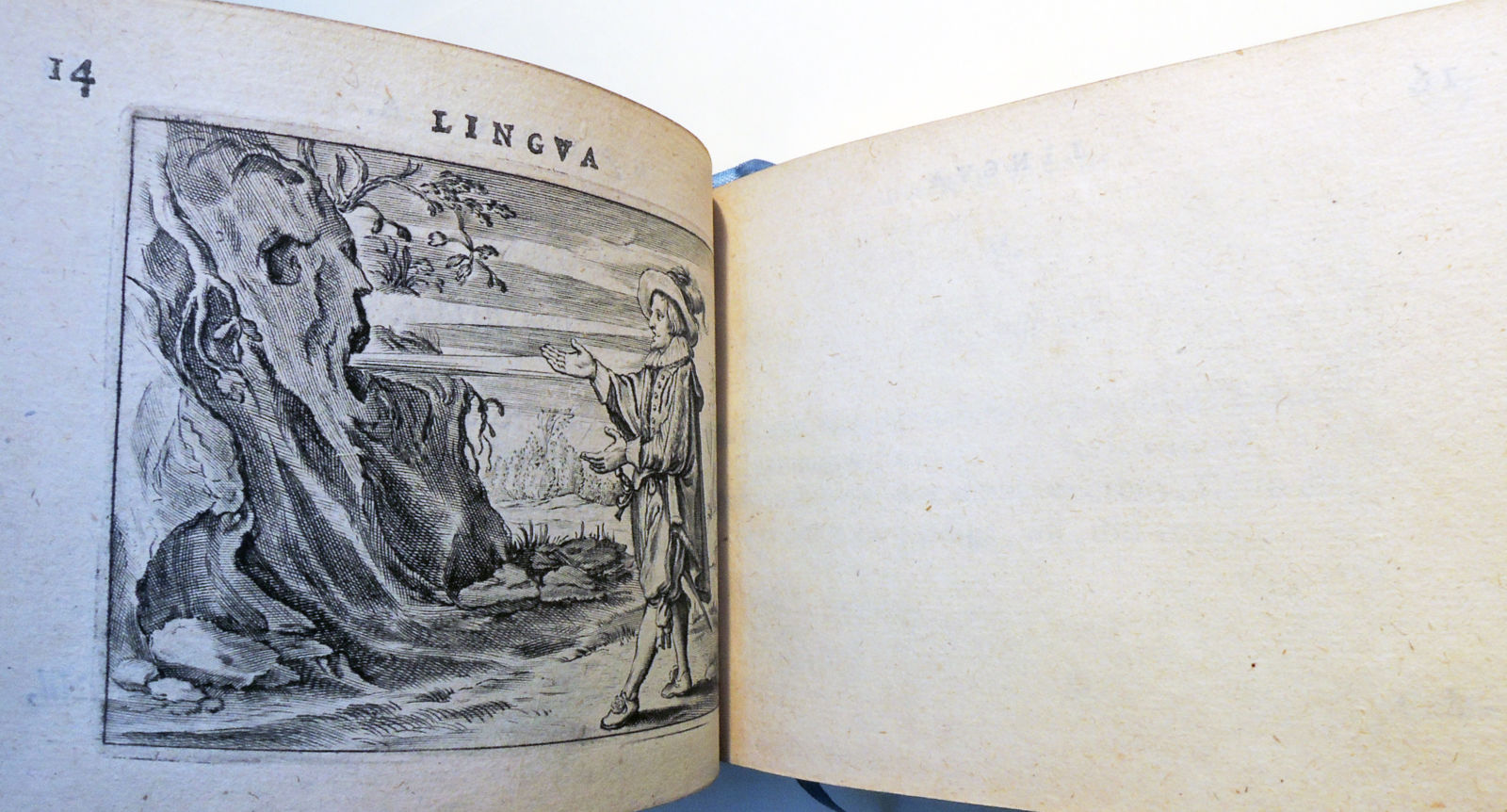 This copy includes the cancelled leaf A8, blank except for pagination and headline on the verso. Interesting that it come at the description of an echo.