Category Archives: Acquisitions

new acquisitions

The Many, Many Roads to Heaven and Hell

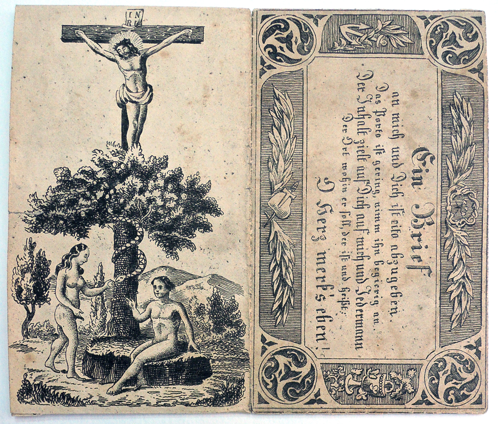
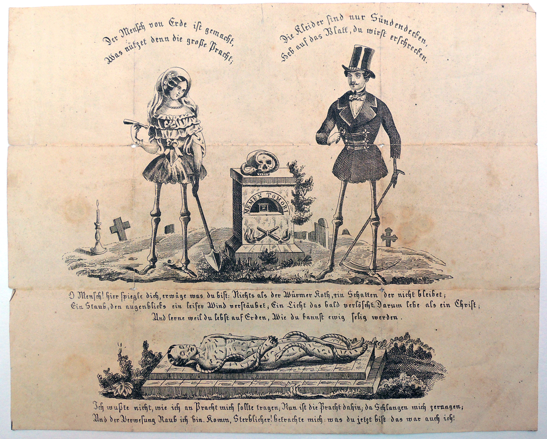
There are many woodcuts and broadsides depicting the roads to heaven and hell. Thanks to Bruce Willsie, Class of 1986, the Graphic Arts Collection is fortunate to have a rather curious variation. It isn’t, as many are, published ca. 1840 by Gustav Peters in Harrisburg, PA or ca. 1830 by Herman William Villee in Lancaster PA, or even the 1825 series printed by François Georgin in the printshop of Jean-Charles Pellerin, Epinal, France.

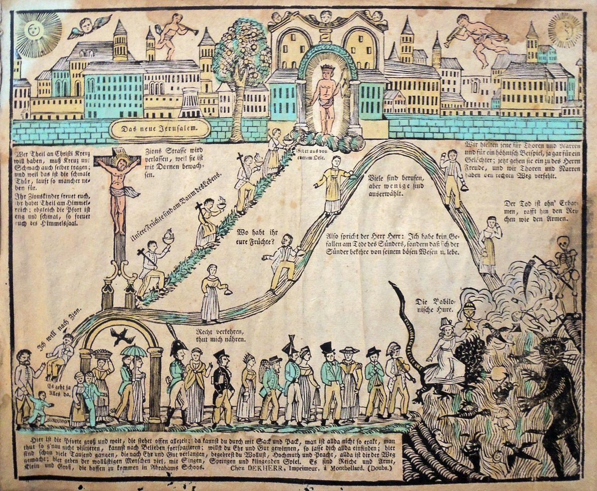
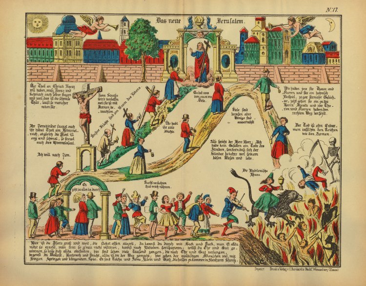
The woodcut now at Princeton titled Das Neue Jerusalem was published by “Chez Dekherr, Montbeliard, Doubs, France,” the only one found from Alsace so far. As are most of the variations, the text is in German and the devil in the lower right is closer to, but not exactly the same as the one at the Library of Congress [below], dated simply 1800s:

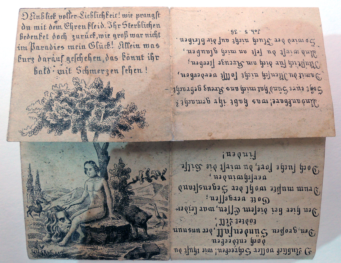
The Library Company of Philadelphia has:
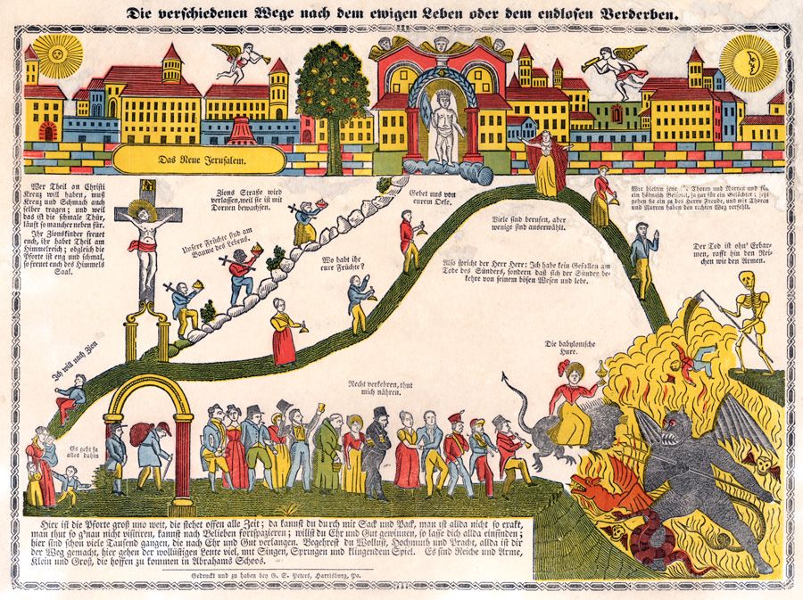
Note these later Pennsylvania Dutch broadsides show only three people walking to heaven, one being African American. They are holding burning lamps while the folks below say “give us some oil” because they have no light.


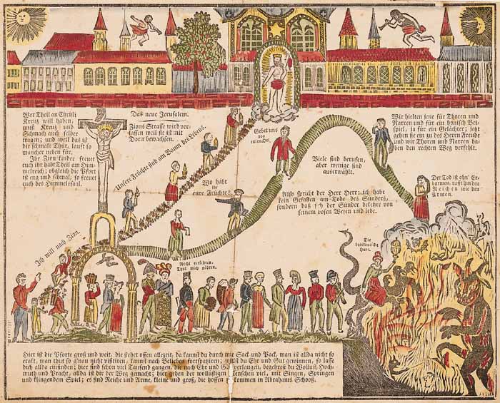
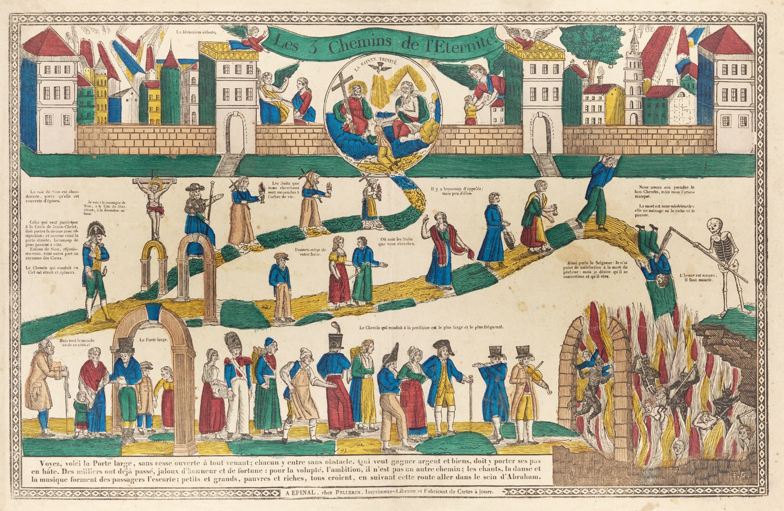
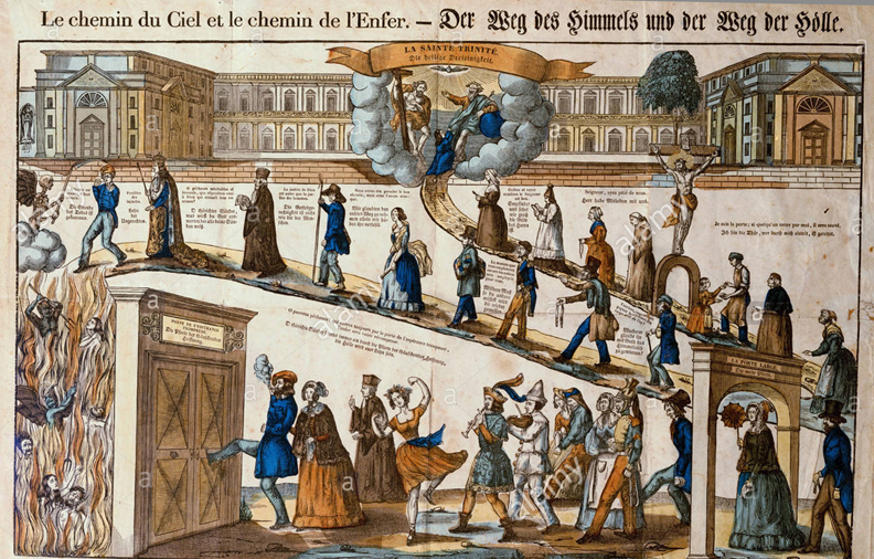
The British Museum [above] has a copy of Das neue Jerusalem (The New Jerusalem) published in Wissembourg and printed by C Burckardt between 1850 and 1870. “No.17. Deponirt / Druck u. Verlag v. C. Burckardt’s Nachf. Weissenburg (Elsass). This version of hell is closer to Cornell University’s The 3 Roads to Eternity (Les 3 Chemins de l’Eternite), which is held in their “Persuasive Maps” collection. [see below] They date it 1825, printed by Francois Georgin, “a popular and accomplished woodcutter in the printshop of Jean-Charles Pellerin, in the Vosges mountain village of Epinal”. For full details on references, see http://persuasivemaps.library.cornell.edu/content/references.

Cornell’s copy

The Heimatmuseum Trostberg has this 1845 Epinal version, with the door to hell oddly closed.
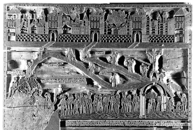
One of the Epinal woodblocks looks ready for printing.


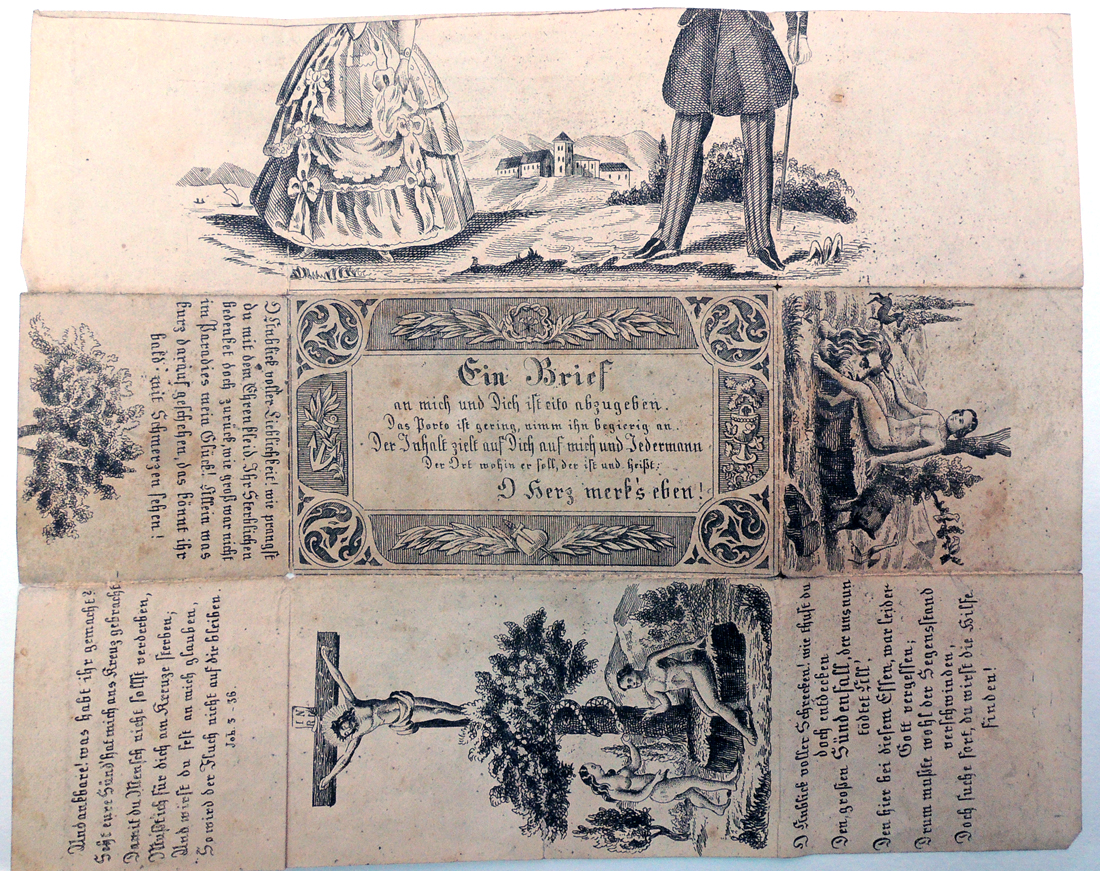
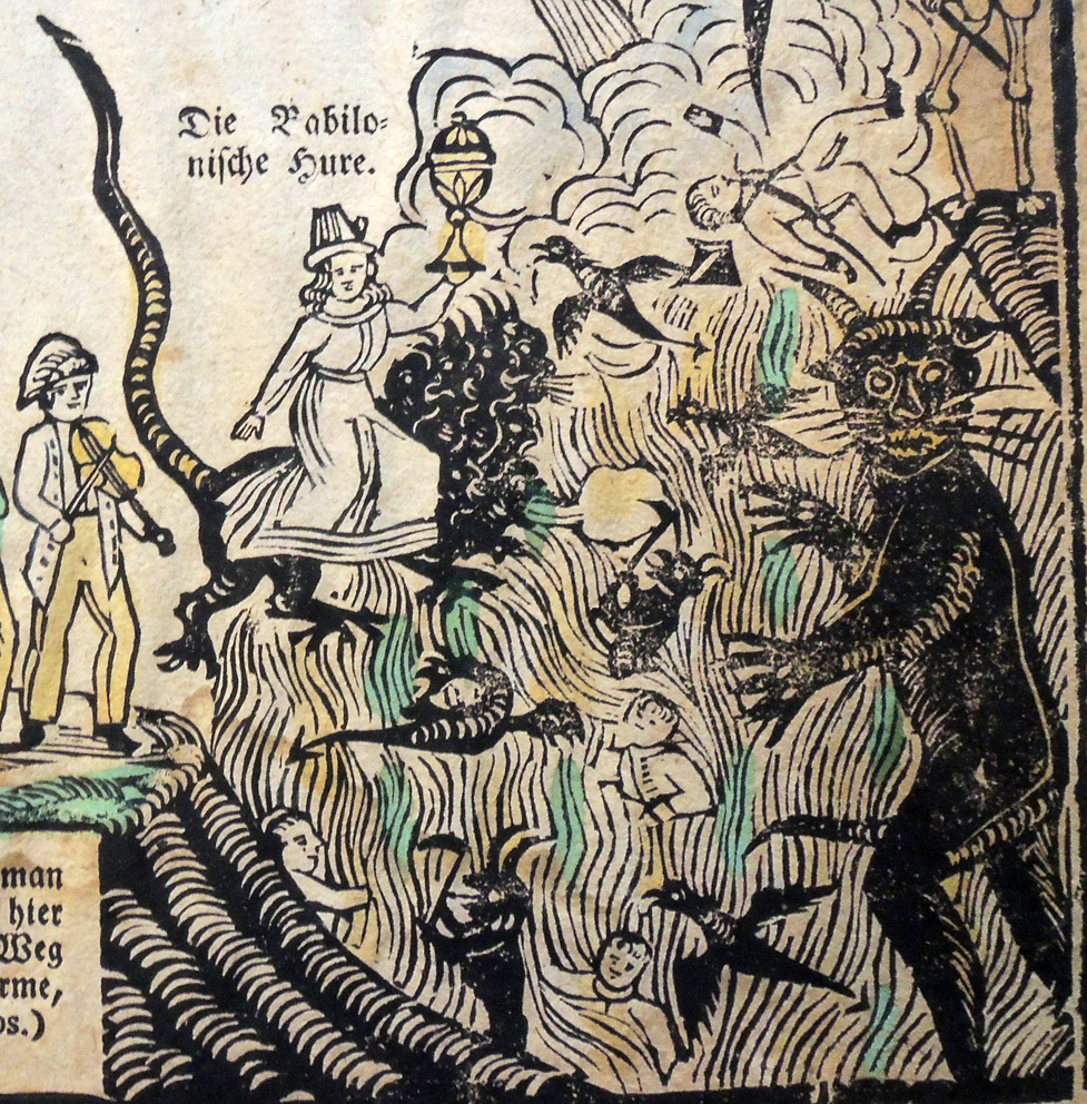
Our devil is the only one who stares directly at the viewer and there are many extra beasts and bodies embedded in Princeton’s copy. Note the dainty Whore of Babylon.

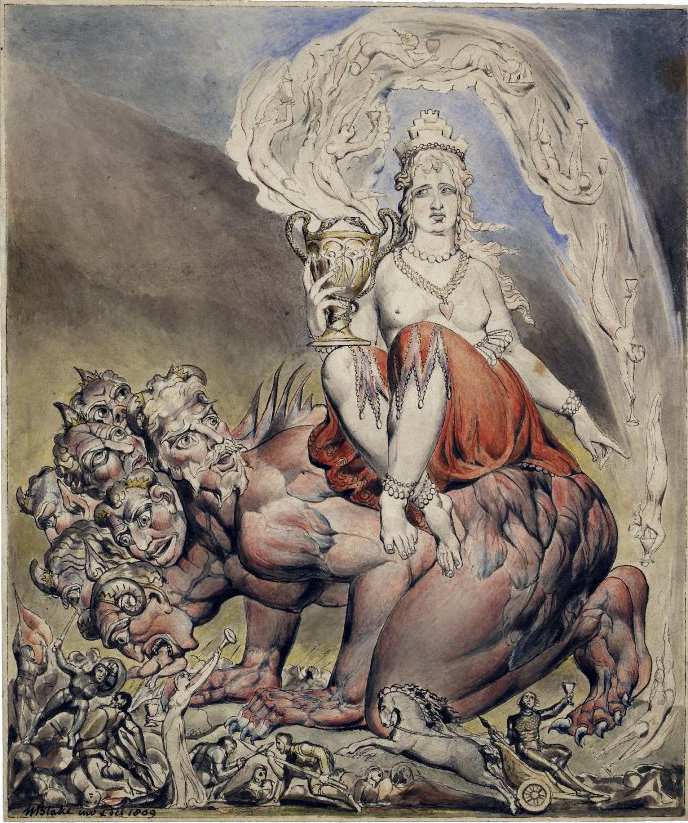
The British Museum has William Blake’s pen and ink and watercolor drawing of The Whore of Babylon also holding a chalice, 1809

Here is Albrecht Dürer version of the Whore of Babylon, woodcut ca.1496-97. She is in the bottom right, it takes a minute to find her.

Read more:
Christa Pieska, “The European Origins of Four Pennsylvania German Broadsheet Themes: Adam and Eve; the New Jerusaslem – The Broad and Narrow way; the Unjust Judgment; the Stages of Life.” Der Reggeboge 23 (1989) 1, pp 13-22 Firestone ReCAP F160.G3 R43

Russell D. Earnest, Flying leaves and one-sheets: Pennsylvania German broadsides, Fraktur, and their printers (New Castle, Del.: Oak Knoll Press, 2005). Marquand Library Z209.P4 E23 2005

Don Yoder, The Pennsylvania German broadside (University Park, PA : Pennsylvania State University Press for the Library Company of Philadelphia and the Pennsylvania German Society, 2005). Firestone Library GR110.P4 A372 vol. 39


Thank you to all the institutions that posted images online, which I have pulled together to compare for educational purposes.

Prang’s American Chromos


Thanks to the recent donation by Hollie Powers Holt, we are the proud owners of a Louis Prang and Company chromolithograph after Benjamin Champney (1817-1907) entitled North Conway Meadows, 1870. The print is still in its original frame with the Prang stencil identification on the back, exactly as it would have been purchased and hung in the last quarter of the 19th century.

Benjamin Champney’s signature and date (1870) can be seen at the bottom right.
This print should not be confused with other similar harvest scenes by Champney. The best place to double check is the hay in the center, which in this view is already on the cart.


Louis Prang Company after Benjamin Champney (1817-1907), North Conway Meadows, ca. 1870. Varnished and framed chromolithograph on canvas. Graphic Arts Collection GAX 2018- in process. Gift of Hollie Holt.

 
See another: https://graphicarts.princeton.edu/2013/12/20/is-it-a-painting-or-a-print/


Exter

Alexandra Exter (1882-1949), Design for two theater costumes [possible design for the ballet Don Juan], ca. 1927. Pencil, watercolor, gouache on paper. Presented by Simon Lissim. RBSC Theater Collection – in process

Among a group of drawings being conserved and rehoused, this design was discovered that may have been created for the production of Don Juan given by Anna Pavlova’s company at the Opernhaus, Cologne in 1927.


The Oxford Art biography lists Exter as a “Russian painter and designer of Polish birth.” After traveling to Paris in 1908, she “became acquainted with Picasso, Braque, Guillaume Apollinaire, Max Jacob and with the Italian Futurists Filippo Marinetti, Giovanni Papini and Ardengo Soffici (with whom she shared a studio in 1914) . . . In 1924 Exter emigrated and settled in Paris, teaching with Fernand Léger and in her own studio.

. . . [Exter] worked extensively in the theatre and continued to experiment, beginning, at this time, to make inventive theatrical puppets. In 1929 she used tubes of light to create an elegant, almost dematerialized spatial setting for the ballet Don Juan . . . .”

The drawing comes into the department thanks to Exter’s colleague and biographer Simon Lissim (1900-1981). Raymond Lister described Lissim, “who belonged unmistakably to the twentieth century, was nevertheless a modern example of Renaissance man, for his achievements were spread over a wide spectrum with theatrical décor at one end and porcelain designs at the other. Between were paintings in gouache and scraperboard, and designs for crystal, cutlery and jewelry.”

Around 1941, Lissim settled in New York City and was appointed head of the Art Education Project in the New York Public Library, later joining City University of New York as a Professor in Art History.

See also:
Simon Lissim (1900-1981), Simon Lissim [with] Raymond Cogniat, Georges Lechevallier-Chevignard, Louis Réau (Paris: Éditions du Cygne, 1933). Illustrations include 16 color plates rendered by the pochoir process. Princeton copy is no. 35 in the Charles Rahn Fry Pochoir Collection. Graphic Arts Collection Oversize 2003-0377Q

O heart take notice! A transformation letter

Letter completely folded. Possible translation: A letter to me and you is easy to give. The postage is low, accept it eagerly. The content is about you, me, and everyone; the places we go, that is and means, O heart take notice!

First unfold

Second unfold

Third unfold

Side one

Side two

The Graphic Arts Collection recently acquired this religious transformation letter, divided into nine panels each front and back, with rhyming couplets to match the engraved illustrations.

Scenes include Adam and Eve in the garden of Eden; the crucifixion; and an overall message of the transience of life. The work is described in the August 2, 1835 issue of the Allgemeine Kitchenzeitung,  where it is called a wonderful new invention. The author writes, in part:

… Now you lift the lower and last cover of the letter, the same figures appeared, from the head to the loins in the same clothing, but from then on to the feet as the most hideous skeletons, with a few Symbols that are supposed to reinforce fear in the mind and imagination. For example, with a corpse lying in a coffin, eaten by greedy snakes seen everywhere …

Rare Books and Special Collections holds a number of similar books and prints–sometimes called Harlequinades or Turn-Ups or Metamorphosis or Transformation books–but this might be the first one in German. The English and French examples are much earlier. See a few more: https://www.princeton.edu/~graphicarts/2010/03/metamorphosis_cards.html. See also Cotsen collection, Print case LA / Box 11465710.


Ein Brief an mich und Dich ist cito abzugeben. Das Porto ist gering, nimm ihn begierig an. Der Inhalt zielt auf Dich auf mich und Jedermann, der Ort wohin her soll, der ist und heisst, O Herz merk’s eben!. [No Place, no printer, 1835]. Graphic Arts Collection GAX 2018- in process

Stanhopes


The Graphic Arts Collection recently acquired two Stanhopes, also called Bijoux Photomicroscopiques. Rene Dagron (1819-1900) patented these devices, using a variation of the process developed by John Benjamin Dancer (1812-1887) to affix images to a miniature magnifying convex lens. Dagron enhanced the novelty by hiding them inside pieces of jewelry, tiny monoculars, or other souvenirs.

Sir David Brewster (1781-1868) described the Stanhope in a piece titled “On the Photomicroscope,” The Photographic Journal, January 15, 1864:

Under the name of bijoux photomicroscopiques, M. Dagron, of Paris, sent to the Exhibition of 1861 a series of these beautiful little optical instruments, which consisted of a plano-convex lens of such a thickness that its anterior focus coincided with the plane side of the lens. By placing the eye behind the convex side, these photographs, invisible almost to the eye, were seen so distinctly and so highly magnified that they excited general admiration. M. Dagron had presented some of them to the Queen, who admired them greatly; and as he was the only exhibitor, he naturally expected that the ingenuity with which he had produced a new article of manufacture would have received a higher reward than ‘Honorable Mention.’ . . . In 1860 M. Dagron had taken out a patent in France for this combination of an elongated or cylinder lens with a photograph, under the name of Bijoux Photomicroscopiques. He placed the lens in brooches and other female ornaments; and the combination became so popular, and the sale so great, that fifteen opticians in Paris invaded the patent, and succeeded in reducing it.

The first newly acquired piece is a jeweled cross with lens at the center. When you look deep inside, you see a microscopic Lord’s Prayer.


The second Stanhope now in the Graphic Arts Collection is a tiny monocular, no more than two centimeters long, with a small ring so it can be attached to a watch chain or necklace.

If you look inside, you can see a tiny reproduction of the 1882 lithograph From the Cradle to the Grave. Scenes and Incidents in the Life of Gen. James A. Garfield, produced as a remembrance of the recently murdered President Garfield.

Stanhope with the miniature From the Cradle to the Grave. Scenes and Incidents in the Life of Gen. James A. Garfield (New York: J.W. Sheehy & Co.; printed by Mayer, Merkel & Ottmann, 1882). Miniature photograph of a lithograph with James A. Garfield (1831-1881) at the center, surrounded by his family and fifteen vignettes with scenes from Garfield’s life. Graphic Arts Collection GAX 2018- in process.

Below is a reproduction of the original lithograph, a little easier to see.

Valmor


In his Chicago Tribune obituary, Morton G. Neumann (1898-1985), is described as a “local cosmetics manufacturer who assembled one of the finest collections of 20th century art in the world.” Held on deposit at the National Gallery of Art for a brief time, the Neumann collection was eventually sold to pay the family’s tax bill. They barely mention the company that provided the wealth to collect Picassos and Miros.

Morton and Rose Neumann made their fortune selling perfumes, cosmetics and other grooming product targeted to African American customers under the labels Valmor, Sweet Georgia Brown, King Novelty, and Madam Jones. The Graphic Arts Collection recently acquired a group of 100 brightly designed product labels dating from 1930s and 1940s.

The eye-catching graphics are immediately recognizable once you are introduced to the product line, chiefly designed first by Charles C. Dawson (1889-1981) and later by Jay Jackson (1905-1954), both African American artists of great talent and reputation.

Neumann’s firm not only had a brick and mortar shop in Chicago’s southside but established an enormous mail-order trade, as well as door-to-door traveling sales. The company’s first headquarters on Cottage Grove Avenue doubled as a recording studio for the Valmor blues record label, and would later become an early home of the legendary Chess Records.

When the firm expanded, Neumann took over the block between S. Indiana Avenue and S. Prairie Avenue, where they remained into the 1970s.

Here are a few samples of their product labels.


Books with money


When the British artist Damien Hirst began planning a work of art “with a story running through it” (think artists’ book), his first stop was the United States Treasury. One thousand $100 bills were obtained so the final three digits would correspond to the edition numbers: 000 to 999.

Each bill was rolled and hidden inside Robert Sabbag’s 1976 cult classic Snowblind, a story about the cocaine trade at that time. Hirst bound the books in mirrored boards and added an American Express credit card bookmark. The card is a facsimile, the bill is real.

How many other books come with money? How many libraries leave the money in place?


The Graphic Arts Collection recently acquired Gertrude Stein’s Money (Los Angeles: Black Sparrow Press, 1973), which comes with a real dollar bill on the cover [above]. The boxed zine North Drive Press #3 (2006) co-edited by Sara Greenberger and Matt Keegan came soon after this, with a dollar bill among the 37 contributions [below].

Can you think of other books with money?

Please send your suggestions to jmellby@princeton.edu.

Coming in 2114, a new book by Elif Shafak

As a member of the Future Library, conceived by the Scottish artist Katie Paterson, Princeton University Library will receive a new book by the Turkish novelist, public intellectual, and political commentator Elif Shafak in 2114.

The author will hand over her manuscript for the Future Library on Saturday June 2, 2018, in a ceremony within the Nordmarka Forest, Oslo, where four-year-old spruce saplings are growing. In 2114, the trees will be harvested and made into paper for the printing of 100 books.

Shafak is the fourth author to be chosen for this project, joining the Canadian author Margaret Atwood, who was the first to contribute a manuscript, British novelist David Mitchell, and the Icelandic poet, novelist, and lyricist Sjón.

To learn more about Future Library visit their website: https://www.futurelibrary.no/

If you can’t wait until 2114, you might read Three Daughters of Eve ([London] UK: Viking, an imprint of Penguin Books, 2016). Firestone Library PS3619.H328 T47 2016, one of Shafak’s ten book in English.


Abolitionist Sewing Circles


Negro Woman who sittest pining in
captivity and weepest over thy sick
child though no one seeth thee.
God seeth thee though no one pitieth thee.
God pitieth thee; raise thy voice forlorn
and abandoned one; call upon him
from amidst thy bonds for assuredly
He will hear thee.

“Reticule” is the term used by the Victoria and Albert Museum to describe this type of small handbag, usually closed with a drawstring and decorated with embroidery or beading. Dating from the 1820s, the curators at the V&A attribute the design of the abolitionist reticules to Samuel Lines (1778-1863) and the production to the Female Society for Birmingham, originally called the Ladies Society for the Relief of Negro Slaves. While several variant images can be found printed on a similar silk bags, all have the same verse from Hymns in Prose for Children by Anna Letitia Barbauld (1743-1825), first published 1781 (Cotsen Children’s Library English 18 21076).

Women played a major role in the abolitionist movement and formed sewing circles where objects decorated with abolitionist emblems were produced, either for sale or to decorate their homes. Cups and saucers, ewers, pillows, and handbags were just a few of the items produced. While the anti-slavery movement found great momentum in England at the end of the 18th century, by the 1830s the Philadelphia Female Anti-Slavery Society and other American groups organized similar activities.

The reticule seen at the top is now in the Graphic Arts Collection but here [below] are some of the other versions of this abolitionist bag.

Victoria and Albert Museum National Society Daughters of the American Revolution.

The Library of the Religious Society of Friends

Undergraduate Life at the Hampton Institute

During his years as an undergraduate at the Hampton Institute, Willis J. Hubert (1919-2007) kept a scrapbook, filling it with programs, report cards, newspaper articles, and many informal photographs of his classmates. This enormous volume bound in carved wood boards, 30 x 46 x 7 cm, provides an intimate look at undergraduate life at this primarily black school from 1936 to 1940.

According to his obituary, published in The Atlanta Journal-Constitution from May 15 to May 17, 2007, Hubert went on to have a distinguished military career in which he achieved the rank of Lieutenant Colonel. Not  long after he graduated from the Hampton Institute, he entered the U.S. Air Force and trained at Tuskegee Army Air Field, where Hubert was one of the original Tuskegee Airmen. He went on to be the first African American to earn an M.A. and Ph.D. (New York University) while on active duty, as well as the first to complete the Harvard Business School (Military Co-op) Statistics Training Program.

There are a number of programs from plays and musicals in the scrapbook, including a program for an appearance by the opera singer Marian Anderson.

Hubert studied agriculture at Hampton, so his horticultural club prizes and programs are also included, as well as by-laws of the college Poultry Producers Association.

Also included are a few items from other historically black colleges, which Hubert visited, including Fisk, Howard, and Tennessee State.