Category Archives: Acquisitions

new acquisitions

567 choreographed printers

For anyone who has had a printer jam just as a paper copy of something is due, you need to watch the video for OK Go’s “Obsession,” which makes use of 567 choreographed printers. The band is known for their innovative music videos and this one takes place in front of two walls of printers. An introductory note assures viewers that all paper was recycled and the proceeds given to Greenpeace.

The technical team included Daito Manabe and Rhizomatiks Research, and choreography was by Mikiko and Elevenplay. The creative agency was Six.

Jerusalem through the Stereoscope

Wretched Lepers Outside of Jerusalem.


The Jews’ Wailing place, Wall of Solomon’s Temple, Jerusalem.

Jerusalem through the Stereoscope (New York: Underwood & Underwood, 1896-1908). 81 albumen silver prints with descriptions in six languages on the verso.

The Graphic Arts Collection has added this group of stereos to our already substantial stereo holdings. These photographs show locations in Jerusalem including the Jaffa Gate, the Valley of Kedron and village of Siloam, the pool of Siloam, the Tombs of the Prophets, the Garden of Gethsemane, the Church of the Holy Sepulchre, the Russian Church of the Magdalene, the Armenian Cathedral of St. James, the Garden Tomb (Golgatha), the interior of the Dome of the Rock, and the minbar in the Al-Aqsa Mosque (Masjid al-Aqṣá), among others.


A Greek Priest Blessing the Village Children in Ramah, Palestine [below]

The Beautiful Church of the Armenian Christians, Jerusalem [above]


Jerusalem Through the Stereoscope is one part of the series Traveling in the Holy Land sold by Underwood and Underwood. Instructions to canvassers selling the sets insist that workers read the book by Dr. Hurlbut that accompanied the series:

“And this year every agent should possess and study carefully our new book, Traveling in the Holy Land, Through the Stereoscope, by Jesse L. Hurlbut, D.D., which accompanies our new tour of 100 stereographs of Palestine. The attitude which Dr. Hurlbut takes to stereoscopic photographs in this book is of great importance to the work of education in general, and especially of immediate importance to ail our men in their work.

In a word, Dr. Hurlbut holds that the representations of places and objects furnished in the stereoscope are not only life-size–as large as the places or objects would appear on the spot–but that these representations serve, when used aright, as the very places and objects themselves, in their power to teach and affect us. In this book, therefore, Dr. Hurlbut treats the stereographs as actual places.

This is the attitude which every agent should come to have toward stereoscopic photographs, not an attitude assumed just for the purpose of selling more, but an attitude conscientiously arrived at after seeing good reasons for it. Dr. Hurlbut gives some of the reasons for his position in the Introduction to his book. This Introduction should be carried by every agent, read and pondered over a great deal. Its conclusions apply to our stereographs of all countries, not Palestine alone.

. . . Let us consider some of the mistakes men are liable to make: Stereoscopic photographs are especially striking and attractive at the first glance, and can be, to a degree, quickly and easily appreciated by any one. Consequently, agents have found that, because of these qualities alone, stereoscopic views can be sold more easily and extensively than any other article. Therefore, many agents have never found it necessary to make any effort to see whether there are higher considerations which can be made use of in selling stereoscopic views. This has been a great mistake.

These men have depended upon the weaker, less important considerations. the striking, amusing, entertaining qualities, etc., to lead people to buy. The most important considerations have in general, not been made use of. The result is that, although the sales have been enormous, still the possibilities of the sale of stereoscopic views have never yet begun to be realized. This must continue to be the case while most agents and people do not appreciate their higher value, nor even know how to use them to get the most from them.”

Die Graphischen Künste der Gegenwart

Theodor Goebel (1829-1916), Die Graphischen Künste der Gegenwart; ein führer durch das Buchgewerbe, (Contemporary Graphic Art, a Leader in the Booktrade). (Stuttgart: Felix Krais, 1895). Graphic Arts Collection GAX 2017- in process


The Graphic Arts Collection recently acquired a rare volume edited by Theodore Goebel (1829-1929) presenting 100 specimens of contemporary European printing. It is the first of three volumes Goebel prepared to document the commercial printing industry of the day, featuring Edward Albert’s héliogravure; photogravures by Joseph Albert, F.A. Brockhaus, and O. Felsing,; the Meisenbachtypes of Meissenbach, Riffarth and Company; and so on. This volume has been digitized but the online images in no way compare to the color, texture, or dimension of the original: https://babel.hathitrust.org/cgi/pt?id=nyp.33433056717493;view=1up;seq=9

A profile of Goebel was published in the May/June 1893 issue of The British Printer to celebrate “the jubilee of his labours in the service of our art.” They note that he trained in numerous cities with various companies, working as “compositeur secondant,” and afterwards as “metteur en pages” in Plon’s celebrated printing office in Paris, followed by Glasgow and London, where Goebel trained with Bradbury & Evans and Edward Taylor.

From 1859 to 1871, Goebel worked as foreman of Ulrich Müller’s printing office in Riga, Latvia, before leaving to become editor of the Journal für Buchdruckerkunst (later absorbed by Deutscher Buch- und Steindrucker (GAX Oversize 2006-0369Q)). The article continues,

“By his thorough knowledge in all the departments of the typographical art—knowledge gained, not by a dry study of books, but by practical experience—by his untiring zeal in collecting everything that was new and was worth knowing, by his keen insight, and not least, by the brilliancy and clearness of his composition, he not only raised the Journal to that height which its founder had always had in view, but enlarged its scope and interests principally by means of his extensive foreign relations.”

It was Goebel who introduced the English Specimen Exchange to German printers and induced so many of them to contribute. This led to his own Graphischen Künste der Gegenwart Ein Fuhrer Durch Das Buchgewerbe. A later volume is already in the collection, described here: https://graphicarts.princeton.edu/2013/10/17/elucidations-on-a-collection-of-sample-prints-on-strasbourg-special-papers/


[Below] E. Ernst (E. Ehrenzweig). Kunstanstalt fur Photogravure, Wien, VIII., Hasplugergasse 3.

[Below] Meisenbach, Riffarth & Co., Graphische Kunstanstalten, Berlin und Munches; Drei Blatter 1) Titelblatt der Firma, Photogravure nach einem Aquarell von A. zick; 2) Portrat; Photogravure nach einem Oelgemalde von E. Rau; 3) Matterhorn vom Gornergrat, Landshaft nach einer photographisches Aufnahme.

[Below] J.B. Obernetter, Kunst-Anstalt fur Light- und Kupferdruck Munchen.


Airborne Propaganda Leaflets

The Graphic Arts Collection recently acquired a small group of propaganda leaflets in English, French, German, Italian, Polish, Russian, Spanish, Burmese, and Japanese, prepared to be dropped from airplanes and hydrogen balloons during World War II. They date from approximately 1940 to 1945, some printed in color and some with illustrations. The variety of languages and messages demonstrate the use of airborne leaflet propaganda by all sides of the conflict.


Of three English language items, two question Britain’s alliance with Russia, asking “Why die for Stalin?” Another depicts a growing number of skeletons within the British army, writing “Which of you will be the last?”

There are six leaflets in French and fifteen in German, most denouncing Hitler. Several guarantee the good treatment of prisoners by the allies and list the statistics on Germans captured. An Italian leaflet claims that Italian workers working in Germany are keeping their families from misery and a Spanish leaflet warns fishermen to keep out of the restricted waters, where they are in danger of attack by the British navy. A Russian flyer promises good treatment to those that surrender and so on.


[Collection of air drop propaganda leaflets in English, French, German, Italian, Polish, Russian, Spanish, Burmese, and Japanese] ([Various places, 1940-1945]). Graphic Arts Collection (GAX) Q-000311

See also
Bernard Wilkin, Aerial propaganda and the wartime occupation of France, 1914-1918 (London; New York : Routledge, Taylor & Francis Group, 2017). Firestone Library (F) D544 .W37 2017

James Morris Erdmann (born 1918), Leaflet operations in the Second World War … ([Colorado? : s.n.], c1969). “The story of the how and why of the 6,500,000,000 propaganda leaflets dropped on Axis forces and homelands in the Mediterranean and European theaters of operations.” Firestone Library (F) D810.P6 E736 1969

Isabella Piccini and Angela Baroni, 18th-century engravers

Detail “Suor Isabella Piccini Sculpi”

Detail “Angela Baroni Scrisse Ve.a”

From: Bernardo Lodoli, Serenissimo Venetiarum Dominio ill[ustrissi]mo, et ecc[ellentissi]mo Arsenatus regimini Bernardi Lodoli … fidele votvm … ([Venetiis], [1703]). 12 leaves. Graphic Arts Collection GAX 2017- in process. Thanks to Gail Smith, Senior Bibliographic Specialist. Rare Books Cataloging Team, who worked out the description of this item.


The Graphic Arts Collection recently acquired a rare all-engraved publication by two eighteenth-century female printmakers, Sister Isabella Piccini (1644-1734) and Angela Baroni (active 1700s), with text by Bernardo Lodoli.

The bound compilation announces and endorses a forthcoming work, including its printed index and engraved title page.: Il cvore veneto legale formato dalla compilatione delle leggi … et altre cose notabili stabilite nel corso di cinque secoli per la buona a[m]ministratione … dell Arsenale di Venetia … Opera dal dottor Bernardo Lodoli … [Venezia] 1703. There are three full-page engravings and engraved title page by Piccini and “Cvore” title page; along with four leaves of text (one illustrated) engraved by Baroni.

For more information see: Morazzoni: Libro illustrato veneziano del settecento, Graphic Arts reference (GARF) Oversize Z1023 .M85 1943q, p.239.

Detail

Thanks to Eric White’s Bridwell Library exhibition “Fifty Women,” we now know “that Elisabetta Piccini (1644–1734) was the daughter of the Venetian engraver Giacomo Piccini (d. 1669), who trained her in the art of drawing and engraving in the styles of the great masters, particularly Titian and Peter Paul Rubens.

In 1666 she entered the Convent of Santa Croce in Venice and took the name Suor (Sister) Isabella. She continued to work as an engraver, accepting numerous commissions from Venetian publishers to illustrate liturgical books, biographies of saints, and prayer manuals. However, as a Franciscan nun dedicated to a life of poverty, she divided her earnings between her convent and her family living in Venice. Her long and productive career ended with her death at the age of ninety.”

For more, see the entry in the Enciclopedia delle donne: http://www.enciclopediadelledonne.it/biografie/elisabetta-piccini/

In this work, Piccini was partnered with Angela Baroni (active 1700s), who specialized in calligraphic engraving.

Detail


Detail

Piccini’s work can also be seen in: Missale Romanum : ex decreto Sacrosancti Concilii Tridentini restitutum, S. Pii V. Pontificis Maximi jussu editum, Clementis VIII. & Urbani VIII. Auctoritate recognitum ; in quo missæe novissimæ Sanctorum accuratè sunt dispositæ (Venetiis: ex Typographia Balleoniana, 1727). Graphic Arts Collection (GAX) Oversize 2012-0009F

Carlo Labia, Dell’imprese pastorali (Venetia: Appresso Nicolò Pezzana, 1685). Rare Books (Ex) Oversize N7710 .L12q

Carlo Labia, Simboli predicabili estratti da sacri evangeli che corrono nella quadragesima, delineaticon morali, & eruditi discorsi da Carlo Labia….(Ferrara: Appresso B. Barbieri, 1692).Rare Books (Ex) Oversize N7710 .L122q


The Newsboy’s Debt and other Lantern Readings

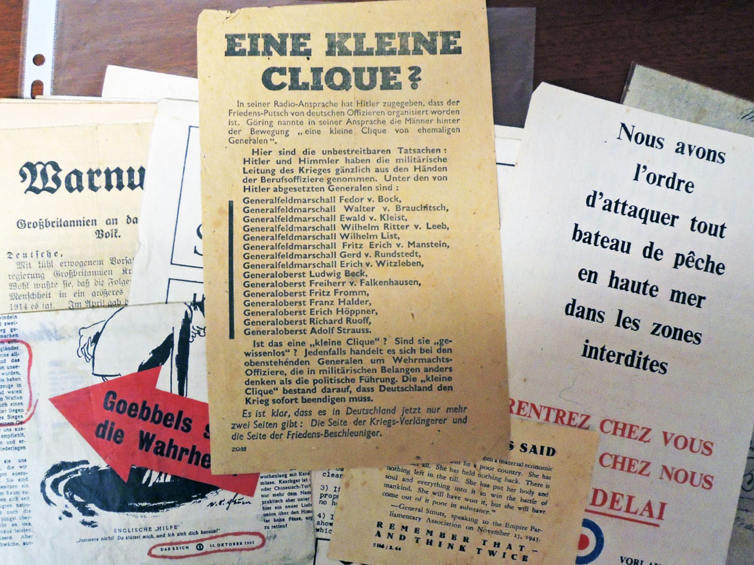
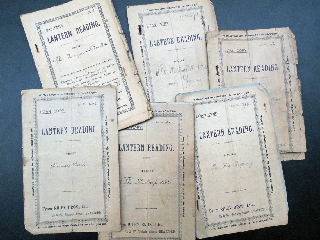
The Lucerna Magic Lantern Website notes: No magic lantern show consisted of slides alone: there were always elements like music, audience participation, or the spoken word. Especially in the later nineteenth century, many slide producers published ‘readings’ giving a recitation, story, or lecture to accompany the slide images.

The Graphic Arts Collection recently acquired a dozen or so Lantern Readings, the text that accompanies a particular set of slide. As noted on the covers, the scripts could be borrowed for a performance and returned when it was done. Today, they can be matched with the Magic Lantern Society’s Readings Library project, launched in 1995, which currently offers nearly 3,000 images, scripts, and music scores.


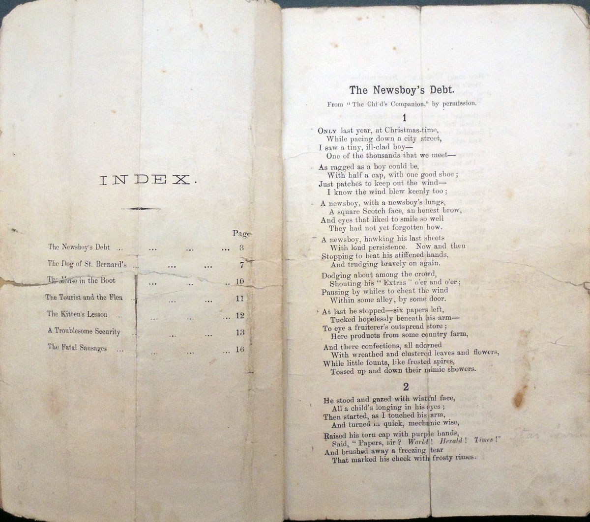
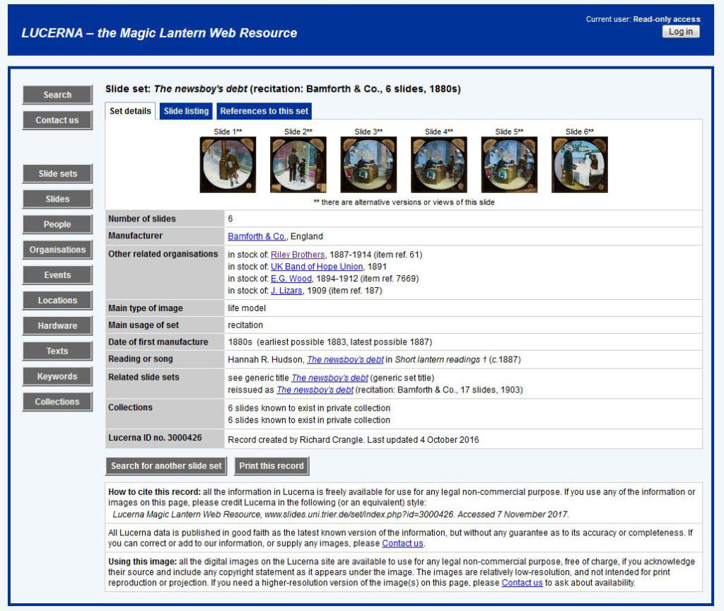
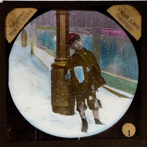
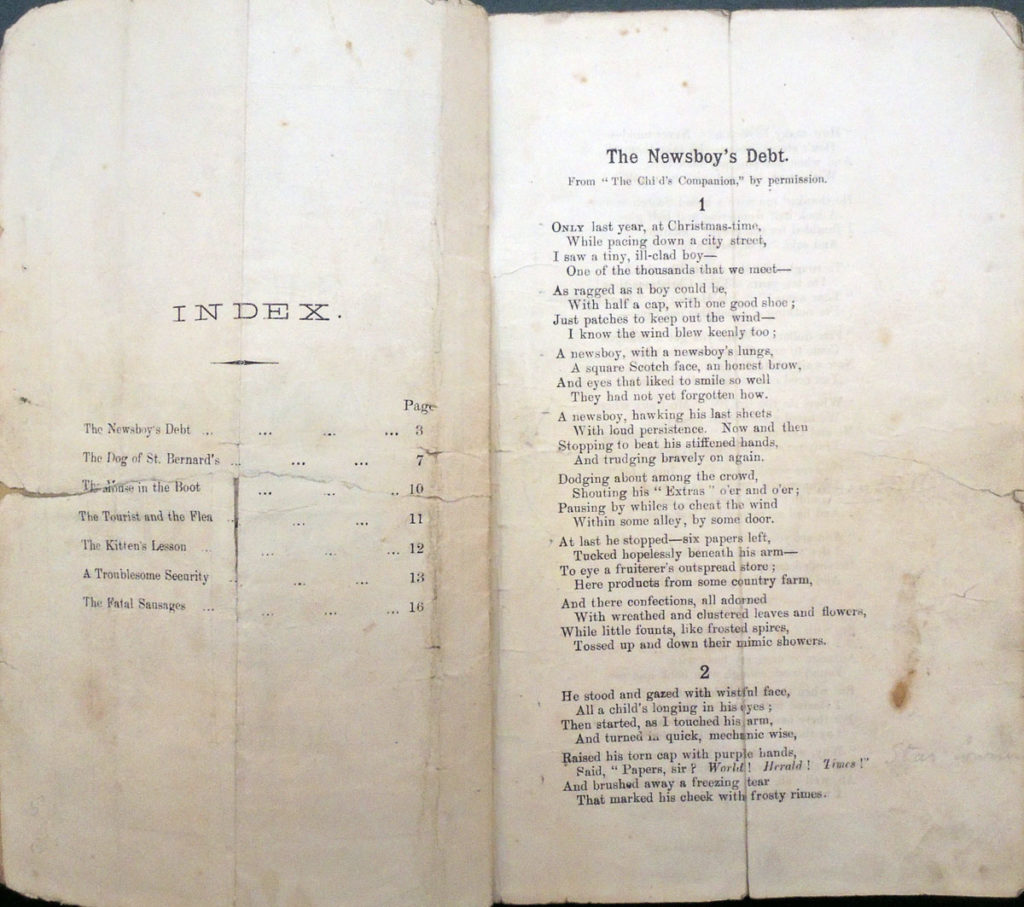
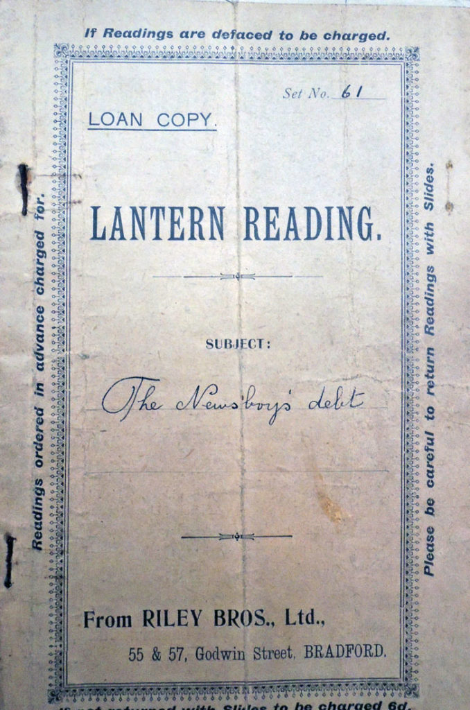
The Newsboy’s Debt: [originally published by Hannah R. Hudson, “The Newsboy’s Debt,” Harper’s New Monthly Magazine, May 1873].  Plot: A gentleman trusts a newspaper boy to get change, which he was to bring to his office. The lad, however, is run over, but sends his brother to say that when he gets well he’ll work to refund the money lost at the time of the accident.

References to this set:
1891 Catalogue of photographic lantern transparencies and apparatus: season 1891-2 (Bradford: Riley Brothers, 1891), 34
1891 Complete catalogue of lantern slides, dissolving views, magic lanterns etc. (London: UK Band of Hope Union, 1891), C 17
1894 Wood’s catalogue of slides, optical lanterns, and dissolving views apparatus: forty-eighth issue (London: E.G. Wood, 1894), 106
1905 Catalogue of optical lantern slides (Bradford: Riley Brothers, 1905), 16
1910 A detailed catalogue of photographic lantern slides, life models &c. (Holmfirth: Bamforth & Co., 1910), 13
1912 Lantern slide catalogue (Glasgow: J. Lizars, 1912), 45
1912 Wood’s catalogue of over 200,000 slides, optical lanterns etc.: 1912-13, sixty-seventh issue (London: E.G. Wood, 1912), 383
Other references (2)
1888 Stationer’s Hall copyright register, COPY 1/393/154-155 (27 July 1888)
1888 Walter D. Welford and Henry Sturmey (compilers), The ‘indispensable handbook’ to the optical lantern: a complete cyclopaedia on the subject of optical lanterns, slides, and accessory apparatus (London: Iliffe & Son, 1888), 299


While the Sabbath Bells Were Ringing:


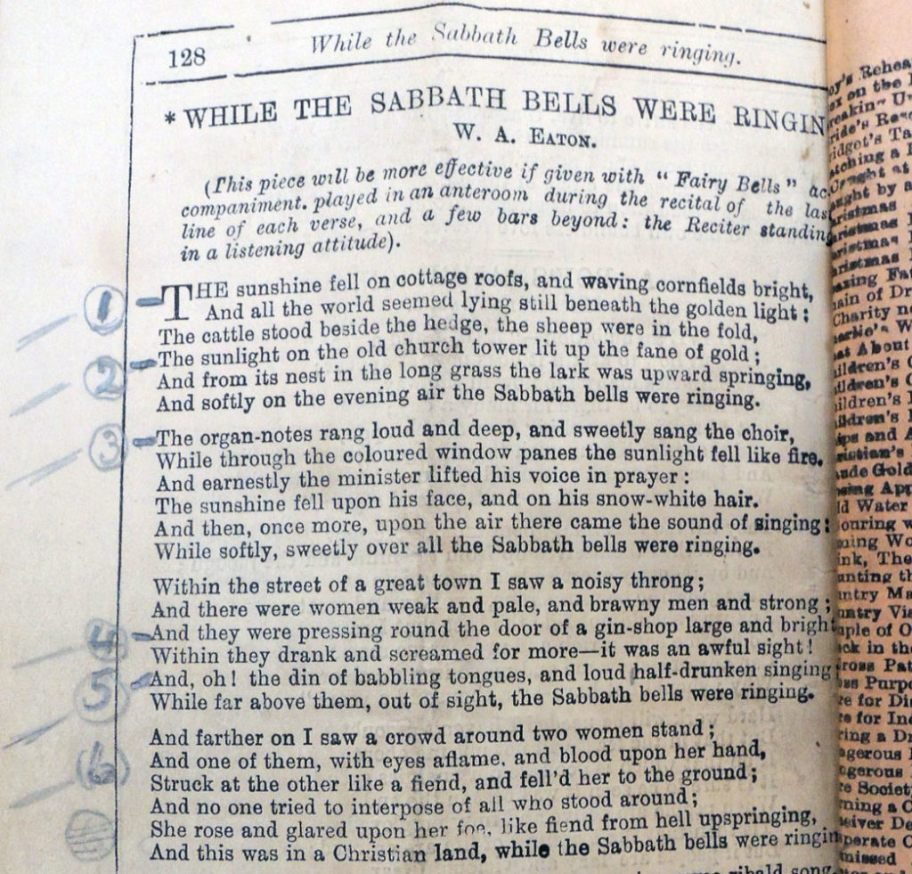
While the Sabbath Bells Were Ringing By W. A. Eaton (1848-1915)

The sunshine fell on cottage-roofs and waving cornfields bright,
And all the world seemed lying still beneath the golden light.
The cattle stood beside the hedge, the sheep were in the fold,
The sunlight on the old church-tower lit up the fane of gold.

And from its nest in the long grass the lark was upward springing,
And softly on the evening air the Sabbath bells were ringing.
The organ-notes rang loud and deep, and sweetly sang the choir,
While through the colored window-panes the sunlight fell like fire.

And earnestly the minister lifted his voice in prayer;
The sunshine fell upon his face, and on his snow-white hair.
And then once more upon the air there came the sound of singing,
While softly, sweetly over all the Sabbath bells were ringing.

Within the street of a great town I saw a noisy throng;
And there were women wan and pale, and brawny men and strong.
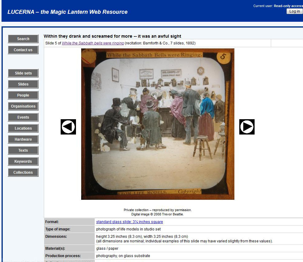
And they were pressing round the door of a gin-shop warm and bright;
Within they drank and screamed for more — it was an awful sight.

And oh ! the din of babbling tongues, and loud, half -drunken singing,
While far above them, out of sight, the Sabbath bells were ringing.
And farther on I saw a crowd around two women stand;
And one of them, with eyes aflame and blood upon her hand,

Struck at the other like a fiend and felled her to the ground;
And no one tried to interpose of all who stood around.
She rose and glared upon her foe, like fiend from hell up-springing.
And this was in a Christian land, while the Sabbath bells were ringing.


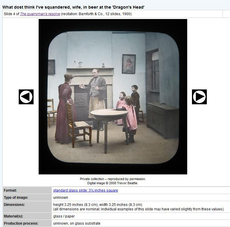
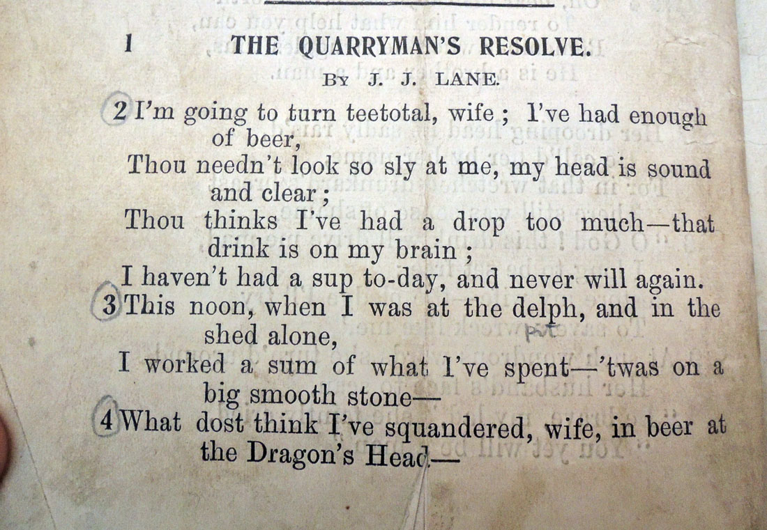
The Quarryman’s Resolve by Joseph John Lane:


Es ist bitter, die Heimat zu verlassen

Romano Hänni, Es ist bitter, die Heimat zu verlassen [It is Bitter to Leave Your Home] (Basel: Hänni, 2017). Number 21 of 87 copies of the standard edition. Text in German, English, and Japanese. Graphic Arts Collection GAX 2017- in process


Swiss artist Romano Hänni has spoken passionately about the devastating effects of contamination from nuclear facilities. His new book Es is bitter die Heimat zu verlassen concerns the disaster at Japan’s Fukushima Daiichi nuclear power plant that occurred on March 11, 2011, as well as the ongoing impact of radioactive contamination.

Hänni writes that claims made by nuclear scientists “that no health consequences are to be expected from contamination are unscientific, immoral, and criminal.” He further states that “there is no peaceful use for nuclear energy. It is repressive, criminal and deadly. Only nuclear plants that have not been built can offer absolutely safety.”

His newest book is printed in five colors on paper towels, a technique the artist perfected with an earlier work: Typo bilder buch: von Hand gesetzt und auf der Handabziehpress gedruckt. Graphic Arts RCPXG-7350409. Small selections of text are juxtaposed with letters, images, and symbols to communicate the event and its aftermath. 

The artist writes “Work on this book began in December 2013, was interrupted by some commissioned work, and lasted until June 2017. The page format was determined by the paper: paper towels, maxi roll . . . The printing forms were composed from individual parts and printed on the hand proofing press. The Japanese text was [cast] and composed in the type foundry Sasaki Katsuji in Tokyo and delivered to Basel. For most of the pages several printing forms and printing runs are needed. The body of the book was bound by hand with thread. Overall production time was approximately 1400 hours.”

http://www.romano-haenni.ch/assets/21_it_is_bitter_to_leave_your_home_standard-edition-2017.pdf

Minnesota Center for the Book: “Educated at the Basel School of Design, [Romano] Hänni returns to the core values of traditional printing technique and modernist European design. The strict limitations of hand typesetting are his cornerstone, everything composed from the incremental units of type and spacing available in the type shop. Hänni’s work encompasses a wide range of fields in visual communication, from books, magazines, catalogs and newspapers to drawings, photography and journalism about design and everyday culture.”


The book is accompanied by a glossy 12-page color pamphlet with 108 photographs documenting the production process for this publication.


Printed in Blue

Alessandro Tassoni (1565-1635), La Secchia Rapita [The Captured Bucket]. Poema Eroicomico di Alessandro Tassoni Patrizio Modenese. Colle dichiarazioni di Gaspare Salviani, Romano. S’Aggiungono la Prefazione, e le Annotazioni di Giannandrea Barotti, Ferrarese; e la Vita del Poeta Composta da Lodovico Antonio Muratori Bibliotecario del Serenissimo Signor Duca di Modena (Modena: Bartolomeo Soliani Stamp. Ducale, 1744). Provenance: book plate of Marco di Carrobio. Graphic Arts Collection GAX 2017- in process.

The War of the Oaken Bucket began late in 1325, when Malatestino dell Occhio, Lord of Rimini, led the Bolognese from Florence and Romagna to the fort at Monteveglio (12 miles west of Bologna) to regain a bucket of treasure stolen by the Modenese.
https://www.warhistoryonline.com/military-vehicle-news/aerosan-war-sleds-red_army.html

Nearly three hundred years later in 1622, Tassoni published a mock-epic poem called La Secchia Rapita, which has also been translated as The Rape of the Bucket or The Stolen Bucket. Many translations and new edition followed, including two in 1744. The Graphic Arts Collection recently acquired the larger of the two, called “stimmatissima edizione” and “belle edition,” and one of the few copies with the plates printed with blue ink.


“The poem is pervaded by an exuberant, satirical, and often brilliant humor. There are passages in which the humor is sustained and cumulative, and others in which an apparent seriousness finds its climate in a sudden hilarious absurdity” (Ernest Hatch Wilkins (1880-1966), A History of Italian Literature (1974) (F) PQ4038.W5 1974 pp. 298-9).

Based on the life of Alessandro Tassoni by Muratori, this edition includes a commentary by Giovanni Andrea Barotti, and notes by the author written under the pseudonym Gaspare Salviani.

Many of the best artists of the period worked on this publication, including engravings by Giuseppe Benedetti (1707-1782); Andrea Bolzoni (1689-1760); Francesco Zucchi (1692-1764);
and Antonio Zuliani from designs by Bartolomeo Bonvicini; Domenico Maria Fratta (1696-1763); Pietro Gradici; and Francesco Villani, among others.

“Intaglio colour printing developed only gradually before 1700. Monochrome colour-printed engravings and etchings appear regularly from the fifteenth century, and some experiments with polychrome intaglio printing date from the time that chiaroscuro woodcut emerged en force in the 1520s…. The reasons for monochrome colour printing may have ranged from practical, such as to distinguish designs for goldsmiths (printed in yellow-brown) from those for silversmiths (printed in blue), to commercial, making the prints more attractive to collectors. — “Colour Printing in intaglio before c.1700,” in Printing Colour 1400-1700: History, Techniques, Functions and Receptions (2015).


See also:
Alexander Pope (1688-1744), The Rape of the Lock: an Heroic-Comical Poem in Five Canto’s [sic]. 2nd ed. (London: Printed for Bernard Lintott, 1714). Rare Books (Ex) 3897.374.11

Alessandro Tassoni (1565-1635), La Secchia Rapita; Poema Eroicomico … con le dichiarationi del sig. Gasparo Salviani [pseud.] el primo canto dell’ oceano nell’ vltimo corretti con gli originali (Bologna: Per G. Longhi [1670]). Editor: Paulino Castelucchio. Rare Books (Ex) 3138.01.38

Birds from Byzantium


Peter Lyssiotis, Birds from Byzantium = Pouliá tou Vyzantíou (Melbourne, Vic.: Masterthief, 2010). Text was written in 2009 at the Monastery of Mavrovouni in the Larnaca district of Cyprus. Greek translation by Andreas Psilides and Lefteris Olympios. Images by Peter Lyssiotis. Binding by Wayne Stock. Copy 17 of 18. Graphic Arts Collection GAX 2017- in process

The artist writes “Birds from Byzantium has been made in an edition of [18] and has been printed duotone on Mohawk Superfine paper. The text has been set in columns, justified to both left and right with no regard to word breaks as this was one of the design elements of the earliest hand scripted Bibles. Sure it makes the text difficult to read but it also traps the eye and gives a nod to tradition.

The images are collages. As a backdrop they have a Bible commentary in Greek. The collages have been made so the text has a place to rest. On some pages there are drawings in ink by Lefteris Olympios. The binding is by Wayne Stock and has used aspects of Byzantine book design and place them in a contemporary setting: for example, the use of circles, the X, the use of gold, the [choice] of burgundy for the colour of the cloth and the bands on the spine.”

Peter Lyssiotis: http://www.australianphotographers.org/artists/peter-lyssiotis


See also:
Leonie Sandercock, Cosmopolis II: mongrel cities in the 21st century. Images by Peter Lyssiotis (London; New York : Continuum, 2003). Firestone Library (F) HT166 .S219 2003

Silent scream: political and social comment in books by artists: an exhibition, 26th September-26th November 2011, Monash University Rare Books Library within the Sir Louis Matheson Library curated and catalogue commentaries by Monica Oppen and Peter Lyssiotis (Sydney, Australia: Bibliotheca Librorum apud Artificem; Melbourne: Monash University Rare Books Library, 2011). Marquand Library (SA) N7433.3 .S545 2011

Printed Tobacco Wrappers


The Graphic Arts Collection recently acquired a bound collection of 19th-century tobacco wrappers from the Dutch-German firm of Hendrik Oldenkott.  The volume holds approximately 194 printed wrappers with a variety of images and text, printed on many different paper stocks, both plain and colored. Some are stenciled, some letterpress, and a few are lithographed.

Michael Twyman writes, “Tobacco was among the first commodities to be sold in printed paper wrappers… The design element of tobacco papers was normally confined to the centre of the printed sheet, which was large enough to accommodate varying quantities of tobacco. The earliest designs were in the tradition of the bookplate, but later they took on the characteristics of the trade card and were often printed from plates actually designed as trade cards.” –(Ephemera, p. 329)

According to the Oldenkott records at http://www.ngw.nl/heraldrywiki/index.php?title=Oldenkott

“Very little is known about the company. According to the albums the company was founded in 1760 in Amsterdam as Hermann Oldenkott, with since 1819 a subsidiary in Ahaus (Germany). Probably the factory had some other factories as well, as in 1838 August Kersten from Rees (Germany) bought the factories from Heinric Oldenkott in Elten (Germany) and Weesp (Holland). It is, however, not clear whether these were part of the same company as the original Oldenkott company.

This German company increased rapidly and became one of the largest German tobacco companies. In 1929 the factories from Hermann Oldenkott in Ahaus and Neuss (Germany) were bought by the German Oldenkott company. The German company also produced pipes since 1932. In 1972 the German company was bought by the Dutch company Niemeijer. Tobacco production ceased in 1974 and only pipes were still made. In 1987 the German pipe company was bought by the Kersten family again, but closed in 1992.”