Category Archives: Acquisitions

new acquisitions

Manhattan 1854

brother jonathan manhattan3For the July 4, 1854, Jubilee Edition of Brother Jonathan, Charles Parsons (1821-1910) drew a bird’s-eye-view of Manhattan nearly 3 feet tall by 4 feet across. Two years later, he drew a somewhat smaller version of the same view and lithographed it for Nathaniel Currier, which is the print in most institutional collections.

Frank Leslie (1821-1880) was given the task of engraving Parsons’s extraordinarily large scene for the newspaper’s double page spread. Using his newly perfected method of dividing a scene into many small blocks and reassembling them once they are engraved, Leslie was able to accomplish this assignment to perfection. The success of this and other oversize plates gave him the confidence, and the professional following, to establish Frank Leslie’s Illustrated Newspaper in December of the following year.

brother jonathan manhattan

Frank Leslie (1821-1880) after Charles Parsons (1821-1910), Bird’s-Eye View of New York City, 1854. Wood engraving. In Brother Jonathan, July 4, 1854, Jubilee Edition. Rare Books in process

brother jonathan manhattan8

brother jonathan manhattan6

East River, Staten Island Ferry. Today’s South Street Seaport

brother jonathan manhattan5

Castle Clinton and the west side boat basin

brother jonathan manhattan7

City Hall and Trinity Church

brother jonathan manhattan4

The Rise and Fall of Paramount Records

paramount2
It is hard to know where multi-media editions should be kept in a university setting. After consultation with colleagues, the Graphic Arts Collection has acquired The Rise and Fall of Paramount Records vol. 1 and 2. Released jointly from John Fahey’s Revenant and Jack White’s Third Man Records, the material was co-produced by the leading scholar on Paramount, Alex van der Tuuk. Volume one (below left) covers 1917 to 1927 and volume two (below right) chronicles 1928 to 1932.

paramount1

paramount3Each ‘cabinet of wonders’ includes 800 newly remastered digital tracks representing over 170 artists; more than 300 fully restored original advertisement from the 1920s-30s; six vinyl records with hand-engraved labels; and two limited edition books including an encyclopedia of artists and tracks as well as a narrative history of Paramount. Volume one is housed in an oak cabinet with a custom-designed USB drive embedded inside and volume two is a stainless steel case also with an embedded drive. Both hold a music & image player app that enables the user personal management of all tracks and advertisements.

paramount7
Quoted from the prospectus: “Paramount Records was formed in 1917 with little fanfare and few prospects its founders ran a Wisconsin furniture company and knew nothing of the record business. Its mission was modest: produce records as cheaply as possible with whatever talent was available. This was not a winning formula, and by the end of 1921 Paramount was on the threshold of bankruptcy.

In 1922 Paramount’s white owners embarked on a radical new business plan: selling the music of black artists to black audiences (a market that became known as “Race Records”). This move, paired with equal parts dumb luck, chicanery, a willingness to try anything, and the fortuitous hiring of Mayo Williams (the first black executive at a white-owned recording company), paid dramatic dividends.
paramount9

paramount8Williams, a Chicago South-sider, early NFL player, bootlegger, impresario, and Brown University graduate, would become a key early champion of those two uniquely American art forms, jazz and blues, while maintaining a not entirely benevolent orientation toward the artists themselves (“screw the artist before he can screw you” being one of his mottoes). Via Williams, Paramount scouted talent, ran the offices of its recording operations, and recorded most of its early records in Chicago, unintentionally playing a documentarian’s role as it captured the very sounds of the Great Migration in the Midwest.

By 1927, Paramount was the most important label in the Race Records field, selling hundreds of thousands of records. And by the time it ceased operations in 1932, it had compiled a dizzying roster of performers still unrivaled to this day by any other assemblage of talent ever housed under one roof spanning early jazz titans (Louis Armstrong, King Oliver, Jelly Roll Morton, Fletcher Henderson, Fats Waller, James P. Johnson, Coleman Hawkins), vaudevillian songsters (Papa Charlie Jackson, The Hokum Boys), the first solo guitar bluesmen (Blind Lemon Jefferson, Blind Blake), theater blues divas (Ma Rainey, Alberta Hunter, Ethel Waters), gospel (Norfolk Jubilee Quartette, Famous Blue Jay Singers of Birmingham), masters of Mississippi blues (Charley Patton, Son House, Skip James, Tommy Johnson), and others.”paramount11

Posographe

pathe posographe4
Thanks to the keen eye and generosity of W. Allen Scheuch II, Class of 1976 and Friend of the Princeton University Library, we now own a posographe. This device, the size of a cell phone, is one of the first calculators for figuring the aperture and exposure time when making a photograph or home movie. Invented in the 1920s for the Pathé company, posographes were produced in French, German, and English.

Unlike a light meter, this instrument uses environmental settings such as “a very narrow old street,” “state of sky” or “snowy scene” to calculate exposure. One side gives you the calculation for an outside scene, the other side for a picture taken indoors.
pathe posographe3

pathe posographe
pathe posographe5


Here is a posographe in English found on the internet, to make it easier to read the settings.
img_1525See also:
http://www.nzeldes.com/HOC/Posographe.htm

http://www.brocantina.com/posogr.pdf

Portmeirion

portmeirian4

Leslie Gerry and Robin Llywelyn, Portmeirion (Risbury: Whittington Press, 2008). Copy 116 of 225. Graphic Arts Collection RECAP-91157790

portmeirian3
portmeirian2

Since 1971, The Whittington Press has been printing and publishing limited edition, letterpress books. In 2008, they broke with tradition to work with artist Leslie Gerry who designed the plates for Portmeirion on his iPad. The flat layers of digital color give the surprising effect of screen prints.

Portmeirion, the extraordinary Italianate village built by the eccentric architect Clough Williams-Ellis on a remote peninsula in North Wales. Clough’s grandson, Robin Llywelyn, who spent much of his childhood with his grandparents at Portmeirion, has written short but evocative texts about each of Leslie Gerry’s seven images of the village.”–prospectus.
portmeirian
portmeirian5Princeton University library holds 49 limited edition books from the Whittington Press along with a complete run of their fine-press journal Matrix: A Review for Printers & Bibliophiles. Issued annually since 1981, Matrix has made distinguished contributions to the study, recording, preservation, and dissemination of printing history, and has done so utilizing a remarkable combination of authoritative scholarship and fine printing.


50th anniversary of Beckett’s Imagination Dead Imagine

No trace anywhere of life, you say, pah, no difficulty there, imagination not dead yet, yes, dead, good, imagination dead imagine.

the dead5Jamie Murphy at The Salvage Press in Dublin has published a new edition of Samuel Beckett’s Imagination Dead Imagine, to coincide with the 50th anniversary of its release in 1965. Beckett first wrote the prose fragment Imagination morte imaginez, in French and translated it himself to English. The new edition is a collaboration between typographic designer Jamie Murphy and the visual artist David O’Kane, with an essay by Stanley E. Gontarski, the Robert O. Lawton Distinguished Professor of English at Florida State University and a Beckett scholar who specializes in twentieth-century Irish Studies. https://instagram.com/thesalvagepress/

The Salvage Press is a new studio, devoted to preserving, promoting and pursuing excellence in design, typography & letterpress printing. You can follow them at: http://websta.me/n/thesalvagepress
the dead4
the dead    the dead3

Samuel Beckett (1906-1989), Imagination Dead Imagine. A collaboration between typographic designer Jamie Murphy & visual artist David O’Kane. Essay by Stanley E. Gontarski. (Dublin: Savage Press, 2015). Copy 2 of 40. Graphic Arts Collection GA2015- in process.

the dead2savage

Colophon:

This new edition of loose sheets celebrates the 50th anniversary of the original publishing in 1965. The project is a collaboration between typographic designer Jamie Murphy & visual artist David O’Kane. The work is introduced with an essay by renowned Beckett scholar Stanley E. Gontarski.

The text has been hand-set & letterpress printed by Jamie Murphy in 18 point Caslon Old Face, supported by a newly drawn ten line grotesque typeface by Bobby Tannam, cut from maple by Tom Mayo. David O’Kane has supplied two lithographs inspired by the text, editioned by Thomas Franke at Stein Werk Lithography studio in Leipzig. The sheets are printed on 250 gsm French made Venin Cuve BFK Rives mouldmade.

The edition is limited to 50 copies, 40 of which make up the standard format, ten accounting for the de luxe. The bindings were executed by Tom Duffy in Dublin. The standard is housed in a cloth covered portfolio, protected inside a slipcase. The de luxe is presented in a clam-shell box accompanied by a typographic triptych based on the text. The standard copies are numbered 11-50, the de-luxe are numbered 1-10. Each copy has been signed by the collaborators.

Notes on the images: The two images included in this edition were made using a lithography technique called Schablithografie. This lithography technique is highly labour intensive and involves scratching away at a surface of the blackened lithographic stone to form the image; literally scraping light forms out of darkness, reinforcing the constructed nature of the text, which Beckett goes to great lengths to emphasise.

The first image is a kind of schematic. It is not fully formed and harkens back to Greek and Roman style images, suggesting a metaphorical excavation. The letters and image turn it into a kind of logotype [literally word-imprint in Greek] or emblem and form a bridge between the text and the image.

The second image is larger. The unusual format of the image echoes the formatting of the prose text as it appears in this edition. There are noticeable discrepancies between what Beckett describes and what is depicted in the image. The image is in fact a failed attempt to portray what is fabricated in the story. What interested the artist in staging it is the fact that the positions and space Beckett describes are anatomically impossible without gross distortion of the human body. Beckett would have known this as he also sketched the space out in his notes. So he deliberately stresses the cramped nature of the scenario. The fact remains that in the artist’s mind’s eye the extreme positions were not exactly related to what is described in the story. The spatial discrepancies are only revealed completely when the space is mapped out point for point.

The finalised lithographs are a combination of the mental image conjured up during the initial reading of the text and the interpretation of the physical reenactment made in the artist’s studio.

Typoretum: A Letterpress Workshop from Jamie Murphy on Vimeo.

First Lithography in English, 1813

We are proud to announce that the Graphic Arts Collection has acquired the earliest independent work on lithography in the English language.

bankes lithography


Henry Bankes (1757?-1834), Lithography; Or, the Art of Making Drawings on Stone, for the Purpose of Being Multiplied by Printing (Bath: printed by Wood and Co., 1813). Purchased with funds from the Rare Book Division and the Graphic Arts Collection 2015- in process


The first edition of Henry Bankes’s treatise was published in Bath in 1813 with the title Lithography; or, the Art of Making Drawings on Stone, for the Purpose of Being Multiplied by Printing. A second edition was published in London in 1816 without the name of the author and titled Lithography; or, the Art of Taking Impressions from Drawings and Writing Made on Stone. As an independent publication, it is predated only by Heinrich Rapp’s Das Geheimniss des steindrucks, in 1810. It wasn’t until 1818 that Alois Senefelder completed his own account of the process he developed, entitled Vollständiges Lehrbuch der steindruckerey.

bankes lithography2

According to Michael Twyman “The value of Bankes’s treatise today is as an historical record of attitudes to the process in England in the period between its introduction right at the outset of the century and its revival by Ackermann, Hullmandel, and others around 1818; and it is of particular interest for the few shafts of light it throws on those associated with the process in Bath and on changing attitudes to lithography between 1813 and 1816.”

bankes lithography3

Only a handful of public institutions hold the 1813 edition, among them are the Bodleian Library at Oxford University; Bristol Public Reference Library; Yale University; the Lessing J. Rosenwald Collection at the Library of Congress; the Bath Somerset Council; the British Library; the Victoria & Albert Museum Library; and now Princeton University Library. In addition, only a few of these small, ephemeral volumes include their original plates, most having been removed over the last two hundred years.

Not only is Princeton’s copy in perfect condition, untrimmed and partially unopened with its original stab sewing, but it has all three (title page only promises two) of Bankes’s lithographic plates. We post them here in the hope that we can complete Twyman’s survey of copies and their plates, published in the facsimile edition. It would be interesting to match them with other institutional copies:

bankes lithography8

bankes lithography7

bankes lithography5

“Lithograph, drawing on stone. An invention ascribed to Alois Sennefelder, about 1796; and soon afterwards announced in Germany as polyautography. It became known in England in 1801, but its general introduction is referred to Mr. Ackermann of London, about 1817. Sennefelder died in 1841. Improvements have been made by Engelmann and others.”– quote from Charlton Thomas Lewis, Harper’s Book of Facts: a Classified Encyclopaedia of the History of the World (New York: Harper & brothers, 1906).

bankes lithography4
bankes lithography6

See also: Henry Bankes’s Treatise on Lithography: Reprinted from the 1813 and 1816 editions. Introduction by Michael Twyman (London: Printing Historical Society, 1976). Graphic Arts Collection GA 2015- in process

Têtes de Pipes

pipe7

L. G. Mostrailles (pseudonym for Leo Trézenik and Georges Rall). Têtes de Pipes. Paris: Léon Vannier, 1885. 21 original photographs by Émile Cohl. Copy 11 of 100. Graphic Arts Collection GAX 2015- in process

pipe2                pipe6
The French poet and novelist Léon-Pierre-Marie Spruce (1855-1902) used a number of pseudonyms during his career including Leo Trézenik and the collective signature L.-G. Mostrailles when he worked together with Georges Rall. Both Trézenik and Rall were active member of the Hydropathes, a group of late nineteenth-century writers, artists, and musicians who worked and drank together, particularly connected with the Chat Noir cabaret after it opened.
pipe5

pipe4Beginning in 1882, Tréenik and Rall acquired a small hand press and used it to print a weekly literary journal they called Lutèce, with Trézenik acting as publisher and Rall as editor. From time to time they printed humorous (bordering on cruel) descriptions of their friends.

In 1885, they used the same hand press to print and publish these text portraits under the title Têtes de Pipes in an edition of 100. At that time, the phrase “têtes de pipes” was pejorative since it only applied to a face with coarse features, in allusion to the rather crude heads carved on the stove of some pipes. The caricaturist and photographer Emile Cohl (pseudonym of Emile Eugene Jean Courtet 1857-1938) provided the photographs (2100 prints) to be pasted into the book.
pipe3
The subjects include Fernand Icres, Maurice Rollinat, Laurent Tailhade, Emile Cohl, George Lorin, Edmond Haraucourt, Robert Caze, Francis Enne, Emile Peyrefort, Edouard Norès, E. Monin, Grenet-Dancourt, Georges Rall, Leo Trézenik, Emile Goudeau, Jean Rameau, Carolus Brio, Henri Beauclair, Jean Moréas, Paul Verlaine, and Léon Cladel.
pipe1
Emile Cohl went on to have a career in cinema, credited with making some of the first animated films. Eventually, Cohl emigrated to the United States and worked at the Éclair film studios in Fort Lee, New Jersey. His animation entitled Fantasmagorie was first projected on August 17, 1908 at the Théâtre de Gymnase in Paris.


Tokens for Booksellers and Bookmakers

tokens4

In 1989, Henry Morris, director of Bird & Bull Press, produced and published the book Trade Tokens of British and American Booksellers & Bookmakers. The book was accompanied by a heavy die-cut board folder containing eleven different copper tokens minted by individual booksellers & bookmakers especially for this book. The Graphic Arts Collection and Numismatics Collection have jointly acquired the dies and proofs used in the production of the these bookseller tokens.

Morris’s original dies, medals, and proofs are housed in a mahogany box with a token inset on the top cover, along with a metal plate inscribed “Original Dies for Bookseller’s Tokens, Bird & Bull Press.”
tokens3
The participants whose tokens are included here are: Bird & Bull Press, The Book Press, Dawson’s Book Shop, Detering Book Gallery, Enterprise Books, Joseph J. Felcone, Kater-Crafts Bookbinders, George Frederick Kolbe/Fine Numismatic Books, G.T. Mandl (English papermakers), Iris Nevins (marbler), and Oak Knoll Books.
tokens2
The tokens (with nine duplicates), along with a rough flan, were made under the supervision of Meyer Katz at the Unity Mint in Ambler, PA, from dies engraved by Kenneth Douglas at the Green Duck Co., in Olive Branch, MS. The set of 11 tool-steel dies (22 pieces), now coated with a protective lacquer, cost Morris $9800 in 1988, which he considered a bargain.
tokens
lead proofsLead proofs

Morris wrote a three-page letter and asked that it be kept with the collection. It is transcribed below.

Everything one might want to know about the dies for Bookseller’s Tokens, 1988.

This was a great project, and in addition to all the pleasure and challenges I had from producing it, I have these unique artifacts—the dies themselves. The first set of dies was made by the Green Duck Co (where did they get such an odd name?) in Miss[issippi]. This was my B&B [Bird & Bull] Token. When I got the idea to do the [Booksellers] Token book I went to Kenneth Douglas in Olive Branch, Miss., who was Green Duck’s die maker. His work was excellent and his price was much less than I would have had to pay locally. The 11 dies (set) here cost $9800, which I know was a bargain. The Green Duck dies have no [shoulder?] as their coining press was different than the Unity Mint in Ambler, who struck all the tokens for the book.

In 1991, I realized what a great B&B artifact this was and in order to keep them all together and protected I made the special box. The dies are made of tool steel and if not protected well easily rust. I gave them 2 coats of clear lacquer which should keep them safe for a long time. If there are signs the lacquer is degrading, remove the old coat with lacquer solvent (thinner) and re-coat.

Way back in 1956 when I started making paper, I bought some Honduras Mahogany to make molds. I still had some of this wood and used it to make the box. (Yes, I know the apostrophe on the label is in the wrong place—the book label is [liberize?]—my fault). Also enclosed here are the original lead proofs which the die maker submitted prior to striking (like a printer’s proof—but in metal).

The box also seemed like a good place to keep the original molds for silver reproductions of Dutch Guild Medals, in my Rarities of Numismata Typographica, 1996. I have written the note to be kept in the box so that someone at some future time knows the main details of the contents, also to know that the contents as described, are complete. H.M. [Henry Morris]

casting2
casting1

Henry Morris, Trade Tokens of British And American Booksellers & Bookmakers, With Specimens of Eleven Original Tokens Struck Especially For This Book (Newtown, PA: Bird & Bull Press, 1989). One of 300. Accompanied by a heavy die-cut board folder containing 11 different copper tokens minted by individual booksellers & bookmakers especially for this book, all enclosed in a slipcase. Graphic Arts Collection Z234.M67 1989.

William Blades, Rarities of Numismata typographica: four examples of early Dutch printers’, bookbinders’ & booksellers’ guild medals: cast in sterling silver from original specimens. Descriptions by William Blades; introduction by Henry Morris (Newtown [Penn.]: Bird & Bull Press, 1996). Graphic Arts Collection (GA) Z234 .B632 1995

In Honor of the Printer

medallions3Jehne no. 323: Paris, Freedom of the Press, 1827.

Princeton’s Numismatics Collection and the Graphic Arts Collection have jointly acquired a collection of 457 medals and tokens issued by printers, booksellers, and others in the book arts. A spread sheet with basic information on each one can be accessed here: Copy of MorrisMedals (1).
medallions2Blades 22: Harlem, 1740. “The wood near Haarlem, with Coster in the scholar’s dress of his time, seated on the stump of a tree; his name being written on the hem of his tunic . . . on the border is N.H. (Martin Holtzhey), the initials of the engraver.”

“This, the most ambitious of the Dutch Medals, was struck in commemoration of the 1740 Jubilee at Haarlem, by Michael Holtzhey, Medallist to the king.”
medallions9Verso: Aux amis de la Maison du Livre 1900. Ch. Meunier [publisher/binder Charles Meunier]


medallions8The collection is the life-work of Henry Morris of the Bird & Bull Press, who designed and printed books relating to the book arts (with additions by Robert Fleck). Morris spent many years tracking and acquiring this archive of medals and tokens, which led to a number of publication from his press, including:

Henry Morris, Trade tokens of British and American booksellers & bookmakers: with specimens of eleven original tokens struck especially for this book. Compiled and edited by Henry Morris (Newtown, Pa.: Bird & Bull Press, 1989). Graphic Arts Collection (GAX) Z234 .M677 1989

Elizabeth M. Harris, The art of medal engraving: a curious chapter in the development of 19th century printing processes (Newtown, Pa.: Bird & Bull Press, 1991). Graphic Arts Collection (GA) NE2720 .H37

William Blades (1824-1890). Rarities of Numismata typographica: four examples of early Dutch printers’, bookbinders’ & booksellers’ guild medals : cast in sterling silver from original specimens. Descriptions by William Blades ; introduction by Henry Morris (Newtown [Penn.] : Bird & Bull Press, 1996.) Graphic Arts Collection (GA) Z234 .B632 1995

and many other titles.


medallions7Here are a few examples of the medals. More about the tokens that Morris had produced in a later post.
medallions5
medallions4
medallions1

William Stillman’s Athens in carbon prints

stillman athens 2015h

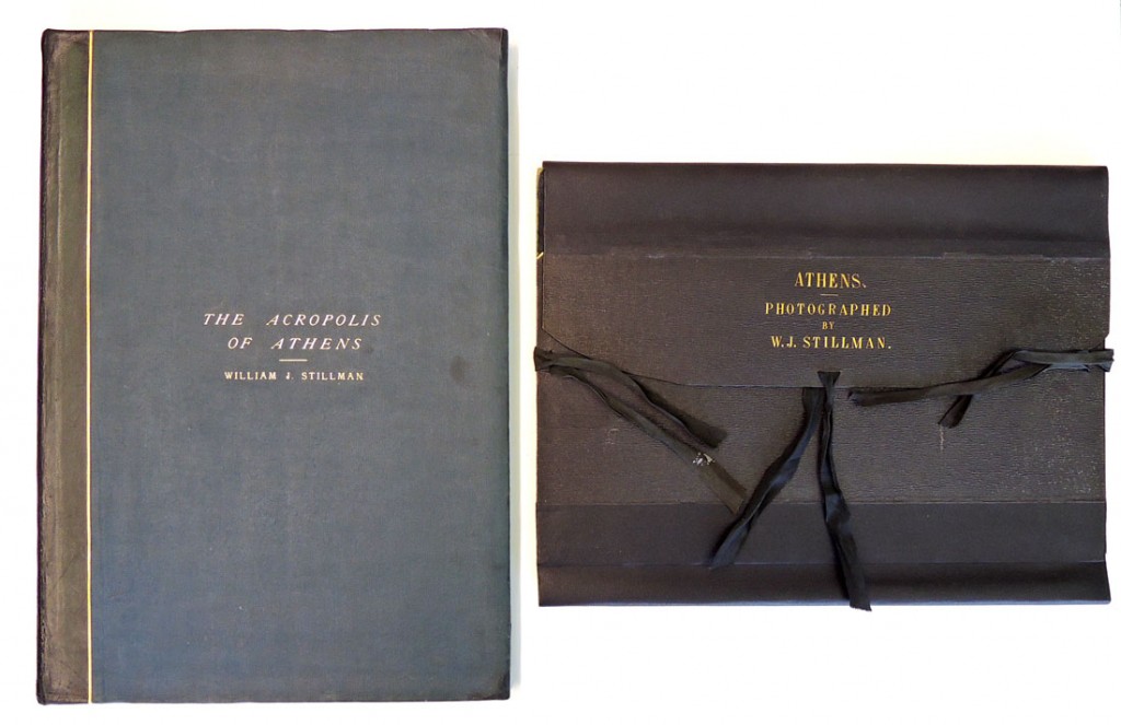
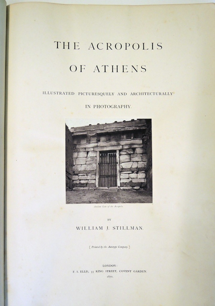
William James Stillman (1828-1901). The Acropolis of Athens. Illustrated Picturesquely and Architecturally in Photography. London: Printed by the Autotype Company for F.S. Ellis. 1870. Graphic Arts Collection 2015- in process. Purchased with funds given by the Program in Hellenic Studies with the support of the Stanley J. Seeger Hellenic Fund and matching funds provided by a gift of The Orpheus Trust to the Seeger Center for Hellenic Studies, in honor of the 35th anniversary of Hellenic Studies at Princeton. Additional funds provided by the Friends of the Princeton University Library and the Graphic Arts Collection.

stillman athens 2015In 2007, the Princeton University Library acquired (thanks to the help of the Friends of the Princeton University Library) a portfolio of photographs by the American painter, journalist, photographer, and US Consul in Crete William James Stillman (1828-1901). In an article for the Princeton University Library Chronicle, Andrew Szegedy-Maszak, Jane A. Seney Professor of Greek at Wesleyan University, proved that our portfolio was an early model for Stillman’s projected book, The Acropolis of Athens, mocked-up in (relatively) quick albumen silver prints. The following year the book was published using carbon prints, both more expensive and time-consuming but also a permanent printing process.

At the time of this purchase, we hoped there would be a day when Princeton could also acquire Stillman’s 1870 published book, offering scholars the opportunity to compare the early composition and design side-by-side with the finished volume. That day has finally arrived.

stillman athens 2015fThanks to two generous gifts we have been able to acquire Stillman’s The Acropolis of Athens, published with original carbon prints. The first gift is from the Program in Hellenic Studies with the support of the Stanley J. Seeger Hellenic Fund and matching funds provided by a gift of The Orpheus Trust to the Seeger Center for Hellenic Studies, in honor of the 35th anniversary of Hellenic Studies at Princeton.

The second gift came when the Friends of the Princeton University Library heard about the generosity of Hellenic Studies and The Orpheus Trust, inspiring them to join in the fun and also donated funds to make this acquisition possible. Our sincere thanks to these admirable organizations and congratulations to the Seeger Center for Hellenic Studies on their anniversary.

stillman athens 2015e
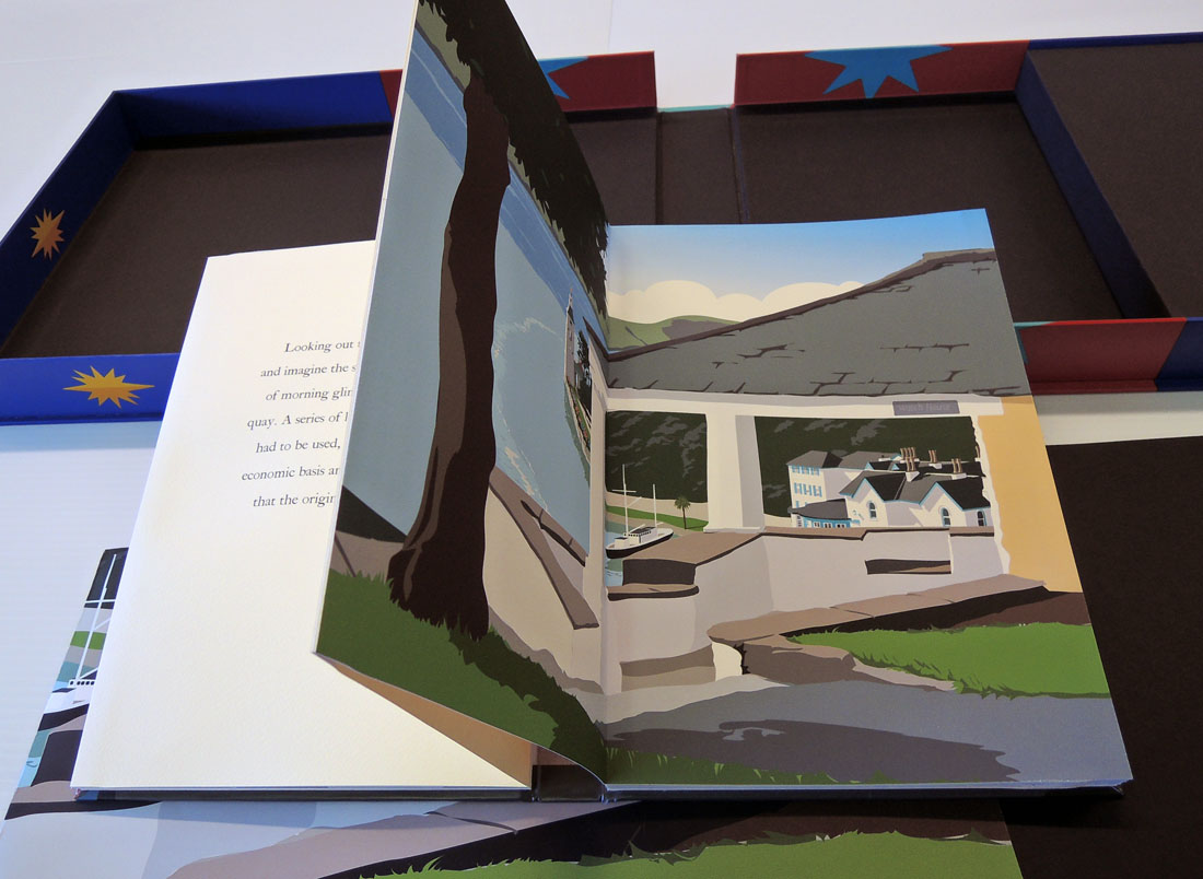
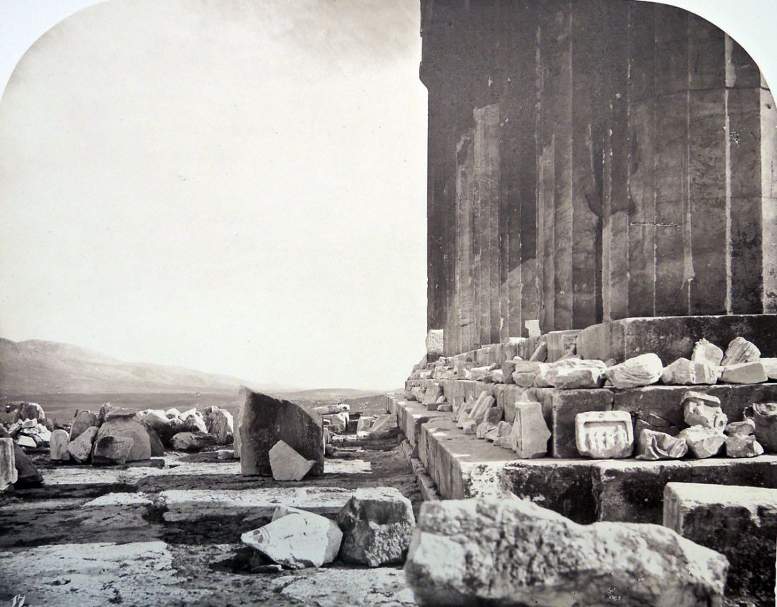
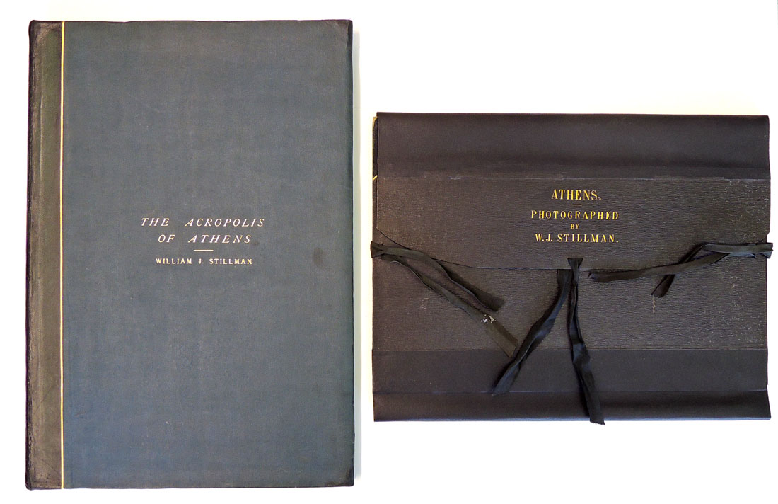
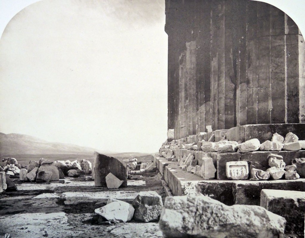
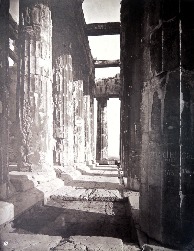
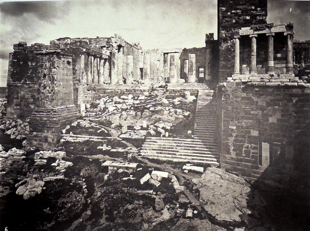
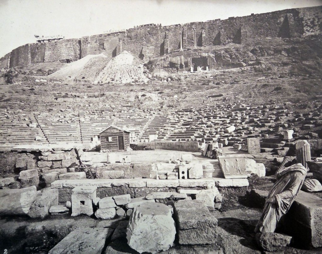
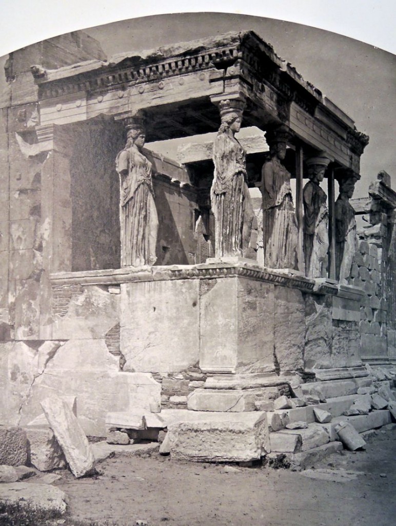
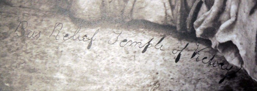
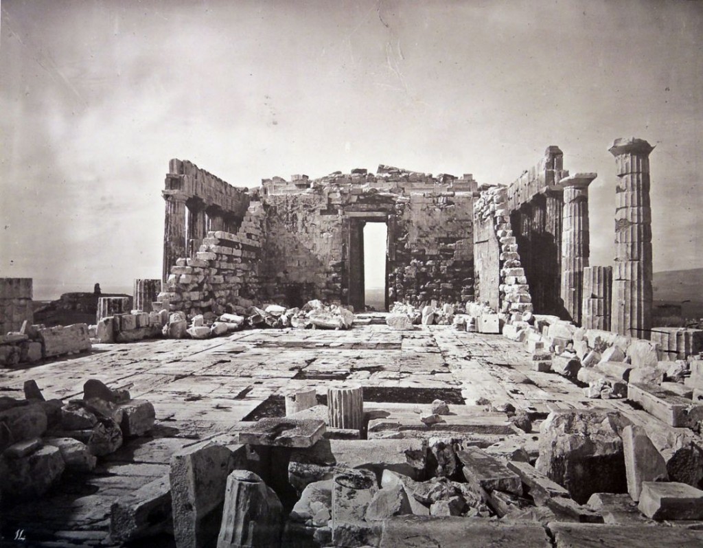
Princeton’s new volume contains 53 unnumbered leaves. The printed title page has a mounted carbon print photograph vignette (Ancient Gate of the Acropolis), followed by a leaf with Stillman’s dedication to Miss Marie Spartall (1844-1927, soon to be his second wife), a leaf with Stillman’s “Notice,” and 25 carbon print photographs with accompanying descriptions. Many plates are numbered in the negative, several with Stillman’s signature and caption and date.

stillman athens 2015d

stillman athens 2015cAs Szegedy-Maszak has suggested, Stillman’s sequence subtly reveals a profound ideological program, in which the Acropolis is ultimately portrayed allegorically as an emblem of liberty. It is an agenda that ties convincingly with Stillman’s lifelong political idealism.

“His [Stillman’s] work is nominally in a straight-forward nineteenth-century topographical mode, fulfilling the brief of documenting the Parthenon and Erectheum, but it also functions as a conscious vehicle for the photographer’s artistic ambitions . . . Photographing the Acropolis was clearly a highly personal project, and it shows in the work. He needed to make money from the endeavor, but he also believed—quite rightly—that he could make better photographs of the monument than anyone else.” (Parr & Badger).

stillman athens 2015bDimitri Gondicas writes, “This very special acquisition adds to our Hellenic Collections at Princeton, complementing perfectly our unique holdings of early photography in Greece and the Eastern Mediterranean. These visual documents are frequently consulted by Princeton students in our classes. Through our Seeger fellowships, we make accessible these research collections to visiting scholars from around the world. On this happy occasion, we wish to thank the Trustees of the Orpheus Trust, in particular, Mr. Christopher Cone, President of the Stanley J. Seeger Hellenic Fund, and Mr. Hubert Ashton.” –Dimitri Gondicas, H. Stanley J. Seeger Director of the Center for Hellenic Studies, Classics. Lecturer in Classics.

stillman athens 2015g
stillman athens 2015s

“[Stillman] embarked on a career as a diplomat, being posted as consul to Crete in 1865. Due to his support of a Cretan revolt against Ottoman rule, he had to flee in 1868 to Athens with his wife and children. Although his family was battered by a series of tragedies, Stillman undertook to photograph the monuments on the Acropolis. A selection of twenty-five photographs was published in London in 1870 as The Acropolis of Athens Illustrated Picturesquely and Architecturally in Photography.”–Szegedy-Maszak

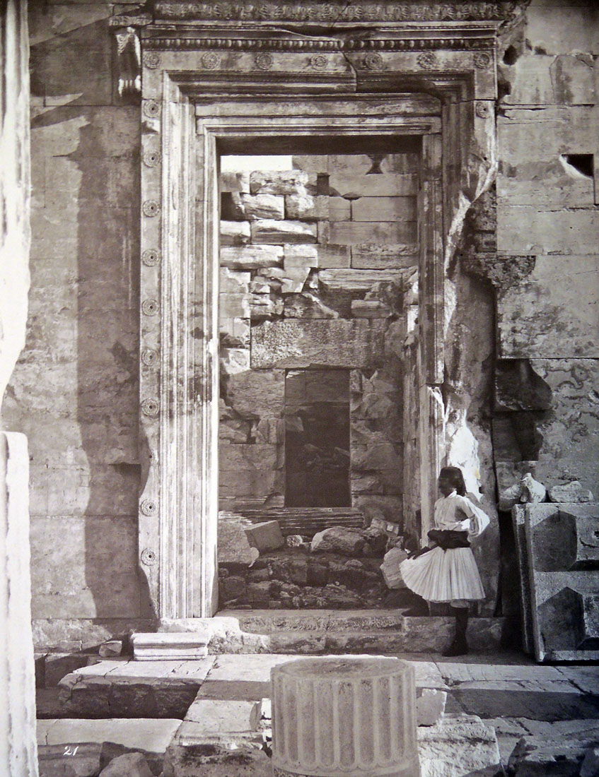
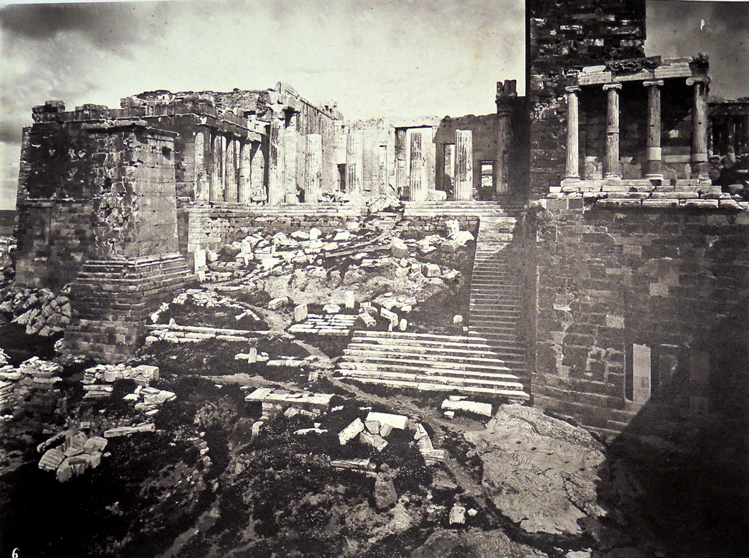
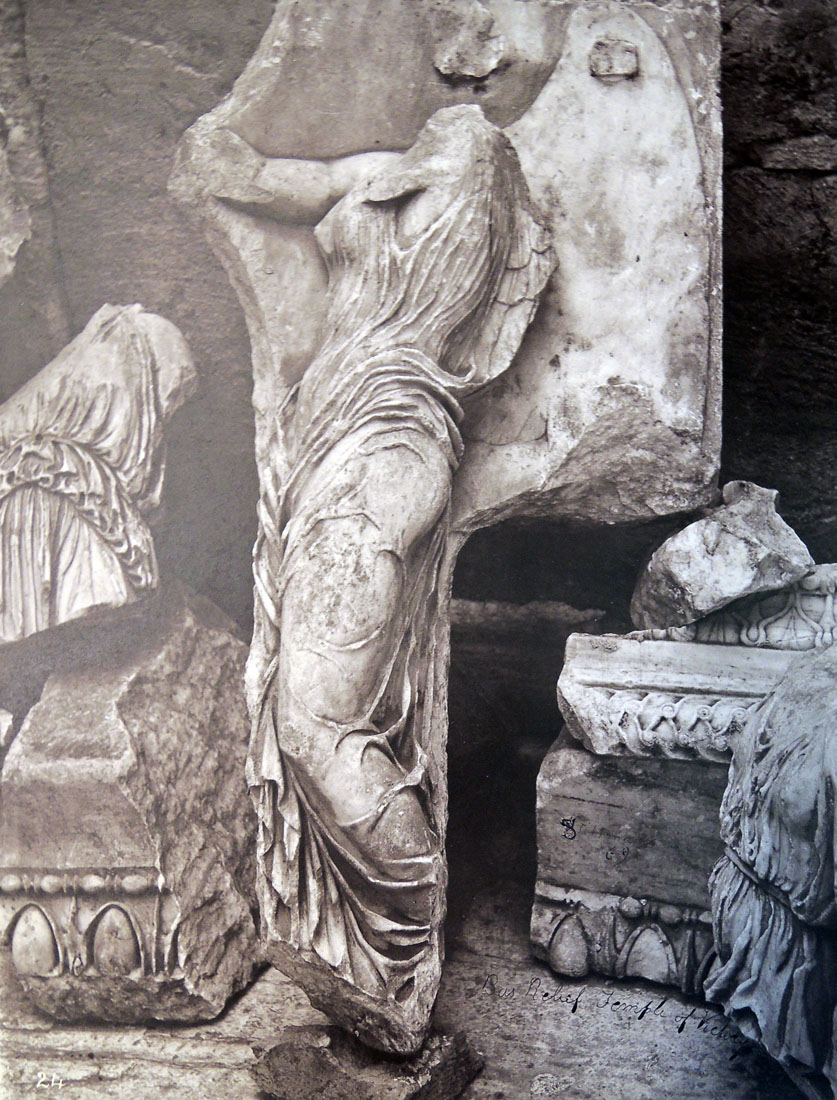
The photographs themselves are at once documents of a civilization past and sublime elegies in light and shadow. They begin with distant views showing the imposing nature of the Acropolis within its city surroundings, and move closer with dramatic and picturesque studies of individual structures and sculptural details. The images include several figures, one of whom is thought to be Stillman himself.

See Andrew Szegedy-Maszak, “Athens. Photographed by W.J. Stillman,” Princeton University Library Chronicle, 70, no.3 (spring 2009): 399-432.
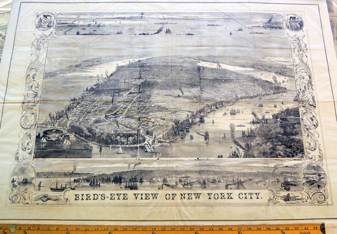
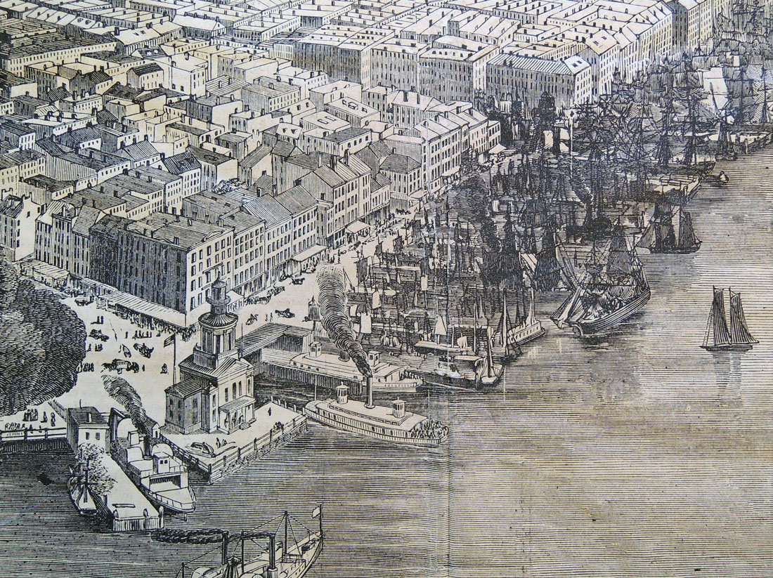
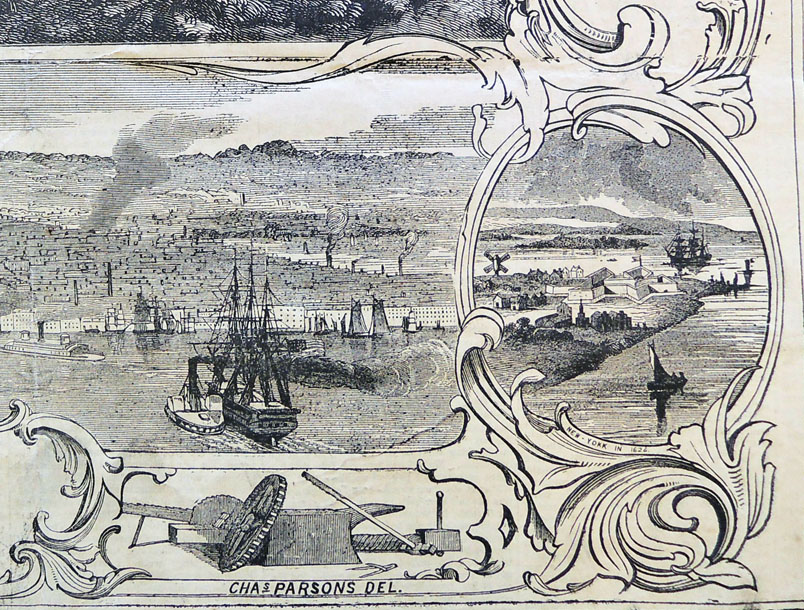
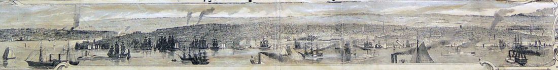
stillman athens 2015mstillman athens 2015n