Category Archives: fine press editions

fine press editions

Comparing The Seasons 1794 and 1797

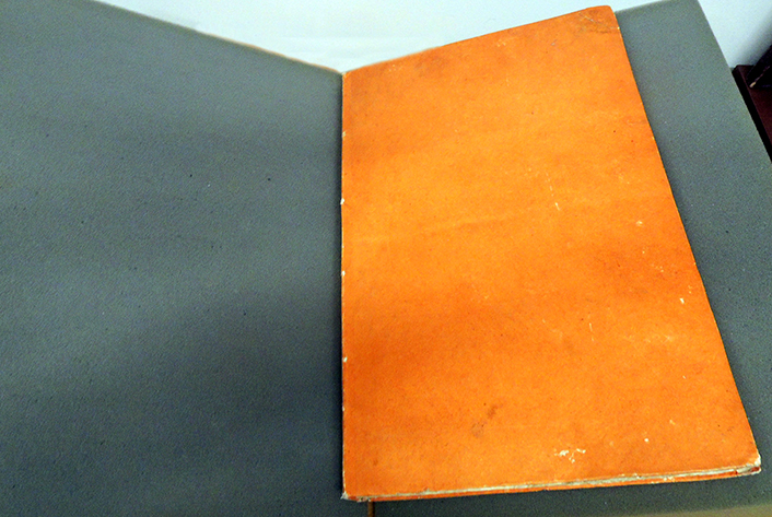
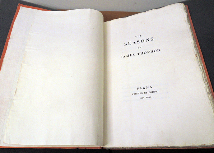
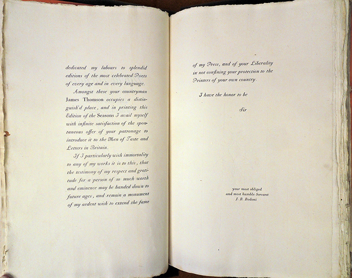
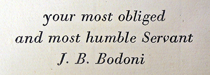
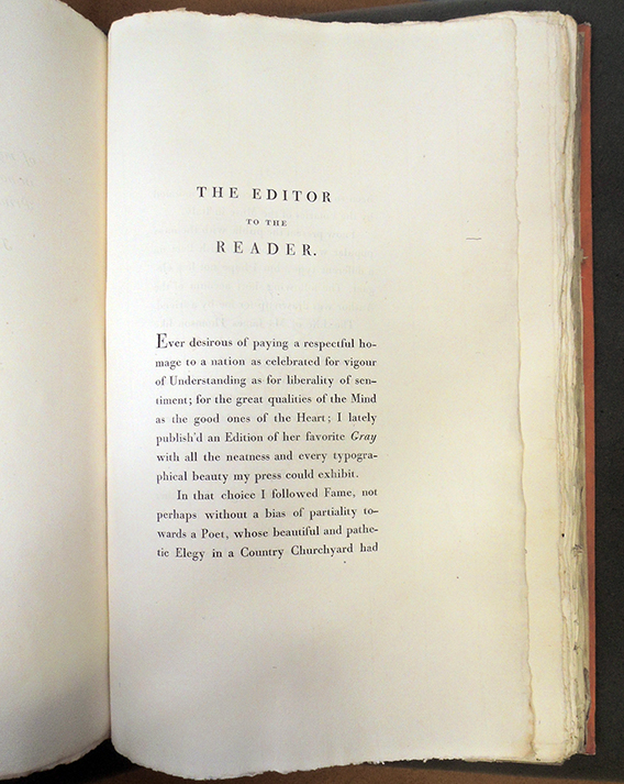
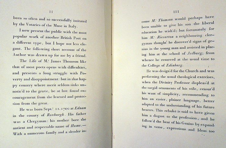
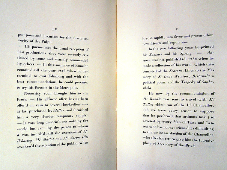
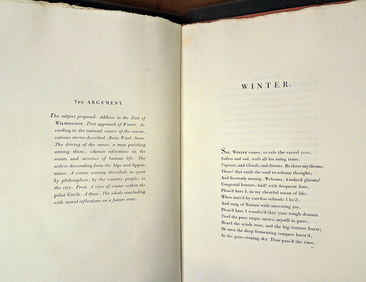
James Thomson (1700-1748), The Seasons (Parma, Bodoni, 1794). Printed by Giambattista Bodoni (1740-1813). In original orange boards. Graphic Arts Collection F-000132.


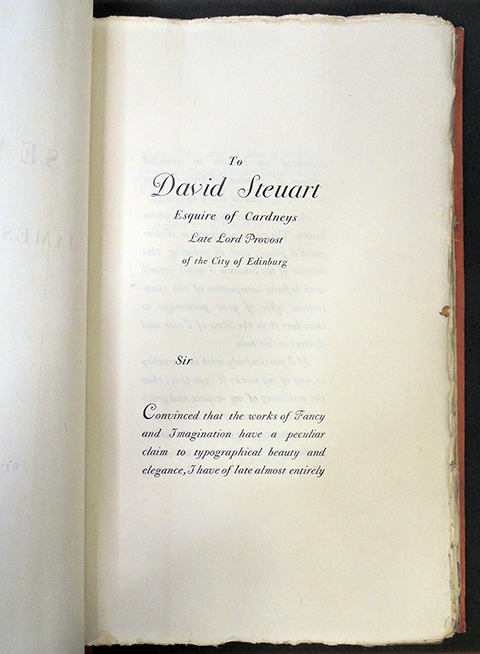
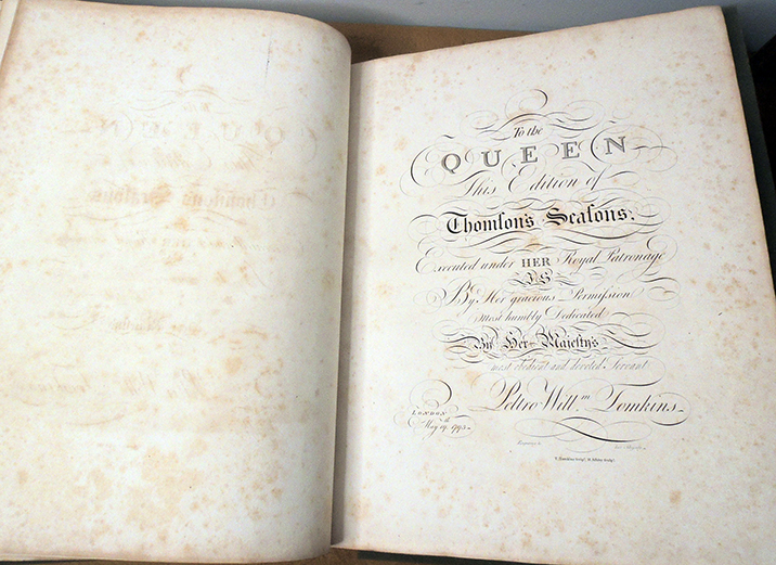
“Despite the general decline of the folio format in the second half of the century, it was revived for two editions of The Seasons, one of which was an elaborate subscription venture that took four years to complete; the other was commissioned and largely financed by Thomson enthusiast David Steuart, 11th Earl of Buchan. Catering to the upper end of the market, booksellers issued the lavishly illustrated 1797 folio edition, dedicated to the Queen, with engravings by Peltro William Tomkins and Francesco Bartolozzi.

In Italy, Giambattista Bodoni published another luxurious English-language folio edition for an elite clientele in Britain, using his superb type but no illustrations; he primarily targeted a Scottish market for the work because of the growing cult of Thomson that Steuart had fostered early in the 1790s, and aimed at book collectors to purchase his edition. –Brian Hillyard, “David Steuart and Giambattista Bodoni: On the Fringes of the British Book Trade,” in Worlds of Print: Diversity in the Book Trade, edited by John Hinks and Catherine Armstrong (2006), 113-25. 8.

To prepare for a virtual student visit this week, both folio editions of Thomson’s The Seasons were pulled and some pages photographed.

Warren E. Preece wrote a brief commentary on Bodoni, noting “In Italy, Giambattista Bodoni enthusiastically took up the principle of page design as worked out by Baskerville, though not his typefaces. Further modifying the Aldine roman of Garamond, he mechanically varied the difference between the thick and thin strokes of his letters to achieve the ultimate contrast possible in that direction. His letters are rather narrower than those of either Caslon or Baskerville. He exaggerated his thick lines and reduced the thin ones almost—it seems at times—to the point of disappearance. Like Baskerville, he used opulent papers and inks blended for special brilliance.

His pages were not easy to read, but he became, in the words of Stanley Morison, the typographical idol of the man of taste, and his “plain”—though deliberately and artfully contrived—designs were an important factor in the decline in importance of the édition de luxe and its replacement by works more austere in feeling, more modern even to today’s eyes. He set what was, in general, to be the standard book style of the world until the appearance of William Morris. Warren E. Preece, “Typography,” Encyclopædia Britannica

As is widely noted, William Morris considered Bodoni’s mechanical typography an example of “modern ugliness.”

Bodoni also set the standard for printing the alphabet with his Manuale tipografico (1818). The two-volume set features 142 sets of roman and italic typefaces, a wide selection of borders, ornaments, symbols, and flowers, as well as Greek, Hebrew, Russian, Arabic, Phoenician, Armenian, Coptic, and Tibetan alphabets (Graphic Arts Collection Q-000122).


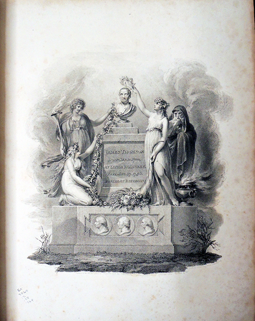
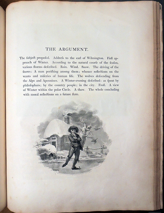
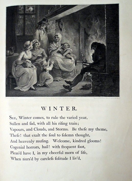
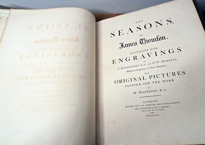
James Thomson (1700-1748), The Seasons. Illustrated with engravings by F. Bartolozzi, R.A. and P.W. Tomkins, historical engravers to Their Majesties; from original pictures painted for the work by W. Hamilton, R.A. (London: Printed for P.W. Tomkins, 1797). Rare Books Oversize 3960.2.38.16f


In contrast with Bodoni’s Seasons, a lavish edition of The Seasons was prepared by Peltro William Tomkins, who commissioned paintings by William Hamilton (1751-1801), which were translated to engravings by Francesco Bartolozzi (1727-1815) and Peltro William Tomkins (1759-1840). Targeted at the Scottish market, this edition was enthusiastically promoted and sold well into the early 19th century.

Anaïs Nin’s first American Publisher

When Anaïs Nin bought a printing press and set up shop in Greenwich Village, Jimmy Cooney made a number of trips into town to give her printing lessons and publishing advice. Who was he?


In the 1930s, Blanche and James Cooney moved “on the Maverick,” an artists’ colony outside Woodstock, NY, founded by Hervey White in 1905. They had no telephone or indoor plumbing but acquired a full stockpile of metal type and a small hand press. Notices were placed in The New York Times Sunday book review section and the Herald Tribune asking for manuscripts to be published in a new magazine. “We would print it ourselves; it would be the rallying point, through it we would spread the word of a community of separate dwellings and shared land and stock and tools; …We would publish writers whose unpopular or seditious views would have no chance in the commercial press.” It would be called The Phoenix, in honor of D.H. Lawrence.

Henry Miller wrote from Paris that both he and his friend Anaïs Nin would send material, happy that someone welcomed their provocative stories. Each was published in The Phoenix several times before they were forced to leave Paris for New York City.

As soon as Anaïs was settled, she and her husband Hugh Guiler (Hugo) made a pilgrimage to meet the Cooneys and the press that was not afraid to publish her work. Anaïs’s famous diaries do not mention of this trip, probably because Hugo asked her not to write about him and she agreed. However, the visit is chronicled in Blanche Cooney’s autobiography:

“In 1940, on her return from Europe, Anaïs came to Woodstock with her husband Hugh Guiler to stay with us for a few days. She wanted to meet her first American publisher, we wanted to meet the fabled Etre Étoilique [Miller’s 1937 short story about Anaïs]. A great pleasure to look at, she moved like the dancer she was, a fluid supple line in a dress of purple wool. . . Hugo—Anaïs called him Hugo and he said we were also to call him Hugo—was the banker, an international banker. A tall lean Scotsman, gentle, handsome, he deferred to Anaïs, his adored one, his indulged one. No whim, no quirk, no passion, or bizarre appetite would he deny her, Yes to a houseboat on the Seine, Yes to the Miller connection, to a fling with a woman, an English poet, a Peruvian Indian, Yes….

Hugo, Anaïs said, will be studying engraving with Stanley Hayter at the New School. Hugo had a definite talent; he will do the covers and illustrations for her books, she said; they will find a printer and publish privately. “my text and Hugo’s decorations.” Anaïs smiled into Hugo’s eyes with intimate secret reference. The visit went well, no explosions, no denunciations . . . .”–Blanche Cooney, In My Own Sweet Time (Ohio: Swallow Press, 1993). Z473 .C755 1993

The Phoenix ([Haydenville, Mass.: Morning Star Press, 1938-1984.]). Vol. 1, no. 1 (Mar./May 1938)-v. 9, no. 3 & 4 (1984). AP2 .P464

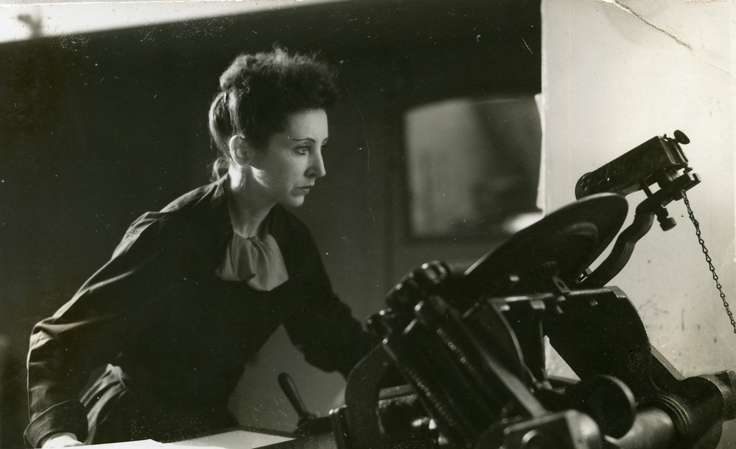
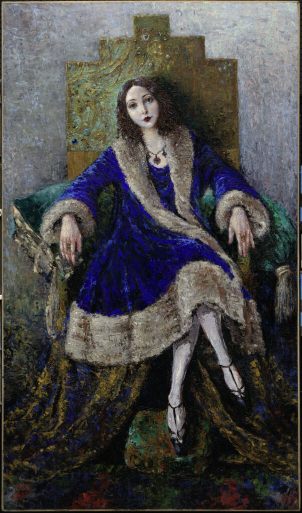
Natashia Troubetskoia, Anaïs Nin, ca. 1932. Oil on canvas. National Portrait Gallery, Smithsonian Institution

Want to know more? Please join us at 2:00 p.m. on September 25, 2020 for the fifth in our series of webinars highlighting the Graphic Arts Collection at Princeton University. Register for free here: https://libcal.princeton.edu/event/6949414


The history of the Maverick: https://player.vimeo.com/video/11435652

The Books and Prints of Anaïs Nin and her Gemor Press

Please join us at 2:00 p.m. on Friday, September 25, 2020, for the fifth in our series of live webinars highlighting material in the Graphic Arts Collection at Princeton University Library. Recently we acquired most of the rare letterpress editions printed by Anaïs Nin (French-Cuban, 1903-1977). Best known for her diaries, Nin also wrote fiction with themes of history, feminism and multiculturalism. Together with Gonzalo More, one of her many lovers, Nin ran a private printing press in Greenwich Village where she taught herself to set type, stood for hours pumping a treadle press, and distributed her books with the help of Frances Steloff at Gotham Book Mart. Many were illustrated with original etchings by her husband, Hugh Parker Guiler, a banker who used the pseudonym Ian Hugo so his colleagues would not discover he was also an artist.

They called the imprint Gemor Press (pronounced G. More) after Gonzalo, although it was Anaïs who raised the money and did most of the physical work. Located first on MacDougal Street and later at 17 East 13th Street where the small building she rented still stands. After a close look at the books and prints, we are fortunate to be joined by Andrew Berman, Executive Director of the Greenwich Village Society for Historic Preservation, who will update us on their efforts to landmark this building, as well as other Village homes and studios of writers we all know and love.

This session is free and open to all. To register: click here

Here is the complete series of past and future webinars highlighting material in Princeton’s Graphic Arts Collection

New Theories on the Oldest American Woodcut. May 22, 2020
To celebrate the 350th anniversary of the oldest surviving print from Colonial America, we assembled all five extent copies of the portrait of the Reverend Richard Mather (1596-1669) by or after John Foster. Julie Mellby was joined by Caroline Duroselle-Melish, Andrew W. Mellon Curator of Early Modern Books and Prints and Associate Librarian for Collection Care and Development, Folger Shakespeare Library.

Thomas Eakins and the Making of Walt Whitman’s Death Mask. June 26, 2020
This program was chosen specifically for June, LGBTQ pride month and this year, the 50th anniversary of the first Gay Pride march. Both Walt Whitman and Thomas Eakins, in their own way, broke down barriers around sex, sexuality, and the celebration of the human body. Presented by Julie Mellby, Graphic Arts Curator, and Karl Kusserow, John Wilmerding Curator of American Art, Princeton University Art Museum.

Afrofuturism: The Graphics of Octavia E. Butler. July 31, 2020
This month focused on the speculative fiction, also called Afrofuturism, of author Octavia E. Butler. Julie Mellby was joined by Damian Duffy and John Jennings, the award winning team who produced the graphic novel adaptations of Parable of the Sower and Kindred.

Celebrate the 100th Anniversary of Women’s Suffrage. August 26, 2020
The fourth in our series celebrated the centenary of the 19th amendment on Women’s Equality Day. Julie Mellby was joined by Lauren Santangelo, author of Suffrage and the City and lecturer in Princeton University’s Writing Program, along with Sara Howard, Librarian for Gender & Sexuality Studies and Student Engagement within Scholarly Collections and Research Services at Princeton University Library.

The Books and Prints of Anaïs Nin and her Gemor Press. September 25, 2020
For the fifth in our series we highlight the recently acquired letterpress editions printed by Anaïs Nin (French-Cuban, 1903-1977). Together with Gonzalo More, Nin ran a private printing press in Greenwich Village where she printed and published fine press books, distributed with the help of Frances Steloff at Gotham Book Mart. Julie Mellby will be joined by Andrew Berman, Executive Director of the Greenwich Village Society for Historic Preservation, who will talk about efforts to landmark the Gemor Press building and other Village homes and studios of writers we all know and love.


Maya Angelou and John T. Biggers

https://achievement.org/achiever/maya-angelou/

Maya Angelou (1928-2014), Our Grandmothers. Lithographs by John T. Biggers (New York: Limited Editions Club, 1994). Lithographs and letterpress. Graphic Arts Collection GAX 2020- in process


She stands
before the abortion clinic,
confounded by the lack of choices.
In the Welfare line,
reduced to the pity of handouts.
Ordained in the pulpit, shielded
by the mysteries.
In the operating room,
husbanding life.
In the choir loft,
holding God in her throat.
On lonely street corners,
hawking her body.
In the classroom, loving the
children to understanding.

Centered on the world’s stage,
she sings to her loves and beloveds,
to her foes and detractors:
However I am perceived and deceived,
however my ignorance and conceits,
lay aside your fears that I will be undone,

for I shall not be moved.
–Maya Angelou, Last stanzas from “Our Grandmothers” first published in I Shall Not Be Moved (1990).

When Maya Angelou (born Marguerite Annie Johnson) agreed to allow her poem “Our Grandmothers”  be used in a Limited Editions Club publication, she asked that it “be illustrated by her favorite artist, John T. Biggers, an internationally acclaimed muralist and printmaker. …And now, for the Maya Angelou poem, Biggers has created five monumental lithographs that synthesize his concepts for the soul of Black Africa and its American reincarnation, of ancient myth and contemporary reality.” [-prospectus]. In planning his contribution to the book, Biggers used several elements from his 1992 triptych entitled “Family Arc,” seen above.

Originally published in her fifth poetry book, I Shall Not Be Moved (1990), the poem’s 1994 printing had a limited run of 400 numbered copies signed by both the author and the artist. It was one of the largest-format books (17 3/4 x 22 inches) ever issued by the Club.

“Angelou had written four autobiographies and published four other volumes of poetry up to that point. Angelou considered herself a poet and a playwright and her poetry has also been successful, but she is best known for her seven autobiographies, especially her first, I Know Why the Caged Bird Sings. She began, early in her writing career, of alternating the publication of an autobiography and a volume of poetry. …[She grew up] with their grandmother in the small town of Stamps, Arkansas. In Stamps, the young girl experienced the racial discrimination that was the legally enforced way of life in the American South, but she also absorbed the deep religious faith and old-fashioned courtesy of traditional African American life. She credits her grandmother and her extended family with instilling in her the values that informed her later life and career. She enjoyed a close relationship with her brother. Unable to pronounce her name because of a stutter, Bailey called her “My” for “My sister.” A few years later, when he read a book about the Maya Indians, he began to call her “Maya,” and the name stuck.
https://achievement.org/achiever/maya-angelou/

An unsigned obituary for John T. Biggers, published on January 29, 2001 in the Washington Post, mentioned their collaboration, describing him as ”a pioneering black muralist who became known for the epic sweep of his work in profiling the African American experience.” The piece continues:

“Dr. Biggers, who lived in Houston, founded the art department of what is now Texas Southern University in Houston in 1949. He directed the department and served on its faculty until retiring in 1983 to devote his time to his artwork. He had gained national attention in 1943, when his mural “Dying Soldier” was included in the landmark exhibition “Young Negro Art” in New York’s Museum of Modern Art. After he settled in Houston, his artwork, which was inspired by Mexican political muralists, became part of the very landscape of Lone Star schools and businesses.

…In 1994, he illustrated Maya Angelou’s poem “Our Grandmothers.” She had said that his art “functions as delight and discovery. He sees our differences and celebrates them. And in so doing, he allows the clans of the world to come together in respectful appreciation.”


Rendezvous with Spain


At the age of seventeen, Julio de Diego (1900-1979) mounted his first exhibition in a gambling casino, and went on to paint sets for the Madrid Opera company, dance in the chorus behind Nijinsky at the Ballet Russe, fight in North Africa, emigrate to the United States where he exhibited with the Surrealists in New York and Chicago, married the burlesque queen Gypsy Rose Lee (among others), and became an expert cook.


“He came to this country from Spain in 1924 with exactly 25 cents,” noted his obituary in The New York Times. “He spent a dime for a ride to the top of the Woolworth Building (then the world’s tallest) and merrily flung the other 15 cents to Manhattan’s skyline. ‘I wanted to start from scratch,’ he explained.” –“Julio de Diego, 79, Artist Who Also Was an Actor,” New York Times August 24, 1979


In 1946, when De Diego illustrated the poem Rendezvous in Spain by Bernardo Clariana Pascual (1912-1962), their publisher Gemor Press had already moved from MacDougal to 13th Street. Anaïs Nin and Gonzalo More, the owner/operators hoped to turn Gemor into a larger commercial studio and so, published five limited-edition books that year: A Child Born Out of the Fog by Anaïs Nin; Moods and Melodies by Henriette Reiss; Mujer, Estados Unidos de América: poema radiofónico by Tana De Gámez; Nine Desperate Men by C. L. Baldwin; and Rendezvous with Spain by Clariana and de Diego.Gypsy Rose Lee and Julio de Diego, Life magazine


Nin wrote in her journal on April 19, 1944:

“Today the machines were moved to 17 East 13th Street. It is to be called the Gemor Press. Gonzalo is active, excited, transformed. His pleasure gives me pleasure. …Tremendous labor, the installation of the press, the work with electricians, window cleaners, movers, packers, packing and unpacking, transferring twelve trays of type into type cases. We are counting paper, beginning to work on engravings (the edition will only have nine engravings instead of seventeen), unpacking twelve boxes of paper, books, plates, tools, etc., buying a scrap basket, bulbs, blotters, files, pasting Gonzalo’s work in a scrapbook to show clients. It was all done in one week.” –Nin, Anaïs. Mirages: The Unexpurgated Diary of Anaïs Nin, 1939–1947, edited by Paul Herron, Ohio University Press, 2013.


Bernardo Clariana (1912-1962) left Havana in 1942 for a position at Middlebury College in Vermont, where he continued to write Spanish language poetry. Unfortunately, he drowned on a beach on the French Riviera at the age of 50. Nin and More published two volumes of his poetry, Ardentissima cura translated by Dudley Fitts in 1944 and two years later, Rendezvous with Spain also translated by Fitts and illustrated by Julio de Diego.


Lake of Darkness


Karen Fitzgerald, Lake of Darkness: Twelve Photogravure Etchings with Five Poems by Czeslaw Milosz ([New York]: Karen Fitzgerald, 1996). Copy 10 of 12. Gift of the Kohler Foundation. Graphic Arts Collection 2020- in process

Abstract:, “Lake of Darkness was created as a response to Czeslaw Milosz’s poetry and what it means to be in the earth, to be embedded within the landscape. The structure of Milosz’s poetry has a deep resonance for me. He evokes the individual, specific, and granular experience of being of the earth. His work also connects historical aspects of this sense with the physical experience of consciousness. When he labels the earth a ‘lake of darkness’ for creatures who are not winged—the ones that can lift themselves out and above—he offers a landscape that has meaning for all of us. Milosz’s poetry offers a transformational language that I have brought into visual form. The natural world beckons to all of us if we slow down, listen, look, recall. The details emerge slowly and delicately, like the smell of linen drying on a clothesline. This project is a way of bringing that hyperawareness forward as a kind of re-knowing. The world is, after all, a Lake of Light. The darkness serves to make the light more defined, even more exceptional.”–Artist’s statement (https://fitzgeraldart.com/lakeofdarkness/)

“12 photogravure etchings printed by the artist on Somerset textured white, 300 grams, in an edition of 12 impressions plus 3 artist’s proofs. Plates by Lothar Osterberg, New York. Type was set in Centaur printed letterpress son Somerset textured white, 300 grams, by Leslie Miller at The Grenfell Press, New York. Tray case was made by Claudia Cohen, bookbinder, Easthampton, Massachusetts.”–Colophon.


Five poems by Czeslaw Milosz: The bird kingdom ; On prayer ; It was winter ; On angels ; An appeal.

It was winter (a selection)
Winter came as it does in this valley.
After eight dry months rain fell
And the mountains, straw-colored, turned green for a while.
In the canyons where gray laurels
Graft their stony roots to granite,
Streams must have filled the dried-up creek beds.
Ocean winds churned the eucalyptus trees,
And under clouds torn by a crystal of towers
Prickly lights were glowing on the docks.

This is not a place where you sit under a café awning
On a marble piazza, watching the crowd,
Or play the flute at a window over a narrow street
While children’s sandals clatter in the vaulted entryway.

Anaïs Nin and Louise Bourgeois


(c) Museum of Modern Art. https://www.moma.org/collection/works/illustratedbooks/15383?locale=en

Angela Anaïs Juana Antolina Rosa Edelmira Nin y Culmell (1903–1977), known professionally as Anaïs Nin (pronounced Ana East Neen) and Louise Joséphine Bourgeois (1911–2010) were two of the strongest, most self-sustaining women of the 20th century. Together they produced a stunningly beautiful image/text narrative, He Disappeared Into Complete Silence, although they may never have met.


As Nin was signing a contract with Dutton Publishers in 1946 and preparing to close Gemor Press, where she and Gonzalo More had been hand-printing books since 1942, she expected to publish only one more title. A large folio edition of her House of Incest, which appeared in Paris in 1936 under the imprint Siana editions (Anais spelled backwards), was to be printed and published in a limited run of 50 copies. Then Stanley William Hayter (1901-1988), director of Atelier 17, the print workshop where Nin’s husband printed, walked in with another project.

Nin with Frances Steloff, at Gotham Book Mart


In the 1930s, Nin, her husband Hugh Guiler, More, Hayter, and Bourgeois were all living and working in Paris but when the city started mobilizing for war, they each made their separate ways to New York City. Just before leaving France, More worked with Hayter on Atelier 17’s limited edition Fraternity, which was completed in March of 1939.

When the Hayter’s studio reopened in New York, Guiler studied etching there and several of his wife’s hand-printed editions include her husband’s prints under the pseudonym Ian Hugo. Nin’s Diaries contain several mentions of Hayter stopping by Gemor Press on Macdougal Street or later 13th Street when they expanded their printing shop to include an etching press.

Nin credits Hayter with teaching her and More to print relief copperplate etchings and with bringing them work when they needed the money. There is never a mention of titles or publications, just the fact that he would bring work to their shop if an artist needed letterpress text with their fine art prints.

This might have been the case with Louise Bourgeois’s He Disappeared Into Complete Silent. There is no mention of Bourgeois in Nin’s Diaries, or of the project. Neither is Nin mentioned in Bourgeois sources. It is a tragedy the two never really collaborated. By this time, More had foolishly given away all the money needed to run the business and Nin had no choice but to close the door.

We would show more of the Gemor Press editions but someone has removed them from Firestone Library and the books will have to be replaced. Be careful when buying or selling these books to check for a Princeton property stamp inside.

 
In Paris
The House of Incest by Anaïs Nin. Paris: Siana éditions [1936].

The Winter of Artifice by Anaïs Nin. Paris; [printed in Belgium]: Obelisk Press, 1939.

Fraternity by Stephen Spender, translated by Louis Aragon. Paris: Stanley William Hayter, 1939). Text printed by Gonzalo More.

In New York City
Winter of Artifice by Anaïs Nin. Metal relief prints by Ian Hugo. [New York: Gemor Press], 1942. First edition 500 copies.

Four Poems by Sharon Vail. New York: Gemor Press, 1942.

Several Have Lived by Hugh Chisholm; Prints by André Masson. New York: Gemor Press, 1942.

Misfortunes of the Immortals by Max Ernst and Paul Éluard. Translated by Hugh Chisholm. New York: Black Sun Press (printed at the Gemor Press), 1943.

Alphabet du décor by Berthie Zilkha. pen drawings by Madison Wood. [New York: Gemor Press], 1944. 68 pages. Edition: 300

Ardentissima cura: a poem by Bernardo Clariana; translated by Dudley Fitts. New York: Gemor Press, 1st ed. 1944. [12] pages ; 22 cm. Edition: 400.

Ho! watchman of the night, ho! by Lee Ver Duft. New York: Gemor Press, 1944. 30 pages ; 23 cm. Edition: 300. Cover Art by Mastrofski.

Quinquivara by C. L. Baldwin; engravings by Ian Hugo. New York: Gemor Press, 1944.

Under a Glass Bell by Anaïs Nin. Line engravings on copper by Ian Hugo. [New York, Gemor Press, 1944]

This Hunger by Anaïs Nin; with five colored hand-pulled woodblocks by Ian Hugo. [New York] Gemor Press, 1945. [1]-183 [1] pages, 4 leaves woodblocks. 23.2 cm. Edition: 1000 copies and limited deluxe edition: 50 copies.

A Child Born Out of the Fog by Anaïs Nin. [New York], Gemor Press, 1946. 2 preliminary leaves, 1-6 pages, 1 leaf 20 cm.
A Child Born Out of the Fog by Anaïs Nin. [New York]: Gemor Press, 1947. 4 unnumbered pages, 6 pages, 2 unnumbered pages ; 19 cm. ?2nd edition?

Moods and Melodies by Henriette Reiss. New York: Gemor Press, 1946. 2nd ed.

Mujer, Estados Unidos de América: poema radiofónico by Tana De Gámez. New York: Gemor Press, 1946.

Nine Desperate Men by C. L. Baldwin. [New York] Gemor Press 1946.

Rendezvous with Spain: A poem by Bernardo Clariana: Translated by Dudley Fitts and illustrated by Julio de Diego. New York Gemor Press 1946. Edition: 520 copies (100 in black and white, 400 in color; 20 deluxe copies have been hand colored by the artist).

He Disappeared into Complete Silence by Louise Bourgeois. Introduction by Marius Bewley. New York: Atelier 17; Printer of text: Gemor Press, printer of images: Atelier 17, 1947.

House of Incest by Anaïs Nin. New York: Gemor Press, 1947. 43 cm. Linotype and etchings. Edition: 50.

A Born Classic

Mark Argetsinger, A Grammar of Typography: Classical Book Design in the Digital Age (Boston: David R. Godine, 2020). 528 pages; 8.5 x 12 inches; illustrated with over 425 images, many in full color.

The arrival of Mark Argetsinger’s new book, A Grammar of Typography, sent me running to a thesaurus in search of a word larger than comprehensive. Should we describe it as thorough? Inclusive? Far-reaching, in-depth, sweeping, or simply grand?

The publisher’s material begins: “A Grammar of Typography is a comprehensive guide to traditional book design that is both practical and historical. Interspersed with discussions of digital typesetting and page layout are broad historical views of the tradition of the book along with specific reference to the printer’s grammar or manual, the industry’s own codification of its usage, from Joseph Moxon in the seventeenth century through Theodore Low De Vinne in the nineteenth. In addition, there are chapters on house style, proof-reading, copy-editing, paper, binding, and appendices on typographical ornaments and Greek type. The book ends with an annotated bibliography and an index.”

How can you not love a book with an introduction titled “The Hidden Soul of Harmony: The Classical Tradition. A Practice in Search of a Theory”? Although Argetsinger claims “this is primarily a practical manual, not a scholarly treatise,” one would be hard-pressed to find a more philosophical look at “marks of quotation,” “font editing,” or “horizontal space.”

There is also biography and chronology. “In addition, Aldus was the first to cast in type the humanist’s running or cursive hand, known as the Italic. The busy work of the humanist, who daily, it seemed, uncovered new works of the Ancients, lying long neglected in the monastic or royal libraries of Europe, had required an efficient script to match the urgent copying of new texts.”

In his preface, Argetsinger writes, “This book intends to provide a historical context to the enterprise of book-making. The term grammar appears in its title both in reference to the historical phenomenon of ‘grammars’ of printing, regarding which much will be said along the way, as well as in reference to a certain graphical literacy that is requisite for the intelligent use of design and production tools in the digital age. Historical context is important both from the point of view of tracking evolving trends in the composition and display of printed matter, as well as from the point of view of preserving the traditions of its best practices.”

Open it anywhere and start reading.


“After the first necessities of life, nothing is more precious to us than books. The Art of Typography, which produces them, provides essential services to society and secures incalculable benefits. …Thus one could rightly call it par excellence the art of all arts and the science of all sciences.” –Pierre-Simon Fournier, le jeune, Manuel Typographique, Book 1 (1764).


A classical book designer, Argetsinger also embraces 21st-century technology, writing:
“There is something wonderful about working out the proportion of the page on screen, precisely mapping out its structure with the (by turns visible or invisible) grid and and page line; setting up one’s font with a complement of sorts so vast, even Christopher Plantin would feel a twinge of envy; readily changing size, font, color, position; and arraying, say, a two-volume, 800-page book heavy with illustrations and then placing its entire content on a digital thumb-drive….”

[Forgive my poor photography, the book itself is perfect.]

Colophon: “A Grammar of Typography set in DTL’s Fleischmann and printed on 115 Gem Munken print cream. All printing and binding by PBtisk Printing Company in the Czech Republic. This first edition consists of 1,875 hardcover trade copies as well as a deluxe slipcased edition of 125 copies signed and numbered by the author and only available directly from the publisher. Designed and composed by Mark Argetsinger, Holyoke, Massachusetts.”


A PostScript: My favorite Argetsinger design, proof he can do it all.

Need a Project no. 10? Music of the Spheres

Linda Connor and Charles Simic, On the Music of the Spheres. Artists and writers series 16. Limited ed. of 250 copies ([New York]: Library Fellows of the Whitney Museum of American Art, 1996). ReCAP Marquand Oversize TR654 .C65472 1996q

On the Music of the Spheres presents 15 tipped in tritone reproductions of Linda Connor’s gold toned printing out prints along with the poetry of Charles Simic. The results are astoundingly beautiful. One hundred copies were specially bound and signed by the poet and photographer with an additional platinum palladium print, signed by Connor, loosely inserted. The publication was named the 1998 Best Book of the Year from 21st- A Contemporary Photography Journal.


Writing for the New York Times, Phyllis Braff keenly observed

“Linda Connor stakes out ambitious visual and conceptual themes for her photographic projects, and her art has been earning wide respect for several decades. Her base is California, but she travels the world to gather content.” In reviewing On the Music of the Spheres, Braff continues “The territory Ms. Connor chooses to explore is nothing less than the heavens. Turning the idea into a multifaceted essay that stimulates the mind as well as the eye, she interweaves her prints made from the glass plates of 19th-century astrological photographers with her images of indoor and outdoor settings that portray heavenly light. Photographs of illumination entering ancient holy places in India, Turkey, Egypt and Tibet seem to subtly depict the sun’s rays as carriers of spiritual messages and these images are rather magical. Quite stunning, too, is the attention to architecture and to its use in building dramatic pictorial structure.”– Phyllis Braff, “Capturing the Elusive: Music of the Spheres,” New York Times December 15, 1996.


As noted by the Poetry Foundation, “Charles Simic is widely recognized as one of the most visceral and unique poets writing today. His work has won numerous awards, among them the 1990 Pulitzer Prize, a MacArthur Foundation “genius grant,” the Griffin International Poetry Prize, the Wallace Stevens Award, and the appointment as US poet laureate. He taught English and creative writing for over 30 years at the University of New Hampshire. Although he emigrated to the US from Yugoslavia as a teenager, Simic writes in English, drawing upon his own experiences of war-torn Belgrade to compose poems about the physical and spiritual poverty of modern life. Liam Rector, writing for the Hudson Review, has noted that the author’s work “has about it a purity, an originality unmatched by many of his contemporaries.”

The project for the week is: Look up.

See also Simic’s The White Room: https://poets.org/poem/white-room
 
It begins:
The obvious is difficult
To prove. Many prefer
The hidden. I did, too.
I listened to the trees. . .


Bard of the Barges, Garbageman Poet

John Herman Kepecs (May 20, 1897-December 21, 1981) arrived in the United States in 1922 from Pécs, Hungary. The trained sailor found work with the New York City Department of Sanitation first as a Captain on a garbage scow and eventually Deputy Inspector of the entire fleet. He also wrote poetry under the pen name John Cabbage, chosen because his Hungarian name sounded like ‘cabbage’ when New Yorkers tried to pronounce it.


“Garbage Scow Sailor Bursts Out Into Verse” announced the New York Sun March 13, 1932:

Meet John Cabbage, garbage scow sailor and poet, author of more than 1,000 verses and of a new volume, just published called “8 Bells.” Mr. Cabbage goes down to the sea in the scows that bury New York’s waste beneath the clean waters of the Atlantic. When that task is accomplished, Mr. Cabbage sits on the stern with ruled notepaper and a pencil, and meditates upon life. One of his effusions goes like this: Mr. Cabbage’s most persistent resolution is to save enough money to fit out a schooner and go to the south seas where he can sit on a beach instead of a scow, and listen to the wild waves. The sailor-poet’s latest book is dedicated “to ships and shipmates who rest in the deep, and woman whose love I could not keep.”

Three volumes of Cabbage’s poetry were printed and published by the Greenwich Village bohemian Lew Ney (Luther E. Widen, 1886-1963) at his Parnassus press on 15th Street (later Brooklyn Heights) including 8 Bells (1932); Down the Dock (1937); and Time and Tide (1938). Lew Ney was the first to draw national attention to Cabbage in 1927 through his weekly column “Greenwich Village As IZ” in Variety, proclaiming that Cabbage would be internationally famous in twenty years.

Cabbage was an original member of the Raven Poetry Circle when it was formed in May 1933 (see the film Joe Gould’s Secret for a typical meeting). The group is remembered for their annual spring exhibition of handwritten poems mounted to the fence around Washington Square Park and Cabbage was often highlighted because of his unusual occupation. “Mere rhymers, wise-cracking doggereleers and other nuts are positively not welcome, and our only word to them is ‘Scram!'”

On the left, we see Cabbage with his work against the Judson Church building across from the park. His poems also appeared in the Raven Anthology 1933-1947, a quarterly magazine of members. “Poets of Village Get Day in the Sun,” announced the New York Times May 22, 1933:

Beneath a benign, approving sun the poets of Greenwich village flooded into a half-block of Washington square south yesterday, tacked their work upon a board fence and invited the passing public to read and buy. A good deal of reading and some buying was in progress until the sun disappeared. It was the beginning of poetry week, and it probably will go down in the village’s history, if and when written, as the first sidewalk poetry show.

From its beggining, Chumley’s restaurant, a Greenwich Village icon, featured book jackets for publications by local authors. They describe the series: “The authors ranged from Theodore Dreiser to John Cabbage, the poet of the garbage scow.”

In 1937, possibly inspired by Francis Alexander Durivage’s novel Mike Martin or, The last of the highwaymen. A romance of reality (1845), Cabbage traveled to California to sell his novel, also titled “Mike Martin” to Hollywood. The press loved the story of a garbage poet hoping for fame in the movies and the story appeared in newspapers across the country.

“John Cabbage the ‘Bard of the Barges’ today offered to sell the movies a story that reaches its climax with the boy and girl honeymooning on a garbage scow. Cabbage, deputy inspector of the department of sanitation dumps in New York, is on 90 days leave from his job of supervising the loading of the garbage fleet.

“Mike Martin” that’s the novel he is peddling to movie producers –is his third volume. He published two books of verse. Let the other poets write of lilies of the valley. Cabbage born John Koppecs 38 years ago in Hungary, take his themes from a discarded top hat, banana peels, coffee ground, an old dance slipper. He imagines perhaps the hat and slipper danced together. ‘Go’ he says ‘go get your song where life and love are cheap. I shall wait till they reach the heap.”


“You may not believe it, but his name is John Cabbage. He works on a garbage scow—and writes poetry. John is ‘captain’ of Scow F of the Street Cleaning department of the city of New York He likes his unlovely but necessary job because it provides him with more leisure and privacy to write than he used to experience on freighters. Every afternoon at a time which varies according to the tide John makes his scow shipshape at the city dump in the shadow of the Brooklyn Bridge. …The trip is a long, slow one. When darkness comes a blog of light appears on the end of each scow and three highpoints glow in the shape of a cross on the tug ahead. If the water is rough when the open ocean is reached there may be hard work in keeping the tow intact. Otherwise there is little to do but watch the receding harbor “with a thousand little stars abreast” as John puts it.– “Men, Things, and Places: In the Mud and Scum of Things” The New York Sun, February 21, 1930.