Category Archives: Illustrated books

illustrated books

The Long Never

When The Long Never arrived yesterday, there was a brief moment of uncertainty as to whether we had received a book without the promised story by Jonathan Safran Foer. A jump to the colophon provided the note, “Foer’s text was printed in the debossed image areas using a lithograph printing press. All plate images were scanned and separated using tritone separation. Plates were printed using tritone lithograph printing on Phoenix Motion Xantur 115 g/sm paper, trimmed and hand-tipped into the debossed image areas.”–Colophon.


Hiroshi Sugimoto, The Long Never; story by Jonathan Safran Foer; designed by Takaaki Matsumoto ([New York: Matsumoto Editions, 2014, New York: Matsumoto Editions]). Copy 215 of 360. Graphic Arts Collection.

We are fortunate to have acquired number 215 from the first edition of 365 copies, which we understand is now sold out. Along with Foer’s story, the special edition book presents sixty-five prints by the Japanese photographer and architect Hiroshi Sugimoto.

Press copy for the book says, “The sequence of images in this book conjures a natural history of the planet, perhaps even one untouched by humans. The black-and-white photographs are hand-tipped onto the pages of the book, which is wrapped in silk cloth. Celebrated author Jonathan Safran Foer has written an original story for this book. Foer’s text sits on the page underneath each artwork, so the reader must lift up each photograph in order to read the story.”


Ocherki perom i karandashem iz krugosvi︠e︡tnago plavanīi︠a︡

Aleksei Vysheslavt︠s︡ev (1831-1888), Ocherki perom i karandashem iz krugosvi︠e︡tnago plavanīi︠a︡ v 1857, 1858, 1859 i 1860 [Sketches in Pen and Pencil from a Trip Around the World in the Years 1857, 1858, 1859 and 1860]. 2nd corrected edition (Saint Petersburg: M.O. Wolf, 1867). Graphic Arts Collection GAX 2918- in process.


Illustrated with 24 tinted lithographs (including the title page seen at the top), this Russian travelogue takes the reader around the Cape of Good Hope to Singapore, Hong Kong, Japan, Hawaii, and Tahiti. Vysheslavt︠s︡ev was a doctor sailing around the world from 1857 to 1860, writing and sketching along the way.

He traveled with a military commission inspecting the Russian territories acquired with the Russian-Chinese Treaty of Aigun. The ship returned by way of the Strait of Magellan, Buenos Aires, and Rio de Janeiro.

Vysheslavt︠s︡ev’s “Letters from the Clipper Plastun” appeared from 1858 to 1860 in the Russky Vestnik, later known as the Russian Herald, where Leo Tolstoy and Fyodor Dostoyevsky also published. By 1862, the doctor was back in Saint Petersburg and published his collected letters with lithographs printed from his sketches by from the studio of Paul Petit. This second edition was published five years later by Mauritius Osipovich Wolf (1825-1883) with the same illustrations.


Professor Ella Wiswell notes,

“In Montevideo the Plastun had to undergo some repairs, and the author was transferred to the corvette Novik which was also returning from Japan. The transfer saved Vysheslavtsev’s life because the Plastun was sunk by an explosion just as the two ships were approaching the home port of Kronshatdt in Russia.

Only nine members of the 79-member crew were rescued. The cause of the explosion was never determined, but it was suspected that a fire was started by a sailor resentful of ill treatment by the commanding officer. The final page in the book describes the disaster.” https://evols.library.manoa.hawaii.edu/bitstream/10524/390/2/JL17076.pdf


The Kittens Are Gone to St. Pauls

Between 1888 and 1896, the Boston-based publisher Joseph Knight (1829-1907) partnered with Ernest Edwards (1837-1903), president of the New York Photogravure Company, to publish a series of small gift books illustrated with photogravures. Most were produced in editions of 500 with similar printed paper covers and horizontal formats, selling for around $2.00.

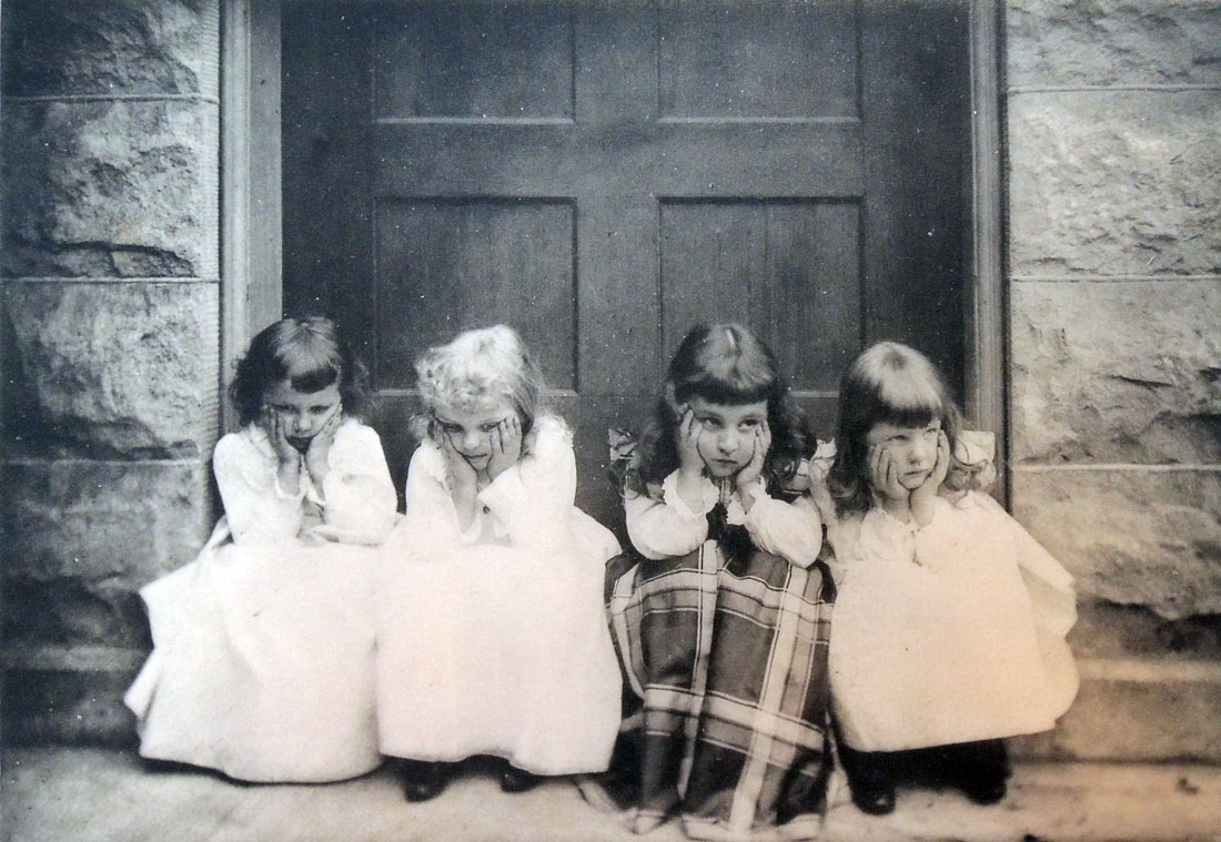
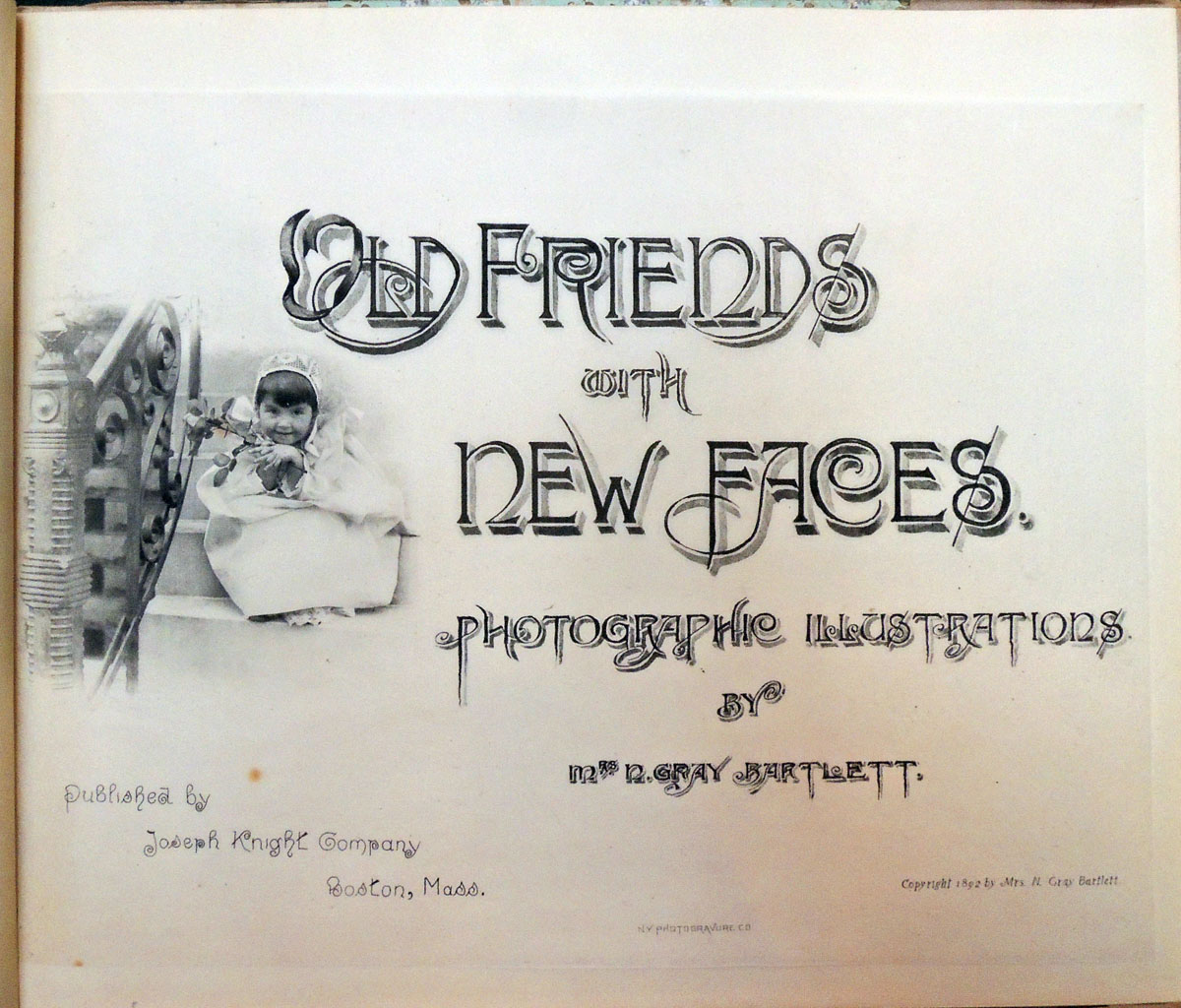
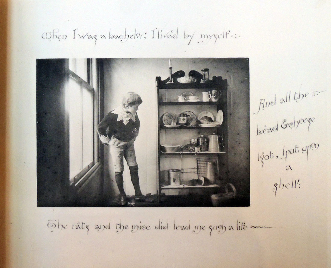
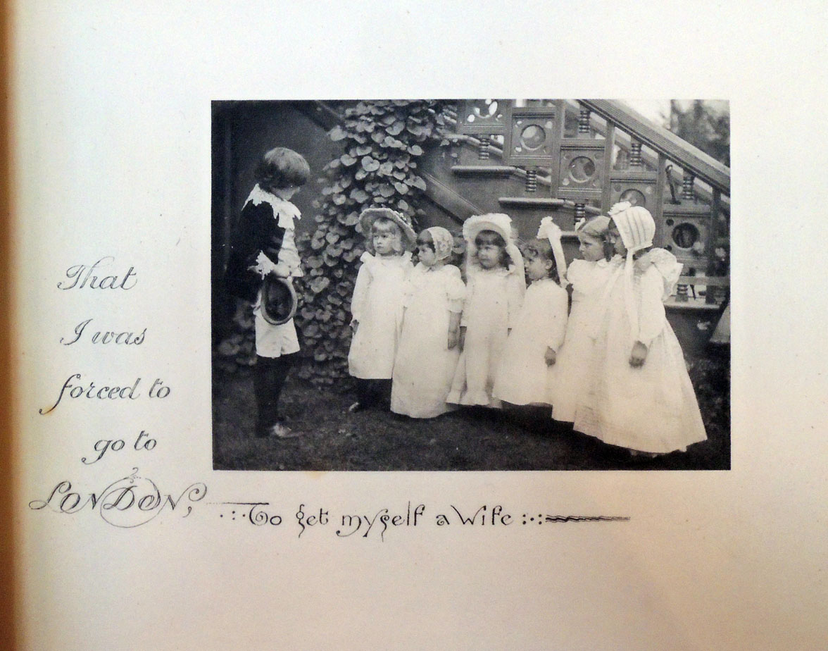
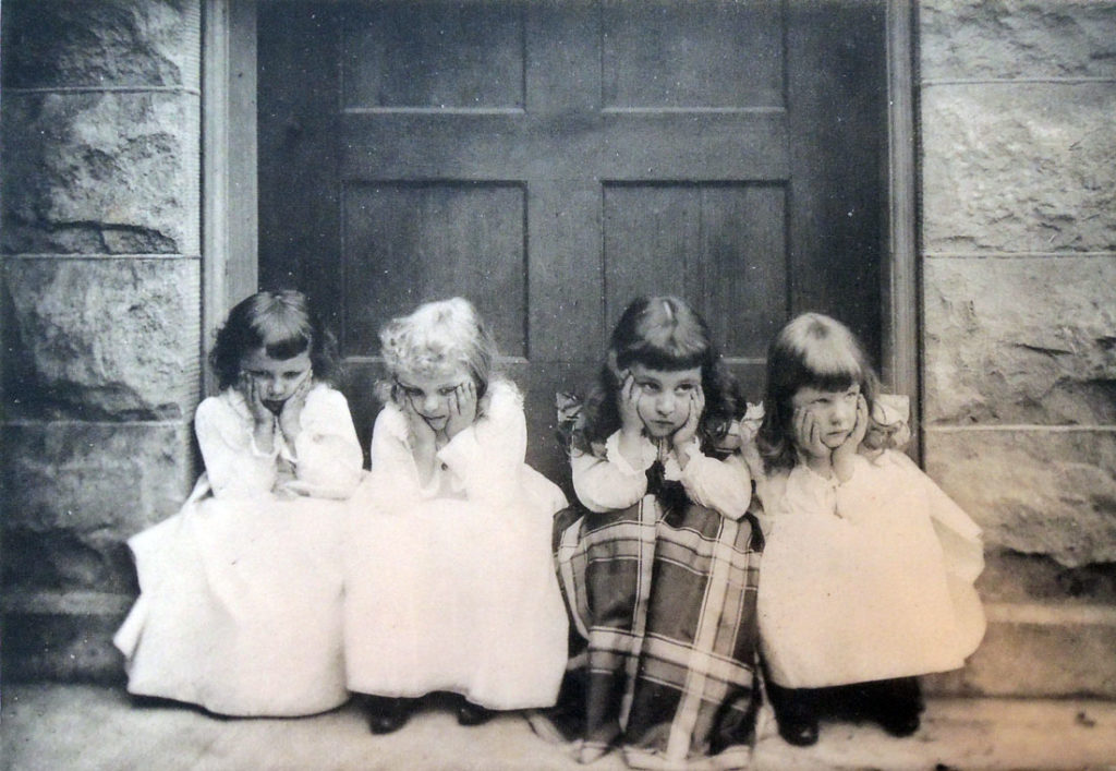
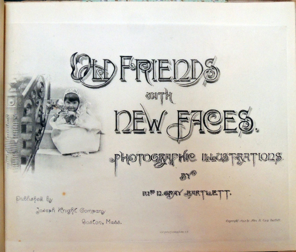
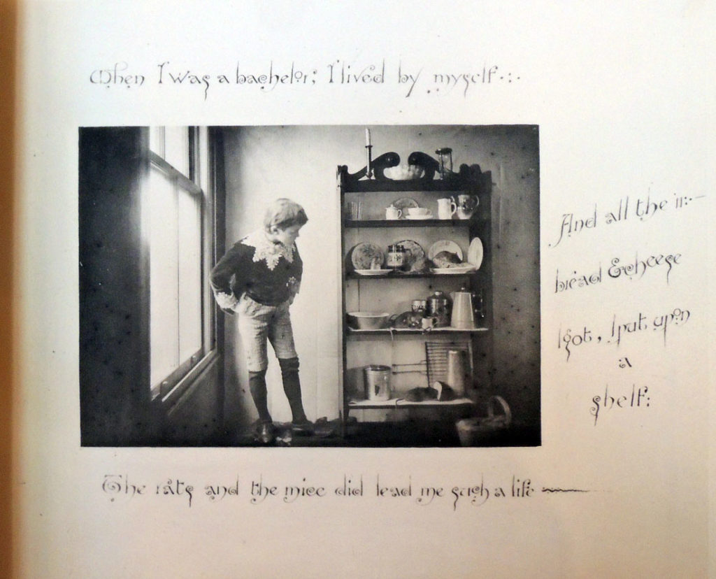
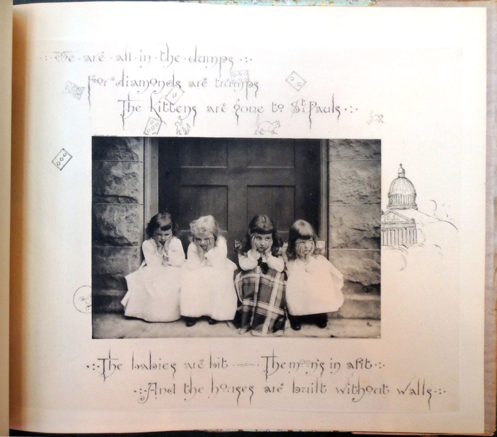
Chicago photographer Mary Ann (Mrs. N. Gray) Bartlett (1846-1913) made three books with Knight, the first in 1892 entitled Old Friends with New Faces. “The most original and genuinely pictorial product of photography we have seen for a long time,” wrote Edward Wilson. “It is a handsomely arranged series of photogravures of children grouped to illustrate Old Friends, the stories of Mother Goose. The New Faces are evidently good friends of the admirable artist, who so deftly caught them here and there in the garden and by the stairs, and so on, for she has made lovely pictures of them.”

“. . . This is no “hand-camera” or “snap-shot” work, but that of a thoughtful, artistic photographer, able to tackle pictures of a good size, and to make them well. . . . The pictures must be on whole-size plates, and they are, every one, technically excellent.”– Wilson’s Photographic Magazine 30, no. 434 (February 1893).

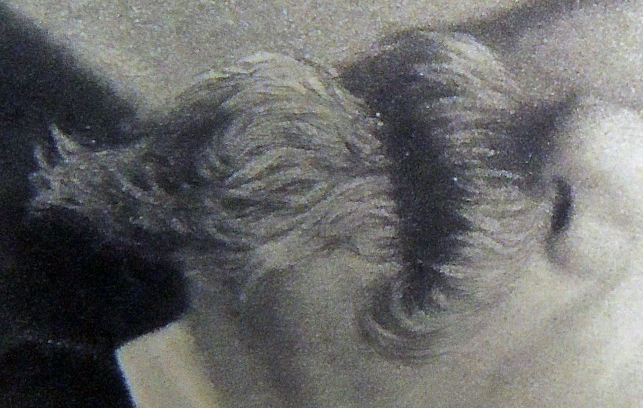
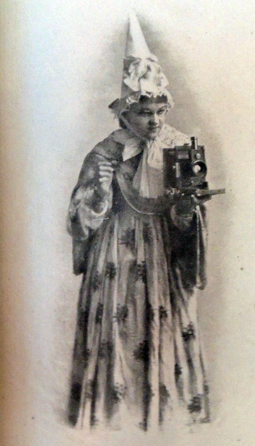
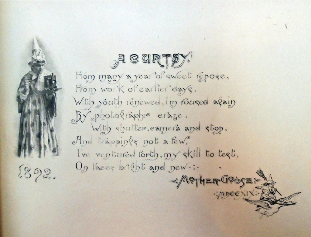
Born Mary Ann McCune, Bartlett married the chemist N. Gray Bartlett (1840-1917) and together they had four children: Greyson, Bertha Madelon, Allyn, and John. It’s Madelon [seen above] who poses for the frontispiece of “Old Friends” dressed up as Mother Goose with a camera and the verse:
A Curtsy
From many a year of sweet repose,
From work of earlier days,
With youth renewed, I’m roused again
By photographic craze.
With shutter, camera and stop,
And trappings not a few,
I’ve ventured forth, my skill to test,
On faces bright and new.
1892 Mother Goose 1719

Both husband and wife became active in the Chicago photography scene, but it was Mrs. Bartlett who rose to prominence among the amateur practitioners. Posing her children and neighbors in the backyard of their stately red brick home at 44 Ray Street, Bartlett took first prize for platinotypes at the Art Institute of Chicago’s 1888 exhibit. By 1890, she is named Director of the Camera Club of Chicago and illustrating stories in St. Nicolas, Outings, Scribner’s, and other national magazines.

In 1893, when the World’s Columbian Exposition came to Chicago, Bartlett was appointed chairman of the committee of the woman’s department of photography for the world’s congress auxiliary. She prepared a second book with Knight, Mother Goose of ’93, to be exhibited and sold in the Woman’s building, the Children’s building and the State of Illinois building.


She produced only one more book with Knight and the writer Marian L. Wyatt, called A Girl I Know. The entire narrative centers around her daughter Madelon, now a teenager.

Joseph Knight’s photogravure-illustrated books include:

Bits of Nature: Ten Studies in Photo-Gravure ([Troy, N.Y.: Nims & Knight, 1888]. Marquand Library in process

William Cullen Bryant, An Autumn Pastoral, the Death of the Flowers. With 15 illustrations by the Photogravure Co. after original drawings by C.E. Philips (Boston: Nims & Knight, 1888).

Thomas Gray, Gray’s Elegy and Its Author. Gray’s Elegy Written in a Country Churchyard with an Introduction and Illustrations from Original Photographs by Dr. J. L. Williams (Boston: Joseph Knight Company, 1890). 16 photogravures

S. R. Stoddard, Camp Life (Boston: Joseph Knight Company, 1890). 12 Photogravures.

W.G. Mitchell, Afternoon Tea: Photogravures from Original Photographs ([Boston: Joseph Knight Company, publishers, 1891]). 8 photogravures. Cotsen Children’s Library Eng 19Q 74839

Mary A. Bartlett, Old Friends with New Faces. Photographic illustrations by Mrs. N. Gray Bartlett ([Boston, Mass: Joseph Knight Company, 1892]). 10 photogravures. Graphic Arts Collection GAX 2018- in process

Henry Irving, The Drama; Addresses by Henry Irving (Boston: Joseph Knight Company, 1892).

Bits of Nature: Ten Photogravures of American Scenery. no. 2 (Boston: Joseph Knight, 1893).

Mary A. Bartlett, Mother Goose of ’93 ([Boston, Mass: Published by Joseph Knight Company, c1893]). 10 photogravures. A souvenir of the Columbian Exposition of 1893. Cotsen Children’s Library Eng 19Q 30529

Alfred (Lord) Tennyson, Song of the Brook (Boston: Joseph Knight Company, 1893).

William Cullen Bryant, Thanatopsis; and, A Forest Hymn (Boston: Joseph Knight Co., 1893). 13 photogravures.

Washington Irving, Rip Van Winkle (Boston: J. Knight Company, 1894). 24 photogravures

Mary A. Bartlett and Marian L. Wyatt, A Girl I Know ([Boston: Joseph Knight Company, 1894]). Cotsen Children’s Library Eng 19 74822

Mark Twain, The Innocents Abroad; or, The New Pilgrim’s Progress, in two volumes (Boston: Joseph Knight Company, 1895).

Seneca Ray Stoddard, Camp Life: Twelve Photogravures. No. 2 (Boston: Joseph Knight Co., 1895). 12 photogravures

Thomson Willing, Corp Dames of High Degree: being portraits after English masters, with decorations and biographical notes (Boston: Joseph Knight Company, 1896).

See more about Edwards: https://graphicarts.princeton.edu/2018/01/11/picture-periodical-without-letterpress/
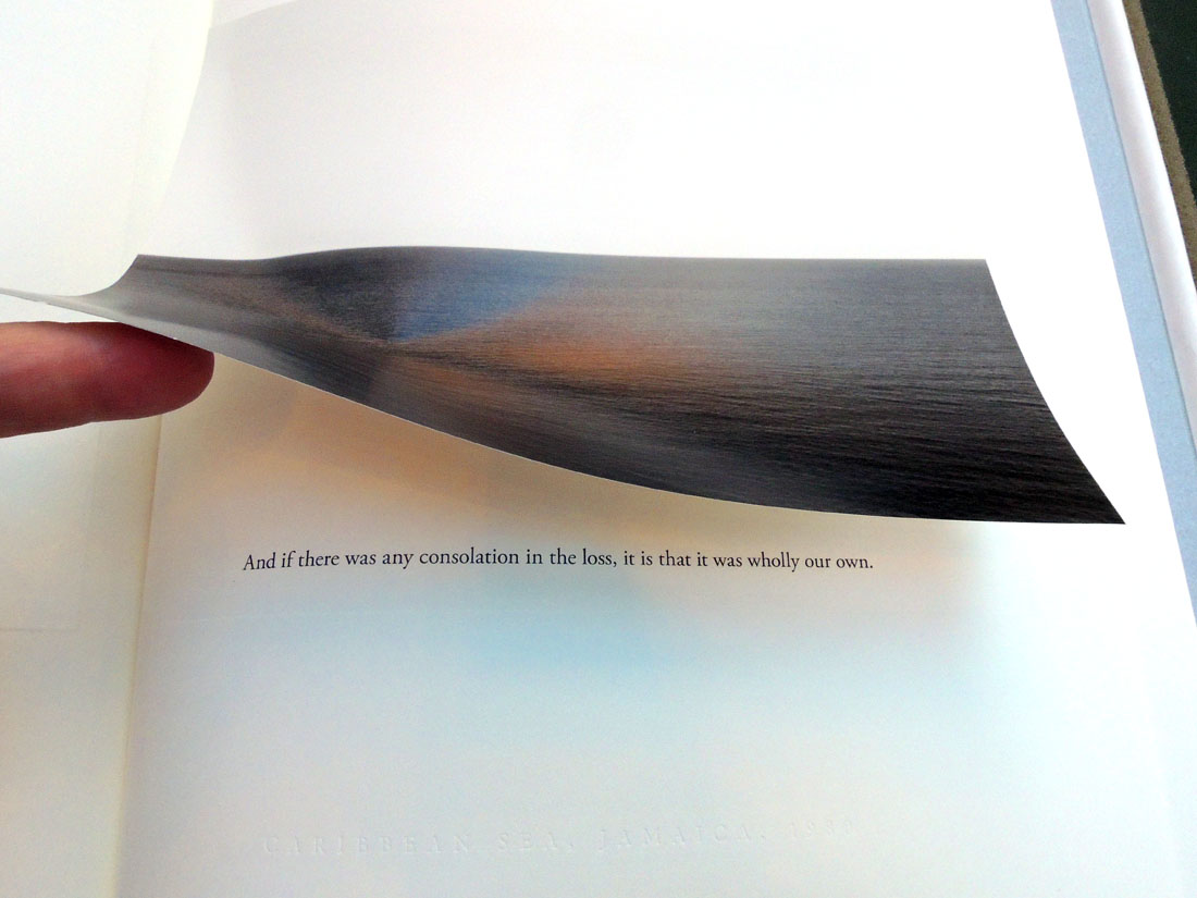
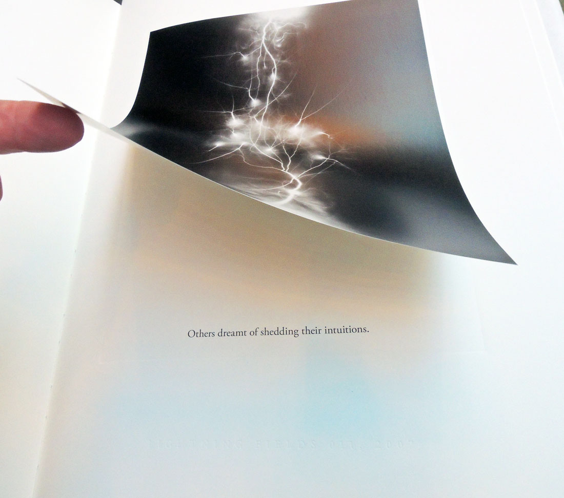
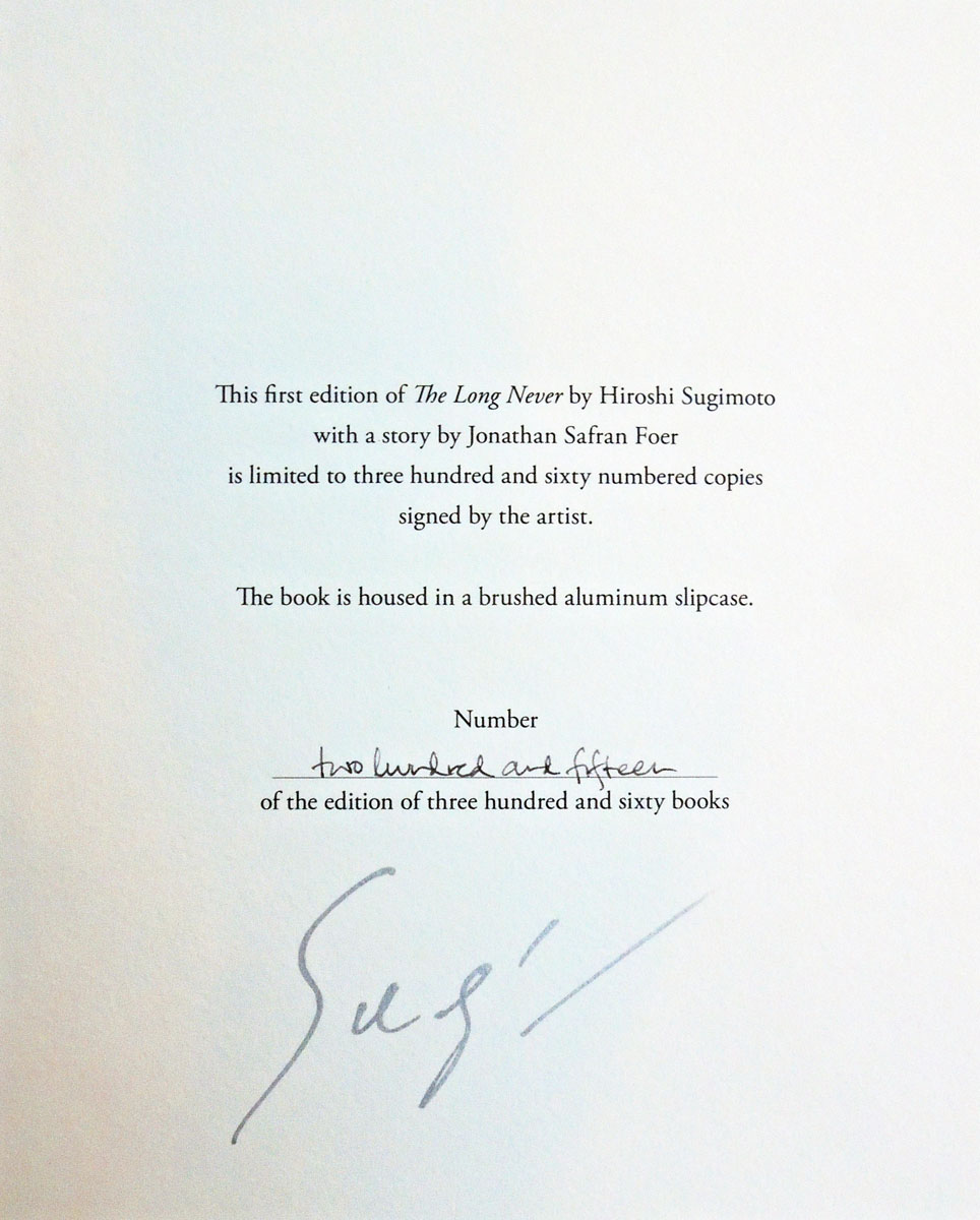
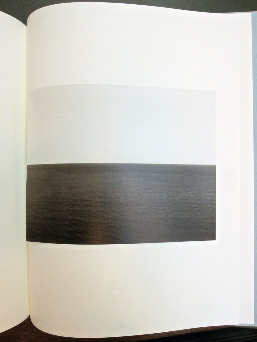
La manière de se bien préparer à la mort = How to Prepare Oneself Well for Death


Engravings after Romeyn de Hooghe (1645-1708) and commentary by M. de Chertablon, La Manière de se bien préparer à la mort par des considérations sur la Cène, la Passion et la Mort de Jésus-Christ, (How to Prepare Oneself Well for Death by Contemplating the Last Supper, the Passion and the Death of Christ), avec de très belles estampes emblématiques, expliquées par M. de Chertablon (Anvers [probably Amsterdam]: George Gallet, 1700). Graphic Arts Collection GAX 2018- in process

In 1673, a series of engravings were commissioned from Romeyn de Hooghe for David de la Vigne’s Miroir de la bonne mort. Since then various editions have been published with extended and translated commentaries, and in some cases, new plates re-engraved by unidentified artists. We know the engravings for the 1700 volume, recently acquired by the Graphic Arts Collection, are after de Hooghe and not by him, since they are laterally reversed from the original.

These plates are not as crisp and clear as Hooghe’s originals. Even so, it is the edition that is in most collections and so, known to most readers.

In each scene, a man is dying. An angel appears with a depiction of a biblical passage, encouraging the man to prepare for death in a Christian manner. If you look closely, you might also find a devil in the shadows, tempting the man away from the Christian path.

“In the tradition of ars moriendi that began in the sixteenth century,” writes Yuri Long at the National Gallery of Art, “this book shows the path to a good death through a series of meditations on the Last Supper, the Passion, and the death of Christ. Each print depicts a man contemplating a religious image accompanied by an appropriate verse of scripture and textual commentary. Though de Hooghe was a Protestant, this work is aimed at a Catholic audience and demonstrates his willingness to take commissions regardless of his own political or religious beliefs.” — www.nga.gov/content/ngaweb/exhibitions/2014/romeyn-de-hooghe.html


A detailed interpretation of each plate in the 1700 edition can be found at the Melbourne Prints website, where Benita Champion notes,

“Five images depict the angel accompanying the man while a devil tempts him . . . . This motif is common in ars moriendi works dating from the famous fifteenth century ars moriendi block-book, c.1414-1418. . . . The fight for the soul occurs at the moment of death (Ariès, 1981, pp. 206-208). In the above example (p. 44) the devil tempts the person to despair by showing him his sins. The angel’s response is Matthew 9:2 ‘take heart, son: your sins are forgiven.’”

The frontispieces are more programmatic and individual. The first shows a skeleton (death) knocking at a door, holding an hourglass and scythe. Above the door is written ‘statutum est omnibus hominibus semel mori’ (‘it is appointed unto men once to die’) (Hebrews 9:27). Courtly activity fills the middle ground. To the left a man carries a cross up the hill, towards a ‘radiant pyramid’ with a serpent devouring itself (Scherer, 1973, p.8).

Below the skeleton is an entombment, with skeletons. This scene in fictive relief is framed by conventional foliage and ribbons, but also by skulls, crossbones and a decorative border in the form of vertebrae. Signs of decay abound in skulls and snakes. The road is placed behind this inevitable death. Superficially death conquers all, but the courtiers, if they follow Jesus and the cross, will come to the pyramid, signifying the ‘infinite holiness of the triune God’, with death, now rendered powerless, eating itself (Scherer, 1973, p. 8).”


See also:
Ariès, P. The Hour of our Death, trans. H Weaver, New York: Knopf, 1981.

Coppens, C. Een Ars moriendi met etsen van Romeyn de Hooghe: Verhaal van een boekillustratie, Verhandelingen van de Koninklijke Academie voor Wetenschappen, Letteren en Schone Kunsten van België, Klasse der Schone Kunsten. Brussels: AWLSK, 1995.

Landwehr, J. Romeyn De Hooghe (1645-1708) as Book Illustrator; a Bibliography. Amsterdam: Van Gendt, 1970.

Landwehr, J. Romeyn De Hooghe the Etcher; Contemporary Portrayal of Europe 1662-1707. Leiden: A. Swijthoff, 1973.

Reinis, A. “Reforming the Art of Dying: The Ars Moriendi in the German Reformation (1519-1528),” St Andrews Studies in Reformation History. Aldershot: Ashgate, 2007.

Roth, F. “Pater Abraham a Sancta Clara, 1644-1709.” Monatshefte für deutschen Unterricht 36, no. 6 (1944): 288-303.

Scherer, W. F. “Through the Looking Glass of Abraham à Sancta Clara.” MLN 85, no. 3 (1970): 374-80.

Portrait of Niépce in Heliogravure 1856

For the seminal publication, Traité pratique de gravure héliographique sur acier et sur verre (A Practical Treatise on Photogravure Engraving on Steel and on Glass) by Niépce de Saint-Victor (1805-1870), either he or his publisher commissioned a portrait for the frontispiece.

To further celebrate Niépce’s important discoveries in photographic printing, they made the portrait using his own process: “Gravure héliographique d’après une photographie sur acier selon les procédés de Niépce de Ste Victor” (Photogravure engraving after a photograph on steel, according to the methods of Niépce de Ste Victor).


Claude-Félix-Abel Niépce de Saint-Victor (1805-1870), Traité pratique de gravure héliographique sur acier et sur verre / par M. Niépce de Saint-Victor (Paris: Librairie de V. Masson, 1856). Provenance: C. F. Chandler. Graphic Arts Collection 2006-3213N


Note the photograph was taken by Victor Plumier (1821-1878) and a great deal was made about the fact that he did not retouch his negative. The engraving plate was made by Madame [is it Pauline?] Riffaut and the portrait finished by Adolphe-Pierre Riffaut (1821-1859).

If you use a microscope, you will see the hand engraving on top of the aquatint done, in particular, in the beard. In addition, there are gouache highlights delicately added to the paper print in the hair and the beard.


It Seems Ridiculous

Endpapers front and back

I.N. Veroy and G. Ryklin, Kazhetsi︠a︡ smeshno: posvi︠a︡shchaetsi︠a︡ desi︠a︡tiletii︠u︡ Moskovskogo teatra satiry = Кажется смешно: посвящается десятилетию Московского театра сатиры [It Seems Ridiculous: Dedicated to the Tenth Anniversary of the Moscow Theater of Satire] (Moskva: Izd. Moskovskogo teatra satiry, 1935). Graphic Arts Collection GA 2018- in process

Several volumes on Russian film and theater history recently entered the Graphic Arts Collection, including the first and only edition of this photoessay on the Moscow Satire Theatre. Although 5000 copies are said to be published, the volume is rare. The photomontages, including wonderful endpapers, are by Chekryzov; the lettering on the title and the binding by L. Brodaty; and the graphics and illustrations by Brodaty, Ganf, Eliseev, Kukryniksy and Williams.


“On Triumphalnaya Square, between the Tchaikovsky Concert Hall and the “Aquarium” garden the Satire Theater is located. The building, which is over a hundred years old, got a modern look in 1960 upon the project of the architect V. Stepanov. The blind screen facade on the right was decorated with an illuminated square panel with the inscription “The Satire Theater”, on the left side of the façade planted theatrical masks were placed. The huge dome of the building testifies its age – it recalls the former famous circus of brothers Nikitin, built in 1910s by architect B. Nilus together with A. Gurzhienko.

Circus was located in the most popular amusement garden of Moscow – “Aquarium”, which thundered in different years throughout the capital for its theatrical programs. “Aquarium” was attended by thousands of Muscovites to watch the performances of the big-city and touring troupes of actors, acrobats, jugglers, trained animals, to have a dinner in the restaurant with live music in the shade of old trees and gurgling fountains.

Guests could also rise over Moscow on an air-balloon, make a keepsake photograph and admire the fireworks in the evening. “Aquarium” had a reputation of a “theatrical oasis”. The garden became famous for operettas of M. Lentovsky theater, ballet by Lydia Geiten, Frenchman Charles Aumont enterprise (he was the one who built the “Buff” and “Olympia” theaters), opera of Zimin theater and gypsy romances of the Blumenthal-Tamarin theatre.

In 1924 brothers Nikitin circus arena has been adapted for the first Soviet music hall, and in 1930 the building housed the Operetta Theater. In 1965 under the old dome a new hall was opened – the Satire Theater at last got a permanent residence after long process of moves.”

For more history on this Moscow institution, which is still in operation, see: https://um.mos.ru/en/houses/theatre-of-satire/


Autogravures from the Autotype Company

On Tuesday February 25, 1919, Virginia Wolff wrote in her diary:

Of no 23 Cromwell Houses . . . I will only say that it is furnished on the great South Kensington principle of being on the safe side & doing the thing handsomely. Good Mrs. Samuel Bruce went to the Autotype Company & ordered the entire Dutch school to be sent round framed in fumed oak. And so they were; & just covered the staircase walls, leaving an inch or two’s margin in between. –Anne Oliver Bell, The Diary of Virginia Woolf (1980).

Founded in 1868 as the Autotype Printing and Publishing Company, several shops merged and expanded over the next few years before settling as The Autotype Company at 74 New Oxford Street, London. This fashionable address became the place to go in the late 19th and early 20th centuries to buy reproductions of fine art to hang in your home. The managing partners of this enormous operation were John Alexander Spencer (182?-1884), John Robert Mather Sawyer (1828-1881), and Walter Strickland Bird (1828-1912).

Initially, the company purchased Joseph Swan’s copyright on carbon printing and an Autotype, in general, means a carbon print. Eventually the firm added collotypes and photogravure (called Autogravure) to their roster, selling framed prints, portfolios, and bound volumes to the social elite, including some of the most beautiful books of the period.


As the quality of their prints rose to challenge the superiority of the French Goupil Company, the Autotype company advertised their ability to ‘bring Paris to London’ and to prove it, published a portfolio of ten photogravures reproducing etchings by the preeminent French printmaker Charles Meryon (1821-1868).


Charles Méryon (1821-1868), Old Paris. Ten etchings by C. Meryon. Reproduced on copper by the autogravure process and accompanied with preface and illustrative notes by Stopford A. Brooke … ([London: Autotype Co., 1887]). Rare Books and Special Collections Oversize 1514.636e

Peter Henry Emerson (1856-1936) worked with the Autotype company that same year to publish his Idyls of the Norfolk Broads (1887) but was only partially satisfied.

The following year, he was introduced Charles L. Colls at the rival Typographic Etching Company, who printed his negatives for a special edition of The Compleat Angler.

Possibly to compare the talents of the two companies, Emerson had half his negatives for Pictures of East Anglian Life (1888) printed by the Autotype Company and the other half by Type-Etching Company.

Still unsatisfied, Colls taught the photographer to make his own copper plate photogravures and from that time on, Emerson did his own printing.


The Wars Occasioned by the French Revolution

“Britannia crowned by Victory, trampling upon the chains of France, holds in her right hand the Trident of Neptune, as Mistress of the Ocean, in her left hand Magna [Carta], whilst Fame is proclaiming to the World the Glory of her Arms, by pointing to some of her principle Battles inscribed on her Shield, which is supported by the Genius of Commerce; beneath are the Emblems of ancient and modern Warfare. London published by Rich. Evans…”


William Nicholson, The History of the Wars Occasioned by The French Revolution. Including A Sketch of the Early History of France, and the Circumstances which Led to the Revolution in that Country; Together with a Complete History of the Revolution in France, The War in Spain and Portugal, Russia, Prussia, &c. &c. Exhibiting a Correct Account of the General Congress at Vienna, the Escape of Bonaparte from the Isle of Elba, the Flight of Louis XVIII. from his Capital, the Defeat of Bonaparte at the Ever Memorable Battle of Waterloo, his Surrender to the British, and his Exile to the Island of St. Helena, with the Result of the Return and Re-establishment of Louis XVIII. on the Throne of France (London: Richard Evans Whites Row Spitalfields, 1816). 22 stencil colored wood engravings. Graphic Arts Collection GAX 2018- in process.

This history of the Napoleonic Wars from a British point of view is noted by some for the first account of a “diving boat” or submarine. Because the author is listed on the title page as L.L.D. [Doctor of Law], it can be assumed he is not the British portrait painter William Nicholson (1781-1844) or the British scientist William Nicholson (1753-1815) who wrote the multi-volume The British Encyclopedia, Or Dictionary of Arts and Sciences. The repetitive equestrian portraits of contemporary world leaders are so far unattributed (list below).


22 stencil colored plates:

1. Britannia, Crowned by Victory… [frontispiece].
2. Napoleon Bonaparte, Emperor of France. May 31, 1815.
3. Alexander 1st. Emperor of all the Russias… May 18, 1815. [Charles] Canton, del et sculp.
4. His Royal Highness, The Prince Regent of Great Britain. June 16, 1815.
5. Count Platoff, Hetman of the Cossacks. August 11, 1815.
6. Wm. Fred. King of Prussia. May 18, 1815. [Charles] Canton, del et sculp.
7. Field Marshall Von Blucher, Prince of Wagstadt. June 30, 1815.
8. The Duke of Wellington. June 29, 1815.
9. Lieut. General Sir Thos. Picton. Octr. 1815.
10. Lieut. General Lord Hill, K.B. Octr. 10, 1815. Meyron, del., [John] Romney, sculp.
11. Francis 2d Emperor of Austria. May 18, 1815.
12. His Royal Highness The Duke Of York. May 18, 1815. [Charles] Canton, del et sculp.
13. Lieut. General The Marquis Of Anglesea. Nov. 1815.
14. Lieut. General Sir John Moore, K.B. Dec. 1, 1815.
15. Field Marshall Prince Swartzenburgh. 1816. Meyron, del, [John] Romney, sculp.
16. Lieut. Genl. Sir Ralph Abercrombie. 1816,
17. The Battle of Waterloo. 1816. Engravd by [John] Romney, from a Painting by Heath.
18. Lieut. Genl. Sir Eire Coote K.B.K.C.&M.P. 1816.
19. Lieut. Genl. Lord Linedock. 1816.
20. Bernadotte Crown Prince of Sweden. 1816.
21. The Prince Of Saxe Cobourg. 1816.
22. The Prince of Orange. 1816.


The 100th Edition of The Compleat Angler

We live in an age of editions de luxe, and so bewildering nowadays is the succession of costly and elegant volumes issuing under this title from the contemporary press that it might seem a task of insuperable difficulty to assign the prize for supreme beauty to any one of them. If, however, we were bound to pronounce a judgment of Paris between the various competitors, our award would go with little hesitation in favour of the two Splendid volumes published by Messrs. Sampson Low & Co., . . .

The “Lea and Dove Edition” (the 100th) of “The Compleat Angler” is a work by which the English printing industry and publishing enterprise of the later nineteenth century might well consent to be represented before the severest aesthetic tribunal of posterity, for clear-cut beauty of typography, for sober richness of binding and decoration, for lavish wealth and artistic excellence of illustration, it is a veritable triumph of the arts which have co-operated in its production.—The Daily Telegraph 1888

In 1888 I brought out the “Lea and Dove” edition, being the hundredth edition of “The Compleat Angler,” in two volumes, small quarto, and a limited large-paper edition. My idea was to make illustrations of scenes on the rivers Lea and Dove the leading feature of this issue, and to give the text of the old classic in a style worthy, if possible, of its hundredth edition, and entirely unencumbered with notes. The text was printed from new type by Messrs. William Clowes & Sons, Limited, who took the greatest interest in the work.

The illustrations consist of about one hundred small woodcuts and fifty full-page photoengraved plates of views on the Lea and Dove—those on the Lea by Mr. P. H. Emerson, B.A., and those on the Dove by Mr. George Bankart. Possessors of this edition may at any rate rest satisfied that it will not be reprinted, as the copperplates I had transformed into boxes for keeping fly-books free from moth, and the type has been distributed. Of the reception of this edition both by the Press and the public I will only say that I was more than satisfied.

–Robert Bright Marston, Walton and Some Earlier Writers on Fish and Fishing (Firestone Z5971 .M377 1894)

Dodd, Mead & Co. have made arrangements with Sampson Low, Marston, Searle & Rivinglon, and purchased the right in America for a limited number of a limited edition of “The Compleat Angler,” to be published this autumn.

. . . It will be known as the Lea and Dove edition. The ninety and nine editions already in the field do not deter Mr. R. B. Marston, the editor, from the idea that his firm can turn out a hundredth edition that shall have a worthy place among its predecessors. He has himself edited the ever-popular work which Charles Lamb said “might sweeten a man’s temper at any time,” and prepared biographies of Walton and Cotton for it.

The illustrations have been prepared especially for it, and depict charming scenes on Walton’s favorite rivers, which, with few exceptions, have never before appeared in the editions of Walton. There will be upwards of fifty full page photogravures, printed from copper-plates, on fine plate paper.

The quiet pastoral scenery of the river Lea is shown in a series of pictures taken by Mr. P. H. Emerson, whose fine photogravures in his works, “Life and Landscape on the Norfolk Broads” and “Peasant Life in East Anglia,” have been so much admired. The views on the rivers Dove, Wye, etc., are by Mr. George Bankart, President of the Leicester Photographic Society and one of the most successful living amateur photographers..—Publisher’s Weekly October 13, 1888.


The Publishers’ Circular and General Record of British and Foreign Literature, 51 (1888)

Izaak Walton (1593-1683), The Compleat Angler, or, The Contemplative Man’s Recreation: being a discourse of rivers fish-ponds fish and fishing written by Izaak Walton; and instructions how to angle for a trout or grayling in a clear stream by Charles Cotton; edited and arranged by R. B. Marston; with fifty-four photogravures and about 100 woodcuts; and containing a reprint of The Chronicle of the Compleat Angler, a [biblio]graphical record of its various editions and imitations by T.Westwood and T.Satchell (London: Sampson Low, Marston, Searle and Rivington, 1888). Copy 165 of 250. Royal Quarto Edition De Luxe. Graphic Arts Collection (GAX) Oversize 2006-0967Q

Blizzard on Fifth Avenue, traffic coming and going

Above: New York Times February 26, 1893, p. 9.   Below: New York Times February 18, 1893

February of 1893 brought terrible weather throughout the United States with the “heaviest snowfalls in years” recorded for New York City.

Alfred Stieglitz (1864-1946) took a day off from work at the Photochrome Engraving Company (formed after the demise of the [New York] Heliochrome Company), and famously spent several hours shooting photographs on Fifth Avenue with a hand-held camera. In particular, he captured a horse drawn coach coming towards him and then, driving away.

Back in the Photochrome studio on Leonard Street, he printed some as magic lantern slides and on April 7, 1893, presented them at the Exhibition of Lantern Slides for the Society of Amateur Photographers of New York.

“The first slides shown were by Alfred Stieglitz, comprising scenes on the Battery, the squalid localities of New York, as well as some interesting souvenirs of life on Fifth Avenue between Murray Hill and the Central Park, and several shots taken during the sloppy weather of March. They exhibited the same knowledge of what to do and how to do it that we have become accustomed to expect from the hand of this accomplished photographer.”– “Society News,” The American Amateur Photographer: A Monthly Review of Amateur Photography (New York), 5, no. 5 (May 1893).

Below: Detail from John Corbin, “The Twentieth Century City,” Scribner’s Magazine 33, no. 3 (March 1903).
Over the next few years, various negatives from the blizzard were printed as photogravures, carbon prints, gelatin silver prints, and as halftone ink prints making the chronology of these iconic images and their reproductions complex. It is unfortunate that today most paper copies of the publications where they appeared are only available in digital form, leaving the identification of the ink print process impossible.

Ink prints of Stieglitz’s negatives for “Winter-Fifth Avenue” appeared in the Photographic Times, 28 (April 1896); W. I. Lincoln Adams (1865-1946), Sunlight and Shadow (New York: The Baker & Taylor company [1897]); the luxury photogravure portfolio Picturesque Bits of New York and other studies (New York: R. H. Russell, 1897); Alfred Stieglitz, “Pictorial Photography,” Scribner’s Magazine 26, no.56 (November 1899); John Corbin, “The Twentieth-Century City.” Scribner’s Magazine 33, no. 3 (March 1903); and of course, Camera Work: A Photographic Quarterly 12 (October 1905). p. 7; among many others. Multiple negatives, multiple processes, multiple headaches.

Detail from W. I. Lincoln Adams (1865-1946), Sunlight and shadow (New York: The Baker & Taylor company [1897]). Originally published in the Photographic Times, 1896. Recap 4597.114.2


Alfred Stieglitz, “Winter-Fifth Avenue,” 1893, carbon print 1894.

The Blizzard, New York. Gelatin silver print, used for the reproduction in Corbin’s article 1905.

Alfred Stieglitz, “Pictorial Photography,” Scribner’s Magazine 26, no.56 (November 1899).

 
Nine versions are listed in: Sarah Greenough, Alfred Stieglitz: the key set: the Alfred Stieglitz collection of photographs (Washington, D.C.: National Gallery of Art; New York : H.N. Abrams, 2002). Marquand Library Oversize TR653 .N38 2002q.

Note: In-between blowing snow the signs can be read.


Advertisement for Stieglitz’s Picturesque Bits of New York (New York: R.H. Russell, 1897) in Bibelot 3, no. 12 (December 1897). No illustration but price: $25.