Category Archives: Illustrated books

illustrated books

Festschrift for Adolf Müller, publisher of “Mein Kampf”

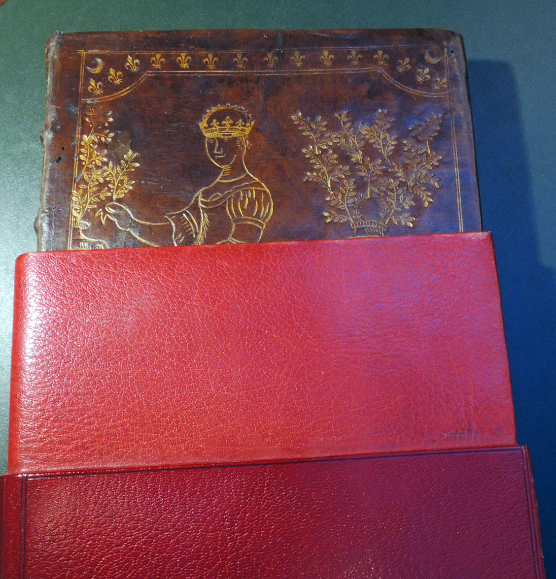
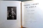
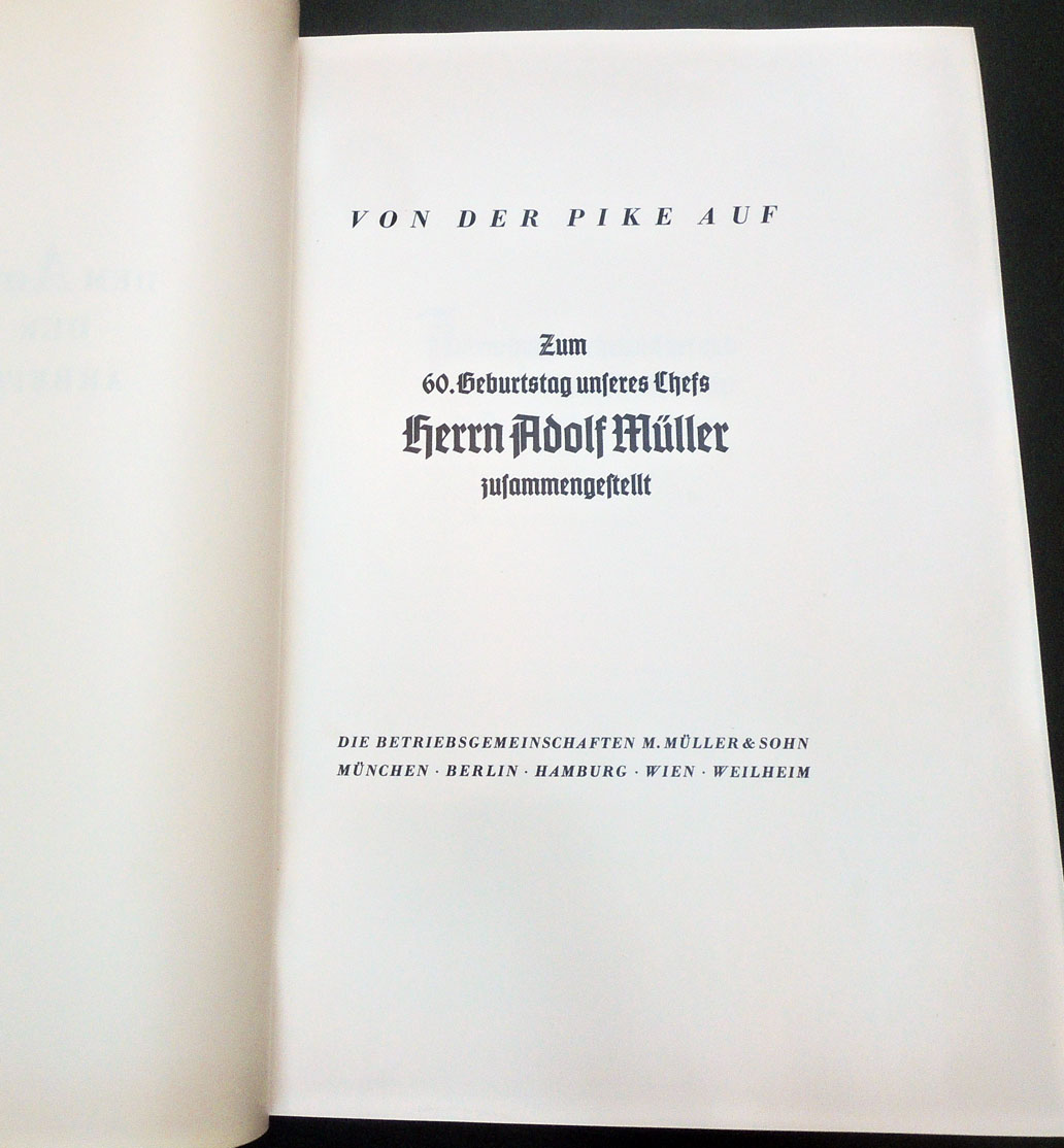
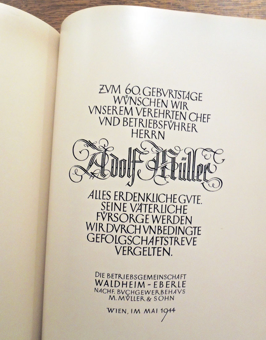
Adolf Müller (1884-1945), Von der Pike Auf, Zum 60. Geburtstag unseres Chefs herrn Adolf Müller zusammengestellt [Munich: H. Schwaiger, 1944]. Frontispiece portrait and approximately 300 black & white photographs on 104 glossy photo paper. 160 unnumbered leaves of text, all printed on coated glossy paper. Graphic Arts Collection 2018- in process.

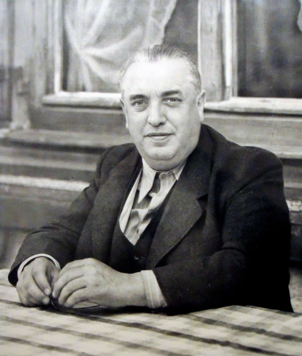
The Graphic Arts Collection recently acquired this richly illustrated festschrift for Adolf Müller (1884-1945), the publisher of Mein Kampf and close confidante of Hitler from the earliest days of the Nazi party. Issued to celebrate the publisher’s 60th birthday on May 4, 1944, only two copies were privately printed. Approximately one year later, on May 23, 1945, Müller hanged himself in prison following his capture by American troops.

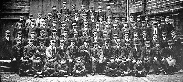
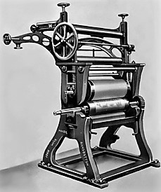
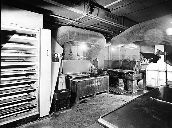
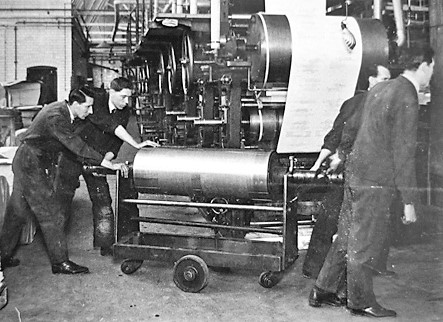
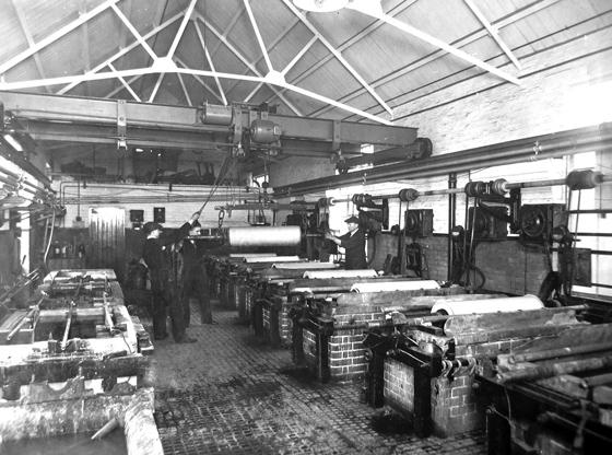
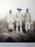
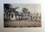
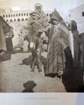
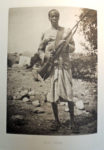
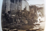
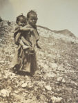
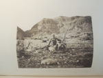
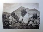
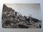
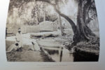
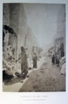
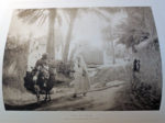
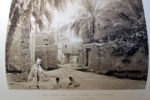
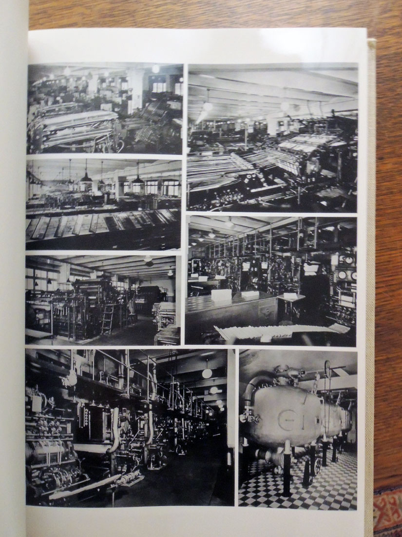
Müller’s personal copy was bound and presented to him from the firm. This is the copy now at Princeton University Library. The volume contains a first-hand history of the Nazi party’s control of media in the pre-World War II period, as well as documentation of Müller’s publishing empire and his relationship with Hitler. The photographs show printing equipment, offices and factories, intimate shots of Müller’s offices, and reproductions of significant publications.

Quotes below are from the dealer’s well-researched description:

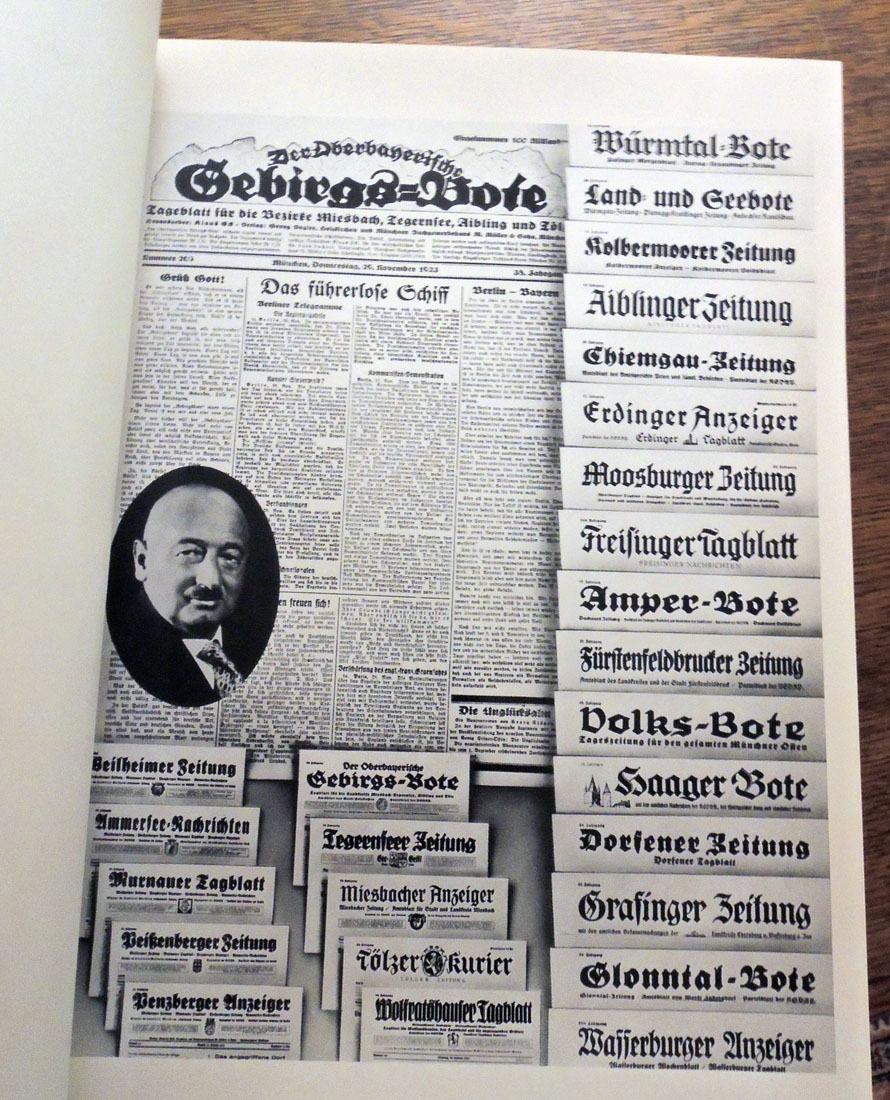
Müller was an intimate friend of Hitler — it was Müller who picked him up from Landsberg prison (documented within) in 1924 and Hitler lived in the publisher’s house in Tegernsee. Müller published Mein Kampf in 1925 and all its subsequent editions. The chief publisher of the Nazi party, he directed the printing of the newspaper “Völkischer Beobachter,” a vital arm of the Nazi propaganda effort.

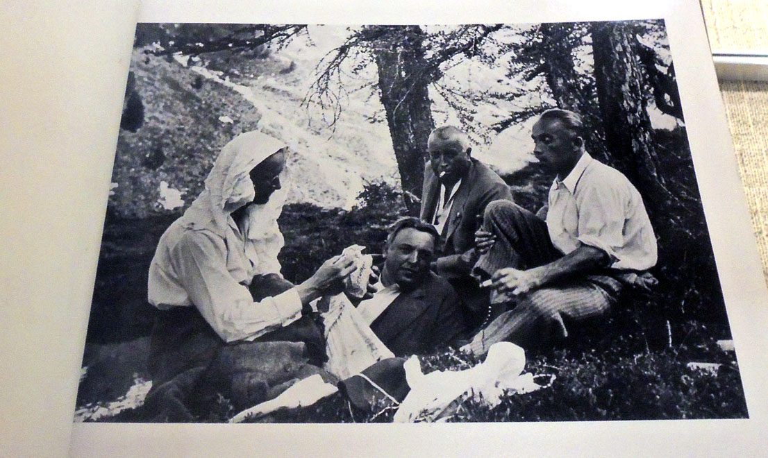
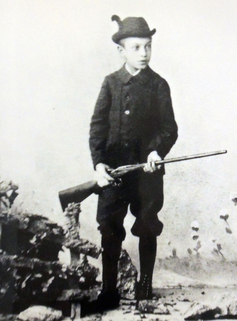
Müller parlayed his firm’s importance to the Nazi cause from its earliest days into powerful administrative positions and a close friendship with Hitler. Intimate scenes of Müller show him hunting and fishing, participating in Nazi rallies, working at his desk, conferring with prominent Nazi officials, etc. Among the many images of Müller’s personal life, Hitler appears in twelve images, including one where he has just been released from Landsberg prison following the Beer Hall Putsch and stands next to Müller’s car.

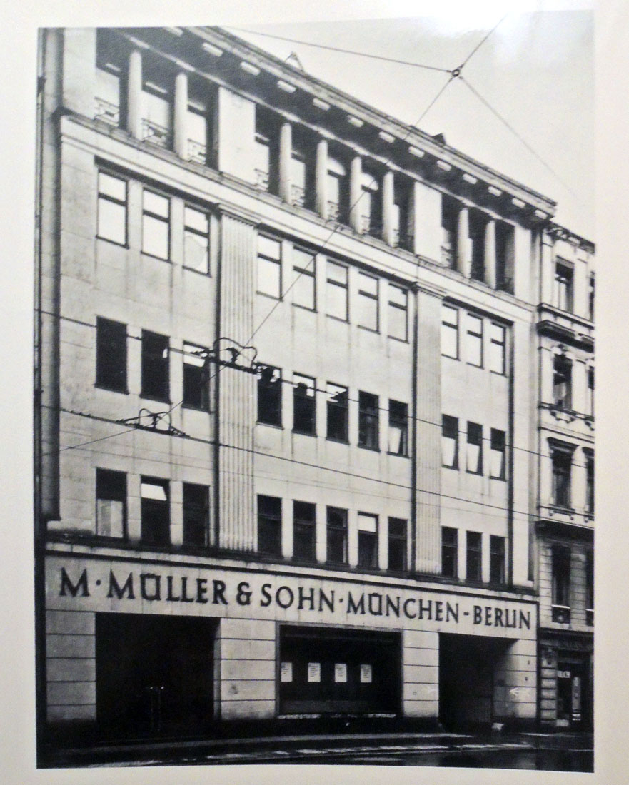
After his discharge from the German army in 1915, Müller founded the printing company Münchner Buchgewerbhaus M. Müller & Sohn, to publish newspapers and magazines. By the early 1920s he had formed friendships with members of the National Socialist German Workers’ Party and, starting in 1925, Müller’s firm was the party’s central publishing house.

Subsequently, the Nazi party entrusted to Müller the publication of Mein Kampf because of his friendship with Hitler. Once the Nazi party had taken over the German government, Müller’s business, benefitting from a near monopoly, grew exponentially. He officially joined the party at Hitler’s request in 1934. His firm printed more than two million copies weekly of various Nazi magazines and newspapers at the beginning of World War II. Müller’s leadership was an irreplaceable component of the Nazi party’s propaganda apparatus in the 1920s and through to the end of the war.


The text of this book provides a thorough account of Müller’s career, which, at times, is surprisingly candid. Certain portions touch upon the company’s claims that it was an impartial entity, even though it underwent a rapid change from a neutral publishing house into a company wholly involved in National Socialist propaganda.

Additionally, it becomes clear that this document was not intended for widespread publication since it openly discusses the company’s internal operations and political decisions in a very forthright and revealing manner.

Another section describes the firm’s entanglement in a controversy regarding the reporting of Germany’s annexation of Austria. Finally, there are extensive histories of the publication of Mein Kampf and the “Völkischer Beobachter.”

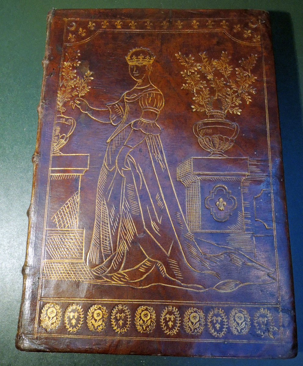
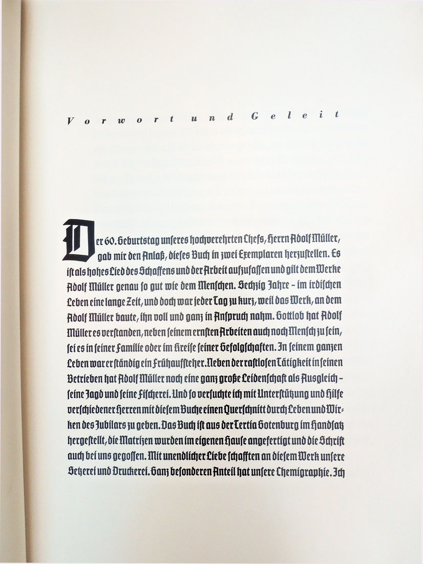
According to the preface composed by Heinrich Schwaiger, chief manager of the Munich headquarters, two copies of the work were printed, however the present copy was the only one bound and the second, which remained in sheets, can no longer be located. Despite Nazi Germany’s growing number of defeats by 1944 and the destruction of the company’s headquarters in a bombing raid, no expense was spared in this book’s production. An original Gothic font was cast especially for this book, and the company’s plant prioritized the high-quality illustrations on fine coated photo paper.


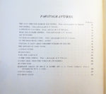
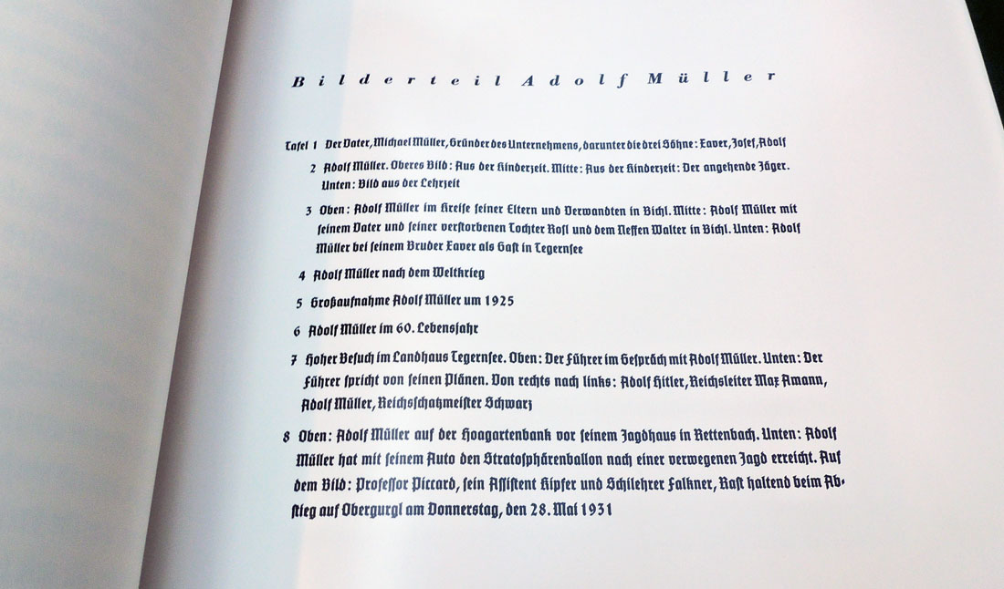
All of the photographs are fully described and the individuals identified. Here is one example of the many indexes through the volume.


Rapid Photogravure or Rembrandt Gravure

The Rembrandt Intaglio Printing Company staff pictured above, director Karl Klíč seated in the front row with his arm over Samuel Fawcett’s shoulder.

“When the whole history of rapid photogravure comes to be written (as I doubt greatly if it ever will be) it will be one of the oddest stories in the whole annals of our craft, and even today the oddities continue. Besides revelations exciting a smile, there might perhaps be revelations of some things of which complaint could at the time have fairly been made.” J. Albert Hepps, Printing Art 20 (1913).

Around 1879, Karl Klíč (1841-1926) perfected the engraving of copper plated cylinders instead of flat plates, in an attempt to speed up the slow process of photogravure. Although it was very expensive to engrave a single cylinder, once it was finished thousands of images could be printed making it financially viable for books, magazines and newspapers.

In 1895, Klíč joined Samuel Fawcett and the Storey Brothers printing firm in Lancaster to form the Rembrandt Intaglio Printing Company. Klíč convinced them to stop printing textiles and specialized instead in the reproduction of old master paintings and other art publications.

Thanks to the Sun Printers’ archive, here is a look at one of the first rotary gravure machines, a 15 in. calico printing press by John Wood of Ramsbottom, Lancaster, in 1910. (Photograph thanks to Digby Wakeman)

The Rembrandt Intaglio Printing Co., of Lancaster and London . . . were the first to introduce this class of work in 1896, and . . . they still stand unrivalled, the reputation of their work is firmly established, and they are to-day the premier company, and we admire them and their ability to keep their secret, for we believe that to this day the knowledge of “how it is done” is still theirs alone.

From the beginning the Rembrandt Intaglio process secured the highest appreciation of connoisseurs and collectors. Dr. Bode, Director of the Royal Museum, Berlin, describes their photogravures as the outcome of a perfected, and the only process which gives the richness and velvety effect of the old mezzotints.”.–Process: The Photomechanics of Printed Illustration 20, Issue 232 (1913).

One of the best examples of these rapid photogravures can be found in the two volumes of The Venture: an Annual of Art and Literature (London: J. Baillie, [1903-1905]. Rare Books 3584.932). Images are printed in black and brown inks until 1905 when Klíč succeeded in producing three-color rotogravure and the following year, his company begins marketing color gravure prints.

Rembrandt Intaglio never patented rapid photogravure but kept the process secret for many years. In 1904, when Eduard Mertens filed his own patent no. 17,198 for rotary photogravure, it was rejected. Not only had pictures and type been printed intaglio from the same copper plate for hundreds of years but the Rembrandt company had clearly been printing on copper cylinders long before Mertens’ application.

The fact that Mertens photographed both the text and the pictures onto a cylinder while the Rembrandt firm engraved the words by hand made no difference.

This decision cleared the way for European and American press manufacturers to sell rotary photogravure presses and for publishers to use them. By 1910, both letterpress text and gravure images were being printed together by Freiburger Zeitung [Freiburg, Germany] and in 1912, the New York Times followed.

Dozens of printing firms were established in major cities across the globe, leaving the Rembrandt Intaglio Printing Company bankrupt. The firm was acquired by the Sun Engraving Company in 1932, renamed Rembrandt Photogravure Ltd, and maintained until it closed in 1961.

Here are a few images of the 20th-century rapid photogravure or gravure printing at Sun Engraving, thanks to their online picture archive. Note the number of men needed to move the cylinders.

Sun Engraving Company gravure press

Carbon tissue room.

Moving of the cylinders

Copper plating of the cylinders.

A very peculiar and unique specimen of binding

The Graphic Arts Collection recently acquired a 1691 edition of poems by Lodovico Adimari (1644-1708) dedicated to Louis XIV, king of France (1638-1715). While the poems may be interesting, it is the binding that first drew our attention.

In the 1903 Book-Prices Current: A Record of Prices at which Books Have Been Sold at Auction, entry 6057 describes a book sold for £16:

Adimari (Lodovico). Poesie, alla Maiesta del Re Lodovico XIV. il Grande. Old morocco, full gilt back with stars and crescents . . . and a full-length figure of a crowned queen in gilt outlines, all apparently hand-tooled except a fieur-de-lis on one of the plinths, which appears to be stamped, a very peculiar and unique specimen of binding, Bologna, 1691.

When this volume was in the hands of Mortimer L. Schiff (1877-1931) he appears to have also considered the binding contemporary with the text.

But in the 1997 article, “A binding decorated c. 1880-1890, probably in Bologna – English and foreign bookbindings 77” in The Book Collector (1997), Anthony Hobson attributed the binding to “a gang of Bolognese forgers . . . torn between conflicting ambitions.” Should the book look Italian to fit the poet and publisher or should it appear French, to fit the larger market for French antiquarian books at the time? This is the concern that led to the book’s unique and hard to classify binding, according to Hobson.

Detail


Lodovico Adimari (1644-1708), Poesie di Lodovico Adimari, patrizio fiorentino e gentiluomo della camera del serenissimo di Mantoua alla maesta del gloriosissimo e cristianissimo re Lodovico XIV, il Grande ([Mantua?]: [publisher not identified], [1691?]) with Alla sacra reale maesta christianissima di Luigi il Grande (Bologna: Per gle Eredi di Antonio Pifarri, 1691). Graphic Arts Collection. Acquired with funds provided by the Rare Book Division, French Studies, and Graphic Arts Collection.

Printed presentation leaf from “Dottore Giouam-battista, e Caualiere Almerigo Visconti Bartholini”, to “Caualiere Francesco, Giouan-Maria, e Camillo Maria Visconti”, bound in at front. Manuscript presentation leaf to Dottore Giovambattista Bartholini from J.A.. Buzzichelli, with two leaves of manuscript verses by Buzzichelli, bound in at end.


On both front and rear covers, a double-rule frames a crowned woman in a long robe standing between two plinths that support potted laurels; crescents in three corners, an upper border of lilies and lower border of daisies and lilies; the crescent repeated in the spine compartments, edges sprinkled red and blue.

One source identified the female figure standing in silhouette as Queen Marie-Thérèse of Austria (1638-1683). Here is the queen’s official portrait by Charles Beaubrun (1604–1692) and Henri Beaubrun the younger (1603–1677), which matches the binding surprisingly well.

One of the rarest festival books of the 16th century

Detail

Hanns Wagner (1522-1590). Kurtze doch gegründte beschreibung des Durchleuchtigen… Fürsten… Wilhalmen Pfaltzgraven bey Rhein Hertzogen inn Obern und Nidern Bairen Und derselben geliebsten Gemahel der… Fürstin… Renata gebornne Hertzogin zu Lottringen… gehalten Hochzeitlichen Ehren Fests… Auch welcher gestalt die darauff geladnen Potentaten und Fürsten Personlich oder durch ire abgesandte Potschafften erschinen. Und dann was für Herrliche Ritterspil zu Ross und Fuess mit Thurnieren Rennen und Stechen. Neben andern vil ehrlichen kurtzweilen mit grossen freuden Triumph und kostlichkait in der Fürstlichen Haubtstat München gehalten worden sein den zwenundzwaintzigisten und nachvolgende tag Februarii Im 1568 Jar 1568. Munich: Adam Berg, 1568. Purchased with funds provided by the Rare Books Division, Marquand Art and Archeology, and the Graphic Arts Collection. Rare Books (EX) 2017- in process


This remarkable Bavarian fête book, considered to be one of the rarest, most significant, and most lavish festival books of the sixteenth-century, has been acquired by Rare Books and Special Collection at Princeton University Library.

The fourteen hand-colored engravings were designed by Nicolaus Solis (1542-1584), most signed with his monogram. “Il paraît certains que l’N et l’S entrelacés donnent le monogramme, non pas de Nicolas Schinagel, comme quelques-uns le croient, mais de Nicolas Solis, frère [sic] de célèbre Virgile Solis; et ce qui semble le confirmer, c’est que cet artiste travaillait à la cour de Guillaume V de Bavière” (Vinet 705). The artist was only twenty-six when he undertook the commission.

A facsimile of the beginning folding plate is included with this volume. Only five copies in the world have that engraving and it has been noted that finding a complete copy is near impossible: “C’est un des plus rares, et l’un de ceux qui peuvent le mieux servir à vous donner l’idée des coutumes et des plaisirs de Allemagne princière au XVIe Siècle” (Vinet 705). Three of the tournament engravings were supplied from another copy.

Solis’s enormous folding plates record festival scenes at the Court of Wilhelm V, Duke of Bavaria (1548-1626) staged for his marriage to Renée, Duchess of Lorraine (1544-1602) in February 1568. The celebration lasted eighteen days with performances, games, and tournaments said to include approximately 5,000 riders. Music was composed by Orlande de Lassus. The book was completed with remarkable speed, finished before the end of the year.

Detail


Provenance: “Georgius Wager, Consiliarigae Secretarig. Ag. 1675” inscribed in brown ink at foot of title; Pierre Berès, his sale, Paris; Pierre Bergé, 16 December 2005, lot 263.

References: Lipperheide 2553. Ruggieri 933-4. Vinet 705. Cicognara 1380 (“Questo è il più raro epiù prezioso libro che conosciamo, specialmente in quel secolo, in material di feste” in 1821). Andresen II, 90-94, No. 31-45.

Isadora Duncan

Margaretta Mitchell, Dance for Life: Isadora Duncan and Her California Dance Legacy at the Temple of Wings (Berkeley, Calif.: Elysian Editions, 1985). Copy 23 of 50. Rare Books: Theatre Collection (ThX) Oversize GV1785.D8 M57f


This limited edition portfolio includes an illustrated essay along with twelve photogravures of dancers inspired by and preserving the legacy of Isadora Duncan (1878-1927). Highlighted is the 1985 Oakland Museum exhibit “Dance For Life: The Bay Area Legacy of Isadora Duncan.” Mitchell’s negative were transferred to copper plates and printed by Jon Goodman in Massachusetts (see also https://graphicarts.princeton.edu/2015/04/09/).

Over many years, Mitchell photographed “women and children dancing in the style of Isadora Duncan at Berkeley’s Temple of Wings. Duncan’s influence is apparent in the flowing costume, the classical open-air setting and the graceful, expressive gestures.

Dance teacher Sulgwynn Boynton Quitzow is the daughter of Duncan’s childhood friend, Florence Treadwell Boynton who shared Duncan’s vision of life lived in harmony with nature and who dedicated the Temple of Wings in 1914 to the ‘democracy and freedom of women.’”


See also: Dorothea Lange, To a cabin [by] Dorothea Lange [and] Margaretta K. Mitchell (New York: Grossman Publishers, 1973). Marquand Library TR654 .L26 1973. Photography of children.

Grids, using straight lines, not-straight lines & broken lines in all their possible combinations

With sincere thanks to the Laura P. Hall Memorial Fund and the Hall Fund committee through the Department of Art & Archaeology, the Graphic Arts Collection has acquired this rare bound collection of etchings by Sol LeWitt (1928-2007).

The Museum of Modern Art digitized the entire volume here,  but the beauty of the ink on paper can really only be appreciated with the original. We anticipate this volume will be on exhibit in the Princeton University Art Museum during 2018. More information on that coming.


Sol LeWitt, Grids, Using Straight, Not-Straight, and Broken Lines in All Vertical & Horizontal Combinations (New York: Parasol Press, 1973). 28 etchings, bound as a book, with slipcase. Image Size:10⅝ x 10⅝ inches (27.0 x 27.0 cm); Paper Size:11 x 11 inches (28.0 x 28.0 cm). Edition of 25. Printed by Kathan Brown at Crown Point Press, Oakland, California. Catalogue raisonné 1973.03. Purchased with funds provided by the Hall Fund. Graphic Arts Collection GAX 2017- in process.
1. Straight/Straight
2. Straight/Not-straight
3. Straight/Broken
4. Straight/Straight, Not-straight
5. Straight/Straight, Broken
6. Straight/Not-straight, Broken
7. Straight/Straight, Not-straight, Broken
8. Not-straight/Not-straight
9. Not-straight/Broken
10. Not-straight/Straight, Not-straight
11. Not-straight/Straight, Broken
12. Not-straight/Not-straight, Broken
13. Not-straight/Straight, Not-straight, Broken
14. Broken/Broken
15. Broken/Straight, Not-straight
16. Broken/Straight, Broken
17. Broken/Not Straight, Broken
18. Broken/Straight, Not-straight, Broken
19. Straight, Not-straight/Straight, Not-straight
20. Straight, Not-straight/Straight, Broken
21. Straight, Not-straight/Not-straight, Broken
22. Straight, Not-straight/Straight, Not-straight, Broken
23. Straight, Broken/Straight, Broken
24. Straight, Broken/Not-straight, Broken
25. Straight, Broken/Straight, Not-straight, Broken
26. Not-straight, Broken/Not-straight, Broken
27. Not-straight, Broken/Straight, Not-straight, Broken
28. Straight, Not-straight, Broken/Straight, Not-straight, Broken

Egypt in photogravure

“Fred Boissonnas (1858-1946) was invited to Egypt in 1929 by King Fuad I to take photographs for the lavish publication L’Egypte (1932), and he returned to complete his Egyptian journey in 1933. During the later trip he embarked on a photographic expedition to Mount Sinai, following the route of the Israelites as recorded in the book of Exodus, and photographing the traditional biblical sites that he encountered on his journey. This work became the book project he never finished.”–Boissonnas in Egypt

Frédéric Boissonnas (1858-1946), Égypte; avec la collaboration de Gustave Jéquier, Pierre Jouguet, Henri Munier … [et autres]. Edition: 337 (Genève: Paul Trembley, 1932). “Sout la haut patronage et avec l’appui de sa Majesté Fouad 1er roi d’Egypte.” Marquand Library (SAX) Oversize DT47 .B64 1932e


Swiss photographer François-Frédéric Boissonnas (1858-1946) was 71 years old when he received the commission from the King of Egypt and Sudan, but he was up to the task having already produced two dozen books of photographs.

L’Egypte, which was published in 1932, is a fascinating example of the art of nation-branding. Royal patronage gave Boissonnas free rein to go where he wanted (only Tutankhamun’s mummy remained out of bounds due to stipulations from Howard Carter’s editors) . . . The book featured essays on the glory days of the pharaohs, on the Greeks, Romans and Copts, and the medieval period when Islamic culture flourished. The Ottoman Empire got a brief mention (King Fuad’s ancestor was a renegade commander who seized power from the Sultan at the beginning of the 19th century) but the British protectorate was conspicuously absent. This was soft power at its most sophisticated.” –Fleur Macdonald, “The Swiss Photographer Who Rebranded Egypt,” The Economist (November 8, 2017).

The typography for this luxury publication was by the Paris firm of Ducros et Colas and the photogravures were printed in Paris by Leblanc and Trautmann (who were also Pablo Picasso’s printers). The entire edition was printed on a special handmade paper by Van Gelder of Amsterdam and each book bound in full parchment with gold ornaments and color by Jacques Wendling.

This is Boissonnas’s portrait of Fuad I (1868-1936) King of Egypt and Sudan, Sovereign of Nubia, Kordofan, and Darfur.


If you are in London over the winter holidays, you can visit the exhibition “Boissonnas in Egypt” at the Saint Catherine Foundation. We have already missed the November conference. To learn more, see: https://www.saintcatherinefoundation.org/boissonnas-in-egypt


See also his many other books, most in rotogravure (that is, printed with a screen, not continuous tone images).

“La Sainte Bible” wants to have it all

James Tissot (1836-1902), La Sainte Bible (Ancien Testament) (Paris: M. de Brunoff, 1904). 2 v.: 400 illus.  “… deux états de tous les sujets horstexte, dont l’un en héliogravure … l’autre en couleur.” Rare Books: William H. Scheide Library (WHS) 199.2. Copy 374 of 560.

Late in 1882, James Tissot had a vision while praying in the church of St-Sulpice. “This prompted him to renounce formally all things secular and to devote his time to illustrating episodes drawn from Holy Scripture. In order to gather material he travelled to Palestine in 1886 and again in 1889.” (Benezit, Dictionary of Artists).

The resultant volume, The Life of Our Lord Jesus Christ (commonly known as Tissot’s Bible) includes reproductions of 250 watercolors and was so successful, Tissot joined Samuel Sidney McClure to form a publishing house to market the bible exclusively.


James Tissot (1836-1902), The Life of Our Saviour Jesus Christ; three hundred and sixty-five compositions from the four Gospels (New York: McClure-Tissot Co., 1899). Firestone Oversize ND553.T52 A3 1899q

Tissot worked from 1896 to 1902 on a companion volume of Old Testament stories. Hundreds of watercolors were planned but only a few were completed before Tissot died. His assistants painted and printed most of the scenes under the direction of his French publisher Maurice de Brunhoff (1861-1937).

Two years after Tissot’s death, La Sainte Bible was published with 400 reproductions in two ostentatious volumes. The images are heavy-handed and dull, 360 of them crowded into elaborate text pages and the other 40 printed as separate full-page plates. What’s more, each plate was printed twice: once in photogravure and once in color halftone.

Twenty copies of the “Imperial Memorial Edition” sold for $5,000 and 560 others sold for much less. Discount offers began appearing, with one 1907 sale offering both volumes for $16. Jacob Schiff (1847-1920) purchased the watercolors and donated them to the New York Public Library.


Spirited and Appropriate Illustrations by F.M. Howarth

The Graphic Arts Collection recently acquired the temperance novel Broken Fetters (1888) along with a four-page prospectus for the book. Publishers Weekly wrote, “A valuable work for those interested in temperance reform movements will be Broken Fetters, by Charles Morris, with numerous realistic and appropriate illustrations by F. M. Howarth…”–September 22, 1888. The title page called them “spirited and appropriate illustrations.”

Franklin Morris Howarth (1864–1908) was in fact not a realistic or appropriate artist but an American cartoonist, best remembered for his comic strips The Love of Lulu and Leander and Mr. E.Z. Mark.

The artist was only twenty-four when he was commissioned to illustration Morris’s temperance novel. He was not especially well-known at the time and it is odd that the illustrations of many artists are included but Howarth was the only one singled out on the title page and in the advertising. Three years later Howarth joined Puck magazine, where he gained national recognition and remained for ten years before he was persuaded to join the staff of The New York World.

An obituary for Howarth ran on September 23, 1908 in Philadelphia’s The Geneva Daily Times:

Frank M. Howarth, a widely known cartoonist, died yesterday morning at his home, 308 High street, Germantown, a suburb of this city, after suffering two weeks from double pneumonia. He was 44 [sic; he was five days short of turning 44] years old. During his early newspaper career Mr. Howarth was connected with the “Call” and “Item”, of this city. Recently he had drawn cartoons for the Chicago Tribune and had engaged in humorius [sic] colored syndicate work, his most noted series being those of “Mr. E.Z. Mark, and “Lulu and Leander.” He was the first artist who ever drew a free hand sketch of the scene of a murder for a newspaper.

Charles Morris (1833-1922), Broken Fetters. The Light of Ages on Intoxication. A Historical View of the Drinking Habits of Mankind, from the Earliest Times to the Present. Especially Devoted to the Various Temperance Reform Movements in the United States … Numerous Spirited and Appropriate Illustrations Drawn Expressly for This Work by the Celebrated Artist F. M. Howarth and Many Others… (Richmond, Va.: H.E. Grosh & Co., 1888). Graphic Arts Collection GAX 2017- in process

Africa in photogravure

Sir Alfred Edward Pease (1857-1939), Travel and Sport in Africa (London: Arthur L. Humphreys, 1902). Rare Books Off-Site Storage DT12 .P35 1902q

Princeton owns a beautiful three-volume set of Pease’s illustrated journals titled Travel and Adventure in Africa, with his personal photographs along with some by the French photographer Emile Frechon (1848-1921), the English aristocrat Sir Edmund Giles Loder, 2nd Baronet (1849-1920), and the environmentalist Edward North Buxton (1840-1924). Arthur Humphreys arranged to have several dozen printed in photogravure, providing a spectacular record of Somaliland in particular, along with other African locations. The group shown above is only a small selection. Surprisingly few document of killing of animals and focus instead on the people he and his wife met along the way.

“Pease was adventurous,” wrote his editor Peter Hathaway Capstick. “Between 1891 and 1912, he visited Asia Minor, Algeria, Tunisia and the Sahara, Somaliland, Abyssinia, Kenya, and Uganda, hunting wherever he could. He was Resident Magistrate of the Transvaal in Komatipoort, next to present-day Mozambique, from 1903 to 1905, and he worked in the Allied Remount service from 1914 to 1918. A keen explorer and hunter, Sir Alfred also sketched. He went on to write thirteen books embracing subjects as varied as wildlife, a dictionary on the North Riding dialect, and oases in Algeria!”—Editor’s note, The Book of the Lion (1911).

Pease’s epigram on the title page comes from the Latin:

Pone me pigris ubi nulla campis
Arbor a stiva recreatur aura,
Quod latus mundi nebulae, malusque
Jupiter urget.
Pone, sub curru minium propinqui
Solis in terra dominibus negata;
Dulce rideutem. Lalagen amabo,
Dulce loquentem.

Place me where never summer breeze
Unbinds the glebe, or warms the trees;
Whereever lowering clouds appear,
And angry Jove deforms th’ inclement year.
Place me beneath the burning ray,
Where rolls the rapid car of day;
Love and the nymph shall charm my toils,
The nymph who sweetly speaks, and
sweetly smiles.