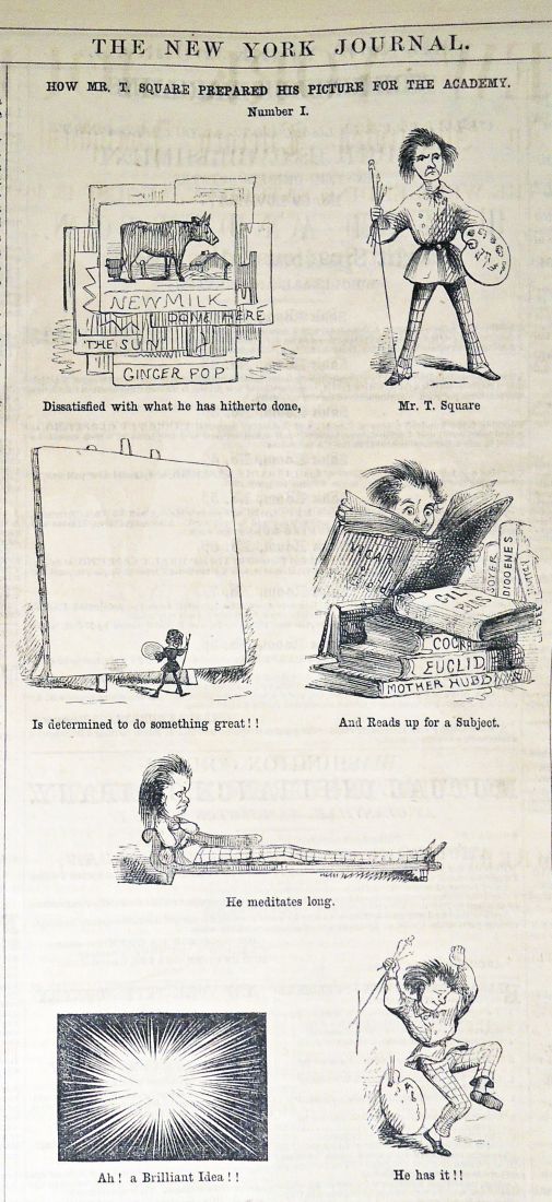

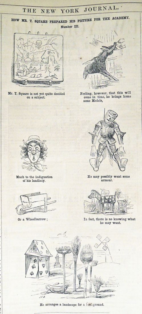
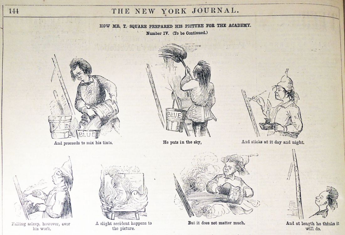

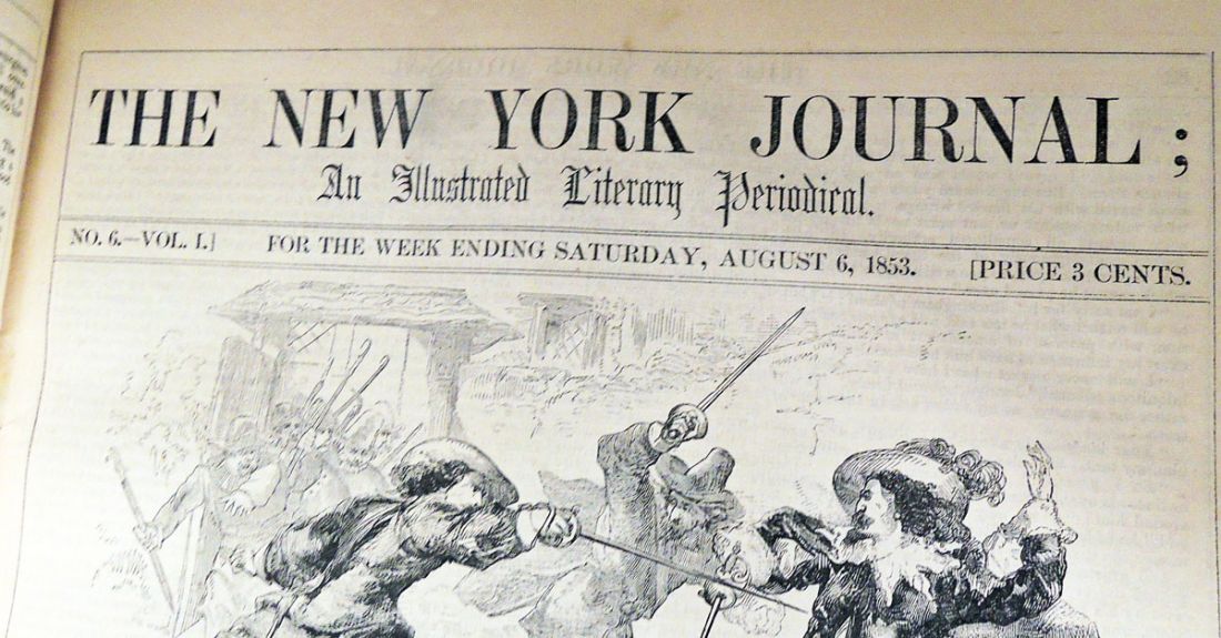
 Attributed to John McLenan (1827-1865), “How Mr. T Square Prepared His Picture for the Academy,” The New York Journal: An Illustrated Literary Periodical, Volume 1 (August-December 1853)

Attributed to John McLenan (1827-1865), “How Mr. T Square Prepared His Picture for the Academy,” The New York Journal: An Illustrated Literary Periodical, Volume 1 (August-December 1853)
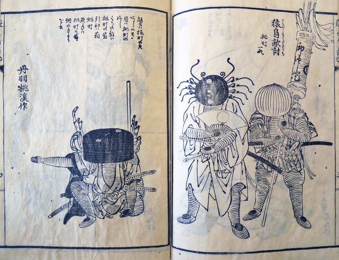
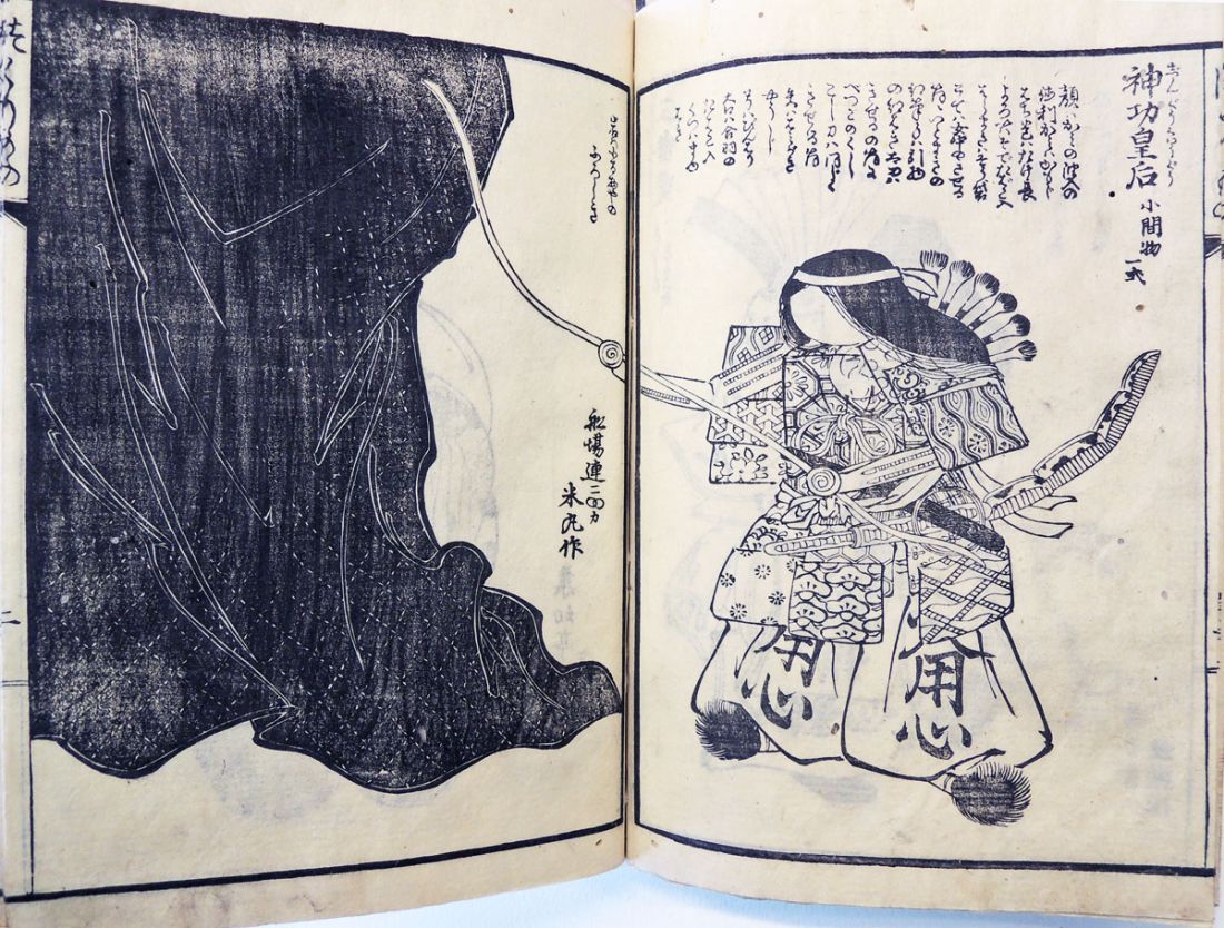
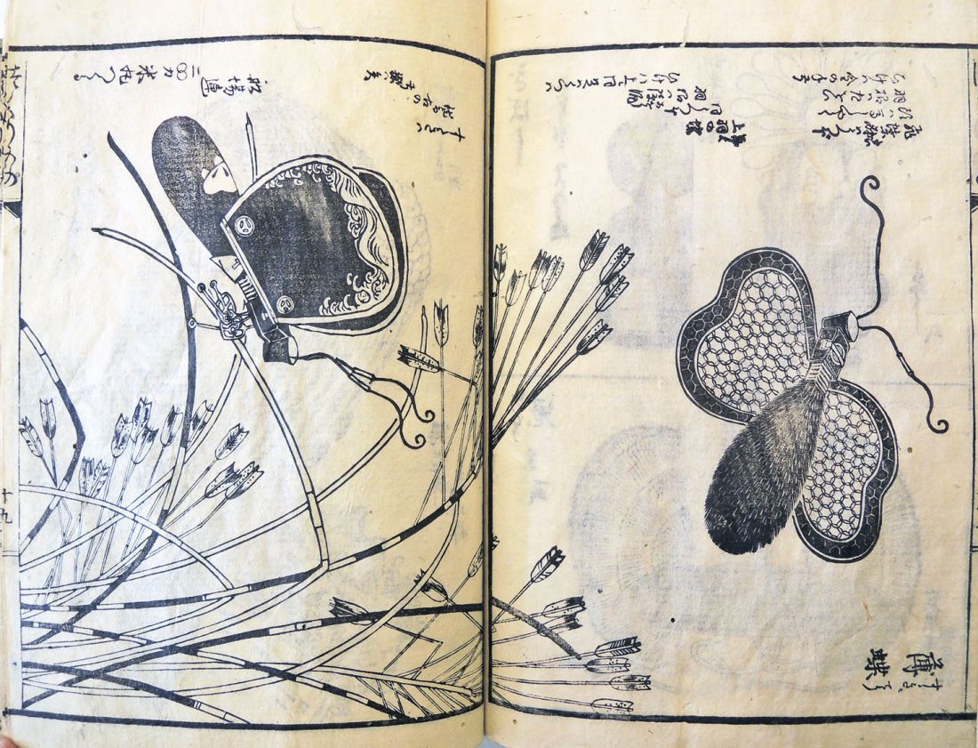
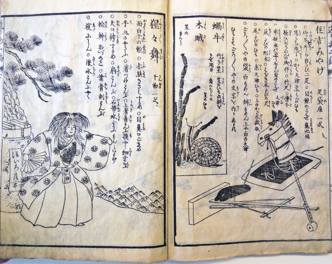
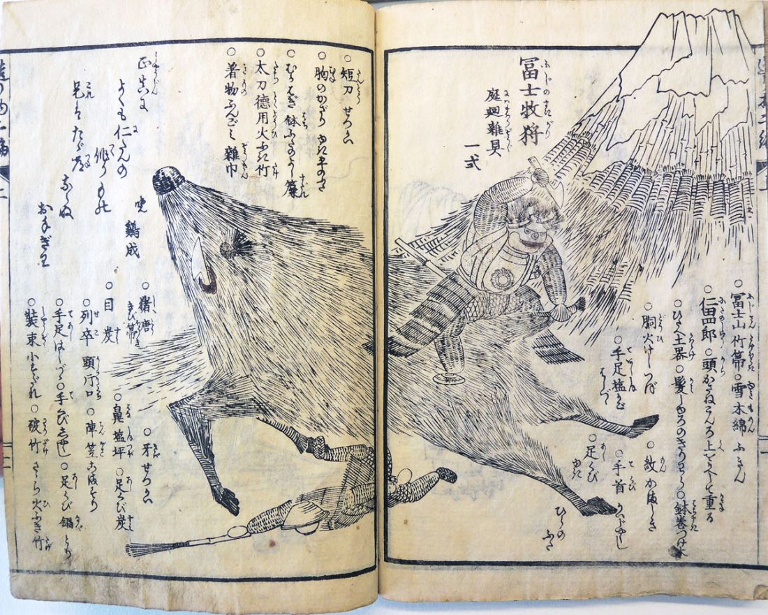
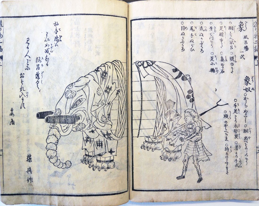
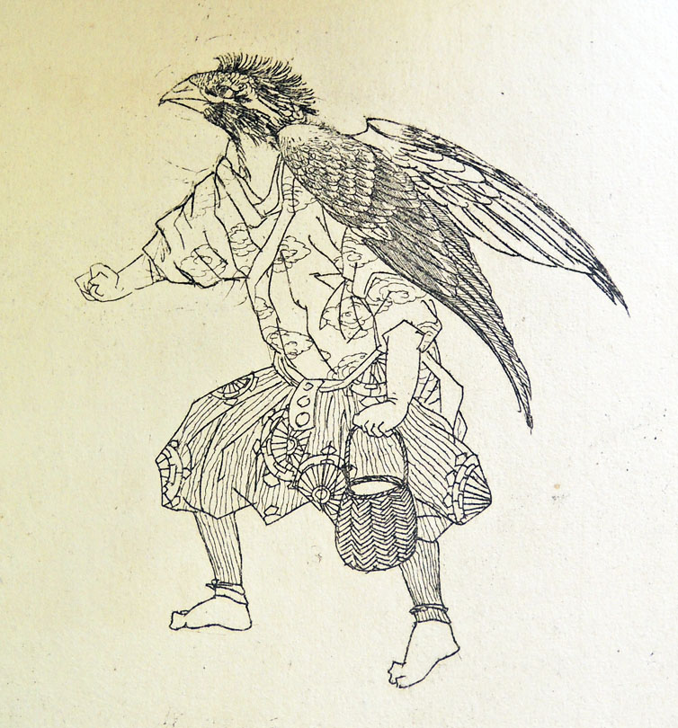
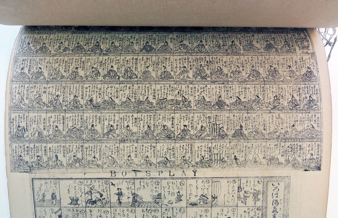
 Title: Tsukurimono shukō no tane
Authors: Kanenari Akatsuki, 1793 or 1794-1861 and Rikimaru Kirotei, active 1830s
Artist: Matsukawa Hanzan, 1818-1882
Period: Edo period (1615–1868) Osaka. 1837.
Set of two woodblock printed books in four parts
Graphic Arts Collection GAX in process
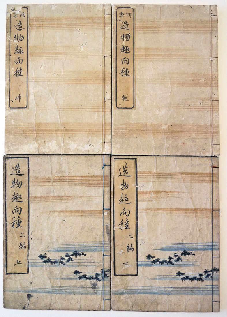
OCLC connects the Japanese illustrator Matsukawa Hanzan with 161 books, demonstrating the magnitude of this artist’s contribution to Ukiyo-e book publishing. This particular volume, however, is extremely rare and unusual among the artist’s work.
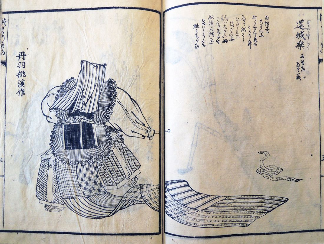
“Tsukurimono” is a type of folklore art of Japan which are made by ceramic, metal, vegetables or flowers. Matsukawa has created a variety of objects for theatrical props or other displays, but he does so by assembling mundane, everyday objects. Fish are built out of dried foods and an insect is made out of a broom and other cleaning tools. See if you can decipher not only the subject of the plate but also the materials that went into the making of each one.
For those who can read the Japanese you will understand that for each prop, there is an explanation of the materials employed along with a kyoka poem critiquing the object, each signed by various poets.
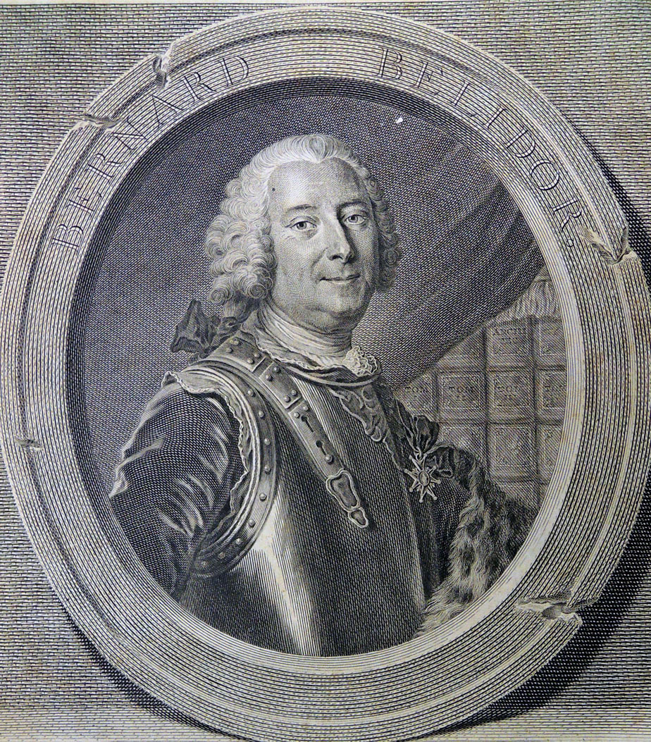
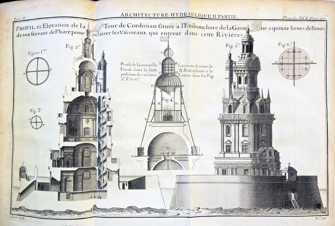
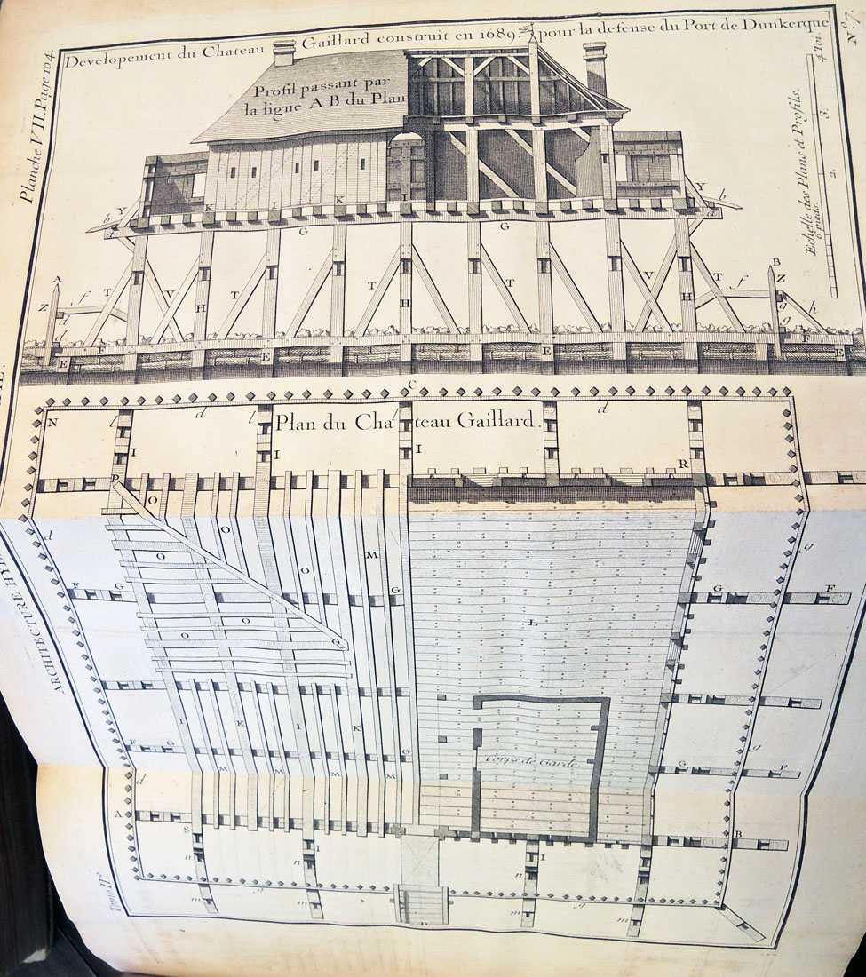
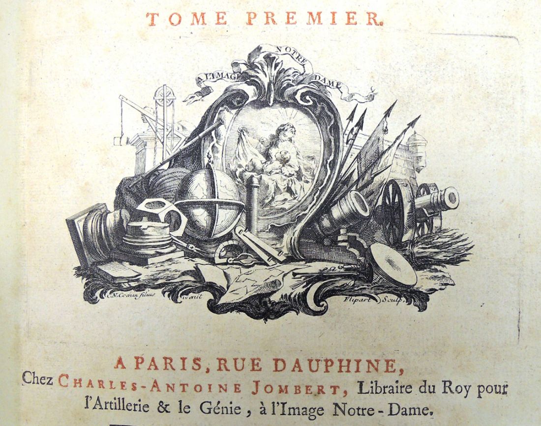
 Bernard Forest de Bélidor (1698-1761), Architecture hydraulique, ou l’Art de conduire, d’elever, et de menager les eaux pour les differens besoins de la vie … ([Paris]: C.A. Jombert, 1737-1753). Graphic Arts Collection recap in process
A check of the open stacks recently brought this 18th-century engineering textbook to our attention. Written by Bernard Forest de Bélidor (1698-1761) and published by Charles-Antoine Jombert (1712-1784), under his royal imprint “libraire du Roi pour l’artillerie et le génie,” the four volumes contain over 200 plates by some of the best French engravers of the period, including Antoine Hérisset (1685-1769), Robert François Bonnart (active 1726-1759), Jacques Rigaud (1681-1754), and many others. The books have been moved to our secure department holdings.
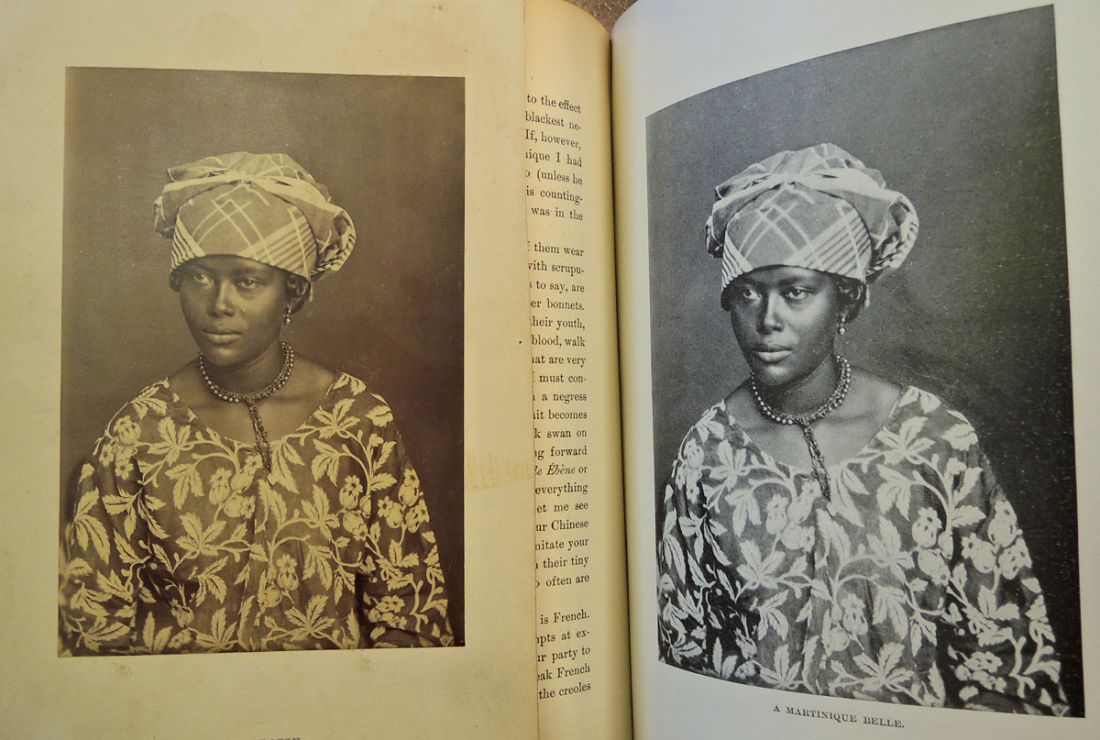
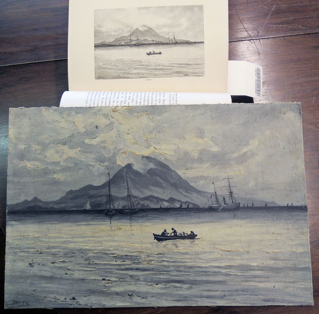
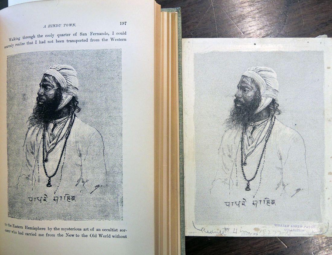
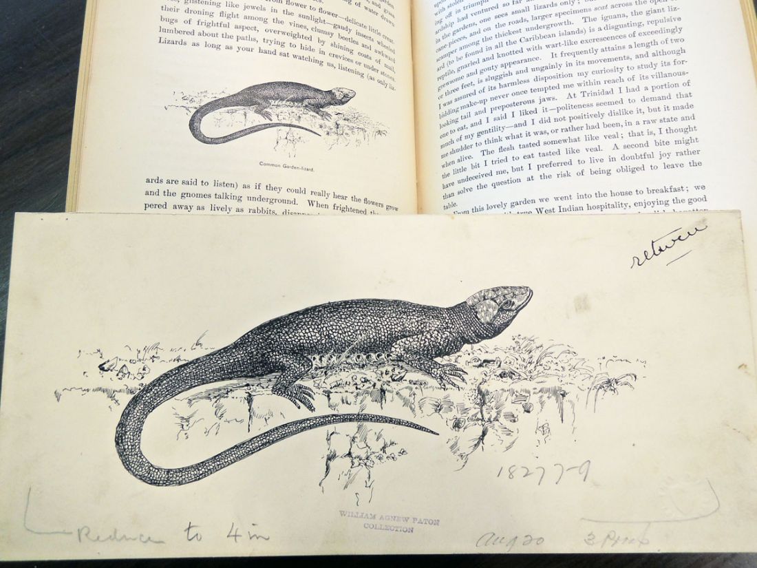
 William Agnew Paton (1848-1918), Down the Islands, a Voyage to the Caribbees, with illustrations from drawings by M. J. Burns (New York: C. Scribner’s Sons, 1887). Graphic Arts Collection (GAX) 2003-0365N
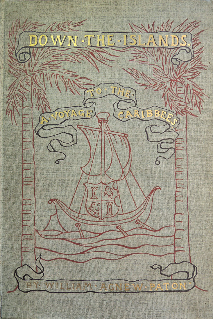
William Agnew Paton (1848-1918) worked as publisher of the New York World from 1877 to 1881; served as trustee of the National Republican from 1881 to 1885; and finally, the first business manager of Scribner’s Magazine from 1885 to 1887.
When he left work for health reasons Paton made an extended trip to the Caribbean and on his return, published Down the Islands, a narrative of his travels. Paton commissioned Milton J. Burns (1853-1933) to illustrate the book, an artist who not only worked for St. Nicholas Magazine, Scribner’s, and Harpers but had also served on fishing vessels and was known for his seascapes.
In 1911, Paton gave Princeton University Library his ‘Paton Spanish War Collection’ of newspapers and magazines. After his death, his brother David Paton, Class of 1874 (1854-1925), donated the entire Paton Library to Princeton in honor of William Agnew Paton.
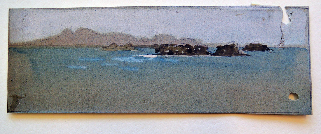
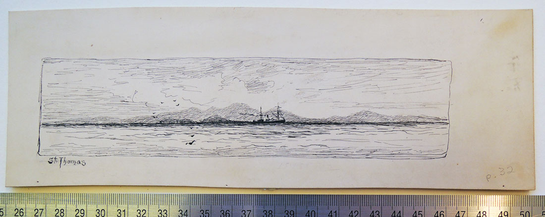
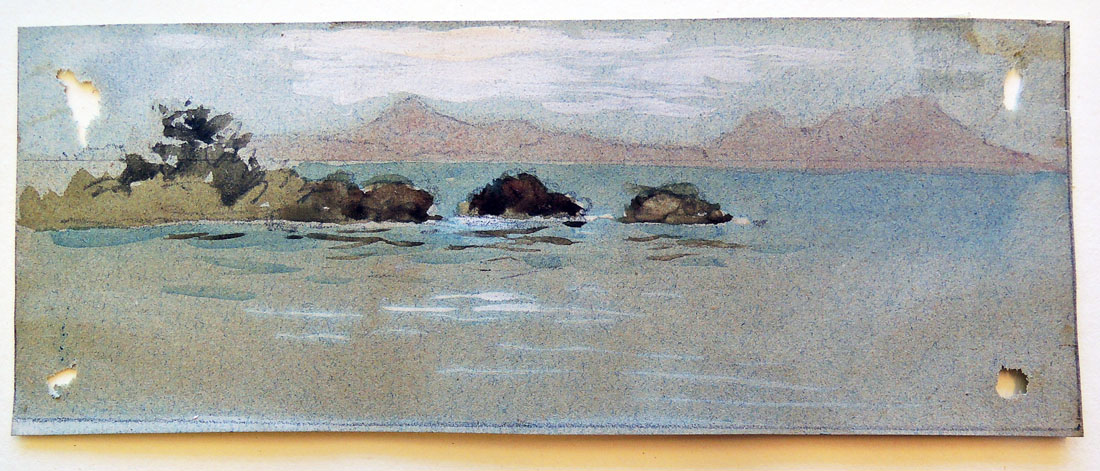
We also received the entire collection of Milton Burns’s paintings, drawings, and photographs for Down the Islands. It is particularly interesting to see the variety of mediums Burns used, from pen and ink to watercolor to charcoal, in order to accomplish the right artwork for each section of the book. Here are a few examples.
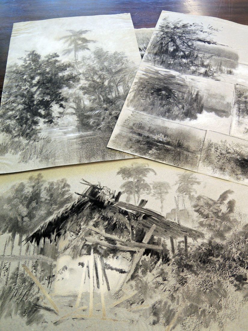 Milton J. Burns collection of drawings, [1880s]. 5 linear ft. (1 solander box). Consists of approximately 75 drawings and sketches, as well as several small oil paintings by Burns that were used as illustrations in William Agnew Paton’s Down the Islands (New York, 1887). Graphic Arts Collection GC093

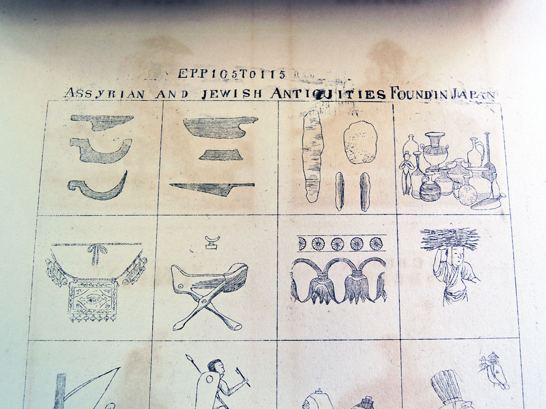
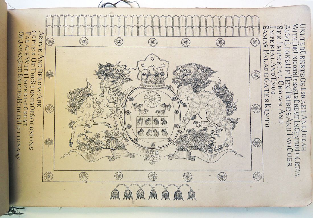
 Illustrations to the Epitome of the Ancient History of Japan, including Illustrations to Guide Book, collected and arranged by N. [Nicholas] McLeod (Kiyoto, 1877). “The illustrations include specimens of the ethnology of the different races in Japan, and their special belongings, Shinto and Buddhist pictures, legends and illustrated proofs of the descent of part of the Japanese race from lost Israel.” Graphic Arts Collection GAX in process. Gift of Edith and Emmet Gowin.
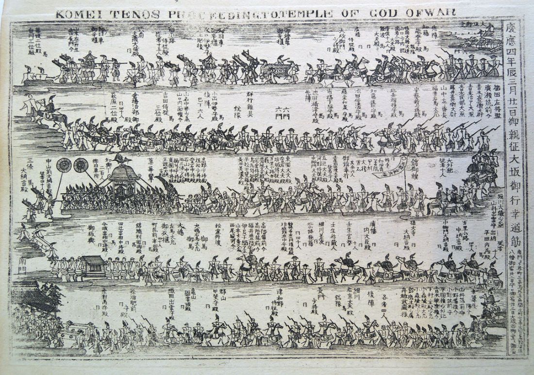 According to the acquisition note posted by the National Library of Scotland (http://www.nls.uk/) “This is, by any standards, a strange book.” Thanks to the generous donation of Edith and Emmet Gowin, Princeton University Library researchers can also puzzle over the first illustrated edition of Nicholas McLeod’s odd volume.
The NLS entry goes on to attempt a description: “It was published . . . to accompany the author’s Epitome of the Ancient History of Japan. . . . Central to the Epitome is McLeod’s belief that the Shindai or holy class of Japan are descended from the Lost Tribes of Israel. He also calls attention to the fact that the first known king of Japan was Osee, who came to the throne in 730 B.C. and that the last king of Israel was, the similarly named Hosea who died in 722 B.C.
In the preface McLeod mentions that ‘the engravings are the workmanship of the best Japanese artists, but as they have had as yet so little experience of foreign letters, the execution is imperfect’. There are engravings of kings, temples as well as some relating to the author’s thesis such as ‘supposed order of march of Israelites to Japan’.”


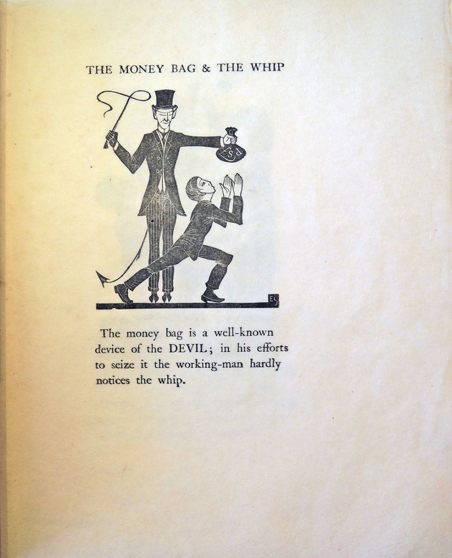
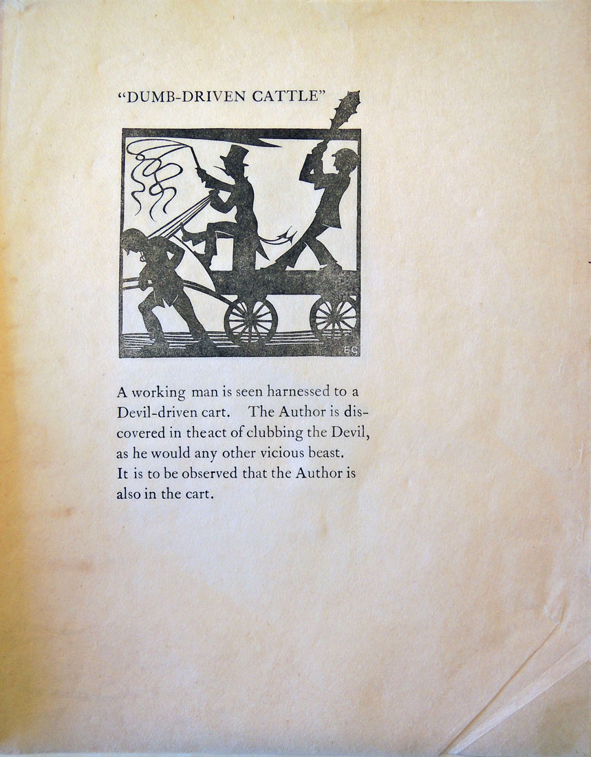
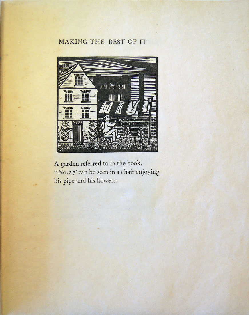
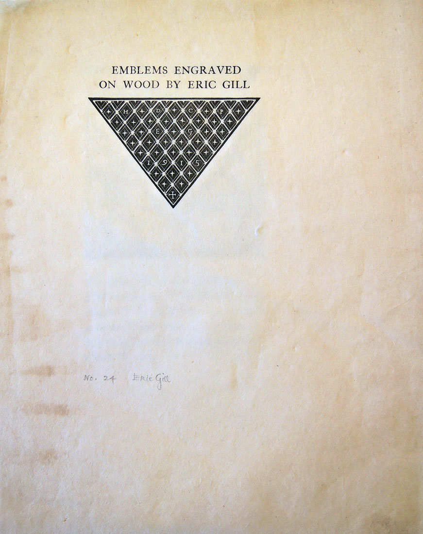 In 1915, Eric Gill (1882-1940) designed and cut illustrations for Hilary Douglas Clarke Pepler’s The Devil’s Devices, or, Control Versus Service (London: Hampshire House Workshops). The following February 2, in honor of the Feast of the Purification of the Blessed Virgin Mary, Gill and Pepler printed fifteen copies of the wood engravings and published them as Emblems Engraved on Wood.
The small keepsake was such a success that Gill printed another run of 33 copies. The Graphic Arts Collection recently acquired a copy of the second edition, without the wrapper but signed by Gill in pencil. Here are a few pages.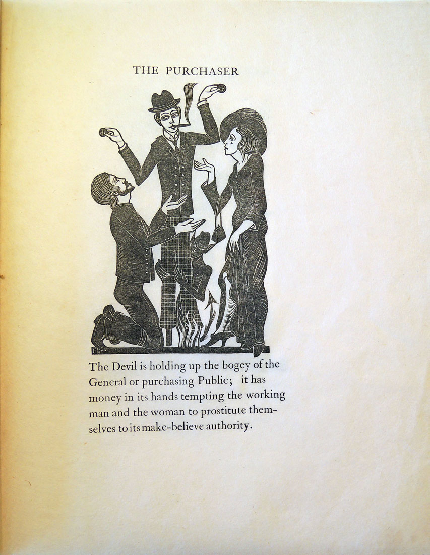
Eric Gill (1882-1940), Emblems Engraved on Wood. 2nd ed. (Ditchling, Sussex: D. Pepler and E. Gill, 1916). Copy 24 of 33. Graphic Arts Collection in process
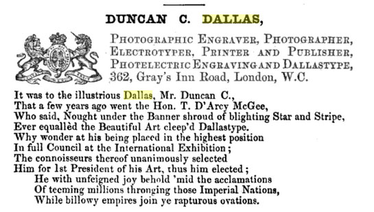
“Although one of the earliest processes for the production of a printing block by means of photography,” begins an advertisement in the August 27, 1897 issue of The Photographic News, “one but rarely nowadays hears the name of ‘Dallastype’ mentioned in connection with photo-process work, and yet the results achieved by it are remarkably fine, and in the early days of mechanics engraving were much admired.”
 The piece continues “Mr. Dallas has been quietly working at his process for many years, and improving and developing its capabilities, and has now decided to make it public, for which purpose he intends to open the ‘Dallastype and Dallastint School of Photographic Engraving,’ were he will give [instruction] to students in the art of producing pictures by his methods, which are free from the messy and cumbrous operations that characterise the zinco process. . . . Prospectus, with all particulars as to terms, &c., will be posted on application by letter to Mr. Duncan C. Dallas, 5, Furnival Street, Holborn, E.C.”
Duncan Campbell Dallas (ca. 1830-ca. 1890) had indeed been perfecting and publishing images with his Dallastype process for at least forty years. Depending on which history you read, he was either a crook or an unheralded talent.
In 1854, Paul Pretsch (1808-1873) patented photogalvanography (sometimes called photoelectrotype) and together with Roger Fenton (1819-1869) went on to establish the Photogalvanographic Company. Dallas was hired as the company manager.
To their surprise, Dallas was granted provisional protection for his own patent in June of 1856 on “Improvements in chemical preparations applicable to the photographic and photogalvanographic processes.” Pretsch and Fenton asked him to leave the company and many years of litigation followed.
In the September 11, 1863 issue of The Photographic News, Dallas published the abstract “Photo-Electric Engraving and Observations Upon Sundry Processes of Photographic Engraving.” Although the paper was submitted to the British Association for the Advancement of Science, it was ultimately deemed inadmissible by the Chairman and never presented to the organization. http://tinyurl.com/gsomauj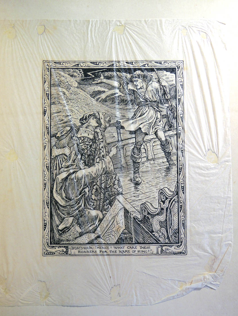
Dallas filed for another patent in May of 1866 and was again refused but moved ahead with his own company, advertising the Dallastype and Dallastint as ”cheap first class engraving, one shilling per square inch. A reliable substitute for wood engraving, faithfully reproducing in any size the artist’s or other original specimens for six stamps.”
Dallas wrote a letter to the British Journal of Photography, published in the March 5, 1875 issue, to protest Pretsch’s claim of developing the photogalvanography. “I had been the founder and organiser of the Photogalvanographic Company,” he claimed, “and had been robbed— I used the word deliberately—of the fruits of ray brain and hand labour by Mr. Paul Pretsch.”
 Duncan C. Dallas, The … Londoniad: giving a full description [in verse] of the principal establishments, together with the most honourable and substantial business men, in the capital. The new, or twentieth Londoniad, 1876. p. 66-68
Later that year, in need of money, he tried to sell the process, publishing Proposal for Divulging the Dallastype Process of Photographic Engraving to Five Hundred Subscribers, or more, at £20 each ([London]: Duncan Campbell Dallas, 1875).
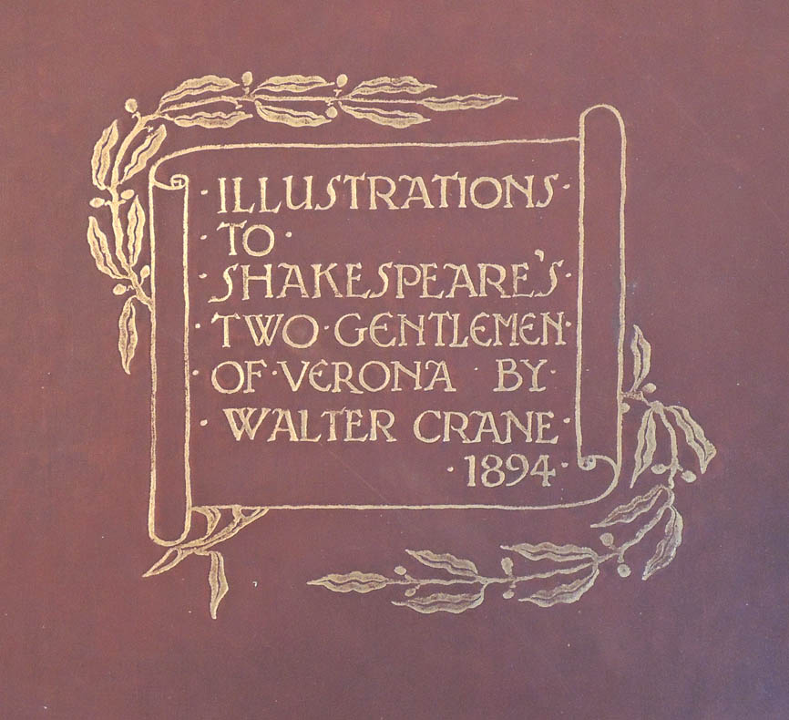
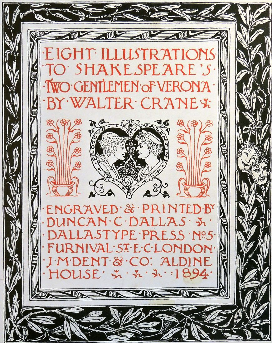
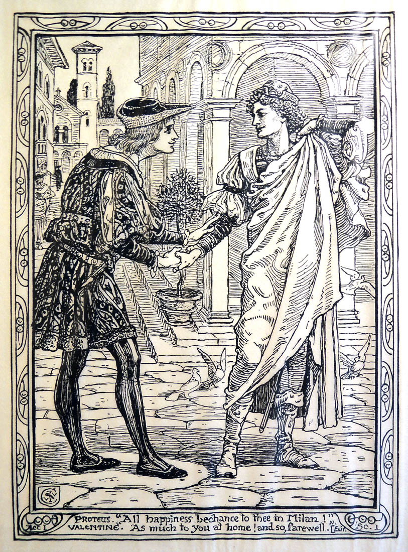
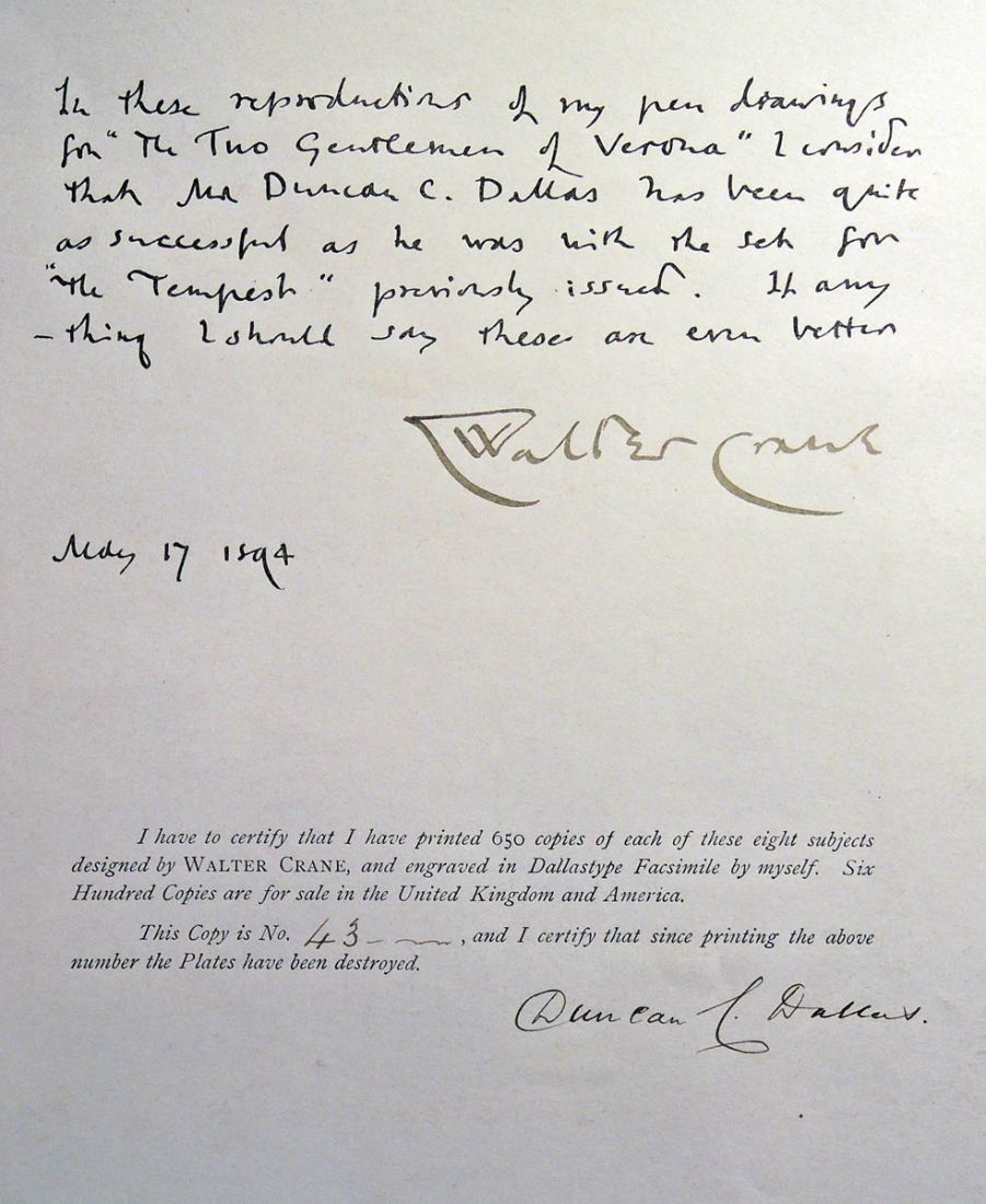
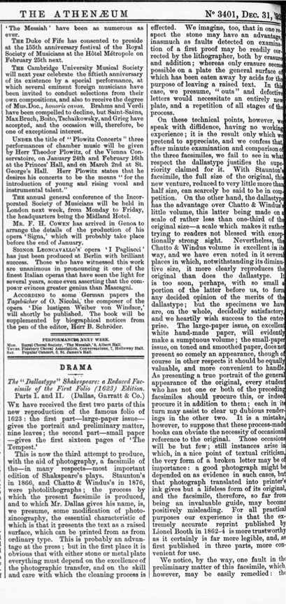
Dallas went on to publish a facsimile of the 1623 Shakespeare First Folio and then, several portfolios of Walter Crane’s illustrations for individual plays. Princeton University Library holds three of these volumes, illustrated with Dallastypes.

Walter Crane (1845-1915), Eight Illustrations to Shakespeare’s Two Gentlemen of Verona; engraved & printed by Duncan C. Dallas (London: J.M. Dent, 1894). No. 43 of 650 copies; signed by Walter Crane and Duncan C. Dallas. Rare Books (Ex) Oversize 3925.633q
Walter Crane (1845-1915), Shakespeare’s Comedy of the Merry Wives of Windsor / presented in eight pen designs by Walter Crane; engraved & printed by Duncan Dallas (London: G. Allen, 1894). No. 165 of 650 copies. Rare Books (Ex) Oversize ND497.C85 A34q
Walter Crane (1845-1915), Eight Illustrations to Shakespeare’s Tempest, designed by Walter Crane; engraved & printed by Duncan C. Dallas (London: J.M. Dent, 1893). Graphic Arts Collection (GAX) Oversize 2007-0246Q
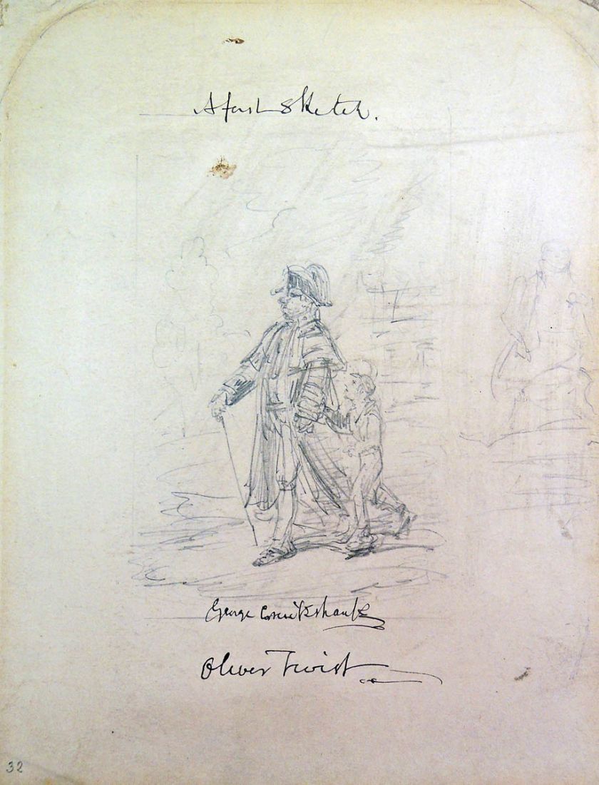
George Cruikshank (1792-1878), “A Fast [first?] Sketch, George Cruikshank, Oliver Twist” ca. 1838. Pencil on paper. Graphic Arts Collection
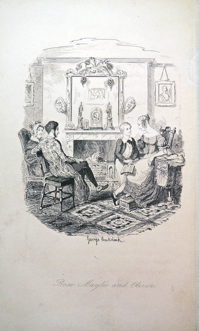
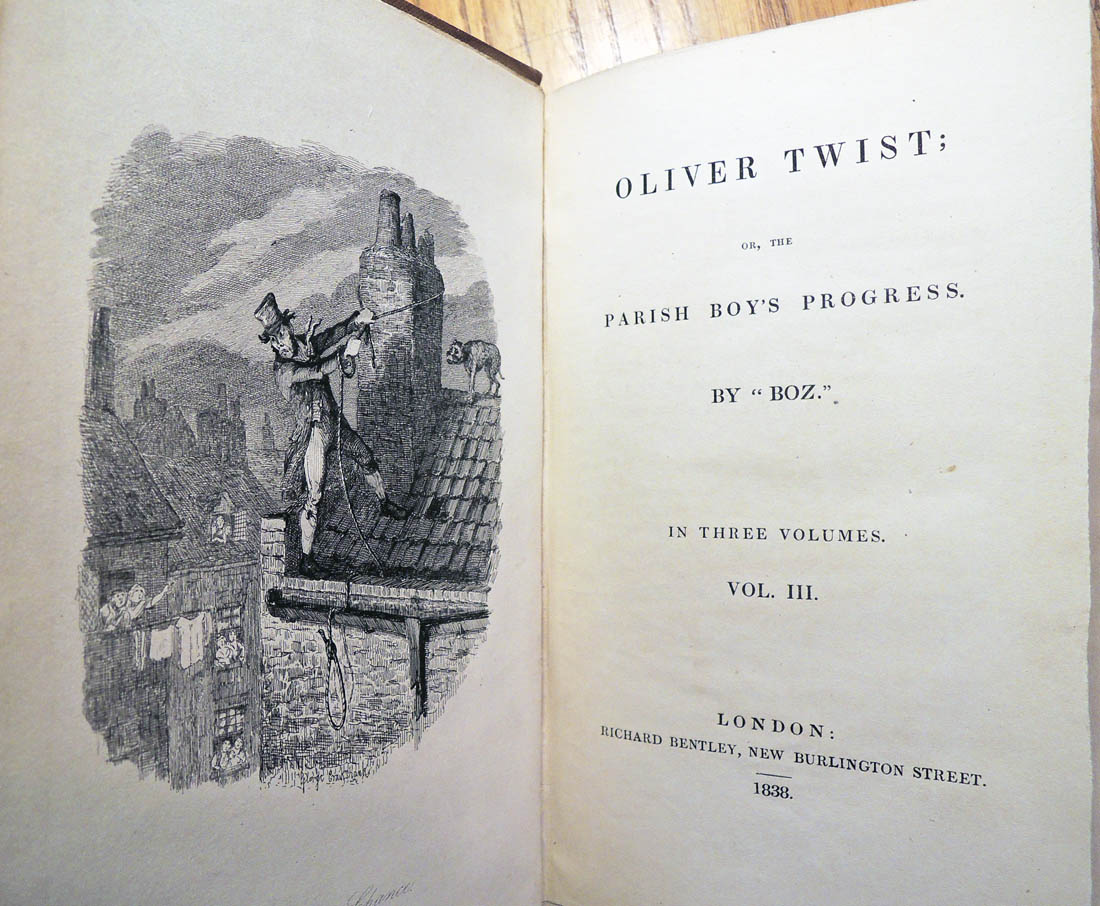 Charles Dickens (1812-1870), Oliver Twist; or, The Parish Boy’s Progress. By “Boz”. [1st ed.] (London: R. Bentley: 1838). 3 v. Illustrated by G. Cruikshank. Contains the “fireside” plate, canceled in later issues and the plate substituted. Graphic Arts Collection (GA) Cruik 1838.2
In preparing for a visit from ENG 343 Word and Image: 19th Century Literature and Art, several editions of Charles Dickens’s Oliver Twist have been pulled. Dickens famously did not like the final illustration and asked his artist, George Cruikshank, to draw another plate. Various editions over the years include one or the other of these illustration, etched in metal.
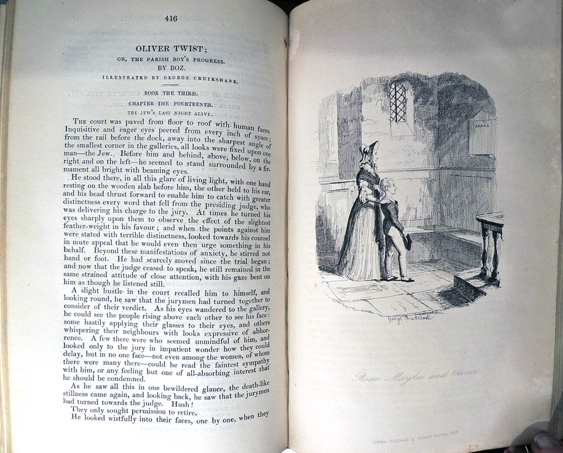
The matter supplied in advance of the monthly portions in the magazine, formed the bulk of the last volume as published in the book; and for this the plates had to be prepared by Cruikshank also in advance of the magazine, to furnish them in time for the separate publication: Sikes and his dob, Fagin in the cell, and Rose Maylie and Oliver, being the three last. Non of these Dickens had seen until he saw them in the book on the eve of its publication; when he so strongly objected to one of them that it had to be cancelled. “I returned suddenly to town yesterday afternoon,” he wrote to the artist at the end of October, “to look at the latter pages of ‘Oliver Twist’ before it was delivered to the booksellers, when I saw the majority of the plates in the last volume for the first time. With reference to the last one—Robe Maylie and Oliver—without entering into the question of great haste, or any other cause, which may have led to it being what it is, I am quite sure there can be little difference of opinion between us with respect to the result. May I ask you whether you will object to designing this plate afresh, and doing so at once, in order that as few impressions as possible of the present one may go forth? I feel confident you know me too well to feel hurt by this enquiry, and with equal confidence in you I have lost no time in preferring it.” John Forster (1812-1876), The Life of Charles Dickens (Leipzig, Tauchnitz, 1872-74): 191-92. Firestone Library (F) PR4581 .F677 1872
 Bentley’s miscellany ([London : Richard Bentley], 1837-1868). (Cruik) 1837.6 vol. 5
Cruikshank replaced the final plate with this “Rose Maylie and Oliver (the Church version),” which is found in most copies.
 Charles Dickens (1812-1870), The Adventures of Oliver Twist; or, The Parish Boy’s Progress. With twenty-four illustrations on steel, by George Cruikshank. A new ed., rev. and cor. (London: Pub. for the author, by Bradbury & Evans, 1846). “For this edition the plates were ’touched up’ by Findlay and changed in several details with sometimes new backgrounds added.” cf. J. C. Thompson, Bibliography. In the 10 original numbers, with all the green pictorial wrappers, in perfect condition, uncut; green morocco case. Graphic Arts Collection (GA) Cruik 1838.21

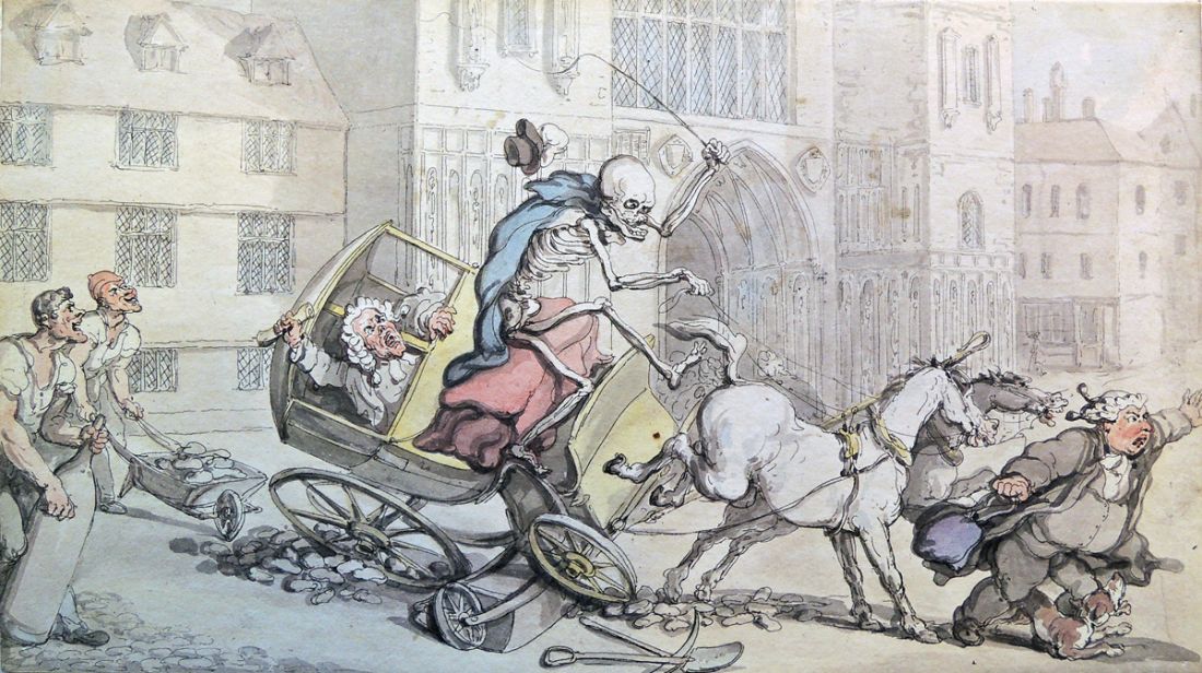
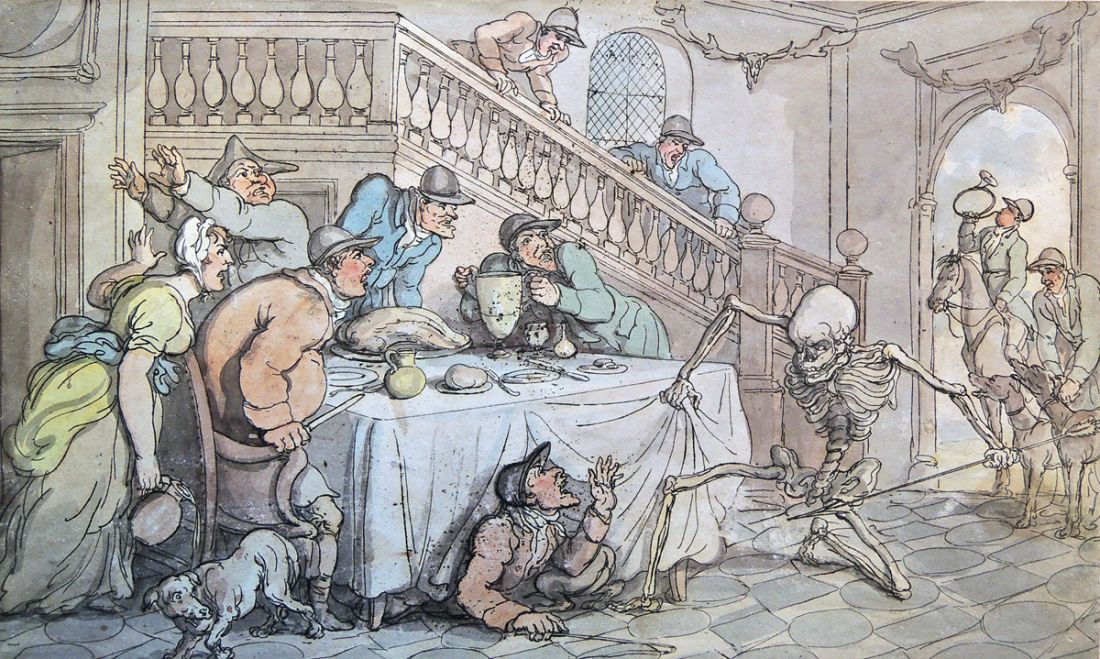
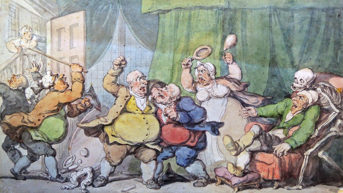
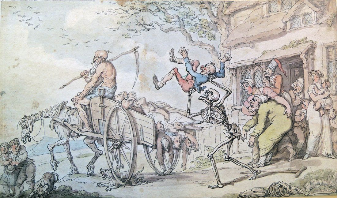
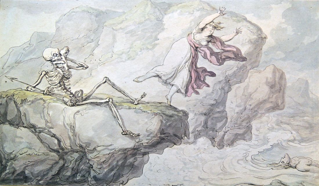
 Thanks to our generous donor Dickson Q. Brown, Class of 1895, the Princeton University Library not only holds the original parts for William Combe’s English Dance of Death, but also fifteen proofs hand colored by Rowlandson. Here are a few:

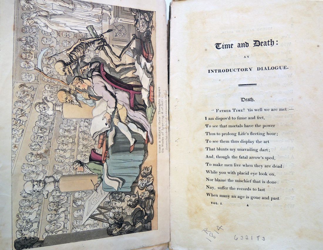 Father Time! ‘tis well we are met:–
I am dispos’d to fume and fret,
To see that mortals have the power
Thus to prolong Life’s fleeting hour;
To see them thus display the art
That blunts my unavailing dart;
And, though the fatal arrow’s sped,
To make men live when they are dead:
While you with placid eye look on,
Nor blame the mischief that is done:
Nay, suffer the records to last
When many an age is gone and past.
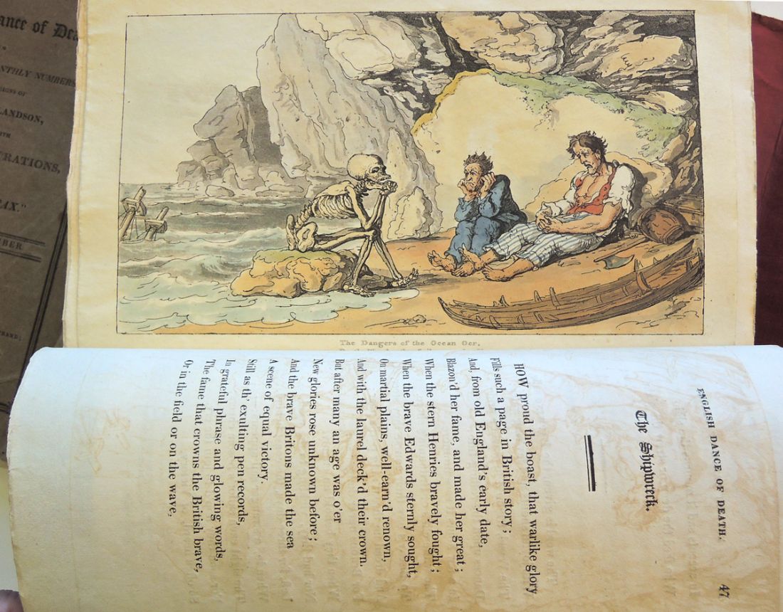 William Combe (1742-1823), English Dance of Death: in twenty-four monthly numbers, from the designs of Thomas Rowlandson, accompanied with metrical illustrations, by the author of “Doctor Syntax” (London: Printed by J. Diggens … : Published at R. Ackermann’s Repository of Arts … and to be had of all the book and print-sellers in the United Kingdom., 1814-1816). 24 pts. in 1; 74 leaves of plates, in aquatint designed by Thomas Rowlandson (1756-1827). Graphic Arts Collection (GA) Rowlandson 1814 and 1814.2
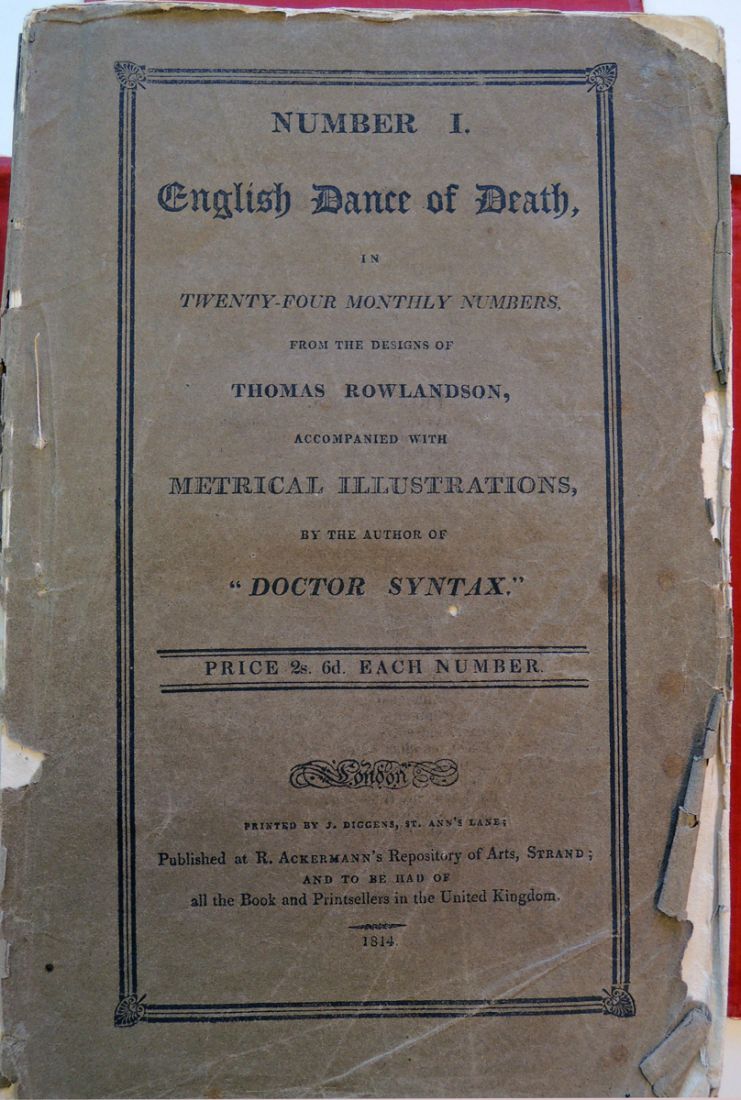
The earliest use of “metrical illustrations” that I’ve found is 1634: George Wither, A collection of emblemes, ancient and moderne: quickenend with metrical illustrations, both morall and divine. Frontispiece by William Marshall and the emblem of Crispijn of the Passe.

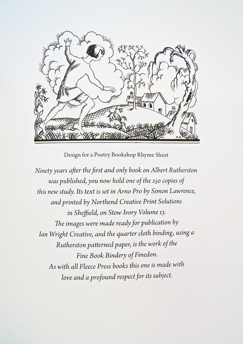
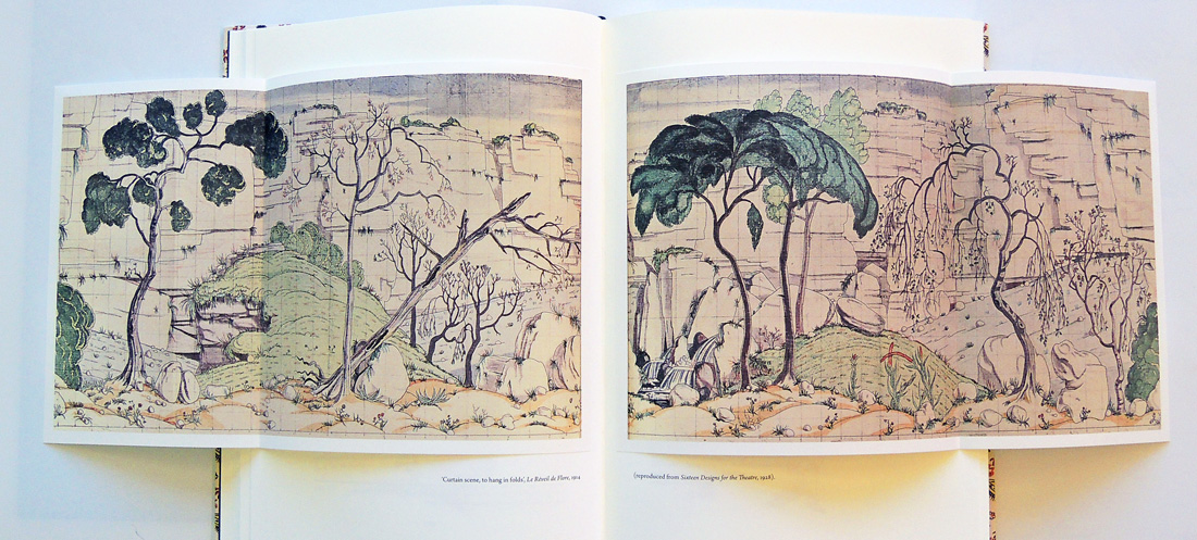
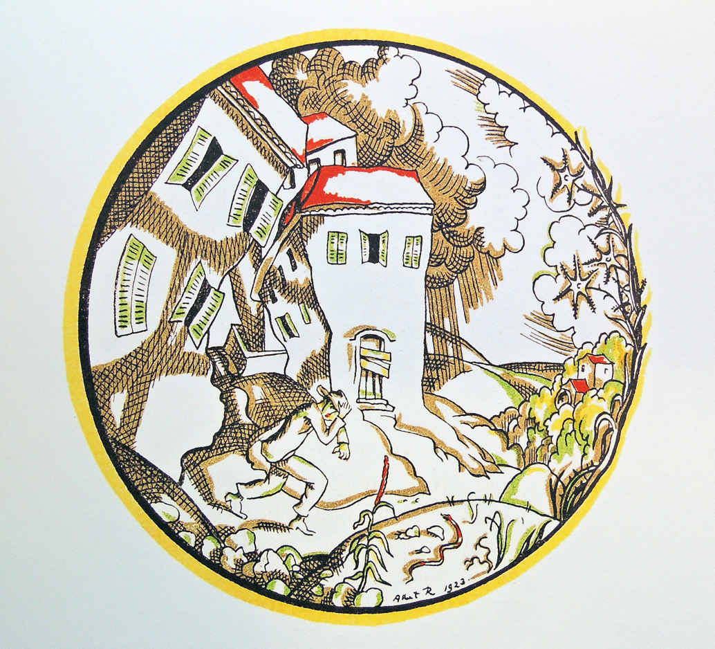 Ian Rogerson, Pen, Paper & a Box of Paints: Albert Rutherston, Illustrator and Designer for the Stage (Upper Denby: Fleece Press, 2015). Graphic Arts Collection GA2015- in process
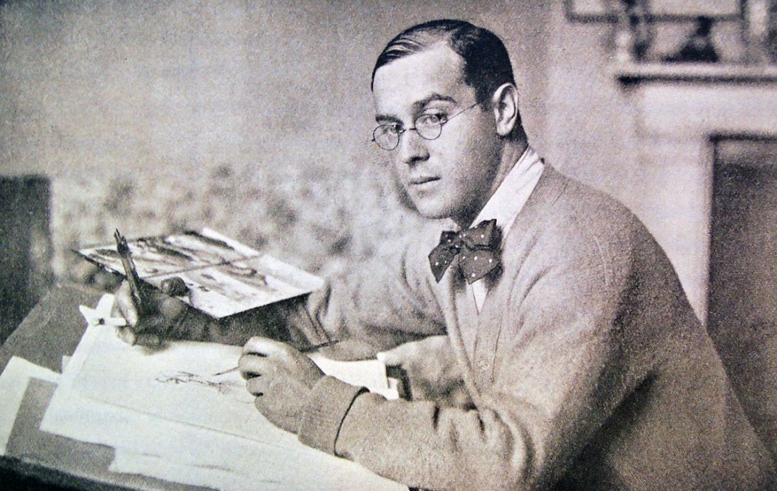
“Ninety years after the first and only book on Albert Rutherston was published,” notes the book’s colophon, “you now hold one of the 250 copies of this new study.”

The Graphic Arts collection recently acquired one of the 250 copies of a new study of the pochoir printed designs by British artist Albert Rutherston, published by Fleece Press.
The prospectus notes, “Albert Rutherston is well known as a distinctive book illustrator whose work benefited from the pochoir process employed by the Curwen Press. He illustrated many books and for a short period before the First World War had a profound influence on theatre and stage costume design, though he chose not to pursue this. There has been no book on his work until now.”
 Albert Rutherston was a figure and landscape painter, book illustrator, and designer of posters and stage sets. He studied at the Slade School from 1898 until 1902 and was a member of the New English Art Club from 1905. Rutherston was Ruskin Master of Drawing at Oxford from 1929 to 1948. –(note from the National Portrait Gallery, London)
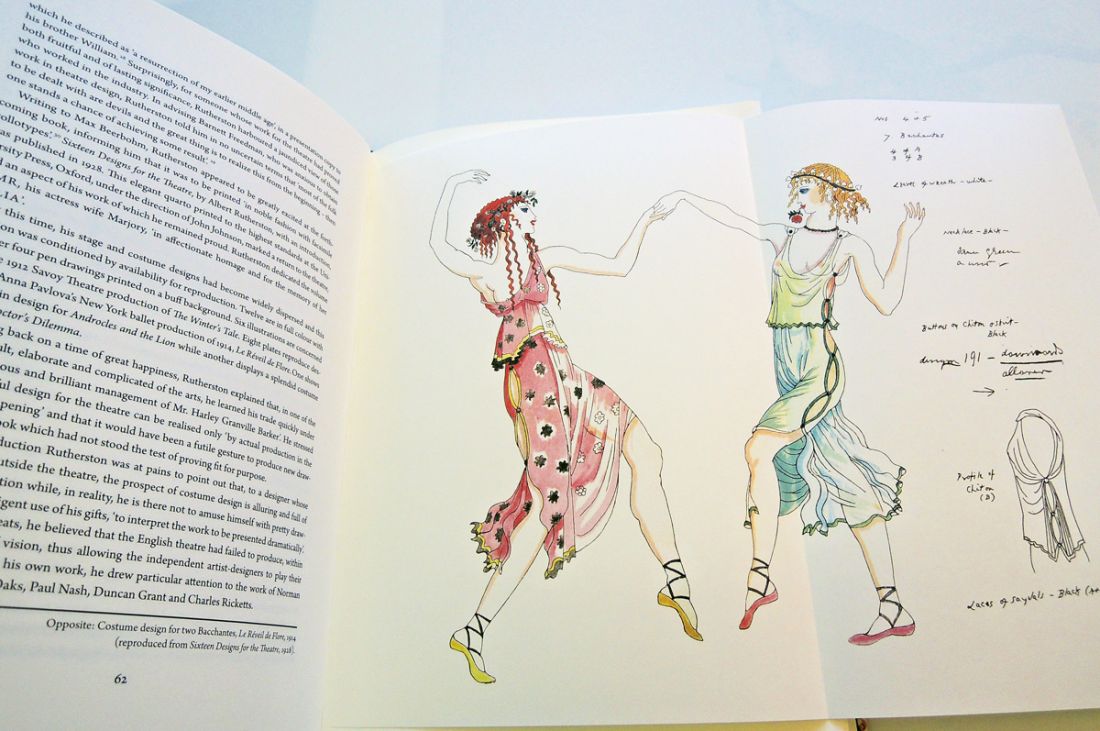
Princeton University Library holds 29 books illustrated by Rutherston, beginning with Ronald Firbank (1886-1926), Inclinations (London: G. Richards, 1916). Rare Books (Ex) PR6011.I7 xI5 1916.
See also: Alan Powers, Art and print: the Curwen story (London: Tate, 2008). Marquand Library (SA) NE628.4 .P69 2008
David McKitterick, Wallpapers by Edward Bawden printed at the Curwen Press (Andoversford, Gloucestershire: Whittington Press, 1989). Graphic Arts Collection (GAX) Oversize 2014-0025F