Category Archives: Illustrated books

illustrated books

Need a Project, no. 4? Book covers

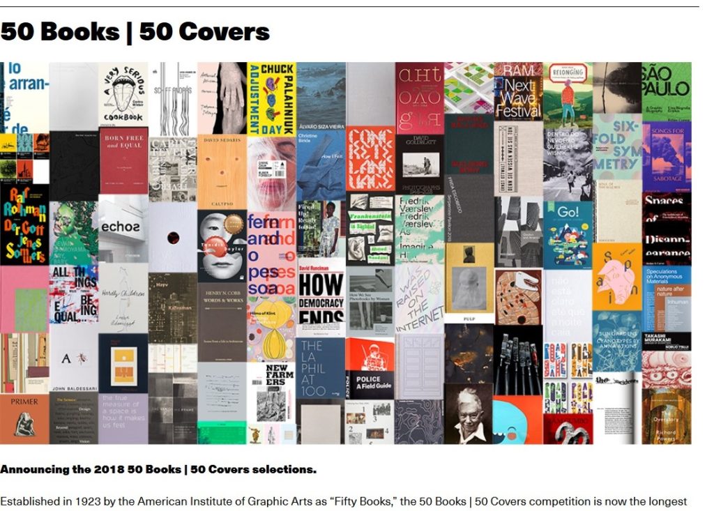
Do you have a favorite book cover or jacket? Each year AIGA (American Institute of Graphic Arts) holds a contest to find the 50 best book covers created over the previous year. “This survey of book design represents perhaps the longest-standing legacy in American graphic design. Beginning in 1923, the Fifty Books of the Year competition was a yearly mainstay of AIGA. As dust jackets became more common, covers were added to the competition. From 2012–2018 Design Observer hosted the competition with AIGA through a joint venture. AIGA is delighted to usher in another year of amazing book and cover design.”

Although entries for the 2019 competition are closed, selections from past competitions have been added to the AIGA Design Archives—one of the richest online resources available to those who practice, study, and appreciate great design—as well as the physical archives at the Denver Art Museum (1980–2012) and at the RBML at Columbia University’s Butler Library in New York City. Winners from 2011–2017 can be seen on Design Observer.

https://www.aiga.org/about-50-0 and https://designarchives.aiga.org/#/collections

Like many awards, sometimes our favorites are not included. This week, (1) Send us your favorite book covers from your own book shelf. (2) Draw your own book jacket, still or moving. send to jmellby@princeton.edu or anyone with this link:
https://drive.google.com/drive/folders/1rbMvioMG_LlO6E5QDbzSmw-4H_zc-lOL?usp=sharing
can upload large files into our cloud.

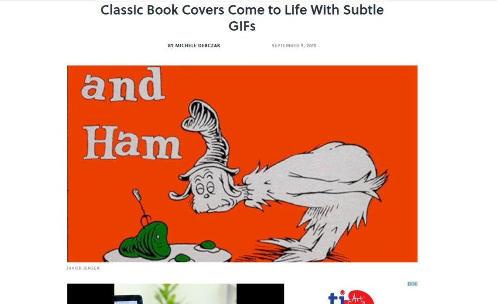
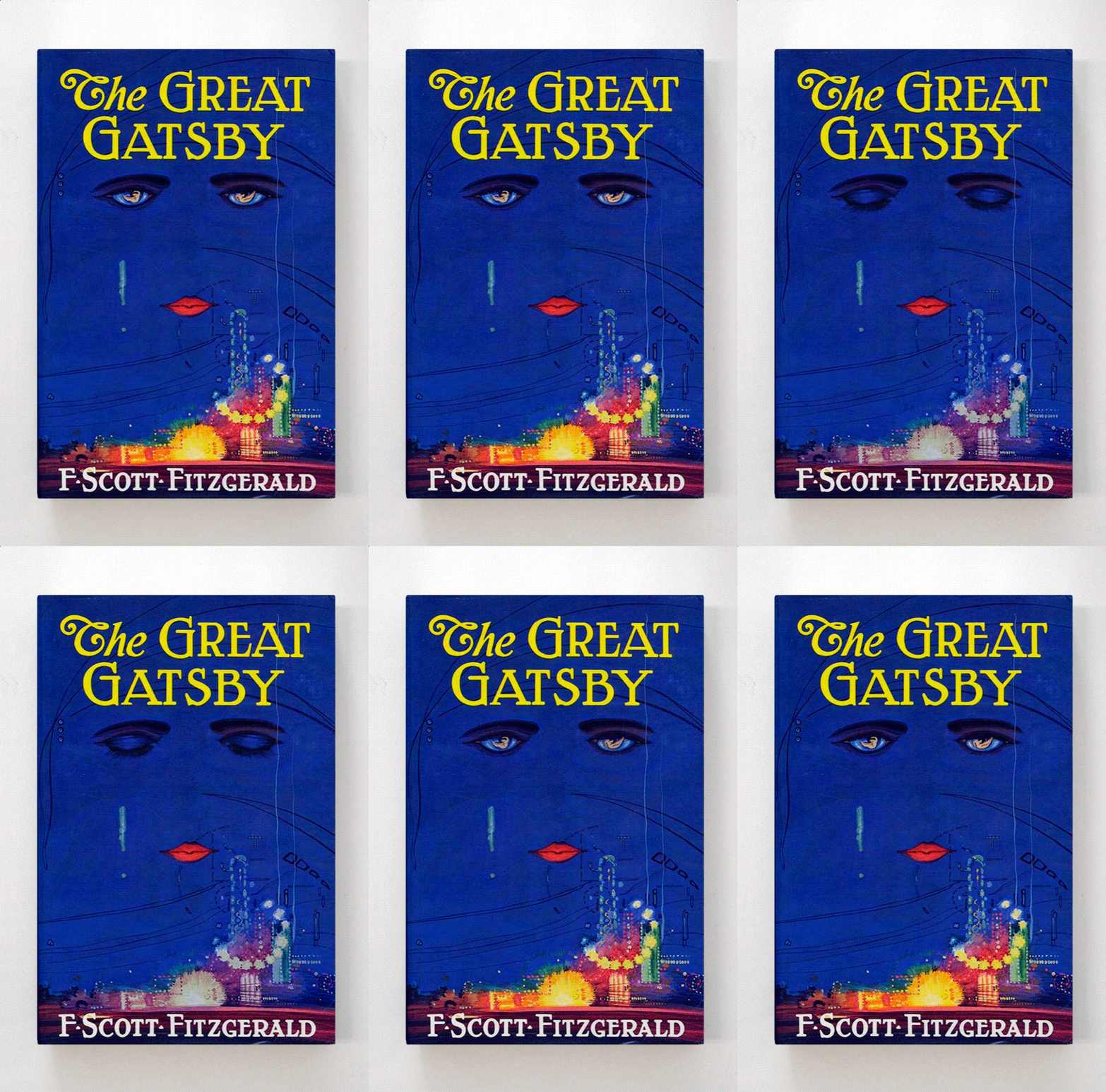
Everyone has seen book cover gifs, like the Great Gatsby cover at the top. There are many sites that offer selections. Michele Debczak posted a set on Mentalfloss several years ago under the title “Classic Book Covers Come to Life With Subtle GIFs” https://www.mentalfloss.com/article/68345/classic-book-covers-come-life-subtle-gifs

The site Giphy has a number of selections: https://giphy.com/explore/book-cover-design

and Fastcompany did an assortment here: https://www.fastcompany.com/3052306/vintage-book-covers-beautifully-animated

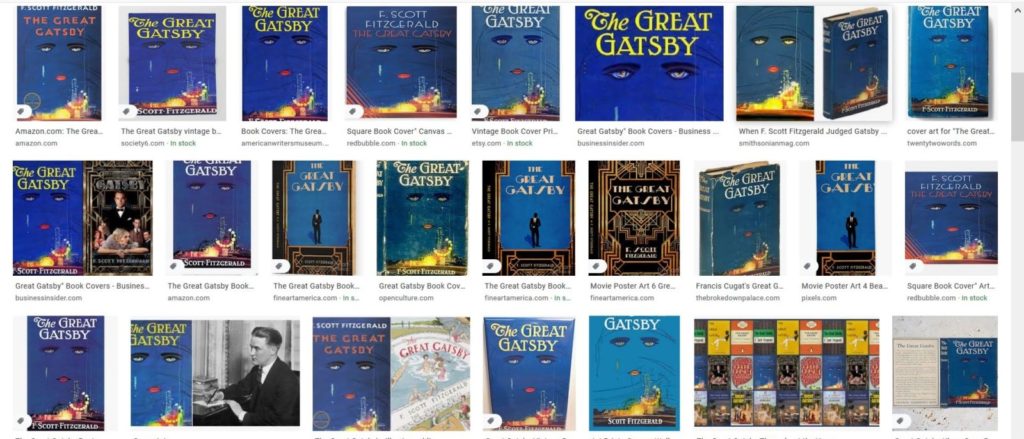
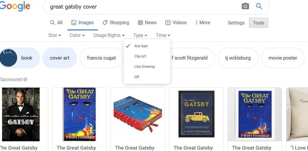
It is more fun to find your own and google image can help. Try searching Great Gatsby images:

Then limit the images to books and covers, and GIFs:

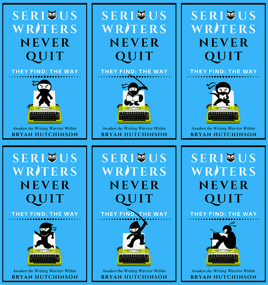
You will find several variations, including:

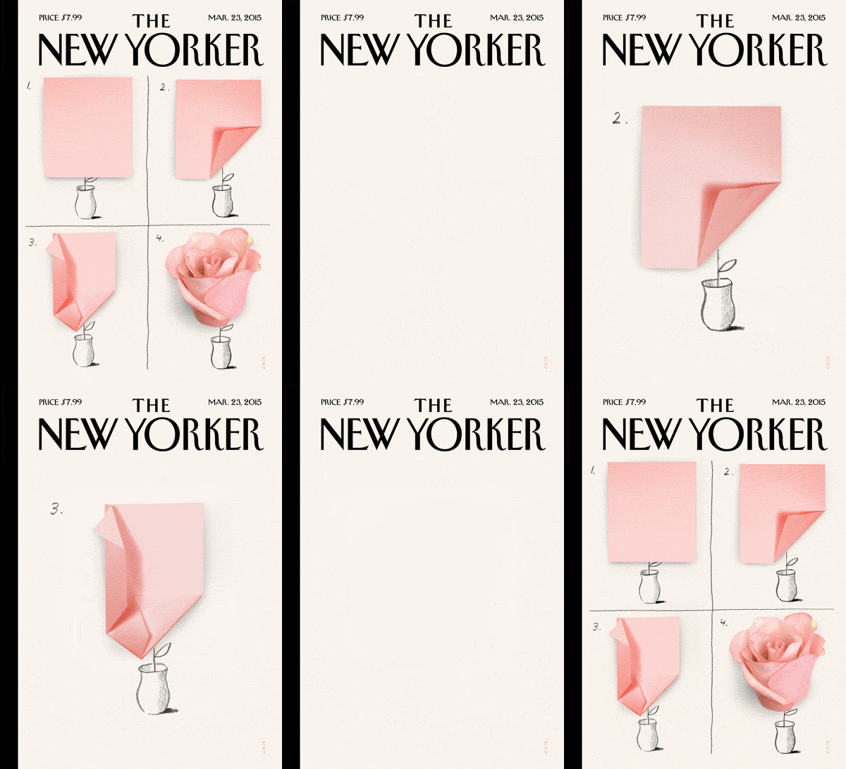
Here are others:

Why not make your own? Derek Murphy posted “How to make an ANIMATED book cover that blows people’s minds” in 2015 here: https://www.creativindiecovers.com/how-to-make-an-animated-book-cover-that-blows-peoples-minds/

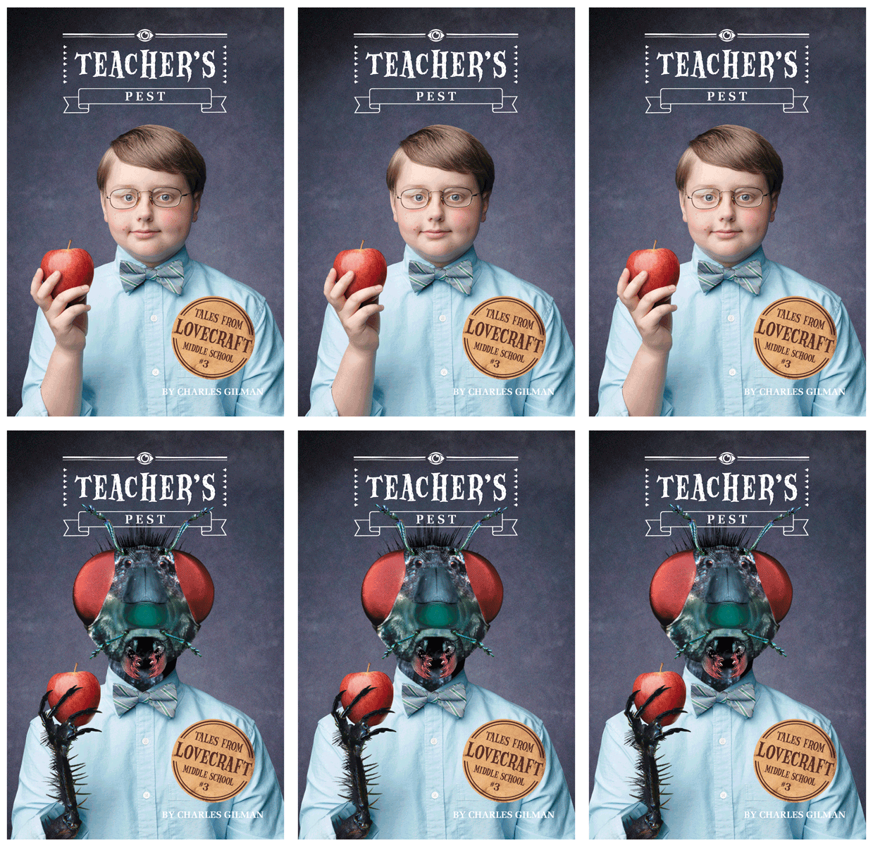
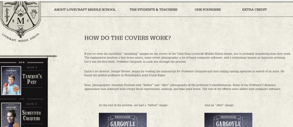
Also the Lovecraft Middle School posted this step by step guide: http://lovecraftmiddleschool.com/extra-credit/covers.html

 
Ask your kids for help. Then send your favorites.

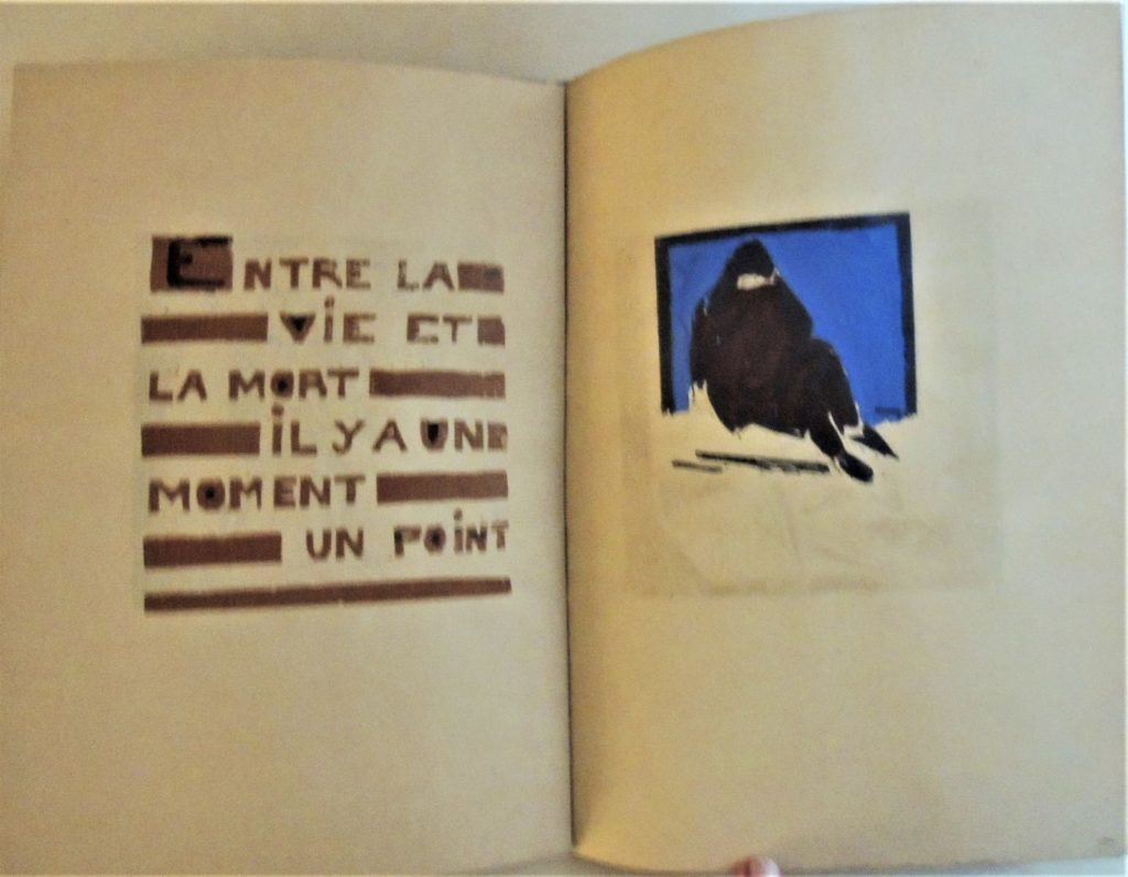
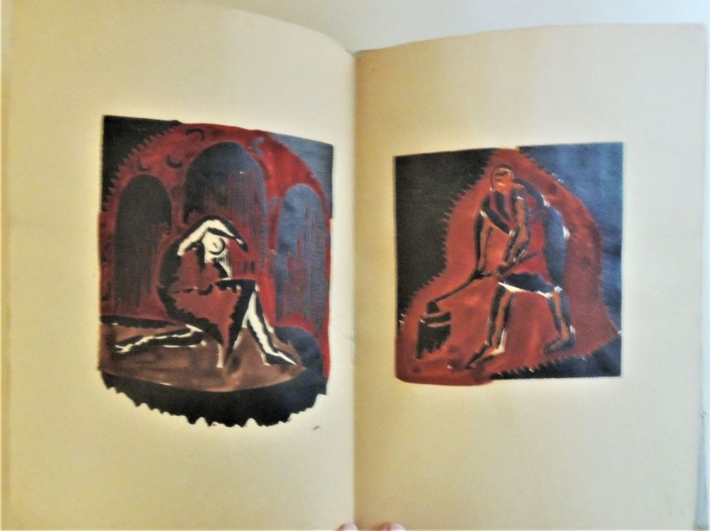
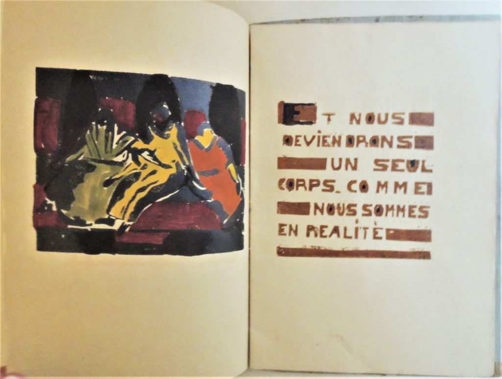
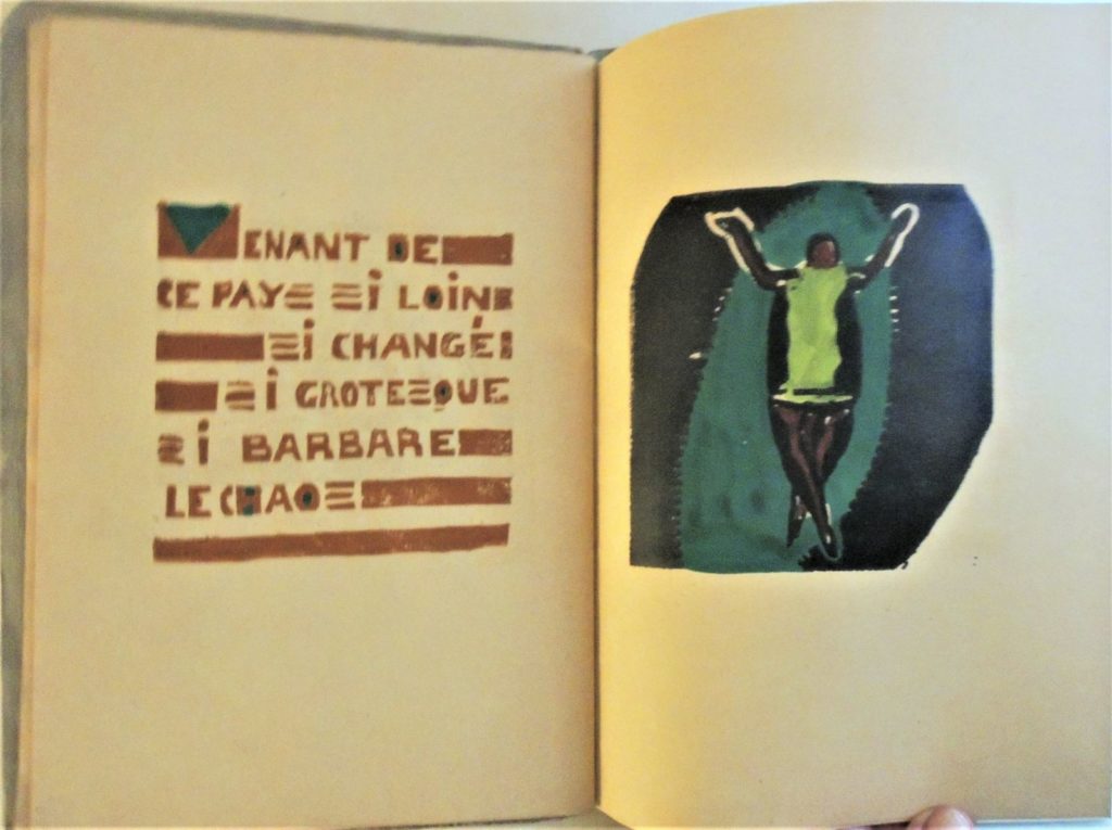
Gestes


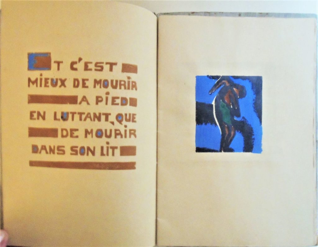
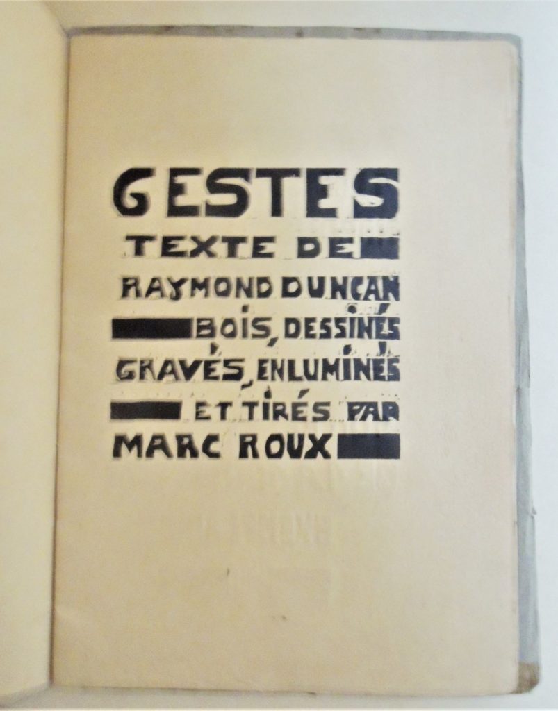
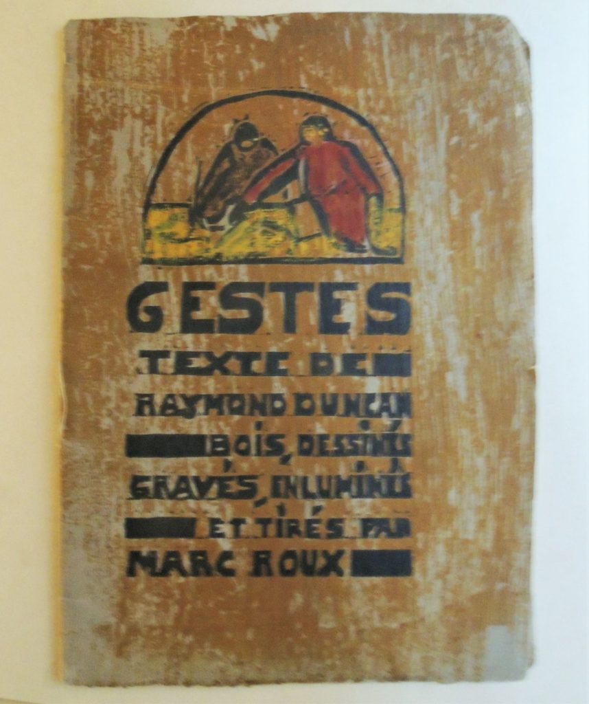
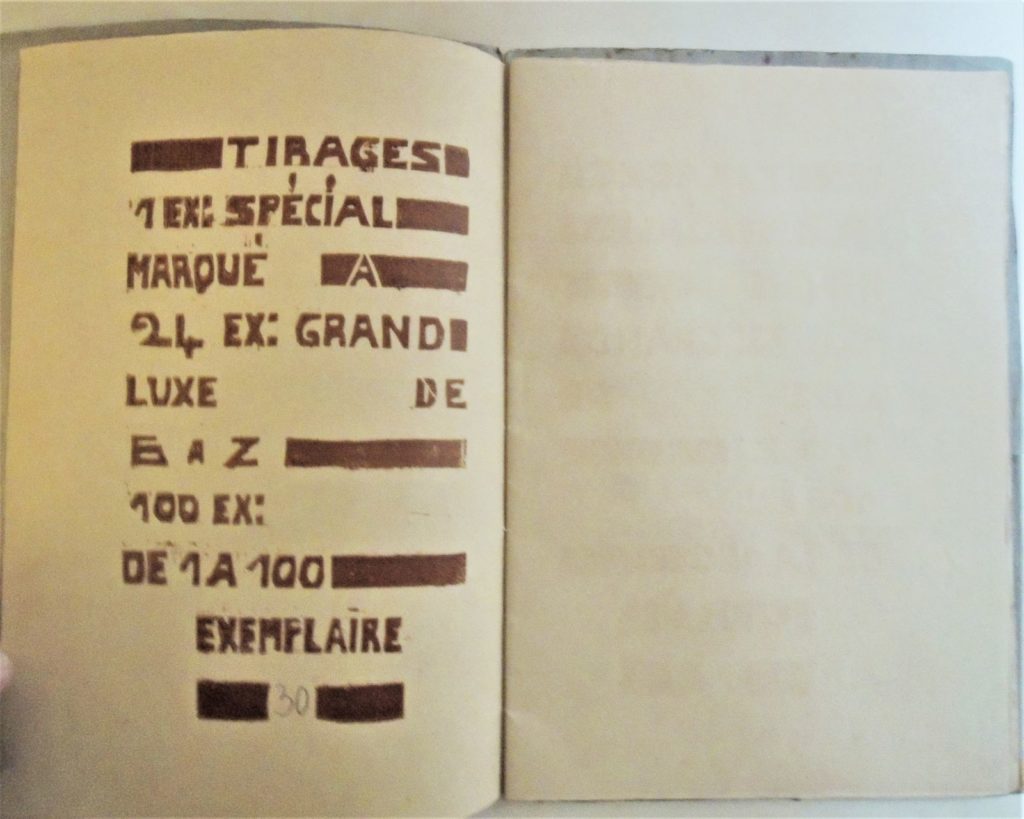
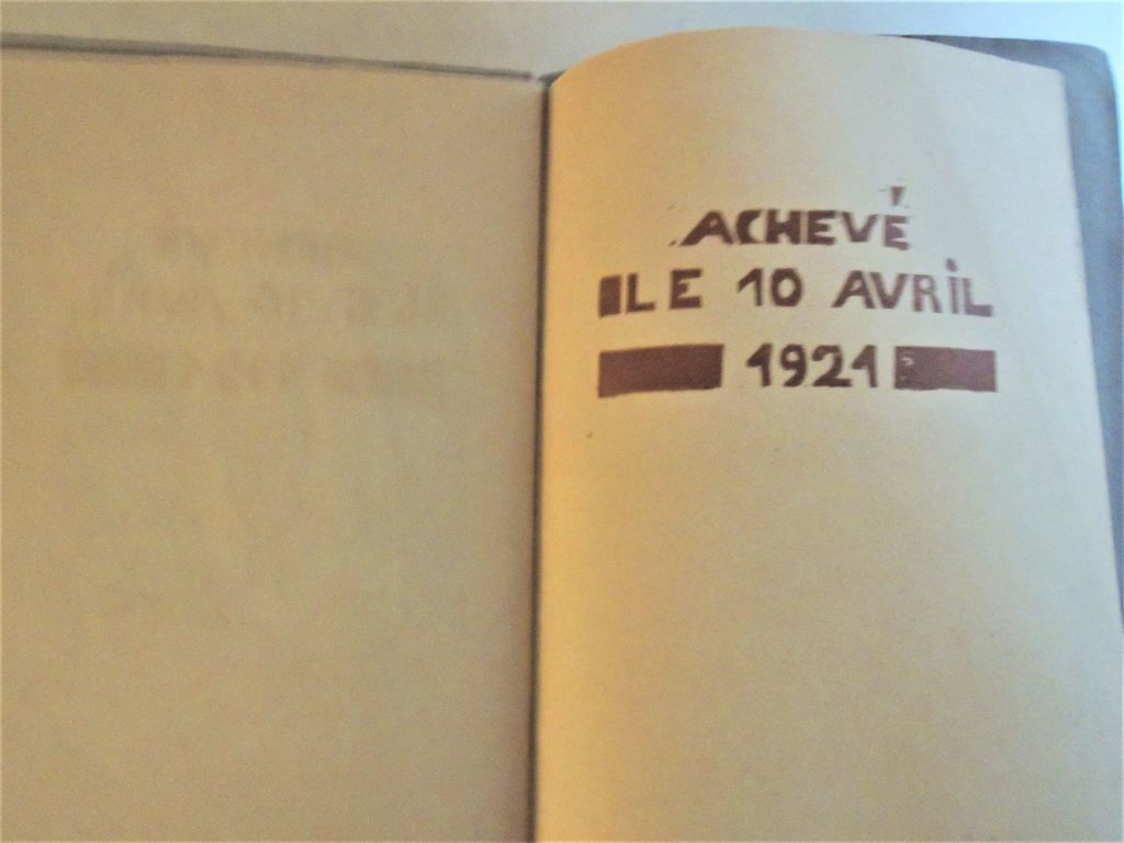
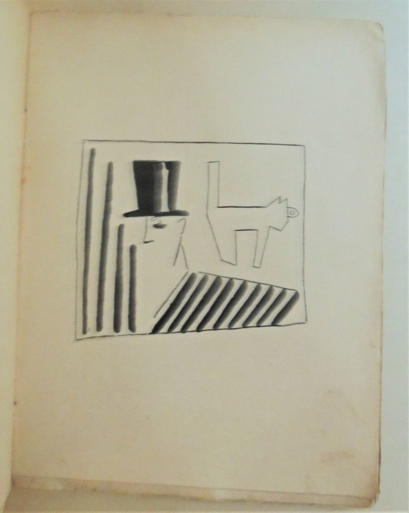
Gestes [Gestures]: Texte de Raymond Duncan. Bois dessinés, gravés, enluminés et tirés par Marc Roux ([Paris]: Raymond Duncan, 1921). Copy 30 of 100. “Tirages, 1 ex: spécial marqué A, 24 ex: grand luxe de B a Z, 100 ex: de 1 a 100 exemplaire”– t.p. verso/ “Achevé le 10 avril 1921.”–Colophon. Graphic Arts Collection GAX 2020- in process

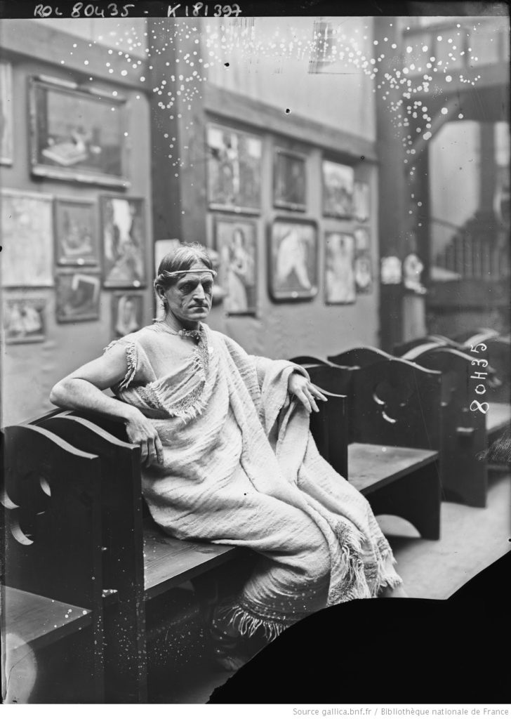
In 1919 Raymond Duncan (1874-1966), wife Penelope, and their teenage son Menalkas, moved back to Paris where he reestablished his Akademia Raymond Duncan at 21 Rue Bonaparte.

With his long, flowing hair and Grecian robes, Duncan became a fixture along the streets of Paris and in the galleries and theaters. He organized international conferences each year at his université philosophique and developed a small following of disciples.

Students were taught to weave, print, and create the other decorative arts sold by the Akademia, in exchange for vegetarian meals and lessons in Duncan’s philosophy of a simple, holistic lifestyle. His sister Isadora Duncan did not appreciate the austerity of her brother’s commune and moved back to Russia where she established her own dance school in Moscow. Conversely, Lucia Joyce, daughter of James Joyce, became deeply immersed in Raymond’s Akademia and studied with him for several years.

Duncan collaborated on Gestes with his friend Marcel (here spelled as “Marc” on the cover and title-page) a year before Roux’s death. The artist suffered from an illnesses contracted while a medical orderly during World War I, and was forced to switch from his usual copperplate engraving to the softer woodcuts for this project but the style fit Duncan’s verse perfectly. Roux printed 100 copies of the book in his studio at 9 Rue Falguiere, published on April 10, 1921.

Only two other copies are held in institutional collections, one at the Bibliothèque nationale de France and the second at the Houghton library, Harvard University. This would be a third known copy of an extraordinary book.


Raymond Duncan’s inspiration was the Antique, but his work needs to be set alongside the other stylistic influences of the era including Japonisme, …Indian and Persian art, His life and work should also be related to other contemporary international art movements operating throughout Europe: the Weiner Werkstätte, the Ecole Martine, Charles Rennie Mackintosh, and the Glasgow School, and Bloomsbury and the Omega workshops. His dress and textiles are part of an important group of hand-crafted objects created by artist-designers that include …Paul Poiret, who was patronized by Isadora, and is said to have copied designs from Raymond (L, Duncan 2014). –Charlotte Nicklas, Dress History: New Directions in Theory and Practice (Bloomsbury Publishing, 2015)


Mayakovsky carrying his “soul on a plate for the dinner of the future.”


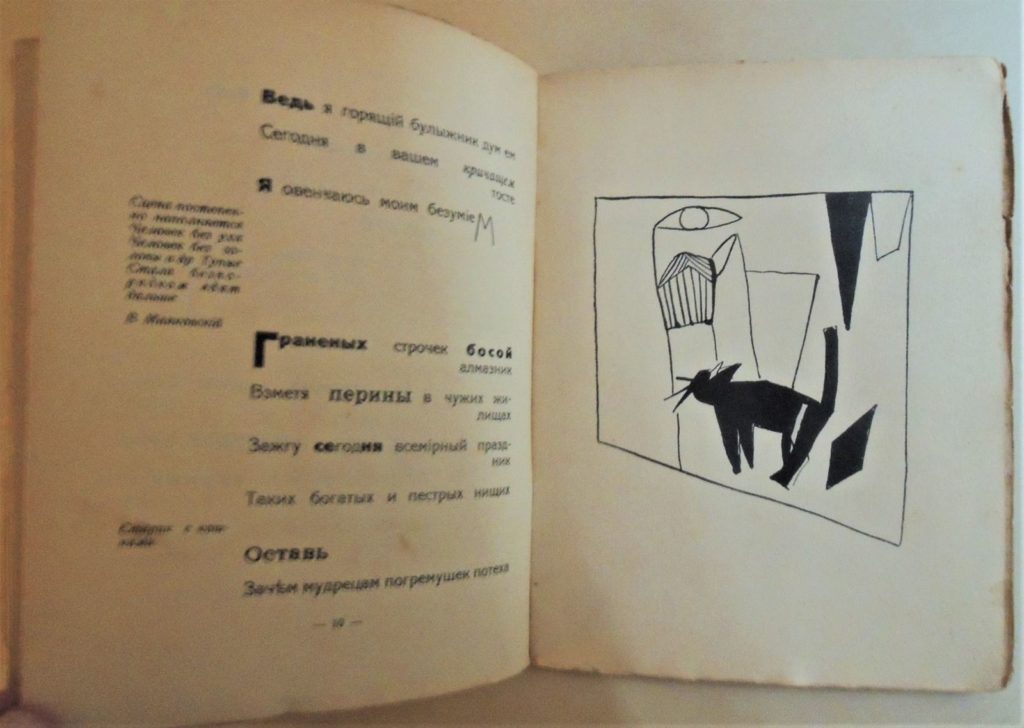
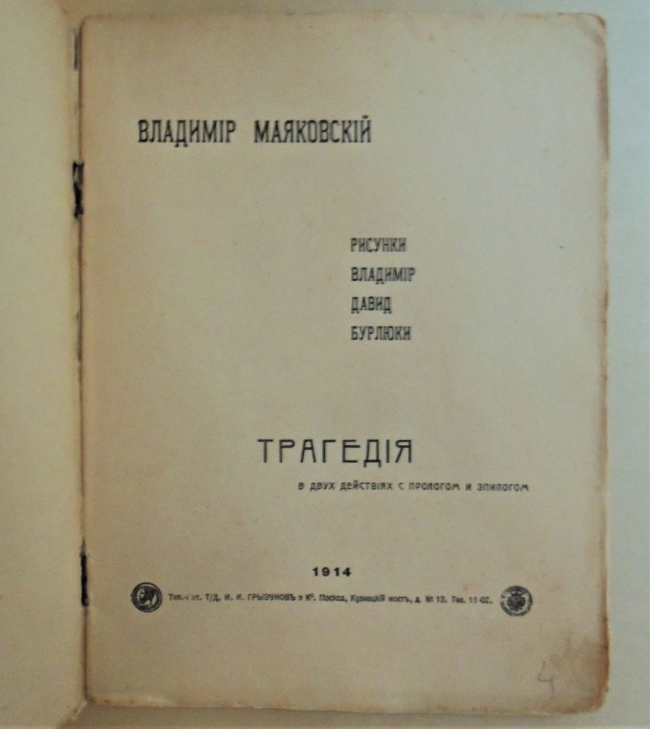
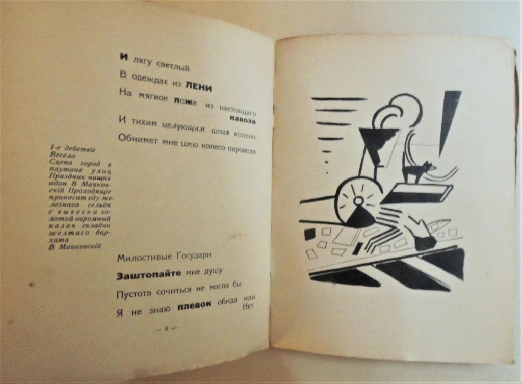
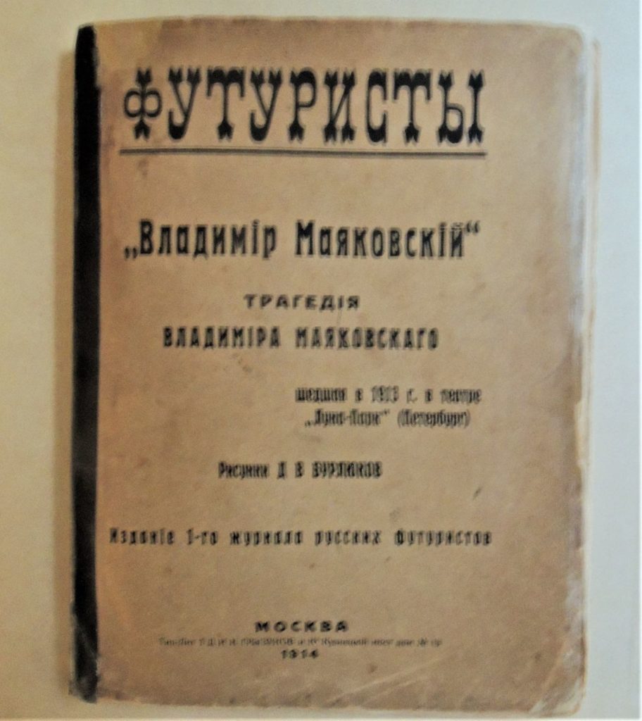
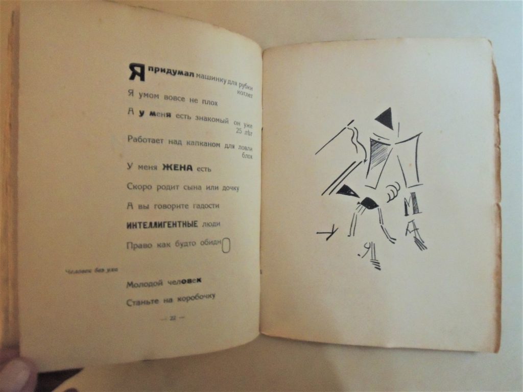
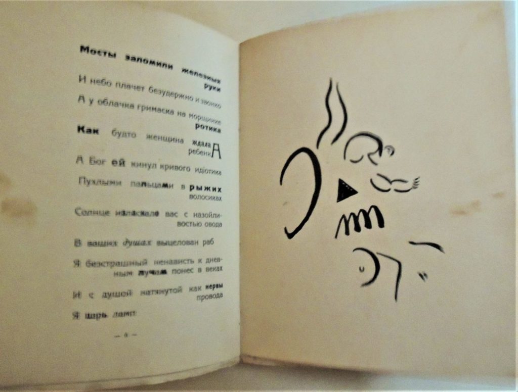
Long before the movie Being John Malkovich, Vladimir Mayakovsky (1893-1930) wrote the play Vladimir Mayakovsky (Tragedy), performing the leading role himself. Originally titled Владимир Маяковский, the 20-year-old poet finished his script in October 1913 and the play premiered in December at the Luna Park theater in St. Petersburg, alongside the futurist opera Victory over the Sun. The following year 500 copies of his visually striking poetry were published.

This rare and amazing book is now in the Graphic Arts Collection. Here a little background in rough translation:

The play, which had two working titles, “The Railway” (Железная дорога) and “The Riot of Things” (Восстание вещей), was written in the summer of 1913, in Kuntsevo near Moscow . . . . Sister Lyudmila Mayakovskaya remembered: “Volodyi felt very lonely. For days he was wandering through Kuntsevo, Krylatsky and Rublyovo parks, composing his tragedy … [At the house] he scribbled words, lines and rhymes on pieces of paper and cigarette boxes, [pleading with] mom to not throw anything away. ” [By] 9 November 1913, the Mayakovsky presented the copy of the [play] to the Petersburg theater censorship commission, having cut off some of the [controversial] bits. —https://pt.qwe.wiki/wiki/Vladimir_Mayakovsky_(tragedy)

Two days before the premiere the entire cast resigned because of rumors that they were going to be beaten up by the audience. Mayakovsky found a group of art students who agreed to take their places. There were only two performances, on Tuesday and Thursday. Eggs were thrown.


In the prologue Mayakovsky’s says he feels that “the wheel of a locomotive will hug my neck,” that is, he feels a lethal embrace of the dynamism and postrationality of daily life. …Feels like today. This is echoed in his explanation of why the play uses his name, to which he answered: “It is the name of the poet in the play who is doomed to suffer for all.” (Jangfeldt, Mayakovsky. A Biography, 2014, p. 65).

Vladimir Mayakovsky (1893-1930). Vladimir Mayakovsky, a tragedy (“Vladimīr Mai︠a︡kovskīĭ” : tragedīi︠a︡ ). Москва : Изд. 1-го журнала русских футуристов (Moscow: zhurnala russkikh futuristov), 1914. Seven prints by David and Vladimir Burliuk. Graphic Arts Collection GAX 2020- in process


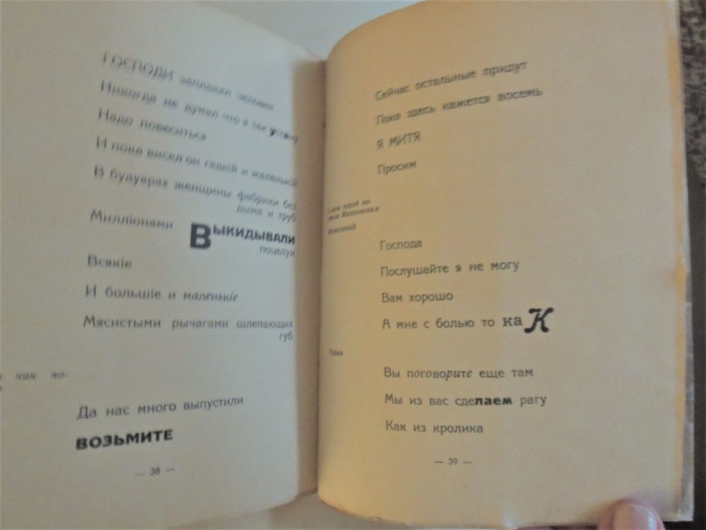
Please forgive the fuzzy images taken with my cell phone as we were leaving last week, but I didn’t want to miss the opportunity to post this amazing new addition to the Graphic Arts Collection.

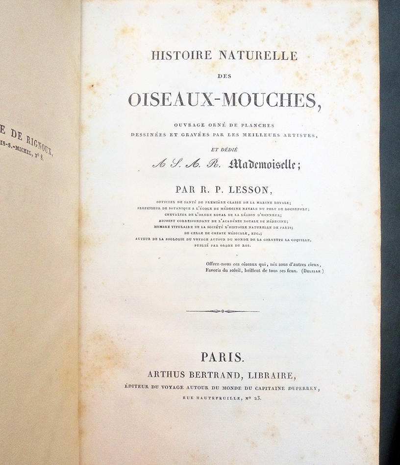
Lesson’s Hummingbirds and Birds of Paradise


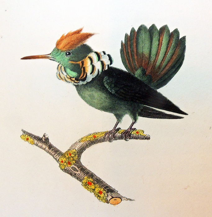
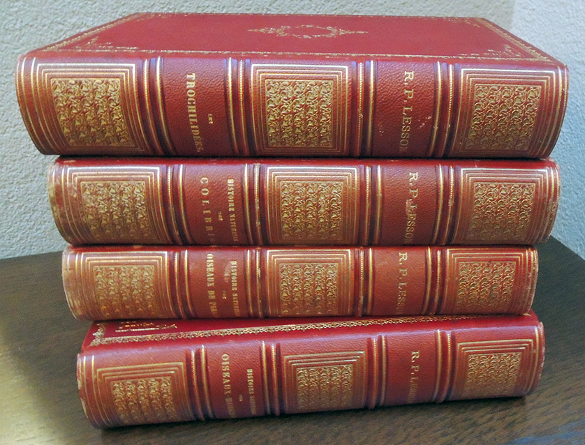
René Primevère Lesson (1794-1849), Histoire naturelle des oiseaux-mouches (with:) Histoire naturelle des colibris, suivie d’ un supplément a l’histoire naturelle des oiseaux mouches (with:) Les trochilidées ou les colibris et les oiseaux-mouches (with:) Histoire naturelle des oiseaux de paradis et des épimaques (Paris: Arthus Bertrand, 1829-1835).  GAX 2020- in process.


The French surgeon René Primevère Lesson (1794–1849) served as “pharmacist and botanist on Duperrey’s round-the-world voyage of La Coquille between 1822 and1825. On the voyage he was responsible for collecting natural history specimens with his fellow surgeon Prosper Garnot and officer Dumont d’Urville. … On returning to Paris, Lesson spent seven years preparing the vertebrate zoological section of the official account of the expedition, Voyage autour du monde sur La Coquille (1826–39). …He also compiled several monographs on hummingbirds and one book on birds of paradise.” https://www.portrait.gov.au/people/ren-primevre-lesson-1794

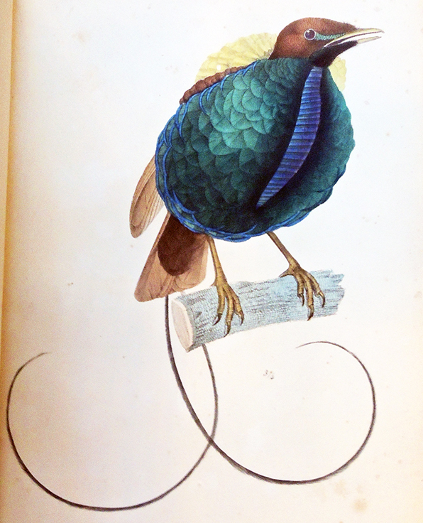
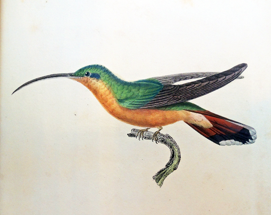
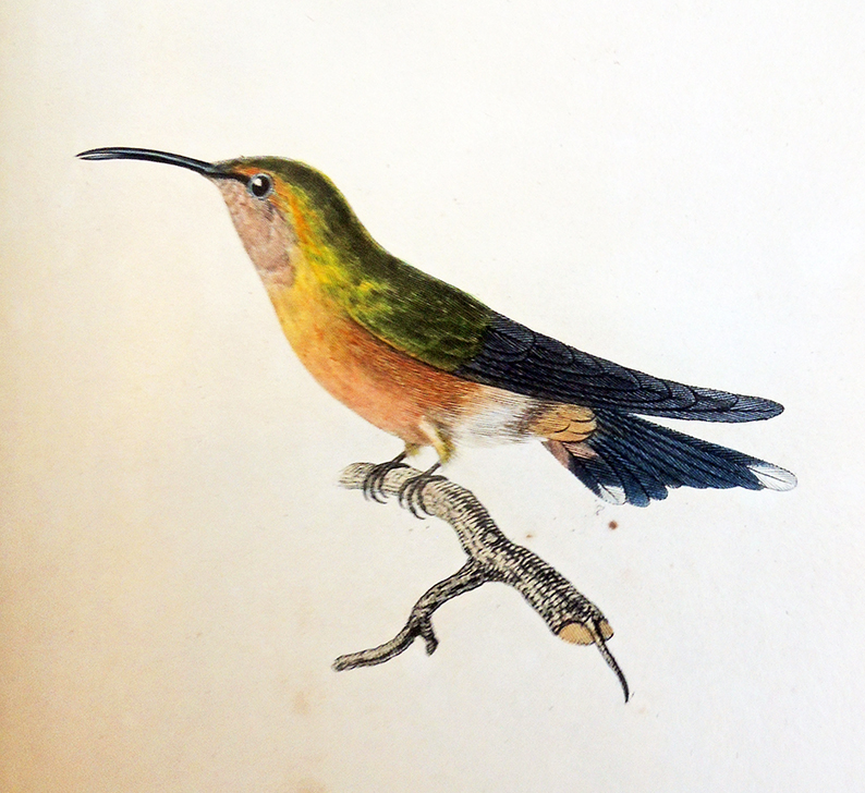
Lesson’s three volumes on the hummingbirds and final book on birds of paradise from tropical Central & South America, the Moluccas and New Guinea are filled with 261 hand-colored plates by Jean-Gabriel Prêtre (1768-1849), Paul-Louis Oudart (1796–1850) and Louis Victor Bévalet.

To see the influence with Robert Havell Jr.’s birds of paradise: https://www.princeton.edu/~graphicarts/2012/06/havells_birds_of_paradise.html

The Graphic Arts Collection acquired a handsome set of Lesson’s treatise, not in pristine condition but perfect for research and class use. Although there is foxing throughout, the colors are strong and the birds lively.


And they sound as beautiful as they look.


Recently Princeton University researchers discovered how “Hummingbirds dive to dazzle females in a highly synchronized display”: https://www.princeton.edu/news/2018/12/18/hummingbirds-dive-dazzle-females-highly-synchronized-display


Savage Impressions

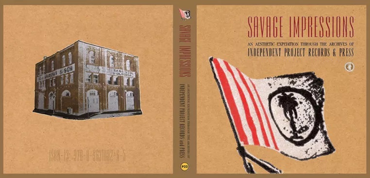
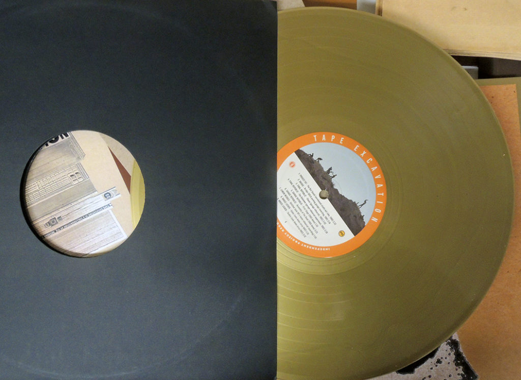
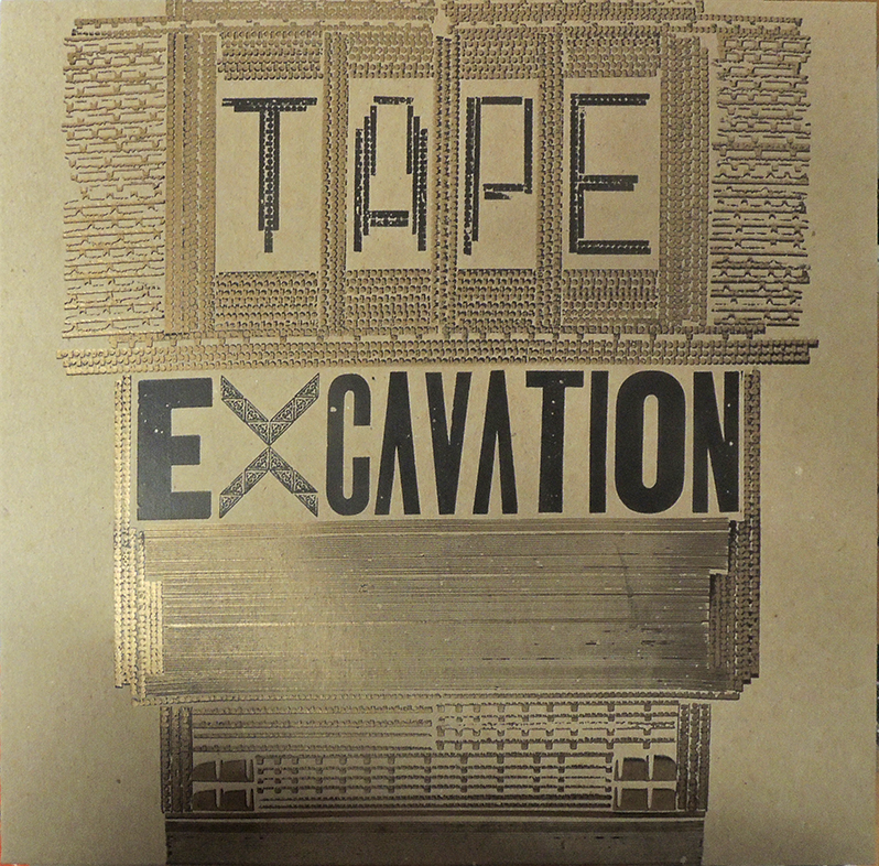
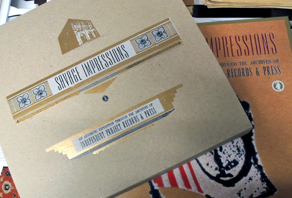
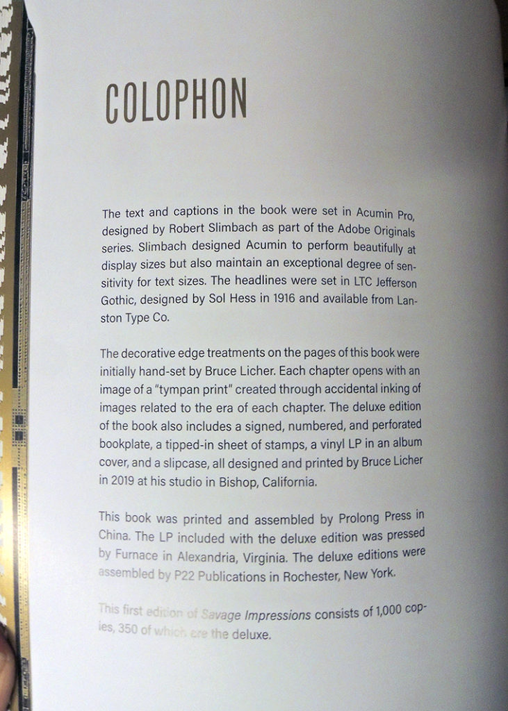
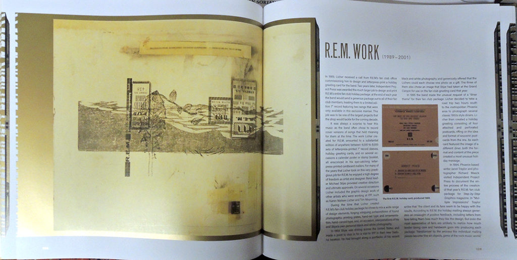
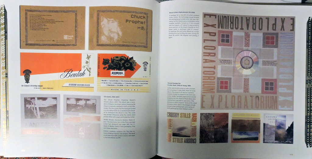
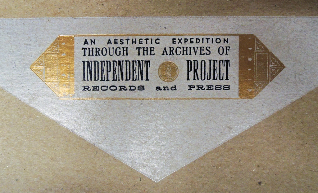
Thanks to a successful Kickstarter campaign, P22 Publications released Savage Impressions: An Aesthetic Expedition Through the Archives of Independent Project Records & Press, founded by Bruce Licher. The Graphic Arts Collection just received one of the 350 deluxe editions that include: 12” gold vinyl record titled Tape Excavation consisting of previously unreleased recordings spanning Bruce Licher’s recording career (1980-2019); special letterpress-printed stamp sheet tipped into the book; perforated chipboard letterpress bookplate tipped in, signed and numbered by Bruce Licher; and a letterpress wrap sleeve to hold the book and record together as a set.

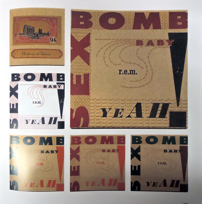
Bruce Licher founded Independent Project Press in 1982 after learning the art of letterpress printing at the Women’s Graphic Center in downtown Los Angeles. His initial projects centered around creating album covers, postcards and promotional stamps for his band Savage Republic and for releases on his Independent Project Records label. It didn’t take long before he was producing work for other L.A. underground music groups, along with a growing number of clients in the Los Angeles design community and an array of better-known musicians such as R.E.M, Harold Budd, and Stereolab.

Licher continues to translate his signature artistic design aesthetic to other products: book, magazine, catalog design, elegant and creative business stationery, wedding invitations, wine labels, promotional stamp sheets and booklets, and other letterpress-printed ephemera for clients large and small.

Licher currently works out of his studio on WIllow Street in the Eastern Sierra town of Bishop, California.–https://info701245.wixsite.com/mysite-5/bruce-licher

https://www.kickstarter.com/projects/p22/savage-impressions-the-book


Savage impressions: an aesthetic expedition through the archives of Independent Project Records & Press, compiled by Bruce Licher and Karen Nielsen Licher. Deluxe edition (Rochester, NY : P22 Publications, 2020). Graphic Arts Collection GAX 2020- in process

Mixing tints

Theodore Henry Adolphus Fielding (1781-1851), the elder son of Nathan Theodore Fielding, was a painter, printmaker, and teacher. He published collections of landscapes in aquatint such as: A Picturesque Tour of the English Lakes (1821), Picturesque Illustrations of the River Wye (1822), and Cumberland, Westmoreland and Lancashire Illustrated (1822).

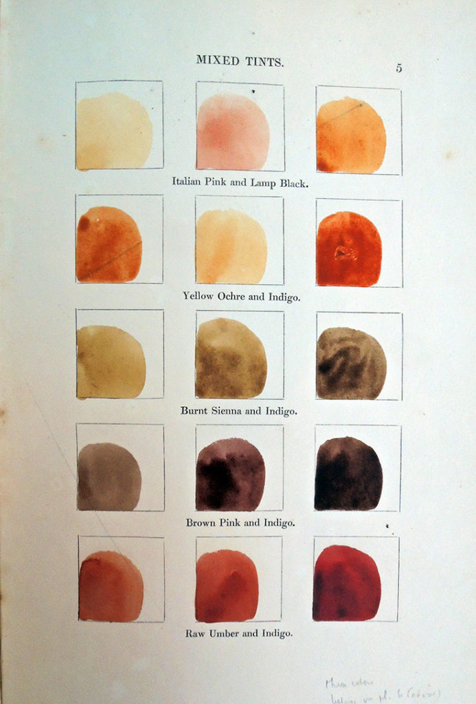
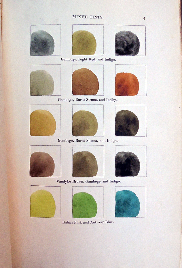
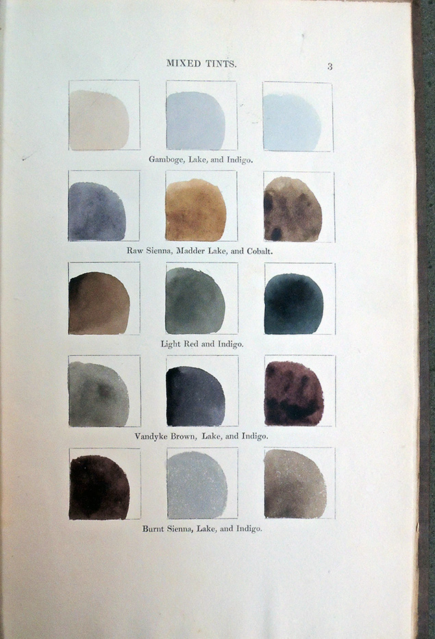
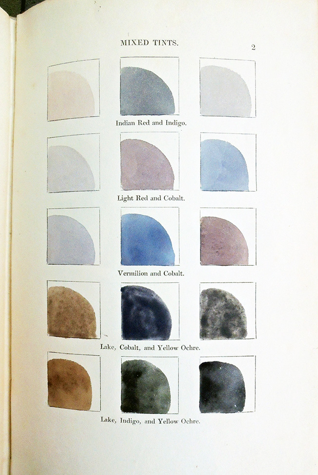
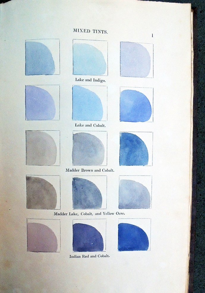
Beginning in 1830, while still a painting instructor to the “senior classes at the Honourable East-India Company’s military Seminary” at Addiscombe, Surrey, Fielding began publishing manuals on painting, perspective, and art theory. In particular, his expertise on mixing color pigments was beautifully documented in physical sample of brightly printed color, as seen here.

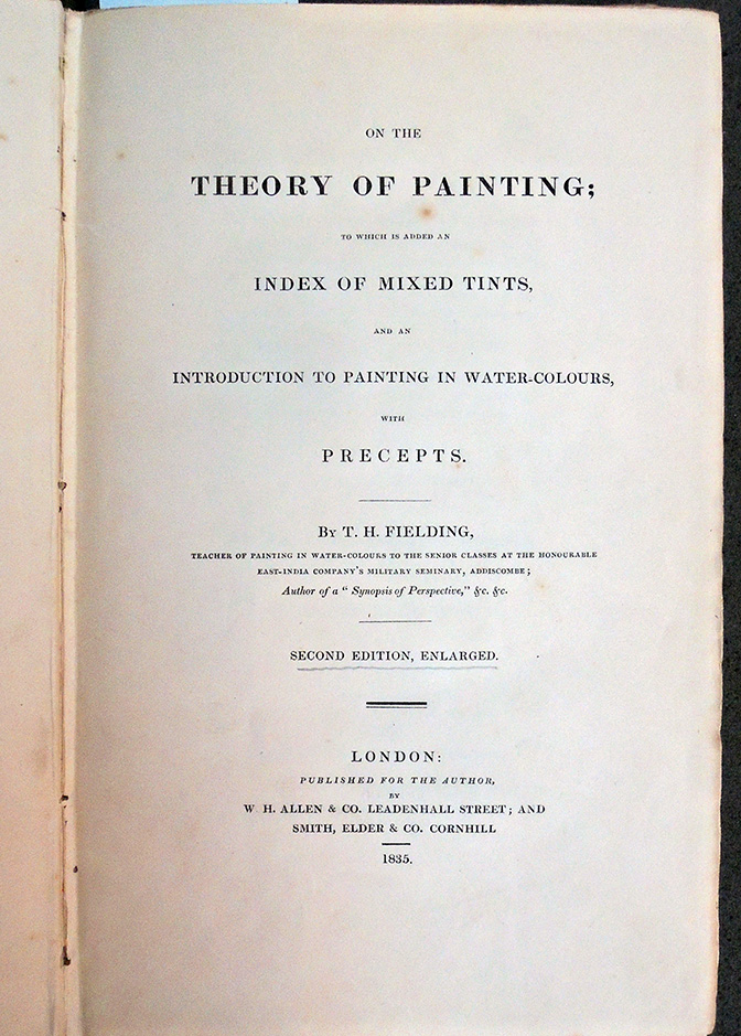
The books were so popular and went through so many editions that it is often difficult to put dates to them. For instance, there were “enlarged, 2nd editions” of his On the Theory of Painting in both 1835 and 1836.  Thanks to the generous donation of Dickson Q. Brown, Princeton Class of 1895, the Graphic Arts Collection has two now rare examples:

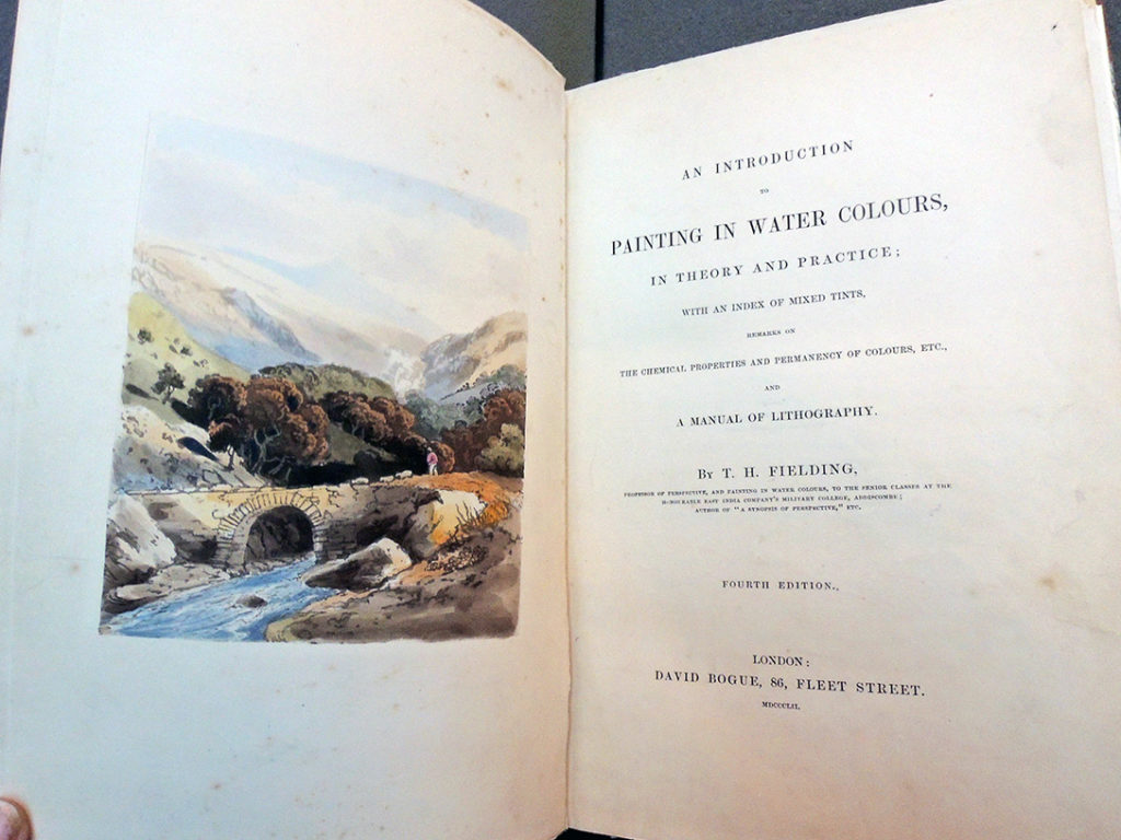
Theodore Henry Fielding (1781-1851), An introduction to painting in water colors: in theory and practice: with an index of mixed tints, remarks on the chemical properties and permanency of colours, etc., and a manual of lithography (London : D. Bogue, 1852). Graphic Arts Collection Rowlandson 671.2

Theodore Henry Fielding (1781-1851), On the theory of painting; to which is added and index of mixed tints, and an introduction to painting in water-colours, with precepts (London, W.H. Allen, 1836). Graphic Arts Collection Rowlandson 671


Fielding included this quote from Sir Joshua Reynolds on the title page of many of his volumes: “The rules of art are not the fetters of genius, they are fetters only to men of no genius.”

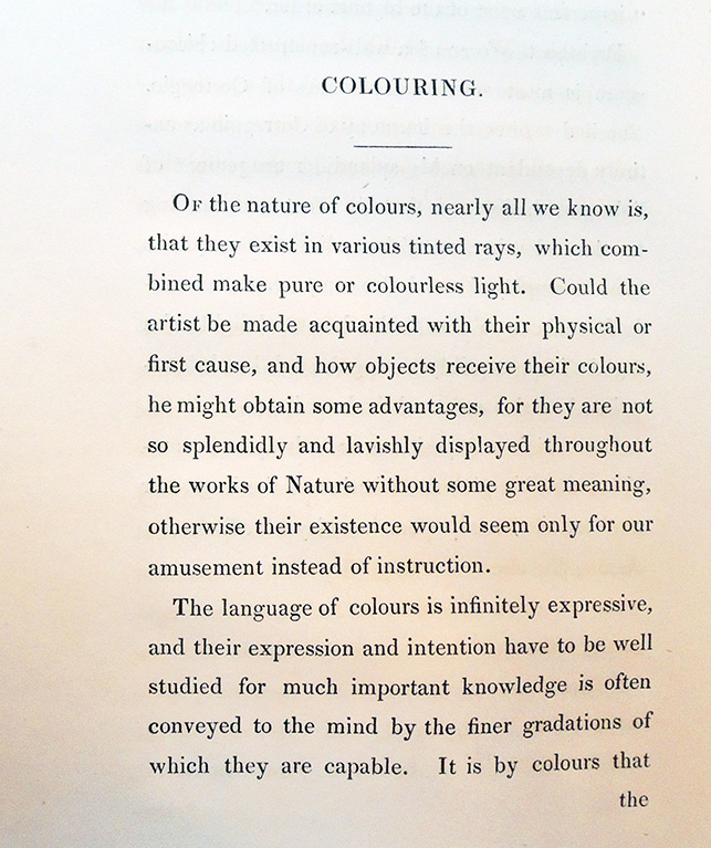
Of the nature of colours, nearly all we know is, that they exist in various tinted rays, which combined make pure or colourless light. Could the artist be made acquainted with their physical or first cause, and how objects receive their colours, he might obtain some advantages, for they are not so splendidly and lavishly displayed throughout the works of Nature without some great meaning, otherwise their existence would seem only for our amusement instead of instruction.


When Worlds Collide: Poetry and Computation


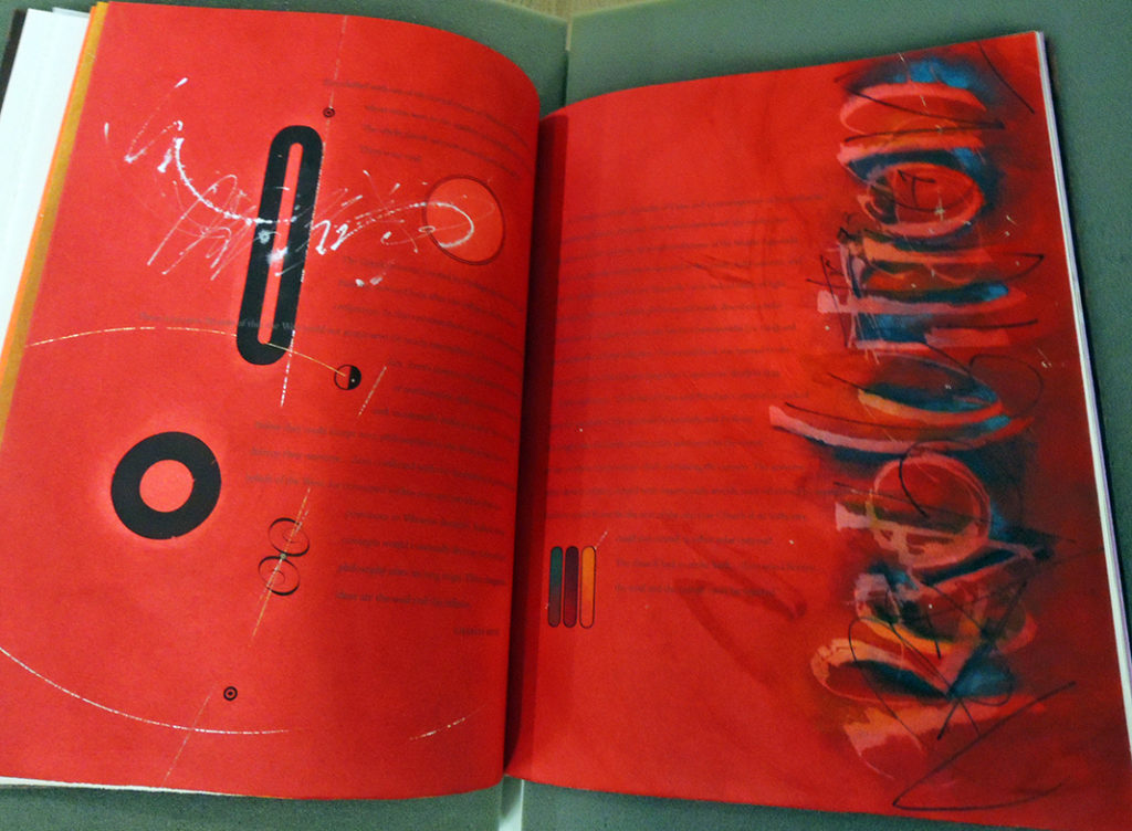
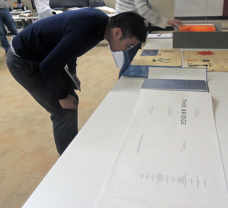
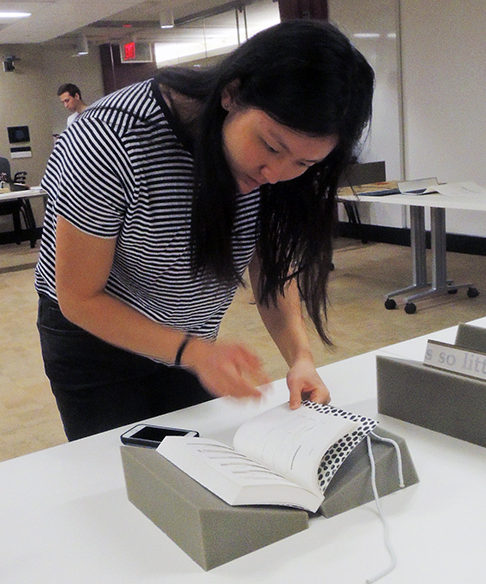
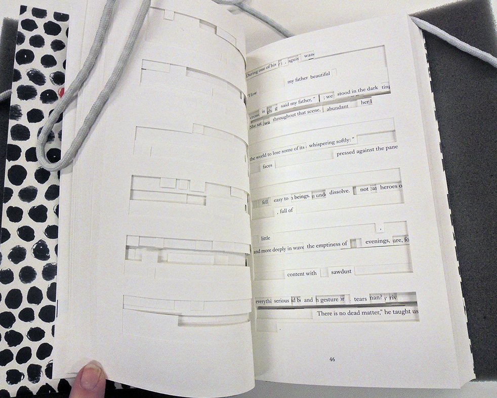
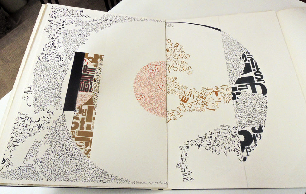
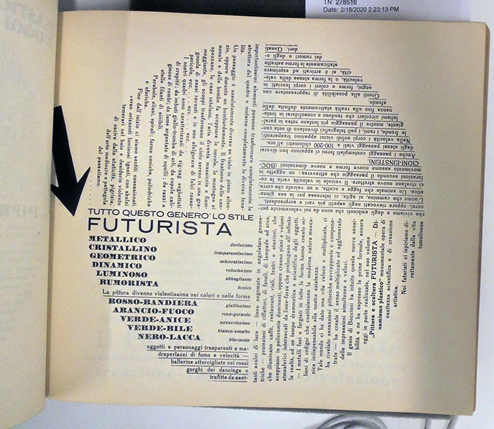
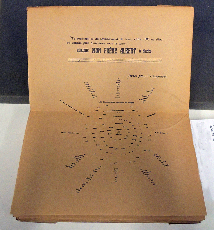
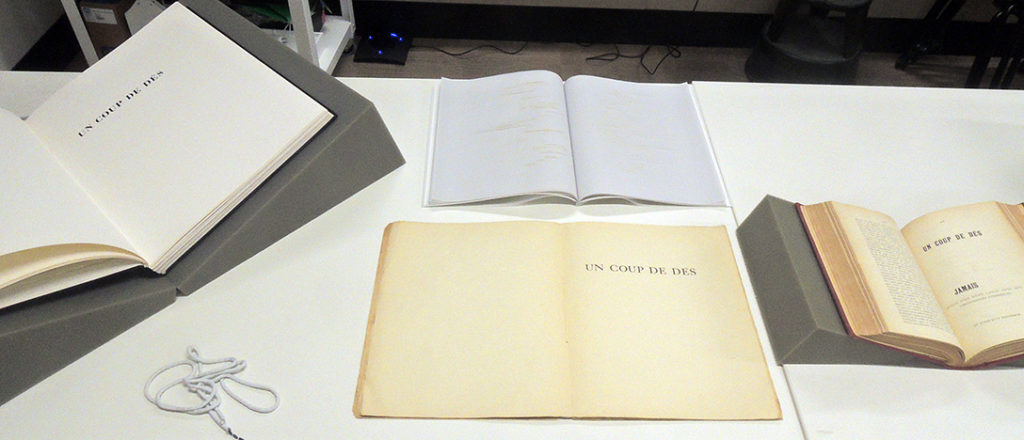
Members of the class “When Worlds Collide: Poetry and Computation” visited the Graphic Arts Collection looking at ways the classic poetry book has been deconstructed beginning with Walt Whitman’s 1855 Leaves of Grass to a 2017 scroll edition of Hart Crane’s The Bridge with woodblock prints by Joel Shapiro. A wide variety of materials were pulled including four distinct versions of Stéphane Mallarmé’s Un coup de dés jamais n’abolira le hazard. Pages designed in positive and negative space are featured in Paul Éluard’s Proverbe, Guillaume Apollinaire’s Calligrammes, and Werner Pfeiffer’s Liber Mobile.

The interdisciplinary seminar, taught by Brian W. Kernighan and Efthymia Rentzou, brings together humanities and applied sciences, addressing questions of literacy, media, and modes of knowledge. The course is organized around poetry and digital technology and explores the history of each as systems of relating, organizing, and understanding the real. Media technologies and means of communication for both poetry and computing — from orality to writing, from the alphabet to the printing press, from the scroll to the book, from computers to the internet — structure our discussion.

Here’s a pdf of the checklist: poetry


Mere Bubbles from The Scourge


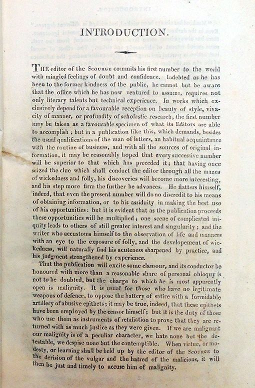
When it began, The Scourge or Monthly Expositor of Imposture and Folly specialized in exposing patent medicines, with a chart of fakes in each issue. Each issue had a folding plate, a hand colored etching, that served as illustrations to various articles, only later evolving to single theme political caricature. The plates in the first volume were all by Samuel De Wilde, known for his theatrical portraits exhibited at the Royal Academy from 1792 until 1821. Later issues include plates by George Cruikshank, Charles Williams, and others.

The First Series was published in 66 monthly numbers 1811 to 1816, bound with a yellow pictorial wrappers. Volumes 1-2 were published by the unidentified M. Jones at 5 Newgate Street and sold by J. Johnston, Cheapside and Goddard, Pall Mall. Beginning with volume 3,William Naunton Jones took over as publisher from the same address. The magazine’s title was altered with volume 7 to The Scourge or Literary, Theatrical, and Miscellaneous Magazine. The Graphic Arts Collection is fortunate to hold a complete set.

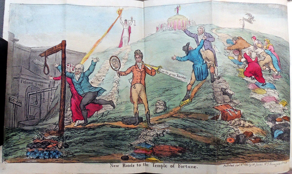
January 1811
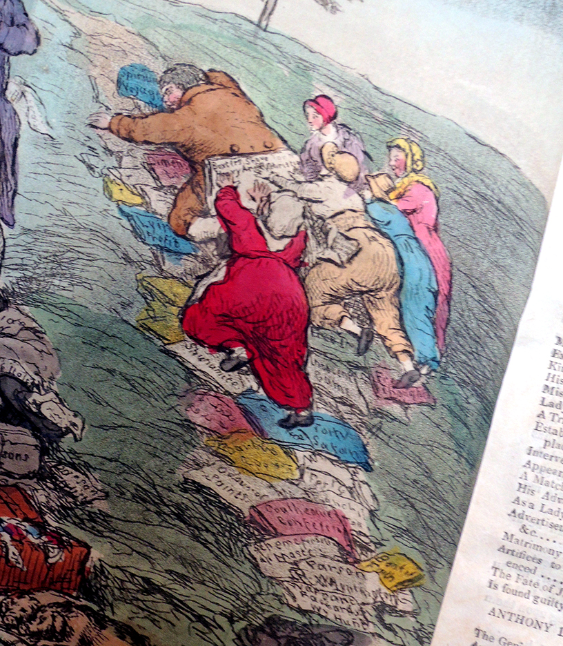
Samuel De Wilde (1751-1832), “New Roads to the Temple of Fortune” in The Scourge or Monthly Expositor of Imposture and Folly v.1, frontispiece (London: M Jones, January 1, 1811). An illustration to four articles in the magazine: (1) “John King,” pp. 1-27. (2) “James Henry Leigh Hunt,” pp. 46-64. (3) “Anthony Daffy Swinton,” pp. 27-46: (4) “Rev. William Huntington, S.S.,” pp. 64-77.
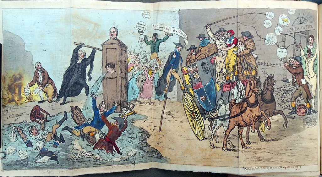
 

“Our Artist has omitted the title of the Caricature, which ought to be MERE BUBBLES.”
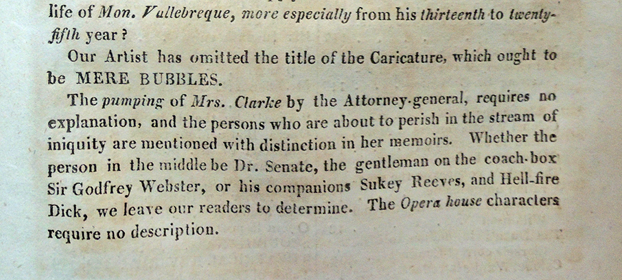
February 1811
Samuel De Wilde (1751-1832), [Mere Bubbles] in The Scourge or Monthly Expositor of Imposture and Folly, v.1, before page 85 (London: M Jones, February 1, 1811). An illustration to four articles in the magazine: [1] An account of Mrs. Clarke (pp. 102-36); [2] An account of Sir Godfrey Webster; [3] An account of Mr. William Taylor of the Opera House (pp. 146-64); [4] An account of a quack, Edward Senate, pp. 137-46.
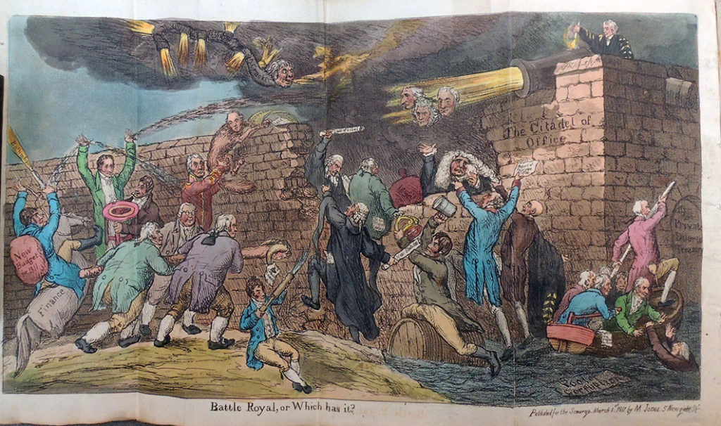
 

March 1811
Samuel De Wilde (1751-1832), “Battle Royal, or Which Has It” in The Scourge or Monthly Expositor of Imposture and Folly v.1, before p. 175 (London: M Jones, March 1, 1811).
A satire on the hopes of the Opposition that the Prince would dismiss the Perceval Ministry on the establishment of the Regency.

April 1811
Samuel De Wilde (1751-1832), “Truth in Jeopardy, or Power, Versus Freedom” in The Scourge or Monthly Expositor of Imposture and Folly v.1 (London: M Jones, April 1, 1811). On 4 Mar. 1811 Lord Holland moved for an account of all ‘Information “Ex Officio”‘ in libel cases from 1 Jan. 1801 to the end of 1810.
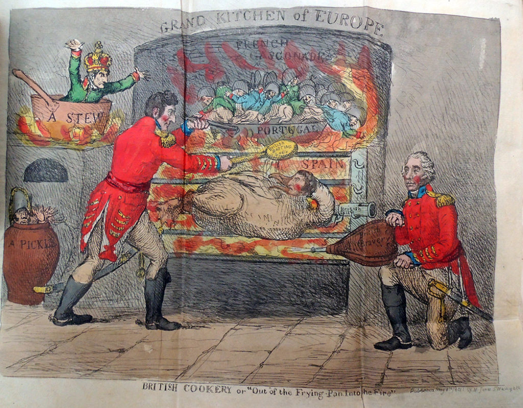
 

May 1811
Samuel De Wilde (1751-1832), “British Cookery or ‘Out of the Frying-Pan into the Fire’” in The Scourge or Monthly Expositor of Imposture and Folly v.1 (London: M Jones, May 1, 1811). The plate is explained; “That Ney should be in a pickle and Buonaparte in a stew John Bull will think very natural. General Graham . . . [gives] new vigor to the flame of patriotism.” The spitted goose is Massena.
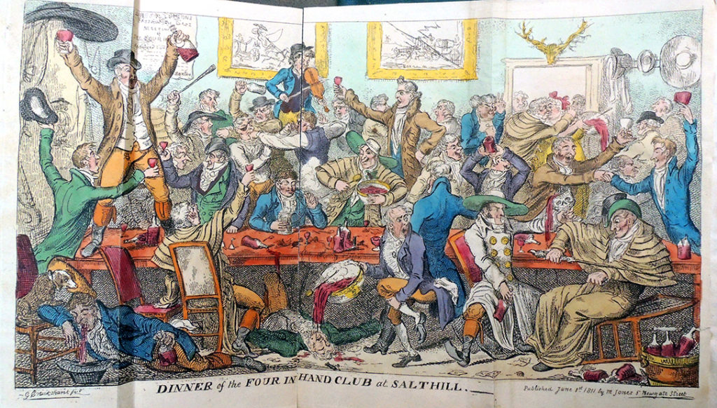
 

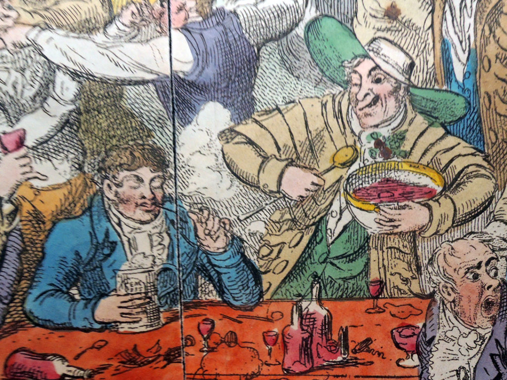
June 1811
George Cruikshank (1792-1878), “Dinner of the Four in Hand Club at Salthill” in The Scourge or Monthly Expositor of Imposture and Folly, v.1, before p. 431. (London: M Jones, June 1, 1811). Illustration to an article ‘The Dinner at Salt Hill’ in The Satirist, March 1, 1811. The Four-in-hand Club met in Cavendish Square, seven members only. The president was C. Buxton (probably Charles, 1787-1817). There is a second state, with the title Bang-up Dinner or Love and Lingo, a frontispiece to Lexicon Balatronicum, A Dictionary of Buckish Slang University Wit, and Pickpocket Eloquence, compiled originally by Captain Grose . . .’, 1811.


July 1811
George Cruikshank (1792-1878), “The Return to Office” in The Scourge or Monthly Expositor of Imposture and Folly v.2, frontispiece (London: M Jones, July 1, 1811). Also an illustration to The Duke of York, the Whigs and the Burdettites, pp. 1-5.

August 1811
George Cruikshank (1792-1878), “The Blessing of Paper Money, or King a Bad Subject” in The Scourge or Monthly Expositor of Imposture and Folly v.2, p. ? (London: M Jones, August 1, 1811).

September 1811
George Cruikshank (1792-1878), “Quadrupeds; or the Managers Last Kick. Last Scene” in The Scourge, or Monthly Expositor of Imposture and Folly v.2, before p. 177 (London: M Jones, September 1, 1811). [On 18 July 1811 a heroic, tragic, operatic drama with the title of the print was played for the first time by the English Opera Company at the Lyceum.]


October 1811
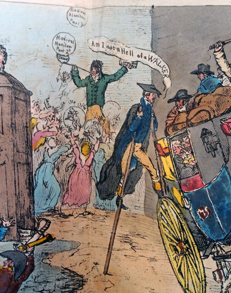
George Cruikshank (1792-1878), “The Examination, of a Young Surgeon” in The Scourge or Monthly Expositor of Imposture and Folly, v.2, before p. 263 (London: M Jones, October 1, 1811). The plate illustrates ‘Medical Science Exemplified’, pp. 263-8, ridiculing the education and examination of surgeons with special reference to two Scottish examiners, clearly David Dundas and Everard Home, both Serjeant-surgeons to the King.

November 1811
George Cruikshank (1792-1878), “Interior View of the House of God” in The Scourge or Monthly Expositor of Imposture and Folly, v.2, before p. 349 (London: M Jones, November 1, 1811). A savage account of Carpenter, a paper-maker of Neckinger House, appeared in the August number of The Scourge v.2. 94-102. The ‘tickets’ must be the half-sheets signed and sealed by Joanna Southcott, by which the faithful were ‘sealed’ or certificated for the millennium.

December 1811
George Cruikshank (1792-1878), “Princely Piety, or the Worshippers at Wanstead” in The Scourge or Monthly Expositor of Imposture and Folly v. 2, before p. 473. (London: M Jones, December 1, 1811).
Vol. 3
No. 13. The Rehearsal, or the Baron and the Elephant. January 1st, 1812.
No. 14. The Mountebanks, &c., &c. February 1st, 1812.
No. 15. Princely Amusements, &c., &c. March 1st, 1812.
No. 16. Princely Predictions, &c., &c. April 1st, 1812.
No. 17. The Prince of Wales, &c., &c. May 1st, 1812.
No. 18. The Antiquarian Society. June 1st, 1812.
Vol. 4
No. 19. The Political Medley, &c., &c. July 1st, 1812.
No. 20. The Cow Pox Tragedy. 1812.
No. 21. The Coronation of the Empress of the Nairs. September 1st, 1812.
No. 22. An Excursion to R Hall. October 1st, 1812.
No. 23. The Court of Love, &c., November 12th, 1812.
No. 24. Management of Butts and Hogsheads. December 1st, 1812.
Vol. 5
No. 25. Quadrupeds, or, Little Bonev’s Last Kick. January 1st, 1813.
No. 26. The Storming of Monopoly Fort. February 1st, 1813.
No. 27. John Bull in the Cellar, &c., kc. March 1st, 1813.
No. 28. State Mysteries, or, a Vision of Pall Mall. April 1st, 1813.
No. 29. The Delicate Investigation. May 1st, 1813.
No. 30. A Sepulchral Enquiry into English History. June 1st, 1813.
Vol. 6
No. 31. John Bull in the Council Chamber. July 1st, 1813.
No. 32. Preparing John Bull for General Congress. August 1st, 1813.
No. 33. The Regency Park. September 1st, 1813.
No. 34. Rival Candidates for the Vacant Bays. Oct. 1st, 1813.
No. 35. Benefits of a Plentiful Harvest, November. 1st, 1813.
No. 36. The Sale of the Coal Heaver’s Scraps. Decr.1st, 1813.
Vol. 7—”The Scourge or Literary, Theatrical, and Miscellaneous Magazine.”
No. 37. Smuggling in High Life. January 1st, 1814.
No. 38. The Divine and the Donkey, or Petworth Frolicks. February 1st, 1814.
No. 39. Imperial Botany, &c., &c. March 1st, 1814.
No. 40. Modern Idolatry, or, Editors and Idols. April 1st, 1814.
No. 41. Nic, alias Nap’s March to Elba. May 1st, 1814.
No. 42. Royal Munificence, &c., &c. June 1st, 1814.
Vol. 8
No. 43. Spirits at Work—Joanna Conceiving. July 1st, 1814.
No. 44. The R 1 Pedagogue and his Ushers. August 1st, 1814.
No. 45. A Paradise for Fools, &c. In three compartments. September. 1st, 1814.
No. 46. Hocus Poems, or, Conjurers Raising the Wind. October 1st, 1814.
No. 47. Delivering a Prophetess. Nov. 1st, 1814.
No. 48. The Siege of St. Quentin. December. 1st, 1814.

Vol. 9
No. 49. The Property Tax—Civic Champions, or, the Darling in Danger. January 2, 1815.
No. 50. Amusements at Vienna, &c., &c. Feb. 1st, 1815.
No. 51. John Bull’s Three Stages. In three compartments. March 1st, 1815.
No. 52. The High Winds of March blowing Events from all quarters. April 1815.
No. 53. The Phomix of Elba resuscitated by Treason. May 1st, 1815.
No. 54. Preparing for War. June 1st, 1815.
Vol. 10
No. 55. Nebuchadnazzars Dream. July 1st, 1815.
No. 56. A Financial Survey of Cumberland, &c. August 1st, 1815.
No. 57. Napoleon’s Trip from Elba to Paris, and from Paris to St. Helena. Sept. 1st, 1815.
No. 58. Boxiana, or, The ‘Fancy. October. 1st, 1815.
No. 59. The Progress of Disappointment, or the Hopes of a Day. November 1st, 1815.
No. 60. State of Politicks at the close of the year 1815. December 1st, 1815.
Vol. 11
No. 61. Royal Christmas Boxes and New Year’s Gifts, 1815 & 16. January 1st, 1816.
No. 62. Odds and Ends for February, 1816. In three compartments. Feb. 1st, i816.
No. 63. The Pall Mall Apollo, or, R tv in a Blaze. March 1st, 1816.
No. 64. Royal Nuptials. April 1st, 1816.
No. 65. Economy—Anticipation. Two compartments. May 1st, 1816.
No. 66. A Bazaar. June 1st 1816.


Pairing Herbert Granville Fell with Annie S. MacDonald
 

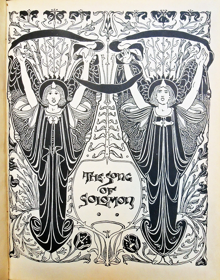
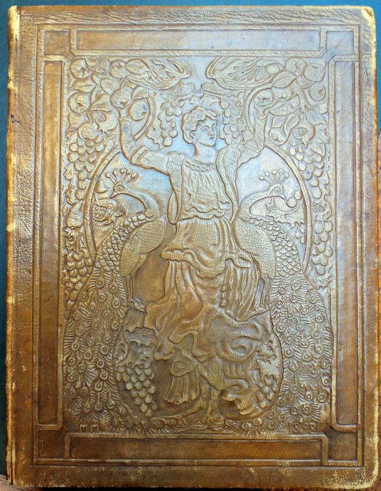
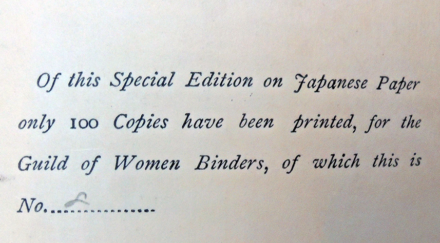
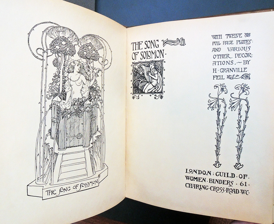
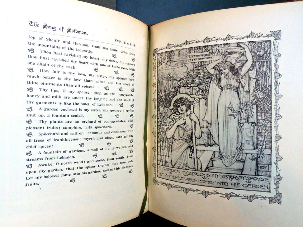
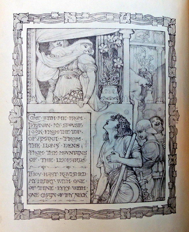
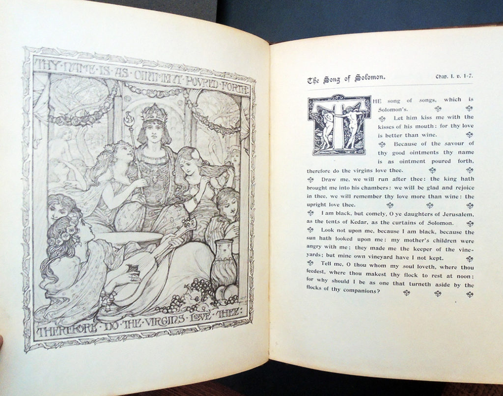
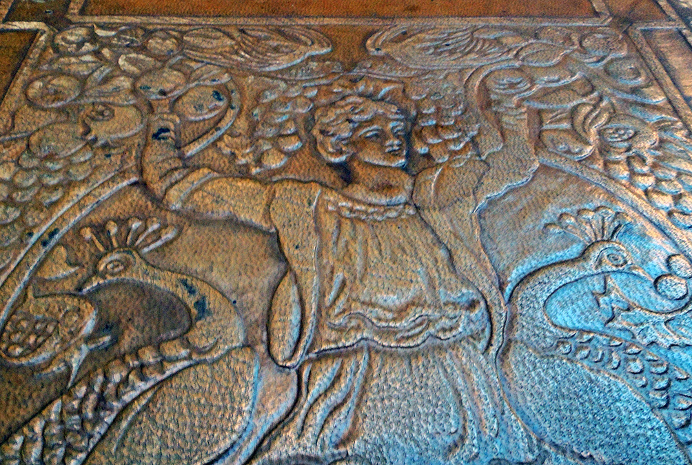
The Graphic Arts Collection recently acquire a copy of The Song of Solomon designed and illustrated by Herbert Granville Fell (1872-1951) with a binding by Annie S. MacDonald (1849-1924) (London: Guild of Women Binders, Chapman and Hall, printed by William Clowes and Sons, 1897). “Of this special edition on Japanese paper only 100 copies have been printed, for the Guild of Women Binders.”–Page 1. This is copy 8 of 100.


The binding is signed in embossed leather with an ‘M M’ at the lower edge of the front cover, with the date ‘1898’ in embossed leather at the opposite edge. ‘M M’ refers to ‘Mrs. MacDonald,’ a member of the Guild of Women-Binders.

The founding of the Guild of Women-Binders and Annie MacDonald’s part in the organization has been repeated on many webpages and catalogues. Here it is from the American Bookbinders Museum post “The Bindings of To-morrow”:

The Guild of Women Binders was founded by Frank Karslake, a London bookseller and also founder of the Hampstead Bindery. Karslake was a bit of a rogue, who dabbled in multiple professions ranging from acting to ranch management, before trying his hand at bookselling and bookbinding. His interest in women binders emerged from his admiration of bindings exhibited at the Victorian Era Exhibition in 1897. Soon after seeing these examples, he invited several of the women binders to exhibit in his shop.

This exhibit, Exhibition of Artistic Bookbinding by Women, confirmed to Karslake that maybe women really could distinguish themselves in this industry. Perhaps he saw an opportunity to profit from the novelty of women binders, but soon after, Karslake acted as agent to prominent binders like Constance Karslake, Edith de Rheims, Florence de Rheims, Mrs. Macdonald, Helen Schofield, Frances Knight, and Lilian Overton (to name a few). In 1899, Karslake’s vision evolved into the workshop and business venture that became the Guild of Women Binders. Women involved in the guild were typically middle class and had a background in artistic education.

When Karslake first conceived of the idea to compile a book, publishers refused it because books on bindings were said to be unprofitable. A warning which Karslake ignored when he published The Bindings of To-morrow himself in 1902, with the assistance of W. Griggs who printed an edition of 500 copies. [Graphic Arts Collection 2008-2402N] This book provides a unique historical insight into the binding process and a glimpse into the under-represented work of women binders. A year after publication, Karslake was forced to offer the remaining 150 copies of the book to booksellers at a fraction of the original price.

In the catalog, The Bindings of To-morrow, Annie MacDonald’s entry includes autobiographical text: “Mrs. Macdonald writing in 1897, when her work was shewn at the “First exhibition of Bookbinding by Women”, said: ‘It began about six years ago, with myself and the late John M. Gray, curator of the Scottish National Portrait gallery. We took great pleasure in searching out and enjoying old bindings in libraries, both at home and abroad and felt that it was a beautiful art, but now fallen to be only a trade. Then we wishes to try it ourselves. . . . The embossed leather in which most of the work is done is an idea of my own. It is not cut, or raised by padding, but is quite solid leather, and is worked on the book after it is covered, with one small tool. It allows of great freedom of design, no two people work it alike.’”
https://archive.org/details/bindingsmorrow00Guil/page/n89/mode/2up

Thanks to Sarah Hovde, not only for the Folger Shakespeare Library post on MacDonald but the Wikipedia page she wrote to introduce MacDonald to the contemporary world. Read: https://collation.folger.edu/2017/03/guild-women-binders/

https://doi.org/10.1093/benz/9780199773787.article.B00062735
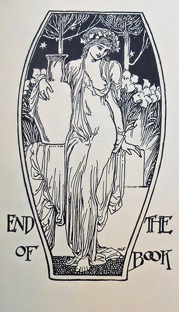
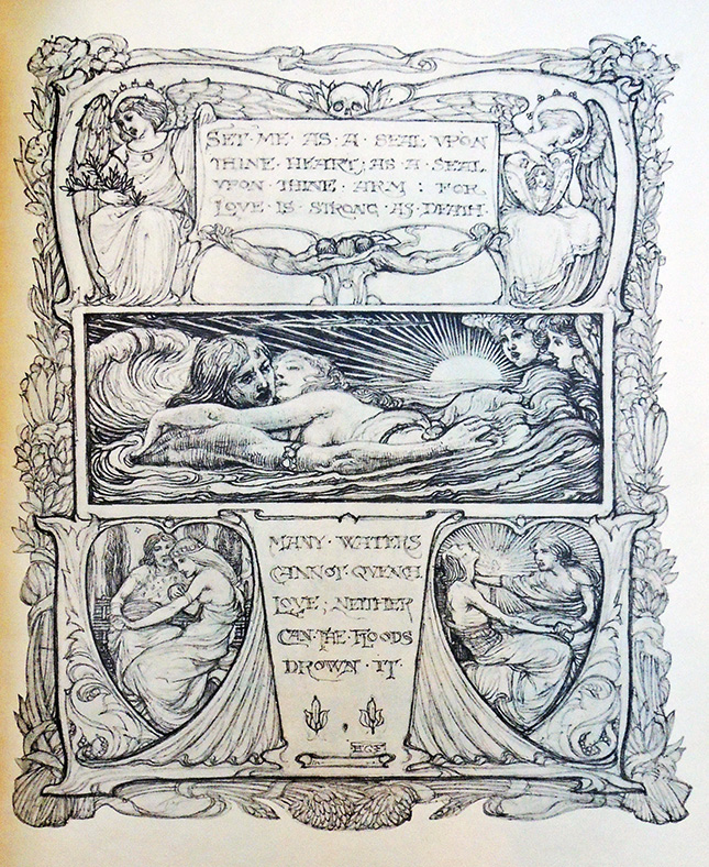
The Oxford Art Online describes Herbert Granville Fell as a painter first, then illustrator and stained glass painters. “Fell studied in London at Heatherley’s, in Brussels and in towns in Germany. He produced drawings for the Pall Mall Magazine, The Ludgate Monthly, The Windmill, the English Illustrated, the Ladies Field (of which he was artistic director) and other magazines.” The Song of Solomon is only one of many elaborately illustrated books by Fell.


Analogy and harmony of colours

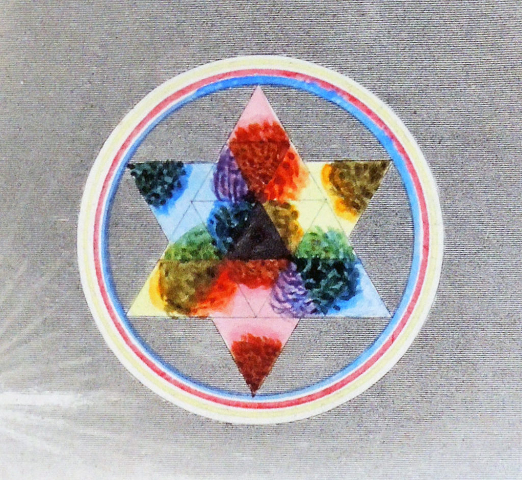
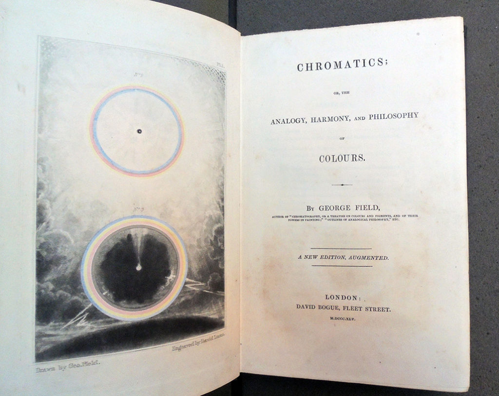
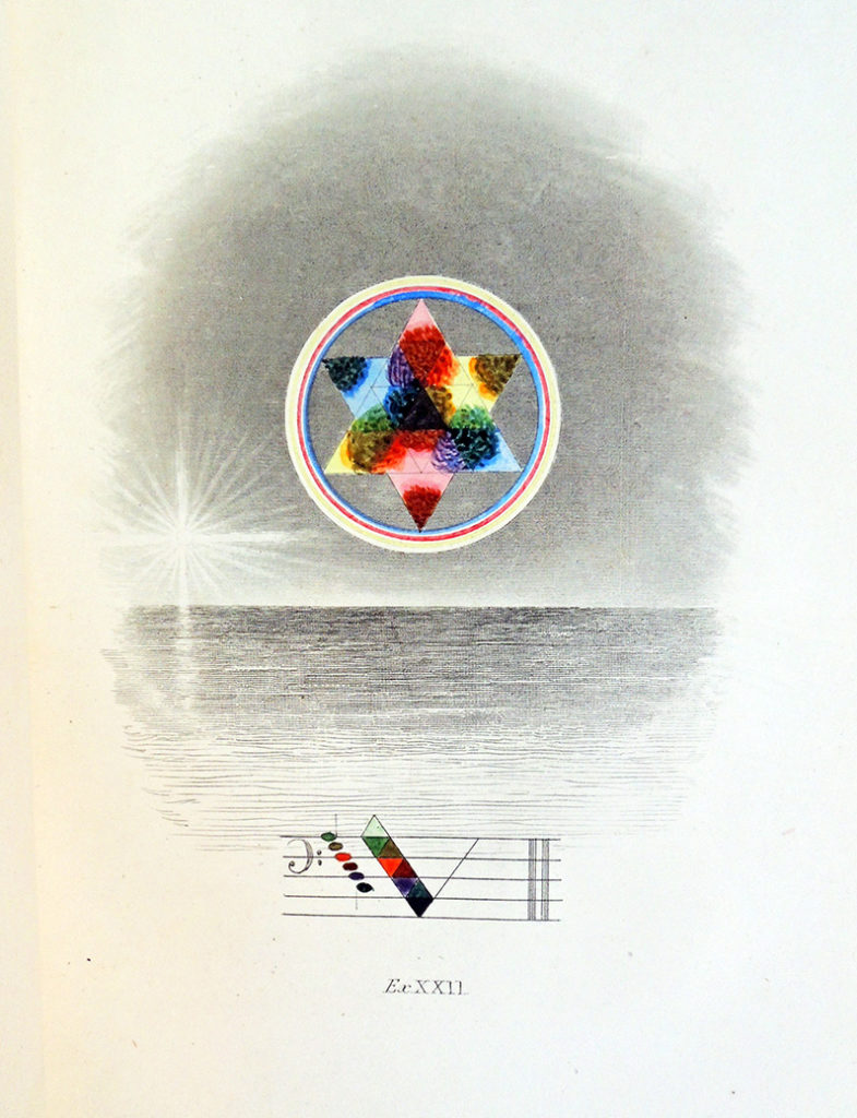
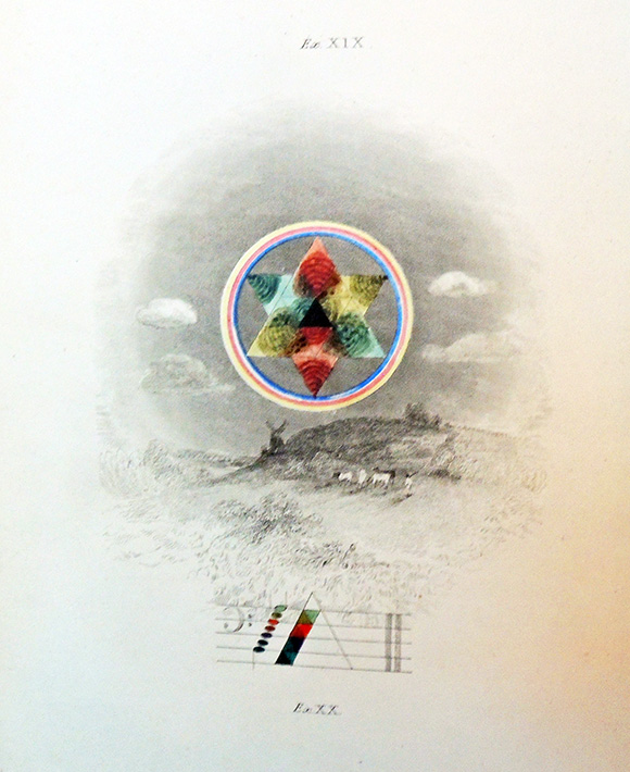
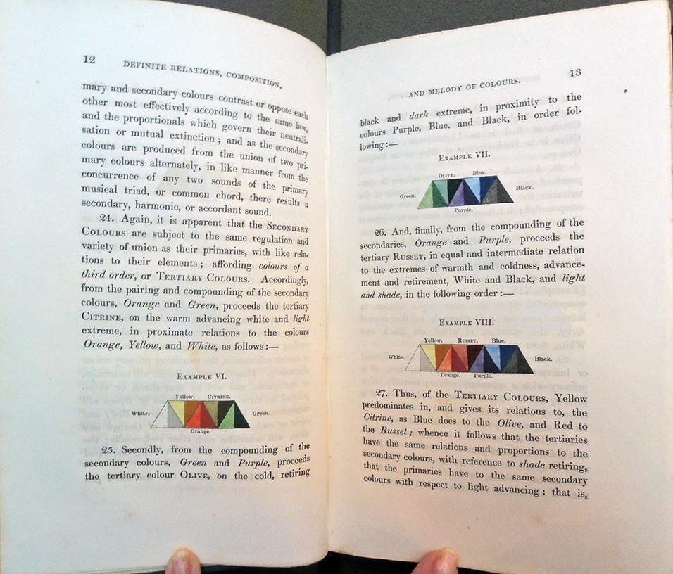
Princeton University Library owns the 1845, new augmented edition of George Field’s essay on harmony and color but not the original 1817 edition, so the two were compared to see what we were missing. The 1817 edition has 57 pages with 5 plates, the later is 263 pages with 11 plates – quite a difference.


George Field (1777?-1854), Chromatics, or, an essay on the analogy and harmony of colours (London: Printed for the Author by A.J. Valpy, 1817). viii, 57, [2] p., [5] leaves of plates). Full text online

George Field (1777?-1854), Chromatics, or, the analogy, harmony, and philosophy of colours, New ed., augm. (London: Bogue, 1845). xviii, 263 p., 11 leaves of plates. Rare Books 2008-0260

In Field’s preface to the 1845 edition he writes:

“This work, as printed twenty-eight years ago [1817], was part of a general treatise on colours, and an abstract of the first principles of chromatic science, constituting one division of a universal system of “Analogical Philosophy.” As it was well received by the artists, and the truth and practicability of its theory continue to be acknowledged, and as we hold the science to be that which, from its middle station, the simplicity, breadth, and perspicuity of its relations, the beauty of its representations, and its easy reference to nature, is best adapted to illustrate the universal analogy of science, we have been induced to republish the work under a wider development, extending the sphere of its application throughout art.”


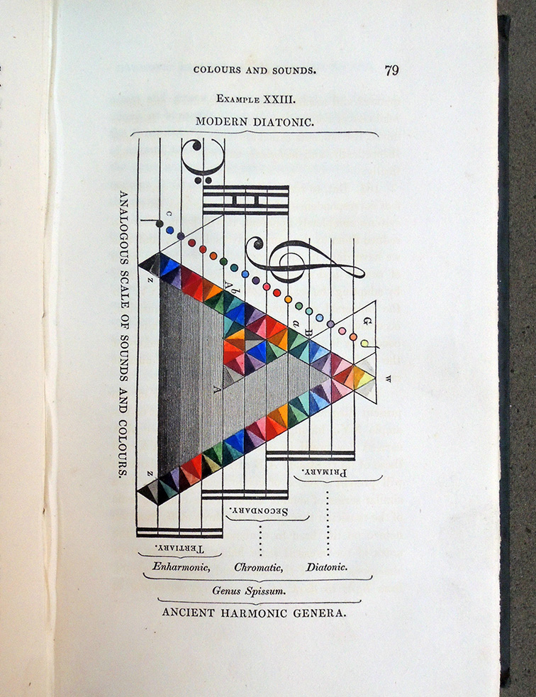
In fact the revised edition is substantially rewritten (not always for the better) and the color plates much improved. For instance, in the first edition the author concludes: “the principal distinction of the two systems is, that the notes of sound are separated by intervals or spaces, while the notes of colour are the spaces themselves; for colour, as expansible quantity, bears the same relation to space that musical sound, as quantity successive, does to time: the Chromatist has therefore not only his melody and harmony, but he has also, if the variety of expanded quantities may be so expressed, his semibreves [whole notes] and minims [half notes], quavers [8th notes], and semiquavers [16th notes]. And this relation of colours answers to that which, in their music, the ancients called harmonica and rhytlimica theoretically; or practically to their Melopoeia and rhythmopoeia.

In the 1845 edition, Field expands on his theories, not ready to conclude at this point: “In such case there will arise this distinction of the two systems, that the notes of sound being separated by intervals or spaces, while the notes of colour (we beg the term) will be the spaces themselves; but in this diagram the distances on the scales from one sound to another, and those from colour to colour, are equally intervals. Thus from the particular hue and shade of Red to that of Orange on the scale, and from E to F, the corresponding sounds of these colours, are both intervals in which a series of intermediate hues and smaller intervals of sound have place. . . .”

The 1818 edition, Field writes “It is evident also that colours have a science as distinct from any association with figure or forms, as that of musical sounds is from figurative language or poetry. Hence the field in which the Chromatist may exercise his genius, is as extensive as that of the musician : to teach the science in all its bearings, is, however, beyond the purpose of an essay designed principally to illustrate the analogy of colours.”

1845 edition: “We may therefore terminate the present head with the remark, that, although colours have a science as distinct from any necessary connection with that of figures, or plastic, or pictorial forms in painting, as that of musical sounds is from figurative language, or the images of poetry, and are similarly associated; nevertheless, each of these sciences has its highest office under such figurative conjunction, as we shall further shew; whence the field in which the chromatist may exercise his genius is as diversified and extensive as that of the musician. To disclose the subtleties of the science is, however, beyond the purpose of an essay, designed principally to illustrate the analogy of colours.”

While having both is preferable, having the 1845 plates is a treat not fully appreciated with the digital surrogate. The 1817 can be read online until one is gifted. *note, the picture in our database is from the 21st century reprinting, although the record is for the 1845.