Category Archives: Books

books

A library for our times, cash only

From now until February 28, 2020, the lounge at 185 Nassau Street, Lewis Center for the Arts, has “slipped into a reading lounge. Sitting next to the existing vending machine with snacks is its fraternal partner, 2019-20 Hodder Fellow Ryan Gander’s vending machine containing USB sticks of over 300 annotated essays. Collected together to form a library for our times, The Annotated Reader project includes texts of almost 300 contributors including the Faculty in Visual Arts. Is there one piece of writing that you would want with you for company in the small hours? All are welcome to come sit and read.”
https://arts.princeton.edu/events/the-annotated-reader/

Unlike his art vending machine that dispensed random artworks for a £500 fee during the London Frieze arts fair last fall, the Princeton vending machine only costs $1.00 for a complete book. The art machine contained a total of 125 items, including stones that Gander has collected with his children, as well as cast versions of some of the most widely used and affordable digital watches.

“The rest of the installation [at Frieze] includes paintings and a book, which is a version If on a Winter’s Night a Traveler, a 1979 novel by Italian writer Italo Calvino, that Gander has re-typed using a typeface of his own invention that no one can read, in which the letters are replaced by shapes of stones–the same stones that can be obtained from the vending machine. The paintings are enlarged pages from the book, printed using the illegible stone typeface, then annotated over by the artist with black ink. ‘I repeated the annotations over them with a large calligraphy brush. They become a form of censorship, it makes them illegible in a way. But through that process they become an abstract, expressionist motif of what art is,’ he said. ‘The book is published. We will distribute these unreadable books in hospitals, prisons, hotels, lighthouses — places that have time abundance and attention abundance,’ he continued, adding that he’s replaced the bible in the hotel room up for grabs with a copy of the book.—Jacopo Prisco, CNN

Gander currently lives and creates in London and Suffolk, visiting Princeton periodically during his fellowship year. His work encompasses graphic design, installation, performance, and more, and he has garnered international attention as he challenges notions of knowledge, language, and understanding. He is drawn to the contradictions in paradoxes and the ambiguity of life. His work often unites the mundane and commonplace with the aberrant and extraordinary.

His recent solo shows include exhibitions at Esther Schipper in Berlin, The National Museum of Art in Osaka, Hyundai Gallery in Seoul, Contemporary Art Gallery in Vancouver, and Manchester Art Gallery in Manchester. His most recent publications include The Boy That Always Looked Up, Picasso and I, and the monograph Culturefield. He has been presented with the 2007 Paul Hamlyn Award for Visual Arts, the 2006 ABN AMRO prize of the Netherlands and the 2009 Zürich Art Prize.

Gander studied at Manchester Metropolitan in the U.K., Rijksakademie van Beeldende Kunsten and the Jan van Eyck Akademie, both in the Netherlands. He has been a visiting lecturer at a number of European art schools throughout the continent. He was also awarded Doctor of Arts of the Manchester Metropolitan University and Honoris Causa for his efforts in academia.—https://arts.princeton.edu/news/2019/11/screening-of-me-my-selfie-and-i-followed-by-talk-with-artist-ryan-gander-presented-by-lewis-center-for-the-arts-program-in-visual-arts/

Remedies for the vices of speech

Antoine de Bourgogne (ca. 1594-1657). Linguae vitia & remedia Emblematicè expressa (Antwerp: Widow Cnobbaert, 1652). Graphic Arts Collection GAX 2019- in process.

Small oblong 16mo (74 x 97 mm). [12] leaves, 191, [1 bl.] pages ; etched title, 93 full-page etchings. Nineteenth-century red morocco with triple gilt fillet borders, spine and turn-ins gold-tooled, edges gilt over marbling, by Trautz-Bauzonnet. Provenance: James Toovey (1814-1893), London bookseller, armorial gilt bookplate with motto inter folia fructus.


This copy includes the cancelled leaf A8, blank except for pagination and headline on the verso. Interesting that it come at the description of an echo.

Rare book historian Nina Musinsky regards this as one of the most delightful of the Netherlandish emblem books, with 94 miniature etchings. This second Latin edition reprints the same plates and text as that of 1631, which was published at the same time as a Flemish-language edition.

Musinsky notes, “The purpose of the book was to list and propose remedies for the “vices” of speech: garrulousness, equivocation, insults, foul language, detraction, blasphemy, lying, perjury and calumny. The theme can be traced back to antiquity, having been treated by Plutarch in the Moralia; but the author, a member of the secular clergy at the Cathedral of Bruges, was more immediately influenced by Erasmus’s De linguae usu ac abusu” (1525. Princeton Rare Books 2949.32.46).


Part 1 provides examples of improper or sinful speech; two introductory emblems (the first a grisly vision of hell) are followed by 45 examples of such speech, each with an etched emblem on the verso and a motto and four-line poem on the facing recto, with an occasional note in smaller italic type at the foot of the page.


Part 2, with 45 more etchings, turns to the remedies for each kind of evil language (each number responds to the same number in the first part). The delicate unsigned etchings are attributed, apparently without question, to Jacobus Neeffs (1610-1660) and Andries Pauli (or Pauwels) the elder (1600-1639), after designs by Abraham van Diepenbeeck (1596-1675), who dominated Antwerp book illustration at the time.

See more designs by Abraham van Diepenbeeck in three other books at Princeton: The Holy Bible: containing the bookes of the Old & New. Cambridge [England] : Printed by John Field …, 1659-1660. William H. Scheide Library 63.9

The temple of the Muses, or, The principal histories of fabulous antiquity : represented in sixty sculptures / designed and ingraved by Bernard Picart le Romain and other celebrated masters ; with explications and remarks, which discover the true meaning of the fables, and their foundation in history. Amsterdam : Printed for Zachariah Chatelain, 1733. Rare Books Oversize NE1715 .P6f

William Cavendish, Duke of Newcastle 1592-1676. A general system of horsemanship in all it’s branches: containing a faithful translation of that most noble and useful work of His Grace, William Cavendish, Duke of Newcastle, entitled, The manner of feeding, dressing and training of horses for the great saddle … with all the original copper-plates in number forty-three …    London: J. Brindley, 1743. Rare Books Oversize 4235.673f


References: Landwehr (3rd ed.) 96; Funck, Livre belge à gravures, p. 284; Forum, The Children’s World of Learning, part 7, no. 3815; cf. Praz, p. 292 (1631 Latin edition); de Vries, De Nederlandsche Emblemata132 (1631 Flemish edition).


The Chalk Plate process

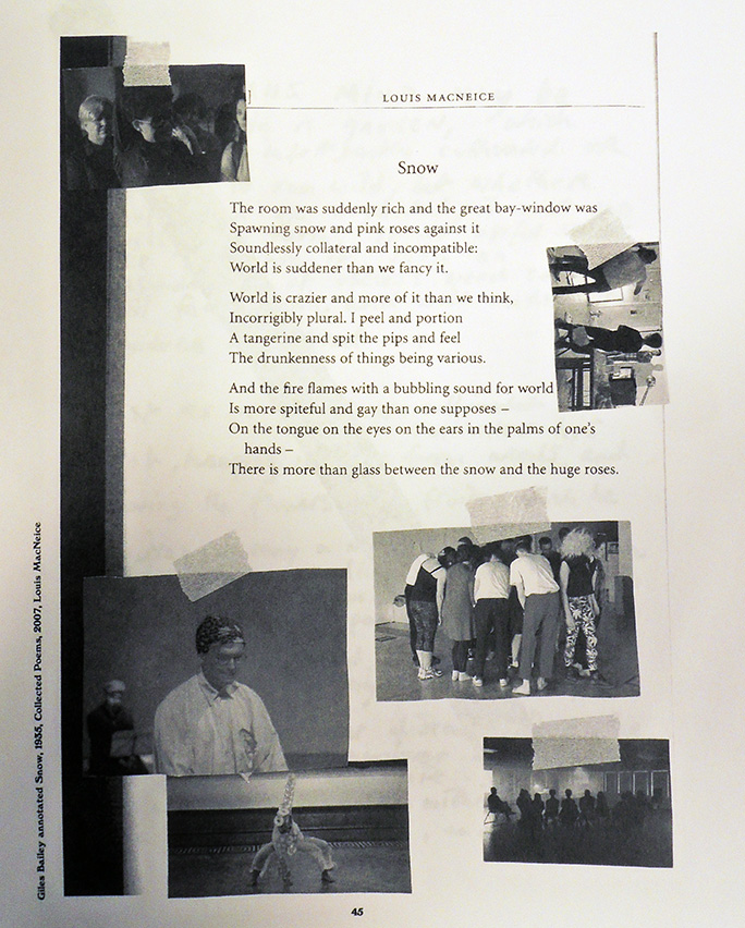
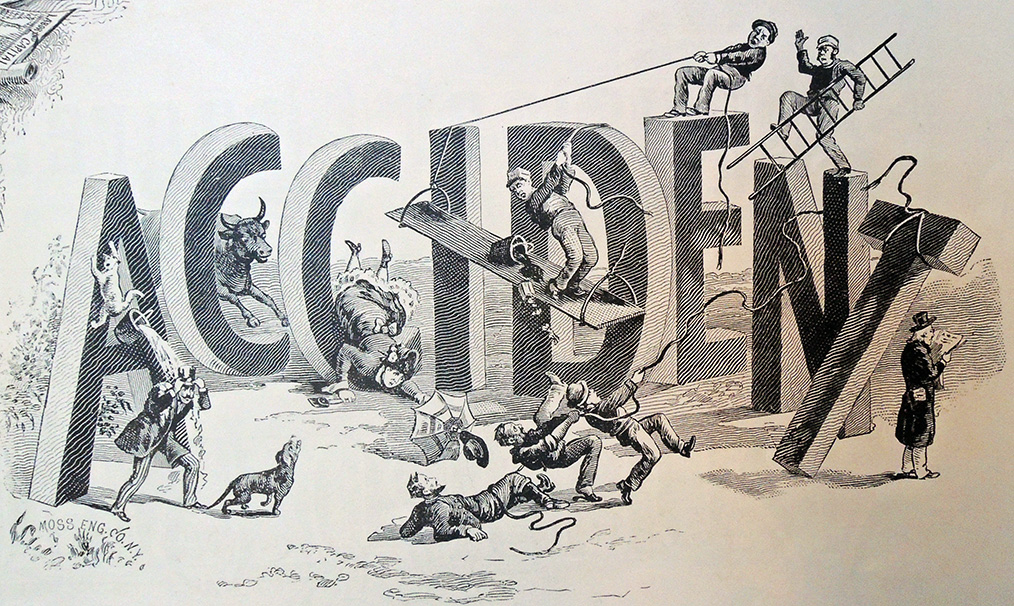
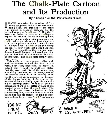
Cartoons Magazine 4, Issue 4 (1913): 401-03

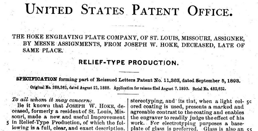
Beginning in 1885 (copyrighted 1888), wood engraving faced serious competition from a new reproductive process. No, not the Kodak camera. It was the chalk-plate process, or Hoke process, named after Joseph W. Hoke who developed a method of free-hand drawing on a chalk covered metal plate, which was then stereotyped and ready for printing in one or two hours, greatly decreasing the time needed to produce illustrations for breaking news stories and other daily newspaper work.

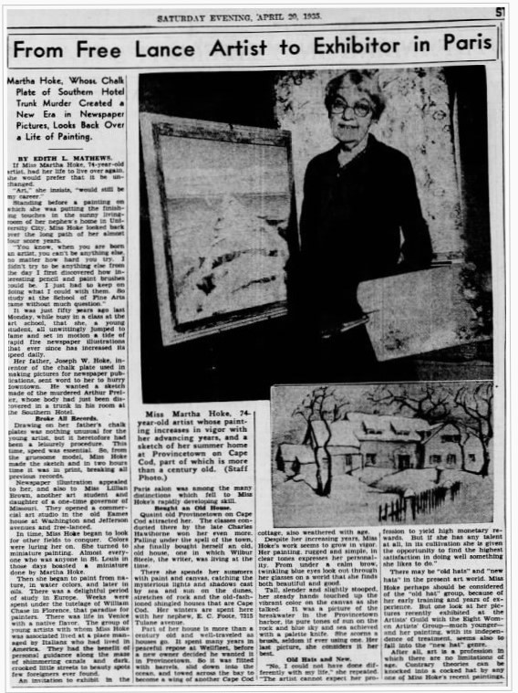
According to Anne Johnson’s 1914 Notable women of St. Louis, it was Hoke’s daughter and professional artist Martha Hoke (1861-1939) who produced the first and still most famous chalk-plate illustration of a murder victim discovered in a trunk, which she was able to sketch around 1:00 p.m. and the picture printed in the regular afternoon edition of the Post-Dispatch a few hours later.

Miss Martha Hoke… was the first person in St. Louis to make drawings for newspaper illustrations. Her father, Joseph W. Hoke, made a discovery in the line of engraving which he perfected by much experiment upon plates capable of producing, in a very short time, a type which could be set up with reading matter. This was the first successful engraving process using the artist’s drawing directly. Miss Hoke gave her father much assistance in the trial drawings necessary to perfect this method. All illustrations had, up to that time, been engraved on wood, or steel, or stone, or etched on copper. Mr. Hoke prepared a chalk composition, baked upon a steel plate, of such consistency that a drawing could readily be made by a pointed stylus bent at such an angle that when held as a pen or pencil the point would be vertical.

The drawing so made is placed in a stereotyping box and as a matrix it is cast in type metal. This type could be produced in a very short time. The possibilities for newspaper illustrations—which previous to that had been very meager and poor—were developed by an emergency, which at once placed this invention in great demand and general use. The event which so suddenly brought success financially was a murder at the Southern Hotel by a man named Maxwell, who hid the body of his victim, Preller, in a trunk which he left in a room he had occupied. The discovery of this brought out an extra edition of one of the daily papers, with a drawing by Miss Hoke. This famous case made chalk plates known to all newspapers everywhere.

Outside the big city papers, such as the New York Times or the Washington Post, many publishers could not afford to maintain a full photoengraving department and so, used chalk-plates for all their illustrations well into the twentieth century. Manuel Rosenberg included a chapter in his 1922 The Manuel Rosenberg Course in Newspaper Art entitled The Chalk Plate Method for the Artist in the Small Town. “Before the invention of the photoengraving process,” he writes, “the newspaper artist and the cartoonist usually used chalk plates. Today the chalk plate is practically a medium of the past. For small-town publications, however, it is often a more serviceable medium than the up-to-date photo-engraving process.”

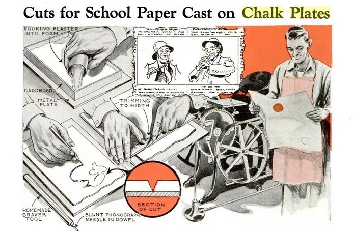
As late as 1941, Popular Mechanics was suggesting chalk plates for cartoonist of high school newspapers [below] and offering a full-page description of the process complete with illustrations. (volume 75, no. 1, January 1941, p.117)


Many lengthy descriptions of the process have been published. One appeared in The Art Amateur: Devoted to Art in the Household 44, no. 6 (May 1901): 158, entitled “How to make chalk plates.”

The following is the method of producing on “chalk plates” such illustrations as are used for general newspaper work: A metal plate, covered with a coating of chalk about a sixteenth of an inch thick, is put into the hands of the draftsman. It should be the actual size of the illustration to be made. The draftsman draws upon the plate with a metal point or needle, like a shoemaker’s awl; every time he makes a line he removes the chalk from that part of the plate, and the exposing of the metal makes his drawing appear dark, contrasted with the whiteness, of the chalk. [In much the same way the etcher removes his etching ground from a copper plate with the etching needle; the etching ground, however, is wax, and it usually is darkened by smoking, so that, the copper of the plate being light, the drawing appears light upon a dark ground.]

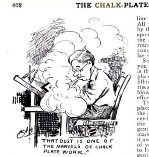
When the artist has finished his drawing—which is really a scratching away of the chalk—the plate is handed to a stereotyper, who makes a stereotype of it. This is done in the following way: It is put into a casting box, not unlike an iron waffle pan, which when closed leaves an opening about one-fourth of an inch in front of the plate, and on the top of which there is an opening, into which the stereotyper pours liquid type metal, as a boy pours melted lead into a bullet mould. The metal fills the vacuum in front of the plate and runs into each gully or furrow which the draftsman’s needle point has made. Of course where the chalk has not been removed, the type metal does not go; when the metal is cold and the casting—box opened, we find a thin plate of metal where the lines rise to an even height, wherever the artist has scratched a line down to the metal plate; but the plate is lower wherever the unremoved chalk prevented the liquid touching the metal plate. This crust of type metal fastened to a block, so that it is type high, resembles a wood engraving or a photo-engraved plate, and serves the same purpose. When the inked rollers of the printing press go over it, they ink the raised lines only, which correspond to the lines the artist drew, and hence it prints just like type.

This method of making illustrations for the newspapers has great advantages and disadvantages. It has the advantage of cheapness, for the plates cost next to nothing, and when the castingbox is once bought the expense of type metal and the recoating of the plates is very slight. It is a very quick method also, as an artist can draw a portrait half an hour before the paper goes to press. His drawing may take fifteen minutes and the casting fifteen minutes more. In photo-engraving, the photographing and etching of the plate takes a couple of hours. The disadvantage of the method is that the artist must make his drawing the exact size it is to be printed, while for photo-engraving he usually works on a larger scale, which is not only easier for him, but when a drawing thus made is reduced it has a greater appearance of fineness and finish than a drawing made small. Then, too, the laying bare of the plate with a metal point, and raising a dust of chalk, which sometimes covers up the lines, is not as pleasant a way of working—does not seem as natural as drawing with a pen on Bristol board. In pen drawing. also, more pressure on the pen turns a thin line into a thick one; in the chalk-plate process, to thicken a line you either have to go over it several times, removing chalk on its sides, or else use a larger instrument than you used for the fine lines.”

See also: R.M.A., “Stereotyping Chalk Plates,” The Inland Printer 28, no. 2 (November 1901): 194-96.

Note, chalk-plates should not be confused with chalk manner engraving from the eighteenth century. https://www.oxfordartonline.com/groveart/view/10.1093/gao/9781884446054.001.0001/oao-9781884446054-e-7000020168

Neither should it be confused with relief line block printing, a technique that uses a negative of a line drawing being contact printed onto a photosensitized metal plate. Light hardens this emulsion into an acid resist while non-exposed areas are washed away in warm water. When etched in a bath of acid the metal surrounding the emulsion protected lines is eaten away forming a low relief, which can be printed as any relief matrix.
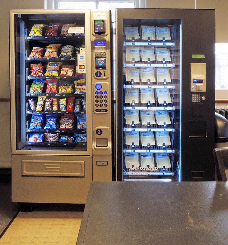
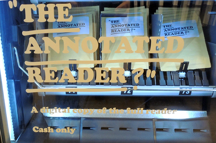
The first printing of a Mozart cantata commissioned by Franz Heinrich Ziegenhagen

First of several music plates

This is the first printed appearance of Die ihr des unermeßlichen Weltalls (also called Eine kleine deutsche Kantate; Little German Cantata) (K619) written by Wolfgang Amadeus Mozart (1756-1791) in 1791, the same year as he wrote The Magic Flute and also the year of his death. The setting here is for soprano and piano but later composers have arranged the work for orchestra as well as string quartets.

The libretto by Franz Heinrich Ziegenhagen (1753–1806), who commissioned the work from his fellow mason, covers the relationship of the progressive and masonic ideal to the commandment of love as outlined in Ziegenhagen’s book Lehre vom richtigen Verhältniss zu den Schöpfungswerken.

Franz Heinrich Ziegenhagen (1753-1806), Lehre vom richtigen Verhältniss zu den Schöpfungswerken und die durch öffentlicche Einführung derselben allein zu bewürkende allgemeine Menschenbeglückung [=The Teaching of the Right Relationship to the Works of Creation and the General Happiness That Can Only Be Admirable by Public Introduction of Them]. Herausgegeben von F. H. Ziegenhagen… einer Musik von W.A. Mozart (Hamburg: Herausgeber, 1792). Prints by Daniel Niklaus Chodowiecki (1726-1801). Graphic Arts Collection 2019- in process

Ziegenhagen was a German industrialist, freemason and philanthropist who spent his entire fortune trying to realize his utopian ideals in actual communities.

The utopian minded philanthropist Franz Heinrich Ziegenhagen appeared just as “revolutionary” in Hamburg in 1792. …. Ziegenhagen’s utopian concept of a social order of “Liberté, égalité et fraternité” rested upon Rousseauian principles, and he … conceived of agrarian colonies where everything is built upon communal property and communal work. Here the political principle that every member of the community is electable would rule, that is to say that there would be an absolute democracy. Indeed, Ziegenhagen dared even to send an abbreviated version of his essay to the National Convention in Paris in the fall of 1792 with the demand to implement his suggestions as soon as possible in France. However, neither the French National Convention nor the few German princes and universities to whom he sent this book reacted to his appeal. –Peter Uwe Hohendahl, Patriotism, Cosmopolitanism, and National Culture: Public Culture in Hamburg 1700-1933 (Rodopi, 2003)

At the heart of the community was Ziegenhagen’s passion for educational reform: An “Erziehungs-kommune,” or educational commune, was to be set up where all children would be educated together without distinction based on birth, wealth or any other kind of status. An emphasis was also to be placed on activities, with practical lessons taught alongside the theoretical.

Ziegenhagen actually founded an agricultural community along these lines in Billwerder, near Hamburg but failed to gain the wider support needed for his initiative to succeed. Forced to sell the property in 1802, Ziegenhagen retired to his home town of Elsass where he committed suicide in 1806.

The etched plates are by Daniel Niklaus Chodowiecki (1726-1801), born in Poland but who spent most of his life in Berlin and became the director of the Berlin Academy of Art. His largest folding plate depicts the realization of Ziegenhagen’s utopian project, featuring [above] the author on horseback surveying the busy scene of the community in action. The frontispiece [top] shows a lecture hall with its tall walls filled with illustrations of natural history and students packed into the benches. Six other etchings depict classroom scenes, including a scene with older children in a laboratory, a ‘Kunst-Kammer’ in the background, being taught how to dissect a pig.


 …Love me in my works,
Love order, proportion, harmony!
Love yourselves and your brothers!
Strength and beauty shall be your ornament
And clarity of understanding your nobility.
Hold out the brotherly hand of everlasting friendship;
It was delusion, not truth, that withheld it for so long.

Le Plutarque français


Édouard Mennechet, editor, Le Plutarque français: vies des hommes et des femmes illustres de la France, depuis le cinquième siècle jusqu’a nos jours, avec leurs portraits en pied gravés sur acier, [=The French Plutarch: lives of illustrious men and women of France, from the fifth century to the present day, with their full-length portraits engraved on steel] ([Paris, 18??]). Graphic Arts Collection Oversize 2004-1041Q

The Graphic Arts Collection holds 35 separate parts from different volumes of Le Plutarque français. Each has the hand colored steel engraving laid in mid-volume, rather than a frontispiece. The men and women profiled are: Georges, cardinal d’Amboise. — Louis XII. — Bayard. — François Rabelais. — Marguerite de Valois. — Le cardinal du Bellay. — Anne de Montmorenci. — François Ier. — Clément Marot. — Cossé-Brissac. — Michel de l’Hospital. — Ambroise Paré. — Jacques Amyot. — Gaspard de Coligny. — François de Guise. — Catherine de Medicis. — Ronsard. — Brantôme. — Louis Ier de Bourbon. — Etienne Jodelle. — Montaigne. — Crillon. — Marie Stuart. — Lesdiguières. — Le duc de Guise. — Philippe de Mornay. — Henri IV. — de Thou. — de Malherbe. — Sully. — Bassompierre. — Mathieu Molé. — Jean le Clerc. — Guez de Balzac. — Gondi.

A complete table of contents for Le Plutarque français, as well as an index to the painters and engravers can be found in the 1838 edition available through google books: https://books.google.com/books?id=VUU7AQAAIAAJ&printsec=frontcover&dq=inauthor:%22%C3%89douard+Mennechet%22&hl=en&newbks=1&newbks_redir=0&sa=X&ved=2ahUKEwit573r78HmAhUwhOAKHUftArEQ6AEwAnoECAYQAg#v=onepage&q&f=false. Here are a few more plates.


Max Ernst and the Gallant Sheep


Max Ernst (1891-1976) and Benjamin Péret (1899-1959), La brebis galante [The Gallant Sheep] (Paris: Editions premières, 1949). Graphic Arts GAX 2019- in process.
***Note this was a collaboration, not illustrations as after thought.***

Cet ouvrage, le premier de la collection GBMZ … a été achevé d’imprimer … le douze novembre mil neuf cent quarante-neuf … Il a été tiré trois cent seize exemplaires … Un exemplaire unique sur vieux Japon … Quinze exemplaires sur Vélin Montval … Trois cents exemplaires sur Grand Vélin d’Arches, numéroté de 1 à 300 et comportant trois eaux-fortes originales. Il a été tiré en outre cinq exemplaires nominatifs sur Vélin Montval …”–Page [2]. =This work, the first in the GBMZ collection … was finished printing … on November 12, 1949 … 316 copies were printed … A single copy on old Japan … 15 copies on Vélin Montval … 300 copies on Grand Vélin d’Arches, numbered from 1 to 300 and containing 3 original etchings. Five nominative copies were also printed on Vélin Montval … “–Page 2.

Beyond the three ‘original’ etchings, 18 of the relief line block illustrations are pochoir colored in striking yellows, greens, reds, oranges, and blues.

M.E. Warlick, Max Ernst and Alchemy: A Magician in Search of Myth (University of Texas Press,  2013)

Sadness is a Bird


The Fine Press Book Association co-sponsors two book fairs: the Oxford Fine Press Book Fair and the Manhattan Fine Press Book Fair. The Oxford event is biennial and at the March 2018 fair, the Judges’ Choice Awards went to three fine press editions.

One of the winners was Elies Plana, Barcelona, for an edition of the poem Neijmantototsintle by Ateri Miyawatl, with linocuts by Francisco Villa, editioned and printed by Plana. Originally written in Nahuatl in 2016, the poem has been translated into Catalan and English.

https://fpba.com/2018/03/prize-winners-announced-at-fpba-oxford-book-fair/

The Nahua actress/poet Ateri Miyawatl was born in Acatlán, Chilapa, Guerrro and graduated from the Michoacana University of San Nicolás de Hidalgo (UMSNH). Together with Celeste Jaime and Mara Rahab Bautista, she directs Originaria, a project that aims to show women poets who express themselves in native languages.

Here is a rough translation of her biographical statement: Ateri Miyawatl is the name that my parents gave me and with which my community knows me, it is also the name with which I identify. Ateri is a Purépecha word and Miyawatl a Nahuatl word. The day I was born my father gilded his brown back in the sun on the beaches of Jalisco selling hammocks to tourists. My mother decided that she would give birth in the town’s bajareque clinic, where Nahuales and wholesale atlapixques were born. That morning, when I came out of my mother’s body, I slipped from the hands of the apprentice nurse, with my head toward the floor. What happened next, just before hitting me on the ground, I leave to the imagination.

Anna Gatica, is the name with which my parents registered me in the Civil Registry. They have never named me that. As Anna, I studied theater and Cultural Management. My lines of research and creative execution are developed with native peoples, with themes and in peripheral geographies. My actress training is complemented by performance studies, audiovisual media, Cultural Management, Gender Equality and Indigenous Rights. I have collaborated with various artists, non-governmental organizations and civil associations in Mexico, the United States and South America.

See her in this video, discussing Originaria.


“De los factores que identifico,” noted Miyawatl, “uno es el poder sobresalir respecto a los compañeros varones, respecto a las compañeras que se dedican a hacer poesía en estas lenguas. …Otro factor importante es la barrera del lenguaje, muchas mujeres llegamos a las escuelas a estudiar y todo se encuentra en español, es como si ustedes llegarán a estudiar su carrera y todo lo encontrarán en italiano, no existe un apoyo para las personas que hablamos otra lengua.”


Ateri Miyawatl, Neijmantototsintle = La tristesa és un ocell = Sadness is a bird. Illustrations by Francisco Villa ([Barcelona, Spain] : Elies Plana, 2018. Graphic Arts Collection GAX 2019- in process

…in that Empire

The Graphic Arts Collection recently acquired the collectors edition of “…In That Empire housed in a sepele wood box in an edition of eight. All sixty-one directional positions are stamped into the top of the lid and each interior compartment is velvet lined with its own cover. Archival, inkjet prints of each turn live comfortably in their respective niches. A vellum reproduction of “On Exactitude in Science” by Borges, with Siegel and Smith’s markings, sits atop each stack of photos. Velvet tabs help ease the photos out for viewing and the bottom of the box is lined with felt for safe display on any surface”.

. . In that Empire is a conversation, an experimental cartography bound by each initial decision. Jorge Luis Borges’ story “On Exactitude in Science” frames the encounter. Both artists’ bodies move in space, simultaneously and an image is snapped at each turn, marking their presence. Each “L” and “R” in order of appearance creates a list of sixty-one positions. The images collapse atop one another, each resting its weight on the other’s back. In this empire, the bodies chart the arbitrariness of turns.

The companion 144-page publication includes sixty-one photos by each artist taken in West Newbury, Massachusetts and Harlem, New York. The reader is invited to access the book through multiple entry points, from front to back, in any order. No matter the beginning, a turn of the page becomes an act of continuing the conversation of experimental cartography established in the making of this book.


Cal Siegel & Sable Elyse Smith, … In that Empire (Pacific, 2019). Graphic Arts Collection GAX 2019- in process

Page through the bound volume here: https://www.pacificpacific.pub/products/in-that-empire-1

The Petersburg Press

[Publications from the Petersburg Press]. London / New York / Milan, 1968–1976. Graphic Arts Collection GAX 2019- in process

The master printers of the Petersburg Press worked with many of the best artists of the 1960s and 1970s, including Patrick Caulfield, Gene Davis, Richard Hamilton, Howard Hodgkin, Jasper Johns, R. B. Kitaj, Allen Jones, Henry Moore, Ed Moses, Claes Oldenburg, Eduardo Paolozzi, Robert Rauschenberg, James Rosenquist, Dieter Roth, Mark Tobey, William Tucker and John Walker. All of these artists are including in our recently acquired reference binder, with cataloguing and documentation for their projects published by Press.

Was this an in-house index or a collector’s bibliography? We don’t know for sure. Founded in London in 1968, with a New York branch opening in 1972, the core activity of the Press was collaboration with artists to publish limited edition prints and livres d’artistes. The Press was a continuation of the collaborative publishing initiated by Paul Cornwall-Jones on the founding of Editions Alecto (EA) in 1961 as a post-graduate at the architectural schools at Cambridge University.

Housed in blue binder (31 x 23 cm.), this small volume features catalogue entries on 66 leaves, inserted loose into plastic sleeves. The alphabetically-organized entries provide details on the works, including title, date, medium, edition size, dimensions, and sometimes prices, with each work illustrated with an accompanying photograph. The majority of the entries appearing on the letterhead of the Petersburg Press.


Here’s an inventory, alphabetical by name: /Petersburg Press Inventory

Moss Engraving Company

[John Calvin Moss (1838-1892)], The Moss Engraving Co. (New York: John C. Moss, ca. 1881). Graphic Arts Collection 2019- in process


The Graphic Arts Collection recently acquired an important specimen catalogue accomplished by means of photo-engraving, a revolutionary technique developed by the firm’s founder John C. Moss. Developed in 1863, his process allowed for the mass production of illustrated books and magazines with speed and efficiency that would have been impossible with traditional wood engraving.

In 1873 Moss founded the Moss Photo-Engraving Company. “By the early 1880’s, according to [Benson] Lossing, his 200 employees were annually turning out an amount of work that would have required at least 2000 wood engravers … Thanks to Moss, America became the leader in the world for mass-producing periodicals and books that contained actual photographs instead of wood-engraved drawings.” In 1880, Moss left that company and founded the Moss Engraving Company, whose product is the subject of this catalogue.

“…The first one to attempt photo-engraving as a business, I have been told, was a Frenchman. named Charles Henry. This was in i865. I believe he made some successful maps. His method was a combination of photo-lithography and zinc etching. The first man to make a substantial success, in a business way, of photo-engraving was without doubt John C. Moss. I well remember the first establishment he had, for I applied there for work. This was in Cortlandt Street. New York, and the year was 1874. I thought I knew all about photography in those days, and I was not slow to tell Moss so. He was anxious to keep his process secret, and naturally did not employ me. I found employment, however. with the Daily Graphic, and soon after Moss moved his business but a dozen doors away from the Graphic building, so that for the subsequent ten years I had an excellent opportunity to watch with interest the growth of his business.

His was the original ‘Photo-Engraving Company‘ and in his place was made about all the photo<engraving there was. He was unable to keep his process secret, some of his employees discovered his methods and went into business themselves. His relief plates were made by what is known as the swelled gelatine method. When he had demonstrated that there was money in photo-engraving other experimenters succeeded in devising a process of photo-engraving called the ‘wash-out method.’ This supplied an electrotype. Competition and price-cutting began then. In 1881, the writer tried to introduce zinc etchings to the publishers of New York, but failed. He was ahead of the times.

In 1884 William Kurtz tried the same thing. He received assistance from a master of business methods—F. A. Ringler—and they founded the Electro-Light Engraving Co. of New York. The zinc-etching method of photo-engraving by which this firm produced all their work proved to be the quickest and most economic one. Moss took it up later, but not until he had lost his grip on the trade that he had only a few years before monopolised. Though not the original photo-engraver, John C. Moss pioneered the way to photo-engraving as a business.“——unidentified author, The Inland Printer, December, 1899 quoted in The Photogram 7 (1900)