Category Archives: Books

books

Tuppenny Rhymes

Attributed to Arthur James Hervey Wyatt (1861-1938), Tuppenny Rhymes. Illustrated manuscript dedicated to Raymond Benedict Hervey Wyatt “on his [16th] birthday 15th Decr. 1906.” 38 illustrated pages. Graphic Arts Collection GAX 2019- in process


The Graphic Arts Collection recently acquired this wonderful illustrated manuscript written for the teenager Raymond Benedict Hervey Wyatt (1890-1977) by one of his parents, likely his father, the engineer Arthur James Hervey Wyatt.

Educated at Bedford Grammar School, Wyatt Sr. went on to become an expert in sighting devices for heavy guns working for over twenty years for Morris Aiming Tube and Ammunition Company, Ltd. During the War, he joined the Ministry of Munitions and became assistant inspector for the East Midlands Area, with headquarters at Bedford.


This comic and affectionate gift to his son interposes humorous verse with nine full page and four half page illustrated comic advertisements for faux companies.

These include “Bovrox. The strongest thing on earth. Prepared only in our Chicago factory from the oldest and most delicate cows. In fragile bottles 2/6”; “Petrach’s Cheese Chocolate. Delicious! Scrumptious! Made from pure chocolate and ripe old Stilton cheese”; “Boko for the nose. Ensures a luxurious nasal organ.”

Of the nine manuscript poems, the second, Raymond’s Life. After W. S. Gilbert, follows the path of Raymond’s life from his ambitions to be an engine driver, his education as a Bedford Scholar, his love of cricket, and his ambition for various careers.

It ends: “With engineering, law and Greek / And many another rum thing, / With half the world’s pursuit’s to seek/ Let’s hope he sticks to something./ Mid agriculture, bank or school- / The crowded court – museum cook, / The bar – the bench / Or chemic stench/ Let’s hope he sticks to something.”

In real life, Raymond went on to be a successful pathologist and coroner, working at Bedford County Hospital in 1926 and the Coroner for the South-Western Division in London. In 1941, Wyatt carried out the inquests into the deaths of Karl Drucke and Werner Walti who were executed as spies by Alfred Pierrepoint at Wandsworth Prison on August 6,1906.


Print Archaeology

A number of people helped today to match a set of unmarked prints to a published book. The prints are some of the many sheets that have been sitting in the department for many years unidentified and uncatalogued. Stop here if you want to try it yourself before reading the answer below.

Success came first to Nicola Shilliam, Marquand Library’s Western Bibliographer, who was able to match the recognizable scenes of Jerusalem with the correct edition and illustrator.

Torquato Tasso (1544-1595), La Gerusalemme liberata di Torquato Tasso; con le annotationi di Scipion Gentili e di Giulio Guastauini: et li argomenti di Oratio Ariosti [=The Liberated Jerusalem of Torquato Tasso; with annotations by Scipion Gentili and Giulio Guastauini: and the topics of Oratio Ariosti] (Genoa: Giuseppe Pavoni ad instanza di Bernardo Castello, 1617). Full page engraved plates facing the opening of each of the 20 cantos, engraved by Camillo Cungi (ca. 1597–1649) after designs by Bernardo Castello (1557–1629). EXOV 3137.34.197


We all felt foolish. Gerusalemme Liberata of Torquato Tasso, published in 1581, is considered one of Italy’s great contribution to epic poetry and should be easily recognized. Three illustrated editions were prepared by the Italian painter Bernardo Castello, the largest and most successful this 3rd edition in 1617.

The sheets discovered in the Graphic Arts Collection, while in poor condition, may have been early proofs as the engraver Camillo Cungi worked to reproduce Castello’s drawings. On the other hand, they may have been prepared for a pirated edition. Below is one example of the proof and the published engraving.


Close up of proof copy
Close up of the final published engraving, note the artist’s initials in the bottom left. B.C.I. stands for Bernardo Castello invenit (designer)

Here is an open library edition, if you want to see or read the whole book: https://openlibrary.org/books/OL25624814M/La_Gerusalemme_di_Torquato_Tasso

Here is a lecture on the various illustrated edition of Gerusalemme Liberata.


Finally, here are several more of the proofs in the Graphic Arts Collection, so you can compare them to the published book.

Complete Index to Pynson Printers Jobs

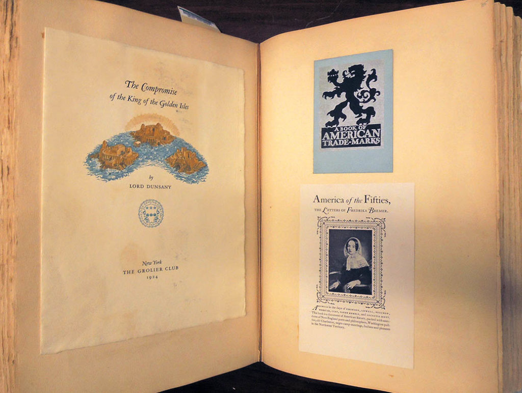
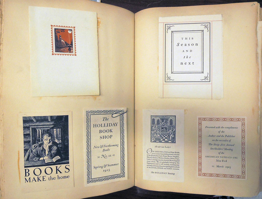
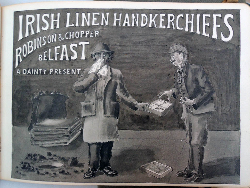
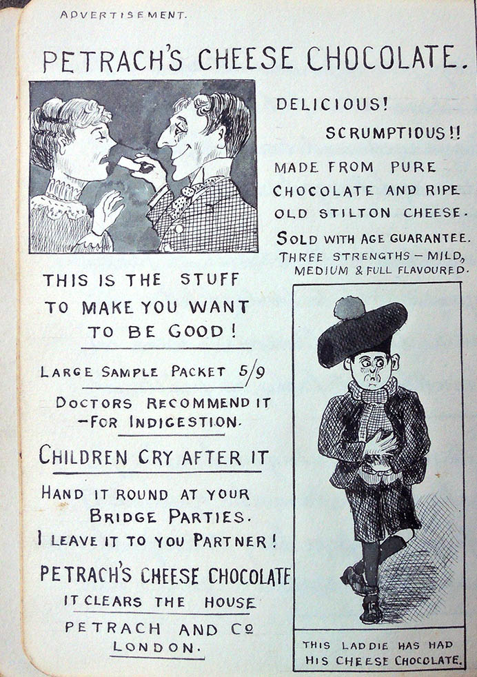
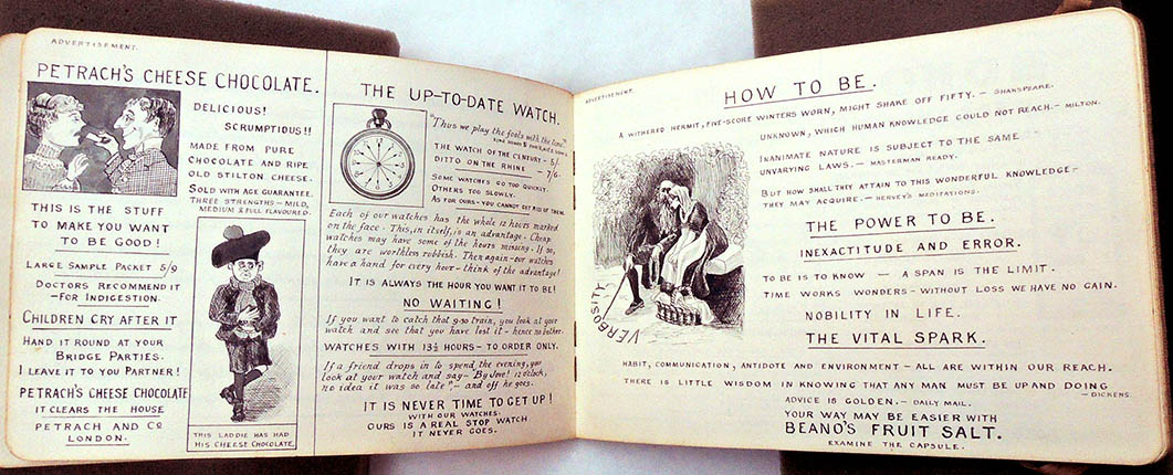
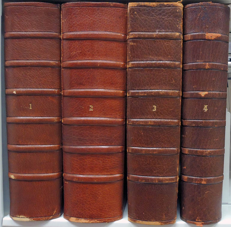
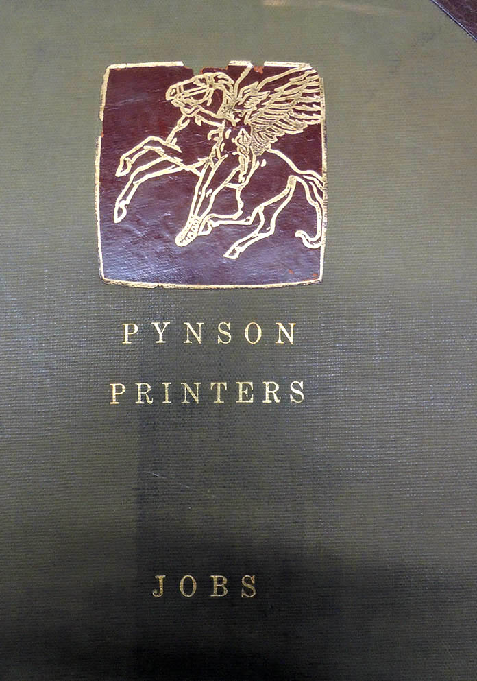
The Graphic Arts reference collection holds four enormous volumes documenting jobs produced by Elmer Adler’s Pynson Printers from 1922 to 1940 when the press was closed. An index to these volumes has been created by Sherry X. Zhang and Jena Mayer with help from Brianna R. Cregle and AnnaLee Pauls, which is key word searchable allowing researchers, for the first time, to study Adler’s commercial work. PDFs are attached here and to the voyager record for these scrapbooks. https://catalog.princeton.edu/catalog/7343684 Pynson Printers jobs. Graphic Arts: Reference Collection Oversize Z232.P99 A9f
Volume one:Copy of PynsonPrinters_Volume 1
Volume two:Copy of PynsonPrinters_vol.2
Volume three:Copy of PynsonPrinters_vol.3
Volume four:Copy of PynsonPrinters_vol.4 (1) (1)
Extras: Copy of PynsonPrinters_Presses
“From the twentieth of March, 1922, the Pynson Printers are at your service for the planning and production of all printing in which quality is the first consideration. We have founded our organization on the belief that the printer should be primarily an artist—a designer and a creator rather than a mere manufacturer. Toward this end, we have assembled a group whose several abilities and varied experience cover every phase of the art and business of printing. . . . We will do no work in which quality must be sacrificed to exigencies of time or cost” (Reprinted in Lawrance Thompson “Forty Mercer Street,” Princeton University Library Chronicle 2, no. 1 (November 1940): 32).

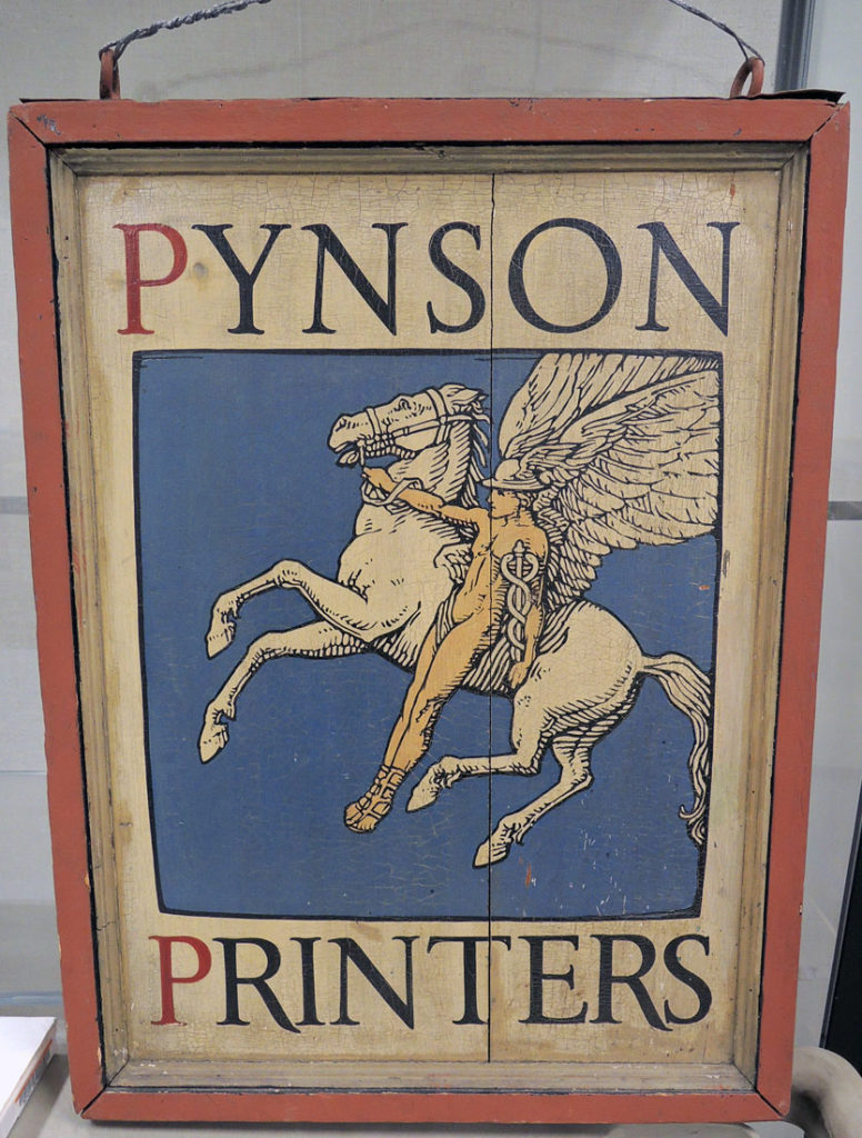
Together with designers Walter Dorwin Teague (1883-1960), Hubert L. Canfield, and David Silvé, Adler opened a small, fine press printing shop at 122 East 32nd Street named Pynson Printers, after the sixteenth-century printer Richard Pynson.

Within six months, the others had moved on, leaving Adler the sole owner of the firm (see: John F. Peckham “Forty Mercer,” Princeton Alumni Weekly 41, no. 12 (December 16, 1940): 8). As stated in the opening announcement, concerns with quality rather than commercial practicality led production. To that end, he sought out artisans, publishers, and clients who shared his love of typography and fine printing.

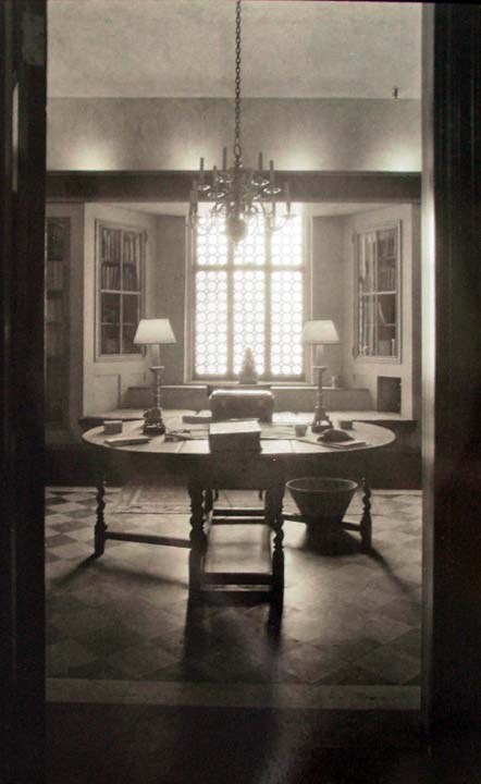
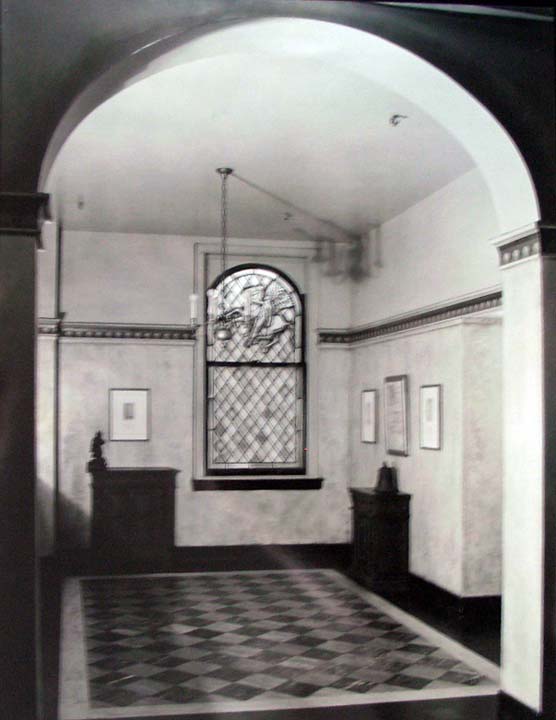
The Pynson Printers office moved to the New York Times building at 239 West 43rd Street, elegantly decorated by Lucien Bernhard. In a 1925 letter to Rockwell Kent (1882-1971), with whom he was already in business, Adler wrote, “Since you were last here Mr. [Lucien] Bernhard has arranged to build a studio adjoining our shop which will help create more of the kind of thing we want to have….” (Adler to Kent, February 13, 1925. CO262, box 32, Adler papers). These three men, Adler, Kent, and the recently emigrated German designer Lucien Bernhard (1883-1972), began working together on a variety of printing and design projects.

Their first fine press book, Candide, began in 1925 when 27-year-old Bennett Cerf and his 23-year-old friend Donald Klopfer decided they wanted a business of their own. Cerf was vice-president at the publishing house of Boni & Liveright and interested in the firm’s catalog of 109 titles published under the Modern Library imprint. Klopfer and Cerf raised $215,000 to purchase the imprint and then, set about to redefine the Modern Library to make it distinctly their own.

“We went to a man I had heard was a great typographer named Elmer Adler, who headed the Pynson Printers,” said Cerf. “He was so good that he was allowed to have his office in the New York Times building . . . Elmer Adler was an elegant gentleman whose family headed the Adler Rochester clothing company. It was beautiful, beautiful work that he turned out at only about eight times what it should have cost . . . Elmer helped us redesign modern library [and] helped us find the man to design the flying girl with the torch. . . So the modern library had a new dress that was very stylish,” (Bennett Cerf oral history, p. 144. Columbia University Libraries).

“We were talking about doing a few books on the side,” recalled Cerf, “when suddenly I got an inspiration and said, ‘We just said we were going to publish a few books on the side at random. Let’s call it Random House.’” Kent was so taken with the idea he offered to draw them a trademark on the spot and five minutes later handed Cerf the Random House symbol, which has been on their colophon ever since.

Candide was a success but Adler’s partnership with Random House was short-lived. “Elmer didn’t cotton to trade publishing . . . He was a very difficult partner anyway—very querulous and dictatorial, and he wanted to do everything his way, and when we wanted to have other printers do books, Elmer was very jealous.”

Cerf and Klopfer bought out his share, even though he never put up any money to join them. Adler continued to do business with Random House and Cerf remained a stockholder in the Pynson Printers. Kent did business with them both and joined Bernhard in founding a design firm they named Contempora.

Adler closed the Pynson Printers in 1940, when he was invited to move to Princeton, New Jersey, and established a department of Graphic Arts for Princeton University. He brought with him a personal collection—fourteen tons of books, prints, paintings, records, and equipment—which became the basis for the graphic arts collection we enjoy today. Although he donated some records of the Pynson Press to the NYPL in 1936, he retained a large amount of material with which to teach, including papers, proofs, and plates, which he sold to the Princeton University Library in 1948 for one dollar.

See also: https://graphicarts.princeton.edu/2014/03/21/exhibition-chronology-of-the-little-gallery-of-the-pynson-printers/

La Galatea poema lirico, ca. 1625

Attributed to Girolamo Priuli (1476-1547), La Galatea: Poema Lirico con l’Allegorie dell’Academico Veneto Sconosciuto ([Place of publication not identified]: [publisher not identified], 1620? Graphic Arts Collection GAX 2910- in process

An unexpected treasure came this week in an unusual first edition of La Galatea. Poema lirico con l’allegorie dell’accademico Veneto sconosciuto cavalleresco (pseudonym of the Venetian poet Girolamo Priuli), variously dated 1620 to 1625. An unidentified artist created sixteen engravings illustrating the poetic epic of Acis and Galatea. Strangely, the first six plates are all of the same scene with Galatea in the water, looking left, looking right, in the rain, in the sunshine, etc. Readers must look twice to realize they have subtle differences.


http://ovid.lib.virginia.edu/trans/Metamorph13.htm

Once while Galatea let Scylla comb her hair, she addressed these words to her, sighing often: ‘At least, O virgin Scylla, you are not wooed by a relentless breed of men: and you can reject them without fear, as you do. But I, whose father is Nereus, and whose mother is sea-green Doris, I, though protected by a crowd of sisters, was not allowed to flee the love of Polyphemus, the Cyclops, except through sorrow’, and tears stopped the sound of her voice. When the girl had wiped away the tears with her white fingers, and the goddess was comforted, she said: ‘Tell me, O dearest one: do not hide the cause of your sadness (I can be so trusted)’ The Nereid answered Crateis’s daughter in these words: ‘Acis was the son of Faunus and the nymph Symaethis, a great delight to his father and mother, but more so even to me, since he and I alone were united. He was handsome, and having marked his sixteenth birthday, a faint down covered his tender cheeks. I sought him, the Cyclops sought me, endlessly. If you asked, I could not say which was stronger in me, hatred of Cyclops, or love of Acis, both of them were equally strong.

Oh! Gentle Venus, how powerful your rule is over us! How that ruthless creature, terrifying even to the woods themselves, whom no stranger has ever seen with impunity, who scorns mighty Olympus and its gods, how he feels what love is, and, on fire, captured by powerful desire, forgets his flocks and caves. Now Polyphemus, you care for your appearance, and are anxious to please, now you comb your bristling hair with a rake, and are pleased to cut your shaggy beard with a reaping hook, and to gaze at your savage face in the water and compose its expression. Your love of killing, your fierceness, and your huge thirst for blood, end, and the ships come and go in safety.

The title page is especially appealing with its architectural frame [recycled?] topped with the word Resistit (Withstands). The allegorical figures have been described elsewhere as “the Temperance that resists Love, Apollo with the nine Muses; below the Aurora brand; adorned with little heads, large initials and xylographed endings.”

Vogel Totentanz


Sarah Horowitz, Vogel Totentanz. Etchings and design by Sarah Horowitz (Washington: Wiesedruck, 2018). Copy 15 of 40. Graphic Arts Collection GAX 2019- in process


The artist writes, “Vogel Totentanz is a bird dance of death alphabet book inspired by Hans Holbein’s Dance of Death woodcut alphabet. After the Black Plague ravaged Europe in the late 14th century, death as inevitable regardless of status or age became a pervasive motif in art and literature.”

“My present-day Totentanz is a reflection of that idea in context of our environmental crisis. Birds are indicator species for overall environmental health and human well-being. The etchings were drawn from specimens at the Cashmere Museum, the Wenatchee Valley College collection, and the Burke Museum in Washington State along with other found remains. Diotima types were used throughout.”


“The text was letterpress printed on Zerkall Book paper by Arthur Larson of Horton Tank Graphics. Claudia Cohen boxed and bound the book. The edition numbers forty, including five deluxe copies. The regular edition is bound in a bird-footprint-etching printed blue paper and housed in a slipcase. The deluxe is bound in full leather, enclosed in a box and includes an additional suite of the etchings.”

Der Totentanz by Hans Ganz and Hans Holbein: https://www.gutenberg.org/ebooks/23775

William M. Ivins, “Hans Holbein’s Dance of Death”: https://www.metmuseum.org/pubs/bulletins/1/pdf/3254072.pdf.bannered.pdf

Which is larger: Double Elephant or Grand Eagle?

Size is relative. John James Audubon (1785-1851) liked to include insects and other small animals to put the size of his birds in context, such as this White Heron and red lizard.


It is often written that Audubon used the largest paper available for his Birds of America but in fact, the “double elephant” was only one of several Imperial size papers made at that time.

Below this plate from Birds is compared to a plate from the Description de l’Égypte and suddenly, it’s not quite so big.


It is a tragedy that libraries only measure and record the binding size, with no regard to the paper size (except for a note that the edges have been trimmed). Prints and drawings curators, on the other hand, measure the plate mark, the sheet, and the support (meaning a binding, a mat, or a frame). While many collections around the world regard both Birds and Description as “Double Elephant,” in fact the atlas of Description is closer to the “Grand Eagle” size.

Here are two of the many charts delineating paper sizes:


https://paper-size.com/c/imperial-sizes.html


By the way: While both Birds and Description were created in the early 19th century, both were acquired by Princeton in the early 20th century:

Description de l’Égypte, ou, Recueil des observations et des recherches qui ont été faites en Égypte pendant l’expédition de l’armée française, publié par les ordres de Sa Majesté l’empereur Napoléon le Grand (Paris: Imprimerie impériale, 1809-22). 8 v. in 9: 41 cm; and atlas of 14 v. (73-110 cm.). Rare Books Oversize EX 1821.358e. The Princeton copy is “… the deluxe printing. Penciled in the margins of several of the astronomical line drawings is the name, comte de Pourtalès. …[I}n 1865 [this copy] was sold. Together with other works on Egypt and the ancient Near East, the set was presented to Princeton University in 1921 by the sons of Ralph E. Prime, Jr., of the Class of 1888, after the latter’s death. He had inherited it from a great-uncle, William Cowper Prime (1824-1905), of the Class of 1843. It was evidently he who acquired [this copy] at the Pourtalès sale or soon afterwards.”– Charles C. Gillispie, Monuments of Egypt (1987), p. 42.

John James Audubon (1785-1851), The Birds of America: from original drawings by John James Audubon ... (London: Pub. by the author, 1827-38). 4 v. CCCCXXXV col. pl. 100 cm. Rare Books Oversize EX 8880.134.11e. The Princeton copy “was presented … in 1927 by Alexander van Rensselaer (Princeton, class of 1871), a charter trustee of the University. It had formerly belonged to Stephen van Rensselaer (Princeton, class of 1808) of Albany, New York, one of the original subscribers to the work. The latter’s name appears as no. 32 in Audubon’s list of subscribers.” — Howard C. Rice, An Aububon Anthology, page 16.


Trumpeter Swan

This Swan feeds principally by partially immersing the body and extending the neck under water, in the manner of fresh-water Ducks and some species of Geese, when the feet are often seen working in the air, as if to aid in preserving the balance. Often however it resorts to the land, and then picks at the herbage, not sidewise, as Geese do, but more in the manner of Ducks and poultry. Its food consists of roots of different vegetables, leaves, seeds, various aquatic insects, land snails, small reptiles and quadrupeds. The flesh of a cygnet is pretty good eating, but that of an old bird is dry and tough.

https://www.audubon.org/birds-of-america/trumpeter-swan

Race, Gender, and Anatomy

Most early anatomies focused their attention on the white male body, with female dissection included only to illustrate the stages of childbirth. Non-white cadavers might have been less expensive but were not considered proper models for published medical atlases.

When the practice of hands‐on anatomical dissection became popular in United States medical education in the late 18th and early 19th centuries, demand for cadavers exceeded the supply. Slave bodies and thefts by grave robbers met this demand. Members of the public were aware that graves were being robbed and countered with various protective measures. …Slave owners sold the bodies of their deceased chattel to medical schools for anatomic dissection. Stories of the “night doctors” buying and stealing bodies became part of African American folklore traditions. The physical and documentary evidence demonstrates the disproportionate use of the bodies of the poor, the Black, and the marginalized in furthering the medical education of white elites.

–Halperin EC. “The Poor, the Black, and the Marginalized as the Source of Cadavers in United States Anatomical Education,” Clin Anat. 2007; 20:489–495.


One significant except was Joseph Maclise’s Surgical Anatomy, first published in 1851 with 35 partially colored lithographic plates, followed by a revised and enlarged second edition in 1856, containing 52 plates. The lithographs were printed by M. & N. Hanhart lithographers, founded by Michael Hanhart, and the volume published by John Churchill, a medical bookseller in Soho.

Two plates [above] feature an adult African Englishman, “Two heads of men, showing dissection of muscles and blood-vessels of the subclavian region of the chest” and “Dissection of the trunk of a seated black man, showing major blood-vessels.” Although female models are illustrated, their faces are always obscured.


The Irish artist, Joseph Maclise (ca.1815-1880) was a younger brother of the painter Daniel Maclise (1806-1870), with whom he sometimes shared a house in Bloomsbury and Chelsea when they were both in London. Joseph was both a professional surgeon and artist, illustrating a number of medical texts.


Joseph Maclise (ca.1815-1880), Surgical Anatomy (London: Churchill, 1856). Graphic Arts Collection GAX 2019- in process

Boundaries


The Graphic Arts Collection recently acquired Boundaries, a collaborative project between presidential inaugural poet Richard Blanco and contemporary landscape photographer Jacob Bond Hessler. The project was first presented at the Coral Gables Museum, Florida, in Fall 2017 where the exhibition was accompanied by a limited edition book published by Two Ponds Press in an edition of 300.

The prospectus states:

“Blanco’s poems and Hessler’s photographs together investigate the visible and invisible boundaries of race, gender, class, and ethnicity, among many others. Boundaries challenges the physical, imagined, and psychological dividing lines—both historic and current—that shadow America and perpetuate an us vs. them mindset by inciting irrational fears, hate, and prejudice.

In contrast to the current narrowing definition of an America with very clear-cut boundaries, Blanco and Hessler cross and erase borders. As artists, they tear down barriers to understanding by pushing boundaries and exposing them for what they truly are—fabrications for the sake of manifesting power and oppression pitted against our hopes of indeed becoming a boundary-less nation in a boundary-less world.”

Jacob Hessler is a fine art photographer specializing in the contemporary landscape. He is a graduate of the Brooks Institute of Photography, Santa Barbara, CA, and attended Parsons, The New School for Design, NYC. He lives in Camden, ME, and is represented by Dowling Walsh Gallery, Rockland, ME.

Richard Blanco is the fifth presidential inaugural poet in U.S. history—the youngest, first Latino, immigrant, and gay person to serve in such a role. Born in Madrid to Cuban exiled parents and raised in Miami, the negotiation of cultural identity and place characterize his body of work. In 2015, the Academy of American Poets named him its first Education Ambassador. Blanco lives in Bethel, ME.


In the Aberlian manner

Johann Heinrich Meynier, Die Kunst zu Tuschen und mit Wasserfarben: sowohl in Miniatur, als in Gouache und in Aberlischer-oder Aquarell-Manier, Landschaften, Porträte, und andere Gegenstände zu mahlen: nebst Vorausgeschickten Bemerkungen über die Kunst zu zeichnen (Leipzig: Bey Heinrich Gräff, 1799). Graphic Arts Collection GAX 2019- in process

As an added incentive to the young artists using this late-18th-century painting manual, a final hand-colored plate purports to offer 784 different color options. This is particularly interesting because Meynier’s text promoted coloring “in the Aberlian manner.” The technique was made famous by the Swiss painter Johann Ludwig Aberli (1723-1786) who designed line etchings printed in black ink and then, hand colored the scene to make each print seem unique. The method was quick and easy, not unlike modern color by numbers. These paintings were promoted to the popular print market.

Meynier went on to write and published a number of dictionaries, grammars, and training manuals. Sources indicate he wrote under various pseudonyms that included the surnames Jerrer, Sanguin, and Renner.

See also: Johann Heinrich Meynier, Erzählungen für Kinder : zur Erweckung eines feineren moralischen Gefühls und zur Bildung milderer Sitten (Nürnberg: bei Friedrich Campe, 1817). Cotsen Children’s Library Euro 18 46196

May Dodge, Patron of the Arts

While her brothers William and Cleveland attended Princeton University and then moved to New York City to work in the family business, Mary (May) Melissa Hoadley Dodge (1861-1934) chose to move away from the family, finally settling in England. As the daughter of William Earl Dodge, Jr. (1832-1903), the developer of the largest copper mining and copper wire manufacturing companies in America, May Dodge had significant funds at her disposal, which she used to sponsor many causes.

In the early 20th century, May became acquainted with Francis Meynell (1891-1975), a printer and poet, whose work she collected and sponsored. When Meynell got married, she gave him a small printing press as a wedding present, on which he printed a limited edition of his mother’s poems and dedicated the book to Mary Dodge. This was his first imprint, “Romney Street Press,” and the beginning of a career that led to Meynell being knighted in 1946.

Together with her companion Countess Muriel De La Warr (1872-1930), May continued to support Meynell’s projects, supplying the capital to establish a new imprint, Pelican Press, in 1916. Even when he was fined £2,000 pounds for libel, after publishing a controversial cartoon of J.H. Thomas as Judas, Mary found a way to slip him the money to pay the fine.

Although she rarely gets credit, it was in large part thanks to her encouragement and financial assistance that Meynell’s career thrived. He went on to found Nonesuch Press in 1923, designing and publishing its books for the next 12 years.

Typography: the written word and the printed word, some tests for types, concerning printers’ flowers, the pioneer work of the Pelican Press, the points of a well-made book, a glossary of printers’ terms, type specimens, a display of borders and initials (London: Pelican Press, 1923). Graphic Arts Collection 2009-1615N

Alice Meynell (1847-1922), Ten poems, 1913-1915 (Westminster: Romney Street Press, 1915). “Dedicated to M.H.D.” Edition 50 copies. http://catalog.hathitrust.org/api/volumes/oclc/5123467.html

Elmer Adler, The Craft of printing: notes on the history of type-forms, etc. Graphic Arts Collection GARF Z124 .C74 1921

Strickland Gibson, English printing 1700-1925; a note by Strickland Gibson. Graphic Arts Collection 2009-0517N846

Francis Meynell, The Holy Bible: reprinted according to the Authorised version 1611. Graphic arts Collection Oversize 2005-0019Q