Category Archives: Books

books

Gospels for Sundays and Saints Days

Louis Barbat ( 1795-1870), Évangiles de Dimanches et fêtes. Illustrés par Barbat père et fils (Chalons-S-Marne: Imprimerie Lithographique Barbat, 1844). Graphic Arts Collection GAX 2018- in process


OCLC lists fewer than a dozen copies of Barbat’s masterpiece of early lithographic printing in libraries worldwide and so, it is a treat to have acquired a copy for the Graphic Arts Collection. In his discussion of 19th-century printing on coated or enameled papers, Michael Twyman mentions two reasons for using “carton porcelaine” as Barbat does with this volume: First because when powdered colors were used, its smooth surface made it easier to brush away the powder from unwanted areas and second, because the coating limited the amount of water that was absorbed in the course of printing. The two notable publications he sites that made use of such paper are Midolle’s Recueil, ou, alphabet de lettres initials historiques (1846) and Barbat’s Évangiles seen here.


Louis Barbat and his son Pierre-Michael opened their shop in 1833 after several years experimenting with lithography. On January 3, 1834, they received a patent to adapt a printing press to print several colors simultaneously. Barbat’s entry for the 1839 Paris exposition, which included some of the title pages for the Évangiles, was praised for his color printing and at the 1844 Paris exposition the completed Évangiles was awarded a silver medal.

Twyman notes that Évangiles “was very much a family undertaking and, in addition to a prominent reference to the Barbat name on both the imprint page and title-page, Barbat, P. Barbat, and Barbat fils are acknowledged as designers at the foot of many borders. This suggests that, like many other lithographic establishments of the day, the ‘Imprimerie lithographique Barbat’ was very much artist-driven.” Interesting to note this on the eve of the artist’s book fair where the artists’ book are frequently defined as beginning in 1965.

Although our collection holds a number of printed labels and Belgian “carton porcelaine” trade cards, we do not have any of Barbat’s metallic wine labels for the Champagne merchants. This would be a wonderful addition, if anyone has any left-over bottles.


See also:

Michael Twyman, A History of Chromolithography, Graphic Arts: Reference Collection Oversize NE2500.T8 2013, pp. 166, 180-81, 191, 275-77, 432, 521; plates 136 & 355.

Sorbonne on-line Dictionnaire des Imprimeurs-lithographes du XIXe siècle. http://elec.enc.sorbonne.fr/imprimeurs/node/25137

History of the Werner Book Publishers


A recent acquisition of a small, ephemeral booklet from 1894 chronicling The Werner Company, a book publishing firm, led to a wonderful sequence of 42 illustrations depicting the bookmaking process at that time. Here are a few in no particular order:

Life Begins

Everyone agrees that publisher Henry Luce launched Life magazine on November 23, 1936, his third magazine after Time (1923) and Fortune (1930). The first issue sold for ten cents and featured a cover photograph of Fort Peck Dam in Montana by Margaret Bourke-White, five pages of Alfred Eisenstaedt’s photographs, and dozens of other photo-essays. The magazine’s circulation went from 380,000 the first week to more than one million four months later, lasting until 1972. Paper issues can be seen at: ReCAP Oversize 0901.L724q

What no one seems to agree on is why someone made a miniature facsimile edition of the first issue, seen here along with the bound original. Some collections call is a salesman’s sample but it seems unlikely Luce would reproduce the entire issue in miniature when he was pushing the large format image.

More likely is that a facsimile was made as a souvenir or keepsake, either at the moment or for a later anniversary. There is nothing in the issue to indicate why or when it was produced, and no information online to settle the question. A call to Time, Inc. did not add any useful information. Happily for us, the facsimile includes the back cover [above], which was removed from our paper issues.

The Gutenberg Bible in popular culture

We were chatting yesterday about moments in popular culture when a Gutenberg Bible turns up. Here is one such episode on the sit-com Newhart.

Newhart, May 12, 1986 entitled “Pre-Nups,” in which the “Loudons, George, Steph, and Michael are invited to Vanderkellen mansion for Arthur’s birthday. Dick worries when he breaks a music box given to Arthur by Winston Churchill.”

There are many attempts to steal a Gutenberg Bible in books and movies, including The Art of the Steal. Note the black and white illuminations.

Below is an episode of Provenance from February 4, 2014, in which “Reese rejoins Finch in New York, but when the team receives the number of a highly skilled antiquities thief, a surprising turn of events finds them planning a heist which could land them all in jail.”

Here is a link to a fairly long clip from Francis Ford Coppola’s 1966 film You’re A Big Boy Now. “Bernard Chanticleer, called “Big Boy” by his parents, is 19 but still lives with his overbearing, clinging mother and his commanding, disapproving father, who is Curator of Incunabula at the New York Public Library.” *It might begin with a commercial.
http://fw.to/AeR8X5e

Can you think of others? jmellby@princeton.edu

Color printing by Jean Robert, assistant to J. C. Le Blon


For those who study the history of printed color, the German printer Jacob Christoph Le Blon (1667-1741) is celebrated for his development of three and four color prints. We usually think of the deluxe editions he produced but forget his three-color system was also used on simple, utilitarian volumes.

Thanks go to Charles B. Wood III, who found this work on obstetrics by Angélique Marguerite Le Boursier Du Coudray (1712-1789). the pioneering midwife who published the manual on childbirth, developed from the lectures and classes she gave throughout Europe. The illustrations are beautifully printed in colors by Le Blon’s assistant Jean Robert (active 1746-1782) and the frontispiece portrait of Du Coudray is also engraved by Robert.

Angélique Marguerite Le Boursier du Coudray (1715-1794), Abbrégé de l’art des accouchemens, dans lequel on donne les préceptes nécessaires pour le mettre heureusement en pratique. On y a joint plusieurs observations intéressantes sur des cas singuliers. Ouvrage très-utile aux jeunes Sages-Femmes, & généralement à tous les éléves en cet art, qui désirent de s’y rendre habiles. Nouvelle édition, enrichie de figures en taille-douce enluminées. Par Madame Le Boursier du Coudray, ancienne maîtresse sage-femme de Paris (Saintes: Pierre Toussaints. Libraire, imprimeur du Roi, rue Saint Maur. M. DCC. LXIX [1769]). Rare Books and Special Collections RG93 .xD8

See also the 1756 book engraved by Pierre François Tardieu (1711–1771) and Jean Robert (active 1746–1782), and printed by Pierre Gilles Le Mercier (active 1735–1766): “Coloritto or the Harmony of Colouring in Painting” in Antoine Gautier de Montdorge (1701-1768), L’art d’imprimer les tableaux, traité d’après les écrits, les opérations & les instructions verbales, de J. C. Le Blon (Paris: Chés P. G. Le Mercier … Jean-Luc Nyon … Michel Lambert … 1756). Graphic Arts Collection 2004-3391N.

Paper made from straw (rye, wheat, barley, oats, peas, beans, lentils, and corn)


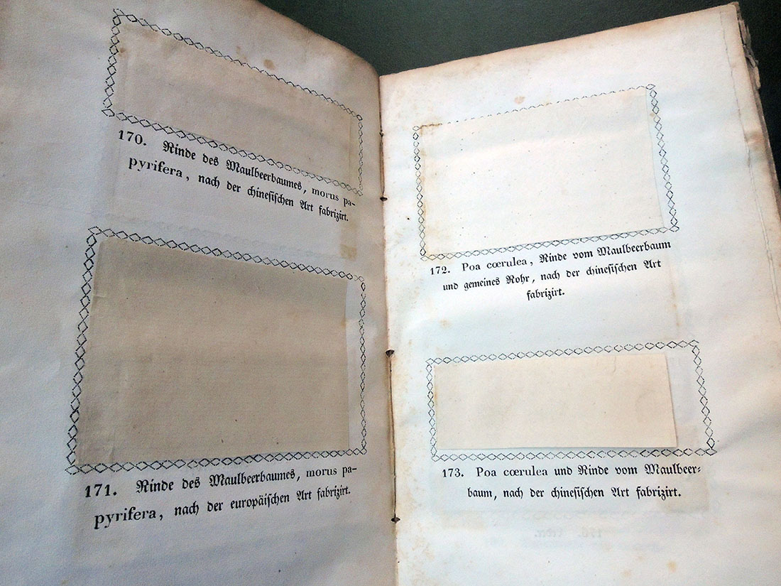
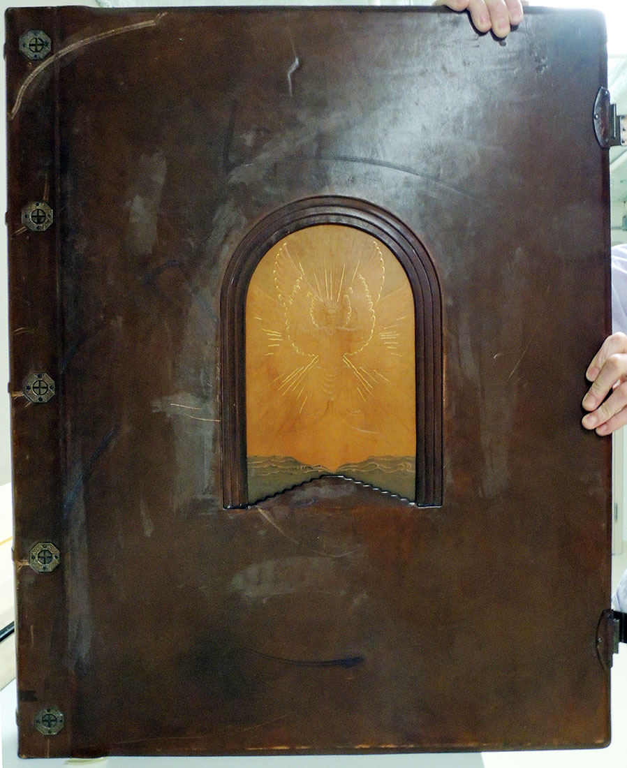
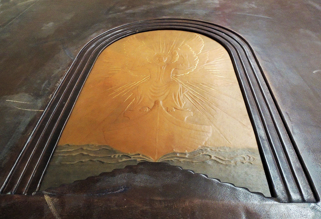
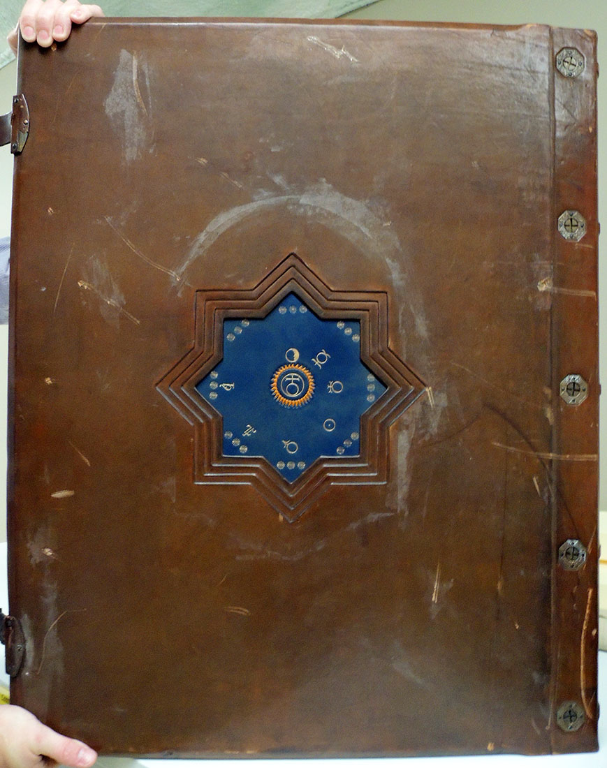
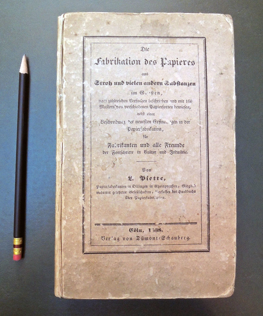
Louis Piette (1803-1862), Die Fabrikation des Papieres aus Stroh und vielen andern Substanzen: im Grossen nach zahlreichen Versuchen beschrieben und mit 160 Mustern von verschiedenen Papiersorten beweisen: nebst einer Beschreibung der neuesten Erfindungen in der Papierfabrikation, für Fabrikanten und alle Freunde der Forschritte in Cultur und Industrie (Cologne: Dümont-Schauberg, 1838). Graphic Arts Collection GAX 2018- in process

The Graphic Arts Collection has a number of early sources on papermaking, often with paper samples tipped in. This volume, recently acquired, is not the earliest but certainly is one of the rarest of all papermaking books, with 25 more samples than most other recorded copies (ok, yes, the copy at the University of Amsterdam apparently has 192 samples but who’s counting).

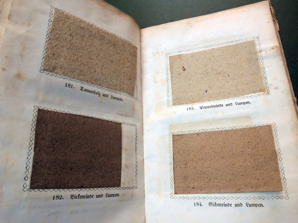
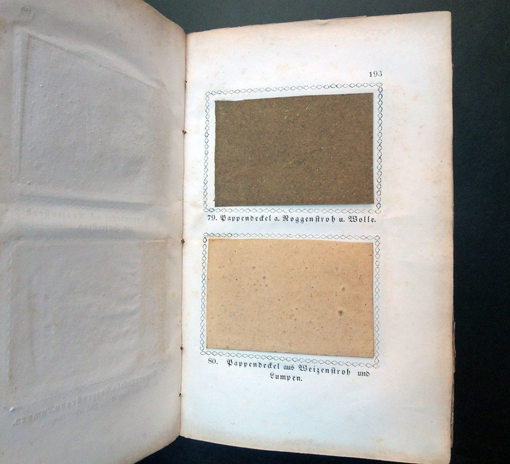
The papers are chiefly from various kinds of straw (rye, wheat, barley, oats, peas, beans, lentils, and corn), singly or in combination; some mixed with hay and/or rags; and some bleached or colored. There are also five samples of cardboard made from straw and other fibers and ten non-straw papers (hay, oakum, wood, linden bark; some with rags).

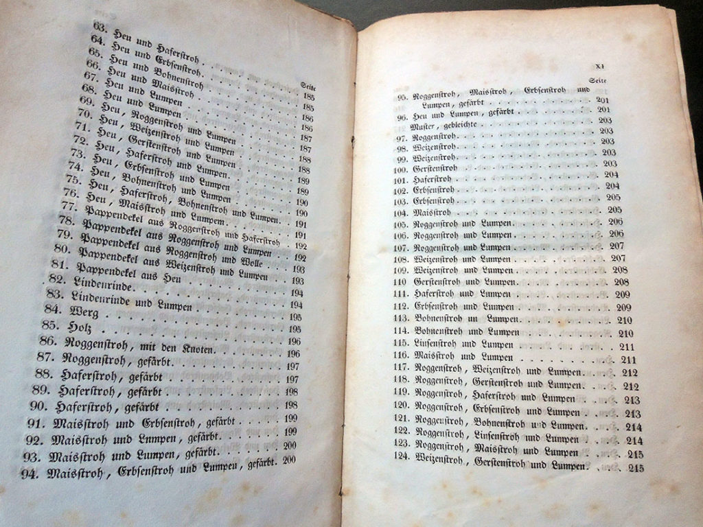
In 1827, Louis Piette, a native of Belgium, took over the paper making factory started by his father in Dillingen and performed many experiments using different materials to produce various suitable kinds of paper, operating the mill from 1819 to 1854.  Note in particular leaves 203-33 are themselves made of various straw papers.

“Louis Piette followed in the footsteps of noted papermaking researchers of the 18th century…These early attempts, however, were not as successful as the finished papers made by Louis Piette. The significance of Piette’s investigations is very simple: his papers made from straw remain clean and almost as pliable as comparable papers made from rag…Piette’s papers, moreover, really are straw papers, without mixing in small amounts of flax fibers. Piette’s experiments showed a great understanding of papermaking from a production standpoint, and, with the increase use of the fourdrinier machine, his work led directly into the use of esparto grass prior to the discovery of chemical bleaching for soft- and hardwood paper manufacture…By the 1860‘s, the age of modern machine papermaking was at hand, and Piette’s earlier papermaking experiment showed how well he understood the future of papermaking.“–The Paper Trail. Quarterly Newsletter of the Robert C. Williams American Museum of Papermaking (Vol. 2, Nos. 1 & 2, January- March & April-June 2004). In these two articles the author states there are only four known copies of this book.


Of particular importance in this volume, found on pages 246-91 is the second printing of Moritz Illig’s Anleitung auf eine sichere, einfache und wohlfeile Art Papier in der Masses zu leimen (first edition 1806). According to Leonard Schlosser’s 1971exhibition catalogue, only two copies are known of the first edition. This text describes Illig’s “momentous” (Schlosser) invention of rosin-alum sizing. The addition of this mixture aided in making the paper take writing ink with less necessity for sizing with glue, as had been the vogue for five hundred years. It provided a simple, sure method for sizing paper more rapidly with non-putrescible materials. Illig’s book was literally consumed in use and only two copies are known.–Special thanks to Yoshi Hill for his research on this volume.

Some of the other early papermaking sources in the Graphic Arts Collection include:

Papeterie: contenant quatorze planches, dont une double ([A Paris: Chez Briasson … David … Le Breton …, 1767]. Graphic Arts Collection Oversize 2011-0013F

Louis-Charles Desnos (1725-1805), Dissertation historique sur l’invention des lettres, ou caracteres d’écriture: sur les instrumens dont les anciens se sont servi pour écrire; & sur les matières qu’ils ont employées: suivie d’une Instruction raisonnée sur le papier nouveau que le sieur Desnos annonce au public: & dont on trouvera à la fin une suite de feuillets pour écrire & dessiner dans tel genre que ce soit avec un stylet ou pointe d’un métal composé pour cet usage (Paris: Chez Desnos, ingénieur-géographe & libraire de Sa Majesté danoise … , 1771). The 52 blank leaves at end are samples of Denos’ paper, intended for use as a notebook; cf. p. 3 (2nd group). Graphic Arts Collection 2009-0605N

Charles-Michel, marquis de, Villette (1736-1793), Œuvres du marquis de Villette (Londres. [i.e. Langlée, France: P. A. Léorier Delisle], M. DCC. LXXXVI. [1786]). “Ce volume est imprimé sur le papier d’écorce de tilleul.”–Verso of half title. Based on the 18mo format, the sheet size is ca. 48 x 36 cm. (crown), though Hunter reported his copy as 16 x 10 cm. (thus ca. 60 x 48 cm, royal, calculated from the same format). Issued also on rose-colored paper and on paper made from marshmallow. Includes 20 sample leaves of Léorier Delisle’s experimental paper made from various plant materials: marshmallow, nettles, hops, moss, reeds, conferva (3 kinds), burdock, burdock-colt’s foot, and thistles; quack-grass root; hazel wood and spindle wood; and bark of willow, spindle tree, oak, poplar, osier and elm. Each leaf includes printed identification of the material used: papier de guimauve, d’ortie, de houblon, de mousse, de roseaux, de conferva (première / seconde / troisième espèce), de racines de chiendent, de bois de coudrier, de bois de fusain, d’écorce de fusain avec son épiderme ou croûte, d’écorce de chéne, d’écorce de peuplier, d’écorce d’osier, d’écorce d’orme, d’écorce de saule, de bardanne, de bardanne et de pas-d’ane, de chardons. Graphic Arts Collection 2004-0061S

Matthias Koops, Historical account of the substances which have been used to describe events, and to convey ideas, from the earliest date to the invention of paper (London: Printed by T. Burton …, 1800). “Printed on the first useful paper manufactured soley [sic] from straw.” Appendix (p. [85]-91) printed on “paper made from wood alone … without any intermixture of rags, waste paper, bark, straw, or any other vegetable substance.” Laid in: sample blank folded sheet of straw paper, 35 x 43 cm. folded to 18 x 12 cm. Watermark: “Neckinger Mill.” Graphic Arts Collection Oversize TS1090 .K66q

The Sister arts, or, A concise and interesting view of the nature and history of paper-making, printing, and bookbinding: being designed to unite entertainment with information concerning those arts, with which the cause of literature is peculiarly connected: embellished with three engravings ([Lewes]: Sussex Press, Lewes: Printed and published by J. Baxter, and sold by the principal booksellers in London, 1809). GAX copy: From the library of P. J. Conkwright. Graphic Arts Collection 2003-0052N
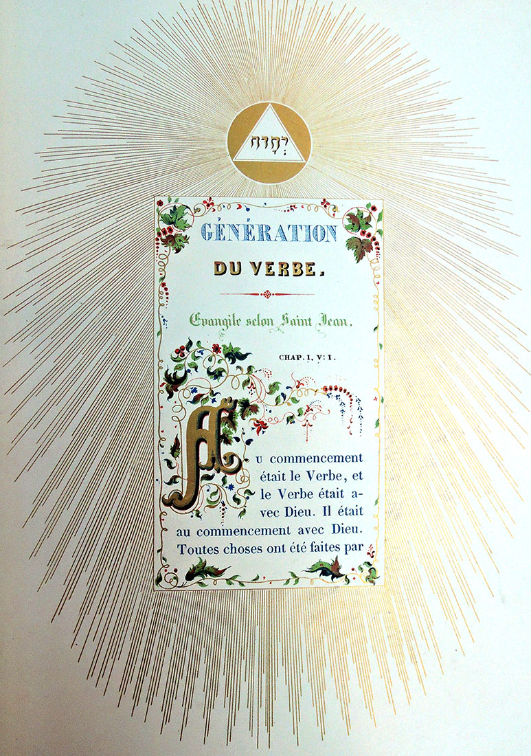
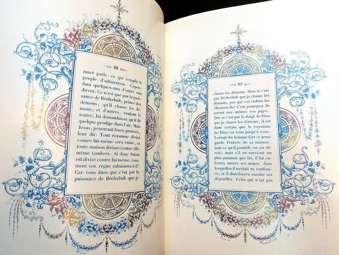
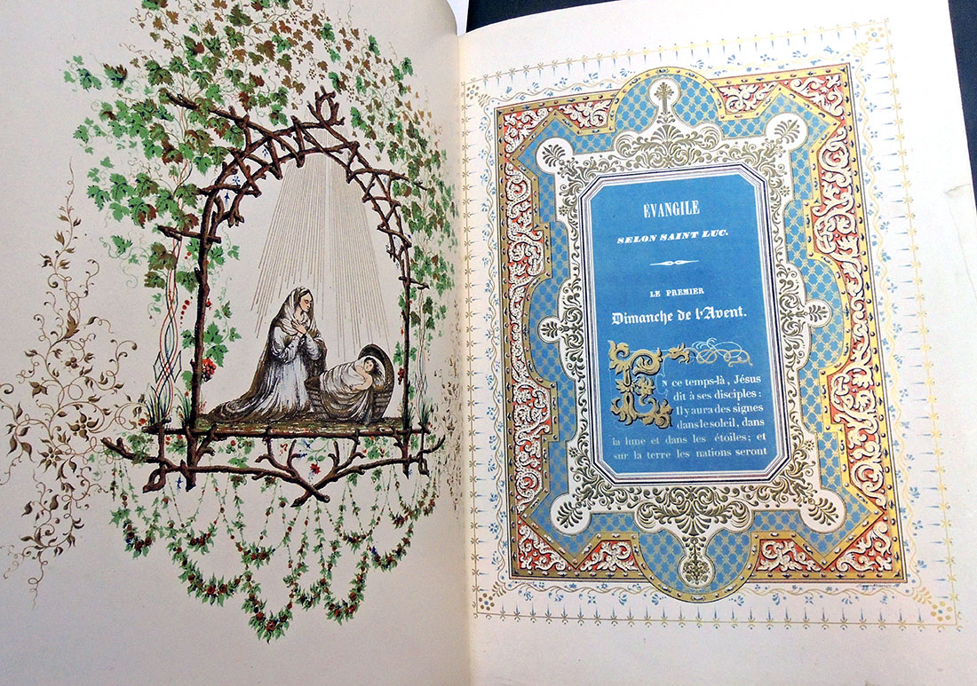
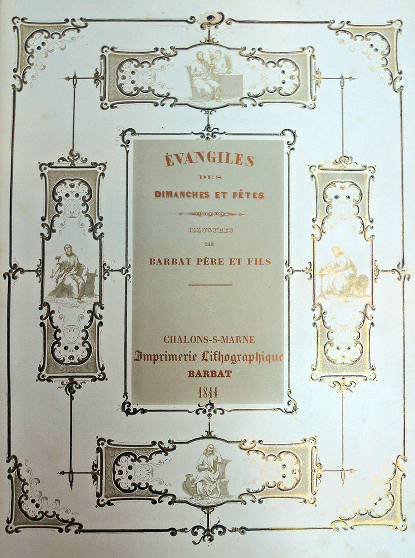
Nattini bindings

Volume 3 front cover
The question yesterday was, What is on the back of the Nattini binding?

As first posted in 2011, the Graphic Arts Collection is fortunate to hold one complete bound set of Dante’s Divine Comedy imagined by the artist Amos Nattini (1892-1985), along with one partially unbound set. At 82 cm long and perhaps 20 pound each, these do not move from the shelf often.

Dante Alighieri (1265-1321), La Divina Commedia, Imagini di Amos Nattini (Milano: Istituto nazionale dantesco, [1923-1941]). GAX Oversize PQ4302 .F23e. Three volumes; 82 cm. each. 100 color lithographs by Amos Nattini (1892-1985). https://www.princeton.edu/~graphicarts/2011/07/amos_nattini.html

In 1921, on the occasion of the 600th anniversary of Dante Alighieri’s death, the Istituto nazionale dantesco in Milan commissioned a new, illustrated edition of the poet’s Divine Comedy. The artist chosen for the project was Amos Nattini, who was charged with creating one plate for each canto. For the next twenty years, Nattini worked on his Dante, releasing each of the three volumes are they were completed in 1928, 1936, and finally 1941.

Perhaps because of the length of time between volumes, the first and second are bound with similar designs while the third volume has its own design. Here are the front and back, along with this lovely design for the screws. The books are now heading to conservation for a good cleaning.

Detail of volume 3 back cover.

Volume 3

We are extra fortunate in Princeton, since both the Princeton Theological Seminary and the Institute for Advanced Study Library are listed as also having sets of Nattini’s Dante. This has not been confirmed in person.

Detail of volume 1 back cover.

Volume 1 back cover

Volume 1 front cover


Special thanks go to Mike Siravo who helped to lift volumes.

Curtis in Alaska

While Edward Curtis (1868-1952) is best remembered for his 2,200 photogravures (ink prints from photographic negatives) published in the 20 volume set, The North America Indian, he began publishing his photographs with images from the Alaskan/Yukon Gold Rush of 1897, and more importantly, as one of the official photographers on E.H. Harriman’s Alaskan expedition of 1899. It was through the Harriman project that Curtis was introduced to the master printers at John Andrew and Son in Boston, who transformed his glass positives into rich aquatinted photogravures. Curtis went on to enlist their services again with his own mammoth series.


When Curtis knew them, the engraving firm was in its thirtieth year, run by John’s son George Theodore Andrew (1843-1934) and their technical skill made it worth the cross-country shipping. Although the scale of the Alaska prints does not compare with the prints in The North American Indian, many of the photogravures in Alaska are equally rich in detail and texture.

The Harriman Expedition to Alaska was the last great 19th-century survey of the North American frontier…

Curtis’ relationship with Harriman, Robert Grinnel, a leading ethnographic expert on Native Americans and other members of the party had a great influence on the rest of his life. After a trip of nine thousand miles the party returned with five thousand pictures and over six hundred animal and plant species new to science. New glaciers were mapped and photographed and a new fjord was discovered. Curtis photographed many of the glaciers, but it was his Indian pictures on this trip that established his artistic genius. Curtis produced a souvenir album of photographs for the participants.

http://www.klotzgallery.com/edward-s-curtis-bio


Harriman Alaska Expedition (1899), Alaska… (New York: Doubleday, Page & Company, 1901). “Advertisement. The publication of the series of volumes on the Harriman Alaska Expedition of 1899, heretofore privately printed, has been transferred to the Smithsonian institution by Mrs. Edward H. Harriman, and the work will hereafter be known as the Harriman Alaska series of the Smithsonian institution. The remainder of the edition of volumes I to V, and VIII to XIII, as also volumes VI and VII in preparation, together with any additional volumes that may hereafter appear, will bear special Smithsonian title pages. Smithsonian institution … July, 1910.” ReCAP WA Q115 .H2 1901

José Angel Toirac’s “Parables”

Parables, with Cuban artist José Angel Toirac and writer Robert Glück, is an extension of Toirac’s life project of examining how the Cuban State has used press imagery to manufacture consent and sell the Revolution which Fidel lead in 1959,” writes Loring McAlpin, ’83. “It’s a sumptuous book meant to be a scripture for Fidel and the Cuban Revolution.”

You may have missed the evening last spring at The David Rockefeller Center for Latin American Studies (DRCLAS), Harvard University, where Toirac, Glück, and McAlpin present their limited edition, fine press book gathering photographs from magazines and newspapers like Granma, the mouthpiece of the Communist Party, and re-purposing the Cuban Revolution as a Gospel, a new religion with a new scripture.

But you can still catch them if you happen to be in Washington D.C. in October 2018, when artists Meira Marrero, Loring McAlpin, and José Angel Toirac will join in a conversation about Parables with Michelle Bird at National Gallery of Art. https://www.nga.gov/calendar/lectures/lectures-signings/parables-the-conversation.html


They note:

Parables (the project/exhibition) by Meira Marrero and José Angel Toirac is a collection of 33 photographs of Cuban life published by the official Cuban press. Sources range from magazines and newspapers like Granma, the mouthpiece of the Communist Party, to books on the history of the revolution. These photographs constitute a narrative of the Cuban Revolution as well as a retelling of the Gospels, with Fidel Castro performing the life of Christ from his childhood in Nazareth to his ascension into Heaven. Just as Christianity appropriated pagan festivals, the Cuban state has incorporated biblical stories into its narrative of the Revolution. Christian expressions have been fashioned into official slogans such as “these are the days to unite.”

In Parables the religious roots of this idolatry are exposed. Poet, fiction writer, editor, and New Narrative theorist Robert Glück was invited to write the “scripture” accompanying these images, as if compelled by the faith they conveyed, without mention of either Fidel or Jesus. Parables (the book) is a limited-edition artist book of 33 parables, each with a corresponding image, designed by Cynthia Madansky and Loring McAlpin.

In Fidel’s Shadow: Cuban History (and Futures), One Year On


José Angel Toirac, Meira Marrero, and Robert Glück, Parables, design by Cynthia Madansky and Loring McAlpin ([New York?]: Faithful Castle Press, 2017). Graphic Arts Collection 2018 in process.


Brian O’Doherty/The Structural Plays

The Graphic Arts Collection received its new copy of Brian O’Doherty/Structural Plays, published by Stoney Road Press, with both pleasure and sadness yesterday. James O’Nolan, co-director of Stoney Road, passed away in July 2018 and so, this will be the last of his beautifully printed books.

Based in Dublin, Stoney Road Press is the only independent commercially run fine art print studio in Ireland. An obituary for O’Nolan, published in The Irish Times, July 21, 2018, was titled “Printmaker who made his mark as an artist. His enduring legacy is as a teacher and mentor, and as an interpreter across different media for some of the country’s most distinguished contemporary artists.”

In his work with his business partner David O’Donoghue at the Stoney Road Press (SRP) in Dublin since 2001, James O’Nolan created an internationally renowned fine print press, counting among its clients some of the most prominent names in contemporary Irish art, and setting a globally appreciated standard of excellence which has seen its products displayed in leading galleries throughout Ireland, the UK and the US.

O’Nolan, who has died aged 65 from injuries sustained while cycling in inner-city Dublin, was a self-taught printmaker, and made his mark as an artist in woodblock and carborundum, examples of which are held in public collections such as the National College of Art and Design and the Arts Council. They are described by James Hanley, Keeper of the Royal Hibernian Academy, as having “an intellectual purity of geometric and colour-filled abstraction.” …In his eulogy at O’Nolan’s Humanist funeral service in Dublin this month, Hanley gave a pointed example of this in practice: “Thirty odd years ago, one student [of O’Nolan’s] vacillated and said she had picked textiles, but really wanted to do fine art. James told her firmly, ‘Go . . . and change to fine art.’ The art student concerned was Rachel Joynt, today one of Ireland’s greatest sculptors.”

…O’Nolan came from a particularly renowned Irish family. His father, Kevin, was a Professor of Ancient Classics at University College, Dublin and one of his uncles was Brian O’Nolan, the writer Flann O’Brien, aka the satirist Myles na gCopaleen, columnist with this newspaper. His mother, Maureen Dwyer, who died when he was aged six, was the matron at Glenstal Abbey School where her husband was teaching when James was born. Kevin O’Nolan later remarried, his second spouse being Marie O’Connell, a noted novelist of the period.

“In re-publishing the Structural Plays,” wrote O’Nolan, “the primary aim was to gather them together in one place, a sort of textbook from which they could be enjoyed, read together, or used as a blueprint to re-create the performances. The original notations are included at the bottom of each. These, together with Brian’s notes on the plays, provide a clear account of how the plays might be performed today.” To page through a digital version, see: https://issuu.com/stoneyroadpress/docs/brian_odoherty_structural_plays-iss


Brian O’Doherty is quoted as saying, “The Ogham Drawings, which preoccupied me for over twenty years, look like drawings, behave like drawings, can be seen as drawings, are drawings, but they also have a voice, that is, they can be spoken and performed. Vowel Grid is a performed drawing.” Many of the structural plays are inspired by Ogham script–an ancient Celtic translation of the Roman alphabet into a writing system of 20 linear characters.

An artist and a teacher, O’Doherty exhibited at Documenta and the Venice Biennale; served as director of both the visual arts and film and media programs at the National Endowment for the Arts; taught film and art criticism at Barnard College and Long Island University; and has written two works of fiction, The Strange Case of Mademoiselle P. and The Deposition of Father McGreevy, which was nominated for the Booker Prize in 2000. He received the College Art Association’s Mather Award for art criticism in 1965 and was a visiting scholar at the Getty Research Institute in 2009–2010.