 Birmingham City University, Marx Memorial Library, Newman University, The Centre for Printing History and Culture and the University of Birmingham are jointly sponsoring an interesting conference in November entitled: Printers Unite! Print and Protest from the Early Modern to the Present. To register: https://www.eventbrite.co.uk/e/printers-unite-tickets-27724132627
‘Printers Unite!’ is a phrase that evokes the historic solidarities and struggles of printers and their eventual consolidation into a single trade union, Unite. On the 90th and 30th anniversaries of the General Strike and the Wapping Dispute, this two-day conference at the Marx Memorial Library will explore the role of printers and print as agents and vehicles of protest.
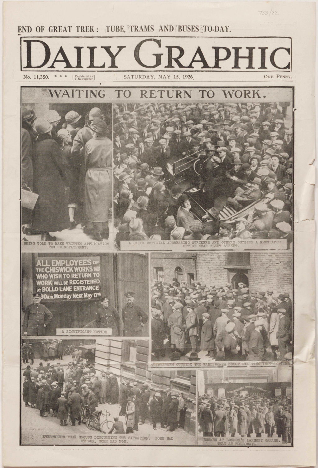
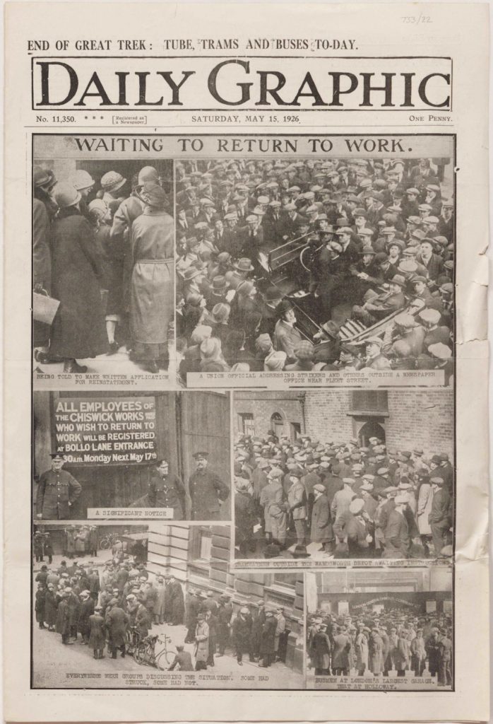
The General Strike, which was triggered by an unofficial strike by printers at the Daily Mail, and the Wapping Dispute, in which 6000 printers were sacked by News International, represent only one of the themes that emerges out of an examination of ‘print and protest’: that of the labor history of printing.
The keynote address will be delivered by Andrew Pettegree, University of St Andrews, author of The Invention of News and Reformation and the Culture of Persuasion.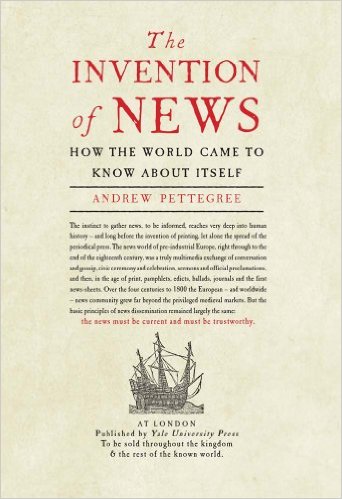 For more information see: http://www.cphc.org.uk/events/2015/11/10/printers-unite
A long list of papers includes
Dr Marie-Céline Daniel, Paris-Sorbonne University, London Printers v. Elizabeth I: How a group of London stationers tried to lobby in favour of a change in Elizabethan diplomacy, 1584-1589;
Kat Lowe, University of Manchester, The importance of female education to public health in the prefaces of Richard Hyrde;
Sally Jeffery, Independent researcher, Art and mystery: descriptions of seventeenth-century printers’ working practices;
Dr Lucy Razzall, Queen Mary, University of London, ‘Thrust into the trundle-bed of the last two lines’: printing theological debate in the 1640s;
Dr Bess Frimodig, Independent researcher, Domestic upheaval: women wallpaper printers and the French Revolution;
Eva Velasco Moreno, King Juan Carlos University, Censorship and the control of printing in eighteenth-century Spain;
Brian Shetler, Drew University, Advocate and abuser: John Wilkes’ relationship with his printers;
Karenza Sutton-Bennett, University of Ottawa, Hogarth’s act: a printer’s protest of society’s consumerism;
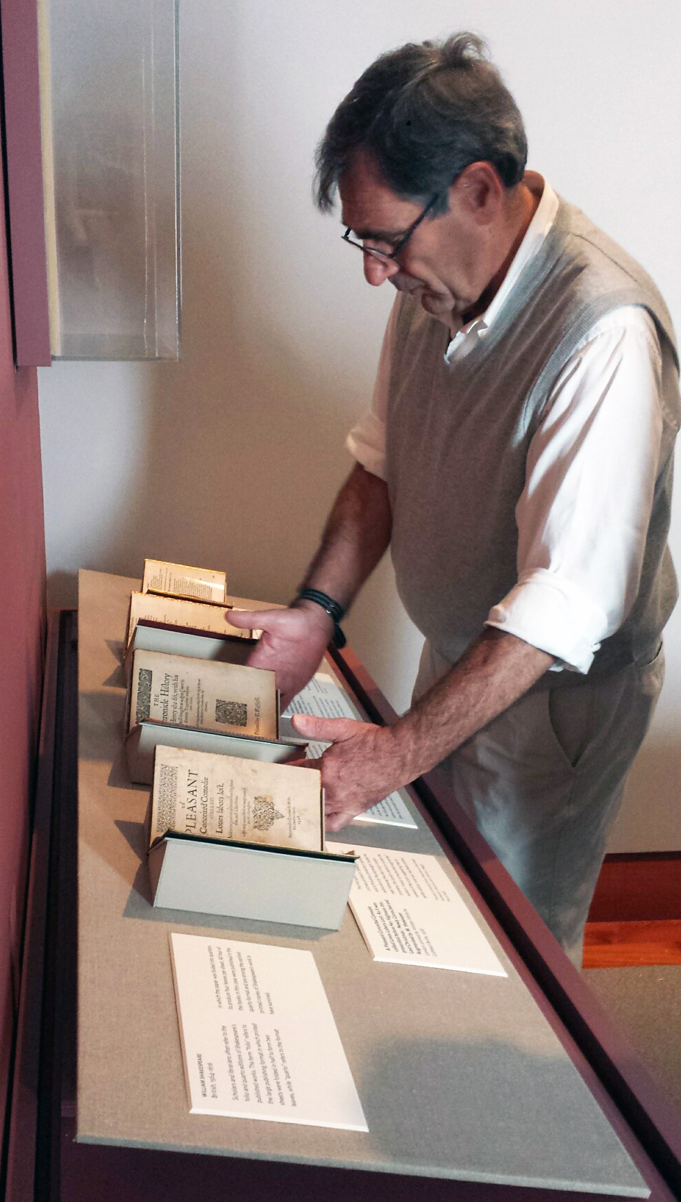
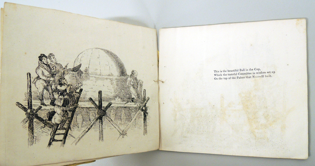
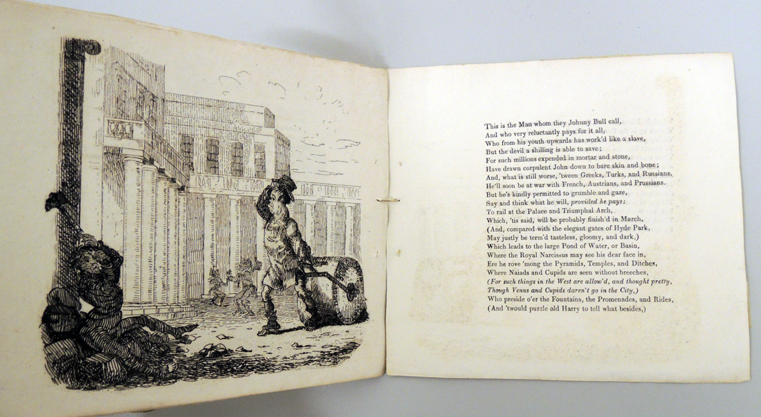
Julie Mellby, Princeton University, Edward Osborne and the Jamaica Rebellion broadside;
Dr Patricia Sieber, Ohio State University, Peter Perring Thoms (1755-1855) and the Radical opposition to the Opium War (1839-42);
Catherine Cartwright, Absence and Presence (evening exhibition);
Dr Anil Aykan, Independent researcher, Deeds and printed words;
Martin Killeen, University of Birmingham, Between the war zone and the Home Front: cartoons in military hospital magazines;
Alison Wilcox, University of Winchester, Defiant, dissenting, and disobedient women of the Great War;
Professor David Finkelstein, University of Edinburgh, Irish Typographical Union networks and the Great Dublin Strike of 1878;
Alexandra Heslop, Royal College of Art and V&A Museum, ‘Open Shop’: A re-assessment of London’s Printing Trades, 1980-1992;
Dr Patricia Thomas, Massey University, Lockout: insubordinate print and the New Zealand 1951 Waterfront Dispute;
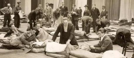
Anthony Quinn, Independent researcher, Duplicating machines, dashes across Europe and nunneries: how emergency issues were produced by newspaper and magazine managements in response to strikes (1926-56);
Jessica Baines, London School of Economics and London College of Communication, Radical printshops, 1968-98;
Mark Dennis, Coventry University, Art & Language’s ‘Support School Project’ and inter-college networks through posters and pamphlets, 1974-79;
Dr Cathy Gale, Kingston University, Collective protest in print;
Dr Ian Horton, London College of Communication, The Grafische Werkplaats, hard werken and cultural protest;
David Sinfield, Auckland University, The serigraphic voice of the worker: stories of the underpaid worker through serigraphic printed posters;
Dr Mark Johnson, Independent Researcher, The work of Jamie Reid – prophet, provocateur and protester.

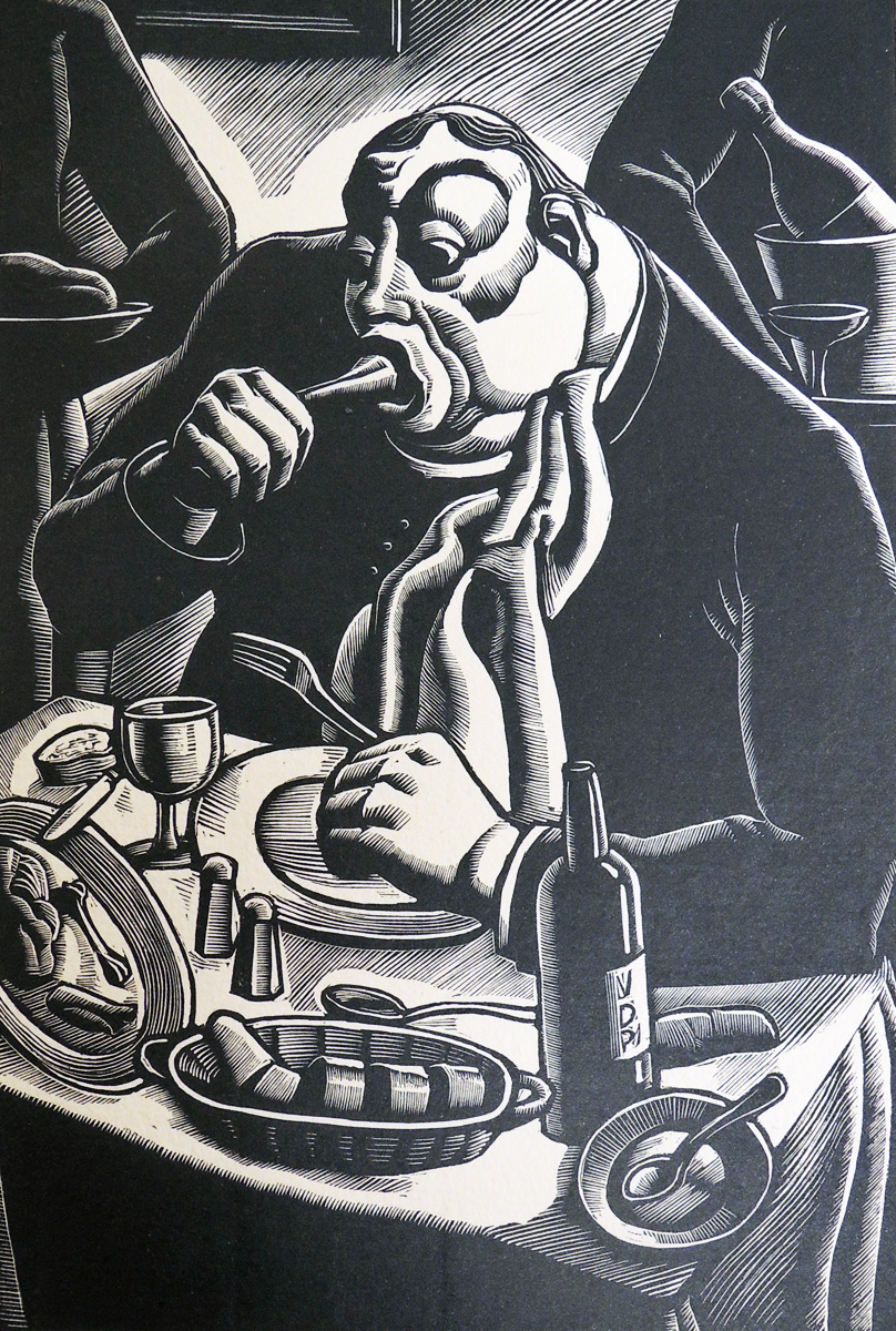
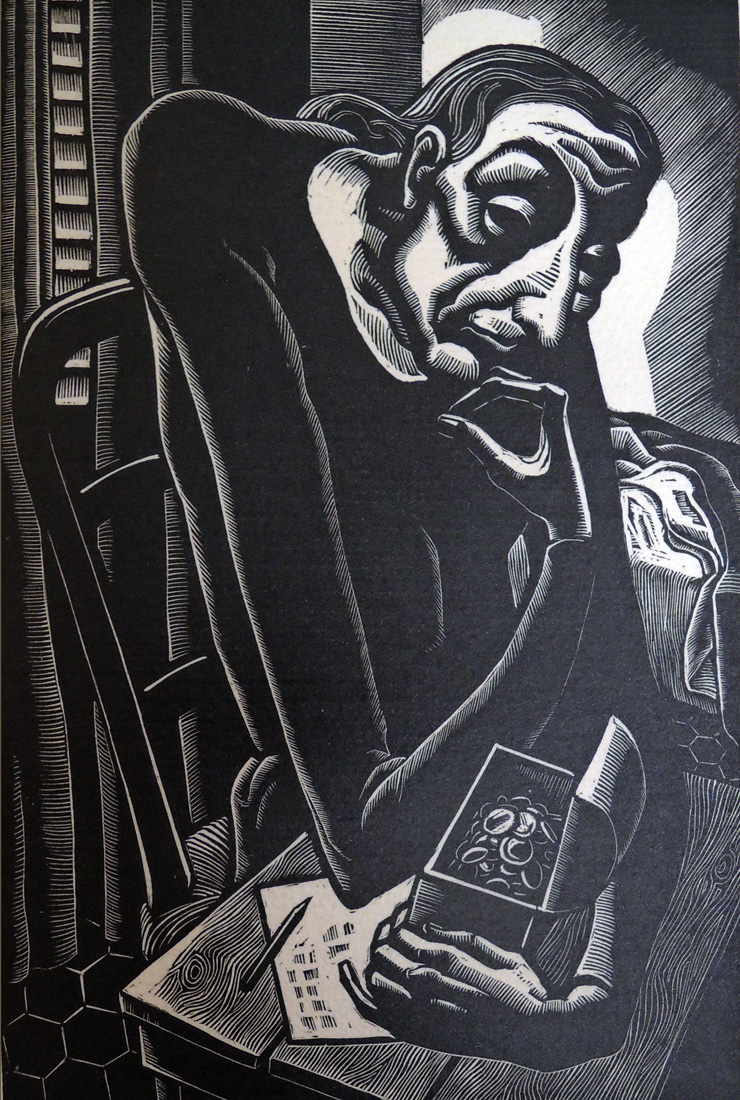
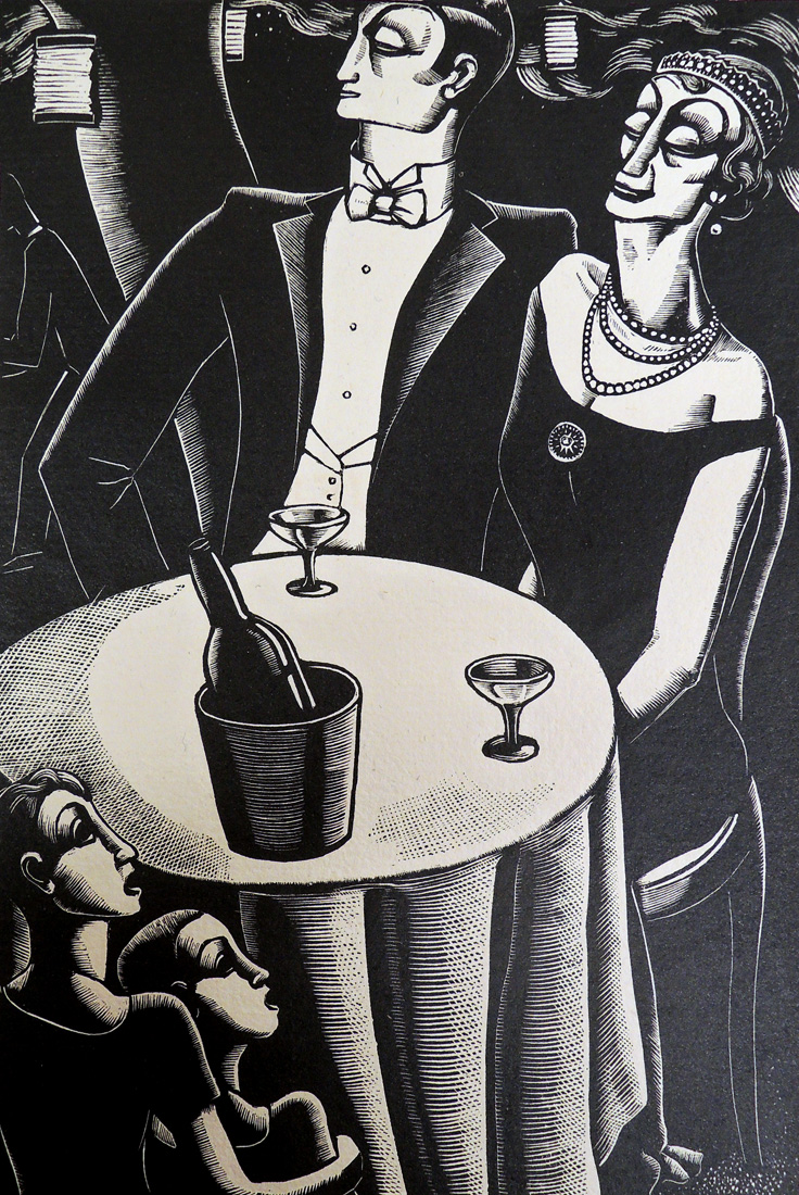
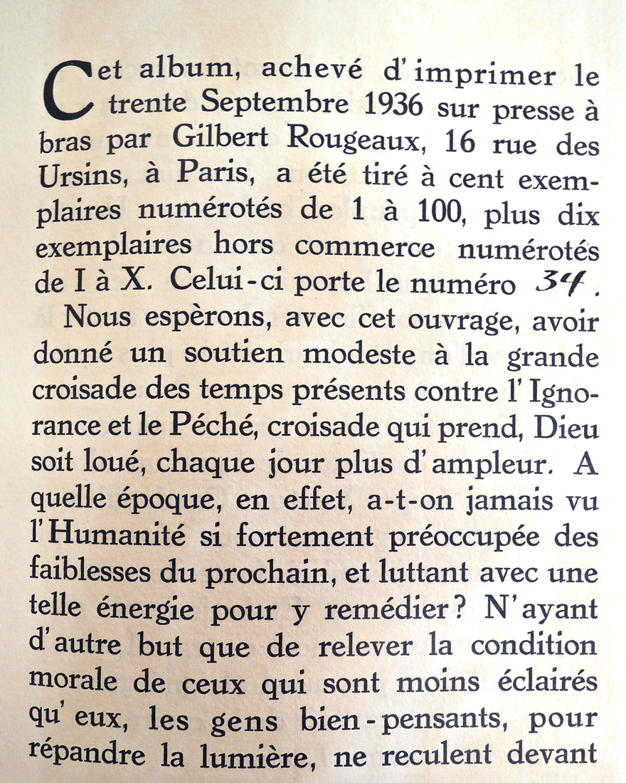
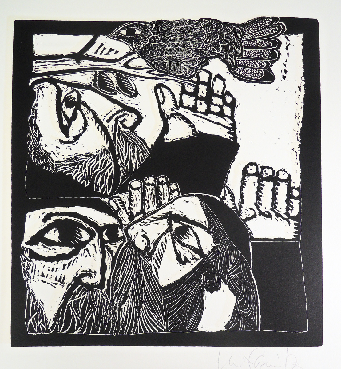
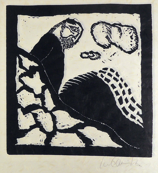
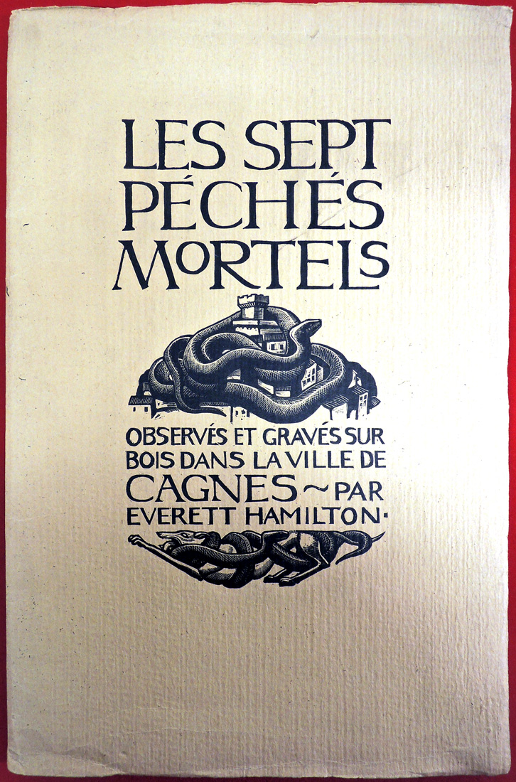 Everett Hamilton, Les sept péchés mortels. Observes et graves sur bois dans la ville de Cagnes (Paris: Gilbert Rougeaux, 1936). Copy 34 of 100. Graphic Arts Collection GAX 2016- in process.
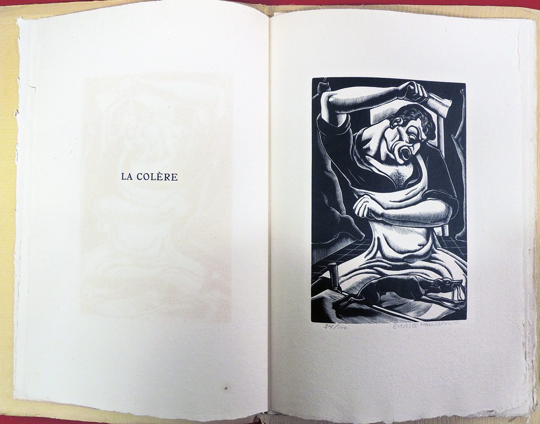


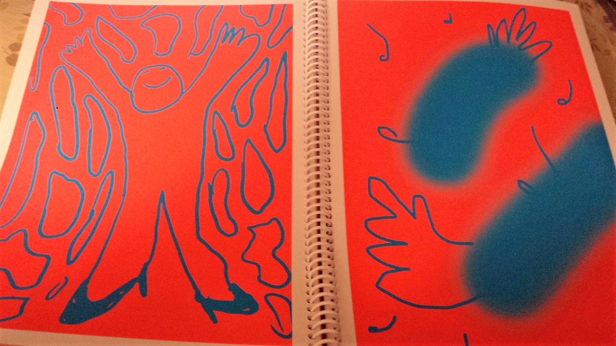
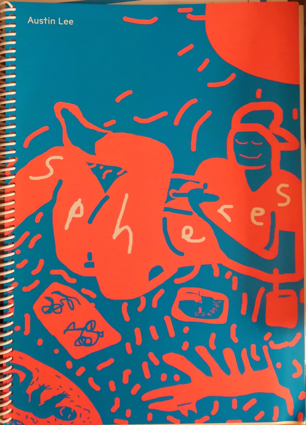
 http://www.postmastersart.com/archive/lee15/images/newshoes.gif
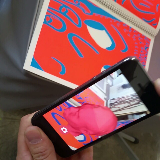
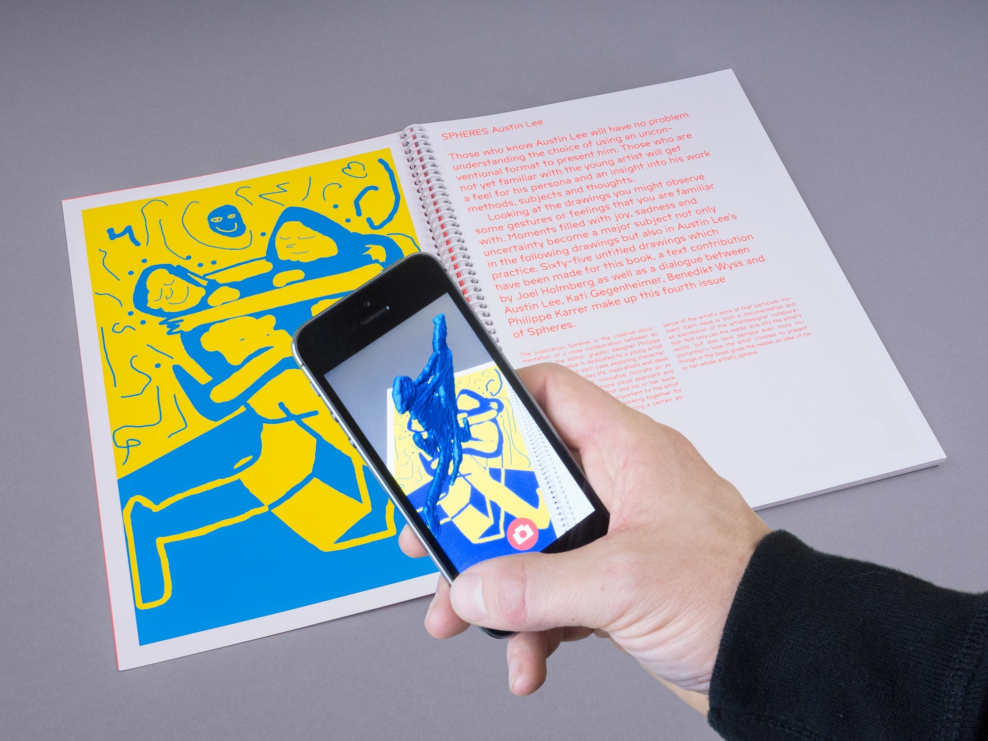