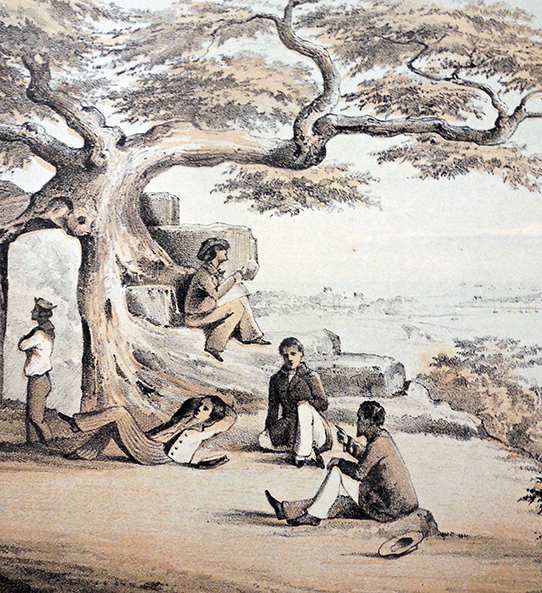
 Scene showing Wilhelm Heine (1827-1885), official artist for Matthew Perry’s Narrative of the Expedition, sketching top center.
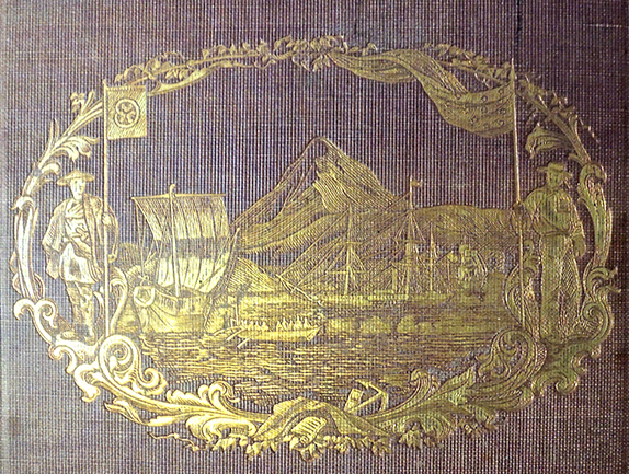
 Matthew Calbraith Perry (1794-1858). Narrative of the Expedition of an American Squadron to the China Seas and Japan, performed in the years 1852, 1853, and 1854, under the command of Commodore M. C. Perry, United States Navy, by order of the government of the United States. Comp. from the original notes and journals of Commodore Perry ... by Francis L. Hawks. With numerous illus. Pub. by order of the Congress of the United States. Washington, A. O. P. Nicholson and Beverly Tucker, 1856.
Separate titles: Vol. 2 Natural history reports by D. S. Green and others; v. 3 Observation of the zodiacal light, from April 2, 1853 to April 22, 1855, made chiefly on board the United States Steam-Frigate Mississippi … data by George Jones.
Copies at Princeton: Eugene B. Cook Chess Collection Oversize 42843.708q; Graphic Arts Collection Oversize 2008-0094Q; Special Collections–Oversize DS809.P45; Special Collections-Rare Books 1732.708q
Matthew Calbraith Perry (1794-1858). Narrative of the Expedition of an American Squadron to the China Seas and Japan, performed in the years 1852, 1853, and 1854, under the command of Commodore M.C. Perry, United States Navy … Compiled from the original notes and journals of Commodore Perry and his officers, at his request and under his supervision, by Francis L. Hawks … New York, D. Appleton and Company; London, Trubner & Co., 1856.
Copies at Princeton: Firestone Library DS809 .P45 1856; Special Collections-Rare Books 2006-0435N
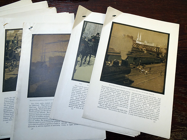
This is a link to a pdf with the lithographs in v.1, including the names of the artists (Heine, Peters, etc) or the photographer (Brown) on the right: Perry
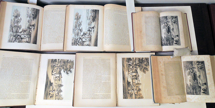 Above, comparing two volumes printed for the Senate, two printed for the House of Representatives, and two trade editions.
“In 1851, President Millard Fillmore authorized a formal naval expedition to Japan to return shipwrecked Japanese sailors and request that Americans stranded in Japan be returned to the United States. He sent Commodore John Aulick to accomplish these tasks, but before Aulick left Guangzhou for Japan, he was relieved of his post and replaced by Commodore Matthew Perry. A lifetime naval officer, Perry had distinguished himself in the Mexican-American War and was instrumental in promoting the United States Navy’s conversion to steam power. …On July 8, 1853… Perry led his four ships into the harbor at Tokyo Bay, seeking to re-establish for the first time in over 200 years regular trade and discourse between Japan and the western world.”–
“Milestones in the History of U.S. Foreign Relations” https://history.state.gov/milestones
The opening of Japan to trade with the United States led to an exchange in both directions of an enormous number of products and technology along with the intermingling of Eastern and Western arts and cultural. Curiosity on both sides was immense and influenced the development of music, costume, food, architecture, and other aspects of modern life for a generation to come.
To document this important moment in history, writer Francis L. Hawks (1798-1866) was hired to compile and published Perry’s Narrative of the Expedition in an illustrated edition for the U.S. Congress and trade edition for the American public. This was complicated by the fact that, at that time, there was no Government Printing (later Publishing) Office but separate printers for the House of Representatives and for the Senate. Nathaniel Beverly Tucker (1820-1890) was an American journalist who was elected Public Printer for the United States Senate from 1853 to 1857 and Alfred Osborn Pope Nicholson (1808-1876), a lawyer from Tennessee, was elected Public Printer of the United States House of Representatives.
Article I, section 5 of the Constitution requires that “each House shall keep a journal of its proceedings and from time to time publish the same.” After years of struggling with various systems of contracting for printed documents that were beset with scandal and corruption, in 1860 Congress created the Government Printing Office as its official printer.– Transforming GPO for the 21st Century and Beyond https://congressional-proquest-com.ezproxy.princeton.edu/congressional/result/congressional/congdocumentview?accountid=13314&groupid=98846&parmId=17A29566C53#1978.6666259765625
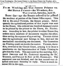
On January 12, 1855, the Senate was the first to place an order for Perry’s Narrative, requesting 5,000 copies, with 500 to be given to Perry and 500 for the U. S. Navy. The following month, the House of Representatives demanded that a copy of the Navy’s report be given to their printer so that 10,00 extra copies be printed along with the 500 for Perry.
“In Senate of the United States, January 12, 1855, ordered to be printed and that 5,000 additional copies be printed; five hundred of which for the use of Commodore Perry. January 29, 1855, ordered that 500 copies be for the use of the Navy Department.”
“In the House of Representatives, February 14, 1855, Resolved. That the Secretary of the Navy be requested to communicate to this House a copy of the report of Commodore M.C. Perry on the subject of the late expedition to Japan; and if said report shall not be completed before the expiration of the present session of Congress, then to deliver the same to the Clerk of the House during the recess. Resolved. That 10,000 extra copies of the said report, together with the maps, charts, and drawings, be printed and five hundred additional copies for the use of the said Commodore M.C. Perry.”
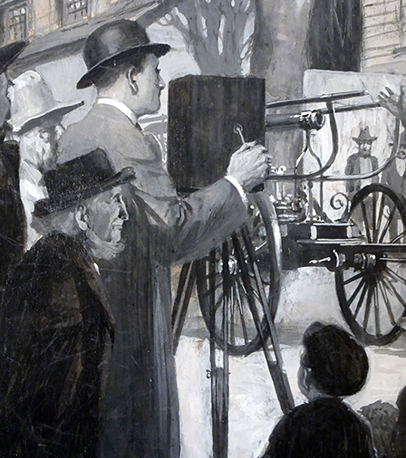
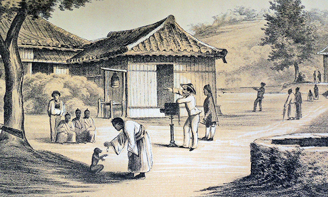 Eliphalet M. Brown preparing to make a daguerreotype.
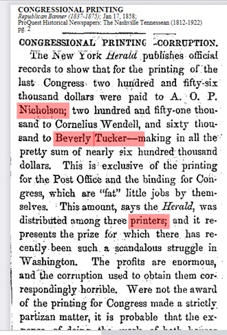
At the time, the animosity between Tucker and Nicholson was such that they had taken each other to court the previous year, claiming the other was responsible for work and/or compensation in the printing of government documents. In fact, both men were subcontracting the work to the same printing office of Cornelius Wendell and in 1858, the New York Herald broke a story of corruption in the “fat” jobs held by the Congressional printers, which led to both Tucker and Nicholson leaving their positions and eventually to the formation of the Government Printing Office in 1860.
A history of the Government Printing Office: https://www.gpo.gov/who-we-are/our-agency/history
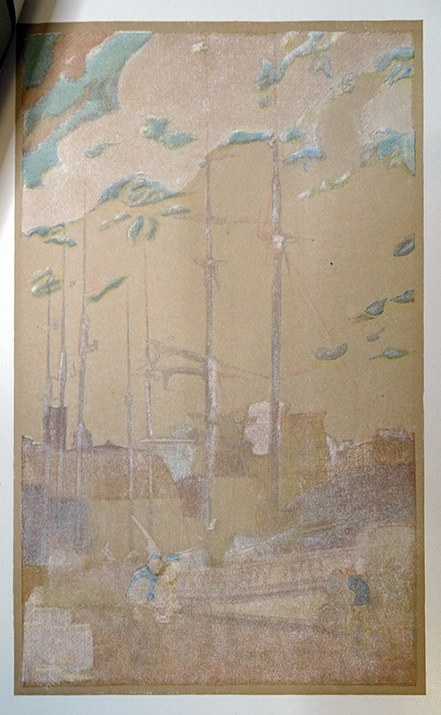
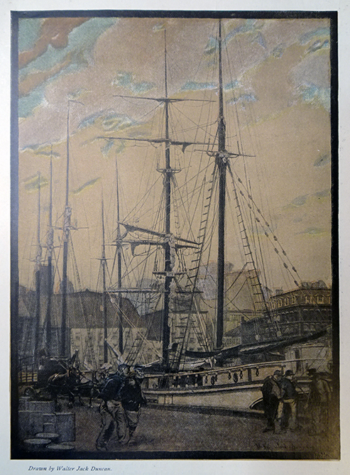
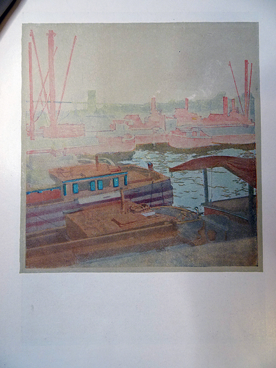
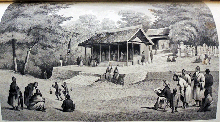
It was during this litigation that they undertook the printing of Perry’s Narrative, presumably ordering up to 10,500 copies, all printed in the same shop of Cornelius Wendell, with exactly the same text and images, bound in three volumes. A smaller trade edition was printed and published in one volume by D. Appleton and Company in New York City with the tinted lithographs from watercolors by Wilhelm Heine (1827-1885) and daguerreotypes by Eliphalet M. Brown (1816-1886) reproduced as wood engravings.
“Some of the volumes issued by the Government in the past have been very elaborate and expensive. In looking over the subject, it appears a mystery how so much money could be put into a single volume.” Navel Expedition to Japan, 3v. $140.851.30 in 1856–R. W. (Robert Washington) Kerr (born 1841), History of the Government Printing Office (Lancaster, Pa., Inquirer Print. and Pub. Co., 1881). Graphic Arts Collection 2006-3271N
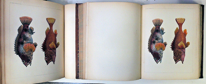
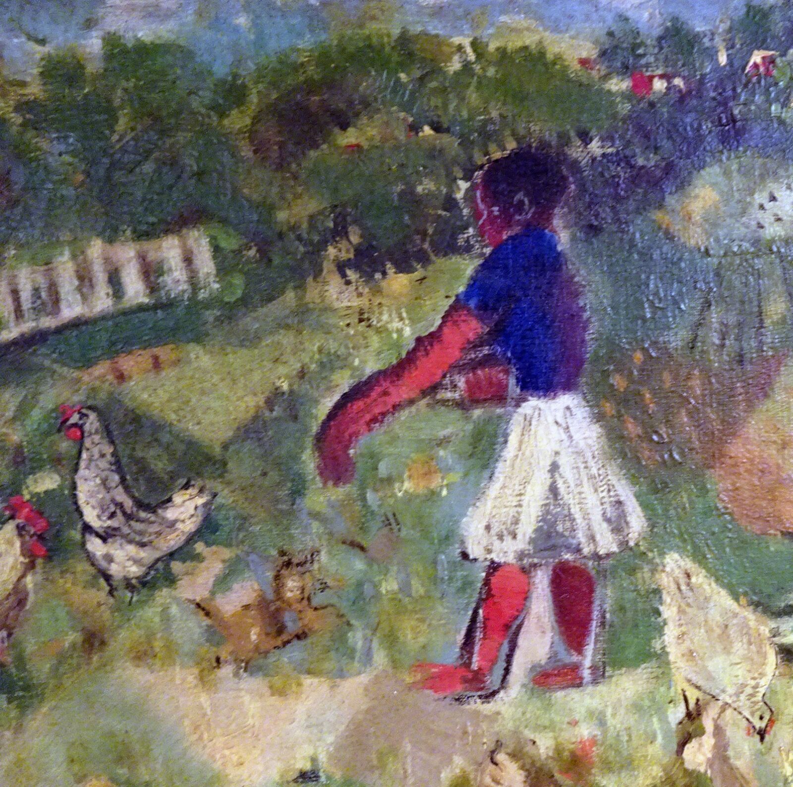
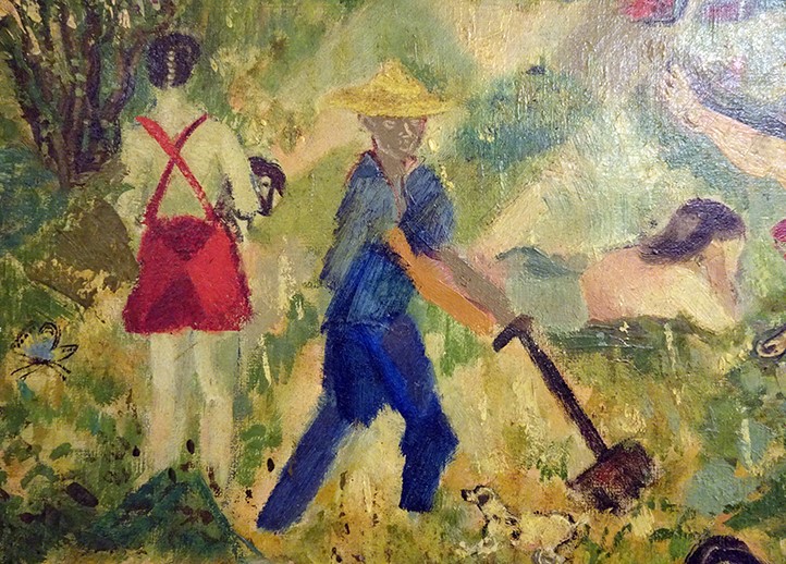
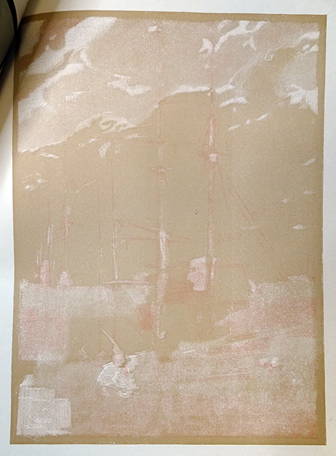
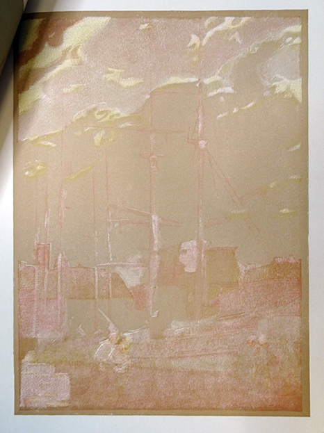
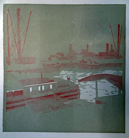
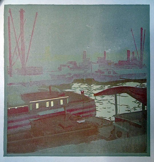
The only difference between the Senate and HoR volumes at Princeton is volume two, which has the colored plates bound recto in one, and verso in the other. Below, in the smaller single volume, Heine’s drawings are slightly changed. See Heine sketching right.
This post is one of two in our Department of Special Collections today about the same phenomenon in the Western world through the lens of different collections under our care, as people throughout Europe and North America had a sudden fascination with all-things Japanese in the latter half of the 19th century. April C. Armstrong, Special Collections Assistant, Seeley G. Mudd Manuscript Library, is posting on the “West meets East Japanese themes in Princeton’s graphic arts of the late-19th-century.” https://blogs.princeton.edu/mudd/2021/08/west-meets-east-japanese-themes-in-princetons-graphic-arts-of-the-late-19th-century/
Another post planned in the coming weeks from Emma Sarconi on the Manuscripts News blog will show what our collections have to tell us about “The Mikado,” a Gilbert and Sullivan comic opera set in Japan that was first performed in London in 1885 and quickly spread throughout the English-speaking world—even, it appears, to the extent that a group of students named their eating club after it.

More about the book’s illustrations: https://library.brown.edu/cds/perry/Perry_Narrative.html

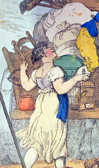
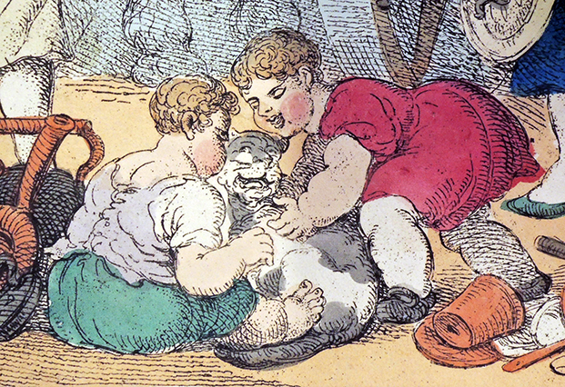
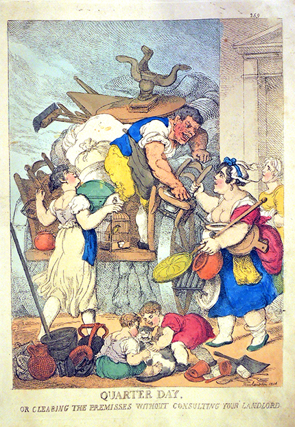 Thomas Rowlandson (1757-1827), Quarter day, or clearing the premisses without consulting your landlord, January 30, 1814. Hand colored etching. Gift of Dickson Q. Brown, Princeton University Class of 1895. Graphic Arts Collection Rowlandson 1785E vol.7