Category Archives: Medium

mediums

The Forgotten John Gast

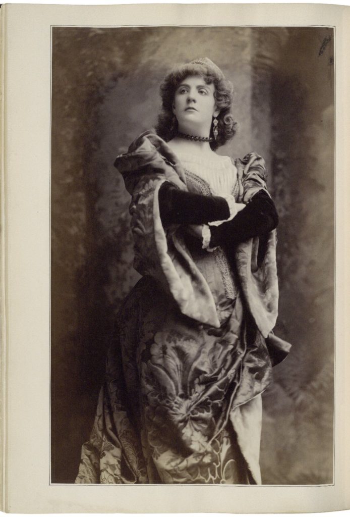
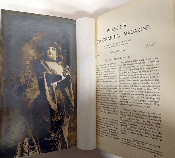
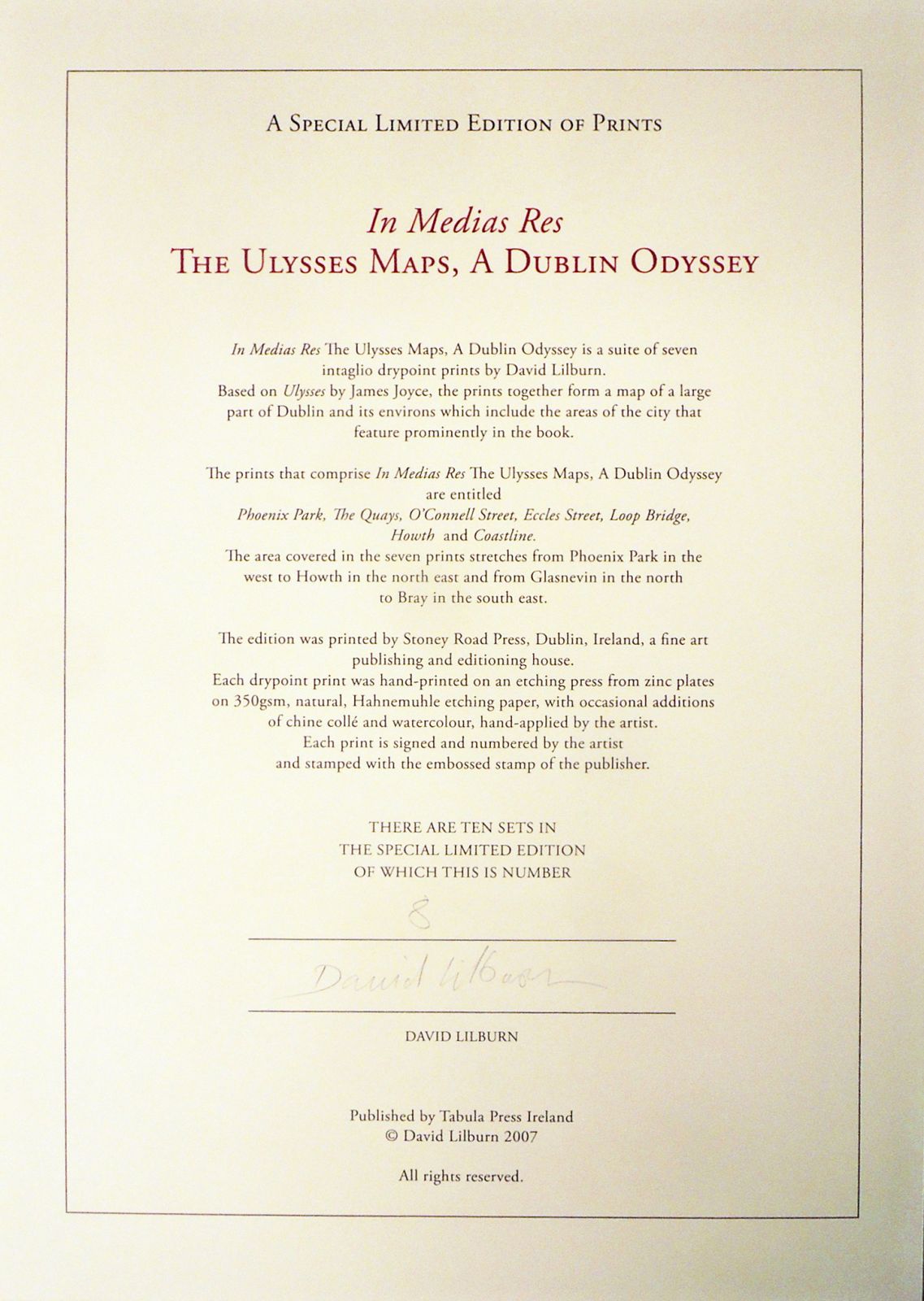
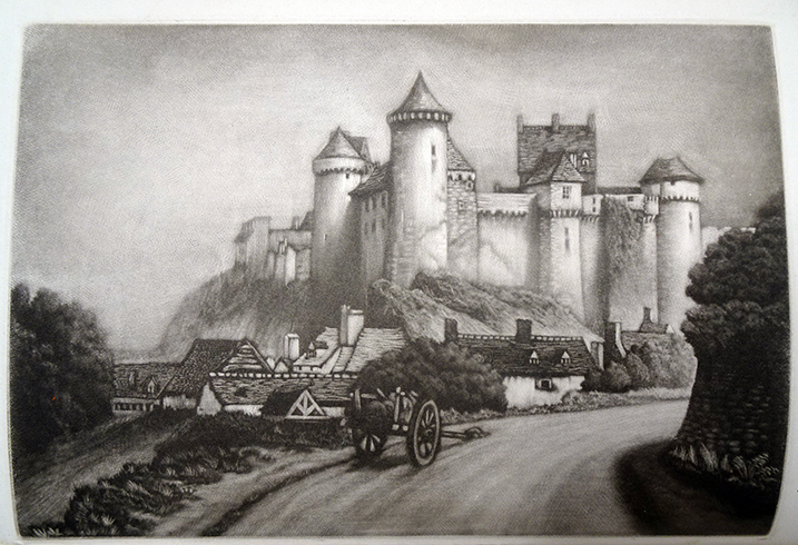
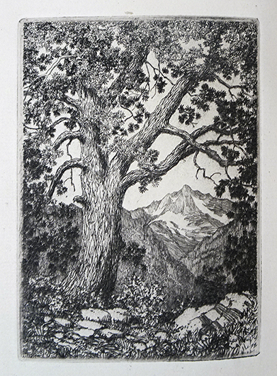
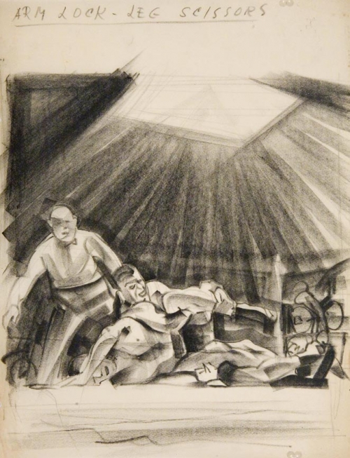
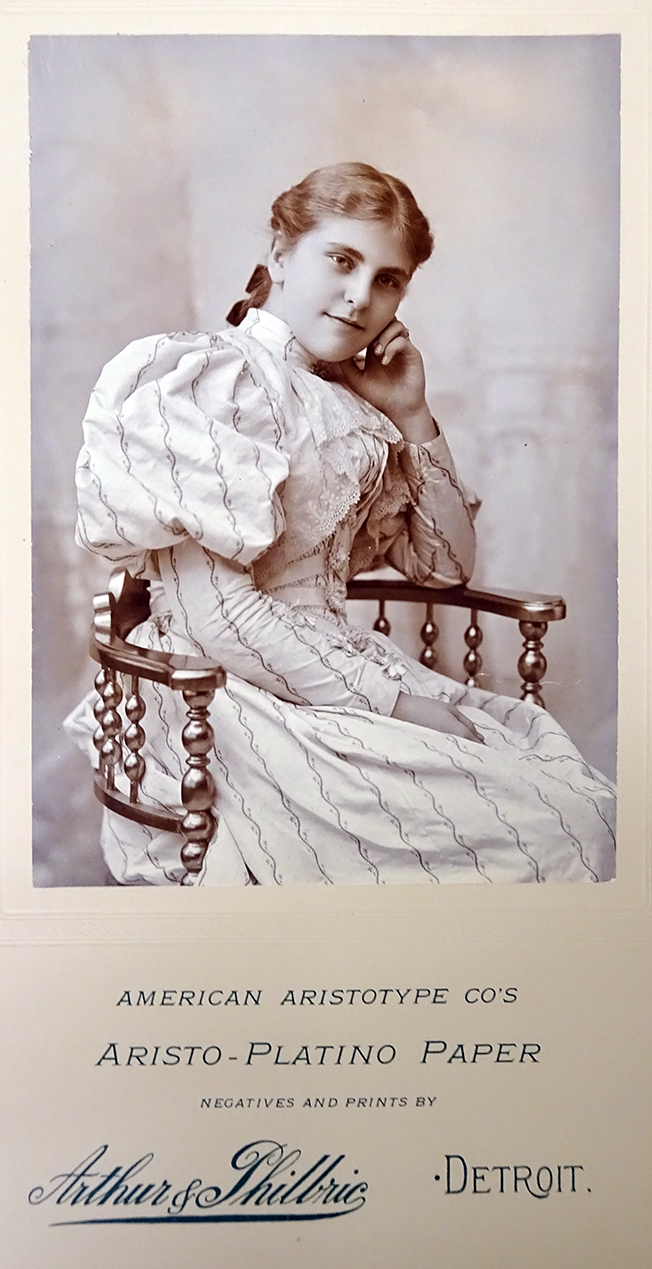
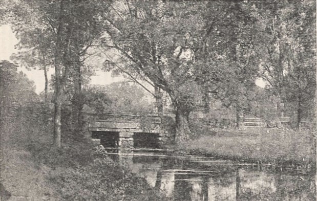
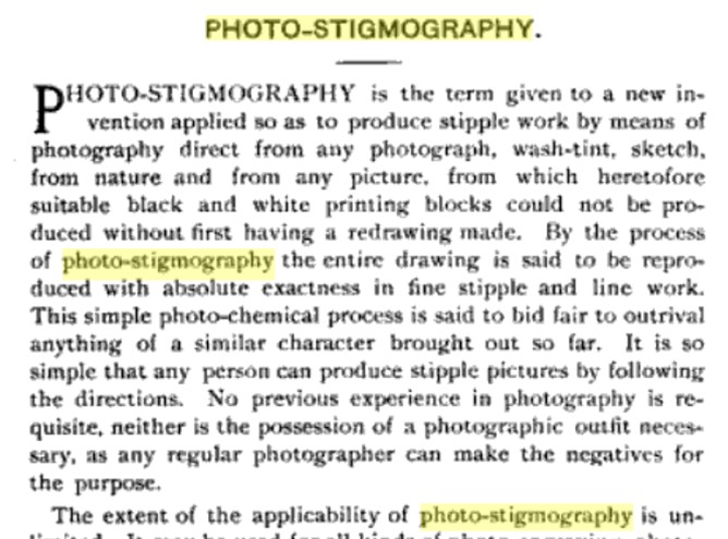
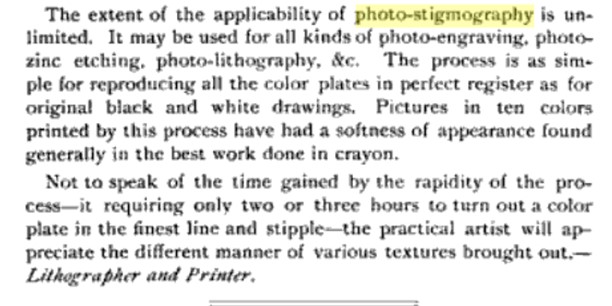
John Gast, “A New Jersey Landscape,” Photo-Stigmograph in The Philadelphia Photographer August 6, 1887. Graphic Arts Collection


John Gast (1842–1896) was brought to the United States from Berlin at the age of six and went on to forged a substantial career as a painter, lithographer, and photomechanical printer. He is primarily remembered for one oil painting, “American Progress” (1872) but more importantly, filed seven new printing patents and was instrumental in establishing several businesses including the Gast Banknote and Lithograph Company (St. Louis); The New York Daily Graphic newspaper; Gast and Company Lithographers (Brooklyn), and the Photochrome Company (also called the Heliochrome Company), which was later purchased in part by Alfred Stieglitz’s father to give his son a stable job.

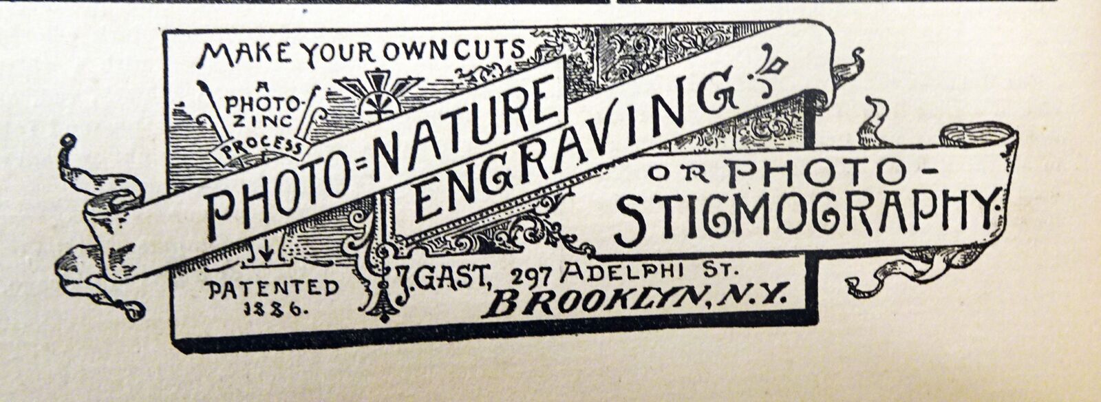
During the late 1870s, Gast worked with William Kurtz, a master of photomechanical printing and the first American to successfully demonstrate the use of three-color photoengraving. Gast developed his own variant processes and began his own company, publishing New Approved Method of Zinc Etching or Photo-zinc-engraving: A Practical Instructor, How to Make Relief Plates, Adapted Especially for Half Tone Reproductions or Photo-nature Engraving in Connection with the Photo-Stigmographic Apparatus in 1886.

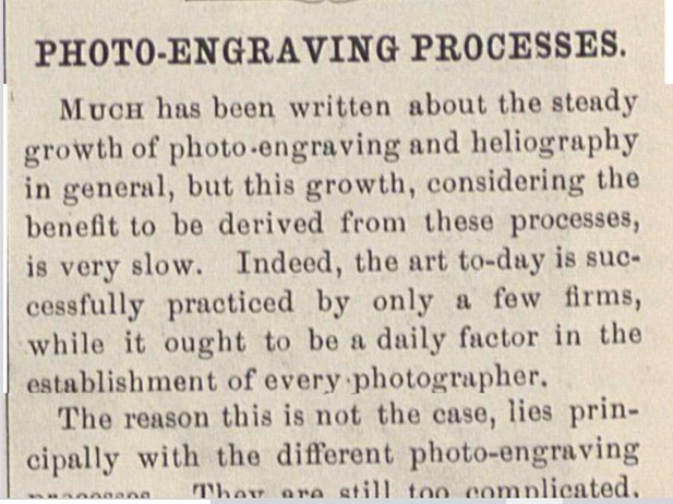
This brought him to the attention of Edward Wilson, editor of The Philadelphia Photographer, who first mentioned Gast’s work in the August 6, 1887 issue. “Much has been written about the steady growth of Photo-engraving and Heliography in general,” commented Wilson, “but this growth, considering the benefit to be derived from these processes, is very slow.” Although he mentions an international group of innovators, it was Gast’s “A New Jersey Landscape” that Wilson used to illustrate his article, noting that the magazine was also advertising the company’s Photo-Stigmography [above].

While Gast had been working in the same field as Wilson for many years, he is incorrectly listed as T. H. Gast, possibly due to the hand-drawn logo. Similarly, when the artist died at the young age of 55, obituaries in multiple papers including the New York Tribune and the Brooklyn Standard print several mistakes. Several credit him as the inventor of the three-colour printing process rather than Kurtz and still others list Gast as establishing the New York Graphic instead of one of their innovative artist/printers. It is not surprising that today, details of his many contributions to the history of printing are misunderstood.

Here is one obituary:

John Gast, a pioneer of the “three-colour” process, died in Brooklyn, N.Y., July 26th, aged fifty-five years. He was born in Berlin, but the family settled in St. Louis. Young Gast returned to Berlin to complete his education. He was graduated from the Royal Academy in Berlin, and returned to St. Louis, where he formed the Gast Lithographic Co. (now Gast-Paul). In three years Gast sold out his interest and went to Paris, where he studied chromo-art under Thürwanger. On returning, he established The New York Daily Graphic in New York in 1871. The Graphic was run successfully for about five years. One of its main features was a page devoted to lithographs made by a special process invented by Mr. Gast. Later on he started the lithographing firm of Gast & Co., now known as Grey & Co. After five years with this company he sold out his interest and started the Photochrome Company. This company used several processes which were invented by Mr. Gast, and soon gained a wide reputation in the lithographic world. He held seven patents on different fine processes for lithographing, but his process which is most widely known is a “three-colour” process. About two years ago Mr. Gast left the Photochrome Company on account of failing health….

“Death of John Gast: He Was a Well-Known Lithographer and Inventor of the Three Color Process,” New-York Tribune July 28, 1896


American Stationer 1886, reprinted in various magazines


Happy 200th Birthday Napoleon Sarony

The Irish American actress Ada Rehan (born Bidelia Crehan, 1857-1916) first appeared on stage as a last minute stand-in for another actress and went on to become one of this country’s best loved Shakespearean actresses with Augustin Daly’s 5th Avenue Theater Company. She was photographed dozens of times in the posh New York gallery of Napoleon Sarony, including this pose from her role as Katherine in the 1887/88 Taming of the Shrew, which ran in New York for 121 performances.

During the last decades of the 19th century, Canadian-born Napoleon Sarony (1821-1896) was the premier portrait photographer of the United States. From his two studios at 680 Broadway (later 256 Fifth Avenue) and 37 Union Square, a staff of over 30 technicians and artists were well-situated for their primary focus: the actors and actresses of New York City.

Sarony’s photographic prints were featured as the frontispiece for 6 issues of The Philadelphia Photographer (later called Wilson’s Photographic Magazine), including March 1867, February 1884, October 1887, May 1892, January 1893, and February 1897. For most, the meticulous Sarony provided the full edition of several thousand prints from his own studio rather than have Wilson’s team reproduce his negatives. One except to this was the final print in 1897, for the issue commemorating Sarony’s death the previous year. All the magazine’s frontispiece in 1897 were printed on glossy Velox paper, many with a full-bleed, and the shiny surface is very difficult to rephotograph or even to view in person. Earlier photogravure and albumen prints made from the 1888 negative are better.

“The negative from which our prints were made was kindly loaned by the Sarony Publishing Co., of this city, now the owners of Sarony’s collection of negatives of celebrities. We may mention, as of public interest, that an exhibition of the choicest pictures of this immense collection will shortly be held on one of our principal thoroughfares. It will be an artistic treat worthy of a visit to New York. …The Velox prints for our frontispiece were made by Mr. Frank Davies under our supervision. Apart from the excellence of the negative their quality is largely due to the special Velox paper manufactured for our edition by the Nepera Chemical Co., of Nepera Park, N.Y.”

Velox Paper was first manufactured by Dr. Leo H. Baekeland in 1894 by the Nepera Chemical Company in Nepera Park, Yonkers, NY. Five years later, George Eastman of the Kodak company bought the Velox process from Dr. Baekeland for one million dollars and started to manufacture its own brand, also called Solio paper.

Wilson’s Photographic Magazine, February 1897

In Medias Res


Was it fate that brought the package from Dublin to the Graphic Arts Collection at Princeton exactly on Bloomsday, June 16, 2021, or just good planning? In the midst of the annual celebration for James Joyce’s Ulysses, we acquired a special limited edition copy of In Medias Res, The Ulysses Maps, A Dublin Odyssey. The portfolio is comprised of seven drypoints by David Lilburn—Phoenix Park, The Quays, O’Connell St., Loop Bridge, Eccles Street, Coastline, Howth—which together form a map of a large part of Dublin and its environs. In particular, they include the areas of the city that feature prominently in Ulysses.


Hand-printed from zinc plates on Hahnemuhle paper, each sheet has additions of chine collé and watercolor applied by the artist. The publishers write:

“Constructed from a multiplicity of drawn marks and viewpoints, the work is packed with references to the topography of Dublin and plots fragments, characters, anecdotes, conversations, historical events and classical allusions all mentioned or implicit in the text. The work enables the viewer to orientate himself or herself within Dublin as it appears in Ulysses and as it is today and to follow the routes taken by various characters in Ulysses as they crisscross the city throughout 16th June 1904.”

While they can be exhibited in sequence, the artist composed each individual print so that it would also function as a completely self-contained image. All seven prints are reproduced on the artist’s website, so we are posting only a few spectacular details from this complex work. Special thanks to Stoney Road Press for their help in the acquisition.


It is with sadness that we learned the artist, David Lilburn, passed away on Wednesday last (July 28, 2021) after a brief period of illness. Lilburn studied history at Trinity College, University of Dublin, 1969-73; lithography at Scuole istituto statale d’arte, Urbino 1973; and art & design at Limerick School of Art and Design (LSAD), Limerick Institute of Technology, 1980-83. Together with Jim Savage, he was also an occasional publisher. Here is a bibliography from his Occasional Press (apologies if I’m missing some):

A Connemara folio: a Ballynahinch sketchbook / Teskey, Donald, artist. Aghabullogue, Co. Cork: Occasional Press in collaboration with Ballynahinch Castle, 2011

An afterglow: a gallery of Connemara poems / Lally, Des.; Fallon, Peter, Aghabullogue, Co. Cork: Occasional Press in collaboration with Ballynahinch Castle, 2010

Ballynahinch postcards: poems / Fallon, Peter, 1951- Aghabullogue, Co. Cork, Ireland: Occasional Press in collaboration with Ballynahinch Castle Hotel, 2007

Being there: an introduction to the work of Joe Wilson / Wilson, Joe; Dunne, Aidan. [Aghabullogue, Co. Cork]: Occasional Press in association with the West Cork Arts Centre, 2006

Berger on drawing / Berger, John, author.; Savage, Jim. Aghabullogue, Co. Cork, Ireland: Occasional Press, 2005, 2007, 2008.

Fountainstown / Cross, Dorothy, 1956-; Cross, Dorothy, Aghabullogue, Co. Cork: Occasional Press, in collaboration with Ballynahinch Castle, 2012

In Connemara: O’Dea, Mick, 1958-; Savage, Jim. Aghabullogue, Co. Cork: Occasional Press in a collaboration with Ballynahinch Castle, 2017

Into the mountains: images from the Twelve Bens / Wilson, Joe, 1947- artist.; Tóibín, Colm; Savage, Jim. Aghabullogue, Co. Cork: Occasional Press in a collaboration with Ballynahinch Castle, 2014

John by Jean: fifty years of friendship: photos of John Berger / Mohr, Jean, photographer. Aghabullogue, Co. Cork, Ireland: Occasional Press, 2016

Montenotte / Cross, Dorothy, 1956-; Cross, Dorothy, Aghabullogue, Co. Cork: Occasional Press, in collaboration with Ballynahinch Castle, 2012

Pony / Curtis, Tony, 1955- author.; Lilburn, David, Aghabullogue, County Cork, Ireland: Occasional Press, 2013, ©2013

The Celtic zoo: a report back on the state of modern Ireland in 24 satirical watercolour drawings / Fitzgerald, Tom, 1939- artist.; Dorgan, Theo. Aghabullogue, County Cork: Occasional Press, 2014

The idea of islands / Hubbard, Sue.; Teskey, Donald. Aghabullogue, Co. Cork: Occasional Press, 2010

This flight tonight: Captain John Alcock & Lieutenant Arthur Whitten Brown’s non-stop transatlantic flight from Newfoundland to Ireland 14th-15th June 1919 / Curtis, Tony, 1955- author.; Lilburn, David, Aghabullogue, County Cork, Ireland: Occasional Press in collaboration with Ballynahinch Castle, 2019

Walking drawing making memory: a Ballynahinch sketchbook / Lilburn, David, artist. Aghabullogue, Co. Cork: Occasional Press in a collaboration with Ballynahinch Castle Hotel, 2009


The Print Connoisseur

John Taylor Arms, Loop the Loop, 1920. Original aquatint printed directly from the copper plate, frontispiece, The Print Connoisseur December 1920.


Frederick Reynolds, Castle of Vitre, 1920. Original mezzotint printed directly from copper plate, frontispiece The Print Connoisseur, October 1920


While clearing an office recently, several early volumes of The Print Connoisseur appeared. Published by Winfred Porter Truesdell (1877-1939) from 1920 to 1932, the quarterly magazine was distinguished by its frontispiece prints, printed directly from the original copper plates and bound into each issue. Truesdell did the printing for the first year himself from his New York studio, but the second and third year were printed at the Clinton Press in Plattsburgh, NY. During this time, Truesdell moved to Champlain, NY, where he joined Hugh McLellan’s Moorsfield Press, and from 1924 forward he and McLellan did the printing.


Dominique Jouvet-Magron, Le Manoeuvre au Levier, 1923. Original etching printed directly form the copper plate, frontispiece The Print Connoisseur April 1923.


“The Print Connoisseur,” American Art News 19, no. 4 (November 6, 1920), p. 4. Stable URL: https://www.jstor.org/stable/25589698

Truesdell’s New York City studio was located in the fashionable east side, not far from J.P. Morgan’s home and library. The studio at 154 East 38th Street was shared with British print maker Frederick Thomas Reynolds (1882-1945) and also served as the meeting place for the Brooklyn Society of Etchers.

Today the address leads to an empty lot, but a sense of the neighborhood can be had thanks to the building directly across the street, owned in the 1920s by Edith Bowdoin, daughter of financier George S. Bowdoin. Although Bowdoin had her father’s carriage house converted to accommodate her automobiles, the façade remained untouched. In the 21st century, the building housed the Gabarron Foundation’s Carriage House Center for the Arts, which hosted exhibitions and lectures until 2011.


George Elmer Burr, Moraine Park, Colo., 1921. Original etching printed directly from copper plate, frontispiece The Print Connoisseur June 1921.


The Print Connoisseur is available digitally through Hathi Trust and has been indexed by David Patrick at: http://www.moorsfieldpress.com/truesdell/the_print_connoisseur_by_winfred_porter_truesdell.html


Maurice Victor Achener (1881-1963), Annecy, Porte Perriere, 1923. Original etching printed directly from the copper plate, frontispiece The Print Connoisseur October 1923.

  George C. Wales, Outbound, 1923. Original etching printed directly from the copper, frontispiece The Print Connoisseur January 1923.


Visualizing the Virus

Visualizing the Virus https://visualizingthevirus.com/ was founded and is led by Dr Sria Chatterjee, an art historian and environmental humanities scholar who received her PhD from the department of Art & Archaeology at Princeton in 2019. It is made possible by a grant from DARIAH EU and support from the Institute of Experimental Design and Media, FHNW. Princeton Center for Digital Humanities is a project partner.

They have a wide network of collaborators and are particularly grateful to the Max-Planck Kunsthistorisches Institute, the University of Global Health Equity in Rwanda, the Department of History at Princeton University, PACE Center for Civic Engagement at Princeton for their collaborations.

The project goes beyond the media narratives around Covid-19. They write:

Visualizing the Virus is an interdisciplinary digital project through which one can visualize and understand the Coronavirus pandemic from a variety of perspectives. It aims to center the inequalities the pandemic makes visible. Gaps between the humanities, social sciences and natural sciences are hard to bridge. This means that pandemics are often studied without considering their many interconnected histories. Visualizing the Virus connects insights from different disciplines to create a collective digital space for exactly such a convergence. We are not only interested in the ways in which scientists, artists and people in their everyday lives have made the virus visible; but also in processes, historical and contemporary, that the viruses make visible – inequalities, be it of access to resources and healthcare, vaccine imperialism, xenophobia, gender inequalities, and so on.

If you would like to participate by collaborating and/or contributing to the project, they would love to hear from you. https://visualizingthevirus.com/about/. Our Graphic Arts webinar and acquisitions played a small part, with thanks to Ellen Ambrosone.

 Dulari Devi, Corona Effect in Patna, 2020. Acrylic on paper. Purchased with funds from South Asian Studies and Graphic Arts Collection GAX 2020- in process

Pictures on paper

https://www.nypl.org/about/divisions/wallach-division/picture-collection/romana-javitz

Coming in the fall, The Color of a Flea’s Eye: The Picture Collection by Taryn Simon, exhibition and events at NYPL opening September 1, 2021; in conjunction with the show currently at the Gagosian Gallery, July 14–September 11, 2021 (https://gagosian.com/exhibitions/2021/taryn-simon-the-color-of-a-fleas-eye-the-picture-collection/)

Read more: Words on Pictures: Romana Javitz and the New York Public Library’s Picture Collection by Anthony T Troncale, Jessica Cline, 2020

New Yorker:
https://www.newyorker.com/magazine/2021/08/02/a-thousand-words-a-million-times-over

Taryn Simon: The Color of a Flea’s Eye: The Picture Collection by Taryn Simon, Joshua Chuang, and Tim Griffin, 2020. Marquand Library use only » Oversize Z664.N499 S56 2020q

Or go see it in person:

Looking under Presses and Printing:

Circulating postcard collection has Princeton’s Drumthwacket


In Conversation: Taryn Simon and Teju Cole: https://gagosian.com/quarterly/2021/06/23/interview-taryn-simon-teju-cole/

Freak Photography

At the very end of the March 15, 1890, issue of Wilson’s Photographic Magazine, the editor threw in a photo-engraving [below] produced by the Moss Engraving Company after a negative by William P. Rhoades of Hot Springs, Arkansas, with a challenge to his thousands of readers to explain how the double exposure was made. With the next issue due out in only two weeks, Wilson emphasized, “Guesses are requested early.”

Not only did he receive a number of answers from around the United States but also examples of work produced in several different methods. In the April 5 issue, Wilson reprinted the photo-engraving and quickly reminded everyone this was not the first time anyone had created a double exposure. He credited Edward Z. Webster with making a daguerreotype in 1850 that included two self-portraits opposite each other at a table. Unfortunately, no reproduction was included and the daguerreotype is not known to have survived. Wilson called this “Freak” photography.

“The interest which has followed our article on the subject of “Freak” photographs, on page 207 of our magazine of April [5]th, has proven to be a great deal more widespread than we at first thought might be the case,” writes Wilson. “As one instance we may [state] (showing at the same time how quick our foreign co-workers are to follow the innovations and inventions of their American cousins), that we have already received a book from a German publisher which faces us with a reproduction of our own engraving of the “Double Subscriber,” accompanied by the instructions we gave for making “Freak” photographs…”.

One of the subscribers who answered Wilson’s challenge was Michigan photographer Abel J. Whalen, who not only described his camera-back apparatus but sent a group of photographs created using his patented process. Wilson published several and with all the publicity Whalen received, he went on to make “Freak” photographs a speciality.

Whalen, however, refused to allow Wilson to published the complete description of how his photographs were made. Instead, with Wilson’s approval, he offered readers the chance to purchase specimens, a vignetting box he would build, and instructions for creating their own pictures. In return, “I will expect $5 with each order.”

F. Gutekunst, Gentlemen of the Jury, Phototype print after a negative by Abel J. Whalen, 1890, published in Wilson’s Photographic Magazine, June 21, 1890. Whalen’s portrait is repeated 14 times against a black background.

“From time to time, since the publication of our issue of April 5th, we have presented articles upon what appear to be “the latest thing out” in photography, namely, “freak” photographs, or photographs which present the same subject in one or more attitudes upon the same plate. Several such pictures have been engraved for our pages, but we have been unable, until now, to present one of a style which, t us, seems to open up a fine lot of possibilities  for the genius of the enterprising photographers who are going to be the first to “get the business” there surely is in it form their patrons. We allude to the “Gentlemen of the Jury” of Mr. A.J. Whalen (formerly of Waldron), Pittsford, Mich. The old time “double” picture, already fully described on page 207 of our issue of April 5th, will, doubtless, have a “big run” too; but we think Mr. Whalen’s method of vignetting in the camera, by means of his “adjuster” and kit, such mysteries as his “Gentlemen of the Jury” gives results which are far more unique, and which, so readily produced, are sure to become popular.”

Wilson went on to highlight Whalen’s photographs several time in his many publications, including Wilson’s Photographic Magazine, Photographic Mosaics, and The Photographic Journal of America, while also running Whalen’s full-page advertisements. One can’t help but imagine it was a winning arrangement for both men, giving Wilson popular copy for the magazine and Whalen a good income.

Olympic medalists in graphic works


The 1928 Summer Olympics, officially known as the Games of the IX Olympiad, held July 28-August 12, 1928, in Amsterdam.

Gold: William Nicholson (1872-1949), British. Un Almanach de douze Sports (Paris Société Française d’Edition, 1898).

Silver: Carl Moos (1878-1959), Swiss. Miscellaneous posters

Bronze: Max Feldbauer (1869-1948), German. Viererzug (Four-in-Hand)


The 1932 Summer Olympics, officially known as the Games of the X Olympiad, held July 30-August 14, 1932, in Los Angeles.

Gold: Joseph Golinkin (1896-1977), American. Leg Scissors, lithograph, 1932?

Silver: Janina Konarska (1900-1975), Polish. Narciarze (Skier), woodcut.

Bronze: Joachim Karsch (1897-1945), German. Stabwechsel


The 1936 Summer Olympics, officially known as the Games of the XI Olympiad, held August 1-16, 1936 in Berlin.


Gold: Alex Diggelmann (1902-1987), Swiss. Arosa I Placard

Silver: Alfred Hierl (1910-1950), German. Internationales Avusrennen (International Avus Race)

Bronze: Stanisław Ostoja-Chrostowski (1900-1947), Polish. Yachting Club Certificate

The 1948 Summer Olympics, officially known as the Games of the XIV Olympiad, held July 29-August 14, 1948 in London.


Gold: none awarded

Silver: Alex Diggelmann (1902-1987), Swiss. World Championship for Cycling Poster

Bronze: Alex Diggelmann (1902-1987), Swiss. World Championship for Ice Hockey Poster


Photography before Photoshop

William Notman (1826-1891), “Victoria Skating Rink, Carnival Shrove Tuesday, March 1, 1870.” Albumen silver print published in The Philadelphia Photographer (Philadelphia, Pa.: Benerman & Wilson, December 1870). Graphic Arts Collection GAX 2007 0008M


In May of 1870 the Canadian photographer William Notman sent the publisher Edward Wilson a copy of a composite photograph entitled “Victoria Skating Rink,” with an offer to edition the print for Wilson’s magazine The Philadelphia Photographer. The offer was immediately accepted and later that fall Wilson received several thousand albumen silver prints that were pasted into the December issue as a special end-of-year treat for his subscribers. Wilson wrote,

“Our picture this month is another example, on a more extended scale, of composition photography; and an example of a class of work which is perfectly legitimate in photography and to which in the future our best artists must reach. The subject is the “Skating Carnival,” which was given in Montreal last winter, during the visit of Prince Arthur [the Duke of Connaught, Queen Victoria’s youngest son], who may be seen in his fur cap, face front, on the left of the picture. It is the work of Mr. Wm. Notman, in Montreal, and as an example of this class, is admirable indeed.”

The fancy dress skating carnival had taken place on March 1, 1870, at the Victoria Rink in Montreal but Notman did not begin work until the following day, when he posted an invitation to anyone who skated at the carnival. Those men and women who attended were asked to come to his studio in costume, to be photographed individually. Approximately 150 portraits were shot, printed, trimmed, and then arranged into a group composition. The background was painted in and the whole scene rephotographed for an inter-negative from which an edition of albumen silver prints could be made.

The first composite prints were completed by April 25, barely two months after the carnival and one was immediately shipped to Wilson in Philadelphia, hoping it would be one of the monthly ‘embellishments’ to his popular journal. Wilson noted:

“The rules of composition are preserved throughout and the photography is excellent. …This is no easy performance, yet those acquainted with the rules of composition and grouping may attempt it and soon succeed. In this the harmony, the ease and naturalness of all the figures, together with the variety, the correct perspective, the perfect light and shade, and admirable definition, make it the most charming thing of the kind we have seen. Many nice studies for positions may be taken from this picture. It is full of matter for study, which fact we hope will be taken advantage of.”

Several large scale versions were also made by projecting the scene onto a light sensitive canvas using a solar enlarger. The photograph was over-painted in oil by Henry Sandham and Edward Sharpe, further obscuring the separate portraits. One such painted photograph is held at the McCord Museum, McGill University, measuring 37 1/2 x 53 1/2 inches, a gift of Charles Frederick Notman [N-0000.116.21.1 seen below]

A key to the picture was also prepared, so some of the 150 individuals photographed could find themselves within the scene and want to buy a copy of the picture.

The Battle of the Aristotytpe Companies


Although the use of collodion as a binder for photographic paper prints goes back to the 1860s, the commercialization of ready-to-use papers took longer to develop and to be accepted by American photographers. In 1884, the Germany manufacturer Paul Eduard Liesegang began selling a collodion emulsion printing out paper (POP) he called Aristotype. The name comes from the Greek aristos and rupos, that is, best type (read more: “Differences In Image Tonality Produced By Different Toning Protocols For Matte Collodion Photographs” by Sylvie Penichon –https://cool.culturalheritage.org/jaic/articles/jaic38-02-002_3.html).


By the end of the 1880s, most photographers abandoned albumen papers for Aristotype papers, with Americans preferring collodion-chloride POP and Europeans using gelatin-chloride POP. This led to the formation of dozens of companies battling for dominance in the Aristotype paper market. Largest was the American Aristotype Company, formed in 1889 with E. & H. T. Anthony as their New York agent, along with the New York (later the New Jersey) Aristotype Company, the Nepera Chemical Company, the PhotoMaterials Company of Rochester, and of course the Eastman Kodak Company, among many others.

Eventually they were all bought out or merged or went bankrupt leaving Kodak as the single American producer. A lawsuit was filed claiming the company used criminal tactics to corner the market but by then, Kodak was too big to fail (see: United States v. Eastman Kodak Co., 226 F. 62, 71 (W.D.N.Y. 1915). Decided August 24 1915).

Wilson’s Photographic Magazine printed dozens of articles and recipes for differing paper chemistry, giving the American public a chance to see for themselves which brand or producer was preferred. In 1893, in particular, Wilson had multiple negatives printed on different papers and inserted them into each copy of the magazine, which had an edition close to 6,000 at that time. Princeton is fortunate to have issues with the photographs still intact, as many were removed by collectors.

In addition to the prints, during the 1890s Wilson’s magazine included advertising by the various companies battling for the photographers’ attention. As seen above, American Aristotype Company used dry detailed listings of their prices, while the New York Aristotype Company hired the firm of Terwilliger & Peck to design humorous advertisements that changed frequently. One in particular shows the company man physically crushing his competitors, the uncomplicated drawing of the ad reflecting the uncomplicated use of their papers.

In 1925, the American Aristotype Company, by then a wholly owned subsidiary of Eastman Kodak, closed its plant for good and the heyday of Aristotypes ended.