Category Archives: prints and drawings

prints and drawings

The March of the Guards to Finchley

hogarth
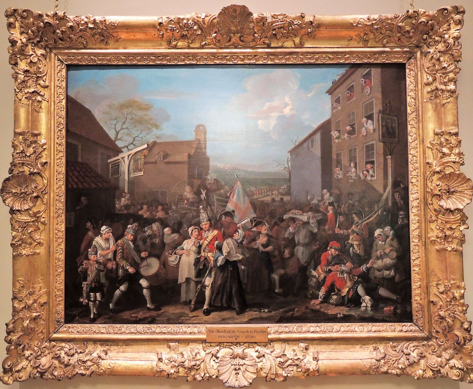
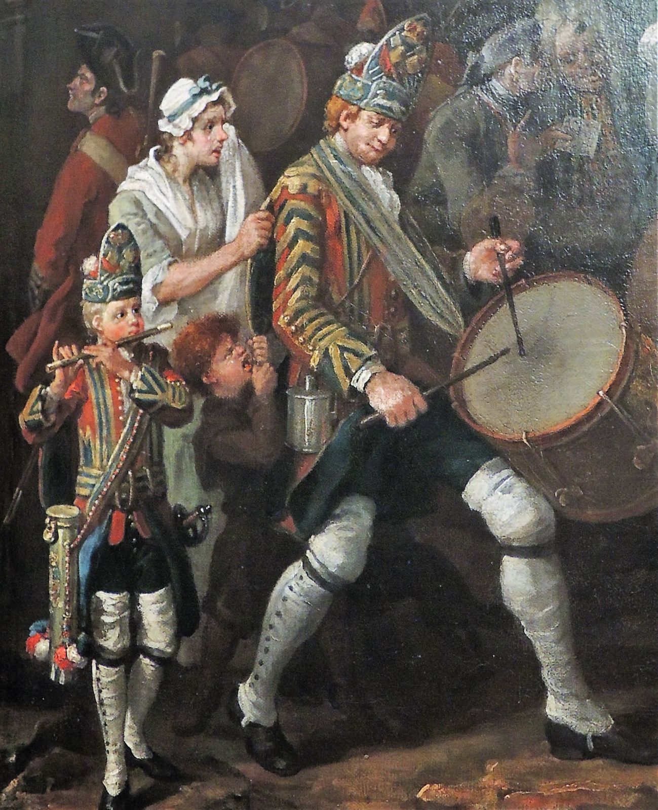
William Hogarth (1679-1764), The March of the Guards to Finchley, 1750. Oil on canvas. The Foundling Hospital Museum, London.

hogarth5-3
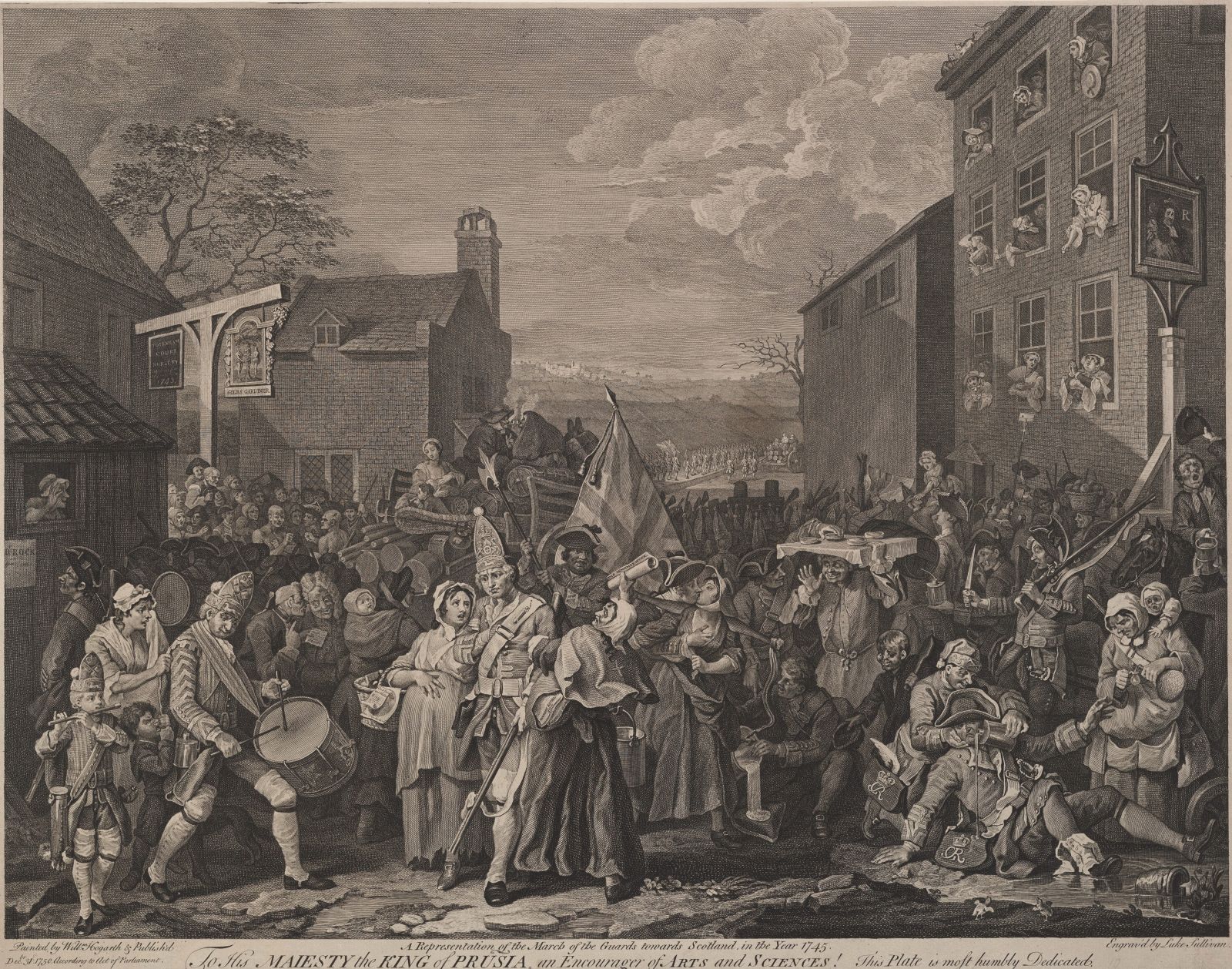
Luke Sullivan (1705-1771) after William Hogarth (1697-1764), The March to Finchley–A Representation of the March of the Guards towards Scotland in the Year 1745, 1761. Etching and engraving. Graphic Arts Collection GC106.

The Graphic Arts Collection has an almost complete set of individual engravings by and after William Hogarth, as well as each of the bound sets of his work. We do not, however, have any of his oil paintings and so, it was fun today to see the oil on canvas [above] from which a series of engravings were made.

Hogarth offered this painting to King George II as a gift but the King foolishly refused it. “So Hogarth gave the first 2000 people to place an advance order for engravings the option of buying a lottery ticket to win the painting. When the day of the lottery came Hogarth had 167 tickets left, and he gave all of them to the Foundling Hospital. Perhaps unsurprisingly, the Hospital won the painting.”–Foundling Hospital Museum.

Princeton does, by the way, also have an advance order ticket for this painting but unfortunately, not the winning ticket.
hogarth3

See also our exhibition website: http://rbsc.princeton.edu/hogarth/home

A Lecture on Heads

lecture-on-heads2In honor of “Reading Faces,” the standing-room-only panel held a few days ago at the Princeton University Art Museum, here is an 1808 “Lecture on Heads”. The University’s scholars focused on caricatures and studies of expressions, approaching the works of art from the perspectives of art history, psychology, and neuroscience.

Speakers included Anne McCauley, David Hunter McAlpin Professor of the History of Photography and Modern Art; Alexander Todorov, professor of psychology; Judy Fan, postdoctoral research associate in the Princeton Neuroscience Institute; and Veronica White, Curator for Academic Programs.

lecture-on-headsGeorge Alexander Stevens, on the other hand, got the idea of a lecture by a country carpenter, who made the character-blocks that formed the subjects of illustrations. It proved an extraordinary success in the hands of the originator. He carried it about England, through the United States, and on finally to Ireland.

After a certain point (there is disagreement on the exact year) Stevens sold his act to the comedian Charles Lee Lewes, who continued to perform the “Lectures” for several years. Lewes is given credit for the performance in this book. The 25 plates in this volume were designed by George Woodward but etched and colored by Thomas Rowlandson.

lecture-on-heads3
lecture-on-heads6

lecture-on-heads8

lecture-on-heads7

lecture-on-heads5

lecture-on-heads4
lecture-on-heads9

Face powder envelopes, Kyoto 1815

oshiroi15
oshiroi2

The Graphic Arts Collection recently acquired a sample album holding nearly 200 colorful cosmetic packages of Oshiroi or white face powder. The ephemeral decorative envelopes are pasted onto 45 unnumbered leaves with various printed and manuscript labels. The final leaf holds a hand-written note indicating the album was produced in Kyoto in 1815.


oshiroi18

oshiroi13

oshiroi14

“In Japan, beauty has long been associated with a light skin tone. During the Nara Period (710–94), women painted their face with a white powder called oshiroi, and in the Heian Period (794–1185), a white facial color continued to stand as a symbol of beauty. References to the beauty of light skin tone are found in the Diary of Lady Murasaki and Tale of Genji. More than a thousand years ago, cosmetics for whitening the skin had already become a status symbol among the aristocracy.”–Originally written in Japanese by Ushijima Bifue.

oshiroi24

This marvelous sample book was assembled in 1815 for the Fujiwara Harima Ishizuka Face Powder Company and the Chikamaro Face Powder Company of Kyoto by a cosmetics distributor named Omi-ya.

The early pages hold thirty sets of three labels each: the first label tells in rapturous detail of the special qualities of the contents, the second gives the brand name, and the third the manufacturer’s name.

Following this are 107 color-printed labels for the envelopes (each including a brand name), then another 52 color-printed labels, and finally the actual face powder envelopes. The decorative designs are either color woodblock prints or made from special paper with metallic flakes including gold.


oshiroi23
oshiroi17

This album was once owned by Dr. Kokichi Kano (1865-1942), a Japanese literature scholar, who came from Oodate City, Akita Prefecture. Kano began his career as the principal of First Higher School (1898-1906) and was then named President of a liberal arts college, Kyoto Imperial University (1906-1908).

oshiroi22

oshiroi16

oshiroi19

oshiroi


Mr. Crindle and The Man in the Moon

crincle8

The British artist Henry George Hine (1811-1895) left Punch in 1844 to freelance for a variety of other satirical newspapers and magazines, including Great Gun, Puck, and, beginning in 1847, The Man in the Moon. Although it had a smaller format, Man in the Moon boasted a large, fold-out cartoon narrative at the front of every monthly issue.

crincle6

The first fold-out told the Life and Death of Don Guzzles of Carrara (artist unknown), followed the next month with The Foreign Gentleman in London; or the English Adventures of M. Vanille, drawn by Cham (1819-1879).

Man in the Moon’s third issue offered the first of nine installments chronicling Mr. Crindle’s Rapid Career upon Town. Hine collaborated on the story and designs with Albert Smith (1816-1869), who had also left Punch for this new journal.

The Crindle series became so popular with the British public that the nine parts were combined and published as a continuous narrative in four pages, titled The Surprising Adventures and Rapid Career Upon Town of Mr. Crindle (recently acquired by the Graphic Arts Collection).crincle4

Not to be outdone, the Paris publisher Charles Philipon (1800-1861) had Gustave Doré (1832-1883) create a revised version called L’Homme aux Cent Mille Écus (The Man with a Hundred Thousand Crowns) which ran in Journal pour Rire between January 12 and June 15, 1850.journal-pour-rire-1850-01-12-800-2

The Man in the Moon: A Monthly Review and Bulletin of New Measures, New Men, New Books, New Plays, New Jokes, and New Nonsense; Being an Act for the Amalgamation of the Broad Gauge of Fancy with the Narrow Gauge of Fact into the Grand General Amusement Junction (London: Clarke, 1847-1849). Edited by Albert Smith (1816-1869) and Angus B. Reach (1821-1856). Artists include Smith; George Augustus Sala (1828-1895); Phiz (Hablot Knight Browne, 1815-1882); Joseph Kenny Meadows (1790-1874); Lionel Percy Smythe (1839-1918); Cham (1819-1879); Robert B. Brough (1828-1860); Henry George Hine (1811-1895); Isaac Nicholson; and Thomas A. Mayhew. Graphic Arts Collection (GA) 2005-0423N

Le Journal pour rire (Paris: Aubert, 1848-1855). Graphic Arts Collection (GAX) 2011-0030E

Here are some details:

crincle3
crincle2
crincle
crincle9

Lot and His Daughters

bacchus4Lot and His Daughters. Engraved by Jan Harmensz Muller (1571–1628), published by Harmen Jansz. Muller (ca. 1540-1617), ca. 1600. Engraving. II/IV. Inscribed below image: Dùm flammâ patriam cernunt cecidisse voraci, / Extinctumque putant omne virile genus: / Largius en solito siffundunt pocla parenti / Lothiades, fallant quo simul arte senem. / Ô laudanda magis quàm condemnada voluptas, / Quae petit amplexus, prolis amore, pios! Graphic Arts Collection.

For this engraving, Muller took as his subject Genesis 19:30-38, which reads in one translation:

Lot and his two daughters left Zoar and settled in the mountains, for he was afraid to stay in Zoar. He and his two daughters lived in a cave. One day the older daughter said to the younger, “Our father is old, and there is no man around here to give us children—as is the custom all over the earth. Let’s get our father to drink wine and then sleep with him and preserve our family line through our father.” That night they got their father to drink wine, and the older daughter went in and slept with him. He was not aware of it when she lay down or when she got up. The next day the older daughter said to the younger, “Last night I slept with my father. Let’s get him to drink wine again tonight, and you go in and sleep with him so we can preserve our family line through our father.” So they got their father to drink wine that night also, and the younger daughter went in and slept with him. Again he was not aware of it when she lay down or when she got up. So both of Lot’s daughters became pregnant by their father. The older daughter had a son, and she named him Moab[a]; he is the father of the Moabites of today. The younger daughter also had a son, and she named him Ben-Ammi[b]; he is the father of the Ammonites[c] of today.

bacchus3The Graphic Arts Collection has the second of four states, printed and published with his father Harmen Jansz. Muller (ca. 1540-1617). We know this because of the description of Muller’s four states at catalogue number 64 in J. P. Filedt Kok, The Muller Dynasty, compiled by Jan Piet Filedt Kok; edited by Ger Luijten, Christiaan Schuckman; introduction by Harriet Stroomberg; [appendix by Erik Hinterding] (Rotterdam: Sound & Vision Interactive in co-operation with the Rijksprentenkabinet, Rijksmuseum Amsterdam, 1999- ). Marquand Library (SA) NE667 .F544 1999

bacchus

800px-lot_daughters_jan_mullerA painted version of this scene also exists in a private collection. There is no indication which came first, the engraving or the oil.

bacchus2
muller3

“Les minutes de sable mémorial”

jarry4Alfred Jarry (1873-1907), Les minutes de sable mémorial ([Paris]: Editio[n] du Mercure de Fra[n]ce, C. Renaudie, 1894). One of 216 copies printed. Seven woodcuts carved and printed by Jarry, two printed from earlier woodblocks. Graphic Arts Collection GAX 2016- in process.


Alfred Jarry published his first book of prints and poems, Les minutes de sable mémorial in September 1894 at the age of twenty-one. He paid the cost himself working with the printers at Mercure de France where many Symbolists were publishing.

The design of the volume, repeated the following year in his second book César antichrist, includes astonishingly modern typography, which predates that of Un Coup de Dés Jamais N’Abolira Le Hasard (A Throw of the Dice will Never Abolish Chance) by Stéphane Mallarmé in 1897. Jarry’s book should be considered an early artists’ book although it never appears in such studies
jarry3

According to Keith Beaumont, “…the prestigious and highly influential Echo de Paris had held a monthly literary competition which offered to aspiring young writers the prospect of four valuable and much coveted prizes of 100 francs each … and a guarantee of publication in the paper’s weekly illustrated literary supplement. Between February and August 1893, Jarry was to win outright or to share five such prizes, with poems or prose texts, which would be republished the following year in his first book, Les Minutes de sable mémorial.” (Keith Beaumont, Alfred Jarry. St. Martin’s Press, 1984)

jarry9

Jarry liked multiple meanings for a single text, exemplified in his title: Les minutes de sable mémorial. Beaumont notes, “Sable refers both to the sand of the sablier or hourglass, which marks the passage of time, and which recurs in the title of the last poem in the volume, and to the term for the colour black in heraldry; and memorial has the meaning of both ‘in memory of’ and ‘of the memory’. The title as a whole therefore refers simultaneously to the passage of time whose ‘minutes’ are here recorded; to the movement of memory; and to the committal to paper of a series of moments of creative activity (‘sable’ referring to the ink-blackened pages) which memory has inspired or, alternatively and simultaneously, which are reproduced here as a ‘memorial’.”


jarry8

jarry6

In November 1894, Jarry cut his long hair and enlisted in the 101st Infantry Regiment in Laval.
jarry5


See also Alfred Jarry (1873-1907), Cesar antechrjst ([Paris]: Mercure de France, 1895). One of 7 large-paper copies on vergé Ingres de carnation. Rare Books (Ex) 3260.33.323 1895 [below]jarry


Les sept péchés mortels

hamilton-deadly-sins5
hamilton-deadly-sinsEverett Hamilton, Les sept péchés mortels. Observes et graves sur bois dans la ville de Cagnes (Paris: Gilbert Rougeaux, 1936). Copy 34 of 100. Graphic Arts Collection GAX 2016- in process.

Rare Books and Special Collections has many different versions of Sept péchés capitaux or Seven Deadly Sins or Siete pecados capitals or Sieben tödliche Sünden. This is a new addition to the group.

hamilton-deadly-sins2

hamilton-deadly-sins4

Almost nothing has been recorded about the life of the American artist Everett Hamilton. As a young man, Hamilton left the United States in 1923 to live and study painting in Paris. Six years later, he returned and received his first one-man show of watercolors and linocuts at Montross Galleries on Fifth Avenue.

“The subject matter his pictures are reminiscent of the work of all the other painters who frequent the popular painting resorts of France. There the similarity ends, in that the artist has remained curiously free from popular trends of style and points of view. A direct transcription of visual reality and an emphasis on structure which, when the human figure is introduced, becomes definitely plastic, [and] gives his work its distinctive style.” Brooklyn Daily Eagle, December 15, 1929

By 1932, Hamilton was included in an American watercolors exhibition assembled by the College Art Association and held at the Worcester Art Museum, in Worcester, Massachusetts. His three paintings hung side-by-side with the work of Milton Avery, Charles Burchfield, Stuart Davis, and Wanda Gag, among others.

This was Hamilton’s last American show and it seems likely that the artist moved back to the South of France, where he observed and engraved The Seven Mortal Sins in the town of Cagnes.


hamilton-deadly-sins3

hamilton-deadly-sins6

“Remember Me” at the Princeton University Art Museum

shakespeare6This Shadowe is renowned Shakespear’s! Soule of th’ age
The applause! delight! the wonder of the Stage,
Nature her selfe, was proud of his designes
And joy’d to weare the dressing of his lines,
The learned will Confess, his works are suchs
As neither man nor Muse can prayse to much,
For ever live thy fame, the world to tell
Thy like, no age shall ever parallel


Like everyone else, we installed a small Shakespeare show at the Princeton University Art Museum this week. A website with checklist and label copy will be up soon. For additional information see: http://artmuseum.princeton.edu/art/exhibitions/2127

shakes6Waiting for his vitrine.


shakes3First and Third on view


shakes1


shakes8


shakes7


shakes4https://blogs.princeton.edu/graphicarts/2011/11/midsummers_night.html


Day-Glo Designer’s Guide

day-glo6
day-glo

In conjunction with VIS 313, we are strengthening our holdings in fluorescent color photography and printing from the 1960s. It is a recognizable moment in printing history, similar to the French pochoir illustration of the 1920s or the wood-engraving of the illustrated newspapers of the 1850s.

This particular guide was printed as a promotional piece to demonstrate the effects of Day-Glo fluorescence for posters and album covers, magazine ads, packaging and more. The volume Includes a short history of Day-Glo and a myriad of tips for designers.

In addition, there is a pop out and build up Day-Glo box, a pop up Day-Glo flower garden and several color sheets in a pocket at the rear. In addition, a 12-page bound in section of Bert Stern’s famous series of Day-Glo serigraph prints of Marilyn Monroe (originally published in Avant Garde magazine)

day-glo3
day-glo2

day-glo7
day-glo5


The Day-Glo designer’s guide (Cleveland, Oh.: Dayglo Color Corp., 1969). Movable/removable parts include (in pocket at rear): Day-Glo tone chart; Day-Glo bonus color chart: Day-Glo four-color process lithography chart.  Graphic Arts Collection GA 2016- in process

Katagami collected in Germany

buntpapierfabrik8
buntpapierfabrik7[Portfolio of twenty-four Katagami or Japanese paper stencils with floral and ornamental designs], ca. 1850. Folio (420 x 250 mm). Graphic Arts Collection GAX 2016- in process.

Not long ago, within a box of Germany ephemera a dealer found a nondescript portfolio of twenty-four stencils. They were mistaken for something European, even German, and were collected by the Graphic Arts Collection for our matrix collection, sight unseen.

When the pieces arrived, Japanese text was found on several and with further study, we confirmed that they are rare 19th-century Katagami, or Japanese stencils for the dyeing of patterns on kimono and other fabrics.


buntpapierfabrik10katagami4 katagami3

One of the stencils has “Katagami” written on it (型紙) in addition to a partial date, which (according to my colleague) seems to be February (second month) proceeded by the character for tiger–which could refer to the year or to the month, based on the astrological calendar.

Another has a date that might indicate the reign date of Kaei, which would date it between 1848 and 1854. A third is stamped “high grade fine pattern.”


katagami2
buntpapierfabrik9
buntpapierfabrik6

The University of Zurich’s Section for East Asian Art held a symposium last March entitled “Katagami in the West [海外での「型紙」の姿]” and has released the abstracts from those sessions. They help to understand the daily use of these matrices as well as their impact on European artisans. Hopefully, a book will come from this wonderful research. abstracts-katagami-conference02

My thanks to Gail Smith, Senior Bibliographic Specialist, Rare Books & Special Collections Department; Nicole Fabricand-Person, Japanese Art Specialist, Marquand Library; and Setsuko Noguchi, Collection Development Department for their help with this mystery.


buntpapierfabrik5
buntpapierfabrik4
buntpapierfabrik3