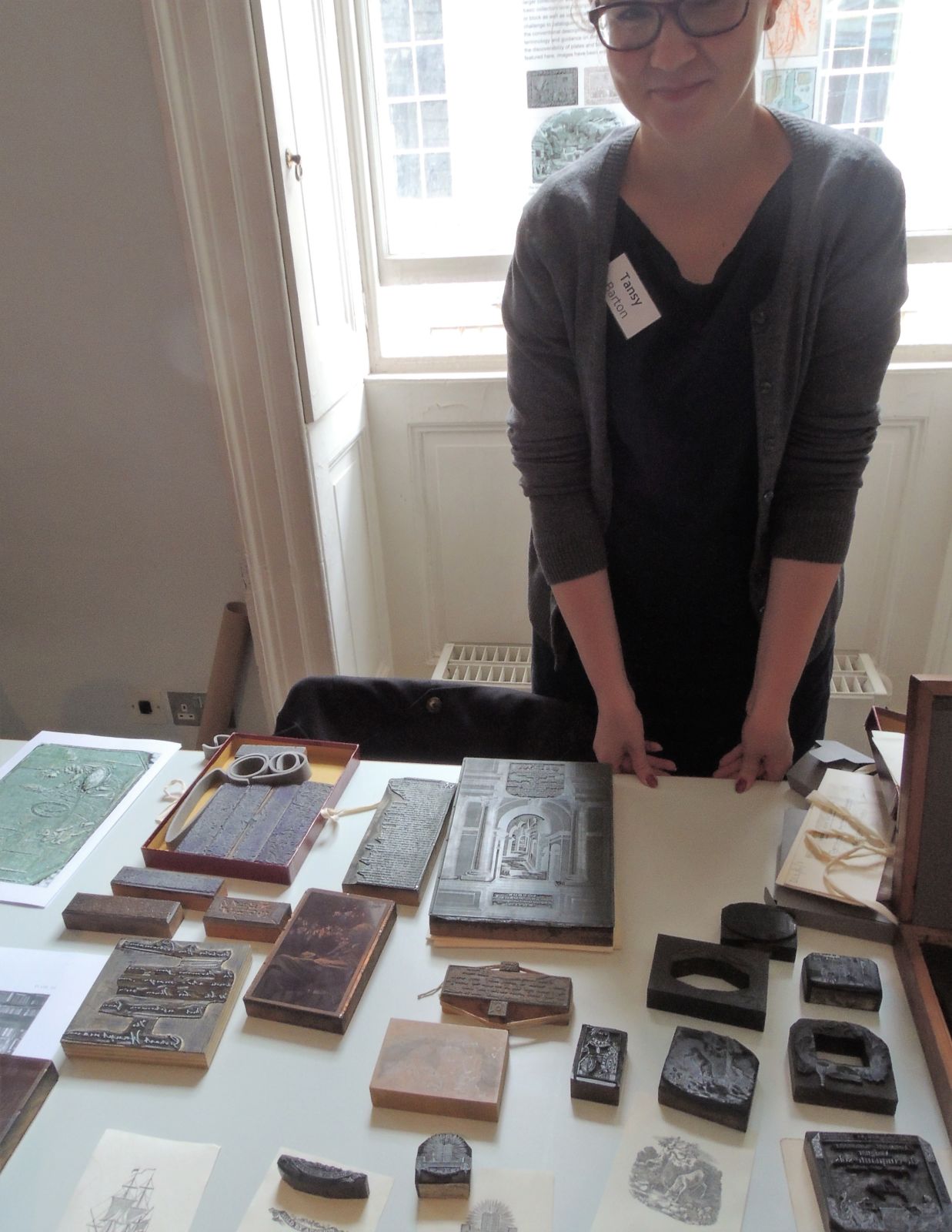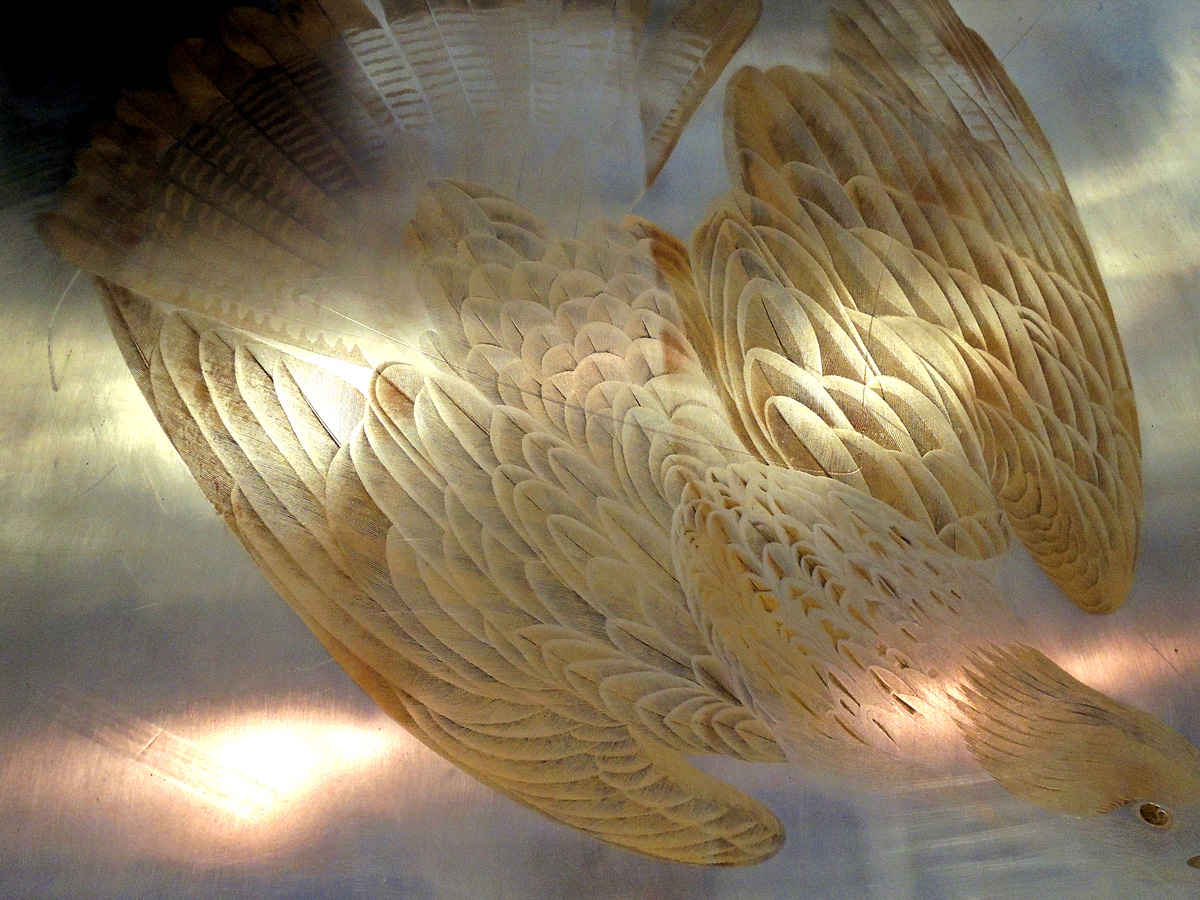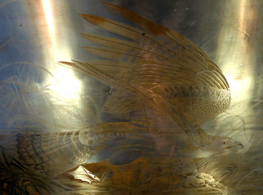
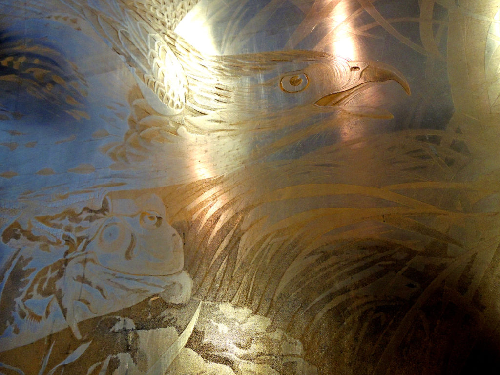
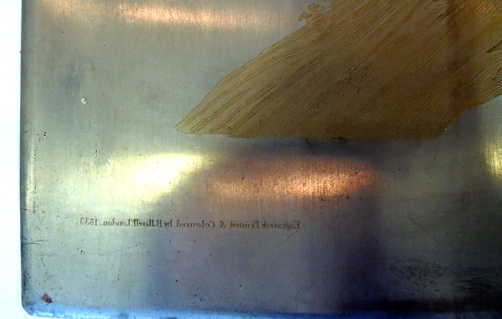
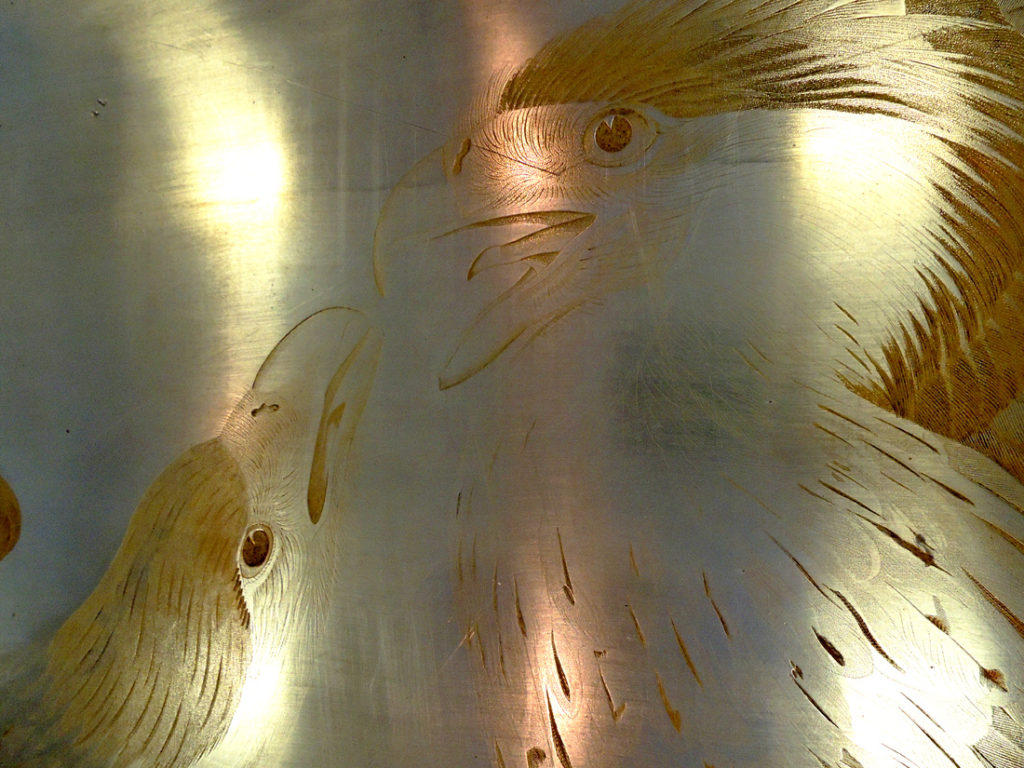
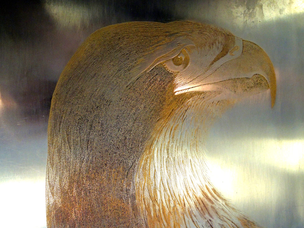
 The copper plates used by Robert Havell, Jr. (1793-1878) for the 435 hand-colored aquatints in John James Audubon’s four-volume The Birds of America, came from at least three London companies. Plate marks have been found for the Hiam Steel and Copper Plate Makers off City Road, where both William Lizars, of Edinburgh, and Havell began buying their enormous plates. There are also marks for Richard Hughes, a copper plate manufacturer off Fleet Street, while still others were from Pontifex and Stiles in Soho.
The National Portrait Gallery’s British artists’ suppliers, 1650-1950 lists the complex ownership and locations of the three companies: http://www.npg.org.uk/research/programmes/directory-of-suppliers/
William Hiam 1819? 1823-1856, Hiam & Sons 1857-1858, William Hiam & Co 1859-1873, William James Hiam 1874, William James Hiam & Son 1875-1916, William James Hiam 1917. At 9 Ratcliffe Row, Bath St, City Road, London 1823-1861, 195 Lever St, Bath St 1862-1891, 162 Lever St 1892-1911, 1 Ironmongers Row, St Lukes, EC 1912-1917. Also 13½ Exmouth St, Euston Square 1849. Steel and copper plate makers.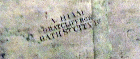
Richard Hughes 1820-1845, Mrs (Mary) Hughes 1846-1847, Miss Mary Hughes 1848-1850, Hughes & Kimber 1850-1874, Hughes & Kimber Ltd 1875-1909, Hughes & Kimber 1910-1940. At14 Lombard St, Fleet St, London by 1822-1825, 8 Peterborough Court, Fleet St 1826-1838, 107 Shoe Lane, Fleet St 1839-1856, 106 Shoe Lane 1850-1856, 5 Red Lion Passage, Fleet St 1856-1862, West Harding St, Fetter Lane 1863-1909, 3 West Harding St 1910, 9 Gough Square, Fleet St 1911-1940. Works, New Church Road, Mitcham, Surrey from 1880, Britannia Iron Works, Bury, Hunts 1881-1899. Copper and steel plate makers.
 Russell Pontifex 1802, William Pontifex, Russell Pontifex & E. Goldwin 1805-1811, William & Russell Pontifex (& Co) 1808-1813, Russell Pontifex 1814-1828, Russell Pontifex & Co 1825-1829, Russell Pontifex & Son 1826-1833, Russell Pontifex 1834 [subsequently Russell Pontifex and/or one of his sons seems to have traded with Stiles at 23 Lisle St and in changing arrangements (see below) at Upper St Martin’s Lane], Pontifex & Stiles 1835-1848, William Stiles 1840-1857. At 126 Bunhill Row 1802, 46-48 Shoe Lane 1805-1813, 5 Lisle St, Soho, London 1814-1816, 23 Lisle St 1813-1857, 22 Lisle St 1818-1819. Initially a watchcase maker, from 1806 copper plate makers and coppersmiths. Russell Pontifex & Co 1827-1829, Russell Pontifex & Son 1830-1834, Russell Pontifex 1834, Russell Pontifex & Co (apparently Pontifex, Farr and Yeowell) 1835-1836, Pontifex & Farr 1837, Russell Pontifex 1839-1841, Pontifex & Mallory 1842-1853, Russell Pontifex 1854-1859, Russell Pontifex & Son 1860-1868, Russell and Alfred Pontifex 1869-1872, Russell Pontifex & Co 1873-1885, Russell Pontifex & Son 1886-1892, Russell Pontifex & Co 1893-1915. At 15-16 Upper St Martin’s Lane 1827-1849, 14 Upper St Martin’s Lane 1851-1915. Copper and engineering works.
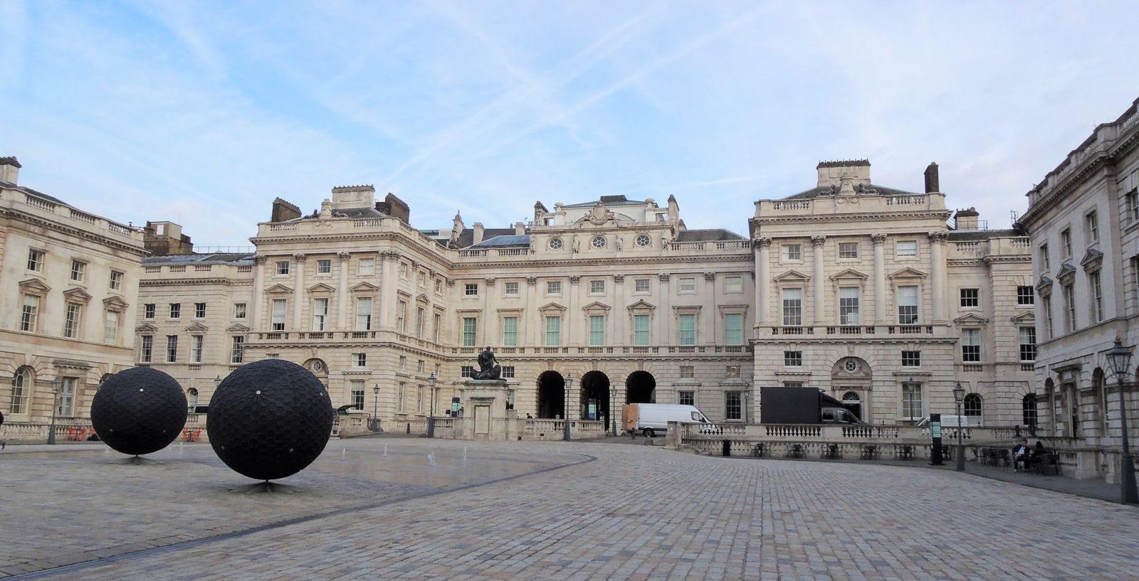
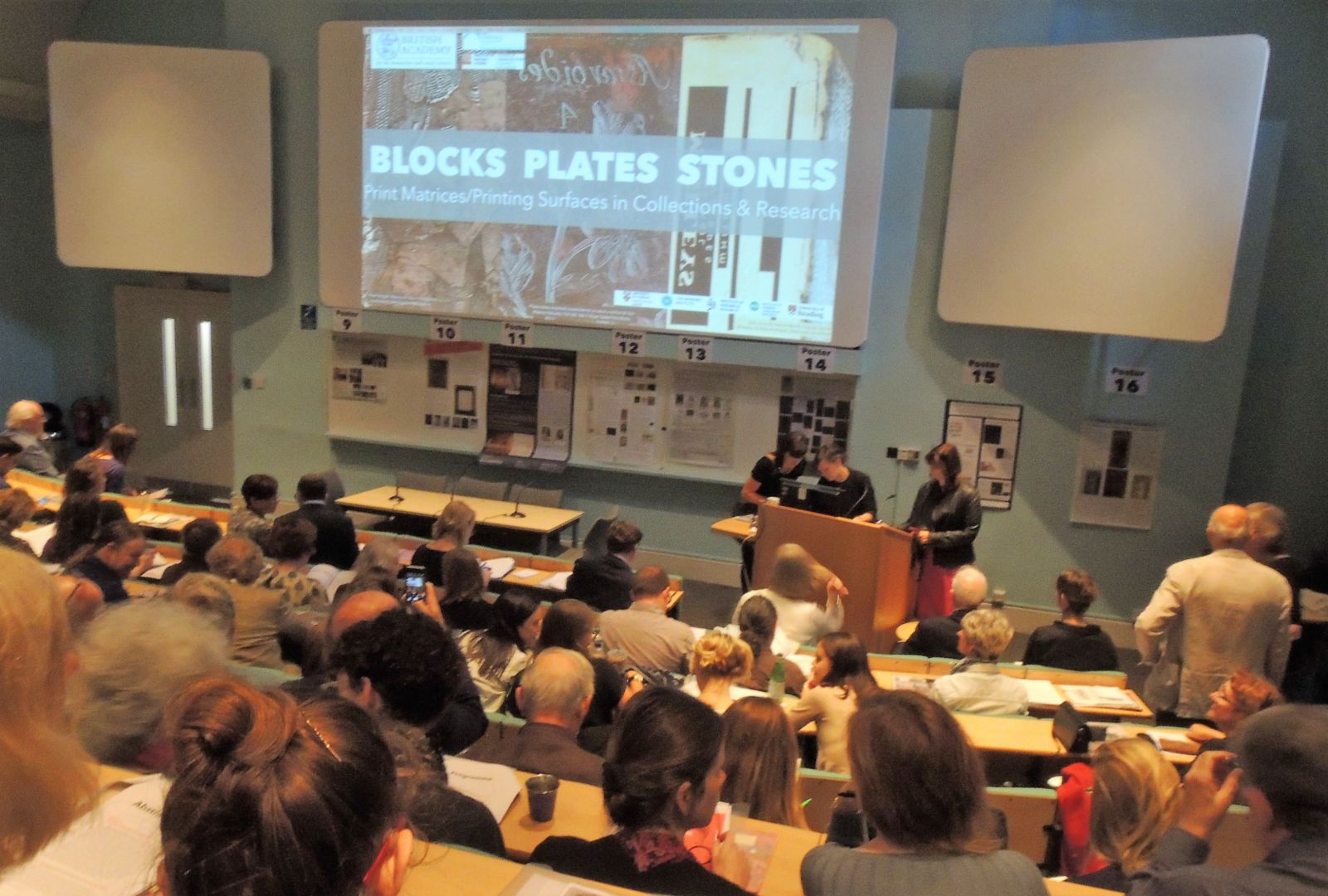
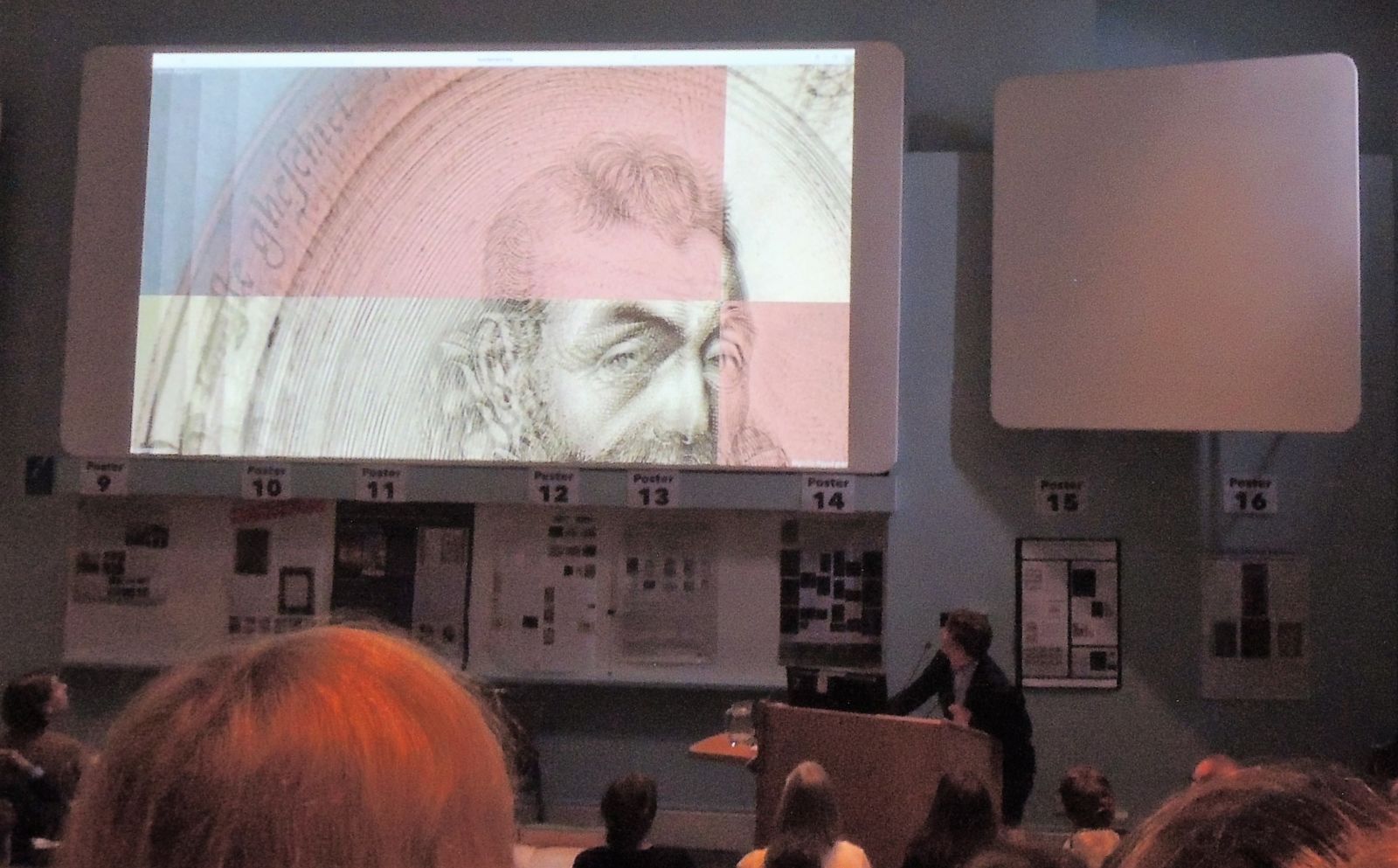
 This research is part of the upcoming conference: Blocks Plates Stones: Matrices/Printing Surfaces in Research and Collections, Thursday, 21 September 2017, Courtauld Institute of Art. Final program:
https://www.ies.sas.ac.uk/sites/default/files/files/events/conferences/BARSEA/BlocksPlatesStones-Programme-Final.pdf
Convened by Dr Elizabeth Savage (Institute of English Studies), “This deeply interdisciplinary conference will survey the state of research into cut woodblocks, intaglio plates, lithographic stones, and other matrices/printing surfaces. It will bring together researchers, curators, librarians, printers, printmakers, cataloguers, conservators, digital humanities practitioners, and others who care for or seek to understand these objects. The discussion will encompass all media and techniques, from the fifteenth century through the present.”

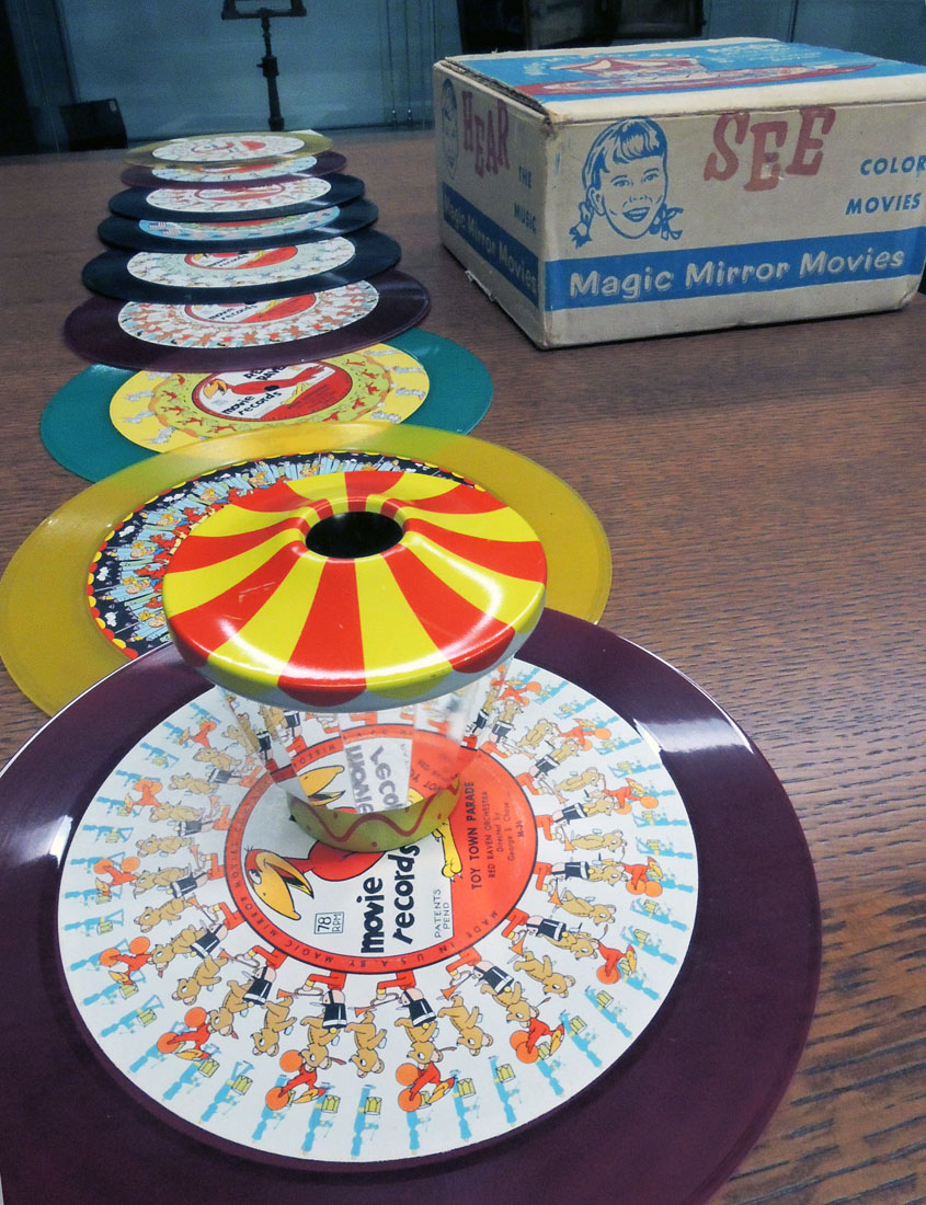
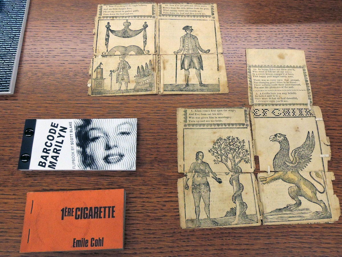
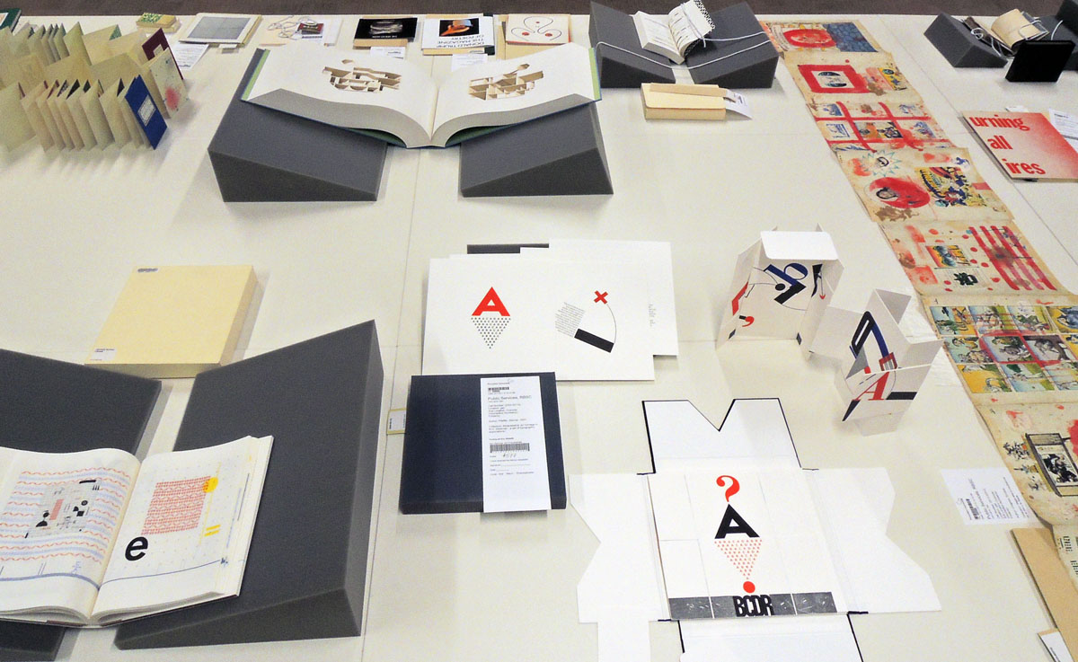
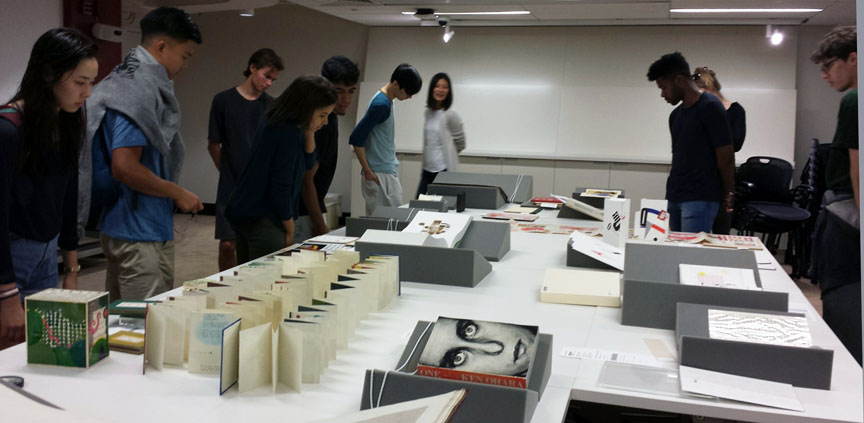
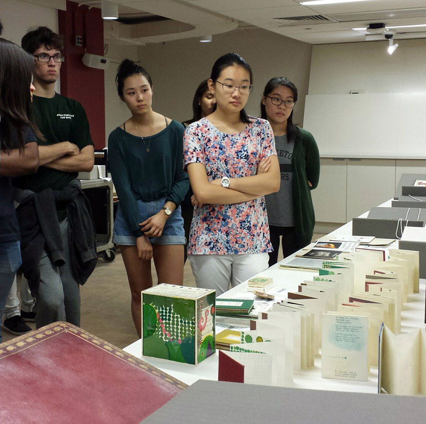
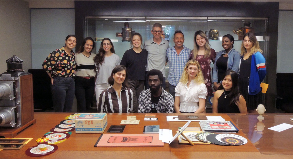 Students in the class “Print to Motion” from Columbia University’s LeRoy Neiman Center for Print Studies visited recently along with instructor Ben Hagari and the Center’s artistic director Tomas Vu-Daniel. http://www.columbia.edu/cu/arts/neiman/about.html They are printing their own thaumatropes, zoetropes, and other optical devices and so, came down to be inspired by our historical collection. http://rbsc.princeton.edu/sites/default/files/Optical%20Devices.pdf
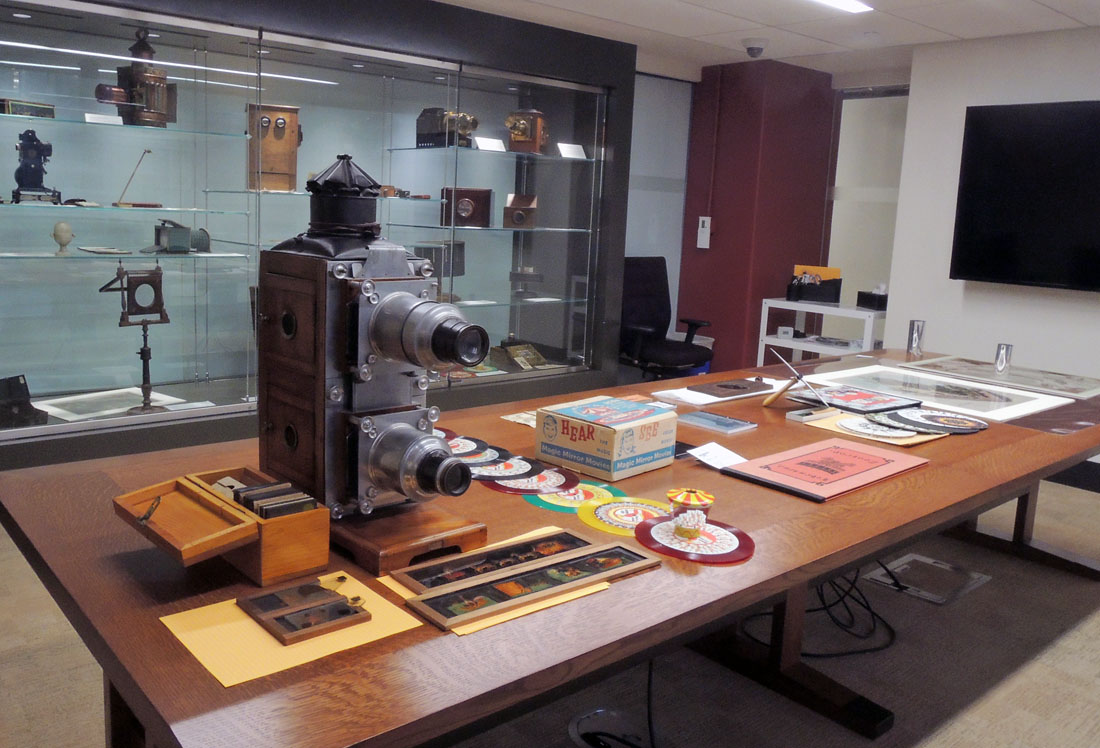
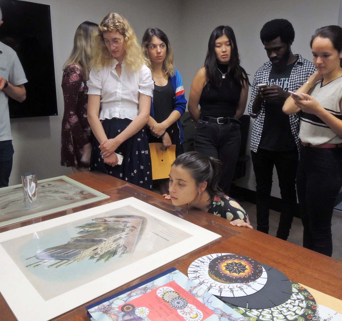
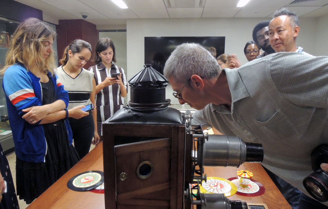
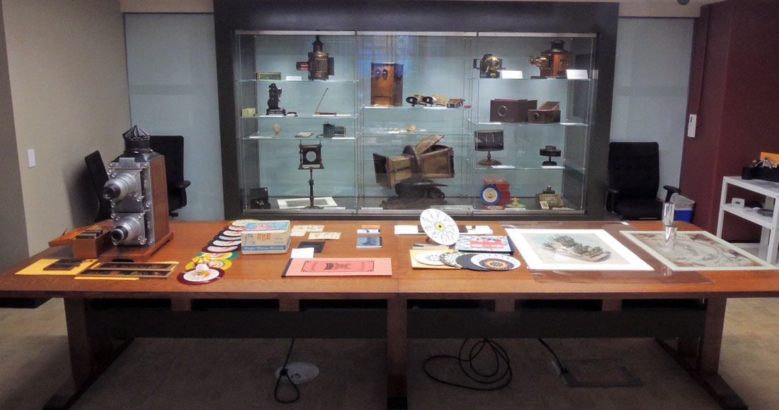 The LeRoy Neiman Center for Print Studies was founded by a generous endowment from LeRoy and Janet Neiman in 1996 to promote printmaking through education, production and exhibition of prints. The center provides students, as well as established artists, a rich environment to investigate and produce images through a myriad of printmaking techniques which include intaglio, lithography, silkscreen, relief, photography, and digital imaging.