With sincere thanks to Dr Sara Stevenson, former Chief Curator of the Scottish National Photography Collection, at least one photograph has been successfully attributed to a specific member of the Cundell family. No small feat.
All nineteenth-century book and photograph historians have run into questions about the Cundells (George, Joseph, Henry and Edward) along with their contemporary Joseph Cundall. In her book, together with A.D. Morrison-Low, Scottish Photography: the First Thirty Years (Edinburgh, 2015, Marquand TR61 .S73 2015), Dr. Stevenson helps us make distinctions between these men.
“Henry Cundell (1810-86), who was an amateur painter, is the only one who exhibited in the 1850s, and he figured in touring exhibitions set up by the London Society of Arts between 1852 and 1854. His photographs ranged from pictures taken in North Wales, to Perthshire, Durham, and Kensington.
Stevenson continues, “However, the photography exhibitions with their helpful lists did not start until the 1850s, and , in the 1840s, the sociable photographers cheerfully exchanged and gave away photographs. Knowing who took the individual photographs in any of the albums is far from easy.”
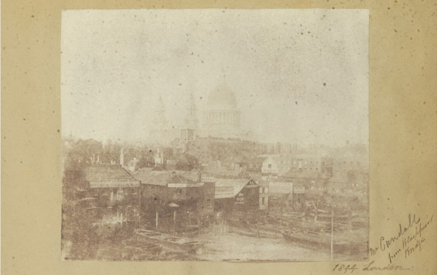
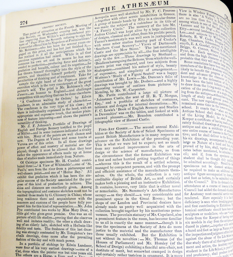
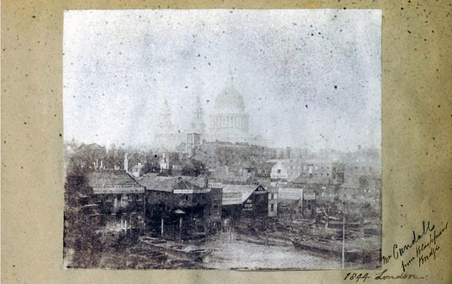
Recently, she discovered a reference to a specific calotype collected and preserved by Richard Willats in the scrapbook now in the Graphic Arts Collection at Princeton University [see above]. In an anonymous account of the London Graphic Society’s fourth meeting, published in The Athenaeum on March 11, 1848, this particular photograph is noted as being presented by Henry Cundell [misspelled Cundall, even they had trouble!].
Identifying this image as a calotype by Henry Cundell enables us to consider two aspects of his work–the solid ground of the size and shape of the contact print gives us the size of his camera (allowing for scissors), and the aesthetic of the image tells us something of his approach. This simple identification should assist the international collections–including the John Muir Wood collection in the Scottish National Portrait Gallery, the Gernsheim Collection in the University of Texas, and George Eastman House–in constructing a body of his work.
After a closer look at the calotype Stevenson made a second discovery.

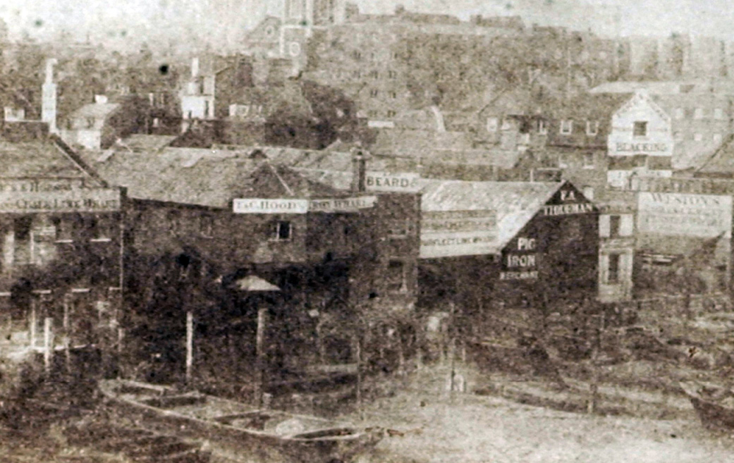
Cropped and photoshopped
“Looking at the photograph again,” she writes, “I see that almost in the centre amongst the warehouses perched on the banks is ‘BEARD &…’ This is the coal selling business of Richard Beard, in Earl Street, Purfleet Warf below Blackfriars Bridge, and it is the same man who purchased the daguerreotype rights for England, and set up the first daguerreotype portrait studio in London. I cannot help but feel that Henry Cundell would have been amused by this, and may even have placed his camera to capture the name.”
According to John Ward’s entry in the DNB, the entrepreneur Richard Beard (1801–1885):
“joined the family grocery business as soon as he was of working age. . . Evidence of wider interests and ambitions can be found in a patent filed on 17 June 1839 by ‘Richard Beard, of Egremont Place, New Road’, concerning the colour printing of calicoes and other fabrics. The announcements in January 1839 of the first practicable photographic processes by L. J. M. Daguerre in France and W. H. F. Talbot in England aroused enormous interest. In early 1840, at the suggestion of the patent agent William Carpmael, Beard met William S. Johnson, who had arrived in London from America to market an ingenious photographic camera on behalf of his son, John Johnson, and an instrument maker, Alexander Wolcott. Beard quickly realized the commercial potential of photography and after securing a financial interest in Johnson and Wolcott’s camera, incorporated it into a patent filed on 13 June 1840.”
“…Beard opened Europe’s first public photographic studio at the Royal Polytechnic Institute in Regent Street, London, in March 1841. By July 1841, following negotiations with Daguerre and his English agent, Miles Berry, Beard had purchased the sole patent rights of the daguerreotype process in England and Wales. On 10 March 1842 Beard filed a patent outlining improvements in colouring daguerreotypes. Later that month he opened a second London studio at 34 Parliament Street, Westminster, and a third at King William Street in April. On 21 March 1842 Prince Albert sat for his portrait in Beard’s studio.”
Richard Willats’s album has been digitized and can be viewed in full at: http://arks.princeton.edu/ark:/88435/k930bx11x. The album appears to have been compiled from the early 1840s onward by Willats, who was a manufacturer and dealer in photographic supplies at 98 Cheapside and Ironmonger Lane, London. The volume contains over 300 of the earliest paper photographs ever created, along with a selection of autographs from authors, authors, and politicians.
We got this identification wrong when it was posted in 2011 but happily, putting it up has led to this wonderful identification. https://blogs.princeton.edu/graphicarts/2011/07/london_in_1844.html
Below is a Photoshopped version of the faded print to give you a little better look at the “picturesque and well-chosen” view made by Henry Cundell in 1844.

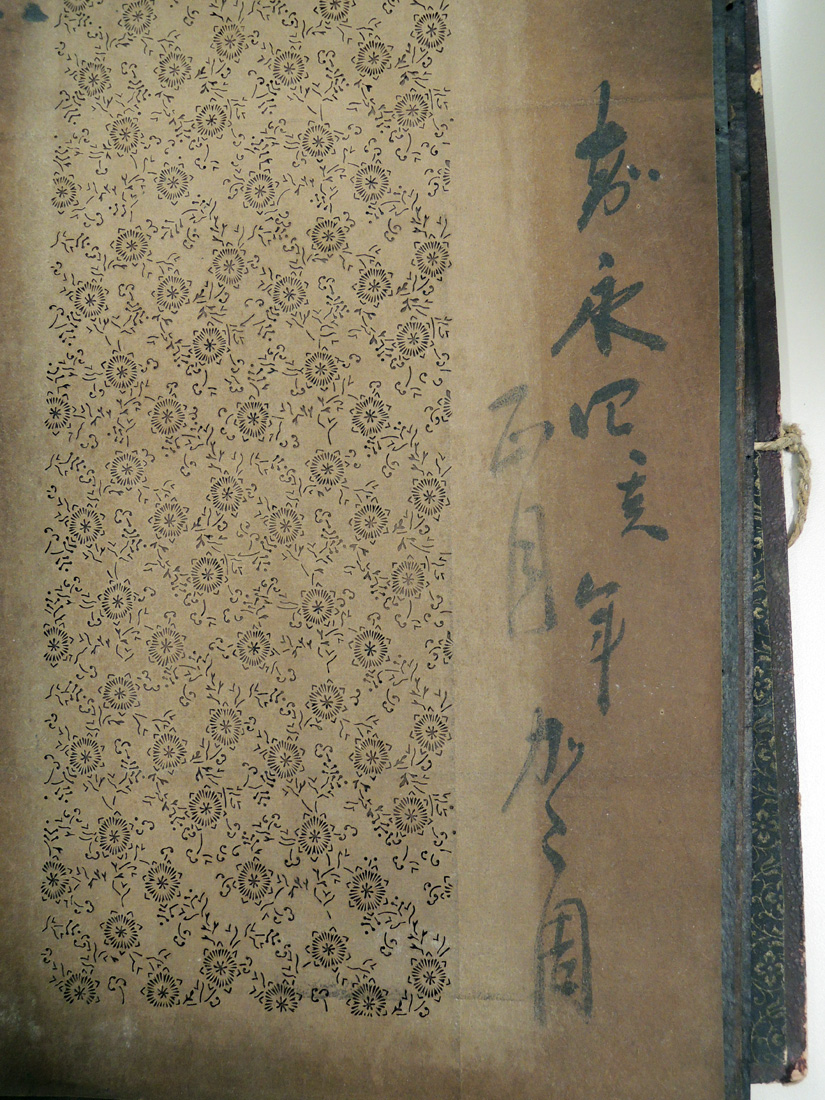
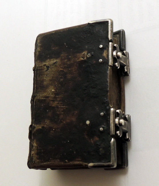
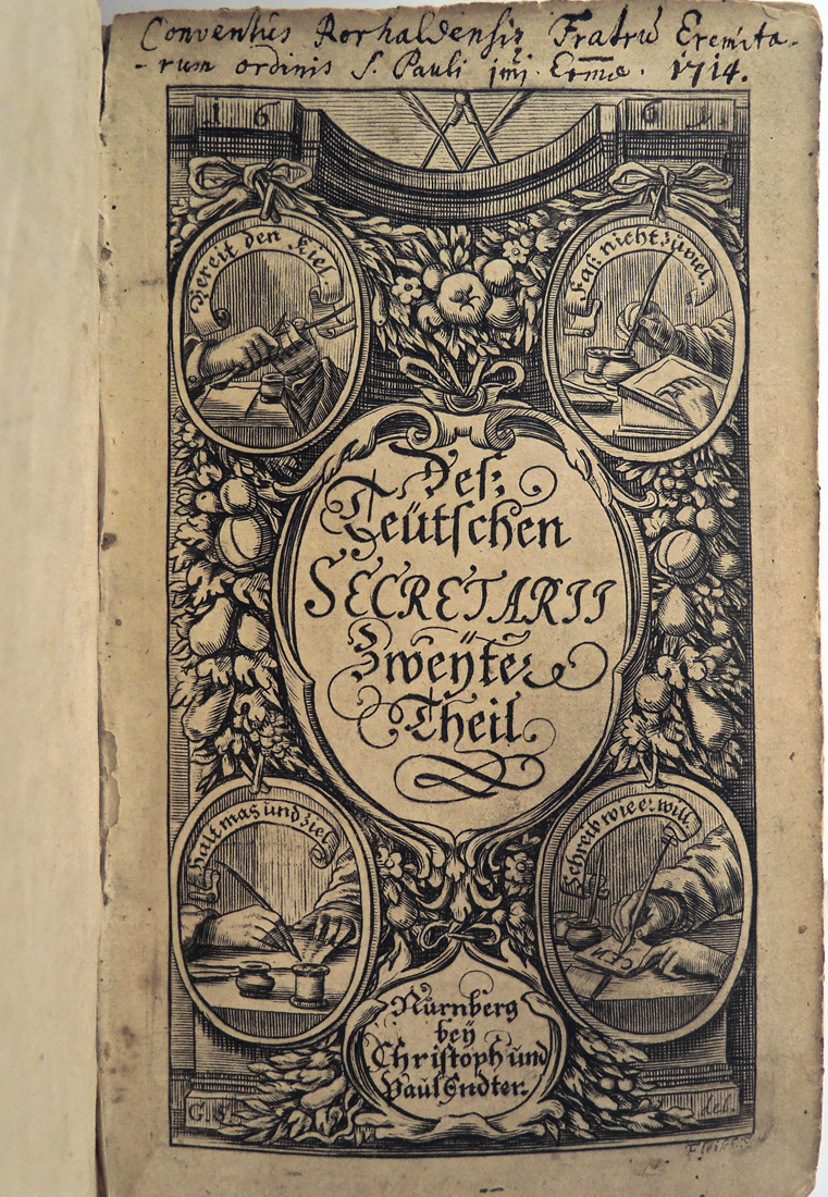 Georg Philipp Harsdörffer (1607-1658), Der Teutsche Secretarius [The German Secretary], part two (Nuremberg: Christoph and Paul Endtern, 1661). Graphic Arts Collection GAX 2016- in process
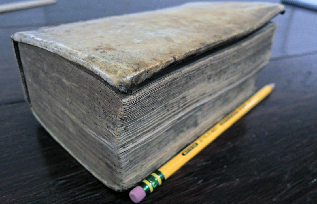
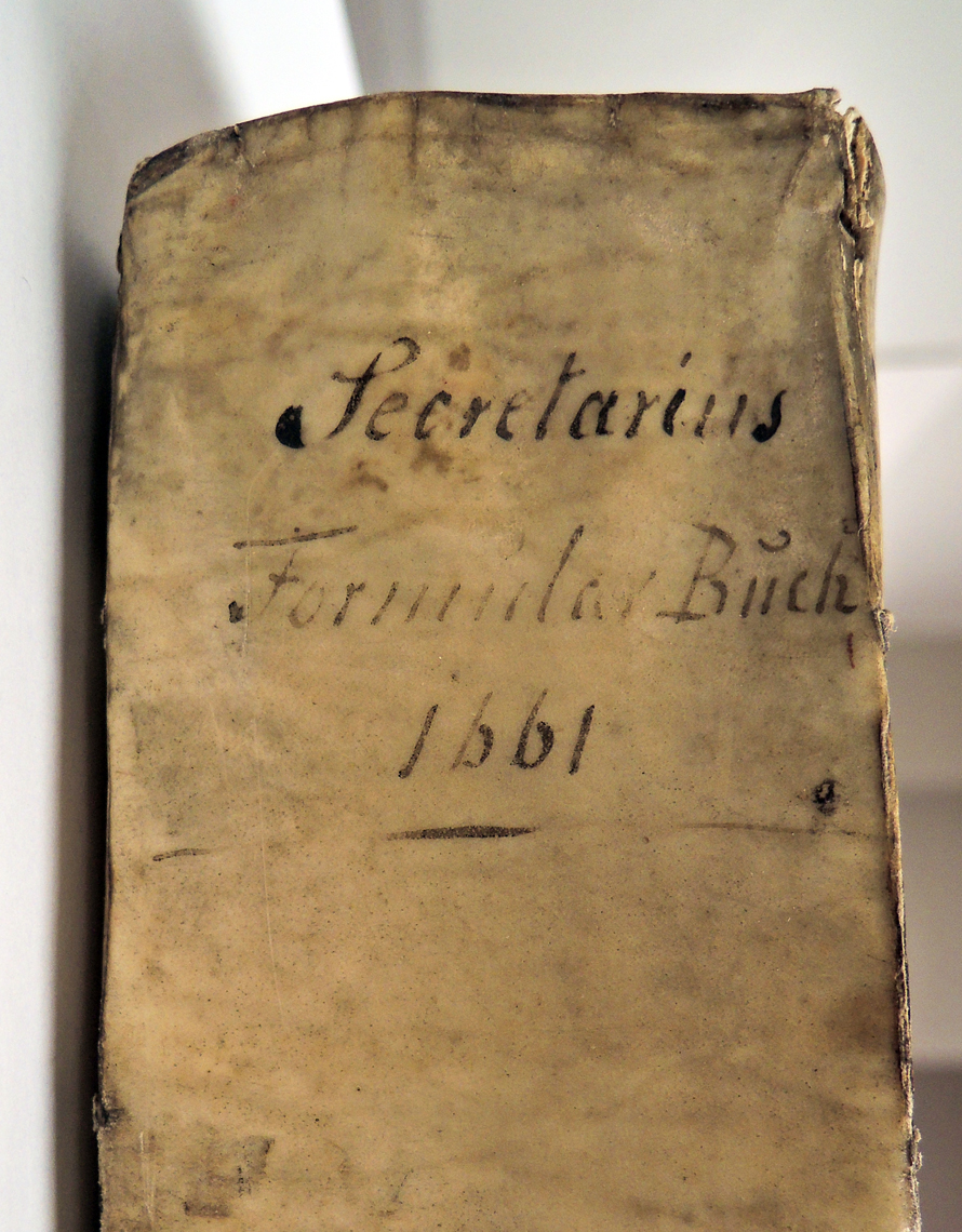
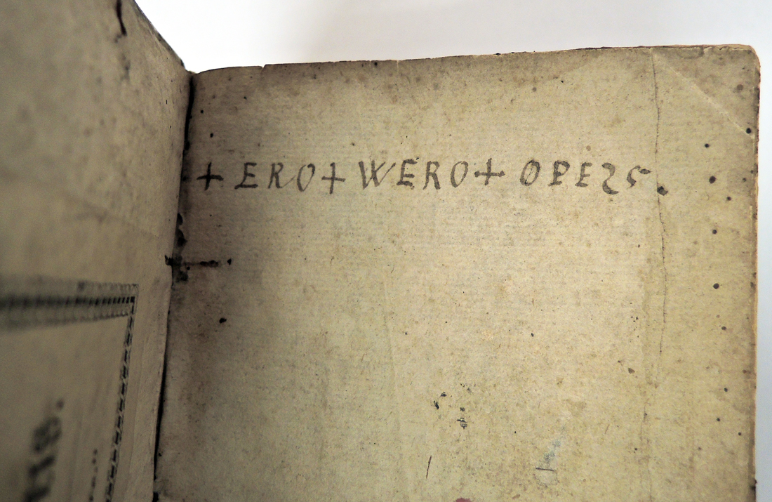 A code appears on the front leaf: +ERO+WERO+OPE25. This has been translated as “I shall be, I shall drink freely, I shall busy myself.” Uvero is the future tense of uveo, which is apparently a variant of uvesco.