Stencils in Philadelphia

quaker city stencil1
quaker city stencil2James Mosley wrote, “Stencils were used in the 17th and 18th centuries in France and Germany to make the texts of big liturgical books. They were also used for marking playing cards.

The first description of how the stencils themselves were made was written in the 1690s for the Description des Arts et Métiers – the account of all trades that was prepared by a little group of specialists for the Academy of Sciences in Paris but most of which was not published at the time, leaving Diderot to carry out the idea in his Encyclopédie.

In the 18th century you could buy your own alphabets, in plain but elegant roman letters or elaborate fancy script, or get labels or visiting cards cut to order. Some that Benjamin Franklin bought from a supplier called Bery in Paris are among his surviving possessions in Philadelphia.” — http://typefoundry.blogspot.com/2010_03_01_archive.html

In the 19th century, Philadelphia became a center for stencil artists, such as Theodore Rue seen here. With these advertisements, he promotes the pochoir labeling of linen, which could have been for commercial packaging or personal decoration. The Graphic Arts Collection is fortunate to have acquired one of his original metal stencils, seen above.

image002

The Vectograph

vectograph11In 1944, the Polaroid Corporation in Cambridge, Massachusetts, published an operation and training manual for their new Vectograph process to create 3D images. The volume was probably not for the general public but only for the few industrial readers interested in using coded pictures, such as the Army or Navy.  A vectograph is composed of two superposed stereoscopic images polarized at right angles to each other, giving a three-dimensional effect when viewed through appropriate polarizing spectacles.

“Credit for the concept of the vectographs is due to Joseph Mahler, cousin of famed composer and conductor Gustav Mahler. He emigragrated to the U.S. from Czechoslovakia in 1938 and was hired by the Polaroid Corporation, where he worked with its founder, inventor Edwin Land, to develop his idea into a practical process.”

vectograph12
vectograph13

The manual guarantees that “the process is practicable under any conditions permitting the making of ordinary paper prints. Equipment and supplies packed in self-contained lockers. Processing time 30 minutes for first print, three minutes each for succeeding prints. May be made as prints for direct viewing or slides for projection in standard projectors.”

vectograph14
vectograph9“Polarized Light Aids the Army,” Popular Science Monthly 142, no. 3 (March 1943).

vectograph8

vectograph3
Dimensional Vectographs in Operations and Training (Cambridge, Mass.: Polaroid Corporation, [1944]). 12 leaves with 18 mounted vectographs and 10 viewers in ring binder. Graphic Arts Collection GAX 2014- in process

Jörg Piringer

Post-digital sound and concrete poet Jörg Piringer was born in 1974 and currently lives in Vienna. He is a member of the institute for transacoustic research and the vegetable orchestra (das gemüseorchester) among other organizations.

Created in 2011, Unicode shows all displayable characters in the unicode range 0 – 65536 (49571 characters), one character per frame. After you spend a few minutes with it, I suggest you leave it running while you work elsewhere and enjoy the sound.

Another of Piringer’s projects is Konsonant, an mp3-album as well as an app for iPhone, iPod touch, iPad and Mac. You can download the whole album for free and for a small charge download the interactive app-version here. Piringer invites you to play with letters and sounds, build acoustic machines, control morphing clouds and experiment with the alphabet.

These and other projects at the intersection of publishing and digital technology (P—DPA) are found at http://p-dpa.net/. The index is maintained by Silvio Lorusso, who systematically collects, organizes and keeps track of experiences in the fields of art and design that explore the relationships between publishing and digital technology. He writes, “The archive acts as a space in which the collected projects are confronted and juxtaposed in order to highlight relevant paths, mutual themes, common perspectives, interrelations, but also oppositions and idiosyncrasies.”


John Latrobe

labrobe pass John H.B. Latrobe (1803-1891), Pass of the James River two miles below Balcony Falls, no date. Watercolor. Inscribed in pencil, l.r.: “Pass of James River 2 miles below Balcony Falls- looking West.” Inscribed, verso: “30 Facing [?] pp. 17 m s Chap.XI.” Graphic Arts Collection Gift of Leonard L. Milberg, Class of 1953.

The architect John Latrobe (son of the architect of the United States capitol), visited White Sulphur Springs in 1832 and made a number of watercolor sketches. He described his visit in a letter to a colleague:

“Truly, this is a lovely spot, in the heart of the mountains,” he wrote, “but the owner is not as energetic as he might be, so the place is susceptible of ten-fold improvement. In the hands of the Yankees it might and would become a veritable paradise. The same money that is being used now could be expended in furnishing accommodations for everyone who desired to stay here, and a little management would soon introduce order, where all now is confusion.”

latrobe baltimore cottages“Crowds collect around the dining room when the bell rings, and when they are opened there is a rush, like that at the booth at a contested election. Every man, woman and child rush to any seat which they may happen to find and in a very short time the food upon the tables disappear consumed by the hungry mob.”

“If you have a servant of your own, he must bribe the cook. If you have no servant, you must bribe one of those attached to the place, or you run the risk of getting nothing. Bribery furnishes you with the best of what is to be gotten in the place, and avoids the rushes at meal time.”

“The day after I arrived two waiters quarreled over an apple pie; one floored the other and neither got the pie, which was floored in the scuffle and this scene took place while the guests were seated at table. Bribe high and you live high; fail to bribe and you starve; look sharp and eat fast, you forget good manners. This is the motto of the dining room of the White Sulphur.”

[above] John H. B. Latrobe (1803-1891), Baltimore Cottages, White Sulphur, no date [after 1830]. Watercolor. Inscribed in pencil, lower margin “Baltimore Cottages White Sulphur S. Latrobe”.  Graphic Arts Collection Gift of Leonard L. Milberg, Class of 1953.
latrobe landscapeJohn H.B. Latrobe (1803-1891), Near the White Sulphur [Springs], no date. Watercolor. “Near the White Sulphur.” Inscribed in pencil. Graphic Arts Collection. Gift of Leonard L. Milberg, Class of 1953.

See also: John Edward Semmes, John H. B. Latrobe and his times, 1803-1891 (Baltimore, Md.: Norman, Remington Co. [c1917]) Firestone Library (F) CT275.L277 S4 1917


Ingenious new study center at CMA

20140508_135550_resizedThe designers of the Cleveland Museum of Art study room have come up with an ingenious system for the viewing of two dimensional works, whether they are prints, drawings, paintings, manuscripts, photographs or other similar materials. The wall folds out when in use and can be adjusted to the height or width of the objects. Then, it miraculously folds back into a flat wall when not needed for a class or researcher’s visit. The wall is large enough for several dozen works of smaller size but flexible enough (and strong enough) to accommodate large, framed work of significant weight.

Congratulations to Jane Glaubinger, curator of prints and Heather Lemonedes, curator of drawings, on the success of their new study center.

20140508_135414_resized                               20140508_135510_resized
20140508_135455_resized

Mother Goose of Oxford

dighton3Robert Dighton (1751-1814), Mother Goose of Oxford, July 1807. Etching. Graphic Arts, British Caricature collection

AN00144713_001_l

(c) British Museum

There is a line in the DNB’s biography of the artist Robert Dighton (1751–1814) that leaves the reader hanging. “In 1806 it was discovered that since 1798 Dighton had been regularly stealing prints from the British Museum.” It makes you wonder about his print of Rebecca Howse (1737-1818), who the students affectionately called Flora. She was a familiar figure to them on the streets of Oxford, blind but able to make a living selling flowers.

On May 12th 1807, the caricaturist James Gillray (1756-1815) published a portrait of Howse, selling her flowers (left). A little over a month later, Dighton came out with a similar print of Howse, seen above from the Graphic Arts Collection. Curiously, Dighton has rarely been held accountable for either his thefts or his pirated images.

This is elaborated on by Heatons, antique dealers in Tisbury, “In 1806 the British Museum discovered that Dighton had been stealing prints from their print room and selling them on the open market. An art dealer by the name of Samuel Woodburn had purchased a copy of Rembrandt’s “Coach Landscape” from Dighton for twelve guineas. Supposing it may be a copy, Woodburn took the print to the British Museum to compare it with their impression; upon which he discovered that their copy was missing. Upon investigation Dighton confessed that he befriended the museum officials by drawing portraits of them when he visited the museum. This relationship allowed him the freedom to steal prints from the print room and remove them from the museum in his portfolio. He then proceeded to supplement his artists’ income by selling the pilfered items to the art trade.” http://www.heatons-of-tisbury.co.uk/dighton2.html

Here are a few more Oxford figures by Dighton in the Graphic Arts Collection.

dighton6        dighton4
dighton5
Dighton1To read more about the artist, see:

S. House, ‘Some letters of Robert Dighton’, Print Quarterly, 19/1 (March 2002), 45–9

H. Hake, ‘Dighton caricatures’, Print Collector’s Quarterly, 13 (1926), 136–55, 237–47

Armadale illustrations

thomas, george h 5              thomas, george h 6

Miss Gwilt, Armadale, v. 1. Preliminary drawings and final wood engraving

thomas, george h 3


According to Mark Bills, writing for the Oxford Dictionary of National Biography, the British artist George Housman Thomas (1824-1868) apprenticed to the wood engraver George Bonnar, learning to both design and cut engravings for illustrations.

Thomas spent several years in New York City illustrating books, newspapers, and banknotes, alongside his younger brother William Luson Thomas (1830-1800). Back in London, Thomas became “one of the first, if not the first, to draw on wood direct from life.”

The Graphic Arts Collection is fortunate to hold a number of Thomas’ preliminary sketches for the illustrations of Wilkie Collins’ Armadale (1866), offering a look at how the original design changed in the engraving of the image. Collins (1824-1889) was one of the most successful writers of Victorian England. Armadale, his longest novel, received a mixed reception when published, probably due to the scandalous portrayal of its female villain, Lydia Gwilt. For more about the author, see: http://www.wilkie-collins.info/index.htm

thomas, george h 2                        thomas, george h 4

Force and Cunning, v.2

Wilkie Collins (1824-1889), Armadale (London: Smith, Elder and Company, 1866). 20 wood engravings designed by George Housman Thomas (1824-1868), engraved by his brother William Luson Thomas.

Read Thomas’s obituary: http://en.wikisource.org/wiki/The_Times/1868/Obituary/George_Housman_Thomas


Penguin Designer Classics

lady chatterley2

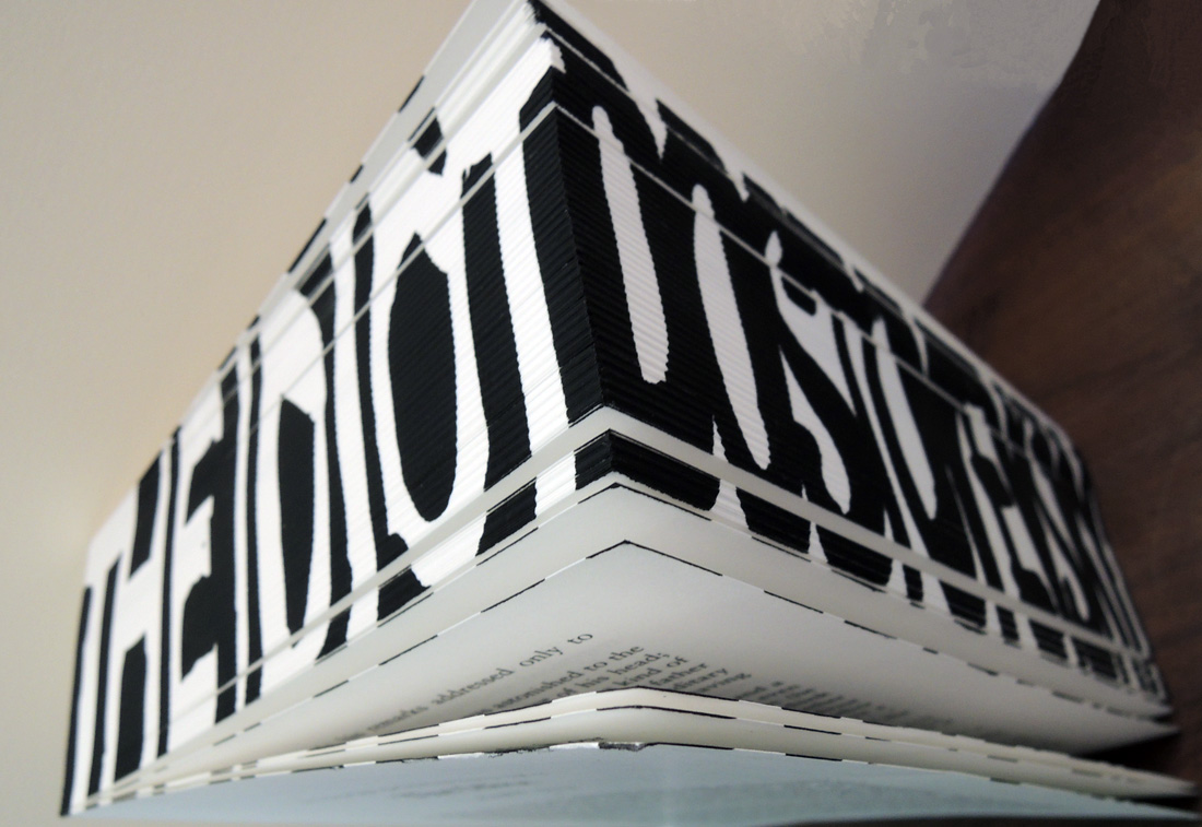
Fyodor Dostoyevsky (1821-1881), The Idiot (London: Penguin/Penguin designer Classics, 2006). Designed by Ron Arad (born 1951). One of 1000 copies. Graphic Arts Collection GAX 2014- in process.

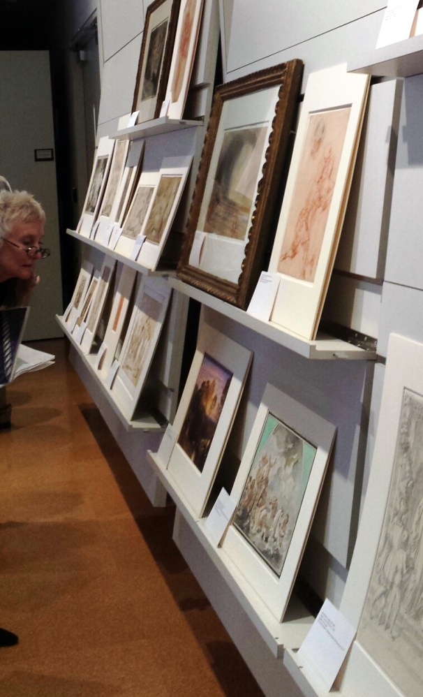
Since 1946, Penguin Books has been publishing Penguin Classics in volumes individually designed in unexpected formats. For their 60th anniversary in 2006, five Penguin Designer Classics were crafted by five internationally known artists, most with no previous experience in book design. Each volume was released in an edition of 1000 copies, with a transparent Plexiglas (Perspex) box serving as the book’s slipcase, which also supplies protection for the curious designs. The Graphic Arts Collection now has four of the five out-of-print classics.

The Israeli industrial designer and architect Ron Arad chose to publish Dostoyevsky’s The Idiot bound but without boards, stating “by not wanting to have a cover, it ended with the book becoming an amazing object that is alive, but which maintains its transparency. It becomes a glorious box with a book inside, almost like a monument.” The title and author are printed on the fore-edges of the paperback.

lady chatterley


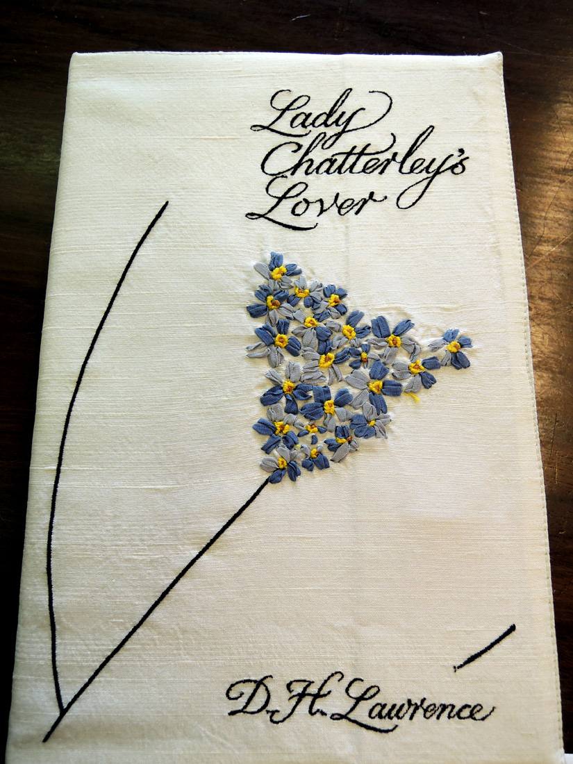
D.H. Lawrence (1885-1930), Lady Chatterley’s Lover (London: Penguin/Penguin Designer Classics, 2006). Designed by Sir Paul Smith (born 1946). One of 1000 copies. Graphic Arts Collection GAX 2014- in process.

Lady Chatterley’s Lover (first published in 1928) was given to the British fashion designer Sir Paul Smith, who bound the volume in a silk jacket delicately embroidered with flowers and title information, along with the Penguin logo on the spine.


bindings tender

F. Scott Fitzgerald (1896-1940), Tender Is The Night: A Romance (London: Penguin/Penguin Designer Classics, 2006) Designed by Sam Taylor-Wood (born 1967). One of 1000 copies. Graphic Arts Collection GAX 2014- in process.

Tender is the Night was first published in Scribner’s Magazine between January and April, 1934. For the new edition, American photographer Sam Taylor-Wood constructed a translucent dust jacket printed with a soft, almost muffled photograph, seen both from the front and the back. The tranquility of the scene is continued in the type, barely visible at the top.

bindings tender2

Also acquired was Fyodor Dostoyevsky (1821-1881), Crime and Punishment (London: Penguin/Penguin designer Classics, 2006) Designed by Fuel. One of 1000 copies. Graphic Arts Collection GAX 2014- in process.

The graphic design firm Fuel was founded in 1991 by London artists Damon Murray and Stephen Sorrell. In general, Fuel books are initiated and compiled by the firm itself so this volume is fairly unique within their catalogue. The brown paper wrapper they created is printed in red with Russian text sandwiched between the English.

Still to be found is Gustave Flaubert (1821-1880), Madame Bovary, designed by the Spanish artist Manuel Blahnik (born 1942) founder of the high-end shoe brand Manolo Blahnik.

Edwin Denby, architect

denby2
denby drawings1Edwin Hooper Denby (American, 1873/74–1957) was an architect and member of the architectural firm, Denby and Nute. In the New York Times obituary, January 18, 1957, it was noted that in 1899 Denby opened offices in New York City and Bar Harbor, designing churches, schools, and residences all over the East Coast. “Mr. Denby also was a type designer, and he was made a fellow of the Institute of American Genealogy for his design of a genealogical chart.”

The Graphic Arts Collection has a collection of his watercolors and two of Denby’s sketchbooks, offering a private look into some of the artist’s informal designs.

denby5Note the artist’s stenciled cover design

denby8
denby7
denby6
denby3
denby4

Daesh’

daesh 3Don’t miss the wonderful post my colleague Thomas Keenan, Slavic, East European and Eurasian Studies Librarian wrote just now describing our new collection of daesh’ or dayosh’ (You Give), acquired jointly with the Graphic Arts Collection.

https://blogs.princeton.edu/seees/2014/04/30/198/