First color printing in the United States: 1789

mr hilliard's sermon4
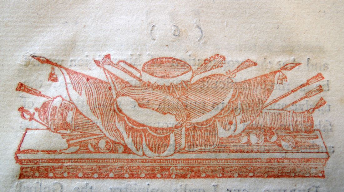
Timothy Hilliard (1747-1790), A Sermon Delivered December 10, 1788: at the Ordination of the Rev. John Andrews, to the Care of the First Church and Society in Newburyport, as a Colleague-Pastor with the Rev. Thomas Cary (Newburyport: Printed by John Mycall, 1789). Head-piece printed in red; first letter of text printed in blue. Graphic Arts Collection (GAX) BX7233.H52 S44
mr hilliard's sermon2  mr hilliard's sermon

mr hilliard's sermon3
“John Mycall [1750-1833] was not educated as a printer. He was born at Worcester, England; was very ingenious, and kept a school in Newburyport before he purchased the [Essex] Journal. He published the paper about eighteen years. Some years after he began printing, his office and its contents were destroyed by fire. With great energy he soon replaced his material with a very valuable printing outfit. On quitting journalism he bought and lived on a farm in the county of Worcester, whence he removed to Cambridge, where he died about the year 1826.”

Extracts from American Newspapers, Relating to New Jersey. 1704-1775, Volume 12 (1895)

Dionysus Crucified

jarvis dionysus1

Simon Jarvis, Dionysus Crucified: Choral Lyric for Two Soloists and Messenger ([Cambridge, England]: Grasp Press, 2011. Graphic Arts Collection GAX 2013- in process

OCLC lists Dionysus Crucified as: Book poetry 12 unnumbered pages; 34 x 34 cm. A cataloguer has listed the subtitle as Choral Lyric for Two Soloists and Messenger and the epigraph as You cannot walk down two roads at once, even in fairyland. The reverse might also be valid.

Written in 2011 by Prof. Simon Jarvis, Gorley Putt Professor of Poetry and Poetics at Cambridge University, this cunning book of visual and aural poetry moves in long lines across the pages in various directions with few signposts. Happily, a recording of Dionysus Crucified, read by Jarvis and Justin Katko at the Centre for Creative Collaboration in King’s Cross London, was made in 2011 and can still be accessed at https://soundcloud.com/the-claudius-app/jarvis-katko-dionysus. This is definitely a book to be seen as well as heard.

jarvis dionysus2

Teratology

sorbin tractatus5Arnaud Sorbin (1532-1606), Bishop of Nevers. Tractatus de monstris [The Treatise on Monsters] Paris: Apud Hieronymum de Marnef, & Gulielmum Cavellat, 1570. Graphic Arts Collection GA 2013- in process.

sorbin tractatus7
The Catholic Bishop Arnaud Sorbin chose fourteen monsters to promote his religious faith. Fourteen woodcuts were designed to accompany fourteen short stories, all intended to entertain a general public audience.

The Oxford English Dictionary defines monster as “a mythical creature which is part animal and part human, or combines elements of two or more animal forms. Later, more generally, as any imaginary creature that is large, ugly, and frightening.”

Printed by Gulielmum Cavellat (died 1576 or 77) and Hiérosme de Marnef (1515-1595), these cuts include a variation of Martin Luther’s monk-calf (half man half donkey); the hairy female; conjoined twins; and other prodigious births thanks, according to Sorbin, to Protestant heresy. This is one of many 16th-century volumes featuring so called monstrous births. For others, see the New York Academy of Medicine’s Telling of Wonders site: http://www.nyam.org/library/rare-book-room/exhibits/telling-of-wonders/ter4.html#sthash.aAdBRqzt.dpuf

sorbin tractatus3
sorbin tractatus2
sorbin tractatus1Princeton’s volume was owned in the 17th century by P. Marie Boschetti and later, by Dr. François Moutier (1881-1961), master of the French gastroenterology, laboratory head of the Faculty of Medicine of Paris (1946-1950).
sorbin tractatus8                    sorbin tractatus6

A ghoul eating the heart of a just married woman

monde fantastique4
Le monde fantastique, illustré par Hadol (The Fantastic World, illustrated by Hadol) (Paris: Degorce-Cadot, 1874-75). Paul Hadol (1835-1875) illustrator and Léon Beauvallet (1829-1885) editor, Graphic Arts Collection 2013- in process.

Ghouls are nothing new nor is fantasy literature. This French periodical offered amazing stories for the whole family featuring witches, sorcerers, outrageous monsters, and tales of evil things.

The illustrator was Paul Hadol (1835-1875) who created designs for many 19th century magazines including Le Gaulois, Le Journal Amusant, High Life, Le Charivari, Le Monde comique, La Vie Parisienne and L’Eclipse.

Hadol, like many of his contemporaries, worked on a variety of commercial assignments including not so fantastic novels, posters, and advertising brochures. Our Cotsen Library holds an accordion folded alphabet book designed by Hadol: Le jardin d’acclimatation ([Paris]: Au Journal amusant, 20, rue Bergère : Et chez H. Plon, éditeur, 8 rue Garancière, [186-?]). 1 folded sheet 16 x 252 cm., folded to 16 x 11 cm. Cotsen Children’s Library (CTSN) Moveables 19 317.

A few of his plates are below. Note in particular the ghoul eating the heart of a just-married woman, reminiscent of The Nightmare by Henry Fuseli (1741-1825) from 1781.

monde fantastique6          monde fantastique5

monde fantastique2monde fantastique3         monde fantiastique3

monde fantastique1

Superbe feux d’artifice

fireworks

Unidentified Artist, Vue d’un superbe feux d’artifice a Vienne [A View of Superb Fireworks in Vienna], 1780. Engraving with hand coloring. Graphic Arts Collection GA 1995.00005

Princeton’s Graphic Arts Collection has a large group of Vues d’optique (optical views) along with the viewing devices used to look at them. A special sub-set are the transparency views or hold-to-light prints. Rather than simply being designed with exaggerated perspective, these are made to be seen in peep shows, boxes with a top lid so that the light could be directed from the front or the back, offering a daytime view and a nighttime view.  Most of our prints are late 18th-century European and have added color or colored paper on the back to enhance the scene.

Below is a shot of the fireworks from the back:

hold to light fireworks3

 Here is another example. We have a whole series of street views from the City of Scheveningen. I’m sorry the registration is poor.

street

Unidentified Artist, View of the City of Scheveningen, 1780. Engraving with hand coloring. Graphic Arts Collection GA 1995-00012a


Thomas Rowlandson incorporated magic lanterns into a number of his prints and drawings but this is the only one I know of that is a transformation print.

magic-lanternEngraved by H. Merke (active ca. 1800-ca. 1820) after a design by Thomas Rowlandson (1756 or 1757- 1827), A Magic Lantern, January 20, 1799. Published by Rudolph Ackermann. Mezzotint with transparencies and added color. GC 138. Gift of Dickson Q. Brown, Class of 1895. Graphic Arts collection GC 138.


The wonderful Dick Balzer’s website has more: http://www.dickbalzer.com/Vue_d_optiques.363.0.html


Lew Ney’s Circus

portrait4

Unidentified photographer, Luther Widen with his portable typewriter, 1928.


The First National Poetry Exhibition began in the summer of 1927 under the directorship of Lew Ney (Luther E. Widen, 1886-1963) and his soon to be wife Ruth Willis Thompson. For one dime, anyone from New York to San Antonio to Toledo could submit a poem.

Each Thursday there was a Poets’ Soiree where many of the poems were read and, much like Facebook, people would “like” particular poems by initialing them. Poems were submitted by photographer Aaron Siskind (1903-1991), Charles Henri Ford (1919-2001), Maxwell Bodenheim (1892-1954), and Louis Ginsberg (1885-1976, father of Allen Ginsberg), along with 6,000 others.

Leona M. Kahl, who managed opera singers, came to each Thursday night soiree and read her poems. Lew Ney was so taken with the rhymes that he offered to design, print, and publish a small volume, illustrated with linocuts by another local Dean Dowell. On March 1, 1928, Circus was released at the price of $1.75, with all profits going back into the Poetry Exhibition.

lew ney circus1

Leona M. Kahl, Circus, with 100 linoleum cuts by Dean Dowell. All printed by Lew Ney (New York: Parnassus [Press] 1928). Graphic Arts Collection (GAX) 2013-0386N

lew ney circus3                            lew ney circus5
lew ney circus7
lew ney circus6
lew ney circus8

Gillray’s Paradise of Fools!

gillray end of4

At the top left of James Gillray’s caricature, St. Peter opens a small door of ‘Popish Supremacy’ where wine, loaves of bread, and fishes are seen waiting. As the petitioners (Grenville, Buckingham, Fox, and others) ascend the stair to this room, they are stopped by three blasts of wind coming from Pitt, Hawkesbury, and Sidmouth.

gillray end of 1

James Gillray (1757-1815), End of the Irish Farce of Catholic Emancipation, May 17, 1805. Etching with hand color. Graphic Arts Collection GAX 2013- in process

gillray end of 3

Dorothy George points out that the Irish petition for Catholic Emancipation was introduced in the House of Lords by Grenville on 10 May 1805 and in the House of Commons by Fox on 13 May 1805. Motions for a Committee to consider it were defeated in the Lords by 178 to 49, and in the Commons by 336 to 124.


The all-powerful sword and crown indicates the opposition of George III, making the petition a farce since it was brought forward in the knowledge that it would not be accepted.


Verses from Paradise Lost etched below:
And now St Peter at heav’n’s wicket seems
To wait them with his keys, & now at foot
Of heav’ns ascent they lift their feet: – when lo!
A violent cross-wind from either coast
Blows them transverse, ten thousand leagues awry
Into the devious Air: then might ye see
Cowls, hoods, & habits, with their wearers, tost,
And flutter’d into rags; then Reliques, Beads,
Indulgences, Dispenses, Pardons, Bulls,
The sport of winds! – All these whirl’d up aloft
Fly o’er ye backside of the world far off
Into a Limbo large, & broad, since call’d
The Paradise of Fools!

–Milton B. 3d’ [ II. 484-96. Correctly quoted, except ‘whirl’d up’ for ‘upwhirled’.]

gillray end of 2

 The British Museum has posted an extended description of each element in this complicated burlesque of Milton’s lines here: http://www.britishmuseum.org/research/collection_online/collection_object_details.aspx?objectId=1644396&partId=1&searchText=gillray+end+of+the+irish+farce+of+catholic&page=1


Eton angler

jones angler in eton2

Richard Jones (1767-1840), Angler in Eton Playing Fields on the Thames, ca. 1820. Oil on canvas. GC164 Kienbusch Angling Collection. Gift of Carl Otto Kretzschmar von Kienbusch, Class of 1906.

jones angler in eton3 Born in Reading, the sporting painter Richard Jones was sought after for his depiction of horses, dogs, and fish. Yet, very little is known about the artist’s life besides a small list of paintings and exhibitions from the early 1800s. Our Angler dates from a similar period as The Anglers at the Brooklyn Museum: https://www.brooklynmuseum.org/opencollection/objects/4795/The_Anglers#

Fishing is more expensive than ever for Eton gentlemen, young and old, according to Angling News (March 15, 2011). In an article entitled, “Eton College hands over fishing rights to new group,” we learn that “Eton College has handed over the fishing rights to a four-mile stretch of river between Romney Island at Windsor and Dorney Rowing Lake to a syndicate that will charge £100 a year.”

“The college had let local angling clubs have the rights in the past. Eton Fisheries–a group consisting of Newbury-based chartered surveyor Patrick Todd and two colleagues–are now in charge. Mr. Todd said that he had met representatives from all the fishing clubs and that reaction had been mixed. …He said that although there would be an £100 annual charge, keen fishermen or women would also be able to obtain a day licence for just £6 and that he had no intention of pricing ordinary people out.”
jones angler in eton

Need paper?

paper allen

paper allen2paper allen4Need some paper? Why go to Office Depot when you can make it yourself? That’s what our good friend Allen Scheuch, Class of 1976, did.

Two years after he graduated from Princeton University, Scheuch decided to learn to make paper. The class he attended followed Dard Hunter’s book, Papermaking: the History and Technique of an Ancient Craft (New York: Knopf, 1943). Graphic Arts Collection (GAX) TS1090 .H816 1943.

A 24 x 32 inch paper mould was fashioned from varnished mahogany, with a bronze screen, simple brass (kitchen cabinet) handles, an inlaid brass rod on one side for reinforcement, and an “S” (for Scheuch) in a circle for the watermark.

100% linen rag was torn and beaten into a milk-like soup. For each sheet, Scheuch dipped the mould into the mixture and let the water drain. The top “deckle” finished the sides of the paper before the damp sheet was transferred to a felt where it would dry.

“I used one or two pieces but that was all!” Scheuch told me. “I liked the texture and the deckle but could never bring myself to use it casually – it meant too much to me! – and never ended up using it in a special project. So this will be its special project – as a teaching aide in Princeton’s Graphic Arts Department; I can’t imagine a finer one!”

paper allen3Even better, this winter Scheuch’s mould and some of his paper will find their way into the Princeton University Art Museum as an educational element for the upcoming extravaganza: 500 Years of Italian Master Drawings from the Princeton University Art Museum, opening January 25, 2014.

Our sincere thanks to Mr. Scheuch!


Overdue Accounts

morley rubaiyat7
morley rubaiyat6

In 1923, when Frances Steloff (1887-1989), owner of the Gotham Book Mart, moved her bookstore to West Forty-Seventh Street, it was her friend Lew Ney (Luther Widen, 1886-1963) who gave up his Fourth of July weekend to carry the books and shelves to the new shop. When Steloff needed a brochure or keepsake printed, it was her friend Lew Ney who hand-set the type, dampened the paper, and printed the edition for her.

And so, when Christopher Morley (1890-1957) wrote the verse, “Rubaiyat of Account Overdue,” in response to the many unpaid bills at the Gotham Book Mart, it was Lew Ney who editioned the poem for Steloff.

Lew Ney designed two separate formats: a narrow broadside that would go in an envelope with each overdue notice and a four page keepsake as a reward to those who paid their bills. He printed 350 of each, using his famous Inkunabula type. Morley signed them all and as they went out, Steloff added the date and her signature.

“That not only brought good results,” wrote Steloff, “but also a problem—our prompt paying customers then felt it was more rewarding to be delinquent.” [Special Gotham Book Mart issue of Journal of Modern Literature 4, no.4 April 1975): 792]morley rubaiyat5As soon as he finished Steloff’s project, Lew Ney was on to his next jobs, using the same Inkunabula type to set Robert Penn Warren’s Thirty-Six Poems; Williams Carlos William’s An Early Martyr and Other Poems; and Wallace Stevens’ Ideas of Order, among other project that year.

morley rubaiyat1       morley rubaiyat3

morley rubaiyat2     morley rubaiyat4

Christopher Morley (1890-1957), Rubaiyat of Account Overdue (New York: Gotham Book Mart, 1935). Copy 29 of 350. Rare Books (Ex) 3866.5.3785.1935

Christopher Morley ( 1890-1957), Rubaiyat of Account Overdue ([New York: Gotham Book Mart, 1935]). (Ex) Oversize 3866.5.3785q