Welcome graphic designer Danielle Aubert

excel16mo_4

Welcome to graphic designer Danielle Aubert, who begins two years of teaching and collaboration as one of the first Fellows in the Creative and Performing Arts at Princeton University. The program provides support for early-career artists who have demonstrated both extraordinary promise and a record of achievement in their fields with the opportunity to further their work while teaching within a liberal arts context.
excel16mo_2

Aubert was an assistant professor at Wayne State University in Detroit and author of 16 Months’ Worth of Drawings in Microsoft Excel (2006, Various Project). In 2008, Aubert began designing the quarterly journal Criticism, which in 2012 was selected to be a part of the 25th Brno Biennial of Graphic Design in the Czech Republic.

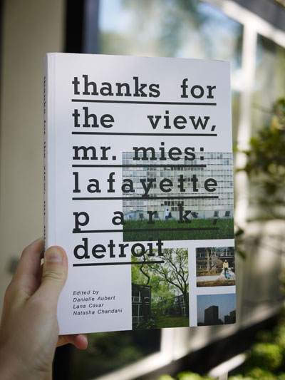
In 2009, she and Lana Cavar co-founded the International Typographical Union. Together they have made a series of projects that explore paper distribution and after-market paper and presented work in various venues including the School of Art Institute of Chicago, the Palais de Tokyo in Paris and Motto in Berlin. Also in 2009, Aubert, Cavar and Natasha Chandani launched the group Placement, which edited, wrote for and designed Thanks for the View, Mr. Mies (2012, Metropolis Books), about life in Lafayette Park, part of Detroit’s Mies van der Rohe Residential District. (Architecture Library NA9127.D4 T53 2012)

P1120198-lighter
Consider taking her first class: VIS 214 Graphic Design: Visual Form. This course introduces students to techniques for decoding and creating graphic messages in a variety of media, and delves into issues related to visual literacy through the hands-on making and analysis of graphic form. Graphic design relies on mastering the subtle manipulation of abstract shapes and developing sensitivity to the relationships between them.

Click here http://vimeo.com/57910594 to see a video about The Center for Abandoned Letterhead, a project of the International Typographical Union (I.T.U.) with Maia Asshaq.

One More Spring

dwiggins one more spring2

One of AIGA’s fifty best books of 1936 was One More Spring with hand-stenciled color by William Addison Dwiggins (1880-1956), who also designed the binding. Each of the 750 copies sold for $10 and it continues to be a favorite of book collectors.
dwiggins one more spring7
While many of his books were designed to look like stencil printing, the final editions were in fact printed from relief metal blocks. This title, however, clearly states that the designs were stenciled by Dwiggins and so, I take it as fact. The flat areas of color show no evidence of a human hand but the artist was extremely precise. I would not want to second guess him. What do you think?

At this point in his career, Dwiggins did all the work himself from his home studio in Hingham, Massachusetts, separating the design into individual stencils and cutting them from celluloid sheets. Several designs include one stencil repeated many times to form a picture. For painting on the color, he cut off a shaving brush since he didn’t have the traditional animal-hair pompon.

dwiggins one more spring8The artist wrote, “the cutting is done into bits of celluloid taped in place over the pen drawings of the elements. After the ties have been located, a light cutting is made, not all the way through the film, and if necessary, French chalk rubbed into the scratches. Then over black paper to let you see where to go, a final cut is made through the film.

Curator Philip Hofer called Dwiggins, “America’s one truly modern typographer, and by far her most outstanding book decorator and calligrapher; a mechanical wizard, type designer, and specialist in advertising layout; an illustrator, mural painter, costume designer, and sculptor, a playwright, satirist, and perhaps beyond ever the best of his art – a thinker and poet in prose.”

dwiggins one more spring6

dwiggins one more spring5

dwiggins one more spring1

Robert Nathan (1894-1985), One More Spring. (Stamford, Conn.: Overbrook Press, 1935). 20 stenciled decorations by W.A. Dwiggins. Edition of 750. Presentation letter from Frank Altschul to Elmer Adler, dated October 29, 1935, laid in. Graphic Arts Collection (GAX) PS3527.A74 O6 1935.

Inside McCosh

mccosh gabriel4

There was a leak recently in Rare Books and Special Collections. Unfortunately, the water chose to come down directly on Augustus Saint-Gaudens’ 1889 bust of James McCosh, the eleventh president of Princeton University. The bronze was not damaged in any way, as confirmed by our excellent sculpture conservator John Scott.

While examining the back of McCosh’s head, Scott noticed that there was an indentation for the brace that holds it in place and inside the head were two tiny pieces of paper. With thanks to our reference librarian, Gabriel Swift, for his investigative probing and to Charles Greene for his flash light, we were able to remove the material.

Here’s what we found.


mccosh gabriel

mccosh gabriel2

mccosh gabriel3

The Sea of Matrimony

On June 10, 1931, Elmer Adler (1884-1962) wrote to the artist Tom Cleland (1880-1964) to say Harvey T. White, of R. Tyson White’s Sons, manufacturers of paper boxes, had contacted him. White was confirming a previous conversation in which Adler, acting as Cleland agent,  “authorized us to reproduce the The Sea of Matrimony by Wm [sic] Cleland for use on trays, waste baskets, lamp shades, cigarette boxes, etc., on the conditions. . . Print royalty is 3-7 cents each up to a total of $300. Depending on size.”

cleland-colophon-six4

The Colophon (New York: Pynson Printers: The Colophon, 1930-1940). Graphic Arts Collection (GAX) Z1007 .C71

The image was published on the colophon page of vol. 2, part six (1931) of The Colophon and proved much more popular than the cover image, also by Cleland.

cleland colophon six2 cleland colophon six

This was the middle of the Great Depression in the United States but Cleland had a good job as art director for Fortune Magazine.  He went on to design for Cadillac; Newsweek; and the newspaper PM.

The artist would not agree to Adler’s arrangement with White, but not because Cleland objected to seeing his art on waste baskets and lamp shades. He felt that so many people would want to license the image that $300 was not an appropriate price ceiling. Cleland would only agree if the company either bought the design for $300 or continue to pay royalties forever.

It is unfortunate that the response from White is not in the Cleland papers at the Library of Congress or Adler papers at Princeton University. If anyone has a lampshade with The Sea of Matrimony, please contact us. Thanks.


Wood engraver’s magnifier

wood engravers magnifier

Among the many optical devices in the graphic arts collection there is a loupe on a pole, which until now, we had not been able to name. The image below makes it clear the magnifier was specifically designed for wood engravers. It comes from an article in Frank Leslie’s Illustrated Newspaper in April 1883 about the artists working for that newspaper.

For wood engravings of that period, a design was copied onto a block of wood, which was then cut into many smaller sections of approximately three inches square, depending on the original. Each section was given to a different engraver who would use this magnifier to cut the tiny lines of their portion of the image. Once all the blocks were completed and reassembled, the whole would be stereotyped to make a metal printing plate strong enough to stand up to the steam presses. The wood would be trimmed and reused for the next design.

For other objects in the optical devices collection, see this pdf: http://www.princeton.edu/~rbsc/exhibitions/optical.pdf

Frank Leslie’s Illustrated Newspaper, (New York, NY) Saturday, April 14, 1883; pg. 125; Issue 1,438; col A

tp036-woodeng.jpglion Example of an engraved wood block (enlarged)

Oblique Strategies

eno oblique2

Sadly, we are not BFF’s with Peter Norton or included on his holiday mailing list of friends who received the annual art projects commissioned over the last few decades. The Norton’s 1996 offering was created by the British musician Brian Eno and we are fortunate to have acquired a copy.

Eno and his friend, artist Peter Schmidt (who passed away in 1980), enjoyed playing the card game of Oblique Strategies. In 1975, the two wrote their own edition focusing on the art world. In this game of strategies, each card presents us with a problem we might face in life, along with a suggested way to approach the problem creatively.

In 1996, Eno revised and rewrote the deck of one hundred cards, which were edited by Norton and translated into Mandarin, Hindi, Spanish, Russian, and Arabic.


eno oblique3

eno obliqueBrian Eno and Peter Schmidt, Oblique Strategies. One Hundred Worthwhile Dilemmas, 1996. Graphic Arts Collection 2013- in process.

“These cards evolved from our separate working procedures. It was one of the many cases during the friendship that he [Peter Schmidt] and I where we arrived at a working position at almost exactly the same time and almost in exactly the same words. There were times when we hadn’t seen each other for a few months at a time sometimes, and upon remeeting or exchanging letters, we would find that we were in the same intellectual position – which was quite different from the one we’d been in prior to that.

-Brian Eno, interview with Charles Amirkhanian, KPFA-FM Berkeley, 2/1/80

See also Peter Schmidt’s design for Eno’s CD, Before and After Science (2004). Mendel Music Library (MUS) CD- 24728

Turrell’s Emblemata

turrell emblemata5

turrell emblemata4

Artist James Turrell is being celebrated this summer with no less than three major museum exhibitions, including a monumental installation in the rotunda of the Guggenheim Museum in New York City.

Back in 2000, Turrell was inspired by the Jesuit Willem van Hees’s (Guilelmus Hesius) 1636 Antwerp emblem book Emblemata Sacra: Spe, Fide, Charitate and created his own Emblemata. Although I don’t believe he was looking at Princeton’s copy, we can do just that and compare the two side by side thanks to the recent acquisition of Turrell’s project. According to the book’s colophon “Turrell responded to the engravings in that book by creating images of his own which are here presented with the originals in sequence.”

turrell emblemata          turrell emblemata6

turrell emblemata3

turrell emblemata2          turrell emblemata7

James Turrell, Emblemata (Tempe, Arizona: Segura Publishing Company, 2000). Graphic Arts collection 2013- in process

Gulielmus Hesius (1601-1690), Gvilielmi HesI antverpiensis è Societate Iesv Emblemata sacra de fide, spe, charitate (Antverpiae, ex officina Plantiniana Balthasaris Moreti, 1636). Gift of Silvain S. Brunschwig. Rare Books (Ex) N7710 .H36

Thank you Library of Congress

20130815_101327_resized_1 
Thank you to our colleagues at the Library of Congress prints and photographs division who were so much help this week.
If possible, don’t miss the last week of their exhibition “The Gibson Girl’s America.” Or view it online at http://myloc.gov/Exhibitions/gibson-girls-america/Pages/default.aspx
This is what a library looks like.

20130815_101132_4_bestshot_resized_1

Images from the Mini-dome

20130814_095936_resized

At the New Bownde pre–conference workshop today, we were introduced to the features of omnimulti–directional lighting (mini–dome) for digitizing bindings and other relief surfaces. Thanks to the hospitality of the Folger Shakespeare Library and Andrew W. Mellon Curator of Rare Books Dr. Goran Proot, a group of bibliophiles met in Washington D.C. for this unique demonstration.

Dr. Lieve Watteeuw (Illuminare, Centre for the Study of Medieval Arts, KU Leuven, Belgium) and Dr. Hendrik Hameeuw (Ancient Near Eastern Studies, KU Leuven, Belgium) presented the innovative digital imaging tool and led a discussion of possible future uses. 260 images are made lit from 260 different angles, combined to make a 80-100 mg file uncovering amazing visual information.

A blog about their research and some of the images they have been able to capture, can be found here: http://portablelightdome.wordpress.com/

20130814_112158_resized

Their web viewer is freely available at this address: http://www.minidome.be/v01/viewer.php
Note, this viewer only works with Mozilla FireFox, and NOT with Internet Explorer. We are told some of the files we saw today will be available here soon: perswww.kuleuven.be/~u0045269/PLD/Folger. These are large files and downloading may take a little while.20130814_112109_resized

Charlize Brakely, Colorist and Stenciler

stencil 009

When we talk about pochoir or stencil coloring, the artist who usually comes to mind is Jean Saudé, a French printmaker who colored the work of the Parisian fashion world. The same technique was practiced in the United States, primarily at the studio of Charlize Brakely (1898-196?). The commercial artist supported herself hand-coloring the plates for limited-edition fine-press publications from her studio at 1674 Broadway between 52 and 53 street.

stencil 010

Firestone PS 2725.N5D82

In 1943, The Dutch Treat Club, a group of men involved in advertising, illustration, and writing, decided to celebrate their 38th “war time” anniversary with a special publication. Texts were provided by Rube Goldberg, Paul Gallico, and others, a play with a moral by Westbrook Pegler, and portraits of nine club functionaries. Brakely was commissioned by hand-color twelve of the illustrations.

For his “History of the Dutch Treat Club,” Will Irwin writes that the Club “was conceived in 1905 on a day coach of a Lackawanna suburban train by an unknown sire out of the Cloister Club. …The Cloister was a luncheon or dinner club pure and simple, which, according to George B. Mallon, sprang to life in the late 1880’s, when the men sported very tight trousers in glaring checks and the women protected their rear approaches with jutting bustles; when the telephone was an exotic luxury and the unmarried lived in boarding-houses.”

He continues, “Uptown in Union Square, or midtown in Franklin Square under the new Brooklyn Bridge, Harper’s, Scribner’s, and Century reigned … over the business of manufacturing periodicals and … book publishing. If the aspiring man of letters wrote poetry that approximated Edmund Clarence Stedman’s, if the young illustrator drew like Abbey or Du Maurier, he might in time enter the charmed circle; if not, he groped in outer darkness, writing or drawing for venturesome new book houses or for what the editors of the Century called to the very end the “upstart periodicals.”

stencil 007Although Blakely was not allowed to join The Dutch Treat Club, she hand cut approximately 30 stencils and colored 12,000 sheets for the privately printed edition.  Other books with pochoir color by Brakely include:

Kidnapped by Robert Louis Stevenson and wood engravings by Hans Alexander Mueller (New York; Limited Editions Club, 1938). GAX PR5484 .K5 1938b;

Soldiers of the American Army, with designs by Fritz Kredel (New York: Bittner and company, 1941) Ex Oversize GT1950 .K87q

Treasure Island by Robert Louis Stevenson, with designs by Edward A. Wilson (New York: Limited Editions Club, 1941) ExParrish Oversize PR5486 .A1 1941q

The Gods Are A-Thirst, with designs by Jean Oberle (London: Nonesuch Press, 1942)

The Rose and The Ring with designs by Fritz Kredel (New York: Limited Editions Club, 1942) GAX Oversize 2005-0170Q

A Woman’s Life, designs by Edy Legrand (London: Nonesuch Press, 1942) Firestone PQ2349.V4 E6 1942

The History of the Life of the Late Mr. Jonathan Wild the Great by Henry Fielding, illustrations by T.M. Cleland (New York: Limited Editions Club, 1943) GAX PR3454 .J663 1943

A Child’s Garden of Verses by Robert Louis Stevenson and illustrated by Roger Duvoisin (New York: Limited Editions Club, 1944). ExParrish PR5489 .C5 1944