Need a Project, no. 6? Venice

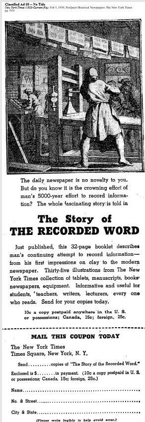
Mercurius Pre Ceteris Huic Fauste Emporiis Illustro = I, Mercury, Shine favorably on this market that surpasses all others


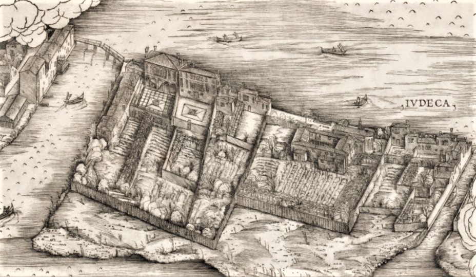
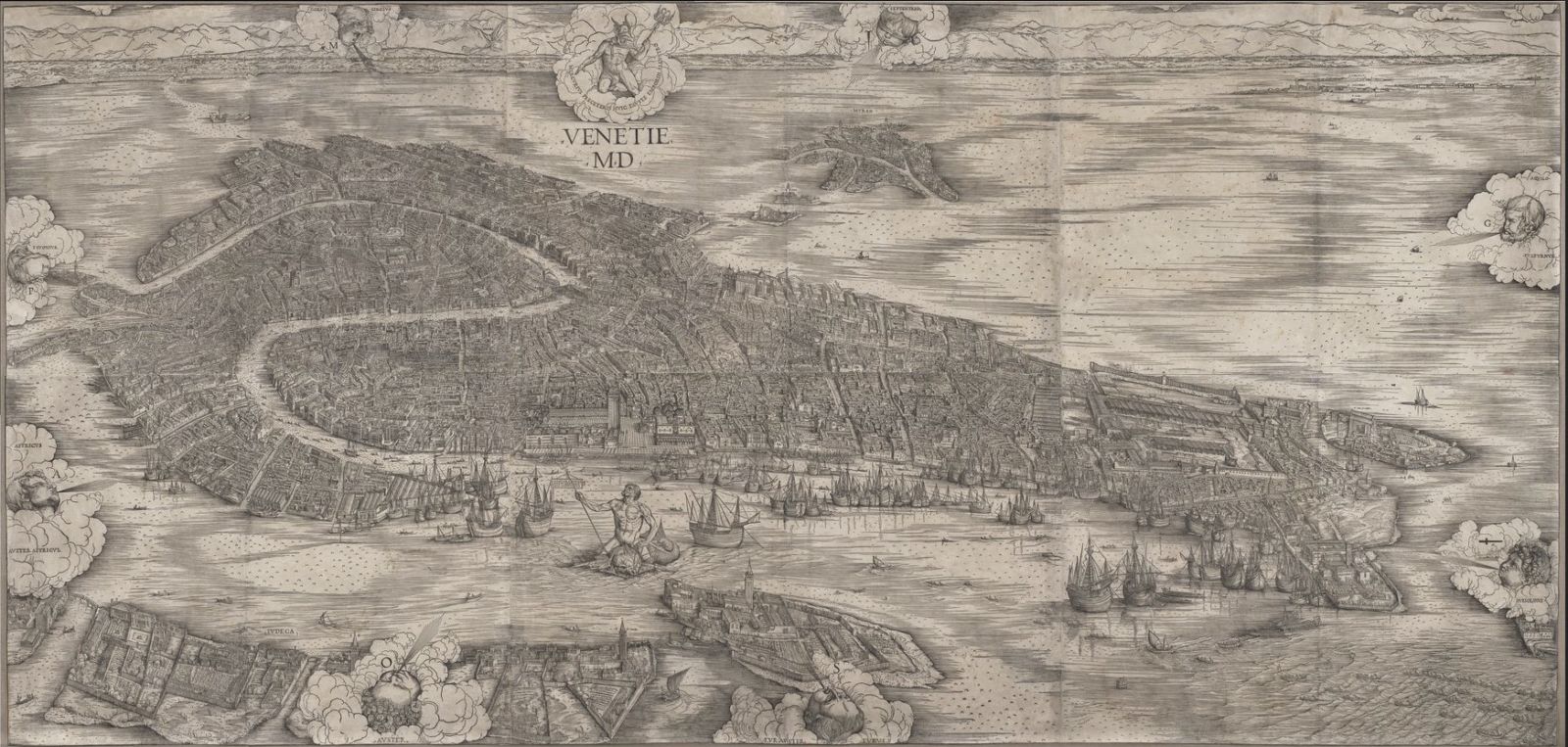
Jacopo de’ Barbari (ca. 1460/70–before 1516), View of Venice, 1500. Published in Venice by Anton Kolb. Woodcut from six blocks on six sheets of paper. 153.35 x 300.04 cm

https://en.wikipedia.org/wiki/View_of_Venice#/media/File:Clevelandart_1949.565.jpg

https://collections.artsmia.org/art/111219/view-of-venice-jacopo-de-barbari

http://gigapan.com/gigapans/166926

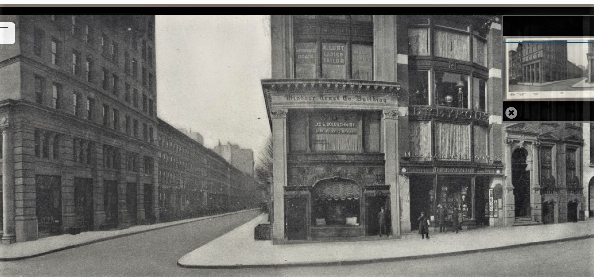
One of the landmark woodcuts of the renaissance is Jacopo de’ Barbari’s bird’s-eye view of Venice, printed from six enormous woodblocks that are still in good condition in the Correr Museum in Venice. Amazingly, there are twelve extant prints of the first 1500 edition; six of the second 1514 edition; and six of the third from the later sixteenth century. Several institutions have digitized their sheets at high resolutions allowing us to closely examine every centimeter of the extravaganza (three links are offered above but there are more). De’ Barbari presents an elongated view of Venice from a vantage point somewhere above San Giorgio Maggiore, which has been compared to the shape of a dolphin. GoogleMaps, below, is condensed but still somewhat fish-like:

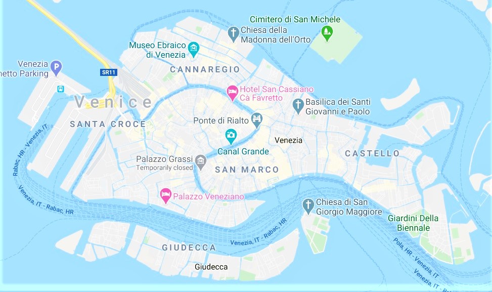
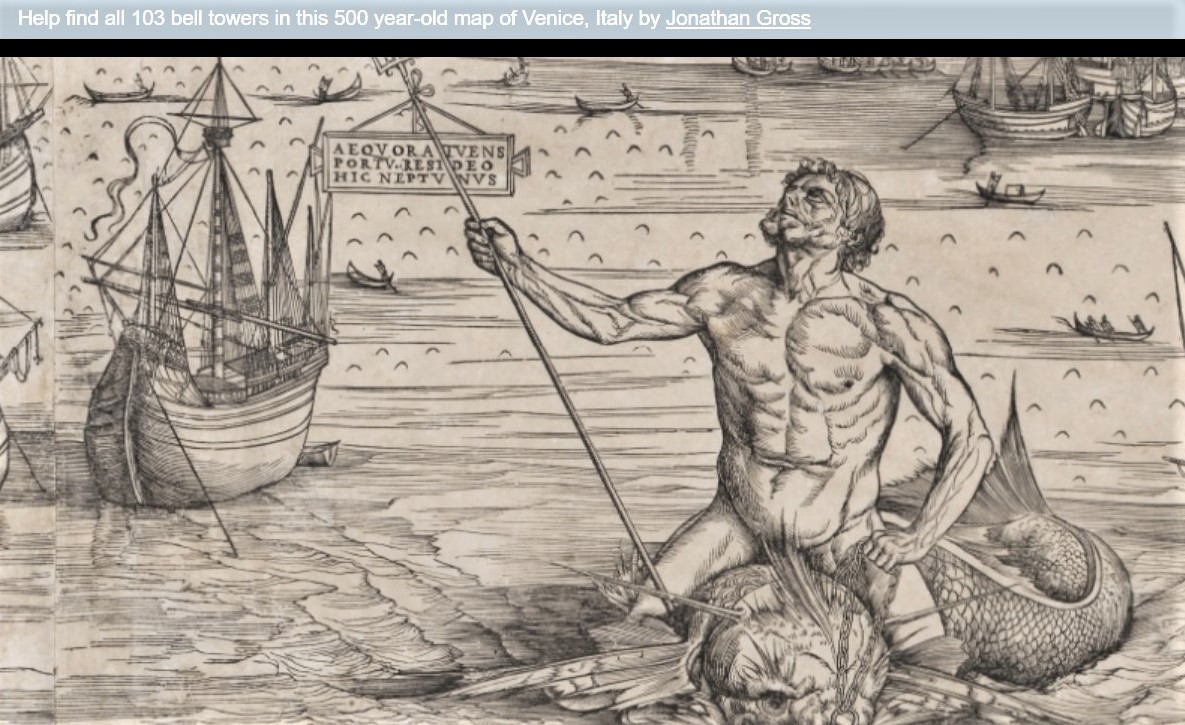
Digital reproductions show the meticulous detail De’ Barbari was able to achieve in his depiction of architecture, commerce, and day-to-day Venetian life. In 2016 a project called “The Venice Atlas” was posted at: http://veniceatlas.epfl.ch/mapping-venice-1500-searching-the-de-barbari-map-final-report/. Among the many things accomplished by the DH project was a count of the bell towers found in the map. Jonathan Gross then asked the public if they could not only find the 103 towers identified but if any others had been missed. As a fun, no pressure home project this week, see if you can find 103 bell towers in De’ Barbari’s view of Venice.


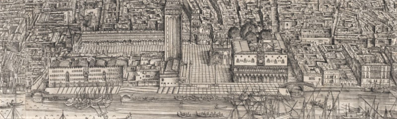
If you look at several of the Venice maps online, check to see if they have a temporary flat roof on the great bell tower in St Mark’s Square, which was erected after a fire in 1489. This means it is a first state, not the second for which the wood blocks were altered to show restoration work done in 1511-14.

One additional search might be for the former Senate Secretary Antonio Landi, hanging by his neck in Canal de San Secondo. The noose hangs from a pole balanced on two tripods. It can only be found in one state of the print and there is no explanation why it was removed. Perhaps the wood was worn down.

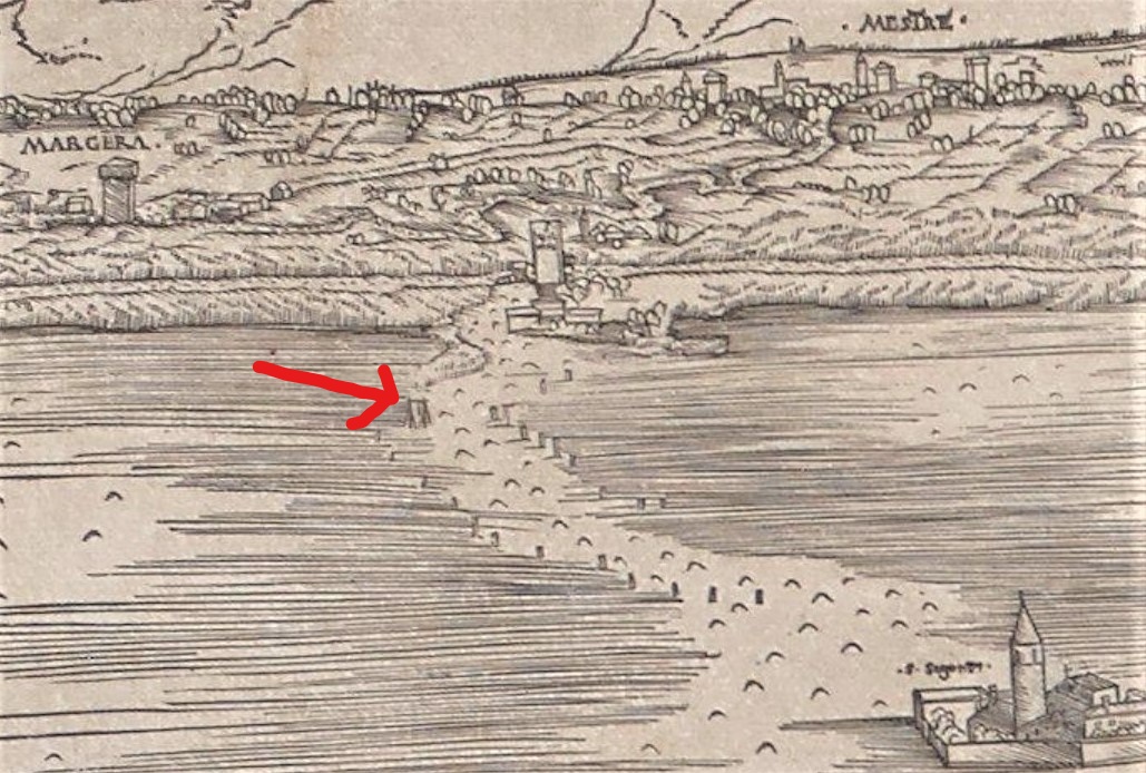
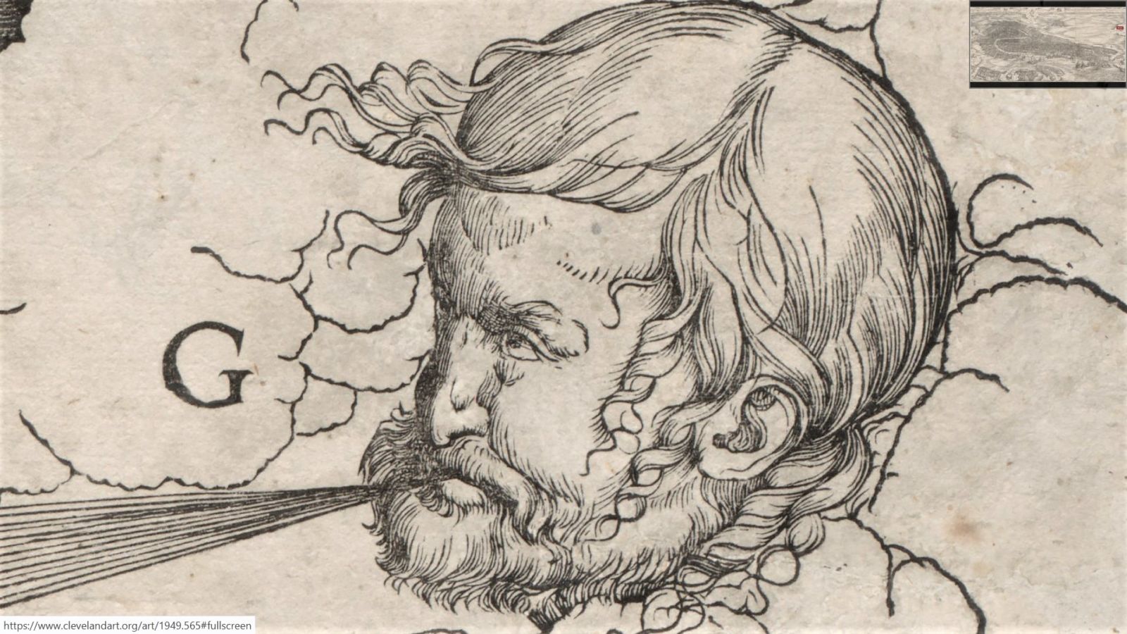
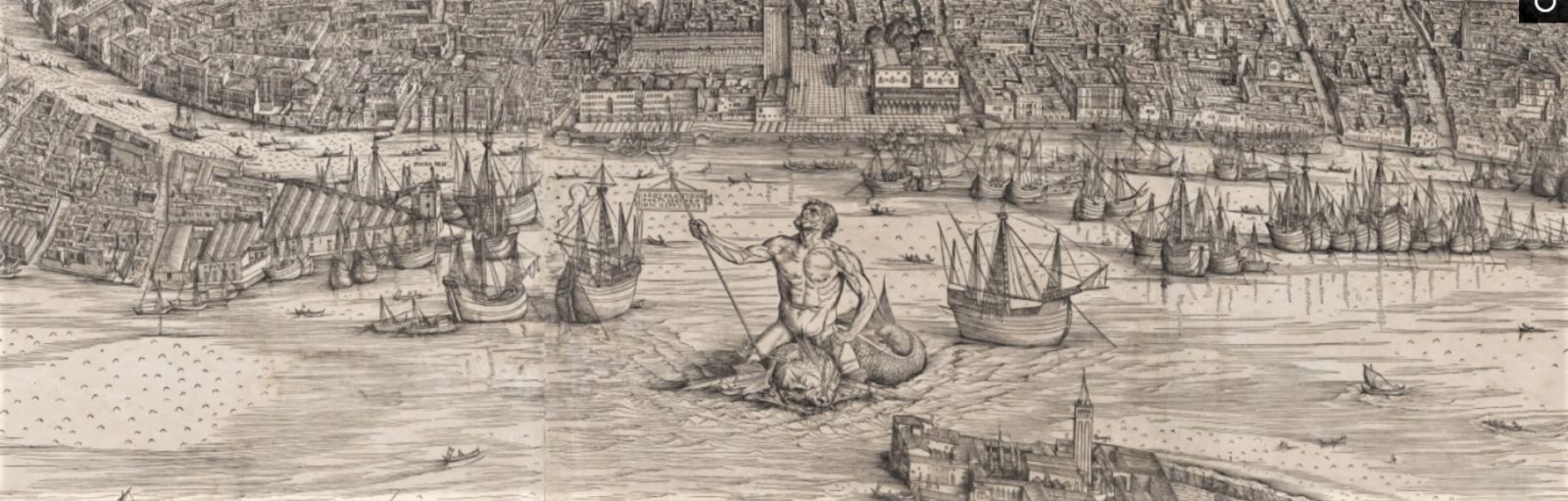
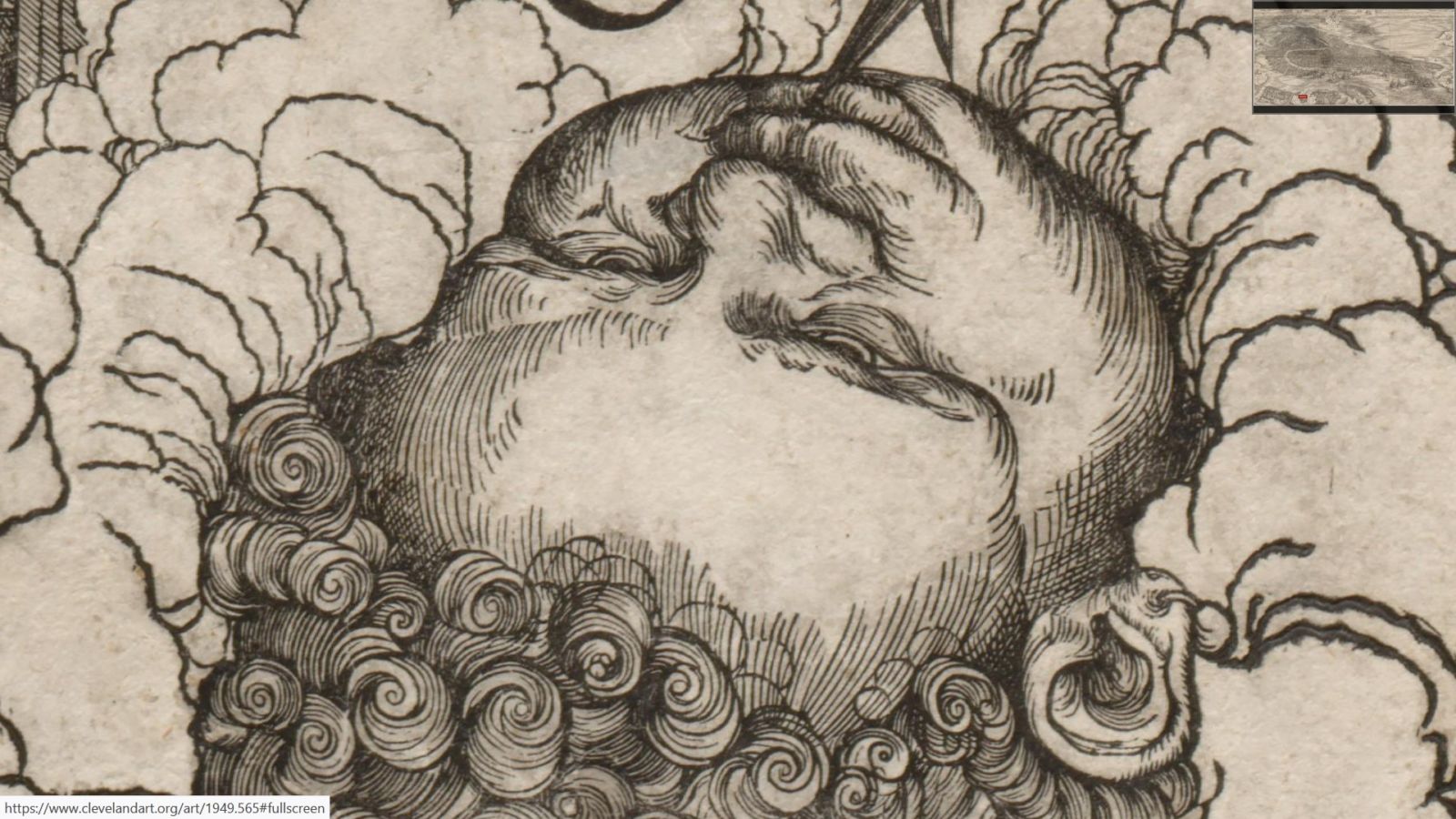
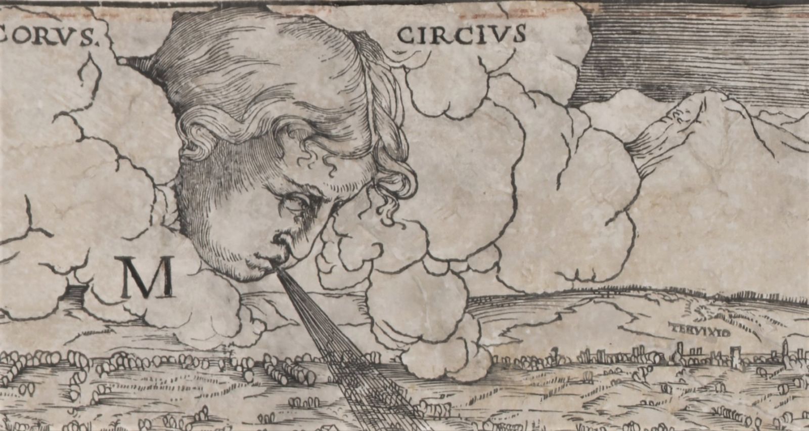
At the top center is the messenger god Mercury, looking down at the city with Neptune riding a sea monster at the mouth of the Grand Canal. Along the sides are putti representing the eight major winds. It has been suggested that the figure representing the northeast wind (left) may be Barbari’s self-portrait.


The Graphic Arts Collection has a facsimile edition of the complete map. The institutions with original prints are: first edition, 1500:
Hamburg, Boston (Museum of Fine Arts), Cleveland (Museum of Art), London (British Museum), Nuremburg (Germanisches National Museum), Paris (BNF), Venice (Fondazione Scientifica Querini Stampalia), Venice (Museo Correr, 3 examples), Venice (Nuseo Navale), Berlin (Staatlichen Museum).

Second edition, 1514 (?):
London (British Museum), Venice (Biblioteca Marciana), Venice (Museo Correr), Vienna (Albertina), Washington (National Gallery of Art), Los Angeles (University of California).

Third edition, late sixteenth century.
Florence (Private collection), Venice (Museo Correr), Venice (Private collection), Vienna (Albertina), Amsterdam (Rijksprentenkabinet), Austin (University of Texas).

Read more: Schulz, Juergen. Jacopo de’ Barbari’s View of Venice: Map Making, City Views, and Moralized Geography before the Year 1500. The Art Bulletin. 1978 Sep; 60(3): 425–474 (Jstor).

For another analysis see: Howard, Deborah. Venice as a Dolphin: Further Investigations into Jacopo de’ Barbari’s View. Artibus et Historiae. 1997 18(35): 101–111 (Jstor).

Missing Baseball? Jim Nasium, Sports Cartoonist

Philadelphia Inquirer May 19, 1907

Trained as a fine art painter, Edgar Forrest Wolfe (pen name Jim Nasium, 1874-1958) began his career in the art department of the New York American, eventually becoming manager of the art department of the Pittsburgh Press and then, the Philadelphia Inquirer. His love of sports led to a weekly column that he also illustrated, chronicling American professional sports (especially baseball). During the World’s Series and other championships his cartoons appeared daily, sometimes filling the top half of the page. Originally titled “Letters from an old sport to his son at college,” Wolfe was only 33 years old when the series began and did not have college-age children.

After a few years, still drawing under the name Nasium, his work expanded to include social and political commentary, as long as it did not interfere with reporting on sports. His drawings were regularly on the covers of The Sporting News (https://newspaperarchive.com/st-louis-sporting-news-oct-28-1926-p-7/) and a few on The Saturday Evening Post.

Wolfe stopped his weekly columns in 1929 but continued to write and draw on a freelance basis until his death in 1958. Here are some of his treasures.

Philadelphia Inquirer April 28, 1907


Philadelphia Inquirer May 12, 1907


Philadelphia Inquirer July 28, 1907


Philadelphia Inquirer August 11, 1907


Philadelphia Inquirer March 5, 1908: 10


Philadelphia Inquirer January 11, 1908


 Philadelphia Inquirer July 24, 1910


Philadelphia Inquirer October 29, 1916


December 3, 1916


Philadelphia Inquirer December 19, 1916


Philadelphia Inquirer May 16, 1920

Need a project no.3? Women’s history final list.


Over the last five weeks of posting projects for those of us at home, by far the most responses have been to a request for women’s history: Who was the first women to graduate from your school, college, or university? What began with the identification of a 1640 (III/IV (Hollstein Dutch and Flemish, v.26, p.113)  engraving of the artist and scholar Anna Maria van Schurman (1607-1678), often identified as the first female student at a European university, led to a survey of other notable women who are recorded as being the first to graduate from universities across the United States (and a few outside the US, although that would be a much longer list. See: https://en.wikipedia.org/wiki/Timeline_of_women%27s_education)

https://drive.google.com/a/princeton.edu/file/d/1Gx_g_fKBkQ_Ija-Ps4k_Dza0QPXJEMe2/view?usp=sharing  Here is a six-page PDF list of women who were the first graduates from various colleges. The stories are wonderful.


Before Ruth Bader Ginsburg there was Bettisia Gozzadini, who studied law at the Studium of Bologna, dressed as a man, graduating from the university in 1237 and teaching law at her home. There is a bust of Gozzadini at the Museum of the History of Bologna, sculpted by Casa Fibbia sometime between 1680 and 1690. An inscription on its base reads: “Loving daughter, in both rights highly eminent/ Public laws explained and in Bishop’s funeral prayed. Flourished 1242. Died 1261.”  Thanks to Janna Brancolini for the image.

From Ohio, there were the “Oberlin Four.” http://www.womenhistoryblog.com notes “Oberlin College was founded in 1833 in Oberlin, Ohio, and became the first college in the United States to admit women as well as men. There were four courses of study: the Female, Teachers, Collegiate and Theological Departments. Women were allowed to study in the Female or Teachers Department. However, in 1837 four women – Mary Kellogg, Mary Caroline Rudd, Mary Hosford and Elizabeth Prall – entered the college degree program, the Collegiate Department. All but Kellogg graduated in 1841 and received the first Bachelor of Arts degrees earned by women in the United States. Kellogg, who had left school for lack of funds, later returned to Oberlin after marrying James Harris Fairchild, a future president of Oberlin College. Mary Caroline Rudd (later Allen) pictured below.

Ellen Swallow Richards (1842-1911) was the first woman admitted to MIT, receiving her S.B. degree in 1873 (the first graduating class of MIT was 1868). The title of her thesis [PDF file] was “Notes on Some Sulpharsenites and Sulphantimonites from Colorado.” In 1875 she appealed to the Women’s Education Association of Boston for help in establishing a laboratory at MIT for the instruction of women in chemistry. The Women’s Laboratory opened in 1876 with Professor John M. Ordway in charge, assisted by Richards. She held the position of instructor in chemistry and mineralogy in the Women’s Laboratory until it closed in 1883. From 1884 to her death in 1911, Richards was instructor in sanitary chemistry at MIT.–https://libraries.mit.edu/mithistory/community/notable-persons/ellen-swallow-richards/

Many schools closely followed the decisions made elsewhere, which influenced their own progress (or lack of). Here is The Harvard Crimson reporting on the decision at Dartmouth College to admit women beginning in the fall of 1972. : https://www.thecrimson.com/article/1971/11/22/dartmouth-to-admit-women-in-fall/

Dartmouth, like Harvard and others, has a complicated history that is not easy to record, given that women were allowed to study at the school long before they were given degrees. The attached PDF is a casual document and if you find mistakes, it can easily be corrected and updated.

The University of Pennsylvania archives posted this image of the first women to matriculate at UPenn, working in the chemistry laboratory, 1878 (L to R: Gertrude K. Peirce, Anna L. Flanigen, and Mary T. Lewis). “Gertrude Klein Peirce and Anna Lockhart Flanigen met at Women’s Medical College. The two women were the first female students admitted to the University of Pennsylvania. Miss Peirce earned a certificate of proficiency in Chemistry in 1878. She continued her studies in a post-graduate course in 1878 and 1879….”–https://archives.upenn.edu/exhibits/penn-people/notables/women

Of course, they are not all success stories.  On May 21, 1897, men and women, young and old, gathered to protest the admission of women to Cambridge University, as seen in Thomas Stearn’s photograph above. Here’s more: https://graphicarts.princeton.edu/2018/02/22/cambridge-boys-celebrate-when-women-are-refused-degrees/.

If your story is missing, you can still send notes to jmellby@princeton.edu and I will add them. Thank you to everyone who participated.


Hamlet in your pocket


Around 1909, Saul L. Kowarsky formed the Knickerbocker Leather & Novelty Company at 314 Broadway in New York City. Also on the board were Barnett Epstein as secretary, Morris Epstein, treasurer, and William Tager, director.

As an advertising promotion, Kowarsky printed a series of leather-bound miniature books, with plays by William Shakespeare; 24 in all, each measuring 3 x 2 inches, housed a tiny leather box. Seen here is Hamlet.

As the company grew, it leased 34,000 square feet in the Knickerbocker Building at 79 Fifth Avenue and 16th street, where they remained from 1914 to 1933.

Meanwhile the Cluett Peabody Company, famous for their Arrow shirt collars, suffered after the stock market crash and had to give up their Manhattan headquarters. The Knickerbocker Company moved into their space in the Cluett Building at 32 West 19th Street, continuing to print and sell the miniature Shakespeares.

Eventually, interest in the leather business also waned and Knickerbocker filed for bankruptcy in 1956. The palm-size books continue to appear here and there online.

Digital Shakespeare: http://shakespeare.mit.edu/index.html

Vulgar notes in almanacs 1768 to 1795

Full online digital access to a number of 18th-century American almanacs can be found in the Princeton University catalog; including:
The New York pocket almanack, for the year 1768 : … Calculated for the use of the province of New York, and the neighbouring provinces by Richard Moore, philo. (New York: Printed and sold by Hugh Gaine, [1767]). 4 v. in one. [with New-York pocket almananck for the year 1772 — New-York pocket almanack for the year 1773 — Gaine’s New-York pocket almanack for the year 1795]. Graphic Arts Collection, Hamilton 60s. Full text: https://catalog.princeton.edu/catalog/3966007

The Journals of Hugh Gaine (1902) provides a rich biography of the Belfast-born printer publisher, which tells us that when Hugh Gaine (1726 or 1727-1807) emigrated to New York City in 1745, “without basket or burden, he secured employment from James Parker, whom Benjamin Franklin had established as a printer in that city in 1742. It is stated that his wages were equivalent to a dollar and a quarter a week, which was later increased by a small allowance for board.” The book continues,

“Gaine also began in 1755 the issue of the “New York Picket Almanac, by Poor Tom,” “handsomely printed in red and black,” written, pretendedly, by one More, or Moore, but really by Theophilus Grew, and this series he also continued till long after the Revolution. This, too, met with popular favor, though of the first he notified his patrons, December 20, 1755, that “There are yet a few of the New-York Pocket Almanacs on Hand, neatly bound in Letter-Cases, which well be sold to those that call first; therefore those that are disappointed must blame themselves.”

The overplus did not last, for in The Mercury he later reprinted a table from this Almanac, “by desire,” “the Almanac itself being out of print from the Great Number sold the Beginning of the Year.” In advertising Moore’s Almanac for 1757 Gaine informed the purchasers that “The Printer has procured a few very neat Letter-Cases, handsomely gilt, just the Size of the above Almanack, with Pockets very convenient for Stuffing in Things that is useful for any Day in the Year.

With the next year’s issue, he warned them that “Many Gentlemen were disappointed of the Use of this Almanack, for the Year 1757, by their not sending for the same in Time: ‘Tis therefore requested they wou’d be less dilatory this Year. It is properly interleaved with fine Paper, on which Memorandums may be made for eery Day in the Year. It contains Twelve Pages more than any other Almanck [sic] of the Kind.” Of the issue for 1774 Gaine gave notice on November 22, 1773, that “The Run for the New-York Pocket Almanack has been so great for a Week past, that no less than one Third of the whold Impression are already sold.”

The Journals of Hugh Gaine, Printer, Vol. 1 (Dodd, Mead, 1902). Graphic Arts Collection 2006-2490N, temporarily online through HathiTrust.

Gaine’s shop was located on what is today Pearl Street in lower Manhattan, formerly known as Queen Street.

Besides the usual calendars, weather, politics, and financial information, each of these volumes include vulgar notes: “The usual method for determining Easter was through the use of a perpetual calendar and a table of “domnenical letters” and “golden” numbers. New England almanacs printed the domenical letter and golden number for the particular year of publication, usually under the heading, “vulgar notes,” but did not supply the necessary tables. For an explanation of the system, see John James Bond, Handy-Book of Rules and Tables for Verifying Dates … (New York: Russell and Russell, 1966), 115-41. –James P. Walsh, “Holy Time and Sacred Space in Puritan New England,” American Quarterly 32, no. 1 (Spring, 1980), pp. 79-95
https://archive.org/details/handybookofrules00bond/page/n4/mode/2up

Museum of the History of the Recorded Word

The Story of the Recorded Word (New York: New York Times Company, 1939). “To tell the story briefly related in this booklet, the New York Times has been assembling…more than two hundred objects now on exhibition…From the exhibits have been selected the illustrations in this booklet.”

The Story of The Recorded Word: Telling In Condensed Form The History of Five Thousand Years of Recording From Man’s First Impressions On Clay To The Modern Newspaper (New York: New York Times, 1940). Graphic Arts Collection Z4 .N56 1940


Arthur Hays Sulzberger (1891-1968), publisher of The New York Times from 1935 to 1961, was enthusiastic when Elmer Adler (1884-1962) proposed a Museum of the History of the Recorded Word. Sulzberger gave his tenant additional space on the tenth floor in the Times 43rd Street building, emphasizing that the focus should be on the final case with the most current edition of the New York Times (rotated daily).

He wrote to Adler, “The desire is to impress the observer with the scholarship, research, and authenticity in back of each issue of the New York Times to show how five thousand years of scholarship contribute to the presentation of each day’s issue of the paper.”

On April 25, 1938, the Museum of the History of the Recorded Word opened to the public with a series of cases circling a single room filled with originals and facsimiles presenting a chronological history of printing. In the middle was a cast of the Rosetta Stone, a rack to display newspapers around historic events, and an old hand press.

The Times printed an announcement taking credit for Adler’s show, which read in part: “The New York Times has assembled a History of the Recorded Word, a permanent collection showing the progress of that word from the dawn of writing to the present day from the primitive markings of stylus, brush and reed pen down through the epochal invention of movable type to the books and the newspapers of the power presses of today.”


By 1940, annual museum attendance was recorded at 8,311 and later rose to approximately 30,000. A didactic exhibition of photographic reproductions traveled to libraries, schools, and 26 other venues across 14 states. Interest eventually dimmed and in 1965 the museum collection was downsized through an auction at Parke- Bernet Galleries and in 1982, after it had been on view for 43 years, the remaining display was donated to the Rochester Institute of Technology.

Adler traveled to Princeton in 1939, where he delivered a lantern slide lecture about the museum display to members of the Princeton Bibliographical Society. He said “For nine-tenths of recorded time man has learned to write; for the last 500 years he has learned to print; and only yesterday he has learned to speed up printing,” Read more about the museum and Adler’s transition to Princeton: file:///C:/Users/jmellby/AppData/Local/Temp/prinunivlibrchro.73.3.0391.pdf

.

“Story of Recorded Word: New Exhibit Covers Six Thousand Years,” New York Times, April 24, 1938.

Karl Ove Knausgård’s new book scheduled for 2114

Future Library: A Century Unfolds from Katie Paterson on Vimeo. Suggestion, play this as large as possible, it is gorgeous.

Karl Ove Knausgård’s new book is scheduled to come to Princeton University Library in 2114. This isn’t a new type of quarantine or social distancing. The novelist is the 2020 author for the Future Library, of which Princeton is a member. As announced last fall 2019, he is to become the sixth contributor to the Future Library, which collects works by contemporary authors that will remain unread until 2114.

“A forest in Norway is growing. In 100 years it will become an anthology of books. Every year a writer is contributing a text that will be held in trust, unpublished, until the year 2114. The texts will be printed on paper made from the trees, only to be read a century from now.

A new film [above] documenting Future Library’s journey so far was commissioned for Katie Paterson’s solo exhibition at the Scottish National Gallery of Modern Art, Edinburgh. Due to the early closure of this exhibition, we are very pleased to share this with you.”

Knausgård will hand over his new manuscript for Future Library on Saturday September 5th 2020. The event was due to take place on May 23rd 2020 but has been shifted to accommodate for current important health concerns relating to the Covid-19 virus. We are all invited to attend, direction are on their website.

“It’s such a brilliant idea,” Knausgård writes, “I very much like the thought that you will have readers who are still not born – it’s like sending a little ship from our time to them. I like that it will be opened in 100 years and I like the slowness of the forest growing, that everything is connected. It’s such a wonderful green artwork.”–Karl Ove Knausgård

Conceived by Katie Paterson, Future Library is commissioned and produced by Bjørvika Utvikling, and managed by the Future Library Trust. Supported by the City of Oslo, Agency for Cultural Affairs and Agency for Urban Environment. Currently the project consists of 1,000 spruce trees that were planted in Oslo’s Nordmarka forest in 2014. After a century, they will be cut down and turned into paper. Until then, each of the 100 manuscripts will be held in a specially designed, wood-lined room [below] in Oslo’s Deichman central library.

Future Library Handover Day with David Mitchell, 2016 from Katie Paterson on Vimeo.

Need a Project, no. 5? Others

Others: a magazine of the new verse (Grantwood, N.J., New York, 1915-1919). Special Collections Rare Books 3598.68905. Art editor William Zorach. Full searchable text at Modernist Journals: https://modjourn.org/journal/others/ Its motto: “The old expressions are with us always, and there are always others.”

“Others: A Magazine of the New Verse was an American literary magazine founded by Alfred Kreymborg in July 1915 with financing from Walter Conrad Arensberg. The magazine ran until July, 1919. It was based in New York City and published poetry and other writing, as well as visual art. While the magazine never had more than 300 subscribers, it helped launch the careers of several important American modernist poets. Contributors included: William Carlos Williams, Wallace Stevens, Marianne Moore, Mina Loy, Ezra Pound, Conrad Aiken, Carl Sandburg, T. S. Eliot, Amy Lowell, H.D., Djuna Barnes, Man Ray, Skipwith Cannell, Lola Ridge, Marcel Duchamp, and Fenton Johnson (poet) (the only African American published in the magazine).” –Suzanne W. Churchill, Modernist Journals https://modjourn.org

On a Sunday in April 1916, Floss Williams threw a party for her husband, William Carlos Williams, and his friends at their home in Rutherford, New Jersey. By all accounts guests began arriving in the morning, continuing throughout the day and into the night. Mrs. Williams fed them all day and night, with the help of several women who accompanied the men.

“In New York Williams was just another figure, another artist among artists, whose particular comings and goings were hardly noticed. But when the village descended on Rutherford, that was another story. As happened, for example, in April 1916, when Williams decided to throw a big bash for the Others crowd. It was still early spring, as the two photographs of the crowd taken that Sunday—one of the men and the other of the women—show. Alanson Hartpence was there, and Alfred Kreymborg in hat and wild bow tie, and of course Williams with Mother Kitty… There were others not in the photographs who showed up during that morning and afternoon and evening as the party got under way and the Williamses wined and dined the crowd into the next morning. Williams remembered Skip Cannell jumping half drunkenly onto the running board of his car as he drove over to Ed’s house to get some more ice.”–Paul Mariani, William Carlos Williams: A New World Naked (2016).

The well-known photograph [above] of the men who wrote for Others magazine are:
Front row left to right: Alanson Hartpence, Alfred Kreymborg, William Carlos Williams, Skip Cannell. Back row: Jean Crotti, Marcel Duchamp, Walter Arensberg, Man Ray, Robert Alden Sanborn, Maxwell Bodenheim.

But who are the women in the other photograph? Did any of them write or publish in Others, even in Helen Hoyt’s “Woman’s Number”? See the anthology Others: A Magazine of the New Verse in 1916 or take a look in the individual issues, you can read full-text here: https://modjourn.org/journal/others/

This week’s project:
Who were the women of the Others group and which woman appears as a character in Ernest Hemingway’s The Sun Also Rises and A Farewell to Arms?

Mail your answer to jmellby@princeton.edu

In case it is helpful, a second photograph of some of the ladies turns up in “Further Conversations With Flossie,” William Carlos Williams Newsletter 3, no. 1 (1977): 1-7. www.jstor.org/stable/24564477

Puerto Rican visual and performing arts


The Institute of Puerto Rican Culture (Instituto de Cultura Puertorriqueña or ICP) is the department of the Puerto Rican government “responsible for the establishment of the cultural policies required in order to study, preserve, promote, enrich, and diffuse the cultural values of Puerto Rico.” The ICP began operating in November 1955 under its first executive director Dr. Ricardo Alegría and continues to promote all aspects of Puerto Rican culture, including archeology, museums, parks, monuments, historic zones, music, visual arts, and dance, as well as maintaining the Archives and the National Library of Puerto Rico. Their site is here: Instituto de Cultura Puertoriqueña

ICP’s first logo was designed by Lorenzo Homar (1913-2004), who also established the Institute’s Graphic Arts Workshop (Taller de Artes Gráficas). During the 960s, Homar designed and screen printed a number of posters for the ICP, many of which are now represented in Princeton’s Graphic Arts Collection thanks to the generosity of Alma Concepción and Arcadio Díaz-Quiñones. Not only are they beautiful works of graphic art but they document important events in Puerto Rican history.

https://www.youtube.com/watch?v=p2b5R0L7HVQ

This 2015 video was recorded in conjunction with the exhibition HOMAR: A Tribute to an Artist of the Puerto Rican Diaspora, organized by the Hunter College Center for Puerto Rican Studies. It features a conversation among artists to share their memories, personal experiences and the ways they have been influenced by the renowned artist and graphic designer Lorenzo Homar and his peers in the Puerto Rican art scene both on the island and among the Puerto Rican stateside communities: Rodríguez-Calero and Nitza Tufiño, with moderator: Néstor Otero.


Lorenzo Homar (1913-2004), Festival de Teatro Puertorriquena, Teatro Tapia, 1962. Graphic Arts Collection GA 2007.03985.
In 1956, barely into its second year, the ICP created the Theater Arts Promotion and Dissemination Program and in 1958 launched an annual Puerto Rican Theater Festival to promote the work of Puerto Rican playwrights. Lorenzo Homar designed and printed several of the festival posters, including this one in 1962 for the 5th annual festival held at the Teatro Tapia, the oldest permanent theater in Puerto Rico.

Located in Old San Juan on Fortaleza Street in front of Plaza Colón, the Tapia Theater was given its name during its reconstruction of 1948, honoring Alejandro Tapia y Rivera (1826–1882) one of the fathers of Puerto Rican literature.

https://enciclopediapr.org/en/encyclopedia/tapia-y-rivera-alejandro/. “As a playwright, Tapia is particularly known for the 1867 play La cuarterona, in which he denounced racial prejudice.”

Full text available: https://babel.hathitrust.org/cgi/pt?id=uc1.a0000253484&view=thumb&seq=11 or in a bilingual edition: https://muse.jhu.edu/article/691871

Homar also designed the poster [left] for ICP’s 8th annual theater festival: Lorenzo Homar (1913-2004), Festival de Teatro Puertorriqueno en el Teatro Tapia, 1965. Graphic Arts Collection GA 2007.03989


Lorenzo Homar (1913-2004), Feria de artesanias en Barranquitas, Instituto de Cultura Puertorriquena, 1966. Graphic Arts Collection GA 2007.03947


The National Artisan or Crafts Fair (Feria Nacional de Artisanas de Barranquitas) takes place every July in Barranquitas, a small mountain town in the center of Puerto Rico. This annual event brings together local artisans from around the island and last year nearly 200 local artisans took part; making this the largest craft festival in Puerto Rico.

The fair dates back to 1959 when the first event was held to mark the centenary of the birth of local barranquiteno hero Luis Muñoz Rivera (1859-1916). https://en.wikipedia.org/wiki/Luis_Mu%C3%B1oz_Rivera

“At that time there was only a single kiosks where local craftsman displayed their creations. The following years fair saw even more artisans taking part and in 1961 the Institute of Puerto Rican Culture announced the first National Fair of Handicrafts in Barranquitas. Since then the fair has grown in popularity, not only with local artisans, but in the variety of cultural activities that occur during the event.”


Lorenzo Homar (1913-2004), 1871-1971 Centenario del tenor Antonio Paoli, 1971. Graphic Arts Collection GA 2007.03999

For the centenary of the tenor Antonio Paoli (1871-1946), this poster celebrates the first Puerto Rican to gain international recognition in the performing arts. His Wikipedia page lists 1,725 performances between 1888 and 1942, including 575 performances of Verdi’s Otello. To his credit, Paoli was also the first opera singer in the world to record an entire opera; he was part of a recorded performance of Pagliacci by Ruggiero Leoncavallo in Italy in 1907.


The ICP organized a celebration in 1971 and commissioned a screen printed poster from Homar, who depicts Paoli in his most famous role of Otello. See more: https://historyofthetenor.com/antonio-paoli/

Archie Pen Co. “It thinks for you.”


One hundred years ago this month, Katherine Dreier (1877-1952), Man Ray (1890-1976), and Marcel Duchamp (1887-1968) established the Société Anonyme, Inc. in two rented rooms (gallery and library) at 19 East 47th Street in New York. Dreier wrote that she “places at the disposal of visitors a complete carefully selected Reference Library on Modern Art, including books and magazines from various European countries. [We do] not sell any works exhibited under its direction, but gladly brings any prospective buyer directly in touch with the artist.”

The location was deliberate. J & S Goldschmidt Fine Art [above] was at Fifth Avenue and 47th, while M. Knoedler and Co. [below] operated around the corner at 556 Fifth Avenue. More important, Man Ray’s dealer Charles Daniel’s gallery was just across 5th Avenue at 2 West 47th Street.

With the end of WWI, travel reopened and the development of international exhibitions on the rise. In February of 1921, Dreier and Daniel joined forces to celebrate the Russian artist Alexander Archipenko (1887-1964), exhibiting drawings and watercolors with Daniel and sculpture at the Société Anonyme.

To publicize the exhibitions, Duchamp published a tongue-in-cheek advertisement in The Arts magazine for the “Archie Pen Co.” [at the top]  Beside an illustration of Archipenko’s relief sculpture Woman Standing (1920) is the text:

“For having invented the circle, Columbus, as everyone knows, was tried and sentenced to death. Today an Archie Pen draws automatically a line of accurate length such as, for instance, the hypothenuse of a possible triangle in which the length of the two other sides is given arithmetically. It thinks for you. To use it reveals new experiences, even to the most blasé.

A distinct achievement of the Archie Pen is its ability to bring delicacy of line and graceful poise to a hard dry mechanical drawing. It has already found great favor among architects, draughtsmen, because it covers a third more space than the old-fashioned Fountain Pen and complies with the exigencies of what the French Scientists call: les inhibitions imbibées.

It does away with blotter. For artistic design, quality and value Archie Pens are without equal. Presented for your approval at the Société Anonyme, 19 East 47th Street, New York City. Write us if you are unable to secure genuine Archie Pens at your favorite stationer. The name will be found at the bottom as an assurance. [This brilliant caricature of a modern magazine advertisement is the work of an artist well-known in many fields who, unfortunately, objects to having his identity revealed—Editor]”


The Princeton University Art Museum “Flat Torso” by Archipenko [left] and his Saks Fifth Avenue advertisement, designed by Raymond Loewy. Marquand Library offers:

Société Anonyme, Inc. (Museum of Modern Art) presents the first exhibition in New York of the works of Alexandre Archipenko (Russian sculptor) : at its 7th exhibition, Feb. 1st-March 15th 1921, 19 East 47th Street, New York (New York: Société Anonyme, Inc., 1921). 1 folded sheet. Marquand Library NB689.A6 S624 1921. “The Société Anonyme Inc. has issued a special pamphlet on Archipenko with five full-page illustrations, and an excellent dissertation by Ivan Goll (translated into English by Mary Knoblauch).”

Alexander Archipenko (1887-1964)—Oxford Art Online:

Ukrainian sculptor, active in Paris and in the USA. He began studying painting and sculpture at the School of Art in Kiev in 1902 but was forced to leave in 1905 after criticizing the academicism of his instructors. … In 1908 he established himself in Paris, where he rejected the most favoured contemporary sculptural styles, including the work of Rodin. . . . Archipenko was represented in the New York Armory Show of 1913 and in many international Cubist exhibitions. In 1921 he moved to Berlin and opened an art school. In 1923 he settled in the USA and established a school in New York City. He initiated a summer programme in Woodstock, New York, in 1924, which continued until his death. In 1927 he was granted a patent for his invention of the ‘peinture changeante’ (or Archipentura), a motorized mechanism for the production of variable images in sequence. This machine (which in his view combined the scientific with the emotional), as well as his incorporation of electric light and actual movement into his work, revealed his continued attraction to the Futurist urge to represent the dynamism of the modern era.

European Culture in a Changing World: Between Nationalism and Globalism (International Society for the Study of European Ideas. Conference, 2004)