Joubert Medailles

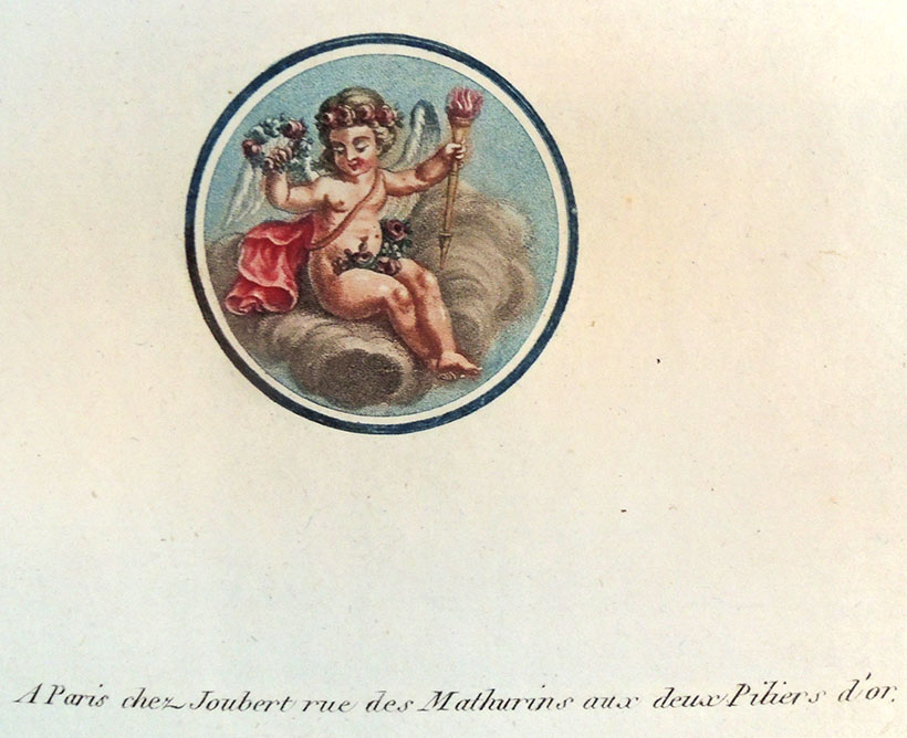
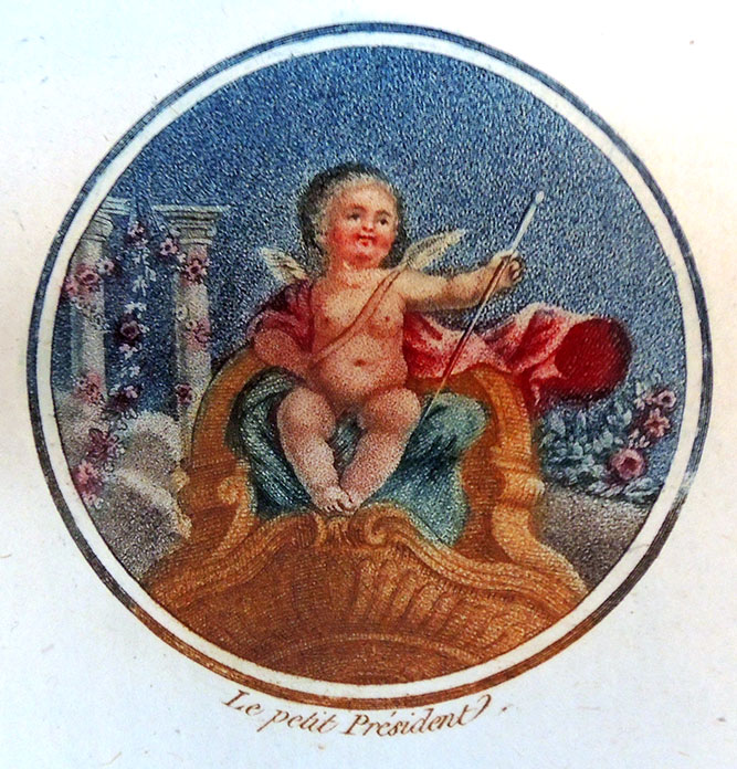
François Etienne Joubert, Medailles (Paris: Joubert, rue des Mathurins, aux deux Piliers d’Or, ca. 1793). 2 vol., 50 engravings. Graphic Arts Collection GAX 2018- in process

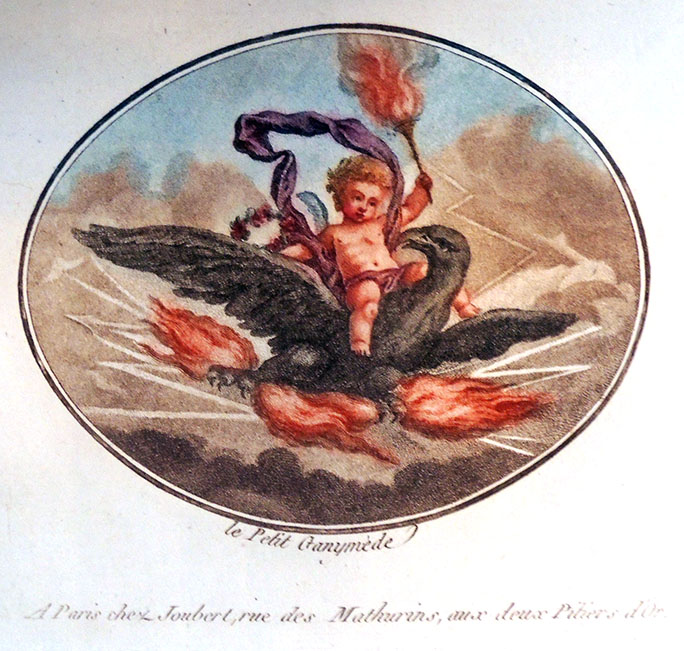
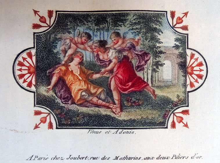
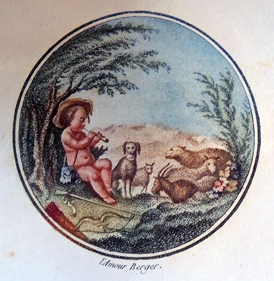
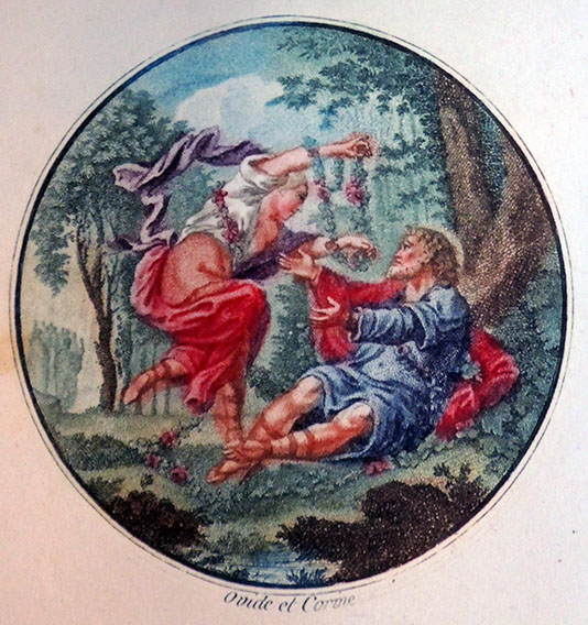
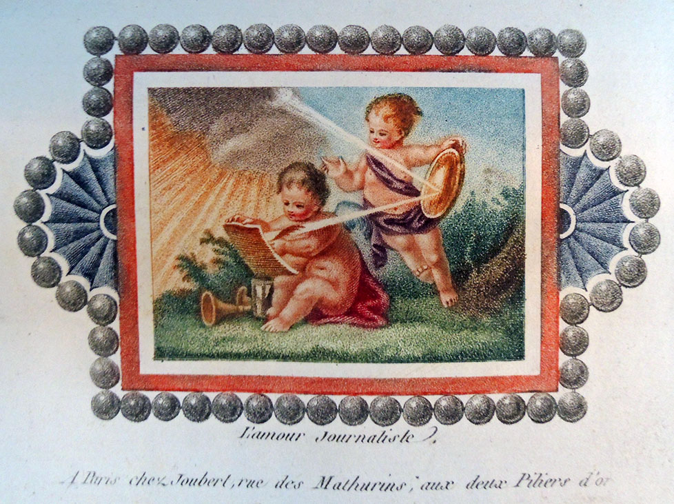
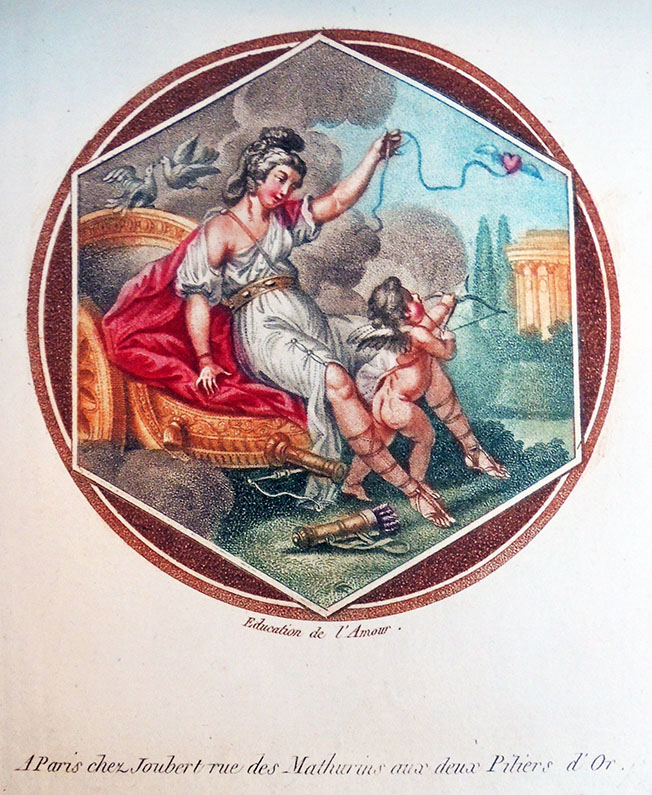
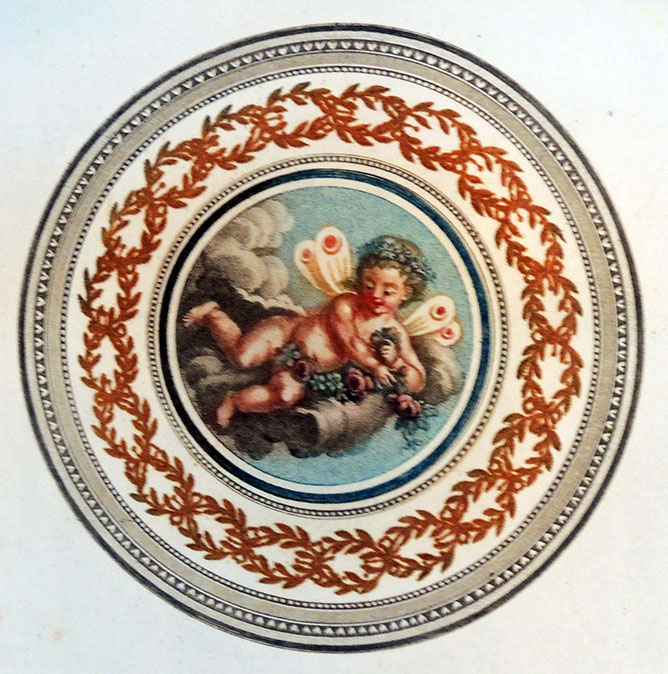
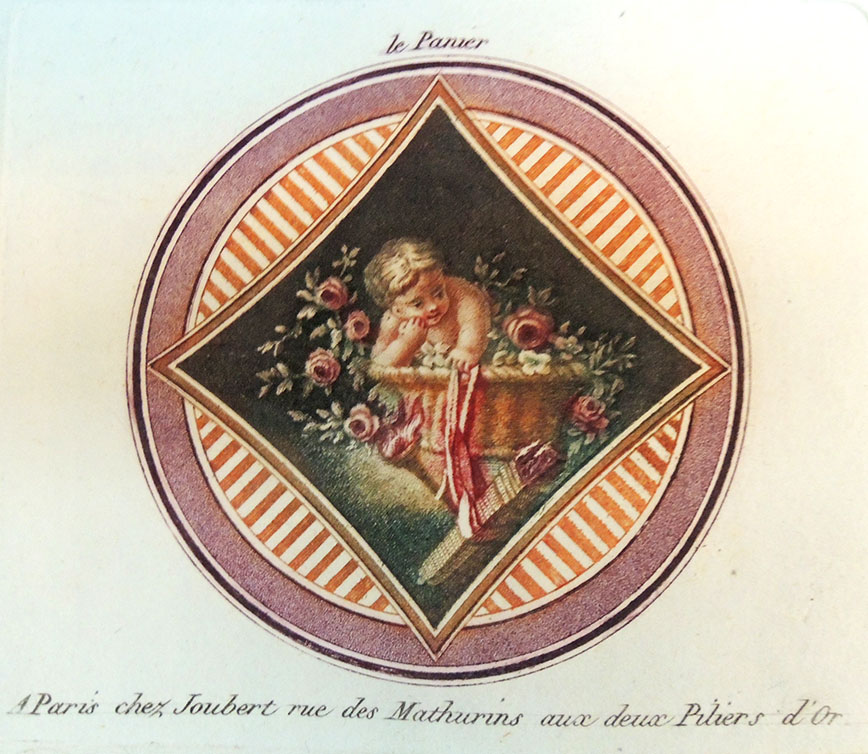
New to the Graphic Arts Collection are two volumes with 50 color stipple engravings, 25 of which are by François Etienne Joubert. Possibly a unique collection, one guess is the books were made to show the printer’s ability. Many plates highlight classical or allegorical subjects, most in a classical circular frame, featuring putti and angels in pastoral settings.

The British Museum posted a biography for François Étienne Joubert that reads in part:
“Began career as engraver and print publisher in Lyons. In 1787 moved to Paris and bought stock of J F Chéreau; the two worked together for several months, before Joubert took over sole running of business in 1788. Moved to new address c.1795 when Depeuille took over his building.

In 1801 published a four page pamphlet, Définition des mots copie et contrefaction en gravure (reprinted by C Hould, Images of the French Revolution 1989, pp.415-6). In 1821 published 3 vols. Manuel de l’Amateur d’Estampes (being a biographical dictionary of engravers, with notes on their principal plates and current prices, plus introductory essays).” –Marquand Library NE90 .J82


Poems by the Knight of Morar, See Princeton

Detail

The British Museum holds an etching [left] by George Cruikshank (1792-1878) designed as a frontispiece to Sir William Augustus Fraser’s Poems by the Knight of Morar, with the inscription “Designed & Etched by- George Cruikshank- September 27th 1870- 78 years of age.” At the bottom someone has written “See Princeton…”.

Princeton University’s Graphic Arts Collection holds a watercolor sketch [below] for this print but no book, since the proposed volume with this 1870 frontispiece was never published.


Thanks to the gift of Richard Waln Meirs (Class of 1888), the Graphic Arts Collection does have two editions of Fraser’s book from 1867 with other Cruikshank’s designs, both particularly rare unpublished copies: Sir William Fraser (1826-1898), Poems by the Knight of Morar (London: Printed by Whittingham and Wilkins, 1867). Copy 1 has three steel engravings by Gustave Doré (1832-1883) and one etching by G. Cruikshank.  Copy 2 uses that Cruikshank print as a frontispiece, described here:

Verse:
“Or on the sundial’s polished face
Round and round the circle trace,
Now to the gnoman’s point they climb
Mocking the Moon’s mistaken time”

Établissements Nicolas designed by Cassandre

A.M. (Adolphe Mouron) Cassandre (1901-1968), Établissements Nicolas maison fondée en 1822 … liste des grands vins fins (Charenton-le-pont [Paris]: [Établissements Nicolas]; [Paris]: Imp. Draeger, 1930). Ephemera – advertising

A student of the École des Beaux-Arts in Paris, France, Adolphe Mouron Cassandre was a painter, commercial poster artist and typeface designer. His inventive graphic techniques show influences of Surrealism and Cubism and became very popular in Europe and the US during the 1930s.

He was a teacher as well as an artist and led courses at both the École des Arts Décoratifs and the École d’Art Graphique in 1934 and 1935. He and several other partners formed the advertising agency Alliance Graphiqe, which worked for a broad client base throughout the 1930s.

One of his most well recognized posters was the Normandie Poster and while his primary success stemmed from designing posters he also designed magazine covers, advertisements, logos and typefaces. In 1937 he designed the typeface Peignot for the Deberny & Peignot type foundry in Paris, France. He joined the French army during the German invasion of World War II, after the devastating effects of the war he found work designing sets for ballet and theater production. In 1968, after a severe battle with depression, he ended his own life.–Biographical information taken from: http://www.designishistory.com/1920/am-cassandre/

See also: Henri Mouron, A.M. Cassandre (New York: Rizzoli, 1985). Graphic Arts Collection NC1850.M6 M68 1985


Google images


…What a way to make a living

(left) The Engraver or Plate cutter, ca. 1725.   (right) The Engraver, 1694.

In 1568, Jost Amman carved woodcuts depicting various occupations, printed together with several lines of verse by Hans Sachs. In 1694 the Amsterdam artist Jan Luyken (or Luiken) and his son Casper published a collection of 100 engravings depicting arts and craft professions, also with a six-line poem below.

Each of these books were enormously successful and many variant copies followed. Recently the Graphic Arts Collection acquired an Amsterdam edition by Reinier and Josua Ottens, published around 1725. This set of engravings includes occupations copied directly from the Luykens’ volume but with completely new verses below.

The prints are also shifted into a new order, offering little narratives. One such example, shown below, is a Doctor seen with a massive botanical open before him and an unhappy patient opening a flask. The verse translates loosely: “The sick people who appear before me are taken in by medics, unless their coincidence was too great, I know no drinks for death.” This is immediately followed by the grave digger seen with a collection of skulls.

A few more plates are posted here.


Afbeelding der menschelyke bezigheden, bestaande in hondert onderscheiden printverbeeldingen vertonende allerhande stantspersonen [= Depictions of Human Activities, Consisting of Hundreds of Distinguished Printed Images Showing All Kinds of People] (Amsterdam: Reinier and Josua Ottens, ca. 1725). Graphic Arts Collection GAX 2018- in process.


See also:

Jan Luyken (1649-1712) and Casper Luyken (1672-1708), Het menselyk bedryf, vertoond. in. 100. Verbeeldingen [= Human Industry, exhibited in 100 Images] (t’Amsterdam: Gedaan door Johannes en Caspaares Luiken, 1694). Reprint of 1694 original. Rare Books 3382.34.358

Hartmann Schopper (born 1542), [Panoplia] omnium illiberalium mechanicarum aut sedentariarum artium genera continens (Francofurti ad Moenum: [Apud Georgium Coruinum, impensis Sigismundi Feyerabent], M.D.LXVIII [1568]). Verses by Hartmann Schopper, accompanied by woodcuts by Jost Amman (1539-1591). Graphic Arts Collection 2003-1720N

Hans Sachs (1494-1576), Eygentliche Beschreibung aller Stände auff Erden (Franckfurt am Mayn : [s.n.], 1568). British Library Online


Note, Jost depicts a woodcutter rather than an engraver, cutting wood rather than copper.

Rodin exhibition extended

Good news from Paris. The exhibition Rodin, Dessiner, Découper has been extended for a couple extra weeks and so, if you are in Paris in March 2019, you may still have time to see the ‘cut-outs’ from our Graphic Arts Collection at the Musée Rodin. The show includes nearly 250 drawings by Auguste Rodin (1840-1917), of which 90 are his rare and often surprising cut and assembled figures, 6 loaned by Princeton University.

“Jouant de la mise en espace de ces corps,” writes curator Sophie Biass-Fabiani, “ce procédé révèle des silhouettes découpées audacieuses et un dynamisme d’une grande modernité. Cette exposition annonce un des modes d’expression novateurs du XXe siècle.”

http://musee-rodin.fr/fr/exposition/rodin-dessiner-decouper

Here are a few gallery shots, thanks to our colleagues.


Note, if you are watching The Marvelous Mrs. Maisel, you will also see Rodin’s museum highlighted.

Mr Pipp the Barber and other early comic strips


The Graphic Arts Collection recently acquired three items from the library of Anne and F.G. Renier of interest to early comic strip researchers. Two were drawn by John Lewis Roget (1828-1908), the son of thesaurus-creator Peter Mark Roget. For more examples of work by John Lewis Roget, see: https://graphicarts.princeton.edu/2014/02/05/rogets-other-work/. The third volume has potential connections to Roget.

Above are a few of the 44 pages from Mr. Pipp,  in which he attempts to woo Mrs. Plum by learning to dance, wearing a wig, losing weight, and other personal improvements. Poor guy.

Viewers will immediately think of Rodolphe Töpffer (1799-1846), who is often credited with drawing the earliest European illustrated comic strip (although James Gillray was doing it much earlier). Töpffer drew Histoire de Mr. Vieux Bois in 1827 and then, published the small volume in 1837. See: https://graphicarts.princeton.edu/2017/04/07/histoire-de-mr-jobard-and-others/ There is no record of Roget’s Mr Pipp appearing in print.


Along with Pipp, we also acquired A Shepherd Once Had Lost His Love, which takes its title from the popular song from Storace’s Drury Lane Opera The Cherokee, 1794. Finally, seen below is a work by the unknown Adolphus Gosling, also named W.A.G. Neither moniker has been found in any database or drawing catalogue and yet, the very similar style suggests a connection with Roget.

What do you think?


John Lewis Roger (1828-1908), A Sketch of a Passage in the Life of Mr. Pipp the Barber; wherein the inroads made upon his peace of mind by the Widow Plum, the fair grocer, are duly registered by their mutual friend and admirer J.L.R. ([England] : J.L. Roget, 1848). Graphic Arts Collection GA2018- in process
John Lewis Roger (1828-1908), A Shepherd Once Had Lost His Love (1847). Graphic Arts Collection GA2018- in process
W.A.G. [Adolphus Gosling], Outlines of the the most interesting portion of the chequered life of that singular individual, designed and drawn by W.A.G. (1851). Graphic Arts Collection GA2018- in process

Micrography


Those who attended the exhibition on Matthias Buchinger prepared by collector Ricky Jay and curator Freyda Spira at the Metropolitan Museum of Art in 2016 will remember the many examples of micrography shown, a traditional art form dating to the late ninth century, in which minute lines of text are used to shape patterns or forms. The Graphic Arts Collection recently acquired two 19th century examples of micrography, each with decorative miniature text around a famous theologian.

The first broadside highlights Martin Luther (1483-1546)–different from the Luther seen at the MET–engraved and etched by Theodor Goetz (1779-1853) of Weimar, Germany. The print is dated 1817, suggesting it was prepared to celebrate the tercentenary of the reformation. Luther is seen “clad in the creed of the holy bishop of Afhanasii, and embraced with the apostolic and Nicene creeds.”

The second broadside is dedicated to John Calvin (1509-1564), a French theologian, pastor and reformer in Geneva during the Protestant Reformation. The miniature text is written in Hungarian and although we do not know where it was produced, it is likely this was also part of a tercentenary celebration.

Kees van Dongen and Kipling

The Dutch painter Kees (Cornelis Theodorus Maria) van Dongen (1877-1968) moved to Paris in 1897, where he was introduced to the artists associated with the Revue Blanche, making a name for himself in the popular press. Between 1901 and 1912, his work was published in L’Assiette au beurre a satirical journal loved by the political left for its radical, sometimes violent lithographs, along with Félix Vallaton, Kupka, Juan Gris, Jacques Villon, Steinlen, and Jean-Louis Forain, In particular, the October 26, 1901 issue devoted to prostitution in Paris was chiefly drawn by Dongen (Rare Books Oversize 0904.133q).

Beginning with the Salon d’automne of 1905, Dongen joined André Derain, Maurice de Vlaminck, and others showing wildly colored canvases, which became known as Fauvism, reinforced at the Salon des indépendants of 1906 and Salon d’automne of 1906.

Dongen’s travels through Spain, Morocco and Egypt led to exotic, sometimes erotic portraits earning him a reputation as chronicler of the period. See: https://www.princeton.edu/~graphicarts/2013/01/deauville.html

But in a departure, Dongen agreed to work on two project unlike anything previous. In 1919, the artist was enlisted to design the imaginative cover typography for a wealthy socialite, Irène Hillel-Erlanger’s book entitled Voyages en Kaleidoscope [Voyage in Kaleidoscope Marquand Library PQ2615.I35 V7 1919]. Sources say that shortly after publication in Paris, all copies of the book were confiscated and pulped, but clearly a few survived.

Then in 1920, Dongen illustrated a collection of short stories by Rudyard Kipling (1865-1936) entitled Les plus beaux contes de Kipling [The Most Beautiful Tales of Kipling]. In New York, Elmer Adler saw and immediately acquired a copy, which he brought to Princeton when he moved down in 1940.

Rudyard Kipling and Kees van Dongen, Les plus beaux Contes de Kipling, 2nd ed.  (Paris: [impr. Louis Kaldor; images coloriées par l’atelier Marty Henir] Jonquiéres & compagnie, 1926). Including 18 full page pochoir colour illustrations and several smaller illustrations (also coloured). Copy 170 of 300. Graphic Arts Collection GAX Oversize PR4853.F7 .F3 1920q

For a complete biography of Kees van (Cornelis Theodorus Maria) Dongen (1877-1968), see Anneke E. Wijnbeek’s entry in Oxford Art Online https://doi.org/10.1093/gao/9781884446054.article.T023275


PBT 1904-1917

Beginning in September 1904, the journalist and poet Eustaquio Pellicer (1859-1937) wrote, edited, and published the satirical weekly P.B.T. out of Buenos Aires. Subtitled “para niños de 6 a 80 años” [for children ages 6 to 80] the magazine lasted thirteen years–693 issues–and together with the Program in Latin American Studies (PLAS), the Graphic Arts Collection has acquired a rare, nearly complete run.

Vol. 1, no. 1 (Sept. 24, 1904)

“The Buenos Aires of the Early Twentieth Century is Reflected in its Pages with Intelligence and Humor,” writes one advertisement. “The word ‘pebete’ in the title was a popular expression in Spain at the time to refer to a boy and which would later take root in Argentina as ‘pibe’.”

The publication was a resounding success, beginning with a print run of 5,000 and explanding to 45,000 copies. It remained true to its motto, focusing on children and adults with varied content featuring photographs and illustrations of weekly current events, stories, poems and reports, jokes, and informative advertisements.

Political satire and caricature also held a prominent place in its pages. P.B.T. was produced by some of the most renowned graphic artists and caricaturists of the time, since a primary focus was precisely the publication’s visual aspects and political caricature. Among them were Mayol, Cao, Zavattaro and Fortuny. This weekly publication, which enjoyed great popularity, contains a wealth of information for the study of Argentine society from the early 20th century to World War I.  Pellicer retired in 1910, maintaining fluid contact with his publication.


Eustaquio Pellicer (1859-1937) was a Spanish journalist, poet, and humorist based in the cities of Rio de Janeiro first and Buenos Aires later. He studied high school in his hometown and in 1886 he traveled to the Río de la Plata where he worked in publications such as La unión Gallega de Montevideo and El Ferrocarril.

In the Uruguayan city of Montevideo he founded a humorous weekly called La Pellicerina and later, in 1890 he founded the magazine Caras y Caretas . Years later he settled in Buenos Aires and at the request of Bartolomé Mitre Vedia founded in that city the Argentine version of the magazine, which gained great popularity.


Eustaquio Pellicer (1859-1937 ), P.B.T.; semanario infantil ilustrado (para niños de 6 a 80 años) (Buenos Aires, 1904-1917). This collection was purchased in part with funds provided by the Program in Latin American Studies (PLAS) and in part the Graphic Arts Collection. GAX 2018- in process.

Playing the weather


Artist Sara Bouchard writes, “Weather Box is a hand-cranked music box, housed in scavenged cardboard and accompanied by 12 punch card scores derived from actual weather data. I obtained hourly reports from the National Climatic DataCenter then graphed changes in temperature, wind and precipitation onto a timeline, which became the foundation for each punch card score. Each score represents one month of weather observations as recorded by NOAA, the National Oceanic and Atmospheric Administration, at the Belvedere Castle weather station in Central Park, NYC.”

Weather Box: March 2014 from Sara Bouchard on Vimeo.

When introduced to Professor Beatrice Kitzinger’s class “Arts of the Medieval Book,” who were comparing contemporary artists’ books with traditional codex structures, the students made comparisons to a Medieval book of hours that holds the offices of the canonical hours of the day. In Bouchard’s work, each page or strip activates the various senses in a small, personal reverie: it can be read with its graphic symbols; seen through its visual aesthetics; and heard as a sensory experience.

Sara Bouchard is a “multi-disciplinary artist and songwriter with a strong foothold in American roots. As an artist, I investigate ways to interact with and represent the American landscape through song. As a musician, I perform original and traditional tunes – drawn from bluegrass, old-time, jazz, country and blues – with my band Salt Parade.”– https://sarabouchard.com/