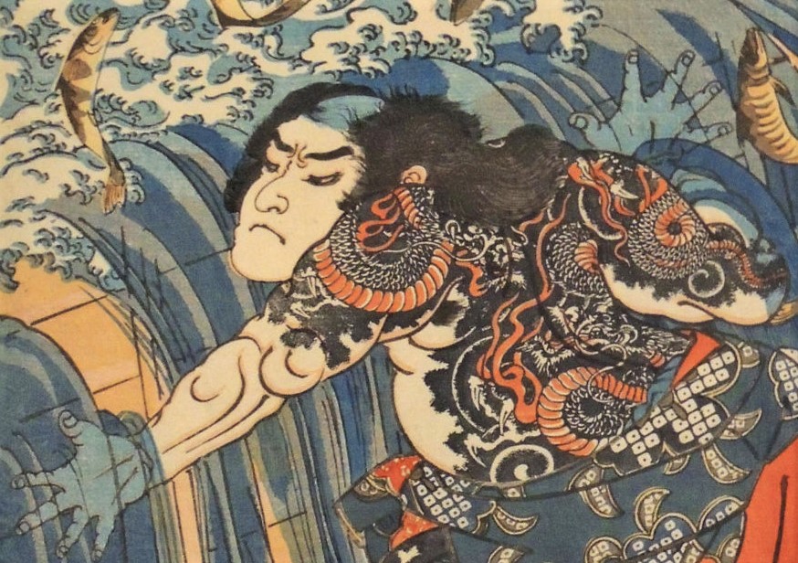
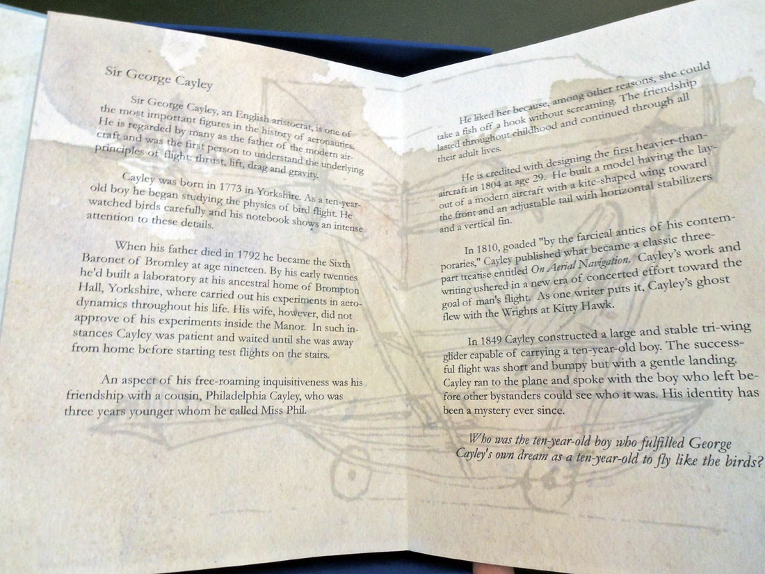
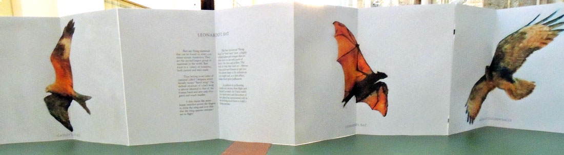
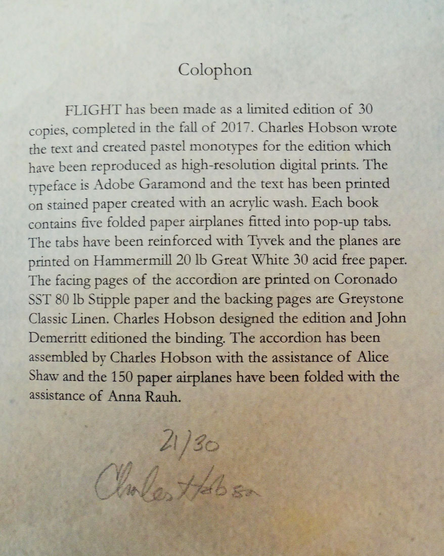
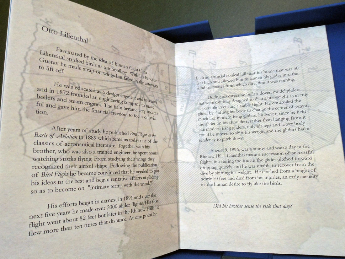
One of the rarest festival books of the 16th century

Detail

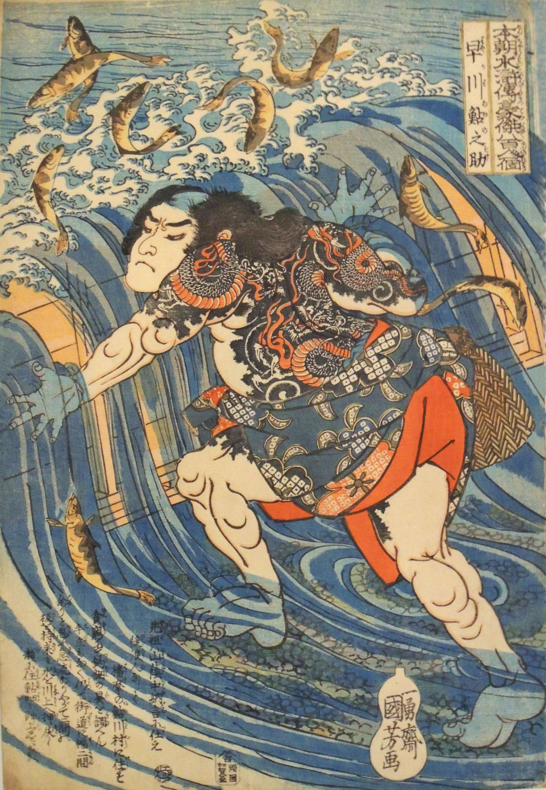
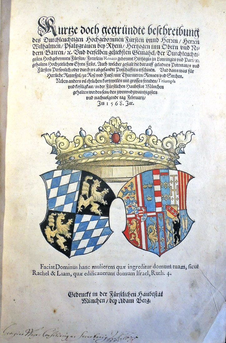
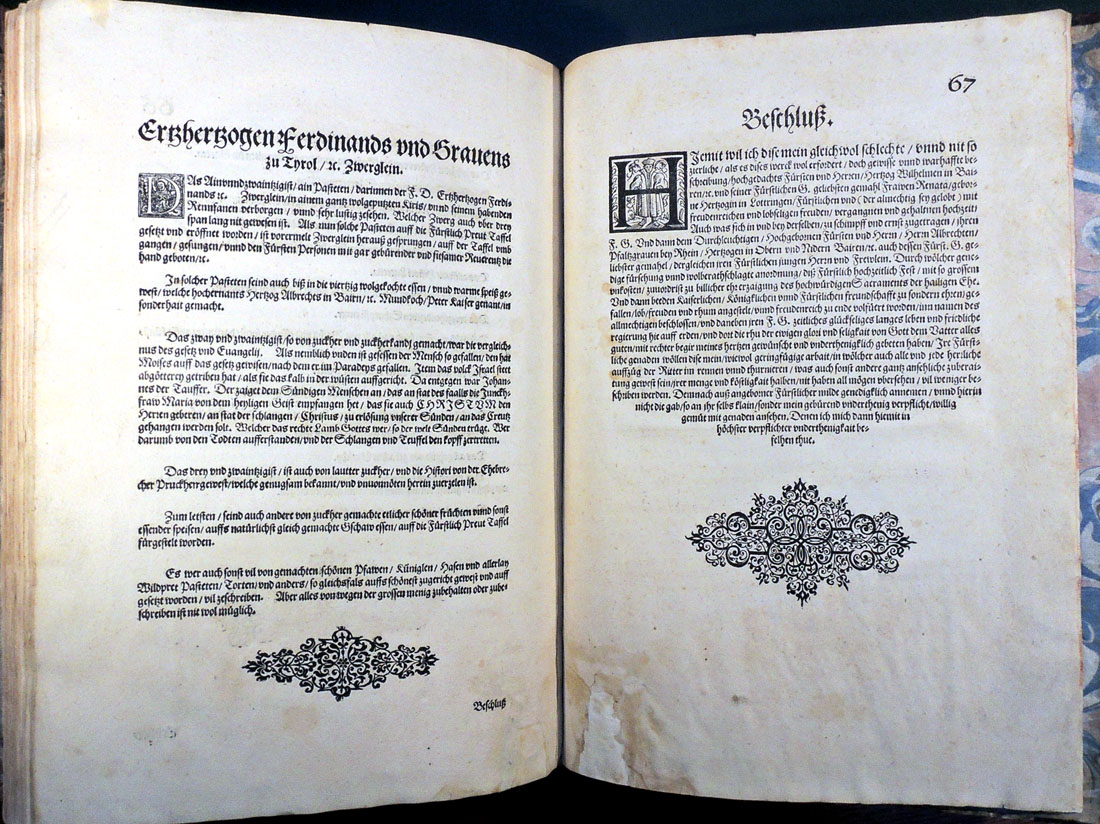
Hanns Wagner (1522-1590). Kurtze doch gegründte beschreibung des Durchleuchtigen… Fürsten… Wilhalmen Pfaltzgraven bey Rhein Hertzogen inn Obern und Nidern Bairen Und derselben geliebsten Gemahel der… Fürstin… Renata gebornne Hertzogin zu Lottringen… gehalten Hochzeitlichen Ehren Fests… Auch welcher gestalt die darauff geladnen Potentaten und Fürsten Personlich oder durch ire abgesandte Potschafften erschinen. Und dann was für Herrliche Ritterspil zu Ross und Fuess mit Thurnieren Rennen und Stechen. Neben andern vil ehrlichen kurtzweilen mit grossen freuden Triumph und kostlichkait in der Fürstlichen Haubtstat München gehalten worden sein den zwenundzwaintzigisten und nachvolgende tag Februarii Im 1568 Jar 1568. Munich: Adam Berg, 1568. Purchased with funds provided by the Rare Books Division, Marquand Art and Archeology, and the Graphic Arts Collection. Rare Books (EX) 2017- in process


This remarkable Bavarian fête book, considered to be one of the rarest, most significant, and most lavish festival books of the sixteenth-century, has been acquired by Rare Books and Special Collection at Princeton University Library.

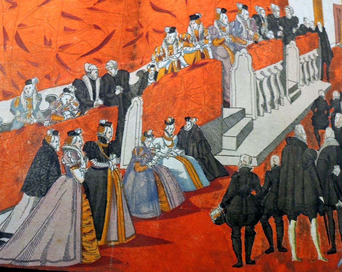
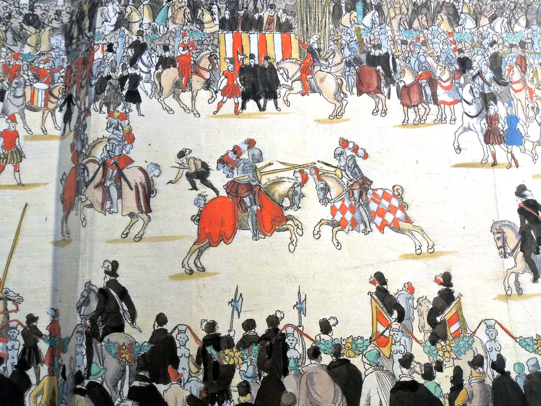
The fourteen hand-colored engravings were designed by Nicolaus Solis (1542-1584), most signed with his monogram. “Il paraît certains que l’N et l’S entrelacés donnent le monogramme, non pas de Nicolas Schinagel, comme quelques-uns le croient, mais de Nicolas Solis, frère [sic] de célèbre Virgile Solis; et ce qui semble le confirmer, c’est que cet artiste travaillait à la cour de Guillaume V de Bavière” (Vinet 705). The artist was only twenty-six when he undertook the commission.

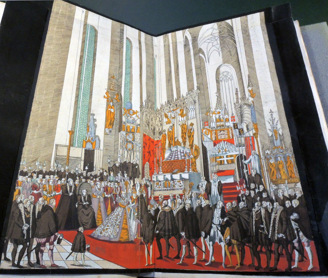
A facsimile of the beginning folding plate is included with this volume. Only five copies in the world have that engraving and it has been noted that finding a complete copy is near impossible: “C’est un des plus rares, et l’un de ceux qui peuvent le mieux servir à vous donner l’idée des coutumes et des plaisirs de Allemagne princière au XVIe Siècle” (Vinet 705). Three of the tournament engravings were supplied from another copy.

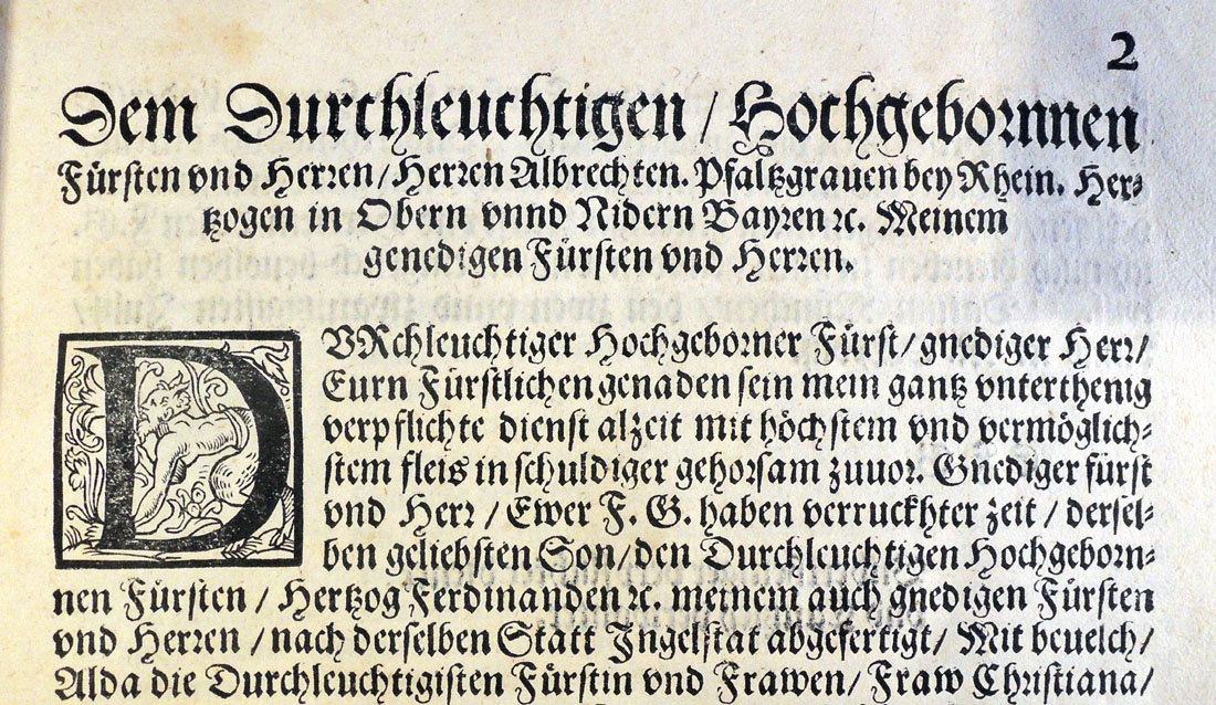
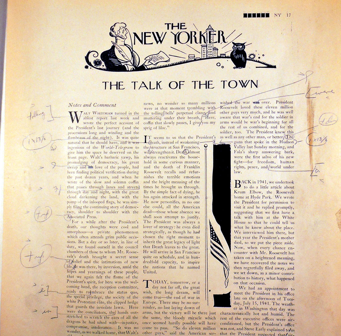
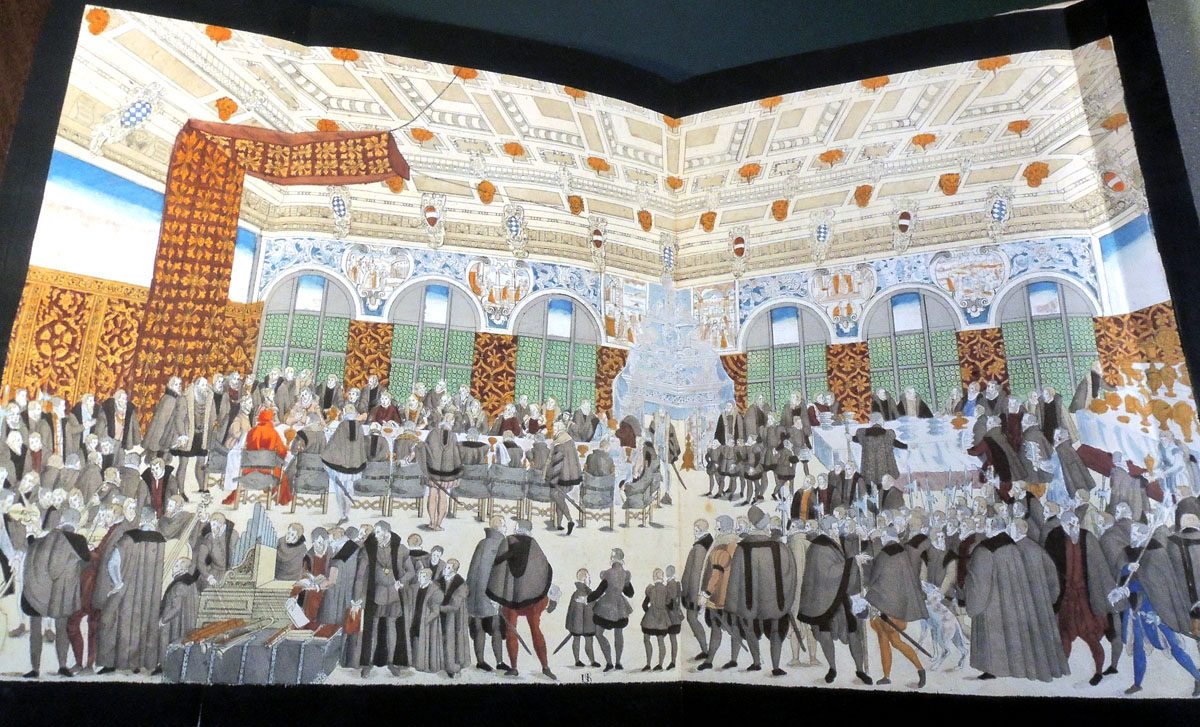
Solis’s enormous folding plates record festival scenes at the Court of Wilhelm V, Duke of Bavaria (1548-1626) staged for his marriage to Renée, Duchess of Lorraine (1544-1602) in February 1568. The celebration lasted eighteen days with performances, games, and tournaments said to include approximately 5,000 riders. Music was composed by Orlande de Lassus. The book was completed with remarkable speed, finished before the end of the year.
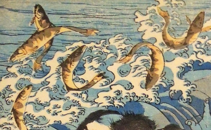
Detail


Provenance: “Georgius Wager, Consiliarigae Secretarig. Ag. 1675” inscribed in brown ink at foot of title; Pierre Berès, his sale, Paris; Pierre Bergé, 16 December 2005, lot 263.

References: Lipperheide 2553. Ruggieri 933-4. Vinet 705. Cicognara 1380 (“Questo è il più raro epiù prezioso libro che conosciamo, specialmente in quel secolo, in material di feste” in 1821). Andresen II, 90-94, No. 31-45.

Hayakawa Ayunosuke

Detail of Hayakawa Ayunosuke’s tattooed back and arms

Utagawa Kuniyoshi 歌川国芳 (1797-1861), Hayakawa Ayunosuke 早川鮎之助 from the series Honcho Suikoden goyu happyakunin no hitori 本朝水滸傳豪傑八百人一個 (One of the Eight Hundred Heroes of the Water Margin of Japan), 1830-32. Color woodblock print. Oban tate-e. Graphic Arts Collection GAX 2017- in process

According to Sarah Thompson’s new book Tattoos in Japanese Prints, “the first Japanese translation of Water Margin (known as Suikoden) was published in parts from 1757 to 1790 and inspired several versions of the story set in Japan. Kuniyoshi’s prints of the late 1820s, however, were based on a more recent work, a new translation by the best-selling writer Kyotutei Bakin (1767-1849).” [Princeton has Suiko gaden (Tōkyō: Yūhōdō, Taishō 6 [1917]). Annex A, Forrestal J5880/4790 v.103-106.]

Utagawa Kuniyoshi added to the four heroes described in the book with tattoos and created eleven additional tattooed heroes. Thompson notes “The great success of Kuniyoshi’s first Water Margin series not only inspired tattoo artists but also made the genre of warrior prints, formerly a minor theme, one of the major categories of subject matter for print designers.”

One of these heroes is Hayakawa Ayunosuke, seen here damming the Ayukawa River in order to catch fish. He was one of the Ten Brave Retainers of Amago, who worked to restore the fortunes of the Amago clan after the civil wars of the 16th century.

This is an early edition of the print, with the seal of Kagaya Kichibei of Ryōgoku at the bottom, left of center. Popular demand led to many later editions.

Sarah Thompson is the assistant curator of Japanese prints at the Museum of Fine Arts, Boston.

Save the date for Thompson’s visit to Princeton University on Friday afternoon, April 6, 2018, when she will deliver the second Gillett G. Griffin Memorial Lecture.

Joel Shapiro and Hart Crane

In 1916, Hamilton Easter Field (1872-1922) expanded the Ardsley School of Graphic Arts to include three buildings, 106-110 Columbia Heights, at the base of the Brooklyn Bridge. Many artists and writers were invited to stay with the Fields over the years and even when Hamilton died suddenly in 1922, many of the rooms continued to be used for temporary housing. Hart Crane (1899-1932) stayed there in the 1920s and was inspired by his view of the bridge. The rest is history. https://graphicarts.princeton.edu/2017/01/16/ardsley-studios/

Now eighty-seven years after Crane’s poem “The Bridge” was first published, Arion Press released a new edition with seven woodblock prints by sculptor Joel Shapiro. The Graphic Arts Collection received its copy today. It is an ambitious and innovative project, so I will quote from their prospectus, which can be read in full here: http://www.arionpress.com/catalog/images/110/Bridge-Prospectus.pdf

The edition also includes a specially commissioned essay on the poem by Langdon Hammer, Niel Gray, Jr. Professor of English & Department Chair, Yale University, in a separate bound volume. An article adapted from this essay can be read in The New York Review of Books: http://www.nybooks.com/daily/2017/11/24/hart-cranes-view-from-the-bridge/

The publisher, Andrew Hoyem, conceived of a scroll format for “The Bridge” while he and senior editor Diana Ketcham were on a two-week tour of China in April 2017 organized by the Grolier Club, an association of bibliophiles in New York City. The theme of the trip was the history of paper, type, printing, binding, and the collecting of books, both private and institutional, in China.

During the first week they visited the Red Star Paper Company in Wuxi, Anhui Province. The Chinese government has recently sought to revive and support traditional crafts. Red Star is the fore-most producer of handmade paper in the nation, using ancient methods and many plant fibers in exacting proportions to make sheets of beautiful thin paper, used mainly for calligraphy and ink and watercolor painting.

In Beijing they visited the most important book collector in China, who showed them an unmounted scroll from the eighth century. Hoyem was inspired to order handmade paper from the mill and to make “The Bridge” in a single-spool scroll format. The book is 13½ inches tall and over 50 feet long, made up of joined sheets measuring 13½ by 25 inches.

Our book is no. 117 of 300. It is interesting to note that Hoyem handset the long poem himself because typesetters on staff were busy with other projects.

“The type he chose is French Elzevir, 16-point for the text, 24-point for titles, and 10-point for subsidiary material. It is based on a modernized French oldstyle, cast by American Typefounders in the early twentieth century, purchased by the San Francisco printer John Henry Nash as new, and then acquired by the Grabhorn Press in the 1930s when Nash went out of business, then inherited by Hoyem in 1973.”

Hart Crane (1899-1923), The Bridge. Woodblock prints by Joel Shapiro, essay by Langdon Hammer, photographs by Michael Kenna (San Francisco: The Arion Press, 2017). “Scroll format, 13-1/2″ x 50′, set by hand and printed by letterpress in black on handmade Chinese paper, with 7 images bound in, presented in a box along with a separate volume containing the introduction.”–Publisher’s website. Graphic Arts Collection GAX 2017- in process

Isadora Duncan

Margaretta Mitchell, Dance for Life: Isadora Duncan and Her California Dance Legacy at the Temple of Wings (Berkeley, Calif.: Elysian Editions, 1985). Copy 23 of 50. Rare Books: Theatre Collection (ThX) Oversize GV1785.D8 M57f


This limited edition portfolio includes an illustrated essay along with twelve photogravures of dancers inspired by and preserving the legacy of Isadora Duncan (1878-1927). Highlighted is the 1985 Oakland Museum exhibit “Dance For Life: The Bay Area Legacy of Isadora Duncan.” Mitchell’s negative were transferred to copper plates and printed by Jon Goodman in Massachusetts (see also https://graphicarts.princeton.edu/2015/04/09/).

Over many years, Mitchell photographed “women and children dancing in the style of Isadora Duncan at Berkeley’s Temple of Wings. Duncan’s influence is apparent in the flowing costume, the classical open-air setting and the graceful, expressive gestures.

Dance teacher Sulgwynn Boynton Quitzow is the daughter of Duncan’s childhood friend, Florence Treadwell Boynton who shared Duncan’s vision of life lived in harmony with nature and who dedicated the Temple of Wings in 1914 to the ‘democracy and freedom of women.’”


See also: Dorothea Lange, To a cabin [by] Dorothea Lange [and] Margaretta K. Mitchell (New York: Grossman Publishers, 1973). Marquand Library TR654 .L26 1973. Photography of children.

Grids, using straight lines, not-straight lines & broken lines in all their possible combinations

With sincere thanks to the Laura P. Hall Memorial Fund and the Hall Fund committee through the Department of Art & Archaeology, the Graphic Arts Collection has acquired this rare bound collection of etchings by Sol LeWitt (1928-2007).

The Museum of Modern Art digitized the entire volume here,  but the beauty of the ink on paper can really only be appreciated with the original. We anticipate this volume will be on exhibit in the Princeton University Art Museum during 2018. More information on that coming.


Sol LeWitt, Grids, Using Straight, Not-Straight, and Broken Lines in All Vertical & Horizontal Combinations (New York: Parasol Press, 1973). 28 etchings, bound as a book, with slipcase. Image Size:10⅝ x 10⅝ inches (27.0 x 27.0 cm); Paper Size:11 x 11 inches (28.0 x 28.0 cm). Edition of 25. Printed by Kathan Brown at Crown Point Press, Oakland, California. Catalogue raisonné 1973.03. Purchased with funds provided by the Hall Fund. Graphic Arts Collection GAX 2017- in process.
1. Straight/Straight
2. Straight/Not-straight
3. Straight/Broken
4. Straight/Straight, Not-straight
5. Straight/Straight, Broken
6. Straight/Not-straight, Broken
7. Straight/Straight, Not-straight, Broken
8. Not-straight/Not-straight
9. Not-straight/Broken
10. Not-straight/Straight, Not-straight
11. Not-straight/Straight, Broken
12. Not-straight/Not-straight, Broken
13. Not-straight/Straight, Not-straight, Broken
14. Broken/Broken
15. Broken/Straight, Not-straight
16. Broken/Straight, Broken
17. Broken/Not Straight, Broken
18. Broken/Straight, Not-straight, Broken
19. Straight, Not-straight/Straight, Not-straight
20. Straight, Not-straight/Straight, Broken
21. Straight, Not-straight/Not-straight, Broken
22. Straight, Not-straight/Straight, Not-straight, Broken
23. Straight, Broken/Straight, Broken
24. Straight, Broken/Not-straight, Broken
25. Straight, Broken/Straight, Not-straight, Broken
26. Not-straight, Broken/Not-straight, Broken
27. Not-straight, Broken/Straight, Not-straight, Broken
28. Straight, Not-straight, Broken/Straight, Not-straight, Broken

Egypt in photogravure

“Fred Boissonnas (1858-1946) was invited to Egypt in 1929 by King Fuad I to take photographs for the lavish publication L’Egypte (1932), and he returned to complete his Egyptian journey in 1933. During the later trip he embarked on a photographic expedition to Mount Sinai, following the route of the Israelites as recorded in the book of Exodus, and photographing the traditional biblical sites that he encountered on his journey. This work became the book project he never finished.”–Boissonnas in Egypt

Frédéric Boissonnas (1858-1946), Égypte; avec la collaboration de Gustave Jéquier, Pierre Jouguet, Henri Munier … [et autres]. Edition: 337 (Genève: Paul Trembley, 1932). “Sout la haut patronage et avec l’appui de sa Majesté Fouad 1er roi d’Egypte.” Marquand Library (SAX) Oversize DT47 .B64 1932e


Swiss photographer François-Frédéric Boissonnas (1858-1946) was 71 years old when he received the commission from the King of Egypt and Sudan, but he was up to the task having already produced two dozen books of photographs.

L’Egypte, which was published in 1932, is a fascinating example of the art of nation-branding. Royal patronage gave Boissonnas free rein to go where he wanted (only Tutankhamun’s mummy remained out of bounds due to stipulations from Howard Carter’s editors) . . . The book featured essays on the glory days of the pharaohs, on the Greeks, Romans and Copts, and the medieval period when Islamic culture flourished. The Ottoman Empire got a brief mention (King Fuad’s ancestor was a renegade commander who seized power from the Sultan at the beginning of the 19th century) but the British protectorate was conspicuously absent. This was soft power at its most sophisticated.” –Fleur Macdonald, “The Swiss Photographer Who Rebranded Egypt,” The Economist (November 8, 2017).

The typography for this luxury publication was by the Paris firm of Ducros et Colas and the photogravures were printed in Paris by Leblanc and Trautmann (who were also Pablo Picasso’s printers). The entire edition was printed on a special handmade paper by Van Gelder of Amsterdam and each book bound in full parchment with gold ornaments and color by Jacques Wendling.

This is Boissonnas’s portrait of Fuad I (1868-1936) King of Egypt and Sudan, Sovereign of Nubia, Kordofan, and Darfur.


If you are in London over the winter holidays, you can visit the exhibition “Boissonnas in Egypt” at the Saint Catherine Foundation. We have already missed the November conference. To learn more, see: https://www.saintcatherinefoundation.org/boissonnas-in-egypt


See also his many other books, most in rotogravure (that is, printed with a screen, not continuous tone images).

Holiday Feasting

One hundred and ninety-three years ago, Charles Williams (active 1797-1850) etched a set of four caricatures called Feasting or Feasting Scraps ridiculing December holiday dinner parties. The set was published by S.W. Fores on December 15, 1824 but still seems timely.

In the print titled “A Pic Nic,” a family gnaws bare bones at a table covered with a ragged cloth.  Note the stand-off between the starving cat and dog. The poem reads:
On meagre fare the humble Curate’s fed;
Severe his labour—dearly earned his bread.
Tho all the duty on his shoulders fall
A paltry Thirty Pounds a Year his all.


“A Tuck Out” features a well-fed family attended by three liveried footmen, feasting on a sucking-pig, possibly a pheasant, and other dishes. Dorothy George was able to identify the picture on the wall as “Balthezar’s [sic] Feast”. This poem reads:
But see the bloated Vicars gaudy state,
Profusion surfiets, pamper ‘d menials wait;
Preaches Humility, his practice pride
Lived like an Infidel, and so he died.


At the dinner for “A Burster”, we can spot a large tureen of soup, pheasant, hare, pig, sausages, wine, and a painting of a frog looking at an ox. The poem reads:
A greasy chin the Aldermans delight
Their stomachs quite prepaid since yesternight
Anticipating, Turtle, Venison, Jellies,
To Cram, to Gorge nay e’en to burst their Bellies.


The final scene, “A Gorge” shows seven fox hunters (their caps are hung on the antler coatrack) drunk and partying. The two servants can barely keep up and their hounds are already falling asleep. Their poems reads:
See l’Esquire seated, at the festive board,
His Tenants squeez’d to satiate their lord,
Who squanders all in riot and excess,
His Family leaves in Want and deep distress.

**Williams also drew under the pseudonyms Argus; C. Lamb; Ansell; Tom Truelove; Timothy Squib and others. He should not to be confused with the American caricaturist William Charles.

Who edits E. B. White?

E.B. White (1899-1985) began submitting copy to The New Yorker in 1925 and joined the staff the following year. Each issue began with his “Comments” and for the April 21, 1945 issue [seen above], he wrote about the death of Franklin Delano Roosevelt.

“Today, tomorrow, or a day not far off, the great wish, the long dream, will come true—the end of the war in Europe. There may be no surrender, no last laying down of arms, but the victory will be there just the same, the bloody miracle which once seemed hardly possible will have come to pass.” While this section was printed as he wrote it with no editing, there were multiple corrections to the rest of the piece.

Above: Proof number one. Below Foundry proof with an OK to print.


The Graphic Arts Collection recently acquired The New Yorker magazine’s foundry book for the April 21, 1945 issue, which includes the copy edits and proofs for the entire magazine. It is a unique and informative resource in the history of this magazine and for mid-twentieth-century publishing in general.

Each page has several printed versions, as the proofs are marked up and the type is reset. It is not clear whether White is reading and proofing his own copy or whether a staff editor is suggesting these changes. The hand is the same throughout the issue, even making corrections to the cartoons.

This issue also includes a story by John Cheever, pieces by Edmund Wilson, a James Thurber cartoon, and much more. Few pages escaped changes and many are heavily edited.


Near the end of his life, E.B. White was interviewed by George Plimpton and Frank H. Crowther for the Paris Review where he commented,

“I do feel a responsibility to society because of going into print: a writer has the duty to be good, not lousy; true, not false; lively, not dull; accurate, not full of error. He should tend to lift people up, not lower them down. Writers do not merely reflect and interpret life, they inform and shape life.” — “Art of the Essay,”  Paris Review 12 (Fall 1969): 65-88.


The advertising must have been proofed before it arrived at the magazine, most pages have only the foundry proof.

View of the World from Nassau Street


_____________________________________________________

In his “Rally ‘Round the Cannon” column published January 19, 2010, Gregg Lange ’70 recounts how two students produced one of Princeton Alumni Weekly’s most memorable covers. Now thanks to Colleen Finnegan at the PAW, the Graphic Arts Collection acquired a copy of this homage to Saul Steinberg (1914-1999) and his iconic March 29, 1976 design for The New Yorker, known as “View of the World from 9th Avenue.” Only five years later, Rob Smiley ’80 and Jim Ryan ’82 re-imagined a “View of the World from Nassau Street,” for the pre-reunion May 4, 1981 issue of the Princeton Alumni Weekly.


Reproduced as a 23 x 30 inch full color poster, Smiley’s design highlights various Princeton clubs across the country along with Mount Princeton in the Sawatch Range of the Rocky Mountains southwest of the Town of Buena Vista in Chaffee County, Colorado. The Garden Theater, Princeton Historical Society, and local pancake house are a few of the landmarks seen on Nassau Street.


In 2005, Steinberg’s cover design was voted no. 4 by the American Society of Magazine Editors’ list of the 40 greatest magazine covers of the last 40 years. See all 40 at: http://www.magazine.org/asme/magazine-cover-contests/asmes-top-40-magazine-covers-last-40-years


Flight: Tales of the Urge to Fly from Daedalus to Lilienthal

Charles Hobson, Flight: Tales of the Urge to Fly from Daedalus to Lilienthal (San Francisco: Pacific Editions, 2017). Contents: Daedalus’s Golden Eagle — Leonardo’s Bat — Cayley’s Red Kite — Le Bris’s Albatross — Lilienthal’s Stork. Copy 21 of 30. Graphic Arts collection GAX 2017- in process.

“FLIGHT has been made as a limited edition of 30 copies, completed in the fall of 2017. Charles Hobson wrote the text and created pastel monotypes for the edition which have been reproduced as high-resolution digital prints. The typeface is Adobe Garamond and the text has been printed on stained paper created with an acrylic wash. Each book contains five folded paper airplanes fitted into pop-up tabs. The tabs have been reinforced with Tyvek and the planes are printed on Hammermill 20 lb Great White 30 acid free paper. The facing pages of the accordion are printed on Coronado SST 80 lb Stipple paper and the backing pages are Greystone Classic Linen. Charles Hobson designed the edition and John Dermerritt editioned the binding. The accordion has been assembled by Charles Hobson with the assistance of Alice Shaw and the 150 paper airplanes have been folded with the assistance of Anna Raugh.”–Colophon.

Five fictional messages are found inside the paper airplanes, including one each from Daedalus, Leonardo da Vinci (1452-1519), George Cayley (1773-1857), Jean-Marie Le Bris (1817-1872), and Otto Lilienthal (1848-1896).


“What bird did they watch? As would be expected each aspiring aviator was transfixed by the flight of a bird. The bird in each case, was different. In the following pages the bird that captivated the man is pictured and the details about its species have been described.”–Page [1] of the facing pages of the accordion.