Monthly Archives: September 2013

Voyages au Soudan oriental et dans l’Afrique septentrionale

tremaux voyage1
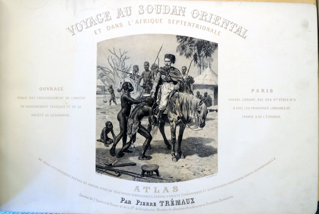
Pierre Trémaux, Voyages au Soudan oriental et dans l’Afrique septentrionale, exécutés de 1847 à 1854: comprenant une exploration dans l’Algérie, les régences de Tunis et de Tripoli, l’Égypte, la Nubie, les déserts, l’île de Méroé, le Sennar, le Fa-Zoglo, et dans les contrées inconnues de la Nigritie (Paris: Borrani, [1852-1858]). Purchased with funds provided by the Friends of the Princeton University Library, Rare Book Collection, and Graphic Arts Collection. GAX 2013- in process
tremaux voyage3
Pierre Trémaux is not well known but holds a place in the history of illustrated books for publishing one of the first photographically illustrated travelogues. North Africa, Egypt in particular, was one of the earliest destinations for European photographers and one of most frequently represented subjects. By autumn 1839 the daguerreotypist Frédéric Goupil-Fesquet was in Egypt, together with the painter Horace Vernet, gathering material for their travelogue Voyage d’Horace Vernet en Orient (1843). The first extensive survey was completed by Joseph-Philibert Girault de Prangey in 1842-43 covering Asia Minor, Syria, Egypt, Palestine, and Greece. None of the early publications of these trips included actual photographs.

tremaux voyage16   tremaux voyage15

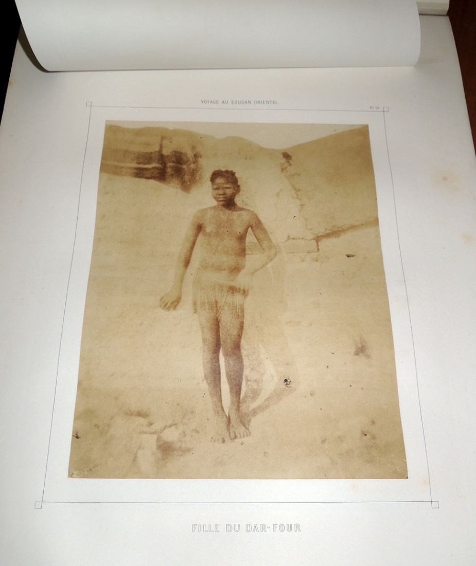
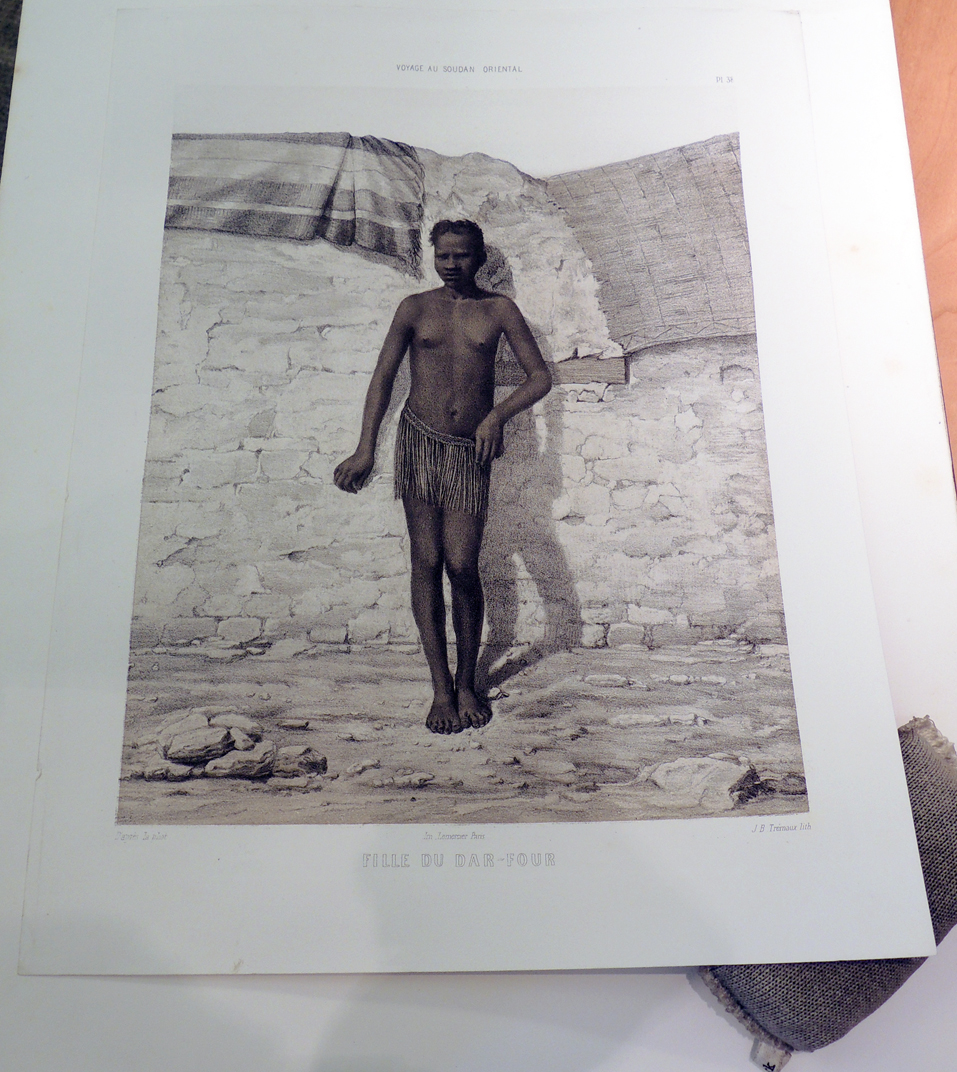
As an architect interested in urban planning, Pierre Trémaux traveled to Algeria, Tunisia, Upper Egypt, Eastern Sudan and Ethiopia beginning in 1847 (preceding Maxime Du Camp by two years and Félix Teynard by four years). At first, he made drawings and daguerreotypes as the basis for lithographic illustrations but wished to publish a more authentic record of the African culture. On the second expedition, he brought a camera and chemistry to create calotypes of the people, buildings, and landscape of in Libya, Egypt, Asia Minor, Tunisia, Syria, and Greece. A third and final expedition included both photographs and sketches. Trémaux published an account of his travels in parts from 1852 to 1858.

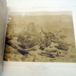
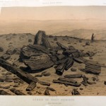
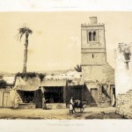
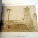
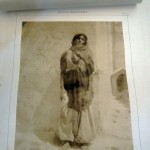
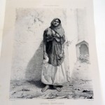
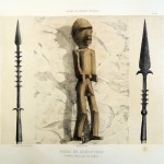
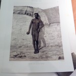
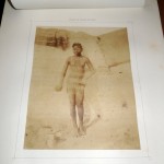
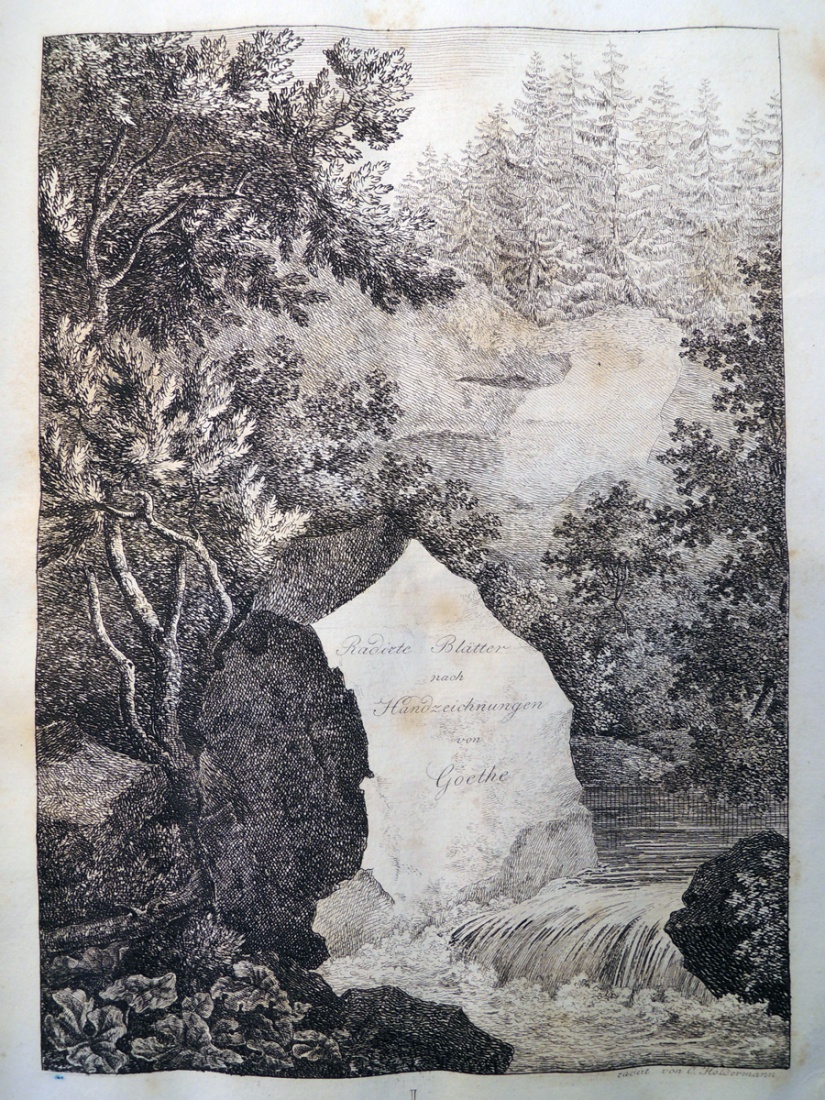
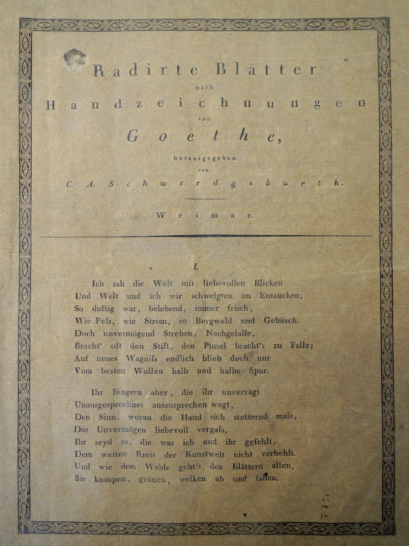
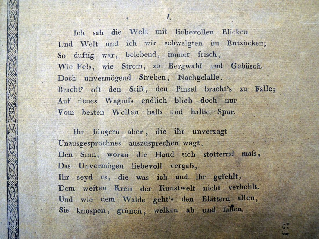
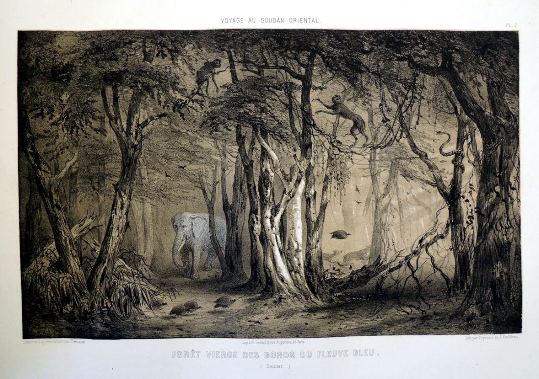
It is with the publication of Voyage au Soudan oriental et dans l’Afrique septentrionale exécutés en 1847 à 1854 that the photographically illustrated travel book begins. In this folio, Trémaux made paper photographs and then, for each one also had lithographs created. The two are bound together so the reader has the authenticity of the photograph–thought to be a truthful document–along with the more robust image of the drawn lithograph. This took a tremendous amount to time and money but demonstrations the importance given to the publication at that time.

The book is included in the catalogue for the Grolier exhibition The Truthful Lens, where it is noted that the artist signed his plates, “Trémaux lithophot. Precédé Poitevin,” referring to Alphonse-Louis Poitevin, a French engineer who is credited with developing photomechanical processes such as photolithography in the 1850s. The entry goes on to mention that copies vary greatly, such as the one at The Avery Library, Columbia University, which has 58 photolithographs, but no calotypes.

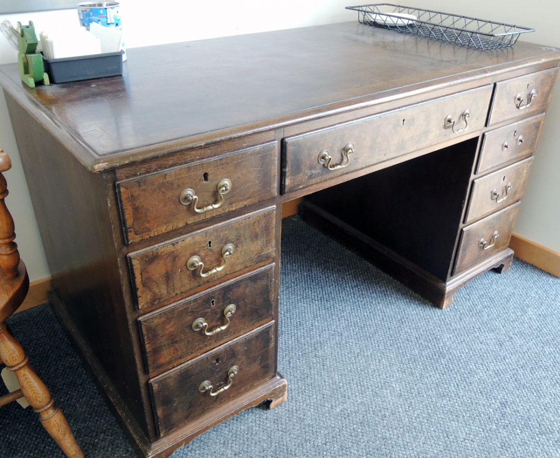
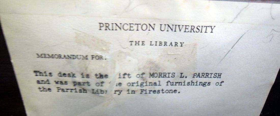
Special thanks to the Friend of the Princeton University Library and Steve Ferguson, Rare Book Division, for making this acquisition possible.


Wessobrunn prayer

clm 22053

Bayerische Staatsbibliothek. [Handschrift des Wessobrunner Gebets]. [Munich, Kurt Wolff Verlag, 1922]. Graphic Arts Collection (GA) 2006-3082N

The Wessobrunn Prayer, sometimes called the Wessobrunn Creation Poem (Wessobrunner Gebet), believed to date from around 790, is among the earliest known poetic works in Old High German. Princeton University Library holds three copies of this 1922 facsimile edition of the manuscript. The one in graphic arts comes to us from the collection of Elmer Adler.

clm 22053e

Written in a Bavarian dialect, the poem is named after Wessobrunn Abbey, a Benedictine monastery in Bavaria. For centuries it was the repository of the manuscript, which is now in the Bavarian State Library in Munich.

clm 22053dBound in a facsimile leather binding, the volume is blind-stamped with brass bosses & wooden peg in leather clasp. Ours comes with Die handschrift des Wessobrunner Gebets; Geleitwort zu der faksimile-ausgabe von A. von Eskardt, von Carl von Kraus (Munich: Kurt Wolff Verlag, 1922). The 1923 edition at Marquand Library includes an English language translation.

clm 22053c
clm 22053b
clm 22053f

Livres du poètes

cortege3
Beginning with Voir Nicolas de Stael in 1953, the French poet Pierre Lecuire (born 1922) created and published over 30 books in collaboration with visual artists. Number six was the spectacular Cortège (Procession), with 25 designs from papiers collés (paper cutouts) by Andre Lanskoy (1902-1976) and pochoir color by Maurice Beaufumé (Graphic Arts Collection GAX 2003-0040F).

cortege2
Lecuire insisted that he was not creating livres d’artistes (artist’s books) or livres de peintres (painter’s books) but livres du poètes or poet’s books. He said, “I make poets’ books with painters.”

He took control over all aspects of the production of his books, including paper, font, and the medium of the images. It was Lecuire, for instance, who suggested to the Russian-born artist Andre Lanskoy that he work in papiers collés or cut paper, similar to what Henri Matisse (1869-1954) used when creating is 1947 masterpiece Jazz. While Matisse worked with the pochoir studio of Edmond Variel to be sure the color was exact, Lecuire work with the studio of Beaufumé to do the same.

cortege5                    cortege4

Beaufumé’s studio began in the 1930s when he colored, among other things, a number of books for Francis Meynell and the Limited Editions Club, including several volumes of The Comedies, Histories & Tragedies of William Shakespeare (1939-1940). But in 1940, the artist was drafted and the printing and coloring of the series was moved to New York.

Printed in a huge font by Marthe Fequet and Pierre Baudier, the text of Cortège begins: [rough translation] “This book is a procession. It has its colors, action and animation. It blazes, it proclaims one knows not which passion, which justice; it flows like the course of a navigation….”

cortege1

See also: Henry Bouillier and Astrid Ivask, “Pierre Lecuire or the Poem in Majesty,” World Literature Today 62, no. 1 (Winter 1988): 14-22.

See also: Pierre Lecuire (born 1922), Livres de Pierre Lecuire. [Catalogue] Édité … à l’occasion de l’exposition Livres de Pierre Lecuire au Centre national d’art contemporain … du 26 janvier au 12 mars 1973 ([Paris: Centre national d’art contemporain, 1973]). Graphic Arts Collection (GA) NC980 .L37


Preserving the Past for Future Generations

ga room12After a long week of moving, and with much thanks to the help of dozens of staff members, the Graphic Arts Collection is finally back together in a new, temporary space on the first floor of Firestone Library. It is thrilling to have our material back in one place. The doorbell is working and we are open for business. Have a good weekend.

ga room15
ga space16
ga room16
ga room11
ga room17

Specimens of Paper with Different Water Marks, 1377-1840

specimens of paper12

1593 unicorn watermark

specimens of paper8


specimens of paper3

1377 griffin watermark

specimens of paper4

During the 1952-53 fiscal year, a unique collection of nearly 400 specimens of European papers with different watermarks (1377-1840) was acquired for the Graphic Arts Collection, at the suggestion of Elmer Adler (1884-1962) with a fund turned over to the Library by the Friends of the Princeton University Library (FPUL). Adler must have been a good negotiator, talking rare book dealer Philip Duschnes down from $350 to $300.

The album was elaborately created with sheets of many shapes and sizes bound in various layers, with a brief description written at the top of each sheet. I have included the front matter pinned to the endpapers.

specimens of paper1

Originally in the collection of Dawson Turner (1775–1858), the auction catalogue description reads: ’Watermarks on Paper. A very curious collection of upwards of three hundred and seventy specimens of paper with various Watermarks, for A.D. 1377 to A. D. 1842, collected with a view to assist in ascertaining the age of undated manuscripts, and of verifying that of dated ones, by Dawson Turner, Esq. and bound in 1 vol. half calf.’

See also: Catalogue of the Remaining Portion of the Library of Dawson Turner, Esq., M.A., F.R.S., F.S.A., F.L.S., etc., etc. formerly of Yarmouth: which will be sold by auction by Messrs. Puttick and Simpson … Leicester Square … on Monday, May 16th, 1859, and seven following days (Sunday excepted). [London, 1859], item 1523.


specimens of paper2
apecimens of paper8

specimens of paper6  apecimens of paper5
specimens of paper5

Specimens of Paper with Different Water Marks, 1377-1840. 1 v. (unpaged); 40 cm. 371 specimens of watermarked paper, together with brief descriptions of each in a mid-nineteenth century ms. hand. The specimens are mainly blank leaves, though some leaves feature writing and letterpress. Specimen 334 is stamped sheet addressed to Dawson Turner (1775-1858), Yarmouth. Purchased with funds from the Friends of the Princeton University Library. Graphic Arts: Reference Collection (GARF) Oversize Z237 .S632f

specimens of paper9

Dawson Turner may have seen a goat, but this is a definitely a Unicorn, specifically a “bearded unicorn”, with its horn removed by Victorian scissors. The date c.1440 is almost certainly wrong; a much more plausible date is mid-1470s.
Thanks very much to Paul Needham for the correction.

watermark 4

For comparison, here is an image of a Unicorn precisely of this type used by Caxton, in Bruges, c. 1475.

specimens of paper11

NO, IT IS

14799Kentridge_NL1

NO, IT IS, 2012. Triptych of three flipbook films; HD video shown on 3 flat screens. (c) William Kentridge

The South African artist William Kentridge prepared and delivered the Charles Eliot Norton lectures at Harvard University in 2012. They can be seen here: http://mahindrahumanities.fas.harvard.edu/content/norton-lectures  His exploration of various ongoing multimedia projects evolved into an exhibition, which just opened at the Marian Goodman Gallery in New York City.
http://vimeo.com/56083100

One segment of the show involves the translation of Kentridge’s 2012 flip book NO, IT IS, into a triptych of flip-book films shown on three flat screens, including Workshop Receipts, The Anatomy of Melancholy, and Practical Enquiries.

The Graphic Arts collection is fortunate to hold one of the sold out copies of NO, IT IS, published by Fourthwall Books, Johannesburg. The Refusal of Time, a documentation of the creative process for the work of the same title, shown at Documenta (13), 2012 and published by Xavier Barral, Paris, is available at Marquand Library (Oversize N7396.K46 A4 2012q).

71ms0gmMQZL

William Kentridge: No, It Is (Johannesburg: Fourthwall Books, 2012). Graphic Arts Collection GAX 2012- in process


Goethe mixes poetry with visual art

radierte blatter4

Graphic Arts recently acquired this fragile booklet with six poems by Johann Wolfgang von Goethe (1749-1832) along with six etching after drawings he had made a number of years earlier and chose specifically for this publication. The plates were etched by the theatrical painter Carl Wilhelm Holdermann (active 1820-1840) and by Carl Lieber (active 1820s), a protégé of Goethe and instructor at the Weimar drawing school. The text was printed by Caesar Mazzucchi in Magdeburg, and the portfolio published by Goethe’s friend, Carl August Schwerdgeburth (1784-1878).

radierte blatter2
The project was described by Goethe himself (translated and printed by Antony Griffiths in German Printmaking in the Age of Goethe 1994):

The undertaking of several worthy artists to edit etched plates after my drawings must be welcome to me in more than one sense. As music is welcome to the poet, whereby the musician brings alive his poem for himself and others, so it is a pleasure to see here old long-faded sheets rescued from the stream of Lethe. On the other hand, I have long thought that in the information and account that I have given of my life, drawing is often mentioned, whereby one might not unreasonably ask why, after repeated effort and continuous enthusiasm, nothing that gives any artistic satisfaction has emerged . . . The finest benefit that an art-lover can get from his unachieved strivings is that the society of the artist remains dear and valuable, supportive and useful to him. And he who is not in a position to create himself, will, if he only knows and judges himself wisely, profit from intercourse with creative men, and, if not on this side, at least from another side form and educate himself.

radierte blatter3

Radirte Blätter nach Handzeichnungen von Goethe herausgegeben von C.A.Schwerdgeburth (Weimar: Schwerdgeburth, 1821). 6 etchings after drawings by Goethe . Graphic Arts Collection 2013- in process

With the feeling that these sketches that are now laid before the public cannot entirely overcome their inadequacies themselves, I have added a small poem to each, so that their inner meaning can be perceived, and the viewer might be laudibly deceived, as if he saw with his eyes what he feels and thinks, that is a closeness to the state in which the draughtsman found himself when he committed his few lines to paper (Über Kunst und Alterthum, III, part 3, 1822, pp.142-50).
redierte blatter5

Although Goethe liked to sketch, he noted, “… I was intelligent enough to recognise that I had no talent for the visual arts and that my efforts in this direction were misplaced. In my drawing I lacked sufficient feeling for substantiality. I had a certain fear of letting the objects make their full impact on me; on the contrary, it was the insubstantial and unemphatic elements that appealed to me . . . Nor without constant practice did I ever make any progress; and I always had to start again from the beginning if I had ever dropped my drawing for a while.”

redierte blatter6

Emil Rudolf Weiss

cinamon emil rudolf weiss6
cinamon emil rudolf weiss1Gerald Cinamon, E R Weiss: the Typography of an Artist: Emil Rudolf Weiss: a Monograph (Oldham [England]: Incline Press, 2012. One of 250 copies. Graphic Arts Collection GAX 2013- in process

Graham Moss of Incline Press issued a wonderful survey of work of the German type designer Emil Rudolf Weiß (1875–1942) with a text by Gerald Cinamon. According to the prospectus, when Cinamon was approached to write about Weiss, he was provided with two suitcases full of research material and examples of Weiss’s work, all in German. The folio volume includes numerous tipped in facsimiles along with two small supplements: The Anagnostakis Pocket Guide to Austrian German and Swiss Antiquarian Bookdealers Terminology and E.R. Weiss In Memorium.
cinamon emil rudolf weiss5

Weiss created Art Nouveau designs for books, textiles and furniture, theater sets and costumes, stained glass, and much more. His work came to prominence in 1895 when it was included in Pan magazine (SAX Oversize N3 .P25q) when he also began publishing small editions of his poetry, such as Die blassen Cantilenen (Recap 3496.23.396).
cinamon emil rudolf weiss4

In 1913, Bauersche Giesserei commissioned a font that became Weiss-Fraktur, which was published in a luxurious specimen book (GA Oversize 2006-0820Q). Two other fonts were designed and cast in metal type.

In the 1920s, Weiss was one of the designers selected by Stanley Morison for the binding and endpaper design of The Fleuron: a Journal of Typography (Weiss: no. 5; GAX Oversize Z119 .F62q).

cinamon emil rudolf weiss3

Before

ga room7

The moving of the Graphic Arts Collection, September 2013.

ga room6  ga room4 ga room3

ga room2

Wish us luck.

Parrish comes home

parrish desk
When is a desk more than just a desk? When it belonged to Morris Longstreth Parrish (1867-1944), Class of 1888, extraordinary collector of Victorian literature.

Assistant University Librarian Alexander Wainwright (1918-2000) wrote a wonderful essay about the man and his collection, which was bequeathed to Princeton in 1944 along with the library furniture from Mr. Parrish’s home, Dormy House, in Pine Valley, New Jersey. http://libweb2.princeton.edu/rbsc2/libraryhistory/195-_ADW_on_Parrish.pdf

I learned today that over the years, several of the taller librarians at Firestone Library  complained that the desk was uncomfortable because it allowed for so little “leg room.” After floating around from office to office, it ended up with our colleagues in the Mendel Museum Library. Happily, the desk came back to Firestone today and will reside in the new/temporary graphic arts collection space being organized behind the circulation desk.

I will let you know if I find a Lewis Carroll or an Anthony Trollope in the bottom drawer.

parrish desk2
1944_Parrish_library_Dormy_House