Yearly Archives: 2014

Kandinsky Pochoir

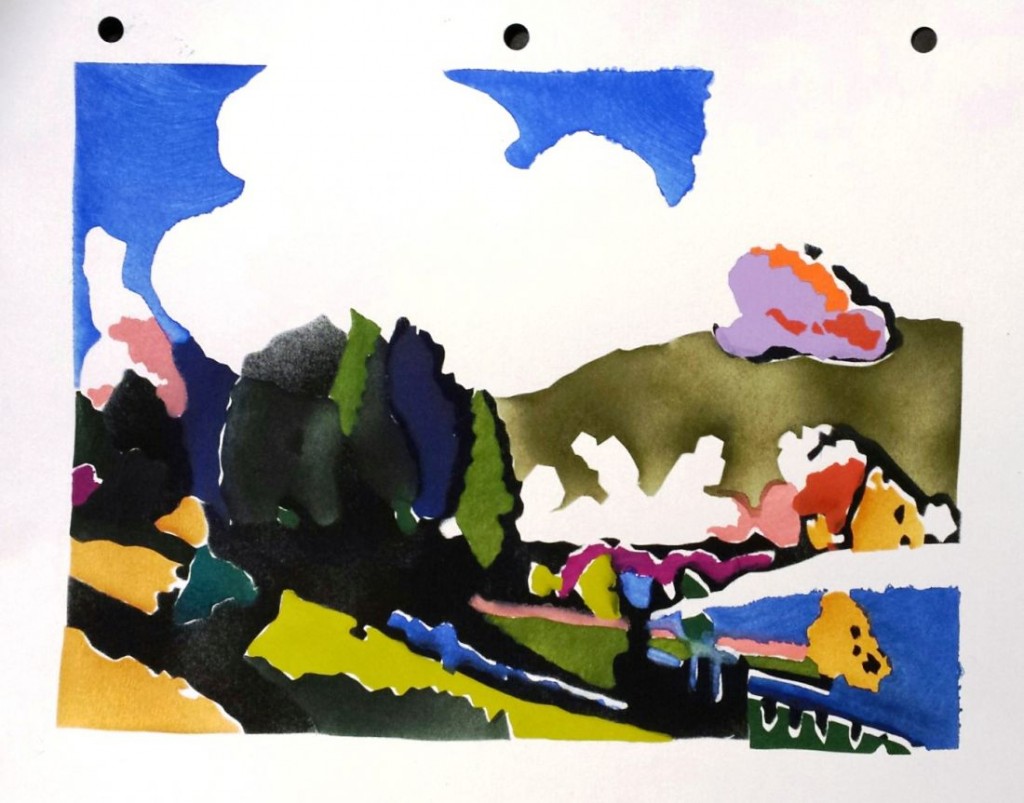
20140927_221308_resizedThis finished pochoir facsimile of a Wassily Kandinsky painting was created in one day by the members of the Frederic W. Goudy workshop: Pochoir à la Française with Kitty Maryatt and Julie Mellby on Saturday September 27, 2014. Held at the Scripps College Press in lovely Claremont, California, the workshop was followed by a banquet and lecture on the history of pochoir from the Renaissance to the present.
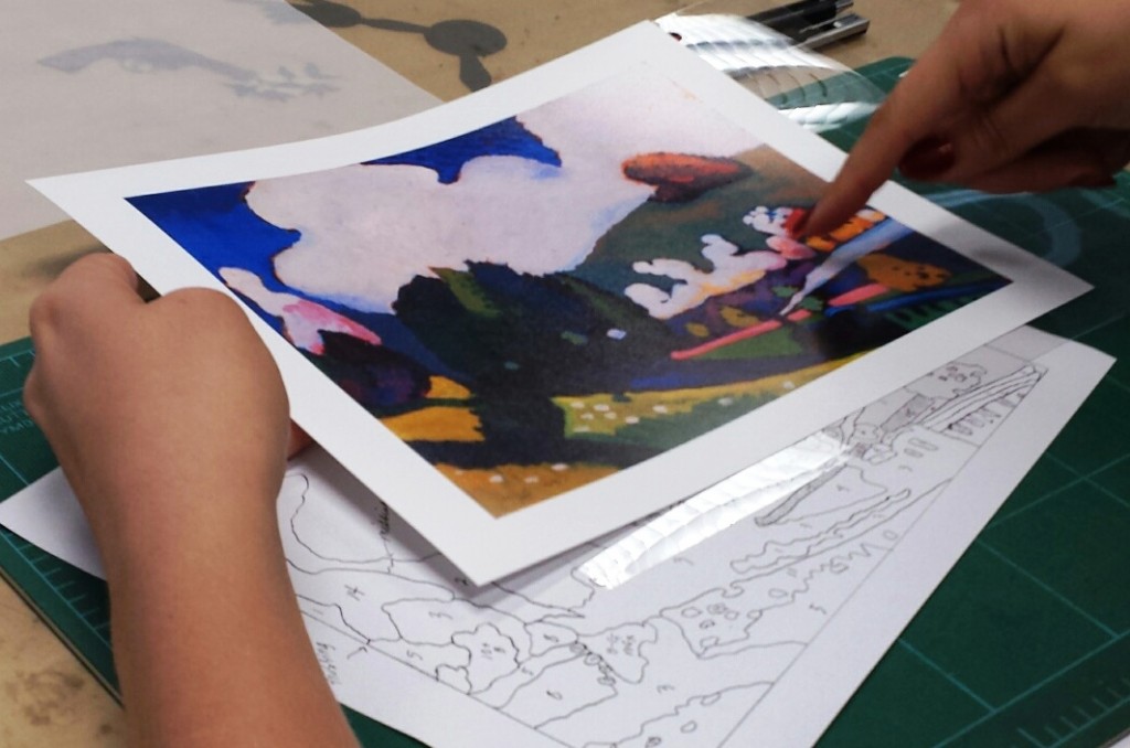
20140927_122717_resized20140927_135755_resizedThanks to Kitty’s the careful preparation, each of the participants spent the morning familiarizing themselves with color separation, a variety of knives, and the cutting of detailed stencils before launching into the Kandinsky.

Fourteen individual colors were identified and analyzed for their relationship with the segments alongside, or in some cases, inside an area.

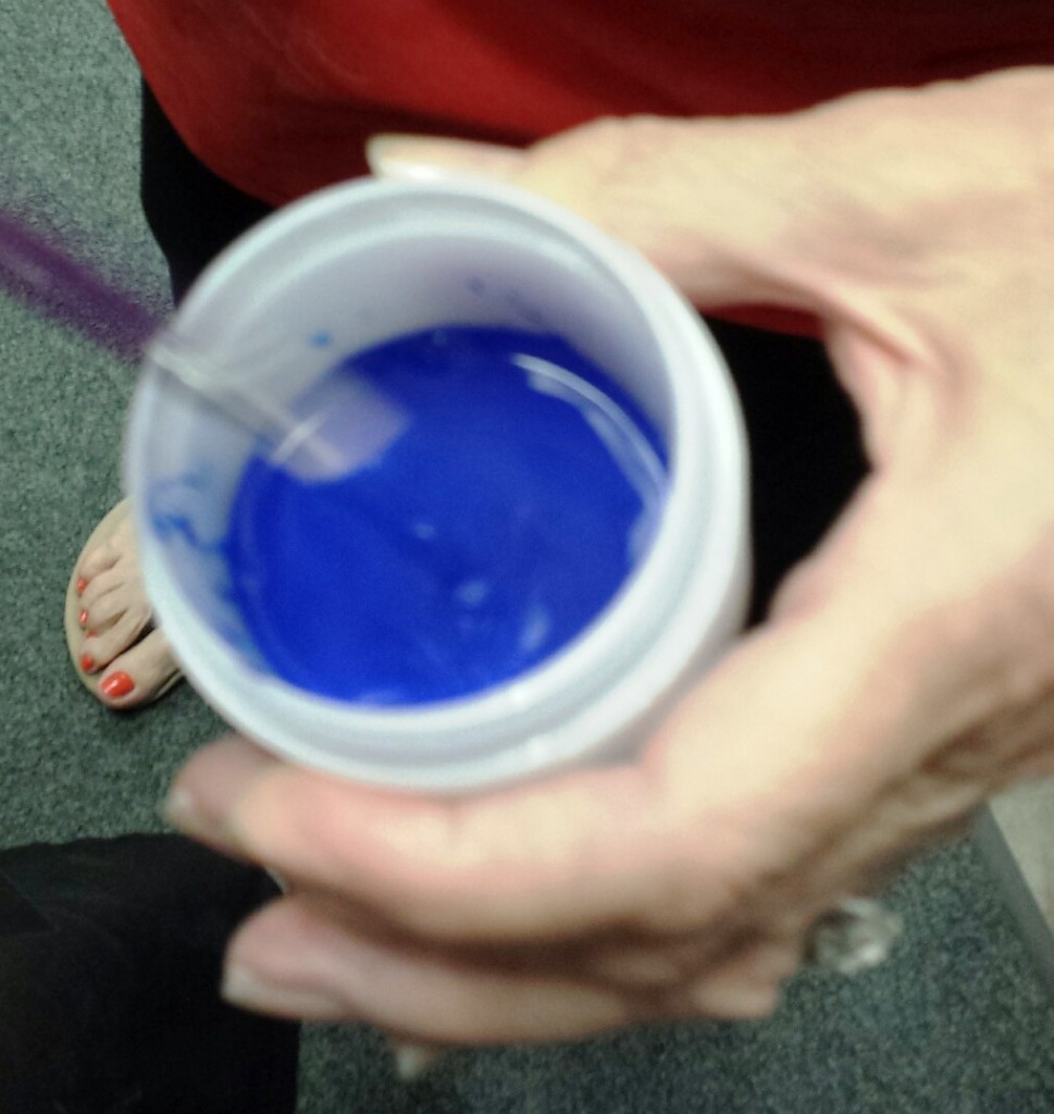
Each person cut the stencil for one color and mixed the paint to match Kandinsky’s color palette.
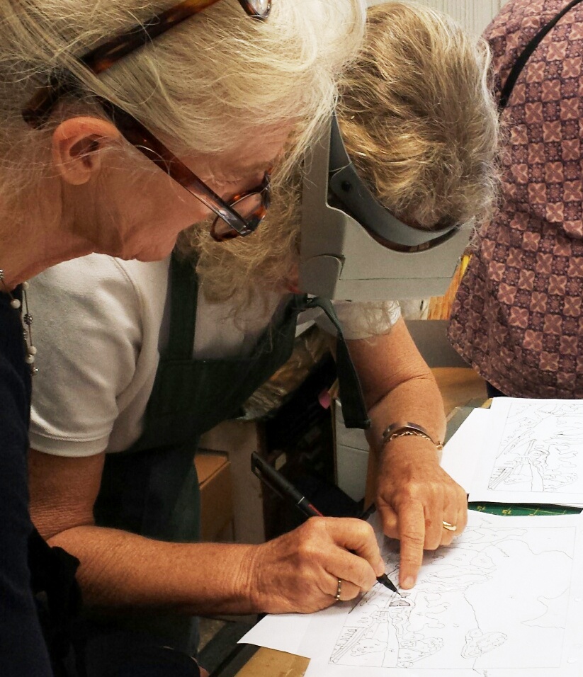
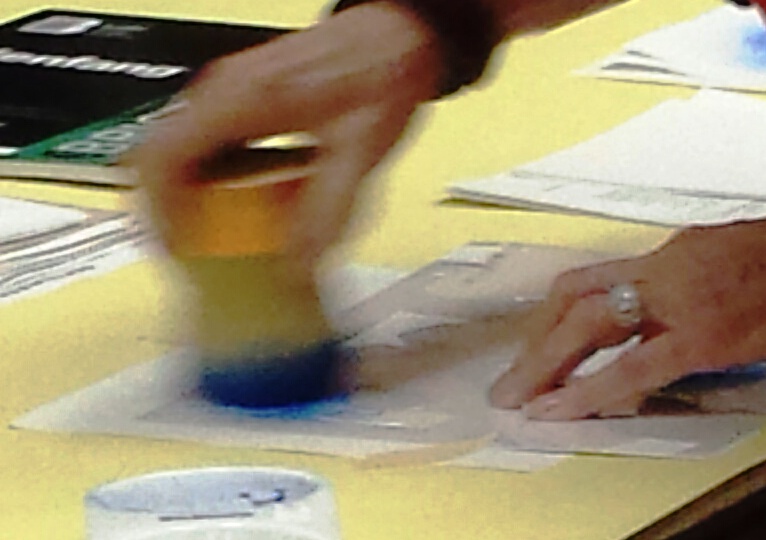
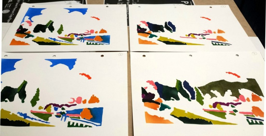
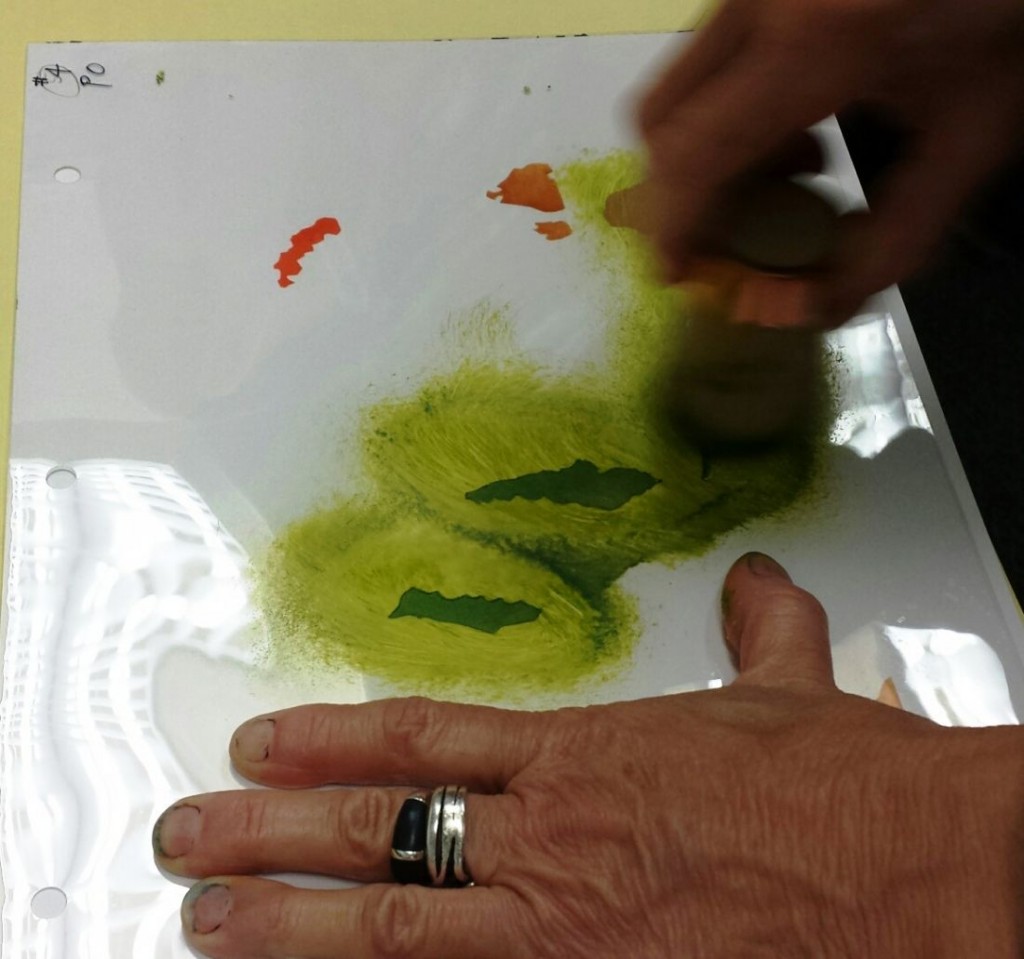
20140927_122947_resizedThen, piece by piece the colors were laid down to reconstruct the original Kandinsky. Special pompons or French pochoir brushes were used to paint through the stencils.
20140927_152003_resized    20140927_140636_resized

20140927_155118_resizedVarious colors went down quickly, while others took longer to complete.
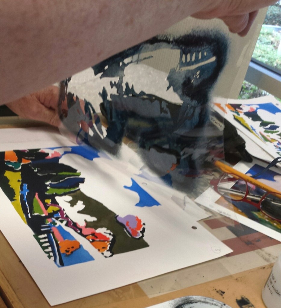
20140927_162251_resizedIt was a wonderful day for one and all, with a completed edition of 20 pochoir prints. Best of luck to Kitty’s students who will be building a book about silence over the next semester.
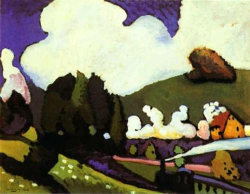
landscape-with-a-steam-locomotive-1909.jpg!Blog

Wassily Kandinsky (1866-1944), Landscape with a Steam Locomotive, 1909. Oil on canvas. © Solomon R. Guggenheim Museum.

 

George Washington, not the best portrait

hamilton 82
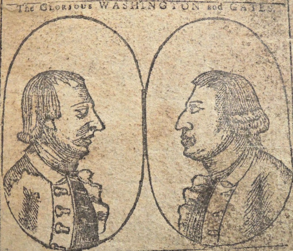
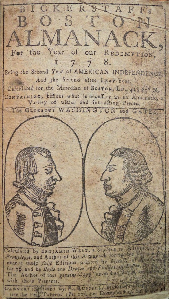
This woodcut portrait of George Washington (1732-1799) was published on the cover of Bickerstaff’s 1778 Boston almanack (said to be the second time the block was used). The caption reads “The Glorious Washington and Gate” referring to British-born Horatio Gate (1727-1806) who fought with Washington during the American revolutionary war. Not, perhaps, Washington’s best moment although it turns up again 13 years later on another almanack.

The block was printed by Ezekiel Russell (1743-1796) who worked in Boston, Salem, and from 1777 out of a shop in Danvers, Massachusetts. The subtitle states “being the second year of American Independence and the second after Leap-year, calculated for the meredian of Boston, Lat. 425 25 [degrees] N, containing besides what is necessary in an almanac, a variety of useful and interesting pieces.”

hamilton 82b                    hamilton 82a

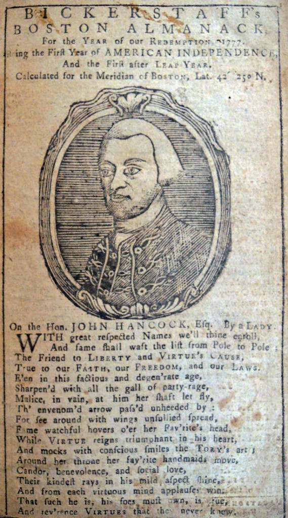
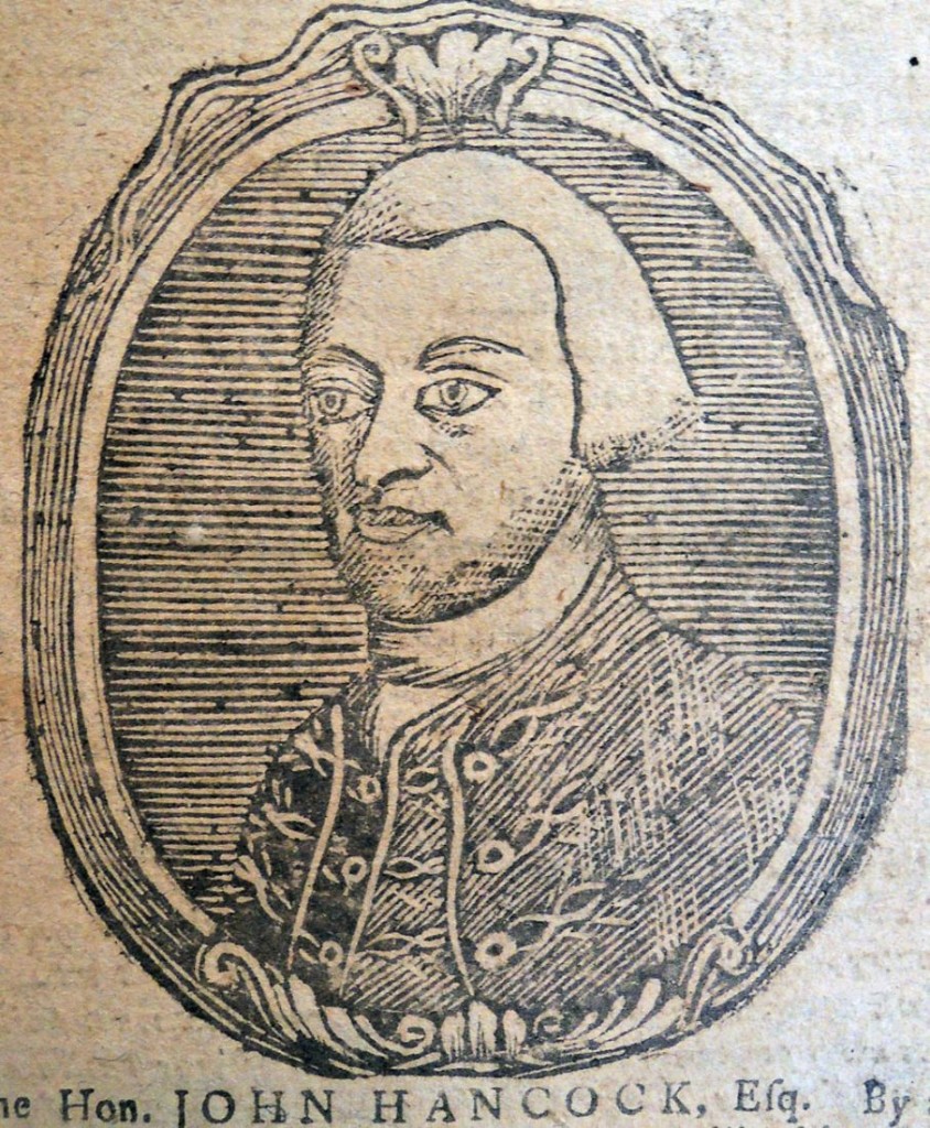
hamilton 82dOne year earlier, John Hancock made the cover of the almanack, described as “the anatomical man” meaning done from life, not imagined. The portrait was done “by a lady.”

Bickerstaff’s Boston Almanac for the year of our redemption 1777 (Danvers, 1776). Graphic Arts Collection Hamilton 78

Bickerstaff’s Boston Almanack, for the year of our redemption, 1778. Being the second year of American Independence…. (Danvers, Ma.: Printed by E. Russell, [1777]). Graphic Arts Collection Hamilton 82.

Dante and G.G. Macchiavelli

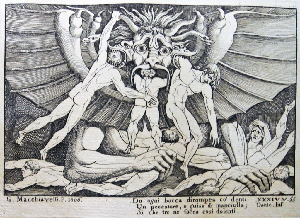
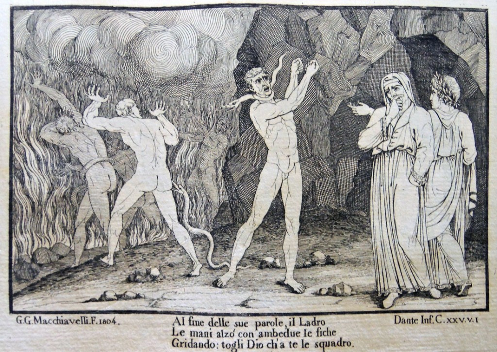
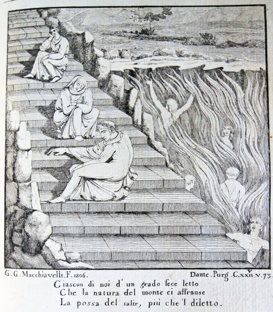
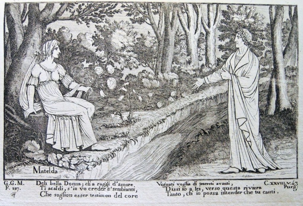
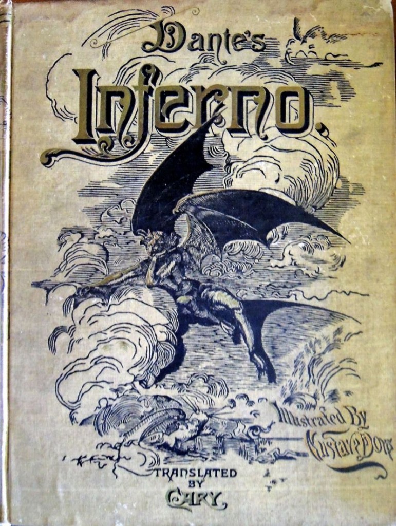
dante macchiavelli4In researching the many editions of Dante’s Divine Comedy illustrated by Gustave Doré (1832-1883), I found a lesser known edition illustrated by Gian Giacomo Macchiavelli (1756-1811).

In 1806, the Italian etcher prepared a series of 39 plates following Dante’s epic poem, which were published that year in a single volume and the following year in a three volume set with text. When Macchiavelli died in 1811, his nephew Filippo Macchiavelli collected the drawings and in 1819, issued an edition of the Divina Commedia with his uncle’s prints. Princeton owns a second edition of Macchiavelli’s Dante from 1826.
dante macchiavelli6
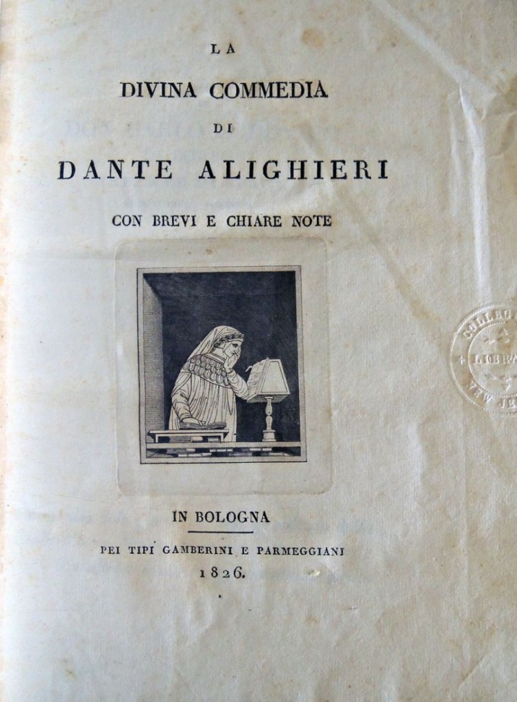
Dante Alighieri (1265-1321), La Divina Commedia; con brevi e chiare note (Bologna: Tipi Gamberini Parmeggiani, 1826). “Della prima e principale allegoria del poema di Dante,” discorso del Conte Giovanni Marchetti. Illustrated by G.G. Macchiavelli. Graphic Arts collection in process
dante macchiavelli5

dante macchiavelli3

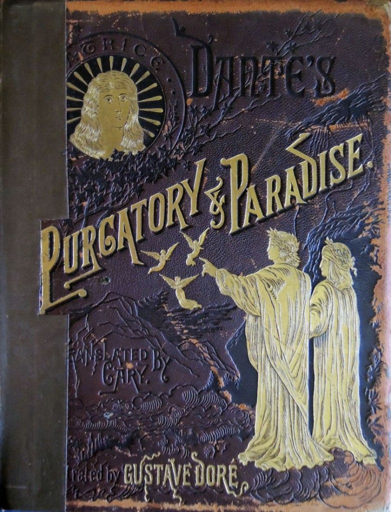
dante Macchiavelli2and just for fun:

dante dore2               dante dore1

Two of the Dore editions with curious covers.

Tourism in Mexico

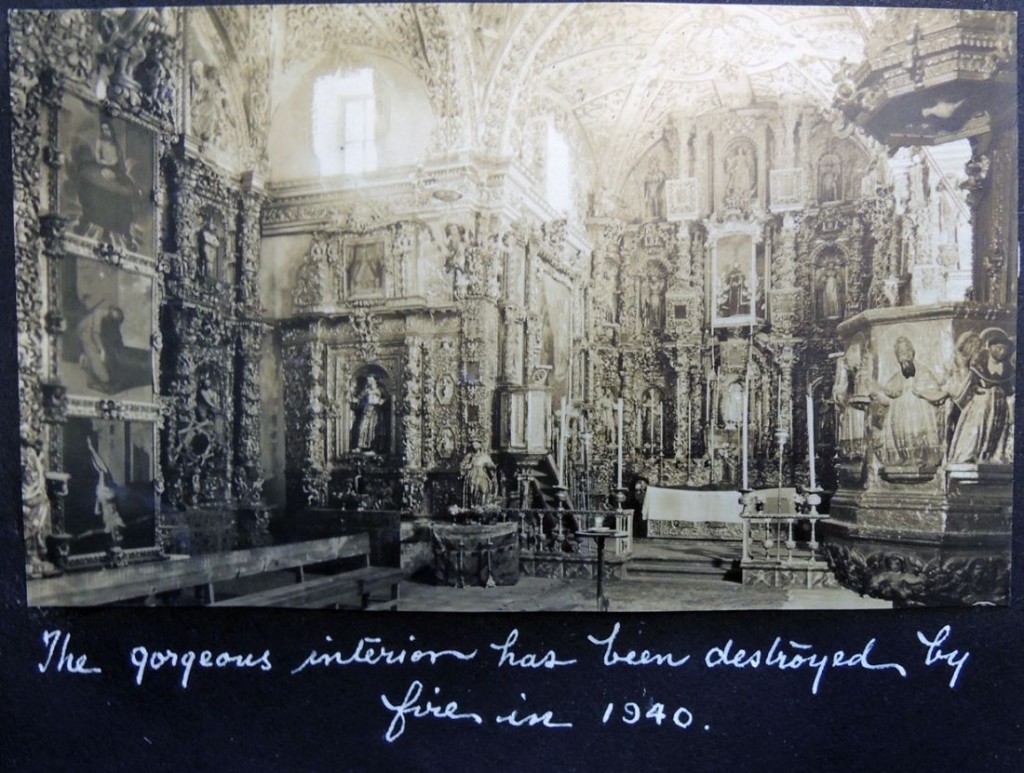
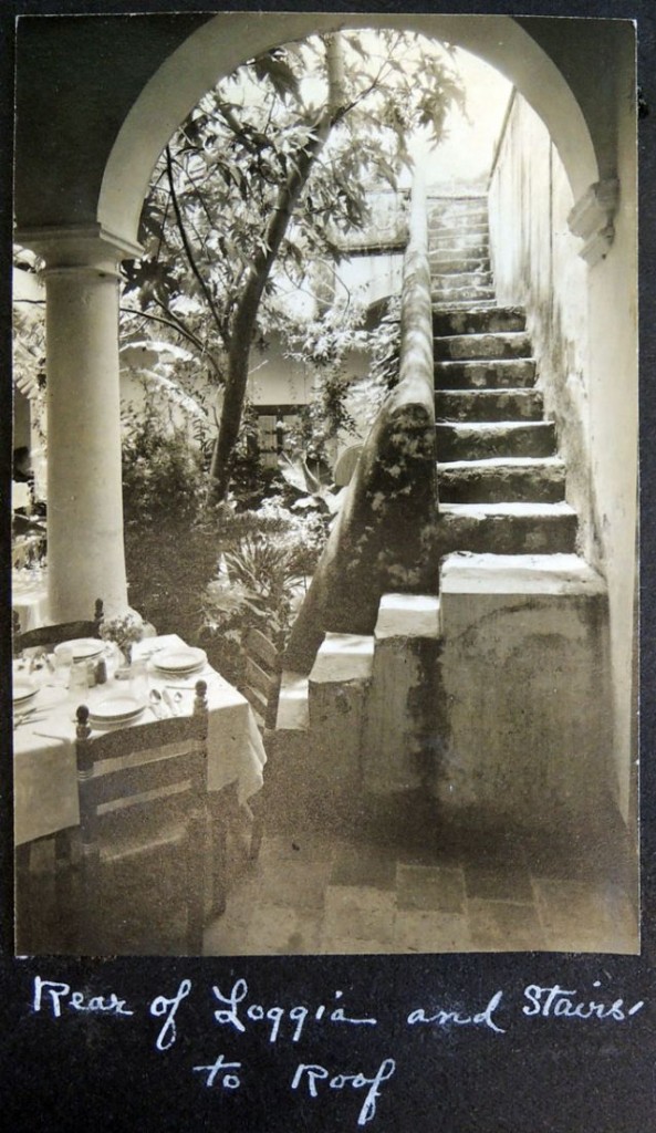
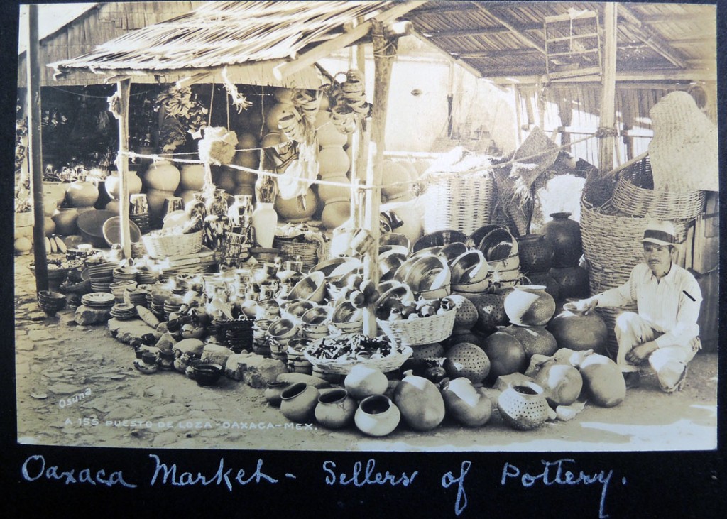
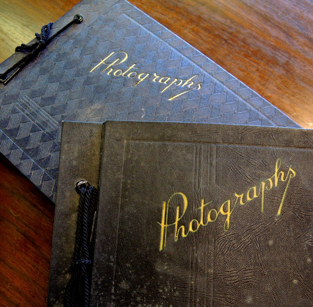
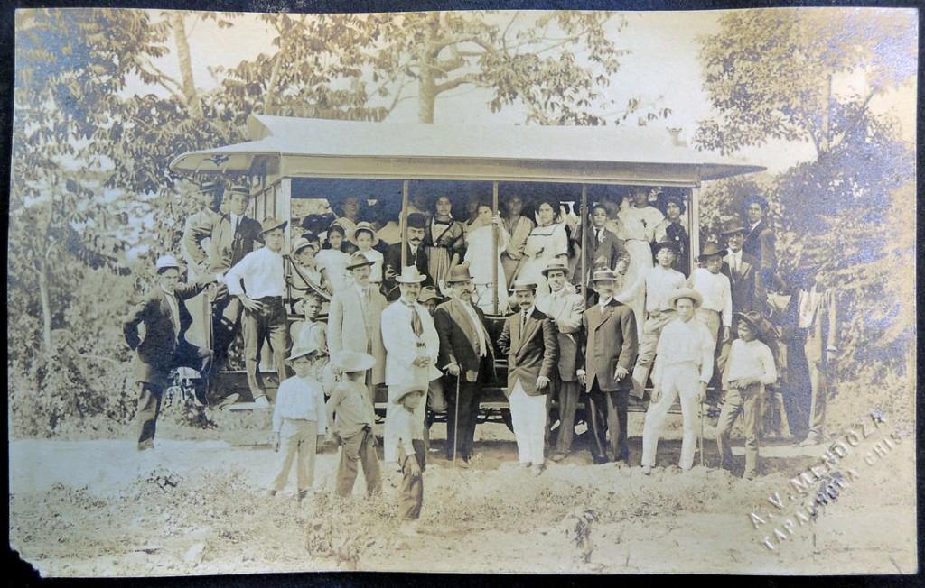
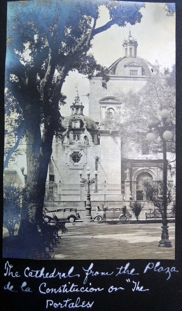
mexican ephemera4The collection WA130 Tourism in Mexico (Graphic Arts Off-Site Storage RCPXG-5830371) includes several dozen boxes of travel scrapbooks, photo albums, journals, letters, brochures, maps, books and other print material. In Box 7, pulled for the class Sound, Immigrants, and the American West, there are eight photo albums, most from the 1940s, which include both personal and commercial photographs. Here are a few samples.
mexican ephemera6

mexican ephemera5

mexican ephemera2

mexican ephemera1
mexican ephemera7mexican ephemera3

Period Advertising

20140920_122140_resized-1
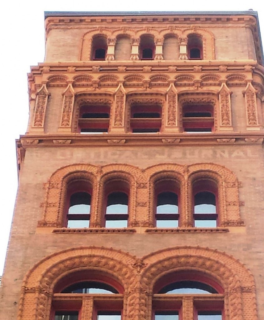
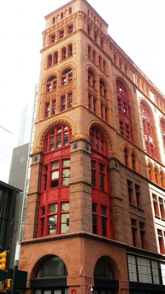
20140920_121553_resized_1-1On one of Columbia Professor Andrew Dolkart’s recent walking tours through lower Manhattan, we stopped at the corner of Broadway and John Street to study the Corbin Building. When it opened in 1889 it was one of the tallest commercial buildings in New York City. Designed by Francis Kimball, the terracotta structure is close by publisher’s row, where most of the large newspapers were located and a block away from Mathew Brady’s studio, along with other photographers and opticians along lower Broadway.

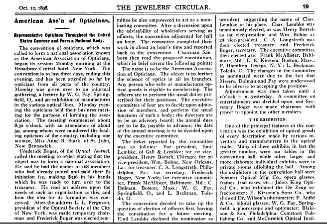
Near the top of the building, just under the penthouse, we saw the words “Optical Journal” on one side and “Jeweler’s Circular” on the other. Dolkart pointed out that while the building was financed by Austin Corbin, president of the Long Island Railroad, most of the floors were rented to various companies. These top floors held the offices of the Jeweler’s Circular Publishing Company, where in 1898, the American Association of Optician was established and a monthly journal printed.

These texts are some of the few period advertisements left in lower Manhattan. Like the rebinding of books and magazine, the renovation and reconstruction of the area has removed most of the print advertising, so valued by researcher and historians. image001

Bal Masqué

taylor bal masque6
taylor bal masque2

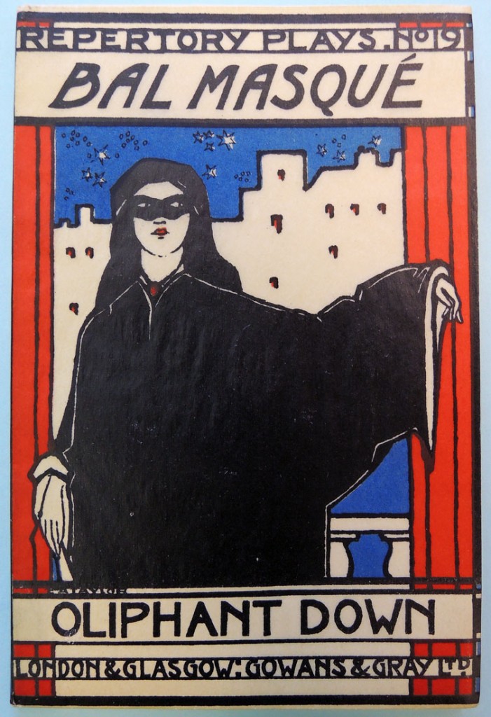
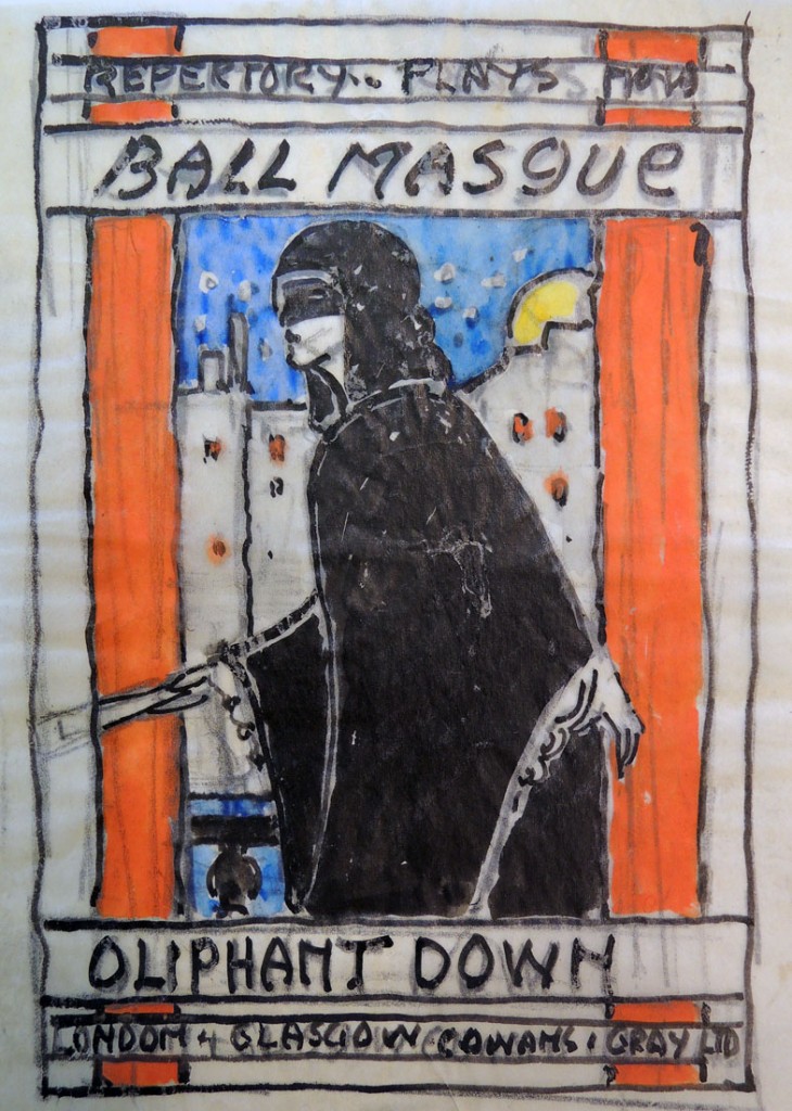
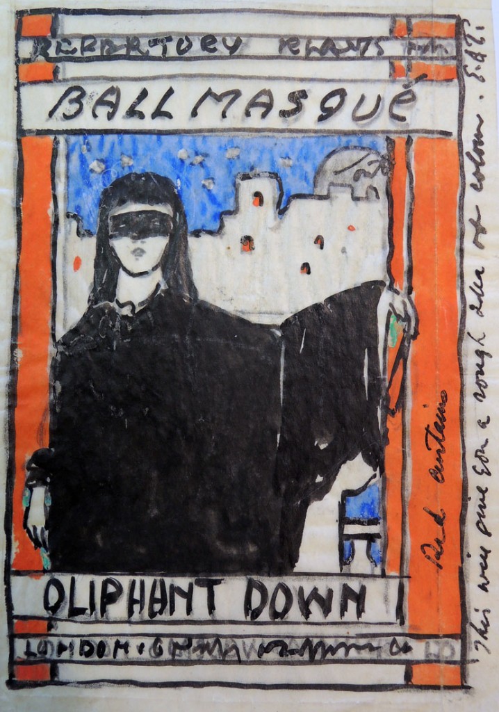
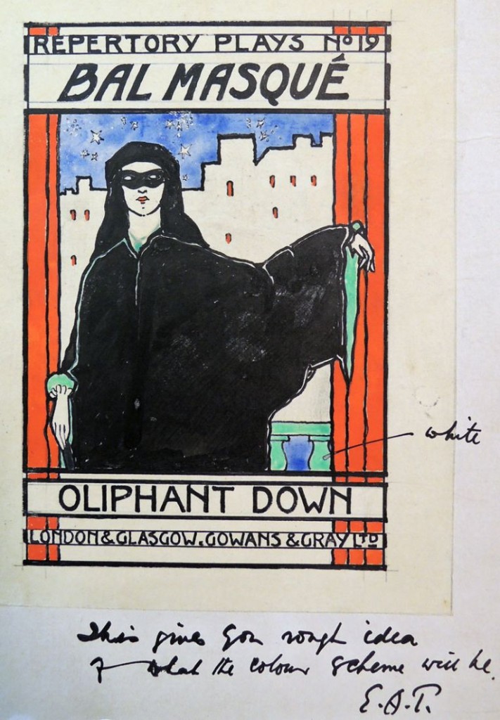
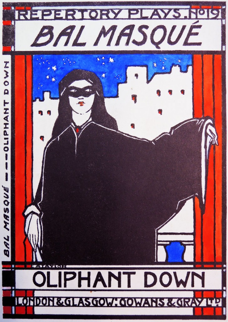
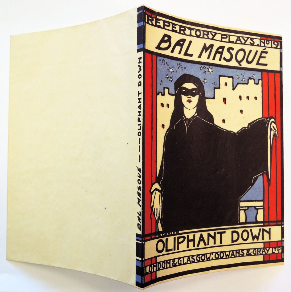
Oliphant Down (1885-1917), Bal Masqué: a Fantasy in One Act (London: Gowan and Gray, 1924). Book jacket design by E.A. Taylor. Graphic Arts Collection 2014- in process

The Scottish artist Ernest Archibald Taylor (1874–1951) not only painted in oil and watercolor but also designed furniture, interiors, and stained glass. He trained at the Glasgow School of Art before taking a position with the design firm of Wylie and Lochhead.

Beginning in 1910, Taylor and his wife, Jessie M. King (1875-1949) spent several years living in Paris, where they ran an art school called the Shearling Atelier. Back in Scotland, they continued to teach, establishing a school at High Corie on the isle of Arran and an artists’ colony in Kirkcudbright.
taylor bal masque3

Taylor’s experience as a stain glass designer is evident in the cover design for the Scottish playwright Oliphant Down’s posthumous publication Bal Masqué. The Graphic Arts Collection recently acquired all of his preliminary drawings leading up to and including the final book. Notice the changes in the figure,  in the background, in the typography, and in the color scheme.

Princeton also holds ten books designed by Jessie King, primarily children’s books in the Cotsen Library.

taylor bal masque5
taylor bal masque4
taylor bal masque1


Hans Alexander Mueller

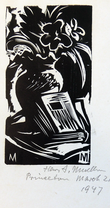
mueller ppc3 The December 4, 1939 issue of Life Magazine included a profile of the German American artist Hans Alexander Mueller (1888-1962), who had just published, Woodcuts & Wood Engravings: How I Make Them. It is surprising that a major magazine would be interested in highlighting a printmaker or a book on printing techniques. However, the fine press edition was printed by Elmer Adler’s Pynson Printers, with original woodcuts and wood engravings for the entire edition. Adler also gave Mueller an exhibition in the New York Times Annex on 43rd Street, which was reviewed in the Times, leading to the additional publicity. Today, it is somewhat unfortunate that we know Mueller primarily as the teacher of Lynd Ward (1905-1985).
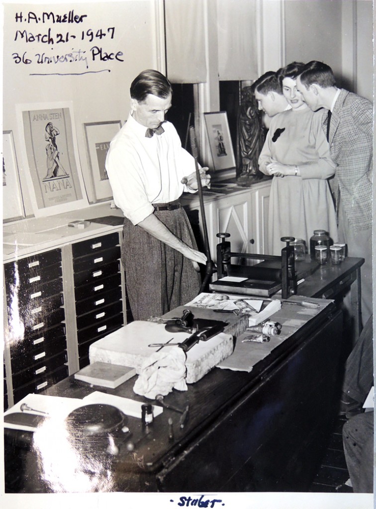
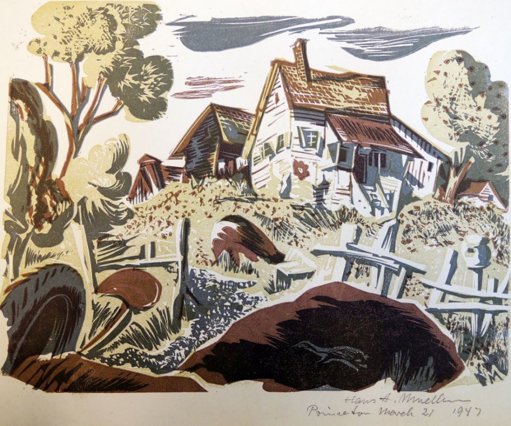
When Adler moved to Princeton and started the Princeton Print Club, Mueller was invited to demonstrate his printing techniques in 1947. As the audience watched, the artist cut and printed several prints, which were then given to the Club for their circulating collection. Two years later, Mueller was invited back to create the Club’s membership print for 1949, depicting the new Firestone Library.

mueller ppc2 mueller ppc

“There have been many books on woodcuts,” wrote Ward for the book jacket, “but this one is without equal in its intrinsic quality. The woodcut artist is peculiarly dependent on the printing process for the realization of his full intent, and probably nowhere else in the world could this book have been produced with the full measure of care and high standard of craftsmanship that it is receiving at the hands of Elmer Adler and the Pynson Printers.”

Hans Alexander Mueller, Woodcuts & Wood Engravings: How I Make Them (New York: Pynson Printers, 1939). Graphic Arts Collection (GAX) NE1000 M87 1939q

Woodrow Wilson and Football

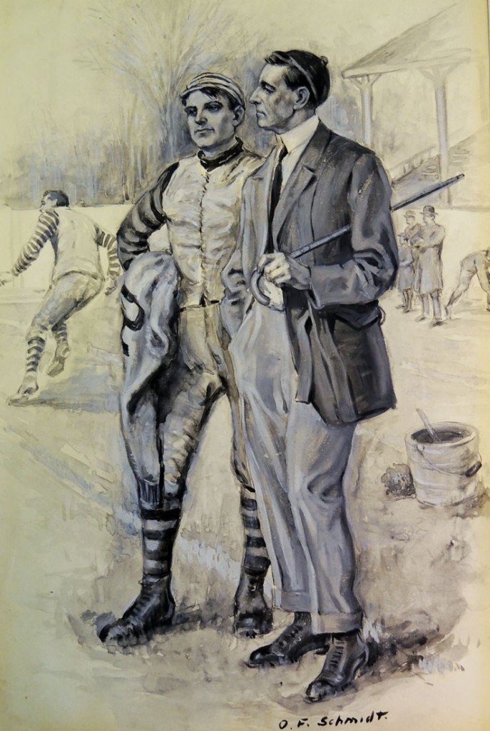
schmidt wilson footballWilson’s Love of Football
“Wilson was a true football enthusiast. He valued the game from a high-minded, moralistic point of view, while also acting as something of an armchair quarterback. On February 14, 1894, in a news report that appeared in Philadelphia’s Public Ledger, Wilson stated that the game of football should be encouraged for the sake of the game itself because it “develops more moral qualities than any other game of athletics…This game produces…qualities not common to all athletics, that of co-operation, or action with others, and self-subordination. These are things to be encouraged, and they unquestionably come from the game of football.” Wilson, however, viewed the game from the fan’s point of view as well. In an 1892 letter to Robert Bridges, a close friend who presumably asked Wilson’s opinion on the outcome of the Yale game, Wilson replied, “Alas, no! There’s not a ghost of a chance of our beating Yale. If the 32-0 experience is not repeated, I shall be thankful. This is not because Penn., the despised Penn., beat us; but because (this is in confidence) incredibly stupid coaching….”

This label copy is quoted from the 2002 main gallery exhibition that University Archivist Dan Linke and his staff prepared for the centennial of Wilson’s Princeton presidency. The item chosen to accompany the text was an illustration of “Woodrow Wilson, Football Coach,” done in 1912 by Oscar F. Schmidt (1892-1957) from the Graphic Arts Collection.

We originally thought the artist was Otto Schmidt (1876-1940), who was another magazine illustrator but thanks to a researcher who tracked down the image, we now know our drawing was reproduced in St. Nicholas: an Illustrated Magazine for Young Folks, published by The Century Company, v. 40, pt. 1 on November 1912, p. 19, in conjunction with an article entitled “What Woodrow Wilson Did For American Football” by Parke Davis.


Schönbrunn Gardens in Vienna

bittner, ruines1

bittner, ruines6
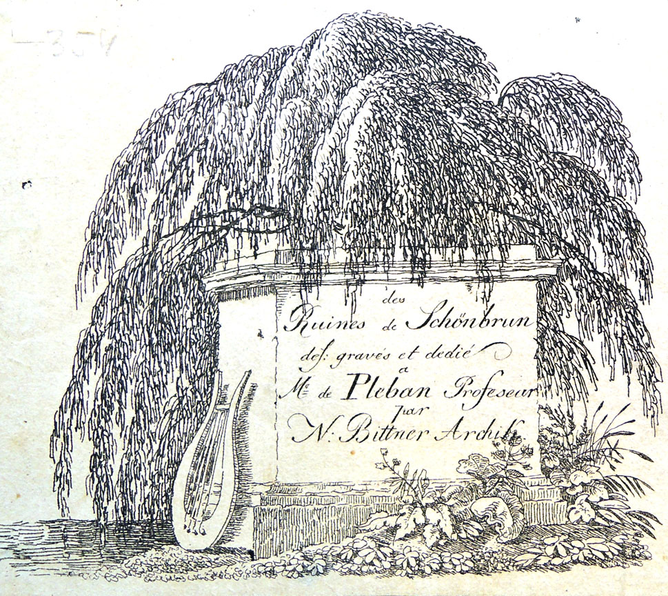
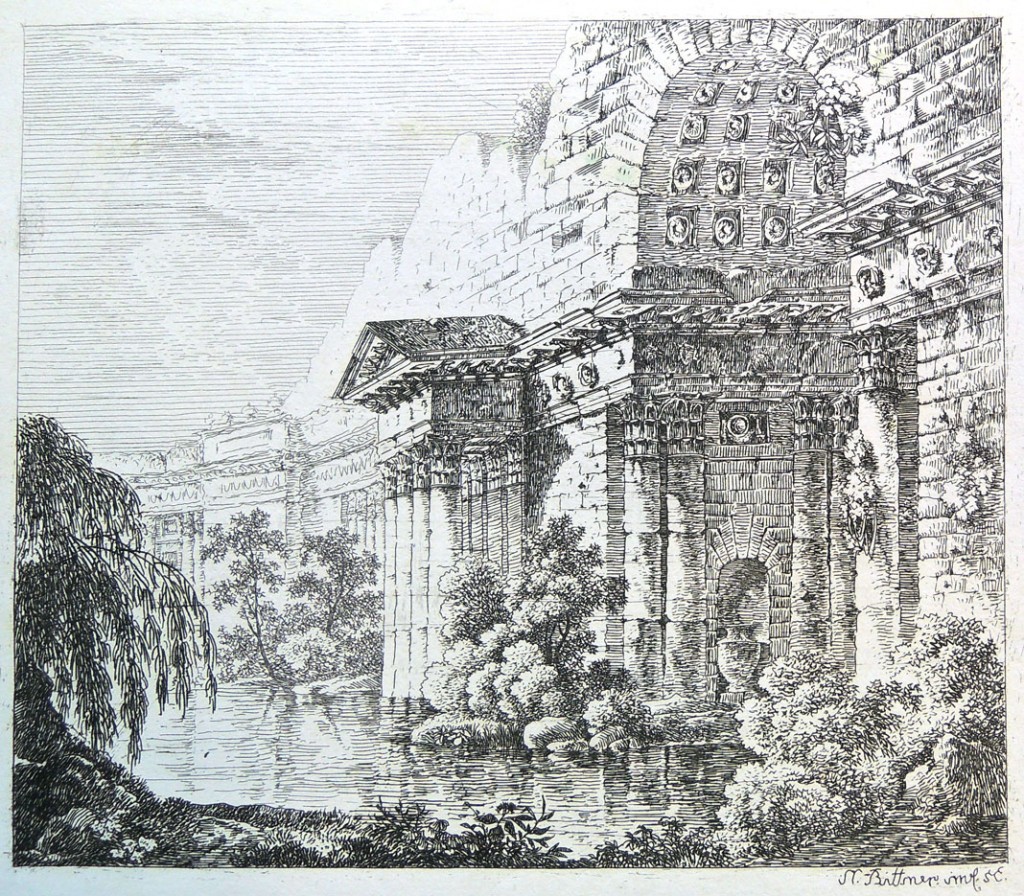
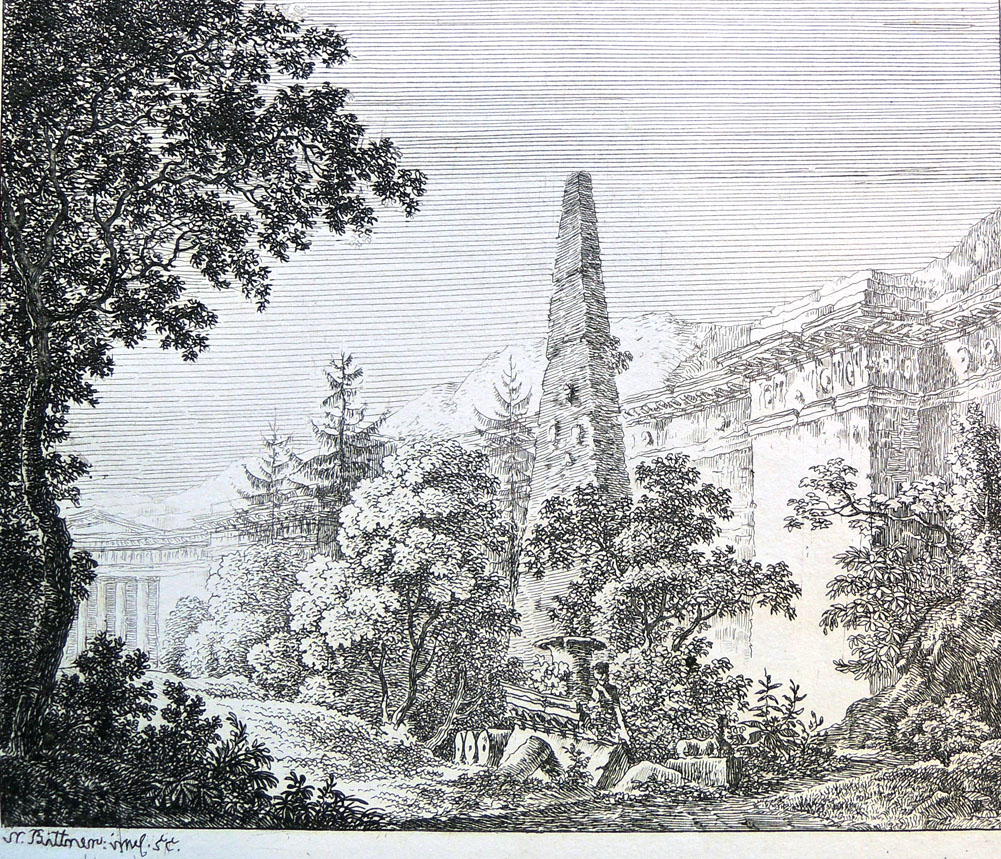
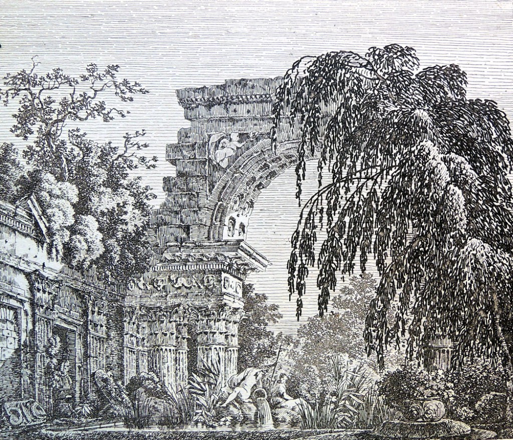
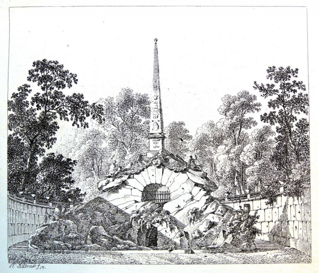
Norbert Bittner (1786-1851), Des Ruines de Schönbrun des[siné], gravés et dedié à Mr. de Pleban, Profeseur par N. Bittner, Archit. (Vienna, ca.1815]. Graphic Arts Collection 2014- in process. 8 etchings

The Graphic Arts Collection recently acquired this exceedingly rare set of eight prints on the ruins of the gardens of Schönbrunn in Vienna. So far, no other copies in libraries have been found (note: the originals are slightly darker than my photographs here). Originally known as the Ruin of Carthage, the Roman Ruin is a set of follies that was designed by the architect Johann Ferdinand Hetzendorf von Hohenberg (1733-1816) and erected as an entirely new architectural feature in 1778 in the Schönbrunn gardens in Vienna.

“Fully integrated into its parkland surroundings, this architectural ensemble should be understood as a picturesque horticultural feature and not simply as a as a ruin. The fashion for picturesque ruins that became widespread with the rise of the romantic movement soon after the middle of the 18th century symbolize both the decline of once great powers and the preservation of the remains of a heroic past.”
bittner, ruines5

bittner, ruines4

bittner, ruines3

bittner, ruines2

Born in Vienna, Norbert Bittner (1786-1851) was a painter, draftsman and etcher, trained in his hometown at the Academy of Fine Arts. Besides decorations and interiors prints (after A. de Pian) he left a large number of landscapes prints and watercolors, almost exclusively from the area in and around Vienna, as well as architectural representations and theater decorations.


Drop Dead Gorgeous

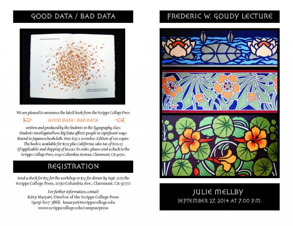
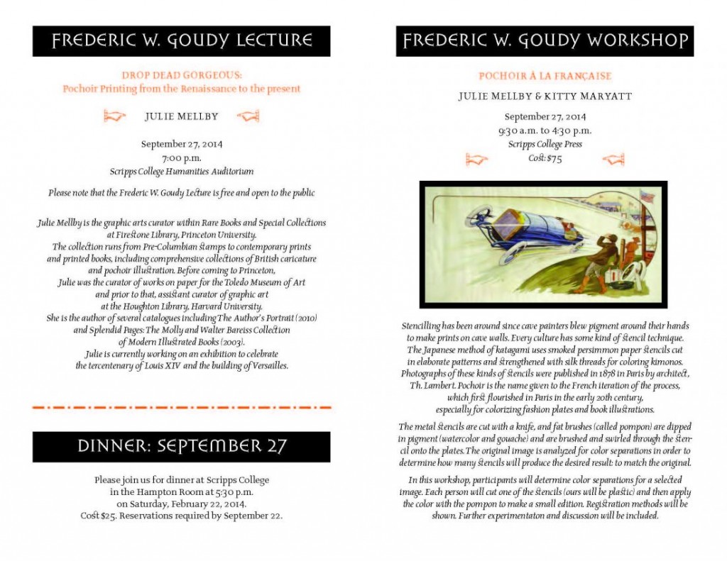
If you are on the west coast next week, why don’t you come to the Frederic W. Goudy Lecture at Scripps College, Saturday, September 27 at 7:00 p.m? Here’s a brochure. This event was organized by the Director of Scripps College Press Kitty Maryatt.
flier2Julie Mellby flyer 2014 Small_Page_2