Author Archives: Julie Mellby

Coming to Princeton in 100 years

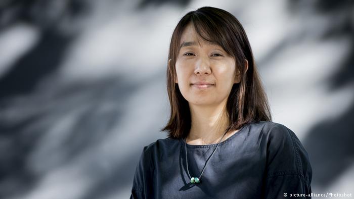
South Korean author Han Kang, winner of the Man Booker international prize for her novel The Vegetarian, has been selected as the fifth writer for the Future Library project, conceived and launched by the Scottish artist Katie Paterson in 2014. Each year, one writer is asked to contribute a book, which will not be printed or read for 100 years. A forest of 1,000 Norwegian spruce trees has been planted outside Oslo to provide the paper for these books in 2114.

Other authors who have contributed a book to the Future Library are Margaret Atwood, David Mitchell, Turkish novelist Elif Shafak, and Iceland’s Sjón. The Princeton University Library is proud to own a certificate entitling us to one copy of each paper book.

Speaking to the Guardian newspaper, Han said she considered the Future Library to be a project about time. “In Korea, when a couple gets married, people bless them to live together ‘for 100 years’. It sounds like almost an eternity,” she said. “I cannot survive 100 years from now, of course. No one who I love can survive, either. This relentless fact has made me reflect on the essential part of my life. Why do I write? Who am I talking to, when I write?” https://www.theguardian.com/books/2018/aug/31/han-kang-bury-book-100-years-norwegian-forest-future-library

Han will deliver her manuscript, which can be a length of her choosing, to Paterson at a ceremony in the Norwegian forest in May. It will be held in a room in the Deichman library, Oslo, alongside the unpublished and unread manuscripts by Atwood, Mitchell, Shafak and Sjón, until 2114, when it is finally printed.

For now, read: Han Kang, The White Book, translated from the Korean by Deborah Smith (London: Portobello Books, 2017). East Asian Library–Western PL992.26.K36 H8413 2017

Le Taxiphote


The Graphic Arts Collection recently acquired an early twentieth-century Taxiphote. Developed by Jules Richard (1848-1930) “Le Taxiphote” is a mechanical tabletop stereo viewer, ours having all its original cabinet drawers and parts, custom slide trays and a collection of approximately 200 glass stereo views of Paris and the French countryside.

This device is the most technically sophisticated of all the stereo-viewers Richard invented, much evolved from the hand-held stereoscopes most families had in their homes. All these devices involve two photographs taken from approximately the distance between our eyes so that when looking through the viewer, the two images merged into a single three-dimensional image. Richard’s camera for making stereograms was called a “Verascope,” patented in 1893. A few years later in 1899, he patented the first model for the viewing stereo-slides, which he called “Le Taxiphote,” sold well into the 1930s. There are two levers; one to raise the slide and view the image with both eyes and a second smaller lever to read the text on the slide caption with your right eye.

Jules Richard was the son of Félix Richard, a manufacturer of optical and measuring instruments and the nephew of Gustave Froment, a well-known manufacturer of electrical instruments.
Jules designed barometers, thermometers, chronographs, dynamometers, and other photographic devices.

“Having been personally owned and managed by Jules Richard for thirty years, in 1921 the business became a public company, with a capital of six million francs and a workforce of about 300. In 1923 Richard gave the city of Paris six million francs to found an ‘École des Apprentis Mécaniciens Précisionnistes’, to provide training for precision instrument makers and ensure the continuity of the skills which were so important to him. This college still exists. So too does the firm, at least in name, the present ‘Société JRC’ (Jules Richard Constructeurs) manufacturing precision instruments for industrial uses.” Museum of the History of Science, Oxford.


Opening the top, one cassette of glass slides is loaded. Turning the side crank will lift the first slide and place it in front of the lens, with light coming through the ground glass behind. Keep turning and the next slide will move into place, and so on.

The bottom of the box is a storage space to hold our 200 glass slides, created for this viewing device specifically. The slides are on their way to Princeton and when they arrive will also be digitized for long-distance viewing.

Thanks to Rubén Gallo, Walter S. Carpenter, Jr., Professor in Language, Literature, and Civilization of Spain at Princeton University for his assistance in acquiring our Taxiphote.

 
Le Taxiphote Stereo-Classeur, French stereo viewer with approximately 200 glass slides, ca. 1910. Mahogany case with hinged and locked lower door opening to a compartment for glass slide storage, two brass handles on sides for carrying, rack and pinion focusing, hinged lid and two adjustable levers at left and right for focus. The front has two engraved gutta percha labels in French text under gutta percha eye pieces. Graphic Arts Collection GAX 2018- in process


Marie-Hélène Vieira da Silva (1908-1992)

Marie-Hélène Vieira da Silva (1908-1992) and Léopold Sedar Senghor (1906-2001), Élégie pour Philippe-Maguilen Senghor pour orchestre de jazz et chœur polyphonique et Soudainement, La terre, Le ciel, trois gravures originales de Vieira da Silva (Paris: Galerie Jeanne Bucher, [1986]). In-folio, 450 x 300: (15 ff. premier et dernier blancs), couverture muette. En feuilles, couverture rempliée, chemise à rabats d’édition.

Very rare edition of this poem written by Senghor in homage to his son who died in 1981, illustrated with 3 original full-page engravings by Vieira da Silva and printed in an edition of 72 copies on Japan, signed by the author and the artist.


Marie-Hélène Vieira da Silva (1908-1992)

Léopold Sedar Senghor (1906-2001)

Sophia Giacomelli

Sophia Giacomelli [Madame Chomel]. Le Paradis perdu, en douze figures (Paris: chez Salmon, 1813). Engraved title and 12 plates bound after Dante, La Divina Comedia. cioé l’Inferno, il Purgatorio, ed il Paradiso (Paris: chez Salmon, [n.d., ?1813]). Engraved title and 99 plates.

The Graphic Arts Collection recently acquired this single volume with two works bound together, previously owned by the politician, statesman and writer Prosper de Barante.

At first glance, you might think these were prints by John Flaxman R.A. (1755–1826) , who often worked in this linear, outline fashion but in fact, both the Milton sequence  and the Dante prints were engraved by Genevieve Sophia Giacomelli (sometimes called Madame Chomel), who was both an accomplished graphic artist and popular singer.

Justin Croft points out that the 100 plates of the Dante sequence are directly after Flaxman but the Milton are unique. “While Flaxman had always intended to illustrate Milton, he never published a Milton sequence, and Sophia Giacomelli’s 12 plates for Paradise Lost can be considered largely original. It is remarkable they are so rare.”


The Journal des arts, des sciences, et de littérature reviewed her Milton collection in 1813:

‘…les amateurs conviendront sans peine que la collection des douze figures de Mme Giacomelli est une des productions les plus agréables que la gravure nous ait offertes depuis long-temps. Nous vivons dans un siècle où les femmes ont conquis, dans la littérature, le rang le plus distingué: il suffit de jeter les yeux sur cet ouvrage, pour s’apercevoir que le domaine des arts ne leur est pas non plus étranger. Déjà le dessin et la gravure ont mérité à Mme Giacomelli d’honorable suffrages; son talent comme cantatrice avait avantageusement brillé dans plusieurs concerts…’ (vol. 15, p.62) [Amateurs will readily agree that the collection of the twelve figures of Madame Giacomelli is one of the most agreeable productions that engraving has offered us for a long time. We live in a century when women have won the most distinguished rank in literature: it is enough to look at this work to discover that the field of the arts is not foreign to them either. Already drawing and engraving have earned Madame Giacomelli honorable votes; her talent as a singer had advantageously shone in several concerts.


A brief note was published in The New Monthly Magazine, Volume 1 1814, “Madame Sofia Giacomelli has drawn and engraved in a style worthy of the best school of Italy twelve figures illustrative of Milton’s Paradise Lost. These figures as well as those which she has executed from the Divina Comedia of Dante, display a vivid imagination, replete with fire and originality.”

See also Giacomelli listed in the Proceedings of the Musical Association, Volume 9 (Stanley Lucas, Weber & Company, 1883).

All of ‘Creation’ [Tvorchestvo]

The Graphic Arts Collection recently acquired a complete set of the early Soviet art magazine Tvorchestvo (roughly translated as Creation) including all 23 issues running from 1918 to 1922. A popular magazine, unfortunately the print runs gradually decreased: 10,200-20,200 copies in 1920, 10,000 copies in 1921, and 5,000 copies in 1922.

According to the dealer, “In 1918 [Tvorchestvo] was probably produced by the first illustrator of the Soviet science-fiction Anatolii Shpir (?-1951). Dmitrii Mel’nikov (1889–1956) completed the cover design of other issues, created the linocuts for internal design, and has written some articles. He was a propaganda poster maker and the artist of satirical magazines Krokodil and Bezbozhnik. At the same time the magazine design had a notable contributor, artist Nikolai Sinezubov (1891-1948), close to the art of Kandinsky and supporting him in theoretical discussions. In this period he participated in the Exhibition of the Four (1920) with Rodchenko, Kandinsky and Stepanova. Sinezubov created the linocut for one cover and a number of linocuts for the internal design.”


The earliest issues were principally literary and were full of revolutionary traces. Later the magazine began to include critical articles on contemporary art, with the beginnings of Soviet art history developing on these pages. In particular, the journal includes early articles by Soviet art historian Aleksei Sidorov (1891—1978), notable figure in the Soviet art and book design. Some of these pieces are critical of the new Museum of Artistic Culture, which flourished from 1919 to 1929, directed by V. Kandinsky in 1919-20 and A. Rodchenko during 1921-22.

Vladimir Markov, Russian Futurism: A History (University of California Press, 1968)


Integrating the Declaration of Independence with the Declaration of Human Rights


The official re-opening yesterday of the subway station at the World Trade Center’s Cortlandt stop also brought the unveiling of “CHORUS” by Ann Hamilton. According to the MTA Arts & Design committee Hamilton’s marble mosaic was commissioned soon after the station was destroyed in the 9/11 terrorist attacks.

“Hamilton’s wall installation, titled “CHORUS,” spans a total of 4,350 square feet and is integrated into the architectural design of the station and the World Trade Center Transportation Hub to which it is connected. Small marble tesserae form a white-on-white surface and spell out text from the U.S. Declaration of Independence and the 1948 United Nations Universal Declaration of Human Rights. The tactile surface invites subway riders to touch the text as they read the words, creating meaningful personal encounters meant to acknowledge the civic ideals and aspirations of humanity and society.” A selection from the MTA press release: http://www.mta.info/press-release/nyc-transit/mta-arts-design-debuts-marble-mosaic-wtc-cortlandt-1-subway-station

“Artists have the extraordinary ability to use their vision and creative process to create deeply meaningful civic places. Ann Hamilton creates a place that speaks to our highest ideals,” said Sandra Bloodworth, Director of MTA Arts & Design. “The woven text of her tactile walls moves us through the WTC Cortlandt station, acknowledging its historic significance and embracing the rights embodied in universally shared declarations.”

A MacArthur and a Guggenheim fellow, Hamilton is known in particular for her many site-specific projects in American libraries integrating text and architecture. She was also honored with the National Medal of Arts in 2015, the highest award given to artists by the U.S. government. “Culture is built upon and with the words and languages of people, their aural and written documents, collectively produced and shared in common,” said Hamilton. “‘CHORUS’ is a testimony to the ideas and ideals these national and international documents embody and demonstrate.”

Isabella Piccini


Antonio de Solis y Ribadeneyra. Istoria della conquista del Messico della popolazione, e de’ Progressi nell’America Settentrionale (Venice: Poletti, 1715). Engraved frontispiece portrait and seven additional plates. Graphic Arts Collection GAX 2018- in process


We recently acquired the second Italian edition of this account of the conquest of Mexico by Spanish forces under Hernando Cortéz (1485-1547). The work describes the three years between the appointment of Cortéz as commander of the invasion expedition and the fall of Mexico City.

Solis was private secretary to Philip IV and considered the “cronista mayor de Indias.” His account contains three marvelous full-page engraved portraits of the author, Cortéz, and Montezuma by the famous printmaker Suor Isabella Piccini and five other plates engraved by Alessandro della Via, illustrating significant scenes of the conquest.


For the Graphic Arts Collection, it is the engraver Suor Isabella Piccini (1644-1734), who is of particular importance. The daughter of the printer Giacomo Piccini (died 1669), she is becoming better known for her many 17th- and 18th-century engraved portraits commissioned by Venetian publishers. See also: https://graphicarts.princeton.edu/2017/11/09/isabella-piccini-and-angela-baroni-18th-century-engravers/  Not unlike the 20th-century Sister Corita Kent (1918-1986), Piccini sent much of her time in the Convent of Santa Croce creating art, in particular to illustrate prayer books and manuals.


Alessandro della Via (active 1688–1724) also engraved book plates and portraits in Venice at this time but little more is known of his biography.


Life Begins

Everyone agrees that publisher Henry Luce launched Life magazine on November 23, 1936, his third magazine after Time (1923) and Fortune (1930). The first issue sold for ten cents and featured a cover photograph of Fort Peck Dam in Montana by Margaret Bourke-White, five pages of Alfred Eisenstaedt’s photographs, and dozens of other photo-essays. The magazine’s circulation went from 380,000 the first week to more than one million four months later, lasting until 1972. Paper issues can be seen at: ReCAP Oversize 0901.L724q

What no one seems to agree on is why someone made a miniature facsimile edition of the first issue, seen here along with the bound original. Some collections call is a salesman’s sample but it seems unlikely Luce would reproduce the entire issue in miniature when he was pushing the large format image.

More likely is that a facsimile was made as a souvenir or keepsake, either at the moment or for a later anniversary. There is nothing in the issue to indicate why or when it was produced, and no information online to settle the question. A call to Time, Inc. did not add any useful information. Happily for us, the facsimile includes the back cover [above], which was removed from our paper issues.

School Begins


Giulio Tomba (about 1780-1841) after Felice Giani (1758-1823). Rosaspina’s Zeichnungsschule [Rosaspina’s Drawing School], ii/ii. Nuremberg: Johann Friedrich Frauenholz, 1811. Etching and engraving and drypoint. Graphic Arts Collection GAX

The Italian printmaker Francesco Rosaspina (1762-1841) taught engraving at the Accademia di Belle Arti [the Academy of Fine Arts] in Bologna. This scene shows the master sitting at the top of the table, along with various female bystanders only allowed to watch. State i/ii [above] of the print is held at the Fogg Art Museum, Harvard University M25869, showing us the various objects in the room before the dark shadows were added. The engraver Giulio Tomba was a student of Rosaspina and could be represented by one of the figures around the table.

Todd Heisler’s 24-column photo-essay


For those who only read the New York Times online, you missed the massive photo-essay on Sunday by NYTs staff photographer Todd Heisler. Two gatefolds open onto a 48 inch, 24 column double-sided spread entitled “This Space Available” with text by Corey Kilgannon. Don’t look for it, the piece will not appear digitally until later this week (according to instagram). Go to the local newsstand and see if they have any leftover or check your neighbor’s porch if they were away for the weekend.
https://www.instagram.com/p/BnMwng6HwlF/?utm_source=ig_share_sheet&igshid=9dk1zks8dm90

https://twitter.com/heislerphoto?lang=en

Editor, Diego Ribadeneira; Visual editors, Jeffrey Furticella, Andrew Hinderaker, and Meghan Louttit; Design, Wayne Kamidoi.