Category Archives: Acquisitions

new acquisitions

This Hunger….

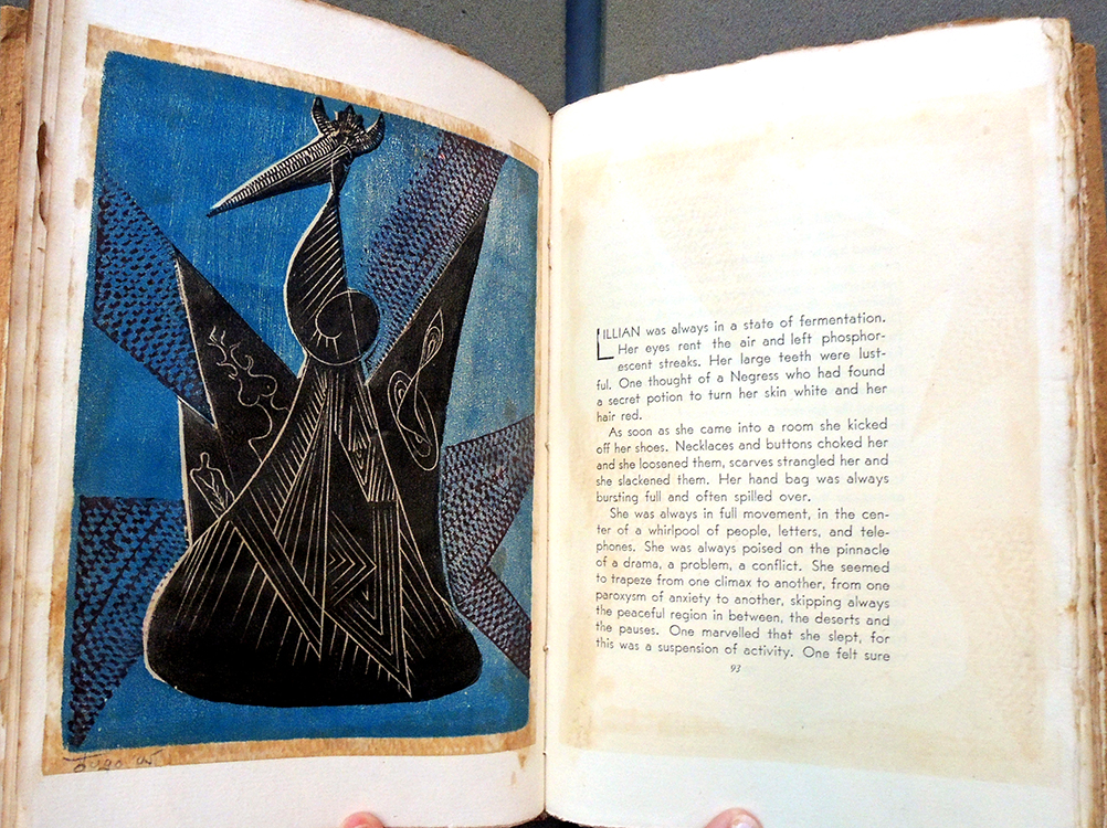
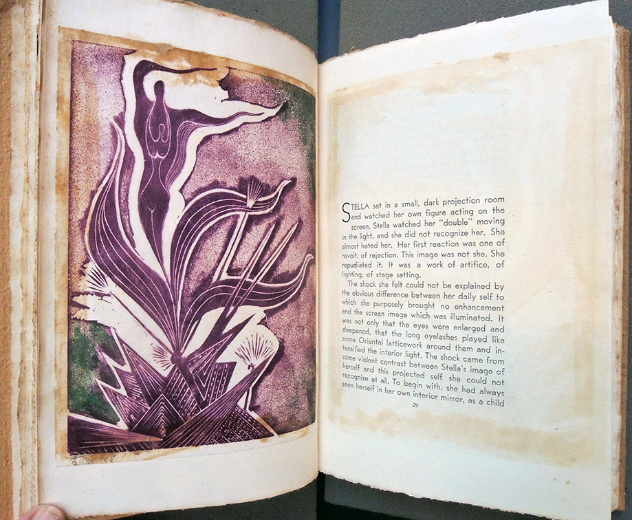
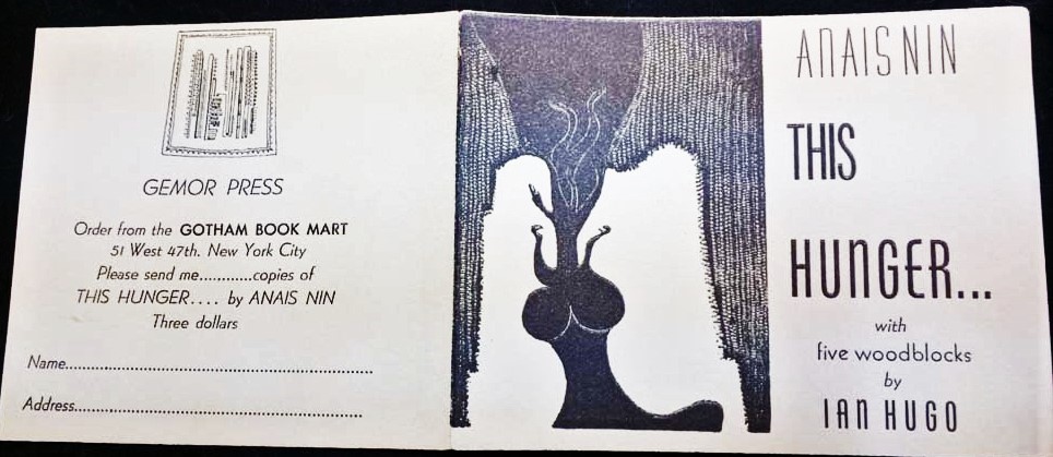
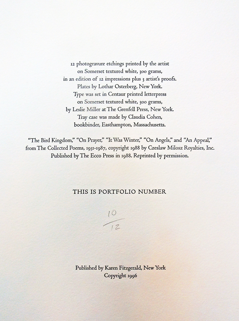
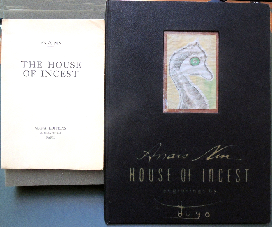
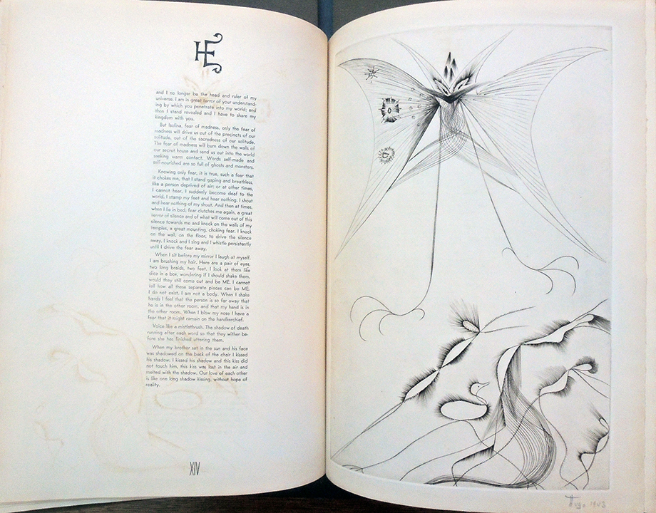
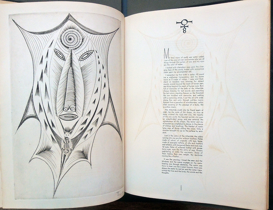
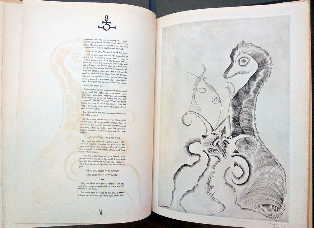
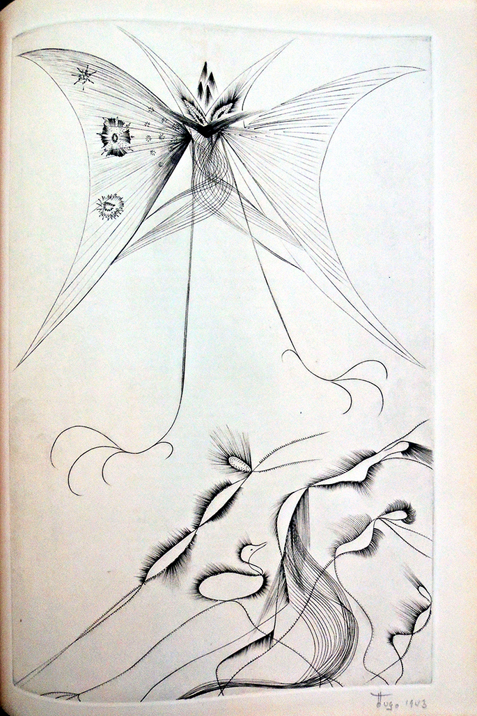
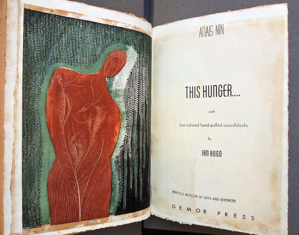
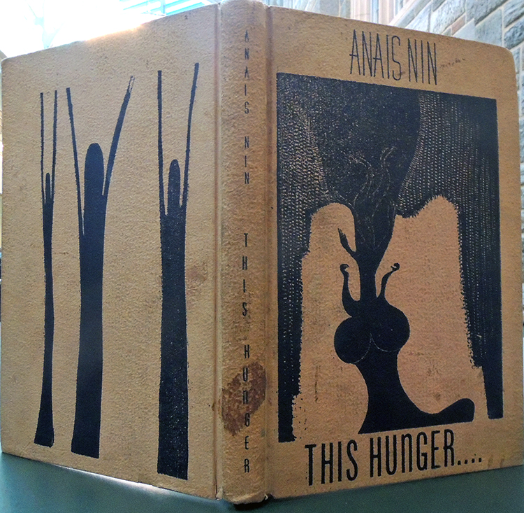
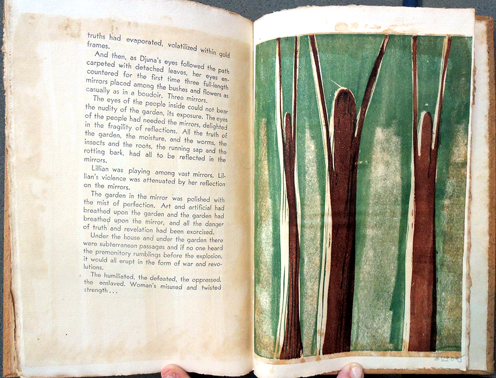
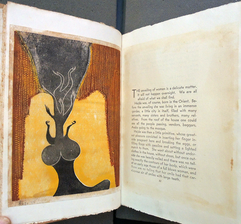
Anaïs Nin (born Neuilly, France, 1903-1977), This Hunger (New York: Gemor Press, 1945). No. 28 of 50 with 5 color woodcuts by Ian Hugo (Hugh Parker Guiler, born Puerto Rico, 1898-1985). Graphic Arts Collection GAX 2020- in process.

When Nin’s 1944 book, Under a Glass Bell sold out in three weeks, she and her lover Gonzalo More moved their printing press to a new home on East 13th Street, calling it Gemor Press after More’s initials. She wrote in her diary,

“As Gonzalo wanted the press to seem more businesslike, more impersonal, less like a private press run by writers, we had to find an appropriate place. The Villager had just moved out of 17 East Thirteenth Street. It was a small, two-story house. The ground level with a cement floor was suitable for the printing press. A narrow, curved iron staircase led to the second floor, which would be perfect for the engraving press. The house rented for sixty-five dollars a month, almost twice as much as the old studio on Macdougal Street.”


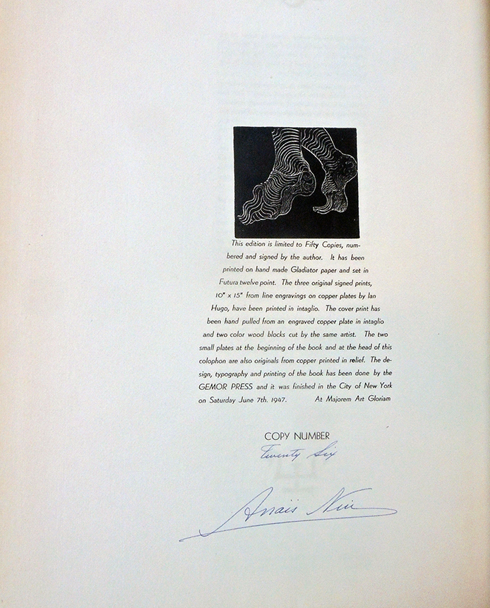
Their first book at the new location was This Hunger…., later expanded and incorporated into Ladders to Fire, She completed it in September 1945, noting in her diary that she “printed the one hundred and eighty-fourth page, the last of the de luxe edition of This Hunger” and went home exhausted. Although More wanted the business, Nin did the majority of the work, printing at least eight hours a day. The move was expensive and she owed money to everyone, saved in part by Henry Miller, another lover, who gave her $1,000, ”the first large amount he ever earned, which helped me pay off debts; with the rest he bought a cottage in Big Sur.”


According to volume 4 of The Diary of Anaïs Nin 1944-1947, in the mid-1940s Nin also had a relationship with Edmund Wilson (1895-1972). In reviewing This Hunger in The New Yorker November 10, 1945, he wrote:

“There is not much expert craftsmanship in This Hunger by Anaïs Nin but it is a more important book than either Marquand or Isherwood because it explores a new realm of material. Even Isherwood can do little more than add to an already long series another lucid and well-turned irony of the bourgeois world on the eve of war. But Anaïs Nin is one of those women writers who have lately been trying to put into words a new feminine point of view, who deal with the conflicts created for women by living half in a man-controlled world against which they cannot help rebelling, half in a world which they have made from themselves but which they cannot find completely satisfactory.”

He ends “I feel sure that Anaïs Nin has still hardly begun to get out of her intelligence and talent the writing that they ought to produce. This new book, like the one before it, has been published by Anaïs Nin herself. Anaïs Nin is at present a special cult, when she ought to have a general public.”

He sent her flowers and a set of Jane Austen. “He was hoping,” Nin wrote, “I would learn how to write a novel from reading her!”


Watch-Paper Printing Plates

If you were a person of sufficient means in the 18th century, you might own and carry a pocket watch. So treasured were these watches that many were designed with a second, outer case to protect the delicate mechanism. Between the inner and outer casing, it became fashionable to insert small circular engravings, printed on square sheets and then cut out and inserted.

By 1780, the various engraved portraits of beautiful women slipped into a gentleman’s pocket watch became the subject of “A Dissertation upon Watch-Prints” by Bob Short in The Westminster magazine, London (Dec 1780): 691-691.

While these circular prints have become collectables, few can boast the copper printing plates that produced them. We are proud to say the Graphic Arts Collection is the new owner of three copper printing plates for watch-papers. Each can be attributed to John June (active 1740-1770), after Sir Joshua Reynolds (1723-1792), and published by Robert Sayer in Fleet Street, ca.1766.

The female subjects are:

Miss Nelly O’Brien. Printed for Rob.t Sayer, at No 53 in Fleet Street. Plate: 164 164 x 1.15mm, barely rounded corners. On the back: punched for correction; engraved outline of a man in a large hat crossed through. Provenance: Iain Bain (1934–2018), Bewick scholar and printing historian.

Lady Selina Hastings. Sold by Rob.t Sayer in Fleet Street. Signed ‘J. June Sc.’ Plate: 63 x 70 x 1.27 mm, rounded corners. On the back: closely spaced lightly scratched lines: O’Brien by Reynolds, The Hunterian, University of Glasgow

Countess of Waldegrave. Printed for Rob.t Sayer, at No 53 in Fleet Street. Plate: 63 x 55 x 1.27mm, barely rounded corners. On the back: makers stamp B.W. under a crown (B. Whittow of Shoe Lane) with burin trials around and filling in the letters; punched for correction; lightly scratched lines, traces of ink.

Copper plates with the digital image inverted below.

Each of these ladies were the subjects of paintings by Sir Joshua Reynolds, later reproduced in mezzotint and widely distributed. While John June is confirmed to have engraved only one plate, we can attribute the others to him as well. Robert Sayer’s catalogue of 1766 contains a list of sixty-one ‘Designs in miniature for watchcases’ engraved by Louis Philippe Boitard at 3d. plain and 6d, so it is possible the same portrait was reproduced by several engravers over the years. See more in London 1753 by Sheila O’Connell, et al. (2003). Marquand Library DA682 .O28 2003

Reynolds, Joshua; Nelly O’Brien (d.1768); Hunterian Art Gallery, University of Glasgow; http://www.artuk.org/artworks/nelly-obrien-d-1768-138887

Maya Angelou and John T. Biggers

https://achievement.org/achiever/maya-angelou/

Maya Angelou (1928-2014), Our Grandmothers. Lithographs by John T. Biggers (New York: Limited Editions Club, 1994). Lithographs and letterpress. Graphic Arts Collection GAX 2020- in process


She stands
before the abortion clinic,
confounded by the lack of choices.
In the Welfare line,
reduced to the pity of handouts.
Ordained in the pulpit, shielded
by the mysteries.
In the operating room,
husbanding life.
In the choir loft,
holding God in her throat.
On lonely street corners,
hawking her body.
In the classroom, loving the
children to understanding.

Centered on the world’s stage,
she sings to her loves and beloveds,
to her foes and detractors:
However I am perceived and deceived,
however my ignorance and conceits,
lay aside your fears that I will be undone,

for I shall not be moved.
–Maya Angelou, Last stanzas from “Our Grandmothers” first published in I Shall Not Be Moved (1990).

When Maya Angelou (born Marguerite Annie Johnson) agreed to allow her poem “Our Grandmothers”  be used in a Limited Editions Club publication, she asked that it “be illustrated by her favorite artist, John T. Biggers, an internationally acclaimed muralist and printmaker. …And now, for the Maya Angelou poem, Biggers has created five monumental lithographs that synthesize his concepts for the soul of Black Africa and its American reincarnation, of ancient myth and contemporary reality.” [-prospectus]. In planning his contribution to the book, Biggers used several elements from his 1992 triptych entitled “Family Arc,” seen above.

Originally published in her fifth poetry book, I Shall Not Be Moved (1990), the poem’s 1994 printing had a limited run of 400 numbered copies signed by both the author and the artist. It was one of the largest-format books (17 3/4 x 22 inches) ever issued by the Club.

“Angelou had written four autobiographies and published four other volumes of poetry up to that point. Angelou considered herself a poet and a playwright and her poetry has also been successful, but she is best known for her seven autobiographies, especially her first, I Know Why the Caged Bird Sings. She began, early in her writing career, of alternating the publication of an autobiography and a volume of poetry. …[She grew up] with their grandmother in the small town of Stamps, Arkansas. In Stamps, the young girl experienced the racial discrimination that was the legally enforced way of life in the American South, but she also absorbed the deep religious faith and old-fashioned courtesy of traditional African American life. She credits her grandmother and her extended family with instilling in her the values that informed her later life and career. She enjoyed a close relationship with her brother. Unable to pronounce her name because of a stutter, Bailey called her “My” for “My sister.” A few years later, when he read a book about the Maya Indians, he began to call her “Maya,” and the name stuck.
https://achievement.org/achiever/maya-angelou/

An unsigned obituary for John T. Biggers, published on January 29, 2001 in the Washington Post, mentioned their collaboration, describing him as ”a pioneering black muralist who became known for the epic sweep of his work in profiling the African American experience.” The piece continues:

“Dr. Biggers, who lived in Houston, founded the art department of what is now Texas Southern University in Houston in 1949. He directed the department and served on its faculty until retiring in 1983 to devote his time to his artwork. He had gained national attention in 1943, when his mural “Dying Soldier” was included in the landmark exhibition “Young Negro Art” in New York’s Museum of Modern Art. After he settled in Houston, his artwork, which was inspired by Mexican political muralists, became part of the very landscape of Lone Star schools and businesses.

…In 1994, he illustrated Maya Angelou’s poem “Our Grandmothers.” She had said that his art “functions as delight and discovery. He sees our differences and celebrates them. And in so doing, he allows the clans of the world to come together in respectful appreciation.”


What happens when a play is a flop but the poster is a hit?


Aubrey Vincent Beardsley (1872–1898), Avenue Theatre, A Comedy of Sighs! March 29, 1894. Printed by Stafford & Co. Ltd., Nottingham. Color lithograph and letterpress. Purchased by the Friends of the Princeton University Library in memory of Ben Primer. Graphic Arts Collection GAX 2020- in process

Thanks to the Friends of the Princeton University Library, the Graphic Arts Collection has a new lithographic poster by Aubrey Beardsley, purchased in memory of Ben Primer (1949-2019).

[William Butler] Yeats and {George Bernard] Shaw had a mutual friend in Florence Farr (1860–1917), who had created Blanche in Widowers’ Houses. She became manageress of the Avenue Theatre in 1894, and set out with a group of others to flout convention with the production of avant-garde plays. Their season opened with Dr. John Todhunter’s The Comedy of Sighs and Yeats’s The Land of Heart’s Desire in a double bill, but Todhunter’s play was a failure and was replaced by Arms and the Man, with Florence Farr as Louka….– W. B. Yeats, Autobiographies (London: Macmillan, 1955) pp. 281–4.

The poster (and program) announcing these two plays was design by the hot young illustrator Aubrey Beardsley, who Farr wisely commissioned to handle her advertising. It was his first and still, best known poster with a rare use of color. As soon as it was posted around town, all of London society began talking.

Already recognized for his infamous illustrations of Le Morte D’Arthur and Salomé (images first published in Pall Mall Budget magazine), Beardsley was seen as a controversial but hugely fashionable new artist. He associated with the British Decadents, inspired by the American expatriate James McNeill Whistler, along with the notorious Oscar Wilde.

The poster opened a Pandora’s box on the Decadents’ use of eroticism and sexual ambiguity in their imagery. Charles Hiatt described its initial reception “nothing so compelling, so irresistible, had ever been posted on the hoardings of the metropolis [of London] before. Some gazed at it with awe, as if it were the final achievement of modern art; others jeered at it as a palpable piece of buffoonery; everybody, …was forced to stop and look at it.” —Le livre, revue du Monde Littéraire 5 (November 1884): 356.

The Japanese influence in the title calligraphy and flatness of the overall design led to questions of racial blending, while the dot pattern over the female’s face and body were read as a suggestion of syphilis and sexual promiscuity. To research the topic further, see the soon to be released Picture World: Image, Aesthetics, and Victorian New Media by Rachel Teukolsky (Oxford University Press, 2020), selections already available on google books.

Here is one of several humorous pieces published in Punch, this one April 21, 1894. The magazine told the theater’s manager (in Cockney slang) to “ave a new poster,” obviously a pun on the word Avenue.

 See more: https://www.tate.org.uk/whats-on/tate-britain/exhibition/aubrey-beardsley

La victoire remportée par l’armée du roi


Almanach pour l’an de grâce M. DCC VIII. La victoire remportée par l’armée du roi commandée par / monsieur le Duc de Barvick sur les anglois et portuguais pres Dalmanza le 25 avril [The Victory Won by the King’s Army Ordered by the Duke of Berwick on the English and Portuguese Near Almanza on April 25] Paris, chez P. Gallays, rue Saint Jacques a Saint Francois de Sales, [1707]. Engraving in two sheets. Graphic Arts Collection GAX 2020- in process


This spectacular depiction of the French victory over the Hapsburgs at the 1707 Battle of Almanza is the second of two French almanac prints recently acquired by the Graphic Arts Collection. Although printed in large runs and sold at low prices, these broadsides were often destroyed at the end of each year to make room for the new almanac print, making them quite rare in collections today.


In the large scene, James FitzJames, 1st Duke of Berwick (1670-1734), is seen with other officers after their victory. FitzJames was the illegitimate son of James Duke of York (later King James II) and Arabella Churchill (1648-1730, sister of John Churchill duke of Marlborough). http://www.spanishsuccession.nl/berwick.html. On April 25, 1707, he won a great and decisive victory at the Almanza, where an Englishman at the head of a Franco-Spanish army defeated Ruvigny, a Frenchman at the head of an Anglo-Portuguese-Dutch army. Vignettes on either side of the almanac show the 1707 battle and the subsequent surrender.

The last great event of the War of the Spanish Succession occurred on September 11, 1714, when his soldiers stormed Barcelona after a long siege. In that year, he was appointed a Knight of the Golden Fleece. This scene appears in a later almanac print.

Pierre Gallays (1677?-1749) was an engraver who made a career out of publishing large runs of popular prints with dramatic historical scenes. The son of a Parisian merchant, in 1702 he married Élisabeth-Louise de Heuqueville (died 1735), daughter of the Parisian bookseller Louis II de Heuqueville and widow of the printer/publisher Pierre Landry (died 1701). Gallays inherited the business Landry established and continued his success in marketing these patriotic prints.


Fin de la guerre ou la paix conclue …

Almanach pour l’année M. DCC XIV. Fin de la guerre ou la paix conclue entre les Princes Chretiens par leurs Plenipotentiaires assemblez à Ultrach 11e avril mil sept cent treize. [End of the War or the Peace Concluded between the Princes Christians by their Plenipotentiaries Assembled in Utecht April 11th 1713]. Paris, chez Gerard Jollain rue St. Iacques a l’Enfant Iesus, 1713. Engraving in two sheets, Graphic Arts Collection GAX 2020- in process.


The Graphic Arts Collection recently acquired two French almanach prints, the first of which is shown here. Thanks to curator Rachel Jacobs, Waddesdon Manor, and her exhibition “Glorious Years,” we know these almanacs were “created at speed, involving a team of artists, specialized engravers, poets, printers, and publishers. Printed in the thousands, they were relatively cheap and available to the middle classes. A calendar is essential for everyday life. …replaced annually [they] were not designed to last.”

During the height of their popularity, there may have been up to ten scenes published for a particular year by private presses, such as this one issued by the printer/publisher François Gérard Jollian (active 1684-1719). The scenes were sanctioned by the King to celebrate his victories. Here we see the signing of one of the treaties of Utrecht, also called Peace of Utrecht, which brought the War of the Spanish Succession (1701–1714) to an end.

By the treaty with Britain (April 11), France recognized Queen Anne as the British sovereign and undertook to cease supporting James Edward, the son of the deposed king James II. At the top of the print are three allegorical figures of peace holding portraits of King Louis XIV and Queen Anne. Three personifications of war are at the bottom holding portraits of the failed rulers. Note the fireworks in the center cartouche. Along the sides are detailed borders presenting twelve different seals of European nobility.


Many of the same scenes turn up in a variety of popular prints, such as L’idée de la paix conclue entre les Hauts alliés et les françois dans la ville d’Utrecht le 11 avril et ratifiée le 12.me mai 1713, published in Amsterdam.

Rendezvous with Spain


At the age of seventeen, Julio de Diego (1900-1979) mounted his first exhibition in a gambling casino, and went on to paint sets for the Madrid Opera company, dance in the chorus behind Nijinsky at the Ballet Russe, fight in North Africa, emigrate to the United States where he exhibited with the Surrealists in New York and Chicago, married the burlesque queen Gypsy Rose Lee (among others), and became an expert cook.


“He came to this country from Spain in 1924 with exactly 25 cents,” noted his obituary in The New York Times. “He spent a dime for a ride to the top of the Woolworth Building (then the world’s tallest) and merrily flung the other 15 cents to Manhattan’s skyline. ‘I wanted to start from scratch,’ he explained.” –“Julio de Diego, 79, Artist Who Also Was an Actor,” New York Times August 24, 1979


In 1946, when De Diego illustrated the poem Rendezvous in Spain by Bernardo Clariana Pascual (1912-1962), their publisher Gemor Press had already moved from MacDougal to 13th Street. Anaïs Nin and Gonzalo More, the owner/operators hoped to turn Gemor into a larger commercial studio and so, published five limited-edition books that year: A Child Born Out of the Fog by Anaïs Nin; Moods and Melodies by Henriette Reiss; Mujer, Estados Unidos de América: poema radiofónico by Tana De Gámez; Nine Desperate Men by C. L. Baldwin; and Rendezvous with Spain by Clariana and de Diego.Gypsy Rose Lee and Julio de Diego, Life magazine


Nin wrote in her journal on April 19, 1944:

“Today the machines were moved to 17 East 13th Street. It is to be called the Gemor Press. Gonzalo is active, excited, transformed. His pleasure gives me pleasure. …Tremendous labor, the installation of the press, the work with electricians, window cleaners, movers, packers, packing and unpacking, transferring twelve trays of type into type cases. We are counting paper, beginning to work on engravings (the edition will only have nine engravings instead of seventeen), unpacking twelve boxes of paper, books, plates, tools, etc., buying a scrap basket, bulbs, blotters, files, pasting Gonzalo’s work in a scrapbook to show clients. It was all done in one week.” –Nin, Anaïs. Mirages: The Unexpurgated Diary of Anaïs Nin, 1939–1947, edited by Paul Herron, Ohio University Press, 2013.


Bernardo Clariana (1912-1962) left Havana in 1942 for a position at Middlebury College in Vermont, where he continued to write Spanish language poetry. Unfortunately, he drowned on a beach on the French Riviera at the age of 50. Nin and More published two volumes of his poetry, Ardentissima cura translated by Dudley Fitts in 1944 and two years later, Rendezvous with Spain also translated by Fitts and illustrated by Julio de Diego.


Lake of Darkness


Karen Fitzgerald, Lake of Darkness: Twelve Photogravure Etchings with Five Poems by Czeslaw Milosz ([New York]: Karen Fitzgerald, 1996). Copy 10 of 12. Gift of the Kohler Foundation. Graphic Arts Collection 2020- in process

Abstract:, “Lake of Darkness was created as a response to Czeslaw Milosz’s poetry and what it means to be in the earth, to be embedded within the landscape. The structure of Milosz’s poetry has a deep resonance for me. He evokes the individual, specific, and granular experience of being of the earth. His work also connects historical aspects of this sense with the physical experience of consciousness. When he labels the earth a ‘lake of darkness’ for creatures who are not winged—the ones that can lift themselves out and above—he offers a landscape that has meaning for all of us. Milosz’s poetry offers a transformational language that I have brought into visual form. The natural world beckons to all of us if we slow down, listen, look, recall. The details emerge slowly and delicately, like the smell of linen drying on a clothesline. This project is a way of bringing that hyperawareness forward as a kind of re-knowing. The world is, after all, a Lake of Light. The darkness serves to make the light more defined, even more exceptional.”–Artist’s statement (https://fitzgeraldart.com/lakeofdarkness/)

“12 photogravure etchings printed by the artist on Somerset textured white, 300 grams, in an edition of 12 impressions plus 3 artist’s proofs. Plates by Lothar Osterberg, New York. Type was set in Centaur printed letterpress son Somerset textured white, 300 grams, by Leslie Miller at The Grenfell Press, New York. Tray case was made by Claudia Cohen, bookbinder, Easthampton, Massachusetts.”–Colophon.


Five poems by Czeslaw Milosz: The bird kingdom ; On prayer ; It was winter ; On angels ; An appeal.

It was winter (a selection)
Winter came as it does in this valley.
After eight dry months rain fell
And the mountains, straw-colored, turned green for a while.
In the canyons where gray laurels
Graft their stony roots to granite,
Streams must have filled the dried-up creek beds.
Ocean winds churned the eucalyptus trees,
And under clouds torn by a crystal of towers
Prickly lights were glowing on the docks.

This is not a place where you sit under a café awning
On a marble piazza, watching the crowd,
Or play the flute at a window over a narrow street
While children’s sandals clatter in the vaulted entryway.

Anaïs Nin and Surrealist Films


Anaïs Nin (1903-1977) is famous for her diaries but she also wrote a book of surrealist prose poetry titled The House of Incest that was first self-published in Paris under Siana Editions (her name spelled backwards) and in New York with two second editions under her Gemor Press (limited edition shown above). An early inspiration for this book was the 1928 German film Alraune or the 1930 adaptation by Richard Oswald.


One year after her first edition appeared, her lover Henry Miller wrote his own interpretation of The House of Incest, titled Scenario, self-published under the Obelisk Press imprint in July 1937 in an edition of 200 copies with a frontispiece illustration by Abraham Rattner (an American artist living in Paris).

“I hate Scenario,” wrote Nin, “and I never had the courage to tell Henry. It is the worst and basest product of our association and collaboration. In his hands all my material was changed, the very texture of House of Incest was changed. He wrote Scenario but the ideas were mine, all of them. He only added Henry-like touches; doves coming out of asses, skeletons, noise, and things I don’t like, loud and filmlike, the opposite of House of Incest. He concretized it, it smells of L’Age d’or, Dali paintings, it is absolutely lacking in originality. A monstrous deformed bastard child born of our two styles and a caricature of mine. And worst of all, to me (and I never forgot the day I received it in New York), it revealed how Henry had not penetrated the meaning of House of Incest, could not.”–Nearer the Moon (1996), p. 107.


All of Nin’s projects were funded by her husband Hugh Parker Guiler (pen name Ian Hugo, 1898-1985). A banker by trade, Guiler also studied engraving with Stanley William Hayter and printed the images for many of his wife’s books, later branching out into experimental filmmaking. Bells of Atlantis (1952) featured Nin reading from House of Incest, with a soundtrack of electronic music by their friends Louis and Bebe Barron.


Ian Hugo, Bells of Atlantis (New York: Museum of Modern Art, 1952). “Evokes the atmosphere of another life, time and another world which the author identifies with Atlantis. The accompanying images of this “cinematic poem” suggest the mythical drowned kingdom and the aqueous beauty of the lost continent.” Based in part on Anais Nin’s The House of Incest. Director, Ian Hugo, assisted by Len Lye; narrator, Anais Nin; music, Louis and Bebe Barron.

A costume party the following year, “Come as your madness,” inspired Kenneth Anger’s film The Inauguration of the Pleasure Dome, in which Nin appeared as Astarte, the goddess of fertility.

Anaïs Nin (1903-1977), The House of Incest (Paris: Siana éditions, 1936). “The first edition consist of two hundred forty nine copies, printed on excelsior cartridge paper, signed by the author, and numbered 1 to 249: printed in 1936.” Special Collections, Sylvia Beach Collection, 3875.4.347

Henry Miller (1891-1980), Scenario: (a film with sound); with a frontispiece by Abraham Rattner (Paris: Obelisk Press, 1937). “This the original edition, published in 1937, is limited to two hundred copies assigned by the author and numbered 1 to 200.” “This scenario is directly inspired by a phantasy called “The House of incest,” written by Anaïs Nin”–3rd prelim. leaf.

Anaïs Nin (1903-1977), House of Incest (New York: Gemor Press, 1947). Limited to 50 copies. Graphic Arts Collection GAX in process

Göttingen University Library


After Georg Daniel Heumann 91691-1759), Bibliotheca Büloviana Academiae, Georgiae Augustae donata Göttingae – La Biblioteca della Università di Göttinga – Di Universitäts Bibliothec zu Göttingen [Augsburg: Georg Balthasar Probst, 1760/70s). Hand colored engraving. Graphic Arts Collection 2020- in process


Inside Georg Daniel Heumann’s True representation of the City of Göttingen [also called Wahre Abbildung der königl. gross britan. und churfürstl. braunschw. lüneb. Stadt Göttingen, ihrer Grund-Lage, äusserl. und innerlicher Prospecte und der zur Georg Augustus Universitaet gehörigen Gebäude; gezeichnet und in Kupffer herauss gegeben] (1747), plate 7 is an engraving of the Göttingen University library. Founded thirteen years earlier in 1734, this ‘book hall’ was located in the converted rooms of the former Pauline monastery.

Later in the century, Augsburg publisher Georg Balthasar Probst (1732-1801) copied and colored the engraving to release as a vue d’optique or perspective print to be used with a zograscope or optical box. This reprinting has entered the Graphic Arts Collection of perspective prints.

“Initially, the Pauliner Church was part of a Dominican monastery founded in Göttingen in 1294. It represents an architectural style typical of the mendicant orders. In 1529, in the wake of the Reformation, the first Lutheran services were held in the Pauliner Church, since it was the largest church in town. Between 1542 and 1733, a newly founded secondary school, the so-called Paedagogium, was located in the building of the former monastery.

In 1733, Prince-Elector Georg August of Brunswick-Lüneburg, who, as George II, was also King of Great Britain and Ireland, decided to found a regional university in Göttingen. One year later, in 1734, the university library was set up in a hall belonging to the former monastery. Three years later, the ceremonial opening of Göttingen University took place in the Pauliner Church. The university also had its home in the former monastery, and the Pauliner Church went on to be used as the university church and as a venue for university events.”

…During the Second World War, in 1944, the Pauliner Church was largely destroyed …. From 2000 to 2006, the whole of the Historical Building was refurbished. Careful attention was paid to the reconstruction of the Historical Hall in the Pauliner Church on the basis of historical depictions. After only six months of work, the Historical Hall [below] was re-opened in its former guise on the occasion of the opening of the exhibition ‘Gutenberg and his impact’.”– https://www.sub.uni-goettingen.de/en/about-us/portrait/history/paulinerkirche/

It is a nice complement to another bookseller print, one of Probst’s five allegorical prints to the Moon, Mars, Mercury, Jupiter and Saturn.

Mercurius, Planetarum Quartus, Ejusque Influentia (Augsburg: Georg Balthasar Probst, 1700s). Hand-colored engraving. Graphic Arts collection, Princeton University Library. GA2007.03748