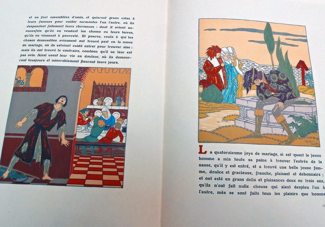
 If you are a Friend of the Princeton University Library, you should be patting yourself on the back for your connoisseurship and good judgement in providing the funds for the purchase of this amazing new volume of satirical engravings. Congratulations.
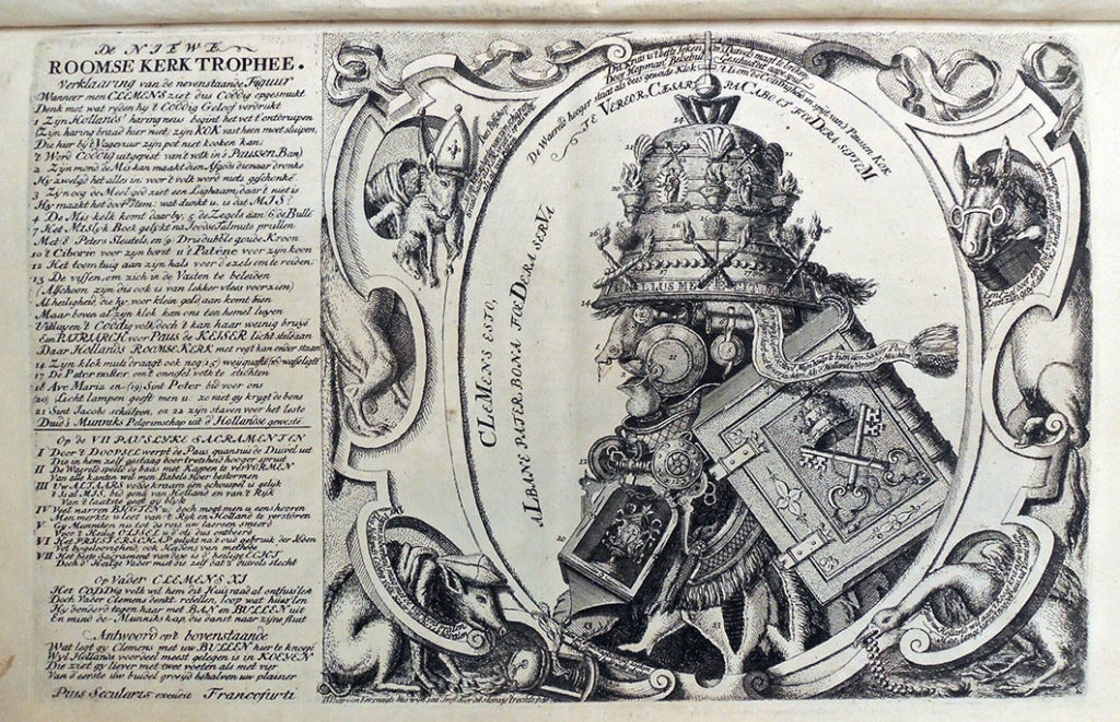
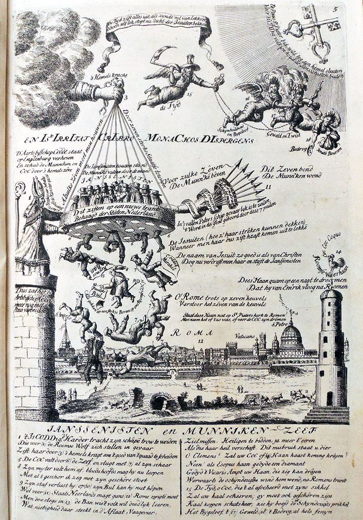
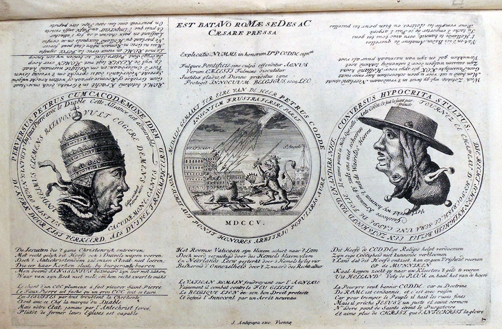
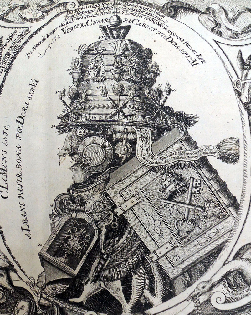
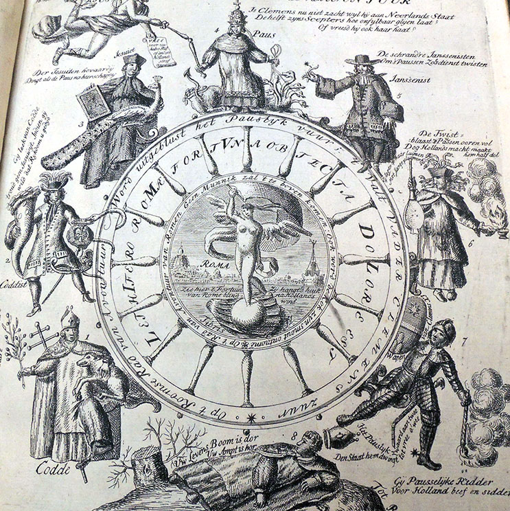
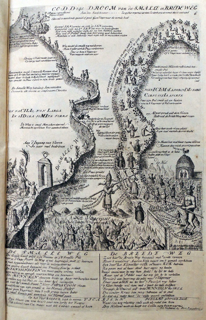
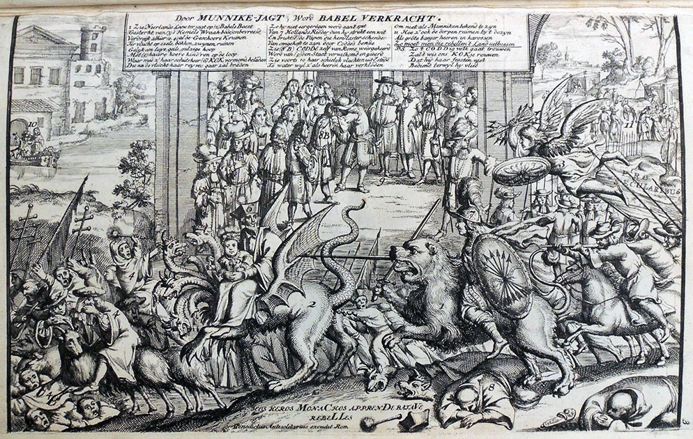
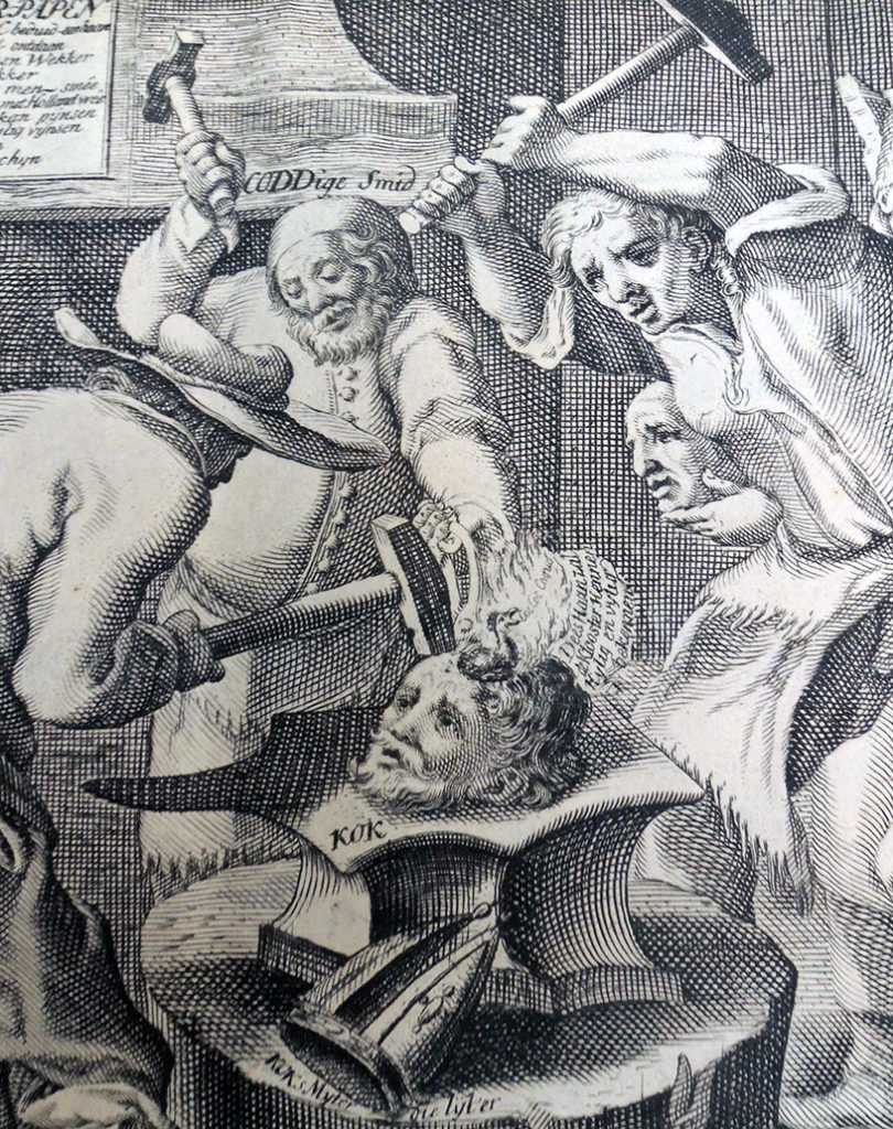
Thanks to the generosity of the Friends, the Graphic Arts Collection has acquired a rare set of Dutch satirical engravings under the title (in English): Rome Perturbed or the Catholic Church in an uproar, presented in ten emblems showing how the papacy, but especially the monks, trespass against the Ten commandments… The volume holds eleven engravings with accompanying verses in Dutch. The imprint is false, ascribed tentatively to the publisher Carel Allard, Amsterdam. The author is identified on the title page by initials only “L.V.J.” for Liefhebber van Jansenius (an anonymous friend of Jansenius).
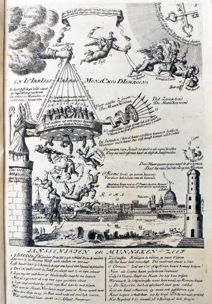
In his study Graphic Satire and Religious Change: The Dutch Republic, 1676-1707, Joke Spaans notes that Roma Perturbata was part of a media offensive against the Catholic Church, culminating in the schism between the Curia and the Dutch diocese in 1723. Apparently the book became something of a bestseller although copies are now extremely rare. This group of elaborate satirical prints focuses on Clement XI’s response to Jansenism in the Netherlands, with particular attention to Pieter Codde and his replacement Theodore de Coc.
The collected engravings went through two editions, one in 1706 consisting of eleven plates [now at Princeton], and an expanded edition with thirteen plates in 1707. Spaans writes
These ‘editions’ are not the fixed entities suggested by this term: the individual plates exist in several versions and the extant copies of the series show some variation in composition. This means that individual plates circulated independently before the series was conceived. The Allard firm collected these prints, altered them as and where they saw fit, and fleshed out the collection with other suitable material they had at hand.
They added a title page, on the reverse side of which they printed ten four-line stanzas that provide the reader with what amounts to a reasoned table of contents. This rhymed table interprets each of the emblems in turn within the wider context of the justification of Codde, the praise of the States of Holland for their support of the Clergy, and the vilification of DeCock, the Jesuits and the Pope and loosely connects them with the Ten Commandments, as referred to in the title of the series.
Spaans also notes that while there were many satirical pamphlets and broadside at this time of dubious quality, “all those in Roma Perturbata were intelligently made, and seem to have been destined for an audience of connoisseurs.”
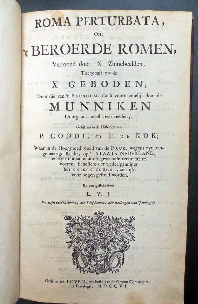
Roma perturbata, ofte ‘t Beroerde Romen, vertoond door x zinnebeelden, toegepast op de x Geboden, door die van ‘t Pausdom … doorgaans meest overtreeden, gelijk nu in de historien van P. Codde, en T. de Kok; waar in de hoogmoedigheid van de Paus … en zyn onmacht om ‘t gewaande recht uit te voeren … voor oogen gesteld worden. By een gesteld door L.V.J. en zijn medehelpers, etc. (Loven [Amsterdam?]: gedrukt ten koste van de Groote Compagnie [Carel Allard?], 1706).
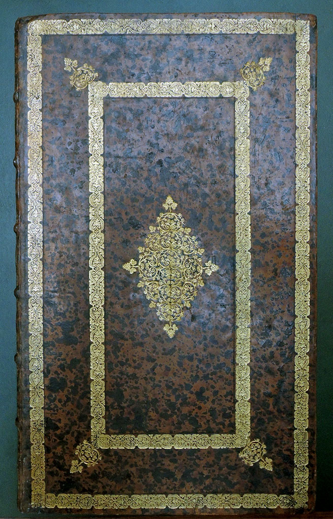
Small folio, 314 x 185 mm, bound in contemporary Dutch speckled calf. Provenance: Bibliotheca Abbatiae Vallis-Dei (Abbot of Gottesthal?), with their ex-libris on front pastedown and stamp of same on front and rear endpaper verso. Purchased with funds donated by the Friends of the Princeton University Library. Graphic Arts Collection GAX 2018- in process
 Given the rarity and uniqueness of each copy, the potential for new research is enormous. OCLC lists only six complete paper copies of the 1706 Roma Perturbata in public collections and none in North America. With current online records and limited published research, it is impossible to know which copies differ and to what extent. Since many of these prints are altered from the original, if in fact an original is known, the study of each impression is not only valuable but essential.
In his catalogue raisonné, Frederik Muller lists the plates of the 1707 publication under numbers 3410 a and b, 1-13, as follows:
Title page: letterpress, kept with the present print
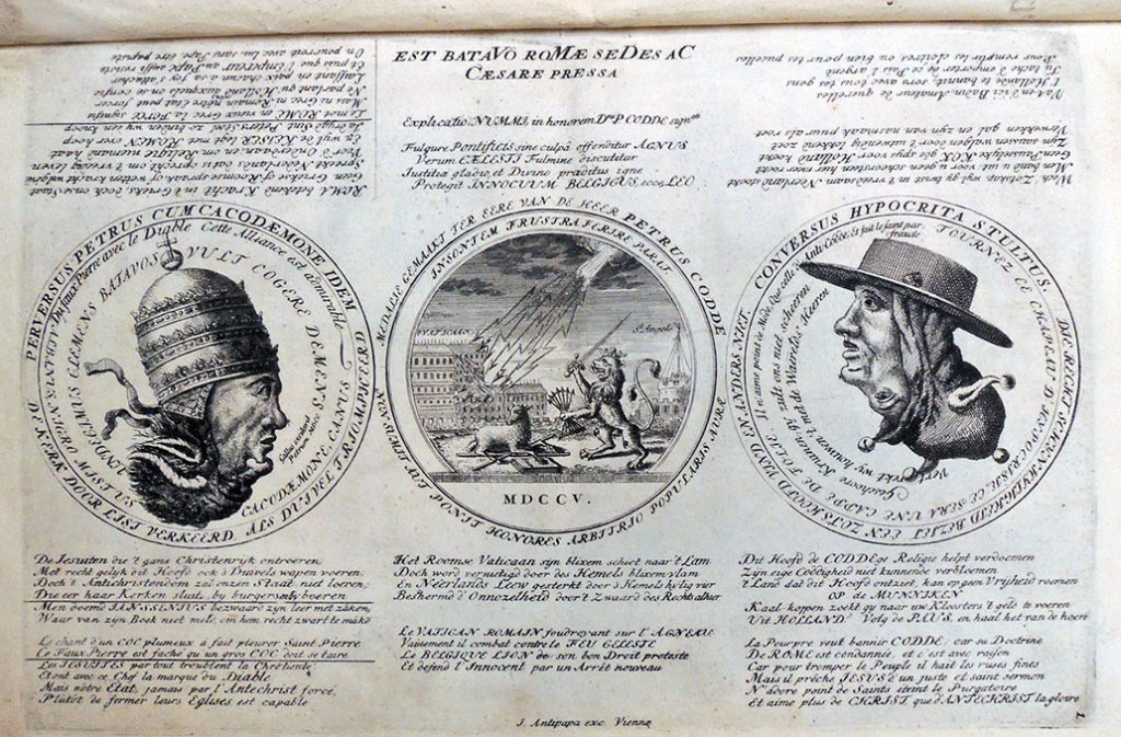
Plate 1: Three medallions, Chronogram 1705
Plate 2: “De niewe Roomse kerktrophee”, Chronogram 1705
Plate 3: “Door Munneke jagt, wordt Babel verkracht”, Chronogram 1705
Plate 4: “Zinnebeeldig pourtret v.d. Ew.Hr. Theodorus de Coc”, Chronogram 1705
Plate 5: “Jansenisten en Munneken zeef”, Chronogram 1705
Plate 6: “Coddige droom van de smalle en brede weg”, Chronogram 1705
Plate 7: “Een Jansenist smeedt met zijn knapen…”, Chronogram 1705
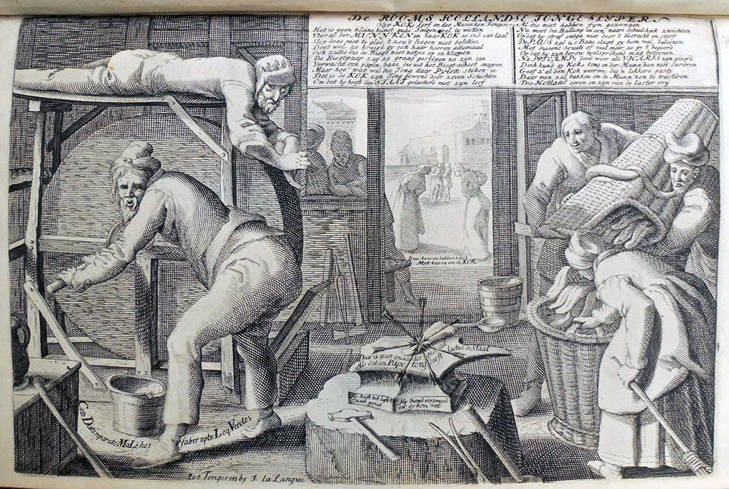
Plate 8: “‘t Rooms Hollands Recht”, Chronogram 1705
Plate 9: “De Rooms Hollandse Tongeslijper”, Chronogram 1705
Plate 10: “‘t Roomse Rad van Avontuur”, Chronogram 1706
Plate 11: “Coddig nachtgezicht”
Plate 12: “De Roomse Kerken-Visiteerder of de Ridder…” Chronogram 1706
Plate 13: “Sic itur ad astra scilicet”; “Rooms Cocceaans Munnike…”
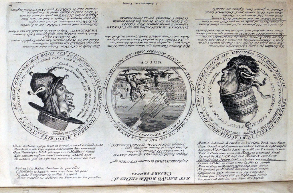
However, these titles vary from the collection catalogue of the British Museum, which also gives lengthy visual descriptions of each plate, suggesting earlier versions and or variations on each theme. Until a compendium of all the extent copies can be attempted, each rare copy of Roma Perturbata in a public collection adds to the scholarship not only of the individual engravings but also to the publication history of the set.

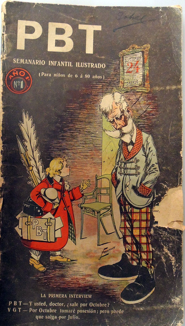 Vol. 1, no. 1 (Sept. 24, 1904)
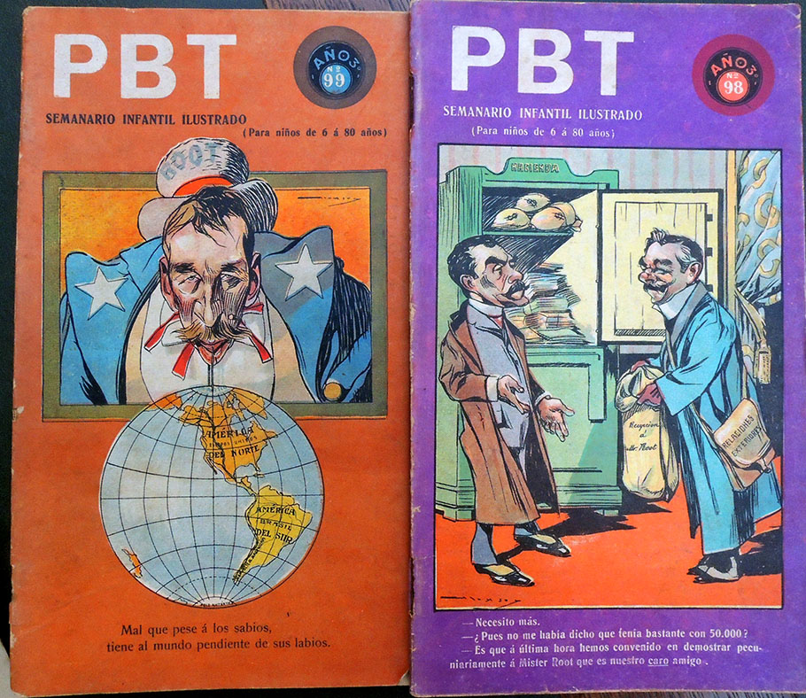
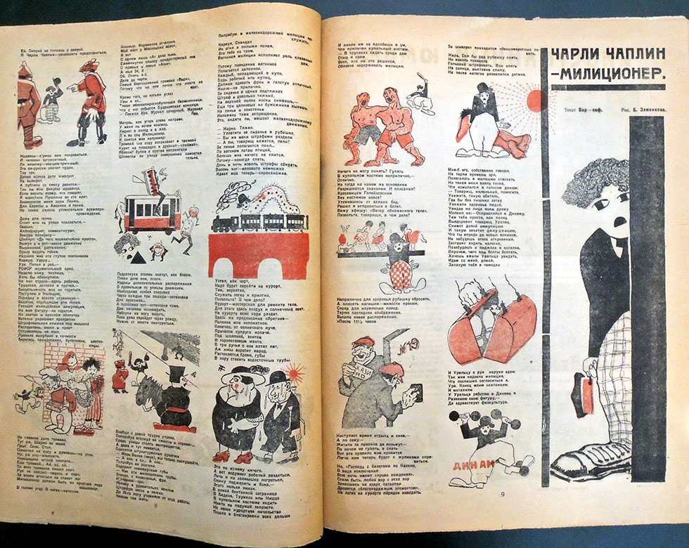
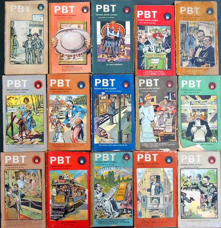
 “The Buenos Aires of the Early Twentieth Century is Reflected in its Pages with Intelligence and Humor,” writes one advertisement. “The word ‘pebete’ in the title was a popular expression in Spain at the time to refer to a boy and which would later take root in Argentina as ‘pibe’.”
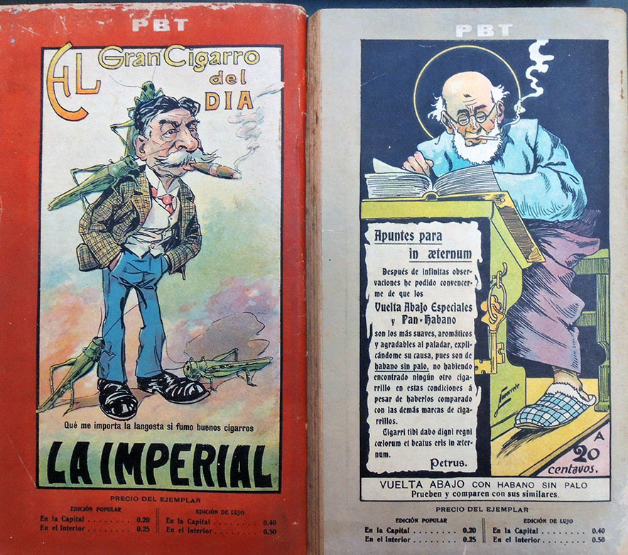

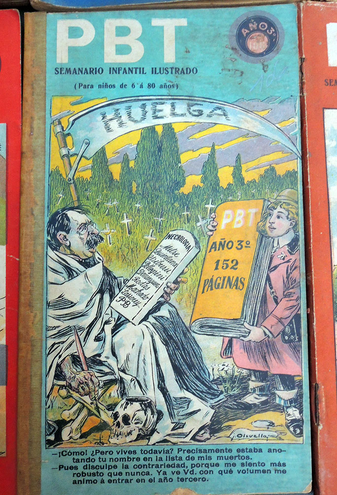
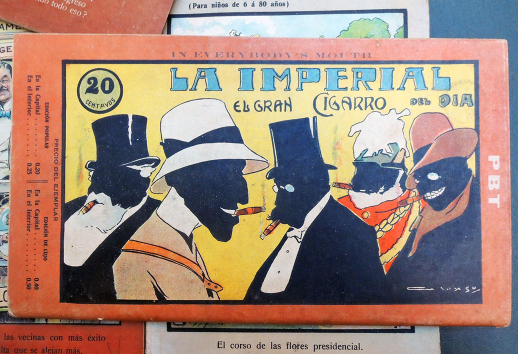 Eustaquio Pellicer (1859-1937 ), P.B.T.; semanario infantil ilustrado (para niños de 6 a 80 años) (Buenos Aires, 1904-1917). This collection was purchased in part with funds provided by the Program in Latin American Studies (PLAS) and in part the Graphic Arts Collection. GAX 2018- in process.