Category Archives: Books

books

The Wars Occasioned by the French Revolution

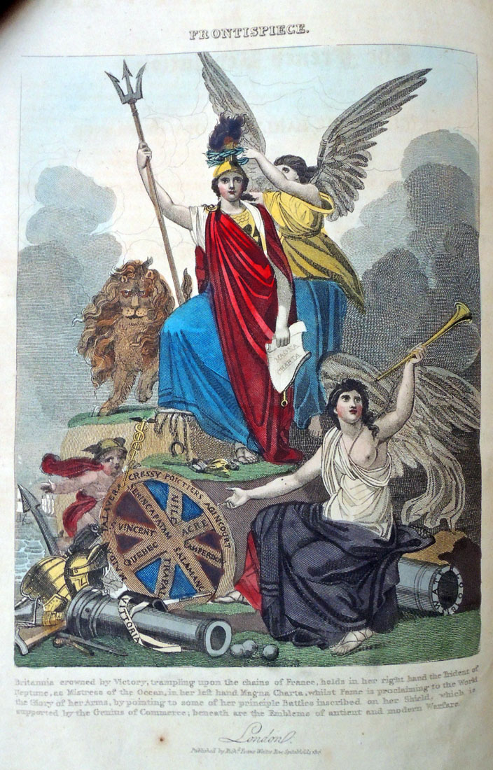
“Britannia crowned by Victory, trampling upon the chains of France, holds in her right hand the Trident of Neptune, as Mistress of the Ocean, in her left hand Magna [Carta], whilst Fame is proclaiming to the World the Glory of her Arms, by pointing to some of her principle Battles inscribed on her Shield, which is supported by the Genius of Commerce; beneath are the Emblems of ancient and modern Warfare. London published by Rich. Evans…”


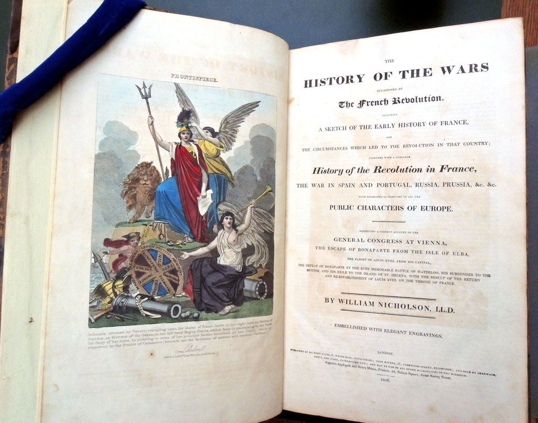
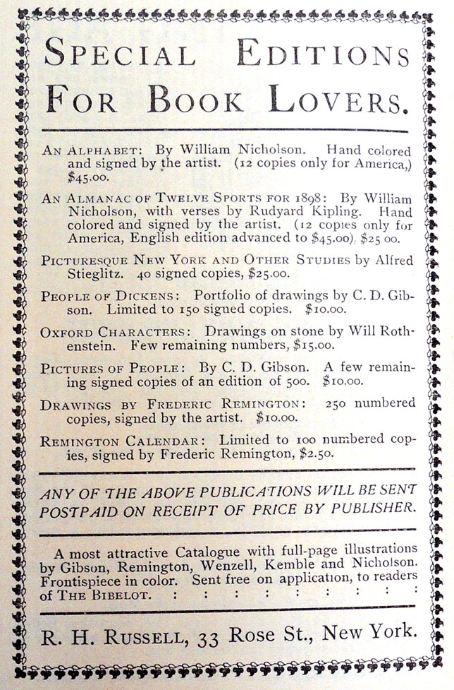
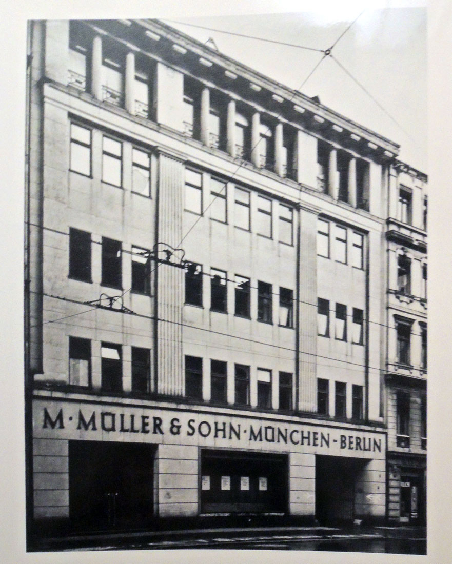
William Nicholson, The History of the Wars Occasioned by The French Revolution. Including A Sketch of the Early History of France, and the Circumstances which Led to the Revolution in that Country; Together with a Complete History of the Revolution in France, The War in Spain and Portugal, Russia, Prussia, &c. &c. Exhibiting a Correct Account of the General Congress at Vienna, the Escape of Bonaparte from the Isle of Elba, the Flight of Louis XVIII. from his Capital, the Defeat of Bonaparte at the Ever Memorable Battle of Waterloo, his Surrender to the British, and his Exile to the Island of St. Helena, with the Result of the Return and Re-establishment of Louis XVIII. on the Throne of France (London: Richard Evans Whites Row Spitalfields, 1816). 22 stencil colored wood engravings. Graphic Arts Collection GAX 2018- in process.

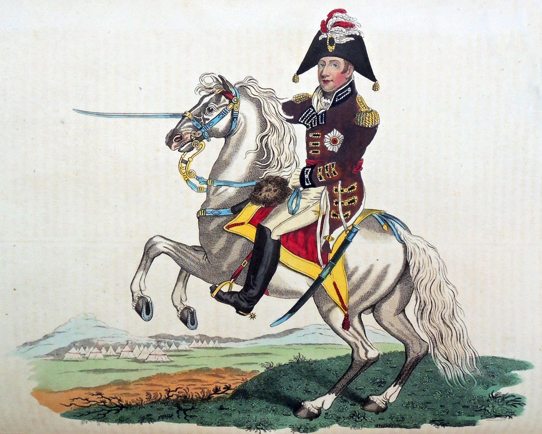
This history of the Napoleonic Wars from a British point of view is noted by some for the first account of a “diving boat” or submarine. Because the author is listed on the title page as L.L.D. [Doctor of Law], it can be assumed he is not the British portrait painter William Nicholson (1781-1844) or the British scientist William Nicholson (1753-1815) who wrote the multi-volume The British Encyclopedia, Or Dictionary of Arts and Sciences. The repetitive equestrian portraits of contemporary world leaders are so far unattributed (list below).


22 stencil colored plates:

1. Britannia, Crowned by Victory… [frontispiece].
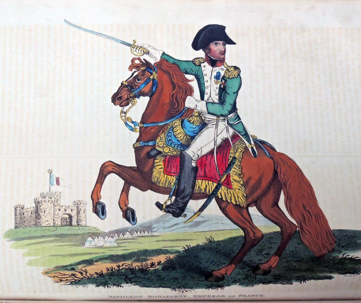
2. Napoleon Bonaparte, Emperor of France. May 31, 1815.
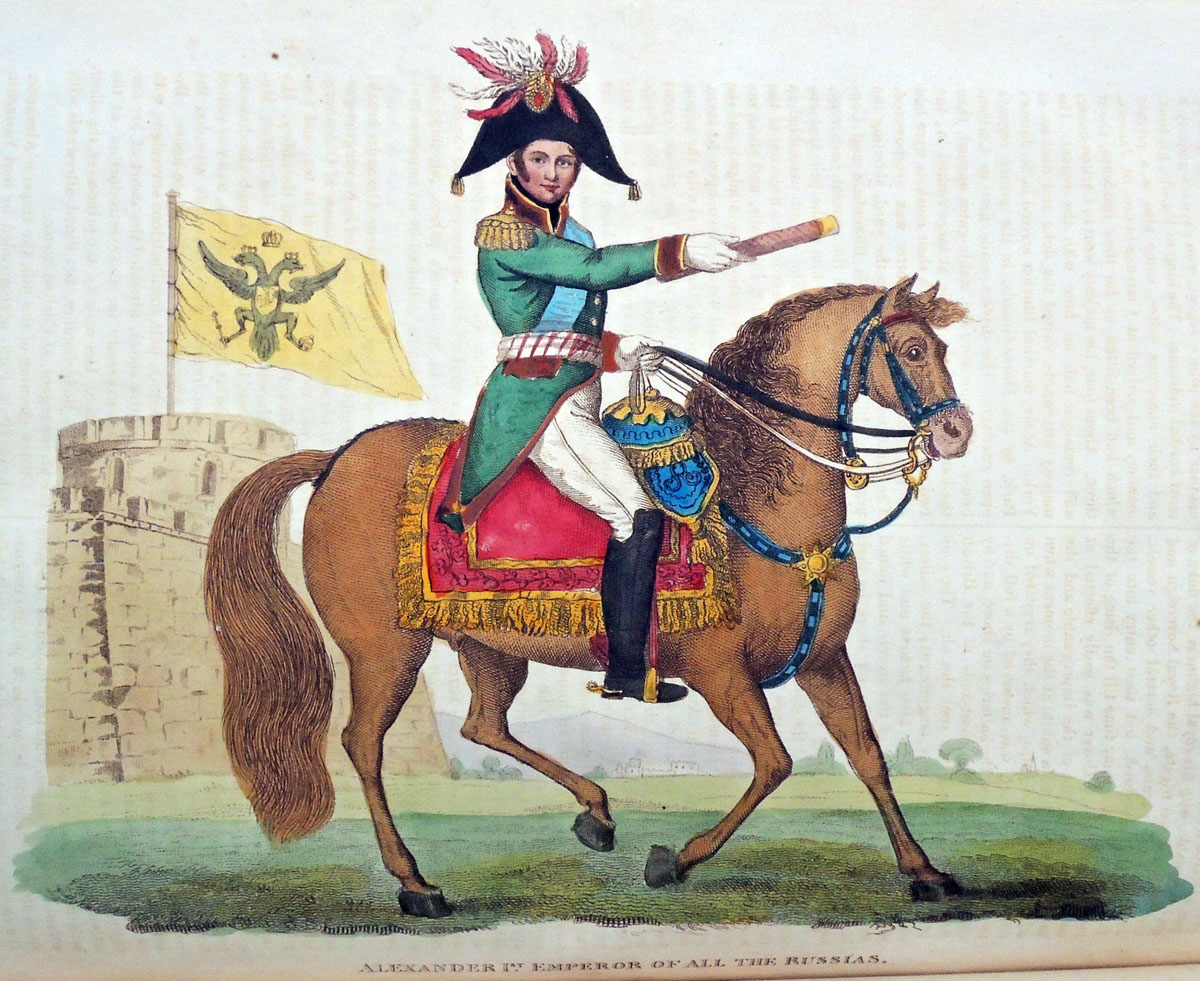
3. Alexander 1st. Emperor of all the Russias… May 18, 1815. [Charles] Canton, del et sculp.
4. His Royal Highness, The Prince Regent of Great Britain. June 16, 1815.
5. Count Platoff, Hetman of the Cossacks. August 11, 1815.
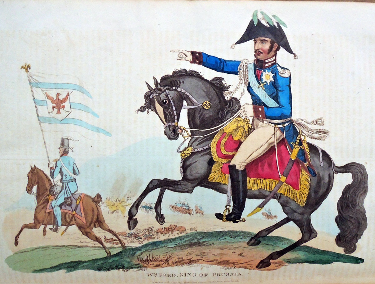
6. Wm. Fred. King of Prussia. May 18, 1815. [Charles] Canton, del et sculp.
7. Field Marshall Von Blucher, Prince of Wagstadt. June 30, 1815.
8. The Duke of Wellington. June 29, 1815.
9. Lieut. General Sir Thos. Picton. Octr. 1815.
10. Lieut. General Lord Hill, K.B. Octr. 10, 1815. Meyron, del., [John] Romney, sculp.
11. Francis 2d Emperor of Austria. May 18, 1815.
12. His Royal Highness The Duke Of York. May 18, 1815. [Charles] Canton, del et sculp.
13. Lieut. General The Marquis Of Anglesea. Nov. 1815.
14. Lieut. General Sir John Moore, K.B. Dec. 1, 1815.
15. Field Marshall Prince Swartzenburgh. 1816. Meyron, del, [John] Romney, sculp.
16. Lieut. Genl. Sir Ralph Abercrombie. 1816,
17. The Battle of Waterloo. 1816. Engravd by [John] Romney, from a Painting by Heath.
18. Lieut. Genl. Sir Eire Coote K.B.K.C.&M.P. 1816.
19. Lieut. Genl. Lord Linedock. 1816.
20. Bernadotte Crown Prince of Sweden. 1816.
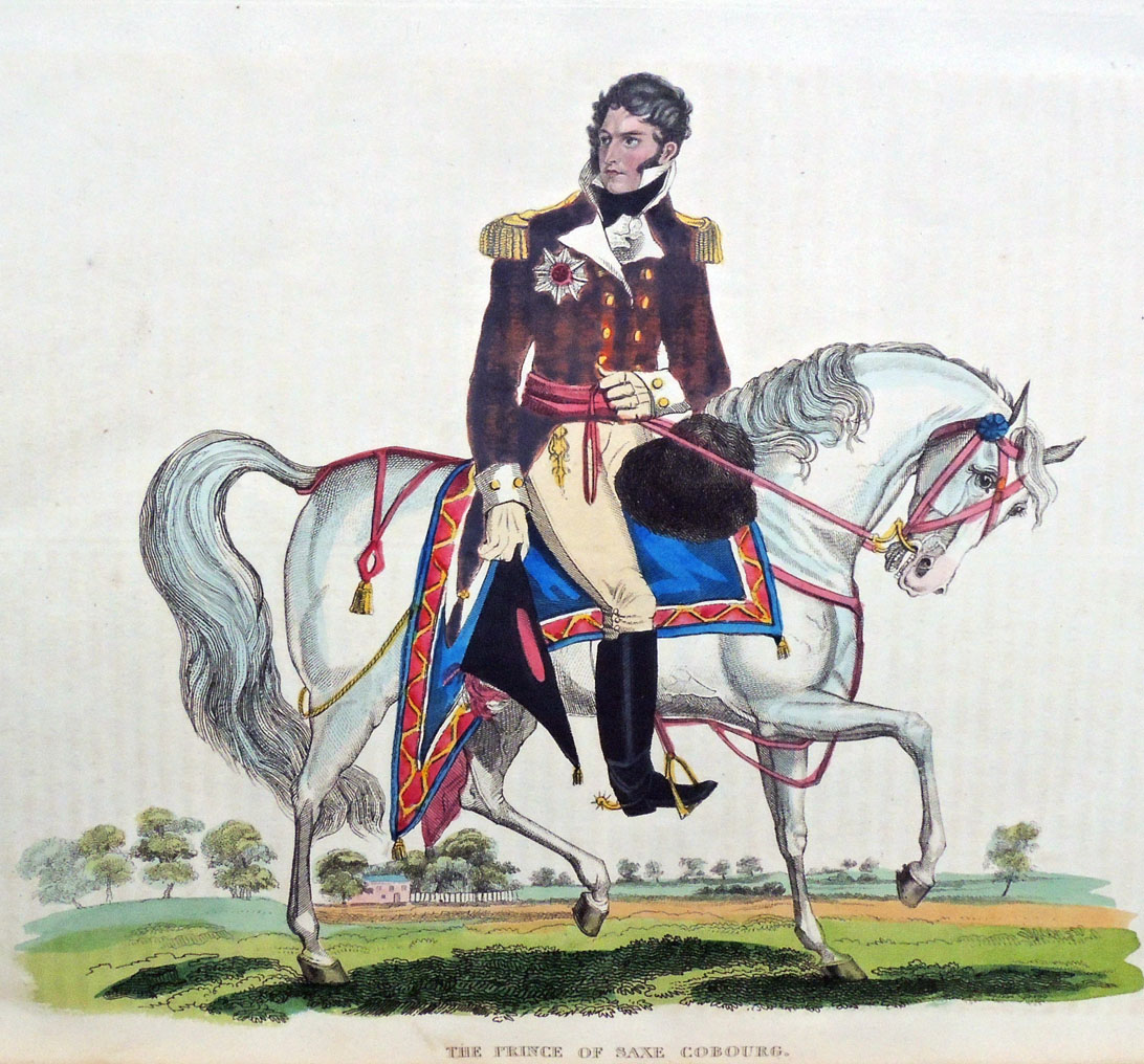
21. The Prince Of Saxe Cobourg. 1816.
22. The Prince of Orange. 1816.


Tuckenhay Paper Mill

Peter Thomas, The Tuckenhay Mill: People and Paper (Santa Cruz: Peter and Donna Thomas, 2016). Housed in clamshell box. Graphic Arts Collection GAX in process.

All copies have: Introductory pamphlet, letterpress printed, 1.They Made the Paper in Tuckenhay Mill, interviews with retired hand paper makers, a 100-page digitally printed book with the text of the interviews; 2.Flash drive with audio files, transcriptions and videos from original interviews; 3.Vintage handmade paper samples and printed ephemera from Tuckenhay Mill. Princeton’s copy has an additional pamphlet titled Handmade Paper in Tuckenhay Devon, pamphlet titled Three Hundred Years of Paper Making, and 22 paper samples with additional booklets.

In the 1830s, Richard Turner started manufacturing paper by hand in the Tuckenhay Mill, and paper was continuously made by hand there until 1962. From then until 1970, the Mill produced pulp (half-stuff) until the business went bankrupt. The equipment was scrapped and the building was sold and converted into vacation cottages, remaining so today.

A self-taught hand papermaker, Peter Thomas became interested in knowing how apprentice-trained hand papermakers working in production hand papermills made paper. He especially wanted to learn the “vatman’s shake,” the series of motions that papermakers used to form their sheets of paper. This desire circuitously led him and Donna to Tuckenhay, near Totnes, Devon, in England, where beginning in 1988, they recorded several hand papermakers, returning to make others in 1990 and 1994.

—  http://www.thelegacypress.com/tuckenhay-mill.html


The 100th Edition of The Compleat Angler

We live in an age of editions de luxe, and so bewildering nowadays is the succession of costly and elegant volumes issuing under this title from the contemporary press that it might seem a task of insuperable difficulty to assign the prize for supreme beauty to any one of them. If, however, we were bound to pronounce a judgment of Paris between the various competitors, our award would go with little hesitation in favour of the two Splendid volumes published by Messrs. Sampson Low & Co., . . .

The “Lea and Dove Edition” (the 100th) of “The Compleat Angler” is a work by which the English printing industry and publishing enterprise of the later nineteenth century might well consent to be represented before the severest aesthetic tribunal of posterity, for clear-cut beauty of typography, for sober richness of binding and decoration, for lavish wealth and artistic excellence of illustration, it is a veritable triumph of the arts which have co-operated in its production.—The Daily Telegraph 1888

In 1888 I brought out the “Lea and Dove” edition, being the hundredth edition of “The Compleat Angler,” in two volumes, small quarto, and a limited large-paper edition. My idea was to make illustrations of scenes on the rivers Lea and Dove the leading feature of this issue, and to give the text of the old classic in a style worthy, if possible, of its hundredth edition, and entirely unencumbered with notes. The text was printed from new type by Messrs. William Clowes & Sons, Limited, who took the greatest interest in the work.

The illustrations consist of about one hundred small woodcuts and fifty full-page photoengraved plates of views on the Lea and Dove—those on the Lea by Mr. P. H. Emerson, B.A., and those on the Dove by Mr. George Bankart. Possessors of this edition may at any rate rest satisfied that it will not be reprinted, as the copperplates I had transformed into boxes for keeping fly-books free from moth, and the type has been distributed. Of the reception of this edition both by the Press and the public I will only say that I was more than satisfied.

–Robert Bright Marston, Walton and Some Earlier Writers on Fish and Fishing (Firestone Z5971 .M377 1894)

Dodd, Mead & Co. have made arrangements with Sampson Low, Marston, Searle & Rivinglon, and purchased the right in America for a limited number of a limited edition of “The Compleat Angler,” to be published this autumn.

. . . It will be known as the Lea and Dove edition. The ninety and nine editions already in the field do not deter Mr. R. B. Marston, the editor, from the idea that his firm can turn out a hundredth edition that shall have a worthy place among its predecessors. He has himself edited the ever-popular work which Charles Lamb said “might sweeten a man’s temper at any time,” and prepared biographies of Walton and Cotton for it.

The illustrations have been prepared especially for it, and depict charming scenes on Walton’s favorite rivers, which, with few exceptions, have never before appeared in the editions of Walton. There will be upwards of fifty full page photogravures, printed from copper-plates, on fine plate paper.

The quiet pastoral scenery of the river Lea is shown in a series of pictures taken by Mr. P. H. Emerson, whose fine photogravures in his works, “Life and Landscape on the Norfolk Broads” and “Peasant Life in East Anglia,” have been so much admired. The views on the rivers Dove, Wye, etc., are by Mr. George Bankart, President of the Leicester Photographic Society and one of the most successful living amateur photographers..—Publisher’s Weekly October 13, 1888.


The Publishers’ Circular and General Record of British and Foreign Literature, 51 (1888)

Izaak Walton (1593-1683), The Compleat Angler, or, The Contemplative Man’s Recreation: being a discourse of rivers fish-ponds fish and fishing written by Izaak Walton; and instructions how to angle for a trout or grayling in a clear stream by Charles Cotton; edited and arranged by R. B. Marston; with fifty-four photogravures and about 100 woodcuts; and containing a reprint of The Chronicle of the Compleat Angler, a [biblio]graphical record of its various editions and imitations by T.Westwood and T.Satchell (London: Sampson Low, Marston, Searle and Rivington, 1888). Copy 165 of 250. Royal Quarto Edition De Luxe. Graphic Arts Collection (GAX) Oversize 2006-0967Q

Blizzard on Fifth Avenue, traffic coming and going

Above: New York Times February 26, 1893, p. 9.   Below: New York Times February 18, 1893

February of 1893 brought terrible weather throughout the United States with the “heaviest snowfalls in years” recorded for New York City.

Alfred Stieglitz (1864-1946) took a day off from work at the Photochrome Engraving Company (formed after the demise of the [New York] Heliochrome Company), and famously spent several hours shooting photographs on Fifth Avenue with a hand-held camera. In particular, he captured a horse drawn coach coming towards him and then, driving away.

Back in the Photochrome studio on Leonard Street, he printed some as magic lantern slides and on April 7, 1893, presented them at the Exhibition of Lantern Slides for the Society of Amateur Photographers of New York.

“The first slides shown were by Alfred Stieglitz, comprising scenes on the Battery, the squalid localities of New York, as well as some interesting souvenirs of life on Fifth Avenue between Murray Hill and the Central Park, and several shots taken during the sloppy weather of March. They exhibited the same knowledge of what to do and how to do it that we have become accustomed to expect from the hand of this accomplished photographer.”– “Society News,” The American Amateur Photographer: A Monthly Review of Amateur Photography (New York), 5, no. 5 (May 1893).

Below: Detail from John Corbin, “The Twentieth Century City,” Scribner’s Magazine 33, no. 3 (March 1903).
Over the next few years, various negatives from the blizzard were printed as photogravures, carbon prints, gelatin silver prints, and as halftone ink prints making the chronology of these iconic images and their reproductions complex. It is unfortunate that today most paper copies of the publications where they appeared are only available in digital form, leaving the identification of the ink print process impossible.

Ink prints of Stieglitz’s negatives for “Winter-Fifth Avenue” appeared in the Photographic Times, 28 (April 1896); W. I. Lincoln Adams (1865-1946), Sunlight and Shadow (New York: The Baker & Taylor company [1897]); the luxury photogravure portfolio Picturesque Bits of New York and other studies (New York: R. H. Russell, 1897); Alfred Stieglitz, “Pictorial Photography,” Scribner’s Magazine 26, no.56 (November 1899); John Corbin, “The Twentieth-Century City.” Scribner’s Magazine 33, no. 3 (March 1903); and of course, Camera Work: A Photographic Quarterly 12 (October 1905). p. 7; among many others. Multiple negatives, multiple processes, multiple headaches.

Detail from W. I. Lincoln Adams (1865-1946), Sunlight and shadow (New York: The Baker & Taylor company [1897]). Originally published in the Photographic Times, 1896. Recap 4597.114.2


Alfred Stieglitz, “Winter-Fifth Avenue,” 1893, carbon print 1894.

The Blizzard, New York. Gelatin silver print, used for the reproduction in Corbin’s article 1905.

Alfred Stieglitz, “Pictorial Photography,” Scribner’s Magazine 26, no.56 (November 1899).

 
Nine versions are listed in: Sarah Greenough, Alfred Stieglitz: the key set: the Alfred Stieglitz collection of photographs (Washington, D.C.: National Gallery of Art; New York : H.N. Abrams, 2002). Marquand Library Oversize TR653 .N38 2002q.

Note: In-between blowing snow the signs can be read.


Advertisement for Stieglitz’s Picturesque Bits of New York (New York: R.H. Russell, 1897) in Bibelot 3, no. 12 (December 1897). No illustration but price: $25.


American Editors

Edna Woolman Chase (1877–1957), editor-in-chief of Vogue magazine from 1914 to 1952. Detail from Doris Ulmann’s A Portrait Gallery of American Editors, full page below.


In 1924, when Doris Ulmann (1882-1934) began photographing the leading magazine and newspaper editors in the United States, she made 43 portraits; 41 were men and 2 were women.

Many of the sitters Ulmann met through The Art Center on 56th Street, incorporated in 1921 to bring together seven organizations: Art Alliance of America, Art Director’s Club, American Institute of Graphic Arts, New York Society of Craftsmen, Pictorial Photographers of America, Society of Illustrators, and the Stowaways.

Elmer Adler (1884-1962), founder of Princeton’s Graphic Arts Collection and a member of AIG and the Stowaways, was the original owner of our book.

A student of the Clarence White School, Ulmann published three volumes of portraits printed in photogravure between 1919 and 1925: The Faculty of the College of Physicians & Surgeons, Columbia University in the City of New York: Twenty-Four Portraits (1919), A Book of Portraits of the Faculty of the Medical Department of the Johns Hopkins University, Baltimore (1922), and A Portrait Gallery of American Editors (1925).

With each, she collaborated with a small circle of friends from the White School and The Art Center, including the Center’s president, Frederic W. Goudy (1865-1947). Goudy designed and arranged the type for her books and Bertha M. Goudy (1869-1935) set the type at their Village Press, which had recently moved from Queens to Marlborough-on-Hudson. The photogravures were engraved and printed from her negatives by Harry M. Phillips at his Manhattan Photogravure Company, 142 W. 27th Street.

At an Art Center meeting, Goudy introduced the typeface he used:

“Members were gratified and reassured to see our ex-president, F. W. Goudy, at the March 22 meeting, the first public affair he had attended since his operation and convalescence. Many compliments were heard that evening, and since, concerning Mr. Goudy’s new typeface, “Garamont,” a classic interpretation of the face used by Geoffrey Tory’s pupil. In further celebration of Mr. Goudy’s return to health and productivity, the Committee on Publications in April distributed to members, as one of their “keepsakes,” Clarence White’s portrait study of Mr. Goudy, reproduced in gravure by Harry M. Phillips of Manhattan Photogravure Company.”–Bulletin of The Art Center May 1923 [Keepsake: Graphic Arts Collection GAX 2010-0022F].

Their friend Ralph Steiner (1899-1986) also worked for Phillips at Manhattan Photogravure during the early 1920s when they producing the photogravures of Robert Joseph Flaherty’s negatives for Revillon Frères. It is likely that Steiner also worked on Ulmann’s books. https://graphicarts.princeton.edu/2018/01/09/revillon-freres-portfolios/ . Steiner went on to become photographer for Adler’s Pynson Printers, https://www.princeton.edu/~graphicarts/2009/02/adlers_pynson_printers_photogr.html.

Note: Each of the sitters was asked to write a short statement about themselves and their work. All except one was published. Why is there no text along with the portrait of Elizabeth Cutting (1871-1946)? Did she not write one or was it considered unacceptable and not printed?

Cutting’s 1947 obituary in New York History notes that she received a B.A. from Vassar College and an M.A. from Columbia University. She joined the editorial staff of Harper’s Bazaar in 1907 before moving to The North American Review in 1910, serving as managing editor from 1921 to 1927. She was among the founders of the Cosmopolitan Club in New York and made a Chevalier of the Legion of Honor by the French government. It is too bad her statement, if there was one, does not appear.


Doris Ulmann (1882-1934), A Portrait Gallery of American Editors, Being a Group of XLIII Likenesses by Doris Ulmann; with critical essays by the editors and an introduction by Louis Evan Shipman (New York: W.E. Rudge, 1925). Copy 193 of 375. “The types, designed and arranged by Frederic W. Goudy, have been set by Bertha M. Goudy at the Village Press, Marlborough-on-Hudson, New York. Presswork by William Edwin Rudge, Mt. Vernon, New York.” Graphic Arts Collection GAX Oversize 2006-0205F

See also: Elizabeth Brown Cutting, Old Taverns and Posting Inns (London: G.P. Putnam, 1898).

Festschrift for Adolf Müller, publisher of “Mein Kampf”

Adolf Müller (1884-1945), Von der Pike Auf, Zum 60. Geburtstag unseres Chefs herrn Adolf Müller zusammengestellt [Munich: H. Schwaiger, 1944]. Frontispiece portrait and approximately 300 black & white photographs on 104 glossy photo paper. 160 unnumbered leaves of text, all printed on coated glossy paper. Graphic Arts Collection 2018- in process.

The Graphic Arts Collection recently acquired this richly illustrated festschrift for Adolf Müller (1884-1945), the publisher of Mein Kampf and close confidante of Hitler from the earliest days of the Nazi party. Issued to celebrate the publisher’s 60th birthday on May 4, 1944, only two copies were privately printed. Approximately one year later, on May 23, 1945, Müller hanged himself in prison following his capture by American troops.

Müller’s personal copy was bound and presented to him from the firm. This is the copy now at Princeton University Library. The volume contains a first-hand history of the Nazi party’s control of media in the pre-World War II period, as well as documentation of Müller’s publishing empire and his relationship with Hitler. The photographs show printing equipment, offices and factories, intimate shots of Müller’s offices, and reproductions of significant publications.

Quotes below are from the dealer’s well-researched description:

Müller was an intimate friend of Hitler — it was Müller who picked him up from Landsberg prison (documented within) in 1924 and Hitler lived in the publisher’s house in Tegernsee. Müller published Mein Kampf in 1925 and all its subsequent editions. The chief publisher of the Nazi party, he directed the printing of the newspaper “Völkischer Beobachter,” a vital arm of the Nazi propaganda effort.

Müller parlayed his firm’s importance to the Nazi cause from its earliest days into powerful administrative positions and a close friendship with Hitler. Intimate scenes of Müller show him hunting and fishing, participating in Nazi rallies, working at his desk, conferring with prominent Nazi officials, etc. Among the many images of Müller’s personal life, Hitler appears in twelve images, including one where he has just been released from Landsberg prison following the Beer Hall Putsch and stands next to Müller’s car.

After his discharge from the German army in 1915, Müller founded the printing company Münchner Buchgewerbhaus M. Müller & Sohn, to publish newspapers and magazines. By the early 1920s he had formed friendships with members of the National Socialist German Workers’ Party and, starting in 1925, Müller’s firm was the party’s central publishing house.

Subsequently, the Nazi party entrusted to Müller the publication of Mein Kampf because of his friendship with Hitler. Once the Nazi party had taken over the German government, Müller’s business, benefitting from a near monopoly, grew exponentially. He officially joined the party at Hitler’s request in 1934. His firm printed more than two million copies weekly of various Nazi magazines and newspapers at the beginning of World War II. Müller’s leadership was an irreplaceable component of the Nazi party’s propaganda apparatus in the 1920s and through to the end of the war.


The text of this book provides a thorough account of Müller’s career, which, at times, is surprisingly candid. Certain portions touch upon the company’s claims that it was an impartial entity, even though it underwent a rapid change from a neutral publishing house into a company wholly involved in National Socialist propaganda.

Additionally, it becomes clear that this document was not intended for widespread publication since it openly discusses the company’s internal operations and political decisions in a very forthright and revealing manner.

Another section describes the firm’s entanglement in a controversy regarding the reporting of Germany’s annexation of Austria. Finally, there are extensive histories of the publication of Mein Kampf and the “Völkischer Beobachter.”

According to the preface composed by Heinrich Schwaiger, chief manager of the Munich headquarters, two copies of the work were printed, however the present copy was the only one bound and the second, which remained in sheets, can no longer be located. Despite Nazi Germany’s growing number of defeats by 1944 and the destruction of the company’s headquarters in a bombing raid, no expense was spared in this book’s production. An original Gothic font was cast especially for this book, and the company’s plant prioritized the high-quality illustrations on fine coated photo paper.


All of the photographs are fully described and the individuals identified. Here is one example of the many indexes through the volume.


Rapid Photogravure or Rembrandt Gravure

The Rembrandt Intaglio Printing Company staff pictured above, director Karl Klíč seated in the front row with his arm over Samuel Fawcett’s shoulder.

“When the whole history of rapid photogravure comes to be written (as I doubt greatly if it ever will be) it will be one of the oddest stories in the whole annals of our craft, and even today the oddities continue. Besides revelations exciting a smile, there might perhaps be revelations of some things of which complaint could at the time have fairly been made.” J. Albert Hepps, Printing Art 20 (1913).

Around 1879, Karl Klíč (1841-1926) perfected the engraving of copper plated cylinders instead of flat plates, in an attempt to speed up the slow process of photogravure. Although it was very expensive to engrave a single cylinder, once it was finished thousands of images could be printed making it financially viable for books, magazines and newspapers.

In 1895, Klíč joined Samuel Fawcett and the Storey Brothers printing firm in Lancaster to form the Rembrandt Intaglio Printing Company. Klíč convinced them to stop printing textiles and specialized instead in the reproduction of old master paintings and other art publications.

Thanks to the Sun Printers’ archive, here is a look at one of the first rotary gravure machines, a 15 in. calico printing press by John Wood of Ramsbottom, Lancaster, in 1910. (Photograph thanks to Digby Wakeman)

The Rembrandt Intaglio Printing Co., of Lancaster and London . . . were the first to introduce this class of work in 1896, and . . . they still stand unrivalled, the reputation of their work is firmly established, and they are to-day the premier company, and we admire them and their ability to keep their secret, for we believe that to this day the knowledge of “how it is done” is still theirs alone.

From the beginning the Rembrandt Intaglio process secured the highest appreciation of connoisseurs and collectors. Dr. Bode, Director of the Royal Museum, Berlin, describes their photogravures as the outcome of a perfected, and the only process which gives the richness and velvety effect of the old mezzotints.”.–Process: The Photomechanics of Printed Illustration 20, Issue 232 (1913).

One of the best examples of these rapid photogravures can be found in the two volumes of The Venture: an Annual of Art and Literature (London: J. Baillie, [1903-1905]. Rare Books 3584.932). Images are printed in black and brown inks until 1905 when Klíč succeeded in producing three-color rotogravure and the following year, his company begins marketing color gravure prints.

Rembrandt Intaglio never patented rapid photogravure but kept the process secret for many years. In 1904, when Eduard Mertens filed his own patent no. 17,198 for rotary photogravure, it was rejected. Not only had pictures and type been printed intaglio from the same copper plate for hundreds of years but the Rembrandt company had clearly been printing on copper cylinders long before Mertens’ application.

The fact that Mertens photographed both the text and the pictures onto a cylinder while the Rembrandt firm engraved the words by hand made no difference.

This decision cleared the way for European and American press manufacturers to sell rotary photogravure presses and for publishers to use them. By 1910, both letterpress text and gravure images were being printed together by Freiburger Zeitung [Freiburg, Germany] and in 1912, the New York Times followed.

Dozens of printing firms were established in major cities across the globe, leaving the Rembrandt Intaglio Printing Company bankrupt. The firm was acquired by the Sun Engraving Company in 1932, renamed Rembrandt Photogravure Ltd, and maintained until it closed in 1961.

Here are a few images of the 20th-century rapid photogravure or gravure printing at Sun Engraving, thanks to their online picture archive. Note the number of men needed to move the cylinders.

Sun Engraving Company gravure press

Carbon tissue room.

Moving of the cylinders

Copper plating of the cylinders.

Gladstone in his Temple of Peace


Joseph Parkin Mayall (1839-1906), William Ewart Gladstone, 1883. Photogravure. Published in Artists at Home, edited by Frederick George Stephens (London: Sampson Low, Marston, Searle and Rivington, 1884). Graphic Arts Collection GAX Oversize 2007-0028F

Joe Mayall was forty-three when he left work in the family business established by his father, daguerreotypist John Jabez Edwin Mayall (1813–1901), and opened his own photography studio at 548 Oxford Street, near the Marble Arch in 1882.

The following year, the firm Sampson Low, Marston, Searle, and Rivington proposed a series of luxury prints depicting prominent artists of the day in their homes, surrounded by their work. Equal weight was to be given to the men and the interiors, featuring “pictures, sculptures, and other objects of art which characterise those places,” according to the prospectus. Since Sampson Low had already retired from the firm, credit for the project might go to Edward Marston (1825-1914), who continued to publish luxury volumes.

Art critic George Stephens (1828-1907) was hired to write the biographies and Mayall secured the commission to make the portraits. Forty-eight men were photographed but only twenty-five appear in the final publication, issued monthly from March to August 1884. Each part cost five shillings, with the final bound volume priced at 42 shillings (£2.40). Mayall’s assistant Frank Dudman (1855-1918) filed his own name to the copyright on many of the negatives.

From the beginning, the portraits were planned as photogravures, advertised in the prospectus as the “entirely new and unquestionably permanent process of photoengraving.” When the book was later reviewed, it was called a “marvels of skill and workmanship.” Thanks to the exhibition at Emery College, we learn that “the first set of photogravures was printed in Paris, but something went awry with one of the plates, and although the March 1st publication date had been confidently announced for weeks, that initial installment was embarrassingly delayed.” Chiswick Press printed the rest of the volume but there is no information on the engraver who made and printed of the plates.

The book is dedicated to Frederic Leighton (1830-1896) [below] but he was pushed aside at the last minute to feature Prime Minister William Ewart Gladstone (1809-1898) as the frontispiece. Although not a painter, he was an Honorary Professor of Ancient History at the Royal Academy. Photographed in his library at Hawarden Castle, Gladstone later became the subject of an article Mayall published describing the two days spent photographing; “Mr. Gladstone at Home. The Whole-Hearted Homage of a Hero-Worshipper,” Pall Mall Gazette no. 7600 (July 27, 1889).

“I packed up my apparatus and started off with my assistant on January 15, 1883, by the 5:15 A.M. train, from Euston. We arrived at Broughton Hall in due course, distant about two miles from Hawarden Castle, which was visible from the railway station. We drove over in a trap. The day was dull and unpromising for photography.”

“Now came the technical and other difficulties to be surmounted in taking a photograph of Mr. Gladstone in his sitting-room [known as the] ‘Temple of Peace.’ . . . Mrs. Gladstone suggested to me that if I found the books in the way they could be removed. I said, ‘No! madam, don’t touch them. I am somewhat of a bookworm myself, and am jealous of any one disturbing my books. I will bring that much-treasured bookcase in view when I photograph Mr. Gladstone,’ which I afterwards did.”

“…All the preparations being made and ready, the camera in site, double slides charged, and a good solid head-rest placed behind the chair, Mr. Gladstone was seated and I exposed the plate 120 seconds. Mrs. Gladstone and her son, who were in the library at the time, thought that I had exposed the plate five minutes, the time seemed so long. I said no, I had counted 120 long seconds, so Mr. Gladstone very good naturedly said, “Photographic seconds,” which I explained must be lengthened out if possible, as every photographer dreads under- exposure.”

Joseph Parkin Mayall (1839-1906), Frederic Leighton, Baron Leighton, ca. 1883. Photogravure. Published in Artists at Home, edited by Frederick George Stephens (London: Sampson Low, Marston, Searle and Rivington, 1884). Graphic Arts Collection GAX Oversize 2007-0028F

Re-creating Delaunay’s “La Prose du Transsibérien”

In 2008, the Beinecke Rare Book and Manuscript Library published a facsimile of La Prose du Transsibérien (Prose on the Trans-Siberian Railway) by Blaise Cendrars and Sonia Delaunay. The full-size color reproduction was even folded like the original. The only problem was it couldn’t represent the pochoir (stencil) printing of the original.

Now, Kitty Maryatt, Director Emerita of the Scripps College Press, has re-created La Prose in the same size, same color, same folding, but this time with the original letterpress text and hand-painted pochoir color.

Maryatt and her assistant Chris Yuengling-Niles finished the first copies in France, where they spent almost two months working daily with Christine Menguy at Atelier Coloris to fine-tuned their skills in the pochoir process. The edition of 150 copies is published by Two Hands Press and the Graphic Arts Collection recently acquired a copy.

All the specifications can be found at http://laprosepochoir.blogspot.com but here are some details.

The type for the book was printed in June of 2017 by printer Richard Siebert in San Francisco. Two Hands Press licensed a high-resolution scan of La Prose from The Palace of the Legion of Honor in San Francisco. Richard removed the surrounding pochoir colors from the Blaise Cendrars poem and then went through the whole text for weeks, cleaning up nearly every letter. Sixteen photo-polymer plates were needed to print the four 16 x 23 inch pages, with each one printed in four colors: orange, ruby red, green and blue. Each of the 1000 sheets was printed four times on his Heidelberg letterpress.

The gouache color for Delaunay’s imagery is hand-applied using thin metal stencils. There are about 25 aluminum stencils for each of the four sheets, totaling 100 in all. The 50 or so colors have been selected with great care to match the originals.

La Prose was first produced in Paris in 1913 and published by Cendrars’s own self-financed publishing house, Éditions des Hommes Nouveaux (New Man Publishing). The text and artwork were printed onto the same sheet, which was folded accordion-style to form the twenty-two panels. Unfolded the book is approximately 199 x 36 cm.

Listen to an audio recording of the text approved by Blaise Cendrars, read by Jacques-Henry Levesque with score by Frederic Ramsey Jr. (Folkways Records, 1967) thanks to the Museum of Modern Art’s Inventing Abstraction website: https://www.moma.org/explore/multimedia/audios/341/4333

Cendrars’s story describes a railway trip taken by a poet and a young girl named after Joan of Arc, from Moscow to Paris, via China and the North Pole.

A very peculiar and unique specimen of binding

The Graphic Arts Collection recently acquired a 1691 edition of poems by Lodovico Adimari (1644-1708) dedicated to Louis XIV, king of France (1638-1715). While the poems may be interesting, it is the binding that first drew our attention.

In the 1903 Book-Prices Current: A Record of Prices at which Books Have Been Sold at Auction, entry 6057 describes a book sold for £16:

Adimari (Lodovico). Poesie, alla Maiesta del Re Lodovico XIV. il Grande. Old morocco, full gilt back with stars and crescents . . . and a full-length figure of a crowned queen in gilt outlines, all apparently hand-tooled except a fieur-de-lis on one of the plinths, which appears to be stamped, a very peculiar and unique specimen of binding, Bologna, 1691.

When this volume was in the hands of Mortimer L. Schiff (1877-1931) he appears to have also considered the binding contemporary with the text.

But in the 1997 article, “A binding decorated c. 1880-1890, probably in Bologna – English and foreign bookbindings 77” in The Book Collector (1997), Anthony Hobson attributed the binding to “a gang of Bolognese forgers . . . torn between conflicting ambitions.” Should the book look Italian to fit the poet and publisher or should it appear French, to fit the larger market for French antiquarian books at the time? This is the concern that led to the book’s unique and hard to classify binding, according to Hobson.

Detail


Lodovico Adimari (1644-1708), Poesie di Lodovico Adimari, patrizio fiorentino e gentiluomo della camera del serenissimo di Mantoua alla maesta del gloriosissimo e cristianissimo re Lodovico XIV, il Grande ([Mantua?]: [publisher not identified], [1691?]) with Alla sacra reale maesta christianissima di Luigi il Grande (Bologna: Per gle Eredi di Antonio Pifarri, 1691). Graphic Arts Collection. Acquired with funds provided by the Rare Book Division, French Studies, and Graphic Arts Collection.

Printed presentation leaf from “Dottore Giouam-battista, e Caualiere Almerigo Visconti Bartholini”, to “Caualiere Francesco, Giouan-Maria, e Camillo Maria Visconti”, bound in at front. Manuscript presentation leaf to Dottore Giovambattista Bartholini from J.A.. Buzzichelli, with two leaves of manuscript verses by Buzzichelli, bound in at end.


On both front and rear covers, a double-rule frames a crowned woman in a long robe standing between two plinths that support potted laurels; crescents in three corners, an upper border of lilies and lower border of daisies and lilies; the crescent repeated in the spine compartments, edges sprinkled red and blue.

One source identified the female figure standing in silhouette as Queen Marie-Thérèse of Austria (1638-1683). Here is the queen’s official portrait by Charles Beaubrun (1604–1692) and Henri Beaubrun the younger (1603–1677), which matches the binding surprisingly well.