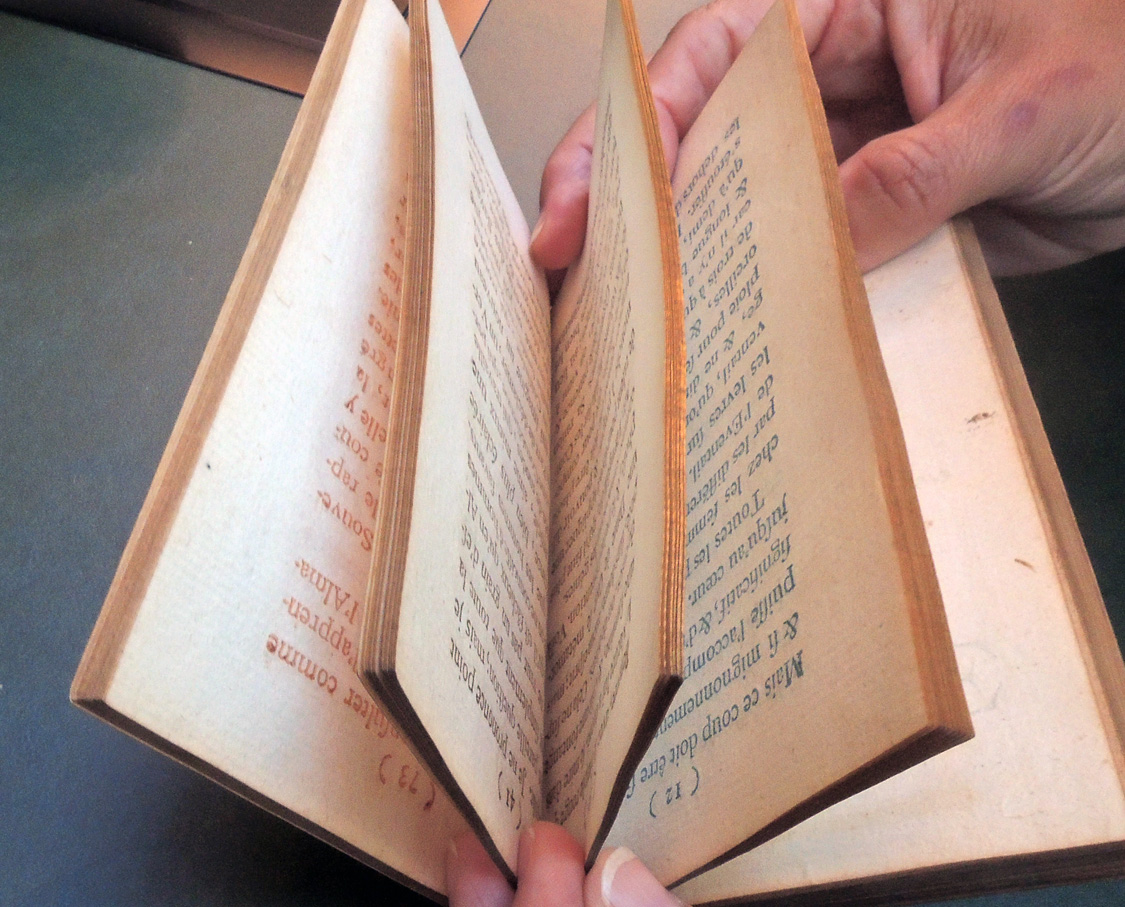
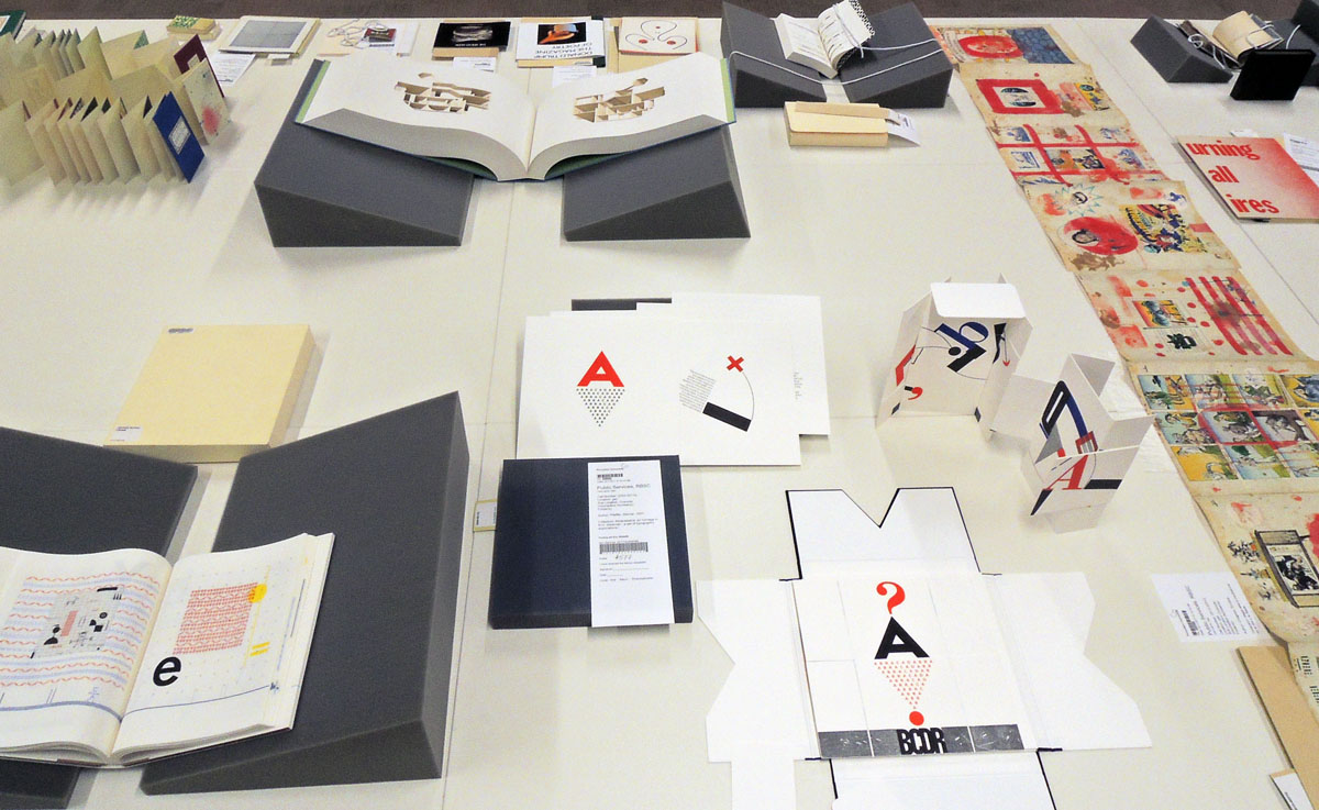
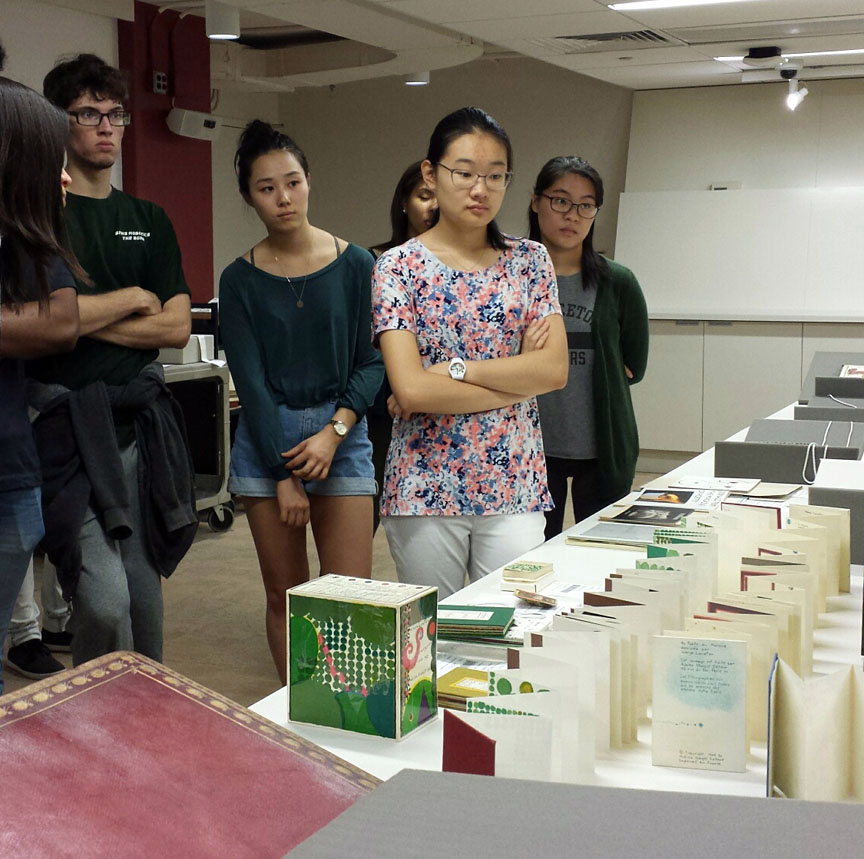
We are beginning the new 2017/2018 academic year with a visit from VIS 214, Graphic Design with Francesca Grassi. The students were shown wonderful book arts, old and new, high and low, rare and well-known.
“This studio course will introduce students to the essential aspects and skills of graphic design, and will analyze and discuss the increasingly vital role that non-verbal, graphic information plays in all areas of professional life, from fine art and book design to social networking and the Internet.
Students in the course will explore visual organization through a series of focused, interrelated assignments dealing with composition, page layout, type design, and image. Hands on production will include an array of do-it-yourself printing and distribution technologies, from letterpress and mimeograph to photocopying and websites.”
Sign painter’s sample album, Alfred Jarry
Olafur Eliasson, Bruno Munari, Henry Wessells, Kenneth Josephson, Sol Lewitt
Warja Honegger-Lavater, Yoji Kuri, German baptismal certificate
Francesca Grassi, Lecturer in Visual Arts, is a New York-based independent graphic designer and creative director. After graduating in 2007 with an MFA in graphic design and typography from the Werkplaats Typografie, in The Netherlands, she worked as a freelance book designer collaborating on books with contemporary artists and fine art publishers.
From 2009–2012 Grassi worked as a designer at the Whitney Museum of American Art, where she was responsible for the overall institutional identity as well as art directing, developing and executing all Museum graphic design needs for print, online and environmental applications.
Enrique Chagoya, Bruce Nauman, Richard Misrach, Ed Ruscha
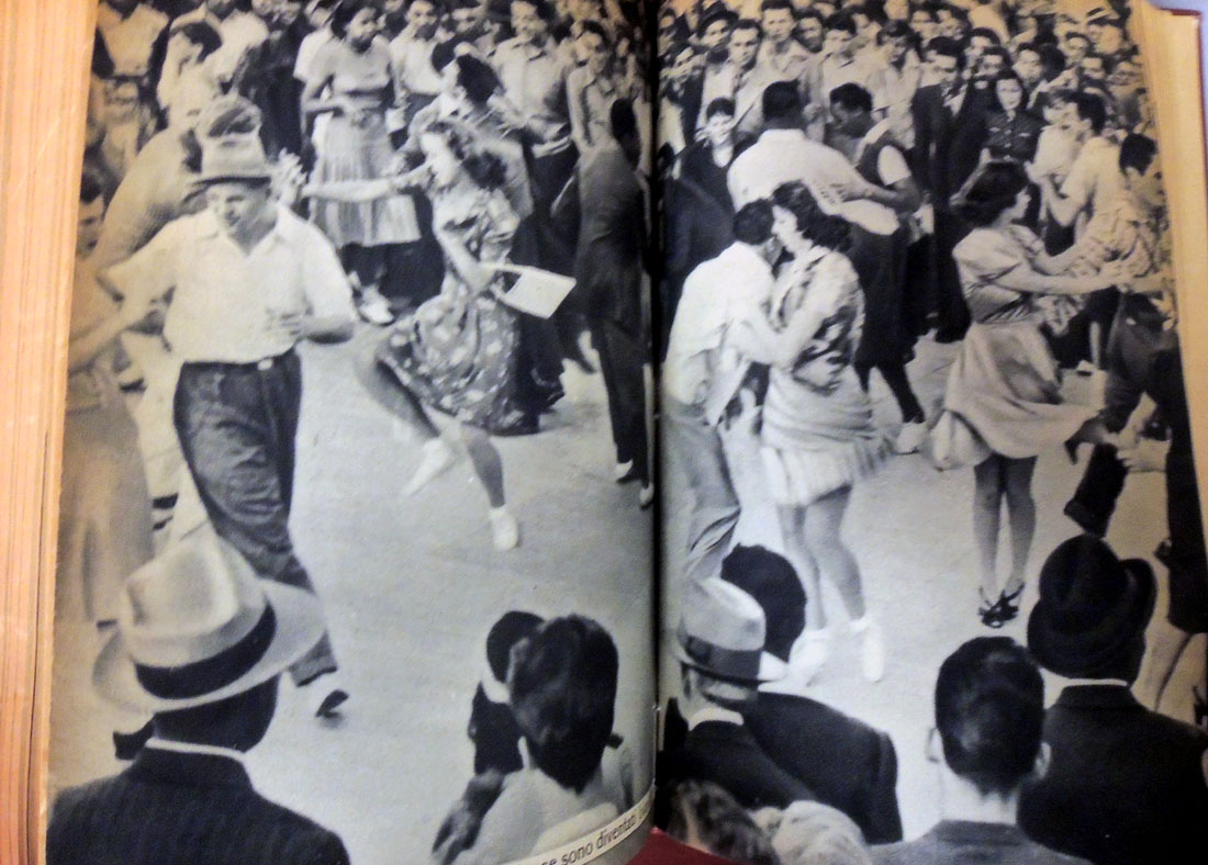
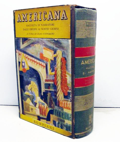
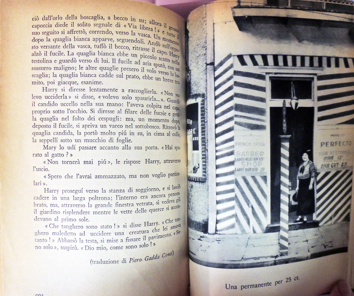
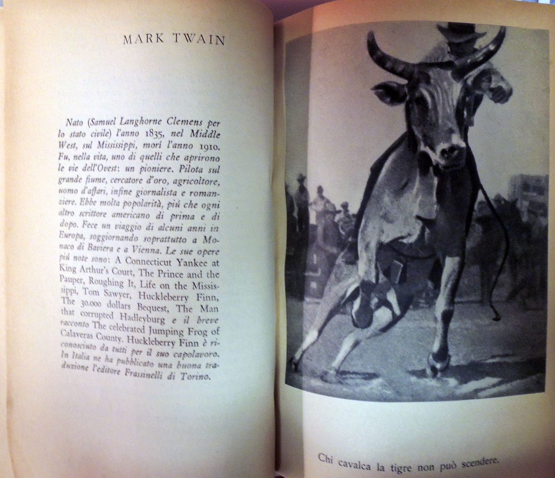
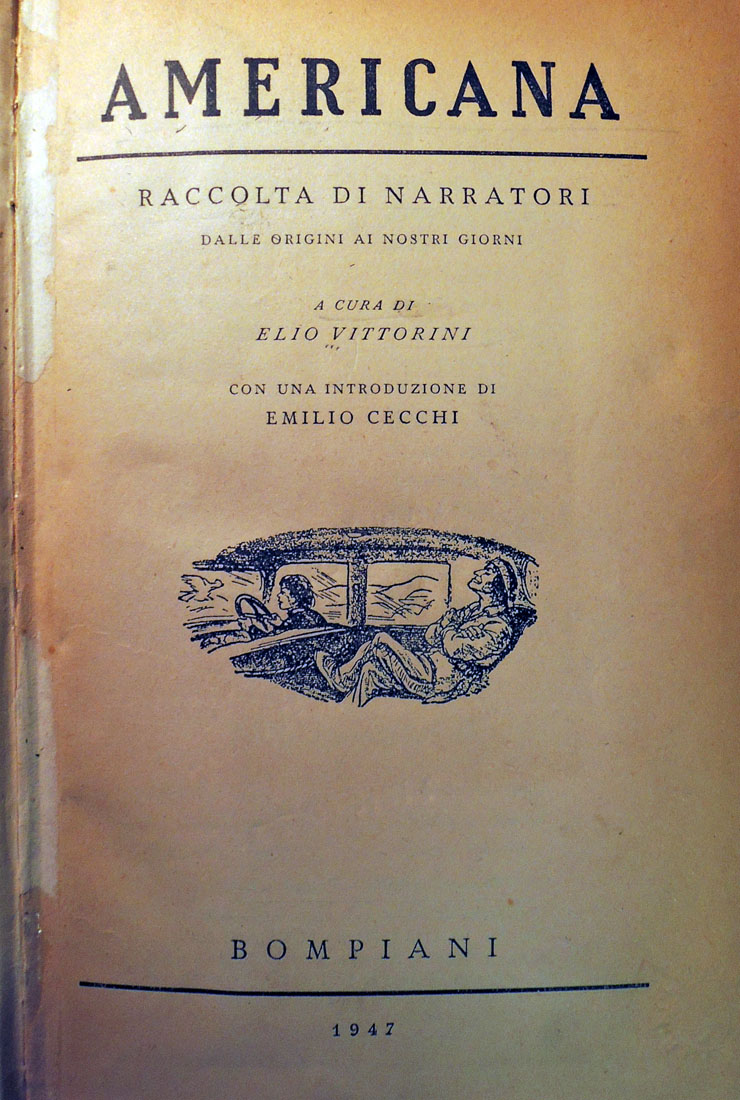
Elio Vittorini (1908-1966), Americana: raccolta di narrator, a cura di Elio Vittorini; con una introduzione di Emilio Cecchi (Milano: Bompiani, 1947). (F) PS519 .V588 1947
This fall, 2017, Jhumpa Lahiri, Professor of Creative Writing, and Sara Teardo, Lecturer in French and Italian, will be teaching: “Translation Workshop: To and From Italian,” based on Elio Vittorini’s 1941 anthology Americana.
The book showcases “thirty-three American writers translated for the first time into Italian – transformed the literary consciousness of a nation under fascism.” An instance where “literary translation broke through barriers of parochialism and became a defining cultural phenomenon.” Also included are 100 plates of iconic American photographs.
Their announcement promoted a look at the book that inspired this class.
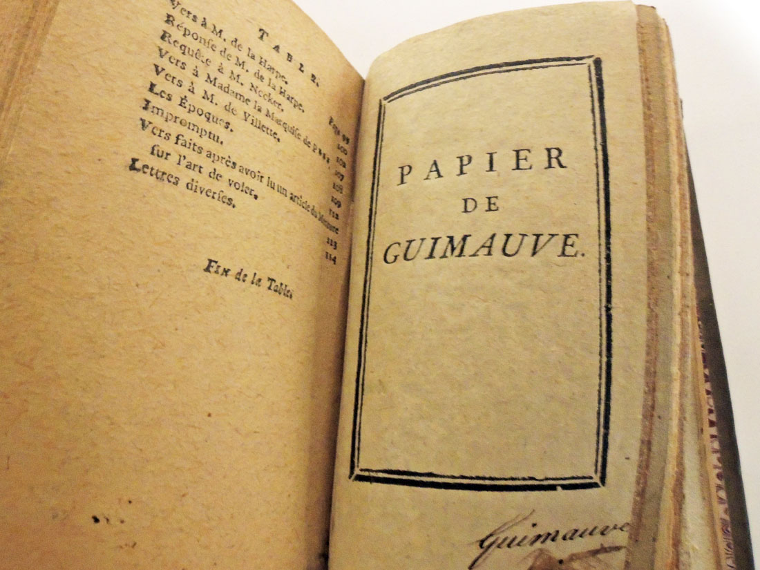
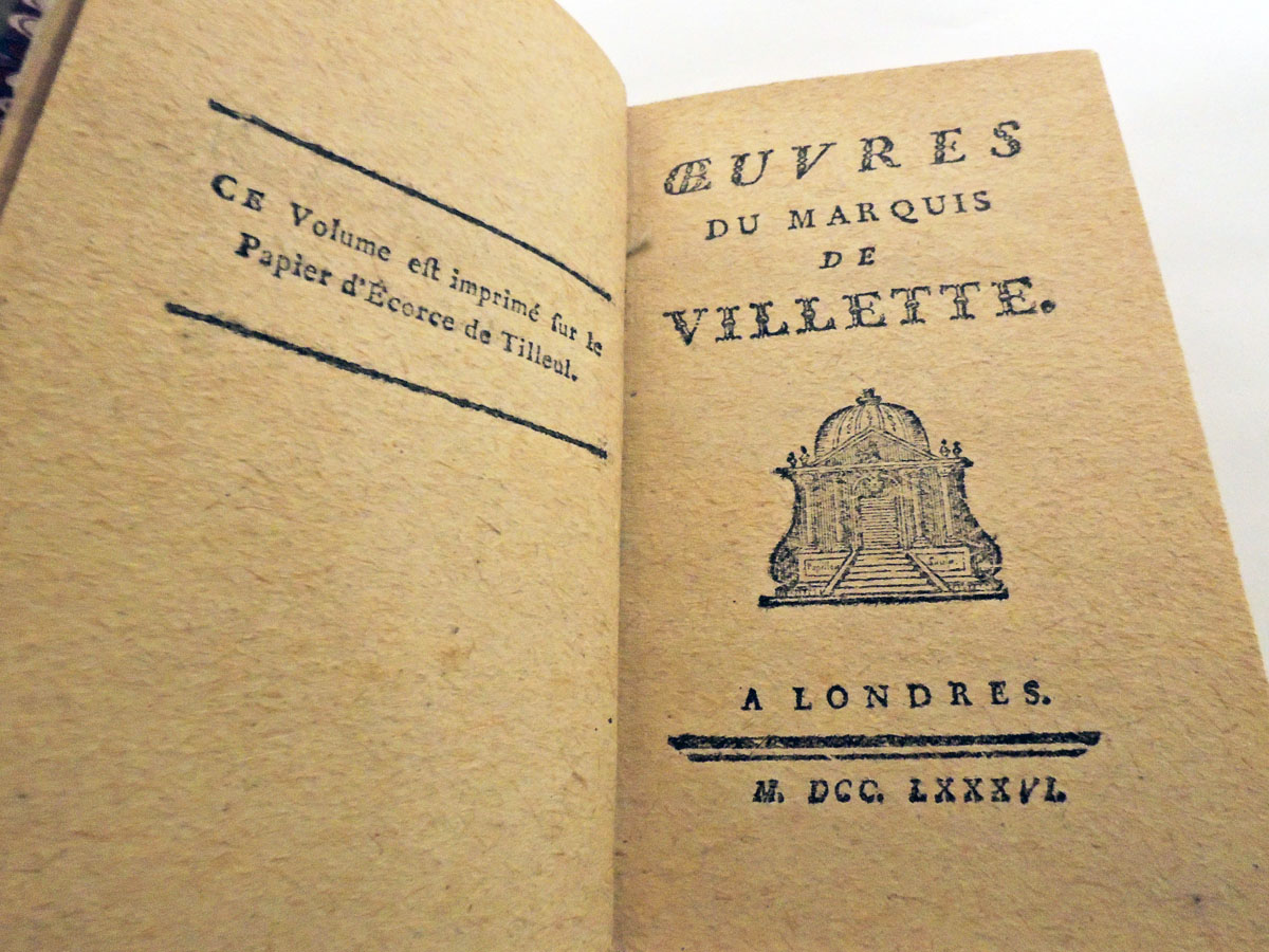
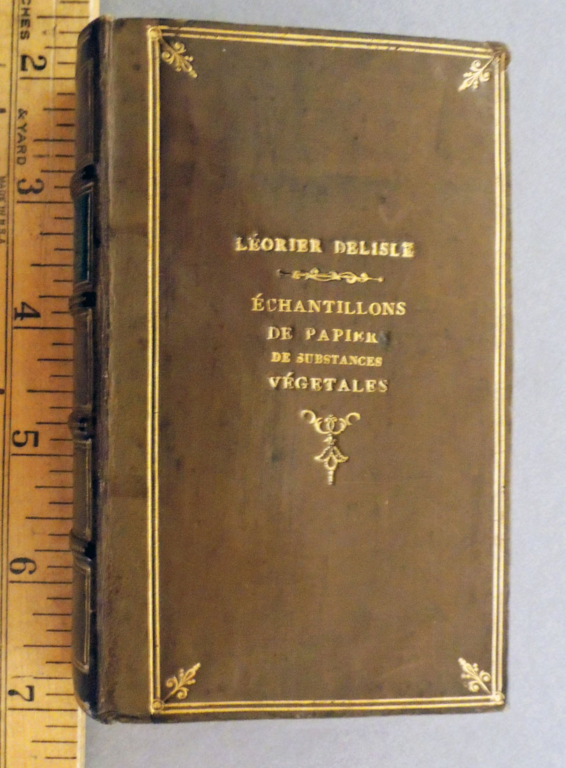
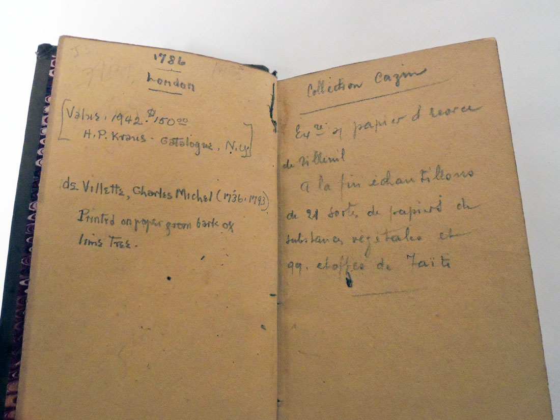
Charles-Michel, Marquis de Villette (1736-1793), Œuvres du marquis de Villette (Londres. [i.e. Langlée, France: P. A. Léorier Delisle], M. DCC. LXXXVI. [1786]). Together with 20 samples of leaves. From the printing collection of Elmer Adler. Graphic Arts Collection (GAX) 2004-0061S.
In 18th century Paris, there was a shortage of linen and cotton rags for making paper and so, Pierre Alexandre Léorier Delisle (1744-1826), director of the paper mill at Langlée, near Montargis, began experimenting with various vegetable materials. His tried marshmallow (plant) paper, nettle paper, as well as hops, moss, reeds, sponge, couch root, linden and willow bark, thistle leaves and more.
Charles-Michel Villette had his writings published by Léorier Delisle using his vegetable paper. A note on the verso of the half title page notes, “Ce volume est imprimé sur le papier d’écorce de tilleul” [This volume is printed on linden bark paper]. It was Leorier Delisle’s second attempt at using non-rag paper. Two years earlier, he published Les loisirs des bords du Loing, ou Recueil de pièces fugitives, poems by Marie-Joseph-Hippolyte Pelée de Varennes (1741-1794), not held by Princeton.
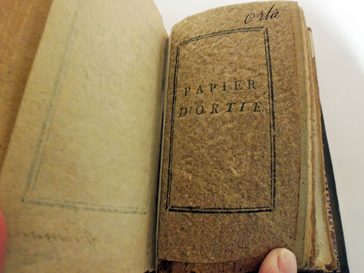
At the back of each book, various paper samples are bound in. At the back of the Graphic Arts Collection copy are bound in twenty sample leaves, each one identified:
papier de guimauve
papier d’ortie
papier de houblon
papier de mousse
papier de roseaux
papier de conferva (première / seconde / troisième espèce)
papier de racines
papier de chiendent
papier de bois de coudrier
papier de bois de fusain
papier d’écorce de fusain avec son épiderme ou croûte
papier d’écorce de chéne
papier d’écorce de peuplier
papier d’écorce d’osier
papier d’écorce d’orme
papier d’écorce de saule
papier de bardanne
papier de bardanne et de pas-d’ane
papier de chardons.
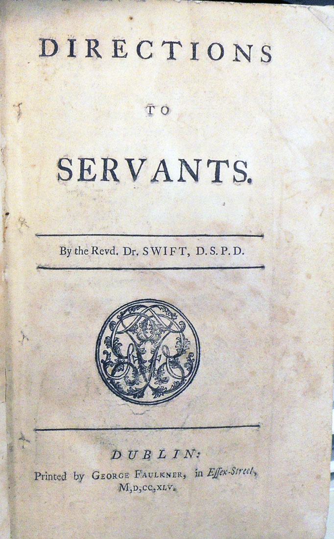
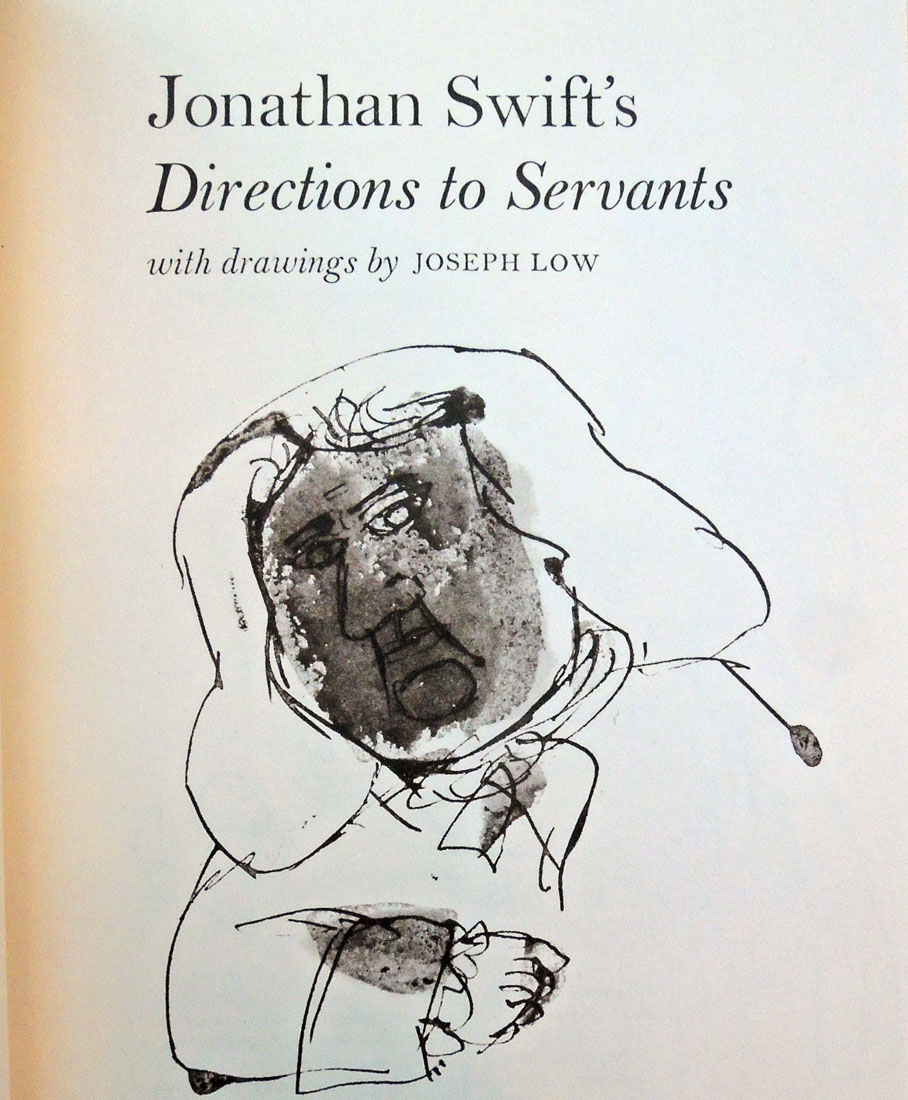
Directions To Servants In General; And In Particular To The Butler, Cook, Footman, Coachman, Groom, House-Steward, And Land-Steward, Porter, Dairy-Maid, Chamber-Maid, Nurse, Lanundress, House-Keeper, Tutoress, Or Governess by the Reverend Dr. Swift, D.S.P.D.
“I have a Thing in the Press, begun above twenty-eight Years ago, and almost finish’d: It will make a Four Shilling Volume; and is such a PERFECTION OF FOLLY, that you shall never hear of it, till it is printed, and then you shall be left to guess. Nay, I have ANOTHER OF THE SAME AGE, which will-require a long Time to perfect, and is worse than the former; in which I will serve you the same Way.” Letters to and from Dr. Swift … http://jonathanswiftarchive.org.uk/browse/year/text_4_18_4.html
Jonathan Swift worked on a parody of courtesy or conduct books for nearly three decades and it was probably still unfinished when finally published. “Lock up a cat or a dog in some room or closet,” he recommends “so as to make such a noise all over the house as may frighten away the thieves, if any should attempt to break or steal in.” The book is hilarious.
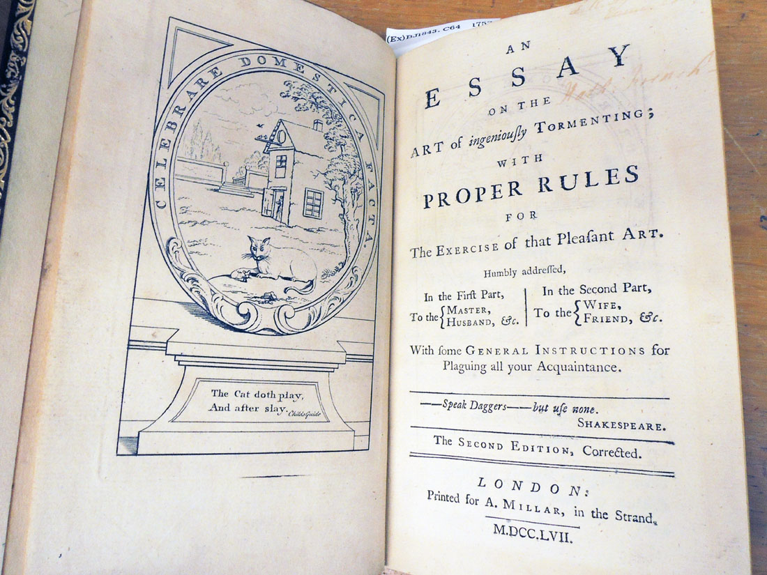
This led to Jane Collier’s An Essay on the Art of Ingeniously Tormenting in 1753, which is basically an advice book on how to nag. The book came and went quickly but in 1806, William Miller chose to issue a new edition, with a frontispiece by James Gillray.
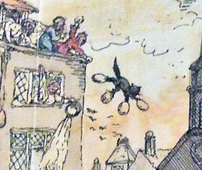
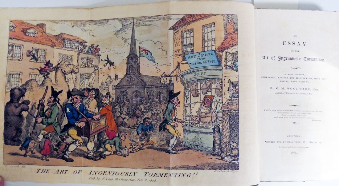
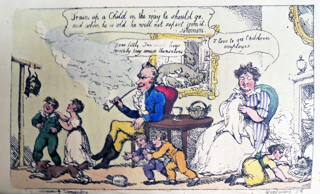
So popular was the volume that Thomas Tegg published an even newer edition in 1808, this time with a frontispiece and four other prints by George Woodward, engraved by Thomas Rowlandson.
‘Directions to the Cook’ from Directions to Servants by Jonathan Swift – Read by Sir Alec Guinness
Detail from George Woodward’s frontispiece (etched by Thomas Rowlandson)
Below, “Train up a Child in the way he should go / and when he is old he will not depart from it. -Solomon.” Left: hanging two cats from their feet. Lower left: Tying a bottle to a cat’s tail. Right: Feeding very hot cheese to a cat.–George Woodward
Jonathan Swift (1667-1745), Directions to servants (Dublin: Printed by G. Faulkner, 1745). Rare Books (Ex) 3950.331
Jonathan Swift (1667-1745), Directions to servants: in general, and in particular, to the butler, cook, footman, coachman, groom, house-steward and land-steward, porter, dairy-maid, chamber-maid, nurse, laundress, house-keeper, tutoress, or governess (London: Printed for R. Dodsley …, 1745). Rare Books: South East (RB) RHT 18th-581
Jane Collier (1715?-1755), An essay on the art of ingeniously tormenting; with proper rules for the exercise of that pleasant art, humbly addressed in the first part, to the master, husband… (London: Printed for A. Millar, in the Strand, 1753). Rare Books (Ex) 2015-0337N
Jane Collier (1715?-1755), An essay on the art of ingeniously tormenting: with proper rules for the exercise of that pleasant art : humbly addressed, in the first part, to the master, husband, … The second edition, corrected. (London: Printed for A. Millar … , 1757). Rare Books (Ex) BJ1843 .C64 1757
Jane Collier (1715?-1755), An Essay on the Art of Ingeniously Tormenting; with proper rules for the exercise of that amusing study. Humbly addressed, Part I. To the Master, Husband… Fourth edition (London: printed for Andrew Millar, in the Strand, 1753; reprinted for William Miller, Albemarle Street, 1806). Frontispiece by James Gillray.
Jane Collier (1715?-1755), An essay on the art of ingeniously tormenting. New ed., corr., rev. and illustrated with five prints / from designs by G.M. Woodward (London: Printed for Tegg … by Hazard and Carthew …, 1808). Engraved by Thomas Rowlandson. Graphic Arts Collection (GA) Rowlandson 1808
Jane Collier (1715?-1755), An essay on the art of ingeniously tormenting. A new ed., corr., rev., and illustrated with five prints, from designs by G.M. Woodward (London: Printed for T. Tegg and R. Scholey, 1809). Engraved by Thomas Rowlandson. Graphic Arts Collection (GA) Rowlandson 1808.11
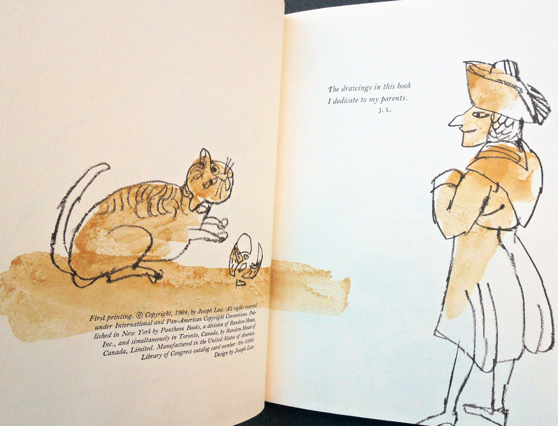
Jonathan Swift (1667-1745), Jonathan Swift’s directions to servants. With drawings by Joseph Low (New York, Pantheon Books [1964]). Cotsen Children’s Library (CTSN) Eng 20 39678
The Graphic Arts Collection recently acquired a number of fine press editions of Greek poetry, thanks to matching funds provided by the Program in Hellenic Studies with the support of the Stanley J. Seeger Hellenic Fund. Thank you to Dimitri H. Gondicas, Executive Director, Program in Hellenic Studies. Lecturer in Classics and Hellenic Studies. Stanley J. Seeger ’52 Director, Center for Hellenic Studies; and to David T. Jenkins, Librarian for Classics, Hellenic Studies and Linguistics.
Here are two:
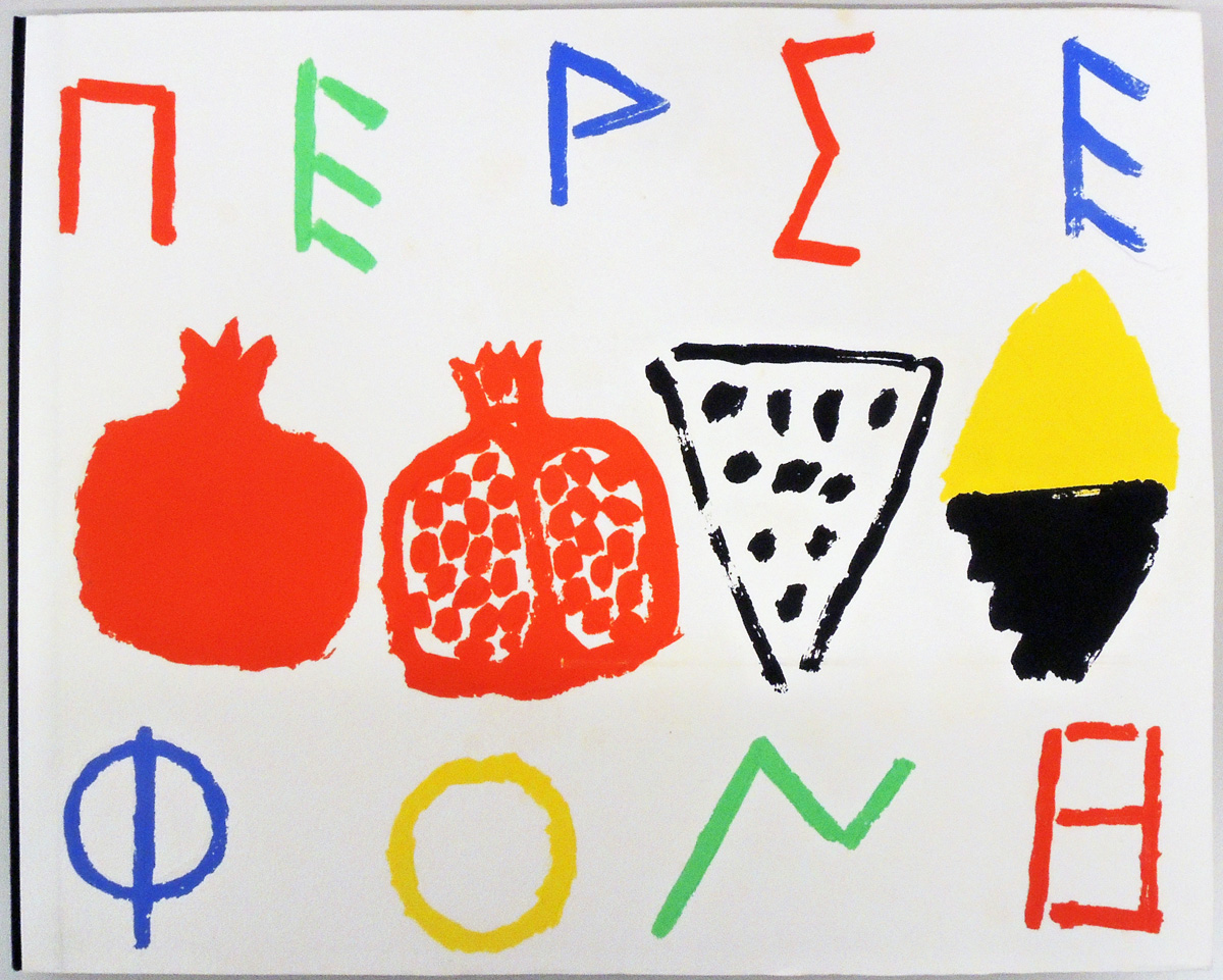
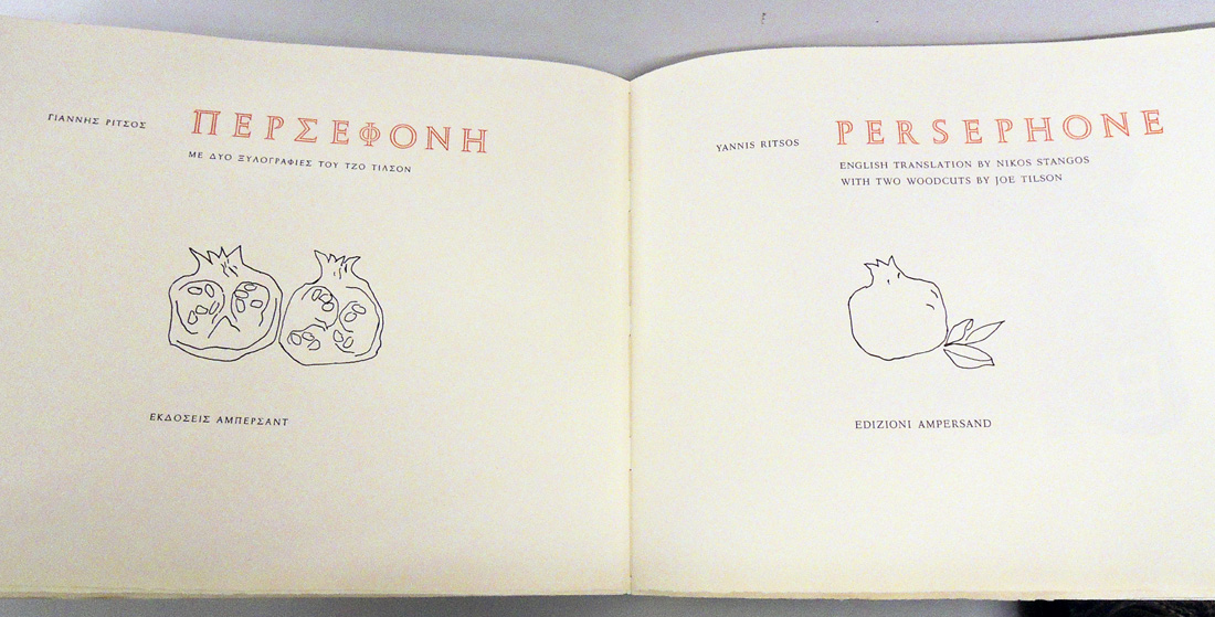
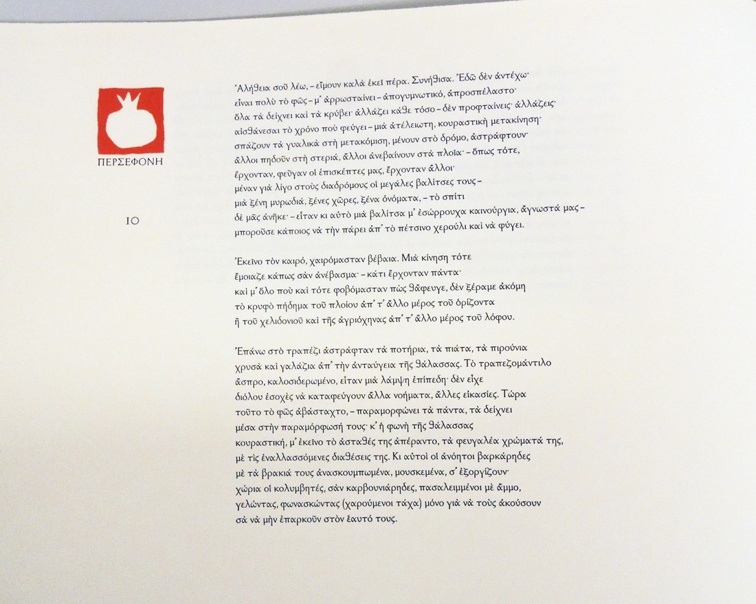
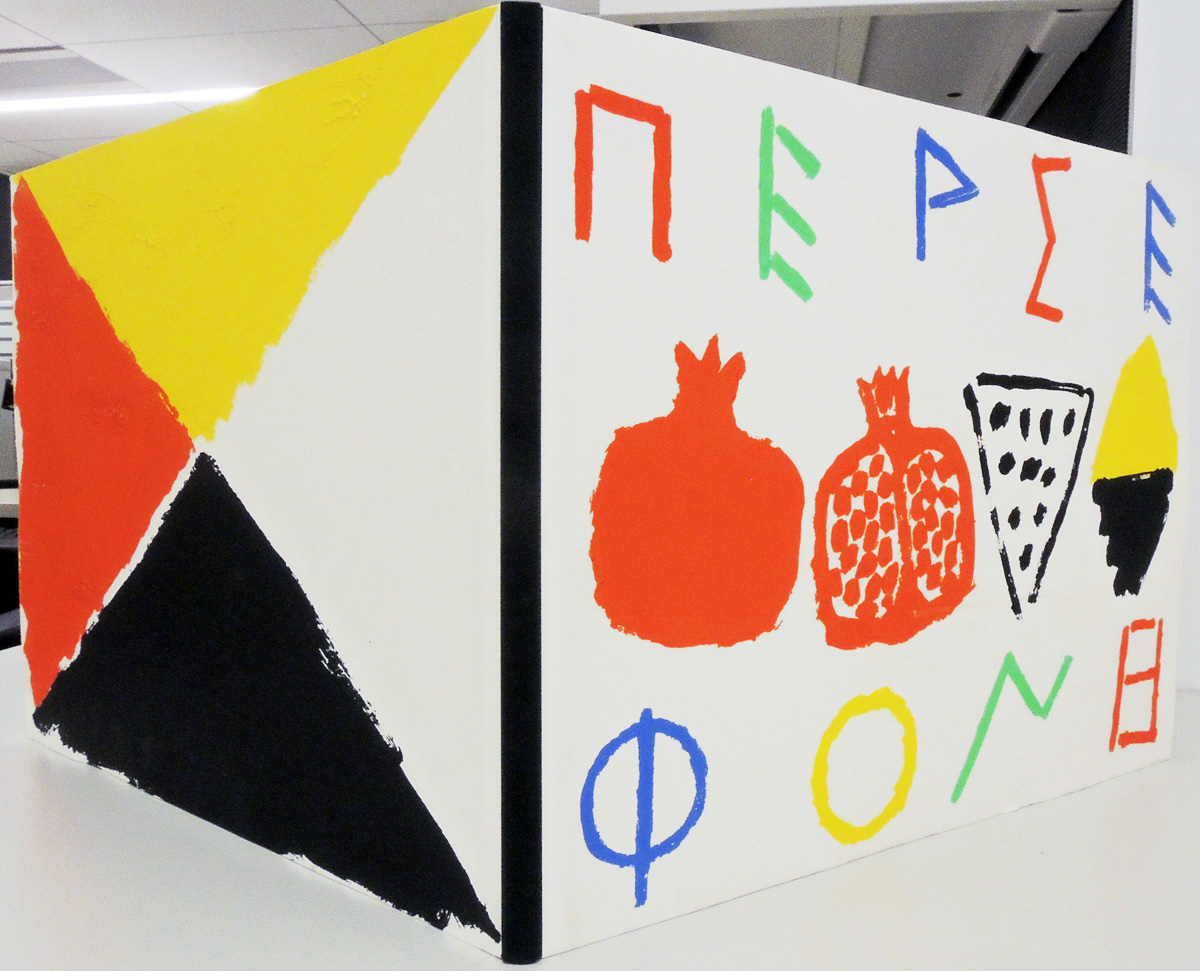
Giannēs Ritsos (1909-1990), Persephone; English translation by Nikos Stangos; with two woodcuts by Joe Tilson = Persephonē / Giannēs Ritsos ; me dyo xylographies toy Tzo Tilson (Verona: Edizioni Ampersand, 1990). Printed on a 1854 Stanhope handpress by Alessandro Zanella (1955-2012). Graphic Arts in process
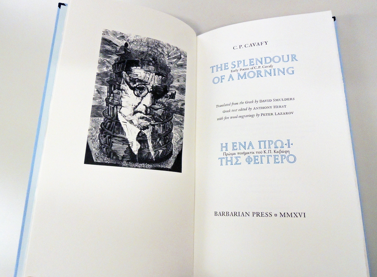
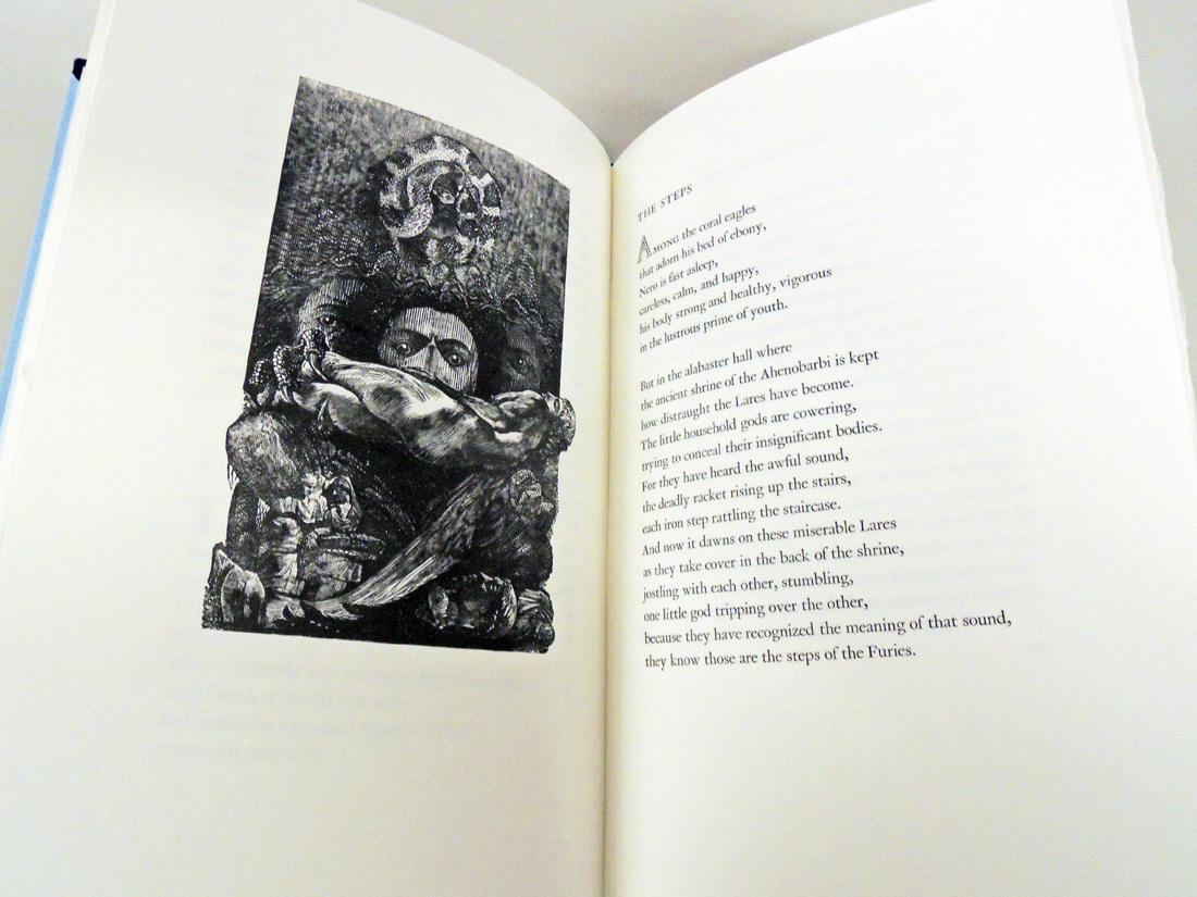
Constantine Cavafy (1863-1933), The Splendour of a Morning: Early Poems of C.P. Cavafy = Hē ena prōi tēs pheggero : proima poiēmata tou K.P. Kavaphē; translated from the Greek by David Smulders; Greek text edited by Anthony Hirst; with five wood engravings by Peter Lazarov (Mission, British Columbia: Barbarian Press, MMXVI [2016]). “Greek text reprinted … from The Collected Poems with parallel Greek text … edited by Anthony Hirst (Oxford University Press, 2007)”–Title page verso. Graphic Arts in process
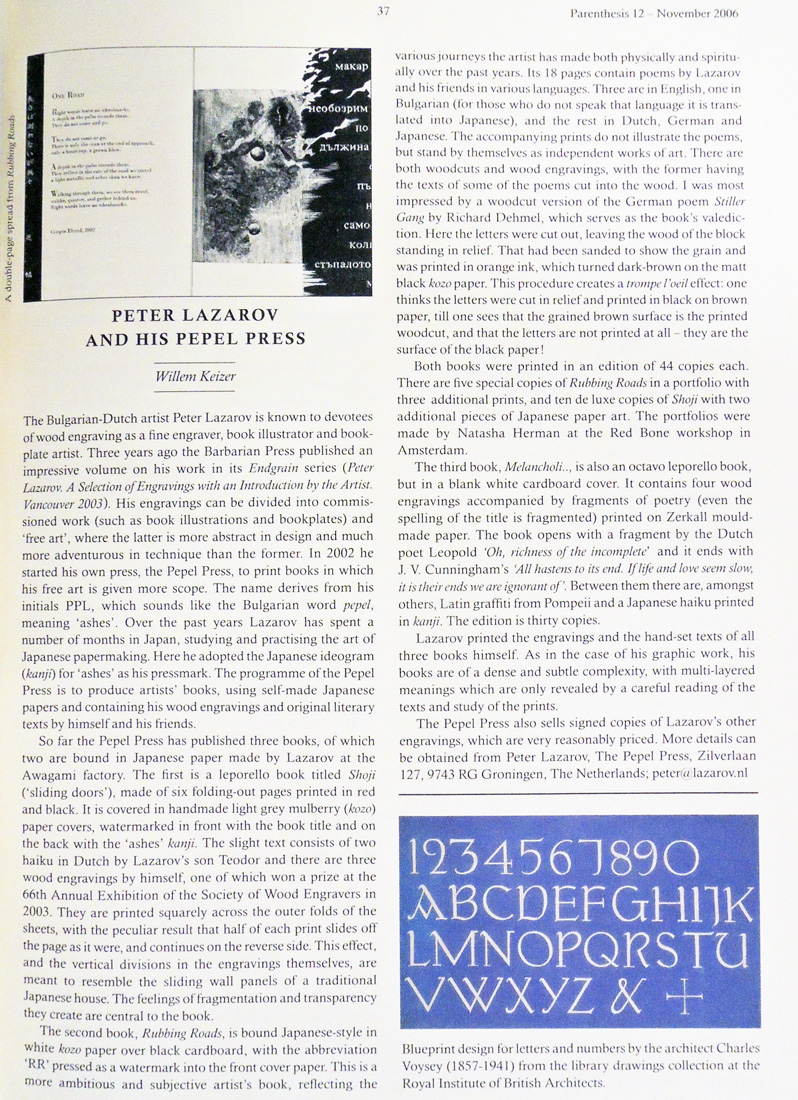
There is limited information on the printmaker Peter Lazarov and so, I’m including this terrific article from the magazine of the Fine Press Book Association: Willem Keizer, “Peter Lazarov and his Pepel Press,” in Parenthesis no.12 (November 2006). Preservation Z119 .P373
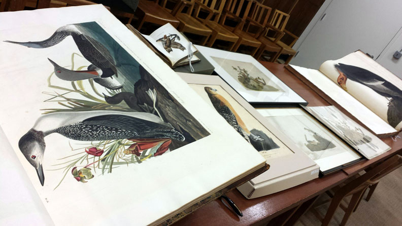
Princeton University Library received the gift of the double elephant folio Birds of America [(Ex) Oversize 8880.134.1860e] from Alexander van Rensselaer, Class of 1871 (1855-1933), during the academic year 1928-29. We believe he inherited the copy from his uncle, Stephen van Rensselaer IV, Class of 1808 (1789-1868). The wealthy van Rensselaer family is the only one I have found who bought two copies of Audubon’s massive publication. The second was purchased by Stephen’s cousin Dr. Jeremias “Jeremiah” Van Rensselaer (1793-1871), who graduated from Yale.
Most American subscribers to Audubon’s Birds of America were convinced to join during his second trip back to the United States in 1831, when Audubon spent considerable time in New York during 1833. Both Jeremias and Stephen IV were born at the sprawling 1,200-square-mile van Rensselaer estate near Albany, New York, but lived during the 1830s in New York City.
Stephen’s father and Alexander’s grandfather, Stephen Van Rensselaer III (1764-1839), was among the richest men in America and when he died, Stephen IV left New York City to live in the “West Manor” of the Rensselaer estate. Jeremiah’s medical practice remained in New York City, where he was also corresponding secretary of the X.Y. Lyceum of Natural History, with a great love for the natural sciences. He retired in 1852, traveled, and died in New York City in 1871. The whereabouts of his copy of Audubon’s Birds of America is not known.
Stephen III was an active businessman who owned several New York properties and in 1816, built a modest two-story house on Mulberry Street (originally no. 153 moved to no. 149) where the family could live while in town. The Federalist structure, which survived flood, fire, and a bomb, has a façade of Flemish bond brick and a Dutch-style gambrel roof, punctured by two tall dormers.
In the 1890s, Helen Louisa Stokes (1846-1930), wife of Anson Phelps Stokes (1838–1913) purchased the house and converted it to The Free Italian Library and Reading-Rooms, which opened in 1894.
“The free Italian library and reading rooms established chiefly by Mrs. Anson Phelps Stokes, in a house formerly used by [an] Italian, as a cheese factory at 149 Mulberry street, was open for inspection yesterday from 2 to 10 P. M. The guests were welcomed by the Rev. Antonio Arrighi. pastor of the Italian church at 123 Worth Street. The library has more than 200 volume, which will be added to by books now being bound, it contains books of history, poetry, science, travel, natural history, and novels. –New York Times, July 23, 1894
See our colleague’s research: Alexandra Deluise, “Mission work, Conversion and the Italian Immigrant in Turn-of-the-Century New York City: the Story of the Anson Phelps Stokes Italian Free Library” (2015). CUNY Academic Works. http://academicworks.cuny.edu/lacuny_events/3
Interesting that her father’s family company, Phelps, Dodge & Company was the organization that helps to preserve the Audubon printing plates when Mrs. Lucy Audubon was forced to sell her family estate.
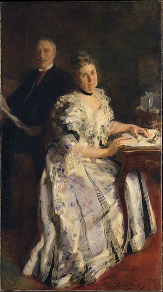
Cecilia Beaux (1855–1942), Mr. and Mrs. Anson Phelps Stokes, 1898 (?). Oil on canvas. Metropolitan Museum of Art
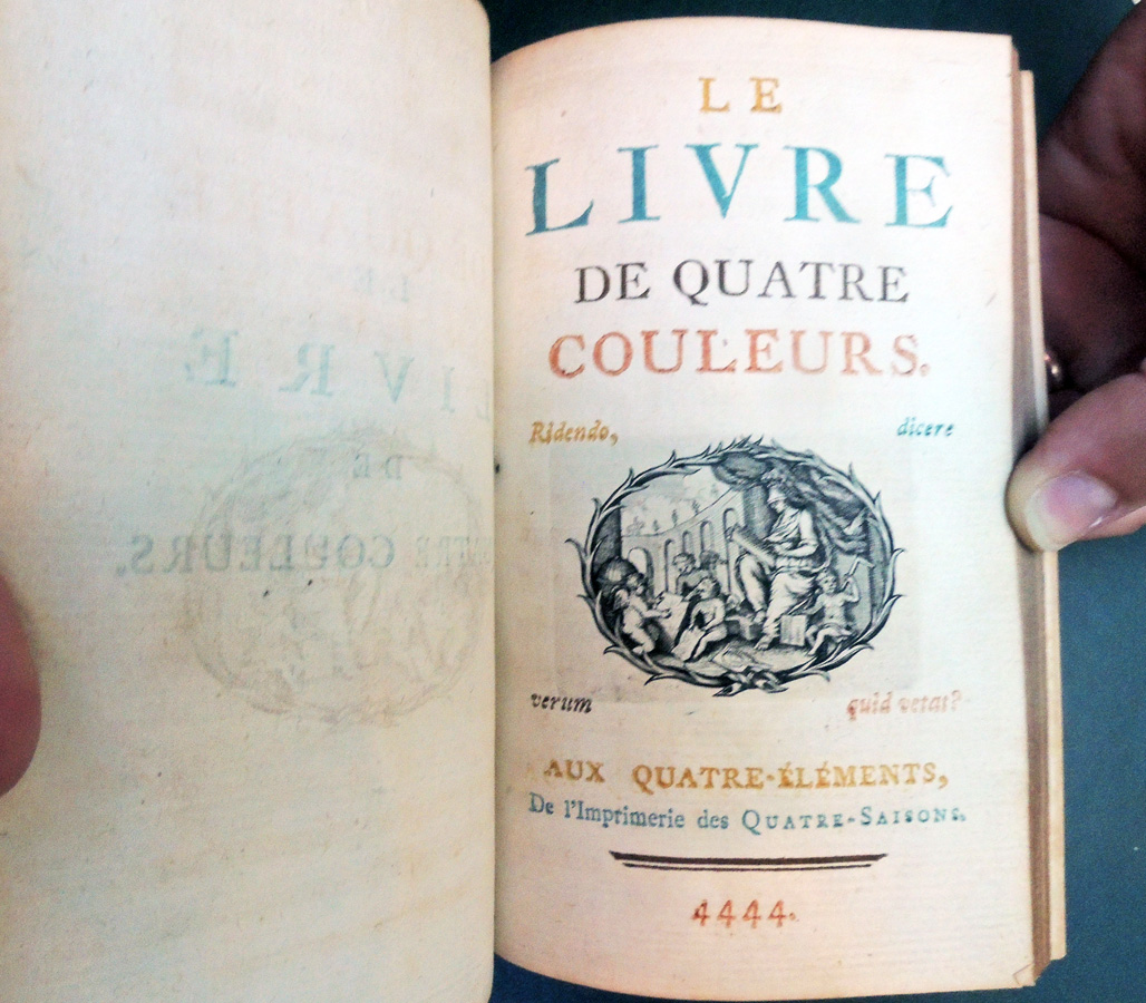
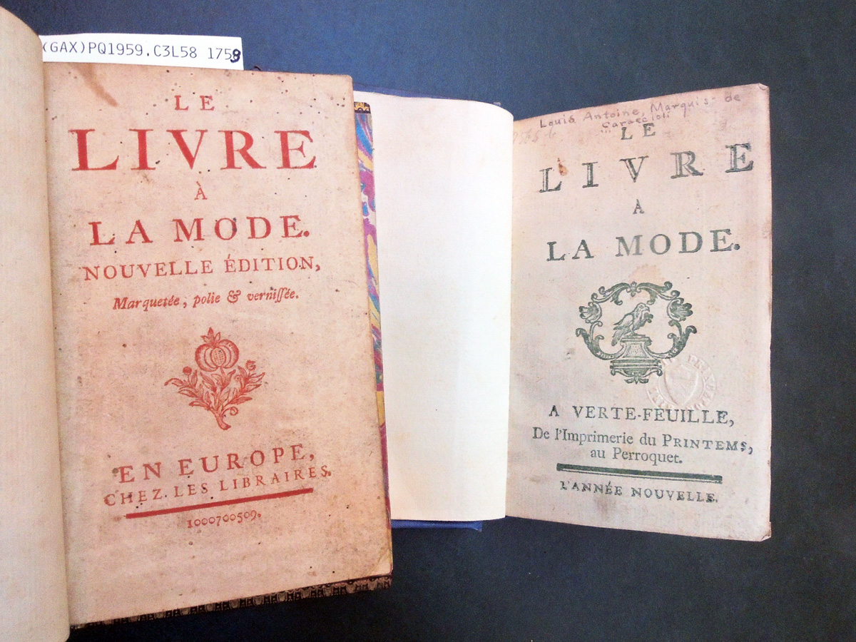
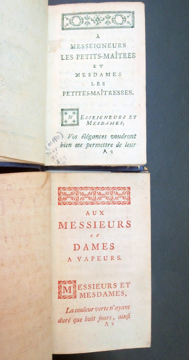
Book collectors remember the Parisian author Marquis Louis-Antoine Caraccioli (1719-1803) not so much for his writing but for the colorful printing of his books. These typographic curiosities were printed separately in one colored ink and then, bound together with separate sections in separate colors. There are many editions and variations, including pirated editions. Some say they are new editions but are exactly the same. Princeton has five variations.
In 1760, they are brought together in the Book of Four Colors, to the Four Elements, of the Printing of the Four Seasons. If you count black, the title page actually has five colors. There are sections in orange-yellow, greenish-blue, brown, and scarlet red, although the orange is very close to the brown and yellow. Of the several copies I’ve seen, the colors look different, perhaps some inks holding up better than others.
One collector writes: “Moreover, the text is also very agreeable, and Caraccioli also laughs at himself and fashions from the beginning, when he stresses that probably the color of his works alone will suffice for their success, at a time when one is enamored of everything and nothing, under the pretense often the most futile. He also writes that he offers his readers books that resemble them, colored “… I offer you (…) the most beautiful vermilion, such that it shines on your faces beautifully and furiously illuminated.” http://bibliophilie.blogspot.com/2007/11/des-livres-lhonneur-les-livre-la-mode.html
“Of letterpress or typographic printing in colours, not very much seems to have been done during the eighteenth century; work in red and black, other than on title-pages, was almost entirely confined to the service books of the Roman Church, and a large proportion of even these were printed in black only, though such establishments as the Plantin Press still produced creditable examples on the old lines.
In the middle of the century, several editions were got out at Paris of a work entitled Le Livre a la Mode, a satirical description of the manners of the time. It was a 12mo volume, of which two editions were published in 1759, one printed wholly in red, the other in yellow. In 1760 there was another red edition, and then the work, which was in four sections, was re-issued with the title of Le Livre de Quatre Couleurs, the sections being respectively printed with green, yellow, red and brown ink. On the title-page lettering in all these colours appears, in addition to a vignette printed in black.” R.M. Burch and William Gamble, Colour Printing and Colour Printers (1910).
Louis-Antoine Caraccioli (1719-1803), Le livre à la mode. Nouvelle édition, marquetée, polie & vernissé. En Europe [Paris]: Chez les libraires, [1759]. Rare Books Off-Site Storage 3238.95.359
Louis-Antoine Caraccioli (1719-1803), Le livre à la mode. Nouvelle édition / marquetée, polie & vernissée. En Europe [i.e. Paris]: Chez les libraires [1759]. Graphic Arts Collection (GAX) PQ1959.C3 L58 1759
Louis-Antoine Caraccioli (1719-1803), Le livre à la mode. A Verte Feuille, de l’imprimerie du Printems au Perroquet. L’année nouvelle. [Paris, 1759]. Rare Books Off-Site Storage 3238.95.359.11
Louis-Antoine Caraccioli (1719-1803), Le livre de quatre couleurs. Aux Quatre-Elements: De l’Imprimerie des Quatre-Saisons, 4444 ; [i.e. Paris]: [publisher not identified], [1760]. Graphic Arts Collection (GAX) in process
Louis-Antoine Caraccioli (1719-1803), Le livre de quatre couleurs. Aux Quatre-Éléments [i.e. Paris], De l’imprimerie des quatre-saisons, 4444 [i.e. 1760]. Graphic Arts Collection (GAX) PQ1959.C3 L58 1759
Louis-Antoine Caraccioli (1719-1803), Le livre à la mode; suivi du, Livre des quatre couleurs, textes présentés et annotés par Anne Richardot. Saint-Etienne: Publications de l’université de Saint-Etienne, 2005. Firestone Library (F) PQ1959.C3 L68 2005
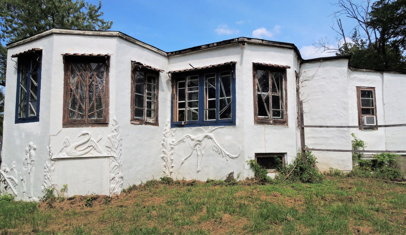
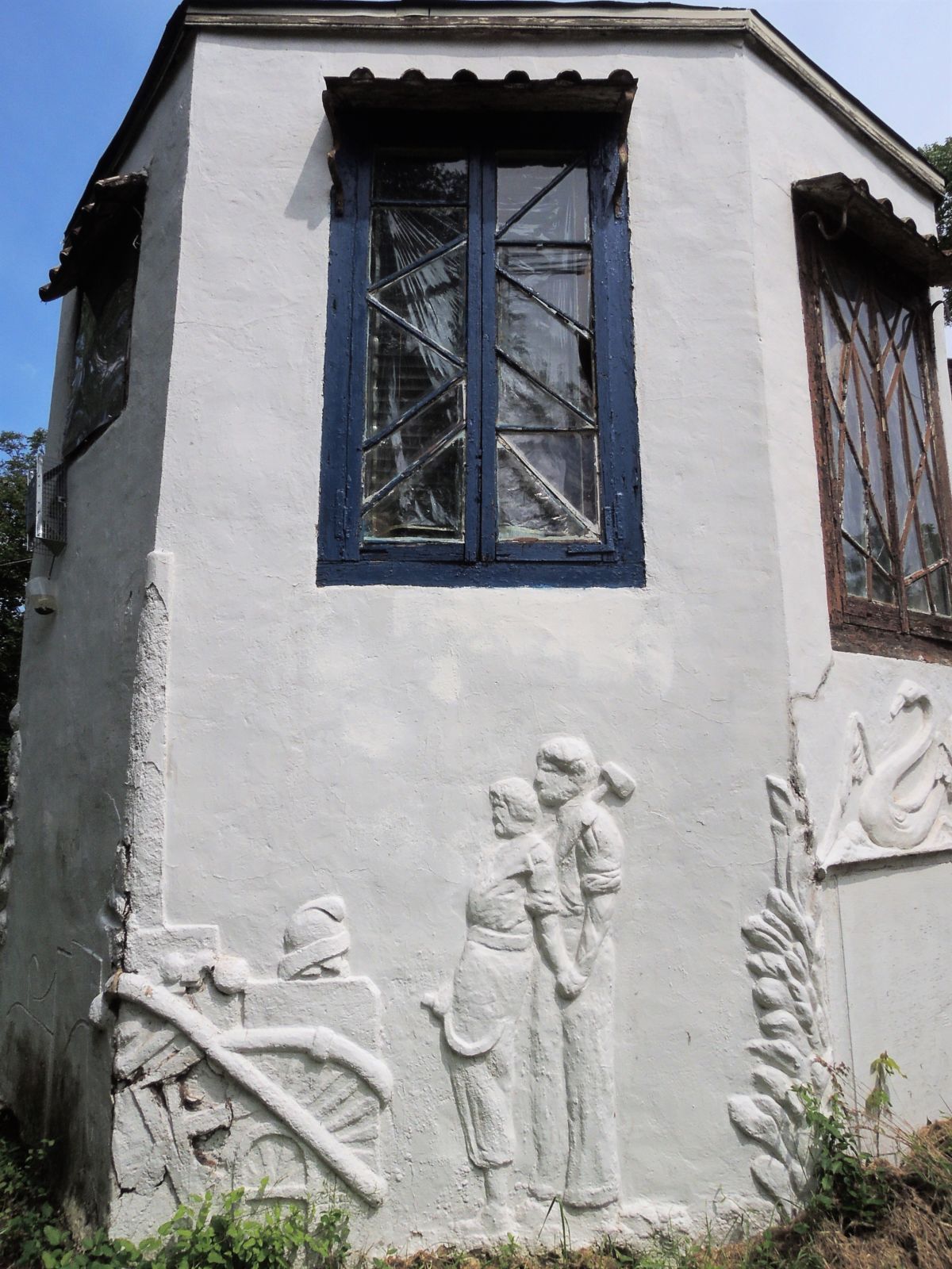
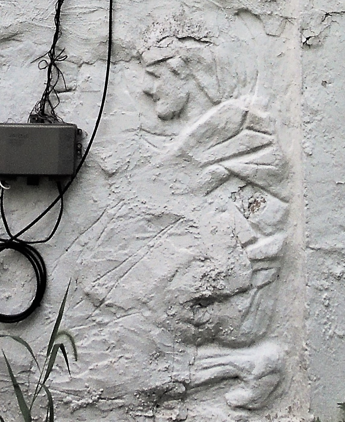
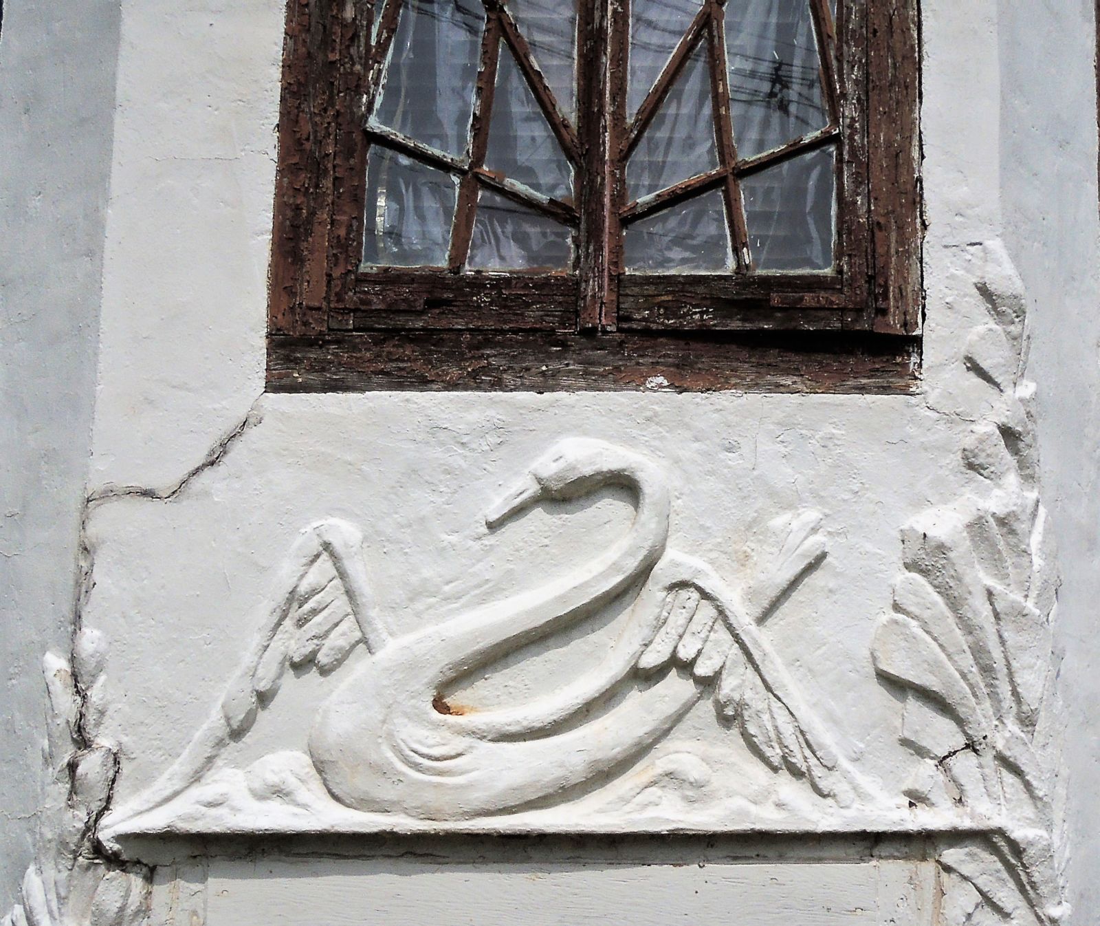
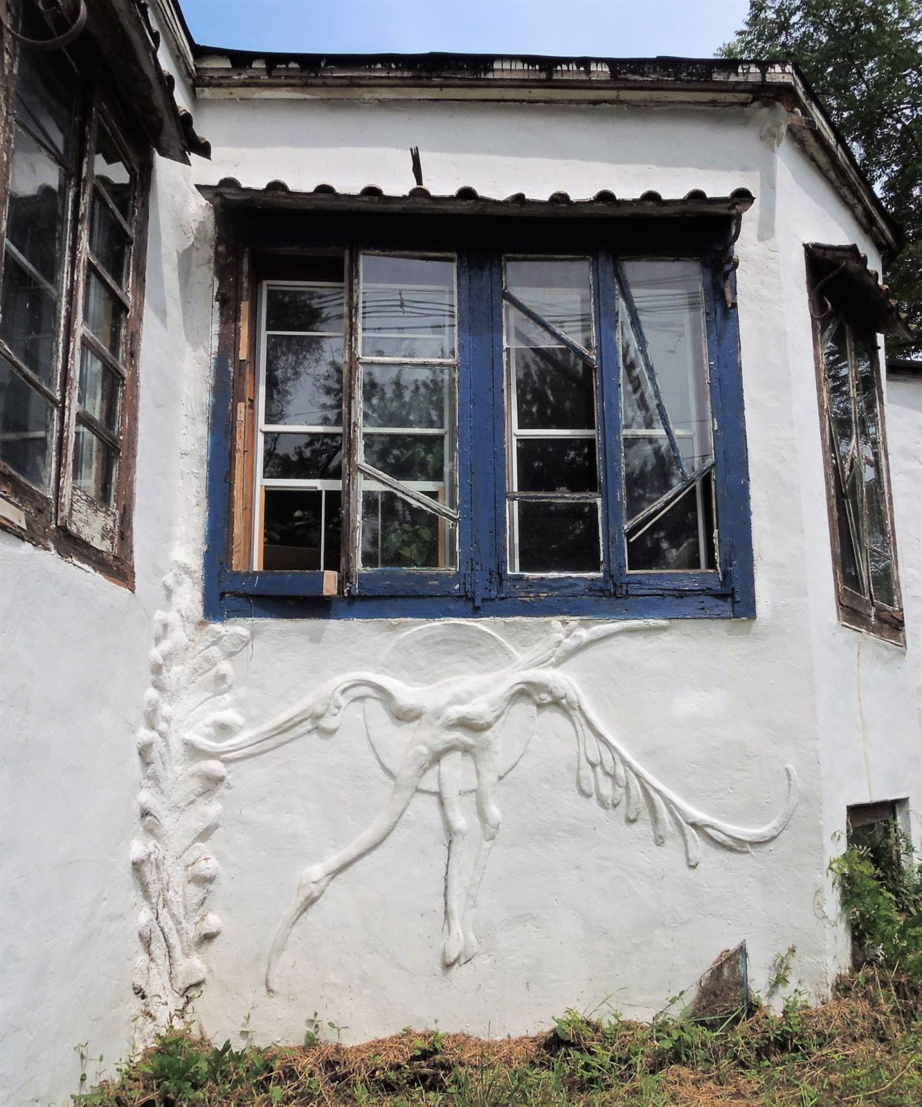
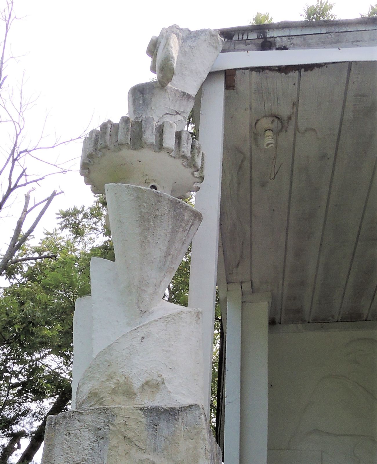
In 1915, Samuel Goldman (1882–1969) constructed and then carved reliefs into the exterior of his stucco home at 143 School Street, in the North Stelton neighborhood of Piscataway Township, New Jersey. The symbols reflect his Marxist beliefs and membership in the Francisco Ferrer Association, founded in 1901 by Emma Goldman and Alexander Berkman.
The Ferrer Colony was a libertarian community where, among many programs, they established the progressive Modern School, an alternative to public schooling and traditional living arrangements. At its largest, the Stelton Colony included 90 houses, although most residents only occupied their homes on the weekend.
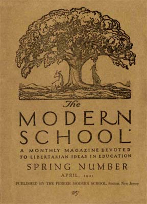
Thanks to the generous donations of Donald Farren, Class of 1958, the Graphic Arts Collection holds a nearly complete run of The Modern School: A Monthly Magazine Devoted to Libertarian Ideas in Education, edited by Carl Zigrosser and printed by Joseph Ishill.
The magazine includes linocuts (primarily) by many contemporary printmakers, such as William Zorach, Man Ray, and Rockwell Kent, who designed its logo and chapter initials. Man Ray was also one of the first adult students to attend night classes at the Modern School, while it was still in New York City.
On Friday afternoon, October 27, 2017, the Friends of the Modern School hold their 45th annual meeting at Alexander Library, Rutgers University, also the home of the Modern School archives.
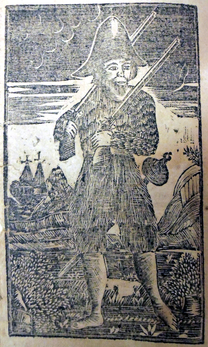
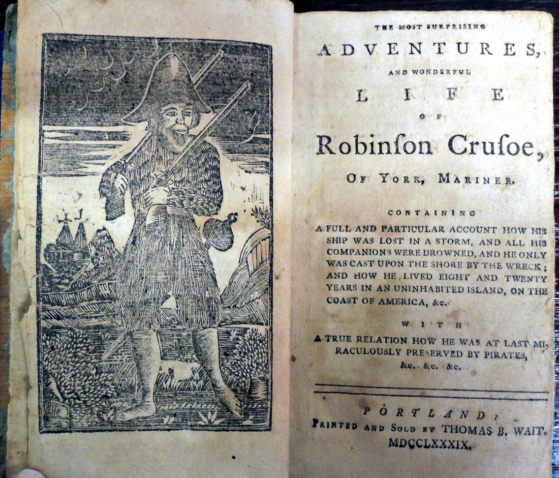
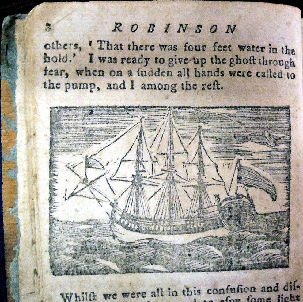
Travels of Robinson Crusoe. Written by himself (Worcester (Massachusetts): Printed by Isaiah Thomas, and sold at his book-store, MDCCLXXXVI: where may be had a variety of little books for children., [1786]). Graphic Arts Collection (GAX) PR3403 .A2 1786s
Defoe’s Adventures of Robinson Crusoe was first published on April 25, 1719, and before the end of the year had run through four editions. An abridged children’s version was published ca. 1784 in Boston, printed and sold by N. Coverly, price three pence.
Two years later Isaiah Thomas (1661?-1731) printed and sold the novel from his bookshop in Worcester, Massachusetts, as “Travels of Robinson Crusoe.” The book was as big a success for Thomas in the United States as it had been in England.
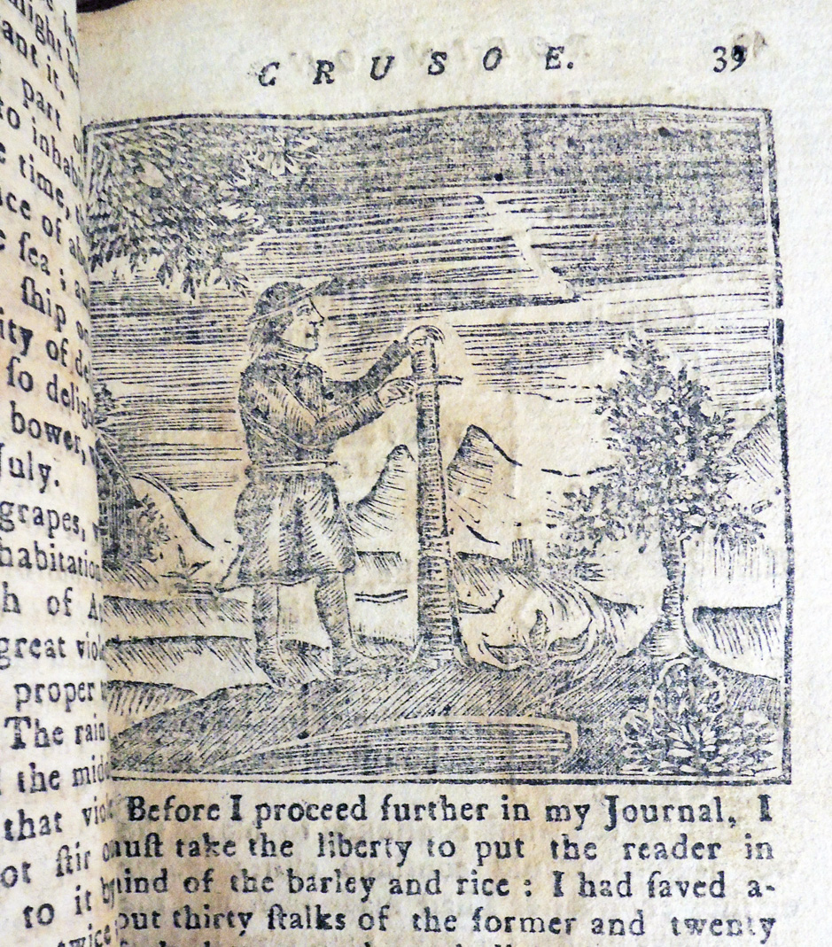
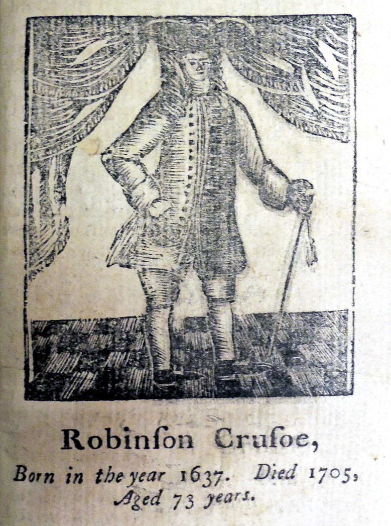
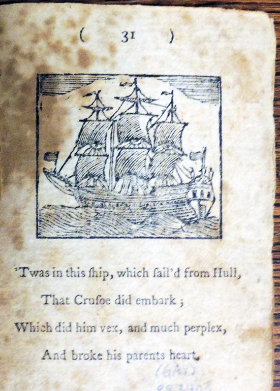
Here are plates from the 1786 and 1795 editions. Note that Crusoe is not only taller in 1795 but he has a new hat and loses his shoes between the editions.
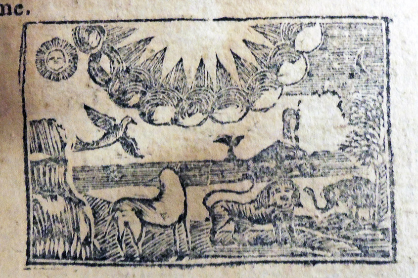
Daniel Defoe (1661?-1731), The Most Surprising Adventures, and Wonderful Life of Robinson Crusoe, of York, Mariner: containing a full and particular account how his ship was lost in a storm, and all his companions were drowned, and he only was cast upon the shore by the wreck and how he lived eight and twenty years in an uninhabited island, on the coast of America, &c. With a true relation how he was at last miraculously preserved by pirates, &c. &c. &c. (Worcester, Mass,: Printed [by Isaiah Thomas] and sold at the Worcester bookstore, 1795). 15 cm. Contains a woodcut frontispiece and 12 (one repeated) woodcuts in the text. Graphic Arts Collection (GAX) Hamilton 163
See also: Daniel Defoe (1661?-1731) The Farther Adventures of Robinson Crusoe : being the second and last part of his life, and of the strange surprizing accounts of his travels round three parts of the globe / written by himself (London: Printed for W. Taylor …, 1719). Princeton copies 1-3: First edition, first issue; copies 4-5: first edition, second issue. Rare Books (Ex) PR3404 .xF37 1719
1786 1795
‘Twas in this ship, which fail’d from Hull,
That Crusoe did embark;
Which did him vex, and much perplex,
And broke his parents heart.
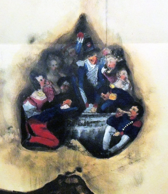
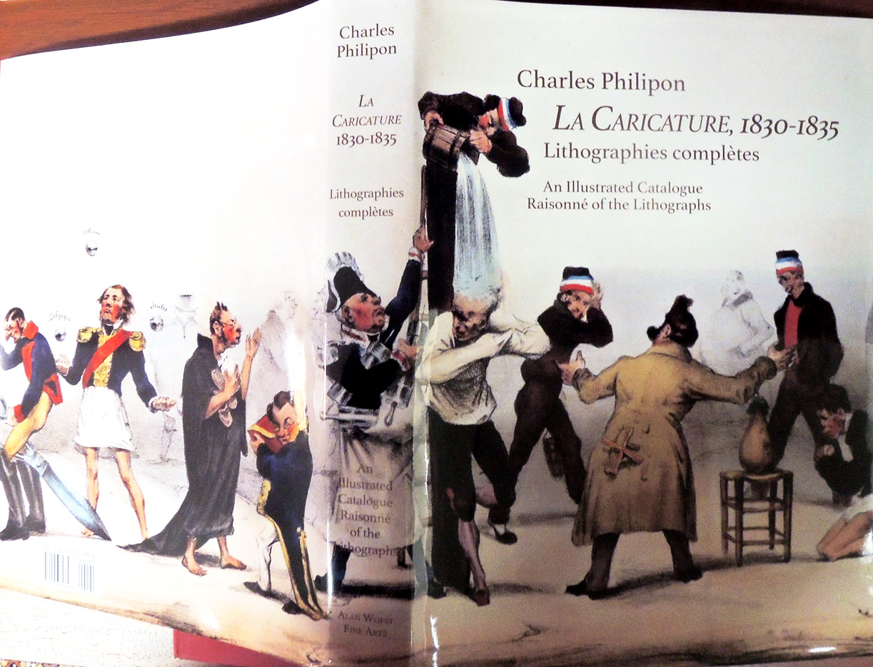
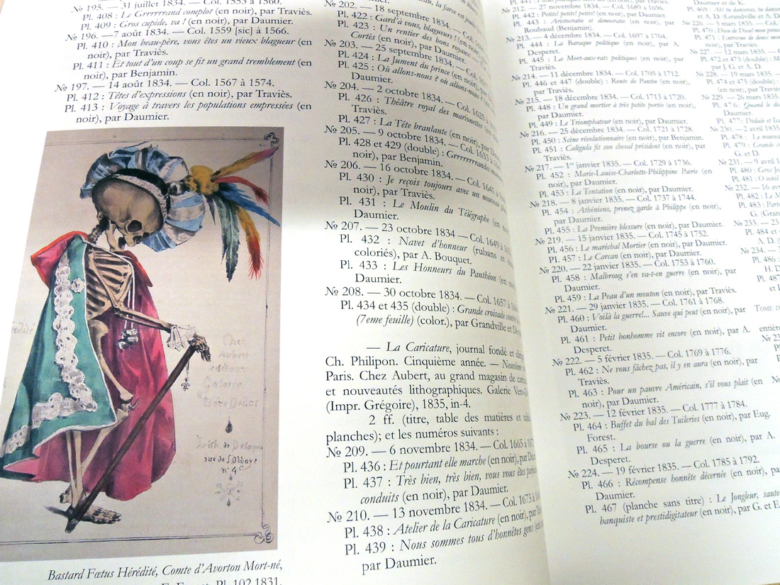
How do you find the bad seeds in the middle of the 10 volume run of La caricature? Answer: using the new index to the magazine, recently published by Alan Wofsy Fine Arts.
Auguste Bouquet. La Poire et ses Pépins. Paris: Chez Aubert, Galerie Véro-Dodat, 1833; in La Caricature: journal fondé et dirigé / par C. Philipon (Paris: Aubert, 1830-1835). 10 v. Graphic Arts Collection (GAX) Oversize 2009-0240Q
La Caricature, 1830-1835: lithographies complètes: an illustrated catalogue raisonné of the lithographs / general editor and designer: Corine Labridy-Stofle (San Francisco: Alan Wofsy Fine Arts, 2017). Graphic Arts: Reference Collection (GARF) Oversize NC1498 .C3 2017q
Summary note:
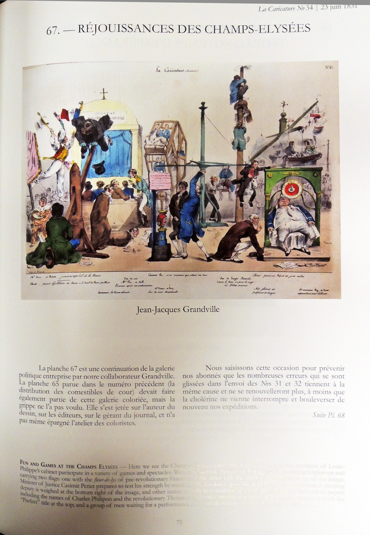
La Caricature” was the 19th century equivalent and the precursor of Charlie Hebdo. The editor Charles Philipon employed the major satirical artists of the mid-19th century notably Daumier, Grandville, E. Forest, Charlet, Bellangé, Traviès, Raffet and Gavarni. It appeared for five years, between 1830-1835. The main subjects of the caricatures were Louis-Philippe and his entourage of July Monarchy politicians. Louis-Philippe, son of the Duke of Orléans, came to power after the 1830 Revolution as the Citizen King. However, he was not amused by the caricatures and once put Daumier in prison for 6 months, before suppressing the whole publication in 1835. He became more and more authoritarian and was finally forced to abdicate during the 1848 Revolution.
The plates are numbered 1-524, but approximately 62 are double sheets so there are actually 462 separate prints. Georges Vicaire catalogued the 251 issues and 524 plates in 1895. However they have never been reproduced in a catalogue, nor has there been an English language discussion or catalogue of the corpus of prints.
All of the works are described in French and English and are arranged in the order they appeared in the original publication. There is an index by artist and the catalogue by Georges Vicaire from 1895 is also included. Many of the artists contributed anonymously and were not identified by Vicaire but are now identified. Where there were not descriptions of the plates in the original publication (about 60 of the 462), this new edition now provides descriptions in French.

 Romano Hanni, Werner Pfeiffer, Enrique Chagoya
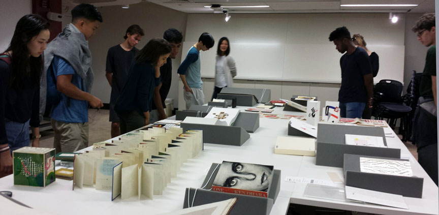
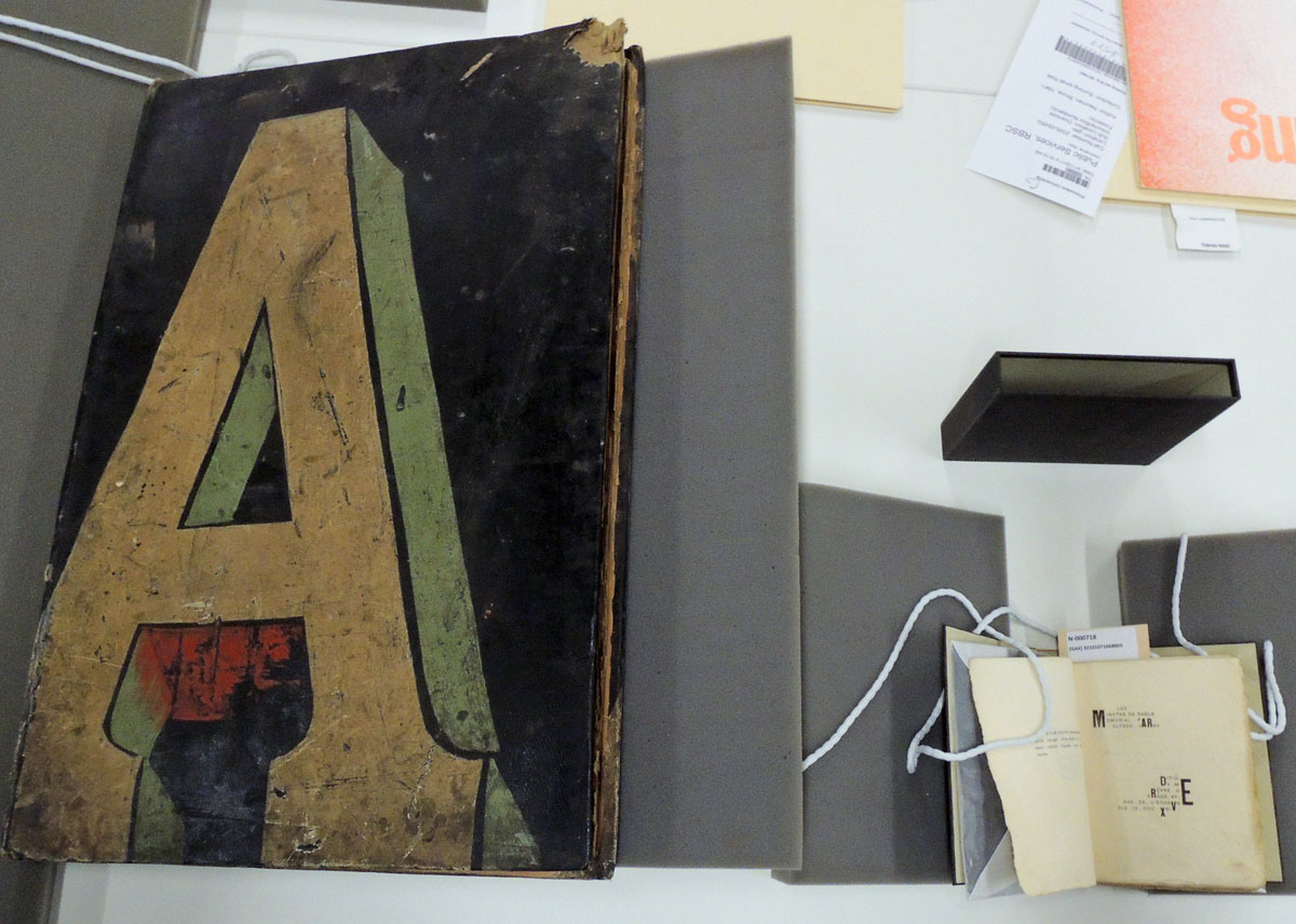 Sign painter’s sample album, Alfred Jarry
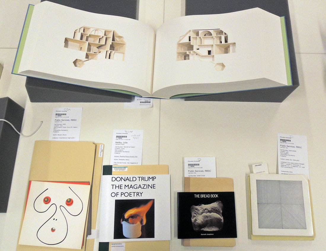 Olafur Eliasson, Bruno Munari, Henry Wessells, Kenneth Josephson, Sol Lewitt
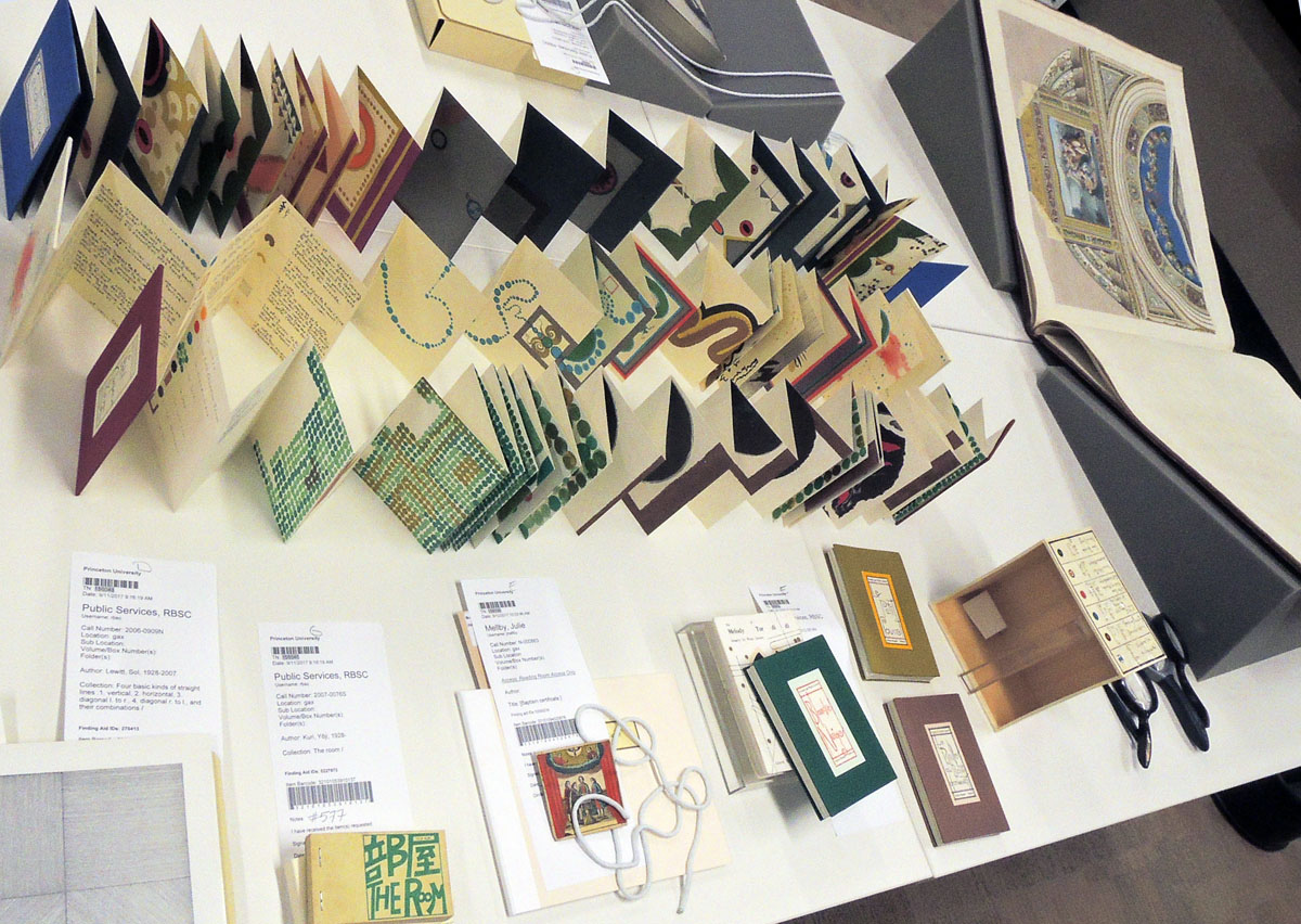 Warja Honegger-Lavater, Yoji Kuri, German baptismal certificate
 Enrique Chagoya, Bruce Nauman, Richard Misrach, Ed Ruscha