Category Archives: Books

books

Hours Press


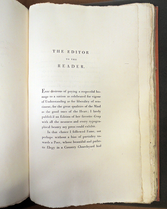
One of the most interesting small presses to come out of Paris in the 1920s was Hours Press, run by Nancy Cunard (1896-1965), with the assistance of Henry Crowder (1890-1955). Details about the press are recorded by Cunard herself in These were the Hours: memories of my Hours Press, Reanville and Paris, 1928-1931, edited with a foreword by Hugh Ford (Carbondale: Southern Illinois University Press, [1969]).

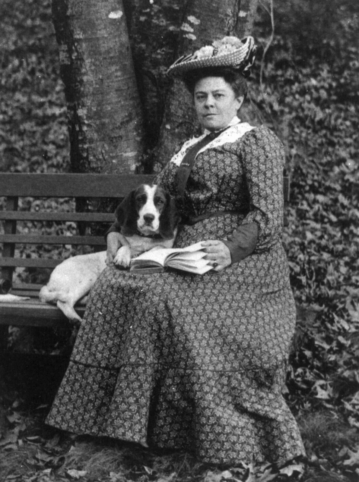
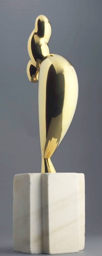
The British heiress was a popular jazz age beauty, well over six feet tall, she was sought after by many artists including Constantin Brancusi whose bronze sculpture La jeune fille sophistiquée (Portrait de Nancy Cunard) sold in 2018 for $71,000,000.

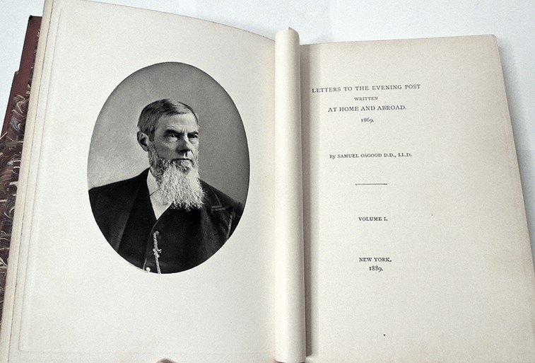
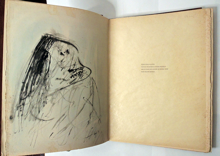
Cunard settled in Paris at the age of 24, where she published three volumes of poetry in quick succession: Outlaws in 1921, Sublunary in 1923, and Parallax in 1925. Convinced that she could print and publish her own books, Cunard left Paris in 1927 for a house in Réanville, Normandy. There she installed a 200-year-old Belgian Mathieu hand press purchased from Bill Bird of Three Mountains editions. It came with plenty of Caslon Old Face type and Vergé de Rives paper that she happily used for most of her early books. As a printer Cunard was chiefly self-taught although she had some lessons in setting type from Leonard and Virginia Woolf. Her imprint was to be called Hours Press, perhaps a suggestion from Virginia.

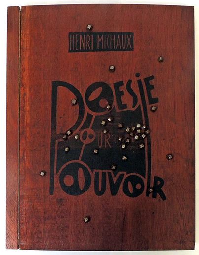
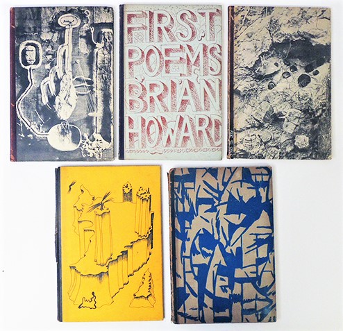
Front covers above. Back covers below.


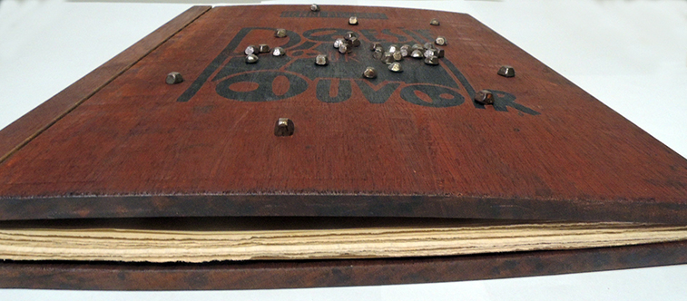
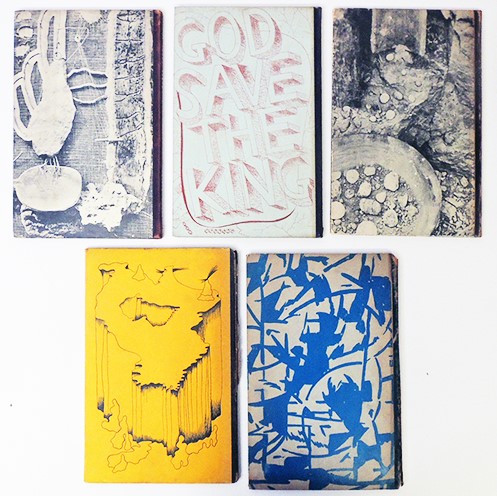
Around this time, she also fell in love with Henry Crowder (1890-1955), a Black American jazz musician and lived with him for the next eight years, building the printshop together. “Henry Crowder, . . . had helped in many different ways already . . . Together we folded the sheets into pages as they came off the new Minerva press I had just bought to increase the tempo of our work.” Many friends offered to let Hours Press publish their manuscripts and artists such as Man Ray and Yves Tanguy agreed to design the covers.

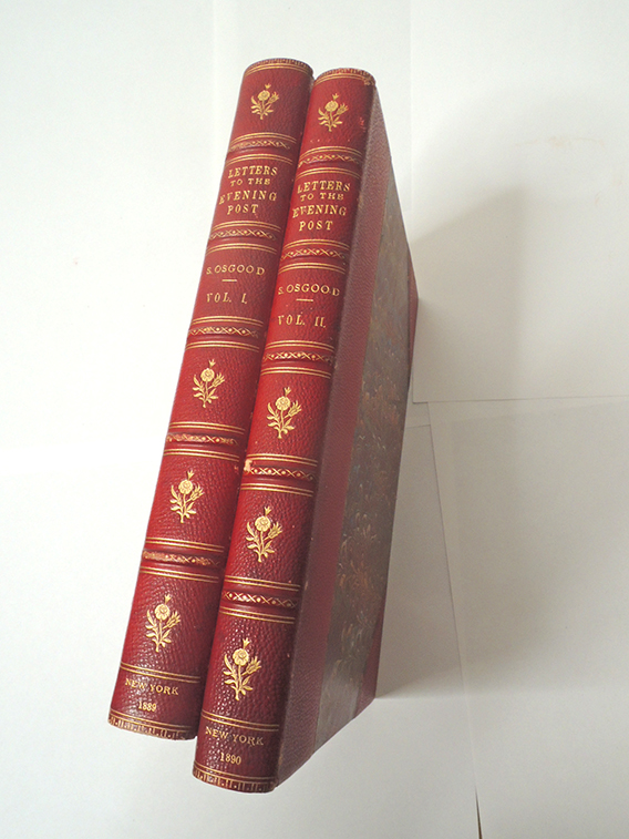
In January 1930, they moved their home and printshop back to Paris where Crowder could both print and perform with his jazz band. Under his direction, they also worked on an anthology of African American writing to be called Negro, which soon became an obsession for Cunard. While vacationing in the south of France that summer, Cunard and Crowder turned over the management of the press to Mrs. Wyn Henderson and her young printer John Sibthorpe. This freed Cunard for research and travel to collect work for their anthology but eventually, she had to choose between projects. Hours Press was closed in early 1931 having completed 25 publications.

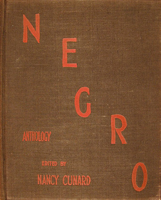
Cunard published her Negro anthology in 1934, collecting poetry, fiction, and nonfiction primarily by African-American writers, including Langston Hughes and Zora Neale Hurston along with writing by George Padmore and her own essay on the Scottsboro Boys.
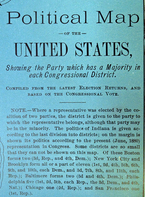
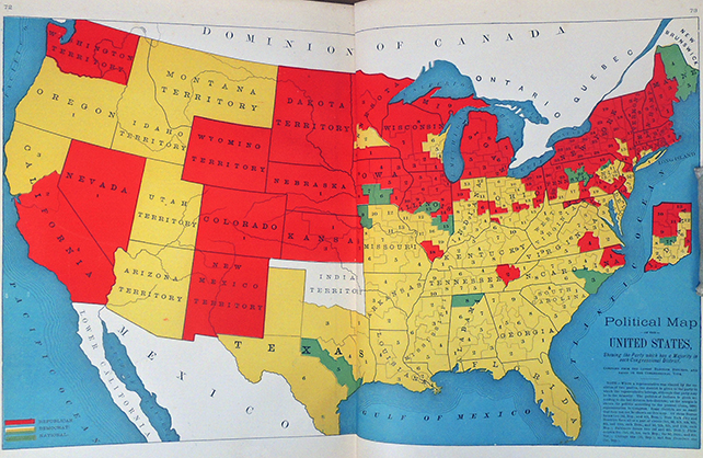
Hours Press books:

1928
Douglas, Norman. Report on the Punice-Stone Industry of the Lipari Islands. June 1928. 80 letterpress copies set in 11 pt. Caslon Old Face. Not for sale.

Moore, George. Peronnik the Fool. December 1928. 200 letterpress signed copies on Vergé de Rives paper set in 11 pt. Caslon Old Face. Sold for £2.

Aldington, Richard. Hark the Herald. December 1928. 100 letterpress signed copies on Vergé de Rives paper, set in 17 pt. Caslon Old Face. Mary blue wrappers. Not for sale.

1929
Guevara, Alvaro. St George at Silene. January 1929. 150 letterpress signed copies on Velin de Rives paper set in 16 pt. Caslon Old Face. Designed by the author. Sold for 10s, 6d.

Douglas, Norman. One Day. July 1929. 200 signed copies on Velin de Rives, set in monotype. Sold for 3 £3, 3 s. Also 300 copies, Vergé de Vidalon sold £1. 10s

Symons, Arthur. Mes Souvenirs. July 1929. 200 signed copies on Velin de Rives paper. Sold for £2, 2s.

Aragon, Louis. La Chasse au Snark. Early winter. 300 letterpress signed copies on Alfa paper set in 16 pt. Caslon Old Face. Title on front designed and composed by Aragon. Also 5 copies on Japan paper. 300 copies sold at £1. 1s; 5 copies at £5, 5s.

Aldington, Richard. The Eaten Heart. Late winter 1929. 200 letterpress signed copies on Canson-Montgolfier set in 16pt. Caslon Old Face. Sold for £1, 1s.

1930
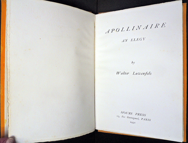
Lowenfels, Walter. Apollinaire. Early 1930. 150 copies signed letterpress copies on Canson-Montgolfier paper set in 16 pt. Caslon Old Face. Cover front and back designed by Yves Tanguy, printed black on daffodil paper boards. Sold for £1, 10s.

MacCown, Eugene. Catalogue of Paintings, Drawings, and Gouaches. Early 1930. 1000 copies set in Caslon old Face Italics on Vergé de Rives paper. Not for sale.

Graves, Robert. Ten Poems More. Early spring 1930. 200 signed letterpress copies on Canson-Montgolfier paper set in 16 pt Caslon Old Face. Cover photomontage by Len Lye. Sold for £1. 10s.

Riding, Laura. Twenty Poems Less. Spring 1930. 200 signed letterpress copies on Canson-Montgolfier paper set in 16 pt. Caslon Old Face. Front and back cover photomontage designed by Len Lye. Sold for £1. 10s.

Riding, Laura. Four Unposted Letters to Catherine. Early summer. 200 signed copies on Haut Vidalon paper set in Garamond Italic type. Front and back cover photomontage by Len Lye. Sold for £2.

Campbell, Roy. Poems. July 1930. 200 letterpress signed copies on Canson-Montgolfier paper set in 16 pt. Caslon Old Face. Two drawings by the author. Sold for £1. 10s.

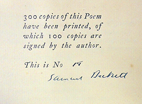
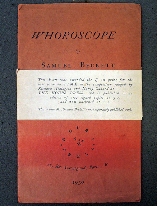
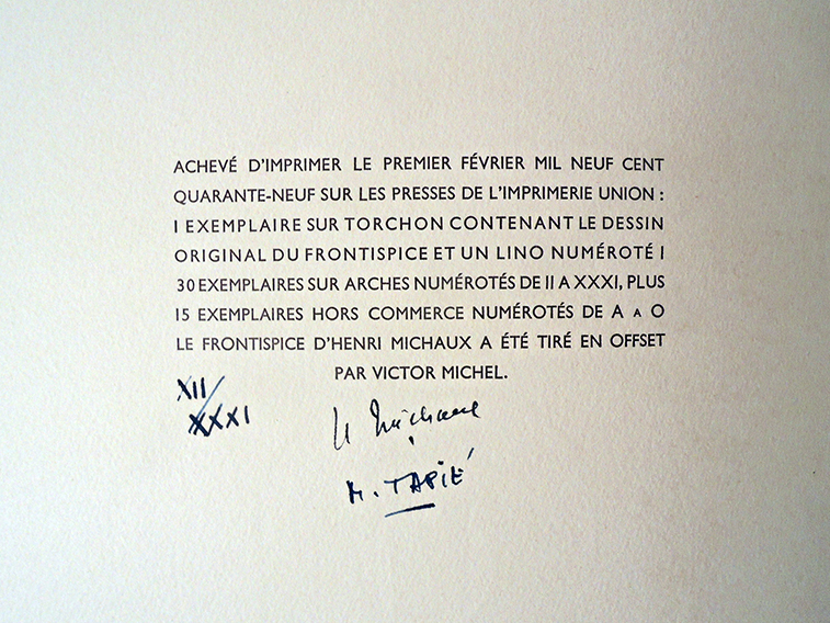
Beckett, Samuel. Whoroscope. Midsummer 1930. 100 signed letterpress copies and 200 not signed, both on Vergé de Rives paper set in 11 pt. Caslon Old Face. Won £10 prize for the best poem on ‘Time.’ Signed sold for 5s; not signed sold for 1s.

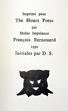
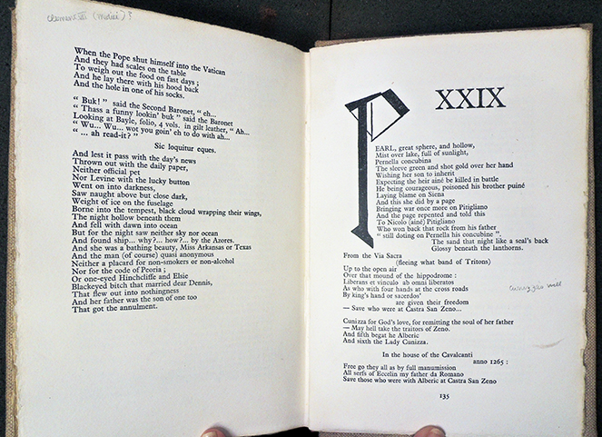
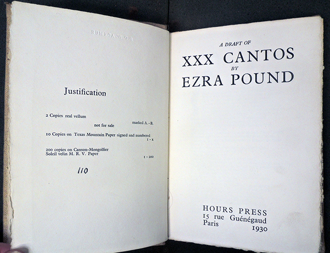
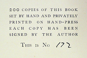
Pound, Ezra. A Draft of XXX Cantos. Midsummer 1930. 200 copies not signed on Canson-Montgolfier-Soleil Velin paper and 10 signed (2 of these on vellum) on Texas Mountain paper bound in red leather. Initial letters by Dorothy Shakespear (wife of Pound). 200 copies sold for £2; 10 copies sold for £5, 5s.

Rodker, John. Collected Poems. August 1930. 200 signed copies hand-made paper. Initial lettering by Edward Wadsworth. Front and back cover photomontage by Len Lye. Sold for £1, 10s.

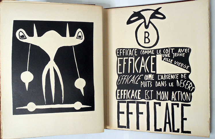
Crowder, Henry. Henry-Music. December 1930. 150 copies signed. Cover photomontage by Man Ray. Sold for 10s, 6d.

1931
Acton, Harold. This Chaos. January 1931. 150 letterpress signed copies on Canson-Montgolfier paper set in 16 pt. Caslon Old Face. Front and back cover designed and printed in blue by
Elliott Seabrooke. Sold for £1, 10s.

Aldington, Richard. Last Straws. January 1931. 200 signed copies in green suede cloth boards. 300 not signed copies in grey-brown paper boards. Designed by Douglas Cockerell. Signed copies sold for £2; unsigned copies sold for 7s, 6d.

Howard, Brian. First Poems. January 1931. 150 signed letterpress copies on Canson-Montgolfier paper set in 16 pt. Caslon Old Face. Covers designed by John Banting. Sold for £1. 10s.

Brown, Bob. Words. January 1931. 150 signed letterpress copies on Canson-Montgolfier paper set in 16 pt. Caslon Old Face. Upper cover designed by John Sibthorpe. Sold for £1, 10s.

Moore, George. The Talking Pine. Early 1931. 500 copies. Not for sale.

Ellis, Havelock. The Revaluation of Obscenity. Spring 1931. 200 signed copies. Blue cloth boards. Sold for £2.

See: https://www.the-tls.co.uk/articles/more-than-a-muse-nancy-cunard/

Zapata from Yolla Bolly Press

If you were very fortunate in the 1980s or 1990s, you got to visit the Yolla Bolly Press, “Publishers of Modern Literature in Fine Press Limited Editions,” in Round Valley, Mendocino County, four hours north of San Francisco, deep in California’s Coast Range mountains. The press, founded by James and Carolyn Robertson, ceased printing/publishing with the death of James Robertson in 2001. Happily, many of their books are still available.


The Graphic Arts Collection recently acquired Zapata: a narrative, in dramatic form, of the life of Emiliano Zapata written by John Steinbeck with woodcuts by Karin Wikström (Covelo, Calif. : Yolla Bolly Press, 1991). Copy 33/100. Graphic Arts Collection Q-000936 (note: printed with several different colored papers)


“This work formed the basis for the screenplay, Viva Zapata!” notes the t.p. verso. Steinbeck’s text is accompanied by: Zapata, the man, the myth, and the Mexican Revolution : commentary on John’s Steinbeck’s narrative by Robert E. Morsberger.

Princeton University Library Forrestal Annex, Reserve PN1997 .V56 1993 c.1; c.2; c.3; c.4

“One hundred copies were printed, of which fifty numbered copies accompany the portfolio version of the Steinbeck narrative” “Forty copies, numbered 11 to 50, have seven handcolored illustrations, an additional Wikström print, a supplemental text, and are enclosed in a portfolio of archival board covered in buckram with bone closures. One hundred ninety copies, numbered 68 to 257, are enclosed in a slipcase of archival board covered with buckram. Copies numbered 1 to 10 and 51 to 67 are reserved for the Press”–Colophon.


La Flaca, La Madeja Politica, La Carcajada, and El Lio

La Flaca, La Madeja Politica, La Carcajada, El Lio (Barcelona, March 1869 – March 1876). Complete with 256 weekly issues bound in 3 volumes, sophisticated copy. Graphic Arts Collection GAX 2020- in process


Latin American Studies and the Graphic Arts Collection recently acquired a scarce complete run of this remarkably well-illustrated satirical weekly, which began life as La Flaca. Each issue is typically comprised of one bifolium with a full-page color lithograph in volume 1 and in volume 2 ans 3, a double-page lithograph. More digital images have been posted at: https://translate.google.com/translate?hl=en&sl=fr&u=https://fr.wikipedia.org/wiki/La_Flaca&prev=search&pto=aue

Published in Barcelona, the Republican magazine faced intense government censorship and so, frequently changed its name, switching from La Flaca to La Carcajada, then La Madeja, La Madeja Política, and finally El Lio to avoid the censors. Biting criticism of the Spanish government and church was a staple while promoting freedom of the press.

The magazine’s chief illustrator was Tomás Padró y Pedret (1840-1877), who should be listed among the great caricaturist of the period. Born in Barcelona to a family of artists, he studied at the Real Academia de Bellas Artes de San Fernando in Madrid. It has been noted that another student, Mariano Fortuny, introduced him to the drawings by Paul Gavarni, an obvious influence in his satirical work. it is interesting that many plates use the iconography of drawing or writing or printmaking in their satirical message.


“The title was an ironic allusion to the plight of the Spanish people: the rickety woman with a shield bearing the country’s coat of arms and laurel wreath, accompanied by an equally starving lion on the cover of the magazine was a satire allegory of the woman and the lion fomented by the authorities in the 19th century and supposed to embody the alliance between the monarchy and the people.”

The contents are as follows:
Volume 1: La Flaca, nos. 1-100 (3rd of April 1869-3rd of September 1871). NB: no. 1 not dated.

Volume 2: La Carcajada, nos. 1-37 (17th of January 1872-31st of October 1872); La Flaca, nos. 38-84 (7th of November 1872-4th of October 1873).

Volume 3: La Madeja Politica, nos. 1-14 (1st of November 1873 – 31st of January 1873); El Lio, nos. 1-7 (7th of February 1874-18th of April 1874); La Madeja, nos. 22-50 (2nd of May 1874-19th of December 1874); La Madeja, nos. 1-22 (2nd of January 1875-3rd of March 1876).


Comparing The Seasons 1794 and 1797

James Thomson (1700-1748), The Seasons (Parma, Bodoni, 1794). Printed by Giambattista Bodoni (1740-1813). In original orange boards. Graphic Arts Collection F-000132.


“Despite the general decline of the folio format in the second half of the century, it was revived for two editions of The Seasons, one of which was an elaborate subscription venture that took four years to complete; the other was commissioned and largely financed by Thomson enthusiast David Steuart, 11th Earl of Buchan. Catering to the upper end of the market, booksellers issued the lavishly illustrated 1797 folio edition, dedicated to the Queen, with engravings by Peltro William Tomkins and Francesco Bartolozzi.

In Italy, Giambattista Bodoni published another luxurious English-language folio edition for an elite clientele in Britain, using his superb type but no illustrations; he primarily targeted a Scottish market for the work because of the growing cult of Thomson that Steuart had fostered early in the 1790s, and aimed at book collectors to purchase his edition. –Brian Hillyard, “David Steuart and Giambattista Bodoni: On the Fringes of the British Book Trade,” in Worlds of Print: Diversity in the Book Trade, edited by John Hinks and Catherine Armstrong (2006), 113-25. 8.

To prepare for a virtual student visit this week, both folio editions of Thomson’s The Seasons were pulled and some pages photographed.

Warren E. Preece wrote a brief commentary on Bodoni, noting “In Italy, Giambattista Bodoni enthusiastically took up the principle of page design as worked out by Baskerville, though not his typefaces. Further modifying the Aldine roman of Garamond, he mechanically varied the difference between the thick and thin strokes of his letters to achieve the ultimate contrast possible in that direction. His letters are rather narrower than those of either Caslon or Baskerville. He exaggerated his thick lines and reduced the thin ones almost—it seems at times—to the point of disappearance. Like Baskerville, he used opulent papers and inks blended for special brilliance.

His pages were not easy to read, but he became, in the words of Stanley Morison, the typographical idol of the man of taste, and his “plain”—though deliberately and artfully contrived—designs were an important factor in the decline in importance of the édition de luxe and its replacement by works more austere in feeling, more modern even to today’s eyes. He set what was, in general, to be the standard book style of the world until the appearance of William Morris. Warren E. Preece, “Typography,” Encyclopædia Britannica

As is widely noted, William Morris considered Bodoni’s mechanical typography an example of “modern ugliness.”

Bodoni also set the standard for printing the alphabet with his Manuale tipografico (1818). The two-volume set features 142 sets of roman and italic typefaces, a wide selection of borders, ornaments, symbols, and flowers, as well as Greek, Hebrew, Russian, Arabic, Phoenician, Armenian, Coptic, and Tibetan alphabets (Graphic Arts Collection Q-000122).


James Thomson (1700-1748), The Seasons. Illustrated with engravings by F. Bartolozzi, R.A. and P.W. Tomkins, historical engravers to Their Majesties; from original pictures painted for the work by W. Hamilton, R.A. (London: Printed for P.W. Tomkins, 1797). Rare Books Oversize 3960.2.38.16f


In contrast with Bodoni’s Seasons, a lavish edition of The Seasons was prepared by Peltro William Tomkins, who commissioned paintings by William Hamilton (1751-1801), which were translated to engravings by Francesco Bartolozzi (1727-1815) and Peltro William Tomkins (1759-1840). Targeted at the Scottish market, this edition was enthusiastically promoted and sold well into the early 19th century.

The Osgood Sisters and Waldstein Press

Agnes Haswell Osgood in her Waldstein Press

Samuel Osgood, Letters to the Evening Post Written at Home and Abroad (New York: [Waldstein Press], 1890). Copy 13 of 25. Presentation copy inscribed by the author’s daughter: “Miss Graham from her friend Agnes H. Osgood New York March 9th 1891.” Graphic Arts Collection GAX 2020-  in process


“… these days the new library was a household magnet that made up for many other changes,” wrote Mabel Osgood Wright in her autobiography My New York (Macmillan, 1926). “Even Gatha [Agnes], who resented innovation and change of any sort, took pleasure in arranging the books evenly, neatly, as they were wont to be shifted and pushed back at random.”

Agnes Haswell Osgood (1844-1929), Bertha Stevens Osgood Miller (1847-1917), and Mabel Osgood Wright (1859-1934) were the daughters of Ellen Haswell Osgood (1820-1906) and Reverend Samuel Osgood (1812-1880), pastor of the Second Congregational (Unitarian) Church in New York, better known as the Church of the Messiah. While the sisters were not allowed to attend Harvard College, as their father had, they were well educated at a private finishing school for ladies, where Agnes excelled at music, Bertha chose to paint, and Mabel, who wanted to be a doctor, settled for a career as a writer. Their New York home was frequented by actors, musicians, and politicians throughout the winter, while summers were spent at Waldstein (later called Mosswood), the family’s country estate in Fairfield, Connecticut.


In 1866, their father oversaw the design of a new church on Park and 34th Street, where a cornerstone was laid containing a copy of the Declaration of Independence, the United States Constitution, the Emancipation Proclamation, a piece of the Trans-Atlantic cable, coins, medals and photographs. But as the congregation grew increasingly liberal, Osgood chose to resign, joining the Episcopal Church, where he was ordained as a priest in 1870. Samuel spent the majority of his later years writing essays for newspapers and magazines, including the New York Evening Post, where Mabel also published her first poem at the age of 16.


left: Mabel Osgood Wright at Waldstein

Most nights, the Osgood family gathered in their upstairs library, where bookshelves had been built across the entire length of the wall. Mabel wrote, “The new love of books, which not only for their contents, but for the shape, size, feel and type, enthralled me and still does, was born of the dainty well-bound, well-printed volumes from which Clarence Cook had read to us at his literature class at Number One Fifth Avenue. His Chaucer and Shakespeare, in English editions, by their form seemed to give more meaning and importance to the text. His Tennyson also, in tree-calf covers, printed on heavy paper in clear text, was such a contrast to the odd volumes of our own copies, “pirated” editions and printed cheaply, like so much of the work of overseas authors before the honor of publishers and the law of international copyright prevailed.”

When Rev. Osgood died unexpectedly in 1880, Bertha had already married and was living apart. In 1884, Mabel married James Osborne Wright (1851-1920), a British art and rare book dealer, moving with her new husband to London. Agnes remained with her mother, living primarily at Waldstein, where she set up a small proofing press and taught herself to set type. By 1889, she had finished printing 25 copies of a two volume set of her father’s essays, entitled Letters to the Evening Post Written at Home and Abroad. She called her operation Waldstein Press, after the family estate, and although she may having continued to print, no other books were ever released with that imprint.

The Graphic Arts Collection recently acquired copy 13 of this set, inscribed “Miss Graham from her friend Agnes H. Osgood New York March 9th 1891.” For the frontispiece of volume one, Agnes chose a portrait of her father and for volume two, she used a photograph of herself with her modest press.

Not long after this, Mabel and James returned to Waldstein, where she continued writing for the New York Evening Post, and then, for Macmillan Press, which published Friendship of Nature (1894), Birdcraft (1895), and Flowers and Ferns in Their Haunts (1901) among others.


Poésie pour pouvoir

Henri Michaux (1899-1984), Poésie pour pouvoir. Text and frontispiece by Michaux. Design and linocuts by Michel Tapié (Paris: René Drouin, 1949). Copy XII of 46, signed by Henri Michaux et Michel Tapié. Teak wood portfolio printed with the title and fitted with 34 steel nails. Graphic Arts Collection GAX 2020- in process. Provenance: Collection of Geneviève and Jean Paul Kahn.

Is there a way to release the magic of poetry stagnating within conventional printed literature? Can you make a book with the power to exorcise a condition or complaint? These are some of the questions that led to Poésie pour pouvoir, with poetry by Henri Michaux (1899-1984) integrated into pictorial linocuts by Michel Tapié (1909-1987) and published in February 1949 by Galerie René Drouin in Paris.

Only a handful of copies of this singular “book-object” as Michaux and Tapié conceived it with the nailed wood cover were completed, in fact only two others can be found in North America besides the one now held in the Graphic Arts Collection at Princeton University.

A seminal work of post-war Paris, the story of Poésie pour pouvoir’s production is also magical. It began in the late 1930s with Michel Tapié’s involvement in “Les Réverbères,” a neo-Dada group, which led to his collaboration with Aline Gagnaire on the hand-printed publications Le Cheval de 4 and Deda L-E. Tapié eventually joined René Drouin’s gallery as artistic advisor, focusing on the promotion of a wide circle of artists that included Henri Michaux.


In 1947, Henri Michaux and his wife traveled to Egypt, where the magical power of hieroglyphics inspired the poems, “Je rame” and “À travers mers et desert.” These texts went unpublished until Tapié proposed to “put them into a space in the form of a book-object.”

Using the crisp, quick black and white technology of linoleum block printing that Tapié perfected while working with the Réverbères, he designed and cut Michaux’s words so they fluctuated between white text on black shapes and black text on white pages incorporated with his own abstract figures. The majority of the 46 copies were produced with only a paper cover.


A full recounting of the year leading up to February 1949, when the final work was exhibited at Drouin’s gallery, can be found in Tapié essay “Commentary on an exorcism,” Les Cahiers de la pléiade 1950.

“…. Mon projet de départ était de graver ce texte sur lino, le lino étant la technique la plus brutale et la plus directe des violentes oppositions de noir et de blanc, et de présenter l’ensemble des tirages dans une couverture de bois clouté, l’ensemble du travail étant jour par jour suivi et approuvé par Henri Michaux; L’esprit d’aventure qui préside aux activités de René Drouin poussa celui-ci à accepter le risque d’édition avec enthousiasme, et il mit l’équipe de sa galerie à notre disposition pour une rapide réalisation. Rapide en effet il le fallait; Michaux nous avait bien prévenus: si nous n’allions pas vite, le poème, lui, irait plus vite que nous et se retournerait contre nous… je pus assez vite graver tous les éléments n nécessaires à l’édification de la maquette complète.

The book’s construction took place at the Drouin family farm, under the daily supervision of Michaux. René Drouin (1905-1979) chose the arrangement of the nails on the covers, Aline Gagnaire (Tapié’s former collaborator) pieced together the wooden cover, and Drouin’s son, Jean-Claude, cut the nails to be hammered into the cover (originally plywood and only later teak wood).

Tapié was almost done with his share of the printing when he became ill and could not finish, leaving it to Gagnaire to complete the book. So many things went wrong, they called it was a cursed project, fueling the myth of a magical book.


As for his part, Michaux wrote:

 “La force exceptionnellement opératoire de ce poème, jointe au fait de son élection unique, centrant justement sur ce texte toutes les intentions d’intervention-de pouvoir-de l’auteur, me donna une furieuse envie d’en faire une édition où je tenterais de forcer les usages du livre dans le même rapport d’échelle qu’Henri Michaux l’avait fait ici par rapport non pas seulement à la poésie, mais même, comme je ne le sentis d’ailleurs que bien plus tard, à l’usage, par rapport à ses plus efficients exorcismes. Le problème consistait à fabriquer un objet receleur de force supportant ce texte de sorte que sa vue, son contact, tant épidermique que musculaire provoque au maximum l’expansion effective de cette force, puisque magie il y avait.


It is a tragedy that OCLC no longer allows local notes. To find copies that include the rare nailed wood cover, a reader must log into every library in the world individually. Otherwise they would not know, for instance, that Houghton Library has copy no. V with “unbound sheets, as issued, laid into original printed paper covers; in original hinged wooden boards, with title printed on cover, decorated with metal studs. In burlap-covered board slipcase.”

It was Tapié’s idea to pound nails into the wooden binding using the same aggressive energy as Michaux’s incantatory texts. The action references the practices of the Romans, who manufactured defixion or curse tablets, as well as African practices of incorporating nails into power figures called nkisi nkondi. The physical hammering of the nails into Poesie pour pouvoir was meant to embed magical powers into the book, just as Tapié’s pictographs unleashed the power in Michaux’s words.


Galerie René Drouin closed in 1950 (later revived in a different format), Michel Tapié went on to promote Art informel, from which Michaux distanced himself, continuing to draw and write in his own personal style. No other magic book-objects were attempted.


For more on this and other works by Michaux, see Raymond Bellour’s Henri Michaux Ouvres Complete (Gallimard, “Bibliothèque de la Pléiade”, 1998), https://babel.hathitrust.org/cgi/pt?id=uva.x004550124&view=1up&seq=1276&q1=%22poesie%20pour%20pouvoir%22

Henri Michaux (1899-1984), Commentaire d’un exorcisme ([Paris: Librairie Gallimard, 1950?]). Beach 3269.96.325. Presentation copy to Sylvia Beach with inscription by Henri Michaux.

 Le Cheval de 4 (Paris: M. Tapié, A. Gagnaire, J. Jausion, H. Bernard, 1940). Graphic Arts Collection Q-000727. Issued in 4 fascicles. Each has a separate title: [no. 1] “Le Cheval de 4” (“tirage limité à 26 ex. hors commerce et 6 ex. de luxe”) ; [no. 2] “Dédal-e” (“Tirage limité à 28 ex. hors commerce et 3 ex. de luxe”) ; [no. 3] “Huit poèmes pour Cécile / Noël Arnaud” (tiré à 150 ex. environ dont 35 de luxe) ; [no. 4] “Expédition Tapié” (tiré à 27 ex.).


Also designed by Michel Tapié while at Galerie René Drouin: Francis Picabia (1879-1953), 491 (Paris, René Drouin, 4 mars 1949). Marquand Oversize ND553.P58 T36 1949e. “50 ans de plaisirs” par Michel Tapié. Catalog in newspaper format issued Mar. 4, 1949 for Picabia exhibition of 136 works dated 1897-1949.


A section of Poetry for Power in translation:
I row
I have cursed your brow your belly your life
I have cursed the streets your steps pursue
The objects your hand grasps
I have cursed the inside of your dreams

I have put a puddle in your eye and it no longer sees
An insect in your ear and it no longer hears
A sponge in your brain and it no longer understands

I have chilled you in the soul of your body
I have frozen you in the depth of your life
The air that you breathe suffocates you
The air that you breathe has an air of cellars
Is an air that has already been exhaled that hyenas have expelled

The dung of this air no one can breathe any longer

Your skin is moist all over
Your skin sweats the sweat of the great fear
Your armpits exhale from afar an odor of crypts
The animals halt when you pass
The dogs howl in the night their heads raised toward your house


Miss traveling? Unusual histories and wonderful experiences commenced in the year 1660

Eduward Meltons, Engelsch Edelmans, Zeldzaame en gedenkwaardige zee- en land-reizen: door Egypten, West-Indien, Perzien, Turkyen, Oost-Indien, en d’aangrenzende gewesten; behelzende een zeer naauwkeurige beschrijving der genoemde landen, benevens der zelber jnwoonderen gods-dienst, regeering, zeden en gewoonten, mitsgaders veele zeer vreemde voorvallen, ongemeene geschiedenissen, en wonderlijke wedervaringen. Aangevangen in den jaare 1660. en geeindigd in den jaare 1677. Vertaald uit d’eigene aanteekeningen en brieven van den gedagten heer Melton, en met verscheidene schoone kopere figuuren versierd...(Amsterdam. 1702). Second edition. Nine of the plates, including the added engraved title page, were engraved by Jan Luiken (1649-1712); others engraved by Jacob Harrewijn (1660-1727). Graphic Arts GAX 2020- in process

= Eduward Meltons, English noblemen, Rare and memorable sea and land journeys: through Egypt, West-Als, Persians, Turkyen, East-Als, and neighboring regions; comprising a very accurate description of the countries mentioned, in addition to the self-inhabiting religion, government, morals and customs, as well as many very strange occurrences, unusual histories, and wonderful experiences. Commenced in the year 1660 and ended in the year 1677. Translated from the notes and letters of Mr. Melton’s own notes and letters, and adorned with several beautiful copper figures

With an added engraved title page with title Eduward Meltons Zee en land reizen door verscheide gewesten des werelds = Eduward Melton’s Sea and Land travel through various parts of the world.

The Graphic Arts Collection acquired this compilation of travel accounts from various sources by the fictitious Eduward Melton, attributed to Godofridus van Broekhuizen.

The part relating to Egypt has been identified as a translation of Johann Michael Wansleben’s Nouvelle relation en forme de iournal, d’un voyage fait en Egypte (Paris, 1677; London, 1678). Rare Books 2272.68958.332.6. No plates

The part relating to New Netherland is thought to be an abridgement of Adriaen van der Donck’s Beschrijvinge van Nieuw-Nederlant (Amsterdam, 1655). Rare Books EXKA Americana 1655 Donck; With the introduction to that part being taken from Arnoldos Montanus’s De nieuwe en onbekende weereld (Amsterdam, 1671). Rare Books Oversize 1075.651q


The part relating to the West Indies is in part taken from Alexandre Olivier Exquemelin’s De Americaensche zee-rooveres (Amsterdam, 1678). Rare Books EXKA Americana 1678 Exquemelin. See more at the John Carter Brown Library: https://jcblibrary.org/collection/engelsch-edelmans-zeldzaame-en-gedenkwaardige-zee-en-land-reizen

Jan Luyken or Luiken or Luijken (Dutch, 1649-1712) studied under the painter Martinus Saeghmolen. He married Marie de Oude on 5 March 1672 and had five children, all of whom died young, except for Caspar, the eldest. Shortly after 1673, having been enthralled by the religious teachings of Jacob Böhme, he became a fanatical Pietist. Jan Luyken was a member of the Haarlem guild in 1699 and returned to Amsterdam in 1705. His large output of engravings totalled some 3,275, and he was also an author.–Benezit Dictionary of Artists

Detail of Slave Market

Look inside this cabinet of wonders, a beautiful rarity


Open the cabinet door, inscribed “Schöne rarität, schöne spielewerk” (Beautiful rarity, beautiful game work), and you will see what others are viewing through the peep holes at the sides. This volume has two engraved plates with movable flaps, along with eight others engraved by Christian Friedrich Boetius, Johann Benjamin Brühl, and Georg Paul Busch after designs by David Richter.


Later in the volume, two wide  tables open to let the viewer see inside the two tents, guarded by several antelope.


The stories are credited to Jean Chretien Toucement, the pseudonym for Johann Christian Trömer (1697-1756), a Franco-German dialect poet at the court of Augustus the Strong. The Oxford companion to German literature by Henry and Mary Garland describe the author:


Jean Chretien Toucement des Deutsch Franc̦os schrifften, mit viel schön kuffer stick, kanss complett, mehr besser und kanss viel vermehrt. Leipssigck, Bey die auteur und ock bey Johann Christian Troemer [1736]. Graphic Arts 2020- in process.  Note the date written in a rebus at the bottom of the title page.

Princeton also holds the later 1745 edition, with many plates reprinted.


The History of [American] Political Parties

Walter Raleigh Houghton (1845-1929) was a history professor at Indiana University who believed  that “the political history of the United States has received less attention than any other important portion of the history of our country, notwithstanding the fact that there is no other subject which meets with such general consideration as politics.” Therefore he took it upon himself to chronicle and depict American political history in several books, each using these colorful maps and charts.


Unfortunately, Googlebooks did not remove the panoramic charts from the envelope, so that they could be digitized.

In this 1880 plan, Republicans are red and the Democratic are yellow. There are many online sites giving the modern day history of party colors but few of them mention yellow. For instance: https://www.smithsonianmag.com/history/when-republicans-were-blue-and-democrats-were-red-104176297/

Slate magazine offers this short video:

Here is the timeline broken into segments so it can be read. 1789 to 1881 election data includes various heads of state, treasury, war, navy, post office, justice, and interior.

Walter R. Houghton (1845-1929), Conspectus of the History of Political Parties and the Federal Government (Indianapolis, Ind.: Granger, Davis & Co., 1880). ReCAP oversize 1097.478q

Princeton’s copy is missing the timeline that presents U.S. political parties entitled: “Diagram of the Rise and Fall of American Political Parties, from 1789 to 1880, inclusive.” Here is the online version:

Note, Houghton’s “Rules of Politeness” can be downloaded for free: https://openworks.wooster.edu/do/search/?q=author_lname%3A%22Houghton%22%20author_fname%3A%22Walter%22&start=0&context=4358143&facet=


Samples of the Peter Adams Company’s American Art Papers

Peter Adams Company, Samples of the Peter Adams Company’s American Art Papers made at the company’s Waverly Mills at Buckland, Conn. New York, 1893. Graphic Arts Collection GAX 2020- in process

“The Waverly Mills were established by Peter Adams, at the village of Buckland, near the city of Hartford, Connecticut, U.S.A., in the year 1861,” wrote Henry H. Bowman in this 1893 paper sample book for the Mill, although other sources indicate Adams purchased the mill in 1863. The book continues:

“…Mr. Adams was born in Scotland, and there learned thoroughly, in all its branches, the business of paper making. His father died when he was very young. His parents were in very moderate circumstances, and the spirit of self-reliance and the restless energy that throughout his career overcame all obstacles to success, were manifested by him then, when, at the tender age of eight years, he commenced the work of making himself an adept in the art of paper making.

To this work he applied himself steadily until he became an expert paper maker in all the branches of the art. At the age of twenty-one years he came to America. He and three other young Scotchmen set up and operated, at Saugerties, N.Y., the first fourdrinier paper machine that was operated in America. He soon became superintendent of a paper mill, and thereafter his services were in constant requisition in that capacity until he entered int the business of paper making on his own.”


By 1884, Peter Adams (1807-1889) was known as one of the oldest and most successful paper manufacturers in the United States. http://www.manchesterhistory.org/reprints/MHS3_AdamsMill.html


Note the specificity of this sample book: plate papers (8); chromolithographic plate papers (10) chart papers (2); map papers (6) and book papers (14). It is rare the printer of a chromolithograph, or other printed material, should credit the type of paper on which it’s printed for its quality but here the paper is shown with an actual chromolithograph, suggesting just that.


The importance of the Adams firm is demonstrated by their New York City offices, housed at 38 Park Row, in the eleven-story Potter Building commissioned by Orlando B. Potter and constructed in 1883-86 to replace Potter’s World Building, destroyed by fire in January 1882.

King’s Handbook mentions that there were two hundred offices in the Potter Building, “including those of several newspaper and periodical publishers, insurance and other companies, lawyers and professional men.” Among its newspaper tenants were the editorial and business offices of The Press, a popular penny newspaper founded in 1887 with ties to the Republican party, and the New York-Observer, the oldest American religious newspaper, started in 1823 and previously located in the World Building until the fire.

Other tenants included Peter Adams Co. and Adams & Bishop Co., manufacturers of fine papers for printing, maps, photography, etc.; the Mutual Reserve Fund Life Association, established in 1881 and the then largest assessment insurance firm in the world; the business offices of Otis Brothers & Co., manufacturers of elevators since 1855 and the leading maker of passenger elevators; the New York Architectural Terra Cotta Co. offices; and O.B. Potter himself, on the top floor.

The mill is now a restaurant, located along a popular hiking trail: https://www.journalinquirer.com/living/adams-mill-repurposing-an-old-building-for-a-restaurant/article_449e527a-2533-11e7-88ba-470bf2fdb629.html