Category Archives: Medium

mediums

Antoine Le Pautre

Robert Nanteuil (1623-1678), Antoine Le Pautre, architecte et ingenieur, 1652. Engraving. Graphic Arts Collection 2005.01080. Dumesnil no. 127. Gift of John Douglas Gordon, Class of 1905. Permanent Link: http://arks.princeton.edu/ark:/88435/r781wg115


Princeton University Library does not hold a copy of Antoine Le Pautre’s Desseins de plusieurs palais plans & éléuations en perspective géometrique, ensemble les profiles éleuez sur les plans, le tout dessiné et inventez par Anthoine le Pautre architecte, et ingenieur ordinaire des bastimens du Roy, first published in Paris, 1652 (=Drawings of several palaces, plans, and elevations in geometric perspective, together with the high profiles on the plans, all drawn and invented by Antoine Lepautre, architect and engineer of the King’s buildings).

A complete copy can be seen at: https://plume.epfl.ch/viewer/1452/?offset=#page=7&viewer=picture&o=info&n=0&q=

The Graphic Arts Collection does have a beautiful impression of the title page engraved by Robert Nanteuil (1623-1678), with a putti designer and architect on either side of the title frame. The print also appears in the later Les Œuvres d’architecture d’Anthoine Le Paultre, Architecte ordinaire du Roy (Paris: Lombert, 1653)


The younger brother of Jean Lepautre 1618-1682), Antoine grew up in a family of architects and designers. He was appointed architect of the king’s buildings in 1644 and in 1654 designed the Hôtel de Beauvais in Paris for Pierre de Beauvais, which is noted for “his ingenious irregular construction, with an original and interesting planimetric distribution, where no side of the building is parallel to the other.”

Here is a view of the courtyard, showing its unusual oval shape:

To distinguish the members of this prolific family, see Stéphane Loire, “Antoine Lepautre, Jacques Lepautre et Jean Lepautre,” in The Burlington Magazine 138, no. 1116 (1996): 198.

See also: Robert W. Berger, Antoine Le Pautre: A French Architect of the Era of Louis XIV. New York: New York University Press. OCLC 121942.


Checking the provenance of John Foster’s 1670 woodcut

Have you checked to bottom of your sewing basket recently for rare prints?

For many years, an impression of the first woodcut portrait printed in colonial America laid in the bottom of the work-basket of Sarah Catherine Mather (1840-1924) before it was discovered. The rare print was passed down to her nephew Frank Jewett Mather Jr. (1868-1953), former art history profession at Princeton University and a direct descendant of the subject of the print, Reverend Richard Mather (1596-1669). In 1957, the woodcut was given to the Princeton University Library, in memory of Frank Jewett Mather, Jr., by his wife, son, Frank Jewett Mather III, and daughter, Mrs. Louis A. Turner.


Sinclair Hamilton wrote,

“This cut is not only the first woodcut portrait produced in what is now the United States, it is also our first portrait print. Indeed, it is the first print of any significance to be made in this country, in any medium or of any kind, and may be said to mark the beginning of engraving, using that word broadly to embrace all types of cuts, in North America. … It is further reported by a good friend of his that, when the cut finally came into [Frank Mather’s] possession, he hung it near the front door so that, in case of fire, it would be the first object to be rescued, even before his Giorgione painting, which, a gift from him shortly before his death, now hangs in Princeton’s Art Museum”.

There are four other extant impressions from Foster’s woodblock. The first to be given to a public institution was presented in 1807 to the Massachusetts Historical Society by Arthur Maynard Walter, a descendant of Richard Mather.

William Bentley, another descendant of Mather, willed his copy of the print to the American Antiquarian Society, who acquired it in 1819. Green compared this copy with the one at the Massachusetts Historical Society, saying “A similar engraving, in which the two parts fit, is owned by the American Antiquarian Society at Worcester. Evidently this is a later impression from the same block, as the two parts fit; and furthermore, the left arm has been considerably pared off.”

According to Gillett Griffin in his 1959 article in PaGA, “The Harvard copy alone has a satisfactory seventeenth-century provenance. The handwriting of William Adams of Dedham, who died in 1685 and the fact that the print also belonged to his son, Eliphalet Adams of New London, who had it ‘bound in 1701-2’, provide the means of establishing its record.” This copy in the Houghton Library was not purchased individually but found, according to Samuel A. Green, “pre fixed to a copy of Increase Mather’s The Life and Death of That Reverend Man of God, Mr. Richard Mather, Cambridge, 1670, which in turn was bound up with a number of other pamphlets. Except for this one instance, nothing has been recorded which would indicate that the cut was originally intended for use as a frontispiece.” No date of the discovery is given.

In 1935 Tracy William McGregor (1869-1936) acquired the best collection in private hands of books and manuscripts written by or relating to the Mathers. Formed by William Gwinn Mather of Cleveland, Ohio, the collection numbered over 2,100 items, including John Foster’s woodcut of Richard Mather. Three years later, the trustees of the McGregor Fund donated the collection to the University of Virginia, beautifully housed today in the Tracy W. McGregor Library of American History.

Circle of Giorgione, Infant Paris Abandoned on Mount Ida, ca. 1510. Oil on wood panel. Gift of Frank Jewett Mather Jr., y1948-65

Reminder of digital graphic arts collections

Over the years a number of materials in the Graphic Arts Collection have been digitized. Some are connected to the online catalogue and some are not. Some are in the newer site DPUL and some in the older PUDL and some just online somewhere. Here is a list of the ones I can confirm, in case they are helpful to your research:

Antonio Martorell. Las Antillas Letradas https://dpul.princeton.edu/wa/catalog/nz8063470

Brother Jonathan Jubilee Pictorial newspapers http://pudl.princeton.edu/objects/9z903261b

Early Soviet Illustrated Sheet Music https://dpul.princeton.edu/catalog?f%5Breadonly_collections_ssim%5D%5B%5D=Early+Soviet+Illustrated+Sheet+Music&q=+Early+Soviet+Illustrated+Sheet+Music&search_field=all_fields

Franklin McMahon. Signing the Israeli/Egyptian Peace Accord, 17 September 1978 https://dpul.princeton.edu/wa/catalog/5138jj65g

Franz Freiherr von Wertheim’s Manuel de l’outillage des arts et métiers http://pudl.princeton.edu/objects/qr46r156v

Franz Hogenberg Engravings http://pudl.princeton.edu/collections/pudl0051

George Humphrey’s The Attorney-General’s Charges Against the Late Queen (50 caricatures) http://arks.princeton.edu/ark:/88435/dj52w599c

Gillett G. Griffin Japanese Woodblock Prints http://pudl.princeton.edu/collections/pudl0026

Giovanni Ottaviani after frescoes designed by Raphael. Loggie di Rafaele nel Vaticano https://dpul.princeton.edu/wa/catalog/5d86p388v

James Gillray Caricatures http://pudl.princeton.edu/collections/pudl0015

Jie zi yuan hua zhuan (Mustard Seed Garden Manual of Painting): http://arks.princeton.edu/ark:/88435/9z9031252
http://arks.princeton.edu/ark:/88435/kh04dr094
http://arks.princeton.edu/ark:/88435/fq977w17w

John Baptist Jackson Chiaroscuro Woodcuts http://pudl.princeton.edu/collections/pudl0031

Lorenzo Homar prints, drawings, and blocks http://pudl.princeton.edu/collections/pudl0033

Middle Eastern Film Posters http://pudl.princeton.edu/collections/pudl0100

Pathé Baby French silent movies https://library.princeton.edu/pathebaby/films

Photography album documenting the Morant Bay Rebellion in Jamaica (1865), the Indian Northwest Frontier Hazara Campaign (1867-1870), views of Malta, etc., 1860-1880 https://catalog.princeton.edu/catalog/5954033#view

Pencil of Nature by William Henry Fox Talbot https://catalog.princeton.edu/catalog/3696558#view

Princeton Print Club scrapbooks http://pudl.princeton.edu/objects/td96k526s

Richard Willats early photography album http://pudl.princeton.edu/objects/k930bx11x

Robert Nanteuil Engravings http://pudl.princeton.edu/collections/pudl0010

Sinclair Hamilton Collection of American Illustrated Books miniatures (1/4 done) https://dpul.princeton.edu/ga_treasures/catalog/v979v657w And other titles

Société Engelmann père et fils (3 vols. Chromolithography). http://pudl.princeton.edu/objects/3484zk471

Specimens of paper with different water marks, 1377-1840 http://pudl.princeton.edu/objects/k930bz393

Taller de Gráfica Popular http://pudl.princeton.edu/collections/pudl0012

Thomas Nast drawings and wood engravings http://pudl.princeton.edu/collections/pudl0039

Thomas Rowlandson prints and drawings http://pudl.princeton.edu/collections/pudl0130

Treasures of the Graphic Arts Collection  https://dpul.princeton.edu/ga_treasures

Versailles on Paper, Books and Engravings
http://pudl.princeton.edu/collections/pudl0083
http://pudl.princeton.edu/collections/versailles2
http://pudl.princeton.edu/collections/versailles3

Need a Project, no. 9? Money

Questions:
1. Whose portrait is hidden in the $20 note?
2. How many number 5’s are on the $5 note?
3. Which bill cannot be redesigned, thanks to a recurring provision in the annual Financial Services and General Government Appropriations Act?
4. Which denomination came first?
5. What happened to the Harriet Tubman $20?

https://www.uscurrency.gov/denominations/5

Since 1929, United States has attempted to standardize the design of its paper currency while still allowing denominations to have their own icons, portraits, and security features as well as a distinct character in colors, textures, and watermarks.

Did you know there are two sides to the Great Seal on the $1 note? One side, the reverse, features the pyramid and the floating eye, called the Eye of Providence. This design is located on the left of the banknote. The other side of the Great Seal features the bald eagle holding the olive branch and exactly 13 arrows. And there are thirteen vertical stripes on the shield and thirteen stars in the constellation above the eagle. President Franklin D. Roosevelt switched the placement of elements, so he is responsible for putting the unfinished pyramid (with 13 steps) on the left side of the banknote.

© =Federal law permits color illustrations of U.S. currency only under the following conditions:
The illustration is of a size less than three-fourths or more than one and one-half, in linear dimension, of each part of the item illustrated; the illustration is one-sided; and all negatives, plates, etc. are destroyed and/or deleted after their final use.

The phrase Novus ordo seclorum (= New order of the ages) is the second of two mottos that appear on the reverse of the Great Seal of the United States. The first motto is Annuit cœptis (= Providence favors our undertakings or Providence has favored our undertakings)


Answers:
No. 1: In 2003, the $20 note was redesigned to include an embedded security thread that glows green when illuminated by UV light. In addition, a portrait watermark of President Jackson is visible from both sides of the note. Finally, the note includes a color-shifting numeral 20 in the lower right corner of the note. An Alexander Hamilton portrait watermark is visible on the $10 note. The portrait of Lincoln was removed from the watermark of the $5 note.

No. 2: Not counting digits in the changing serial numbers, there are 10. Be sure to count the three 5’s watermarked in a vertical pattern on the left and one large 5 embedded in the paper on the right.

No. 3: The $1 note remains the same since the note was issued in 1963. “The United States government redesigns Federal Reserve notes primarily for security reasons: to stay ahead of counterfeiting threats and keep counterfeiting levels low. Because the $1 note is infrequently counterfeited, the government has no plans to redesign this note. In addition, there is a recurring provision in the annual Financial Services and General Government Appropriations Act that prohibits the redesign of the $1 note.”

No. 4: On June 25, 1776, the Continental Congress authorized issuance of the $2 denominations in “bills of credit” for the defense of America.

No. 5: All plans are on hold. Read the whole story here: https://www.thedailybeast.com/what-happened-to-the-plan-to-put-harriet-tubman-on-the-dollar20-bill

See also $100 note: https://graphicarts.princeton.edu/2013/10/08/100/

Something that will not “blow over.”

When the Irish Protestant Orange Day parade kicked off on July 12, 1871, in New York City, artist Thomas Nast was one of 5,000 National Guardsmen called out to protect the marchers from hundreds of Irish Catholic protestors. Shots were fired and the resulting Orange Day Riots left 60 civilians and three guardsmen dead, along with many others wounded. Nast recorded a first-hand account in a double-page wood engraving published July 29, 1871 in Harper’s Weekly.

Although Harper’s printed two texts presenting the two sides to the Protestant/Catholic debate, Nast’s depiction is clearly anti-Catholic, showing the protestors as apes and thugs connected to Boss Tweed who Nast was in the midst of overthrowing. Nast titled his print “Something That Will Not ‘Blow Over’” alluding to the words used by Mayor Abraham Oakey Hall when he dismissed the allegations of Tweed’s corruption, claiming they would soon “blow over.”

At the center of Nast’s design is a globe-like vignette; Washington at the top, California on one side and New York on the other. It is named “The Promised Land. U.S.A.” with an upside-down flag on the left, with the words embedded: “The land of the free, home of the brave.”  Mixed in with the Orange Day rioters below, several figures have been identified as (left to right) Queen Victoria, John Bull, King Victor Emanuel of Italy, Emperor Franz Josef of Austria, and Tsar Alexander II of Russia, along with Uncle Sam at the center. On the left, a lynched black man and the burning Colored Orphan Asylum are references to the 1863 Civil War Draft Riots in New York City.

Thomas Nast (1840-1902), Something that will not “blow over.”–July 11 and July 12, 1871 (New York: [Harper’s Weekly], July 29, 1871). Wood engraving. Graphic Arts GA 2008.01711. http://arks.princeton.edu/ark:/88435/qv33rw804


Below the central panel we see Boss Tweed with his crew being asked the question, “Well What Are You Going To Do About It?”–a question famously posed by Tweed during the corruption trials.

Nast’s work drew such attention that a New York Times editorial was printed, urging readers to see the Harper’s Weekly issue. “Everybody should see, and seeing, retain Nast’s great ‘Riot Cartoons’ on the New Number of Harper’s Weekly.

See more: https://www.harpweek.com/09Cartoon/BrowseByDateCartoon.asp?Month=July&Date=29

https://archive.nytimes.com/www.nytimes.com/learning/general/onthisday/harp/0729.html


“The Doctor Too Many For Death” and “Death Too Many For The Doctor”


Walker’s Hibernian Magazine, or Compendium of Entertaining Knowledge, published in Dublin monthly from February 1771 to July 1812 is available at Princeton University Library by interlibrary loan, microfilm, and Hathi Trust digital images. Unfortunately, the prints bound into each issue digitized by the New York Public Library were never unfolded and so, only the text is available.

A rare sequence of two drawings by Samuel Collings were etched by Thomas Rowlandson for the December 1, 1788 and January 1, 1789 issues of the Hibernian but it is difficult to know how they relate to the few extent loose prints. In the first plate [left], a doctor at a sick man’s bedside fires a full syringe or clyster or enema into the face of Death represented as a skeleton.

Thomas Rowlandson (1757–1827) after Samuel Collings (active 1784-89, died 1810), The Doctor Dismissing Death (also called The Doctor Too Many For Death). Frontispiece: Hibernian Magazine: or Compendium of Entertaining Knowledge, December 1788. Etching.

Hibernian Magazine: or Compendium of Entertaining Knowledge, for December 1788. The Doctor Dismissing Death. (Engraved from an original Design of the celebrated Rowlandson). Yes—Doctors will differ,–that’s as just an adage as ever fell from the lips of man; though people might suppose, indeed, that they should in the general agree in opinion; yet the contrary is evident in the various modes of cure used every day by the faculty; –and it is but just it should be so, as we shall prove by experience. Had inoculation never been brought into repute, and the improvement on it too by Lady Wortley Montague, Dimmesdale, or Sutton. (for people might as well have taken it naturally, and died a natural death at once, as to die by an infection poured copiously into an aperture dug in the flesh for the purpose of containing it, after the poor patient had been almost starved to death) what an abominable ugly set of animals would most of us be at this time; seamed, blind, disfigured, and featureless…

Two earlier impressions, 1786 and 1787, were etched by N.C. Goodnight for John Smith, 35 Cheapside, with the slightly different title but assumed to be the same image, given the elaborate description in the December issue. Thomas Rowlandson was commissioned to re-engrave Collings’ drawing in 1788 and presumably also 1789.

In the second plate, the Doctor is overwhelmed by death as a group of skeletons, variously labeled “Luxury,” “Apoplexy,” “Fever,” “L’Amour Omnia Vincit Amor,” “Mania,” “Despair,” “Cold,” and “Vapour.” Attributed to Thomas Rowlandson (1757–1827) after Samuel Collings (active 1784-89, died 1810), Death Too Many For the Doctor. Frontispiece: Hibernian Magazine: or Compendium of Entertaining Knowledge, January 1789. Etching.

Death too many for the Doctor. Embellished with a humorous print (from an original design) by Collins [sic]. In a late publication “The Doctor dismissing death” (see our Magazine for December last) the artist has whimsically represented the emaciated patient retired to a country village, where the grim tyrant pursues him; –however, in this salubrious retreat, the valetudinarian sets him at defiance, whilst the doctor at his back, like Sterne’s sentinel on Pont-neuf, puts on a formidable countenance, and levels his harquebus in the firm of a huge syringe at the impertinent intruder. Who retires from the window, into which he first peeped, with a sarcastic grin at his medical adversary. In the present scene, however, Death is too many for the Doctor, the patient is represented as returned to his town residence, and forgetful of his late wonderful escape, relapses into his former course of dissipation, in consequence of which, notwithstanding his friend the Doctor (armed with a clyster-pipe, and a magazine of nostrums at his back) has victoriously triumphed over cold and vapours; death attacks him with a host of foes. …

The second print was also aquatinted by Francis Jukes (1747-1812) dated in various collections from 1786 to 1803, each on a mat that might not be contemporary with the print

“May-Day in London” by William Blake

William Blake (1757-1827) after Samuel Collings (active 1784-1795), May-Day in London. Folding frontispiece to the v.1, May 1, 1784 issue of Wit’s Magazine (London, 1784). Etching. Also published as an individual print dated June 1, 1784 by Harrison and Company, London.


Happy May Day.

One of the best-loved prints to celebrate this festive day is William Blake’s etching “May-Day in London” commissioned for the frontispiece in the May 1, 1784 issue of The Wit’s Magazine; or, Library of Momus. Being a compleat repository of mirth, humour, and entertainment… , edited by Thomas Holcroft (London, Printed for Harrison and Co., 1784-84). Rare Books 0901.981 v.1-2.

There are numerous folding plates throughout the magazine’s run, five etched by Blake; one after a design by Thomas Stothard and four after designs by Samuel Collings. The print is announced on the title page: “with a large quarto engraving representing a curious description of May-Day in London, as mentioned in Sammy Sarcasm’s Epistle to his Aunt; designed by Mr S. Collings and engraved by Mr. W. Blake purposely for this work.

While Princeton University Library has a beautiful set of Wit’s Magazine with all the original Blakes bound in, there is no access to the paper issue this week. Several digital surrogates are offered by our online catalogue but they present the reader with this unfortunate image [below], not much good for study or entertainment. The digital image at the top is from the National Gallery of Art.

https://access-newspaperarchive-com.ezproxy.princeton.edu/uk/middlesex/london/wits-magazine/

Blake’s prints appear in successive issues from February to May 1784 and show an uncharacteristic side of the artist’s talent. In the study “Puzzling the Reader,” Gregg Hecimovich points out that,

The Wit’s Magazine represents the first known contact between [Thomas] Holcroft and Blake, and it was from about this time that Blake began to move in the circle of radicals, including Godwin, Wollstonecraft, and Horne Tooke, in which Holcroft figured so prominently. Although Blake had been employed to engrave illustrations for publications such as the Novelist’s Magazine, it seems clear that his connection with the Wit’s Magazine was through Holcroft. Blake’s friend Thomas Stothard designed the illustration for the first issue but, despite the replacement of Stothard with Samuel Collings, Blake stayed on as engraver until just after Holcroft resigned as editor in May 1784. For Blake, who had recently married and established a household independent of his father, such commissions provided much-needed income, but he probably also felt the attraction of working with the dynamic and provocative Holcroft.” –Gregg A. Hecimovich, Puzzling the Reader: Riddles in Nineteenth-century British Literature (2008): 32.

This frontispiece (often rebound next to the poem in section two) presents a busy London street on May-Day with milkmaids, chimney sweepers, a violinist, and others. Notice that the violinist has a wooden leg. Unlike many pastoral scenes, Collings’ design and Blake’s rendering feature an underprivileged population of London rather than the beautiful people.

Hecimovich calls this the most powerful of all Blake’s contributions to Wit’s Magazine. He writes, “…the traditional May-Day festivities are inverted into a sordid anti-pastoral. Beneath a maypole hung not with flowers but with dirty pots and pans, a crippled one-eyed fiddler plays for drunken clergymen, lascivious milkmaids, child-age chimney sweeps, and assorted other street people.”

He goes on to question whether or not there was a direct influence on later Blake poems such as The Chimney Sweep and London, commenting that this is “perhaps the earliest instance of Blake’s exploring and depicting through the new verbal and pictorial mediums the degeneracy of urban London life.”


Blake aside, Samuel Collings was a interesting amateur draughtsman, caricaturist, and genre painter who remains understudied by art historians. He  mainly worked in London, exhibiting at the Royal Academy in 1784-89. He received commissions from The Bon-Ton Magazine in the 1790s as well as The Wit’s Magazine and others. Collings may have used the pseudonym Annibal Scratch and others, leaving good work without attribution. Princeton holds a unique portfolio of Thomas Rowlandson etchings after drawings by Collings, commissioned by the Marylebone publisher E. Jackson to illustrate Boswell’s Tour to the Hebrides. See more: https://www.princeton.edu/~graphicarts/2012/09/the_journey_of_dr_johnson_and.html

The never realized Litho-Graphic Arts Industrial Center


On September 30, 1962, a letter from President John F. Kennedy appeared in the New York Times. He wrote “Your two great New York ALA building projects, Litho Central City and Litho-Graphic Arts Industrial Center, are concepts which express my own philosophy that urban redevelopment must be motivated out of respect for the essential values of human betterment—education, art and brotherhood. I congratulate you, Eddie Swayduck, as president of a great union that is recognizing its responsibilities to the social community.”

Mayor Robert F. Wagner added “I congratulate your organization on its wonderful history of public service, Eddie. You can count on my enthusiastic cooperation in the development of the exciting building project, Litho Central City, sponsored by ALA Local I, and the proposed Litho-Graphic Arts Industrial Center.”

The Wall Street Journal commented “This is a union that not only accepts labor-saving devices but actually pours funds into promoting their use. This magnificent dream is actually coming true in the lithographic industry”


The 28-page special supplement was published in the New York Times by ALA Local 1, the labor union of the Amalgamated Lithographers of America to promote the building of two enormous complexes in Manhattan: “The litho-graphic art center of the world and scene of a great renaissance in the graphic arts.” Bold letters proclaimed “Art Is Not an End In Itself, But a Means of Addressing Humanity.” ‎  Following an extended history of lithography, page 24 notes, “Today, Litho Central City, now in the advanced stages of planning–and the proposed Litho-Graphic Arts Industrial Center …–are potent evidence of the power for progress that can be generated by a far-thinking craft union in a great industry.”

Scheduled for completion in 1967, neither the Litho Central City or the Litho-Graphic Arts Industrial Center were built. Instead the property at Pier 25 was used for Borough of Manhattan Community College and the Westside lots became the Riverside Park South. Project designer Paul Rudolph’s webpage continues to note:

“The proposals for the Graphic Arts Center are based on the concept of the megastructure, or the idea that many functions can be served in a single large building complex. In this case there are facilities for industry (lithography, legal and financial printers); office space; 4,000 apartments of varying kinds; elementary schools, kindergartens; play spaces at grade, as well as on platforms in the sky; community center; restaurants; commercial shopping; gardens and recreational space; and parking-trucking access incorporating portions of the West Side Highway. In other words, it is a city within a city. The idea of a megastructure is different from the idea of building an apartment house, industrial and office space, schools and restaurants. Rather, it is the intent to build all of these multiple functions in one complex. https://www.paulrudolphheritagefoundation.org/196701-graphic-arts-center

This special section is not available from the New York Times digital site or from Proquest, except for the single page 2 with a letter from Edward Swayduck, ALA local 1 president, who wrote “Today we’re at the beginning of a great renaissance in the graphic arts. Business management can now tap the entire treasury of classic art or commission the finest work of living artists, photographers and designers, with a finally developed process which can bring to millions all the world’s beautify and richness with an economy only dreamed of a short lifetime ago. It’s a New York story. And I think you’ll find it interesting … and perhaps profitable!”


The majority of the NYTimes supplement provides a history of lithography “from the Stone Age of art to the Space Age of communications…” along with a history of the ALA union.  It seems a beer and crabcake outing of the Romar Fishing Club was held on Sunday April 23, 1882. The Club’s five members were lithographers by trade and that afternoon their fishing club became “the first craft union in a hungry but hopeful new industry.” The Amalgamated Lithographers of America (ALA) posts a timeline of its labor union that begins:

April 1882: Romar Fishing Club is organized.
June 10, 1882: Romar Fishing Club becomes Hudson Assembly 1971, which was part of the Knights of Labor.
1886: First general lithographers’ strike to reduce the workweek to 54 hours. Romar Fishing Club becomes the Hudson Lithographic Association and then develops into the Lithographers’ International Protective and Benevolent Association (LIP&BA). Withdrawal from Knights of Labor.
1892: Organization of the Artists, Engravers and Designers League.
1906: General strike for the 48-hour/6-day workweek. (The strike was so successful that by
1912: The Artists, Engravers and Designers League develops into the International Union of Lithographic Workmen.
1915: Amalgamated Lithographers of America is formed.
…1958: ALA withdraws from the American Federation of Labor and Congress of Industrial Organizations (AFL-CIO)
Labor Day 1964: the Amalgamated Lithographers of America merges with the International Photoengravers Union (IPEU; founded in 1900) to form the new Lithographers and Photoengravers International Union (LPIU). Membership total reaches 60,000.

Swayduck later published Lithopinion, the journal of ALA local 1 from 1965 to 1975. There is a run in Firestone Library: Oversize NE2250 .A414q and Graphic Arts Collection Oversize 2006-0364Q (1975 only),See also: www.local1.org/ and https://prudolph.lib.umassd.edu/node/4548


The devil, as he in the fulnes of his malice, first invented these great ruffes…

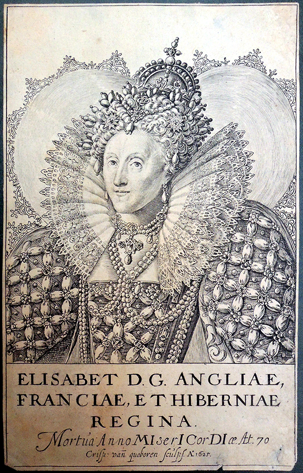
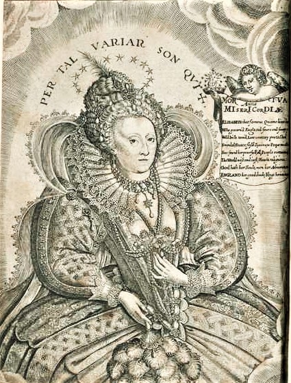
Crispijn van den Queborn (1604-1652) after Isaac Oliver (ca.1556-1617), Elisabet D.G. Angliae Franciae, et Hiberniae, Regina, 1625. Engraving. Graphic Arts Collection

It was not difficult to identify this engraving of Elizabeth I, Queen of England (1533–1603), with the information inscribed on the plate below image: “Mortua Anno MiserI CorDI ae At 70 / Crisp: van queboren Sculp A:1625”

The half-length posthumous portrait shows Elizabeth I wearing an elaborate pearl adorned dress with a striking ruff and crown. According to O’Donoghue’s A Descriptive and Classified Catalogue of Portraits of Queen Elizabeth (1894): “It is a noteworthy fact that none of the engravings of Elizabeth published in or near her own time can be affiliated to existing oil paintings or miniatures, and (with the exception of the large plate by C. van de Passe and one of those by F. Delaram), none bear the name of the original artist.”


O’Donoghue continues “The most striking of all, and one peculiarly associated with Elizabeth, is the ruff, and almost the entire history of the rise and progress of that remarkable article of attire may be traced in her portraits; for this reason the various forms which it took at different periods have been used for the classification of the present catalogue.”


When researching the fashion of Elizabethan London, one of the first contemporaneous sources is Philips Stubbes’ The anatomie of abuses, published in 1583 and reprinted four times over the course of the next decade. While documenting both men and women’s dress, Stubbes did not hesitate to give his opinions, subtitling his study:  “a discouerie, or briefe summarie of such notable vices and imperfections, as now raigne in many countreyes of the world: but (especiallye) in a famous ilande called Ailgna: together, with most fearefull examples of Gods iudgements, executed vppon the wicked for the same, aswel in Ailgna of late, as in other places, elsewhere. Very godly, to be reade of all true Christians: but most needefull to be regarded in Englande. Made dialogue-wise by Phillip Stubbes. Here is a segment on Ruffes:

They have great and monsterous ruffes, made either of Camericke, Holland, Lawne, or els of some other the finest cloth that can be got for money, whereof some be a quarter of a yard deep, yea, some more, very few lesse; So that they stand a full quarter of a yarde (and more) from their necks, hanging over their shoulder poynts, instead of a vaile. But if Aeolus with his blasts, or Neptune with his stormes chaunce to hit uppon the crafie bark of their brused ruffes, then they goe flip flap in the winde, like rags flying abroad, and lye upon their shoulders like the dishcloute of a slut. But wot you what? The devil, as he in the fulnes of his malice, first invented these great ruffes, so hath hee now found out also two great stayes to beare up and maintaine that his kingdome of great ruffs : the one arch or piller wherby his kingdome of great ruffes is underpropped, is a certaine kinde of liquide matter which they call Starch, wherin the devill hath willed them to wash and dive his ruffes wel, which when they be dry, wil then stand stiffe and inflexible about their necks. The other piller is a certain device made of wyers, crested for the purpose, whipped over either with gold, thred, silver or silk, and this hee calleth a supportasse, or underpropper. This is to be applyed round about their necks under the ruffe, upon the out side of the band, to beare up the whole frame and body of the ruffe from falling and hanging down….

So few have them, as almost none is without them; for every one, how meane or simple soever they bee otherwise, will have of them three or foure apeece for sayling. And as though Cambrick, Holland, Lawne, and the finest cloth that maye bee got any where for money, were not good inough, they have them wrought all over with silke woorke, and peradventure laced with golde and silver, or other costly lace of no small price. And whether they have Argente to mayntaine this geare withall, or not, it forceth not much, for they will have it by one meane or another, or else they will eyther sell or morgage their Landes (as they have good store) on Suters hill & Stangate hole, with losse of their lives at Tiburne in a rope. & in sure token thereof, they have now newly found out a more monstrous kind of ruffe of xii. (12) , yea, xvi (16) lengthes a peece, set 3 or 4 times double, & is of some, fitlie called: “Three steppes and a halfe to the Gallowes”.

The women there [in Ailgna] use great ruffes, & neckerchers of holland, lawne, camerick, and such cloth, as the greatest thred shall not be so bigge as the least haire that is: then, least they should fall down, they are smeared and starched in the devils liquore, I meane Starch: after that, dryed with great diligence, streaked, patted and rubbed very nicely, and so applyed to their goodly necks, and, withall, underpropped with supportasses (as I tolde you before) the stately arches of pride: beyond all this they have a further fetch, nothing inferiour to the rest; as, namely, three or foure degrees of minor ruffes, placed gradatim, step by step, one beneath the other, and all under the Maister devil ruffe. The skyrts, then, of these great ruffes are long and wide every way, pleted and crested ful curiously, God wot. Then, last of all, they are either clogged with golde, silver, or silk lace of stately price, wrought all over with needle woork, speckled and sparkled heer and there with the sonne, the moone, the starres, and many other antiquities straunge to beholde. Some are wrought with open woork down to the midst of the ruffe and further, some with purled lace so cloyd, and other gewgawes so pestered, as the ruffe is the least parte of it self. Sometimes they are pinned up to their eares, sometimes they are suffered to hang over their shoulders, like windmil sayles fluttering in the winde; and thus every one pleaseth her self with her foolish devices, for suus cuiusque crepitus sibi bene olet, as the proverb saith: “every one thinketh his own wayes best”.

Seen above:

Francis Delaram. From Annales: The True and Royal History, of the Famous Empresse Elizabeth, Queene of England, France and Ireland, &c., by William Camden. 1625.

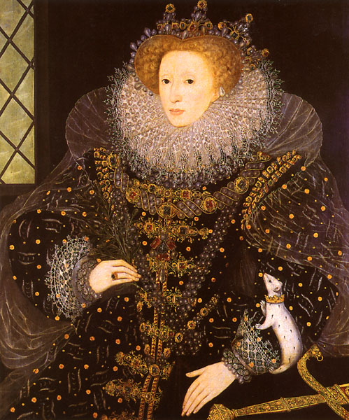
The Ermine Portrait [Elizabeth I]  by Nicholas Hilliard (1585).
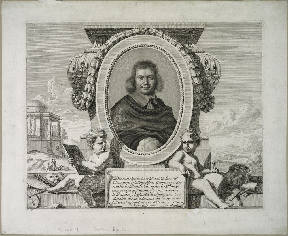
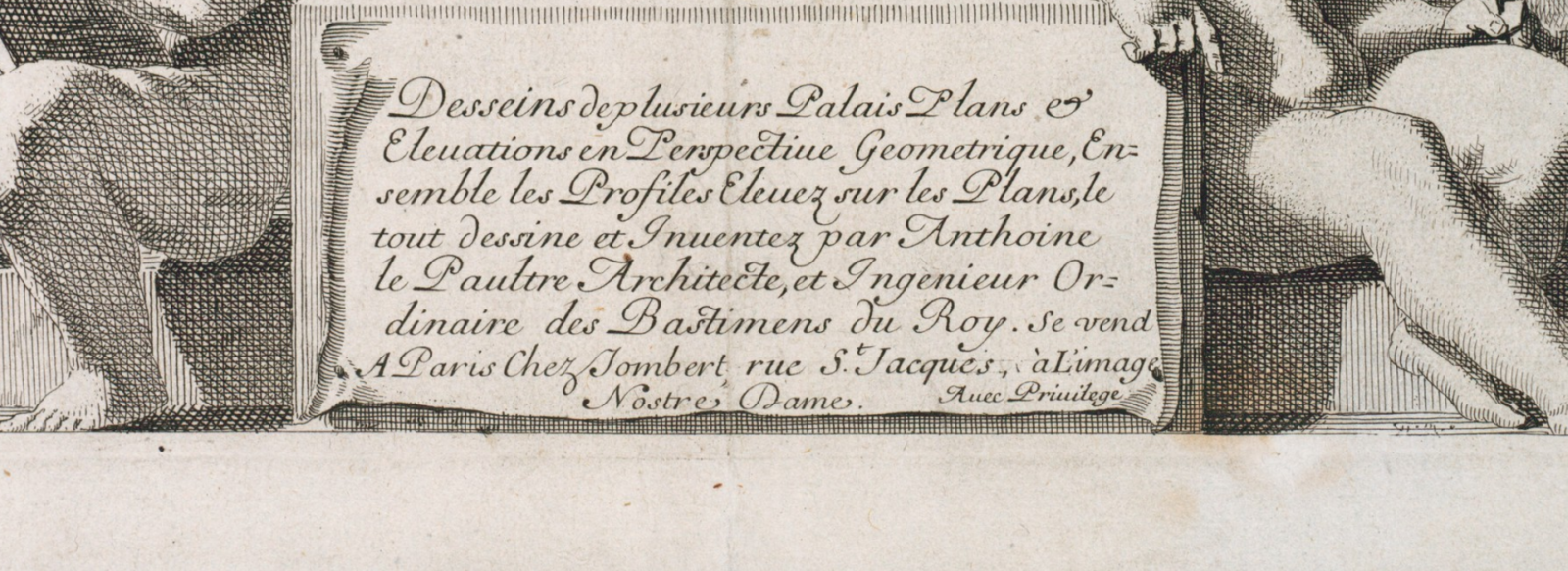
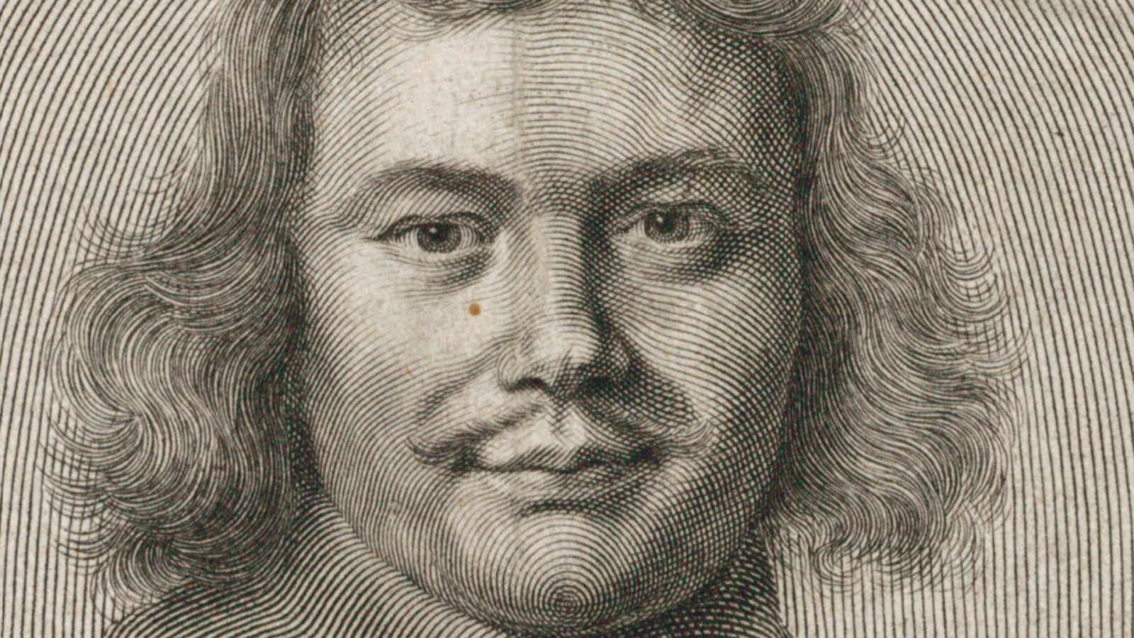
Sequestered in 1767

https://dpul.princeton.edu/ga_treasures/catalog/9593tz72p
The History of the Holy Jesus … Being a pleasant and profitable Companion for Children : composed on Purpose for their Use. By a Lover of their precious Souls. 15th edition (Boston: Printed by I. Thomas, for Z. Fowle, [1767?]). Graphic Arts Collection Sinclair Hamilton 68 (2) s

The History of the Holy Jesus: containing a brief and plain account of his birth, life, death, resurrection, and ascention into heaven : and his coming again at the great and last Day of Judgment : being a pleasant and profitable companion for children : compos’d on purpose for their use / by a lover of their precious souls. Sixth edition (Boston: Printed by J. Bushell and J. Green, 1749). Graphic Arts Collection Hamilton 28s


The Sinclair Hamilton Collection has six editions of The History of the Holy Jesus, 1749: Hamilton 28s; 1749: Hamilton 1311(1)s; 1767: Hamilton 68(2)s; 1774: Hamilton 68(1)s; 1779: Hamilton 88s; and 1958 (1746): Hamilton 1311(2)s. According to Hamilton, the 4th edition, published by D. Gookin in Boston in 1747 was the earliest American edition of this book, with similar plates in the 4th, 5th, and 6th editions attributed to James Turner (1721-1759?). Turner is best known for “Join or Die” the snake representing the early American states commissioned by Benjamin Franklin (See: Karen Severud Cook, “Benjamin Franklin and the Snake That Would Not Die,” The British Library Journal 22, no. 1 (spring 1996)).

Later on the Boston printer Zechariah Fowle (1724-1776) published several editions of this book with illustrations recut by young Isaiah Thomas (1749-1831). Hamilton notes “Certain of the cuts in these two edition of 1766 and 1767 appear to have been re-engraved from those which James Turner may have made for the earlier edition…. All of these are in reverse form the earlier cuts and are of poorer workmanship than the originals. Some changes have been introduced such as … in the cut of the prodigal son the number of swine has been reduced from two to one. There is also a small cut of a three-masted square rigger, presumably representing the ship which figured in the miraculous draught of fishes, which may have been copied but not in reverse, from the more elaborate cut of a ship, proudly flying what looks very much like the English flag, in the earlier editions.”

Besides the changes in cuts, Princeton’s 1767? volume has a unique hand painted paper wrapper with the design continued on the back. This copy is missing pages 1-10 and 41-45 but the rest is usable and a great comparison with the earlier cuts.

Left: 15th edition 1767?  Right: 6th edition 1749


15 edition, 1767? above

6th edition 1749 below

6th edition 1749, not in later editions

6th edition 1749 above

15th edition 1767? below

15th edition 1767? not in earlier editions


15th edition 1767? above

6th edition 1749 below


Above: 15th edition 1767?    Below: 6th edition 1749

See another copy: https://graphicarts.princeton.edu/2017/09/29/being-a-pleasant-and-profitable-companion-for-children/