Category Archives: Typography

Metametrica

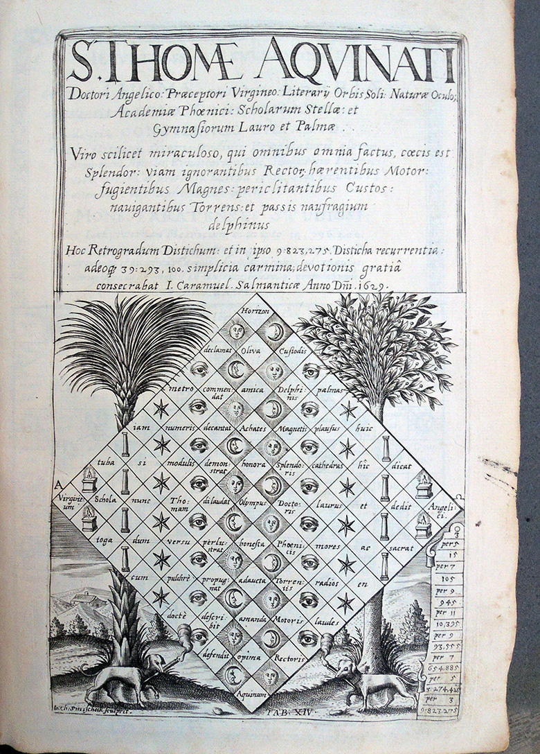
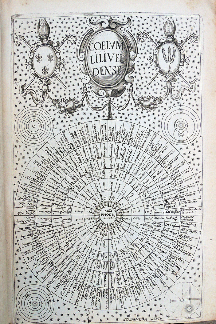
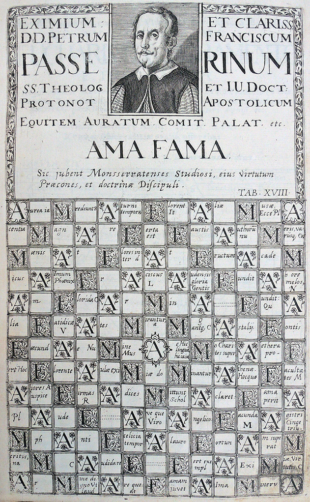
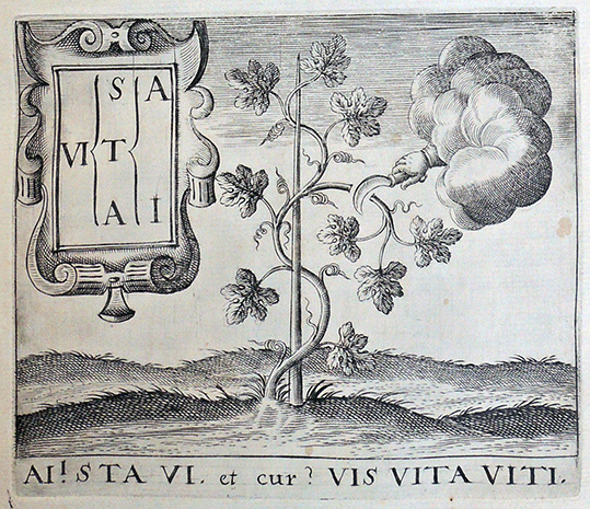
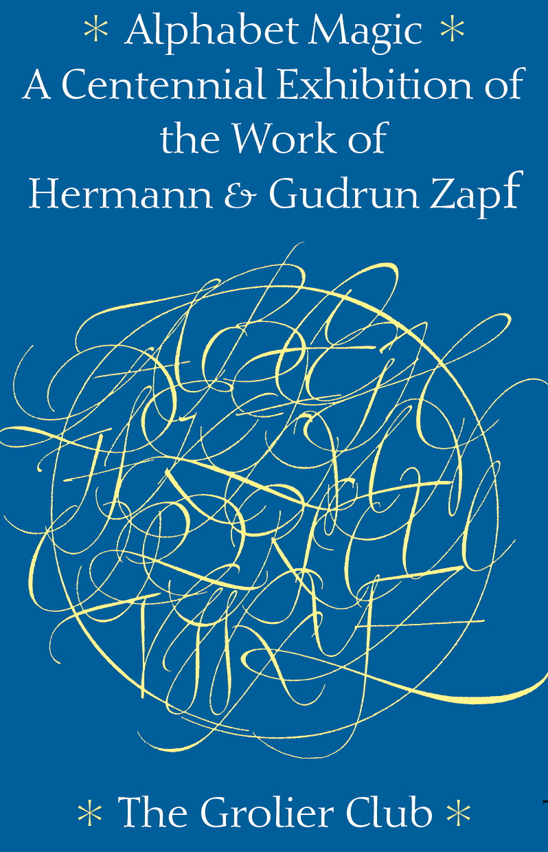
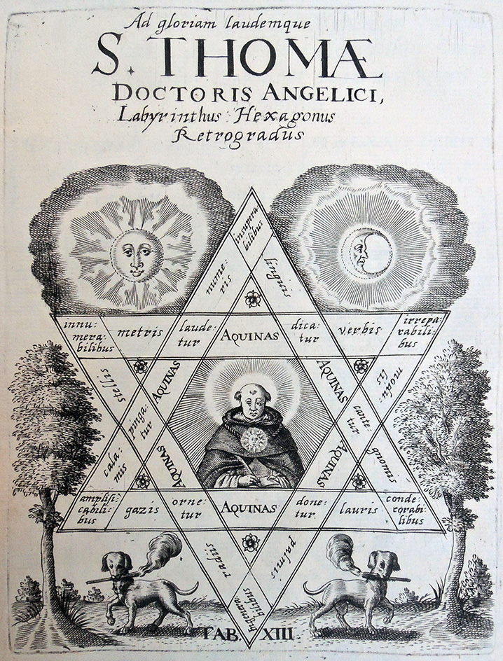
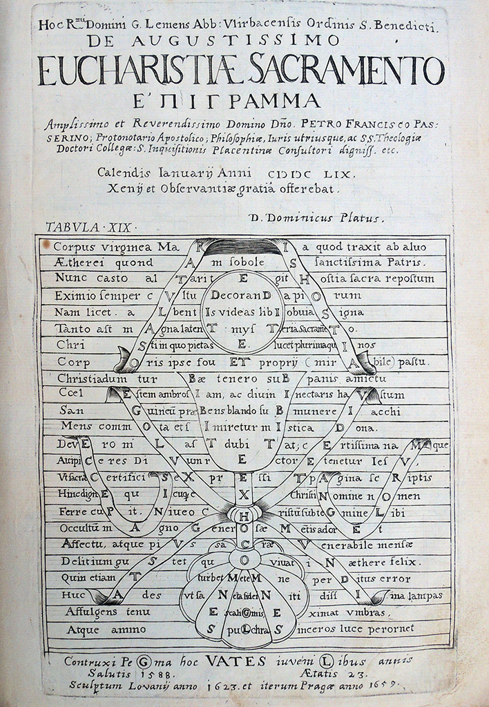
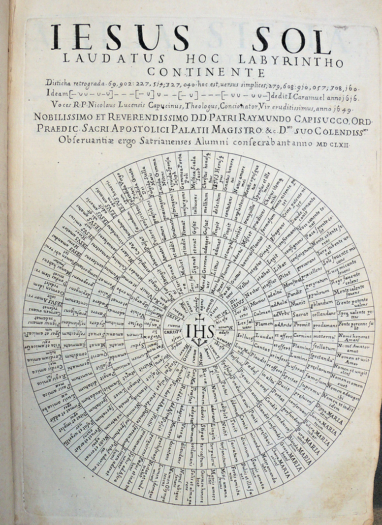
When we were offered a copy of Juan Caramuel y Lobkowitz’s 1663 book on metametrica, with a series of engraved plates that could be described as visual poetry, it was a happy surprise to find it already in our vault. Historians have labeled the plates anagrams, pattern poems, echo poems, and rebuses while Caramuel called his work “labyrinths, hexagonus, and retrogrades”. No matter the tag, he was obviously having fun with Latin and letters (although our colleagues fluent in Chinese are unimpressed with his attempt at Eastern metametrics).


Juan Caramuel y Lobkowitz (1606-1682) was a Cistercian priest and a prominent figure in the Spanish Golden Age. One biographer notes:

He was a precocious child, early delving into serious problems in mathematics and even publishing astronomical tables in his tenth year. After receiving a superficial education at college, where his unusual ability brought rapid advancement, this prodigy turned his attention to the Asiatic languages, especially Chinese. …His books are even more numerous than his titles and his varied achievements; for, according to Paquot, he published no less than 262 works on grammar, poetry, oratory, mathematics, astronomy, physics, politics, canon law, logic, metaphysics, theology and asceticism. –L. O’Neil, L. (1908). Juan Caramuel y Lobkowitz. In The Catholic Encyclopedia. New York: Robert Appleton Company. Retrieved January 30, 2020 from New Advent: http://www.newadvent.org/cathen/03329c.htm

The complete volume can be downloaded here: https://babel.hathitrust.org/cgi/pt?id=ucm.5317972478&view=thumb&seq=41

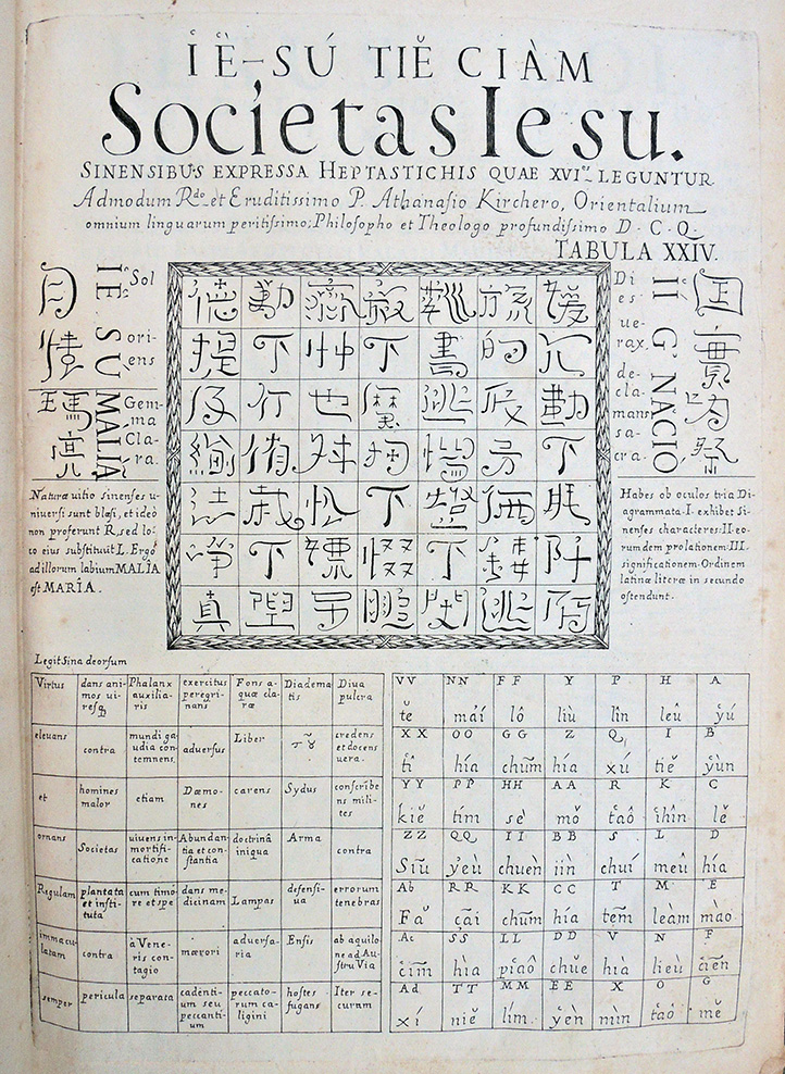
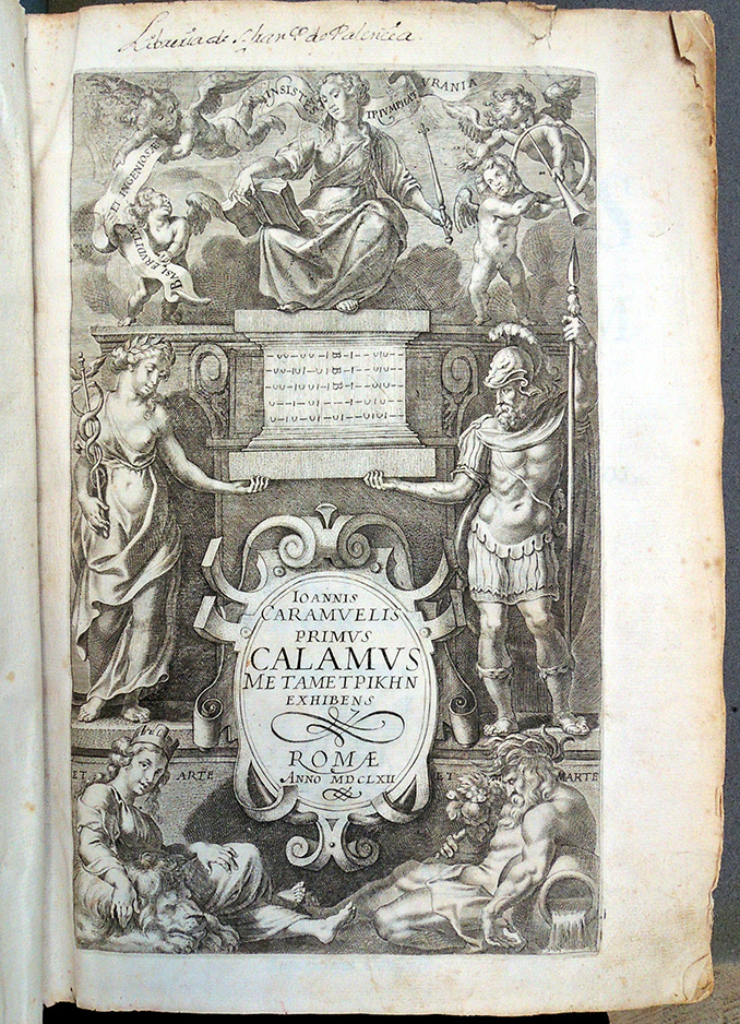
Juan Caramuel Lobkowitz (1606-1682), Ioannis Caramuelis Primus calamus ob oculos ponens metametricam : quae varijs currentium, recurrentium, adscendentium, descendentium, nec-non circumvolantium versuum ductibus, aut aeri incisos, aut buxo insculptos, aut plumbo infusos, multiformes labyrinthos exornat (Romae: Fabius Falconius excudebat, anno 1663). Rare Books Oversize PA8485.C374 P74 1663q.

Read: Dick Higgins Pattern poetry: guide to an unknown literature / Dick Higgins; with appendices by Herbert Francke … on Chinese pattern poetry, and a comparative study by Kalānāth Jhā … on the Citrakāvyas of Sanskrit and the Prākrits (Albany: State University of New York Press, 1987. PN1455 .H54 1987

Jed Rasula, Steve McCaffery, Imagining Language: an Anthology (MIT Press, 2001). P120.I53 I46 1998


See also Library of Congress post by Nathan Dorn https://blogs.loc.gov/law/2011/12/caramuel%E2%80%99s-metametrica-and-the-probability-of-law/


Madeline Gins, speculative fiction

Madeline Gins (1941-2014) was an American poet, writer and philosopher. She grew up in Island Park, NY, and graduated from Barnard College in 1962 where she studied physics and philosophy. While studying painting at the Brooklyn Museum Art School in 1962, Gins met Arakawa and she would become one of the primary interpreters of Arakawa’s work.

Gins published three books: the experimental novel Word Rain (or a Discursive Introduction to the Intimate Philosophical Investigations of G,R,E,T,A, G,A,R,B,O, It Says) (New York: Grossman Publishers, 1969); What The President Will Say and Do!! (New York: Station Hill, 1984), an excursion into identity, language and free speech using the devices of political rhetoric; and Helen Keller or Arakawa (Santa Fe: Burning Books with East/West Cultural Studies, 1994), an art-historical novel that took on a form of speculative fiction.

With Arakawa, Gins developed the philosophy of ‘procedural architecture’ to further its impact on human lives. These ideas were explored through three books that she co-authored with Arakawa: Pour ne Pas Mourir/To Not to Die (Éditions de la Différence, Paris 1987); Architectural Body (University of Alabama Press, 2002); and Making Dying Illegal – Architecture Against Death: Original to the 21st Century (Roof Books, New York, 2006). …Gins also completed the manuscript for Alive Forever and the illustrated version of her poem Krebs Cycle.–http://www.reversibledestiny.org/arakawa-and-madeline-gins/madeline-gins


http://www.reversibledestiny.org/arakawa-and-madeline-gins/madeline-gins/bibliography1

Word rain; or, A discursive introduction to the intimate philosophical investigations of G,r,e,t,a, G,a,r,b,o, it says. New York, Grossman Publishers, 1969. Firestone Library » PS3557.I5 W6 1969; Rare Books Off-Site Storage » RECAP-94763388

For example (a critique of never) = Par esempio (una critica del mai): a melodrama / by Madeline Gins and Arakawa (from The mechanism of meaning). [Place of publication not identified]: A. Castelli, [1974?]. Rare Books Off-Site Storage » RECAP-94765342

The mechanism of meaning: work in progress (1963-1971, 1978) based on the method of Arakawa / Arakawa and Madeline H. Gins; [editor, Ellen Schwartz]. New York: H. N. Abrams, 1979. N7359.A7 G56; Rare Books Off-Site Storage » RECAP-97151300

What the president will say and do!! / Madeline Gins. Barrytown, N.Y.: Station Hill, c1984. Rare Books Off-Site Storage » RECAP-33922780

To not to die / Arakawa, Madeline Gins = Shinanai tame ni / Arakawa Shūsaku, Madorin Ginzu; Miura Masashi yaku. Tōkyō: Riburo Pōto, 1988. PS3557.I5 T66 1988

Helen Keller or Arakawa / Madeline Gins. Santa Fe, N.M.: Burning Books; New York: East-West Cultural Studies: D.A.P., distributor, c1994. PS3557.I5 H44 1994; Rare Books Off-Site Storage » RECAP-94763370

Reversible destiny: Arakawa/Gins / [organized by Michael Govan]. New York: Guggenheim Museum: Distributed by H.N. Abrams, c1997. Marquand Library » Oversize N7359.A7 G562 1997q

Architectural body / Madeline Gins and Arakawa. Tuscaloosa, Ala.; London: University of Alabama Press, c2002. Architecture Library » NA2500 .G455 2002. Marquand Library » NA2500 .G455 2002

Making dying illegal: architecture against death: original to the 21st century / Arakawa and Madeline Gins; introduction by Jean-Jacques Lecercle. New York: Roof Books, 2006. HQ1073 .A73 2006g

Touarick alphabet and drawings

James Richardson, Touarick Alphabet, with the Corresponding Arabic and English Letters. First edition (London: T.R. Harrison, 1847). Graphic Arts Collection GAX 2019- in process

Dealer’s note: “This rare pamphlet is prefaced with a note from Richardson to John Bidwell at the Foreign Office. “I think I may say without hesitation, that the enclosed Alphabet is the most remarkable, as well as the most interesting contribution to the Science of Philology which has been brought into Europe during the present year.”

It commences with the Toureg alphabet in column form alongside that of English and Arabic. Richardson states that this alphabet, and how it corresponds to the other two languages, was dictated to him by a Toureg. This is accompanied by Richardson’s observations on the pronunciation of the language and some of its irregularities, and completed with lithographed “Specimens of Touarick Character.”

Richardson was born in Lincolnshire. He trained as a missionary and set out for North Africa in 1845. He travelled “openly as a European and a Christian, and headed southwest to Ghadames, where he remained for three months. He then went on to Ghat, where he concentrated on establishing friendly relations with the inhabitants.

He styled himself ‘Consul for the English’, met Sheikh Hatita who had helped Lyon, Clapperton and Laing, and was given presents to take back to Queen Victoria. He also collected much valuable information about Timbuktu, but was warned against undertaking the journey himself. Richardson returned to Tripoli with a caravan of slaves, having spent nearly nine months in the interior, then took a ship for London, arriving in 1846. (Howgego).

Homer’s “Odyssey” and Owen’s “Sing to Me”

We hosted a visit this week from Professor Reeves’s class “The Classical Roots of Western Literature,” which focuses on the classics of the Western literary tradition from Antiquity through the medieval period, including Apollonius of Rhodes’s Jason and the Argonauts, Apuleius’s The Golden Ass, Dante’s Inferno and others.  This week they read The Odyssey and so, we focused on the calligraphic work of Jan Owen’s “Sing to Me” with text by Homer.

The group had so many questions about the work, donated to the Graphic Arts Collection by Lynne Fagles, that an email was sent directly to the artist. The wonderful Ms. Owen replied immediately with an explanation of how the work came about and the inspiration for her interest in calligraphy. Here are a few of her words.

In 1997, I was invited to participate in Perspectives, the Art of the Book at the Portland Museum of Art in Portland, ME. That fall, I got a call from Lynne Fagles who said her husband had seen and liked my work and would I do a piece with words from his new translation as a Christmas present. I had read excerpts of The Odyssey in high school so began to read. I asked her to help me select text and she sent some of his favorite passages, which I marked and posted in my copy of the book. She had also asked that Greek text be included and this was before everything could be found on the web. Fortunately a local theological school had a copy of The Odyssey in Greek.

Several years before the Portland show, I’d wanted to work large on paper but not have to frame under glass. I experimented with hanging accordion fold books and liked the relief of the form. After doing several, they seemed to look ‘old’ and I began weaving in strips of gold painted paper, now Tyvek, to give texture to the surface and to be like a new communication code. The little basketmaker’s twist gives the strips dimension but can still fold flat. The weaving was also a fitting reference for The Odyssey. The ink changes color to give more variety—and to try to keep doing something a computer can’t do. Robert Fagles gave me permission to use the translation and I’ve included passages in several pieces [in addition to Sing to Me].

http://www.janowenart.com/

Corrado Govoni, with and without teeth

Carrado Govoni’s “Diver” (La Palombaro) first appeared in the February 11, 1915 issue of Filippo Tommaso Marinetti’s Parole consonanti vocali numeri in libertà. Then on March 27, 1915, the Futurist journal Lacerba published Govoni’s self-portrait, drawn with visual poetry.

Not long after this, Govoni’s book Rarefazioni e parole in libertà was published by the Marinetti’s Milan imprint Edizioni futuriste di “Poesia.” (SAX PQ4817.O8 Z4852 1915q), which included both Govoni’s Driver and his Self-portrait but this time, with slight variations in each. Why are they different? Did he decide not to have teeth for a reason? Which versions are the final, definitive work?

Filippo Tommaso Marinetti (1876-1944) began the entrepreneurship [Parole] as “a disinterested love of art which was combined with his wish to address the need for an alternative space that could sustain the talents he wished to launch into the marketplace of art and literature: the painters Umberto Boccioni, Carlo Carrà, Luigi Russolo, Gino Severini, Ardengo Soffici, Fortunato Depero, Enrico Prampolini, as well as the writers Aldo Palazzeschi, Corrado Govoni, Paolo Buzzi, Luciano Folgore, Francesco Cangiullo, and many others.

The “Futurist Editions of Poesia” were perhaps the most important embodiment of Marinetti’s desire to create an alternative cultural space, becoming an experimental laboratory in the true sense of the term, where the canons of a new writing, the “words-in-freedom,” were successively elaborated and consecrated for the first time …’We reserve the ‘Futurist Editions of Poesia’ for those works that are absolutely Futurist in their violence and intellectual extremism and that cannot be published by others because of their typographical difficulties.—Claudia Salaris, “Marketing Modernism: Marinetti as Publisher,”.Modernism/Modernity 1.3 (1994): 109-27.


Corrado Govoni’s book, Rarefazioni e parole in libertà (Rarefactions and Words in Freedom) is divided into two parts:

“The first presented a series of experiments in visual poetry, while the second featured applications of the poetical techniques suggested by F.M. Marinetti in the “Manifesto della letteratura futurista” (Manifesto of Futurist Literature, 1912). In both instances, however, the Futurist method provided Govoni a pretext for his eclectic analogical imagery. These works were often illustrated by the poet’s own sketches or drawings, which constituted in integral part of his verse.” —Encyclopedia of Italian Literary Studies (2006)

Typography

Two exhibitions are in New York City this spring featuring masters of typography. Already open is a show at the Bard Graduate Center Gallery titled, Jan Tschichold and the New Typography, which examines the role of graphic design in the broader context of Weimar culture (1919-1933). Here is the press release:
https://www.bgc.bard.edu/files/Tschichold_PressBrochure_Final.pdf

They write,

“Tracing the revolution in graphic design in the 1920s, this exhibition displays materials assembled by typographer and designer Jan Tschichold (1902–1974) in Weimar Germany. Published in Berlin in 1928, Tschichold’s book Die Neue Typographie was one of the key texts of modern design, partly due to its grasp of Constructivist ideas and new print technology, but equally, because it was a manual for practicing designers. In the years leading up to its publication, Tschichold struck up a correspondence with many European artist-designers, including Kurt Schwitters, El Lissitzky, László Moholy-Nagy, Herbert Bayer, Piet Zwart, and Ladislav Sutnar, among others. In the course of this, Tschichold exchanged and acquired many examples of their design work, some pieces now quite famous (such as El Lissitzky’s Pro dva kvadrata [The Story of Two Squares], 1920) while other items are modest and ephemeral, such as tourist brochures, handbills, headed notepaper, product catalogues, and magazine advertisements.

In conjunction with the exhibition is a symposium, The New Typography: Graphic Design in Weimar Germany 1919–1933 at Bard on Friday, March 22, 2019 from 1:00 to 5:30. Admission is free but you must register. They promise to address the broader history of design, technology, economics, and aesthetics that played a similarly decisive role in the formation of modernist graphic design.


From February 20 to April 27, 2019, the exhibition Alphabet Magic: Gudrun & Hermann Zapf and the World They Designed will be on view at the Grolier Club on East 60th Street.

2018 marked the 100th anniversary of the birth of both Hermann Zapf and Gudrun Zapf von Hesse, and the show, Alphabet Magic will chronicle the extraordinary artistic achievements of both with the most comprehensive display of their work to date.

The curators write, “Zapf’s typefaces Palatino, Optima, and Zapfino (to name a few) are a part of our everyday lives in the United States and Europe, as well as around the world. He was also at the forefront of type technology. Zapf’s Marconi alphabet design was the first typeface ever created specifically for digital typography. Gudrun Zapf Von Hesse secured her own design legacy through typefaces such as Diotima, Carmina, and Shakespeare Roman.”

The show draws mainly on two collections: The Melbert B. Cary Jr. Graphic Arts Collection at the Rochester Institute of Technology, where Dr. Steven K. Galbraith is curator and the private collection of Jerry Kelly, a leading calligrapher, book designer, type designer and typographer, who has co-curated the show with Dr. Galbraith.

In conjunction with the exhibit, the Club will host the New York premier of the film: Alphabet Magic, by Alexandra Albrand, on Thursday, February 27, beginning at 6:00 p.m. Then, on Wednesday, March 20, there will be a panel discussion with author Robert Bringhurst (Canada), type historian Ferdinand Ulrich (Germany), calligrapher Julian Waters, and moderator David Pankow (USA). As far as I know, these events are open to the public.

Typographics 2019

The website for the fourth annual New York City Typographics festival is now online at https://2019.typographics.com. The team organizing this year’s event includes Cara Di Edwardo, Alexander Tochilovsky, Ellen Lupton, Barbara Glauber, and many others.

The site notes: “The 11-day festival is a forum for presentations about graphic design, web design, publication design, book design, type design, packaging, branding, corporate identity, advertising, motion graphics, and more. Importantly, Typographics focuses on new frontiers in digital typography.”

From June 10 to 20, 2019, there will be workshops, tours, speakers, and of particular interest, a book fair. Entrance to the fair on Saturday June 15 is limited to those registered for the conference but on Sunday June 16 the event will be free and open to the public. This year’s location will be the East Village gallery space at 41 Cooper Square, just across the street from the Cooper Union Great Hall where the main conference will be taking place. https://2019.typographics.com/book_fair/ .

The organizers promise “a wide diversity of material available relating to typography, lettering, design, etc, with everything from rare antiquarian type specimens to contemporary titles on modern graphic design.” A full listing of participating booksellers will be posted soon. For updates and announcements, join the Typographics mailing list or follow @TypographicsNYC on Twitter.

DotDotDot

Sometimes contemporary material can be just as difficult to collect as that from hundreds of years ago. It has taken much effort and the help of an international group of colleagues to acquire a complete run of the typography journal DotDotDot (2000-2010).

First established in a basement room on the lower east side of Manhattan, this non-profit organization and publication evolved in 2010, ending the DotDotDot paper journal. http://www.dot-dot-dot.us/index.html

Today Stuart Bailey, Angie Keefer, and David Reinfurt, are based in Liverpool where The Serving Library has a publishing platform, a seminar room, a collection of framed objects, and an event space. The Serving Library currently resides at Exhibition Research Lab in the School of Art & Design, Liverpool John Moores University, which has been home to a regular program of free public talks since spring 2017.

http://www.servinglibrary.org/

Es ist bitter, die Heimat zu verlassen

Romano Hänni, Es ist bitter, die Heimat zu verlassen [It is Bitter to Leave Your Home] (Basel: Hänni, 2017). Number 21 of 87 copies of the standard edition. Text in German, English, and Japanese. Graphic Arts Collection GAX 2017- in process


Swiss artist Romano Hänni has spoken passionately about the devastating effects of contamination from nuclear facilities. His new book Es is bitter die Heimat zu verlassen concerns the disaster at Japan’s Fukushima Daiichi nuclear power plant that occurred on March 11, 2011, as well as the ongoing impact of radioactive contamination.

Hänni writes that claims made by nuclear scientists “that no health consequences are to be expected from contamination are unscientific, immoral, and criminal.” He further states that “there is no peaceful use for nuclear energy. It is repressive, criminal and deadly. Only nuclear plants that have not been built can offer absolutely safety.”

His newest book is printed in five colors on paper towels, a technique the artist perfected with an earlier work: Typo bilder buch: von Hand gesetzt und auf der Handabziehpress gedruckt. Graphic Arts RCPXG-7350409. Small selections of text are juxtaposed with letters, images, and symbols to communicate the event and its aftermath. 

The artist writes “Work on this book began in December 2013, was interrupted by some commissioned work, and lasted until June 2017. The page format was determined by the paper: paper towels, maxi roll . . . The printing forms were composed from individual parts and printed on the hand proofing press. The Japanese text was [cast] and composed in the type foundry Sasaki Katsuji in Tokyo and delivered to Basel. For most of the pages several printing forms and printing runs are needed. The body of the book was bound by hand with thread. Overall production time was approximately 1400 hours.”

http://www.romano-haenni.ch/assets/21_it_is_bitter_to_leave_your_home_standard-edition-2017.pdf

Minnesota Center for the Book: “Educated at the Basel School of Design, [Romano] Hänni returns to the core values of traditional printing technique and modernist European design. The strict limitations of hand typesetting are his cornerstone, everything composed from the incremental units of type and spacing available in the type shop. Hänni’s work encompasses a wide range of fields in visual communication, from books, magazines, catalogs and newspapers to drawings, photography and journalism about design and everyday culture.”


The book is accompanied by a glossy 12-page color pamphlet with 108 photographs documenting the production process for this publication.


Next week: Typecon

Next week brings the opening of TypeCon 2017, the annual conference of the Society of Typographic Aficionados (SOTA), an international organization dedicated to the promotion, study, and support of typography and related arts.

Each year, the SOTA Typography Award is presented to an outstanding member of the type community. Recipients have included Hermann Zapf (2003), Ed Benguiat (2004), Matthew Carter (2005), Adrian Frutiger (2006), David Berlow (2007), Gerrit Noordzij (2008), Gerard Unger (2009), Doyald Young (2010), Erik Spiekermann (2011), Mike Parker (2012), Zuzana Ličko (2013), Fiona Ross (2014), Robert Slimbach (2015), and Fred Smeijers (2016). This year the award will be presented on Saturday, August 26.

Martina Flor will be this year’s keynote speaker. Based in Berlin, Flor runs a leading studio specializing in lettering and custom typography for clients around the globe, including: The Washington Post, Vanity Fair, Harper Collins, and Cosmopolitan, among others.

Here are some of the many talks and events:
Friday, August 25th
8:50 a.m. Bruce Kennett: W. A. Dwiggins, Hermann Püterschein, and the Fictional Society of Calligraphers
9:35 a.m. Tucker McLachlan: Typography Ghost Stories
9:55 a.m. Jennifer McKnight: Victorian Grande Dames and German Engravers: How Type Design Taught a City to Dream
10:35 a.m. Peter Bella & Caleb Fairres: Making the Machine Human: Embracing Printing Technologies in Crafting a Present-day Moveable Typeface
10:55 a.m. Petra Dočekalová: New Lettering Forms
11:20 a.m. Catherine Leigh Schmidt: Yatra: A Journey in Painted Signs
11:40 a.m. Linh O’Briant: Playing by the Rules—Type & Origami Design Rules
2:00 p.m. Bobby Martin: The Meeting Point of Type, Design, and Brand
2:45 p.m. David Jonathan Ross: EXTRA! EXTRA!
3:05 p.m. Judy Safran-Aasen & Mike LaJoie: Deconstructing the Construction of the Microsoft Emoji Font
3:25 p.m. Scott Boms: Imperfection Machines: Low Res in a High Res World
4:05 p.m. Geri McCormick & James Grieshaber: Dr. Strangefont or: How I Stopped Worrying and Learned to Make Chromatic Type
4:25 p.m. Meaghan Dee: The Slow Death of Handwriting
4:45 p.m. Rachel Elnar: Cultivating Creative Communities

Saturday, August 26th
8:35 a.m. Lucas Czarnecki: An Ethnography of Garbage (Fonts)
8:55 a.m. Hrant Papazian: protoType: The Book (?)
9:15 a.m. Mary Catherine Pflug: Results of the Second Font Purchasing Habits Survey
10:00 a.m. Christopher Rouleau: Brush Lettering Demo
10:25 a.m. Qiu Yin & Ming Wei: Thinking and Practicing Chinese Type Design on Screen
10:45 a.m. Mark Jamra & Neil Patel: Lessons Learned in Designing Type for Africa
11:10 a.m. Richard Kahwagi: Arabic Typography and Popular Culture
11:50 a.m. Masataka Hattori: Fundamentals of Japanese Metrics Editing
1:30 p.m. Geri McCormick & James Grieshaber: Chromatic Wood Type Printing Demo
2:00 p.m. Elizabeth Carey Smith: Type in Couture
2:45 p.m. Ana Monroe: The Typography of Bling
3:05 p.m. Jess Meoni: Liner Notes & Ligatures: A Reflection on Typography in the Age of Vinyl
3:45 p.m. Amelia Hugill-Fontanel: Typographic Realia: Cataloging and Connecting Wood and Metal Resources
4:05 p.m. Spencer Charles & Frances MacLeod: The Left Handed Path: A Twisting Journey Through Left-Handed Lettermaking

Sunday, August 27th
8:35 a.m. Yves Peters: Type With Character(s)—Reclaiming Control Over OpenType Fonts
9:20 a.m. Jason Pamental: Variable Fonts & The Future of Web Design
9:45 a.m. John Roshell: ZAP! POW! BAM! Comic Book Lettering, From Pens to Pixels
10:10 a.m. Radek Sidun: Typefaces for Television
10:30 a.m. David Shields: Muster Hundreds! Towards a People’s History of American Wood Type
11:10 a.m. Ina Saltz: The Rise of Typographic Tattoos
11:30 a.m. Douglas Wilson: A Multimedia Extravaganza Through the World of Printing Films
11:55 a.m. Jason Campbell: Mojo’s Workin’: Blues Typography & Album Art
12:15 p.m. James Walker: Type Hike: A Typographic Exploration of America’s National Parks