El Círculo de piedra — Cuba 1967


Carlos Franqui (1921-2010), El Círculo de Piedra (Milan: Grafica Uno, printed by Giorgio Upiglio, 1971). Purchased in part with funds provided by the Program in Latin American Studies (PLAS) and by the Graphic Arts Collection GAX 2019- in process

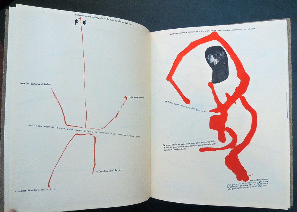
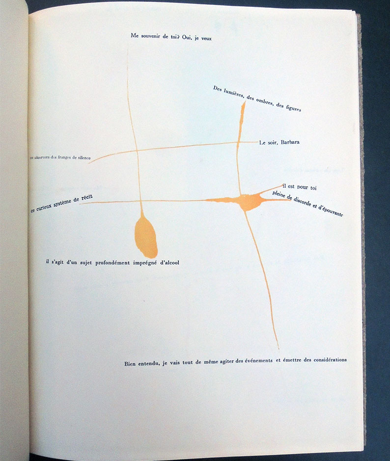
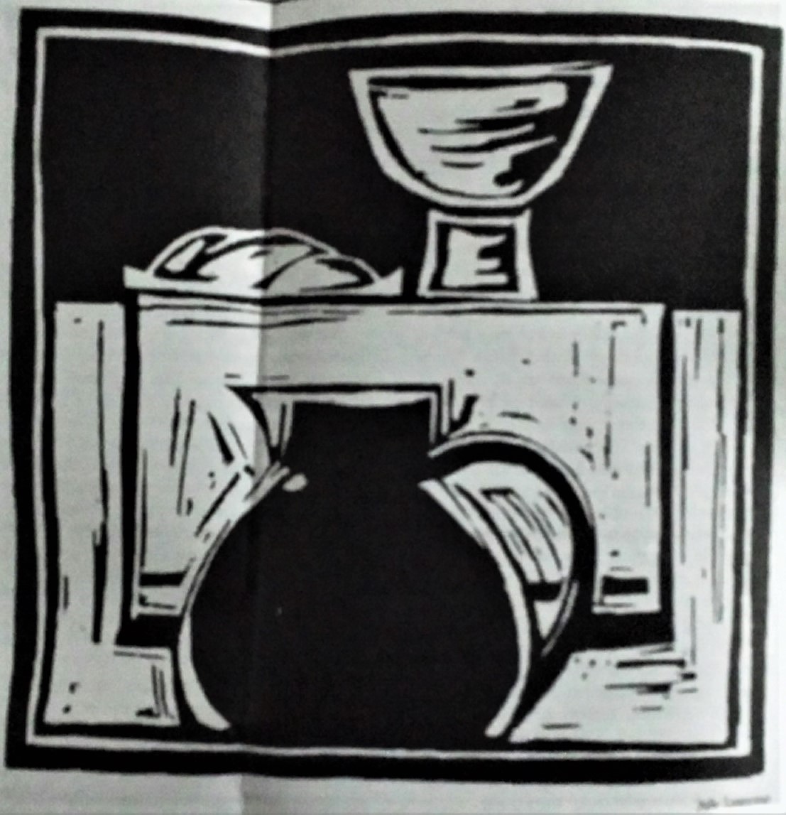
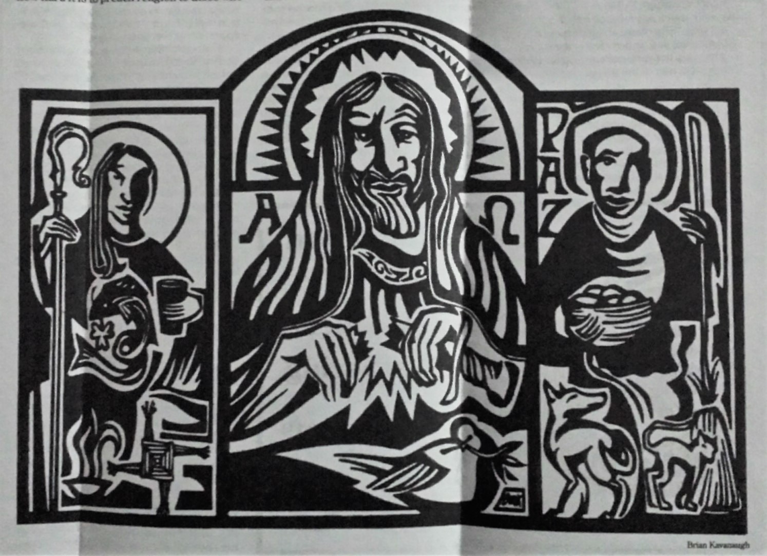
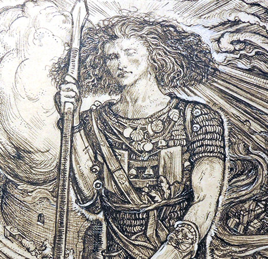
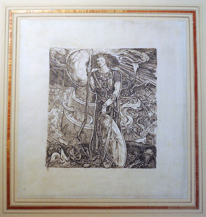
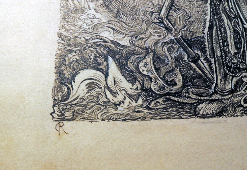
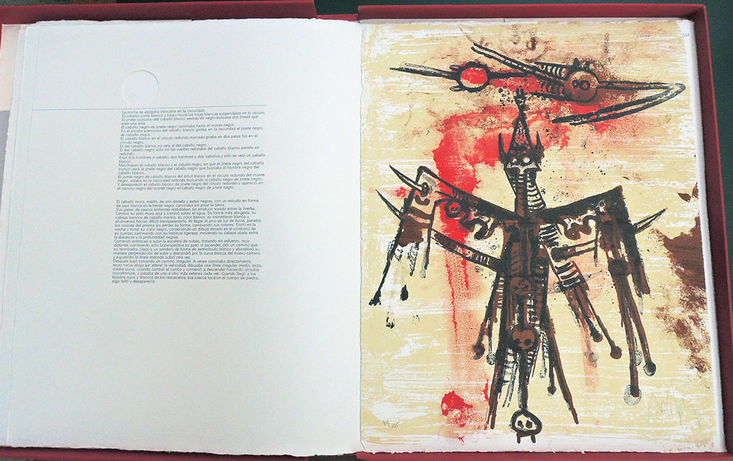
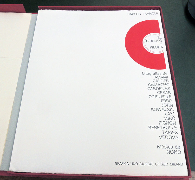
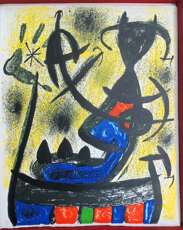
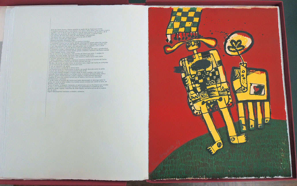
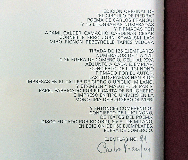
The Graphic Arts Collection recently acquired a portfolio with poetry by Carlos Franqui and fifteen color lithographs on wove paper signed in pencil by the author in an edition of 125. The title, The Stone Circle, is a reference both to the lithographic process and to the circle of artists while in exile. Contributing artists include Valerio Adami, Alexander Calder, Jorge Camacho, Augustin Cárdenas, César Baldaccini, Corneille, Gudmundur Erró, Asger Jorn, Piotr Kowalski, Wifredo Lam, Joan Miró, Edouard Pignon, Paul Rebeyrolle, Antoni Tápies, and Emilio Vedova. The portfolio also contains a recording on vinyl of Y Etonces Comprendio by Luigi Nono.

“The memories of Giorgio Upiglio on the ‘Círculo de piedra’,” loosely translated:

‘The Círculo de piedra’ adventure was born thanks to the friendship with Carlos Franqui, who was introduced to me by Wilfredo Lam. I was in Cuba, in 1967, in the middle of the cold war, I remember that there were cannons under my hotel. All of Carlos’s friends, including almost all the artists who would later create the ‘Circulo de piedra’ three years later, were in Havana in ’67 for the Salon de Mayo congress. I remember Jorn, Lam, Cesar, Tapies, my wife Rita Gallè, Calder, Adami, the critic Guido Ballo. On that occasion I met Fidel Castro, to whom I gave a copy of my edition made with Lam Apostroph Apocalypse. Castro subsequently organized a graphic exhibition at the Casa de las Américas.

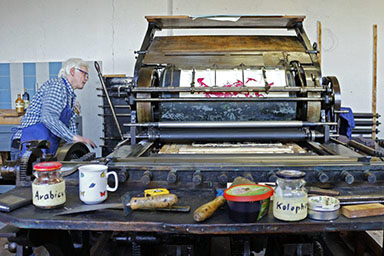
On that occasion, they gave me all the prints that went on the boxes of the Romeo y Julieta cigars and those of the Montecristo. The prints that were still made in lithography on stone, a lithograph that remained a tradition of graphic art untouched by the big industry low cost runs. What interests me remains of the ‘Círculo de Piedra’ is the common spirit of familiarity with Carlos Franqui, mine, and of all the artists, in the years of exile from Cuba. The folder is born without a precise commercial purpose and neither is there a a union between artists and a movement…

It was also born to support Carlos economically and that is why I left him a part of the edition. The portfolio is a project that–as you can imagine–has also cost a lot for the artists involved, but the enthusiasm for our work has led us to bear the costs of the edition and each of the 15 artists was left with a copy of the work, as a reminder of the common project. Mirò was printed by Maeght in Saint-Paul-de-Vence, Jorn by Bramsen in Paris, Calder I printed it, because he was in Milan for the exhibition at Studio Marconi; Vedova, Tapies, Adami, Lam and all the others were printed in Milan in Via Fara 9.

http://www.fafafineart.com/portfolio/el-circulo-de-piedra/. The work was presented on October 17th 1970 at the Marconi Studio and at the Piccola Scala in Milan with the concert by Luigi Nono Y entonces comprendò, of which each folder contains the disc published by Ricordi.


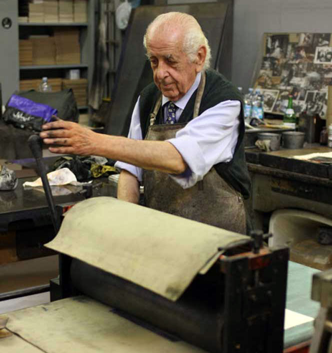
For more about Giorgio Upiglio, see: http://www.italianways.com/giorgio-upiglio-engraver-printer-and-publisher/

Tag der Druckkunst

Congratulations to our colleagues in Germany for the enormous success of their first “Tag der Druckkunst“ (National Day of Printing Arts) on March 15, 2019. Scheduled to coincide with the anniversary of the inclusion of artistic printing techniques in the nationwide directory of the Intangible Cultural Heritage by the German UNESCO Commission, the day included more than 250 events held nationwide.


Their website notes, “Artists, print shops, museums, galleries, art societies and many others contributed to the preservation and development of artistic printing techniques with a multitude of activities and to draw attention to the importance of printing for culture in Germany.” https://www.bbk-bundesverband.de/veranstaltungen/tag-der-druckkunst-15-maerz-2019/veranstaltungen-zum-tag-der-druckkunst/

This follows on the success of a smaller event in 2018: https://www.unesco.de/en/artistic-printing-techniques-relief-gravure-planographic-pressure-printing-and-their-mixed-forms

Germany’s national celebration is not unlike the Fête de l’estampe held each year in France on May 26 in honor of the recognition engravers received from Louis XIV: https://www.fetedelestampe.fr/

Perhaps some year the United States will follow their lead.
https://www.halle365.de/veranstaltung/tag-der-druckkunst

“O António Maria” followed by “Ponto nos II”


O António Maria, edited and directed by Rafael Bordalo Pinheiro (Lisbon). Complete: Vol. 1, No. 1 (June 12, 1879) to Vol. 7, No. 3 (January 21, 1885)
Ponto nos II, edited and directed by Rafael Bordalo Pinheiro (Lisbon). Complete: Vol. 1, No. 1 (May 7, 1885) to Vol. 7, No. 293 (February 5, 1891). Graphic Arts Collection GAX 2019- in process

Few artists rise to such stature that an entire museum is created in their honor. Rafael Bordalo Pinheiro (1846-1905) is such a talent. The Rafael Bordalo Pinheiro Museum and Library in Lisbon describe him as

“a striking figure of the Portuguese culture of the second half of the 19th century. He was born in Lisbon on Rua da Fé on March 21, 1846 [and] followed the family tradition of a life dedicated to the Arts. An enterprising and multifaceted artist, he has traveled a very personal way, dedicating himself to the graphic arts, plastic arts, ceramics, drawing of objects and decoration, producing a vast work that almost always critically reflects the daily cultural, political and social of the time in that lived.…

Pinheiro was also innovative, developing humorous design and cartoon as an artistic expression. Integrating the circle of intellectuals and artists who defined the Generation of 70 [ also called the Generation of Coimbra]… to show a true portrait of the society of that time. Conscious of the power and strength of the press, he founded several periodicals, using caricature as a vehicle for the defense of his ideals.”

The Graphic Arts Collection has acquired complete runs of two of Pinheiro’s satirical magazines, openly political and focused on changing public opinion against the corruption in the Portuguese government of that period. While extremely popular O António Maria faced opposition from various agencies and in 1884, the government passed new laws, resulting in serious limitations to freedom of the press. Publication of the magazine ended in January 1885.

After several months and a change of title, Pinheiro began once again with Ponto nos II, this time joined by his son, Miguel Gustavo Bordalo Pinheiro. One reviewer notes: “Ponto nos II goes beyond the erosive action of political caricature. In its pages also there is space for the news, the chronicle, literary activity, the success of exploration trips in Africa, the Portuguese representation at the Paris International Fair.”

An additional note comes from the dealer:

From the middle of 1889, colonial policy, within the framework of the conflict of interests between Portugal and England, is the theme that dominates weekly the pages of Ponto nos ii. In the face of the government’s vacillations before the “English arrogance,” the weekly assumes itself as the mouthpiece of national interests and calls everyone to fight. The allusions to republicans and to the Republic also grow. Political tension and popular outrage roar on every page.

On 31 January, the Republican revolt erupts in Porto, a fact the newspaper Pontos nos ii does not hesitate to analyze in the following numbers: “Cowards!” In February of the following year, the same author will present a more sober reading of the events. It is a true republican manifesto that Ponto nos ii welcomes in its pages. The price of such high courage is not unexpected: the newspaper is suspended.

Thanks to Fernando Acosta-Rodríguez, Librarian for Latin American, Iberian, and Latino Studies at Princeton University Library for his help with this acquisition.


The First Capitol of the United States

The New York Magazine; or, Literary Repository for March 1790 (New York: T. and J. Swords, 1790). One engraving included by Cornelius Tiebout (ca.1773-1832) “Perspective View of the Federal Edifice in the City of New York, engraved for the New-York Magazine,” 1790. Graphic Arts Collection GAX 2019- in process

The New-York Magazine began publication in January 1790 and ran until December, 1797, making it one of the longest running eighteenth-century American magazines. The Graphic Arts Collection is fortunate to have acquired a rare issue for March 1790 (Vol.1, No.3).

Each issue included a full page engraving and this particular issue contains a “Perspective View of the Federal Edifice in the City of New York”, also known at that time as the capitol of the United States. During the first two years of George Washington’s presidency, the United States Congress, consisting of the United States Senate and the United States House of Representatives, met from March 4, 1789, to March 4, 1791, at Federal Hall in New York City and then, later at Congress Hall in Philadelphia.


New-York Magazine‘s varied content includes the weather report, local marriages and deaths, as well as four pages of “Congressional Affairs,” with reports from Alexander Hamilton and George Washington. Among the topics under discussion were establishing a 24 diplomatic corps, organizing a national militia and considering the request of Yale College that the duties on a lately­ imported “philosophical apparatus” be refunded to the college so as to encourage science.

The magazine listed 469 subscribers at the close of its first volume, George Washington among them and his library at Mount Vernon included at least the first five volumes. Princeton’s issue is signed by John Barron, Broad Street­­, assumed to be the subscriber.

Federal Hall in New York City today.

Tiebout was around eighteen-years-old when he began engraving for the editors Thomas and James Swords, cutting simple copper plates from drawings by Alexander Anderson and others. In 1793 he went to London, where he studied with the printmaker James Heath, returning an expert in stipple engraving. His plate in March 1790 of the New York City Federal Building details the embellishment by Pierre Charles L’Enfant in 1788 and the issue opens with an article describing the building at length. It is assumed that the print was originally not bound in but simply laid into the issue and so, exceedingly rare to find it still included.

De heerlyke beloning en glorieryke zegepraal der deugd


De Heerlyke Beloning en Glorieryke Zegepraal der Deugd : Vertoond in de Verwonderlyke Lot- en Levensgevallen, van een Door het Huwelyk Ongelukkig Geworden Huisvrouw; Die, Na Dat ze Door Haar eige Man Tot Slavinnen Was Verkogt … Eindelyk Door Hem Weder Wierd Opgezogt ... = [The Wonderful Reward and Glorious Triumph of Virtue: Shown in the Astonishing Fate and Life of a Housewife Who Became Unhappy With Her Marriage; [and] After She Had Been Turned Into a Slave By Her Own Husband … Was Finally Returned Again To Him …] (Amsterdam: Steven van Esveldt, boekverkoper in de Kalverstraat, 1758). Graphic Arts Collection GAX 2019- in process


The Graphic Arts Collection recently acquired this rare first edition an anonymously published novel on the virtues of women, illustrated with eight engraved plates by an equally anonymous artist.

The book tells the story of the beautiful young Antonetta, Marquise Alb***, a married noble-woman living in Genoa who gets into trouble when she finds out her husband is sleeping with another woman. Her husband sells her as a slave to the Turks in Algiers and she ends up living in a harem.

When Antonetta finally manages to escape and travel back to Italy, her ship is destroyed during a storm near Tuscany. Thankfully, she is found by a hermit, who takes care of her until she is able to finish her journey back to Genoa. Spoiler:  Antonetta forgives her husband and they live happily ever after.

According to the preface the story is based on true events. The author also promises that it will be both entertaining and educational, a real example for women.

#me too 1758


Internationale situationniste

Guy Debord and Asger Jorn, Mémoires (Paris: Internationale situationniste; [Copenhaguen, Permild & Rosengreen Press], 1959). Graphic Arts Collection GAX 2019- in process


Printed in 1959, Mémoires (Memories) is the result of the second collaboration between the Danish artist Asger Jorn (1914-1973) and the French artist and theorist Guy Debord (1931-1994). Published by Éditions Situationist International (founded by Debord and Jorn), the book has been reprinted several times given its importance to the movement, first by Jean-Jacques Pauvert aux Belles Lettres in 1993 and then by Éditions Allia in 2004.

Mémoires is perhaps most famous for its cover made of heavy-grade sandpaper. Usually credited to Debord, the sleeve was actually conceived in a conversation between Jorn and the printer, V.O. Permild:

[Jorn] asked me, if I couldn’t find an unconventional material for the book cover. Preferably some sticky asphalt or perhaps glass wool. Kiddingly, he wanted, that by looking at people, you should be able to tell whether or not they had had the book in their hands. He acquiesced by my final suggestion: sandpaper (flint) nr. 2: ‘Fine. Can you imagine the result when the book lies on a blank polished mahogany table, or when it’s inserted or taken out of the bookshelf. It planes shavings off the neighbour’s desert goat. – “Memories on Asger Jorn” by Troels Andersen, quoted online in Christian Nolle, Books of Warfare, The Collaboration between Guy Debord & Asger Jorn from 1957-1959, http://virose.pt/vector/b_13/nolle.html


Although few people own copies of these rare publications, both the first collaboration Fin de Copenhague and Mémoires are embedded in art historical literature of the period, such as a review in Architectural Review, October 1957, calling Fin de Copenhague a “remarkable piece of improvisation among the techniques of graphic reproduction.” The startling layouts in both volumes “anticipate, by 30 or more years, the typographic and textual fragmentation of Cranbrook, CalArts and Ray Gun magazine, which became a global design phenomenon.”

One of many descriptions of the making of these books, both publishing and performance, recounts:

Having just arrived in Copenhagen, Jorn and Debord rushed into a newsagents, stole a huge amount of magazines and newspapers, and spent a drunken afternoon collaging elements together. The next day they arrived at the printers with 32 collages, which were transferred to lithographic plates. Jorn then sat at the top of a ladder over the zinc plates, dropping cup after cup of Indian ink onto them. The plates were then etched and printed over the black texts and images.


Grand jeu de l’histoire de Paul et Virginie

Grand jeu de l’histoire de Paul et Virginie. Avec figures coloriées (France, after 1863). Graphic Arts Collection GAX 2019- in process

The Graphic Arts Collection recently acquired a scarce set of playing cards inspired by Bernardin de Saint-Pierre’s popular novel Paul et Virginie, first published in 1788. The cards are housed in a mid-nineteenth-century romantic paneled cloth binding, ornately decorated with gilt and colored detailing. The central panel on the front cover has been cut away to enclose a further colored vignette and title caption from the playing cards.

Rare book dealer and historian Amanda Hall determined that the previous occupant of the binding was “Madame Wolliez’ Souvenirs d’une mère de famille, a collection of educational stories that was first published in 1833 but which continued in print through to the end of the century. This seems most likely to have been a publisher’s binding issued by the booksellers Mame in Tours for their ‘fifth’ edition of 1863. Madame Wolliez’ work has been removed from its binding and is has been replaced by these beautiful playing cards, each separately mounted.”


The date of this collection is hard to judge but might be sometime after 1863, given the binding. OCLC suggests a date of 1815 but the Morgan Library copy has a watermark of the Dambricourt paper mill suggesting that it was created around 1834. “Some of the unsigned etchings can be traced back to the first illustrated edition of 1789, containing plates after Moreau le Jeune and Joseph Vernet.”–Morgan, Corsair online catalog.

It has been suggested that the cards were the work of Jean-Charles Pellerin at Epinal: “Dès 1800, Pellerin inaugure sa longue série d’illustrations du roman [de Bernardin de Saint-Pierre] avec son Grand jeu de l’Histoire de Paul et Virignie” (see François Cheval and Thierry-Nicolas C. Tchakaloff, Souvenirs de Paul et Virginie, 1995, p. 153). Paul Toinet, however, ascribes them to the celebrated artists and engravers of rue Saint Jacques in Paris (see Toinet, Répertoire bibliographique et iconographique de Paul et Virginie, no. 742).

Both the Morgan Library and Yale University record copies of the twenty-five cards printed on a single sheet. There are also copies in the Musée Léon Dierx de Saint Denis de la Réunion and at the Rouen Musée national de l’éducation.


The novel tells the story of Paul and Virginia, who are raised as brother and sister by two widows. Both mothers agree to marry the two children when they are old enough. Virginia’s aunt proposes to send her niece to France. Virginia accepts, though she is heartbroken to leave Paul, whom she loves. Two years later, she sails back to Mauritius Island, but her ship is pushed against reefs by a tempest and Paul fails to save her. Shortly after, he dies from grief.

In The French Revolution: A History, Thomas Carlyle wrote: “[It is a novel in which] there rises melodiously, as it were, the wail of a moribund world: everywhere wholesome Nature in unequal conflict with diseased, perfidious art; cannot escape from it in the lowest hut, in the remotest island of the sea.”


1933=one cent . . . 2019=one cent

On May 1, 1933, in the depths of the Great Depression, The Catholic Worker newspaper made its debut with a first issue of twenty-five hundred copies. Dorothy Day and a few others hawked the paper in Union Square for a penny a copy to passersby.–https://www.catholicworker.org/

Still costing one penny, The Catholic Worker remains one of the best sources for black and white graphic art. Here are a few cuts from a recent issue. Browse or search for additional examples of CW art here: https://www.catholicworker.org/dorothyday/browse/index.html
Rita Corbin

After realizing she had no interest in advertising, she then studied under printmaker Harold Sternberg at the Art Students league, followed by an apprenticeship with German-born abstract expressionist Hans Hoffman, though her studies with him came to end when she married. But her best art education, she said, came from spending afternoons visiting the art museums and galleries, and walking the streets and riding the subways drawing the ordinary people she saw.

Rita arrived at the Catholic Worker on Chrystie Street at the age of twenty. Although she wasn’t aware of it she was following in the footsteps of Ade Bethune. the first Catholic Worker artist. As Dorothy did with Ade fifteen years previously, she immediately set Rita to work illustrating the paper, and Rita became a life-long contributor as one of the three primary Worker artists along with Ade and Fritz Eichenberg. Of the three, Rita was the only one to have lived at the Catholic Worker, and she also raised five children while being an artist. –“In Memory of Rita Corbin 1930-2011” by Kate Hennessy in The Catholic Worker January 2012

Julie Lonneman

Rita Corbin

Julie Lonneman

June Hildebrand

Brian Kavanagh

The Catholic Worker. Firestone Library Forrestal Annex 0921.247f
Subscriptions
36 East 1st Street
New York NY 10003
Phone: 212-777-9617

American War Information Unit, 1945

KZ: Bildbericht aus fünf Konzentrationslagern Amerikanisches Kriegsinformationsamt (S.l.: American War Information Unit, no date [1945]). Graphic Arts Collection GAX 2019- in process

One of the earliest reports and the first published by the United States Army on the horrors of Nazi concentration camps, this fragile pamphlet offers eyewitness accounts of American and British troops after the liberation of Buchenwald, Belsen, Gardelegen, Nordhausen and Ohrdruf.

KZ was distributed in Germany by the Psychological Warfare Division of the American War Information Unit (Amerikanischen Kriegsinformationsamt im Auftrag der Oberbefehlshaber der Aliierten Streitkräfte) at the end of the war in order to convey the enormity of the crimes committed under the Nazi regime. Despite wide circulation, relatively few copies remain and so, it is important that one has now entered the Graphic Arts Collection.

These photographs are reported to have played an important role as evidence in the Nuremberg Trials. Note, only a few pages have been posted here due to the horrific content depicted.


Ricketts’s drawings, published and unpublished


[Above] John Byrne Leicester Warren, Baron de Tabley (1835-1895), Poems dramatic and lyrical; with illustrations by C. S. Ricketts (London: E. Mathews and John Lane ; New York : Macmillan and company, 1893). ExC J. Harlin O’Connell Collection 3713.1.1893. “This edition is limited to six hundred copies.”

[Above] Charles Ricketts (1866-1931), Nimrod, 1893. Pen and ink drawing for John Byrne Leicester Warren, Baron de Tabley (1835-1895), Poems dramatic and lyrical; with illustrations by C. S. Ricketts (London: E. Mathews and John Lane ; New York: Macmillan and company, 1893). Graphic Arts Collection GA 2006.02078

[Below] Oscar Wilde (1854-1900), The Sphinx; with decorations by Charles Ricketts (London: E. Mathews and J. Lane, 1894). Rare Books 3989.5.386.11. “Limited for England to 200 copies.”

[Below] Charles Ricketts (1866-1931), The Sphinx, 1916. Pen and colored inks drawing, not included in Oscar Wilde (1854-1900), The Sphinx (London: E. Mathews and J. Lane, 1894). Graphic Arts Collection GA 2006.02079. The genesis of this drawing is not known. There was no proposed 1916 edition of the Wilde book.

Charles Ricketts has been called the quintessence of the nineties. In his life as much as his work, he embodied not merely an “aesthetic” devotion to art and beauty but also many of the fin de siècle’s finest creative energies. …In London, the writers Oscar Wilde, Michael Field, John Gray, Thomas Hardy, W. B. Yeats and Thomas Sturge-Moore were all eager for Ricketts to decorate their books or design stagings for their plays.

Wilde especially was proud of Ricketts’s involvement in his own work: he once called Ricketts “the subtle and fantastic decorator” of his books. In some respects, Ricketts was Wilde’s collaborator or kindred spirit. His sympathies with Wilde were profound. His designs for Wilde’s The Sphinx mark one of the high points, if not the high point, of late-Victorian book design.”

–selection by Nicholas Frankel, Associate Professor of English at Virginia Commonwealth University, editor of Ricketts’s The Sphinx and author of Oscar Wilde’s Decorated Books and Masking The Text: Essays on Literature and Mediation in the 1890s. http://www.1890s.ca/PDFs/ricketts_bio.pdf