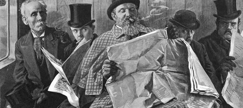
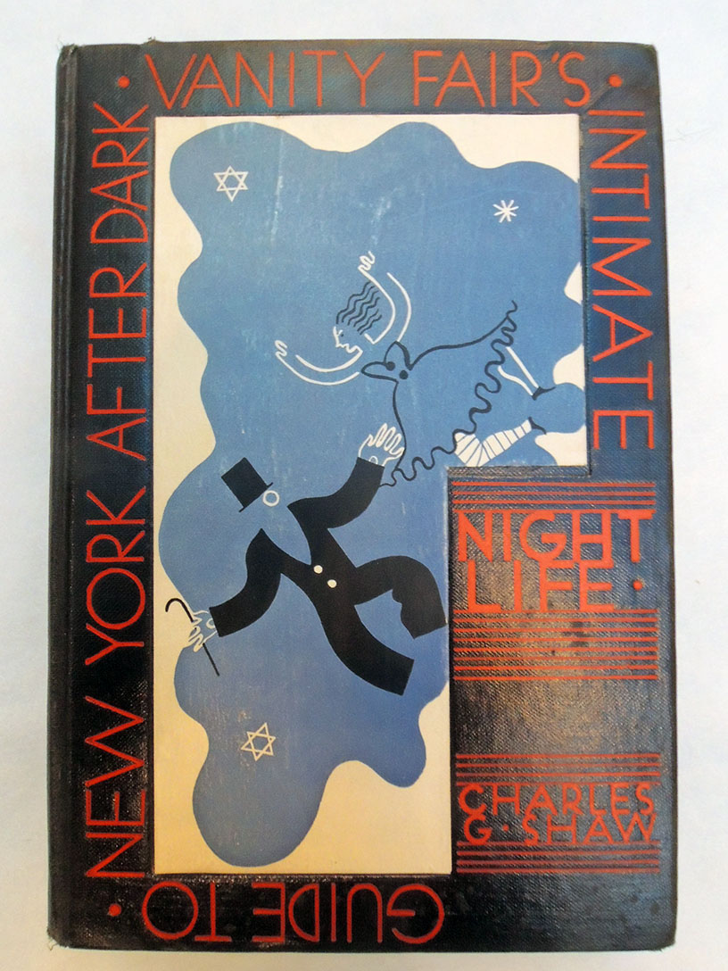
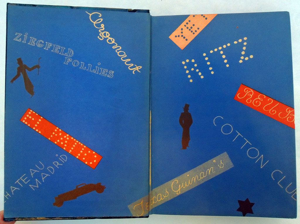
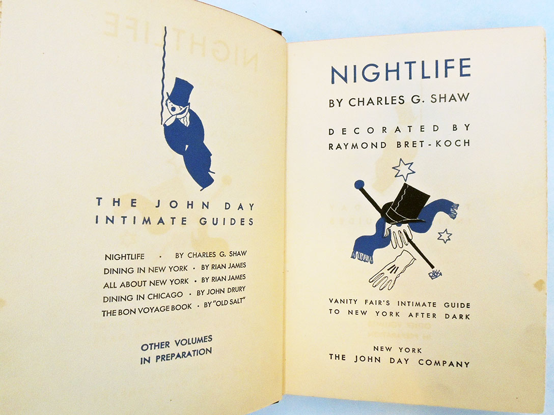
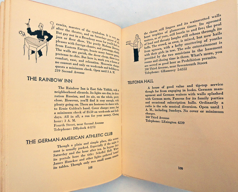
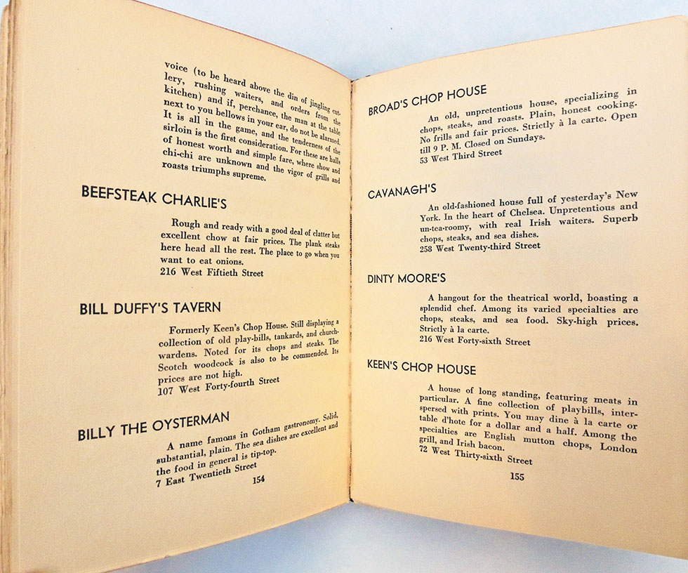
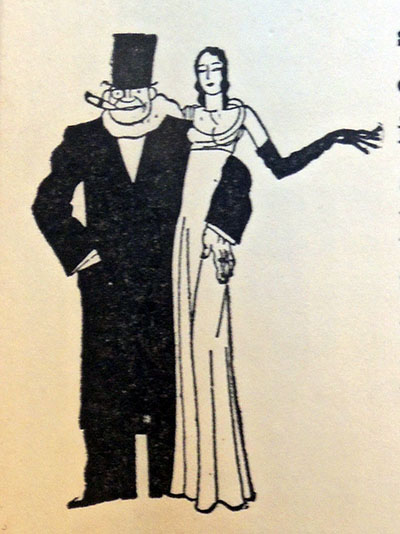
Charles G. Shaw, Nightlife: Vanity Fair’s Intimate Guide to New York After Dark (New York: John day Company, 1931). Decorated by Raymond Bret-Koch (1902-1996). Graphic Arts Collection GAX 2019- in process. Note: Prohibition ended in 1933.
This indexed guide provides information on speakeasies, night clubs, dance halls, and more with specific chapters on Harlem, Greenwich Village, Lower East Side, and Yorkville. Restaurants are divided into luxury, foreign, chop suey with dancing, chop suey without dancing, chophouses, and grill rooms.
Decoration throughout is by Raymond Bret-Koch (1902-1996). The BnF lists him as French and continues “Architect, decorator, poster designer and illustrator.– Learn architecture with Mallet-Stevens, decoration with André Groult, advertising art with Tolmer.– After his military service, he specialized in decoration and advertising.He has had a great activity in the press, as a creator, editor, poster artist and in publishing as an illustrator.”
The Fourth Annual APS (Association of Print Scholars) Distinguished Scholar Lecture will be held today, January 25, 2019, at the City University of New York. Titled “Print Catalogues and Databases: Past, Present, and Future,” Antony Griffiths, FBA, is expected to speak to a standing-room audience of students, curators, historians, collectors, conservators, and dealers.
Griffiths will share his long-term work on the British Museum’s online print catalogue and the implications of this work for other institutions and future scholarship on the history of prints. As many collection databases are being merged with a broad range of other mediums in online databases, the loss of image specific information and art historical data is a serious concern to us all.
Antony Griffiths is the Former Keeper of the Department of Prints and Drawings, British Museum, where he served from 1991 to 2011. He was also Slade Professor of Fine Art at the University of Oxford for the 2014/2015 academic year, where he delivered a series of lectures in conjunction with his book, The Print Before Photography: An Introduction to European Printmaking 1550–1820.
Please note that the lecture will be recorded and is to be made available online for APS members and the general public.
The Association of Print Scholars (APS) is a non-profit organization that encourages innovative and interdisciplinary methodological approaches to the history of printmaking. By maintaining an active website, sponsoring working groups, and hosting periodic symposia and lectures, APS facilitates dialogue and community among its members and promotes the dissemination of their ideas and scholarship. APS supports research grants and sponsors projects in the digital humanities that advance knowledge of printmaking. Membership is open to anyone whose research focuses on printmaking across all geographic regions and chronological periods. https://printscholars.org/
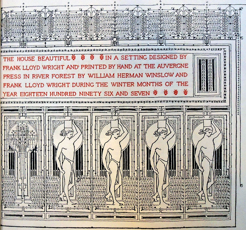
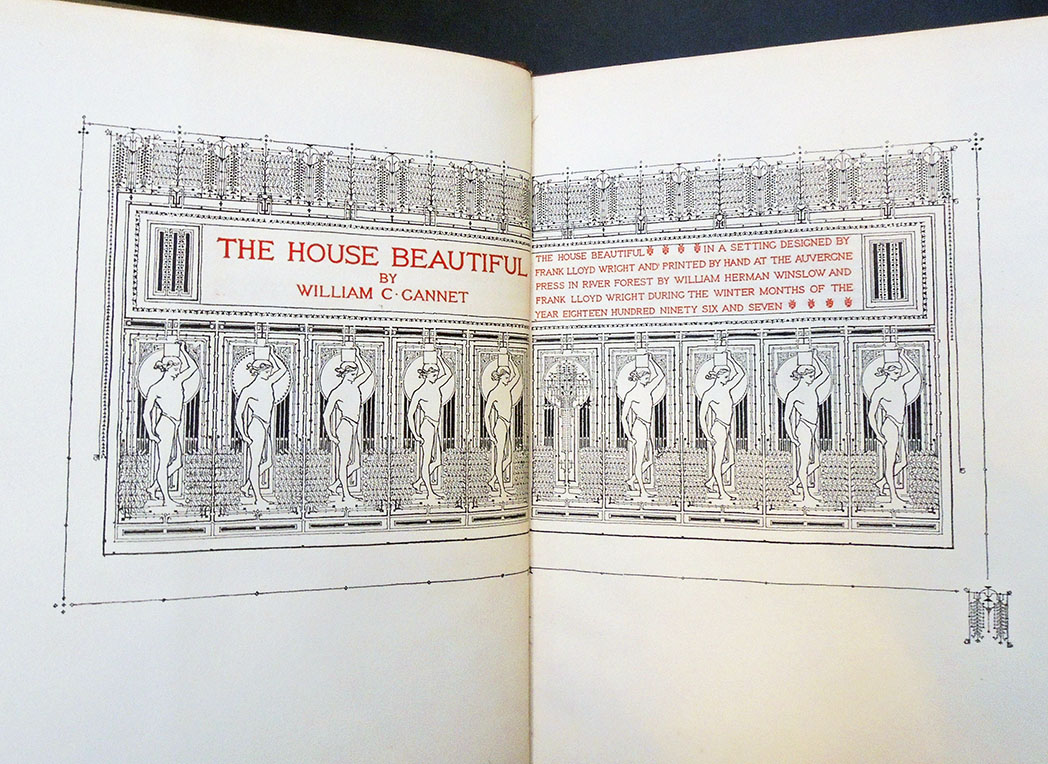
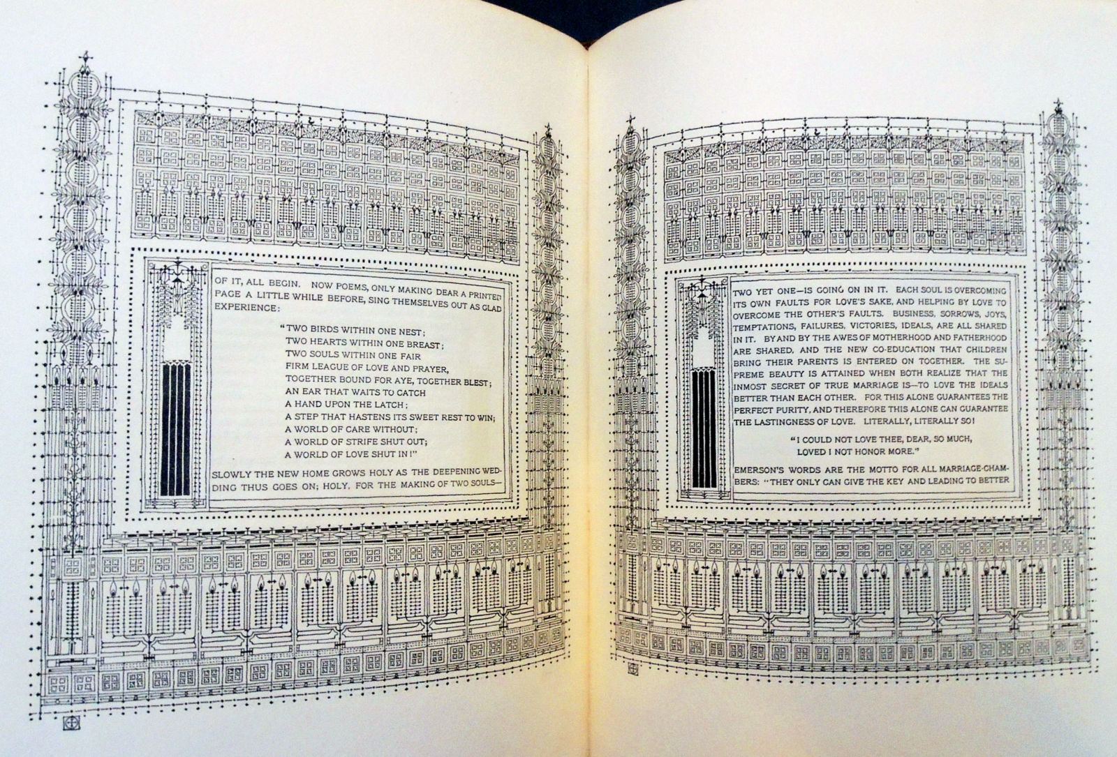
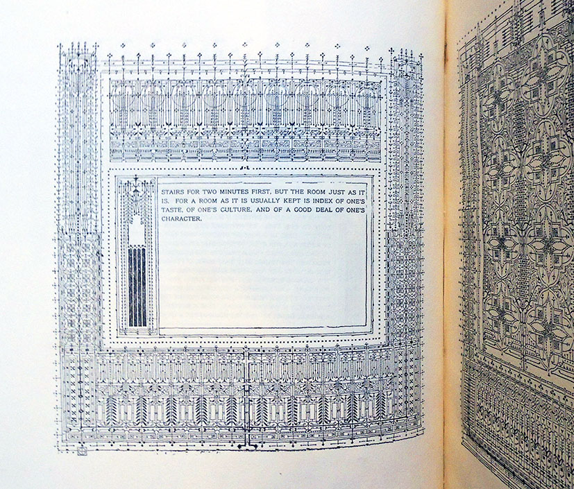
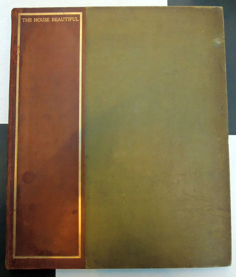
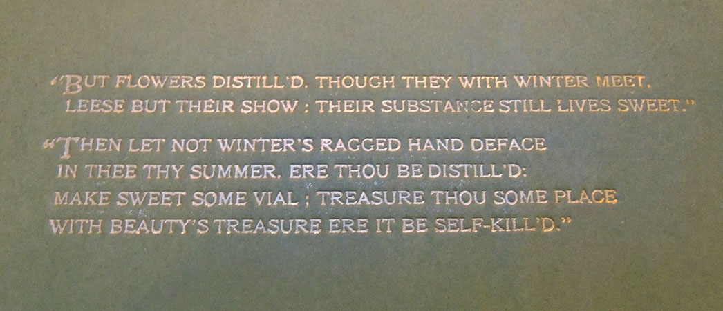
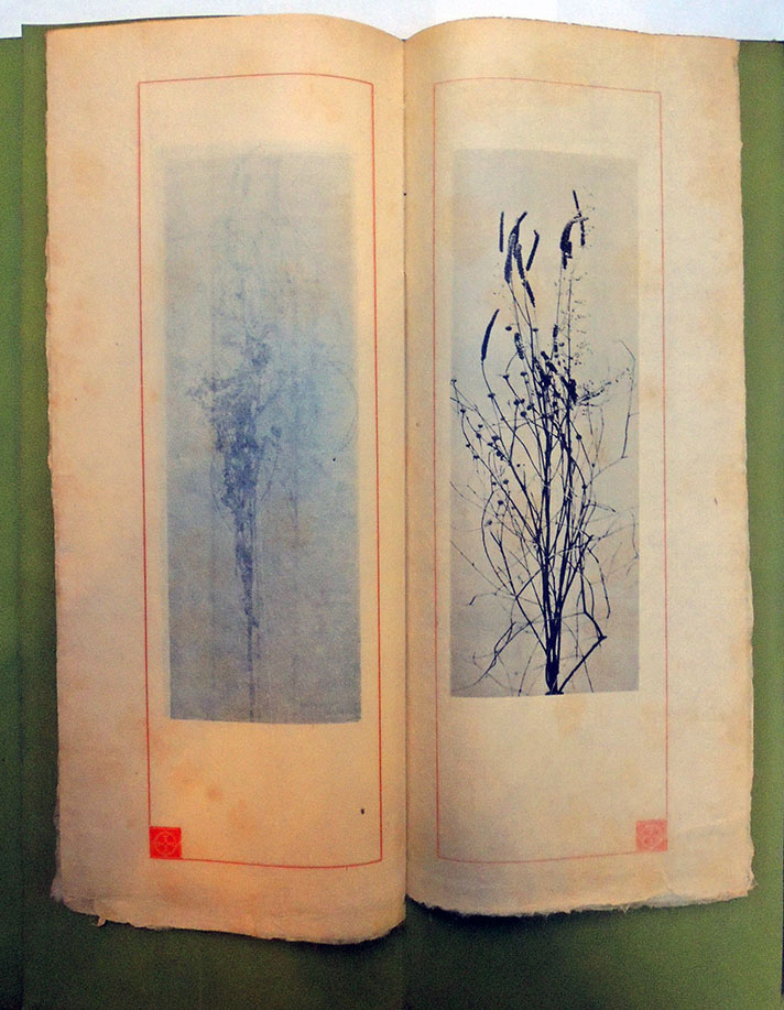
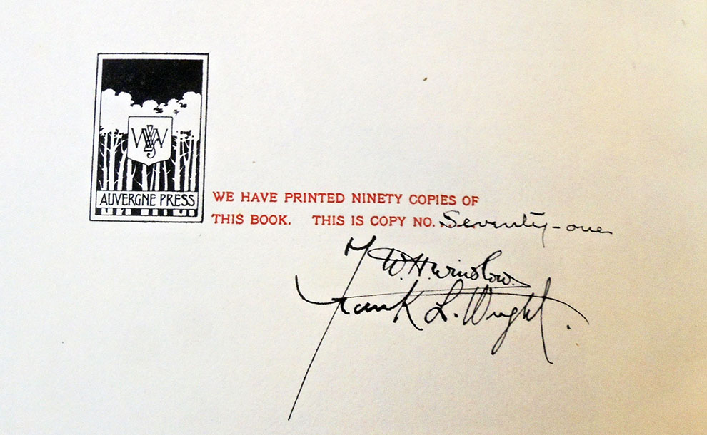
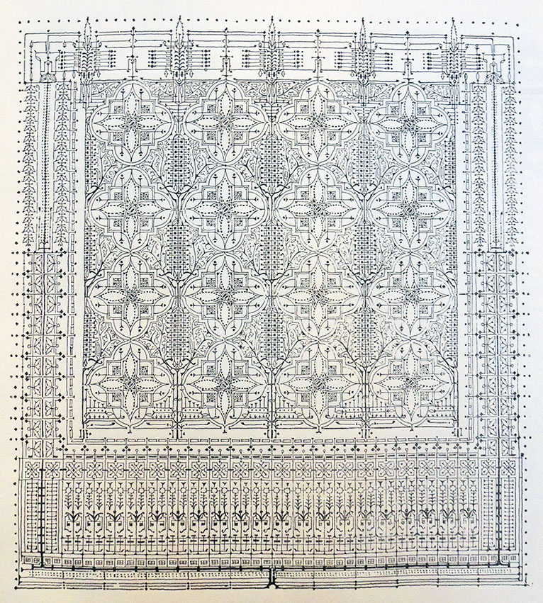
William C. Gannett (1840-1923) and Frank Lloyd Wright (1867-1959), The House Beautiful (River Forest, Ill.: Auvergne Press, 1896-1898). Printed by William Herman Winslow. Copy 71 of 90. Graphic Arts Collection GAX 2019- in process
“In a setting designed by Frank Lloyd Wright and printed by hand at the Auvergne Press in River Forest by William Herman Winslow and Frank Lloyd Wright during the winter months of the year eighteen hundred ninety six and seven.” Includes a brochure sewn to 1st front fly-leaf containing 12 collotypes [not photogravure] of dried weeds. Completed at the end of 1898. Cf. Mary Jane Hamilton, Frank Lloyd Wright and the book arts, 1993.
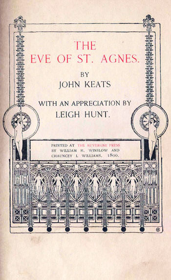
“In 1895 the Auvergne Press … printed its first book, an edition of Keats’s The Eve of St. Agnes, for which [Frank Lloyd] Wright designed the title page. They then set to work on a second, Wright contributing photographic studies of dried weeds and several pen-and-ink designs of highly stylized flower patterns. The book’s title was The House Beautiful, a reprint of a sermon by William C. Gannett, editor of Unity and close friend of Jenkin Lloyd Jones. Gannett’s account of the construction of the Lloyd Jones family church made the first public mention of the family’s “boy architect.” Gannett’s sermon is not inspired, but his title was most up-to-date and symbolic, echoing as it did the central concern of the Arts and Crafts Movement.”
“The chance to experiment in a new field was obviously a great lure for Wright, but what seems to have meant most to him was the importance of the message being put forward by this old friend of his family, one that he could ‘clothe with chastity,’ as he noted in the book itself. Later, he explained to Gannett, ‘its [sic] good to catch a glimpse sometimes of what the world will be like when cultivation has mellowed harshness and gentle unselfishness is the rule of life.’” –Meryle Secrest, Frank Lloyd Wright: A Biography (1998).
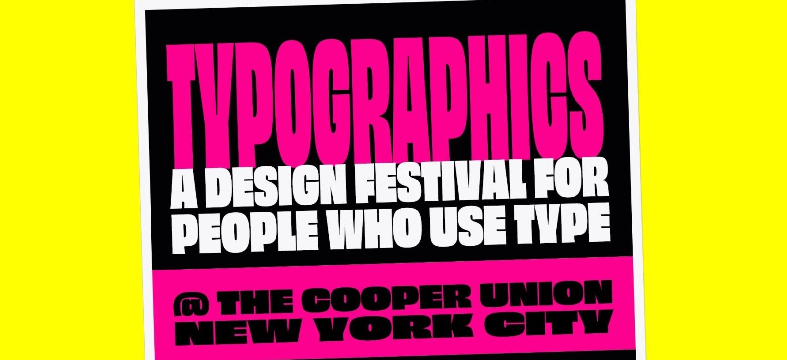
The website for the fourth annual New York City Typographics festival is now online at https://2019.typographics.com. The team organizing this year’s event includes Cara Di Edwardo, Alexander Tochilovsky, Ellen Lupton, Barbara Glauber, and many others.
The site notes: “The 11-day festival is a forum for presentations about graphic design, web design, publication design, book design, type design, packaging, branding, corporate identity, advertising, motion graphics, and more. Importantly, Typographics focuses on new frontiers in digital typography.”
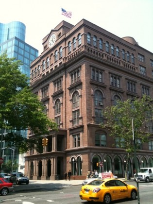
From June 10 to 20, 2019, there will be workshops, tours, speakers, and of particular interest, a book fair. Entrance to the fair on Saturday June 15 is limited to those registered for the conference but on Sunday June 16 the event will be free and open to the public. This year’s location will be the East Village gallery space at 41 Cooper Square, just across the street from the Cooper Union Great Hall where the main conference will be taking place. https://2019.typographics.com/book_fair/ .
The organizers promise “a wide diversity of material available relating to typography, lettering, design, etc, with everything from rare antiquarian type specimens to contemporary titles on modern graphic design.” A full listing of participating booksellers will be posted soon. For updates and announcements, join the Typographics mailing list or follow @TypographicsNYC on Twitter.
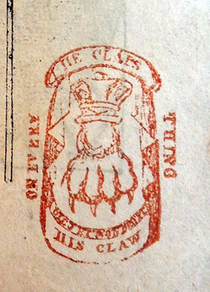
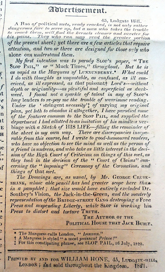
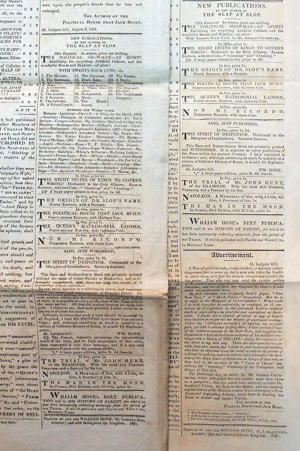
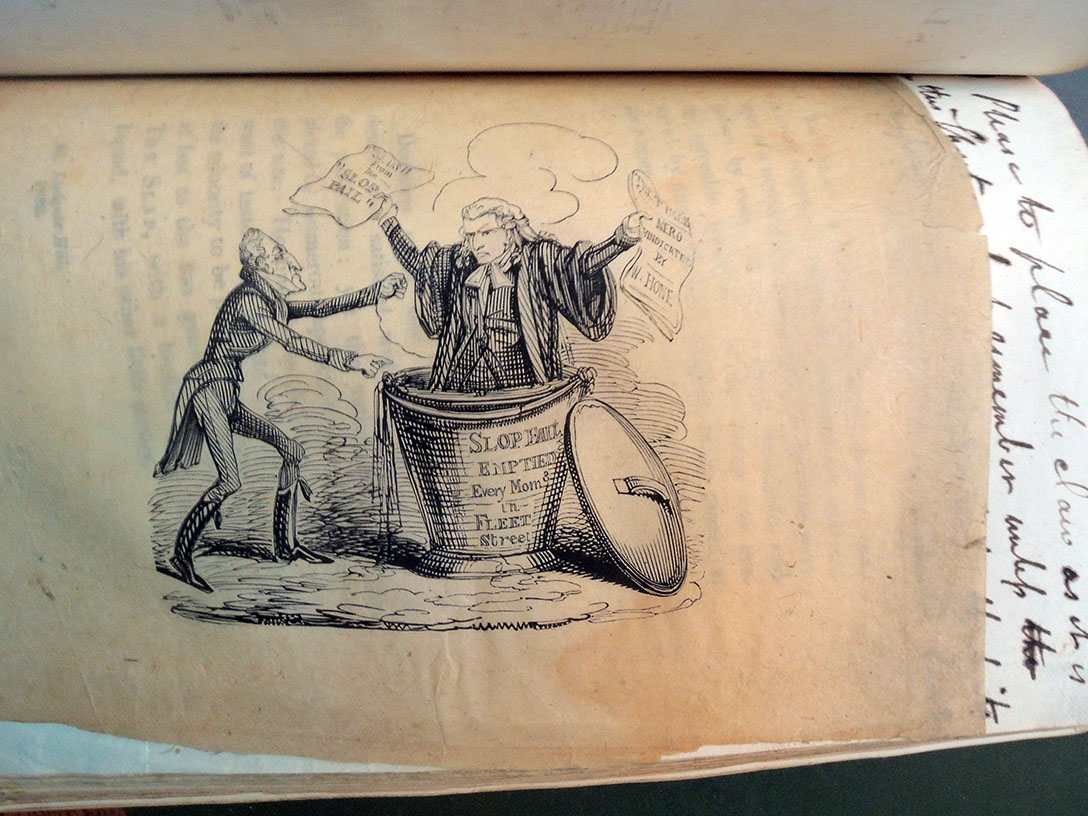
The Lenny Bruce of the early nineteenth century, William Hone (1780-1842) was a radical comic writer and publisher who joined forces with the visual artist George Cruikshank (1792-1878) to expose and ridicule abuses in British politics as well as the news media supporting the conservative government.
Hone was charged with three counts of libel in 1817 but brilliantly acquitted of all charges citing his use of parody. It wasn’t a crime to be funny.
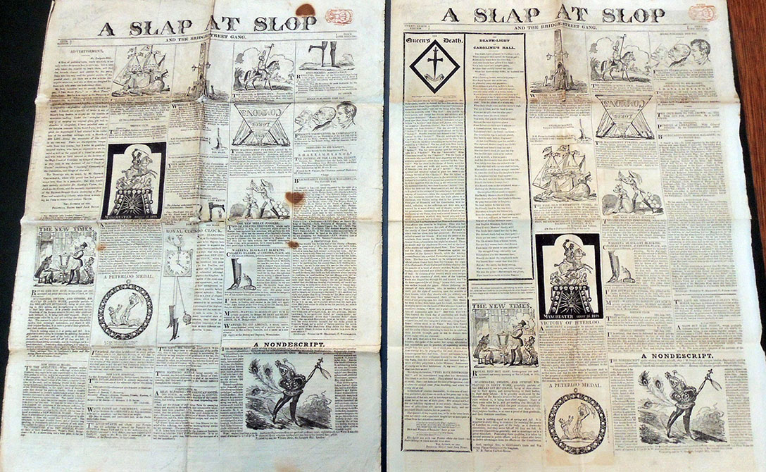
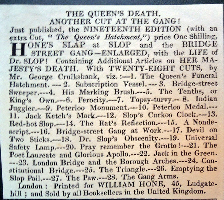
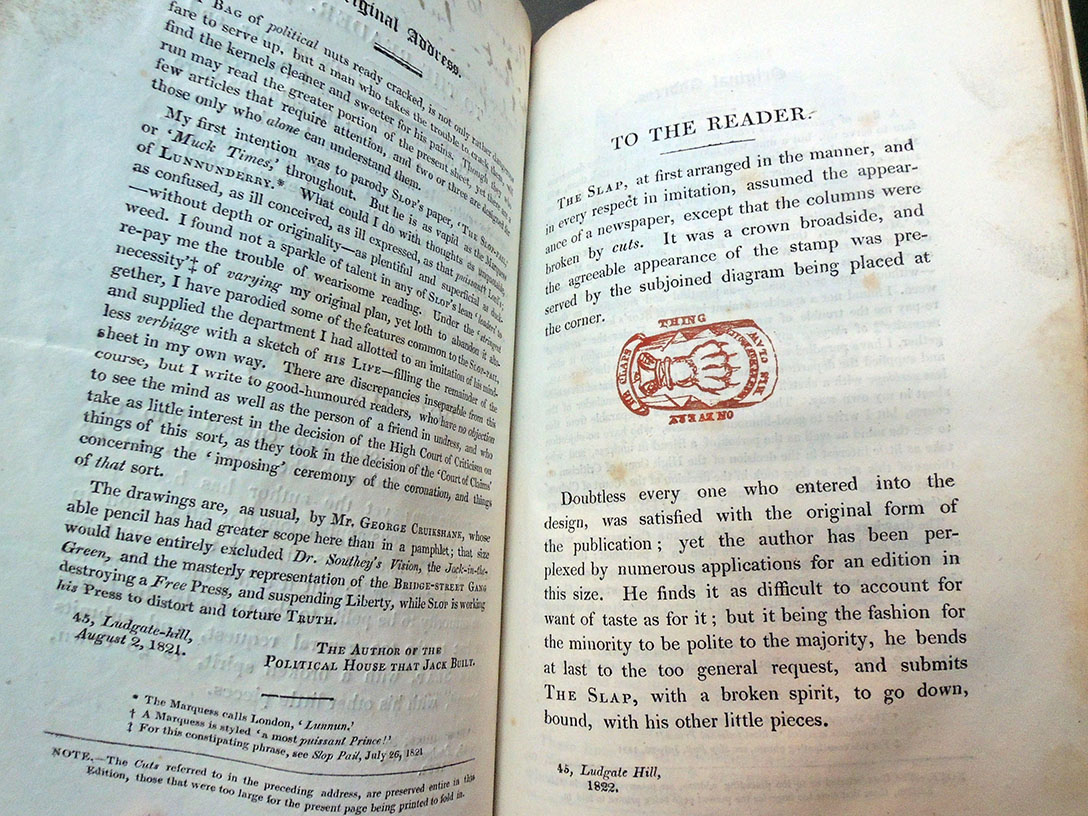
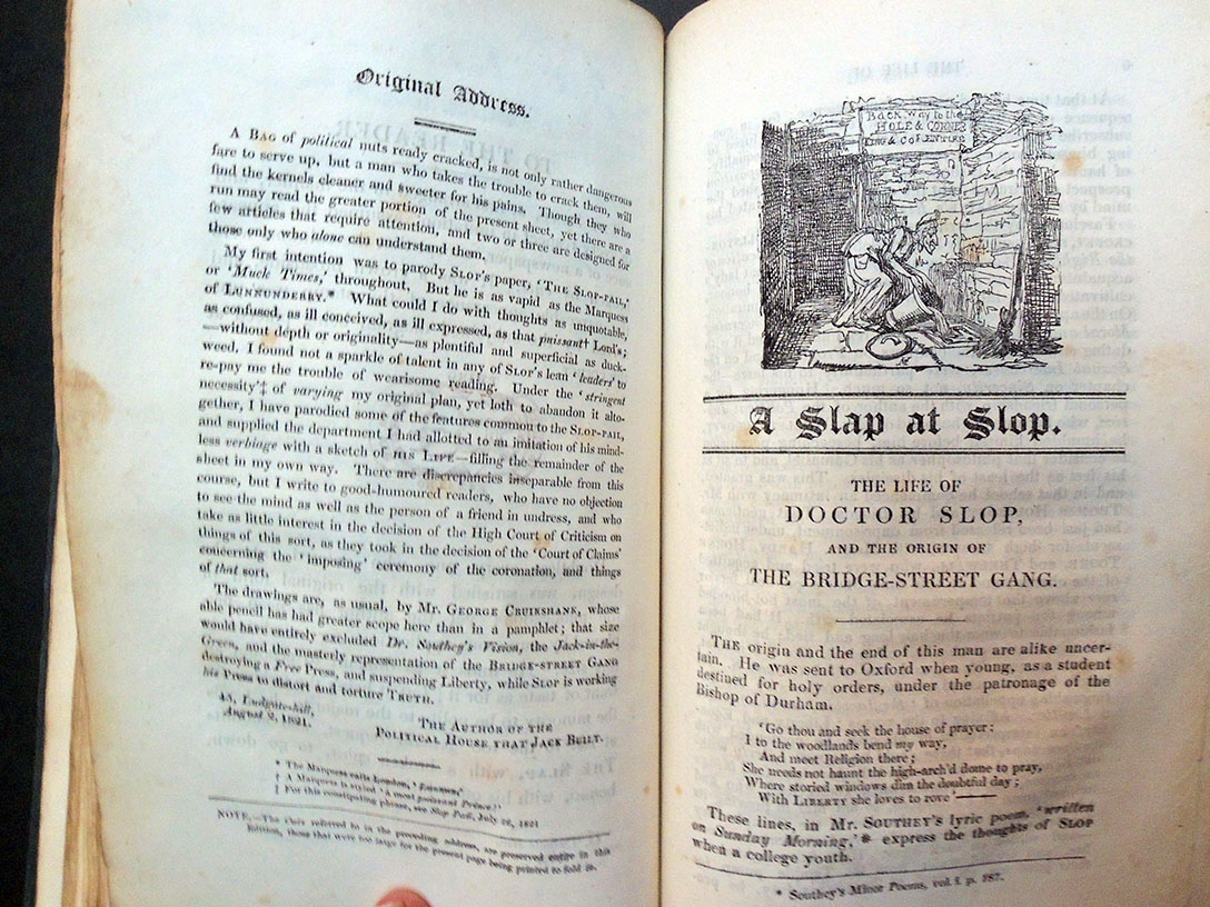
One of the greatest but least celebrated publications issued by the two men was a serial news sheet titled A Slap at Slop, lampooning the work of John Stoddard, publisher of The Times and The New Times newspapers.
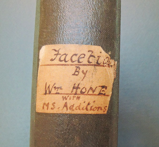
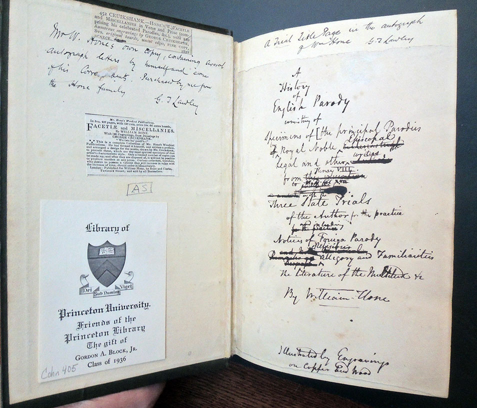
Along with two variant editions of A Slap at Slop, the Graphic Arts Collection holds Hone’s personal copy of Factiae and Miscellanies (1827), a collection of 14 of his tracts and 120 engravings by George Cruikshank, which includes Hone’s manuscript annotations, autograph letters, newspaper clippings, and a likenesses of William Hone and George Cruikshank. These came to Princeton thanks to the astute collecting and generous gift of Richard W. Meirs, Class of 1888 and Gordon A. Block Jr, Class of 1936.
Rather than talk about their work, here are some examples (obviously just a taste) reproduced hopefully large enough for you to read the hilarious texts for yourself:
George Cruikshank (1792-1878), A Slap at Slop and the Bridge-Street gang: Royal cuckoo clock, 1821. Pencil drawing for the Royal Cuckoo Clock, with inscription in George Cruikshank’s hand “Reward for the discovery of the Royal Society–south of the pendulum of England”. References: Cohn 749. Graphic Arts Collection GC022/George/Drawings
William Hone (1780-1842), A Slap at Slop and the Bridge-Street Gang (London: Printed by and for William Hone, 1822). Illustrations by George Cruikshank. Graphic Arts Collection Cruik 1819.41
William Hone (1780-1842), A Slap at Slop and the Bridge-Street Gang; with twenty-seven cuts (London: Printed by and for William Hone, 1822). Illustrations by George Cruikshank. Graphic Arts Collection Cruik 1817.28
William Hone (1780-1842), A Slap at Slop and the Bridge-street gang ([London, W. Hone, 1821]) 5th edition; 26 illus. by G. Cruikshank. “By a closer setting of the material, room is made for an extra illus. and over a column and a half on the Queen’s death. Included also is an octavo sheet with 4 original pencil sketches with explanations, 3 of them from “A slap at slop.” The two issues and the drawings inserted in a red cloth wrapper and slip case. Graphic Arts Collection Cruik 1821.28
William Hone (1780-1842), Factiae and Miscellanies. With one hundred and twenty engravings drawn by George Cruikshank (London: Published for W. Hone by Hunt and Clarke, 1827). A collection of 14 of Hone’s tracts gathered together and published under the above title. There is an additional woodcut on the title representing two men seated at a table. These are likenesses of William Hone and George Cruikshank. Laid in: “The queen’s matrimonial ladder / printed by William Hone, Ludgate Hill, London. Price (with the pamphlet) One shilling.” 30 x 6.5 cm., folded to 15.5 x 6.5, on cardstock. Provenance: The author’s copy, containing his ms. annotations, with autograph letters bound in, and newspaper clippings laid in. Front free endpaper has trial title page, entitled “A history of English parody …” Annotations by George T. Lawley, noting he purchased the volume from Hone’s family. Graphic Arts Collection Cruik 1827.61
From 1923 to 1931, the fine print publishing house of Maison Devambez established the imprint, Les Éditions d’Art Devambez (also written Ed. d’art Devambez), which produced a series of limited edition, artist illustrated books. Édouard Chimot (1880-1959) was named artistic director of the imprint that he led with close, personal interaction with his fellow artists, often matching them with texts by nineteenth-century French authors. Most volumes include intaglio prints, with drypoint a particular specialty of their printers.
In its first years, Chimot published:
Anatole France, Le Petit Pierre, illustrated by Pierre Brissaud, 1923
Anatole France, La Vie en Fleur, illustrated by Pierre Brissaud, 1924
Henri de Regnier, La Canne de Jaspe, illustrated by Drian, 1924
Pierre Louÿs, Les Chansons de Bilitis, illustrated by Édouard Chimot, 1925
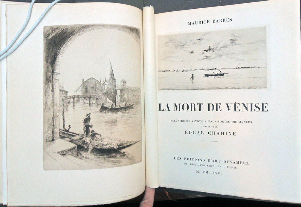
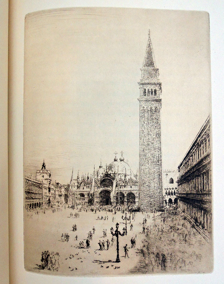
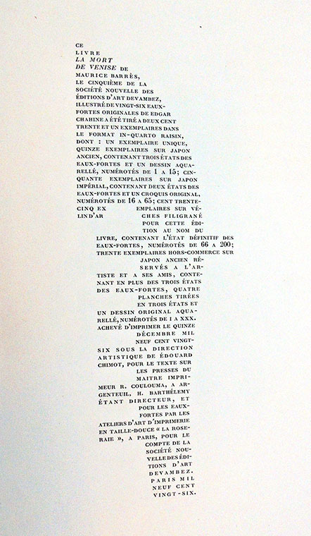
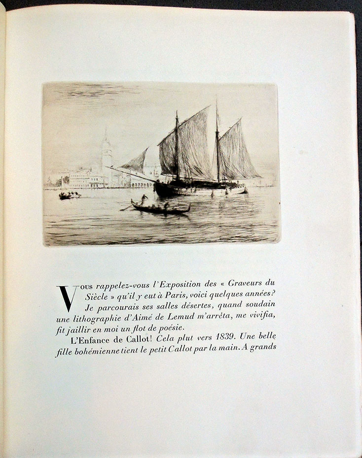
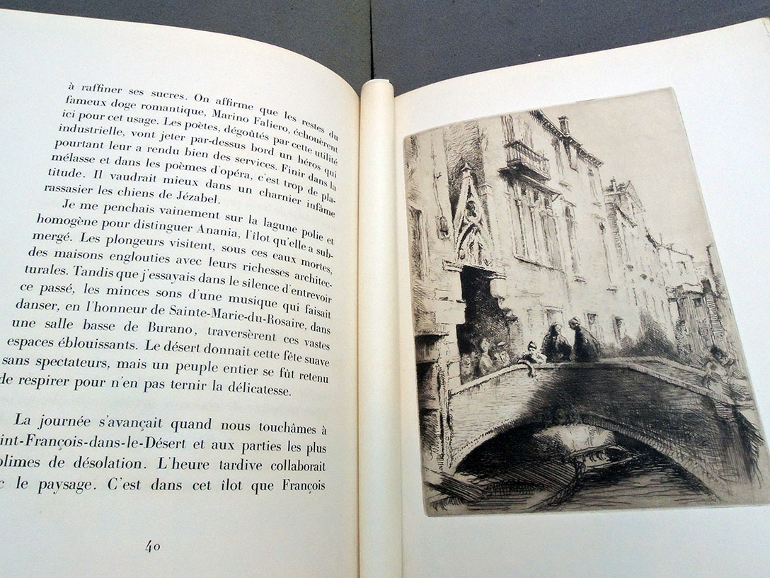
Maurice Barrès, La Mort de Vénise, illustrated by Edgar Chahine, 1926
Claude Farrère, L’Homme qui Assassina, illustrated by Henri Farge, 1926
Gustave Flaubert, Salammbô, illustrated by William Walcot, 1926
Pierre Loti, La Troisième Jeunesse de Madame Prune, illustrated by Tsuguharu Foujita, 1926
Pierre Louÿs, Les Poésies de Méléagre, illustrated by Édouard Chimot, 1926
Born in Venice, Edgar Chahine (1874-1947) became a French citizen in 1925 and spent the next few years creating prints as illustration for fine press editions. His work on Mort de Venise is of particular interest because his Paris studio was destroyed by fire in 1926, making the prints in this book some of the few surviving impressions from his Venice series (begun in 1906 with Impressions d’Italie). Chahine went on to illustrate books by Paul Verlaine (1844-1896); Anatole France (1824-1924); Collette (1873-1954); Gustave Flaubert (1821-1880); and others.
Maurice Barres (1862-1923), La mort de Venise. Illustrée de vingt-six eaux-fortes originales gravées par Edgar Chahine (Paris: Editions d’Art Devambez, 1926). Copy 94 of 231. Graphic Arts Collection GAX Q-000649
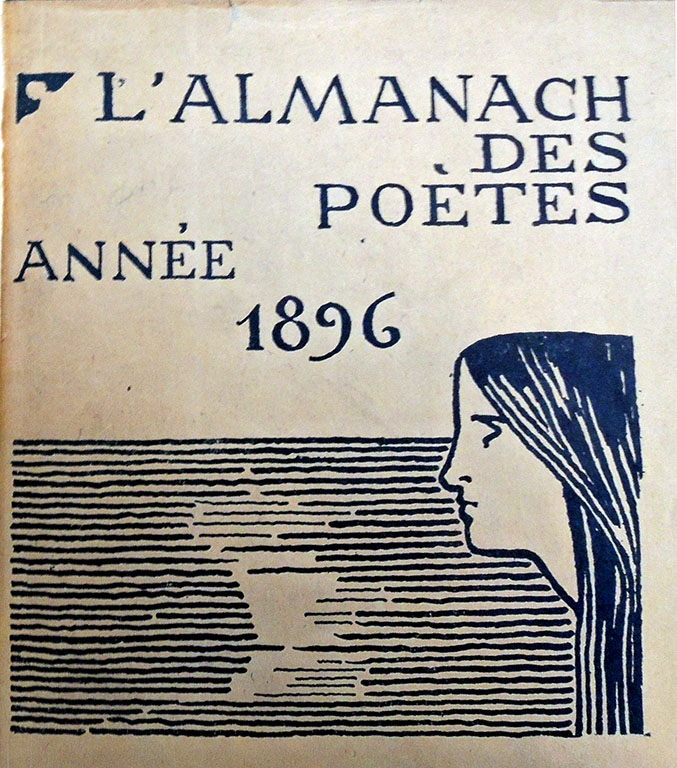
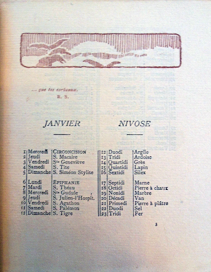
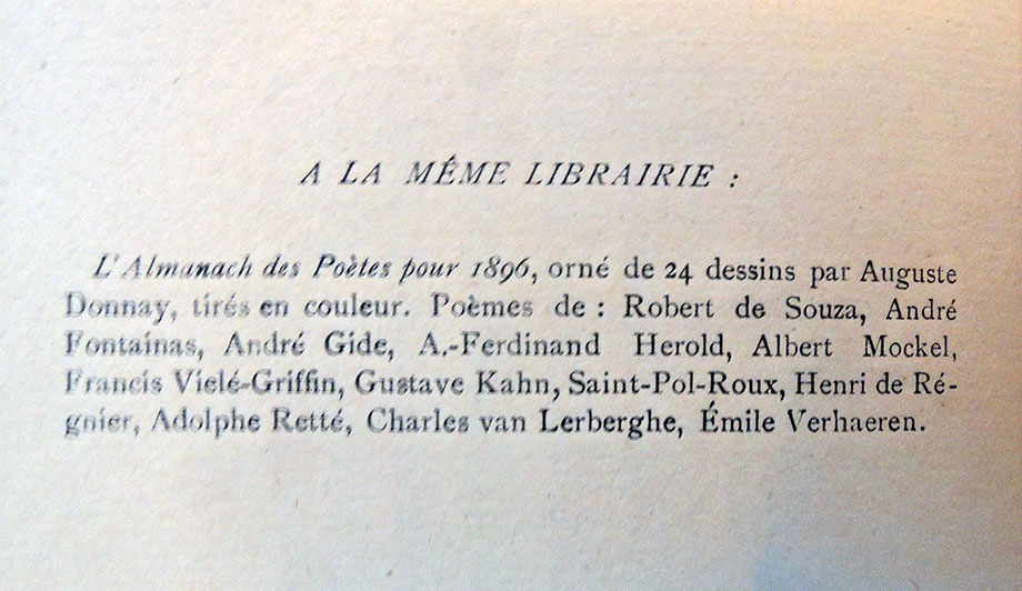
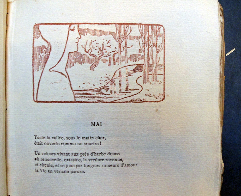
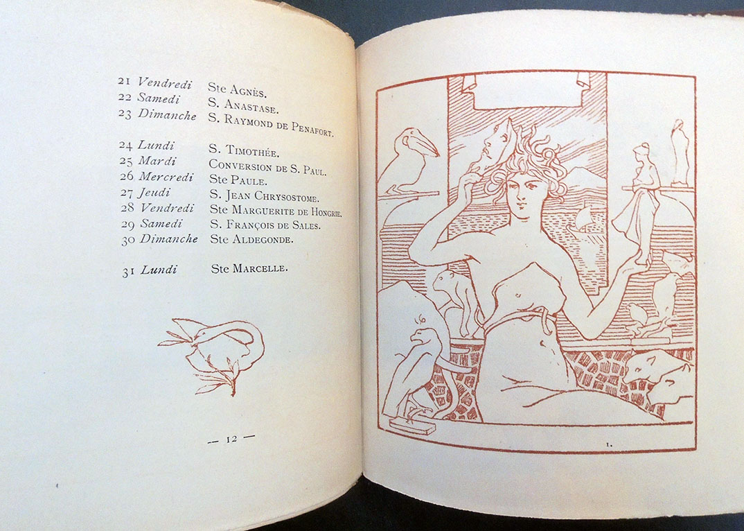
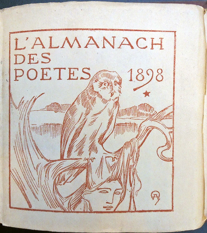
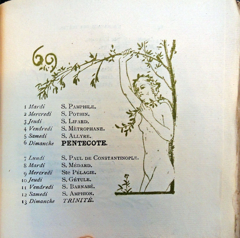
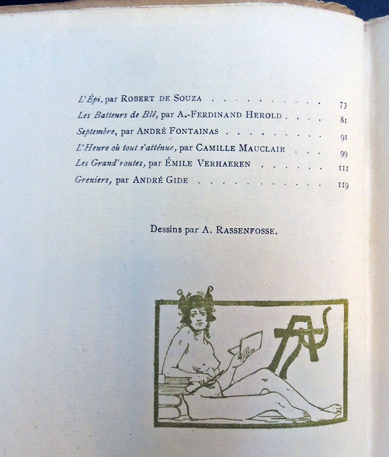
L’Almanach des poètes pour l’année ... (Paris: Edition du Mercure de France, 1896-1898). Volumes for 1896 and 1898 illustrated by Auguste Donnay; for 1897 by A. Rassenfosse. The editor for the series is R. de Souza. Graphic Arts Collection PQ1163 .A463 in process
These rare fin-d-siècle almanacs were designed by the Belgian artists Auguste Donnay (1862-1921) and A. [André] Rassenfosse (1862-1934) under the watchful supervision of poet and editor Robert de Souza (1864-1946), a disciple of Stéphane Mallarmé. Small and unassuming, they include poems by such celebrated authors as André Gide, Gustave Kahn, Henri de Regnier, Emile Verhaeren, Stuart Merrill, Camille Mauclair, and many others.
Benezit Dictionary of Art mentions that as a young artist Donnay spent “five months in Paris, where he got to know the Nabis. However, he was particularly attracted to Egyptian statuary, Japanese art and the Italian primitives, before he discovered the work of Puvis de Chavannes.
In 1894 he participated in the first Salon de la Libre Esthétique, and in 1896 he took part in the Salon de l’Art Indépendant in Paris. In 1901 he was appointed to teach at the Académie de Liège and gave lessons in ornamental composition. He left Liège in 1905 and went to live in Méry-sur-Ourthe.” Donnay was equally interested in art and poetry, illustrating many books and magazines throughout his life, including the issues of this Almanach.
Rassenfosse was the same age as Donnay and involved with many of the same people and projects. He spent time in Paris and became friends with Félicien Rops, together perfecting ‘Ropsenfosse,’ a soft varnish for paintings. By 1934, he was appointed the director of Fine Arts at the Belgian Académie Royale des Beaux Arts.
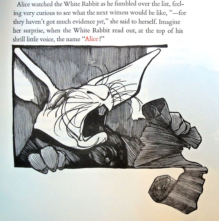
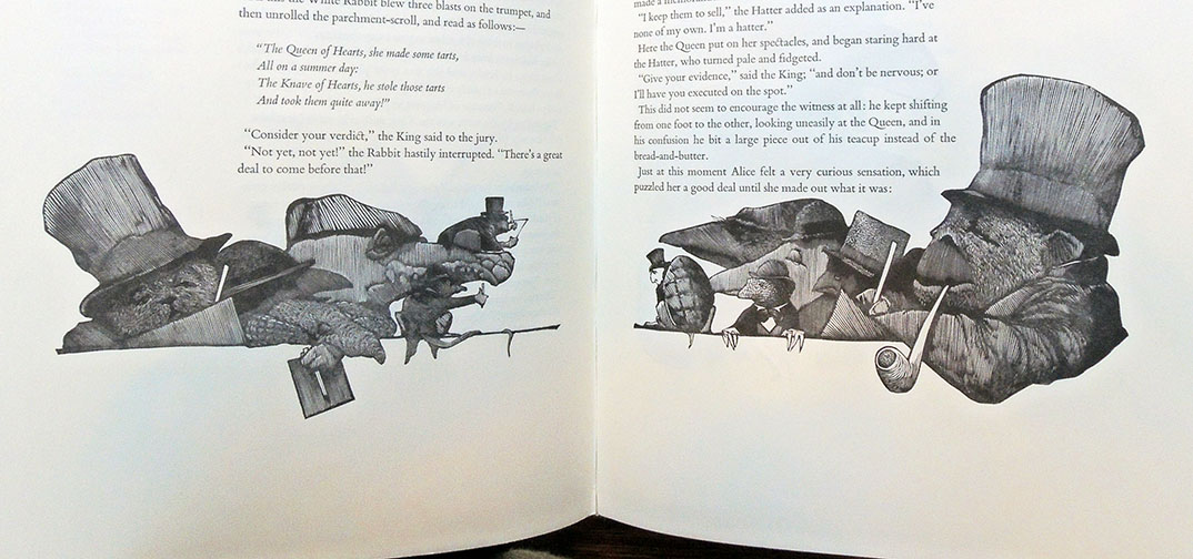
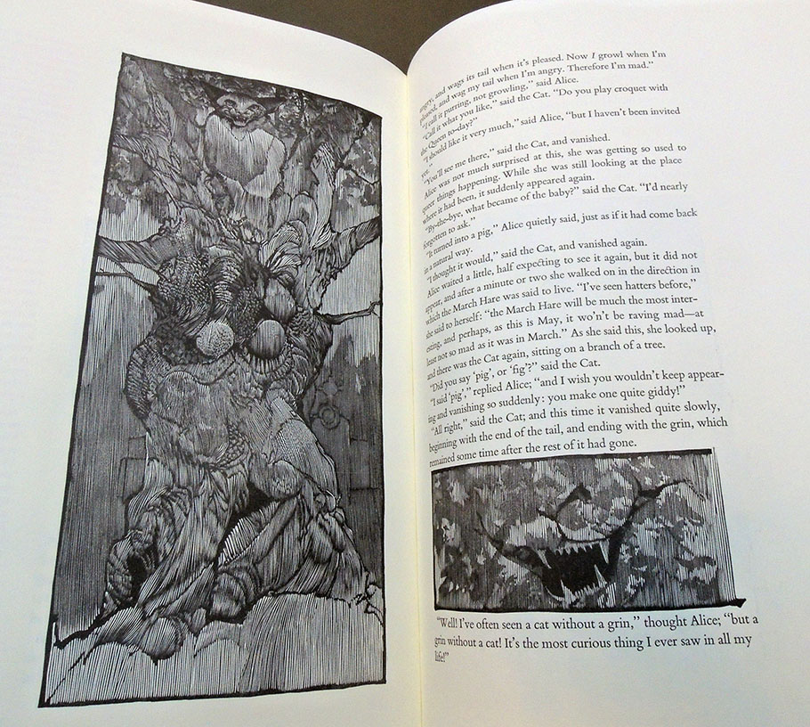
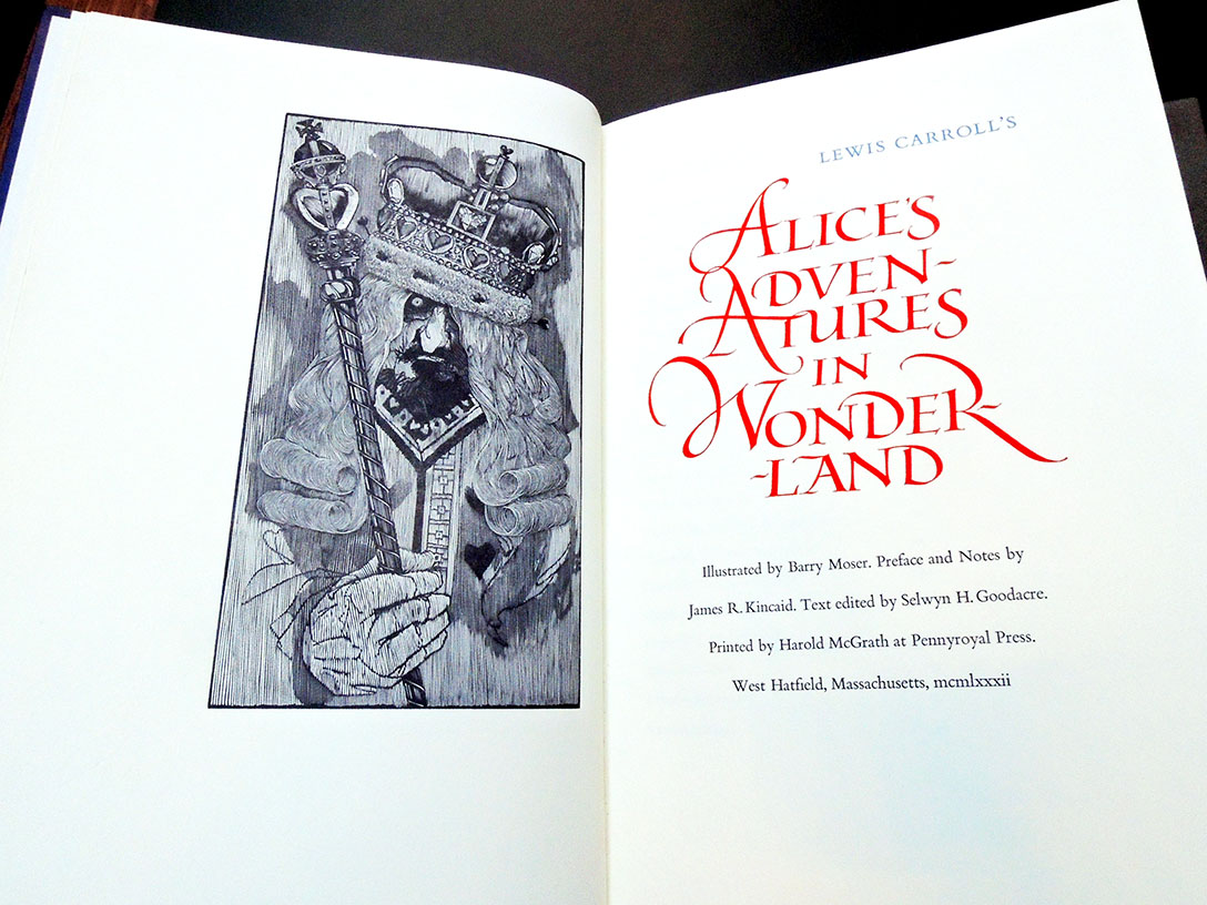
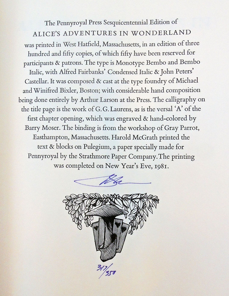
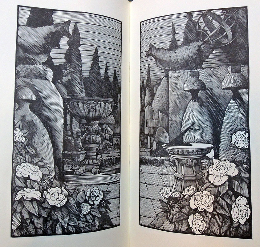
Alice’s Adventures in Wonderland [by] Lewis Carroll; illustrated by Barry Moser; preface and notes by James R. Kincaid; text edited by Selwyn H. Goodacre; printed by Harold McGrath at Pennyroyal Press (West Hatfield, Mass.: Pennyroyal Press, 1982). Bound volume and additional portfolio of 68 black and white engravings, signed by Moser. “The Pennyroyal Press Sesquicentennial Edition of Alice’s Adventures in Wonderland was printed in an edition of three hundred and fifty copies, of which fifty have been reserved for participants & patrons” –Colophon. Copy 317 of 350. Graphic Arts Collection Oversize PR4611 .A7 1982bF
Notes on the prints by Barry Moser (1981) “To illustrate Alice entails a certain indelicacy, for Alice is a story of loneliness. Its illustrators, beginning with Carroll himself and including Tenniel, Rackham, Steadman, Pogany, Furniss, and Dali, have intruded on the privacy of Alice’s adventure, standing apart and observing Alice in her dream. They have been voyeurs, and yet there can be no voyeurs to dreams. In The Pennyroyal Alice, the reader is a voyeur only when Alice is associated with her sister: first, on the bank; then, after awakening, running home for tea; and finally in her sister’s reverie. The images of Alice’s dream are always seen from Alice’s point of view, for after all, the dream is Alice’s dream.
…Carroll’s thoughts on his own creation provided important keys which took The Pennyroyal Alice in interesting visual directions. For instance, Carroll commented to Alexander Macmillan in 1864, that the binding cloth for Alice should be bright red—not because it was the best, he said, but because it would be “the most attractive to the childish eyes.” I used that note as a displaced chromatic key: red for the shoulder commentary, and red for Alice’s name when it is shrieked by the White Rabbit in the trial scene. Similarly, Carroll’s habit of writing letters in purple ink suggested the use of violet leather for the binding. The blue that appears in the chapter heads and other titles is, of course, Oxford blue. Carroll’s (often meddlesome) letters to and about Tenniel, Arthur Hughes, and G.W. Taylor gave me insights into Carroll’s vision of Wonderland, a contradictory vision which embraced the “weird” and “grotesque” as enthusiastically as it embraced the “graceful and pretty.”…
The Cheshire Cat is modeled after the hairless Sphinx, a ridiculously rare feline, which like a mule cannot reproduce itself.”
“In 1977 Moser met Andrew Hoyem, who asked if Moser would be interested in illustrating Arion Press’s forthcoming Moby-Dick. He was, he did, and it was published to great fanfare. This had profound ramifications for Pennyroyal Press because, as Moser reasoned in retrospect, he could certainly design a book as well as Hoyem, and Harold McGrath, who was widely considered as the finest letterpress printer in America at the time, was certainly as good a pressman as any of Hoyem’s. And so Moser, McGrath, and Jeff Dwyer, their business manager and partner, determined to produce something that was much grander than any of the previous Pennyroyal books. In 1982 the Pennyroyal Press edition of Lewis Carroll’s Alice’s Adventures in Wonderland appeared and subsequently won the 1983 American Book Award for the trade edition published by the University of California Press in Berkeley, California.”–https://www.moser-pennyroyal.com/
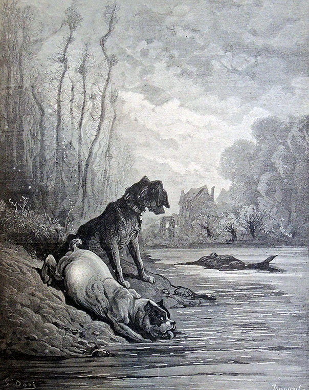
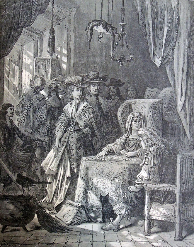
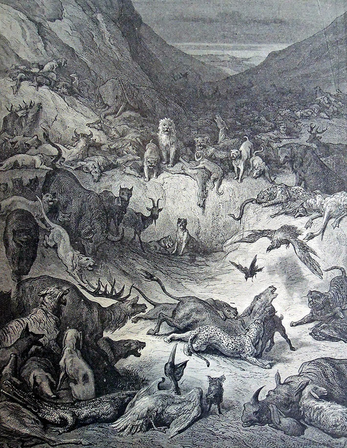
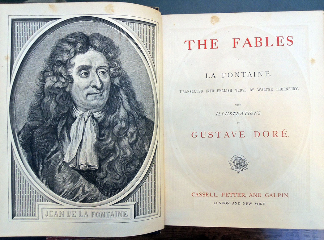
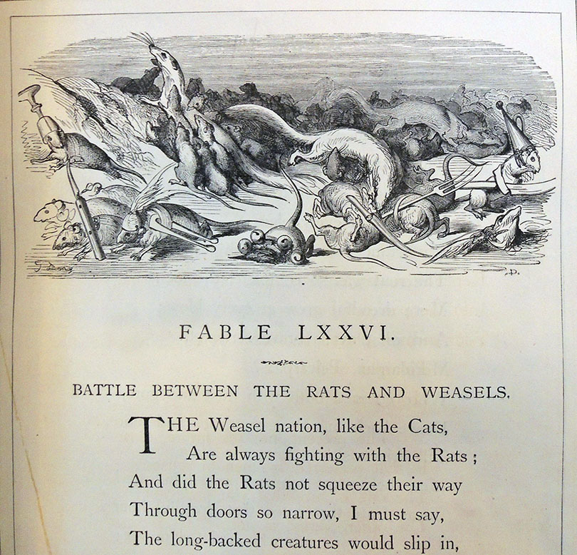
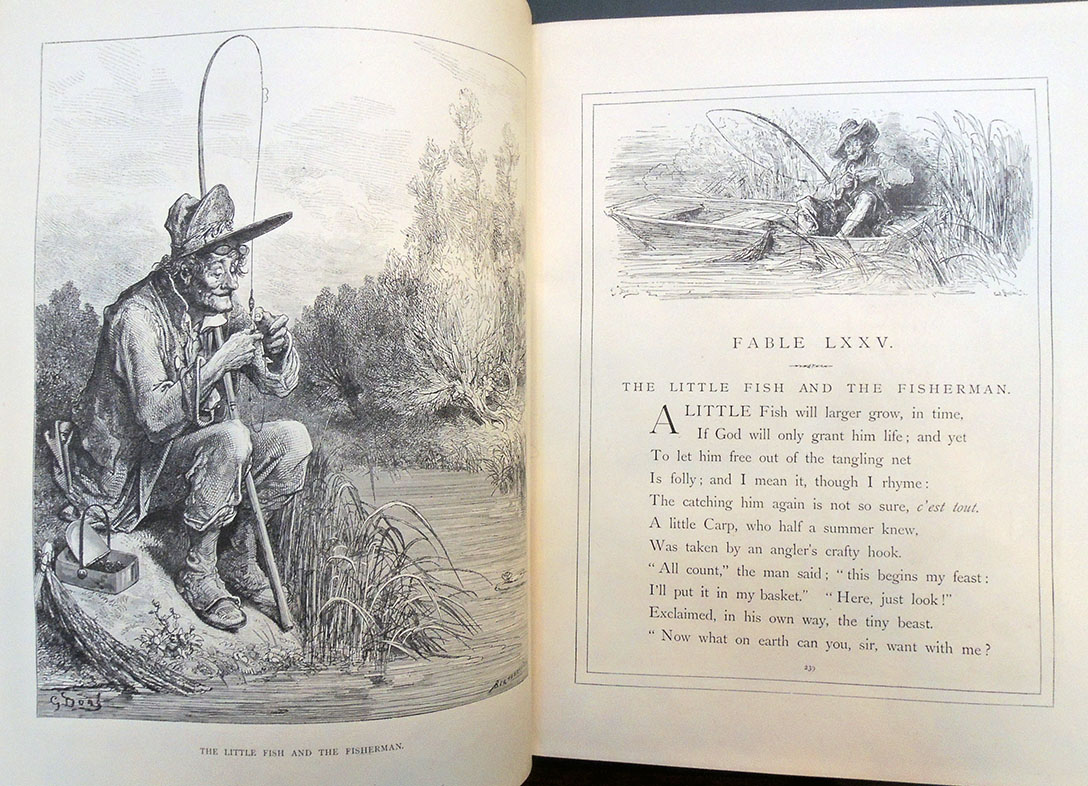
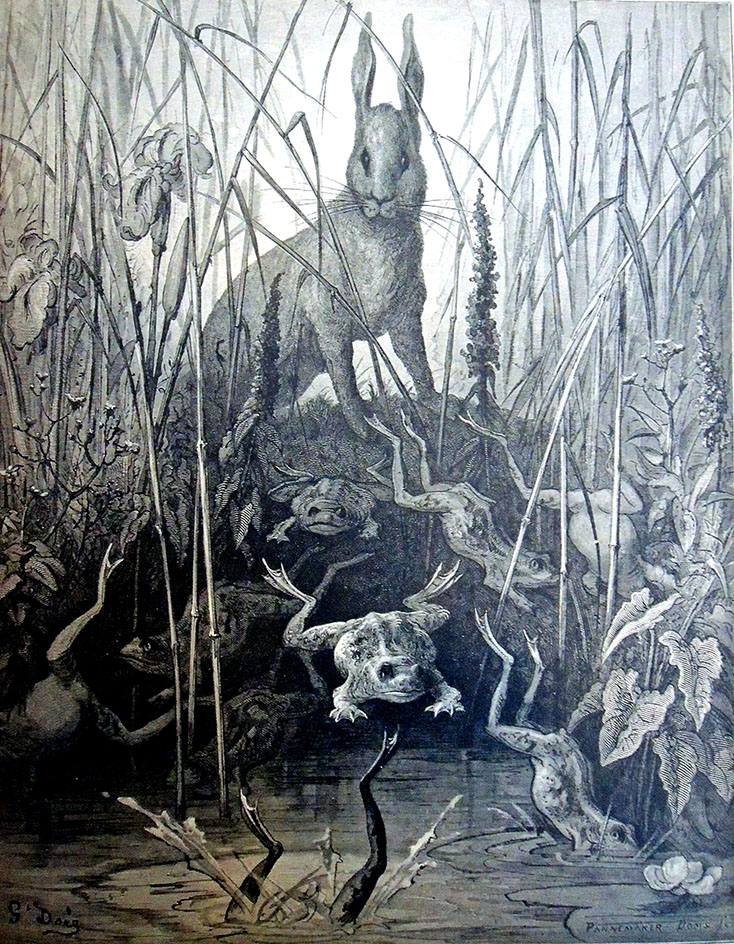
Princeton University Library lists 696 versions of the Fables of Jean de La Fontaine (1621-1695) dating from 1668 to 2018 in twenty identified languages, including both paper and online, audio, manuscript, visual, projected, and a senior thesis. Yet it was a surprise when a request came for the book illustrated by Gustave Doré.
His more than 300 designs were first published in Paris by Librairie de L. Hachette in 60 parts between 1866 and 1868. Our London and New York edition published by Cassell, Petter, and Galpin has no date connected to it but sources list 1868. It was a generous gift from the great book collector W.T. Scheide.
Don’t miss the lizard hanging from the ceiling.
Doré’s designs were handsomely wood engraved by T. Ettling; Huyot; Adolphe François Pannemaker (born 1822); George Auriol (1863-1938); Paul Jonnard (ca. 1863-1902); and possibly others, but the prints were not well received. “La Fontaine sees clearly and true; M. Doré sees falsely, strangely and eccentrically,” wrote a critic (recorded by Jules Claretie). The artist himself was worn out by the effort and wrote, “-the job appalled me, crushed me.”
Regardless, readers loved the translation and the prints leading to multiple editions, including a sold out trade edition. The unusual presence of human beings in these animal tales seemed to resonate with people. Situations are presented with great dramatic flare and a realistic terror usually reserved for Dante or Milton. What do you think? Read more about the project in Nigel Gosling, Gustave Doré, (Newton Abbott: David and Charles, 1973) Marquand ND 553.D7G6.
Jean de La Fontaine (1621-1695), The Fables of La Fontaine, translated into English verse by Walter Thornbury, with illustrations by Gustave Doré (1832-1883) (London and New York: Cassell, Petter, and Galpin, [1800?]). GAX copy: Bookplate of William Taylor Scheide (1847-1907). Graphic Arts Collection Oversize 2003-0072Q