Cambridge Boys Celebrate When Women Are Refused Degrees

Thomas Stearn (1825-1905), [Cambridge University protest], May 21, 1897. Albumen silver print photoshopped to remove some yellow for easier viewing. Graphic Arts Collection GA2018- in process

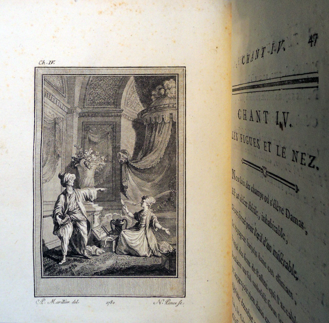
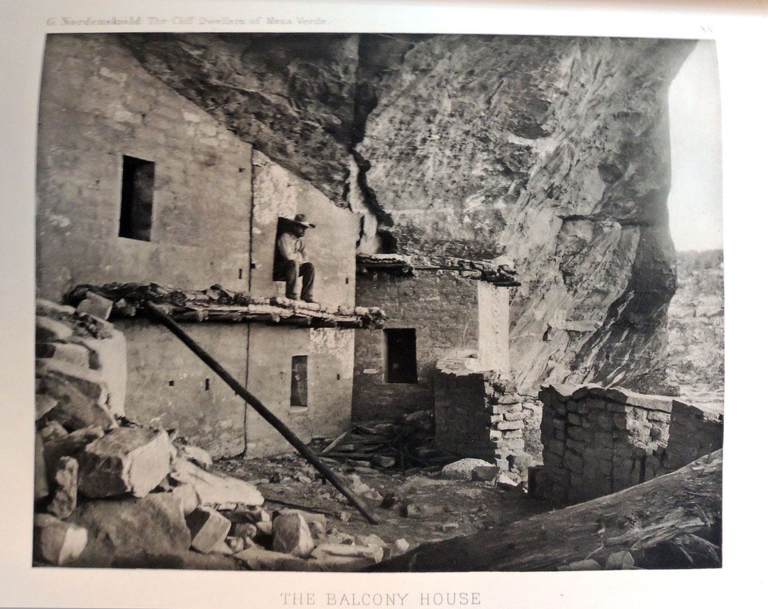
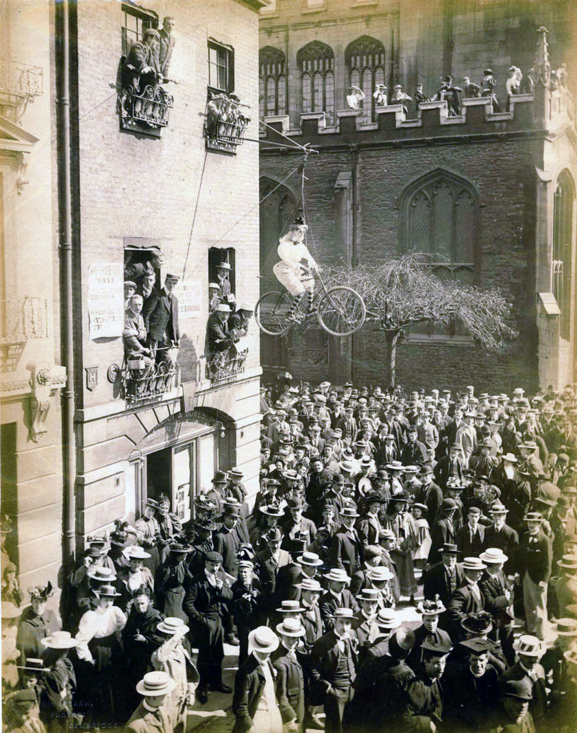
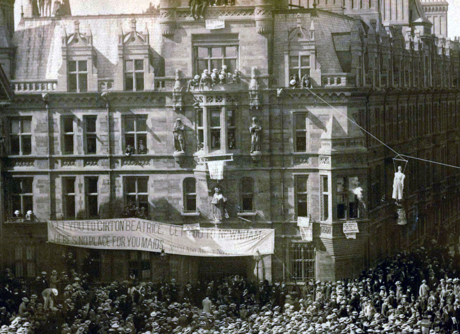
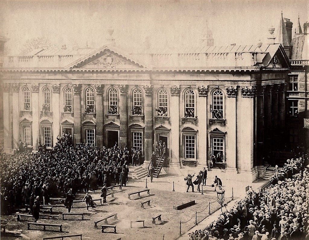
The Graphic Arts Collection recently acquired three unmounted albumen silver prints taken on May 21, 1897. That was the day when the Cambridge University Senate voted on whether to grant female students the right to receive a full degree. Large numbers of undergraduates, alumni, and staff protested. Degrees to women were rejected and it wasn’t until 1947 that Cambridge reversed this decision.

The above photograph features an effigy of a new, emancipated woman on a bicycle, hung from a window of a bookshop (Macmillan & Bowes at 1 Trinity Street, today the Cambridge University Press bookshop). The second print shows an female figure hung from Caius College across Trinity Street. A large banner parodying Shakespeare reads, “Get you to Girton Beatrice, Get you to Newnham, Here’s No Place for You Maids, Much Ado About Nothing.” [Girton and Newnham were the two female colleges] The final photograph shows the large crowd of jubilant men gathered on the Senate House steps.

Each print has a blind stamp in lower left corner for the photographer Thomas Stearn, who established a studio at 72 Bridge Street in 1886. His wife, sons, niece, and other family members worked in the firm, which finally closed in 1970. If you look closely, a photographer with his camera is visible on the roof of the north aisle of the University Church, accompanied by assistants and a group of women.
Thomas Stearn (1825-1905), [Cambridge University protest], May 21, 1897. Albumen silver print photoshopped to remove some yellow for easier viewing. Graphic Arts Collection GA2018- in process.

The following account is taken from Teacher Training at Cambridge: The Initiatives of Oscar Browning and Elizabeth Hughes (Routledge, 2004)

[There was] good reason to believe that high education for women . . . was gaining acceptance. Nationally, by 1894 women were receiving degrees from the Scottish universities, Wales, Durham, London and many other universities.

In 1896, Oxford University refused degrees for women at a university vote, but, in Cambridge, 1,234 past students of Hewnham and Girton [Colleges] petitioned the university Senate to have their degrees awarded just like the men, rather than being offered a Tripos ‘certificate’. A highly public campaign by supporters and opponents took place . . . .

The vote to admit women to degree titles was arranged for Friday, 21 May 1897. The Times took the trouble to point out that special trains of the Great Northern Line would leave King’s Cross for Cambridge in time for [graduate students] to register their ‘non-placet’ votes. There was rabble-rousing going on among the undergraduates (who could not vote) for there were near-riots in the streets of Cambridge.

Male undergraduates in one-horse hackney carriages met the [graduates] at Cambridge station and rushed them at break-neck speed along Regent Street, through the marketplace to the Senate House. There they had to press through excited throngs, under the gaze of undergraduates leaning out of Caius College dangling effigies of women students. . . . When at last the result was announced, the women had suffered a crushing defeat. The final vote was 1,707 against women receiving degrees, and only 661 in favour.”

Thomas Stearn (1825-1905), [Cambridge University protest], May 21, 1897. Albumen silver print photoshopped to remove some yellow. Graphic Arts Collection GA2018- in process

50 years after this protest, Cambridge finally accepted women as full members of the University. At Princeton University, it wasn’t until April of 1969 that the Board of Trustees voted to enroll women and the first mixed gender class entered the following fall. In the book world, the Rowfant Club and the Club of Odd Volumes remain closed to women.

The Long Never

When The Long Never arrived yesterday, there was a brief moment of uncertainty as to whether we had received a book without the promised story by Jonathan Safran Foer. A jump to the colophon provided the note, “Foer’s text was printed in the debossed image areas using a lithograph printing press. All plate images were scanned and separated using tritone separation. Plates were printed using tritone lithograph printing on Phoenix Motion Xantur 115 g/sm paper, trimmed and hand-tipped into the debossed image areas.”–Colophon.


Hiroshi Sugimoto, The Long Never; story by Jonathan Safran Foer; designed by Takaaki Matsumoto ([New York: Matsumoto Editions, 2014, New York: Matsumoto Editions]). Copy 215 of 360. Graphic Arts Collection.

We are fortunate to have acquired number 215 from the first edition of 365 copies, which we understand is now sold out. Along with Foer’s story, the special edition book presents sixty-five prints by the Japanese photographer and architect Hiroshi Sugimoto.

Press copy for the book says, “The sequence of images in this book conjures a natural history of the planet, perhaps even one untouched by humans. The black-and-white photographs are hand-tipped onto the pages of the book, which is wrapped in silk cloth. Celebrated author Jonathan Safran Foer has written an original story for this book. Foer’s text sits on the page underneath each artwork, so the reader must lift up each photograph in order to read the story.”


Ocherki perom i karandashem iz krugosvi︠e︡tnago plavanīi︠a︡

Aleksei Vysheslavt︠s︡ev (1831-1888), Ocherki perom i karandashem iz krugosvi︠e︡tnago plavanīi︠a︡ v 1857, 1858, 1859 i 1860 [Sketches in Pen and Pencil from a Trip Around the World in the Years 1857, 1858, 1859 and 1860]. 2nd corrected edition (Saint Petersburg: M.O. Wolf, 1867). Graphic Arts Collection GAX 2918- in process.


Illustrated with 24 tinted lithographs (including the title page seen at the top), this Russian travelogue takes the reader around the Cape of Good Hope to Singapore, Hong Kong, Japan, Hawaii, and Tahiti. Vysheslavt︠s︡ev was a doctor sailing around the world from 1857 to 1860, writing and sketching along the way.

He traveled with a military commission inspecting the Russian territories acquired with the Russian-Chinese Treaty of Aigun. The ship returned by way of the Strait of Magellan, Buenos Aires, and Rio de Janeiro.

Vysheslavt︠s︡ev’s “Letters from the Clipper Plastun” appeared from 1858 to 1860 in the Russky Vestnik, later known as the Russian Herald, where Leo Tolstoy and Fyodor Dostoyevsky also published. By 1862, the doctor was back in Saint Petersburg and published his collected letters with lithographs printed from his sketches by from the studio of Paul Petit. This second edition was published five years later by Mauritius Osipovich Wolf (1825-1883) with the same illustrations.


Professor Ella Wiswell notes,

“In Montevideo the Plastun had to undergo some repairs, and the author was transferred to the corvette Novik which was also returning from Japan. The transfer saved Vysheslavtsev’s life because the Plastun was sunk by an explosion just as the two ships were approaching the home port of Kronshatdt in Russia.

Only nine members of the 79-member crew were rescued. The cause of the explosion was never determined, but it was suspected that a fire was started by a sailor resentful of ill treatment by the commanding officer. The final page in the book describes the disaster.” https://evols.library.manoa.hawaii.edu/bitstream/10524/390/2/JL17076.pdf


De la saltation théâtrale

François-Henri-Stanislas de L’Aulnaye (1739-1830), De la Saltation théâtrale, ou Recherches sur l’origine, les progrès et les effets de la pantomime chez les anciens [Theatrical Saltation, or Research on the origin, progress, and effects of pantomime among the ancients] (Paris: Barrois l’aîné, 1790). Graphic Arts Collection 2018- in process


While the text of this volume tracing the history of dance and ancient pantomime might be interesting, the main event happens at the end with nine brightly colored plates after those by the Italian antiquarian and connoisseur Francesco Ficoroni.

See also: Francesco de Ficoroni (1664-1747), Le maschere sceniche e le figure comiche d’antichi Romani, descritte brevemente da Francesco de’ Ficoroni ([Roma: nella stamperia di Antonio de’ Rossi, 1736]). Marquand Library GT1747 .F5.


The plates are:
1. Moriones fire Macci. Ex Museo Florentino, Nos 1 & 2. Saltator believed to be a Luperce.
2. Parody of the Loves of Jupiter and Alcmene, painted on an Etruscan Vase / Socrates sexercant to the saltation, ex Museo Gerlaex.
3. Scene of Etruscan Mimes. Ex Muso Etrusc.
4. Bouffon mime, Parasite.
5. Mime Bouffon.
6. Bouffon mime, Parasite.
7. Mask of Tragic Pantomime. Our 1 & 2.
8. (1) Triple mask of a Woman, a Viellard and a Jester / (2) Mask of Satyr / (3) Double mask of Socrates and Xantippe.
9. Saltator who holds a sort of bagpipe with three mouths.


Tangu et Félime


The writer Jean-François de La Harpe (1739-1803) lived a tumultuous life; orphaned at nine, arrested while still a student, suicide of his first wife, fired from the Mercure, performances that cause scandal, and finally confined to Luxembourg prison where he converted to Christianity. Throughout all this, he wrote plays, literary criticism, poetry, translations, and essays, resulting in nearly 3,000 entries in OCLC.

His poems Tangu et Félime were first published in 1780 by Noël-Jacques Pissot (ca. 1724-1804), with a frontispiece by Clément-Pierre Marillier (1740-1808); and additional engraving by Emmanuel De Ghendt (1738-1815); Jean Dambrun (born 1741); Louis-Michel Halbou (1730-ca. 1809); and Nicolas Ponce (1746-1831) after drawings by Marillier. An English language translation was published in 1928 under the title, Three Gifts. An Arab Love Story, reproducing the same plates


Jean-François de La Harpe (1739-1803), Tangu et Félime: poëme en IV chants. Frontispiece by Clément-Pierre Marillier (1740-1808); and engravings by Emmanuel De Ghendt (1738-1815); Jean Dambrun (born 1741); Louis-Michel Halbou (1730-ca. 1809); Nicolas Ponce (1746-1831) after Marillier. Edited by Noël-Jacques Pissot (ca. 1724-1804) (Paris: Chez Pissot, 1780). Graphic Arts Collection GAX 2018- in process

See: Henri Cohen. Guide de l’amateur de livres a gravures de XVIIIe siecle. Paris, 1912: Marquand Library 0410.261.


The Kittens Are Gone to St. Pauls

Between 1888 and 1896, the Boston-based publisher Joseph Knight (1829-1907) partnered with Ernest Edwards (1837-1903), president of the New York Photogravure Company, to publish a series of small gift books illustrated with photogravures. Most were produced in editions of 500 with similar printed paper covers and horizontal formats, selling for around $2.00.

Chicago photographer Mary Ann (Mrs. N. Gray) Bartlett (1846-1913) made three books with Knight, the first in 1892 entitled Old Friends with New Faces. “The most original and genuinely pictorial product of photography we have seen for a long time,” wrote Edward Wilson. “It is a handsomely arranged series of photogravures of children grouped to illustrate Old Friends, the stories of Mother Goose. The New Faces are evidently good friends of the admirable artist, who so deftly caught them here and there in the garden and by the stairs, and so on, for she has made lovely pictures of them.”

“. . . This is no “hand-camera” or “snap-shot” work, but that of a thoughtful, artistic photographer, able to tackle pictures of a good size, and to make them well. . . . The pictures must be on whole-size plates, and they are, every one, technically excellent.”– Wilson’s Photographic Magazine 30, no. 434 (February 1893).

Born Mary Ann McCune, Bartlett married the chemist N. Gray Bartlett (1840-1917) and together they had four children: Greyson, Bertha Madelon, Allyn, and John. It’s Madelon [seen above] who poses for the frontispiece of “Old Friends” dressed up as Mother Goose with a camera and the verse:
A Curtsy
From many a year of sweet repose,
From work of earlier days,
With youth renewed, I’m roused again
By photographic craze.
With shutter, camera and stop,
And trappings not a few,
I’ve ventured forth, my skill to test,
On faces bright and new.
1892 Mother Goose 1719

Both husband and wife became active in the Chicago photography scene, but it was Mrs. Bartlett who rose to prominence among the amateur practitioners. Posing her children and neighbors in the backyard of their stately red brick home at 44 Ray Street, Bartlett took first prize for platinotypes at the Art Institute of Chicago’s 1888 exhibit. By 1890, she is named Director of the Camera Club of Chicago and illustrating stories in St. Nicolas, Outings, Scribner’s, and other national magazines.

In 1893, when the World’s Columbian Exposition came to Chicago, Bartlett was appointed chairman of the committee of the woman’s department of photography for the world’s congress auxiliary. She prepared a second book with Knight, Mother Goose of ’93, to be exhibited and sold in the Woman’s building, the Children’s building and the State of Illinois building.


She produced only one more book with Knight and the writer Marian L. Wyatt, called A Girl I Know. The entire narrative centers around her daughter Madelon, now a teenager.

Joseph Knight’s photogravure-illustrated books include:

Bits of Nature: Ten Studies in Photo-Gravure ([Troy, N.Y.: Nims & Knight, 1888]. Marquand Library in process

William Cullen Bryant, An Autumn Pastoral, the Death of the Flowers. With 15 illustrations by the Photogravure Co. after original drawings by C.E. Philips (Boston: Nims & Knight, 1888).

Thomas Gray, Gray’s Elegy and Its Author. Gray’s Elegy Written in a Country Churchyard with an Introduction and Illustrations from Original Photographs by Dr. J. L. Williams (Boston: Joseph Knight Company, 1890). 16 photogravures

S. R. Stoddard, Camp Life (Boston: Joseph Knight Company, 1890). 12 Photogravures.

W.G. Mitchell, Afternoon Tea: Photogravures from Original Photographs ([Boston: Joseph Knight Company, publishers, 1891]). 8 photogravures. Cotsen Children’s Library Eng 19Q 74839

Mary A. Bartlett, Old Friends with New Faces. Photographic illustrations by Mrs. N. Gray Bartlett ([Boston, Mass: Joseph Knight Company, 1892]). 10 photogravures. Graphic Arts Collection GAX 2018- in process

Henry Irving, The Drama; Addresses by Henry Irving (Boston: Joseph Knight Company, 1892).

Bits of Nature: Ten Photogravures of American Scenery. no. 2 (Boston: Joseph Knight, 1893).

Mary A. Bartlett, Mother Goose of ’93 ([Boston, Mass: Published by Joseph Knight Company, c1893]). 10 photogravures. A souvenir of the Columbian Exposition of 1893. Cotsen Children’s Library Eng 19Q 30529

Alfred (Lord) Tennyson, Song of the Brook (Boston: Joseph Knight Company, 1893).

William Cullen Bryant, Thanatopsis; and, A Forest Hymn (Boston: Joseph Knight Co., 1893). 13 photogravures.

Washington Irving, Rip Van Winkle (Boston: J. Knight Company, 1894). 24 photogravures

Mary A. Bartlett and Marian L. Wyatt, A Girl I Know ([Boston: Joseph Knight Company, 1894]). Cotsen Children’s Library Eng 19 74822

Mark Twain, The Innocents Abroad; or, The New Pilgrim’s Progress, in two volumes (Boston: Joseph Knight Company, 1895).

Seneca Ray Stoddard, Camp Life: Twelve Photogravures. No. 2 (Boston: Joseph Knight Co., 1895). 12 photogravures

Thomson Willing, Corp Dames of High Degree: being portraits after English masters, with decorations and biographical notes (Boston: Joseph Knight Company, 1896).

See more about Edwards: https://graphicarts.princeton.edu/2018/01/11/picture-periodical-without-letterpress/

A Dictionary to Wear Around Your Neck

Thanks to the generous gift of Robert J. Milevski, the Graphic Arts Collection now holds “The Smallest English Dictionary in the World” (Glasgow: David Bryce and Sons, [1900]). This is an estimated date of issue, no printed date can be found in the volume.

The book is contained in a metal case with glass window; designed to be worn on a chain around your neck. Unfortunately, you would also have to carry a large magnifying glass.

Bryce’s English Dictionary [cover title], The smallest English dictionary in the world: comprising besides the ordinary and newest words in the language short explanations of a large number of scientific, philosophical, literary and technical terms (Glasgow: David Bryce and Sons, 1900). 384 pages; 27 mm. References: Welsh, D.V. Miniature books; no. 2408; Bondy, L.W. Miniature books; p. 106-107. Gift of Robert J. Milevski. Graphic Arts Collection GAX 2018- in process.

Our binding is not as nice as the one in Buckingham Palace: https://www.royalcollection.org.uk/collection/1171055/the-smallest-english-dictionary-in-the-world

Correction: Thank you to Gordon Dow, who wrote on September 26, 2024 to explain that the glass window of the case functioned as a magnifying glass.

Espaces aveugles

The Graphic Arts Collection recently acquired one of the seventeen copies of Espaces aveugles (Blind Spaces) editioned by the filmmaker and visual artist Charles Billot. Best viewed in a dark room, the reflections from each location also add to the visual narrative.


Espaces aveugles is a book with no binding or spine, no introduction or index, no gutter or endsheet. The pages of Billot’s book are comprised of a series of photographs (inkjet on velum paper) to be viewed on a light box, which constitutes the book block. Readers are given the freedom to create their own unique narrative every time they page through the book. “Charles processes his film in complete darkness before exposing it to light. The edition, both a book and a work of art in itself, is a reflection of the artistic process behind the images it brings together.” https://www.instagram.com/storm_editions/


The book is published by the Brooklyn-based studio Storm Editions, which states “We create beautiful objects that are books.” According to their website “Storm Editions is born from love for books. And a need of new ways of interacting with art books. Founded by Nour Sabbagh Chahal, Storm Editions focuses on collaborations between multidisciplinary artists. We are an independent edition house.”

The prototype of Espaces Aveugles is dated 2016 but in truth, the edition was only recently finished and shipped. Special thanks to Nathaniel Wojtalic, who worked with Storm Editions to design and manufacture the light boxes.

Charles Billot, Espaces Aveugles (Brooklyn, NY: Storm Editions, 2017). Copy 11 of 17, numbered and signed. Graphic Arts collection GAX 2017- in process

From Ben Shahn to Andy Warhol to Sister Corita


One of several themes explored during the visit by students in VIS 326 “Pathological Color” with James Welling, was the artistic lineage from Ben Shahn (1898-1969) to Andy Warhol (1928-1987) to Sister Corita Kent (1918-1986).

All three of these celebrated artists also had connections with Princeton, beginning with Shahn who lived a few miles east in Roosevelt, N.J., a homestead originally designed for Jewish immigrant garment workers who wanted to leave New York City.

Throughout the 1940s and 1950s, Shahn’s painting and graphic arts were exhibited in Princeton and at the University. He participated, along with composer John Cage and Judith Malina, co-founder and director of the Living Theatre, in a 1961 panel discussion entitled, “Art and the Responsive Action,” at Princeton’s Murray Theater that inspired many residents to begin protesting injustice.

The following year, Shahn received an honorary degree of Doctor of Fine Arts from Princeton and that June, designed the set for a production of W.B. Yeats’s play, “Calvary,” at Princeton’s Theatre Intime. These are a few of many interactions Shahn had with the students and faculty.

                    
We are fortunate to own Andy Warhol’s self-published A is an Alphabet and Love is a Pink Cake, given to then curator Gillett Griffin on a visit to the artist in New York City. They are two of a series of books and multiples Warhol printed from 1953 to 1959 as personal gifts to introduce his work to art directors and publishers.

Early in March 1966, many of our students joined Rutgers colleagues to hear Warhol personally introduced a program of his films. Todd Simonds, class of 1968, interviewed the artist:

“Andy Warhol is a nervous, soft-spoken, ordinary-looking man. He dresses informally, wears his hair medium length, streaked artificially with gray. In short, he could get lost in a crowd. He also happens to be the man at the top Ol the Pop Culture heap. If he is not the ‘best, he is at least the best known. Mr. Warhol first gained national attention when his paintings of soup cans and salamis were suddenly in demand by serious art collectors in New York.”

“…With him he brought his circle of co-workers —actors, cameramen and friends. The Rutgers program consisted of three films, ranging from a back-and-white soap opera (one of his first films) through a 35-minute reel of a blonde-haired New York post-debutante named Edie Sedgewick eating breakfast to a wild, multi-projector floor show. Before the show began, Mr. Warhol and Gerard Malanga (who calls himself an “underground superstar”) discussed their work.”

You will enjoy reading the extended article here.


Born Frances Elizabeth Kent, Sister Corita created iconic works of Pop art and social activism. In 1962, she visited the Ferus Gallery in Los Angeles where Andy Warhol’s soup cans were on view and began producing her own prints. Like Warhol, she favored brightly colored screen prints.

In 1962, Town Topics reported on an exhibition of liturgical art held at Princeton’s Aquinas Foundation on Stockton Street featuring Ulli Steltzer and Sister Mary Corita, among others. A few years later, the Calvary Baptist Church mounted a show of Carita’s serigraphs and another was held at Murray-Dodge on the Princeton campus.

The artist returned to campus in March 1968 to give a lecture at the Princeton Seminary as part of the fourth Edward F. Gallahue “Theology Today” conference. We are fortunate to have recently acquired a box-set of Corita’s screen prints from that year.

The class will study the history of color both printed and photographic. Here are a few more images from their visit.


See also: Ludwig Wittgenstein (1889-1951), Remarks on colour, translation of Bemerkungen über die Farben ([Pasadena, Calif: Archetype Press, Art Center College of Design, 1994]). “This work is limited to sixty copies. It is printed in 43 colors on Mohawk Superfine letterpress paper using foundry and wood type and polymer plates. The cover is handmade Diego Negra paper. The end papers are Japanese Moriki. The binder was Alice Vaughn. All work was printed on Vandercook proof presses at Archetype Press …”–Colophon. Graphic Arts Collection Oversize Z232.A59 W57f

Gustaf Nordenskiöld (1868-1895)

Gustaf Nordenskiöld (1868-1895), The Cliff Dwellers of the Mesa Verde, Southwestern Colorado: their pottery and implements ([Chicago: P. A. Norstedt & Söner, 1893]). Western Americana F778.N8q

Gustaf Nordenskiöld (1868-1895), Ruiner af klippboningar i Mesa Verde’s cañons / af G. Nordenskiöld; med talrika illustrationer efter originalfotografier af författaren ([Stockholm: P.A. Norstedt, 1893]). Western Americana 2014-0242Q

In his preface, translated by D. Lloyd Morgan and dated August 14, 1893, Swedish geologist Gustaf Nordenskiöld wrote:

The summer and autumn of 1891 I passed in Colorado, engaged upon investigations of the remarkable cliff-dwellings scattered in the canons of an extensive plateau, the Mesa Verde, in the south-west of the State. The present work is the result of those researches. It contains a description of the ruins, an account of the excavations carried out there and of the objects discovered.

In order to trace as far as possible the development of the cliff-dweller culture, I append a survey of the ruins in the South-western States akin to the cliff-dwellings of the Mesa Verde, a description of the Moki Indians, the descendants of the ancient Pueblo tribes, and an account, based on the relations of the first Spanish explorers, of the manners and customs of the agricultural town-building Indians in the middle of the sixteenth century. A special part of the work is devoted to a description by Prof. G. Retzius of the crania found during the excavations.

In order to give my descriptions of the ruins and of the objects found in them as great objectivity as possible, I have almost exclusively employed in the illustrations direct methods of reproduction. The ruins have been reproduced from my photographs, partly in autotype by Messrs. Angerer & Goschl of Vienna, partly in photogravure at the Librairies-imprimeries Reunies in Paris. The pottery, implements, etc. are heliotyped from photographs of the originals by Mr. Chr. Westphal of Stockholm. 14 August, 1893. G. Nordenskiold.

The photogravures were printed from Nordenskiöld’s own photographs at Librairies-imprimeries réunies. managed by Albert Quantin. The actual printer was probably the heliogravurist Paul Dujardin (1843-1913), who worked for Quantin and other publishers from his shop at 28, rue Vavin.

With thanks to our Lecturer in Visual Arts Fia Backström, here is the translation of the inscription in our volume:
To Gustaf’s teacher,

The assistant at the Royal national archive
Honorary A – Hammarskiöld
with many warm regards
from
Gustaf’s father

A Nordenskiöld.

‘Go wanderers on the road of life.
Your path ahead with quick steps
and measure your goal not your reasons
don’t measure your famn!’