Unpublished cut for “Tales of the Cordelier Metamorphosed”

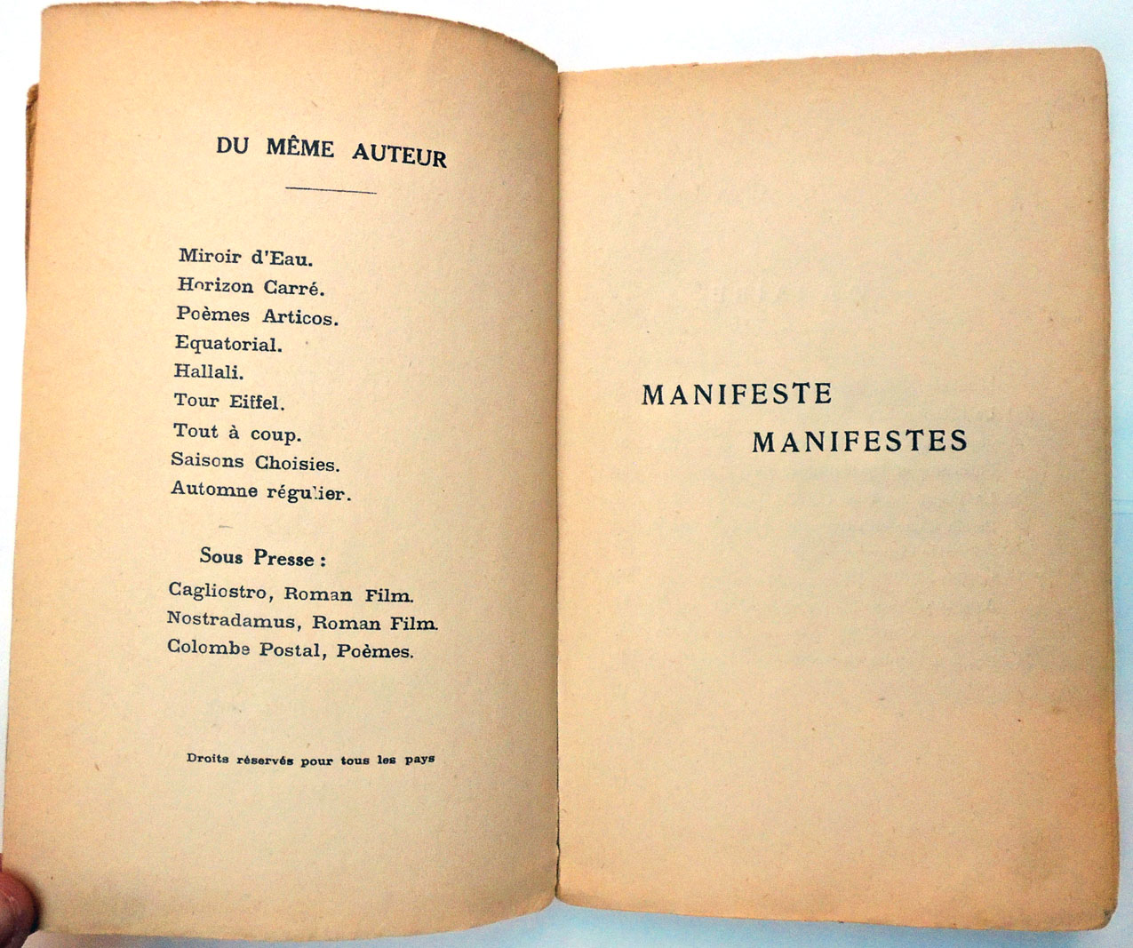
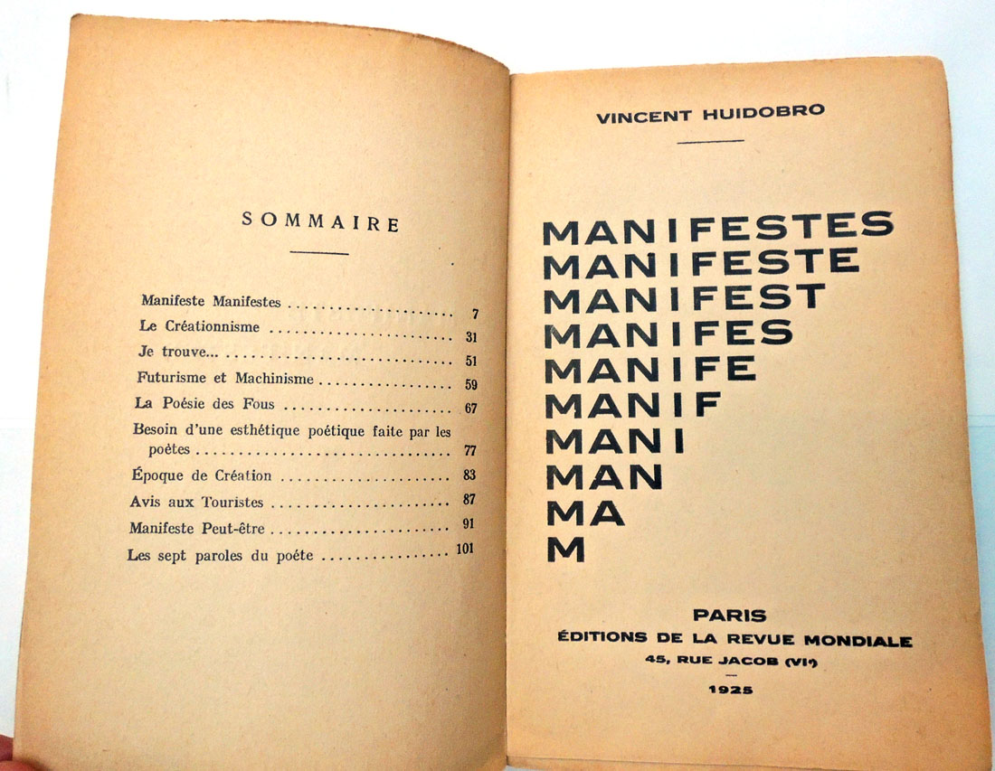
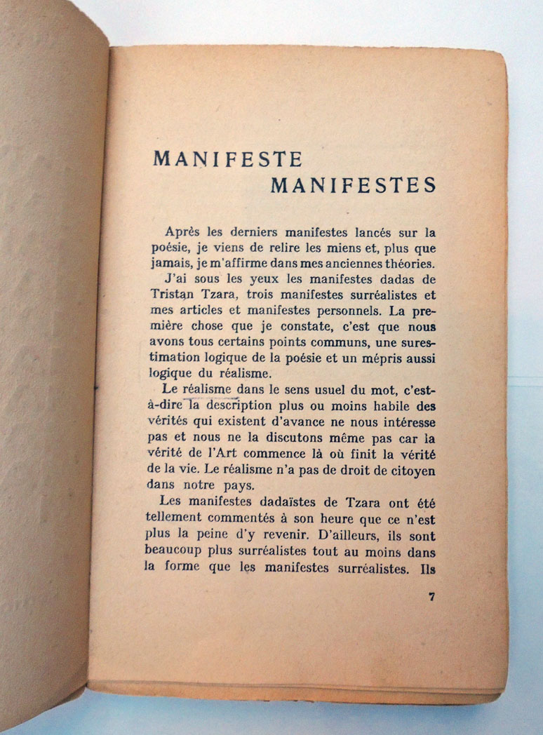
George Hibbert (1757-1837), editor, Tales of the Cordelier Metamorphosed, as Narrated in a Manuscript from the Borromeo Collection: and in The Cordelier Cheval of M. Piron. With translations ([London: Printed at the Shakespeare Press by W. Bulmer and W. Nicol, 1821]). Graphic Arts Collection Cruik 1821 Robert. and Graphic Arts Collection 2018- in process.


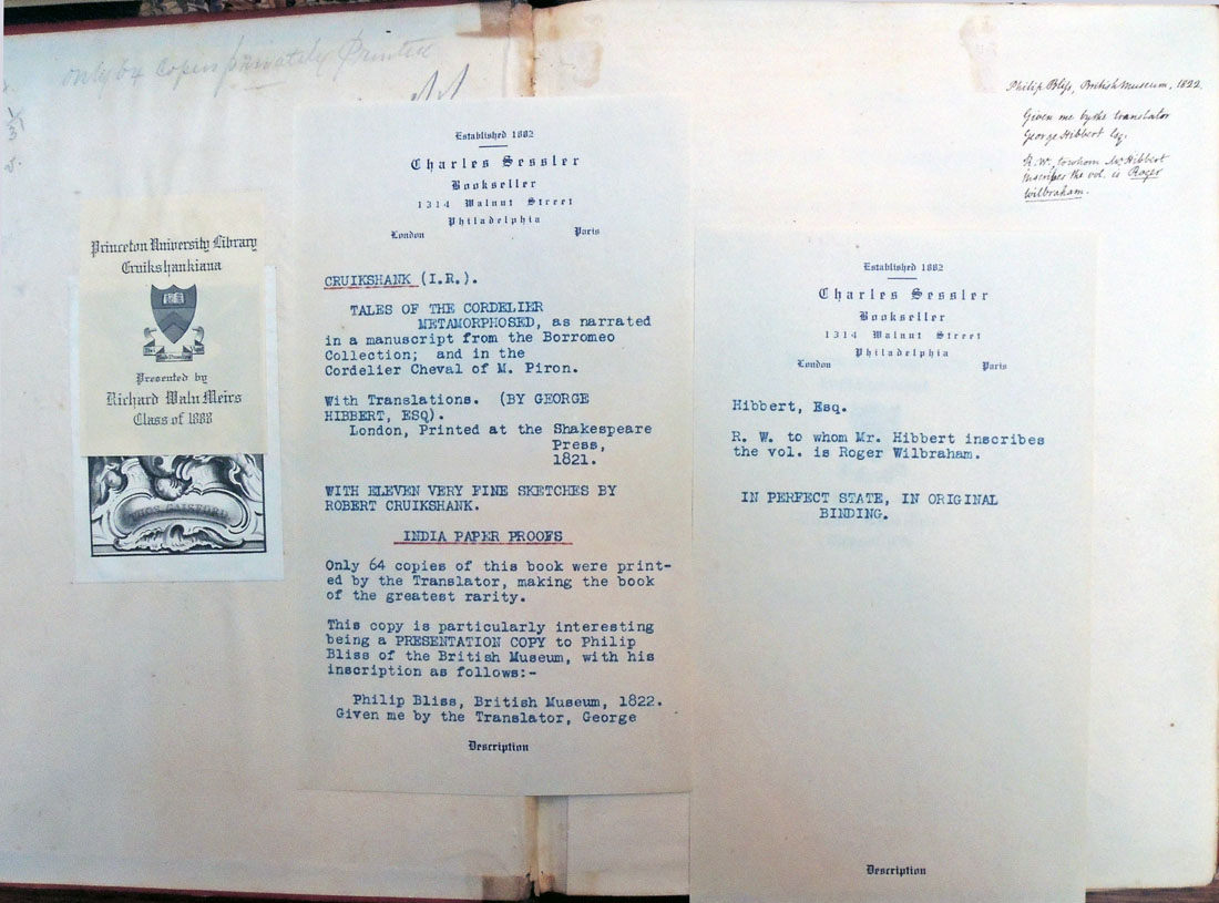
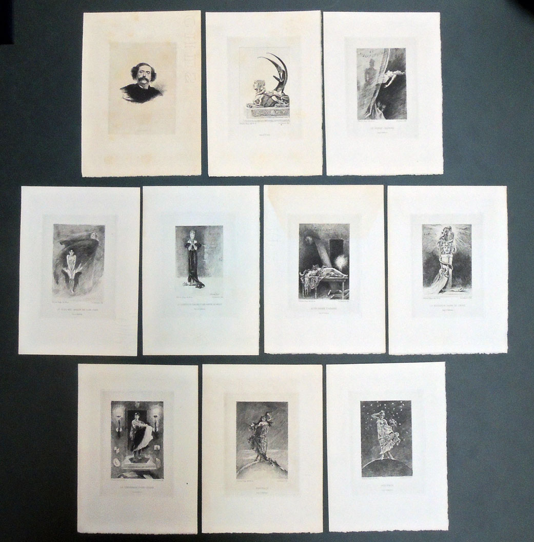
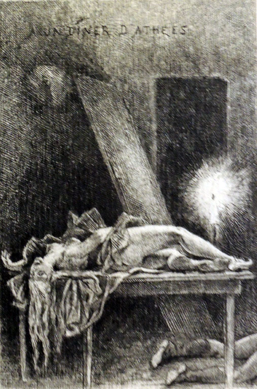
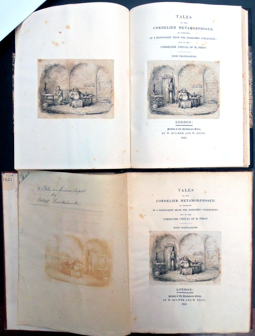
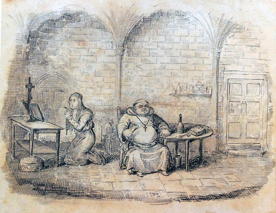
The Graphic Arts Collection now holds two of the sixty-four copies printed of Tales of the Cordelier Metamorphosed, with illustrations by Robert Cruikshank (1789-1856). Our new volume seen at the top includes an unpublished Cruikshank cut, presumably rejected by George Hibbert (1757-1837) for the title page. This is Hibbert’s own copy where he kept both side by side.

These are first (and only) editions of the publication, printed for Hibbert, who was a wealthy Jamaica merchant, rare book collector, and an early member of the Roxburghe Club. The text consists of two tales, one a prose novella attributed to Michele Colombo and the other a French verse tale by Alexis Piron (1689-1773).

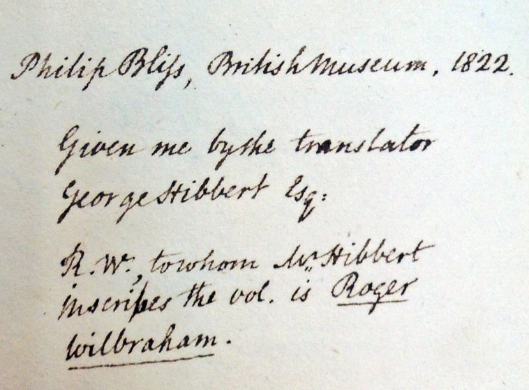
Hibbert writes to Roger Wilbraham:

The Italian Novel, which I believe to be now for the first time printed, existed, in Manuscript, in the Collection of the late Count Borromeo, of Padua; at the sale of which, in 1817, you made some interesting additions to your already valuable store of Italian Literature; and this manuscript, among other trifles, fell to my lot. It stands entitled, in the catalogue of that Sale, no.250. Novella di Gianni andato al Bosco a far legna, &c &c in 4to, MS, indeita, and it is there, upon what authority I know not, attributed, together with some preceding articles of the catalogue, to Michele Colombo.

It attracted my notice, from its close resemblance in the principal incidents of the story, to ‘Le Cordelier Cheval,’ or, as it is sometimes entitled, ‘Le Moine Bride,’ of Alexis Piron, a tale which I have always esteemed as not the least pleasant of that author’s facetious effusions; and suspecting that Piron, like La Fontaine before him, often gathered his subjects from some older record, I have looked in vain among the earlier novelists, for an original hint of this story. Whether the Italian be really such, or merely an imitation, or whether both the narrations be not borrowed from some preceding collection of facetiae, I will not pretend to determine.

According to Lowndes only 64 copies were printed, presumably distributed only to Hibbert’s friends. Hibbert’s copy has the bookplate of ‘Munden’, indicating the Munden estate, Hertfordshire, which he inherited in 1828. When Hibbert moved out of London in 1829, much of his book collection was sold at auction bringing a total of £23,000. This volume stayed in the family into the 20th century.

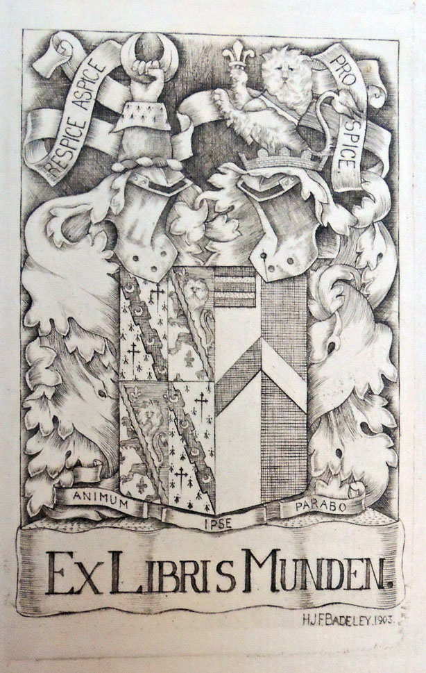
The Munden bookplate was engraved by Baron Henry John Fanshawe Badeley (1874-1951). The motto above is Respice, adspice, prospice (Look to the past, Look to the present, Look to the future). Below: Animum ipse parabo (I myself will provide courage).


Our first copy was a gift of Richard Waln Meirs, Class of 1888, donated to Princeton University Library in 1913. It has an armorial bookplate of Thomase Gaisford (1779-1855) and a presentation inscription to Philip Bliss (1787-1857) on front free endpaper: “Philip Bliss, British Museum, 1822. Given me by the Translator, George Hibbert, Esq. R. W., to whom Mr. Hibbert inscribes the vol. is Roger Wilbraham.”


Photogravures after Félicien Rops

From his bookshop at Passage Choiseul, 23-33, Alphonse Lemerre (1838-1912) sold this portfolio of ten provocative prints for the 1874 short story collection Les Diaboliques by Jules Amédées Barbey d’Aurevilly (1808-1889). The prints are described on the title-page, and by bibliographer Erastène Ramiro, as etchings but except for the frontispiece (a portrait of the author engraved by Raul Rajon (1843-1888)), they are all photogravures with additional etching after drawings by the Belgian artist Felicien Rops (1833-1898).

The copper plates were printed by Alfred Salmon (1825-ca. 1894), who was at this time in partnership with Adolphe Ardail (1835-1911), trading as Salmon & Ardail.

A second edition of Les Diaboliques was published in 1882 and these plates may have been for a third edition but no bound copy of the text with Rops’s plates is recorded. It is possible the project was never completed and so, the plates were issued separately. The nine Rops plates are Sphinx; Le Rideau Cramoisi; Le plus bel amour de Don Juan; Le dessous de cartes d’une partie de whist; A un diner d’athées; Le bonheur dans le crime; Le vengeance d’une femme; Postface; and Postface.

Félicien Rops (1833-1898), Dix eaux-fortes pour illustrer les diaboliques de J. Barbey D’Aurevilly; dessinèes et gravées par Félicien Rops ([Paris: A. Lemmerre, 1886]). One portfolio of ten etchings. Graphic Arts Collection GAX 2018- in process


See also: Erastène Ramiro, Catalogue descriptif et analytique de l’œuvre gravé de Félicien Rops, précédé d’une notice biographique et critique par Erastène Ramiro; orné d’un frontispice et de gravures d’après des compositions inédites de Félicien Rops et de fleurons et culs-de-lampe d’après F. Rops, Jean La Palette et Louis Legrand (Paris: Librairie Conquet, 1887).

La manière de se bien préparer à la mort = How to Prepare Oneself Well for Death


Engravings after Romeyn de Hooghe (1645-1708) and commentary by M. de Chertablon, La Manière de se bien préparer à la mort par des considérations sur la Cène, la Passion et la Mort de Jésus-Christ, (How to Prepare Oneself Well for Death by Contemplating the Last Supper, the Passion and the Death of Christ), avec de très belles estampes emblématiques, expliquées par M. de Chertablon (Anvers [probably Amsterdam]: George Gallet, 1700). Graphic Arts Collection GAX 2018- in process

In 1673, a series of engravings were commissioned from Romeyn de Hooghe for David de la Vigne’s Miroir de la bonne mort. Since then various editions have been published with extended and translated commentaries, and in some cases, new plates re-engraved by unidentified artists. We know the engravings for the 1700 volume, recently acquired by the Graphic Arts Collection, are after de Hooghe and not by him, since they are laterally reversed from the original.

These plates are not as crisp and clear as Hooghe’s originals. Even so, it is the edition that is in most collections and so, known to most readers.

In each scene, a man is dying. An angel appears with a depiction of a biblical passage, encouraging the man to prepare for death in a Christian manner. If you look closely, you might also find a devil in the shadows, tempting the man away from the Christian path.

“In the tradition of ars moriendi that began in the sixteenth century,” writes Yuri Long at the National Gallery of Art, “this book shows the path to a good death through a series of meditations on the Last Supper, the Passion, and the death of Christ. Each print depicts a man contemplating a religious image accompanied by an appropriate verse of scripture and textual commentary. Though de Hooghe was a Protestant, this work is aimed at a Catholic audience and demonstrates his willingness to take commissions regardless of his own political or religious beliefs.” — www.nga.gov/content/ngaweb/exhibitions/2014/romeyn-de-hooghe.html


A detailed interpretation of each plate in the 1700 edition can be found at the Melbourne Prints website, where Benita Champion notes,

“Five images depict the angel accompanying the man while a devil tempts him . . . . This motif is common in ars moriendi works dating from the famous fifteenth century ars moriendi block-book, c.1414-1418. . . . The fight for the soul occurs at the moment of death (Ariès, 1981, pp. 206-208). In the above example (p. 44) the devil tempts the person to despair by showing him his sins. The angel’s response is Matthew 9:2 ‘take heart, son: your sins are forgiven.’”

The frontispieces are more programmatic and individual. The first shows a skeleton (death) knocking at a door, holding an hourglass and scythe. Above the door is written ‘statutum est omnibus hominibus semel mori’ (‘it is appointed unto men once to die’) (Hebrews 9:27). Courtly activity fills the middle ground. To the left a man carries a cross up the hill, towards a ‘radiant pyramid’ with a serpent devouring itself (Scherer, 1973, p.8).

Below the skeleton is an entombment, with skeletons. This scene in fictive relief is framed by conventional foliage and ribbons, but also by skulls, crossbones and a decorative border in the form of vertebrae. Signs of decay abound in skulls and snakes. The road is placed behind this inevitable death. Superficially death conquers all, but the courtiers, if they follow Jesus and the cross, will come to the pyramid, signifying the ‘infinite holiness of the triune God’, with death, now rendered powerless, eating itself (Scherer, 1973, p. 8).”


See also:
Ariès, P. The Hour of our Death, trans. H Weaver, New York: Knopf, 1981.

Coppens, C. Een Ars moriendi met etsen van Romeyn de Hooghe: Verhaal van een boekillustratie, Verhandelingen van de Koninklijke Academie voor Wetenschappen, Letteren en Schone Kunsten van België, Klasse der Schone Kunsten. Brussels: AWLSK, 1995.

Landwehr, J. Romeyn De Hooghe (1645-1708) as Book Illustrator; a Bibliography. Amsterdam: Van Gendt, 1970.

Landwehr, J. Romeyn De Hooghe the Etcher; Contemporary Portrayal of Europe 1662-1707. Leiden: A. Swijthoff, 1973.

Reinis, A. “Reforming the Art of Dying: The Ars Moriendi in the German Reformation (1519-1528),” St Andrews Studies in Reformation History. Aldershot: Ashgate, 2007.

Roth, F. “Pater Abraham a Sancta Clara, 1644-1709.” Monatshefte für deutschen Unterricht 36, no. 6 (1944): 288-303.

Scherer, W. F. “Through the Looking Glass of Abraham à Sancta Clara.” MLN 85, no. 3 (1970): 374-80.

Artists’ books and hand-made posters

The exhibition “This font was handmade by literally chopping off the serifs of Princeton Monticello,” is on view at the Hurley Gallery in the Lewis Arts complex now through February 23, 2018.

The show includes hand-made posters and artists’ books by Princeton University seniors and juniors in the Program in Visual Arts, curated by faculty member Pam Lins. In both, the students explore unique formats for image and text combinations, many going far beyond the usual codex format or flat sheet of paper.

Their website notes, “The senior posters are a response to a project for the students in the Exhibition Issues and Methods Seminar to make a “handmade” poster while considering their upcoming spring thesis shows. The students determined what “handmade” could mean to them at this point in digital culture and gave them a chance to contemplate the history of artists producing their own visual aids in regards to their exhibitions.”

For these class, students also view and study the historical artists’ books in the Rare Book and Special Collections Library at Princeton University. Here are a few samples of their work.

http://arts.princeton.edu/events/junior-book-senior-poster-show/2018-02-07/


Portrait of Niépce in Heliogravure 1856

For the seminal publication, Traité pratique de gravure héliographique sur acier et sur verre (A Practical Treatise on Photogravure Engraving on Steel and on Glass) by Niépce de Saint-Victor (1805-1870), either he or his publisher commissioned a portrait for the frontispiece.

To further celebrate Niépce’s important discoveries in photographic printing, they made the portrait using his own process: “Gravure héliographique d’après une photographie sur acier selon les procédés de Niépce de Ste Victor” (Photogravure engraving after a photograph on steel, according to the methods of Niépce de Ste Victor).


Claude-Félix-Abel Niépce de Saint-Victor (1805-1870), Traité pratique de gravure héliographique sur acier et sur verre / par M. Niépce de Saint-Victor (Paris: Librairie de V. Masson, 1856). Provenance: C. F. Chandler. Graphic Arts Collection 2006-3213N


Note the photograph was taken by Victor Plumier (1821-1878) and a great deal was made about the fact that he did not retouch his negative. The engraving plate was made by Madame [is it Pauline?] Riffaut and the portrait finished by Adolphe-Pierre Riffaut (1821-1859).

If you use a microscope, you will see the hand engraving on top of the aquatint done, in particular, in the beard. In addition, there are gouache highlights delicately added to the paper print in the hair and the beard.


Welcome to Columbia Students


Founded by an endowment from LeRoy and Janet Neiman, Columbia University’s LeRoy Neiman Center for Print Studies promotes printmaking through education, production and exhibition of prints. http://www.columbia.edu/cu/arts/neiman/about.html Twelve students and their instructor Ben Hagari made the trip south to visit the Graphic Arts Collection of pre-cinema and optical devices on Tuesday.

The class, Print into Motion, encourages undergraduates to “use printmaking techniques to create animation works, optical devices and projections.” The students have already begun creating their own thaumatropes and other phantasmagoria. Future projects will take inspiration from our metamorphosis cards, transformation images, and flap books. Here are a few moments from the class.


Ben Hagari is a New York-based artist, who was born in Tel Aviv, Israel. His work “dissolves the distinction between theatrical facades and backstage by creating spaces where magic, subterfuge, and poetry collide.” Hagari’s solo and group exhibitions include Afterwards, Total Museum of Contemporary Art, Seoul, Korea (2012); Invert, Rosenfeld Gallery, Tel Aviv (2011); The Museum Presents Itself: Israeli, Art from the Museum Collection, Tel Aviv Museum of Art (2011, 2012, 2013, 2014); and in December 2017, 24:7 in New York City’s Time Square. https://arts.columbia.edu/news/vaben-hagari-%E2%80%9814-video-installation-times-square

It Seems Ridiculous

Endpapers front and back

I.N. Veroy and G. Ryklin, Kazhetsi︠a︡ smeshno: posvi︠a︡shchaetsi︠a︡ desi︠a︡tiletii︠u︡ Moskovskogo teatra satiry = Кажется смешно: посвящается десятилетию Московского театра сатиры [It Seems Ridiculous: Dedicated to the Tenth Anniversary of the Moscow Theater of Satire] (Moskva: Izd. Moskovskogo teatra satiry, 1935). Graphic Arts Collection GA 2018- in process

Several volumes on Russian film and theater history recently entered the Graphic Arts Collection, including the first and only edition of this photoessay on the Moscow Satire Theatre. Although 5000 copies are said to be published, the volume is rare. The photomontages, including wonderful endpapers, are by Chekryzov; the lettering on the title and the binding by L. Brodaty; and the graphics and illustrations by Brodaty, Ganf, Eliseev, Kukryniksy and Williams.


“On Triumphalnaya Square, between the Tchaikovsky Concert Hall and the “Aquarium” garden the Satire Theater is located. The building, which is over a hundred years old, got a modern look in 1960 upon the project of the architect V. Stepanov. The blind screen facade on the right was decorated with an illuminated square panel with the inscription “The Satire Theater”, on the left side of the façade planted theatrical masks were placed. The huge dome of the building testifies its age – it recalls the former famous circus of brothers Nikitin, built in 1910s by architect B. Nilus together with A. Gurzhienko.

Circus was located in the most popular amusement garden of Moscow – “Aquarium”, which thundered in different years throughout the capital for its theatrical programs. “Aquarium” was attended by thousands of Muscovites to watch the performances of the big-city and touring troupes of actors, acrobats, jugglers, trained animals, to have a dinner in the restaurant with live music in the shade of old trees and gurgling fountains.

Guests could also rise over Moscow on an air-balloon, make a keepsake photograph and admire the fireworks in the evening. “Aquarium” had a reputation of a “theatrical oasis”. The garden became famous for operettas of M. Lentovsky theater, ballet by Lydia Geiten, Frenchman Charles Aumont enterprise (he was the one who built the “Buff” and “Olympia” theaters), opera of Zimin theater and gypsy romances of the Blumenthal-Tamarin theatre.

In 1924 brothers Nikitin circus arena has been adapted for the first Soviet music hall, and in 1930 the building housed the Operetta Theater. In 1965 under the old dome a new hall was opened – the Satire Theater at last got a permanent residence after long process of moves.”

For more history on this Moscow institution, which is still in operation, see: https://um.mos.ru/en/houses/theatre-of-satire/


Clinker Press

The Graphic Arts Collection recently acquired a selection of fine press editions from Clinker Press in Pasadena, California. Andre Chaves runs this a private letterpress studio, with an emphasis on material relating to the Arts and Crafts Movement. He writes, “Within this focus I print subjects relating to art and literature. Although I do not do job printing, some special projects would be considered upon their own merits, as long as it falls within these parameters.” For a complete list of books still in print, see: https://www.clinkerpress.com/

“Clinker Press was started in 1996,” Chaves continues, “urged by Peter Hay, Carl Heinz and Helen Driscoll. Peter owned Book Alley, an antiquarian bookstore, and is an Oxford graduate who allowed me to use a small Kelsey press. Helen owned a paper store and now runs a very successful company called Invitesite. Carl teaches the History of design. We printed together and I provided the “garage” in a Greene and Greene house surrounded by ‘clinker bricks’. I first invested in a Chandler and Price platen and we started printing. Peter was the first to drop off, followed by Helen and then by Carl, although Carl continues to print on his own and Helen’s business is also about printing.”

Here are a few examples.

Autogravures from the Autotype Company

On Tuesday February 25, 1919, Virginia Wolff wrote in her diary:

Of no 23 Cromwell Houses . . . I will only say that it is furnished on the great South Kensington principle of being on the safe side & doing the thing handsomely. Good Mrs. Samuel Bruce went to the Autotype Company & ordered the entire Dutch school to be sent round framed in fumed oak. And so they were; & just covered the staircase walls, leaving an inch or two’s margin in between. –Anne Oliver Bell, The Diary of Virginia Woolf (1980).

Founded in 1868 as the Autotype Printing and Publishing Company, several shops merged and expanded over the next few years before settling as The Autotype Company at 74 New Oxford Street, London. This fashionable address became the place to go in the late 19th and early 20th centuries to buy reproductions of fine art to hang in your home. The managing partners of this enormous operation were John Alexander Spencer (182?-1884), John Robert Mather Sawyer (1828-1881), and Walter Strickland Bird (1828-1912).

Initially, the company purchased Joseph Swan’s copyright on carbon printing and an Autotype, in general, means a carbon print. Eventually the firm added collotypes and photogravure (called Autogravure) to their roster, selling framed prints, portfolios, and bound volumes to the social elite, including some of the most beautiful books of the period.


As the quality of their prints rose to challenge the superiority of the French Goupil Company, the Autotype company advertised their ability to ‘bring Paris to London’ and to prove it, published a portfolio of ten photogravures reproducing etchings by the preeminent French printmaker Charles Meryon (1821-1868).


Charles Méryon (1821-1868), Old Paris. Ten etchings by C. Meryon. Reproduced on copper by the autogravure process and accompanied with preface and illustrative notes by Stopford A. Brooke … ([London: Autotype Co., 1887]). Rare Books and Special Collections Oversize 1514.636e

Peter Henry Emerson (1856-1936) worked with the Autotype company that same year to publish his Idyls of the Norfolk Broads (1887) but was only partially satisfied.

The following year, he was introduced Charles L. Colls at the rival Typographic Etching Company, who printed his negatives for a special edition of The Compleat Angler.

Possibly to compare the talents of the two companies, Emerson had half his negatives for Pictures of East Anglian Life (1888) printed by the Autotype Company and the other half by Type-Etching Company.

Still unsatisfied, Colls taught the photographer to make his own copper plate photogravures and from that time on, Emerson did his own printing.


Vincent Huidobro “Manifestes”

Vincent Huidobro (1893-1948), Manifestes, Manifeste, Manifest, Manifes, Manife, Manif, Mani, Man, Ma, M. (Paris: Editions de la Revue Mondiale, 1925). Purchased with funds provided by the Program for Latin American Studies (PLAS). Graphic Arts Collection GAX 2018- in process.

We thought we had collected every volume published by the Chilean writer Vicente Huidobro (1893-1948) and then, this rare collection of manifestos turned up including a French translation of his best-known manifesto on Creacionismo (Creationism), as well as Manifestos manifest, The Poetry of Madmen, Tourist Advisory, and The Seven Oaths of the Poet among others.

For another volume in our collection, see: https://www.princeton.edu/~graphicarts/2010/08/vincente_huidobro.html

Printed (not drawn) verso of paper cover.


Huidobro was only 23 years old when he left South America for Europe. From 1916 to 1925, the young poet lived with his wife and children in Paris, quickly aligning himself with the circle of Cubist artists and writers. He remembered:

“It was the heroic epoch, in which we struggled for a new art and a new world. The thunder of the cannons didn’t drown the voices of our spirit. Intelligence stood its group, at least in France. I formed part of the Cubist group, the only one that’s had a real importance in the history of contemporary art. In 1916 and 1917, I published in Paris, along with Apollinaire and Reverdy, the magazine Nord-Sud, which today is considered one of the principal organs of the great struggle for revolutionary art in those days. My closest friends were Juan Gris and Jacques Lipchitz. Lipchitz and I were the youngest in the group. They called me the “blanc-bec,” which could be translated as the Benjamin of the family. . . .

Apollinaire would come to dinner on Saturdays. Max Jacob, Reverdy, and Paul Dermée would often come as well. Occasionally, Blaise Cendrars, Marcoussis, and Maurice Raynal would show up, just home from the front. Then I met Picasso who was returning form Southern France and about to put on the famous “Parade” ballet to the music of Erik Satie, another old and dear friend…”–The Selected Poetry of Vicente Huidobro (New Directions Publishing, 1981).

Nord-Sud (Sylvia Beach Collection Oversize 0904.682q)

Huidobro believed poets had a heightened state of consciousness, or super-consciousness, which he wrote about it in his Manifesto of Manifestos:

“Super-consciousness is reached when our intellectual capabilities acquire a superior vibratory intensity, a wavelength, a wave clarity, infinitely more powerful than ordinarily. In the poet, this stage can take place, can be triggered be a cause that is, at times, insignificant and invisible for the poet himself.”

Read: The International Yearbook of Futurism Studies, 2017, Mariana Aguirre, Rosa Sarabia, Renée M. Silverman, Ricardo Vasconcelos (Walter de Gruyter, 2017) SA NX456.5.F8 I589