Monthly Archives: August 2013

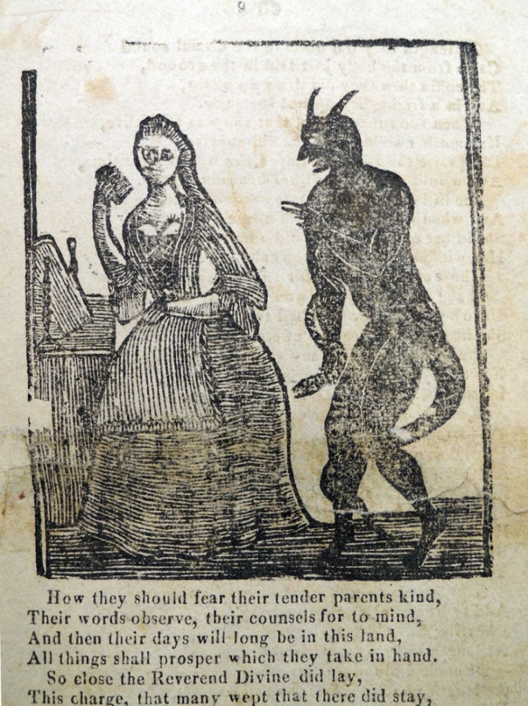
Was “The Prodigal Daughter” illustrated by Pompey Fleet?

fleet prodigal1  fleet prodigal5  fleet prodigal7

Hamilton51(3) not later than 1810; Hamilton51(1) not later than 1769; Hamilton51(2) 1735-1769?

Princeton is fortunate to own three early American illustrated editions of The Prodigal Daughter, thanks to collector and donor Sinclair Hamilton. In the introduction to Early American Book Illustrators and Wood Engravers, Hamilton writes,

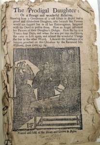
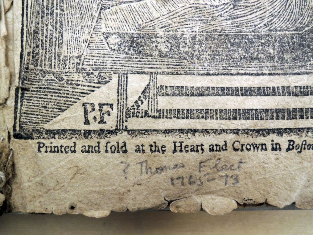
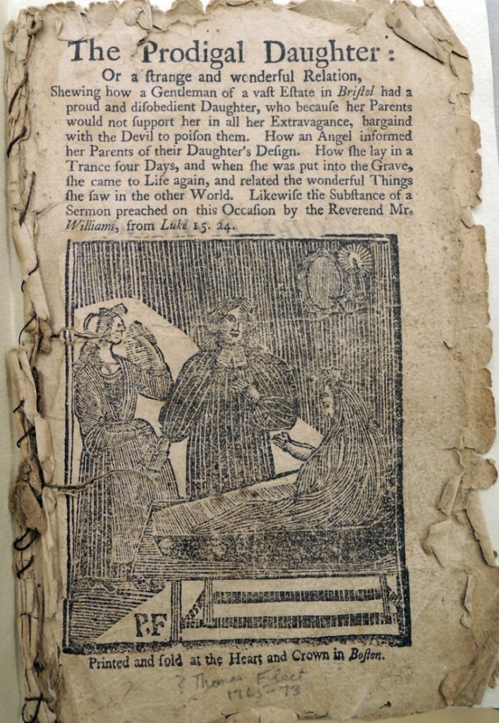
Thomas Fleet of Boston and, after him, his sons, Thomas Fleet, Jr. and John Fleet… owned several Negroes, one of whom was an ingenious man who cut on wooden blocks the pictures which Fleet published. Two sons of this ingenious Negro, named Pompey and Cesar, were also employed at the printing office. We find some editions of that well-known chapbook “The Prodigal Daughter” issued from the Heart and Crown certainly not later than 1769 with a woodcut bearing the initials “P.F.” and it is possible that this is the work of Pompey Fleet, or perhaps the work of that ingenious Negro himself, Pompey’s father, who may have borne a similar name.
fleet prodigal6


fleet prodigal5
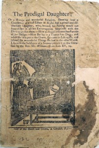
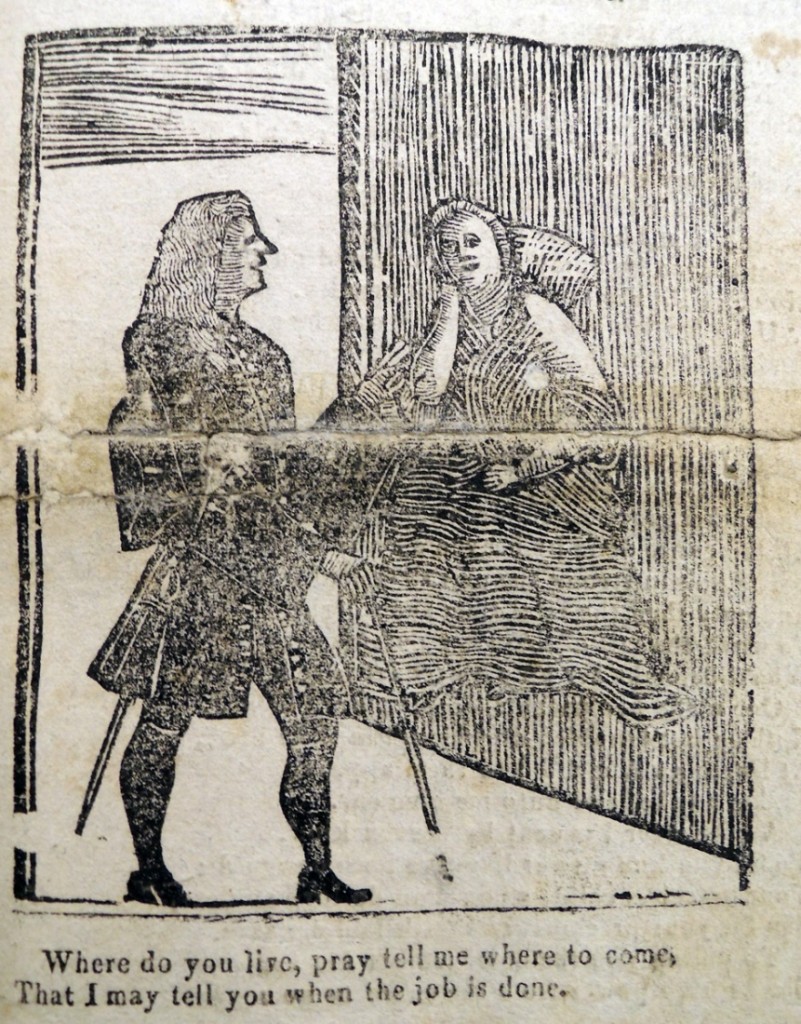
The Prodigal Daughter; or a strange and wonderful Relation, Shewing how a Gentleman of a vast Estate in Bristol, had a proud and disobedient Daughter, who, because her Parents would not support her in all her Extravagance, bargained with the Devil to poison them. -How an Angel informed her parents of her Design.-How she lay in a trance four Days; and when she was put in the Grave, she came to Life again, and related the wonderful Things she saw in the other World. Likewise the Substance of a Sermon preach’d on this Occasion by the Rev. Mr. Williams, from Luke XV, 24. Sold at the Heart and Crown, in Cornhill, Boston. Graphic Arts Hamilton 51.1-3.
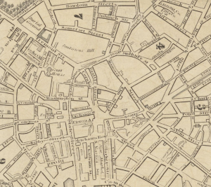
1832_ElmSt_map_Boston_Stimpson_BPL10944Thomas Fleet, Sr. had his printing and publishing house at the Heart and Crown, Cornhill, from 1731 to 1751 and thereafter Thomas Fleet, Jr. and John Fleet had their establishment at the Heart and Crown from 1757 to 1776. Cornhill ran from Water Street to Dock Square, laid out in 1708 as part of a winding road between Roxbury and Boston.

Evans lists an edition of The Prodigal Daughter with cuts, printed in Boston by T. Fleet in 1736, but locates no copy. Evans lists no other editions prior to 1770.

fleet prodigal3

fleet prodigal2


Raumbild Verlag (Stereoview publishing)

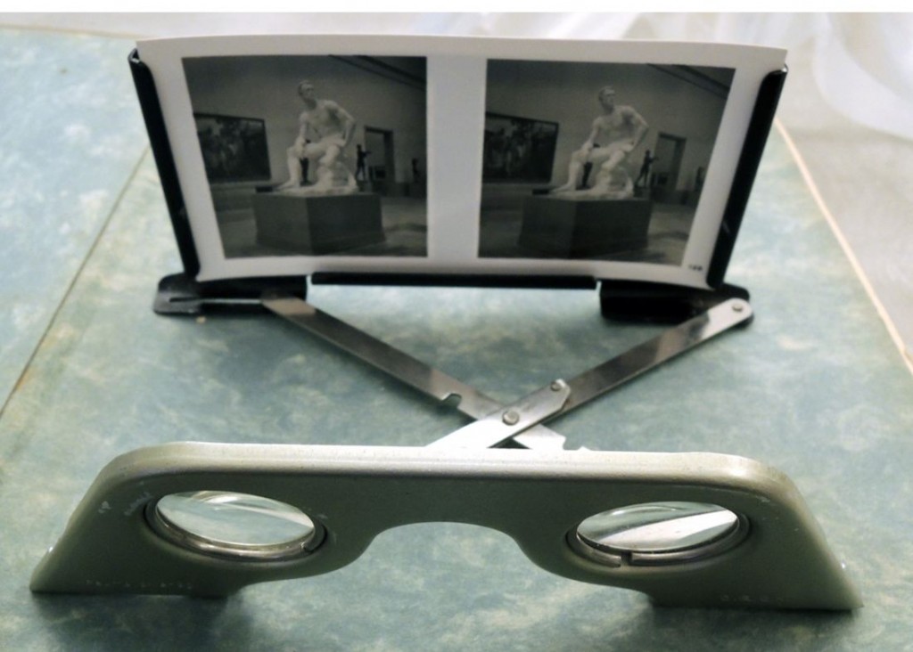
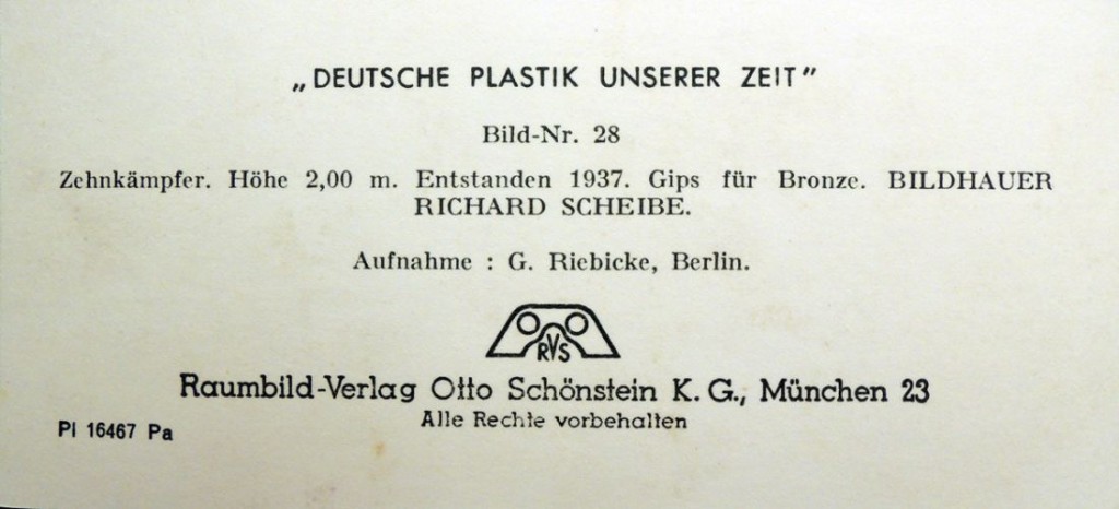
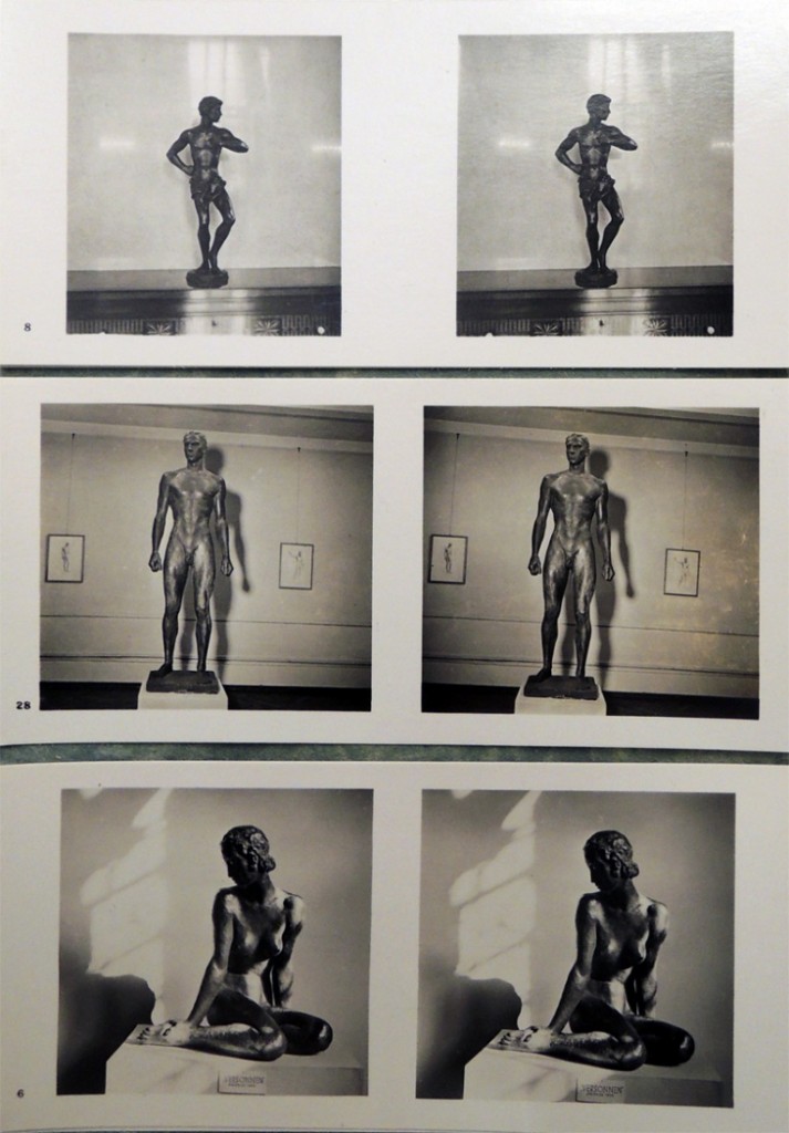
deutsche plastik 6Raumbild Verlag (Stereoview publishing) was established by Otto Wilhelm Schönstein (1891-1958) in the 1930s (the earliest book I found is 1935). Their offices moved several times, eventually settling in Munich by the end of the decade.

deutsche plastik 4

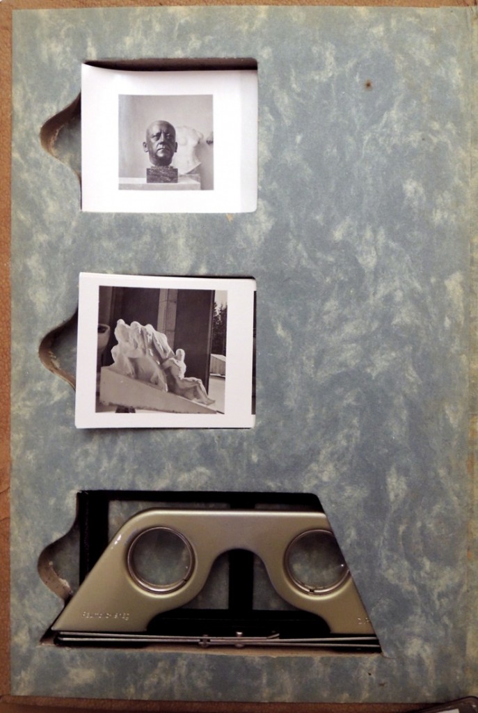
Each of his books was designed with extra thick boards, die-cut so that small stereographs could be inserted at the front and back, along with a stereo viewer (Raumbildbetrachter). Many of the titles included the photography of Heinrich Hoffmann (1885-1957), Adolf Hitler’s official photographer.

Thanks to the generous donation of professor Anson Rabinbach, Department of History, we now hold our third photobook from Schönstein’s firm, this one documenting Deutsche Plastik Unserer zeit (German Sculpture of Our Time).

The art exhibition was organized by Arno Breker (1900-1991) and hosted by the Nazi Party, highlighting the work of German sculptors. For an interesting article about Breker’s work, see  http://www.nytimes.com/2006/07/24/world/europe/24germany.html?_r=0


deutsche plastik 5

Kurt Lothar Tank (1910-) and Wilfrid Bade (1906-1945), Deutsche Plastik unserer Zeit (München: O. Schönstein, 1942). “Mit 150 Raumbildaufnahmen und acht Tafeln.” Graphic Arts Collection GAX 2013- in process. Gift of Anson G. Rabinbach.

deutsche plastik 3
deutsche plastik1

Other volumes published by Raumbild Verlag include:

Vendig; ein raumerlebnis by Kurt Lothar Tank (1935)

Reichsparteitag der ehre by Heinrich Hoffmann (1936)

Die Olympischen spiele 1936 by Ludwig Haymann (1936)

München, die Hauptstadt der Bewegung by Heinrich Hoffmann (1937)

Die Weltausstellung: Paris 1937 by E.P. Frank (1937)

Deutsche Gaue by Alfons Czibulka (1938)

Parteitag Grossdeutschland by Henrich Hansen (1939)

Aus der lebensgemeinschaft des waldes by Kurt Dieterich (1939)

Der erste Großdeutsche Reichskriegertag by Heinrich Hoffmann (1939)

Die Soldaten des Führers im Felde by Hasso von Wedel (1940)

Der Kampf im Westen by Hasso von Wedel (1940)

Die Kriegsmarine by Fritz-Otto Busch (1942)

Der Stadt Nürnberg Ursprung und Werdegang by Fritz Schulz (1949)

Hausärztliches Taschenbuch by Wilhelm Ermer (1950)

Deutschland erwacht (Germany Wakes)

deutschland 4

Standartenweihe im Luitpoldhain 1933. Half-tone panorama in six plates, approximately 137 cm.

deutschland 2

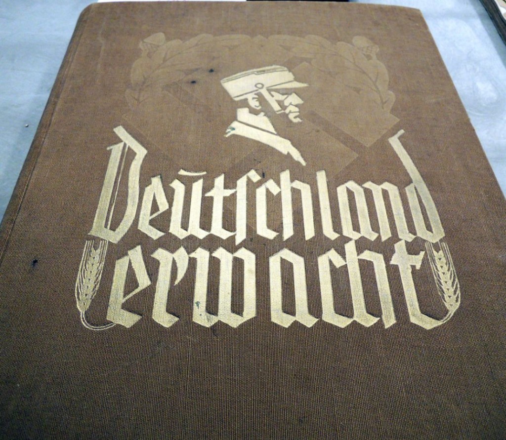
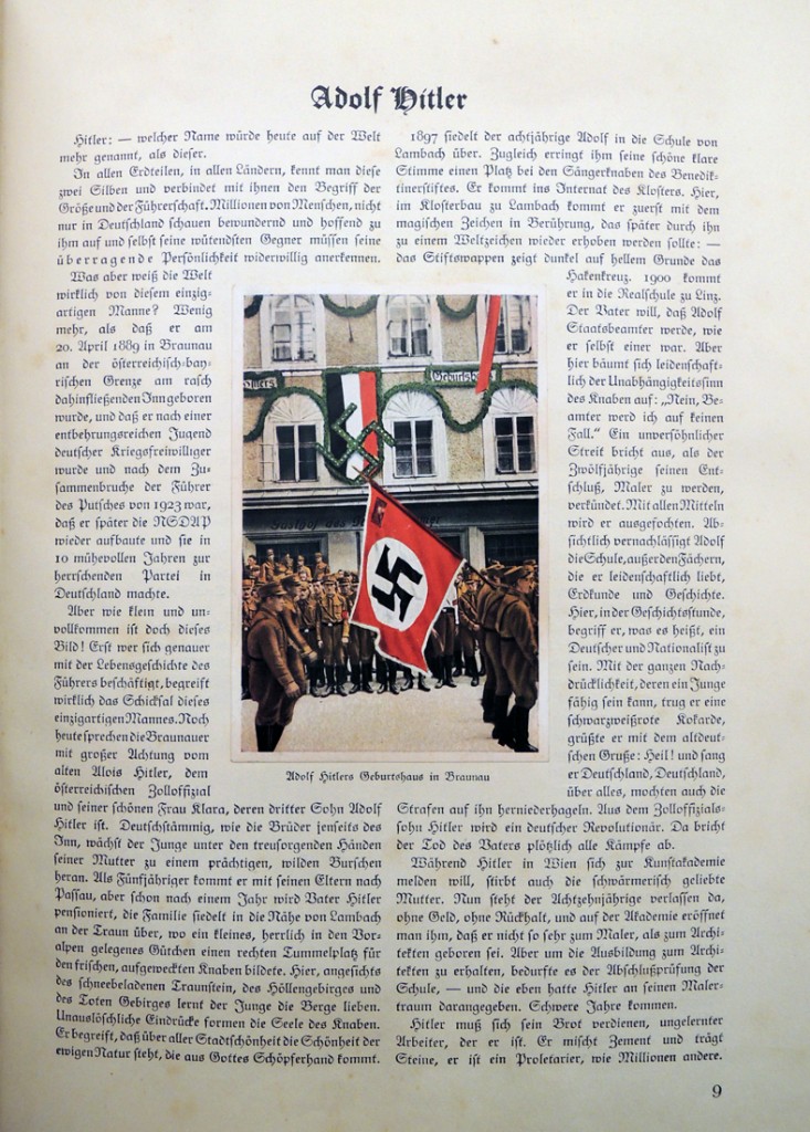
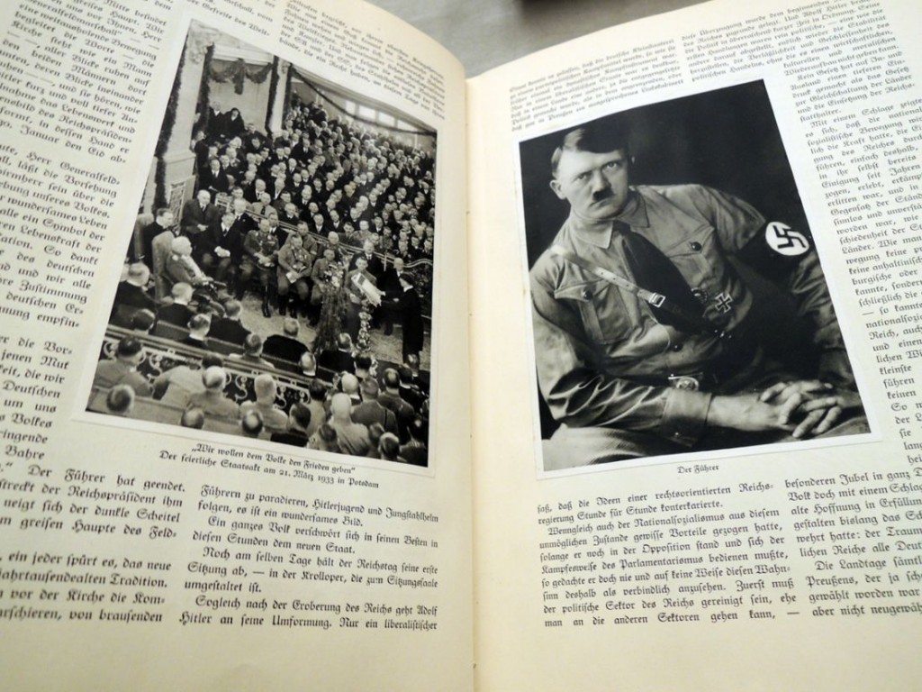
Deutschland erwacht. Werden, kampf und sieg der N S D A P … ( [Altona-Bahrenfeld? Cigaretten-bilderdienst Altona-Bahrenfeld, 1933]) Notes: “Die auswahl und künstlerische durcharbeitung der lichtbilder übernahm Heinrich Hoffmann … Der verfasser des textes ist Wilfrid Bade.” Graphic Arts GAX 2013- in process. Gift of Anson Rabinbach.

deutschland 3

Princeton professor Anson Rabinbach, Department of History, is a specialist in modern European history with an emphasis on intellectual and cultural history. He has published extensively on Nazi Germany, Austria, and European thought in the nineteenth and twentieth centuries. His newest volume, due out any day, entitled The Third Reich Sourcebook (with Sander L. Gilman), is a collection of more than 400 documents with critical introductions. Thanks to Professor Rabinbach, we have acquired a number of rare books, the first pictured here.

Deutschland erwacht (Germany Wakes) is a collaboration between the author Wilfrid Bath and the photographer Heinrich Hoffmann, chronicling the “struggle and victory of the NSDAP” (Nationalsozialistische Deutsche Arbeiterpartei  or Nazi Party).

The book documents the founding of the party; the Reichstag election of 20 May 1928; selections from Mein Kampf; and both public and private moments in the life of Adolf Hitler along with much more. One highlight is the panorama at the back depicting a massive rally in 1933 at Luitpoldhain.

Our sincere thanks to Prof. Rabinbach and to Elizabeth Bennett, Librarian for History and History of Science, who coordinated the gift.

deutschland 5


Picturing a Sentimental Journey

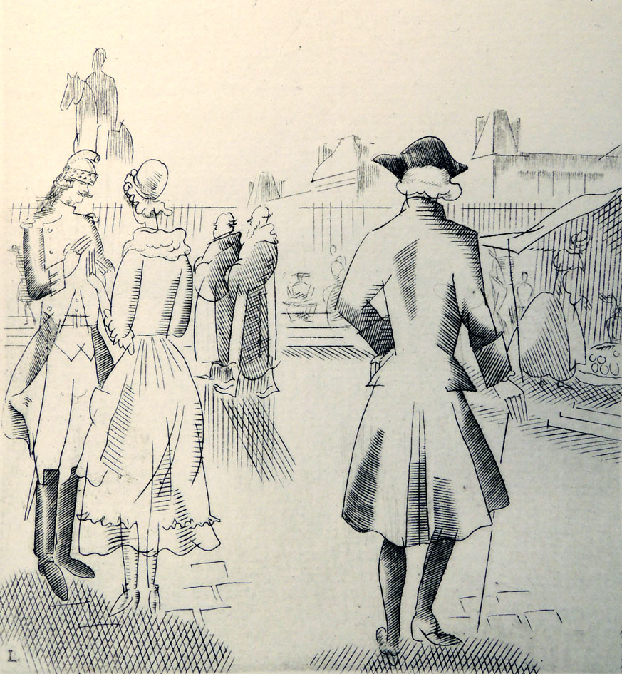
sterne-sentimental8Artist: Jean Emile Laboureur (1877-1943). Laurence Sterne (1713-1768), A Sentimental Journey through France and Italy (Waltham Saint Lawrence, Reading, Berkshire: Golden Cockerel Press, 1928). Copy 392 of 500. Graphic Arts Collection (GAX) 2007-0497N

When Sentimental Journey was first published, there were no pictures. The first Dublin edition included decoration. Since then, many artists have been invited to embellish the novel. Here are a few examples.

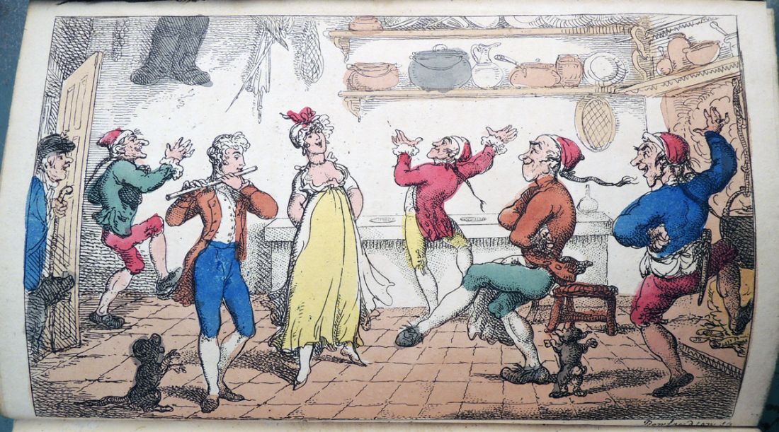
sterne sentimental 1Artist: Thomas Rowlandson (1756-1827). Laurence Sterne (1713-1768), A Sentimental Journey through France and Italy / by Mr. Yorick. A new ed. embellished with two caricature prints, by Rowlandson (London: T. Tegg, 1809). Graphic Arts Collection (GA) Rowlandson 1809.3
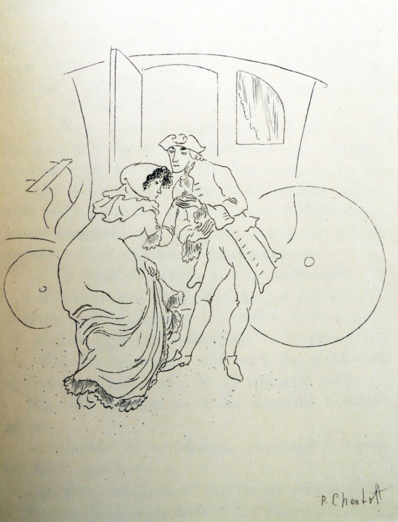
 

sterne sentimental 5Artist: Polia Chentoff (1896-1933). Laurence Sterne (1713-1768), A Sentimental Journey through France and Italy (Paris: Black Sun Press/Editions Narcisse; New York: Sold at Bookshop of Harry F. Marks, 1929). “15 special copies on Japan paper each copy supplemented by one of the fifteen original drawings and signed by the artist”–Colophon. Rare Books (Ex) 3943.7.385.1929


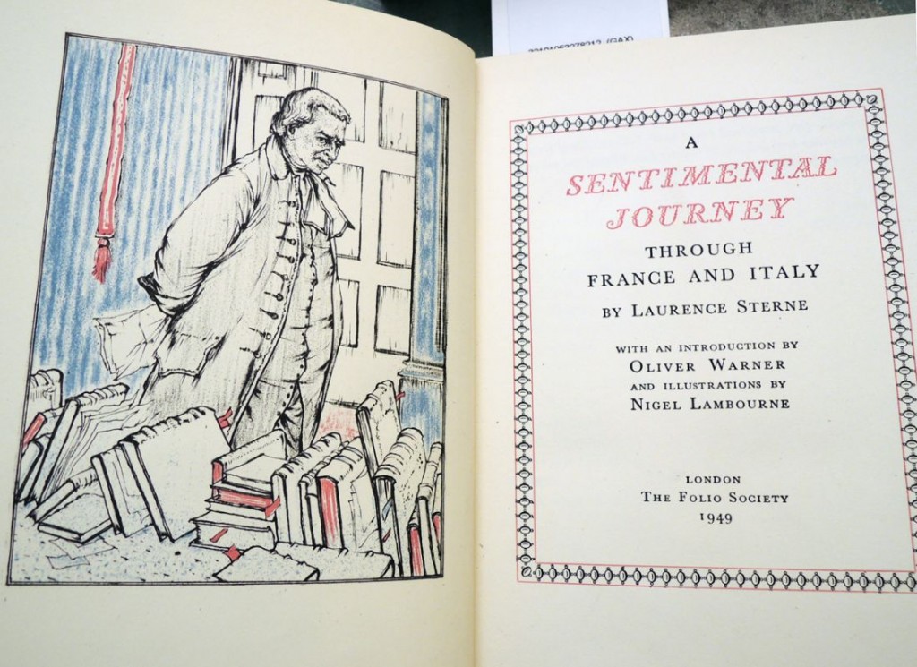
sterne sentimental 6Artist: Nigel Lambourne (1919-19??). Laurence Sterne (1713-1768), A Sentimental Journey through France and Italy. With an introduction by Oliver Warner (London: Folio Society, 1949). Graphic Arts Collection (GAX) 2007-0269N

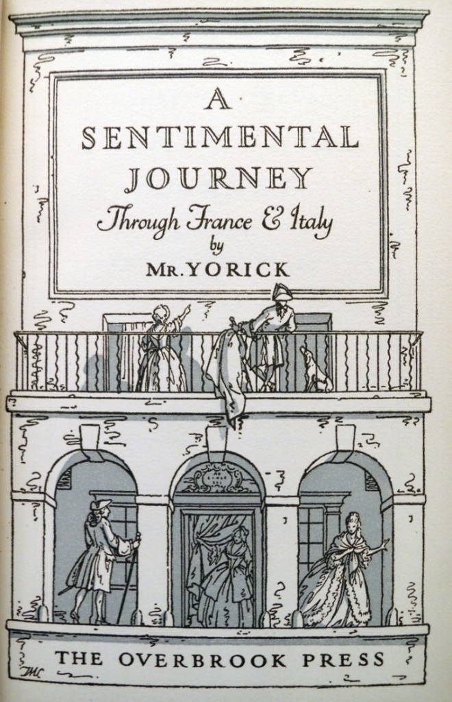
sterne sentimental 8Artist: T.M. Cleland (1880-1964). Laurence Sterne (1713-1768), A Sentimental Journey through France and Italy (Stamford [Conn.]: Overbrook Press, 1936). “175 copies have been printed on dampened hand-made paper.”–Colophon. Graphic Arts Collection (GAX) PR3714 .S468 1936

sterne sentimental 2Artist: Thomas Rowlandson (1756-1827). Laurence Sterne (1713-1768), A Sentimental Journey through France and Italy / by Mr. Yorick. A new ed. embellished with two caricature prints (London: T. Tegg, 1809). Graphic Arts Collection (GA) Rowlandson 1809.3
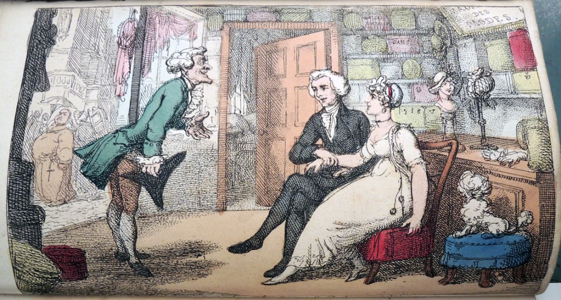
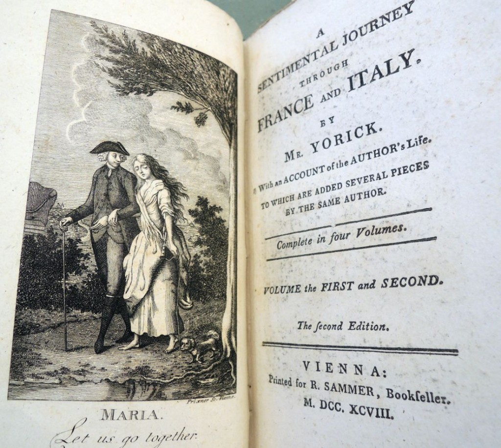
sterne sentimental 3Artist: Unidentified. Laurence Sterne (1713-1768), A Sentimental Journey through France and Italy (Vienna: printed for Sammer, 1798). Rare Books (Ex) 3943.7.385.125

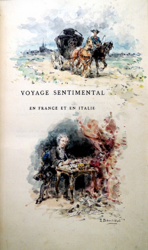
sterne sentimental 4Artist: Émile Benassit (1833-1902). Laurence Sterne (1713-1768), Voyage sentimental en France et en Italie, traduction nouvelle par Alfred Hédouin (Paris: Librairie des bibliophiles, 1875). Graphic Arts Collection (GAX) 2011-0811N

Le dur désir de durer

eluard chagall1

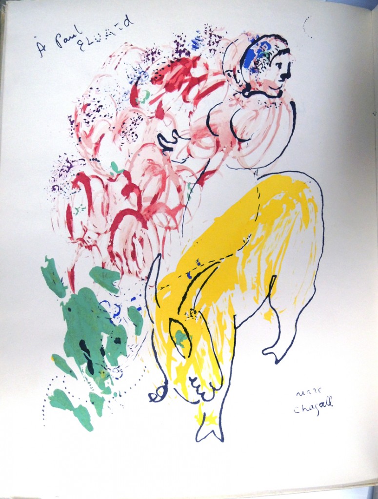
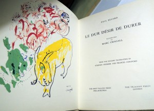
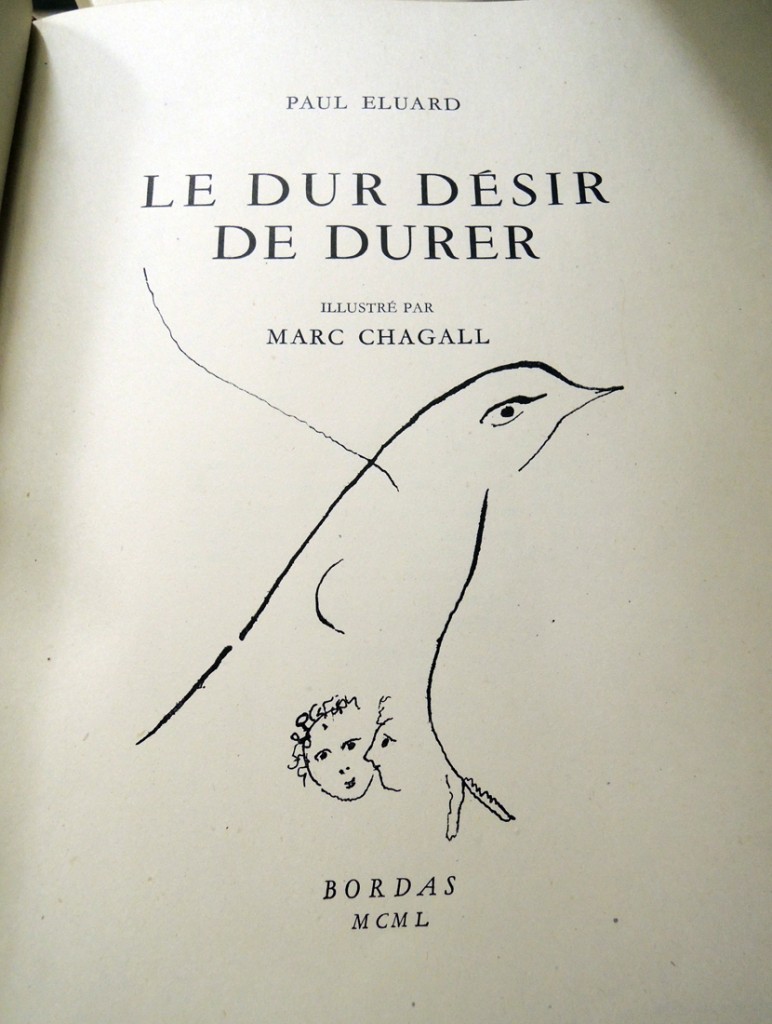
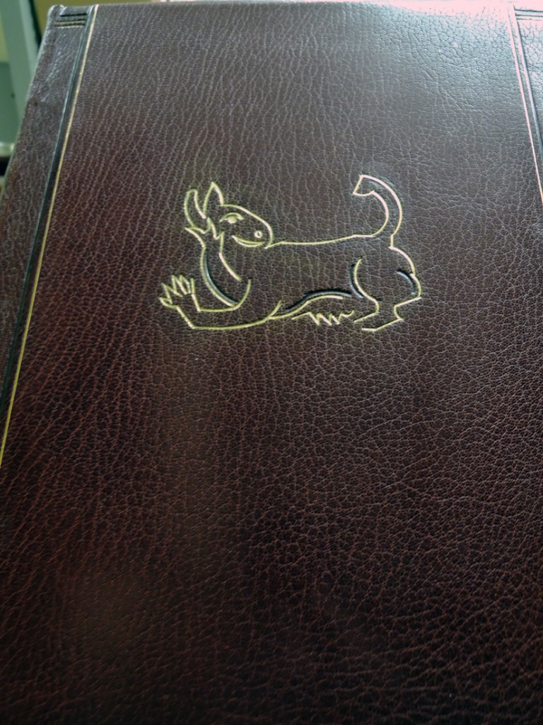
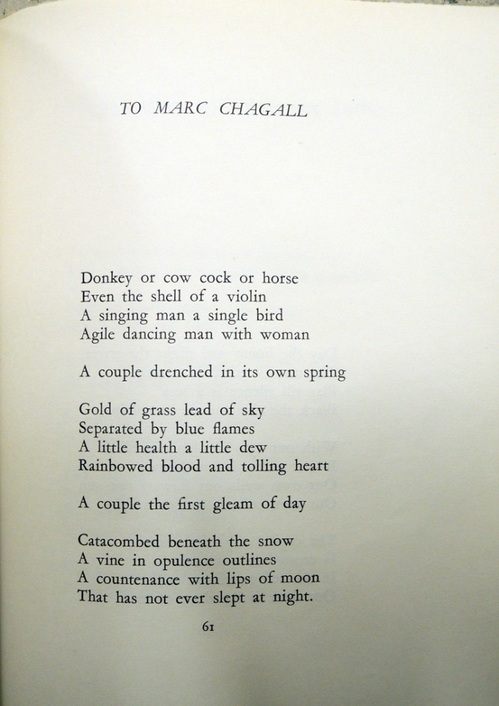
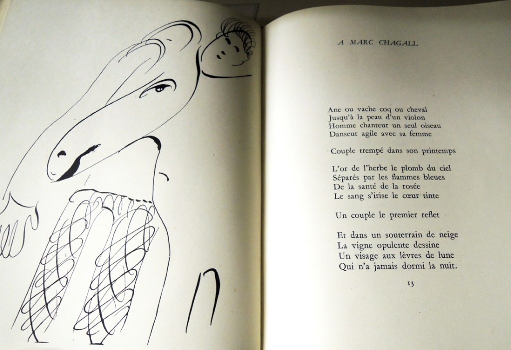
The 1946 Paris partnership of Arnold Fawcus (1917-1979) and Pierre Bordas (1913-2000) led to only one Arnold-Bordas Edition, a livre d’artiste pairing Paul Eluard (1895-1952) poetry with drawings by Marc Chagall (1887-1985) entitled Le dur désir de durer (The Hard Desire to Endure). When Bordas left the following year, Fawcus established the Trianon Press in London and to increase distribution, several American companies including Grey Falcon Press in Philadelphia. By 1950, a second larger edition of Le dur désir de durer was released with an English translation.

eluard chagall2
eluard chagall5        eluard chagall7

Both editions include one pochoir (stencil) colored plate created at the studio of Daniel Jacomet (1894-1966), under Chagall’s supervision. Jacomet worked primarily on fine art reproductions for museums, preparing a collotype of the original painting or watercolor, which was then hand colored through a series of stencils to replicate the original. Editions were usually 300-500 and Jacomet had a large studio of women who did the cutting and coloring once he designed the stencils. The studio continues to operate under Jacomet’s son Bruno.

To get both Chagall prints, one needs to have both editions of the book.

eluard chagall4

For more information, read Sebastian Carter “Arnold Fawcus and the Trianon Press,” in Matrix 3 (GAX Oversize Z119 .M38q) and Emily Anderson, The Pursuit of Happy Results (Boston: David R. Godine, Published for members of Hoc Volo, [1991]) (Graphic Arts Collection (GA) NC139.S635 A54 1991)


eluard chagall10    eluard chagall9 eluard chagall8

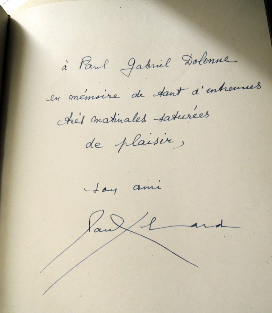
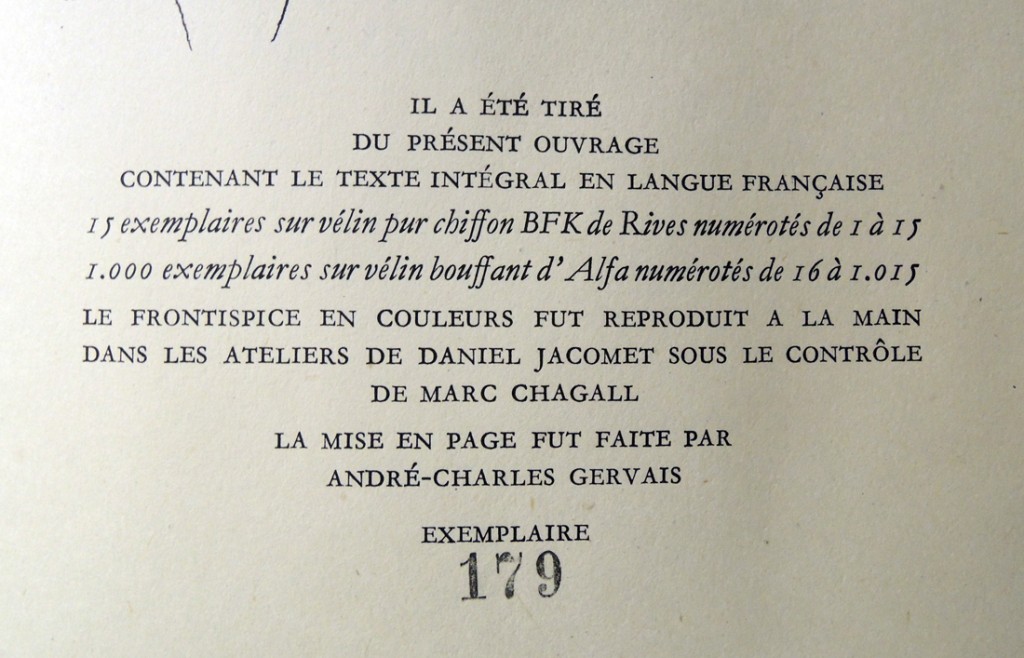
Paul Éluard (1895-1952), Le dur désir de durer. Illustré par Marc Chagall ([Paris] Bordas, 1946, 1950). “Il a été tiré du présent ouvrage … 1.000 exemplaies sur vélin bouffant d’Alfa numérotés de 16 à 1.015 … Le frontispice en couleurs fut reproduit à la main dans les ateliers de Daniel Jacomet sous le contrôle de Marc Chagall”–P. [9]. Copy 179 or 1000. Inscribed by the author to Paul Gabriel Dolonne. Full red crushed morocco with gilt and blind tooling and block-printed endpapers, by Christine Hamilton.  Graphic Arts Collection (GAX) Oversize PQ2609.L75 D78q

Paul Eluard (1895-1952), Le dur désir de durer; illustrated by Marc Chagall ; with the English translation by Stephen Spender and Frances Cornford (Philadelphia: Grey Falcon Press; London: Trianon Press, 1950). “750 copies, numbered 1 to 750, reserved for the Trianon Press … 750 copies, numbered 751 to 1500, reserved for the Grey Falcon Press … The color frontispieces … were reproduced by hand in the workshops of Daniel Jacomet, Paris, under the supervision of Marc Chagall.” Copy 420 or 1500. Graphic Arts Collection (GAX) Oversize PQ2609.L75 D7813q

eluard chagall6


Welcome graphic designer Danielle Aubert

excel16mo_4

Welcome to graphic designer Danielle Aubert, who begins two years of teaching and collaboration as one of the first Fellows in the Creative and Performing Arts at Princeton University. The program provides support for early-career artists who have demonstrated both extraordinary promise and a record of achievement in their fields with the opportunity to further their work while teaching within a liberal arts context.
excel16mo_2

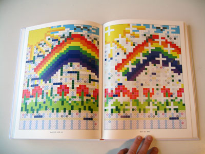
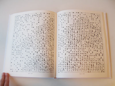
Aubert was an assistant professor at Wayne State University in Detroit and author of 16 Months’ Worth of Drawings in Microsoft Excel (2006, Various Project). In 2008, Aubert began designing the quarterly journal Criticism, which in 2012 was selected to be a part of the 25th Brno Biennial of Graphic Design in the Czech Republic.

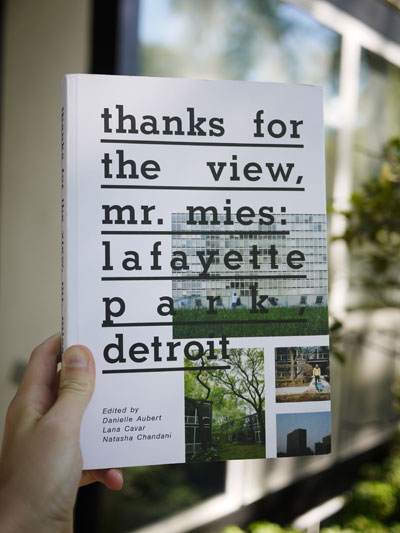
In 2009, she and Lana Cavar co-founded the International Typographical Union. Together they have made a series of projects that explore paper distribution and after-market paper and presented work in various venues including the School of Art Institute of Chicago, the Palais de Tokyo in Paris and Motto in Berlin. Also in 2009, Aubert, Cavar and Natasha Chandani launched the group Placement, which edited, wrote for and designed Thanks for the View, Mr. Mies (2012, Metropolis Books), about life in Lafayette Park, part of Detroit’s Mies van der Rohe Residential District. (Architecture Library NA9127.D4 T53 2012)

P1120198-lighter
Consider taking her first class: VIS 214 Graphic Design: Visual Form. This course introduces students to techniques for decoding and creating graphic messages in a variety of media, and delves into issues related to visual literacy through the hands-on making and analysis of graphic form. Graphic design relies on mastering the subtle manipulation of abstract shapes and developing sensitivity to the relationships between them.

Click here http://vimeo.com/57910594 to see a video about The Center for Abandoned Letterhead, a project of the International Typographical Union (I.T.U.) with Maia Asshaq.

One More Spring

dwiggins one more spring2

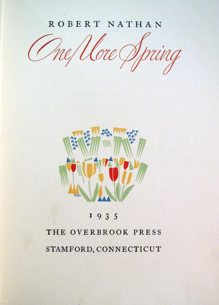
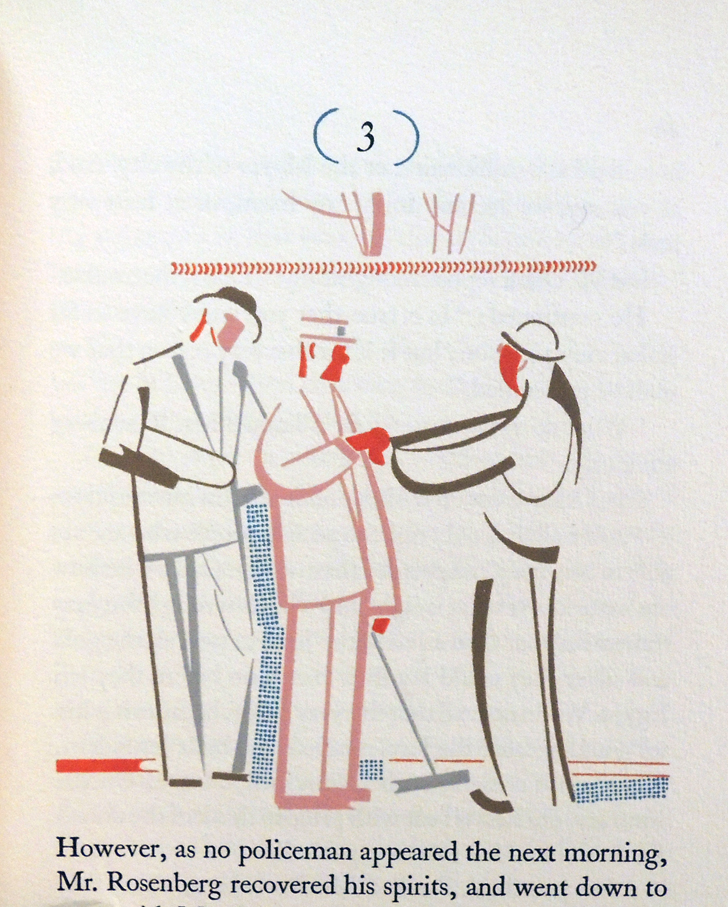
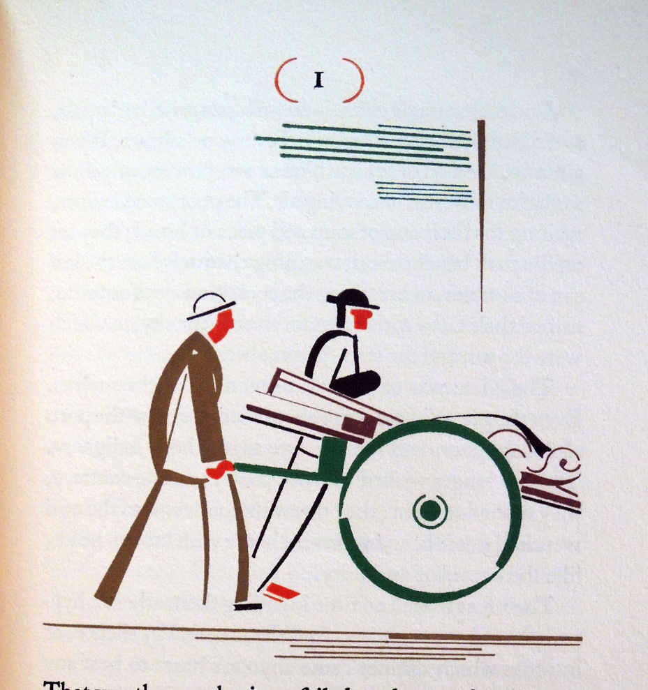
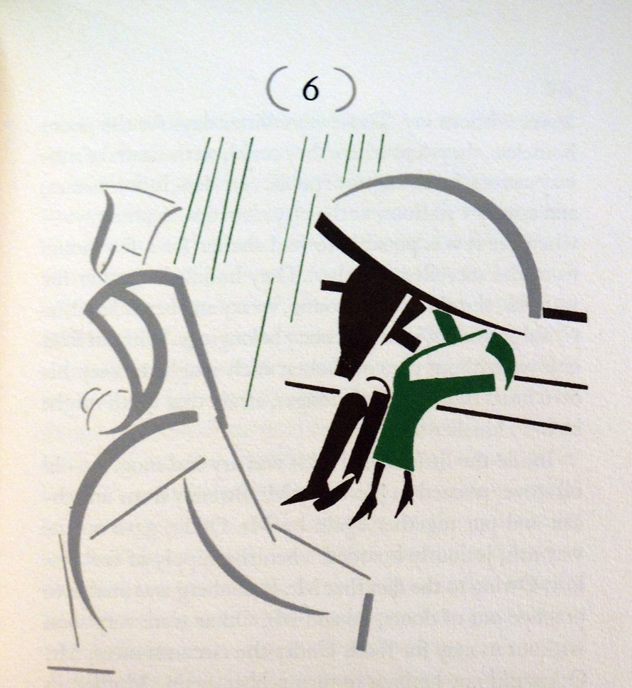
One of AIGA’s fifty best books of 1936 was One More Spring with hand-stenciled color by William Addison Dwiggins (1880-1956), who also designed the binding. Each of the 750 copies sold for $10 and it continues to be a favorite of book collectors.
dwiggins one more spring7
While many of his books were designed to look like stencil printing, the final editions were in fact printed from relief metal blocks. This title, however, clearly states that the designs were stenciled by Dwiggins and so, I take it as fact. The flat areas of color show no evidence of a human hand but the artist was extremely precise. I would not want to second guess him. What do you think?

At this point in his career, Dwiggins did all the work himself from his home studio in Hingham, Massachusetts, separating the design into individual stencils and cutting them from celluloid sheets. Several designs include one stencil repeated many times to form a picture. For painting on the color, he cut off a shaving brush since he didn’t have the traditional animal-hair pompon.

dwiggins one more spring8The artist wrote, “the cutting is done into bits of celluloid taped in place over the pen drawings of the elements. After the ties have been located, a light cutting is made, not all the way through the film, and if necessary, French chalk rubbed into the scratches. Then over black paper to let you see where to go, a final cut is made through the film.

Curator Philip Hofer called Dwiggins, “America’s one truly modern typographer, and by far her most outstanding book decorator and calligrapher; a mechanical wizard, type designer, and specialist in advertising layout; an illustrator, mural painter, costume designer, and sculptor, a playwright, satirist, and perhaps beyond ever the best of his art – a thinker and poet in prose.”

dwiggins one more spring6

dwiggins one more spring5

dwiggins one more spring1

Robert Nathan (1894-1985), One More Spring. (Stamford, Conn.: Overbrook Press, 1935). 20 stenciled decorations by W.A. Dwiggins. Edition of 750. Presentation letter from Frank Altschul to Elmer Adler, dated October 29, 1935, laid in. Graphic Arts Collection (GAX) PS3527.A74 O6 1935.

Inside McCosh

mccosh gabriel4

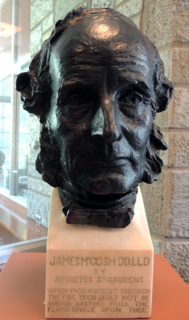
There was a leak recently in Rare Books and Special Collections. Unfortunately, the water chose to come down directly on Augustus Saint-Gaudens’ 1889 bust of James McCosh, the eleventh president of Princeton University. The bronze was not damaged in any way, as confirmed by our excellent sculpture conservator John Scott.

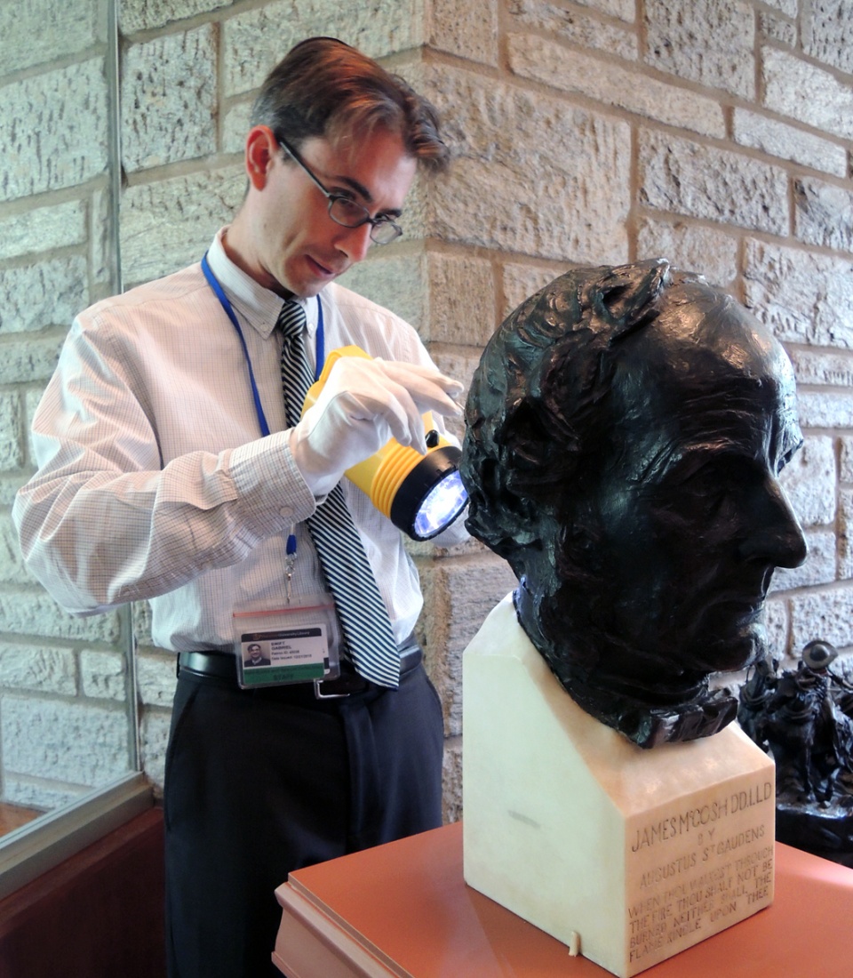
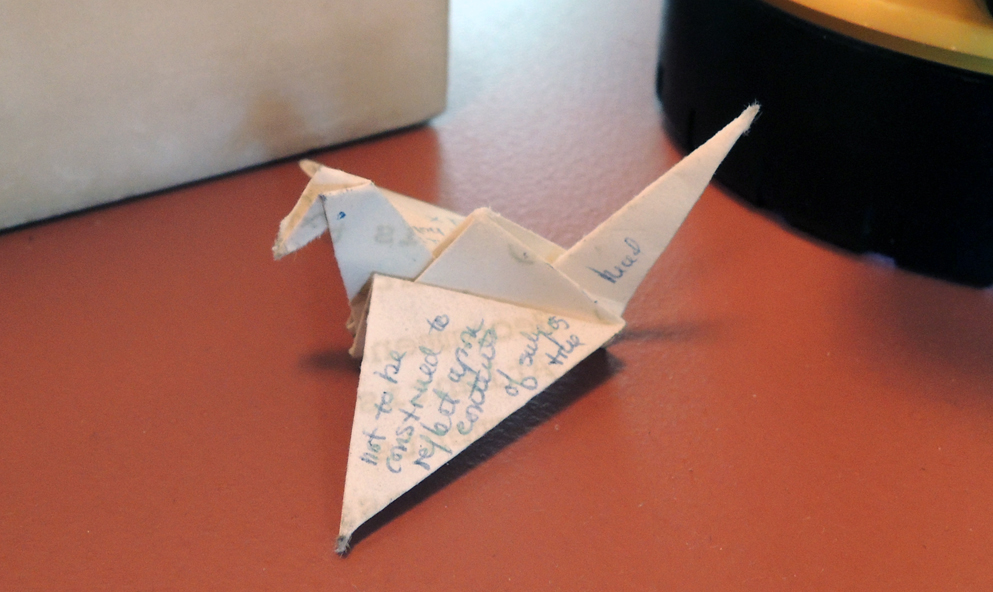
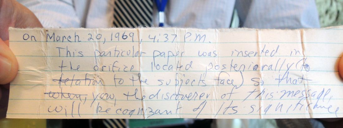
While examining the back of McCosh’s head, Scott noticed that there was an indentation for the brace that holds it in place and inside the head were two tiny pieces of paper. With thanks to our reference librarian, Gabriel Swift, for his investigative probing and to Charles Greene for his flash light, we were able to remove the material.

Here’s what we found.


mccosh gabriel

mccosh gabriel2

mccosh gabriel3

The Sea of Matrimony

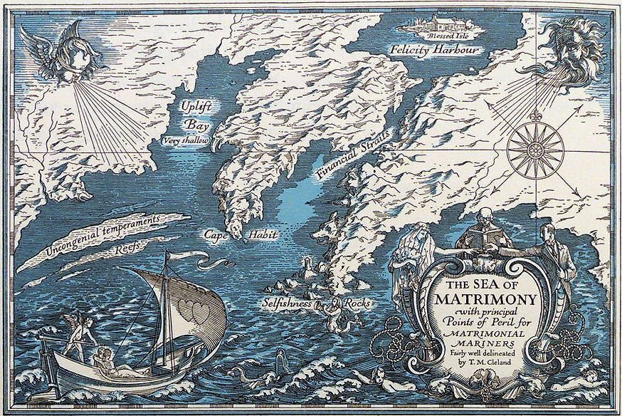
On June 10, 1931, Elmer Adler (1884-1962) wrote to the artist Tom Cleland (1880-1964) to say Harvey T. White, of R. Tyson White’s Sons, manufacturers of paper boxes, had contacted him. White was confirming a previous conversation in which Adler, acting as Cleland agent,  “authorized us to reproduce the The Sea of Matrimony by Wm [sic] Cleland for use on trays, waste baskets, lamp shades, cigarette boxes, etc., on the conditions. . . Print royalty is 3-7 cents each up to a total of $300. Depending on size.”

cleland-colophon-six4

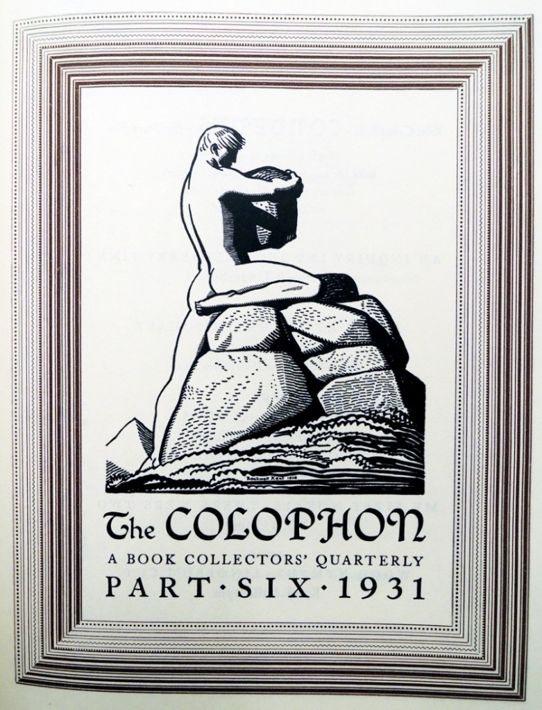
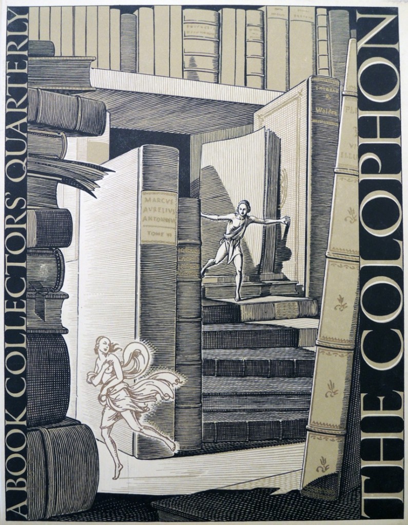
The Colophon (New York: Pynson Printers: The Colophon, 1930-1940). Graphic Arts Collection (GAX) Z1007 .C71

The image was published on the colophon page of vol. 2, part six (1931) of The Colophon and proved much more popular than the cover image, also by Cleland.

cleland colophon six2 cleland colophon six

This was the middle of the Great Depression in the United States but Cleland had a good job as art director for Fortune Magazine.  He went on to design for Cadillac; Newsweek; and the newspaper PM.

The artist would not agree to Adler’s arrangement with White, but not because Cleland objected to seeing his art on waste baskets and lamp shades. He felt that so many people would want to license the image that $300 was not an appropriate price ceiling. Cleland would only agree if the company either bought the design for $300 or continue to pay royalties forever.

It is unfortunate that the response from White is not in the Cleland papers at the Library of Congress or Adler papers at Princeton University. If anyone has a lampshade with The Sea of Matrimony, please contact us. Thanks.


Wood engraver’s magnifier

wood engravers magnifier

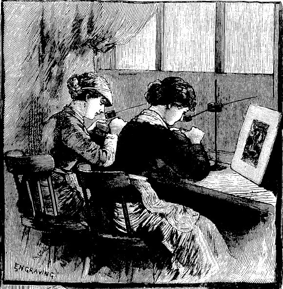
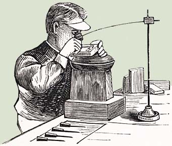
Among the many optical devices in the graphic arts collection there is a loupe on a pole, which until now, we had not been able to name. The image below makes it clear the magnifier was specifically designed for wood engravers. It comes from an article in Frank Leslie’s Illustrated Newspaper in April 1883 about the artists working for that newspaper.

For wood engravings of that period, a design was copied onto a block of wood, which was then cut into many smaller sections of approximately three inches square, depending on the original. Each section was given to a different engraver who would use this magnifier to cut the tiny lines of their portion of the image. Once all the blocks were completed and reassembled, the whole would be stereotyped to make a metal printing plate strong enough to stand up to the steam presses. The wood would be trimmed and reused for the next design.

For other objects in the optical devices collection, see this pdf: http://www.princeton.edu/~rbsc/exhibitions/optical.pdf

Frank Leslie’s Illustrated Newspaper, (New York, NY) Saturday, April 14, 1883; pg. 125; Issue 1,438; col A

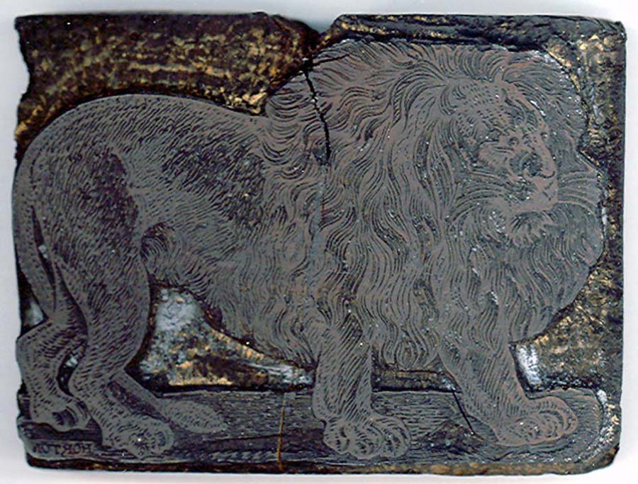
tp036-woodeng.jpglion Example of an engraved wood block (enlarged)