Author Archives: Julie Mellby

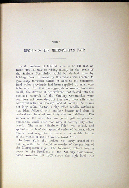
The Record of the Metropolitan Fair

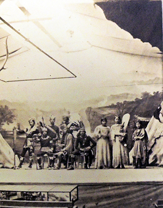
“View in the Wigwam” by J. Gurney and Son, Photographers


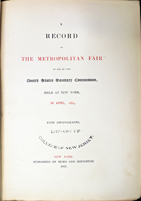
A Record of the Metropolitan Fair: in aid of the United States Sanitary Commission, held at New York, in April, 1864, with photographs. New York: Hurd & Houghton, 1867. John Shaw Pierson Civil War Collection, W25.67.6

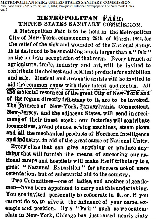
Following on the success of the Chicago Sanitary Fair in 1863, the Metropolitan City of New York’s Sanitary Commission organized their own fair to raise money for Union Army soldiers and their families. Privately funded and managed primarily by female volunteers, the fair would help with the soldiers’ back pay, distribute supplies to camp hospitals, and support other organizations hurt by the American Civil War.

After several delays, the Metropolitan Fair was held from April 4 to 23, 1864, and raised $1,34 million dollars. Several years later, A Record of the Metropolitan Fair was published, printed at the distinguish Riverside Press of H.O. Houghton, with 8 original albumen photographs pasted in every volume, after negatives by the celebrated photographer Jeremiah Gurney (1812-1895) and the practically unknown Maurice Stadtfeld (ca.1831-1881). Princeton owns a copy collected at the time of publication by John Shaw Pierson, class of 1840, whose thousands of gifts to the library began arriving in 1869.

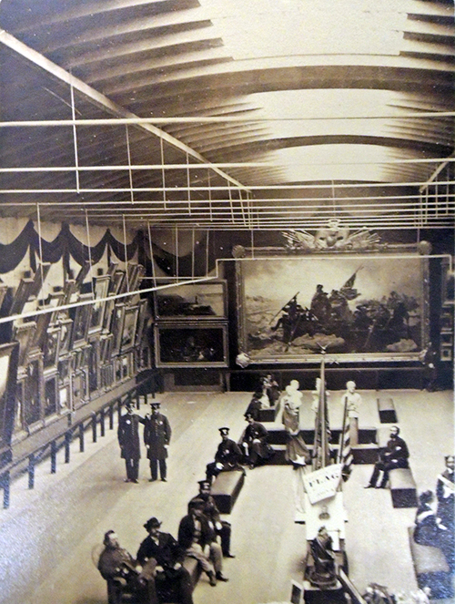
“View in the Art Gallery” by J. Gurney and Son, photographers.

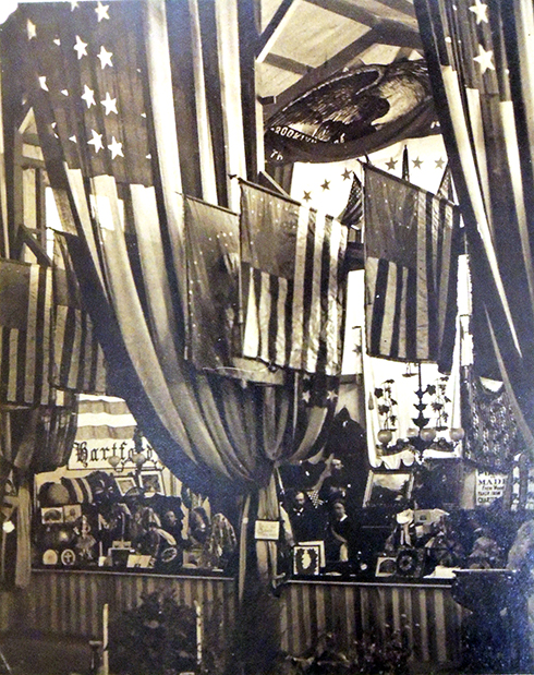
“Hartford Booth” by M. Stadtfeld, photographer.


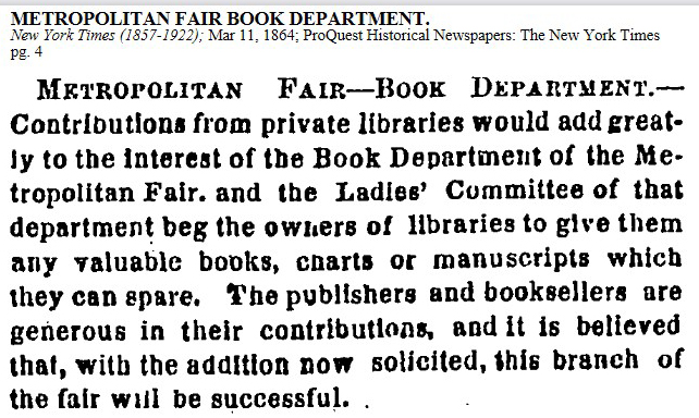
A season ticket to the Metropolitan Fair was $5, which allowed visitors to attend all the events and see all the displays at the 22nd Regiment Armory, 125 West 14th Street, as well as the other buildings and venues constructed solely for the three weeks of the fair. Performances were held by an international array of musicians including indigenous Americans who brought their own buffalo-skin teepee in which to perform. Cooking demonstrations took place in the Knickerbocker Kitchen, rare books and manuscripts were sold at the Metropolitan Book Department on the second floor while a working photography studio operated on the third floor. Barrels of free clothing and other items were offered to anyone who might be in need.

In the main hall of the Armory, an exhibition of paintings was hung including Albert Bierstadt’s Rocky Mountains opposite Frederic Edwin Church’s Heart of the Andes; and in the center Emanuel Leutze’s mammoth Washington Crossing the Delaware. Leutze’s original painting of this scene had been destroyed and so, in 1850 he painted a second version purchased by Marshall O. Roberts that was lent to the Fair. Later the painting was given to the Metropolitan Museum of Art by John Stewart Kennedy.

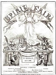
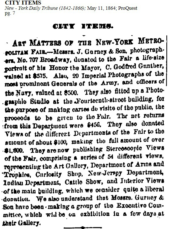
A newspaper called The Spirit of the Fair was published daily with a serial essay by James Fenimore Cooper to make sure people read each issue. The main contract for images from the fair went to Jeremiah Gurney whose elegant gallery was nearby at 707 Broadway. J. Gurney & Sons produced the majority of the official photographs sold or distributed during the fair from the Armory and afterwards at their own studio. Two of the prints included in The Record of the Metropolitan Fair are credited to Maurice Stadtfeld, whose studio was just up the block from Gurney at 711 Broadway. Only recently established in New York, Stadtfeld may have been engaged by Gurney and his son Benjamin to help with the enormous demand for prints.

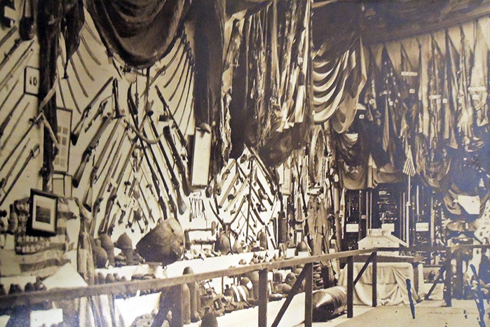
“View in Arms and Trophies Room” by J. Gurney and Son, photographers


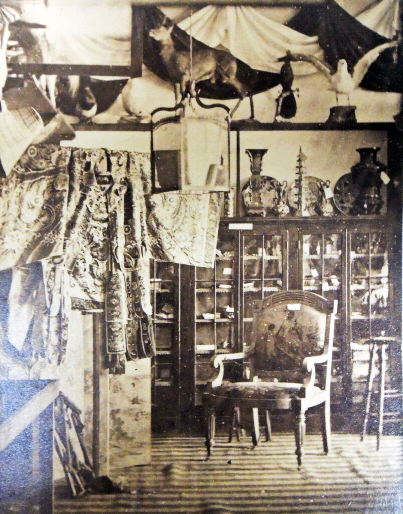
“View in Curiosity Shop” by J. Gurney and Son, photographers


“Irving Cockloft” by J. Gurney and Son photographers


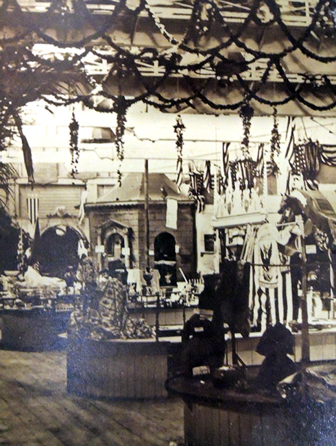
“View in Main Hall, 14th Street Building” by J. Gurney and Son, photographers


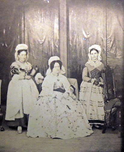
“Costumes of Ladies in Knickerbocker Kitchen” by M. Stadtfeld, photographer

How Many Female Type Designers Do You Know?

The following is a selected list of notable female type designers who might have been considered for the typographic exhibition at the Grolier Club, New York City. It has been compiled from many sources including:

https://www.printmag.com/post/10-wildly-talented-female-type-designers10 Brilliant Female Creatives …Women of Words by Rebecca Bedrossian

https://www.cphc.org.uk/the-typographic-hub-affiliate The Typographic Hub

https://femme-type.com Femmetype

https://www.printmag.com/post/10-wildly-talented-female-type-designers10 Women Type Designers by Shelley Gruendler

https://typequality.com/ A platform for discovering and sharing typefaces designed by women

https://fontsinuse.com/sets/5247/type-designs-by-women Type Designs by Women, created by “Fonts In Use” staff

https://eyeondesign.aiga.org/that-type-of-women/Eye on Design

https://www.ideo.org/perspective/9-typefaces-designed-by-womxn Nine typefaces designed by women

https://bookshop.org/books/how-many-female-type-designers-do-you-know-i-know-many-and-talked-to-some/9789493148321
How Many Female Type Designers Do You Know?: I Know Many and Talked to Some! by Yulia Popova (Author, Editor), Gayaneh Bagdasaryan (Author), Veronika Burian (Author), Maria Doreuli (Author), Louise Fili (Author), Martina Flor (Author), Loraine Furter (Author), Jenna Gesse (Author), Golnar Kat Rahmani (Author), Indra Kupferschmid (Author), Briar Levit (Author), Zuzana Licko (Author), Ana Regidor (Author), Fiona Ross (Author), Carol Wahler (Author). Onomatopee Projects, 2021
Get to know them:
Alice Savoie
Notable typefaces: Capucine, Fred Fredburger
Thanks to a teacher who passed on his love of letters, Lyon, France–based Alice Savoie found design at an early age. “There were very few institutions where you could learn typeface design back in the early 2000s,” recalls Savoie. Lucky for her, she picked up the basics of calligraphy and type design in a two-year course at École Estienne in Paris. “This experience comforted me,” Savoie says, “in the idea that typeface design might be the right path.” And like many designers, she then moved to the United Kingdom to study in the master’s type design program at the University of Reading. After graduating in 2006, Savoie joined Monotype, setting her career off to a solid start.

Jessica Hische
Notable typefaces: Tilda, Minot, Brioche, Snowflake, Buttermilk
Art meets type in the work of Jessica Hische. She wears many hats—letterer, typographer, illustrator—and her output reflects this. From stamps, movie titles and books to branding and packaging, Hische blends fresh elements of fun and grace in her illustrative work. While Hische is best-known for her elegant lettering, she has also adapted it into a number of beautiful typefaces.

Ksenya Samarskaya
Samarskaya learned type design while working at Hoefler & Frere-Jones. While she hadn’t expected to pursue type design, it fit well into her ideas regarding communication, culture, translation, and form. (Her typeface Wyeth is below.) Since starting her own studio, she has consulted with the world’s top foundries on multi-script typography.

Laura Meseguer
Notable typefaces: Multi, Lalola, Cortada Dos
Meseguer calls Barcelona, Spain, home, so it should come as no wonder that shapes and forms move her. She is surrounded by them—in nature, architecture, design, painting, lettering and calligraphy. The city touts not only Basque and Catalan influences, sitting between the Mediterranean and Europe, but the surreal architecture of Antoni Gaudí.

Laura Worthington
Notable typefaces: Adorn, Charcuterie, Mandevilla
Worthington lives in the Pacific Northwest, which makes one wonder if Seattle’s short, dark winter days account for her prolific output. She’s been on a roll since she released her first typeface in 2010. Worthington’s interest in calligraphy started early, while learning penmanship at age 9 in school. Like many of her peers, she found typography through design. “My father encouraged me to pursue graphic design, a career I engaged in from 1997 till late 2010. During that time, I kept looking for more opportunities.”

Liron Lavi Turkenich
Notable typefaces: Makeda, Aravrit, Lefty
“I get angry, I smile to myself, I get sad, I get energized,” says designer Liron Lavi Turkenich, referring to the multilingual signage in her native Israel. Every sign features three scripts—Hebrew, Arabic and English—some with typefaces chosen without care or respect; some with slightly different translations; others with too small or cramped scripts; while some are painted with a single brush for all scripts. Those signs are a huge source of inspiration and, she says, “such an important visual of our urban space. They say a lot about it.”

Luisa Baeta
Notable typefaces: Bligh, Arlecchino
Baeta has always been about evolution. After graduating with a degree in graphic design, she fell down the typographic rabbit hole. “I got this idea that if I learned to design type, I would gain a structural understanding of typography and would become a better graphic designer as a consequence,” she says. And so this Brazilian-born designer entered the University of Reading, which resulted in a master’s degree in type design. Upon completion, the perpetual student felt that there was still more to learn.

Lynne Yun
Notable typefaces: Constant, Ampersandist
Spend a little time with Lynne Yun, and you cannot help but be taken by her thoughtful, curious nature. “I often ponder the role of calligraphy in design, both in terms of its historical significance and its practical applications in modern-day design,” says Yun. “It used to be that calligraphy, lettering, type design and typography were practiced by a similar group of people. Somehow they split apart over the years, but the time is ripe for them to converge again. They are all branches of letterform design.”

Marina Chaccur
Chaccur earned a graphic design degree in Brazil, then moved to England for a master’s degree in the field. After working as a designer, design instructor, hand letterer, and letterpress printer, she realized that she wanted more and travelled to the Netherlands for the Type and Media MA at the Koninklijke Academie van Beeldende Kunsten (KABK).

Nadine Chahine
Notable typefaces: Frutiger Arabic, Neue Helvetica Arabic, Univers Next Arabic
Lebanese designer Dr. Nadine Chahine cites her studies with Samir Sayegh, a calligrapher teaching Arabic Typography at the American University of Beirut, as the catalyst for her interest in type design. “The beauty of the shapes, coupled with the desperate need for well-designed Arabic typefaces, got me hooked very quickly,” says Chahine.

Nicole Dotin
Dotin was a graphic designer before she transitioned into typography. Once she completed the Type Design Master’s program at the University of Reading, she became a type designer at Process Type Foundry. She says that the intrinsic nature of the method of type designing drew her to the profession; the independence afforded by type design is an added bonus.

Nina Stössinger
Notable typefaces: FF Ernestine, Nordvest, Sélavy
Swiss-born Nina Stössinger found type while studying graphic design in Germany. One thing led to another, and she enrolled in the postgraduate TypeMedia Program at the Royal Academy of Art in The Hague, Netherlands.

Sara Soskolne
Soskolne has one of the most coveted type design jobs in the world: Senior Type Designer at Hoefler & Co. She has collaborated on some of the most popular typefaces of the past decade, including Gotham, Tungsten, and Sentinel.

Pooja Saxena
Saxena created her early type designs while earning a Communication Design degree in Delhi, India. (She describes the work as naïve, but I find it energetic.) Because she knew she wanted more for her letterforms, she earned a Master’s Degree in Type Design at the University of Reading and followed it with a typographic internship at Apple, where she learned about large-scale projects as well as collaborative type design teams.

Veronika Burian
Notable typefaces: Abril, Adelle, Bree
Who would have thought that a Prague-born product designer living in Milan would fall hard for type? Well, that’s exactly what happened to Veronika Burian. And all it took was a fellow designer teaching her how to draw in FontLab. “It was like falling in love,” recalls Burian. “I was already disillusioned with product design, and I wanted to change careers. So I started looking into the possibility of doing a [master’s] in graphic design.” After a bit of research, she found the type design program at University of Reading, visited the campus, spoke to professor Gerry Leonidas, and had discovered her path.

Victoria Rushton
Rushton was an Illustration major in college until she took a graphic design class. There, she discovered that type design was the best direction for her. While in school, she began working on the typeface that would become Marcia. When she encounters Marcia now, she sees the bad ideas, redraws, and subsequent fixes along with the resulting learning, practice, and success.

Also:
Alessia Mazzarella
Alexandra Korolkova
Alice Tebaldi
Alisa Nowak
Amélie Bonet
Andrea Tinnes
Carol Twombly
Carolina Marando
Elena Albertoni
Elena Schneider
Erin McLaughlin
Francesca Bolognini,
Glenda de Guzman
Gudrun Zapf von Hesse
Jane Patterson
Joana Correia
Jungmyung Lee
Justyna Sokolowska
Karolina Lach
Kris Holmes
Liya Ophir
Martina Flor
Medeina Musteikyte
Milena Brandao
Nadia Knechtle
Nicole Dotin
Nicole Fally
Nicolien van der Keur
Pria Ravichandran
Sibylle Hagmann
Sofie Beier
Stefanie Preis
Susan Kare
Trine Rask
Vanessa Farano
Vera Evstafieva
Zuzana Licko

Simon Beattie adds the following: Margaret Calvert. She designed all the UK road signs, as well as the lettering for British Rail (which is also used on the UK Government website, gov.uk). Hers is surely among the most-seen lettering/design work in the country, and yet most people probably haven’t heard of her. https://en.wikipedia.org/wiki/Margaret_Calvert
https://designmuseum.org/exhibitions/margaret-calvert-woman-at-work​https://my.matterport.com/show/?ref=em&m=Lz47nCpTeLS
https://designmuseum.org/exhibitions/margaret-calvert-woman-at-work-the-virtual-experience
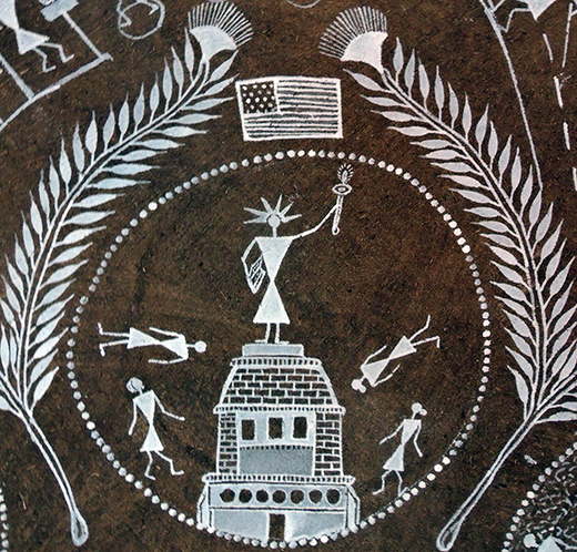
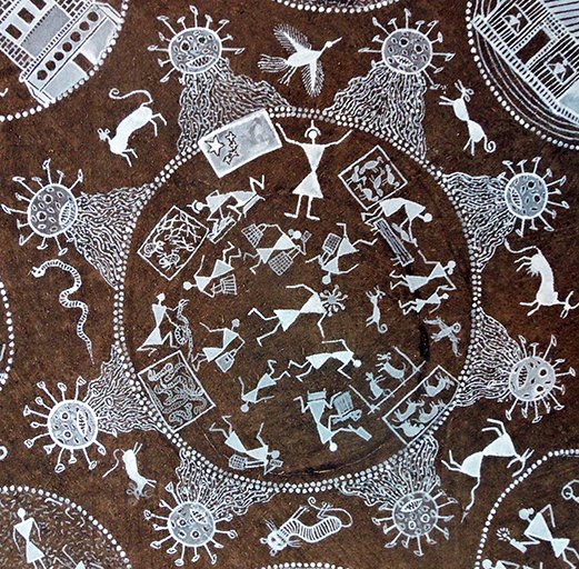
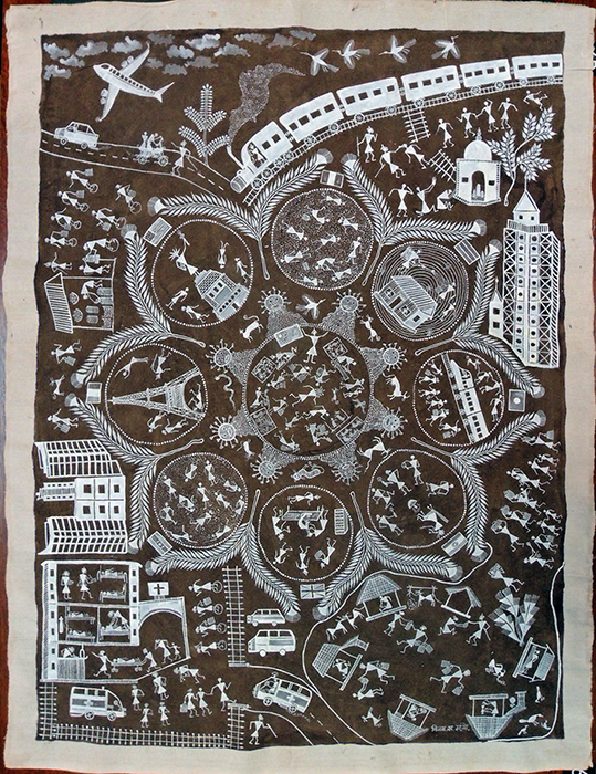
Corona Ek Mahamari = Corona An Epidemic


Vijay Sadashiv Mashe, Corona Ek Mahamari [Corona an Epidemic], 2020. Cow dung background, poster color on traditionally treated cloth. 104 x 78 cm. Graphic Arts Collection 2021.

The Graphic Arts Collection recently acquired a dense composite painting by the contemporary Warli artist Vijay Sadashiv Mashe. The son of Sadashiv Mashe and grandson of Jivjy Soma Mashe, Vijay continues the traditions of the Warli painters, but with an international consciousness. The simplicity of the forms lends itself to the representation of our global pandemic and its consequences in India and beyond.


Read more about the Indian Warli Community projects at the V&A Museum of Childhood: https://www.vam.ac.uk/blog/museum-of-childhood/warli-at-moc

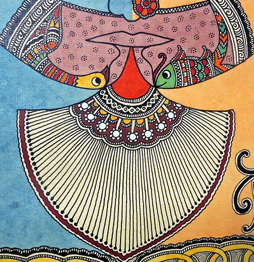
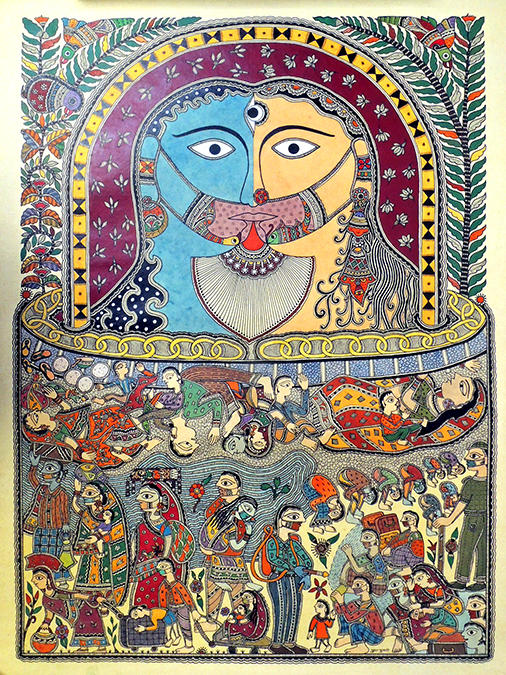
Migrant Labor Goes Home, 2020

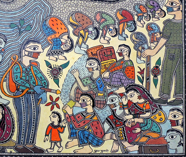
Pushpa Kumari, Migrant Labor Goes Home, 2020. Natural color on cow dung, washed handmade paper. 67 x 54 cm. Graphic Arts Collection GAX 2021.

This recent acquisition painted by Pushpa Kumari is part of our ongoing effort to document the work of contemporary Indian indigenous artists during the 2020-2021 pandemic.

The following description was written by Anubhav Nath of Ojas Art:

“Shiv-Parvati play an important role in Madhubani art. They are depicted as Ardhnareswar, which portrays a perfectly fused balance of divine masculine and feminine energies.

In April 2020, caught unaware, thousands of migrant labor walked thousands of miles to their homes in the region of Bihar, from where this art form originates. This work refers to a lot of images from local media in connection to the migrant labor headed back and the duress they faced.

People walking with families in never ending queues with children being dragged on suitcases; a woman collapsing and eventually dying on the railway track as her infant child continued to breast-feed and laborers being washed down with disinfectant before being allowed to enter a village.
These images are symbolic of the lockdown, and have been translated into a traditional Madhubani style very effectively and poignantly.”

LVxNBA: Printed or Woven?

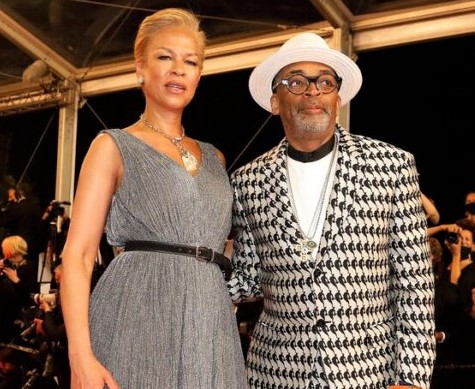
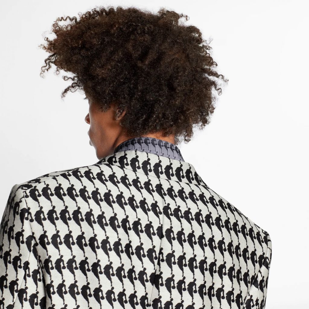
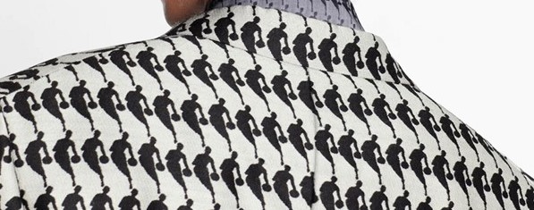
In 2001, Spike Lee (born 1957) received an honorary degree from Princeton University alongside Bill (William Felton) Russell, the former professional basketball player who played for the Boston Celtics from 1956 to 1969. Last Saturday, serving as the president of the Cannes Film Festival jury, Lee appeared on the red carpet wearing a suit from the LVxNBA collection. Press photographs made it difficult to tell if the vibrant graphic design on the suit was printed or woven.

(Sebastien Nogier/EPA, via Shutterstock)

Last year, to commemorate the Los Angeles Lakers win of the NBA championship, Louis Vuitton formed a three-year partnership with the National Basketball Association and under designer Virgil Abloh, unveiled a line of limited edition clothing and accessories intersecting French craftsmanship and American sports. It became known as LVxNBA or Louis Vuitton x National Basketball Association.

Vitton’s site describes it: “The collection adapts the designer’s codes with the iconography of the basketball universe and honors the values of relatability and inclusion key to Virgil Abloh’s vision at Louis Vuitton.”  https://us.louisvuitton.com/eng-us/men/highlights/lvxnba-i/_/N-2djx1c?gclid=Cj0KCQjw0K-HBhDDARIsAFJ6UGhirqwC4ybWB3JUrbutKWiYwPZZVbrHAtqpG4WkET-RFp7xsvJh7D0aAuVlEALw_wcB&gclsrc=aw.ds

The clothing features the iconic NBA logo, which is a silhouette of the former Los Angeles Lakers basketball player Jerry West (born 1938), sometimes called “Mr. Clutch” and sometime “The Logo,” because of his ubiquitous image. Created in 1969 by brand consultant Alan Siegel, the NBA logo has been a staple of the association for over 50 years. West was never asked or compensated for his profile.

On the LVxNBA apparel, the repetition of the NBA logo forms a houndstooth appearance, which is a pattern you get when you combine a 2/2 twill weave (two threads over, two under) with simple alternations of color—four white, then four black, then four white, and so on—on both the warp and weft. In fact, the exclusive Vuitton clothing is made with a Jacquard weave, produced only on a special loom that creates complex woven-in repeated designs, producing the houndstooth-style effect.


Unfortunately, the line is only for men since women don’t watch basketball.


Walking from Cole to Church

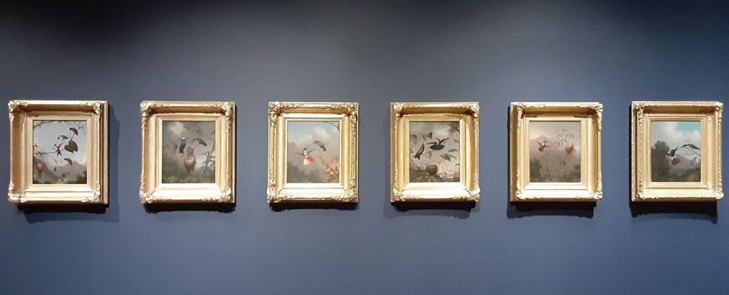
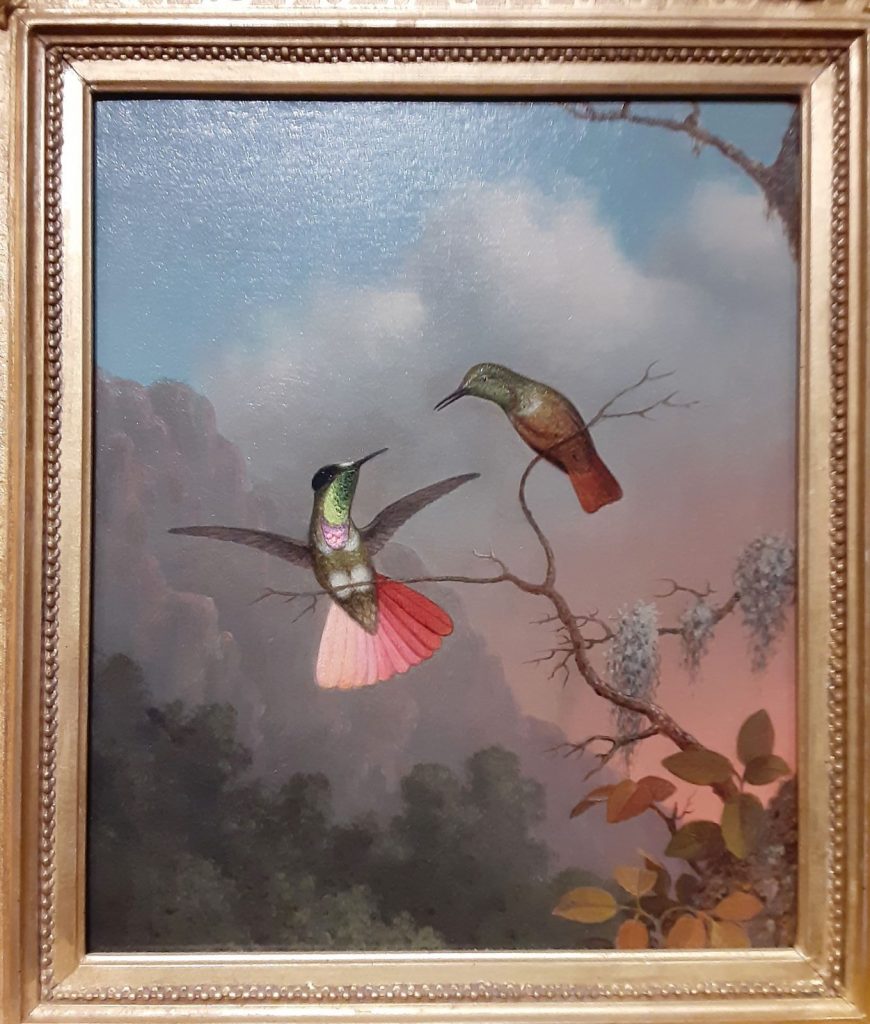
Martin Johnson Heade’s hummingbird paintings in “Cross Pollination,” Thomas Cole House, 2021. Below is a video of Juan Fontanive’s Ornithology.

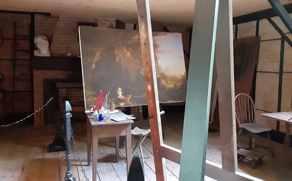
Cedar Grove was the Catskill home and studio of the Hudson River School painter Thomas Cole (1801-1848). Cole married into the property, first renting studio space each summer until 1836, when he married the owner’s niece, Maria Bartow, and moved in permanently.

Several studios were built for Cole and his pupils, one of whom was the 18-year-old Frederic Edwin Church (1826-1900), who spent two years working under Cole. Eventually Church bought a farm for his family on the eastern side of the Hudson river and then, after an extended trip to Europe and northern Africa, purchased land at the topmost point opposite Cole’s estate and began creating Olana, meaning “a place on high.” Unlike the traditional Federalist home Cole inherited, Church and his wife envisioned a house with a Middle Eastern design. Architect Calvert Vaux did the central structure, where the family moved in 1872 but in fact, work continued throughout Church’s lifetime and it wasn’t until 1891 that the house was considered complete. Church personally designed many of the stencils that decorate the interior rooms and happily, they remain untouched except for some cleaning.

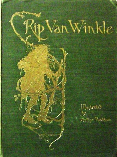
In Washington Irving’s 1819 story “Rip Van Winkle,” the title character falls asleep in the mountains of Catskill, only to wake up 20 years later to a world he doesn’t recognize. When a bridge was finally constructed in 1935 connecting Hudson on the east and Catskill on the west, it was called the Rip Van Winkle Bridge. Unfortunately, given the depression of the 1930s, only wealthy drivers could afford to pay the 80 cents charged to drive from one side to the other. The rest of the public remained in the past and ferried across the river.

In 2018, a pedestrian foot path was added on the south side of the bridge allowing the public to not only walk the one mile across the Hudson river but to walk directly from Cole’s home to Church’s house. This summer, to encourage the hike, a new exhibition organized by the Crystal Bridges Museum of American Art is being presented jointly at the Thomas Cole Site in Catskill and Frederic Church’s Olana entitled “Cross Pollination: Heade, Cole, Church & Our Contemporary Moment” (through October).

“Cross Pollination… is a national collaborative exhibition exploring the theme of cross pollination in art and the environment from the 19th century to today. The project stems from the artist Martin Johnson Heade’s 19th-century series of hummingbird and habitat paintings, The Gems Of Brazil, and their unique relationship to the epic landscapes of Hudson River School artists Thomas Cole And Frederic Church, as well as their continued significance to major contemporary artists working today. For the first time in over two decades, 16 paintings from the influential series of hummingbirds and habitats, The Gems of Brazil (1863-64), by Martin Johnson Heade (1819-1904) will be on tour in New York for public audiences. The project uses the metaphor of “cross-pollination” inspired by Heade’s paintings to explore interconnections in art and science, between artists, and across the 19th and 21st centuries. Paintings, sketches, sculpture and natural history specimens will be displayed in provocative juxtapositions within the historic spaces.

The artists featured in the exhibition are Martin Johnson Heade, Thomas Cole, Frederic Church, Emily Cole, Isabel Charlotte Church, Rachel Berwick, Nick Cave, Mark Dion, Richard Estes, Juan Fontanive, Jeffrey Gibson, Paula Hayes, Patrick Jacobs, Maya Lin, Flora C. Mace, Vik Muniz, Portia Munson, Lisa Sanditz, Sayler/Morris, Dana Sherwood, Jean Shin, Rachel Sussman, and Jeff Whetstone. See more: https://www.hudsonriverskywalk.org/crosspollination


Woodward’s Caricature Magazine. Why do you laugh? Change only the name and this story is about you.

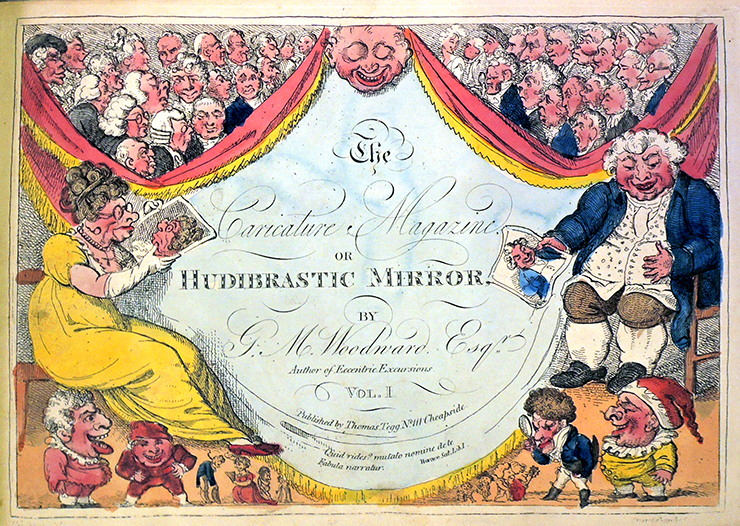
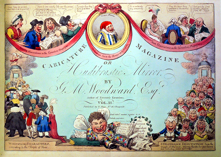
The Caricature Magazine Or Hudibrastic Mirror. By G.M. Woodward. Etchings by Thomas Rowlandson, Isaac Cruikshank, and Charles Williams, after George Moutard Woodward, published by Thomas Tegg. 1807-09.

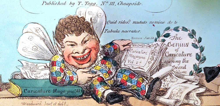
Volume 1. September 1, 1807. Quid rides? Mutato nomine et de te fabula narrator = Why do you laugh? Change only the name and this story is about you.–Horace, Satires 1. 1. 68–72. Front cover above, back cover (tail piece) below.

Volume 1, tailpiece.

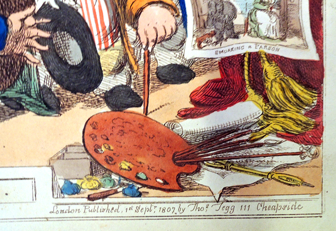
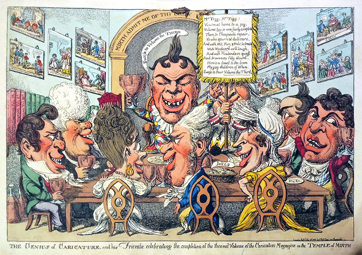
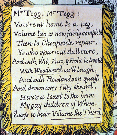
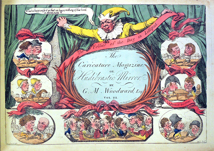
Between September 1807 and November 1809, George Moutard Woodward’s humorous designs were etched and hand colored by Isaac Cruikshank, Charles Williams, Thomas Rowlandson, and others, then published by Thomas Tegg as The Caricature Magazine, or, Hudibrastic Mirror. Each plate was reissued several times and the serial run reissued in 1821. Because of the multiple versions, it has been difficult to conclusively describe this serial. In addition, it is often mixed up with The caricature Magazine by Thomas Rowlandson. Princeton owns 4 bound volumes of Tegg’s magazine published from No. 111 Cheapside, between 1807 and 1809. Dorothy George agreed that the original series included only 4 volumes.


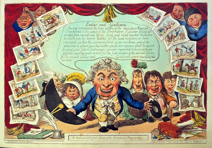
Volume 2. On the left. are Whimsical Characters ascending to the Temple of Fame. On the left. is A Grotesque Deputation from the Temple of Momus – returnig [sic] thanks for past favors and soliciting future patronage.

Front cover above, back cover below. Volume 2. July 2, 1808. Between the two processions and forming a tail-piece is ‘The Genius of Caricature,’


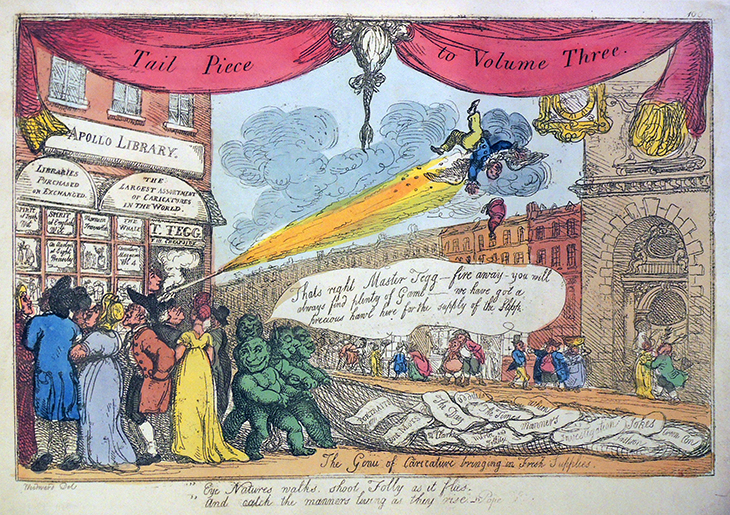
Volume 3. Front cover above, back cover below. 1809. Tail Piece offers a street scene showing Tegg’s printshop, the Apollo Library at 111 Cheapside, with signs above its windows reading “Libraries purchased or exchanged,” and advertisements: ‘Spirit of fresh wit / Spirit of English wit / Marmion travestee / The whale / An auction at eight precisely.” Below the image is a quotation from Pope: “Eye Natures walks, shoot Folly as it flies. / And catch the manners living as they rise.”


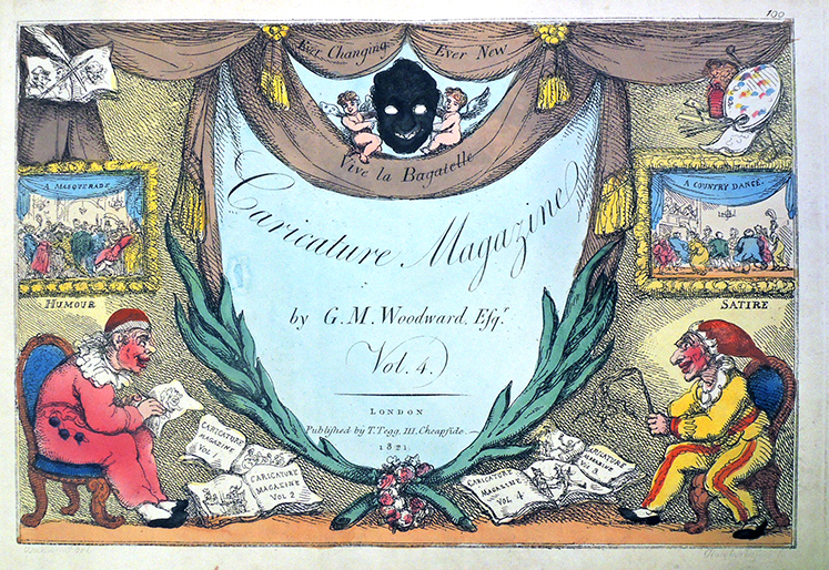
Volume 4. Before November 1809. Missing the back cover.

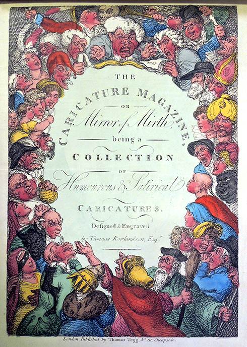
Not to be confused with a separate, vertical run titled The Caricature Magazine or Mirror of Mirth... by Thomas Rowlandson, 1809?

China Painting

Porcelain paints case, 1880s. German. Graphic Arts Collection GAX 2021- in process

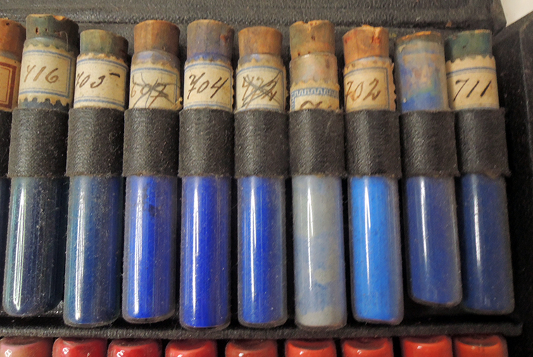
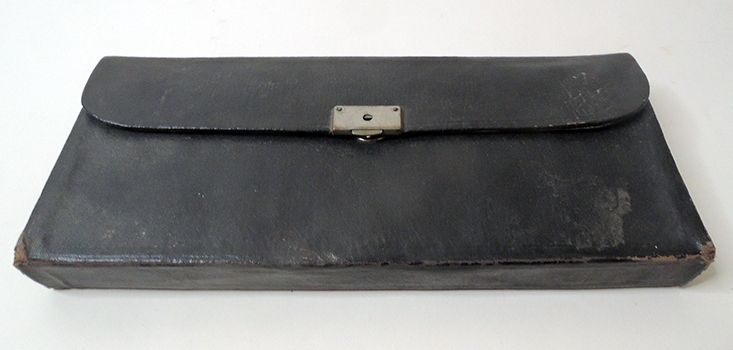
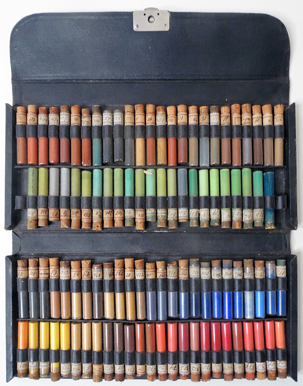
The Graphic Arts Collection recently acquired a linen case containing 98 glass vials filled with powder pigments to be used in the painting of porcelain wares, also known as china painting. The pigment is now permanently sealed in the vials with the cork tightly fixed to the glass. Each vial is numbered with a paper label. “China or porcelain paint pigment does not dissolve in water or oil, because the pigments are made up of metallic oxides blended with fine powdered glass. The powdered glass acted as a flux so that the glaze and coloured paint would adhere together permanently upon firing.”

As Debby DuBay writes in The Journal of Antiques and Collectibles:

…Women played significant roles in the birth of the china-painting movement in America. In 1873 in Cincinnati, Karl Lagenbeck, an immigrant ceramic chemist, and his neighbor, Maria Longworth Nicols (1849-1932) experimented with over-glaze china paints. Maria, a student at the McMicken School of Design, placed some of her decorated pieces on display at a student exhibition. Several classmates, specifically one Mary Louise McLaughlin (1847-1939), was so smitten by the beauty of Nicols’ work that she requested their instructor, Ben Pitman, to purchase the necessary supplies to paint on porcelain.

With so much interest in this new art form, Pitman engaged Marie Eggers, an immigrant who had studied the art of china painting in the Dresden factory, to teach a class in 1874. This group of students entered their wares in the Philadelphia Centennial Exposition and were responsible for exposing millions of Americans to this new art form.

…By 1877 there had been several books published in Europe on directions for painting on china for amateurs, but it is student Mary Louise McLaughlin who published the first book in America – China Painting, A Practical Manual for the Use of Amateurs in the Decoration of Hard Porcelain. McLaughlin’s infectious enthusiasm for this art form spread throughout the United States, and she is credited with educating the general public and those who could not attend classes on the art of china painting. Her book included information on tracing on china, china painting techniques and directions for gilding, firing, etc.

In 1879 McLaughlin formed the Woman’s Pottery Club. By 1881, there were major china painting studios in Boston, Cincinnati, Philadelphia and New York, including The Osgood Art School established in New York City by Adelaide Harriett Osgood (1842-1910). But it is McLaughlin who is credited with influencing the entire nation and setting the standards for porcelain clubs established throughout the United States.–Painted Porcelain: Women Played a Major Role – The Journal of Antiques and Collectibles –by Debby DuBay.https://journalofantiques.com/features/hand-painted-porcelain-women-played-a-major-role/

Anita J. Ellis, The ceramic career of M. Louise McLaughlin (Athens, Ohio: Ohio University Press [for] Cincinnati Art Museum, 2003). NK4023.M382 E443 2003

Mary Louise McLaughlin, China painting: a practical manual for the use of amateurs in the decoration of hard porcelain (Cincinnati: R. Clarke, 1877). ReCAP 738 M22


The Day of Rejoicing for Monopoly!

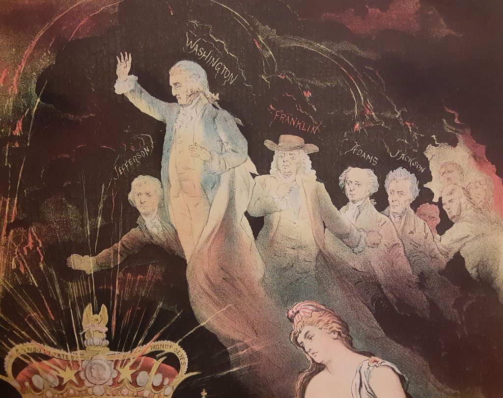
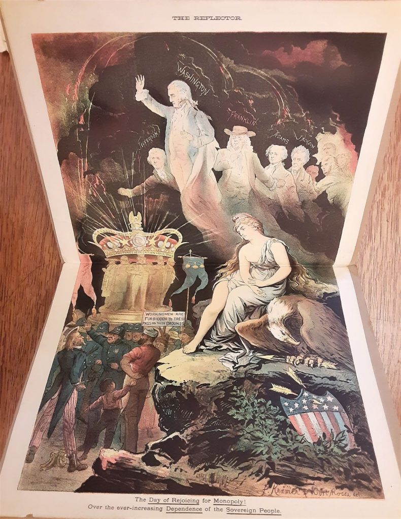
For the July 3, 1886, issue of The Reflector, an Illustrated Journal devoted to the Interests of Labor & Capital VS. Monopoly, the  double-page centerfold is captioned “The Day of Rejoicing for Monopoly! Over the ever-increasing Dependence of the Sovereign People,” and signed by both members of the publication’s art department, Peter Kraemer (1823-1907) and Conrad Rossi-Diehl (also known as Curt Rossi, 1842-1926).


“The Day of Rejoicing for Monopoly! Over the ever-increasing Dependence of the Sovereign People.” in The Reflector, an Illustrated Journal devoted to the Interests of Labor & Capital VS. Monopoly 1, no. 7 (July 3, 1886). Photographed from the New-York Historical Society Library.

The description of the cartoon reads:

“Our double page cartoon represents “The day we celebrate.” Columbia weeps; her proud bird is sad, and the ghosts of Washington and other founders of our Great Republic which float above the scene are amazed to find : that only the ‘favored few’ enjoy the fruits of the ‘Declaration of Independence’, whilst the masses have been reduced to a state of abject Dependence.– Even Uncle Sam must ‘doff’ his hat before the crowned Heads of the land.”

Together with editorial manager John Fredericks, Kraemer and Rossi produced this spectacular and little appreciated illustrated weekly in an attempt to overtake Puck and Judge with decidedly liberal politics and an anti-corporate point of view. Although not directly connected, the Knights of Labor are regularly quoted and supported in many issues. From May 22 to November 6, 1886, these three men wrote, drew, and lithographed their colorful publication that sold for six cents (or an optimistic $3.00 annually). The Reflector Publishing Company was based at 58 & 60 Fulton Street, with the printing done by the “power press printers” Eckstein & Porr in the same building.

Their mission is defined in the second issue: “As labor alone creates capital, and capital—when properly employed—in turn increases the productively of labor, it will be the sole endeavor of this journal to combat monopoly, the evil which grows and thrives in proportion as it flourishes and fans the fratricidal feud between those agents of human progress and prosperity. Monopoly paralyzes the arm of the small capitalist and prostrates the wag-workers . unless labor and capital unite their strength in joint effort to check the sway of monopoly, disruptions and dismemberment will be imminent or the doom of a return to abject dependence—worse than feudal thraldom [sic]—is sealed.”

Both Kraemer and Rossi were trained in Munich, with long resumes that included book and commercial illustration. When the illustrated weekly closed, Rossi-Diehl joined John Ward Stimson (1850-1930) to establish the Artist Artisan Institute also called the New-York Institute for Artist-Artisans, on West 23rd street. See more: https://graphicarts.princeton.edu/2021/05/20/conrad-rossi-diehl/

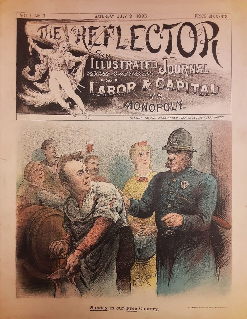
On the cover of the July 3 issue is a cartoon titled “Sunday in our Free Country,” objecting to the growing temperance movement and prohibition of alcohol, stating: “On the title page we show the manner in which the ‘hand of the law’ lays hold of the offe[n]der against the dictates of Intolerance in our Land of Liberty. Supporting the ability of a citizen to partake in a humanizing beverage.”

In the early issues of The Reflector, the artists chose not to sign their lithographs, noting: “The editor of the new have workmen seems to take exception to the modesty which our artists have shown by withholding their signatures from the illustrations. They simply proposed to let the work stand on its merits—name of no name. the coat you wear is not a whit better or worse though it bear the names of a dozen tailors. Not all men seek notoriety.” In later issues, Kraemer signs the front and back cover illustrations and both Kraemer and Rossi sign the centerfold.


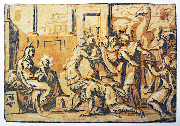
Adoration of the Magi, with camel

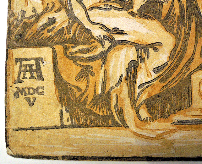
Giuseppe Niccolò Rossigliani, called Niccolò Vicentino (active about 1510–1550) after a drawing by Parmigianino (Girolamo Francesco Maria Mazzola, 1503–1540), The Adoration of the Magi, [between 1540 and 1560]. Chiaroscuro woodcut from three blocks. Bartsch XII.029.2, ii/ii. Graphic Arts Collection GC094


This is the final state of Vicentino’s print, with the publisher Andrea Andreani’s monogram AA MDCv. Although Andreani was also an artist, he did not carve or print this woodcut. The first state has the letters FP for “Franciscus Parmensis” in the same position.


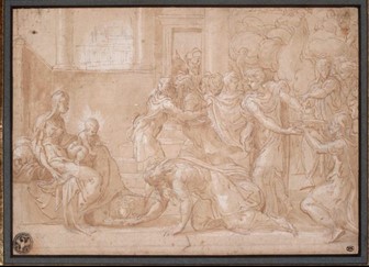
The print reproduces a drawing in the Louvre by Parmigianion:

Parmigianino (1503-1540), L’Adoration des mages, no date. Pen and ink, brush drawing. Musée du Louvre INV 6377


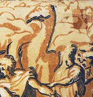
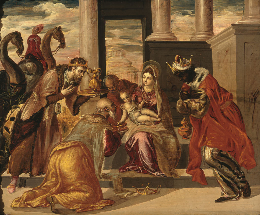
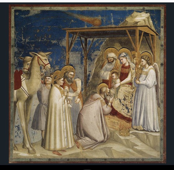
One of the nicest aspects of the chiaroscuro print is the simplicity of the camel, drawn in tone with the animal’s long neck accented in a single black line. Many artists included camels in their Adoration scenes but often used a horse as the model with limited success in its appearance.

http://www.larsdatter.com/camels.htm offers a wonderful set of links to various camels throughout the medieval and renaissance periods. A few have been included below.

El Greco (1541–1614), Adoración de los Reyes Magos known in English as Adoration of the Magi with Camels, between 1568 and 1569. Oil on panel. Museo Soumaya at Plaza Carso


Giotto (active 1295-1337), Adorazione dei Magi, ca.1304-1306. Portion of frescoe in the Arena Chapel, Padua, Italy.


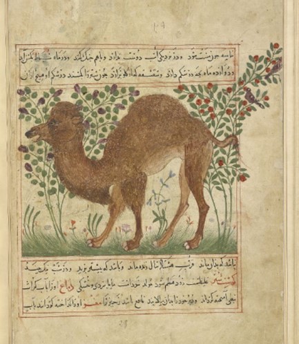
One of the most charming of all the camels can be found at the Morgan Library, in a Persian manuscript:

Ibn Bakhtīshū (died 1058), Camel. Manāfi˓-i ḥayavān (The Benefits of Animals), in Persian, for Shams al-Dīn Ibn Ẓiyā˒ al-Dīn al-Zūshkī, between 1297 and 1300. Morgan Museum and Library MS M.500, fol. 16v


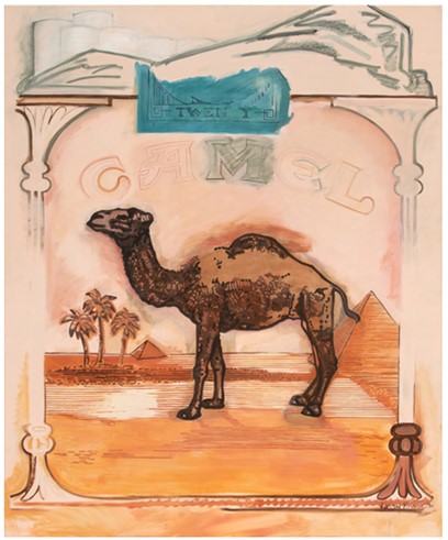
Larry Rivers (1923-2002), Beyond Camel, 1980. Acrylic on canvas. Privately owned.