Category Archives: Acquisitions

new acquisitions

Internationale situationniste

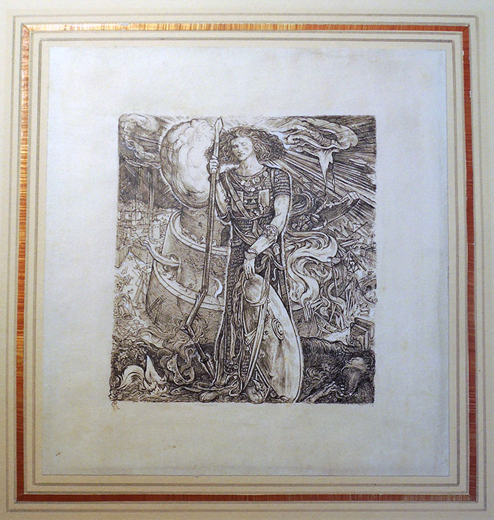
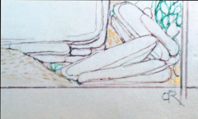
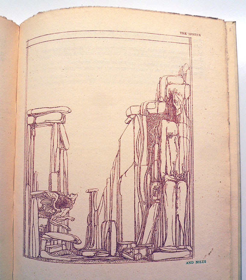
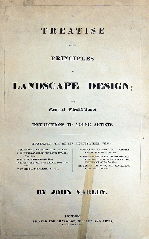
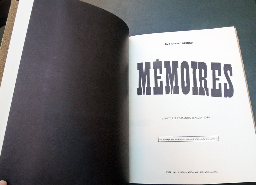
Guy Debord and Asger Jorn, Mémoires (Paris: Internationale situationniste; [Copenhaguen, Permild & Rosengreen Press], 1959). Graphic Arts Collection GAX 2019- in process


Printed in 1959, Mémoires (Memories) is the result of the second collaboration between the Danish artist Asger Jorn (1914-1973) and the French artist and theorist Guy Debord (1931-1994). Published by Éditions Situationist International (founded by Debord and Jorn), the book has been reprinted several times given its importance to the movement, first by Jean-Jacques Pauvert aux Belles Lettres in 1993 and then by Éditions Allia in 2004.

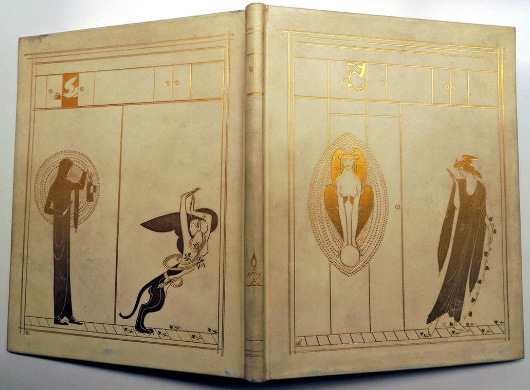
Mémoires is perhaps most famous for its cover made of heavy-grade sandpaper. Usually credited to Debord, the sleeve was actually conceived in a conversation between Jorn and the printer, V.O. Permild:

[Jorn] asked me, if I couldn’t find an unconventional material for the book cover. Preferably some sticky asphalt or perhaps glass wool. Kiddingly, he wanted, that by looking at people, you should be able to tell whether or not they had had the book in their hands. He acquiesced by my final suggestion: sandpaper (flint) nr. 2: ‘Fine. Can you imagine the result when the book lies on a blank polished mahogany table, or when it’s inserted or taken out of the bookshelf. It planes shavings off the neighbour’s desert goat. – “Memories on Asger Jorn” by Troels Andersen, quoted online in Christian Nolle, Books of Warfare, The Collaboration between Guy Debord & Asger Jorn from 1957-1959, http://virose.pt/vector/b_13/nolle.html


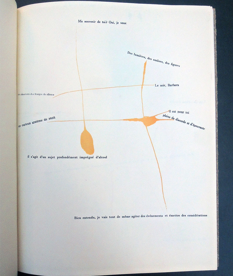
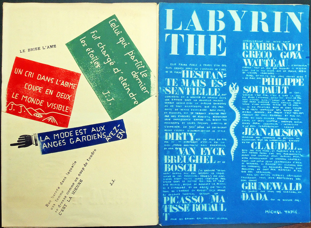
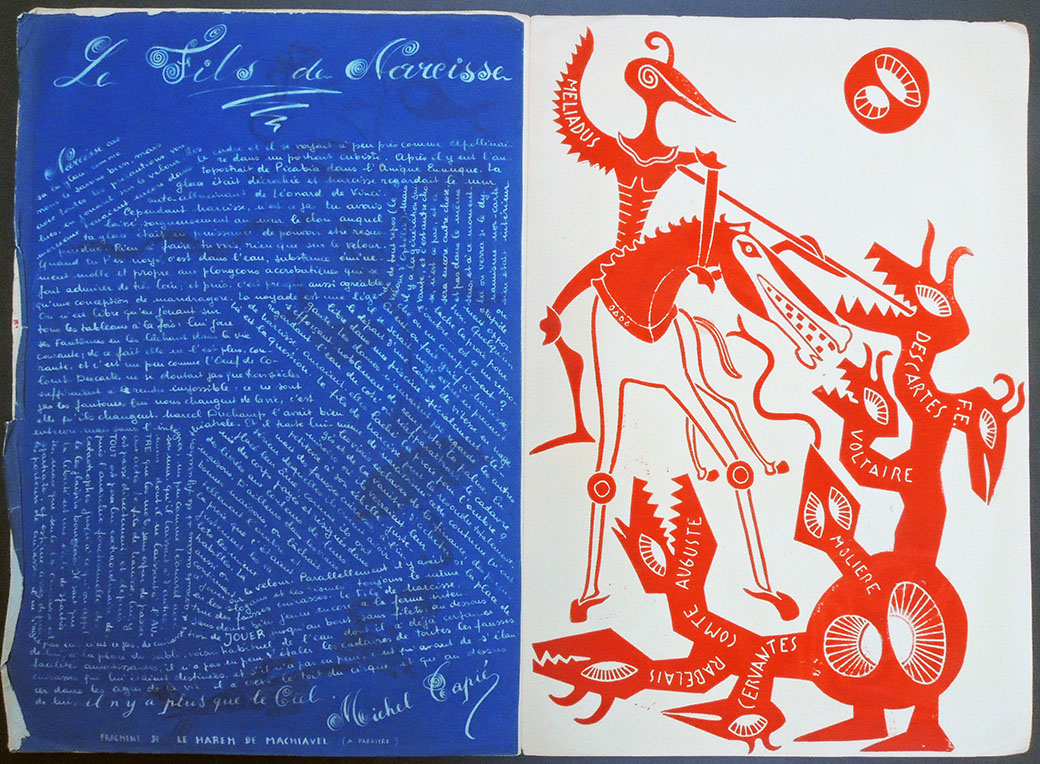
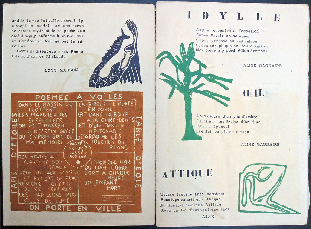
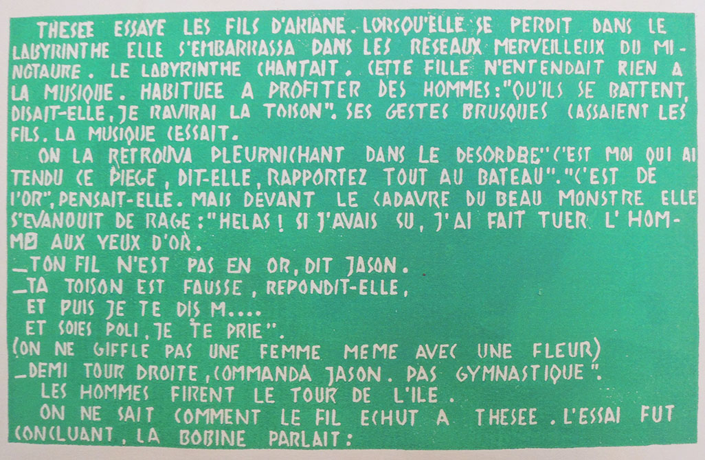
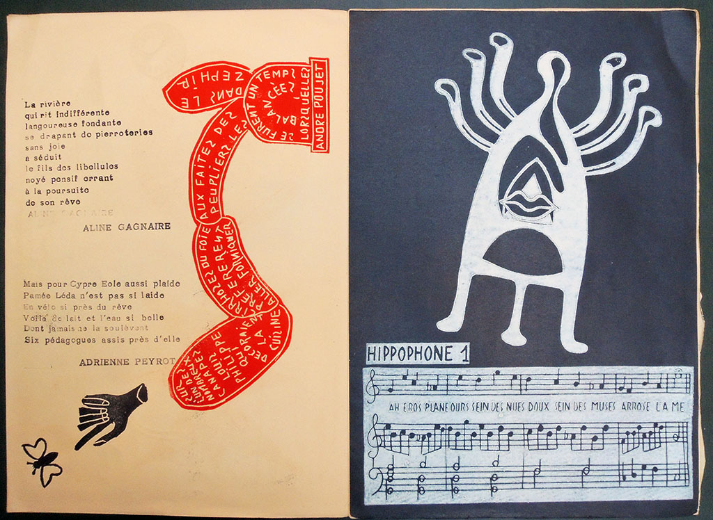
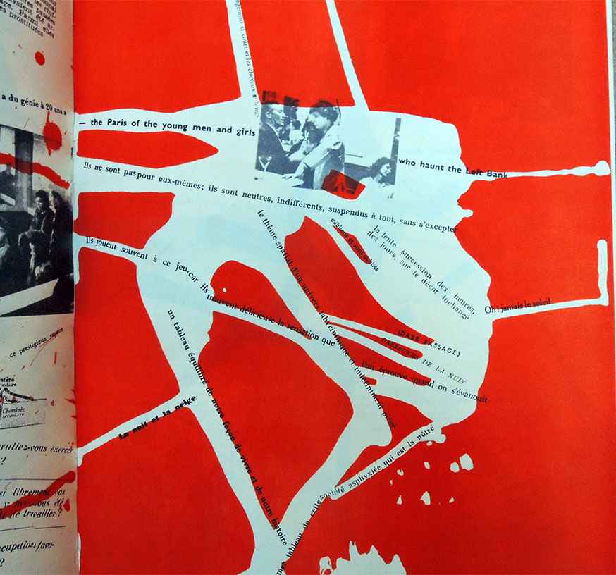
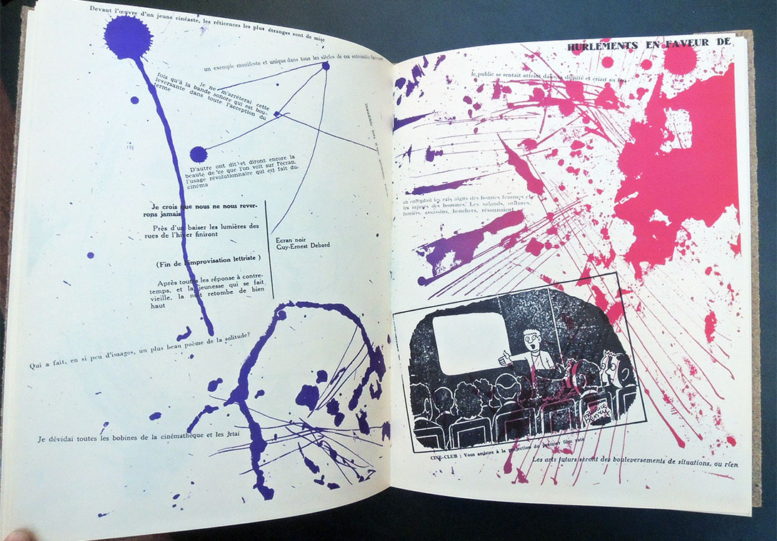
Although few people own copies of these rare publications, both the first collaboration Fin de Copenhague and Mémoires are embedded in art historical literature of the period, such as a review in Architectural Review, October 1957, calling Fin de Copenhague a “remarkable piece of improvisation among the techniques of graphic reproduction.” The startling layouts in both volumes “anticipate, by 30 or more years, the typographic and textual fragmentation of Cranbrook, CalArts and Ray Gun magazine, which became a global design phenomenon.”

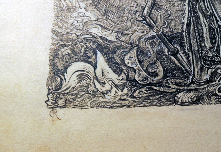
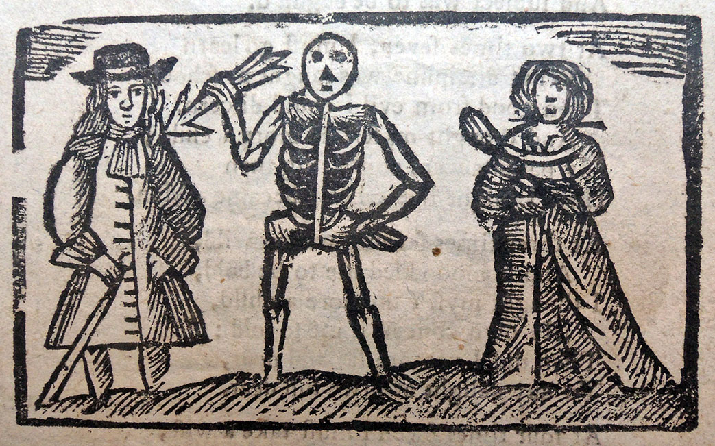
One of many descriptions of the making of these books, both publishing and performance, recounts:

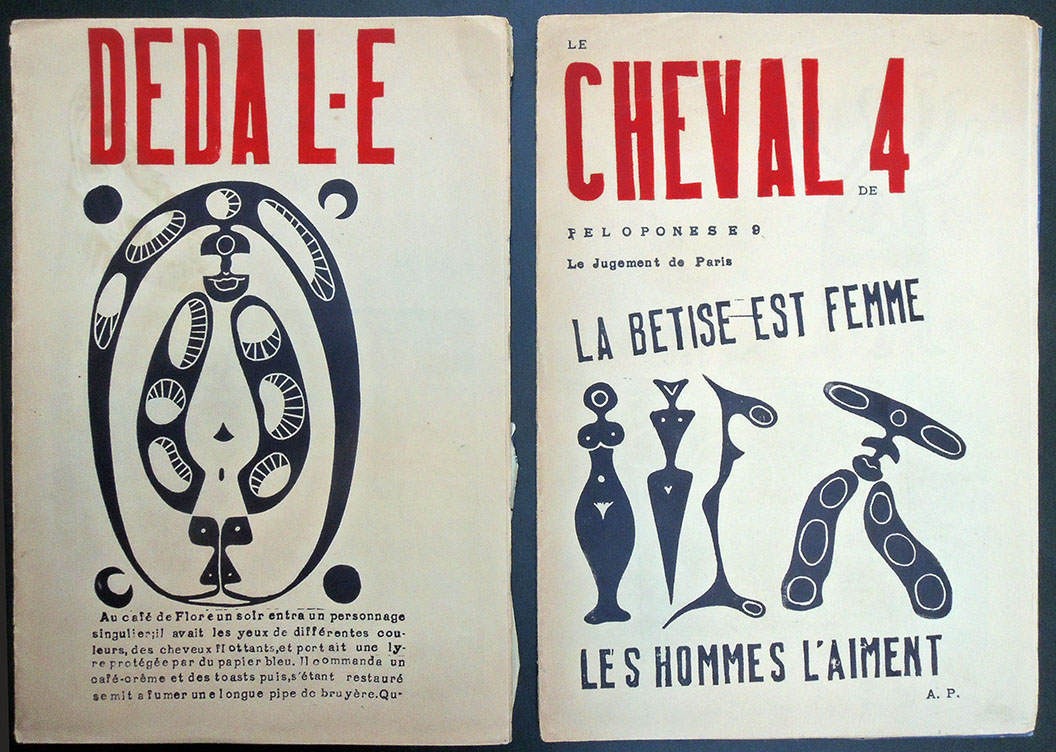
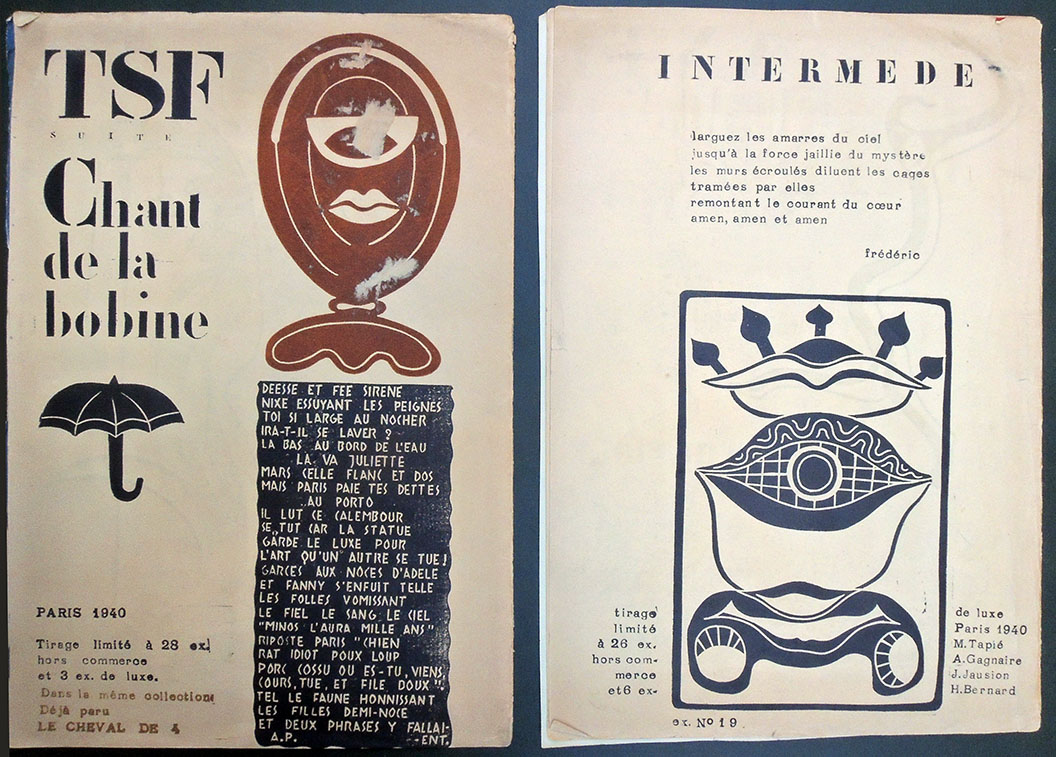
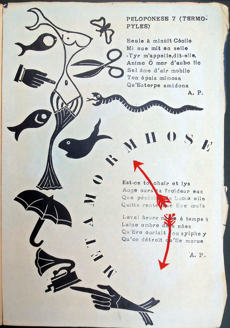
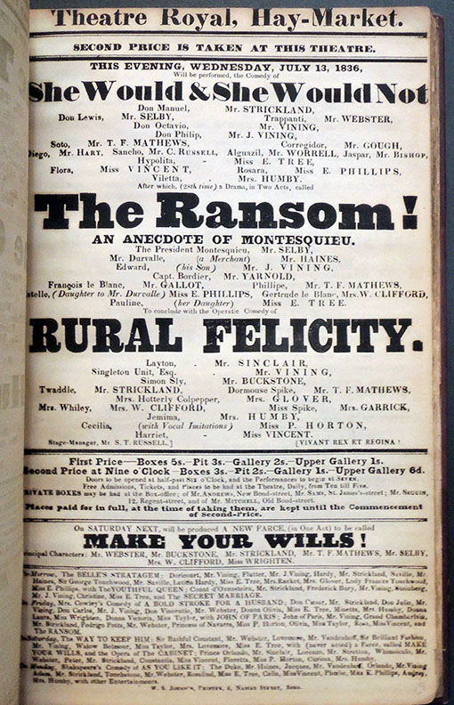
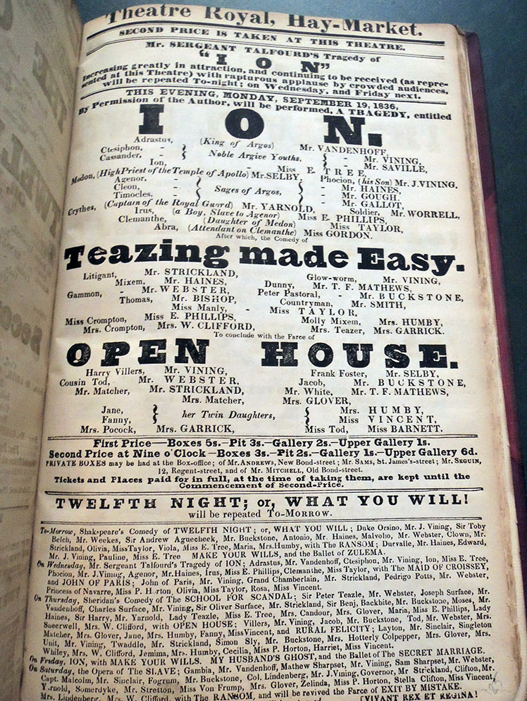
Having just arrived in Copenhagen, Jorn and Debord rushed into a newsagents, stole a huge amount of magazines and newspapers, and spent a drunken afternoon collaging elements together. The next day they arrived at the printers with 32 collages, which were transferred to lithographic plates. Jorn then sat at the top of a ladder over the zinc plates, dropping cup after cup of Indian ink onto them. The plates were then etched and printed over the black texts and images.


Grand jeu de l’histoire de Paul et Virginie

Grand jeu de l’histoire de Paul et Virginie. Avec figures coloriées (France, after 1863). Graphic Arts Collection GAX 2019- in process

The Graphic Arts Collection recently acquired a scarce set of playing cards inspired by Bernardin de Saint-Pierre’s popular novel Paul et Virginie, first published in 1788. The cards are housed in a mid-nineteenth-century romantic paneled cloth binding, ornately decorated with gilt and colored detailing. The central panel on the front cover has been cut away to enclose a further colored vignette and title caption from the playing cards.

Rare book dealer and historian Amanda Hall determined that the previous occupant of the binding was “Madame Wolliez’ Souvenirs d’une mère de famille, a collection of educational stories that was first published in 1833 but which continued in print through to the end of the century. This seems most likely to have been a publisher’s binding issued by the booksellers Mame in Tours for their ‘fifth’ edition of 1863. Madame Wolliez’ work has been removed from its binding and is has been replaced by these beautiful playing cards, each separately mounted.”


The date of this collection is hard to judge but might be sometime after 1863, given the binding. OCLC suggests a date of 1815 but the Morgan Library copy has a watermark of the Dambricourt paper mill suggesting that it was created around 1834. “Some of the unsigned etchings can be traced back to the first illustrated edition of 1789, containing plates after Moreau le Jeune and Joseph Vernet.”–Morgan, Corsair online catalog.

It has been suggested that the cards were the work of Jean-Charles Pellerin at Epinal: “Dès 1800, Pellerin inaugure sa longue série d’illustrations du roman [de Bernardin de Saint-Pierre] avec son Grand jeu de l’Histoire de Paul et Virignie” (see François Cheval and Thierry-Nicolas C. Tchakaloff, Souvenirs de Paul et Virginie, 1995, p. 153). Paul Toinet, however, ascribes them to the celebrated artists and engravers of rue Saint Jacques in Paris (see Toinet, Répertoire bibliographique et iconographique de Paul et Virginie, no. 742).

Both the Morgan Library and Yale University record copies of the twenty-five cards printed on a single sheet. There are also copies in the Musée Léon Dierx de Saint Denis de la Réunion and at the Rouen Musée national de l’éducation.


The novel tells the story of Paul and Virginia, who are raised as brother and sister by two widows. Both mothers agree to marry the two children when they are old enough. Virginia’s aunt proposes to send her niece to France. Virginia accepts, though she is heartbroken to leave Paul, whom she loves. Two years later, she sails back to Mauritius Island, but her ship is pushed against reefs by a tempest and Paul fails to save her. Shortly after, he dies from grief.

In The French Revolution: A History, Thomas Carlyle wrote: “[It is a novel in which] there rises melodiously, as it were, the wail of a moribund world: everywhere wholesome Nature in unequal conflict with diseased, perfidious art; cannot escape from it in the lowest hut, in the remotest island of the sea.”


American War Information Unit, 1945

KZ: Bildbericht aus fünf Konzentrationslagern Amerikanisches Kriegsinformationsamt (S.l.: American War Information Unit, no date [1945]). Graphic Arts Collection GAX 2019- in process

One of the earliest reports and the first published by the United States Army on the horrors of Nazi concentration camps, this fragile pamphlet offers eyewitness accounts of American and British troops after the liberation of Buchenwald, Belsen, Gardelegen, Nordhausen and Ohrdruf.

KZ was distributed in Germany by the Psychological Warfare Division of the American War Information Unit (Amerikanischen Kriegsinformationsamt im Auftrag der Oberbefehlshaber der Aliierten Streitkräfte) at the end of the war in order to convey the enormity of the crimes committed under the Nazi regime. Despite wide circulation, relatively few copies remain and so, it is important that one has now entered the Graphic Arts Collection.

These photographs are reported to have played an important role as evidence in the Nuremberg Trials. Note, only a few pages have been posted here due to the horrific content depicted.


Ricketts’s drawings, published and unpublished


[Above] John Byrne Leicester Warren, Baron de Tabley (1835-1895), Poems dramatic and lyrical; with illustrations by C. S. Ricketts (London: E. Mathews and John Lane ; New York : Macmillan and company, 1893). ExC J. Harlin O’Connell Collection 3713.1.1893. “This edition is limited to six hundred copies.”

[Above] Charles Ricketts (1866-1931), Nimrod, 1893. Pen and ink drawing for John Byrne Leicester Warren, Baron de Tabley (1835-1895), Poems dramatic and lyrical; with illustrations by C. S. Ricketts (London: E. Mathews and John Lane ; New York: Macmillan and company, 1893). Graphic Arts Collection GA 2006.02078

[Below] Oscar Wilde (1854-1900), The Sphinx; with decorations by Charles Ricketts (London: E. Mathews and J. Lane, 1894). Rare Books 3989.5.386.11. “Limited for England to 200 copies.”

[Below] Charles Ricketts (1866-1931), The Sphinx, 1916. Pen and colored inks drawing, not included in Oscar Wilde (1854-1900), The Sphinx (London: E. Mathews and J. Lane, 1894). Graphic Arts Collection GA 2006.02079. The genesis of this drawing is not known. There was no proposed 1916 edition of the Wilde book.

Charles Ricketts has been called the quintessence of the nineties. In his life as much as his work, he embodied not merely an “aesthetic” devotion to art and beauty but also many of the fin de siècle’s finest creative energies. …In London, the writers Oscar Wilde, Michael Field, John Gray, Thomas Hardy, W. B. Yeats and Thomas Sturge-Moore were all eager for Ricketts to decorate their books or design stagings for their plays.

Wilde especially was proud of Ricketts’s involvement in his own work: he once called Ricketts “the subtle and fantastic decorator” of his books. In some respects, Ricketts was Wilde’s collaborator or kindred spirit. His sympathies with Wilde were profound. His designs for Wilde’s The Sphinx mark one of the high points, if not the high point, of late-Victorian book design.”

–selection by Nicholas Frankel, Associate Professor of English at Virginia Commonwealth University, editor of Ricketts’s The Sphinx and author of Oscar Wilde’s Decorated Books and Masking The Text: Essays on Literature and Mediation in the 1890s. http://www.1890s.ca/PDFs/ricketts_bio.pdf


Première Imprimerie Royale

L’abbé François-Philippe de Laurens de Reyrac (1734-1781), Hymne au soleil (Paris: de l’Imprimerie royale, 1783). Previously owned by Bernard H. Breslauer. Graphic Arts Collection GAX 2019- in process

Étienne-Alexandre-Jacques Anisson-Duperron (1749-1794) joined his father at the Imprimiere Royal (Royal printing office) in 1783 and succeeded him in 1788. He was especially interested in papermaking and printing methods, and claimed to be the inventor of the ‘one-shot press’. This work ended in 1792, when the Office became the Imprimerie nationale (National Printing Office) and not long after this Anisson-Duperron was arrested on charges of provoking disturbances, finally sentenced to death and executed on April 25, 1794. He is the author of a thesis presented to the Royal Academy of Sciences from March 1783 and published in 1785 under the title “First Memoir on the printing in letters, followed by the description of the new press executed for the service of the King …”. — https://data.bnf.fr/fr/12449428/etienne-alexandre-jacques_anisson-duperon/

In 1783, one of Anisson-Duperron’s first projects at the Imprimiere was to produce this little book as a demonstration of his new press (the invention of which was claimed by Didot l’Aîné). For a text, he chose L’abbé de Reyrac’s Hymne au soleil, written in 1776 and reprinted several time in various formats due to its popularity.

The Graphic Arts Collection recently acquired a copy this first book printed with the new press “à un coup.” It is a superb presentation copy bound in morocco with the royal coat of arms. According to the catalog of the Breslauer collection, “this version of the Royal arms (45 mm high) is not recorded. […] No other book printed by the Imprimerie Royale in a binding with its arms appears to be known”. –From the library of Bernard Breslauer (Bibliotheca bibliographica breslaueriana I, New York, 2005, no. 66: “The recipient of this handsomely bound work of publicity, presumably presented by the director of the Royal Press, is not identified”).

There are two known issues. In the first issue, printed on laid paper, p. [1] (1st count) is blank and the text “Première épreuve …” is printed on the front cover. In the second issue, printed on wove paper, the text “Première épreuve …” is printed on p. [1] (1st count), and substantial portions of the text have been reset. The copy in the Graphic Arts Collection is the second issue, with text “Première épreuve” printed on p. [1].

“Première épreuve d’une nouvelle presse inventée pour le service de l’Imprimerie royale: et approuvée par l’Académie des sciences le 17 mai 1783. Cette presse qui diffère des autres dans presque toutes ses parties, est plus expéditive d’un quart que les presses ordinaires, & rend la main d’œuvre moins pénible: Elle procure aussi aux ouvrages une perfection indépendante du talent des ouvriers.” = First test of a new press invented for the service of the Royal Printing Office: and approved by the Academy of Sciences on May 17, 1783. This press, which differs from the others in almost all its parts, is more expeditious than a quarter ordinary presses, and makes work less painful. It also gives the book a perfection independent of the talent of the workmen.


Thanks in particular to John Logan, Literature Bibliographer, Collection Development, Scholarly Collections and Research Services, for his help in this acquisition.

State of the Union

Werner Pfeiffer, State of the Union: a Snapshot of Our Political and Social Conundrum ([Red Hook, N.Y.] : Pear Whistle Press, 2012). Graphic Arts Collection.

A representation of the flag of the United States divided into 8 rectangular sections, each holding accordion folded reproductions of articles from periodicals on one side, the other containing images of fanciful 19th-century mechanical instruments surrounded by political quotations.


“Werner Pfeiffer was born in 1937 in Stuttgart in the southwestern part of Germany. He studied at the Akademie der Bildenden Künste in his home town. In 1961 he emigrated to the United States. Initially, he was active as a designer and art director on a variety of projects. In this capacity he received many citations and awards from the New York Art Directors Club, the New York Type Directors Club, the New York Society of Illustrators, and the American Institute of Graphic Arts. His design work has been widely published in the international design literature in magazines such as Graphis, Gebrauchsgrafik, Print, Modern Publicity and Art Direction.

In 1969 he was appointed Professor of Art at Pratt Institute in New York. At the same time he assumed the position of director of the Pratt Adlib Press, a publishing venture of the Department of Graphic Art at Pratt.”

Death’s Arrow

The Christian’s Looking-Glass. In four parts. I. Contemplations on the Life of Man; Shewing his Birth, Progress, and Manner of living, his Thirst after Riches, and sudden Decay from that Vain-Glory. Set forth in a plain and easy Stile, for the instruction both of old and young. II. An excellent Poem on Time; fit to be purused by those who spend their precious Time in voluptuous, sinful, and unnecessary Pleasures. III. Sacred Contentment: Or, The best Companion for an afflicted Mind. IV. Rules out of the Golden Tables of Ptolomy [sic]. Printed and sold at the printing office in Aldermary church-yard, Bow Lane, 1780. Graphic Arts Collection, on deposit from Bruce Willsie, Class of 1986.

This simplified woodcut of death with an arrow is a common symbol in western art. Here are a few more examples.

Hieronymus Bosch, Death and the Miser, ca. 1485/1490. Oil on panel. National Gallery of Art


Willem van Swanenburg, after Maarten van Heemskerck, Allegories of the Misuse of Wordly Property, Plate 4, ca. 1609. Engraving. British Museum


Jan van de Velde II, Death with arrow and hourglass, 1633.


Thomas Bewick, Fable of the Old Man and Death, ca. 1789. Illustration to an unidentified publication. Wood engraving. British Museum


Unidentified artist, The Last Drop, 1778. Etching. Published by Matthew Darly.


Wall-painting commemorating Louis, duke of Orléans, in the family chapel at the monastery of Les Célestins, Paris, commissioned in the late fifteenth century and destroyed ca.1779. Antiquarian Gaignières drawing. Bodleian Library, MS Gough-Gaignières 1, fol. 1r.


After Francis Hayman, The Bad Man at the Hour of Death, ca. 1784. Hand-colored mezzotint. Published by Carington Bowles. British Museum


after Joshua Gleadah, Death and the Dancer, 1800s. Aquatint. Wellcome Library, London.

Les Réverbères

Early in his career, the influential French painter and critic Michel Tapié (1909-1987), editor of Francis Picabia’s 1949 catalog 491 and author of the pivotal study Un art autre (Art of Another Kind, 1952), joined forces with the artist Aline Gagnaire (1911-1997) to produce three issues of a spectacular magazine, under a collective they called “Les Réverbères.”

Printed by hand from woodblocks, the editions are believed to have been around 31 signed copies, although the magazine is so rare it is difficult to verify. The Graphic Arts Collection recently acquired two of the three issues produced in 1940 wartime Paris. Each issue has it’s own title, here showing Le Cheval de 4, the first issue, and Dédal-e, the second.

Front covers

Michel Tapié (1909-1987); Aline Gagnaire (1911-1997); Jean Jausion; Henri Bernard (1868-1941); Noël Arnaud; Simone Bry; and Adrienne Peyrot, Le cheval de 4 and Dédal-e (S.n. [Paris]: s.l., 1940). Graphic Arts Collection GAX 2019- in process.

Back covers


According to the Historical Dictionary of Surrealism by Keith Aspley, the “Réverbères” club was founded in 1938 in the painter Jean Marembert’s workshop by Tapié, together with other neo-dadaist writers Jacques Bureau, Pierre Minne and Henri Bernard, who campaigned for the rehabilitation of Dada at impromptu evening parties in the Montparnasse district. With the same objective, they published this typically Dada journal, designed and produced on a small scale.

The pages of each issue are typographical masterpieces, combining literary texts using humor and vibrant color woodcuts. There are magnificent puns and spoonerisms, recapturing the extravagant spirit of the Dada pioneers Tristan Tzara or Marcel Duchamp.

This journal of exceptional visual and literary quality marks one of the last productions of the French artistic avant-garde before the start of the German oppression.


Varley’s List of Colours


Watercolorist John Varley (1778-1842) helped to establish the first Watercolour Society in London, and later the Society of Painters in Oil and Watercolours, serving as one of the leading instructors in the medium. In his cottage at Twickenham, Varley’s students learned to draw and paint from nature, among them William Mulready, John Linnell, and Samuel Palmer.

This sheet, recently placed on deposit in the Graphic Arts Collection, is assumed to have been created for his students rather than the general public. Eighteen colors are illustrated with hand-painted samples and explanations of their qualities along with recommendations for use. The upper nine painted in pure pigment colors are Prussian blue, indigo, lake, gamboge, burnt sienna, yellow ochre, Venetian red, vermilion and burnt umber. The lower nine painted in mixed tints are warm grey, purple grey, neutral tint, dark warm grey, warm green, olive green, orange, roman ochre and sepia.

The copy of Varley’s list held by the British Museum illustrates nineteen colors, beginning with cobalt blue, not found on the sheet in the Graphic Arts Collection at Princeton.

The Art Journal, 1841 Vol. 3-5

In conjunction with his classes, Varley published a number of instruction manuals including:

A Practical Treatise on the Art of Drawing and Perspective, 1815.
Precepts of Landscape Drawing, exemplified in fifteen views, 1818.
Varley’s List of Colours, 1818 (Princeton’s 1816)
A Treatise on the Principles of Landscape Design, illustrated by sixteen views on eight aquatint plates, issued in eight parts at 5s., between 20 Feb. 1816 and 1 May 1821.
A Treatise on Zodiacal Physiognomy (five illustrations), 1828.

The final volume was developed with his closest friends John Linnell (1792-1882) and William Blake (1757-1827). The two portraits above are by Linnell.

The works that brought Blake most notoriety in his lifetime, and were most responsible for accusations that he was mad, were the ‘Visionary Heads’ he did for the delectation of the landscape watercolourist John Varley, whom he had met in 1818 through one of Varley’s pupils, John Linnell, the great patron of Blake’s later years. These Heads … portray biblical and historic individuals such as David, Socrates and Richard Coeur de Lion, semi-historical characters such as Wat Tyler’s Daughter and imaginary beings such as The Man who built the Pyramids. They were executed from 1819 onwards, mainly in the evenings at Varley’s house. –selection from “Blake, Linnell and Varley and A Treatise on Zodiacal Physiognomy” by Martin Butlin.


John Varley (1778-1842), J. Varley’s List of Colours, 1816. Letterpress and watercolor. Graphic Arts Collection. On deposit from Bruce Willsie, Class of 1986.

See also:
John Varley (1778-1842), A Practical Treatise on Perspective [adapted for the study of those who draw from nature … by] (London: The author, 1815). Rare Books » Oversize NC730 .V43f

John Varley (1778-1842), A Treatise on the Principles of Landscape Design; with general observations and instructions to young artists ... (London: Sherwood, 1821). Rare Books » Oversize NC730 .V42f

John Varley (1778-1842), A Treatise on Zodiacal Physiognomy : illustrated by engravings of heads and features, and accompanied by tables of the time of rising of the twelve signs of the Zodiac : and containing also new and… (London: Published by the author … ; and sold by Longman and Co. … , 1828). Rare Books 2005-2238N

Programmes of the Theatre Royal, Haymarket, for the Season of 1836

The Graphic Arts Collection has been given, on deposit, 135 programs from the Theatre Royal, Haymarket, for the Season of 1836. The bound set is inscribed from the actor and playwright Sir Edward Seymour Hicks (1871-1949), best known for the role on stage and screen of Ebenezer Scrooge in Charles Dickens’s A Christmas Carol.

Our thanks to Bruce Willsie, Class of 1986, for finding and donating this volume. Here are a few samples assumed to have been collected and bound by Hicks: