Category Archives: Acquisitions

new acquisitions

Mr Pipp the Barber and other early comic strips


The Graphic Arts Collection recently acquired three items from the library of Anne and F.G. Renier of interest to early comic strip researchers. Two were drawn by John Lewis Roget (1828-1908), the son of thesaurus-creator Peter Mark Roget. For more examples of work by John Lewis Roget, see: https://graphicarts.princeton.edu/2014/02/05/rogets-other-work/. The third volume has potential connections to Roget.

Above are a few of the 44 pages from Mr. Pipp,  in which he attempts to woo Mrs. Plum by learning to dance, wearing a wig, losing weight, and other personal improvements. Poor guy.

Viewers will immediately think of Rodolphe Töpffer (1799-1846), who is often credited with drawing the earliest European illustrated comic strip (although James Gillray was doing it much earlier). Töpffer drew Histoire de Mr. Vieux Bois in 1827 and then, published the small volume in 1837. See: https://graphicarts.princeton.edu/2017/04/07/histoire-de-mr-jobard-and-others/ There is no record of Roget’s Mr Pipp appearing in print.


Along with Pipp, we also acquired A Shepherd Once Had Lost His Love, which takes its title from the popular song from Storace’s Drury Lane Opera The Cherokee, 1794. Finally, seen below is a work by the unknown Adolphus Gosling, also named W.A.G. Neither moniker has been found in any database or drawing catalogue and yet, the very similar style suggests a connection with Roget.

What do you think?


John Lewis Roger (1828-1908), A Sketch of a Passage in the Life of Mr. Pipp the Barber; wherein the inroads made upon his peace of mind by the Widow Plum, the fair grocer, are duly registered by their mutual friend and admirer J.L.R. ([England] : J.L. Roget, 1848). Graphic Arts Collection GA2018- in process
John Lewis Roger (1828-1908), A Shepherd Once Had Lost His Love (1847). Graphic Arts Collection GA2018- in process
W.A.G. [Adolphus Gosling], Outlines of the the most interesting portion of the chequered life of that singular individual, designed and drawn by W.A.G. (1851). Graphic Arts Collection GA2018- in process

Micrography


Those who attended the exhibition on Matthias Buchinger prepared by collector Ricky Jay and curator Freyda Spira at the Metropolitan Museum of Art in 2016 will remember the many examples of micrography shown, a traditional art form dating to the late ninth century, in which minute lines of text are used to shape patterns or forms. The Graphic Arts Collection recently acquired two 19th century examples of micrography, each with decorative miniature text around a famous theologian.

The first broadside highlights Martin Luther (1483-1546)–different from the Luther seen at the MET–engraved and etched by Theodor Goetz (1779-1853) of Weimar, Germany. The print is dated 1817, suggesting it was prepared to celebrate the tercentenary of the reformation. Luther is seen “clad in the creed of the holy bishop of Afhanasii, and embraced with the apostolic and Nicene creeds.”

The second broadside is dedicated to John Calvin (1509-1564), a French theologian, pastor and reformer in Geneva during the Protestant Reformation. The miniature text is written in Hungarian and although we do not know where it was produced, it is likely this was also part of a tercentenary celebration.

PBT 1904-1917

Beginning in September 1904, the journalist and poet Eustaquio Pellicer (1859-1937) wrote, edited, and published the satirical weekly P.B.T. out of Buenos Aires. Subtitled “para niños de 6 a 80 años” [for children ages 6 to 80] the magazine lasted thirteen years–693 issues–and together with the Program in Latin American Studies (PLAS), the Graphic Arts Collection has acquired a rare, nearly complete run.

Vol. 1, no. 1 (Sept. 24, 1904)

“The Buenos Aires of the Early Twentieth Century is Reflected in its Pages with Intelligence and Humor,” writes one advertisement. “The word ‘pebete’ in the title was a popular expression in Spain at the time to refer to a boy and which would later take root in Argentina as ‘pibe’.”

The publication was a resounding success, beginning with a print run of 5,000 and explanding to 45,000 copies. It remained true to its motto, focusing on children and adults with varied content featuring photographs and illustrations of weekly current events, stories, poems and reports, jokes, and informative advertisements.

Political satire and caricature also held a prominent place in its pages. P.B.T. was produced by some of the most renowned graphic artists and caricaturists of the time, since a primary focus was precisely the publication’s visual aspects and political caricature. Among them were Mayol, Cao, Zavattaro and Fortuny. This weekly publication, which enjoyed great popularity, contains a wealth of information for the study of Argentine society from the early 20th century to World War I.  Pellicer retired in 1910, maintaining fluid contact with his publication.


Eustaquio Pellicer (1859-1937) was a Spanish journalist, poet, and humorist based in the cities of Rio de Janeiro first and Buenos Aires later. He studied high school in his hometown and in 1886 he traveled to the Río de la Plata where he worked in publications such as La unión Gallega de Montevideo and El Ferrocarril.

In the Uruguayan city of Montevideo he founded a humorous weekly called La Pellicerina and later, in 1890 he founded the magazine Caras y Caretas . Years later he settled in Buenos Aires and at the request of Bartolomé Mitre Vedia founded in that city the Argentine version of the magazine, which gained great popularity.


Eustaquio Pellicer (1859-1937 ), P.B.T.; semanario infantil ilustrado (para niños de 6 a 80 años) (Buenos Aires, 1904-1917). This collection was purchased in part with funds provided by the Program in Latin American Studies (PLAS) and in part the Graphic Arts Collection. GAX 2018- in process.

Playing the weather


Artist Sara Bouchard writes, “Weather Box is a hand-cranked music box, housed in scavenged cardboard and accompanied by 12 punch card scores derived from actual weather data. I obtained hourly reports from the National Climatic DataCenter then graphed changes in temperature, wind and precipitation onto a timeline, which became the foundation for each punch card score. Each score represents one month of weather observations as recorded by NOAA, the National Oceanic and Atmospheric Administration, at the Belvedere Castle weather station in Central Park, NYC.”

Weather Box: March 2014 from Sara Bouchard on Vimeo.

When introduced to Professor Beatrice Kitzinger’s class “Arts of the Medieval Book,” who were comparing contemporary artists’ books with traditional codex structures, the students made comparisons to a Medieval book of hours that holds the offices of the canonical hours of the day. In Bouchard’s work, each page or strip activates the various senses in a small, personal reverie: it can be read with its graphic symbols; seen through its visual aesthetics; and heard as a sensory experience.

Sara Bouchard is a “multi-disciplinary artist and songwriter with a strong foothold in American roots. As an artist, I investigate ways to interact with and represent the American landscape through song. As a musician, I perform original and traditional tunes – drawn from bluegrass, old-time, jazz, country and blues – with my band Salt Parade.”– https://sarabouchard.com/

Hans Burgkmair’s woodcuts reused in “Le relationi universali”


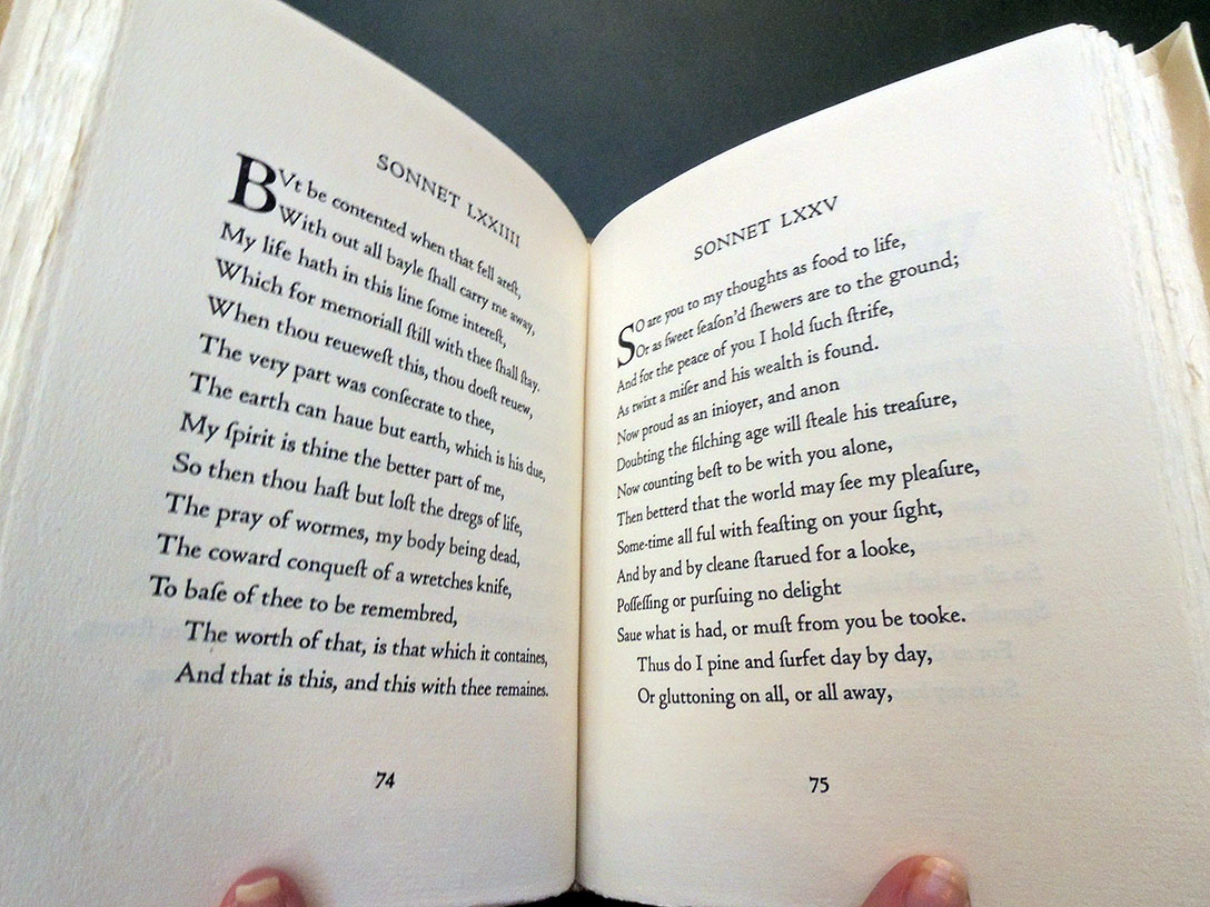
Lengthy essays have been written about Giovanni Botero’s Universal relations but for the Graphic Arts Collection, it is the book’s Aggiunta (supplement) added by publisher Alessandro Vecchi with 33 woodcuts from 32 blocks that must be the primary focus of this rare publication. Vecchi knew the power of pictures.

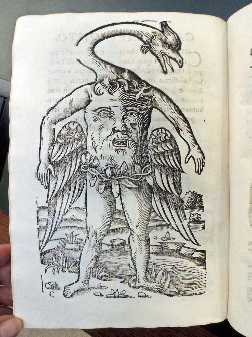
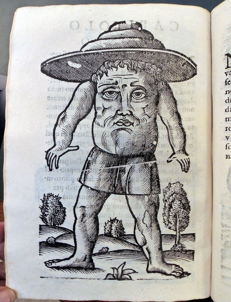
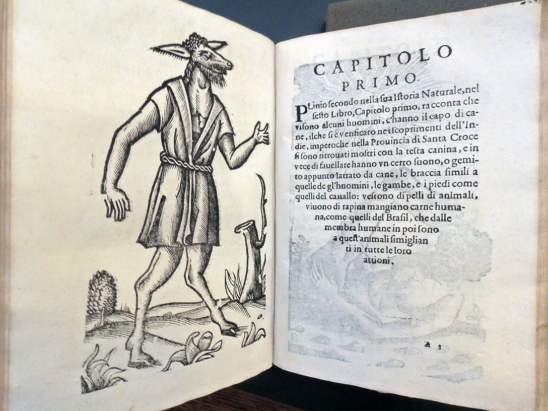
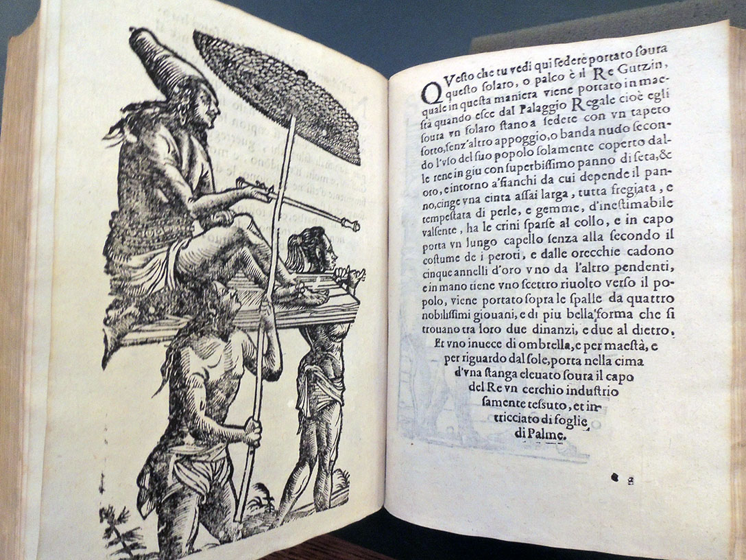
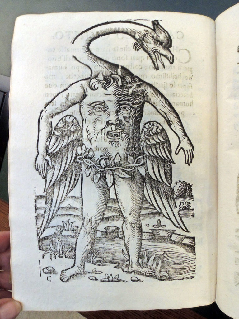
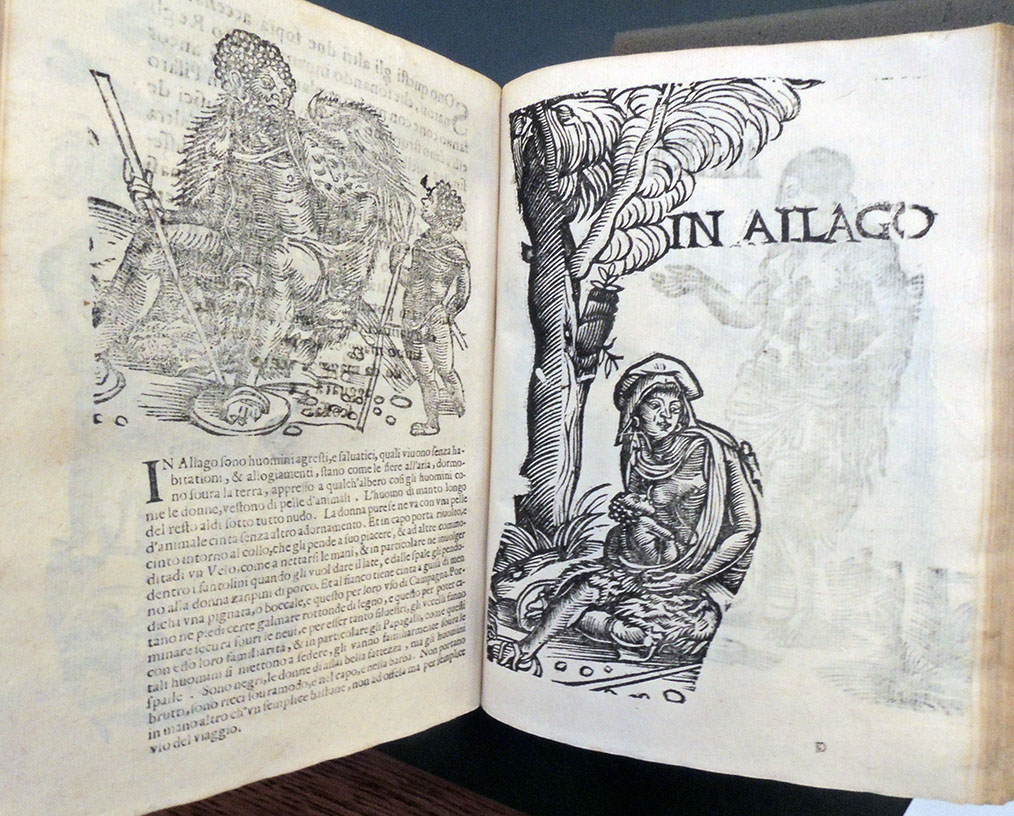
Now attributed to the Renaissance genius Hans Burgkmair (1473-1531), the 30 full-page and 2 half-page woodcuts fall into two sections: the first group depict semi-human monsters and the remainder represent natives of India, Guinea, and East Africa. Walter Oakeshott’s 1960 study claims this was “the first serious study of native life and dress made for publication in a European travel book.”

Thanks to funds provided by the estate of Gillett G. Griffin, the copy recently acquired by the Graphic Arts Collection comes from the collection of Count Wolfgang Engelbert von Auersperg (1641-1709). The volume also holds a 19th-century bookplate of the Auersperg princely library in Laybach (Ljubljana), along with a label of Helmut N. Friedlaender.

Hans Burgkmair the Elder was the foremost Augsburg designer of woodcuts of his time, and together with Hans Holbein the Elder, the most important painter of the early sixteenth century in the city. The British Museum notes that the artist:

“Trained with his father, the painter Thoman Burgkmair (q.v), and from 1488 to 1490, was apprenticed to Martin Schongauer in Colmar. Designed woodcuts for the leading presses in Augsburg throughout his career. He became a master in 1498, and had a short stay in Italy during 1507. Worked primarily for the emperor Maximilian from c.1508 to 1519, for whom he designed the Genealogy of the Habsburgs of 1509-11, Der Weisskunig of 1514-16, Der Theuerdank of 1517 and the Triumphal Procession of 1516-18. …Between 1508 and 1512, [Burgkmair] played a leading role, together with the printer Jost de Negker, in the development of printing in colour. He was particularly influential in the introduction of Italian Renaissance forms into Augsburg.

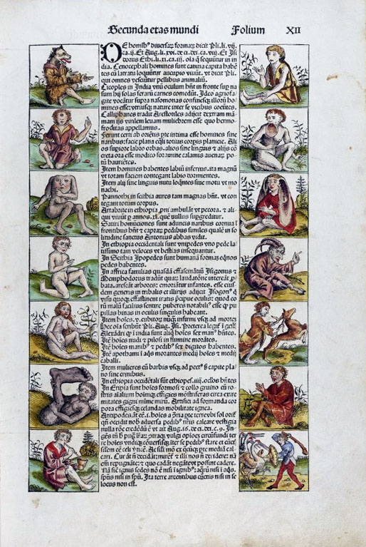
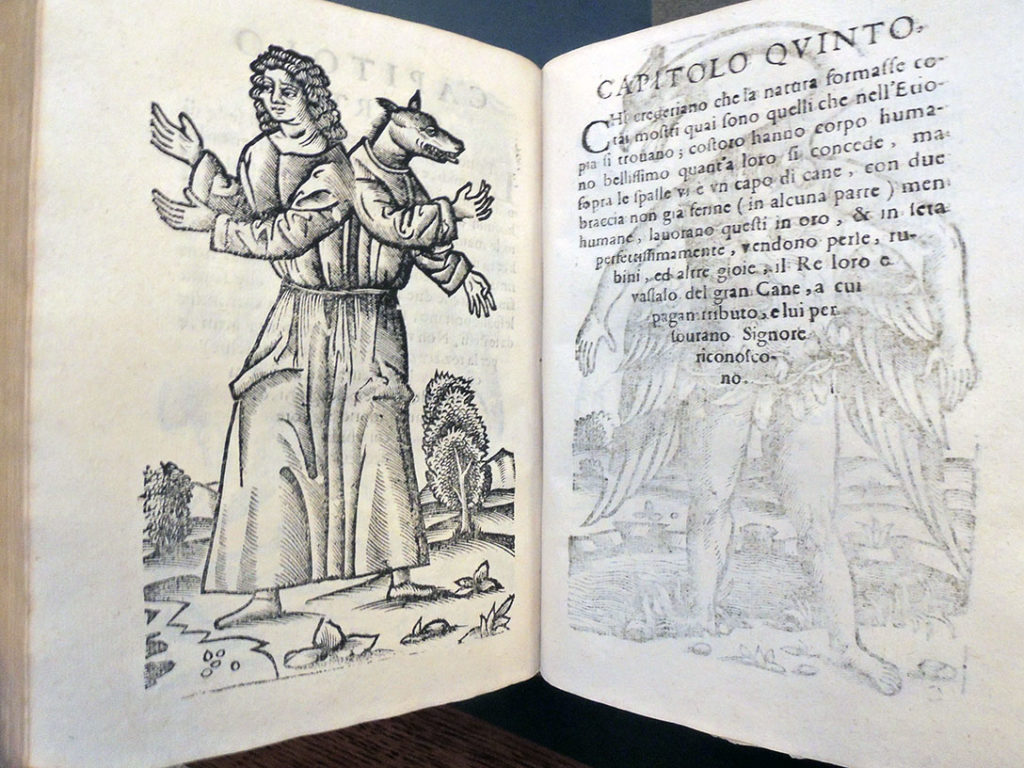
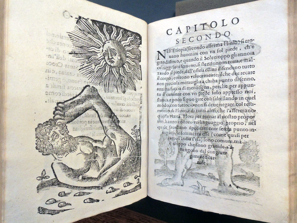
The first of Burgkmair’s 15 woodcuts in the Aggiunta show mythological semi-human monsters, including a centaur, a dog-headed man, and others reminiscent of the border cuts in Schedel’s Nuremberg Chronicle.

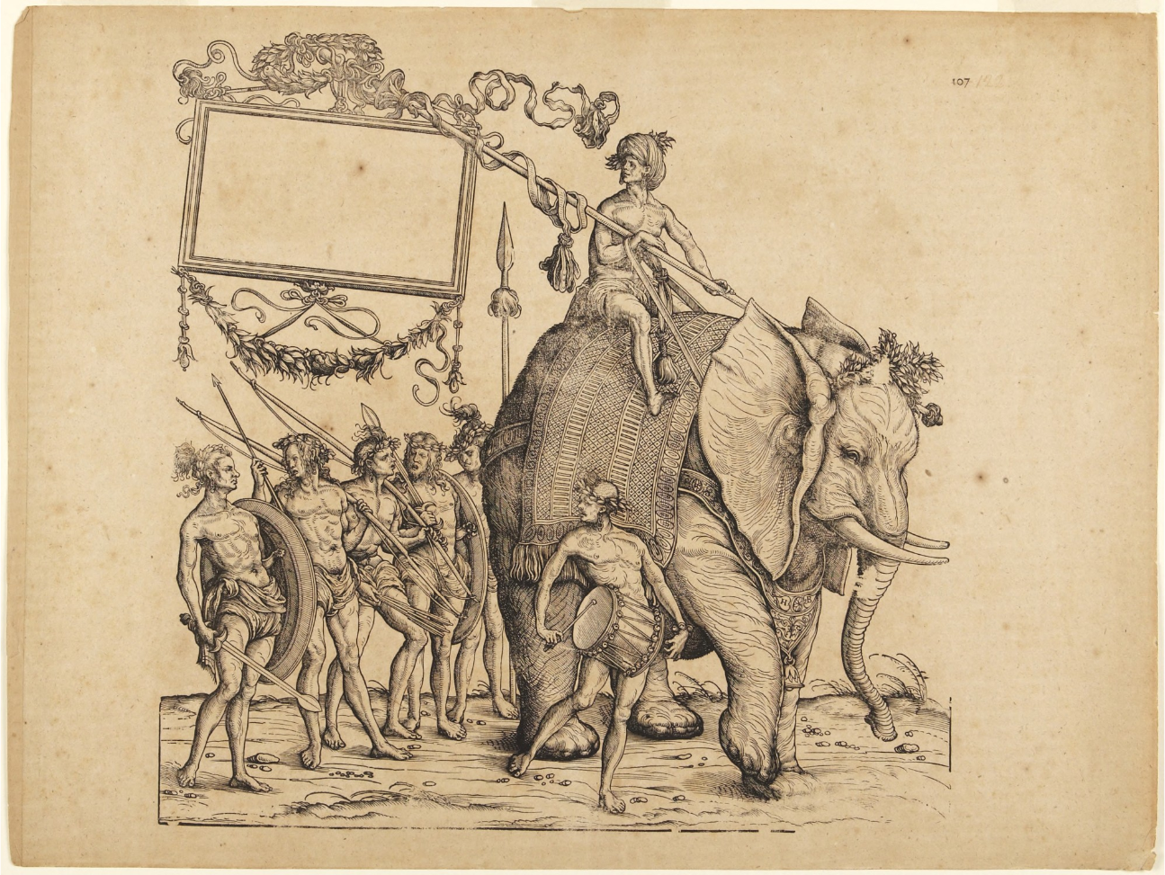
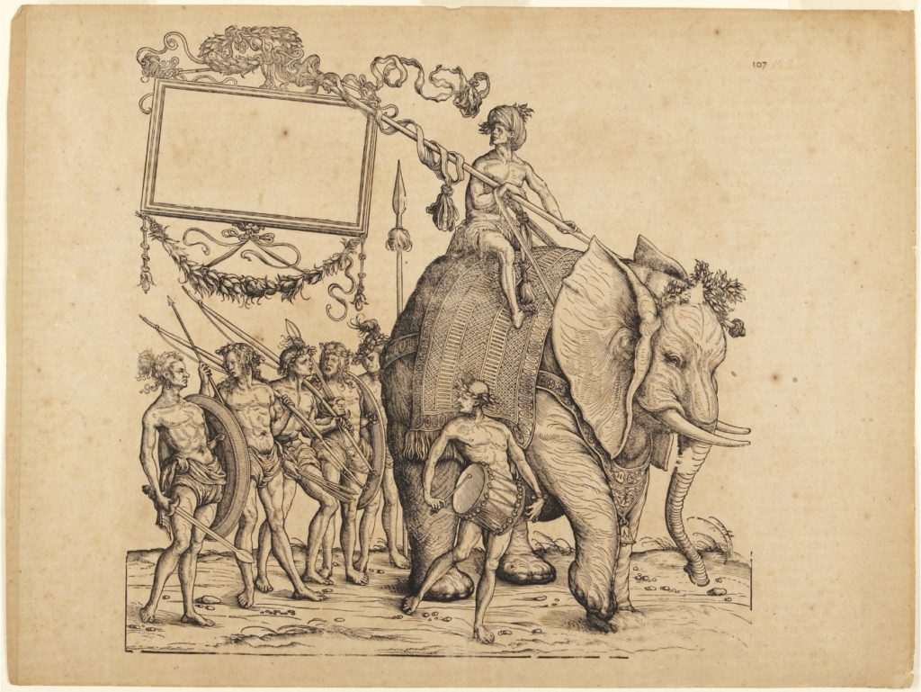
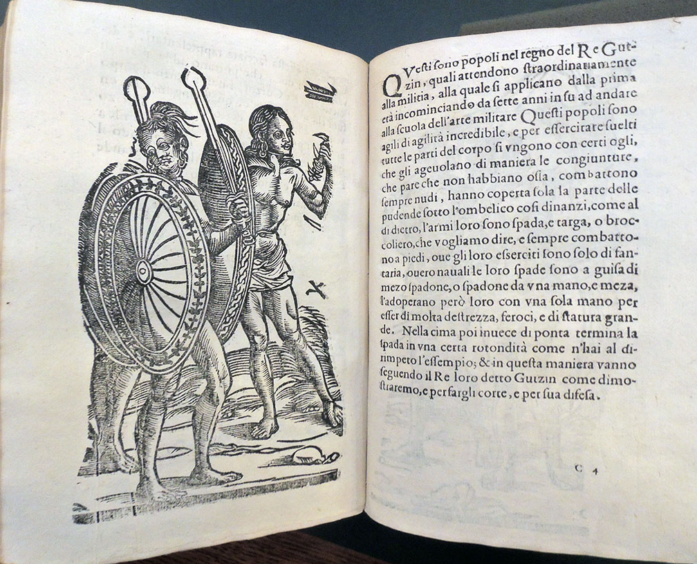
The remaining 17 cuts depict real men and women, in attire and appearance exotic to European readers, 8 of which form part of a panorama that was cut up into single vignettes. The British Museum owns a rare portion of this procession of the King of Cochin, noting:

“These three blocks come from a set of eight, which was originally printed in the format of a frieze … and was based on a short report by Balthasar Springer published in 1508 of the first voyage made by German traders in 1505-6 to Africa, Arabia and the East Indies.”

The Princeton University Art Museum owns a single section (seen below).

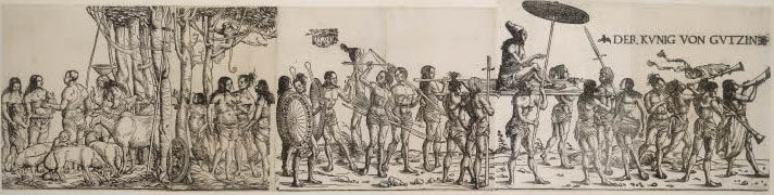
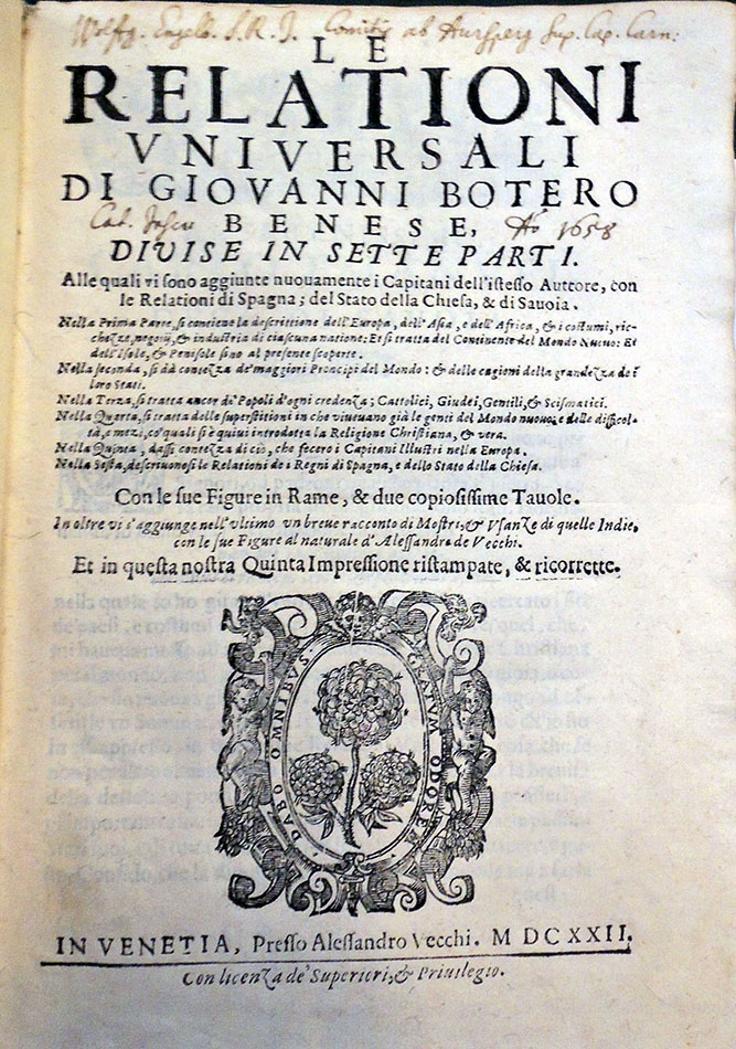
Burgkmair’s original woodcuts must have been known, as they were copied throughout the 16th century, but the blocks themselves were not published until the 1618 edition of Le relationi universali. For the 1622 edition now at Princeton, Vecchi added a title illustration and improved the layout, using a larger type fount.

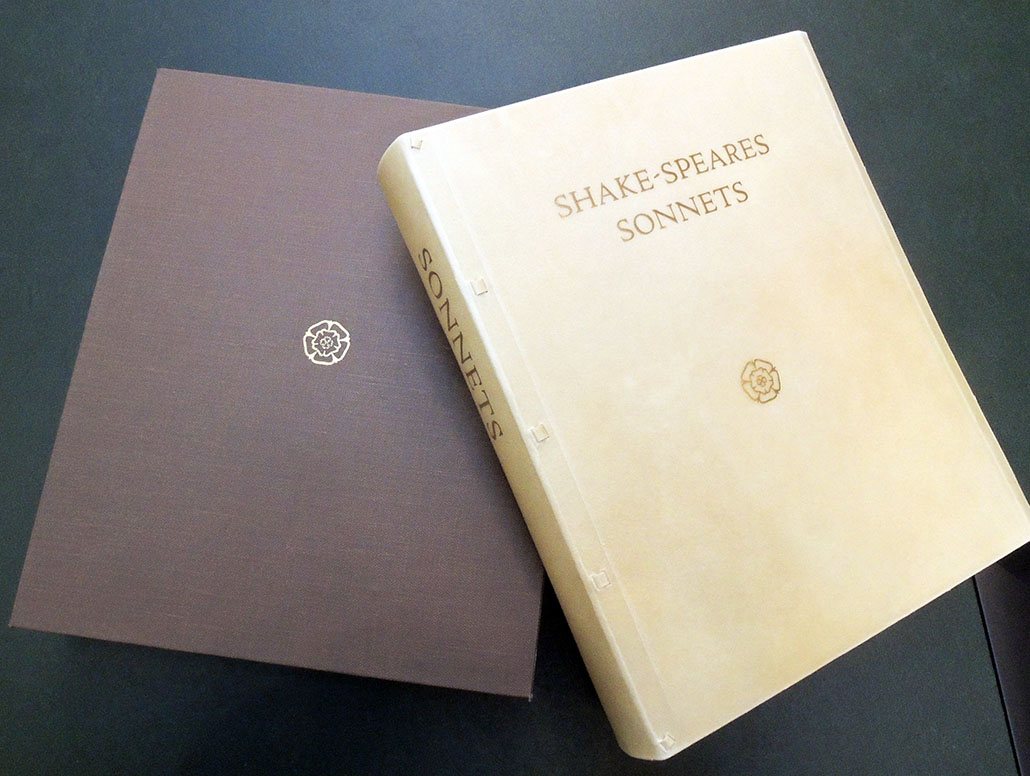
Giovanni Botero (1544-1617). Le relationi vniversali … diuise in sette parti… In oltre vi s’ aggiunge … un breve racconto di Mostri, & Usanze di quelle Indie, con le sue Figure al naturale d’ Alessandro de Vecchi … Quinta impressione stampata & ricorrette (Venice: Alessandro Vecchi, 1622-1623). Eight parts, numbered to six: with the Aggiunta to Part 4, and Part 6 in two parts, separately titled and paginated. Graphic Arts Collection GAX 2018- in process

See also:
Hartmann Schedel (1440-1514), Das Buch der Croniken und Geschichten (Liber chronicarum) (Nuremberg, Anton Koberger, 23 Dec. 1493). Rare Books and Special Collections EXI Oversize 1016.816.11f

Walter Oakeshott (1903-1987), Some woodcuts by Hans Burgkmair : printed as an appendix to the fourth part of Le relationi universali di Giovanni Botero, 1618 (Oxford: Printed for presentation to the members of the Roxburghe Club, 1960). Graphic Arts Collection 2009-0966N

Hans, the elder Burgkmair (1473–1531), The Savages of Calicutt woodcut; watermark: HG? Block. Princeton University Art Museum. Gift of Professor Robert A. Koch, Graduate Class of 1954 x1983-159

Krysodav!

front pagesback pages

Together with Slavic, East European and Eurasian Studies, the Graphic Arts Collection has brought to North America the first complete run of Krysodav! also known as The Rat Crusher.

Complete in three issues, this short-lived satirical Russian literary journal was produced under the editorial direction of Ukrainian writers Leonid Nedolia (later the main editor of Iugo-Lef magazine) and Mark Gai. It features poetry and prose by a number of noted writers related to contemporary politics and social issues in Russia, although it is the spectacular graphics throughout that will draw you in.

Vladimir Vladimirovich Mayakovsky (1893-1930) wrote the poem My [i.e. Us] for the front cover of the first issue (see top). Sergei Mikhailovich Tretyakov (1892-1937) wrote the hymn of the magazine that also appeared in the first issue: in his poem Krysodav is the metaphor for USSR. Sergei Makletsov (born 1892) contributed the impressive collage Nozhnitsy po Trotskomu [i.e. The Scissors according to Trotsky] showing Red Army soldier cutting ‘former people’ with giant scissors (above).

The second issue has several caricatures by Kirill Zdanevich (1892-1969) including the full-page back cover (above) with a Red Army soldier proclaiming Workers of the world, Unite! Issue three also features a Red Army soldier (Lenin) rolling over the map of Istanbul with its people trying to escape. Other contributors include Nikolai Aseev, Osip Brik, Aleksei Kruchenykh, Vsevolod Meyerhold, Dmitry Moor, Boris Zemenkov, and Boris Yefimov.


Крысодав! = Krysodav! (Moskva: [Sibkraĭizdat], 1923). No. 1 (ii︠u︡nʹ 1923 g.)-no. 3 (okt. 1923 g.). Complete run. Graphic Arts Collection GAX 2018- in process

See also online: https://primarysources.brillonline.com/browse/russian-avantgarde-19041946/krysodavdvukhnedelnik;ava332

Toyohara Kunichika

(detail)


Thanks to funds provided by the estate of Gillett G. Griffin (1928-2016), the Graphic Arts Collection has acquired a unique album of 56 superb color woodblock prints by Toyohara Kunichika 豊原国周 (1835-1900). A theater bill has been placed at the front of the album, in which the actors of these portraits are listed in the manner of sumo contestants, followed by the sequence of color woodblock prints. Blockcutters include Katada Horichô, Uta Hori, and Hori Ei; and printers Yamamotoya, Kagaya, Kyu, Kinjudô, Kineidô, and Koeidô. The portraits are chiefly the male actors of the Kabuki theater, many of whom were known personally by the artist.

Toyohara Kunichika (1835–1900), First two (left and center) of triptych: A Shuihuzhuan of Beautiful and Brave Women (Kayûjo Suikoden): Actors Bandô Hikosaburô V, Onoe Kikugorô V, Sawamura Tosshô II (R), Ôtani Tomoemon V, Sawamura Tanosuke III, Iwai Shijaku II, Nakamura Shikan IV (C), Kawarazaki Gonnosuke VII, Bandô Mitsugorô V = 「花勇女水滸傳」 五代目坂東彦三郎、五代目尾上菊五郎、二代目沢村訥升  五代目大谷友右衛門、三代目沢村田之助、二代目岩井紫若、四代目中村芝翫  七代目河原崎権之助、六代目坂東三津五郎、三代目市川九蔵, 1869 (Meiji 2). Publisher Gusokuya Kahei, Blockcutter Ôta Masukichi (Hori Masu). Color woodblock print.

A complete list of the 56 prints with English translations is in process and will be posted in the future.

Kunichika was apprenticed to Utagawa Kunisada at thirteen having previously worked in the studio of the artist Toyohara Chikanobu (not his more famous contemporary of the same name) – his artist’s name being a composite of his two teachers as was the custom. His first confirmed print is from 1854 but his mature works begin in the early 1860’s. Kunichika was above everything an artist of the theatre. The vast majority of his output was concerned with actor portraits – as demonstrated in his great series 100 Roles of Ichikura Danjuro, in depictions of kabuki performances or scenes from well known plays. Despite his obsessive interest in kabuki, some of his best work remains the non-theatrical series, notably 36 Good and Evil Beauties.

–The Toshidama Gallery, where you can also find an 1898 interview with the artist transcribed and translated, http://www.kunichika.net/

Japanese print collectors will recognize many of the actors found in this album from facial features, even without the extensive cartouches, which also provide details on of the plays in which they were appearing. Among them are contemporary stars such as Nakamura Shikan IV (part of an acting dynasty tracing its lineage from 1818 to the twenty-first century), and Ichikawa Sadanji I (1842-1904), one of the leading Kabuki actors of the Meiji period, alongside Ichikawa Danjuro and Onoe Kikugorô.


Toyohara Kunichika, [Woodblock prints of Kabuki actors]. [Tokyo], Meiji 2-Meiji 7 [1869 -74]. Folio album (380 × 254 mm) containing 56 prints. French cloth binding, ca. 1900 with onlaid suminagashi marbled paper. Purchased with funds provided by the estate of Gillett G. Griffin. Graphic Arts Collection GAX 2018- in process.


By one report, Toyohara Kunichika changed residences over 110 times while changing wives 40 times.  He  once boasted, “Although I can’t equal Hokusai in art, I beat him in the number of times I’ve moved.”  He spent money as in the saying, “A true Tokyoite doesn’t save a penny even for one night” and although he was a heavy drinker, he possessed fine manners.  Indeed, Kunichika’s life is full of colorful anecdotes. Kunichika was known as one of “The Three Greats of Meiji Ukiyo-e”, along with Yoshitoshi Tsukioka (1839-1892) and Kiyochika Kobayashi (1847-1915), and received praise as the “Meiji Sharaku”, a reference to the Edo period Ukiyo-e artist, Sharaku.

Source: Database on Yakusha-e Prints from the Ohe Naokichi Collection of Toyohara Kunichika’s Ukiyo-e Prints, Kyoto University Art and Design http://kensaku.kyoto-art.ac.jp/ukiyoe/kuni_e.html and Time Present and Time Past: Images of a Forgotten Master: Toyohara Kunichika (1835-1900) by Amy Reigle Newland (1999)

(detail)

Coming Soon…

Paul Souday (1869-1929), Les livres du temps (Paris: Émile-Paul Frères, 1913). ReCAP PQ281 .S71 1913

If Colette, author of La vagabonde, opened a store, would it be a travel shop? Wouldn’t Max Jacob, author of Le Cabinet noir, open a photography store? What about others?

This is the brilliant literary jeu d’esprit attempted by Pierre Henri Mac Orlan (Pierre Dumarchey, 1882-1970) in conjunction with the artist Henri Guilac (1888-1953) and Daniel-Henry Kahnweiler (1884–1979) who was publishing under the name Simon Kra. It’s easy to imagine them sitting at a sidewalk cafe late one night devising the scenarios, and then preparing a limited edition with pochoir plates under the title Coming Soon. 62 Literary Shops. Here are a few.


André Maurois (1885-1967), Ni ange, ni bête (Paris: B. Grasset, 1927, c1919). ReCAP 3269.34.367

Jean Giraudoux (1882-1944), Adorable Clio (Paris: Emile-Paul, 1920). ReCAP *Z-4838

Anatole France (1844-1924), Le livre de mon ami (Paris, Calmann-Lévy [189-?]). First edition published in 1885. ReCAP PQ2254 .L587 1890z

André Salmon, Peindre (Edité par Paris Ed La Sirène, 1921)

Edmond Jaloux (1878-1949), Le Reste est silence (Paris: P.-V. Stock, 1909). ReCAP 3260.26.376.11

Max Jacob (1876-19 ), Le Cabinet noir, lettres avec commentaires ([Paris] Gallimard, 1968). ReCAP 3260.24.323

Benjamin Crémieux (1888-1944), Le premier de la classe (Paris: B. Grasset, 1921). ReCAP PQ2605.R4 P7 1921

Pierre Mac Orlan and Henri Guilac, Prochainement Ouverture … de 62 boutiques littéraires (Paris: Simon Kra, [1925]). 62 pochoir plates. Graphic Arts Collection GAX 2018- in process.

How Long Is Your Family Tree?

The Graphic Arts Collection recently acquired a bound volume holding seven engraved chronologies produced and published by Louis-Joseph Mondhare (1734-1799), each folded in half vertically and mounted on a stub:

1. Chronologie figurée pour l’intelligence de l’histoire des revolutions monarchiques … Inventé et dessiné par Mrs Mazaroz. A Paris chez Mondhare … [after 1774].
2. Chronologie de France appliquée a la généologie des rois et des princes du sang qui ont eu part au domaine de cet état … Inventé et dessiné par Mazazarot [sic]. A Paris chez Mondhare … [after 1774].
3. Chronologie figurée de l’Empire d ’Allemagne ou table de toutes les revolutions des differents etats d’Allemagne. Par Mr Moreau … A Paris chez Mondhare et Jean … [after 1780].
4. Chronologie figurée de l’Italie ou tableau de toutes les révolutions des differents états de l’Italie a ppliqué à l’histoire sacrée et profane, depuis J. C. jusqu’à nos jours … A Paris chez Mondhare et Jean … [after 1783].
5. Chronologie d’Espagne et de Portugal depuis l’invasion des goths vers l’an 370 avec toutes les revolutions arrivée dans ces roy aumes … A Paris chez Mondhare et Jean … [after 1780].
6. Chronologie d’Angleterre appliquée a la Généalogie des Rois Princes et Princesses qui ont eu des pretentions sur cette Couronne … A Paris chez Mondhare … Mararoz inv. [presumably 1780s].
7. Chronologie figurée des etats du Nord et de la Hollande ou tableau de toutes les revolutions des differents etats du Nord … A Paris chez Mondhare et Jean … [after 1788].

These still-growing trees represent the royal lineage of France; Germany; Italy; Spain and Portugal; England; States of the North and Holland; along with the “history of monarchical revolutions.” Genealogical trees are the most common visualization of family lineage and the Graphic Arts Collection hold a number of others, including this and this and this.


According to the Bnf, Mondare (or Mondard) was an engraver, publisher, and dealer of prints and maps. A native of Bougy (Calvados), Mondhare was active in Paris from 1759 until his death in August 1799. His son Pierre Jean (1754-1829) succeeded him. The British Museum lists his address as Rue St Jacques, à l’Hôtel Saumur.

Although these are European histories, the United States turns up on the far side of the chronology of England, as one of several “conquests and losses” along with Normandy, Ireland, various French provinces, and Scotland.


See also:

Timelines of History [produced in association with the Smithsonian Institution] (New York: DK Publishing, Inc., 2011). Trustee Reading Room Reference (DR) Oversize D11 .T538 2011q

Daniel Rosenberg and Anthony Grafton, Cartographies of Time (New York: Princeton Architectural Press, c2010). Graphic Arts Reference GARF Oversize D11.5. R64 2010


Shake-speare’s Sonnets

“The Petrarch Press edition of Shake-speare’s Sonnets has been the most significant project in our history,” writes William Bentley, “both for the end result and for the new skills and capabilities we developed along the way. The decision to print the original text was itself a journey of discovery, in which we abandoned our initial plan to issue (yet another) modernized edition of these timeless poems, and learned to appreciate the orthography of Shakespeare’s day.”

The Graphic Arts Collection recently acquired a copy of their Sonnets, for which they cast their own metal type and engraved the special characters needed to print a 17th-century text.
http://www.petrarchpress.com/shakespeare-sonnets/

When we began to visualize our new edition of Shakespeare’s Sonnets, just a few ideas stood out. We wanted an intimate volume where each sonnet would be presented on its own page and where each verse would stand on one line, regardless of its length. Visually, we wanted our edition to resonate with the books produced by the early fine presses: Handmade paper with deckle edges, an authentic limp-vellum binding, and types that have their roots in classic early printing.

Our access to typecasting matrices for Cloister Old Style (designed in 1913 to resemble the Jenson-based types of the Kelmscott Press) made the choice of font easy. William had already begun casting our own metal type after we acquired our first Monotype Thompson casting machine (as told in Our New Typecasting Foundry). But preparing the type for Shakespeare’s Sonnets turned into an adventure on a different level.

http://www.petrarchpress.com/creating-new-types-for-shakespeare/


The Petrarch Press in Oregon House, California, is a revival and expansion of the late Peter Bishop’s own Petrarch Press, which produced a series of special, hand-printed, limited editions both in Northern California and in New York City from 1985 through 1996.

“The Petrarch Press now builds on the rich history of 110 years of fine-press printing, using our passion and standards of refinement to create lasting fine editions of great world literature with a focus on typography.”


“This edition of Shakespeare’s sequence of sonnets honours the Quarto impression of 1609, perhaps the last publication of Shakespeare’s writings in his own lifetime. We have chosen to respect the arrangement, orthography, and punctuation of the original, with all its peculiarities, the only significant departure being to give each poem a page of its own. In all other ways we have tried to present the most authentic version of the Sonnets possible, in both typography and content, for our modern age.”

William Shakespeare (1564-1616), Shake-speare’s sonnets (Oregon House, CA: Petrarch Press, 2018). Copy 68 of 75 numbered copies on handmade Twin Rocker paper; bound in semi-limp calfskin vellum with slipcase. Graphic Arts Collection GAX 2018- in process

SONNET 29
When, in disgrace with fortune and men’s eyes,
I all alone beweep my outcast state,
And trouble deaf heaven with my bootless cries,
And look upon myself, and curse my fate,
Wishing me like to one more rich in hope,
Featur’d like him, like him with friends possess’d,
Desiring this man’s art and that man’s scope,
With what I most enjoy contented least;
Yet in these thoughts myself almost despising,
Haply I think on thee, and then my state,
Like to the lark at break of day arising
From sullen earth, sings hymns at heaven’s gate;
For thy sweet love remember’d such wealth brings
That then I scorn to change my state with kings.