Category Archives: Books

books

Secret Journal of a Self-Observer


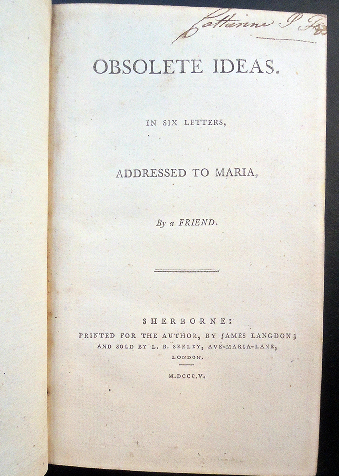
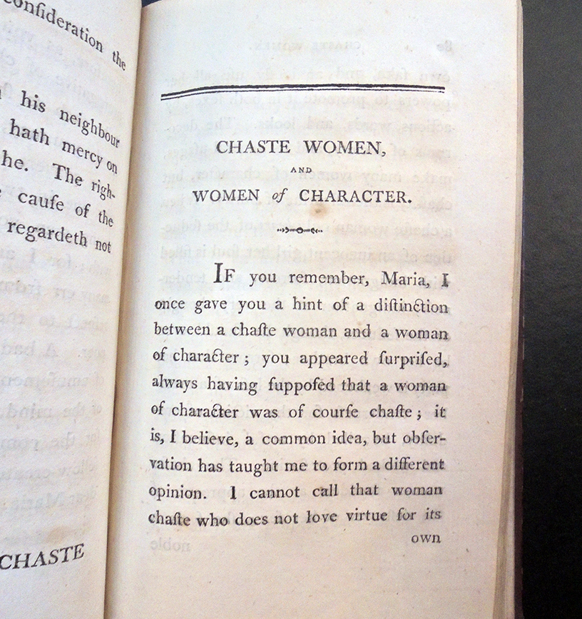
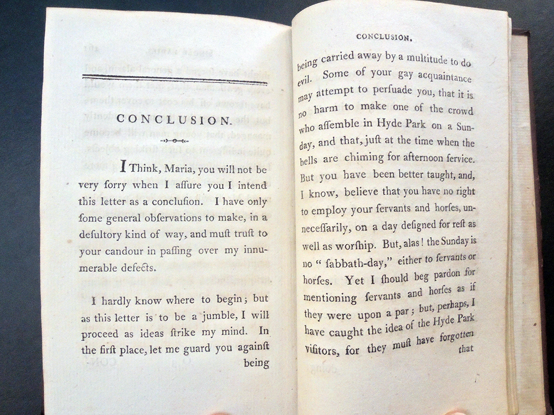
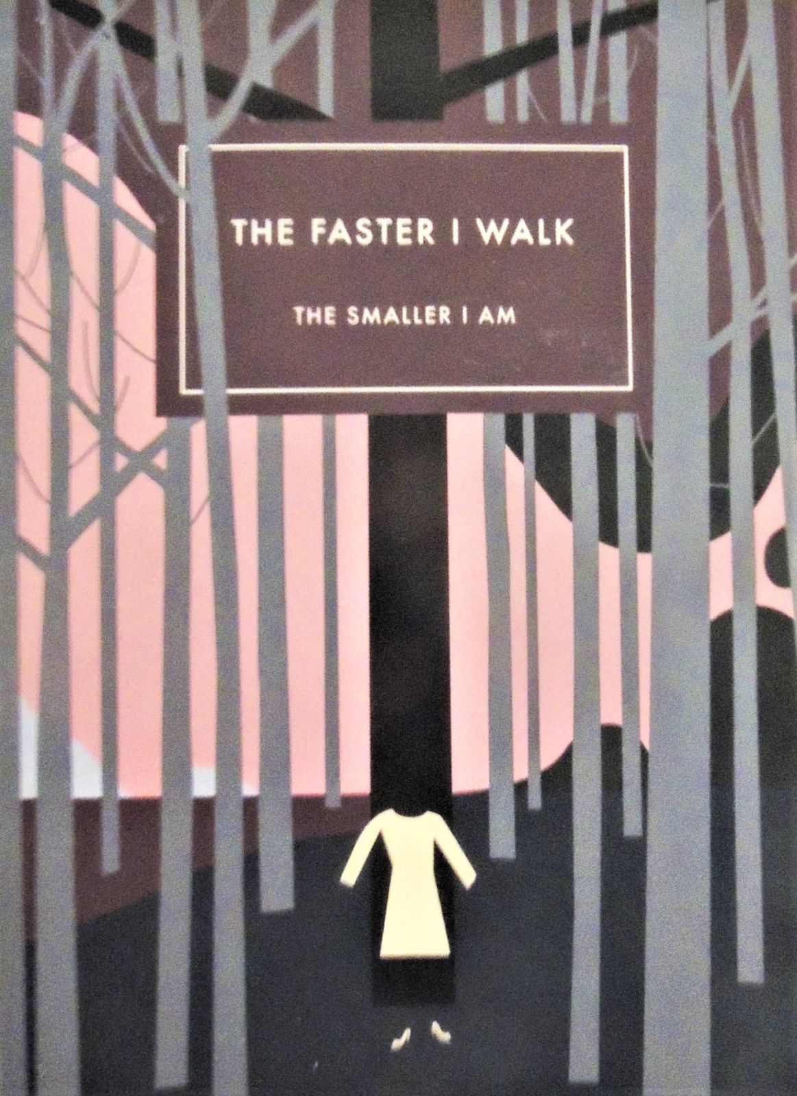
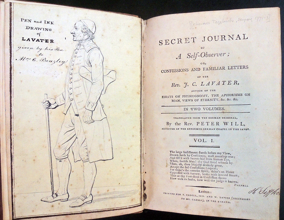
Johann Caspar Lavater (1741-1801), Secret Journal of a Self-Observer;or, Confessions and familiar Letters of the Rev. J. C. Lavater… Translated from the German Original, by the Rev. Peter Will, Minister of the Reformed German Chapel in the Savoy… (London: Printed for T. Cadell, Jun. andW. Davies (Successors to Mr. Cadell)… [1795]). Early ownership inscriptions, in ink and pencil, of Henrietta Siffken and with pencil notes throughout; with an original pen-and-ink drawing of Lavater bound in as a frontispiece, “given by his Son to Mrs C. Beazley.” Graphic Arts Collection GAX 2020- in process.


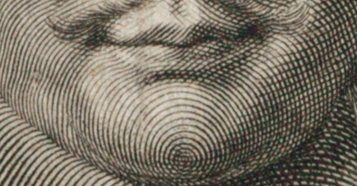
The first English translation of: Johann Caspar Lavater (1741-1801), Geheimes tagebuch von einem beobachter seiner selbst (Leipzig: Weidmanns erben und Reich, 1771-73) is notable for the pen and ink drawing on the frontispiece attributed to Johan Heinrich Lips (1758-1817) as well as for the text never meant to be widely circulated.

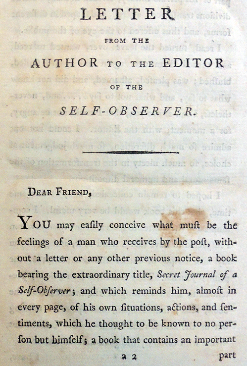
Preface of the translator:

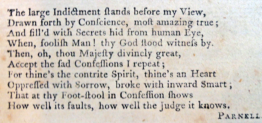
“The present Translation, which originally was intended to be circulated only in manuscript, among some admirers of Mr. Lavater, would certainly never have been intruded on the Public, if the Translator were not fully persuaded, that its great utility will overbalance its many defects, and contribute to propagate piety and Religious prudence, for which purpose he recommends the perusal of it particularly to his congregation, who always have displayed the most laudable desire to improve in Christian knowledge and virtue. . .”

“…Mr. Lavater’s manner of expressing his ideas, being as extraordinary as his manner of thinking, those who are not intimately acquainted with the writings of this eccentric, but truly venerable man, will easily be induced to mistake for a foreign idiom what, in reality, is an idiom of the Author, and could not be exchanged for a genuine English one, as it is the peculiar characteristic which distinguishes his way of thinking.”

The Swiss minister Johann Caspar Lavater (1741-1801) was convinced that the science of physiognomy made it possible to know about a person’s interior self from their exterior body. This included both the physical skull itself and the visual representation of it. He published his beliefs in three major editions, Physiognomische fragmente (1775-78) RBSC Oversize 6453.568.15q, Essai sur la Physiognomonie (1781-1803), and Essays on Physiognomy (1788-99) GAX Oversize 2007-0002Q. Johan Heinrich Lips (1758-1817) was the principal engraver of the plates, working from his own drawings and after drawings by Georg Friedrich Schmoll. Lavater’s close friend Henry Fuseli (1741-1825) added a few illustrations and brought in the young William Blake (1757-1827) to complete a few additional plates.

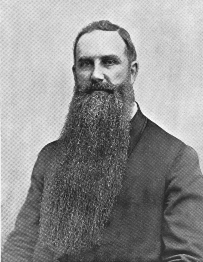
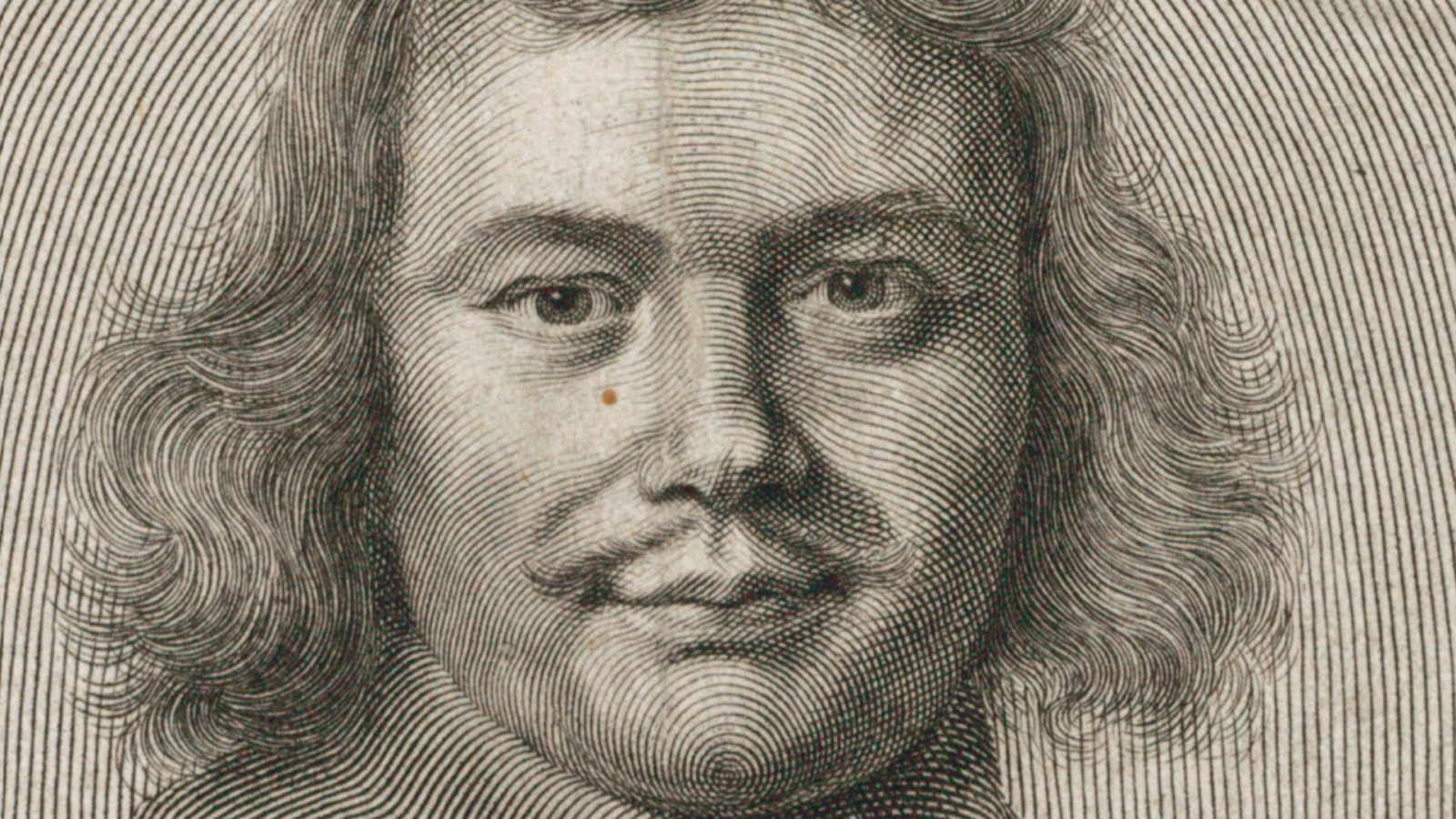
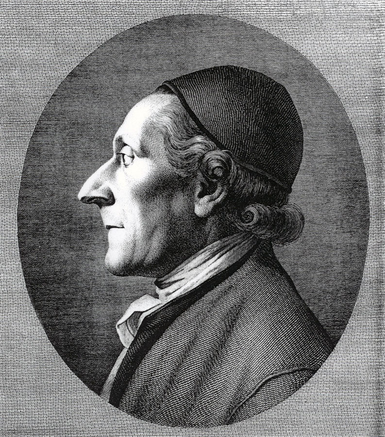
William Blake, Johann Caspar Lavater, 1800. Engraving and etching. Graphic Arts Collection


Obsolete ideas from 1805: Single ladies, vulgarly called old maids

Eliza Browne, Obsolete Ideas, in Six Letters Addressed to Maria By a Friend (Sherborne: for the author by James Langdon, 1805). Graphic Arts Collection GA 2020- in process.

If the contents of this small volume written by a women to a female reader were not appealing enough, the provenance of a female owner,  Catherine P[ayton] Fox, (inscribed on the title page with her label on front pastedown), makes it extra desirable.

Eliza Browne, identified in the fourth edition of her work, wrote six letters giving advice to a younger women. This is not your usual etiquette book or guide to modern manners. It would be interesting to compare all four editions to see if the advice changes over the years.

“Under this singular title, are comprised some shrewd and useful observations on the relative conduct of parents and children; the fashionable dissipation of young men, who have been piously educated; the respect due to aged persons; chaste women, and women of character; on the poor in general; and on single women. To the latter two classes, the fair author, though apparently allied to neither, is in every respect very charitably disposed. In proof that a deserving person may be reduced even to beg in the streets, she relates a very pleasing and pathetic story… No part of the short table of contents, probably, may excite the curiosity of our readers, so much as the distinction between chaste women and women of character.”–The Eclectic Review, vol. II, part 1, 1806, pp. 148-49

“Courteous, candid, and gentle Reader,” Eliza begins, “those are epithets that must sound very strange in modern ears, but the writer of the following pages cannot by any means do without them; and as she makes a point of rejecting nothing that may answer her purpose, even though it should have been the fashion of the sixteenth century, it is therefore hoped that the introduction of so obsolete an address with give offence [sic] to [no one].”

The fourth edition of this book introduces yet another women to the mix. It is dedicated to the Viscountess Cremorne, probably Philadelphia Hannah Freame, the daughter of Thomas Freame and Margaretta Penn, fourth daughter of William Penn (1644-1718), the founder of Pennsylvania.

“In 1770 she married the widowed Thomas Dawson (1725-1813), who in that same year was elevated to the Irish peerage, as Baron Dartry of Dawson’s Grove. Dawson was the son of Dublin banker Richard Dawson and his wife Elizabeth Vesey Dawson. From 1749-1768 Thomas Dawson served as a member of Parliament for County Managhan [Ireland].

He was married firstly in 1754 to Lady Anne Fremor, daughter of the first Earl of Pomfret, with whom he had a son and a daughter. Dawson and his second wife had a son and daughter as well. In 1795 he was made Viscount Cremorne, and in 1797 he became Baron Cremorne of Castle Dawson.

Dawson was a patron of the arts and a collector of paintings. Gilbert Stuart painted his portrait, as well as that of the Viscountess, and he was included on Stuarts’ 1895 list of those patrons who were to receive copies of the artist’s portrait of George Washington (although it is unknown whether he actually received one).”–National Gallery of Art, Washington D.C.


Gilbert Stuart, Portrait of ‘Philadelphia Hannah’, ca. 1785. Oil on canvas. Philadelphia Academy of the Fine Arts 1999.11

Unfolding Digital Images

Folding plates are trouble in an all-digital world. The brief joy of finding a title through temporary access to Hathi Trust can be tempered when you get blank pages staring back at you instead of unfolded plates.


Princeton University’s library catalog offers 18 digital versions and/or editions of: A journey to Jerusalem, or, A relation of the travels of fourteen English-men in the year 1669 : from Scanderoon, to Tripoly, Joppa, Ramah, Jerusalem, Bethlem, Jericho, the River Jordan, the Dead Sea, and back again to Aleppo … London : Printed by T.M. for N. Crouch …, 1672, with its wonderful series of fold-out plates.Unfortunately, I was not able to find one copy that offered the plates unfolded, looking in google books, hathi trust, or several other platforms. While it is possible to access the engravings from museums that have removed them from the books, then you have the image without the text.


A class favorite is William Hogarth’s Analysis of Beauty with two plates, usually front and back, folded multiple times to fit with the rest of the pages. Again, many museums have removed the plates and provide excellent digital access without the text but most online books either do not have the plates at all, or like ECCO, demand you look at the book at 10% of the original size, to see the entire print.The exception in this case is at Hathi Trust where you see the folded package and then, the opened image. Download this quickly before your one hour window is up.


There are a number of 19th-century journals that begin with a folded frontispiece, fun to teach with when you have the physical object. Finding a frontispiece in the all-digital world can itself be too daunting for most people. I had to look through a dozen or so issues before I found a few frontispieces in ProQuest., list under a title and interspersed with the articles/chapters.

The complete title of George Cruikshank’s satirical print seen above is Princely piety, or the worshippers at Wanstead. Here is the complete hand colored print in the British Museum:

One other option is offer, below, but is no better than the first.


So as not to only complain, here is a success story:

One example of beautifully handled folding plates comes from Princeton’s digital imaging studio, managed by Roel Munoz, whose staff captured this French costume book for the Graphic Arts Collection with great success: http://pudl.princeton.edu/boundart.php?obj=v118rf94k

Scott Printing Machine Works, Plainfield, New Jersey

525 South Avenue, Plainfield, New Jersey, in 2020.


Scott Printing Press Co.’s Works, Plainfield, N.J., Industrial Area, side view of the factory along with the water tank. Plainfield Public Library. https://plainfieldlibrarynj.contentdm.oclc.org/digital/collection/p17109coll3

In 1884, Walter Scott (1844-1907) moved his printing press manufacturing business from Chicago to Plainfield, New Jersey, taking over the lot previously used by New Jersey’s Central Baseball Club. By 1903, Walter Scott & Company covered five acres of downtown Plainfield. “The buildings are of brick, contain a floor space of upwards of 115,000 square feet and are connected with each other by a narrow-gauge railroad, 2,300 feet in length, which runs through the buildings.” —Newspaperdom 10 (January 1, 1903).

Scott operated the largest printing press manufacturing firm in the United States (claimed to be the largest in the world), known especially for high-speed presses and folding machines used by newspapers. In 1893, the New York World installed the first color press in America adapted to newspaper printing, which was built by Scott’s Company in Plainfield. Known as a brilliant inventor, he received his first patent in 1874 and by 1903, held 200 patents. When he died 1907, his widow, Isabella Scott, operated the business until her death in 1931.

Google maps overview of the factory buildings still standing in 2020. The New Jersey Transit Raritan line still runs along the rear of the buildings.


Advertisements: The Inland printer. v.3 (1885/86) and American Printer and Lithographer 31 (1900).


A biographical sketch of Scott was published in The Inland Printer that begins “It is with pleasure that we are enabled to place before our readers the portrait of a gentleman whose name is familiar to every printer in the United States, Mr. Walter Scott. Blessed with great genius, tireless energy, indomitable perseverance, and administrative ability, he has succeeded in building up what is now the largest and most progressive printing press manufacturing establishment in the world.” It continues:

“Mr. Scott was born in Scotland on May 22, 1844. He was educated at the Ayr Academy, studied theoretical and applied mechanics, and learned the machinist trade. He came to the United States in 1869 and settled in Chicago. He was employed in several printing offices, and was for many years foreman of the pressrooms of the Inter Ocean. In 1872 he commenced to make inventions in printing machinery. His mechanical skill and thorough knowledge of the requirements of the printing office enabled him to produce economical and labor-saving machinery which was eagerly sought after by the appreciative printer. Among his inventions at that time was the printing from a web, pasting, cutting and folding, so as to produce a newspaper with the leaves cut in book from at one operation; also a new rotary web printing and folding machine which produced 30,000 copies per hour.

The demand for Mr. Scott’s improved machines became so great … that in 1884 it was found necessary to erect extensive and commodious works at Plainfield, New Jersey, a cut and description of which will be found below. Messrs. Walter Scott & Co. now makes no less than 117 different kinds and sizes of printing machines, ranging from a small cylinder press to a large book and newspaper machine costing $40,000 and capable of printing, pasting, cutting, and folding 96,000 eight-page papers per hour; besides many other machine and appliances connected with printing.

…This extensive manufactory is situated on South Avenue, between Richmond and Berckman Streets, and adjacent to the central Railroad of New Jersey, in the city of Plainfield. The works occupy five acres, are connected with the central Railroad by a siding and 1,700 feet of rails are laid through the yard to the various building. … The area of floor space is over 78,000 square feet. The buildings are beautifully lighted up by 25 arc and 400 incandescent electric lights, the dynamos of which are placed in the engine room.

…The factory and its equipment are the most complete of anything we have ever seen in this line of manufacture, and we understand it is the largest exclusively devoted to the manufacture of printing and kindred machinery in the United States, over one hundred and fifty machines being in process of construction at one time.– The Inland Printer, American Lithographer 7 (1889/1890): 564-66

See also:
Frederick W. Hamilton, Type and presses in America, a brief historical sketch of the development of type casting and press building in the United States ([Chicago] Pub. by the Committee on education, United typothetae of America, 1918). Graphic Arts Collection 2006-1856N

Herbert L. Baker, Cylinder printing machines, being a study of the mechanism and operation of the principal types of cylinder printing machines ([Chicago] Pub. by the Committee on education, United typothetae of America, 1918). Graphic Arts Collection 2007-0021N


A Born Classic

Mark Argetsinger, A Grammar of Typography: Classical Book Design in the Digital Age (Boston: David R. Godine, 2020). 528 pages; 8.5 x 12 inches; illustrated with over 425 images, many in full color.

The arrival of Mark Argetsinger’s new book, A Grammar of Typography, sent me running to a thesaurus in search of a word larger than comprehensive. Should we describe it as thorough? Inclusive? Far-reaching, in-depth, sweeping, or simply grand?

The publisher’s material begins: “A Grammar of Typography is a comprehensive guide to traditional book design that is both practical and historical. Interspersed with discussions of digital typesetting and page layout are broad historical views of the tradition of the book along with specific reference to the printer’s grammar or manual, the industry’s own codification of its usage, from Joseph Moxon in the seventeenth century through Theodore Low De Vinne in the nineteenth. In addition, there are chapters on house style, proof-reading, copy-editing, paper, binding, and appendices on typographical ornaments and Greek type. The book ends with an annotated bibliography and an index.”

How can you not love a book with an introduction titled “The Hidden Soul of Harmony: The Classical Tradition. A Practice in Search of a Theory”? Although Argetsinger claims “this is primarily a practical manual, not a scholarly treatise,” one would be hard-pressed to find a more philosophical look at “marks of quotation,” “font editing,” or “horizontal space.”

There is also biography and chronology. “In addition, Aldus was the first to cast in type the humanist’s running or cursive hand, known as the Italic. The busy work of the humanist, who daily, it seemed, uncovered new works of the Ancients, lying long neglected in the monastic or royal libraries of Europe, had required an efficient script to match the urgent copying of new texts.”

In his preface, Argetsinger writes, “This book intends to provide a historical context to the enterprise of book-making. The term grammar appears in its title both in reference to the historical phenomenon of ‘grammars’ of printing, regarding which much will be said along the way, as well as in reference to a certain graphical literacy that is requisite for the intelligent use of design and production tools in the digital age. Historical context is important both from the point of view of tracking evolving trends in the composition and display of printed matter, as well as from the point of view of preserving the traditions of its best practices.”

Open it anywhere and start reading.


“After the first necessities of life, nothing is more precious to us than books. The Art of Typography, which produces them, provides essential services to society and secures incalculable benefits. …Thus one could rightly call it par excellence the art of all arts and the science of all sciences.” –Pierre-Simon Fournier, le jeune, Manuel Typographique, Book 1 (1764).


A classical book designer, Argetsinger also embraces 21st-century technology, writing:
“There is something wonderful about working out the proportion of the page on screen, precisely mapping out its structure with the (by turns visible or invisible) grid and and page line; setting up one’s font with a complement of sorts so vast, even Christopher Plantin would feel a twinge of envy; readily changing size, font, color, position; and arraying, say, a two-volume, 800-page book heavy with illustrations and then placing its entire content on a digital thumb-drive….”

[Forgive my poor photography, the book itself is perfect.]

Colophon: “A Grammar of Typography set in DTL’s Fleischmann and printed on 115 Gem Munken print cream. All printing and binding by PBtisk Printing Company in the Czech Republic. This first edition consists of 1,875 hardcover trade copies as well as a deluxe slipcased edition of 125 copies signed and numbered by the author and only available directly from the publisher. Designed and composed by Mark Argetsinger, Holyoke, Massachusetts.”


A PostScript: My favorite Argetsinger design, proof he can do it all.

Arcola Pettway’s “Lazy Gals Variation”


Princeton University President Christopher L. Eisgruber recently announced that our 2020 “pre-read” is This America: The Case for the Nation by historian Jill Lepore. https://princeton.overdrive.com/media/4618070 Each year Princeton’s incoming class collectively explores one text, this year focusing on the concept of the nation, American civil ideals, and historical truth-seeking.

Published by W.W. Norton & Company in 2019, the book’s cover features the image of a quilt in the shape of an American flag. The work was created in 1976 by Arcola Pettway (1934-1994), titled Lazy Gals Variation, as a Bicentennial quilt composed of brightly colored strips of corduroy fabric. “Lazy Gal” refers to the quilting pattern of irregular bars, one of a variety of traditional patterns used by Pettway and other quilters who are part of the Gee’s Bend collective. The quilt pictured above is owned by the High Museum, a purchase and gift of the Souls Grown Deep Foundation from the William S. Arnett Collection.

Pettway and the other quilters are the descendants of enslaved people from rural Gee’s Bend, Alabama. They first came to national attention with the Freedom Quilting Bee, a cooperative arising from the Civil Rights movement in the 1960s, and their quilts were sold in New York City at Bloomingdale’s and Sak’s, providing income for the women.

In the 1990s, art collector William Arnett and his family, rediscovered them and, together with curators, patrons and others with a large respect for African-American culture, a touring exhibition was organized by the Museum of Fine Art, Houston.

According to the Souls Grown Deep Foundation, Arcola Young was raised by her mother, Deborah Young, and her grandfather, Reverend Paul S. Pettway. Her mother also raised Young’s cousin, Leola Pettway. Leola described their childhood as being full of play and adventure, like fishing, singing in church choirs, and inventing games. Young married Joseph Pettway, brother of Lucy T. Pettway, and together they had 16 children, 8 boys and 8 girls! They farmed together and Young was a part of a gospel singing group, the Golden Angels.– For more information on the women of Gee’s Bend, see https://www.soulsgrowndeep.org/gees-bend-quiltmakers


In 2017, three etchings after the quilts of Loretta Pettway and Mary Lee Bendolph, members of the Gee’s Bend quilters, were acquired by the Graphic Arts Collection and installed in Firestone Library’s African American Studies Room (B floor) thanks to a joint initiative between the Princeton University Art Museum, Princeton University Library, and the Department of African American Studies. https://graphicarts.princeton.edu/2017/04/10/gees-bend-prints-acquired/


Glad Syttende Mai

To honor the Norwegian Constitution Day, May 17th, or Syttende mai, here is a post for my favorite Norwegian author Kjersti A. Skomsvold. Seen above is her first and perhaps, still most compelling novel The Faster I Walk, The Smaller I Am (Firestone Library PT8952.29.K65 J613 2011).

Happily last summer “Two Month Review” chose to feature Skomsvold’s Monsterhuman, translated from the Norwegian by Becky L. Crook, for their discussion and deep read. Note in this episode the discussion on the book does not begin until about 23.40.

“Marius Hjeldnes from Cappelen Damm joins Chad and Brian to provide a bit of background on Skomsvold, on trends in Norwegian literature, on that whole “dice” thing, and much more. They cover the first three sections of the book, laying out the main themes and ideas that set-up this novel about a young woman suffering from Chronic Fatigue Syndrome, trying to rebuild her sense of self by becoming a writer. An incredibly interesting, episodic novel that you should be able to dive into, even if you don’t read every page.”

Other podcasts of the Two Month Review can be found online. “Each “season” they highlight a new work of world literature, reading it slowly over the course of eight to nine episodes. Featuring a rotating set of literary guests—from authors to booksellers, critics, and translators—each episode recaps a short section of the book and uses that as a springboard for a fun (and often irreverent) discussion about literature in a general sense, pop culture, reading approaches, and much more.”


The English language edition of Jo fortere jeg går, jo mindre er jeg (The Faster I Walk, the Smaller I Am) has a cover designed by the American artist Richard McGuire. In 2014, the Morgan Library and Museum mounted an exhibition of the artist’s work titled From Here to Here: Richard McGuire Makes a Book; https://www.themorgan.org/exhibitions/From-Here-to-Here . Many of us got to know him originally through RAW magazine, the comics journal edited by Art Spiegelman and Françoise Mouly, and then the book of Here strips. (https://web.archive.org/web/20100814190317/http://www.rci.rutgers.edu/~jbass/courses/402/402_mcguire_here.htm)

Luc Sante, writing for the New York Times in 2015, commented, “No one who saw that story ever forgot it: a chronicle of a life, running from 1957 to 2027, as situated in one room, with kaleidoscopic intrusions from various pasts and a wisp of a future — the house burns in 2029 and is torn down in 2030…” https://www.nytimes.com/2015/10/18/books/review/richard-mcguires-here.html

See more of McGuire here https://www.richard-mcguire.com/new-page-4 and get other Skomsvold novels at your local bookshop.

Antoine Le Pautre

Robert Nanteuil (1623-1678), Antoine Le Pautre, architecte et ingenieur, 1652. Engraving. Graphic Arts Collection 2005.01080. Dumesnil no. 127. Gift of John Douglas Gordon, Class of 1905. Permanent Link: http://arks.princeton.edu/ark:/88435/r781wg115


Princeton University Library does not hold a copy of Antoine Le Pautre’s Desseins de plusieurs palais plans & éléuations en perspective géometrique, ensemble les profiles éleuez sur les plans, le tout dessiné et inventez par Anthoine le Pautre architecte, et ingenieur ordinaire des bastimens du Roy, first published in Paris, 1652 (=Drawings of several palaces, plans, and elevations in geometric perspective, together with the high profiles on the plans, all drawn and invented by Antoine Lepautre, architect and engineer of the King’s buildings).

A complete copy can be seen at: https://plume.epfl.ch/viewer/1452/?offset=#page=7&viewer=picture&o=info&n=0&q=

The Graphic Arts Collection does have a beautiful impression of the title page engraved by Robert Nanteuil (1623-1678), with a putti designer and architect on either side of the title frame. The print also appears in the later Les Œuvres d’architecture d’Anthoine Le Paultre, Architecte ordinaire du Roy (Paris: Lombert, 1653)


The younger brother of Jean Lepautre 1618-1682), Antoine grew up in a family of architects and designers. He was appointed architect of the king’s buildings in 1644 and in 1654 designed the Hôtel de Beauvais in Paris for Pierre de Beauvais, which is noted for “his ingenious irregular construction, with an original and interesting planimetric distribution, where no side of the building is parallel to the other.”

Here is a view of the courtyard, showing its unusual oval shape:

To distinguish the members of this prolific family, see Stéphane Loire, “Antoine Lepautre, Jacques Lepautre et Jean Lepautre,” in The Burlington Magazine 138, no. 1116 (1996): 198.

See also: Robert W. Berger, Antoine Le Pautre: A French Architect of the Era of Louis XIV. New York: New York University Press. OCLC 121942.


Need a Project no. 10? Music of the Spheres

Linda Connor and Charles Simic, On the Music of the Spheres. Artists and writers series 16. Limited ed. of 250 copies ([New York]: Library Fellows of the Whitney Museum of American Art, 1996). ReCAP Marquand Oversize TR654 .C65472 1996q

On the Music of the Spheres presents 15 tipped in tritone reproductions of Linda Connor’s gold toned printing out prints along with the poetry of Charles Simic. The results are astoundingly beautiful. One hundred copies were specially bound and signed by the poet and photographer with an additional platinum palladium print, signed by Connor, loosely inserted. The publication was named the 1998 Best Book of the Year from 21st- A Contemporary Photography Journal.


Writing for the New York Times, Phyllis Braff keenly observed

“Linda Connor stakes out ambitious visual and conceptual themes for her photographic projects, and her art has been earning wide respect for several decades. Her base is California, but she travels the world to gather content.” In reviewing On the Music of the Spheres, Braff continues “The territory Ms. Connor chooses to explore is nothing less than the heavens. Turning the idea into a multifaceted essay that stimulates the mind as well as the eye, she interweaves her prints made from the glass plates of 19th-century astrological photographers with her images of indoor and outdoor settings that portray heavenly light. Photographs of illumination entering ancient holy places in India, Turkey, Egypt and Tibet seem to subtly depict the sun’s rays as carriers of spiritual messages and these images are rather magical. Quite stunning, too, is the attention to architecture and to its use in building dramatic pictorial structure.”– Phyllis Braff, “Capturing the Elusive: Music of the Spheres,” New York Times December 15, 1996.


As noted by the Poetry Foundation, “Charles Simic is widely recognized as one of the most visceral and unique poets writing today. His work has won numerous awards, among them the 1990 Pulitzer Prize, a MacArthur Foundation “genius grant,” the Griffin International Poetry Prize, the Wallace Stevens Award, and the appointment as US poet laureate. He taught English and creative writing for over 30 years at the University of New Hampshire. Although he emigrated to the US from Yugoslavia as a teenager, Simic writes in English, drawing upon his own experiences of war-torn Belgrade to compose poems about the physical and spiritual poverty of modern life. Liam Rector, writing for the Hudson Review, has noted that the author’s work “has about it a purity, an originality unmatched by many of his contemporaries.”

The project for the week is: Look up.

See also Simic’s The White Room: https://poets.org/poem/white-room
 
It begins:
The obvious is difficult
To prove. Many prefer
The hidden. I did, too.
I listened to the trees. . .


The Zamorano 80

The Zamorano 80: a selection of distinguished California books made by members of the Zamorano Club (Los Angeles: Zamorano Club, 1945). Copy 215 of 500. Former owner Elmer Adler. Graphic Arts Collection 2004-2534N


The question was asked today whether the Graphic Arts Collection had the complete Zamorano 80? …What is the Zamorano 80?

The Zamorano Club was formed in 1928 by a small group of Los Angeles bibliophiles–men only–who were interested in books and fine printing (women were finally invited to be members in 1990). They named the club after Agustin Vicente Zamorano (1798-1842), who imported the first printing press to be set up west of the Rocky Mountains in 1826.

From 1826 to 1831, Zamorano created letterheads from woodblocks and type, pounding proofs without a press. With the acquisition of a press in 1834, Zamorano issued eleven broadsides, six books, and six miscellaneous works before departing California in 1838. His first book was included in the list of 80: José Figueroa (1792-1835), Manifiesto a la República Mejicana: que hace el General de brigada, José Figueroa, Comandante general y cefe politico de la alta California sobre su conducta y la de los señores D. José María de Hijar y D. José María Padrés, como directores de colonizacion en 1834 y 1835 (Monterrey: Impr. del C. Agustin V. Zamorano, 1835).

Princeton has access to a digital copy but not Zamorano’s original edition answering the question: we don’t have a complete Zamorano 80. However, we do have quite a few.


“The seeds of what was to become the Zamorano Club of Los Angeles were first planted at a dinner held on 19 October 1927, in the University Club, then located at 614 South Hope Street. The minutes of that pioneer gathering listed the following attendees: A. Gaylord Beaman (insurance), Garner A. Beckett (cement manufacturer), William W. Clary (attorney), Arthur M. Ellis (attorney), and W. Irving Way (bookman). The latter was the catalytic agent, a fact which has been well established.”

A longer history of the club can be found at their website: http://www.zamoranoclubla.org/zam80/


The majority of the Zamorano 80 are available in full texts online. A complete list can be found on the club’s website, but here are the first 20 with links:

    1. Gertrude Atherton, THE SPLENDID IDLE FORTIES: STORIES OF OLD CALIFORNIA. New York: Macmillan, 1902. Digital text.
    2. Mary Austin, THE LAND OF LITTLE RAIN. Boston: Houghton, Mifflin, 1903. Digital texts 1, 2, 3.
    3. Hubert Howe Bancroft, WORKS. San Francisco: A.L. Bancroft & Co., 1882-1890.
    4. Frederick William Beechey, NARRATIVE OF A VOYAGE TO THE PACIFIC AND BEERING’S STRAIT. London: Henry Colburn & Richard Bentley, 1831. Digital texts 1, 2.
    5. Horace Bell, REMINISCENCES OF A RANGER. Los Angeles: Yarnell, Caystile & Mathes, 1881. Digital texts 1, 2.
    6. Anthony J. Bledsoe, INDIAN WARS OF THE NORTHWEST: A CALIFORNIA BOOK. San Francisco: Bacon & Company, 1885. Digital text.
    7. Herbert Eugene Bolton, ANZA’S CALIFORNIA EXPEDITIONS. Berkeley: University of California Press, 1930. Digital text.
    8. John David Borthwick, THREE YEARS IN CALIFORNIA. Edinburgh: W. Blackwood & Sons, 1857. Digital texts 1, 2.
    9. William Henry Brewer, UP AND DOWN CALIFORNIA IN 1860-1864: THE JOURNAL OF WILLIAM H. BREWER. New Haven: Yale University Press, 1930. Digital text.
    10. John Henry Brown, REMINISCENCES AND INCIDENTS OF EARLY DAYS OF SAN FRANCISCO (1845-1850). San Francisco: Mission Journal Publishing Company, [1886]. Digital text.
    11. John Ross Brown, REPORT OF THE DEBATES IN THE CONVENTION OF CALIFORNIA. Washington, DC: John T. Towers, 1850. Digital text.
    12. Edwin Bryant, WHAT I SAW IN CALIFORNIA. New York: D. Appleton & Co., 1849. Digital texts 1, 2.
    13. Peter Hardeman Burnett, RECOLLECTIONS AND OPINIONS OF AN OLD PIONEER. New York: D. Appleton & Co., 1880. Digital texts 1, 2.
    14. CALIFORNIA AND NEW MEXICO: MESSAGE FROM THE PRESIDENT OF THE UNITED STATES. Washington, DC, 1850. Digital text.
    15. Carlos Antonio Carrillo, EXPOSICIÓN DIRIGIDA A LA CÁMARA DE DIPUTADOS DEL CONGRESSO … Mexico: Imprenta del C. Alejandro Valdés, 1831.
    16. James H. Carson, EARLY RECOLLECTIONS OF THE MINES, AND A DESCRIPTION OF THE GREAT TULARE VALLEY. Stockton: San Joaquin Republican, 1852. Digital text.
    17. Samuel Clemens [Mark Twain], THE CELEBRATED JUMPING FROG OF CALAVERAS COUNTY AND OTHER SKETCHES. New York: C.H. Webb, 1867. Digital text (one among many).
    18. Samuel Clemens [Mark Twain], ROUGHING IT. Hartford: American Publishing Company, 1872. Digital texts 1, 2, 3 et al.
    19. James Clyman, JAMES CLYMAN, AMERICAN FRONTIERSMAN, 1792-1881: THE ADVENTURES OF A TRAPPER AND COVERED WAGON EMIGRANT AS TOLD IN HIS OWN REMINISCENCES AND DIARIES. San Francisco: California Historical Society, 1928.
    20. Walter Colton, THREE YEARS IN CALIFORNIA. New York: A.S. Barnes & Co., 1850. Digital texts 1, 2.