 1650
1650
 1653
1653
 J.B. (John Bulwer, 1606-1656), Anthropometamorphosis: Man Transform’d; or, the artificial changeling : Historically presented, in the mad and cruel gallantry, foolish bravery, ridiculous beauty, filthy finenesse, and loathsome lovelinesse of the most nations, fashioning & altering their bodies from the mould intended by nature. With a vindication of the regular beauty and honesty of nature. And an appendix of the pedigree of the English gallant (London: J. Hardesty, 1650). Rare Books 2011-0065N [right]
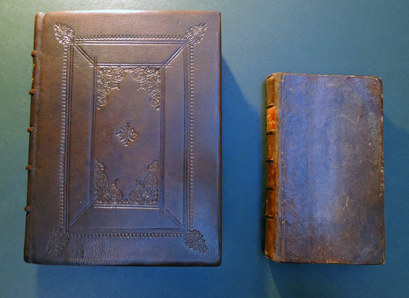
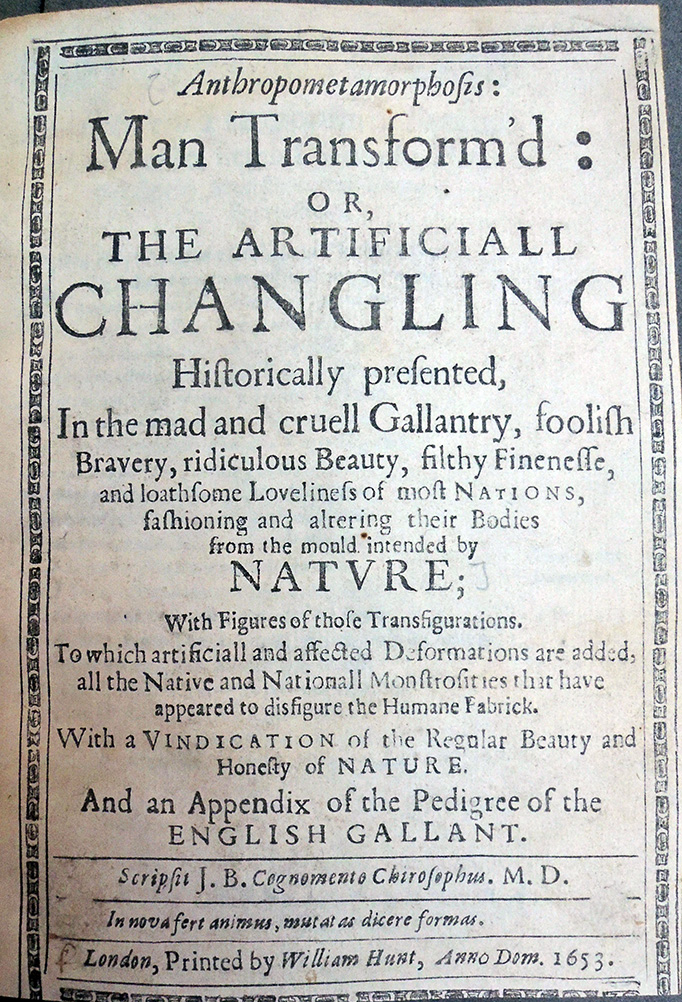
J.B. (John Bulwer, 1606-1656), Anthropometamorphosis: Man Transform’d, or, The artificiall changling historically presented, in the mad and cruell gallantry, foolish bravery, ridiculous beauty, filthy finenesse, and loathsome loveliness of most nations, fashioning and altering their bodies from the mold intended by nature : with figures of those transfigurations. To which artificiall and affected deformations are added, all the native and nationall monstrosities that have appeared to disfigure the humane fabrick. With a vindication of the regular beauty and honesty of nature. And an appendix of the pedigree of the English gallant (London: Printed by William Hunt, 2653 (i.e. 1653)). Graphic Arts Collection GAX 2019- in process. [left]
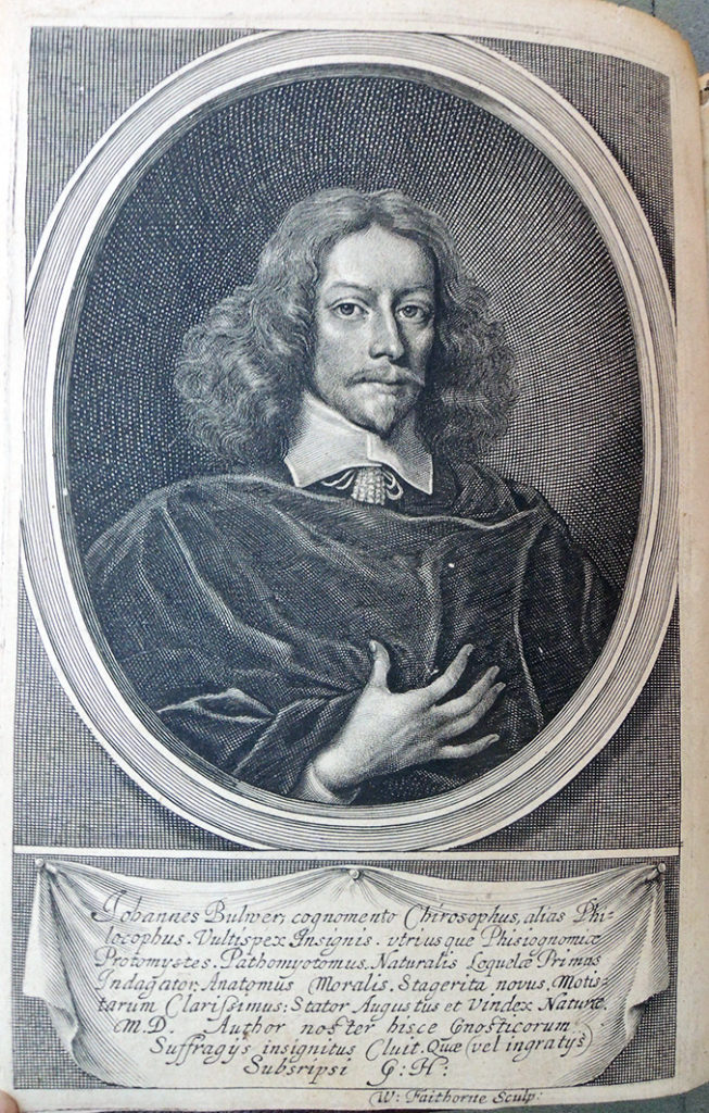
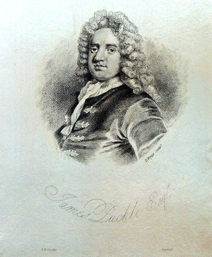
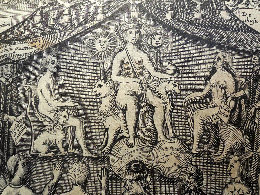
The Graphic Arts Collection recently acquired the second edition of Man Transform’d, greatly enlarged and illustrated with numerous woodcuts along with an elaborate allegorical engraved half-title by Thomas Cross (active 1632-1682) and engraved frontispiece portrait of the author by William Faithorne (1616-1691). This complements the first edition in Rare Books with an elaborate title page designed by Cross but no other illustrations.
 “Where it is the fashion to make the Nailes of their hands red, and to paint them of several colours, or to gild them, this being the beauty of the country.”
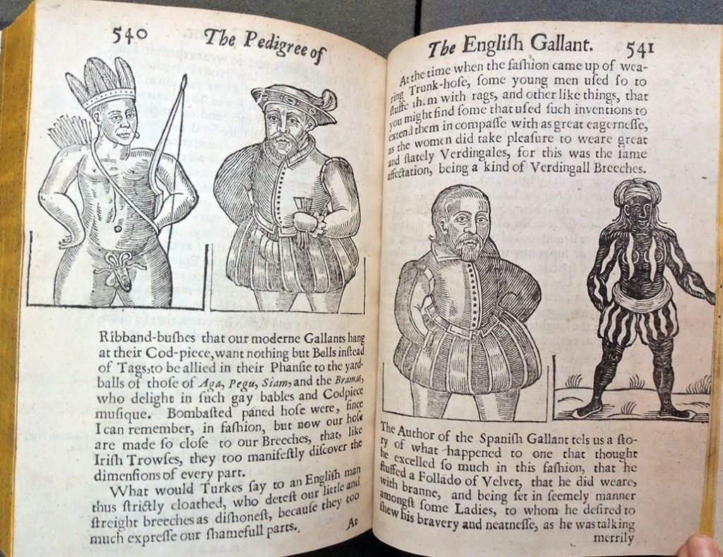
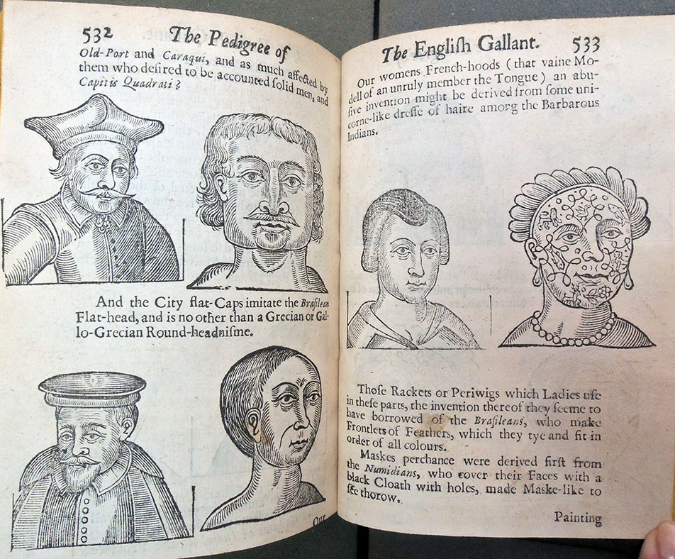
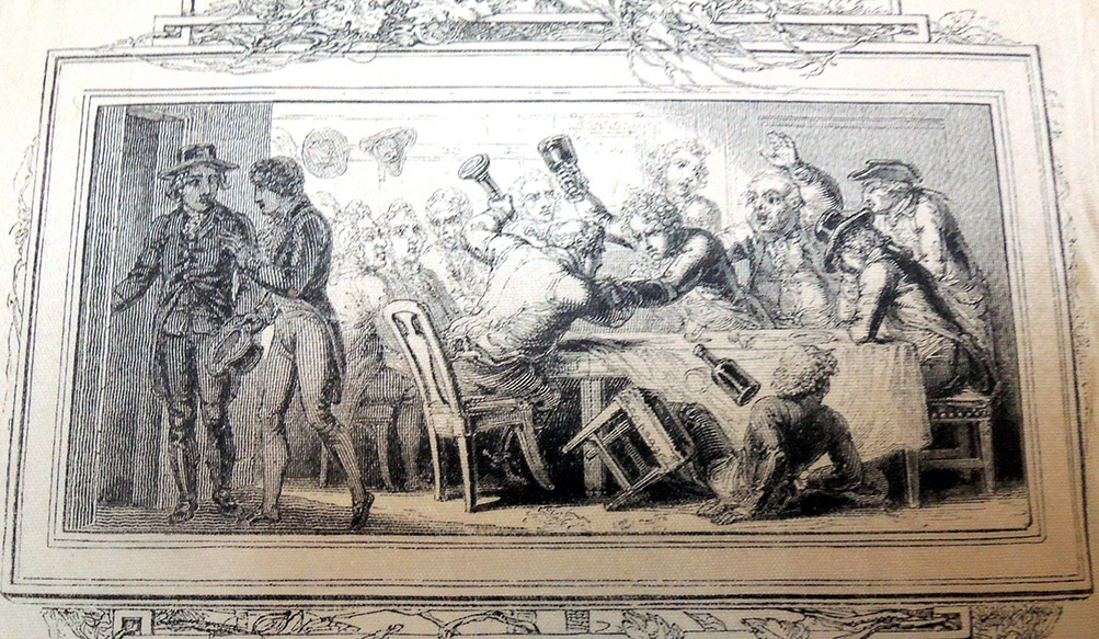
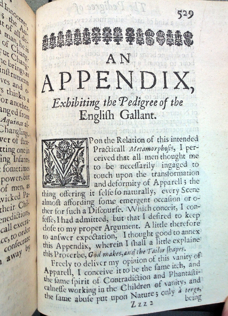
 “God makes, and the Tailor Shapes”
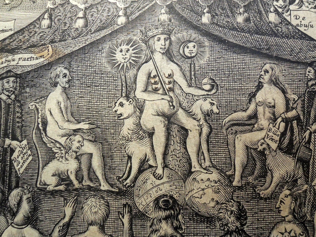
“The frontispiece of this book, which faces a portrait, engraved by Faithorne, of the author (Bulwer), comprises a representation of Nature, with many breasts, like the Diana of Ephesus, seated upon a throne, which is formed of the back of two sejant monsters, crowned, holding an orb of sovereignty (without the cross) in her left hand and a sceptre in her right hand: her feet rest on celestial and terrestrial globes. Behind Nature rise, over the back of her seat, emblems of the sun and moon; on her right and left sit Adam and Eve, naked. These are under a pavilion, on the front of which is the title of the book “Anthropometamorphosis.”
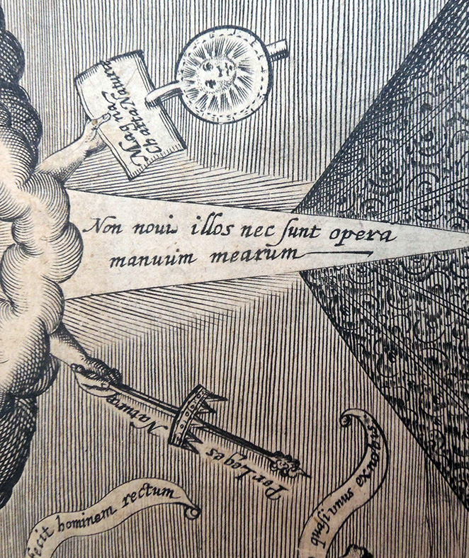
Above, two hands appear, of which the right holds a sceptre with a crown upon it; near these is “Per Leges Natura.” The left hand holds a paper sealed with the sun, and inscribed, “Magna Charta Natura.” The hands issue from a cloud, from which a ray likewise proceeds, and is inscribed, “Non noui illos nec sunt opera manuum mearum.” On our left an angel approaches, saying, “Deus fecit hominem rectum”; on our right a devil goes away, saying, “Ha ha, he ad imaginem.”
Below the angel are an ape, leopard, dog and ass, the last saying, “Ecce homo quasi unus er nohis;” below the devil are, “Testes jurati,” several men in foreign costumes adapted to their climates. Below the animals, an open book bears “De usu partium”; below the men, “De Abusu partium.” Before the last, as if approaching the throne of Nature, appears a man in a lawyer’s costume (? the author), bearing a paper inscribed “Defatio abusu partium.” Behind him a bearded personage says, “Quid de abusu partium.” To the opposite side of the throne approach “Juratores,” whose foreman presents “Billa rera.”
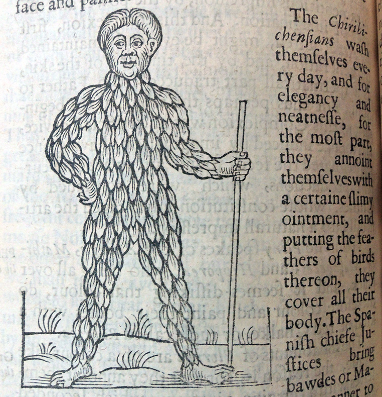
Before a bar which is placed in front of the pavilion appear many persons who have more or less deformed their shapes by artificial means: one wears a mask, another a crown of feathers, the skull of a third has been pressed backwards; a woman wears patches cut like the moon and stars, and a farthingale; one man has painted his skin with flowers and birds, the next shows a striped skin; after this stands a woman in the then correct costume and a “salvage man,” an Indian with suns and moons painted on his skin, others who have deformed their ears, mouths and noses.”–Catalogue of Prints and Drawings in the British Museum, Volume 1 (1870)

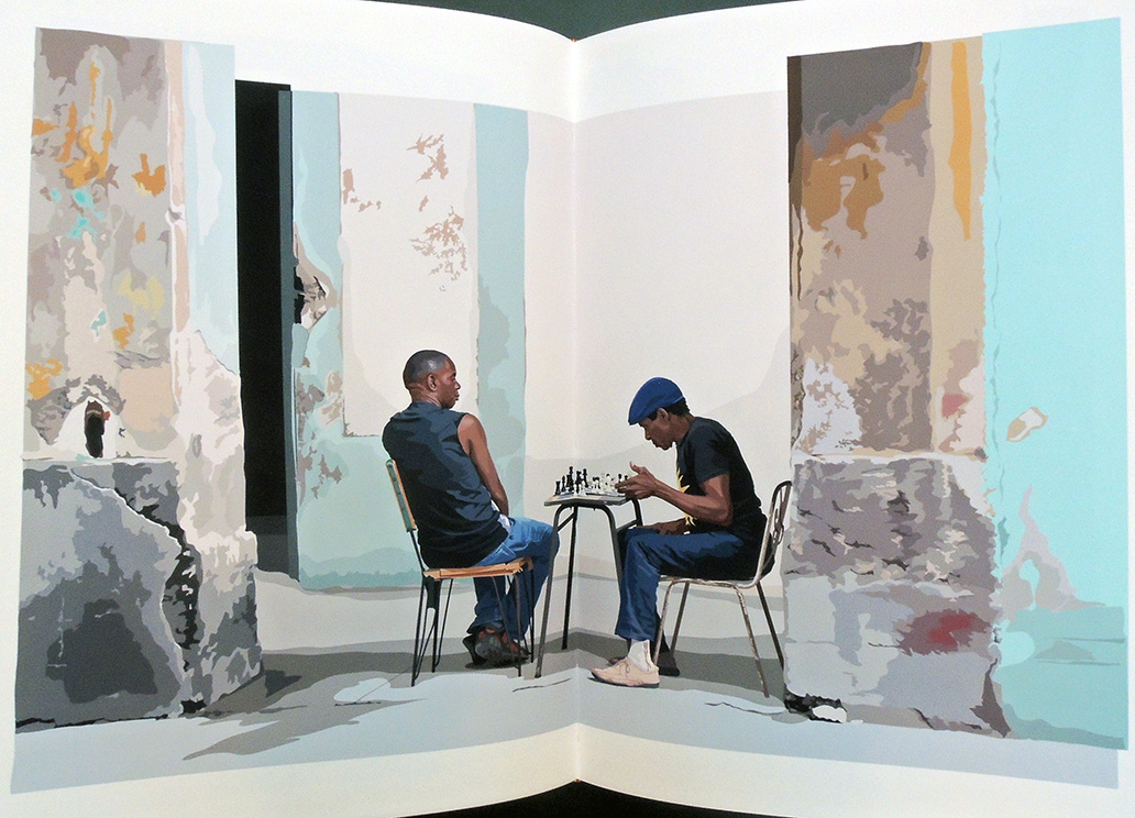
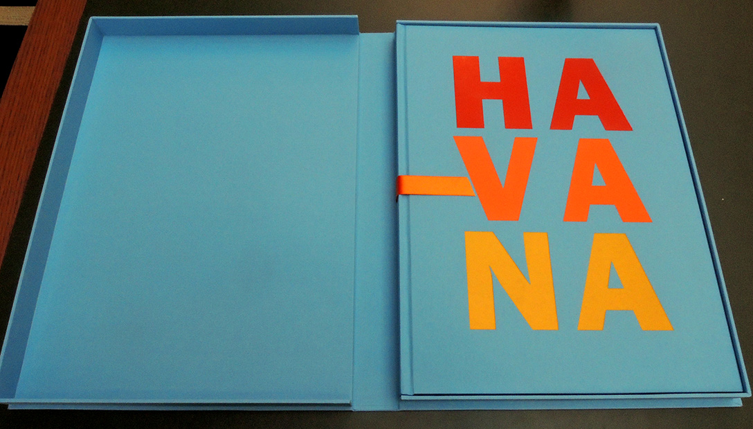
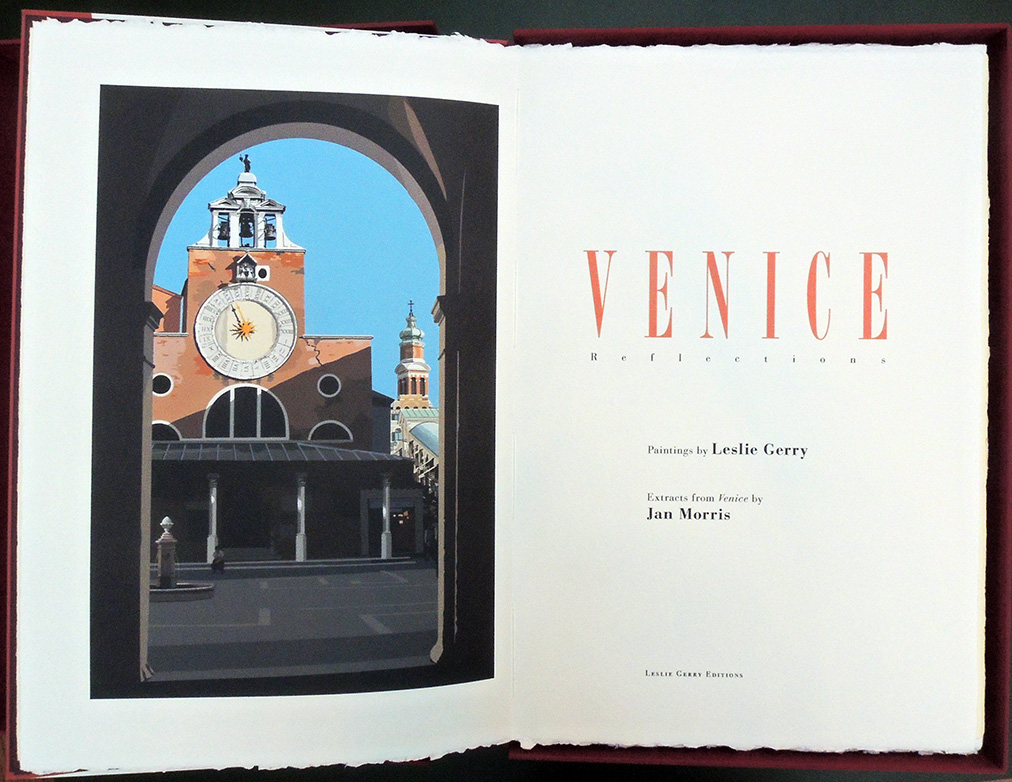
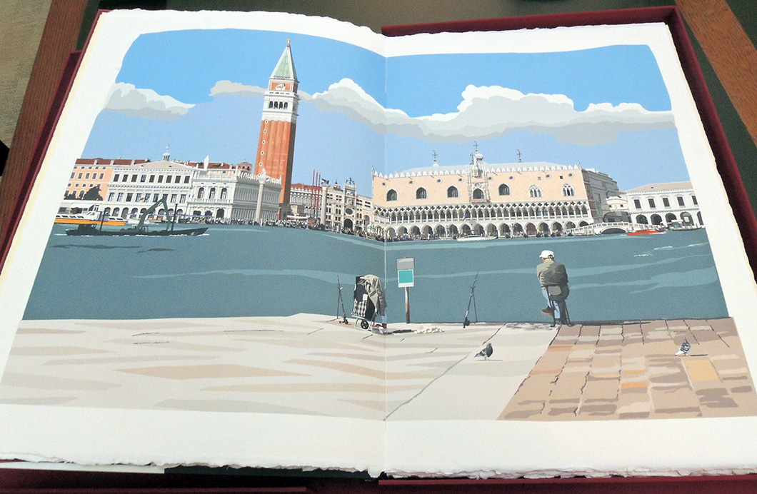
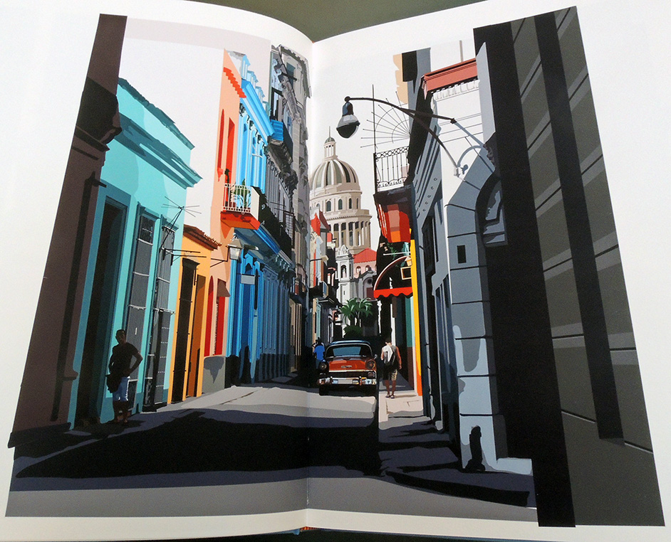 The Graphic Arts Collection is fortunate to have acquired two volumes from Leslie Gerry Editions. The contemporary artist works with 21st century technology informed by modern fine press traditions.
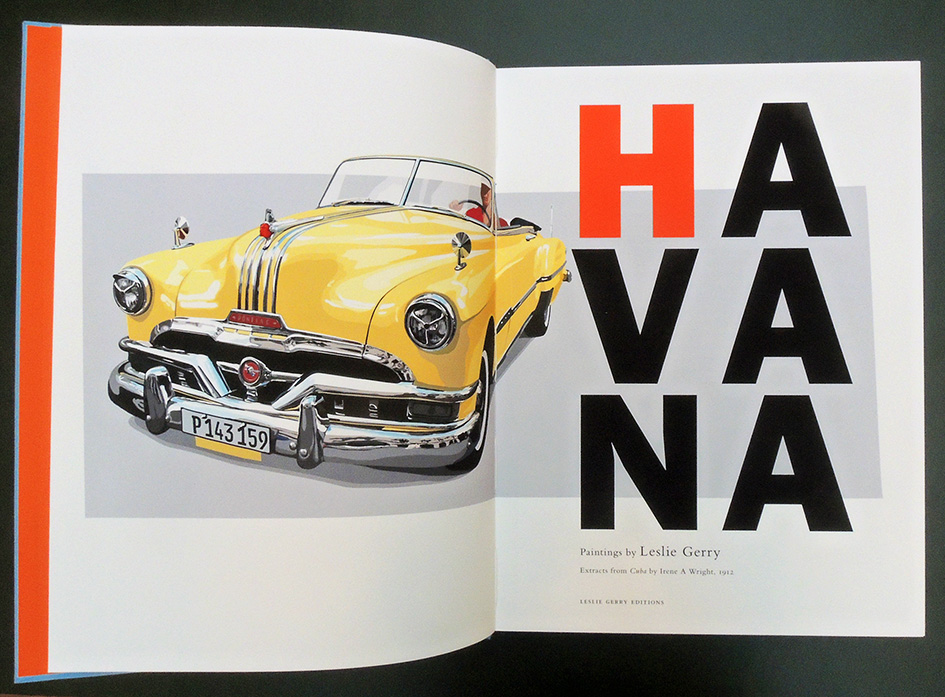 Leslie Gerry, Havana, paintings by Leslie Gerry; extracts from Cuba by Irene A. Wright, 1912 (Dowdeswell, Gloucestershire: Leslie Gerry Editions, December 2016). Copy 39 of 70. Graphic Arts Collection GAX E-000092


