Category Archives: prints and drawings

prints and drawings

Photogravures after Félicien Rops

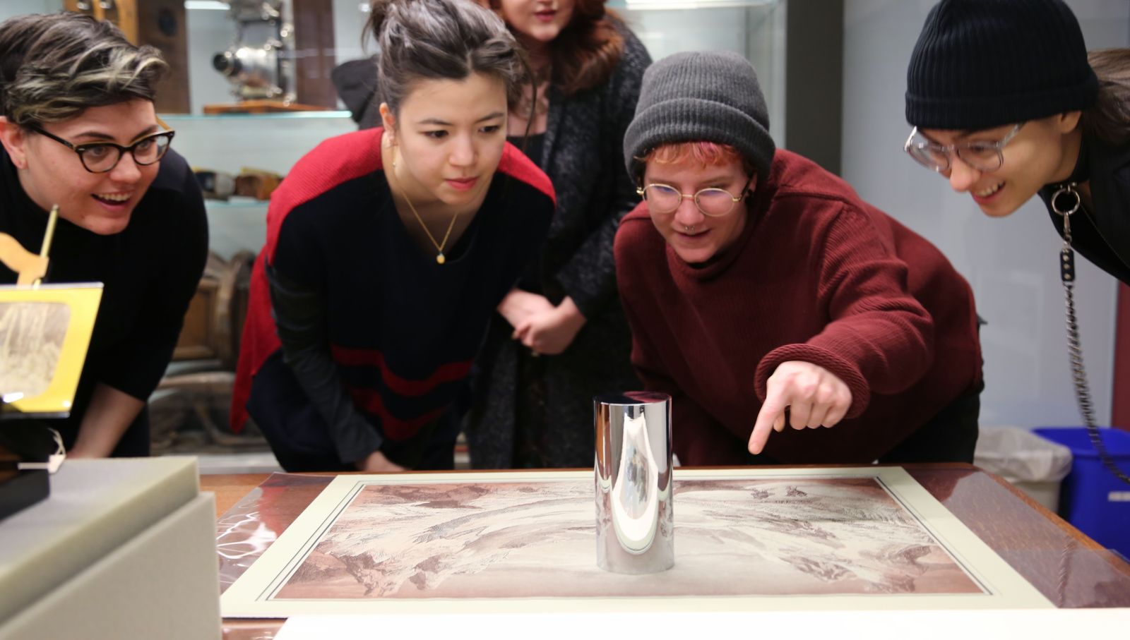
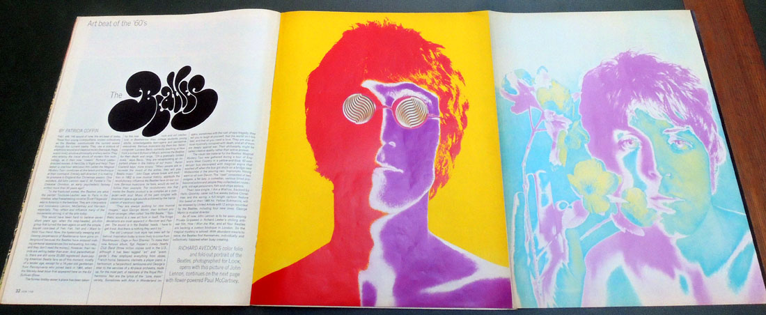
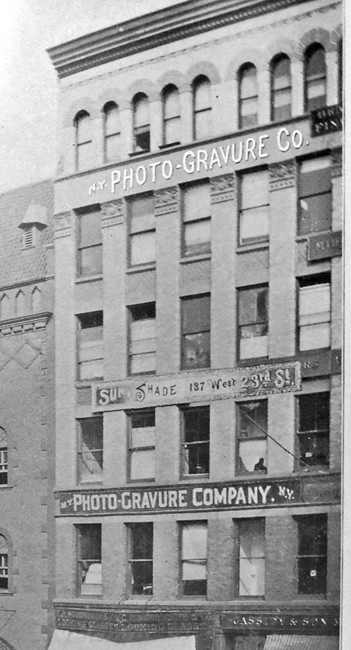
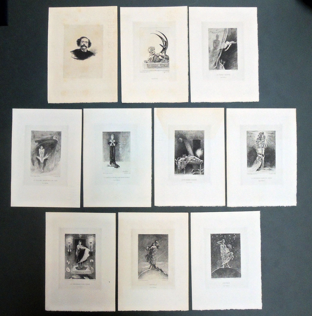
From his bookshop at Passage Choiseul, 23-33, Alphonse Lemerre (1838-1912) sold this portfolio of ten provocative prints for the 1874 short story collection Les Diaboliques by Jules Amédées Barbey d’Aurevilly (1808-1889). The prints are described on the title-page, and by bibliographer Erastène Ramiro, as etchings but except for the frontispiece (a portrait of the author engraved by Raul Rajon (1843-1888)), they are all photogravures with additional etching after drawings by the Belgian artist Felicien Rops (1833-1898).

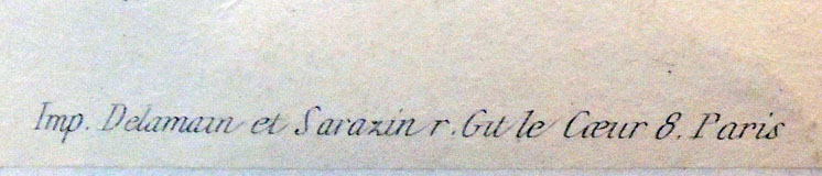
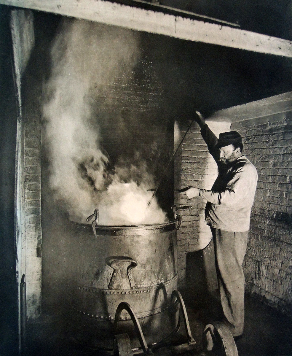
The copper plates were printed by Alfred Salmon (1825-ca. 1894), who was at this time in partnership with Adolphe Ardail (1835-1911), trading as Salmon & Ardail.

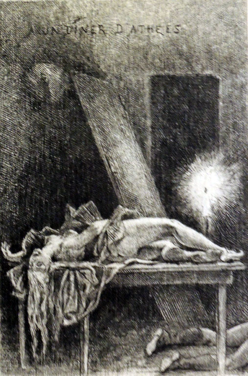
A second edition of Les Diaboliques was published in 1882 and these plates may have been for a third edition but no bound copy of the text with Rops’s plates is recorded. It is possible the project was never completed and so, the plates were issued separately. The nine Rops plates are Sphinx; Le Rideau Cramoisi; Le plus bel amour de Don Juan; Le dessous de cartes d’une partie de whist; A un diner d’athées; Le bonheur dans le crime; Le vengeance d’une femme; Postface; and Postface.

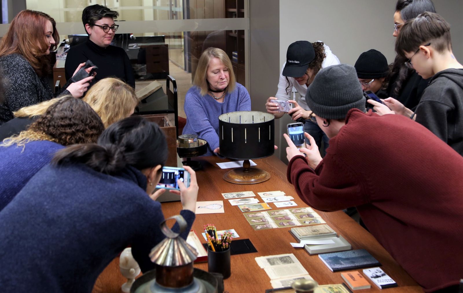
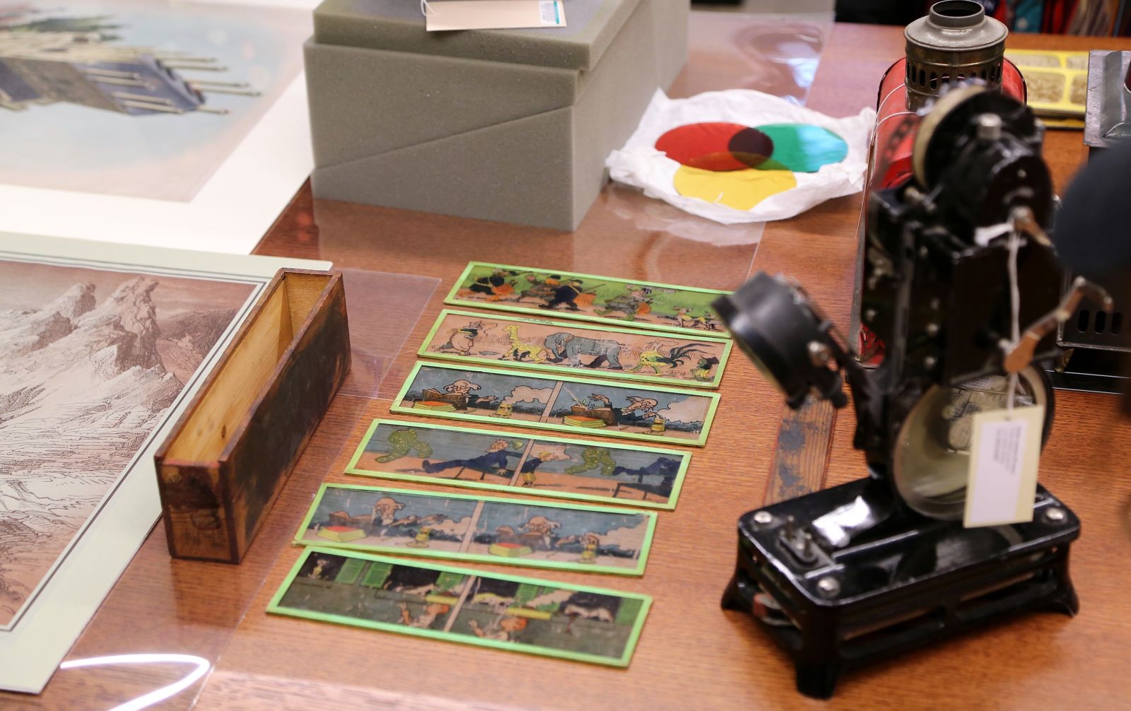
Félicien Rops (1833-1898), Dix eaux-fortes pour illustrer les diaboliques de J. Barbey D’Aurevilly; dessinèes et gravées par Félicien Rops ([Paris: A. Lemmerre, 1886]). One portfolio of ten etchings. Graphic Arts Collection GAX 2018- in process


See also: Erastène Ramiro, Catalogue descriptif et analytique de l’œuvre gravé de Félicien Rops, précédé d’une notice biographique et critique par Erastène Ramiro; orné d’un frontispice et de gravures d’après des compositions inédites de Félicien Rops et de fleurons et culs-de-lampe d’après F. Rops, Jean La Palette et Louis Legrand (Paris: Librairie Conquet, 1887).

Portrait of Niépce in Heliogravure 1856

For the seminal publication, Traité pratique de gravure héliographique sur acier et sur verre (A Practical Treatise on Photogravure Engraving on Steel and on Glass) by Niépce de Saint-Victor (1805-1870), either he or his publisher commissioned a portrait for the frontispiece.

To further celebrate Niépce’s important discoveries in photographic printing, they made the portrait using his own process: “Gravure héliographique d’après une photographie sur acier selon les procédés de Niépce de Ste Victor” (Photogravure engraving after a photograph on steel, according to the methods of Niépce de Ste Victor).


Claude-Félix-Abel Niépce de Saint-Victor (1805-1870), Traité pratique de gravure héliographique sur acier et sur verre / par M. Niépce de Saint-Victor (Paris: Librairie de V. Masson, 1856). Provenance: C. F. Chandler. Graphic Arts Collection 2006-3213N


Note the photograph was taken by Victor Plumier (1821-1878) and a great deal was made about the fact that he did not retouch his negative. The engraving plate was made by Madame [is it Pauline?] Riffaut and the portrait finished by Adolphe-Pierre Riffaut (1821-1859).

If you use a microscope, you will see the hand engraving on top of the aquatint done, in particular, in the beard. In addition, there are gouache highlights delicately added to the paper print in the hair and the beard.


Welcome to Columbia Students


Founded by an endowment from LeRoy and Janet Neiman, Columbia University’s LeRoy Neiman Center for Print Studies promotes printmaking through education, production and exhibition of prints. http://www.columbia.edu/cu/arts/neiman/about.html Twelve students and their instructor Ben Hagari made the trip south to visit the Graphic Arts Collection of pre-cinema and optical devices on Tuesday.

The class, Print into Motion, encourages undergraduates to “use printmaking techniques to create animation works, optical devices and projections.” The students have already begun creating their own thaumatropes and other phantasmagoria. Future projects will take inspiration from our metamorphosis cards, transformation images, and flap books. Here are a few moments from the class.


Ben Hagari is a New York-based artist, who was born in Tel Aviv, Israel. His work “dissolves the distinction between theatrical facades and backstage by creating spaces where magic, subterfuge, and poetry collide.” Hagari’s solo and group exhibitions include Afterwards, Total Museum of Contemporary Art, Seoul, Korea (2012); Invert, Rosenfeld Gallery, Tel Aviv (2011); The Museum Presents Itself: Israeli, Art from the Museum Collection, Tel Aviv Museum of Art (2011, 2012, 2013, 2014); and in December 2017, 24:7 in New York City’s Time Square. https://arts.columbia.edu/news/vaben-hagari-%E2%80%9814-video-installation-times-square

Autogravures from the Autotype Company

On Tuesday February 25, 1919, Virginia Wolff wrote in her diary:

Of no 23 Cromwell Houses . . . I will only say that it is furnished on the great South Kensington principle of being on the safe side & doing the thing handsomely. Good Mrs. Samuel Bruce went to the Autotype Company & ordered the entire Dutch school to be sent round framed in fumed oak. And so they were; & just covered the staircase walls, leaving an inch or two’s margin in between. –Anne Oliver Bell, The Diary of Virginia Woolf (1980).

Founded in 1868 as the Autotype Printing and Publishing Company, several shops merged and expanded over the next few years before settling as The Autotype Company at 74 New Oxford Street, London. This fashionable address became the place to go in the late 19th and early 20th centuries to buy reproductions of fine art to hang in your home. The managing partners of this enormous operation were John Alexander Spencer (182?-1884), John Robert Mather Sawyer (1828-1881), and Walter Strickland Bird (1828-1912).

Initially, the company purchased Joseph Swan’s copyright on carbon printing and an Autotype, in general, means a carbon print. Eventually the firm added collotypes and photogravure (called Autogravure) to their roster, selling framed prints, portfolios, and bound volumes to the social elite, including some of the most beautiful books of the period.


As the quality of their prints rose to challenge the superiority of the French Goupil Company, the Autotype company advertised their ability to ‘bring Paris to London’ and to prove it, published a portfolio of ten photogravures reproducing etchings by the preeminent French printmaker Charles Meryon (1821-1868).


Charles Méryon (1821-1868), Old Paris. Ten etchings by C. Meryon. Reproduced on copper by the autogravure process and accompanied with preface and illustrative notes by Stopford A. Brooke … ([London: Autotype Co., 1887]). Rare Books and Special Collections Oversize 1514.636e

Peter Henry Emerson (1856-1936) worked with the Autotype company that same year to publish his Idyls of the Norfolk Broads (1887) but was only partially satisfied.

The following year, he was introduced Charles L. Colls at the rival Typographic Etching Company, who printed his negatives for a special edition of The Compleat Angler.

Possibly to compare the talents of the two companies, Emerson had half his negatives for Pictures of East Anglian Life (1888) printed by the Autotype Company and the other half by Type-Etching Company.

Still unsatisfied, Colls taught the photographer to make his own copper plate photogravures and from that time on, Emerson did his own printing.


Edward Steichen: The Early Years 1900-1927

Thrilling news. The Graphic Arts Collection acquired one of the remaining 1981 portfolios, Edward Steichen: The Early Years 1900-1927, published by Aperture in the United States and simultaneously at Saint-Prex, Switzerland by the Atelier de Taille Douce.

Here is a small taste but honestly, there is no digital image that reproduces the true beauty of these hand-inked and hand-pulled aquatinted and chrome-faced copper plates. The complete colophon information is reproduced below.

I asked the master printer Jon Goodman to say a few words about the project. Exerts are posted here and the complete statement can be read here: Jon Goodman steichen


Edward Steichen (1879-1973), Edward Steichen: The Early Years, 1900-1927 ([New York]: Aperture, Inc., 1981). Texts by Mary Steichen Calderone and Beaumont Newhall. Portfolio of twelve hand-pulled dust-grain photogravures printed by the master printer Jon Goodman. Graphic Arts Collection GAX 2018- in process.

Edward Steichen: The Early Years 1900-1927 contains twelve photographic images made by means of the Talbot-Klic photogravure process. The chrome-faced copper plates were made by Jon Goodman and Richard Benson in Newport, Rhode Island. Eleven plates were made using the dust-grain technique and one plate (Three Pears and an Apple) using a specially prepared screen. The plates were hand pulled on the presses of the Atelier de Taille Douce of Saint-Prex, Switzerland. The texts by Beaumont Newhall and Mary Calderone have been set in Monotype Bembo and printed by The Stinehour Press, Lunenburg, Vermont, and are signed by the authors. The design is by Wendy Byrne. The edition is limited to one thousand examples and one hundred artist proofs. …This is number 984.” –Colophon


“The Steichen Portfolio was my first big project in photogravure,” writes Jon Goodman. “I started work on it in 1979 (I was 25). But it was a project that predated me. I was told that it was a project that Edward Steichen and Alfred Stieglitz had discussed while both were alive. In 1967 when Paul Strand’s “Mexican Portfolio” was re-editioned by Da Capo press in conjunction with a nascent Aperture (printed by Andersen Lamb Printing Co. of Brooklyn from plates made in 1939 by the Photogravure and Color Co.) Edward Steichen approached Michael Hoffman of Aperture about doing his project. . .”

Goodman continues, “I met with Michael Hoffman in New York in June of 1978 and showed him the work that I had been doing on my research which had primarily been done in Switzerland, first at the Centre Genevoise de Gravure Contemporaine and later at the Atelier de Taille Douce et Lithographie of St. Prex. He was quite interested and spoke to me about a couple of projects but primarily about the Steichen Portfolio which had been languishing for a few years.

Michael Hoffman called Richard Benson in Newport and arranged for me to go and meet with him at his home and studio. Benson had most of the equipment and facility needed to work in photogravure in his shop in Newport. He had an intaglio press that had been purchased with funds provided by Georgia O’Keeffe to make photogravures of Stieglitz’s work. I met with Benson and we arranged that I could come and work in his shop in the fall of 1978 on some of Aperture’s potential photogravure projects.”

“I returned to Newport in September of 1978 with the purpose of making some initial plates of Paul Strand’s work. I had access to Strand’s negatives through his association with Aperture and Benson had been Strand’s printer at the end of Strand’s life and knew what the images should look like. There was no funding for this work initially. It was thought that I would come to Newport for a few weeks but that turned into 3 years.

The initial Strand plates (“Gaspe’ Fisherman” and “Iris, Maine”) were a struggle. It was one thing for me to take one of my own negatives and make a photogravure plate and print but it was a whole other order of magnitude to take a negative of Paul Strand’s and make a photogravure plate and subsequent print that had a visual equivalency to Strand’s own print from that negative. The Gaspe’ Fisherman was made and editioned for the end of 1978 early 1979. Once it was established that I was a viable worker and able to try to make photogravures worthy of Paul Strand’s work and comparable to the photogravures from the Mexican Portfolio it was decided that we could proceed with the making of the Steichen Portfolio.”

“In the winter of 1979 I was sent to Munich to retrieve the material that had been provided to the printers there (Steichen’s printer had passed away by then). I had with me the “Iris” plate that I had made that fall in collaboration with Richard Benson. I asked the printers in Munich to make some proofs of that plate to take back to New York. I then went on to St. Prex Switzerland where I shared the work that I had been doing with my friends at the Atelier de Taille Douce and asked them to also proof the “Iris” plate in their manner of working.

I then took both sets of proofs of the “Iris” back to New York to show to Michael Hoffman. The difference in quality between the proofs made at the Atelier de Taille Douce and those from Munich was quite striking. There is a smoothness and a freshness to the photographic tones in the Atelier proofs while the Munich proofs were cottony and muddy. It was decided that the Atelier should edition the “Iris” plate while I went on to the making of the plates for the Steichen Portfolio.”

“It took me a full 12 months to make the 12 plates that are in the Steichen Portfolio. I learned a great deal in that time, multiple plates were made for each image before a satisfactory plate was accomplished. Then multiple proofs were made for each image, in different inks, varying both the transparency and the ink color for each. In the end after a great deal of deliberation we established the “bon a tirer” for each plate, which I then took back to the Atelier de Taille Douce in St. Prex.” Continue reading Goodman’s account here: Jon Goodman steichen


Pathological Color

The Graphic Arts Collection recently acquired the January 9, 1968 issue of Look magazine for Princeton University’s upcoming class: Pathological Color, VIS 326 • Spring 2018, being taught by James Welling, Lecturer with the rank of Professor in Visual Arts.

This course will examine photography’s ongoing negotiation of evolving color technologies. Students will use film and digital cameras to explore color as a physiological phenomenon and a technology of image reproduction as well as a virtual construct to be created at will. The analog darkroom and the digital lab will be used to make prints for periodic critiques. A range of new tools will be introduced, including sheet film development, less used Photoshop tools, and analogue color pigment printing. This course will require independent and collaborative assignments, augmented by field trips, readings and discussion.

http://arts.princeton.edu/courses/pathological-color-spr-18/

For this issue, an article on the success of the Beatles entitled “The Art Beat of the ’60s” was written by Patricia Coffin and Richard Avedon was commissioned to photograph the four young men. The shoot took place in New York City on August 17, 1967, but there were changes in the layout throughout the fall, with the size and sequence of the portraits changing several times at the insistence of the record company.

Avedon’s photographs are at the center of the issue so they can easily be removed for framing. One side has the psychedelic color version and the other has the black and white.

Currently, there is room for one more student in this class. The sample reading list includes Ludwig Wittgenstein, Notes on Color; Johan Wolfgang von Goethe, Theory of Colors; Wassily Kandinsky, Concerning the Spriritual in Art; Rudolph Steiner, Colour; Julia Kristeva, Black Sun; and Michael Taussig, What Color is The Sacred?


Portrait of Ekaterina Nikolayevna Yurovskaya


The Graphic Arts Collection of Early Soviet sheet music, purchased in conjunction with Slavic East European Studies, has been conserved, digitized, and now, individually catalogued by special collections assistant Anna Meerson, along with dozens of new name authority records created by Eva Eslami, Western Languages Cataloging Team.

Thanks to Thomas Kenan, Slavic, East European, and Eurasian Librarian, two copies of the sheet music for the same 1926 song were identified, which is already rare but in addition, one has a portrait on the cover of the Russian singer E. N. I︠U︡rovskai︠a︡ (also written Ekaterina Nikolayevna Yurovskaya, 1886-1949) while the other has no such image.

The music, “L’etsi︠a︡ pesni︠a︡. t︠s︡ygane” was written by Valentin Kruchinin and the lyrics by M.N Lakhtin. Our score is designed by the artist Evgeniĭ Mikhaĭlovich Gol’shtein (ca. 1880-ca. 1942).

Each piece of music can be searched by composer, lyricist, title, and other elements here: http://library.princeton.edu/. This one is: Valentin Kruchinin (composer) and M.N. Lakhtin (lyricist), Lʹetsi︠a︡ pesni︠a︡ t︠s︡ygane (Moskva: Izdanie avtora, 1926). Notes: “Abramu Markovichu Olinskomu”—Cover; Artist’s monogram “EG”—Cover; Illustrated by Golʹshteĭn, Evgeniĭ Mikhaĭlovich. Artist’s full name is taken from the book “Opredelitelʹ monogramm khudozhnikov-oformiteleiĭ proizvedeniiĭ pechati”; sostavil Alekseĭ Morozov. Graphic Arts Collection Q-000377

Listen to a recording by Ekaterina Yurovskaya here: http://www.russian-records.com/details.php?image_id=18812&l=Russian
Thanks to Mike Siravo for processing the collection.

Blizzard on Fifth Avenue, traffic coming and going

Above: New York Times February 26, 1893, p. 9.   Below: New York Times February 18, 1893

February of 1893 brought terrible weather throughout the United States with the “heaviest snowfalls in years” recorded for New York City.

Alfred Stieglitz (1864-1946) took a day off from work at the Photochrome Engraving Company (formed after the demise of the [New York] Heliochrome Company), and famously spent several hours shooting photographs on Fifth Avenue with a hand-held camera. In particular, he captured a horse drawn coach coming towards him and then, driving away.

Back in the Photochrome studio on Leonard Street, he printed some as magic lantern slides and on April 7, 1893, presented them at the Exhibition of Lantern Slides for the Society of Amateur Photographers of New York.

“The first slides shown were by Alfred Stieglitz, comprising scenes on the Battery, the squalid localities of New York, as well as some interesting souvenirs of life on Fifth Avenue between Murray Hill and the Central Park, and several shots taken during the sloppy weather of March. They exhibited the same knowledge of what to do and how to do it that we have become accustomed to expect from the hand of this accomplished photographer.”– “Society News,” The American Amateur Photographer: A Monthly Review of Amateur Photography (New York), 5, no. 5 (May 1893).

Below: Detail from John Corbin, “The Twentieth Century City,” Scribner’s Magazine 33, no. 3 (March 1903).
Over the next few years, various negatives from the blizzard were printed as photogravures, carbon prints, gelatin silver prints, and as halftone ink prints making the chronology of these iconic images and their reproductions complex. It is unfortunate that today most paper copies of the publications where they appeared are only available in digital form, leaving the identification of the ink print process impossible.

Ink prints of Stieglitz’s negatives for “Winter-Fifth Avenue” appeared in the Photographic Times, 28 (April 1896); W. I. Lincoln Adams (1865-1946), Sunlight and Shadow (New York: The Baker & Taylor company [1897]); the luxury photogravure portfolio Picturesque Bits of New York and other studies (New York: R. H. Russell, 1897); Alfred Stieglitz, “Pictorial Photography,” Scribner’s Magazine 26, no.56 (November 1899); John Corbin, “The Twentieth-Century City.” Scribner’s Magazine 33, no. 3 (March 1903); and of course, Camera Work: A Photographic Quarterly 12 (October 1905). p. 7; among many others. Multiple negatives, multiple processes, multiple headaches.

Detail from W. I. Lincoln Adams (1865-1946), Sunlight and shadow (New York: The Baker & Taylor company [1897]). Originally published in the Photographic Times, 1896. Recap 4597.114.2


Alfred Stieglitz, “Winter-Fifth Avenue,” 1893, carbon print 1894.

The Blizzard, New York. Gelatin silver print, used for the reproduction in Corbin’s article 1905.

Alfred Stieglitz, “Pictorial Photography,” Scribner’s Magazine 26, no.56 (November 1899).

 
Nine versions are listed in: Sarah Greenough, Alfred Stieglitz: the key set: the Alfred Stieglitz collection of photographs (Washington, D.C.: National Gallery of Art; New York : H.N. Abrams, 2002). Marquand Library Oversize TR653 .N38 2002q.

Note: In-between blowing snow the signs can be read.


Advertisement for Stieglitz’s Picturesque Bits of New York (New York: R.H. Russell, 1897) in Bibelot 3, no. 12 (December 1897). No illustration but price: $25.


The Renaissance of Epinal

Established in 1796 by Jean-Charles Pellerin (1756-1846), the Imagerie d’Épinal (or Imagerie Pellerin) published tens of thousands of popular prints, illustrated books, comics, and other colorful stenciled material.


After years as an antiquarian novelty, entrepreneurs Pacôme Vexlard and Christine Lorimy purchased the company in 2014, changed the name to Images d’Épinal, and began printing new images.

Young artists are being commissioned to design prints, clothing, and home furnishings, while many of the original lithographic stones are being reinked and editioned. Shops through Europe and nearby in New York City now carry their colorful products.


In conjunction with the local university École supérieure d’art de Lorraine (ESAL) students are being trained to use the traditional machinery, including the only two surviving stenciling presses, known as L’Aquatype. There is even hope for a masters program in printmaking.

New editions are in the works, thanks to 7,000 lithographic stones, hundreds of tin stencils, and studios filled with classic tools.

Keep up with them on twitter: https://twitter.com/imagerieepinal and www.imagerie-epinal.com

See also: https://graphicarts.princeton.edu/2015/02/02/apotheosis-in-graphic-arts/

Picture Periodical without Letterpress

After Seneca Ray Stoddard (1844-1917), Statue of Liberty at Night, 1889. Photogravure. Published in Sun and Shade, vol. 3, no. 25 (September 1890).

“Mr. Stoddard employed five cameras on this occasion, stationing them on the Steamboat Pier. A wire was stretched from the torch of the Statue to the mast of a vessel a considerable distance away. Placed on this wire, controlled by a pulley, was a cup containing one and one-half pounds of flash powder; an electric wire was connected with it, and at a given signal the current turned on, by the electrician in charge of the torch, the flash exploded and the exposure made.”

While living in Kilburn Square, Ernest Edwards (1836-1903) recorded his occupation as Heliotyper, having patented his own version of the heliotype or collotype. The Edwards Heliotype Plant employed 72 workers in 1872, making ink prints for such noteworthy projects as Oscar G. Rejlander’s photographs in Darwin’s The Expressions of Emotions in Man and Animals,  [Graphic Arts Collection 2003-0902N].

At the age of 36, Edwards left his business to make heliotypes for Osgood and Company in Boston from 1872-1886 but when that firm went bankrupt, Edwards joined Edward L. Wilson (1838-1903) in New York City, where The Philadelphia Photographer was now published as Wilson’s Photographic Magazine. The two men each rented offices at 853 Broadway, off Union Square, and Wilson began highlighting Edwards’s photomechanical prints each month in his magazine.

Thanks to wide-spread acclaim and growing demand in his work, Edwards moved again, taking over the entire building at 137 West 23rd Street for his New York Photo-Gravure Company. To further promote his artistic printing, the company launched a luxury magazine, entitled Sun and Shade, a large format monthly comprised of photogravure and photogelatine (collotype) plates “without letterpress.” Each issue featured several important photographers of the day as well as reproductions of fine art.

“A year ago we commenced the publication of our novel venture in journalism Sun and Shade,” wrote Edwards, “a Picture Periodical without letterpress, almost as an experiment, with a modest list of less than fifty subscribers. To-day we are printing an edition of 4,000 copies monthly. A sufficiently convincing proof of the wisdom of our hope that there was room for us.”

“In our rapid growth, the wish has been indicated unmistakably for the higher grade of pictures, and of the higher class—always for quality rather than quantity. Following rather than leading such a wish, we feel that we make no mistake in marking the future career of the magazine to be rather that of an artistic periodical than a photographic record of events.” —Photographic Times and American Photographer, Vol. 19 (1889): 394.

Reviews of the lavish magazine noted in particular that it offered “pictures without text,” and today, we recognize Sun and Shade as the important forerunner of Camera Notes, Camera Work, and later, Life and Look magazines.

Sun and Shade is evidently meeting with the popularity it so richly deserves, in as much as it is impossible to secure back numbers, and we are told that the publishers in several cases have been obliged to re-issue in order to meet the great demand for certain numbers. —American Journal of Photography, vol. 10 (1889): 189.


Princeton University Library is fortunately to have an almost complete run of Edwards’s journal, with all the plates intact. Here are a few more examples.

Sun & Shade: an Artistic Periodical (New York: New York Photo-gravure Co., 1888/89-1896). 8 v. SA Oversize N1 .S957q.