Rowlandson after Sandby after Allen

rowlandson carnival
Thomas Rowlandson (ca. 1756-1827) after an aquatint by Paul Sandby (1731-1809) after a watercolor by David Allan (1744-1796), Carnival at Rome. London: R. Ackermann’s Repository of Arts; No. 101 Strand, August 2,1802. Graphic Arts Collection GA 2014.00778. Gift of Dickson Q. Brown, Class of 1895

In 1780, Paul Sandby printed and published an aquatint of David Allan’s watercolor The Opening of the Carnival at Rome, the Obelisk near the Porta del Popolo.

sandby2(c) Yale Center for British Art, Paul Mellon Collection, B1977.14.10962

This was one of four elaborate watercolor drawings Allan produced of the 1780 carnival in Rome, which were engraved, aquatinted, and self-published by Sandby. There is no record of why London publisher Rudolph Ackermann engaged Thomas Rowlandson to aquatint another version of Sandby’s print or if he was going to market the full series in color.

The print in the Graphic Arts Collection might be the only copy of Rowlandson’s hand colored aquatint, which is not listed in Grego, British Museum, Yale Center for British Art, or other institutional collections. If you can prove us wrong, please write.

Titles in the Sandby/Allan series include The Carnival at Rome: The Opening of the Carnival at Rome; The Romans Polite to Strangers; The Horse Race at Home During the Carnival; and The Victor Conducted in Triumph. The full set of 4 plates, with an introduction plate, was published in 1780.

rowlandson carnival5

rowlandson carnival4

rowlandson carnival2

Washington Irving Adams and Washington Irving Lincoln Adams

washington irving adams10On the right, businessman Washington Irving Adams (1832-1896, also known as W.I. Adams or W. Irving Adams). On the left his son, photographer and author Washington Irving Lincoln Adams (1865-1946, also known as W. I. Lincoln Adams).
washington irving adams
The Graphic Arts Collection is fortunate to hold a family album owned by Mrs. Marion Lydia Briggs Adams (1837-1914), of Montclair New Jersey. Her husband, Washington Irving Adams (1832-1896) was a prominent businessman, who went to work for the Scovill Manufacturing Company in 1858 and became president of Scovill and Adams, the photographic division of the company 30 years later. The majority of the cabinet cards in the album were made at the celebrated Philadelphia studio of their friend and colleague, Frederick Gutekunst (1831-1917).

In 1871, Adams convinced Scovill to publish The Photographic Times, a small monthly magazine directed to the photographic community. He used as his model The Philadelphia Photographer and arranged with its editor, Edward L. Wilson (1838-1903), to distribute both magazines together. From 1871 to 1881, anyone subscribing to The Philadelphia Photographer also received The Photographic Times free of charge.

In 1876, Wilson, Adams, and several others formed the Centennial Photographic Company, which had a monopoly on the sale of all the photography at the Philadelphia Centennial Exposition. One of their catalogues list nearly 3,000 photographs in various formats including stereo cards, cabinet cards, CDV, large format prints and lantern slides, selling from $1 to $5. The owners each made a sizable profit.

Adam’s son Washington Irving Lincoln Adams (1865-1946) graduated from high school in 1883 and went to work for the family business. Unlike his father, Lincoln Adams was himself a practicing photographer and writer, who was soon given responsibility for editing The Photographic Times. He authored several textbooks including The Photographic Instructor for the Professional and Amateur (1888); Amateur Photography, a Practical Guide for the Beginner (1893); Sunlight and Shadow, a Book for Photographers, Amateur and Professional (1897); and many others. Below, his mother uses her son’s book as a prop when she is photographed.
washington irving adams9
washington irving adams4

Adams, the father.
washington irving adams7Adams, the son.
washington irving adams3
washington irving adams3b
washington irving adams6
washington irving adams5A daughter, Mary Wilson Adams, died in 1876.
washington irving adams8Family photograph album of Mrs. Washington Irving Adams, ca. 1880s. 23 albumen silver prints. Graphic Arts Collection (GAX) Oversize 2013-0021Q

A City Hunt

bunbury triptych4James Bretherton (active 1770-1781) after a design by Henry William Bunbury (1750-1811), A City Hunt, February 8, 1781. Triptych in drypoint and etching. Total: 60.5 x 169.5 cm. Graphic Arts Collection GA 2011.01395

This very rare triptych caricatures the British upper class institution of the fox hunt by sending the riders into London to get a drink. From the surrounding rooftops chimney sweeps cheer the passing hysteria as several carriages get caught going in the wrong direction. Animals tumble under the galloping horses.

bunbury triptych7
bunbury triptych6
Bunbury is also satirizing the popular equestrian paintings of George Stubbs (1724-1806), which filled the men’s clubs of the period. Dedication below image on first sheet: To His Royal Highness George Prince of Wales.

A stone road marker “[5] Miles from Shoreditch Church” has been knocked down in the rider’s hurry to reach a pub off to the left, signaled with the banner “John Bull, Dealer in all sorts of spirits.”

bunbury triptych2
bunbury triptych

Souvenir serviette

coronation napkinThanks to the generous donation of Nancy Armstrong, the Graphic Arts Collection is the proud new owner of a souvenir serviette (paper napkin) from the coronation of King Edward VII, held August 9, 1902. Our collection holds a small number of similar British souvenirs, chiefly from the 1902 event. A few others are posted here: https://blogs.princeton.edu/graphicarts/2009/08/souvenir_serviettes.html

The napkin has a printed border of red, white and green with the words to the national anthem in the center square. “You are requested,” notes the printed text, “to join in singing ‘The National Anthem’ after dinner,” leading us to believe that this particular napkin was handed out free of charge to attendees of the coronation dinner rather than sold by street hawkers at the price of one penny. According to Michael Twyman, the printing was done by a few London firms who specialized in this genre, including S. Burgess of the Strand and Mathews of Hoxton (this sheet gives no indication of its printer). Thanks to Ms. Armstrong for her contribution to our collection.

Did an artist have to pay to get a copy of their own book?

tiebaut[Above: Subscription list from Olaudah Equiano, The Interesting Narrative of the Life of Olaudah Equiano, or Gustavus Vassa, the African (New-York, [1791])]

Akiyo Ito’s article “Olaudah Equiano and the New York Artisans,” in Early American Literature 32, no.1 (1997) mentions that “Cornelius Tiebout, the engraver who did the portrait of Equiano for the New York edition, was also a subscriber.”

The frontispiece by Cornelius Tiebout (1777-1832) was copied from an engraving by Daniel Orme for the 1789 London edition, which in turn was after a portrait painted by English miniaturist William Denton. Both Denton and Orme were also subscribers to Equiano’s book.

Did an artist receive a copy of the book with their work, or did they have to subscribe and pay for the book, if they want one?


subscribers15The Self-Interpreting Bible: Containing the Sacred Text of the Old and New Testaments . . . (New-York: Printed by Hodge and Campbell, M.DCC.XCII. [1792]). Plates engraved by Abraham Godwin, Cornelius Tiebout, William Rollinson, Peter Maverick, and Amos Doolittle. William H. Scheide Library (WHS) 19.6.4

subscribers3

subscribers13

The following year, Tiebout was one of the subscribers who ordered this bible in advance of its publication. The other artists who produced work for the book–Godwin, Rollinson, Maverick, and Doolittle–chose not to buy a copy. Did Tiebout subscribe to all books with his prints in them?

The quick answer is no, since three years earlier, Tiebout chose not to subscribe to William Gordon (1728-1807), The History of the Rise, Progress, and Establishment of the Independence of the United States of America (New-York: Printed by Hodge, Allen, and Campbell, 1789). John Witherspoon Library WIT 1081.402

subscribers12
subscribers11

A brief survey revealed many other artists had to purchased a copy of the book they helped to create. For instance, Daniel Bellany’s Ethic Amusements (London: printed by W. Faden, 1768) includes engraved plates by George Bickham (1706?-1771) and Charles Grignion (1721-1810). The names of both these artists appear on the list of subscribers published with the book.

Please let me know if you find others.
subscribers8

subscribers9
subscribers4
subscribers10

Decorative Menus

menu26c
menu4

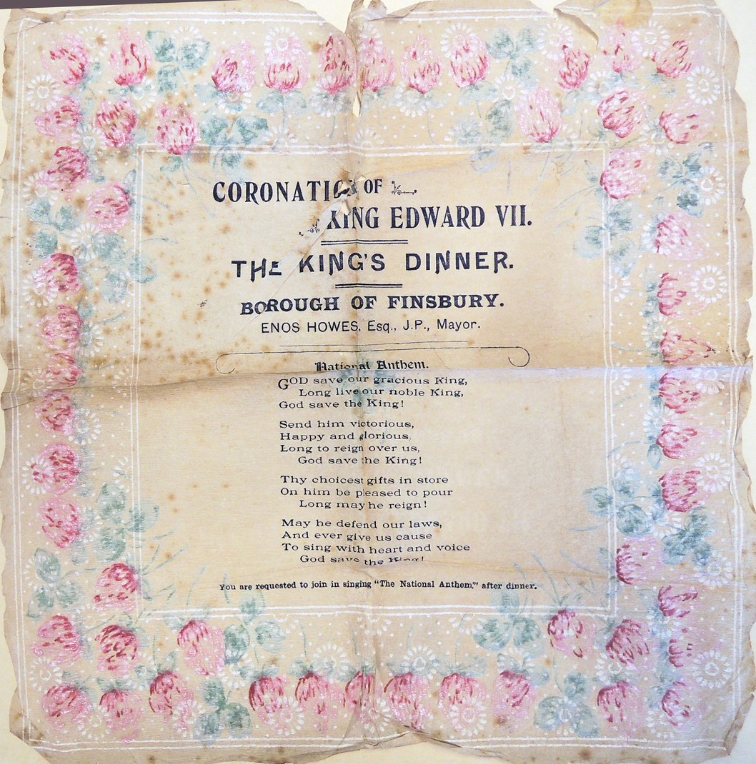
Thanks to the generous gift of William Drenttel, Class of 1976 (1953-2013) the Graphic Arts Collection has a small collection of decorative and handwritten menus. Here is a small sample.


menu13

Drenttel was a designer, author, publisher, and president of Winterhouse Institute. He was also editorial director of Design Observer, a website covering design, social innovation, urbanism and visual culture.

The July 9, 2014 Princeton Alumni Weekly notes, “Bill came to Princeton from Tustin High School in California, where he starred on the debate team. Bill devised his own academic program, graduating in 1977 with an independent concentration in European cultural studies. Bill reported for The Daily Princetonian, managed the Student Bartending Agency, and joined Ivy Club. After graduation, Bill joined Compton Advertising, where he managed more than 20 Procter & Gamble brands. He left as senior vice president in 1985 to start the design company Drenttel Doyle Partners. In the 1990s, Bill met and married Jessica Helfand, and they operated Winterhouse in Connecticut while raising their two children.

Theorist and publisher William Drenttel is recognized for advancing critical thinking about design; for his long-standing commitment to integrating design strategy into organizations; for expanding design’s role in social innovation; and for his work as cofounder, editor and publisher of Design Observer.

menu2
menu25
William Drenttel collection of menus, 1650-1981. Gift of William Drenttel (1953-2013). Graphic Arts Collection GC013. Sizes in inches.
1. Handwritten & color lithograph for Joseph Pelmain. French, no date. 6 x 4.5
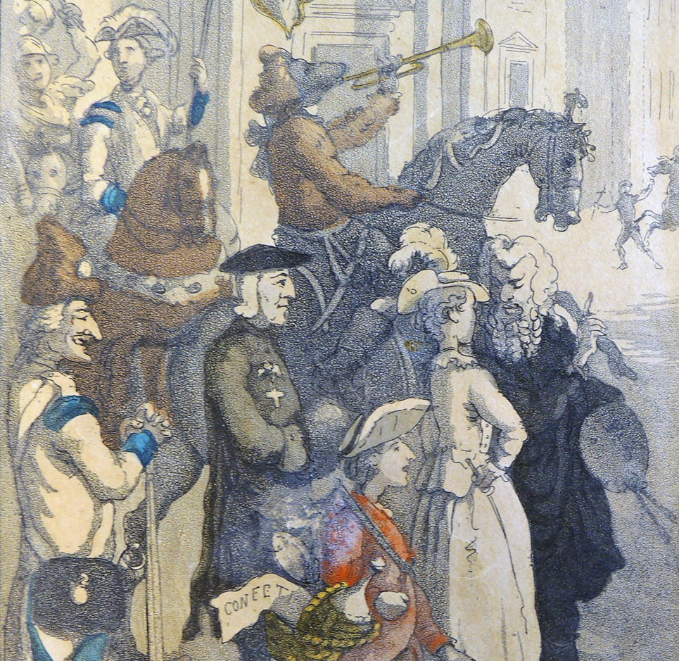
2. Hand-colored and written menu with image of two Chinese figures holding kite (on which menu items are written), no date. 5 x 7
3. Menu for dinner by Société des Anciens Elèves des Ecoles Nationales d’Arts et Métiers, no date. One-color lithograph. 8.25 x 5.5
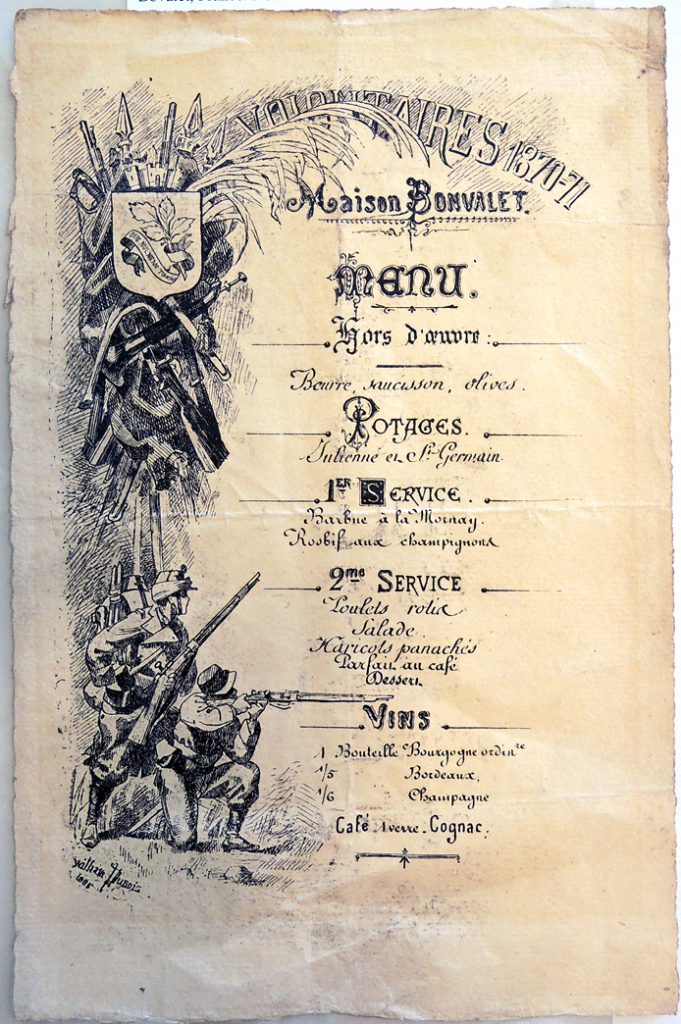
4. Menu for “Volontaires 1870-71” dinner at Maison Bovalet, France, no date. 10 x 6.5
5. Menu for dinner at “La Lanterne.” Paris, 1881. One-color lithograph. 9 x 5.5
6. Printed menu with ornamental border for Exposition Universelle, 1889. Brown and blue ink. 8.25 x 5.25
7. Representative’s card for Chocolat Frey, supplier of cocoa, (1891?). Lithographed in black & gold. 5.5 x 3.5
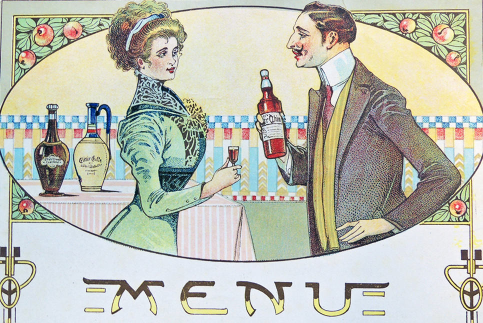
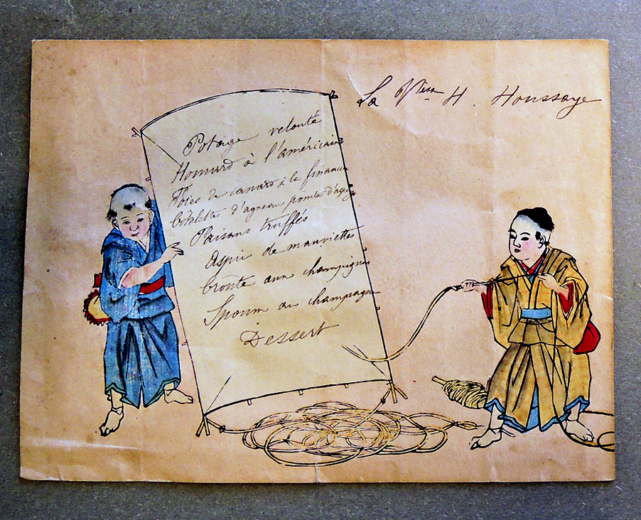
8. Color-lithographed and handwritten menu. French, 1893. Printed in yellow, red, green, light blue; shows two Japanese figures. 5.75 x 4.25
9. Menu for “Match International de l’Olympique” dinner at Grand-Hotel. France, 1896. Printed, blue type, with red/black Olimpique crest at top left. Gilt edges. 6.5 x 4.5
10. Menu, color lithograph and hand-written, for St. Edine (Etine?). French, 1896. 6.75 x 4.5
11. Printed color litho (blue/brown split fount, plus red type) menu for Centieme Anniversaire Du Diner de Lalsace, 1897. 9.25 x 6.75
12. Two-sided, printed menu for dinner by Association Tulousaine de Paris, 1897. 11 x 7.5
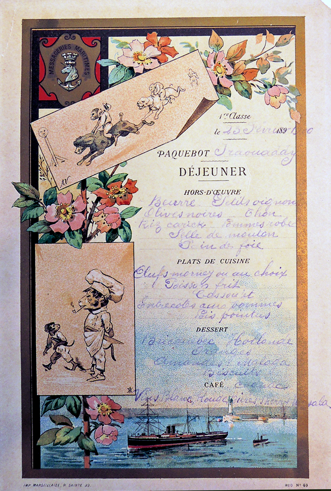
13. Menu for ocean-liner. French, 1900. Color litho; menu blank imprint: Messageries Maritimes. 9 x 6.
14. Printed menu for Restaurant Maire. Paris, 1902. Die cut, with ornamental design at top in raised silver ink; type in dark blue ink. 7.5 x 3.75
15. Printed menu for Société Archéologique dinner. Paris, 1909. With reproduced title-page engraving. 6.75 x 9
16. Printed menu. French, 1912. Card die-cut to suggest scroll forms. 7 x 4.25
17. Printed menu for Société Archéologique dinner. Paris, 1912. With reproduced engravings of Quarter de L’Opéra area of city. 11 x 8.75
18. Printed menu for Société Archéologique dinner. Paris, 1913. With reproduction of ornamental border, human figures, and center scroll formed out of handwriting model-book penstrokes. Inscribed at bottom: Daprés un Modéle d’Écriture de Coulon–coll. R. Havatte). 7.25 x 8
19. Menu for dinner at Cadou restaurant. Blois, France, 1920. Pale green with raised white ink ornamental border, and type printed in dark brown. 6.5 x 4
20. Menu for dinner at C. Jahan restaurant. Blois, France, 1920. Raised gold ink ornamental border, and type printed in black. 6.75 x 3
21. Printed menu for Société Archéologique, Historique & Artistique dinner. Paris, 1926. With reproduced engraving. 11 x 7.75
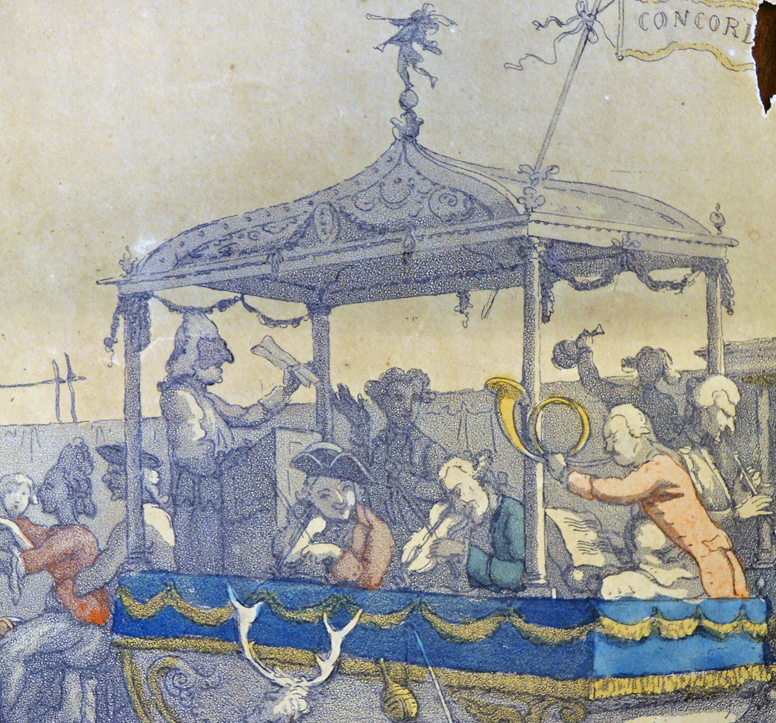
22. Printed menu for dinner of Le Coronet, Société Artistique et Litteraire, held at Maison de Centraux. Paris, 1931. Menu on front and lithograph on back. 15 x 11, folded
23. Menu for (Gameoli restaurant?). French, 1936. Handwritten onto menu blank. 8 x 3.5
24. Menu for dinner by the Académie des Psychologues du Gout, at Restaurant Tong Yen. Paris, 1963. Four-page booklet, with tipped-in color litho on front cover. 9.75 x 7
Italian Language:
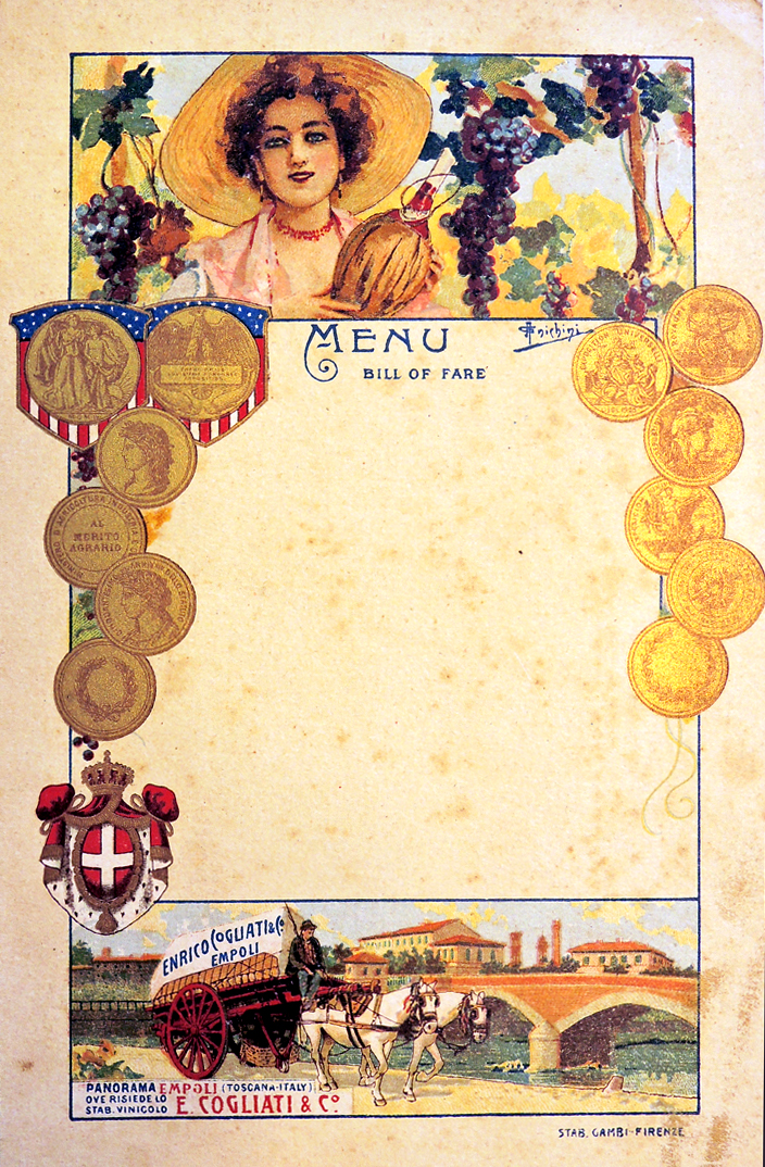
25. Blank menu with color lithos of Tuscany, printed by Enrico Cogliati & Co. (wine merchants), no date. 8 x 5.25
26. Blank menu (color litho. printed by Dott. Botto Micca (liquor distributor?), Italy, no date. 13.5 x 7.0
27. Drawing for plate design, partially watercolored, no date. 9 x 12
28. Menu for Delbinari restaurant. Milan, no date. Six-page folded booklet, printed in brown and grey. 9.25 x 6.75
29. Menu for “La Mora” restaurant. Lucca, Italy, no date. Four-page folded booklet. 8 x 5.75
30. Receipt/bill-of-trade for wine 1649/50 vintage. Printed red ink on laid linen paper, with markings in pen. 4.5 x 6.25
31. Handwritten Italian menu, 1881. 12 x 8.5
32. Booklet of dinner menu with program (with booklet cover) for Musica della Legione Allieve Carabinieri, Rome, 1911. Booklet size 5.75 x 3.5
33. Menu for dinner (at Fert restaurant?), Rome, 1911. Litho, type in brown, crest at upper left in red, brown, gold, silver. 6 x 4
34. Menu for dinner at Villa Savoia, Italy, 1933. Blue ink on pale blue/green backdrop, with crest at top in raised white ink, and border in silver. 7 x 4.5
35. Menu for dinner at Villa d’Este, Italy, 1981. Four-page folded booklet, color litho on front. 7.75 x 6.25
English Language:
36. Menu blank with edges die cut, beveled, and gold-leafed, no date. 6.75 x 4.25
37. Menu for dinner by “S.S. Sado Maru.” 1910. Color litho of reeds and flying fish with printed type. 7.75 x 9.75
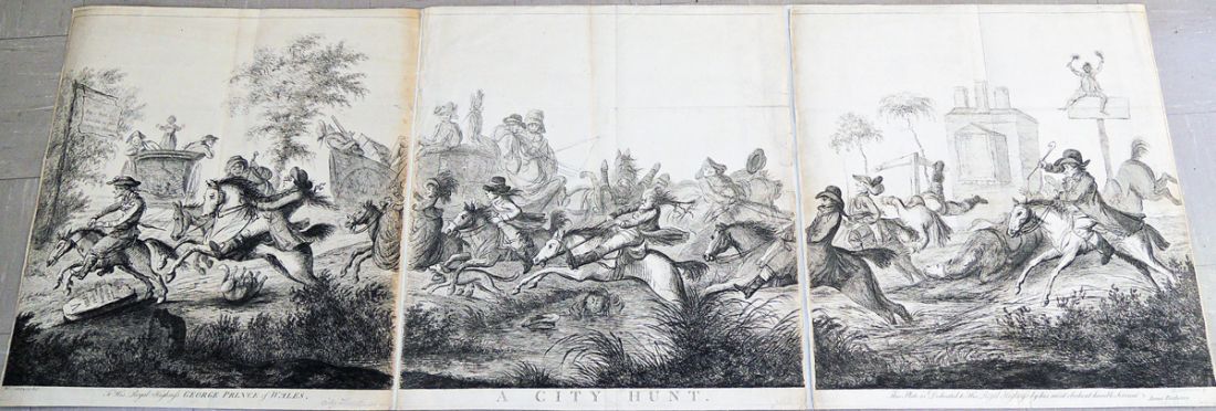
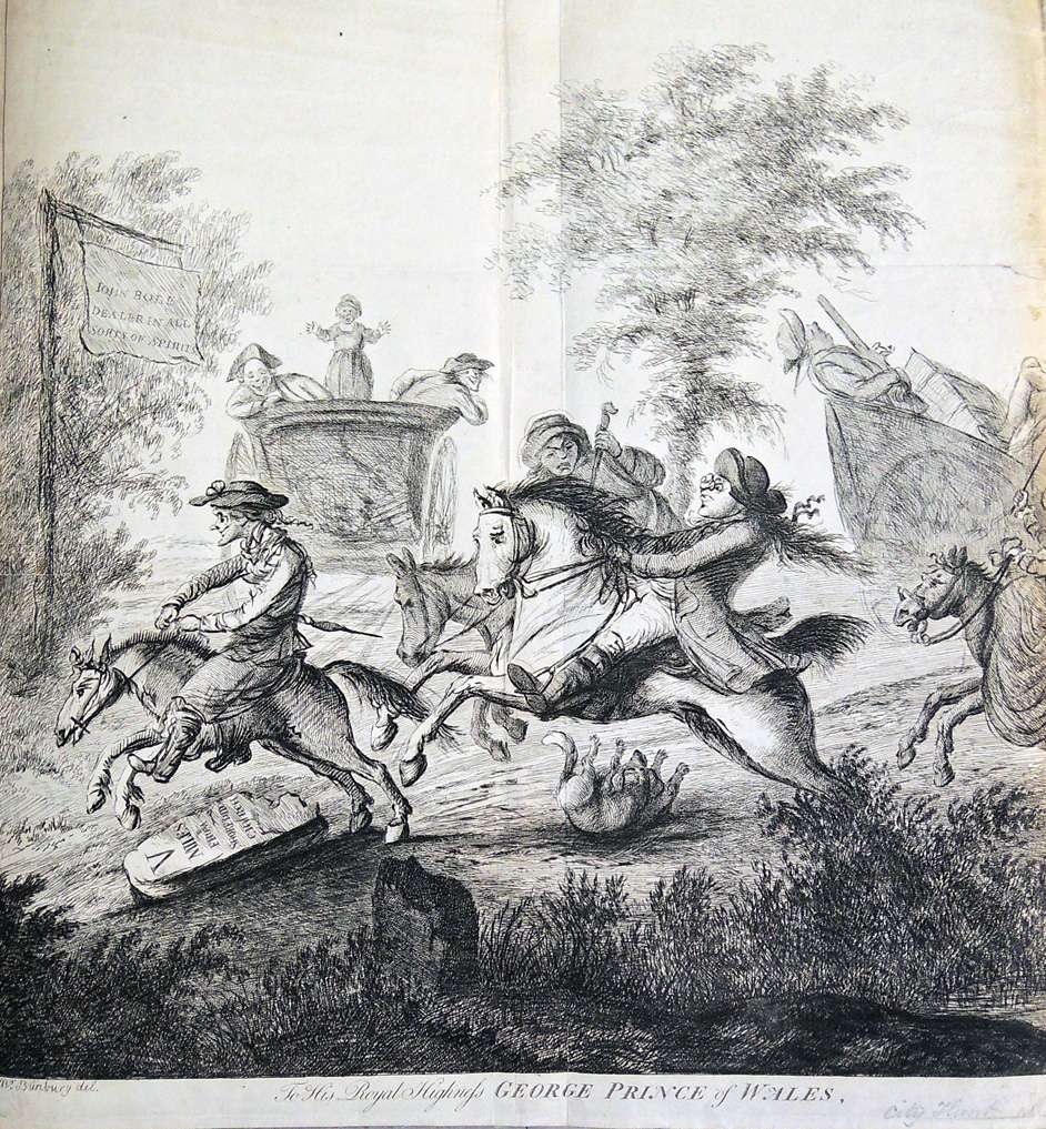
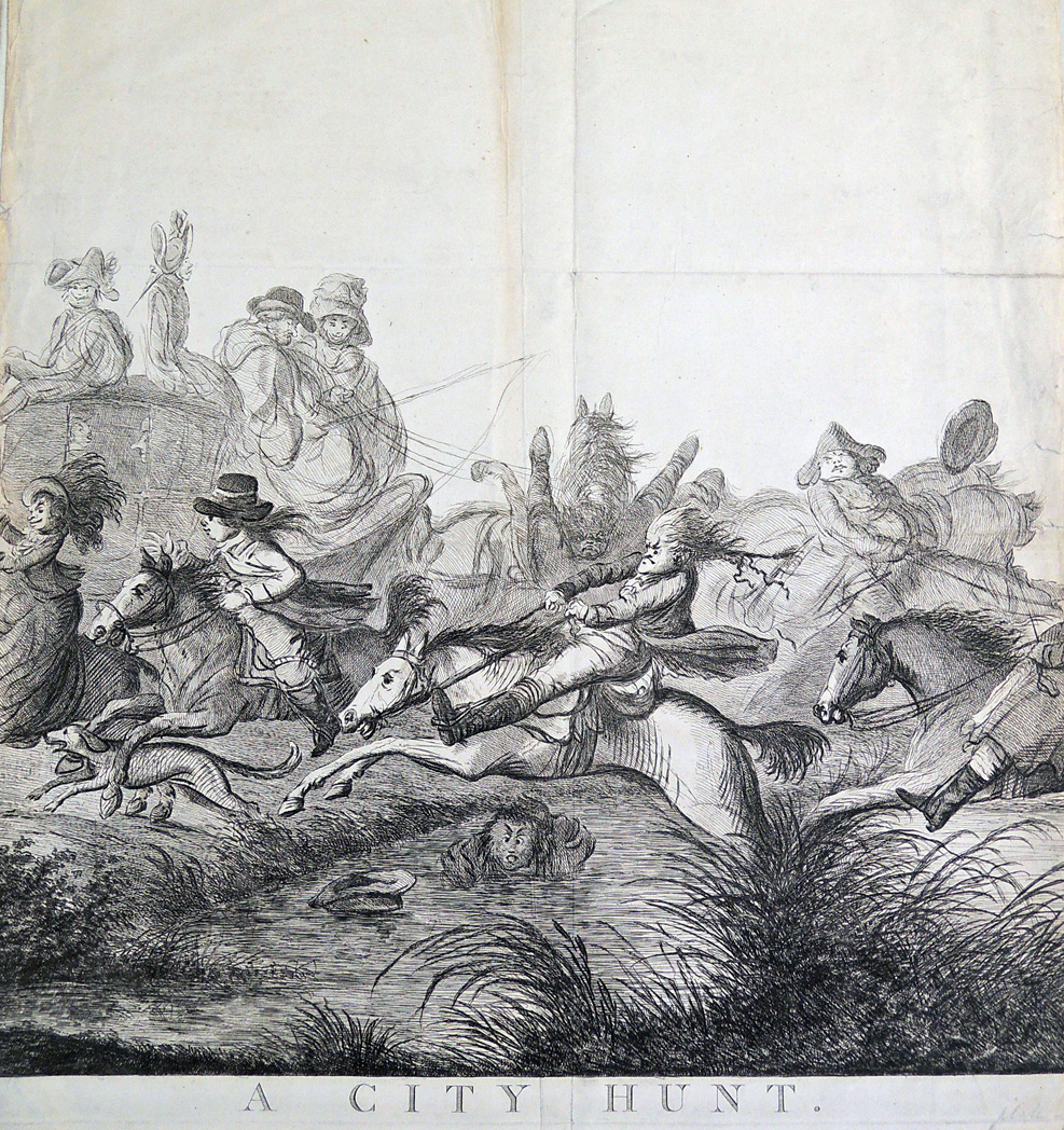
The specimen book to end all specimen books

bodoni3
Giambattista Bodoni (1740-1813), Manuale tipografico del cavaliere Giambattista Bodoni (Parma: Presso la Vedova, 1818). 2 volumes, frontispiece portrait engraved by Francesco Rosaspina after a painting by Andrea Appiani; 33 cm. 250 type specimens designed and cut by Bodoni in Latin, Greek, German, Hebrew, Russian and numerous other languages. One of approximately 290 copies. Purchased with funds provided by the Friends of the Princeton University Library and the Graphic Arts Collection. GA 2016- in process

bodoni2

Thanks to the Friends of the Princeton University Library, we are the proud owner of the second and final edition of Giambattista Bodoni’s Manual tipografico. This much enlarged edition of his 1788 specimen book represents the culmination of more than four decades of work by one of Italy’s greatest typographers, type-designers, compositors, printers, and publishers. Universally celebrated as a “libro importantissimo” (Brooks), “ouvrage magnifique” (Graesse), “an imposing tour de force” (Updike), and “the specimen book to end all specimen books” (Lester), it was surprising to find this pivotal study had been missing from Princeton University Library.

bodoni5

David Pankow, for his introduction to the 1998 DVD, wrote, “The Manuale Tipografico of Giambattista Bodoni has been called the greatest type specimen book ever printed. Issued posthumously in 1818 at Parma by Bodoni’s devoted widow Margherita, the two-volume work contains a dazzling array of 142 roman alphabets with corresponding italics, . . . the culmination of more than forty years of assiduous devotion by Bodoni to the typographic arts, both in his capacity as printer to the Duke of Parma and as proprietor of his own private press and type foundry.”

bodoni4
bodoni8

No facsimile or DVD can truly replace the original printed pages of this typographic milestone and the acquisition of Bodoni’s 1818 Manuale closes a significant gap in our collection on the history of printing. Bodoni’s introduction of what were considered exotic typefaces—Hebrew, Greek, Russian, Arabic, Coptic, Armenian, Phoenician, and Tibetan alphabets—is essential to the study of European history and publishing.
bodoni7

“Bodoni’s Manuale is a crucial document,” writes Thomas Keenan, Slavic, East European and Eurasian Studies Librarian, “of the introduction to the West and the first attempts at standardization in the West of the non-Roman scripts of Russia, Eastern Europe and the territories of the present-day Former Soviet Republics, and most particularly of the Cyrillic alphabets used in Russian and other Slavic languages, and the Georgian and Armenian scripts.”


bodoni6

The Water of the Wondrous Isles

water of the wondrous11

William Morris (1834-1896), The Water of the Wondrous Isles (Hammersmith: Kelmscott Press, 1897). Limited ed. of 250 copies printed on paper. Cf. Peterson. “Printed at the Kelmscott Press … The borders and ornaments were designed entirely by William Morris, except the initial words Whilom & Empty, which were completed from his unfinished designs by R. Catterson-Smith …”–Colophon. Original full limp vellum with silk ties, lettered in gilt on spine. Graphic Arts Collection GAX 2016- in process


water of the wondrous2A heliogravure portrait of William Morris is tipped in as a frontispiece, engraved by Frederick John Jenkins (1872-1929), after a negative by Elliott & Fry (active 1863-1962), published 1895.


water of the wondrousThe copy of The Water of the Wondrous Isles recently acquired by the Graphic Arts Collection was once owned by Sydney Ansell Gimson (1860-1938), with a bookplate on the front pastedown designed by his brother Ernest Gimson (1864-1919). Primarily a furniture and wallpaper designer, Ernest was an early member of the Art-Workers’ Guild and the Society for the Protection of Ancient Buildings.

This might be his only attempt at a bookplate design. He gave his brother two options, writing “I have done what I can with the book plates and send you the result. They are neither of them satisfactory… I don’t understand designing for reduction. And it would require a more microscopic eye than mine to draw it real size.”


water of the wondrous3To read the entire text, in this edition, see http://morrisedition.lib.uiowa.edu/Images/WaterWondrousIsles/waterwondrouskelmscott.html.

“In this magical setting,” writes literary historian Holly Ordway, “Morris gives us a characterization that subverts contemporary cultural norms for female behavior at a time in Victorian England when women agitated for the right to vote and equality before the law. What makes it even more complex is the issue of Birdalone’s beauty. In her world of brave knights, evil witches, and magical quests, it’s expected that damsels will be lovely. In this setting, to be the subversive character that she is without being beautiful would suggest that her independence is a compensatory mechanism, and that with physical attractiveness to fall back on she would be more traditional. As it is, her beauty seems irrelevant, making the point beauty is not a prerequisite to love, be loved, and be an individual as Birdalone is.”– “Subverting the Female Stereotype: William Morris’s The Water of the Wondrous Isles,” by Holly E. Ordway, Associate Professor, MiraCosta College

water of the wondrous9


The author and designer, William Morris, died in 1896 before the printing of his novel was finished and so, the book was published by the members of Morris’s estate. Enormously popular, OCLC lists 85 editions of the book from 1897-2016.
water of the wondrous6
water of the wondrous5

16

16 bookSeveral years in the making, the Graphic Arts Collection is fortunate to acquire copy 84/150 of the fine press, limited edition entitled 16, published at the centenary of Dublin’s 1916 Rising.

Stoney Road Press, An Post, and Poetry Ireland collaborated to produce this book, which includes four contemporary poems by Harry Clifton, Vona Groarke, Paula Meehan, and Paul Muldoon, alongside eight historical texts.

In addition, Stoney Road Press commissioned four limited edition prints by Irish artists Michael Canning, Alice Maher, Brian O’Doherty, and Kathy Prendergast. The Irish literary scholar, Professor Declan Kiberd, provides the introduction. More information on the project can be found at http://www.stoneyroadpress.com/books/16/

16 book7

16 book3

16 book5


http://rte.ie/r.html?rii=b9_20953810_1526_17-03-2016_

A special program on RTE radio with historian Declan Kiberd, Maureen Kennelly of Poetry Ireland, and publisher Kieran Owens was broadcast last March but it can still be hear at the above link.

Paul Muldoon, Princeton University’s Howard G.B. Clark ’21 Professor in the Humanities; Director, Princeton Atelier; and Professor of Creative Writing reads his own poem in Irish and Kennelly reads her translation in English.

16 book4

16 book6

16 book2
See also W.J. McCormack, Enigmas of sacrifice: a critique of Joseph M. Plunkett and the Dublin Insurrection of 1916 (East Lansing: Michigan State University Press, [2016]). Firestone Library (F) DA962 .M243 2016

A selection from Easter, 1916
W. B. Yeats (1865-1939)

I have met them at close of day
Coming with vivid faces
From counter or desk among grey
Eighteenth-century houses.
I have passed with a nod of the head
Or polite meaningless words,
Or have lingered awhile and said
Polite meaningless words,
And thought before I had done
Of a mocking tale or a gibe
To please a companion
Around the fire at the club,
Being certain that they and I
But lived where motley is worn:
All changed, changed utterly:
A terrible beauty is born.

Find the unicorn

homar unicornCan you find the unicorn in this remarkable six foot print by the Puerto Rican artist Lorenzo Homar? The woodcut has been pulled by special request for visiting alumni this week.


homar unicorn2Lorenzo Homar (1913-2004), Unicornio en la Isla = Unicorn on the Island, 1965-66. 94 x 184.2 cm (37 x 72 1/2 in.). Woodcut on Japan paper. Graphic Arts Collection GA 2013.00217

homar unicorn5

The poem is by the Puerto Rican writer Tomás Blanco (1896-1975) entitled “Unicornio en la Isla.”
Isla de la palmera y la guajana
con cinto de bullentes arrecifes
y corola de soles.
Isla de amor y mar enamorado.
Bajo el viento:
los caballos azules con sus sueltas melenas;
y, con desnuda piel de ascuas doradas,
el torso de las dunas.
Isla de los coquís y los careyes
con afrodisio cinturón de espuma
y diadema de estrellas.
Isla de amor marino y mar embelesado.
Bajo los plenilunios:
Húmedas brisas, mágicas ensenadas, secretos matorrales…
Y el unicornio en la manigua alzado,
listo para la fuga, alerta y tenso.

homar unicorn4Our entire collection of prints, drawings, and carved blocks by Lorenzo Homar is digitized and available online at: http://pudl.princeton.edu/collections/pudl0033
homar unicorn3

Spoiler alert, the answer is below:

homar unicorn6

See also Lorenzo Homar, Plenas: 12 grabados de Lorenzo Homar y Rafael Tufiño; introducción por Tomás Blanco; diseño de Irene Delano (San Juan, P.R.: Editorial Caribe, 1955). Graphic Arts Collection (GAX) Oversize NE585.H66 A4 1955q