Paul Revere gets the time wrong

boston massacre2
On March 28, 1770, just three weeks after the battle we now call the Boston Massacre, Paul Revere published an engraving of the bloody scene. The week before, Henry Pelham had shared with Revere a depiction of the battle that he was planning to publish. Revere copied the picture, engraved it, and published it under his own name, working quickly to get it out before Pelham finished his print.

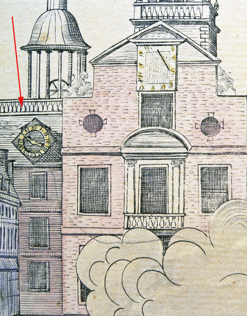
As we all know, when you work too quickly you make mistakes. Revere got the time on the clock wrong and didn’t catch the error until a few impressions had already been pulled. He took back the plate, changed the time to 10:20, and finished the print run. This second state of the first edition is the print now held at Princeton University.

Pelham did complain about this piracy, writing to Revere on March 29, “When I heard that you was cutting a plate of the late Murder, I thought it impossible as I knew you was not capable of doing it unless you coppied it from mine and I thought I had intrusted it in the hands of a person who had more regard to the dictates of Honour and Justice than to take the undue advantage you have done of the confidence and trust I reposed in you.” Pelham’s letter was published in the Proceedings of the Massachusetts Historical Society, 2nd series, volume 8 (1892-1894), page 227. Firestone Library Recap F61 .M377.
boston massacre5Note that Revere only claims to have engraved, printed, and sold the print, not to have designed or drawn the image.

boston massacre1
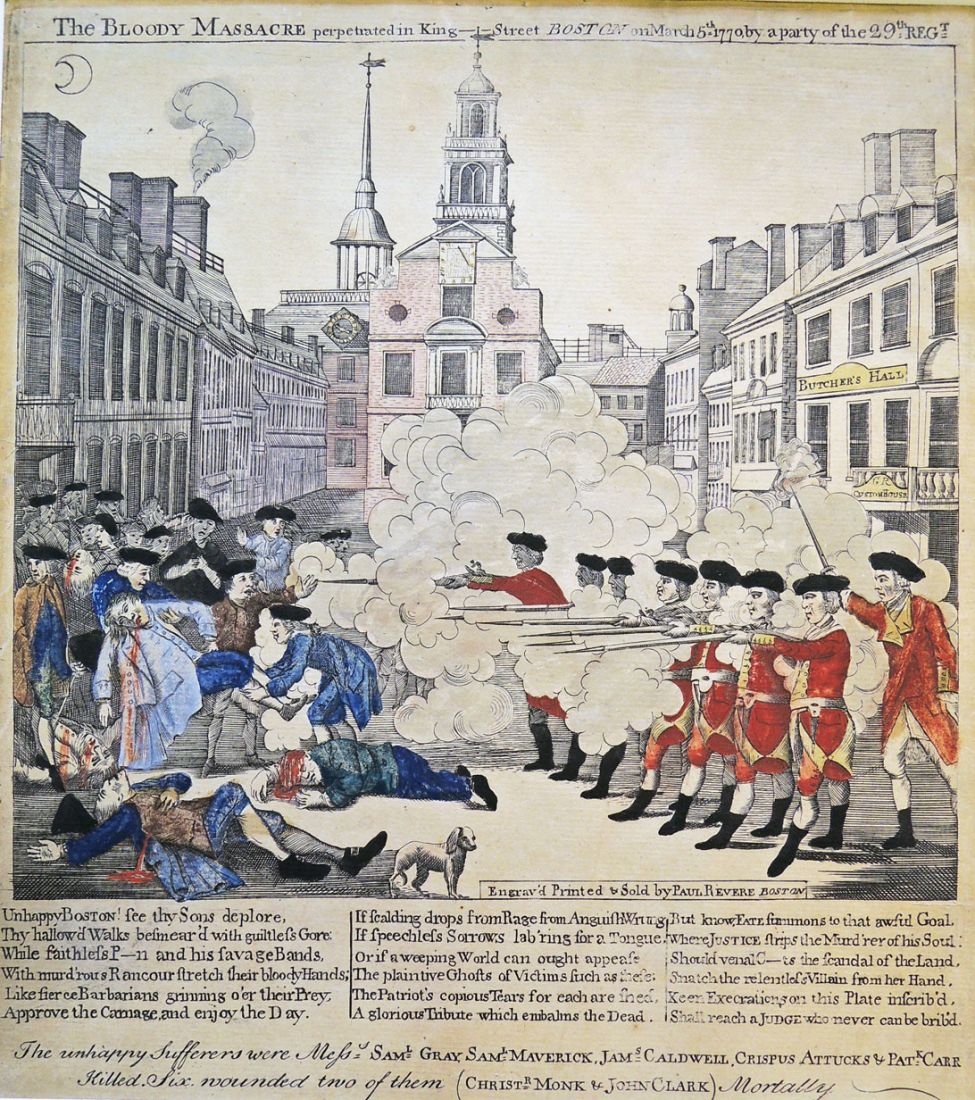
Paul Revere (1735-1818) after Henry Pelham (1748/49-1806), The Bloody Massacre perpetrated in King-Street Boston on March 5th 1770 by a party of the 29th Regt., [1770]. Engraving with hand color. Scheide Library, Gift of William H. Scheide, Class of 1936.

“Unhappy Boston! See thy Sons deplore. Thy hallow’d Walks besmear’d with guiltless Gore. While faithless P-n and his savage Bands. With murd’rous Rancour stretch their bloody Hands; Like fierce Barbarians grinning o’er their Prey, Approve the Carnage and enjoy the Day. If scalding drops from Rage from Anguish Wrung if Speechless Sorrows lab’ring for a Tongue, or if a weeping World can ought appease The plaintive Ghosts of Victims such s these; The Patriot’s copious Tears for each are shed, a Glorious Tribute which embalms the Dead. But know Fate summons to that awful Goal, Where justice strips the Murd’rer of his Soul; Should venal C-ts the scandal of the Land, Snatch the relentless Villain from her Hand, Keen Execrations on this Plate inscrib’d Shall reach a Judge who never can be brib’d.”

boston massacre4
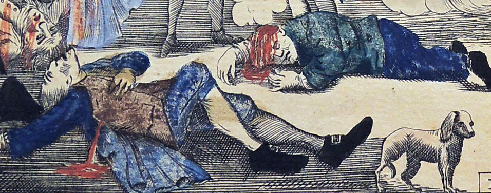
Note the unharmed dog. It has been suggested that Revere was showing that the British treated the dog better than the American colonists.

boston massacre3
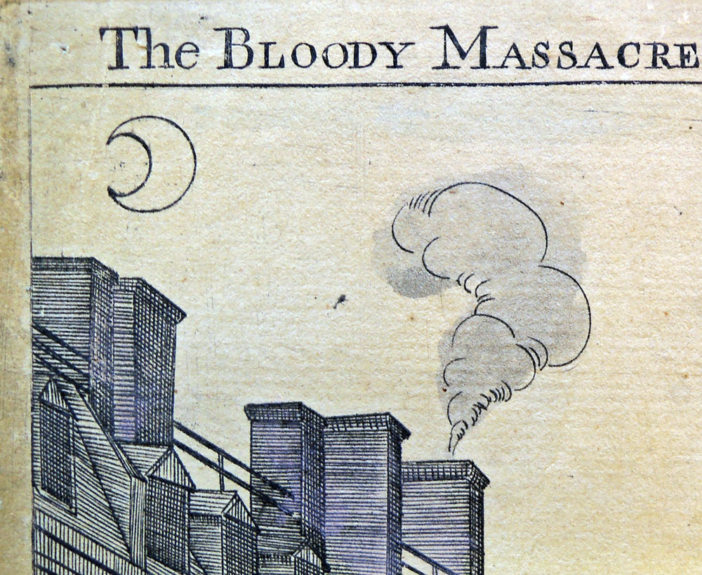
In Pelham’s print, the moon in the top left-hand corner faces to the right, whereas it faces to the left in Revere’s version.
boston massacre6           boston massacre7

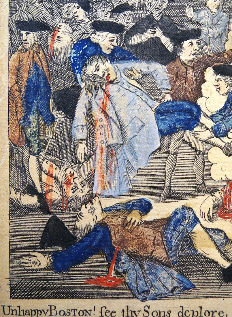
The Red Coats are placed under the sign “Butcher’s Hall.”

There are many variations of this scene. A wonderful page comparing various Boston massacre prints has been mounted by the Boston Historical Society: http://www.masshist.org/features/massacre/comparison

boston massacre12
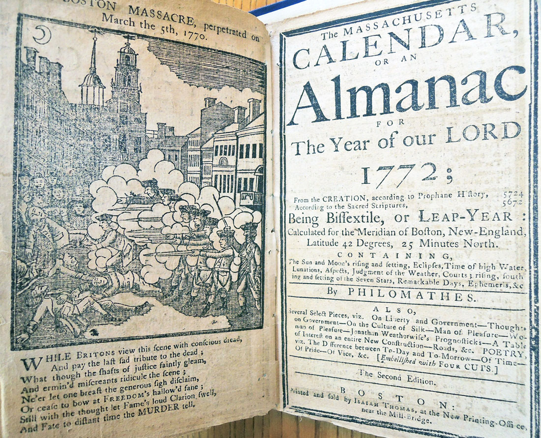
See also Philomathes, The Massachusetts Calendar, or an Almanac for the Year of Our Lord 1772 … 2nd ed. Boston: [s.n., 1772?]. Woodcut of the Boston massacre after Paul Revere’s engraving of 1770. Philomathes is a pseudonym of Ezra Gleason. Graphic Arts Collection (GAX) Hamilton 59.

boston massacre8
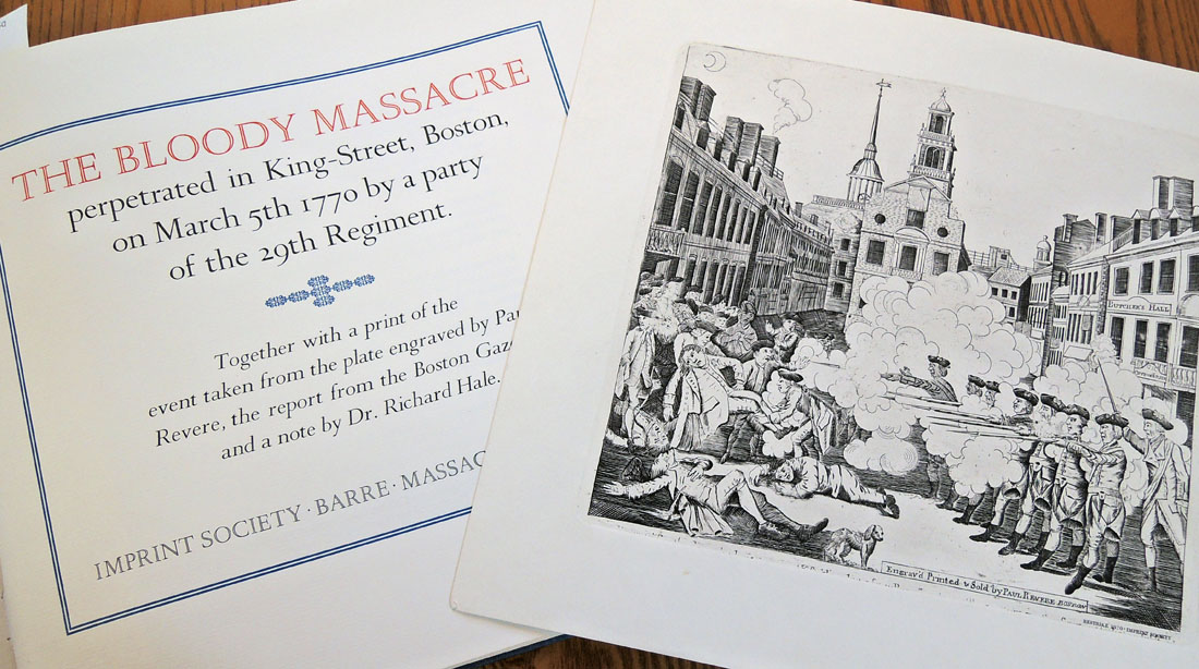
See also Paul Revere (1735-1818), The Bloody Massacre, 1970 (restrike). Graphic Arts Collection (GAX) NE539.R5 B55q This is a restrike from Revere’s original plate.

Persistence of Vision

20151007_151826_resized
thaumatrope        thaumatrope2recto and verso
20151007_151834_resizedAnne McCauley’s ART 589, “Seminar in 19th-Century Photography: Inventing Photography” visited the graphic arts collection recently. Among other things, the students were introduced to the concept of ‘persistence of vision’ by handling 19th-century thaumatropes.

A thaumatrope is a small disc you hold by two pieces of string. An image is printed or drawn on each side of the disc and when you spin it between your fingers, the two images appear to become superimposed. These “turning wonders” are credited to the London physicist, John Ayrton Paris who brought them to the public’s attention around 1825.

How to make a thaumatrope:
http://www.wikihow.com/Make-a-Thaumatrope
See also J.H. Brown, Spectropia; or, surprising spectral illusions. Showing ghosts everywhere, and of any color. First Series (London: Griffith and Farran; H. & C. Treacher, Brighton. 1864). Cotsen Children’s Library (CTSN) English 19 18457
 

Rules of Punctuation 1785

comma

Joseph Robertson (1726-1802), An Essay on Punctuation (London: Printed for J. Walter, 1785). Rare Books (Ex) TS1090 .xM8

comma2 In honor of Mary Norris’s visit to Labyrinth Books on October 13 at 6:00 p.m., here are a few images from An Essay on Punctuation by Joseph Robertson (1726–1802) printed for J. Walter in 1785.

Princeton’s copy is bound with Practical Remarks on Modern Papers (1829) and Typographical Antiquities (1813).

According to her webpage Mary Norris, the author of Between You and Me: Confessions of a Comma Queen, “spent more than three decades in The New Yorker’s copy department, maintaining its celebrated high standards, has written the most irreverent and helpful book on language since the #1 New York Timesbestseller Eats, Shoots & Leaves.”


See also:
thomas-Pencil-sPeter Thomas and Donna Thomas, The Pencil (Santa Cruz: the authors, 2010). “This book tells a short history of the pencil and displays vintage advertising pencils. The text was hand written and colored with pencil by Donna, then color copied on Peter’s handmade paper.” Copy 26 of 30. Graphic Arts Collection (GAX) 2015-1147N

Watch the Comma Queen’s videos: http://video.newyorker.com/watch/comma-queen-comma-queen-series-premiere

50th anniversary of Beckett’s Imagination Dead Imagine

No trace anywhere of life, you say, pah, no difficulty there, imagination not dead yet, yes, dead, good, imagination dead imagine.

the dead5Jamie Murphy at The Salvage Press in Dublin has published a new edition of Samuel Beckett’s Imagination Dead Imagine, to coincide with the 50th anniversary of its release in 1965. Beckett first wrote the prose fragment Imagination morte imaginez, in French and translated it himself to English. The new edition is a collaboration between typographic designer Jamie Murphy and the visual artist David O’Kane, with an essay by Stanley E. Gontarski, the Robert O. Lawton Distinguished Professor of English at Florida State University and a Beckett scholar who specializes in twentieth-century Irish Studies. https://instagram.com/thesalvagepress/

The Salvage Press is a new studio, devoted to preserving, promoting and pursuing excellence in design, typography & letterpress printing. You can follow them at: http://websta.me/n/thesalvagepress
the dead4
the dead    the dead3

Samuel Beckett (1906-1989), Imagination Dead Imagine. A collaboration between typographic designer Jamie Murphy & visual artist David O’Kane. Essay by Stanley E. Gontarski. (Dublin: Savage Press, 2015). Copy 2 of 40. Graphic Arts Collection GA2015- in process.

the dead2savage

Colophon:

This new edition of loose sheets celebrates the 50th anniversary of the original publishing in 1965. The project is a collaboration between typographic designer Jamie Murphy & visual artist David O’Kane. The work is introduced with an essay by renowned Beckett scholar Stanley E. Gontarski.

The text has been hand-set & letterpress printed by Jamie Murphy in 18 point Caslon Old Face, supported by a newly drawn ten line grotesque typeface by Bobby Tannam, cut from maple by Tom Mayo. David O’Kane has supplied two lithographs inspired by the text, editioned by Thomas Franke at Stein Werk Lithography studio in Leipzig. The sheets are printed on 250 gsm French made Venin Cuve BFK Rives mouldmade.

The edition is limited to 50 copies, 40 of which make up the standard format, ten accounting for the de luxe. The bindings were executed by Tom Duffy in Dublin. The standard is housed in a cloth covered portfolio, protected inside a slipcase. The de luxe is presented in a clam-shell box accompanied by a typographic triptych based on the text. The standard copies are numbered 11-50, the de-luxe are numbered 1-10. Each copy has been signed by the collaborators.

Notes on the images: The two images included in this edition were made using a lithography technique called Schablithografie. This lithography technique is highly labour intensive and involves scratching away at a surface of the blackened lithographic stone to form the image; literally scraping light forms out of darkness, reinforcing the constructed nature of the text, which Beckett goes to great lengths to emphasise.

The first image is a kind of schematic. It is not fully formed and harkens back to Greek and Roman style images, suggesting a metaphorical excavation. The letters and image turn it into a kind of logotype [literally word-imprint in Greek] or emblem and form a bridge between the text and the image.

The second image is larger. The unusual format of the image echoes the formatting of the prose text as it appears in this edition. There are noticeable discrepancies between what Beckett describes and what is depicted in the image. The image is in fact a failed attempt to portray what is fabricated in the story. What interested the artist in staging it is the fact that the positions and space Beckett describes are anatomically impossible without gross distortion of the human body. Beckett would have known this as he also sketched the space out in his notes. So he deliberately stresses the cramped nature of the scenario. The fact remains that in the artist’s mind’s eye the extreme positions were not exactly related to what is described in the story. The spatial discrepancies are only revealed completely when the space is mapped out point for point.

The finalised lithographs are a combination of the mental image conjured up during the initial reading of the text and the interpretation of the physical reenactment made in the artist’s studio.

Typoretum: A Letterpress Workshop from Jamie Murphy on Vimeo.

First Lithography in English, 1813

We are proud to announce that the Graphic Arts Collection has acquired the earliest independent work on lithography in the English language.

bankes lithography


Henry Bankes (1757?-1834), Lithography; Or, the Art of Making Drawings on Stone, for the Purpose of Being Multiplied by Printing (Bath: printed by Wood and Co., 1813). Purchased with funds from the Rare Book Division and the Graphic Arts Collection 2015- in process


The first edition of Henry Bankes’s treatise was published in Bath in 1813 with the title Lithography; or, the Art of Making Drawings on Stone, for the Purpose of Being Multiplied by Printing. A second edition was published in London in 1816 without the name of the author and titled Lithography; or, the Art of Taking Impressions from Drawings and Writing Made on Stone. As an independent publication, it is predated only by Heinrich Rapp’s Das Geheimniss des steindrucks, in 1810. It wasn’t until 1818 that Alois Senefelder completed his own account of the process he developed, entitled Vollständiges Lehrbuch der steindruckerey.

bankes lithography2

According to Michael Twyman “The value of Bankes’s treatise today is as an historical record of attitudes to the process in England in the period between its introduction right at the outset of the century and its revival by Ackermann, Hullmandel, and others around 1818; and it is of particular interest for the few shafts of light it throws on those associated with the process in Bath and on changing attitudes to lithography between 1813 and 1816.”

bankes lithography3

Only a handful of public institutions hold the 1813 edition, among them are the Bodleian Library at Oxford University; Bristol Public Reference Library; Yale University; the Lessing J. Rosenwald Collection at the Library of Congress; the Bath Somerset Council; the British Library; the Victoria & Albert Museum Library; and now Princeton University Library. In addition, only a few of these small, ephemeral volumes include their original plates, most having been removed over the last two hundred years.

Not only is Princeton’s copy in perfect condition, untrimmed and partially unopened with its original stab sewing, but it has all three (title page only promises two) of Bankes’s lithographic plates. We post them here in the hope that we can complete Twyman’s survey of copies and their plates, published in the facsimile edition. It would be interesting to match them with other institutional copies:

bankes lithography8

bankes lithography7

bankes lithography5

“Lithograph, drawing on stone. An invention ascribed to Alois Sennefelder, about 1796; and soon afterwards announced in Germany as polyautography. It became known in England in 1801, but its general introduction is referred to Mr. Ackermann of London, about 1817. Sennefelder died in 1841. Improvements have been made by Engelmann and others.”– quote from Charlton Thomas Lewis, Harper’s Book of Facts: a Classified Encyclopaedia of the History of the World (New York: Harper & brothers, 1906).

bankes lithography4
bankes lithography6

See also: Henry Bankes’s Treatise on Lithography: Reprinted from the 1813 and 1816 editions. Introduction by Michael Twyman (London: Printing Historical Society, 1976). Graphic Arts Collection GA 2015- in process

Yellow Wagtail

audubon yellow3
Listen to the Yellow Wagtail’s call here: https://www.audubon.org/sites/default/files/snd-1-961-149-2804963252304559332.mp3?uuid=560e688a50f98

audubon yellow2
audubon yellowPreparing for ART 562, Seminar in American Art-Impossible Images, taught by Rachael Z. DeLue, we pulled a selection of Audubon paintings and drawings including this preparatory drawing for the Yellow Wagtail finished in 1834. John Woodhouse Audubon, the son of John James Audubon, worked on his dad’s famous project: John James Audubon (1785-1851), The Birds of America : from original drawings (London: Pub. by the author, 1827-38). 4 v. 100 cm. Rare Books: South East (RB) Oversize EX 8880.134.11e

Princeton has a rich collection of Audubon material, by the father and the son. One of the best descriptions can be found in the exhibition catalogue: Howard C. Rice, “The World of John James Audubon; Catalogue of an Exhibition at the Princeton University Library. 15 May-30 September 1959” published in the Princeton University Library Chronicle XXI, 1&2 (Autumn, 1959 & Winter, 1959) pp. 9-88. [full text]

audubon yellow4

John Woodhouse Audubon (1812-1862), Yellow Wagtail (Matacilla flava), 1834. Pencil and watercolor, and gouache on paper. Signed: “Drawn from Nature by J. W. Audubon. Sunday, Sept. 21, 1834. London.” Graphic Arts Collection GC 154

The Yellow Wagtail did not make it into the Birds . You can double check this thanks to The University of Pittsburgh’s digitized copy of The Birds of America here: http://digital.library.pitt.edu/a/audubon/plates.html

Amalie von Stubenberg

amalia3

This memorial portrait of Amalie von Stubenberg (1632-1661) was engraved following her death at the age of 29.  Amalie was the wife of Georg Augustin von Stubenberg (1628-1691), a cousin and close acquaintance of Johann Wilhelm Herr von Stubenberg (1619-1663).

The print includes Amalie’s family crest and her husband’s at the upper corners, with two weeping putti at the bottom corners. Her portrait is framed with the words: Amalia, Herrin und Frau von Stubenberg, geborne Kevenhüllerin, Freyherrin zu Aichelberg. Ist gebohren den 9 May 1632. Starb den 26 October 1661. Ihres Alters 29 Jahr 5 Monat, 17 Tag. [Amalia, mistress and wife of Stubenberg, born Kevenhüllerin, mistress to Aichelberg. She was born on May 9 1632. Died the 26 October 1661. 29 years of age, 5 months, 17 days.]

Bartholomäus Kilian II (1630-1696), the engraver, included a few lines from a sermon by Christoph Ludwig Dietherr (1619-1687). The verse reads:

Hier ist das Tugendt-Bild, so offt für Gott getretten,
Die wol verstundt die kunst in Andachts glut zu beten,
Was sterblich an Ihr war, zeigt uns des Künstlers Handt,
Ihr Seel war Gottes Lust, sein theures unterpfandt.
amalia2

amalia

Bartholomäus Kilian II (1630-1696), Amalia Herrin und Frau von Stübenberg, no date [1661]. Engraving. Graphic Arts collection GA 2014.00910

Têtes de Pipes

pipe7

L. G. Mostrailles (pseudonym for Leo Trézenik and Georges Rall). Têtes de Pipes. Paris: Léon Vannier, 1885. 21 original photographs by Émile Cohl. Copy 11 of 100. Graphic Arts Collection GAX 2015- in process

pipe2                pipe6
The French poet and novelist Léon-Pierre-Marie Spruce (1855-1902) used a number of pseudonyms during his career including Leo Trézenik and the collective signature L.-G. Mostrailles when he worked together with Georges Rall. Both Trézenik and Rall were active member of the Hydropathes, a group of late nineteenth-century writers, artists, and musicians who worked and drank together, particularly connected with the Chat Noir cabaret after it opened.
pipe5

pipe4Beginning in 1882, Tréenik and Rall acquired a small hand press and used it to print a weekly literary journal they called Lutèce, with Trézenik acting as publisher and Rall as editor. From time to time they printed humorous (bordering on cruel) descriptions of their friends.

In 1885, they used the same hand press to print and publish these text portraits under the title Têtes de Pipes in an edition of 100. At that time, the phrase “têtes de pipes” was pejorative since it only applied to a face with coarse features, in allusion to the rather crude heads carved on the stove of some pipes. The caricaturist and photographer Emile Cohl (pseudonym of Emile Eugene Jean Courtet 1857-1938) provided the photographs (2100 prints) to be pasted into the book.
pipe3
The subjects include Fernand Icres, Maurice Rollinat, Laurent Tailhade, Emile Cohl, George Lorin, Edmond Haraucourt, Robert Caze, Francis Enne, Emile Peyrefort, Edouard Norès, E. Monin, Grenet-Dancourt, Georges Rall, Leo Trézenik, Emile Goudeau, Jean Rameau, Carolus Brio, Henri Beauclair, Jean Moréas, Paul Verlaine, and Léon Cladel.
pipe1
Emile Cohl went on to have a career in cinema, credited with making some of the first animated films. Eventually, Cohl emigrated to the United States and worked at the Éclair film studios in Fort Lee, New Jersey. His animation entitled Fantasmagorie was first projected on August 17, 1908 at the Théâtre de Gymnase in Paris.


Phizzzzz

phiz2

David Croal Thomson (1855-1930), Life and Labours of Hablôt Knight Browne, “Phiz” (London: Chapman and Hall, 1884). 20-volume set, extra-illustrated with tipped-in works by Browne, including: etchings (some hand-colored); engravings; aquatints; lithographs; wood engravings; pencil drawings (some with added gouache); pen and ink washes; watercolors; one albumen photograph of a drawing; illustrated letters; and book covers.

phiz10There was a need to pull our extra-illustrated set of Thomson’s “Phiz” biography this week and so, a few extra images were taken to post here. Originally, Thomson’s 1884 single volume contained an engraved portrait and 130 illustrations by the artist best known for his illustrations of Charles Dickens’s novels (GA Rowlandson 946).

Princeton’s unique copy has been vastly expanded to 20 volumes, extra-illustrated with the insertion of more than 1250 plates, including 11 watercolors, 81 pencil and ink drawings (a few with a touch of color or double-sided), and 11 autograph manuscript items signed by Browne.

Robert L. Patten, Lynette S. Autry Professor Emeritus in Humanities at Rice University, studied Princeton’s set and wrote a description for our Library Chronicle, published in the spring of 2010. http://library.princeton.edu/libraries/firestone/rbsc/aids/libchron/LXXI-3-contents.pdf. But we recommend your coming to our reading room to see this item in the original, as we can’t do justice to the variety and number of unique materials included in this set.

Here are a few examples.

phiz9
phiz7
phiz11
phiz8
phiz4
phiz3The original purchase announcement: https://blogs.princeton.edu/graphicarts/2008/06/twenty_volumes_of_phiz.html

Walking the City of Print

barnes

Century Building at 33 East 17th Street

Dr. Mark Noonan, author of Reading the Century Illustrated Monthly Magazine (Firestone PN4900.S4 N66 2010), organized the National Endowment for the Humanities summer institute, “City of Print: New York and the Periodical Press from the Antebellum Era to the Digital Age,” held last June 2015. http://www.citytech.cuny.edu/City_of_Print/index.aspx

He kindly offered the American Printing History Association a taste of the walking tours created for The City of Print this weekend. Beginning at Union Square we worked our way east to Stuyvesant Park, north to Gramercy Park, and then to Madison Square Park.

Along the way, Professor Noonan discussed the notable buildings and sites that were important to the rise of New York’s periodical press, such as The Century, The New Masses, McClure’s and Harper’s Weekly.

city of

city

flatironWe stopped at the Flat Iron building on 23rd Street where pulp fiction began. Noonan commented on the publisher and author Frank Munsey (1854-1925), who introduced Argosy Magazine with an all-fiction format in 1882, printed on cheap, pulp paper. By 1903, the publication had a circulation of 500,000.

Bernarr Macfadden (1868-1955), editor of Physical Culture magazine, set up “Physical Culture City,” in Spotswood, NJ, until legal problems forced him to close the community and move Macfadden Publications to the Flat Iron building. True Story was his next publication in 1919, followed by Photoplay, True Detective, and New York Evening Graphic.

We ended at the north end of Madison Square Park by the Admiral Farragut Monument created by sculptor Augustus Saint-Gaudens and architect Stanford White. Unveiled in 1881, this was Saint-Gaudens’ first public commission. The original home of McClure’s Magazine was in sight at 141-151 East 25th Street, where the magazine was published from 1896 to 1903. Herman Melville lived at 104 East 26th Street, while Henry James lived down the block at 111 East 26th Street.

stgaudensAdmiral Farragut Monument

temperance

We also paused at the Temperance Fountain Union Square, erected in 1888 and one of two such remaining fountains in New York City. The premise behind the fountains was that the availability of cool drinking water would make alcohol less tempting. It features the Greek Goddess Hebe, cup bearer to the Gods, and four lion heads that served as the water spouts.

The fountain was associated with the Woman’s Temperance Publishing Association (WTPA), one of many social and political organizations who marched in Union Square. Emma Goldman (1869-1940), editor of Mother Earth, lived at 208 East 13th Street until 1913.

We also visited the homes of artist and illustrator George Bellows (1882-1925) and James Harper, Sr. (1795-1869), Mayor of New York City and co-founder of the firm Harper and Brothers in 1817. Our sincere thanks to Dr. Noonan.

bellowsHome of George Bellows, 146 East 19th Street

harpersHome of James Harper, 3 Gramercy Park West