Look inside this cabinet of wonders, a beautiful rarity


Open the cabinet door, inscribed “Schöne rarität, schöne spielewerk” (Beautiful rarity, beautiful game work), and you will see what others are viewing through the peep holes at the sides. This volume has two engraved plates with movable flaps, along with eight others engraved by Christian Friedrich Boetius, Johann Benjamin Brühl, and Georg Paul Busch after designs by David Richter.


Later in the volume, two wide  tables open to let the viewer see inside the two tents, guarded by several antelope.


The stories are credited to Jean Chretien Toucement, the pseudonym for Johann Christian Trömer (1697-1756), a Franco-German dialect poet at the court of Augustus the Strong. The Oxford companion to German literature by Henry and Mary Garland describe the author:


Jean Chretien Toucement des Deutsch Franc̦os schrifften, mit viel schön kuffer stick, kanss complett, mehr besser und kanss viel vermehrt. Leipssigck, Bey die auteur und ock bey Johann Christian Troemer [1736]. Graphic Arts 2020- in process.  Note the date written in a rebus at the bottom of the title page.

Princeton also holds the later 1745 edition, with many plates reprinted.


The History of [American] Political Parties

Walter Raleigh Houghton (1845-1929) was a history professor at Indiana University who believed  that “the political history of the United States has received less attention than any other important portion of the history of our country, notwithstanding the fact that there is no other subject which meets with such general consideration as politics.” Therefore he took it upon himself to chronicle and depict American political history in several books, each using these colorful maps and charts.


Unfortunately, Googlebooks did not remove the panoramic charts from the envelope, so that they could be digitized.

In this 1880 plan, Republicans are red and the Democratic are yellow. There are many online sites giving the modern day history of party colors but few of them mention yellow. For instance: https://www.smithsonianmag.com/history/when-republicans-were-blue-and-democrats-were-red-104176297/

Slate magazine offers this short video:

Here is the timeline broken into segments so it can be read. 1789 to 1881 election data includes various heads of state, treasury, war, navy, post office, justice, and interior.

Walter R. Houghton (1845-1929), Conspectus of the History of Political Parties and the Federal Government (Indianapolis, Ind.: Granger, Davis & Co., 1880). ReCAP oversize 1097.478q

Princeton’s copy is missing the timeline that presents U.S. political parties entitled: “Diagram of the Rise and Fall of American Political Parties, from 1789 to 1880, inclusive.” Here is the online version:

Note, Houghton’s “Rules of Politeness” can be downloaded for free: https://openworks.wooster.edu/do/search/?q=author_lname%3A%22Houghton%22%20author_fname%3A%22Walter%22&start=0&context=4358143&facet=


Chris Killip 1946-2020

In Flagrante is one of the greatest photobooks of our generation. Its artist/author Chris Killip passed away yesterday at the age of 74. His photographs for that series, created between 1973 and 1985, were published, sold out, republished, sold out, and continue to be loved by the world. Hopefully you are lucky enough to have one or at least a reproduction of one.

“History is what’s written, my pictures are what happened.”

In the Guardian today, Martin Parr is quoted, “Chris is without a doubt one of the key players in postwar British photography. …It was a different way of looking. Put simply, Chris created a new narrative by looking more closely at his subjects and what they represented.”

While Four Young Photographers, the catalogue for Killip’s 1972 group show quickly made its way to library shelves in America and remains a classic, his prints were first appreciated on the East Coast thanks to John Szarkowski’s 1989 exhibition Photography Until Now, followed in 1990 by MoMA’s British Photography From The Thatcher Years.

Fittingly born on the Isle of Man, Killip was a charming and enthusiastic mentor to many young students. “In 1991, Killip was invited to Harvard University, in Cambridge, Massachusetts, as a visiting lecturer. He embraced the move to America, was made a tenured professor in 1994, and remained teaching at the world-famous university until 2017, as a professor of visual and environmental Studies.”—Art Newspaper

His personal webpage offers more: https://chriskillip.com/index.html, including this link to a recent interview: https://a-small-voice-conversations-with-photographers.simplecast.com/episodes/094-chris-killip

A few years ago, The Getty mounted Now Then: Chris Killip and the Making of “In Flagrante”, noting “Poetic, penetrating, and often heartbreaking, Chris Killip’s In Flagrante remains the most important photobook to document the devastating impact of deindustrialization on working-class communities in northern England in the 1970s and 1980s. The fifty photographs of In Flagrante serve as the foundation of this exhibition, which includes maquettes, contact sheets, and work prints to reveal the artist’s process. The show also features material from two related projects—Seacoal and Skinningrove—that Killip developed in the 1980s, included selectively in In Flagrante, and revisited decades later.” — https://www.getty.edu/art/exhibitions/chris_killip/


Chris Killip (1946-2020), In flagrante; with an essay by John Berger and Sylvia Grant (London : Secker & Warburg, 1988).
https://www.theguardian.com/artanddesign/2020/oct/14/chris-killip-hard-hitting-photographer-of-britains-working-class-dies-aged-74

Poetamenos (Minuspoet)

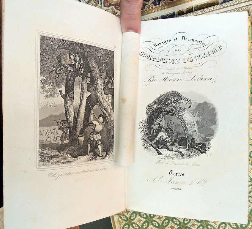
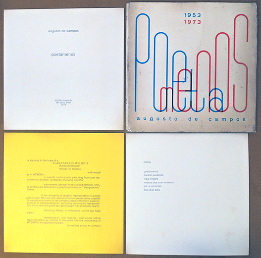
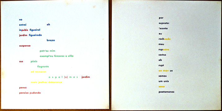
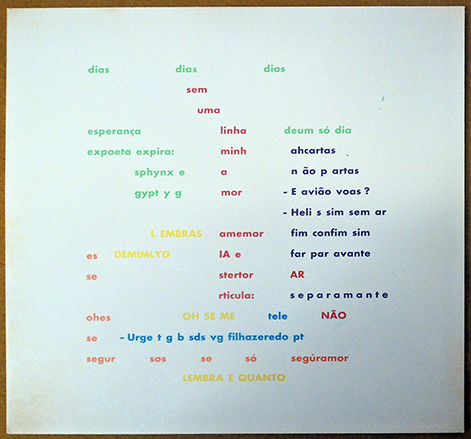
Augusto de Campos, Poetamenos (São Paulo: Edições Invenção, 1973). Graphic Arts in process

As leading voices in Brazilian concretism or concrete poetry, Augusto de Campos (born 1931), his brother Haroldo de Campos, and Décio Pignatari founded the Noigandres group and its literary magazine, Noigandres; antologia do verso à poesia concreta in the 1950s. Like Europeans such as Stéphane Mallermé, the Noigandres were interested in exploring the visual elements of written or printed words, along with sung or spoken performances of these texts, which they called verbivocovisual.

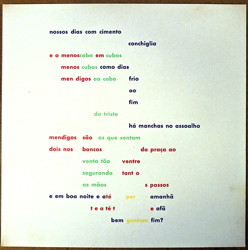
Here is a small portion of the biography on his website that mentions Poetamenos (Minuspoet):

Born in São Paulo (Brazil) in 1931, poet, translator, literary and music critic. In 1951 he published his first book of poems, O REI MENOS O REINO (The King Minus the Kingdom). In 1952, with his brother Haroldo de Campos and Decio Pignatari, he launched the literary magazine “Noigandres”, the origin of the Noigandres Group which initiated the international movement of concrete poetry in Brazil. The second issue of that magazine (1955) contained his series of color¬poems POETAMENOS (Minuspoet), written in 1953, and considered the first consistent examples of concrete poetry in Brazil. Verse and conventional syntax are abandoned and the words are rearranged in graphic patterns. sometimes printed in six different colors, under inspiration of Webern’s Klangfarbenmelodie.

In 1956 he participated in the organization of the First National Exhibition of Concrete Art (Painting and Poetry) in the Museum of Modern Art in São Paulo. His work has since been included in many international exhibitions, as well in world¬known anthologies like “Concrete Poetry: an International Anthology”, edited by Stephen Bann (London, 1967), “Concrete Poetry: a World View”, edited by Mary Ellen Solt (University of Bloomington, Indiana, 1968),” Anthology of Concrete Poetry”, edited by Emmet Williams (NY, 1968). Most of his poems were assembled in VIVA VAIA,1979, DESPOESIA, 1994, and NÃO (with a CDR of his Clip-Poems), 2003. Other important works are POEMOBILES (1974), CAIXA PRETA(Black Box)1975, collections of object-poems in collaboration with the graphic artist and designer Julio Plaza. —http://www.augustodecampos.com.br/biografia.htm


See also:
Mary Ellen Solt, ed., Concrete Poetry: A World View (1968).

Emmet Williams, ed., An Anthology of Concrete Poetry (1967).

Douglas Thompson, “Pound and Brazilian Concretism,” Paideuma (Winter 1977): 279-294.

Claus Clüver, “Languages of the Concrete Poem,” in Transformations of Literary Language in Latin American Literature, edited by K. David Jackson (1987), pp. 32-43.

Augusto De Campos, Décio Pignatari, and Haroldo De Campos, Teoria da poesia concreta, 2d ed. (1975).

Yve Alain Bois, Geometric Abstraction: Latin American Art from the Patricia Phelps De Cisneros Collection. Abstracción Geométrica Arte Latinoamericano En La Colección Patricia Phelps De Cisneros. Cambridge, MA: Harvard University Art Museums, 2001.

Cintrão, Rejane, and Ana Paula Nascimento. Grupo Ruptura: Arte concreta paulista. São Paulo, SP: Cosac & Naify, 2002.

Bandeira, João. Arte concreta paulista: Documentos. São Paulo: Cosac & Naify, 2002.

João Bandeira, Grupo Noigandres, textos João Bandeira, Lenora de Barros (São Paulo: Cosac & Naify, 2002). Marquand Oversize PQ9661.C64 B35 2002q

Trade cards for pianos and organs

The Graphic Arts Collection includes many boxes of chromolithographed trade cards. Here is a section of piano and organ companies, mixed with a few videos so you can hear the sound of the reed instruments. A brief video introducing the Estey Organ Company is at the bottom.


William Gray’s Social Contrasts [of women]


William Gray, Social Contrasts, Portrayed in a series of twenty two coloured lithographic plates from pen and ink sketches (London: William Oliver, 3 Amen Corner, Paternoster Row. And all Booksellers, no date [1865]). Graphic Arts Collection GAX 2020- in process

In Victorian London, women were either good or bad, wealthy or poor, public or private, lucky or out of luck. There was no in-between. While this lovely volume offers charming lithographic plates, it also highlights the lack of options for women at that time. A successful performer is seen “Coming out in the lime light” but at the end of the night “Going Home in the Rain.”

Gray’s work was enthusiastically advertised in the March 31st issue of The Bookseller (1865), which promoted the “magnificently-coloured lithographic plates, copied from the original coloured pen and ink sketches” designed and executed by William Gray. In the same issue, the editor comments,

Mr William Oliver, who has recently commenced business in Amen Corner, Paternoster Row, publishes a volume, which in its way, is the most striking thing we have seen since the appearance of George Cruikshank’s “Bottle”. It is by a new artist, William Gray, and is entitled “Social Contrasts” … All are thoughtful studies, and preach more impressive sermons on a painful subject, than even Mr. Spurgeon [Charles Spurgeon the noted preacher] or the Bishop of Oxford could deliver. Shall we add that like many other erring objects, the pictures in this volume are so pretty, that we look on them with great enjoyment’ (p. 157).

“the most striking thing we have seen since the appearance of Greoge Cruikshank’s Bottle”


George Cruikshank (1792-1878), The Bottle: in eight plates designed and etched by George Cruikshank (London: published for the author by David Bogue; New York: Wiley and Putnam; Sydney, New South Wales: J. Sands, 1847). Graphic Arts Collection Oversize Cruik 1847.6eq

Samples of the Peter Adams Company’s American Art Papers

Peter Adams Company, Samples of the Peter Adams Company’s American Art Papers made at the company’s Waverly Mills at Buckland, Conn. New York, 1893. Graphic Arts Collection GAX 2020- in process

“The Waverly Mills were established by Peter Adams, at the village of Buckland, near the city of Hartford, Connecticut, U.S.A., in the year 1861,” wrote Henry H. Bowman in this 1893 paper sample book for the Mill, although other sources indicate Adams purchased the mill in 1863. The book continues:

“…Mr. Adams was born in Scotland, and there learned thoroughly, in all its branches, the business of paper making. His father died when he was very young. His parents were in very moderate circumstances, and the spirit of self-reliance and the restless energy that throughout his career overcame all obstacles to success, were manifested by him then, when, at the tender age of eight years, he commenced the work of making himself an adept in the art of paper making.

To this work he applied himself steadily until he became an expert paper maker in all the branches of the art. At the age of twenty-one years he came to America. He and three other young Scotchmen set up and operated, at Saugerties, N.Y., the first fourdrinier paper machine that was operated in America. He soon became superintendent of a paper mill, and thereafter his services were in constant requisition in that capacity until he entered int the business of paper making on his own.”


By 1884, Peter Adams (1807-1889) was known as one of the oldest and most successful paper manufacturers in the United States. http://www.manchesterhistory.org/reprints/MHS3_AdamsMill.html


Note the specificity of this sample book: plate papers (8); chromolithographic plate papers (10) chart papers (2); map papers (6) and book papers (14). It is rare the printer of a chromolithograph, or other printed material, should credit the type of paper on which it’s printed for its quality but here the paper is shown with an actual chromolithograph, suggesting just that.


The importance of the Adams firm is demonstrated by their New York City offices, housed at 38 Park Row, in the eleven-story Potter Building commissioned by Orlando B. Potter and constructed in 1883-86 to replace Potter’s World Building, destroyed by fire in January 1882.

King’s Handbook mentions that there were two hundred offices in the Potter Building, “including those of several newspaper and periodical publishers, insurance and other companies, lawyers and professional men.” Among its newspaper tenants were the editorial and business offices of The Press, a popular penny newspaper founded in 1887 with ties to the Republican party, and the New York-Observer, the oldest American religious newspaper, started in 1823 and previously located in the World Building until the fire.

Other tenants included Peter Adams Co. and Adams & Bishop Co., manufacturers of fine papers for printing, maps, photography, etc.; the Mutual Reserve Fund Life Association, established in 1881 and the then largest assessment insurance firm in the world; the business offices of Otis Brothers & Co., manufacturers of elevators since 1855 and the leading maker of passenger elevators; the New York Architectural Terra Cotta Co. offices; and O.B. Potter himself, on the top floor.

The mill is now a restaurant, located along a popular hiking trail: https://www.journalinquirer.com/living/adams-mill-repurposing-an-old-building-for-a-restaurant/article_449e527a-2533-11e7-88ba-470bf2fdb629.html

Sons of Africa designed by Aaron Douglas


The designs created by Aaron Douglas (1899-1979) for Georgina A. Gollock’s Sons of Africa (New York: Friendship Press, 1928) are simple and refined but add enormously to the beauty of the book’s first edition. Gollock compiled this collection of biographies of notable Africans, “including kings and chiefs of pre-modern times, characters of the early nineteenth century when Africa was coming to know the West, and recently living Christian leaders.” In the 19th century, the Sons of Africa was an abolitionist group composed of prominent Africans living in Britain, including Olaudah Equiano.


Chapters include: The discovery of the sons of Africa. The great Askia; a tale of Timbuktu. Osai Tutu Kwamina; from Kumasi to the coast. A Nigerian romance; the career of Bishop Crowther. Tshaka the Zulu; a black Napoleon. Moshesh the nation-builder. Khama the Good. Sir Apolo Kagwa; from page to prime minister. Where three continents meet; the life work of J.E. Kwegyir Aggrey. Men of affairs. Evangelists, pastors, teachers. Among the prophets. Mothers of men.


1928 was a pivotal year for Douglas, a pioneered the African-American modernism. He received a one-year Barnes Foundation Fellowship in Philadelphia, Pennsylvania, where he studied the painting and African art collection of Albert C. Barnes. It was also the year Douglas participated in the seminal College Art Association exhibition entitled “Contemporary Negro Art.”


The book’s publisher, The Friendship Press, was at that time a branch of the National Council of the Churches of Christ in the United States of America, which produced an international array of progressive books, including Blind spots: experiments in the self-cure of race prejudice by Henry Smith Leiper; India looks to her future by Oscar MacMillan Buck; Young Islam on trek by Basil Mathews; and Aggrey of Africa: a study in Black and white by Edwin William Smith.


Princeton’s copy also includes the dust jacket, which reproduces the design printed on the front and back covers.

The irresistible “wow” factor of Charles LeDray’s Book Ends

The unpacking and opening of this new acquisition has been documented below to avoid any misunderstandings with our reading room or the reading public. Seen here is the latest in a continuing series of deluxe limited editions published for the Library Council of the Museum of Modern Art under its editor May Castleberry.

Over the past two years Charles LeDray, an artist known for creating collections made up of a multiplicity of carefully crafted and often very small objects, produced a collection of 177 unique “used” miniature books and this week, the Graphic Arts Collection received its unique edition of LeDray’s Book Ends.


Writing for the New Yorker, Peter Schjeldahl observed, “The bite-size world of LeDray’s miniature sculptures is the real world scaled to thought—which, of course, must be compact enough to fit into our crowded skulls. . . . Beyond the irresistible “wow” factor of LeDray’s workaholic perfectionism, there’s a profound delight in grasping the quiddity of a specific mop or a lonesome cinder block. Even when the works are fanciful . . . they have the obduracy of righteous Minimalism, defying associations with the cute or the twee.” —https://www.newyorker.com/goings-on-about-town/art/charles-ledray

Here is a description from MoMA: “LeDray’s volumes are miniaturized, abridged, and altered versions of eighteen used books that the artist found in secondhand shops, yard sales, or on the streets of New York and his own library. The list of eighteen . . . recall and reveal the multiple histories and fragile aspirations and creations of another era. The artist’s constructed artifacts, seemingly marked by the passage of time, illuminate the journey of a set of books through the twentieth and twenty-first centuries.

. . . To create miniature ephemera to be placed in each volume, he made over 1,500 drawings based on old bookplates, library cards and other printed or drawn pieces of his own invention that might have been inserted in a forgotten book. These pieces were printed by hand-letterpress by the Grenfell Press and by Peter Kruty Editions in Brooklyn.

. . . Each of these hand-sewn volumes measures less than four by five inches. Some are bound in cloth, some in paper; in all cases their covers have been foil stamped to replicate the covers of the original books. Working from LeDray’s drawings and mostly using letterpress, Miller and Ewing at the Grenfell Press, with the help of Peter Kruty Editions in Brooklyn, New York, printed over 1,100 pieces of ephemera, each unique.”


Of the 177 volumes, most of which went to the members of the Library Council, to libraries, and to the artist, 18 copies were set aside to make a unique sculptural set of 18 unique volumes as a gift from the artist to The Museum of Modern Art.


Read more about Charles LeDray:

https://www.icaboston.org/exhibitions/charles-ledray-workworkworkworkwork

http://www.artnet.com/magazineus/reviews/kley/charles-ledray-at-whitney-museum1-7-11.asp

https://www.speronewestwater.com/exhibitions/charles-ledray/installations

https://www.youtube.com/watch?v=D8a5gXYzK2A

http://www.nyartbeat.com/event/2019/3DA3

https://www.peterfreemaninc.com/exhibitions/charles-ledray/press-release


Mame et Compagnie Bindings


One of the sad aspects in the history of our library, like many other institutional collections, is that many books and magazines were rebound as soon as they are purchased, discarding often decorative and even unique bindings. Although we already hold many books from the publishing firm of Mame et Compagnie or Mame et fils, we have acquired an additional set of ten volumes with their 19th-century French decorative paper bindings intact. Each has the original publishers’ colored embossed paper-covered boards, many with hand-colored lithograph inlays, some with school prize labels.


“The book then undergoes the binding in three workshops, magnificent in their arrangement and comfort, and in which are employed 260 men and 250 women and children.” This is the entire description of the Mame binding workshop given in the 1878 history of the Mame and Sons publishing company, entitled Firm of Alfred Mame and Sons (1796-1893): printing–binding–bookselling: patronal institutions: participation, A. Mame’s endowments, homes for working people, superannuation, mutual aid societies. The report offers little information on production of their books but concentrates on the civic engagement of the company, which promoted the health and well-being of its workers through stock participation, company housing, and other benefits.

“…The situation of the establishment in the centre of a city excluded the idea of giving gratuitous lodgings to the working people: a [site], Peabody’s buildings style, has been constructed, where 62 families are lodged in habitations completely isolated the one from the other, each having its little garden and forming a quadrangle around a vast square planted with trees” …The Firm of Alfred Mame… https://archive.org/details/firmofalfredmame00alfr/page/4/mode/2up


The titles included in this group of decorative bindings
Louis Fridel, Les Naugrages au Spitzberg ou les Salutaires effets de la confiance en dieu. Neuvième édition. [Bibliothèque de la jeunesse chrétienne]. Tours: Mame, 1850.
Jean-Baptiste-Joseph Champagnac, Les Amies de Pension traduit de l’anglais. [Bibliothèque spéciale de la jeunesse]. Paris: P.C. LeHuby, [c. 1851].
Washington Irving, Voyages et découvertes des compagnons de Colomb… 4e édition. [Bibliothèque des écoles chrétiennes]. Tours: Mame, 1851.
Washington Irving, Voyages et découvertes des compagnons de Colomb… 7e édition. [Bibliothèque de la jeunesse chrétienne]. Tours: Mame, 1858.
Fanny, comtesse de Tilière, Laure et Anna ou la Puissance de la foi sur le caractère… sixième édition. [Bibliothèque de la jeunesse chrétienne]. Tours: Mame, 1859.
Jules Lacroix de Marlès, Histoire de Russie… nouvelle édition. [Bibliothèque des écoles chrétiennes].Tours: Mame, 1861.
Ernest Fouinet, Gerson ou le Manuscrit aux enluminures… dixième édition. [Bibliothèque de la jeunesse chrétienne]. Tours: Mame, 1866.
Anaïs, comtesse de Bassanville, La Gerbe. Rouen: Mégard et Compagnie, 1870.
Catherine-Thérèse Woillez, Le jeune Tambour… onzième édition. [Bibliothèque de la jeunesse chrétienne]. Tours, Mame et fils, 1872.
Contes arabes tirés des Mille et une nuits… Iere partie. [Bibliothèque de la jeunesse chrétienne]. Tours: Mame et fils, 1879.


The Catholic Encyclopedia published this biography of Alfred-Henry-Armand Mame (1811-1893) https://www.catholic.com/encyclopedia/alfred-henri-amand-mame

“Alfred conceived and carried out, for the first time, the idea of uniting in the same publishing house, a certain number of workshops, grouping all the industries connected with the making of books: printing, binding, selling, and forwarding. By analogy with the great ironworks of Le Creusot, the Mame firm has been called the literary “Creusot”.

Mame was also one of the principal owners of the paper-mills of La Haye-Descartes; and it could thus be said that a book, from the time when the rags are transformed into paper up to the moment when the final binding is put on, passed through a succession of workers, all of whom were connected with Mame. Daily, as early as 1865, this publishing house brought out from three to four thousand kilograms of books; it employed seven hundred workers within and from four hundred to five hundred outside.

Inspired by the social Catholic ideal, Alfred Mame established for his employees a pension fund for those over sixty, wholly maintained by the firm. He opened schools, which caused him to receive one of the ten thousand francs awards reserved for the “établissements modèles où régnaient au plus haut degré l’harmonie sociale et le bien-être des ouvriers”. In 1874 Mame organized a system by which his working-men shared in the profits of the firm.”