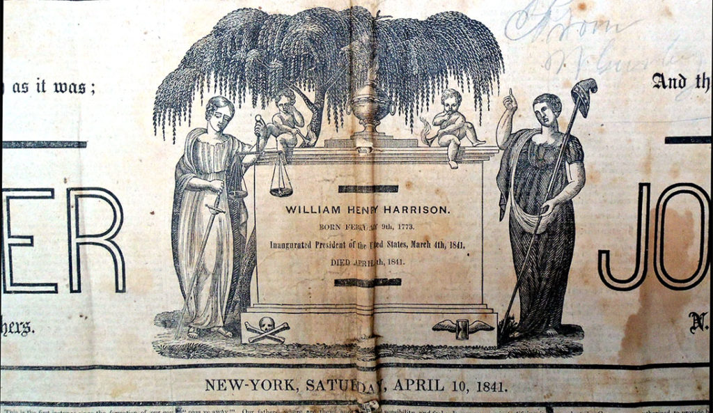
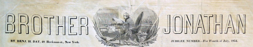
William Henry Harrison (1773-1841), the ninth President of the United States, died on his 32nd day in office, April 4, 1841. Only six days later, the spectacular mammoth double sheet pictorial newspaper Brother Jonathan published a special spring issue with a commemorative note on their masthead [see above], replacing the usual logo [seen below].
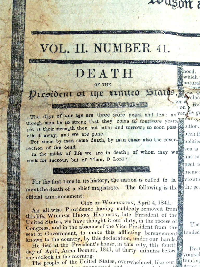
“For the first time in its history, the nation is called to lament the death of a chief magistrate,” wrote the editor Benjamin Henry Day (1810-1889), “…we thought it our duty, in the recess of Congress, and in the absence of the Vice President from the seat of Government, to make this afflicting bereavement known to the country, by this declaration, under our hands.”
Nine years later, July 9, 2850, the second president to die in office, Zachary Taylor, was similarly honored by Brother Jonathan. Abraham Lincoln was shot by John Wilkes Booth in 1865, after Brother Jonathan had ceased publication.
According to their own advertisements, these enormous newspapers (called bedsheet size) began in 1840:
“The Pictorial Double Brother Jonathan for Christmas and New Years was first issued in the year 1840-—just twenty years ago. It was at that time such a novelty that the demand for it continued three or four months, and even then the circulation reached eighty thousand copies. Since that period it has been issued regularly each year, with the avearage [sic] sale of over one hundred thousand copies for every number. Among the Newsvenders, the Brother Jonathan is extremely popular, as they never have a copy of it leftover unsold.
The immense size of the Mammoth Double Brother Jonathan enables us to give in it a profuse amount of reading and still leave room for the great number of Elegant Large Pictures. Altogether, you will find it to be a paper unsurpassed in interest, in point of handsome embellishment and agreeable reading. We give away this elegant Pictorial Paper to every yearly and half-yearly subscriber to the Weekly Brother Jonathan. The Christmas and New Years Pictorial Brother Jonathan will be sent, post-paid, to purchasers at 12 cents per single copy, or ten copies for One Dollar; but if you [subscribe] to the weekly paper, you will get a copy of the pictorial for nothing. Be sure to mention that you want the Pictorial Brother Jonathan, to prevent any mistake. Send cash to B. H. Day, 48 Beekman-Street, New York.”
Princeton University Library now owns 24 mammother issues and and 2 prospectuses of the Pictorial Double Brother Jonathan. Many have been cleaned, flattened, repaired, catalogued, digitized, and posted online for the public to read and enjoy. This one will also soon be cleaned and repaired. See more: http://pudl.princeton.edu/objects/9z903261b
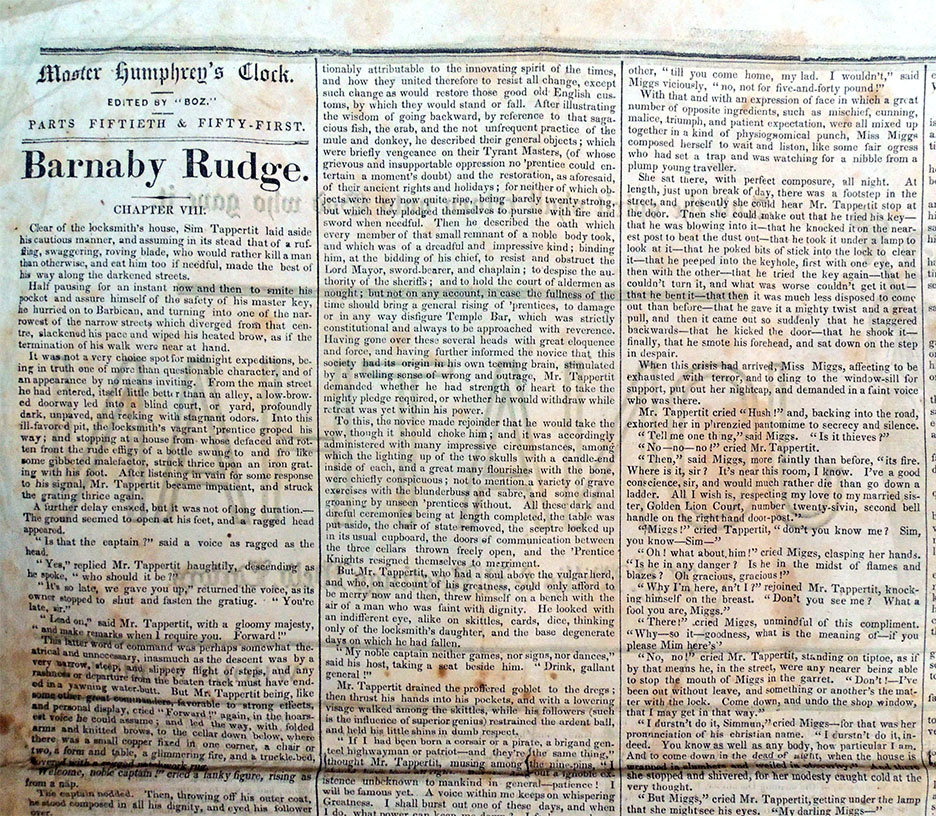
It took a great deal of text to fill the mammoth newspaper. Charles Dickens’s Barnaby Rudge: A Tale of the Riots of Eighty was the fifth of his novels to be published, first appearing in serial form in Master Humphrey’s Clock from February to November 1841. At approximately the same time, Day published it in the United States serially in Brother Jonathan. This is only one of many novels to appear in the paper.
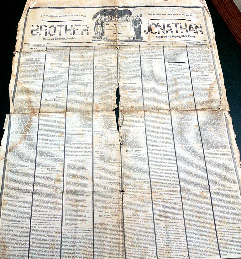 Brother Jonathan, special memorial edition, vol.2, no. 41 whole number 92 (April 10, 1841). Gift of Ivan J. Jurin, 2019. Graphic Arts Collection GAX 2019- in process

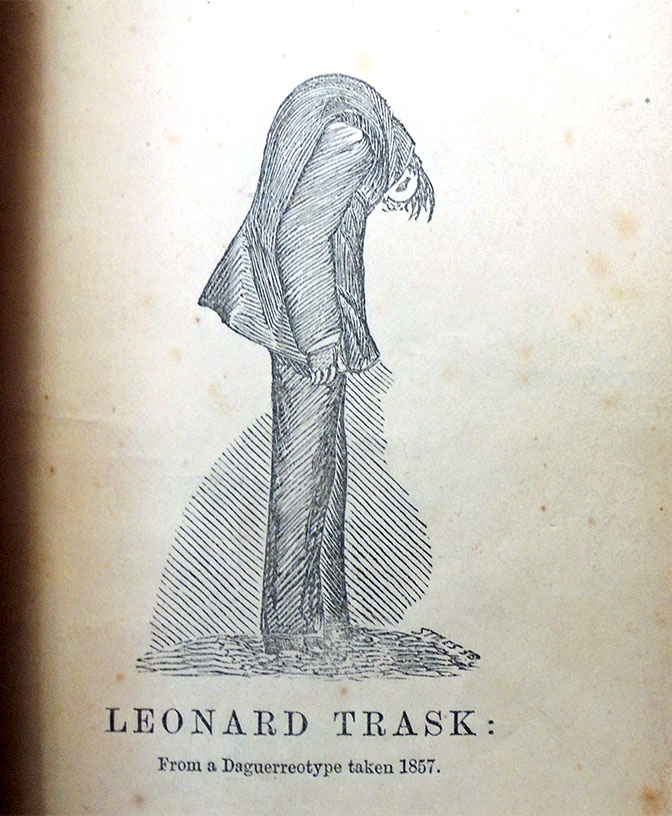
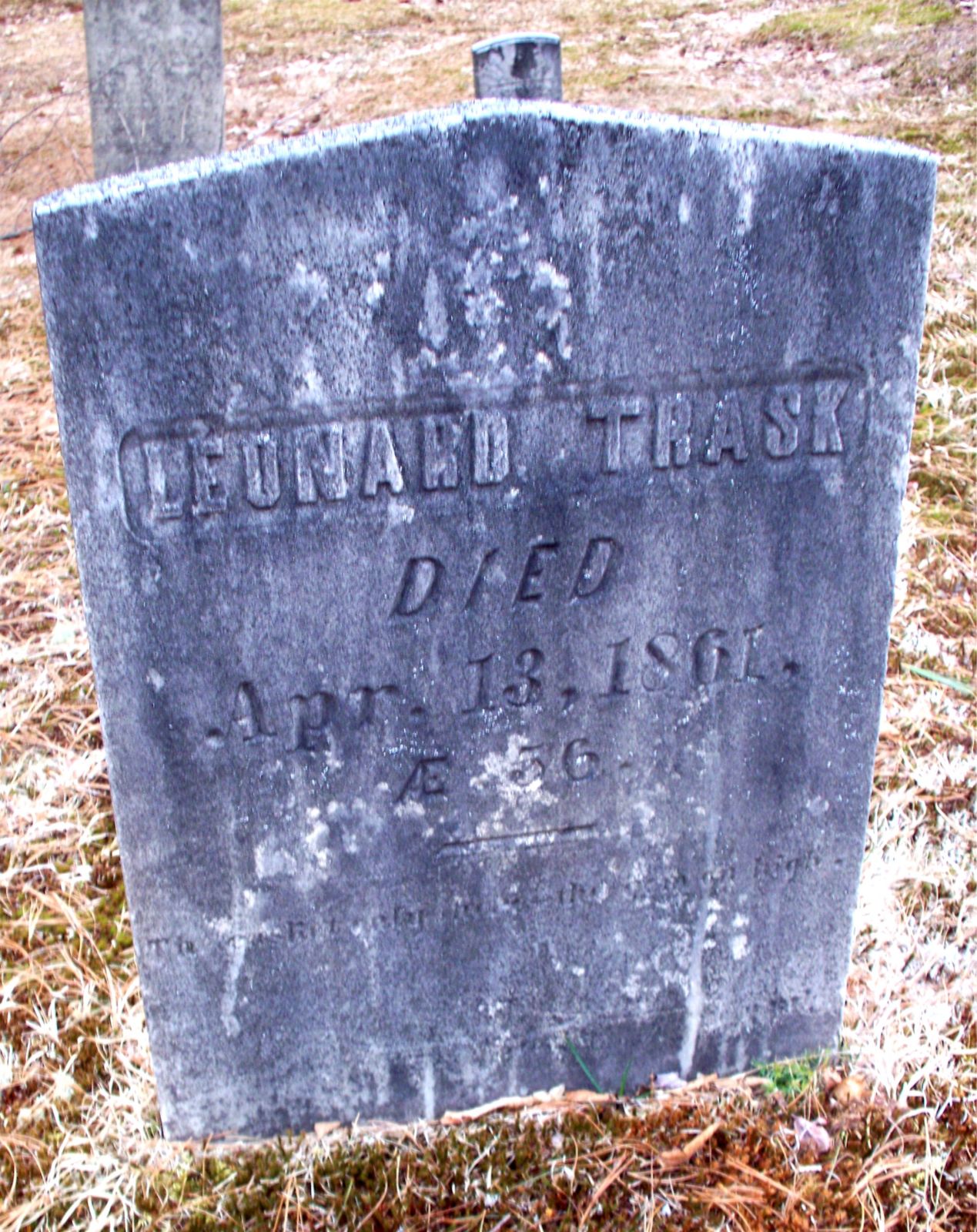
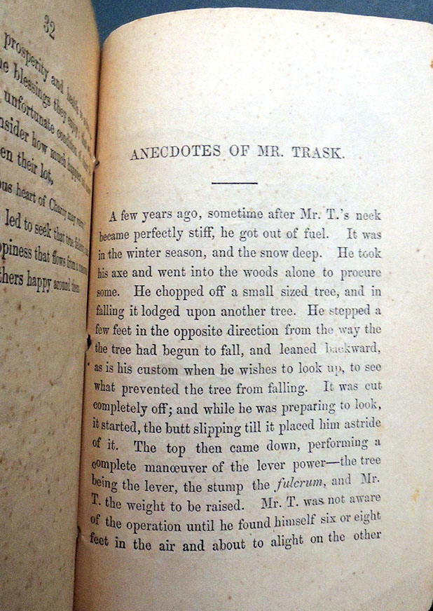 Leonard Trask (1805-1861), A Brief Historical Sketch of the Life and Sufferings of Leonard Trask, the Wonderful Invalid (Portland [Maine]: Printed by David Tucker, 1857). Graphic Arts Collection 2019- in process
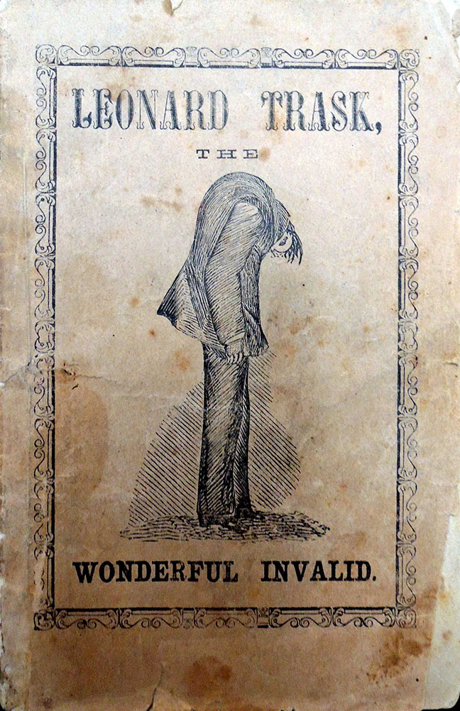