Author Archives: Julie Mellby

Schiller’s Gedichte

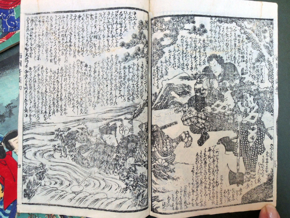
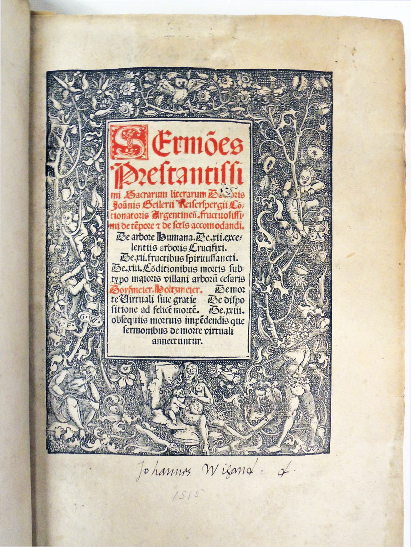
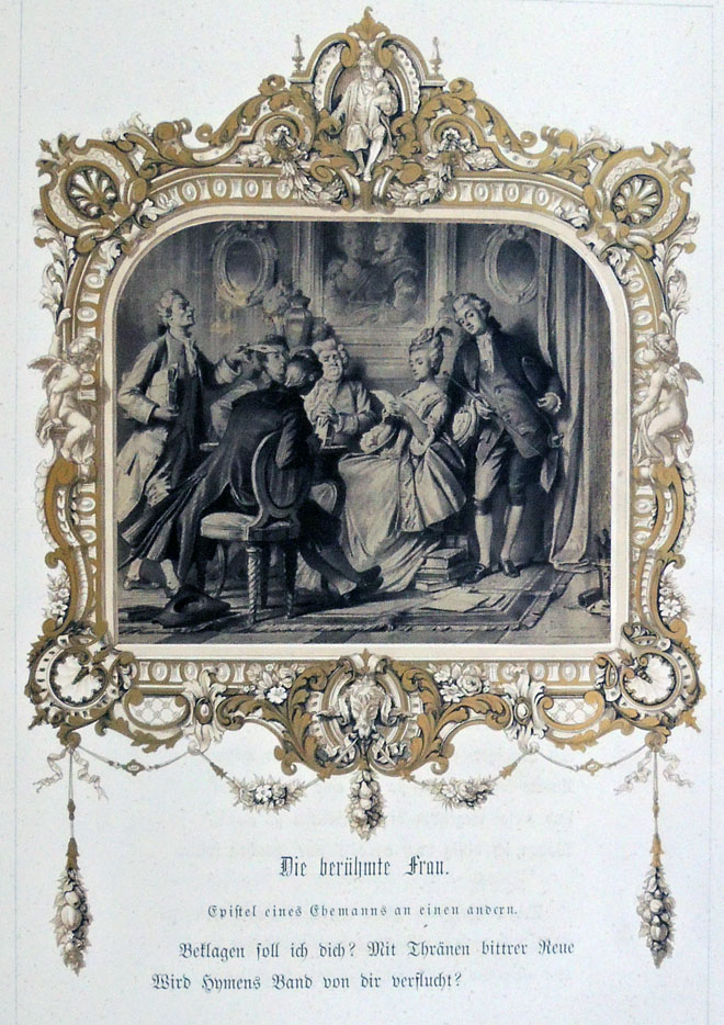
When Lucien Goldschmidt and Weston Naef got to Schiller’s Gedichte, while working on The Truthful Lens, they did not mince words but described it as “the most sumptuous early German book illustrated with photographs.” —The Truthful Lens: a Survey of the Photographically Illustrated Book, 1844-1914 , no. 145 (1980). GARF Oversize TR925 .G73


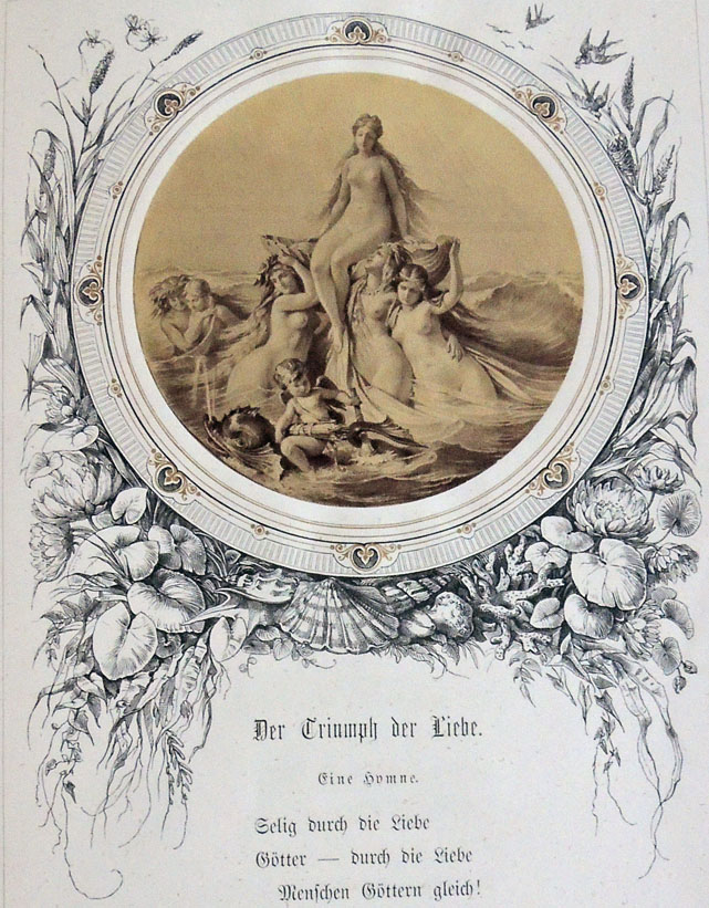
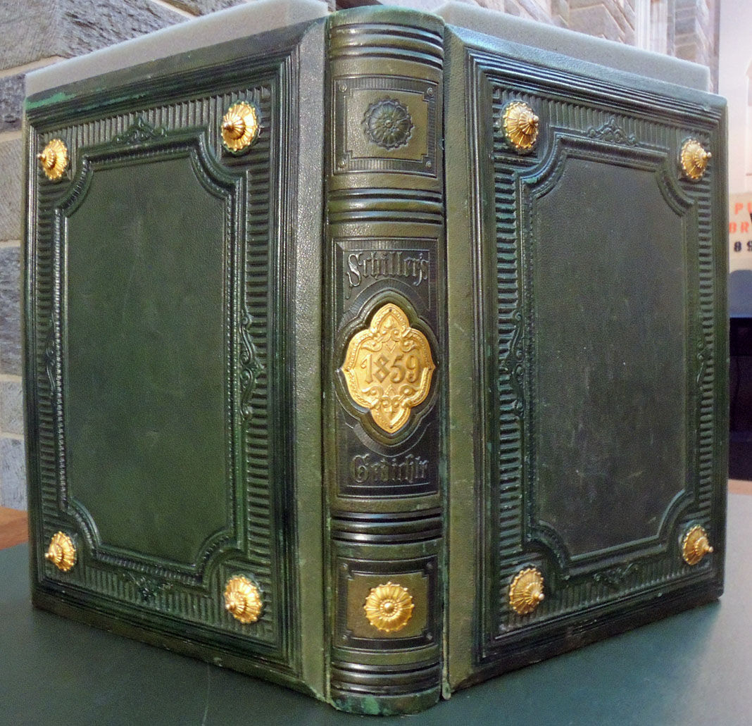
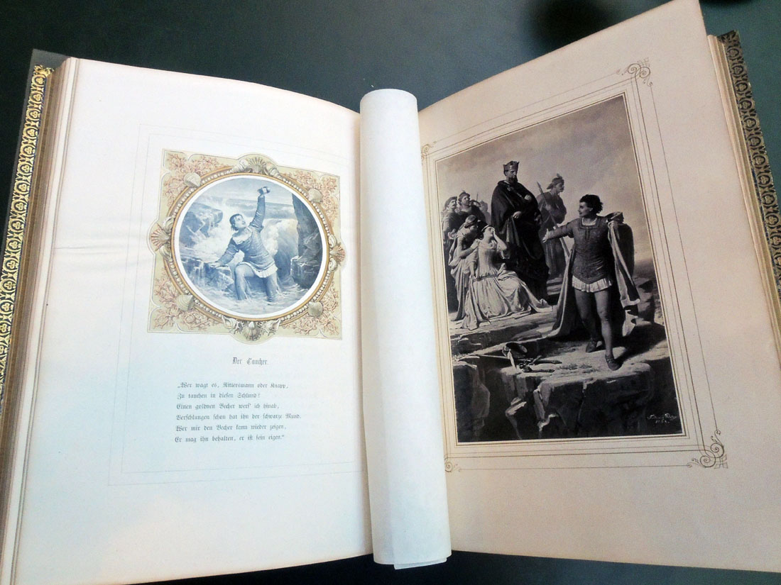
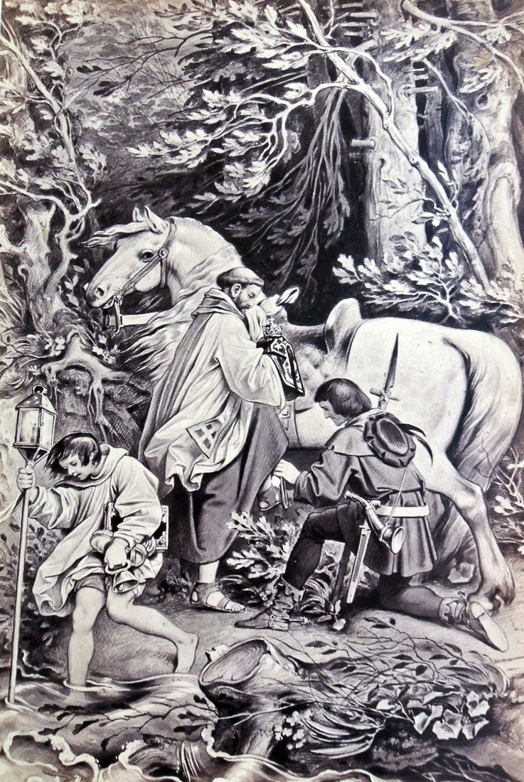
To mark the centenary of Friedrich Schiller’s birth, a Jubiläum (anniversary) edition of his poems was published between 1859 and 1862, decorated with 44 albumen silver prints by Joseph Albert (1825-1886), after drawings by Böcklen, Kirchner, C. Pilothy, F. Pilothy, Ramberg, Schwind, and others. Throughout the text are woodcuts by an unidentified artist after designs by the Nazarene artist Julius Schnorr von Carolsfeld (1794-1872).

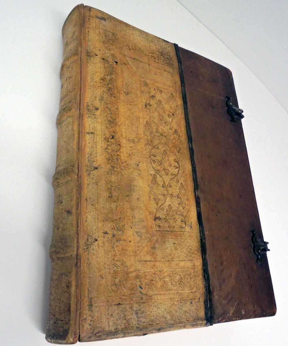
The Graphic Arts Collection is fortunate to have acquired this extraordinary book, beautifully bound in beveled-edge wooden boards covered with dark green embossed morocco and brass-corner bosses.


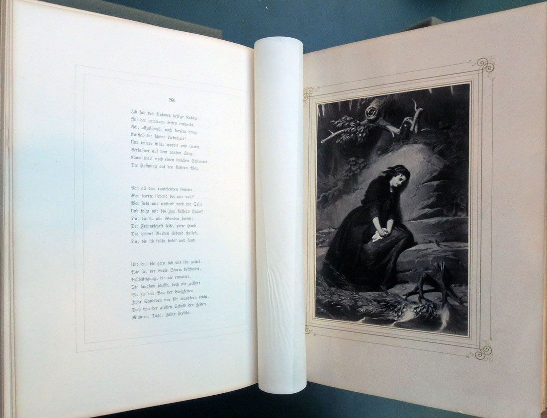
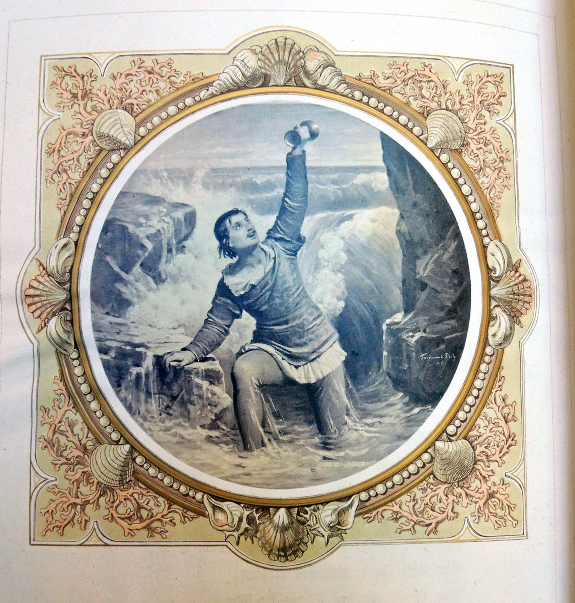
Friedrich Schiller (1759-1805), Schiller’s Gedichte, mit Photographieen nach Zeichnungen von Böcklen … [et al.]; und Holzschnitten nach Zeichnungen von Julius Schnorr (Stuttgart: Cotta, 1859-1862). Graphic Arts Collection GAX 2017- in process


Ode To Joy
Friedrich Schiller, translated by William F. Wertz (first section)

Joy, thou beauteous godly lightning,
Daughter of Elysium,
Fire drunken we are ent’ring
Heavenly, thy holy home!
Thy enchantments bind together,
What did custom stern divide,
Every man becomes a brother,
Where thy gentle wings abide.

Chorus.
Be embrac’d, ye millions yonder!
Take this kiss throughout the world!
Brothers—o’er the stars unfurl’d
Must reside a loving Father.

Who the noble prize achieveth,
Good friend of a friend to be;
Who a lovely wife attaineth,
Join us in his jubilee!
Yes—he too who but one being
On this earth can call his own!
He who ne’er was able, weeping
Stealeth from this league alone!

Chorus.
He who in the great ring dwelleth,
Homage pays to sympathy!
To the stars above leads she,
Where on high the Unknown reigneth.

Joy is drunk by every being
From kind nature’s flowing breasts,
Every evil, every good thing
For her rosy footprint quests.
Gave she us both vines and kisses,
In the face of death a friend,
To the worm were given blisses
And the Cherubs God attend.

Chorus.
Fall before him, all ye millions?
Know’st thou the Creator, world?
Seek above the stars unfurl’d,
Yonder dwells He in the heavens.


Le Magasin charivarique

Le Magasin charivarique. Musée comique, magasin de charges et de caricatures [The Charivaric Store. Museum of Comics, a store of cartoons and caricatures] (Paris, 1834). Full page prints by Honoré Daumier, Benjamin, Grandville, and others. From the collection of Arthur & Charlotte Vershbow; purchased from Goodspeed’s Book Shop; previously owned by William M. Ivins, Jr., former curator of the Department of Prints at the Metropolitan Museum of Art. Graphic Arts Collection GAX 2017- in process.

A ministerial newspaper editor

The Graphic Arts Collection recently acquired a complete set of Le Magasin charivarique, comprised of two parts in three volumes. The first volume includes nine lithographs by Honoré Daumier (D. 219, 220, 223, 224, 225, 229, 231, 234 and 237). The second volume (issued in two parts, plates 1-19 and 20-37) containing 14 ‘chalk-plate’ prints (Bouvy 23-36).

“The only large cuts that Daumier made, aside from two or three odd ones like Le Carnaval and Le Compliment, that came out in the Charivari, are the series of ‘chalk plate’ caricatures that the Charivari published in the early 1830s, many of which subsequently appeared, printed carefully on one side only of good paper, in the Magasin Charivarique . . . In certain ways, these two series exhibit him at the height of his prowess. For sheer brutal dominant power of presentation there are few things to be found in the history of the relief print finer than a number of the early chalk plates” –William Ivins, “Daumier,” in The Colophon, part V, 1931.


Inside front cover.

When the vessel is full, it overflows. Monseigneurs, take care.


A caricature of the French magistrate Nicolas Martin du Nord (1790-1847) as a bear climbing a tree labeled conspiracy “to earn his living.”


Every Building on the Thames Strip

John Heaviside Clark, Panorama of the Thames from London to Richmond (London: Samuel Leigh, ca. 1824). Graphic Arts Collection GAX 2017- in process


In 1966, American artist Ed Ruscha pieced together photographs showing both sides of the Los Angeles Sunset Strip from Beverly Hills and Laurel Canyon. The mile and a half stretch of road became a 24-foot-long leporello or concertina folded book, which he called Every Building on the Sunset Strip.

Nearly 150 years earlier in 1824, Scottish printmaker John Heaviside Clark (ca. 1770-1836) created 45 aquatinted etchings of the Thames River, showing the buildings and landscape on both sides from London to Richmond. The 15-mile stretch became a bound volume called Panorama of the Thames from London to Richmond. If it were unbound, the prints would extend 59 feet (18 meters).


Edward Ruscha, Every Building on the Sunset Strip ([Los Angeles]: E. Ruscha, 1966). 1 folded sheet ([53] p.). Graphic Arts Collection (GAX) 2006-2722N


John Heaviside Clark was sometimes known as Waterloo Clark, after the drawings he made of the battlefield. He exhibited regularly at the Royal Academy and published A Practical Essay on the Art of Colouring and Painting Landscapes (1807); A Practical Illustration of Gilpin’s Day (1824); The Amateur’s Assistant, or, A series of instructions in sketching from nature (1826); Elements of Drawing and Painting in Water Colours; (1841)(GAX) 2003-0273N; and Friedrich Wilhelm Delkeskamp (1794-1872), Panorama of the Rhine and the adjacent country from Cologne to Mayence (ca. 1830)(Ex) Oversize 2008-0020Q.


Being a pleasant and profitable companion for children

It was a good day. In preparing to digitize the smallest volumes in the Sinclair Hamilton collection of American books illustrated with woodcuts and wood engravings, we made a search for the few missing copies. Many were found including this 1774 edition of The History of the Holy Jesus, printed and sold by John Boyle in Marlborough Street, Boston. Note the frontispiece portrait of “a lover of their precious souls.”


Many of the illustrations in this 1774 edition are thought to have been cut by Isaiah Thomas (1749-1831) after the metal relief plates engraved by James Turner (1722-1759), first published in 1745. The Sinclair Hamilton Collection has six editions of The History of the Holy Jesus, 1749: Hamilton 28s; 1749: Hamilton 1311(1)s; 1767: Hamilton 68(2)s; 1774: Hamilton 68(1)s; 1779: Hamilton 88s; and 1958 (1746): Hamilton 1311(2)s.

For more, see Dale Roylance’s “Of Sin and Salvation,” in Princeton University Library Chronicle Winter 1998 http://libweb5.princeton.edu/visual_materials/pulc/pulc_v_59_n_2.pdf

One of the cuts completely changed by Thomas is this image of three stars, which replaced a picture of three wise men. Two might be seen as falling stars, or shooting stars. Below are a few more of his cuts.


The History of the Holy Jesus: containing a brief and plain account of his birth, life, death, resurrection and ascension into heaven: and his coming again at the great and last Day of Judgment: being a pleasant and profitable companion for children: composed on purpose for their use / by a lover of their precious souls. The twenty-fifth edition. Boston: Printed and sold by John Boyle … , 1774. Woodcuts attributed to Isaiah Thomas. Cf. Hamilton. Inscribed “Moley Heving, her book” and “Moley Heving, her book, bought the year 1779, March the 22, price four shillings.”–in ink, on frontispiece recto. Graphic Arts Collection (GAX) Hamilton 68(1)s


Print to Motion

Students in the class “Print to Motion” from Columbia University’s LeRoy Neiman Center for Print Studies visited recently along with instructor Ben Hagari and the Center’s artistic director Tomas Vu-Daniel. http://www.columbia.edu/cu/arts/neiman/about.html They are printing their own thaumatropes, zoetropes, and other optical devices and so, came down to be inspired by our historical collection. http://rbsc.princeton.edu/sites/default/files/Optical%20Devices.pdf


Their timing was good, arriving just in time to see our newly acquired biunial magic lantern, a recent donation from David S. Brooke, director emeritus of the Clark Art Institute.

This very special lantern has a mahogany body with aluminum slide holders and has been wired for electricity making it possible to project slides for our students. As the name indicates, a biunial has two separate projection systems placed one over the other, which allows the lanternist to superimpose two images for dissolving views or other special effects. Ours was made by the Optimus company and is a nice companion to our single lens Perken Optimus Magic Lantern, ca. 1875.

The LeRoy Neiman Center for Print Studies was founded by a generous endowment from LeRoy and Janet Neiman in 1996 to promote printmaking through education, production and exhibition of prints. The center provides students, as well as established artists, a rich environment to investigate and produce images through a myriad of printmaking techniques which include intaglio, lithography, silkscreen, relief, photography, and digital imaging.

To see other items in our collection, choose the category ‘pre-cinema optical devices’ in the right margin.

Shinzoho Saigoku kidan = Mysterious Stories of the Western Country

Kunisada Utagawa II, artist and Shunsui Tamenaga (pseudonym for Sadataka Sasaki, 1790-1844), author. 新増補西圀奇談 新増補西國奇談 = Shinzoho Saigoku kidan = Mysterious Stories of the Western Country. Complete in twenty parts bound in forty volumes. Edo: Tsutsumi Kichibei, 1856-1875. Graphic Arts Collection GAX 2017- in process.


The Graphic Arts Collection recently acquired the first edition and a rare complete set of this beautifully illustrated example of gokan, a type of fiction of the kusa zoshi genre. According to The Princeton Companion to Classical Japanese Literature, “gōkan are popular illustrated stories and romances, prose narratives succeeding Kibyōshi, and flourishing sometime after 1807. By combining three or four sōshi into one gōkan unit, much longer stories were possible.”


We are told that “these serial novels are usually characterized by their vividly colored pictorial wrappers upon which the artists’ names were given equal prominence with the name of the author on the covers, title-pages, and colophons. Each volume of a gokan contains ten sheets/twenty pages. The images are more sophisticated than those encountered in most earlier kusa zoshi and the texts far denser.”

Shunsui Tamenaga was the pen name of Sadataka Sasaki (1790-1844), one of the major writers of the Edo period. He is perhaps best remembered for Colors of Spring, the Plum Calendar, written in 1832-33. But he is also known for his humorous story Longevity, which was translated by Yei Theodora Ozaki for The Japanese Fairy Book (Westminster: Archibald Constable & Co., 1903). Cotsen Children’s Library (CTSN) Eng 20 28988.

Kunisada II (1823-1880), successor to Kunisada Utagawa, worked in the style of his master and illustrated nearly 200 books. Each of the stories is in two parts, each with its own color woodblock cover that matches and completes the image on the cover of the other volume.

Our new collection is in remarkably good condition, given the popularity of these volumes and the simple paper cover. Even for those who do not read Japanese, the matching print covers are spectacular.


Sermones prestantissimi sacrarum literarum

Johann Geiler von Kaysersberg (1445-1510), Sermo[n]es prestantissimi sacrarum literarum doctoris Joa[n]nis Geilerii Keiserspergii, contionatoris Argetine[m] fructuosissimi de te[m]pore [et] de s[e]ctis accomodandi ([Strasbourg]: [Joannes Grüniger], [1515]). Bound in contemporary blind-stamped half pigskin over wooden boards with brass clasps, the book has been rebacked, preserving old spine. Provenance: early marginalia; Joh. Wigand (signature on title); collection of Arthur and Charlotte Vershbow; purchased from John Fleming, 1971. Graphic Arts Collection GAX 2017- in process

The Graphic Arts Collection recently acquired one of several issues of the second edition of Geiler’s sermons, illustrated with the same unusual set of woodcuts representing danse macabre subjects that appeared in the first edition of 1514. Geiler, sometimes called the German Savonarola, was a “preacher at the Strassburg cathedral, who attracted huge audiences while advocating reform. Inspired by the ideals of humanism, Geiler composed and delivered sermons that were at once learned and passionate, and above all, accessible to a broad audience.” Carlos M.N. Eire, Reformations: The Early Modern World, 1450-1650 (2016).

The title page is printed in the dotted manner or manière criblée or Schrotblatt, a technique found in Germany and France in the late 15th and early 16th centuries, in which the design is created from punches or stamps on a metal plate. Seven woodcuts and numerous woodcut initials also decorate the book.

For more about the dotted manner technique, see also: Prints in the dotted manner and other metal-cuts of the XV century in the Department of Prints and Drawings, British Museum, edited by Campbell Dodgson …(London: Printed by order of the Trustees, 1937). Marquand Library (SA) Oversize NE55.L8 B709f

Sylvester Rosa Koehler (1837-1900), White-line engraving for relief-printing in the fifteenth and sixteenth centuries. [Dotted prints, gravures en manière criblée, Schrotblätter] (Washington: Government Printing Office, 1892). Marquand Library NE1000 .K7

The Business of Prints

Abraham Bosse (ca. 1604–1676), The Workshop of a Printer (detail). Etching, 1642.

Last year, Princeton University Libraries acquired Antony Griffiths, The Print Before Photography: an Introduction to European Printmaking, 1550-1820. Marquand Library (SA) Oversize NE625.G77 2016q. Described accurately as “a landmark publication . . . destined to be a leading reference in print scholarship.”

This week the companion exhibition, The Business of Prints, opened at the British Museum and was packed by noon. Rather than only show master prints, the Museum’s former keeper of prints and drawings has filled the cases with extra illustrated volumes, unique impressions, and sequential proofs never seen before. It is an exhibition no other institution could possibly mount.

One example is the prospectus Rudolph Ackermann printed for his publication Westminster Abbey.  [left] There are two copies of the published volume at Princeton but not this print describing the project and requesting subscribers.

William Combe (1742-1823), The History of the Abbey Church of St. Peter’s Westminster: Its Antiquities and Monuments (London: Printed for R. Ackermann … by L. Harrison and J.C. Leigh, 1812). Plates signed by Augustus Pugin (1762-1832). “With … coloured plates after Pugin, Huett and Mackenzie.”–Dict. nat. biog. Marquand Library (SA) Oversize 14653.262q and Rare Books (Ex) Oversize 14653.262q


The making of a mezzotint. Where else can you see a proof of the fully rocked sheet?

Blocks, cut but never printed

One hundred and fifty curators, conservators, and historians met on Thursday 21 September 2017 at the Courtauld Institute, London, to view and discuss “Blocks Plates Stones.”

Twelve papers were delivered, including Huigen Leeflang of the Rijksmuseum seen here introducing the “curtain viewer” developed by Robert G. Erdmann, senior scientist at the Rijks, which allows you to compare differing impressions or a plate together with a print in the same image. The Metropolitan Museum of Art posted examples of Erdmann’s viewer that you can use online: http://www.metmuseum.org/exhibitions/listings/2017/hercules-segers/segers-closer-look

In addition, there were nine object sessions with physical blocks and plates. Seen here are a selection of “printing blocks from the collections of Senate House Library” by Tansy Barton, Senate House Library. Nineteen posters introducing new and continuing projects were available with their creators. After today, the posters have been accepted into the newly established Poster House in Chelsea, New York City.

One thread throughout the sessions involved blocks prepared but never printed. Conference organizer Elizabeth Savage reminded us that William Morris never allowed anyone to print from his woodblocks but only from the electrotypes after them. The boxwood blocks for his Kelmscott Chaucer were wrapped up and packed away for 100 years to assure they would not be inked or printed. **Those 100 years are now over and the blocks, in the British Museum, might be available for printing (or at least photographing).

See the article written by Peter Lawrence in the August 15, 2015 issue of Multiples, the Journal of the Society of Wood Engravers, edited by Chris Daunt, for more information about Morris’s blocks. Princeton students note: This can be ordered through interlibrary loan and should not be confused with the Wood Engravers’ Network (WEN). The Graphic Arts Collection at Princeton has the archive for the Wood Engravers Network here:

Wood Engravers’ Network collection (1995- ). Consists of issues of Bundle, Newsletter, and Block & Burin, along with membership directories, supplier directories, announcements, and other related printed material. Grouped by date into folders labeled by Bundle issue number. Graphic Arts Collection (GAX) 2015-0046F.

Charles Darwin replaced by Jane Austen


Although you can take your chances at any cash machine, a visit to the Bank of England will get you the new £10 banknote celebrating Jane Austen (1775-1817), which entered circulation a few days ago. Like the £5 note already in use featuring Sir Winston Churchill, the new £10 banknote featuring the author of Pride and Prejudice is made from polymer.

The portrait is taken from a pencil and watercolor drawing by her sister, Cassandra Austen (1773-1845), made around 1810, now owned by the National Portrait Gallery of London. Their wall label describes this portrait as a “frank sketch by her sister and closest confidante Cassandra . . . the only reasonably certain portrait from life”. It is the basis for a late nineteenth-century engraving, commissioned by Austen’s nephew, which is featured on the new ten pound notes.

Cassandra Austen (1773-1845), Jane Austen, 1775-1817, ca. 1810. Pencil and watercolor. National Portrait Gallery PG 3630

Just over one billion polymer £10 notes have been printed ready for issue and an exhibition has been mounted at the Bank of England Museum to celebrate. One feature in the gallery is this geometric lathe by Herbert W. Chapman of Newark, New Jersey, produced in 1905. The machine was used to create the ornamental patterns that were used as security features on early banknotes. Today, the new bills have holograms and many other security features. The video below takes you through all the details.


This is the paper mould designed by William Brewer in the late 1840s to watermark 19th century banknotes. Brewer’s first waved line was the most important change (according to the Bank) to British notes at that period. Brewer continued to develop the watermark throughout the century with several additional copyrighted features.

Over the years, many banknote designs were proposed but never used. One such note was designed by Frederick Leighton for an Alfred Lord Tennyson bill, seen below. Like Tennyson, Charles Darwin is now moving out of circulation and by 2018, the bill will no longer be valid. You can spend it now or exchange it. A new £20 note featuring artist J.M.W. Turner will appear in 2020.


See also: Jane Austen (1775-1817), Pride and Prejudice (London: Printed for T. Egerton, 1817).  Rare Books (Ex) 3612.1.373.1817


Darwin does not look happy.